Munich Personal RePEc Archive
On the World Productivity Distribution:
Recent Convergence and Divergence
Patterns
Mendez-Guerra, Carlos
Nagoya University
10 October 2014
Online at
https://mpra.ub.uni-muenchen.de/59811/
On the World Productivity Distribution:
Recent Convergence and Divergence Patterns
Carlos A. Mendez-Guerra
November 9, 2014
Abstract
The post-World War II period has seen substantial changes in labor productivity around
the world. Motivated by these changes, this article documents four facts about the world
productivity distribution. First, there is a large and increasing disparity between the tails.
Second, this disparity rapidly increased in the mid-1980s, slowed down in the next decade,
and stabilized in the mid-2000s. Third, overtime, there has been substantial forward and
backward mobility of countries and regions. Fourth, the upper tail of the distribution is
more sensitive to improvements in human capital, while the lower tail is more sensitive to
improvements in efficiency.
Keywords: average labor productivity, world productivity distribution, convergence
JEL Codes: O40, O50, E10
1
Introduction
Both convergence and divergence in output per worker characterize the post-World War II
pe-riod. The world productivity distribution shows a noticeable divergence at the bottom, and
convergence and overtaking at the top. For example, average labor productivity in Taiwan
rela-tive to that in the United States rose from 13 percent in 1960 to 78 percent in 2010. Conversely,
in the same period of time, labor productivity in Venezuela dropped from 60 percent to 25
percent.
Restuccia (2006), this article updates and expands the set of facts that theories of development
should explain. Using data on potential GDP per worker, this article highlights three facts
about disparity and mobility of the world productivity distribution between 1960 and 2010. In
addition, two simple forecast exercises, following the work of Jones (1997a, b) and Quah (1993,
1996), suggest potential scenarios where convergence in labor productivity seems more plausible.
The first fact highlights large cross section disparities in labor productivity since 1960. For
example, in 1960 an average worker in ten most productive countries of the sample produced
about 40 times more output than the average worker in the ten least productive countries.
Also, the shape of the world productivity distribution in 1960 appears unimodal and largely
concentrated at the bottom—50 percent of the sampled countries show a relative output per
worker no greater than 17 percent relative to that in United States.
The second fact points to the speed at which the disparity in labor productivity has been
evolving. After more than two decades of relative stability, productivity disparities across
coun-tries rapidly increased in the mid-1980s. In the next decade, however, the speed of this
diver-gence slowed down; particularly since mid-2000s, the data suggest a small tendency towards
convergence.
These two facts consistently update and extend the previous literature. Parente and Prescott
(1993) report stable differences in labor productivity across countries for the coverage period
ending in 1985. Duarte and Restuccia (2006) not only verify this stability, but also —after
extending the coverage period until 1996— document a rapidly increasing dispersion. In this
context, this article not only updates the disparity facts until 2010, but also provides some
initial evidence on the stabilization of the productivity differences due to improvements in poor
countries.
The third fact documents substantial forward and backward mobility of countries and even
regions within world productivity distribution. For example, labor productivity in Asia relative
to that in the United States rose from 15 percent in 1960 to 37 percent in 2010. In contrast,
labor productivity in Latin America declined from 28 percent in 1960 to 23 percent in 2010.
Overall, these forward and backward mobility patterns seem consistent with the polarization of
the world productivity distribution and the “twin-peaks” hypothesis suggested by Quah (1993,
1996).
distribution look in the future? Analysis based on an aggregate production function provides
some insights answer this questions. Jones (1997a) emphasizes that potential differences in
output per worker can be attributed to current differences in population growth rates, physical
investment rates, human capital stocks, and technology levels (TFP). Building on this approach,
countries above the 75th percentile are expected to increase their convergence rate and even
overtake the technological leader. Less developed countries, however, might remain very close
to, or even fall behind, their 2010 labor productivity levels. The results also emphasize the role
of total factor productivity (TFP) as the key driver of this convergence and divergence process.
An alternative yet complementary framework to forecast the world productivity distribution
(over a more distant time horizon) uses Markov methods. This is an approach taken by Quah
(1993, 1996) and Jones (1997b) among others. Based on historical mobility frequencies, the
results suggest that labor productivity might still be characterized by a bimodal distribution,
with a small yet significant number of countries at the bottom.
Overall, this article contributes to the earlier literature in three ways. First, it adds the
period between 1996 and 2010 to the analysis. Second, it characterizes disparity, mobility, and
the steady-state distribution of labor productivity using trended data to abstract from
business-cycle fluctuations. Third, it presents a comprehensive view (past, current, and future) of the
evolution of labor productivity for a large sample of countries.
The article proceeds as follows. Section 2 documents the main disparity and mobility facts.
Section 3 describes how the world productivity distribution might look in the near future using
a neoclassical production function approach. Assuming a more distant time horizon, Sections
4 describes the world productivity distribution using Markov methods. Section 7 offers some
concluding remarks.
2
Disparity and Mobility Facts
This section characterizes the cross-section dynamics of labor productivity around the world
using a balanced sample of 92 countries for the period 1960-2010.1
To build upon and extend
previous findings, the organization and presentation of facts follows the work of Duarte and
Restuccia (2006)
1
2.1
Large and Increasing Disparities
One of the main motivating facts in the field of economic growth and development is the large
and increasing disparity in output per worker across countries. This subsection presents the
behavior of disparity indicators between 1960 and 2010. Focusing first on the top and bottom
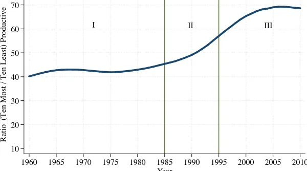
of the world productivity distribution, Figure 1 illustrates the labor productivity gap between
the ten most productive and ten least productive countries for each year since 1960 until 2010.
Over this period, the productive gap between the tails of the distribution varied from 39 to 68
times. By 2010 the average worker in the ten most productive countries produced 67.6 times
more output than the average worker in the least productive group of countries. Historically, the
first decade of the new millennium records the largest disparity between the tails of distribution
[image:5.612.156.456.351.518.2]in the post-World War II period.
Figure 1: Output per Worker—Ratio of the Ten Most Productive to the Ten Least Productive Countries
I II III
10 20 30 40 50 60 70
Ratio
(
Ten
Most
/
Ten
Least) Productive
1960 1965 1970 1975 1980 1985 1990 1995 2000 2005 2010 Year
Source: Author's calculations using data from PWT 7.1
Notes: Between 1960 and 2010, the following countries comprised the ten most productive group with the highest frequency (i.e., 51 years): Australia, Belgium, Netherlands, Norway, United States. The following countries comprised the ten least productive group with the highest frequency (i.e., 51 years): Burundi, Ethiopia, Malawi, Mozambique, Zimbabwe.
Consistent with earlier findings in the literature, Figure 1 suggests that the disparity between
the tails of the distribution has been roughly constant during the first two decades of the sample
period. Since the mid-1980s until the mid-2000s, however, there has been a rapid increase in
the productivity gap between the top and bottom of the distribution.2
The first line drawn at
2
1985 represents the ending period of the first strand of the previous literature, which emphasizes
constant disparities between the tails of the distribution. That literature includes the work of
Parente and Prescott (1993), and Chari et al. (1997). The second line drawn at 1995 represents
the second strand of the earlier literature, which emphasizes rather increasing disparities. That
literature inclues the work of Duarte and Restuccia (2006)
Extending the findings of the earlier literature, Figure 1 also documents that since the
mid-1990s this increasing productivity disparity has slowed down. Moreover, after 2006 the gap has
stabilized and shifted its tendency. Evaluating more extensible the nature of this trend, Figure
2 suggests that the recent stabilization of the productivity gap is driven by improvements at the
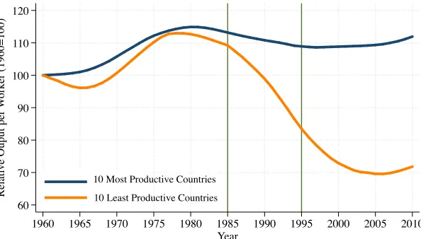
[image:6.612.159.456.324.493.2]bottom of the distribution.
Figure 2: Relative Output per Worker-Ten Most Productive and Ten Least Productive Countries (1960=100)
60 70 80 90 100 110 120
Relative Ouput per
W
orker (1960=100)
1960 1965 1970 1975 1980 1985 1990 1995 2000 2005 2010 Year
10 Most Productive Countries
10 Least Productive Countries
Source: Author's calculations using data from PWT 7.1
Notes: Average output per worker relative to that in the U.S. for the ten most productive and least productive countries. Both series are normalized to 100 in 1960. As reference, in 1960 the average relative output per worker of the ten most productive countries is 85.88 percent, while for the ten least productive countries, it is 2.20 percent.
Figure 2 reports the average labor productivity relative to that in the United States for the
ten most productive and least productive groups, each normalized to 100 in 1960. Overall, this
figure shows that the increase in the disparity between the tails of the distribution is mostly
driven by the decline in productivity in the least productive productive countries. For example,
from 1977 to 2006, relative productivity decreased by 42 percent. Since 2006, however, the ten
poorest countries have grown even faster than the ten richest countries. This positive growth
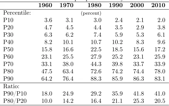
Table 1: Relative Output per Worker by Percentile
1960 1970 1980 1990 2000 2010
Percentile: (percent)
P10 3.6 3.1 3.0 2.4 2.1 2.0
P20 4.7 4.5 4.4 3.5 2.9 3.8
P30 6.3 6.2 7.4 5.9 5.3 6.1
P40 8.2 10.1 10.7 10.2 8.3 9.6
P50 15.8 16.6 22.5 18.5 15.6 17.2
P60 23.1 25.5 27.9 25.2 23.1 25.9
P70 33.1 38.0 44.3 39.8 33.7 33.9
P80 47.5 63.4 72.6 74.2 74.4 78.0
P90 64.2 76.4 88.3 85.9 86.3 83.1
Ratio:
P90/P10 18.0 24.9 29.2 35.9 41.8 41.0
P80/P20 10.0 14.2 16.4 21.1 25.3 20.5
episode ends up a 30-year period of productivity divergence.
Moving beyond the analysis of the tails of world productivity distribution, Table 1 reports
the relative labor productivity for a selected number of percentiles and years. The last two rows
report the ratio of the ninetieth percentile to the tenth percentile and the ratio of the eightieth
percentile to the twentieth percentile.
In 1960, the least productive countries of the tenth percentile showed an average
productiv-ity of 3.6 percent relative to that in the United States. In the same year, the most productive
percentile percentile achieved 64.2 percent of the productivity in the United States. This
differ-ence yields a ratio of 18 between the highest and lowest percentile. Note that both percentile
ratios increased substantially until the year 2000, but then they started decreasing. Moreover,
all other percentiles showed improvements in the last decade. This global coververgence episode
occurred after more than two decades of productivity divergence in all percentile groups.3
When considering the entire distribution, our sample seems consistent with the “twin peaks”
hypothesis (Quah (1993a,b), Quah (1996), Jones (1997)). Using gaussian kernel densities at
different points in time, Figure 3 shows the movement in the mass of countries from the middle
to both right and left of the distribution. This polarization of the distribution characterizes the
third fact on the cross-sectional dynamics of labor productivity is evaluated at the country and
regional levels in the next subsection.
3
Figure 3: Distribution of Relative Output per Worker
1960
1985
2010
0 .004 .008 .012 .016 .02 .024
D
ens
it
y of Count
ri
es
0 20 40 60 80 100 120
Relative Output per Worker (U.S.=100)
Source: Author's calculations using data from PWT 7.1
World Productivity Distribution
2.2
Substantial Mobility within the Distribution
Table 2 reports a mobility matrix based on the frequency of country movements over a period
of 51 years. Based on their relative productivity in 1960 and 2010, the first column and the row
classify countries into seven intervals. The variable y˜indicates a country’s labor productivity
relativity to that in the United States. The labels for each interval are somewhat arbitrary
cutoffs for low (L), upper low (UL), middle (LM), middle (M), upper-middle (UM),
lower-high (LH), and lower-high (H) productivity levels. For example, the first element of this matrix, 0.86,
indicates that out of all the low-productivity countries (L) in 1960, only 14 percent of those
[image:8.612.136.478.526.623.2]countries upgraded their status to an upper-low productivity country (UL) by the year 2010.
Table 2: Mobility Matrix 1960-2010
L2010 U L2010 LM2010 M2010 U M2010 LH2010 H2010
(˜y <2.5)L1960 0.86 0.14 0 0 0 0 0
(2.5≤y <˜ 5)U L1960 0.27 0.40 0.07 0.27 0 0 0
(5≤y <˜ 10)LM1960 0.18 0.29 0.35 0.12 0.06 0 0
(10≤y <˜ 20)M1960 0 0 0.29 0.29 0.21 0.21 0
(20≤y <˜ 40)U M1960 0 0 0.06 0.22 0.44 0.17 0.11
(40≤y <˜ 80)LH1960 0 0 0 0 0.13 0.27 0.6
(˜y >80)H1960 0 0 0 0 0 0.33 0.67
Values in the off-diagonal elements of the matrix indicate the mobility frequencies of
coun-tries. The distribution shows a higher degree of mobility in the middle compared to the
high-productivity countries in this subset. For example, out of all lower-middle (LM)
produc-tivity countries in 1960, 35 percent of those countries remained in the same producproduc-tivity interval,
while 47 percent moved backward and 18 percent moved forward after 51 years. In contrast, out
of all upper-middle (UM) productivity countries in 1960, 44 percent of those countries remained
in the same productivity interval, while and 28 percent moved backwards and 28 percent moved
forward after 51 years. Overall, these results reiterate the story of Figure 3: the post-war period
is characterized by both convergence and divergence patterns (that is, countries moving from
the middle to both right and left of the labor productivity distribution).
Figure 4 also characterizes the mobility within the distribution by comparing the level of
relative productivity for each country in 1960 and 2010. The solid 45-degree line represents
countries in which productivity relative to that in the United States has not changed from 1960
to 2010. Countries above (below) the solid 45-degree line improved (deteriorated) their position
relative to the technological frontier. The dashed lines indicate the median relative productivity
[image:9.612.154.464.381.570.2]for each year.
Figure 4: Relative Output per Worker- 1960 vs 2010
ARG AUS AUT BDI BEL BEN BFA BGD BOL BRA CAF CAN CH2 CHE CHL CIV CMR COG COL CRI DNK DOM DZA ECU EGY ESP ETH
FIN GBRFRA
GHA GIN GRC GTM HKG HND HTI IDNIND IRL IRN ISR ITA JAM JPN KEN KOR LKA MAR MDG MEX MLI MOZ MRT MWI MYS NER NGA NIC NLD NOR NPL NZL PAK PAN PER PHL PNG PRI PRT PRY ROM RWA SEN SGP SLV SWE SYR TCD TGO THA TUR TWN TZA UGA URY USA VEN ZAF ZAR ZMB ZWE .2 .6 .81 1.2
Relative Output per
W
orker in 2010
.2 .4 .6 .8 1
Relative Output per Worker in 1960 Source: Author's calculations using PWT 7.1
.17 .16
.16 .17
.4
Figure 4 is useful for identifying large convergence and divergence experiences. Countries
with the largest productivity improvements include Taiwan, South Korea, China, Hong Kong,
and Romania. In contrast, countries with the largest productivity deterioration include the
Democratic Republic of Congo, Niger, Central African Republic, Nicaragua, and Madagascar.
Another approach to continuously characterize mobility reports the level of relative
perspective for Latin America, Asia and Africa.4
Among these cases, the most noticeable
pat-tern points to contrasting performance of Latin America and Asia. Although regional averages
tend to mask interesting exceptions,5
Figure 5 is still informative in suggesting that the bulk of
[image:10.612.153.457.183.366.2]diverging countries are primarily located in Latin America and Africa.
Figure 5: Relative Output per Worker by Developing Regions
Africa
Asia Latin America
0 5 10 15 20 25 30 35 40
Re
la
ti
ve
O
ut
put
pe
r
W
orke
r (U
.S
.=100)
1960 1965 1970 1975 1980 1985 1990 1995 2000 2005 2010 Year
Source: Author's calculations using data from PWT 7.1
So far this section has presented a set of facts about the increasing disparity and mobility
within the world productivity distribution. These facts, naturally, lead to the question: what
will the distribution of labor productivity look like in the future? The following two sections
aim to answer this important question based on the characterization of a steady-state (long-run)
equilibrium in both a determinist and a stochastic setting.
3
Labor Productivity in the Long Run
This section uses economic theory to deterministically estimate the long-run (steady-state)
dis-tribution of labor productivity. Briefly, the following subsection describes the model suggested
by Jones (1997a), which is a variation of the standard neoclassical growth model. Within this
framework, long-run labor productivity depends on the current equipment, skills, and technology
available to workers. After introducing the model, the following subsections empirically describe
the variables, parameters, which will be used in the computation of a steady-state distribution
4
This regional classification is based on the macro geographical classification of the United Nations. See http://unstats.un.org/unsd/methods/m49/m49regin.htm for details.
5
of output per worker for a sample of 85 countries.6
3.1
Model
Consider the following economy:
Y(t) = K(t)α(A(t)H(t))1−α
, (1)
H(t) = eφS(t)L(t), (2)
˙
k(t) = sK(t)y(t)−(n(t) +δ)k(t), (3)
whereY is total output, which is produced by physical capitalK, human capitalH, and
labor-augmenting total factor productivityA. Human capital or skilled labor is produced by raw labor
L, the time devoted to skill accumulation S , and the rate of return to a year of education φ.
Letting lower case letters represent variables in per worker terms, the accumulation of physical
capital per worker k depends on the investment rate sK, the population growth n, and the
depreciation rateδ.
To solve for a balanced growth path, all the variables should grow at constant rates. Then,
in equilibrium, the growth rate of output per worker and the growth rate of capital per worker
should be equal to the growth rate of total factor productivity, which is denoted as gA. By
construction of the model, the exogenous variables are the growth rate of technology,gA, the
physical capital investment rate,sK, the human capital investment rate,S, and the population
growth rate,n.
Given the previous settings, the value of output per worker along a balanced growth path is
specified as follows:
y(t) =
sK
n+gA+δ
1−αα
hA(t). (4)
Note that along this equilibrium state, all economies growth at the same exogenous rate, gA,
but the levels of technology. A, are not necessarily the same across countries. Finally, redefining
per-worker variables relative to those of the United States we have
˜
y(t) = ˜ξ α 1−α
K ˜hA˜(t), (5)
6
wherey˜≡ y(t)
yU S(t),
˜
ξK ≡ ξK
ξK U S,
˜
h≡ h
hU S,
˜
A≡ A(t)
AU S(t), andξK
≡ sK
n+gA+δ. Equation 5 summarizes
the most important prediction of the model: in a proximate sense,7
the steady-state distribution
of relative output per worker is a function of (1) the investment rate in physical capital, sK,
(2) the investment rate in human capital accumulation,S, (3) the population growth rate, n,
and (4) the level of technology,A. Finally, as noted by Jones (1997a), other more fundamental
factors such as political instability, macroeconomic policy, taxes and subsidies, social conflict,
corruption and so on must work through one or more of these four proximate channels.
3.2
Determinants of the Steady State
Parameters
To calculate Equation 5 we need data on the parameters related to the shape of the production
function: α, φ, and gA+δ. By construction, those parameters are assumed to be constant
across countries and their calibration is based on standard estimates of the growth literature
(See Table 3).
Table 3: Calibration of Parameters
Parameter Calibration Source
α 13 Mankiw, Romer, and Weil (1992)
φ 0.10 Psacharopoulos and Patrinos (1994)
gA+δ 0.075 Mankiw, Romer, and Weil (1992)
Variables
Equation 5 also requires variation across countries forsK,n,S, andA˜. Last decade averages for
the physical investment rate,sK, and population growth rate,n, are computed from the Penn
World Tables version 7.1. Data on average years of schooling,S, for the year 2010, are taken
from Barro and Lee (2010). Finally, to estimate the relative level of technologyA˜in 2010, the
paper follows “development accounting” decomposition suggested by Jones (1997a).
Figure 6 shows the behavior of three of four determinants of labor productivity (the
con-struction of the relative level of technology is discussed in the next paragraph). Note that the
rate of investment in physical capital sK appears to be converging across regions. With the
exception of countries in Sub-Saharan Africa, global convergence in population growthnis also
7
Figure 6: Regional Averages forsK,n, andS
Sub-Saharan Africa
Latin America Advanced Economies
East Asia and Pacific
10 15 20 25 30 35 Investment Rate
1960 1965 1970 1975 1980 1985 1990 1995 2000 2005 2010 Year
Source: Author's calculations using data from PWT 7.1
Average Long-Run Investment Rate by Region
Investment Share (sK)
Advanced Economies
Sub-Saharan Africa
Latin America East Asia and Pacific
.005 .01 .015 .02 .025 .03
Population Growth Rate
1960 1965 1970 1975 1980 1985 1990 1995 2000 2005 2010 Year
Source: Author's calculations using data from PWT 7.1
Average Population Growth Rate by Region Population Growth Rate (n)
Sub-Saharan Africa East Asia Pacific
Latin America Advanced Economies 2 4 6 8 10 Y
ears of Schooling
1950 1955 1960 1965 1970 1975 1980 1985 1990 1995 2000 2005 2010 Year
Source: Author's calculations using data from Barro and Lee (forthcoming) Average Years of Schooling by Region
Years of Schooling (S)
Notes: A smooth trend, based on the Hodrick-Prescott filter, is used to depict the behavior of physical investment rates. Equal weights for each country are used in the computation of regional averages. The regional definitions are from Barro and Lee (2010)
observable. In terms of educational attainment, although there are noticeable improvements in
all regions, there still exists a large gap between advanced and developing economies.
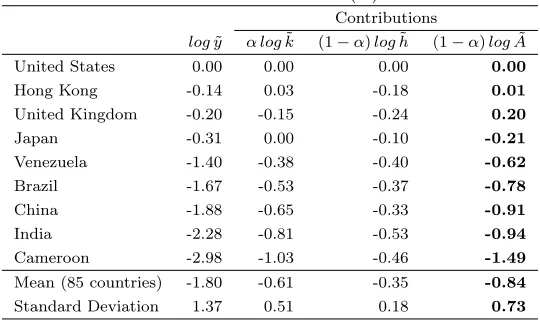
The relative level of total factor productivity (TFP) is the last determinant we need to
fore-cast the distribution of labor productivity. Table 4 summarizes the calculation of this variable
for a selected sample of countries.8
The overall finding of this exercise is that for the whole
85-country sample, the standard deviation of the natural logarithm of technology (logA˜) is about
80 percent of the standard deviation of the natural logarithm of output per worker (logy˜). This
finding favors the predominant role of total factor productivity (TFP) in the determination of
output per worker. Among the particular cases, it is worth noticing that although Japan shows
the same capital-labor ratio as the United States, output per worker is about 31 percent less
than because of lower TFP. In contrast, Hong Kong and the United Kingdom report higher TFP
levels than the United States, but output per worker is lower mainly due to inferior educational
attainment. Performance in developing countries lags far behind in all these variables, yet the
major determinant of output per worker seems clearly TFP.
8
Table 4: Relative TFP levels( ˜A)in 2010
Contributions
logy˜ α log˜k (1−α)log˜h (1−α)logA˜
United States 0.00 0.00 0.00 0.00
Hong Kong -0.14 0.03 -0.18 0.01
United Kingdom -0.20 -0.15 -0.24 0.20
Japan -0.31 0.00 -0.10 -0.21
Venezuela -1.40 -0.38 -0.40 -0.62
Brazil -1.67 -0.53 -0.37 -0.78
China -1.88 -0.65 -0.33 -0.91
India -2.28 -0.81 -0.53 -0.94
Cameroon -2.98 -1.03 -0.46 -1.49
Mean (85 countries) -1.80 -0.61 -0.35 -0.84 Standard Deviation 1.37 0.51 0.18 0.73
3.3
The Steady-State Distribution and Alternative Scenarios
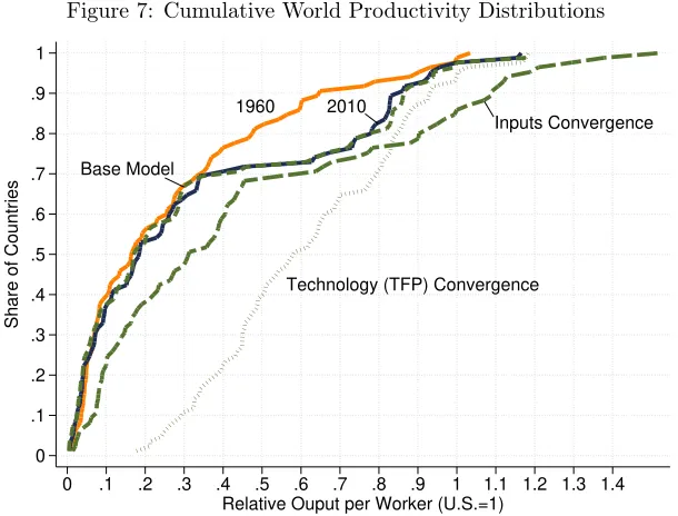
Figures 7, 8 and 9 illustrate the main empirical results of this section. They describe the
steady-state distribution of labor productivity under different assumptions. Also, Appendix B presents
further information for every country in the sample.
Base Model
To predict the steady-state output per worker, I use decade averages for the investment ratesK
and populationngrowth; also I assume therelative levels of TFP and human capital from 2010
to be constant in the near future. Given this setting, two results are worth noting.
First, consistent with the previous findings of the literature (Jones1997a), the steady-state
distribution of labor productivity appears very similar to the 2010 distribution, particularly
for the poorer 70 percent of the sample. The R2 statistic comparing labor productivity in
2010 and in steady state equals 0.99. Also, the standard deviation raises from 34 percent to 35
percent and the median decreases from 19 percent to 17 percent. Overall, these statistics suggest
that if todays’ policies regarding human capital accumulation and technological progress remain
invariant (in relative terms across countries), divergence in labor productivity —and income—
is expected to continue in the future.
Second, although the 2010 and steady-state distribution look broadly similar, they also
exhibit some interesting differences in terms of additional convergence (divergence) cases. For
example, countries which are expected to have the largest improvement in labor productivity in
Figure 7: Cumulative World Productivity Distributions
1960 2010
Inputs Convergence
Technology (TFP) Convergence Base Model
0 .1 .2 .3 .4 .5 .6 .7 .8 .9 1
Share of Countries
0 .1 .2 .3 .4 .5 .6 .7 .8 .9 1 1.1 1.2 1.3 1.4
Relative Ouput per Worker (U.S.=1)
which are expected to have the largest deterioration include the Democratic Republic of Congo,
Togo, Burundi, Cote d’Ivoire, and Central African Republic.
Inputs Convergence: The Power of Human Capital is at the Top
In this scenario, I equalize the physical investment rate sK, and years of schooling S of all
countries to that in the United States. The results of this experiment are somewhat mixed.
Figure 8 (panel a) shows that almost all countries9
improve their position (they lay above the
45-degree line) after allowing for full convergence in inputs. Further analysis reveals that human
capital is the main driver when shifting the distribution. Also the largest effect of human capital
convergence is concentrated at the top of the distribution. The median labor productivity raises
from 19 percent in 2010 to 31 percent; and the upper middle and top10
of the distribution
show the largest improvements. The downside of this scenario, however, is an increase in the
disparity of labor productivity. The standard deviation of relative output per worker raises from
34 percent in 2010 to 40 percent in steady state.
Evaluating the shape of the cumulative distribution in steady state, Figure 7 points to a
9
Only Australia deteriorates its 2010 position.
10
potential explanation for understanding the unsatisfactory results of input convergence.
Pro-ductivity at the bottom of the distribution appears very sticky in spite of additional accumulation
of productive factors (inputs). Other countries, at the middle and top of the distribution, get
better returns with similar endowment levels. This results suggests that it is not only the low
level of inputs what keeps productivity stagnant in the poorest countries, but also the way in
which inputs are used. In the next scenario, I empirically test this well known argument of the
[image:16.612.172.444.244.643.2]economic growth literature.
Figure 8: Output per Worker- 2010 vs Predicted Steady State
ARG AUS AUT BDI BEL BEN BGD BOL BRA CAF CAN CH2 CHE CHL CIV CMR COG COL CRI DNK DOM DZA ECU EGY ESP FIN FRA GBR GHA GRC GTM HKG HND HTI IDN IND IRL IRN ISR ITA JAM JPN KEN KOR LKA MAR MEX MLI MOZ MRT MWI MYS NGA NIC NLDNOR NPL NZL PAK PAN PER PHL PNG PRT PRY ROM RWA SEN SGP SLV SWE SYR TGO THA TUR TWN TZA UGA URY USA VEN ZAF ZAR ZMB ZWE 0.19 0.31 .02 .04 .08 .16 .32 .64 1.28
Predicted Steady-State Value (Input Convergence)
.01 .02 .04 .08 .16 .32 .64 1.28
Relative Ouput per Worker (U.S.=1 in 2010) (a) ARG AUS AUT BDI BEL BEN BGD BOL BRA CAF CAN
CH2 CHL CHE
CIV CMR COG COL CRI DNK DOM DZA ECU EGY
ESP FINGBRFRA
GHA GRC GTM HKG HND HTI IDN IND IRL IRN ISRITA JAM JPN KEN KOR LKA MAR MEX MLI MOZ MRT MWI MYS NGA NIC NLD NOR NPL NZL PAK PAN PER PHL PNG PRT PRY ROM RWA SEN SGP SLV SWE SYR TGO THA TUR TWN TZA UGA URY USA VEN ZAF ZAR ZMB ZWE 0.19 0.58 (b) .16 .32 .64 1.28
Predicted Steady-State Value (TFP) Convergence
.01 .02 .04 .08 .16 .32 .64 1.28
Technology (TPF) Convergence: The Main Determinant of Development
In this scenario, I allow countries with less than the United States TFP level converge to this
benchmark, and the twelve countries with higher TFP maintain their technological advantage.
Results in this setting are more encouraging, TFP convergence both condenses and shifts
the steady-state distribution. Contrary to input convergence, the standard deviation of relative
labor productivity falls from 34 percent in 2010 to 25 percent in steady state. Almost all
countries lay above the 45-degree line11
—all developing countries move forward within the
steady state distribution— and the median raises from 34 percent to 62 percent. The overall
magnitude of this improvement appears more clearly in Figure 7. TFP convergence shifts the
entire cumulative distribution with larger effects on countries at the bottom 70 percent of the
distribution. This result is consistent with the growth and development accounting literature
in the sense that TFP differences are at least as important as capital accumulation differences.
Particularly for this exercise, the effect of TFP convergence on the median country about two
times the effect of input convergence.
There are also interesting changes at the top of the distribution. South Korea, Australia,
and Japan are expected to overtake the United States. The intuition behind the Korean and
Japanese case both countries currently have low TFP levels (among industrialized nations) and
high physical and human capital stocks. This low TFP level argument, however, might appear
puzzling if we consider these countries as current technological leaders in many areas. One
interpretation raises from the recent literature on resource misallocation.12
The main insight
of this literature suggests that TFP does not only captures technological development, but also
aggregate efficiency losses due to distortions in inputs and goods markets. To support this
argument, Baily and Solow (2001) suggests that burdensome regulation might be keeping TFP
low in Japan.
Figure 9 summarizes the different shapes of the world productivity distribution for 1960,
2010, and the three forecasted scenarios. Note that overtime the bimodal distribution persist
even under input convergence or TFP convergence. The twin-peaks hypothesis and convergence
clubs argument appear in the literature as potential explanations for this phenomenon. In the
next section, I use the basic tools of this literature to evaluate the probability of persistence of
these two peaks.
11
The exceptions are Netherlands, Ireland, and Italy
12
Figure 9: World Productivity Distributions
Technology (TFP) Convergence
Inputs Convergence 1960
2010
Base Model
0 .5 1 1.5 2
Density of Countries
0 .5 1 1.5
Relative Output per Worker (U.S.=1)
4
Labor Productivity in the Very Long Run
Motivated by the mobility and polarization of countries within the world income distribution,
Quah (1993a,b) and Jones (1997) use Markov methods to study the evolution of the world
income distribution in a distant time horizon13
. This section applies similar methods in the
context of the 2010 productivity distribution.
Essentially Markov methods compute the evolution of a system based on initial states and
transition probabilities. Mathematically, this process is described by
dtMs=d
t+s, (6)
where the vector dt corresponds to the productivity distribution in the year t, the transition
matrixMcontains mobility frequencies from sample data andsrepresents the number of years
into the future.
The first set of columns in Table 2 reports the world productivity distribution, for the years
1960, 1985, and 2010, based on the same seven productivity intervals (states) defined in Table
2. Using Equation 6 for s = 25, s = 50, and s→ ∞, we can compute estimates of the very
long-run productivity distribution.
13
Table 5: World Productivity Distribution-Using Markov Chains
Predicted
States Interval 1960 1985 2010 2035 2060 Steady State L [0, 0.025) 0.08 0.09 0.14 0.17 0.14 0.12 UL [0.025, 0.05) 0.16 0.15 0.13 0.06 0.05 0.04 LM [0.05, 0.10) 0.18 0.12 0.13 0.04 0.03 0.03 M [0.10, 0.20) 0.15 0.12 0.15 0.05 0.05 0.05 UM [0.20, 0.40) 0.20 0.21 0.15 0.07 0.08 0.08 LH [0.40, 0.80) 0.16 0.17 0.13 0.21 0.23 0.23 H [0.80, 1.2) 0.07 0.14 0.16 0.40 0.43 0.45
Before going over the results let us recall the differences and complementarities between the
deterministic approach used in Section 3 and the stochastic approach of this section. First,
in the previous section, I computed the near-future steady state towards which each country
seems to be headed. This section, however, focuses both on a more distant time horizon and
seven broad productivity intervals (states). Second, in the previous section, there were not
policy changes (recall that relative TFP and human capital are constant in the baseline model
SS). This section, however, by the stochastic nature of the Markov process, explicitly recognizes
policy changes, which in turn, might shift the position of a country’s steady state.
Section 3 ended with an open question: are the twin peaks of the world productivity
dis-tribution persistent? Results from Table 5 suggest that the answer of this question has two
folds.
First, even in a more distant future (i.e., the steady-state vector of a Markov chain), labor
productivity might be characterized by a bimodal distribution. Second, although the world
productivity distribution appears to be bimodal, the two peaks are far from being twins:
con-vergence dominates the process in the long run. Consider the following example: in 1960 only
7 percent of countries reported a productive level higher than 80 percent; in the long run,
how-ever, almost 50 percent of countries are expected to report a productivity level higher than 80
percent.
When contrasting these results with the early findings of Jones (1997b), the main differences
arise at the bottom of the distribution. Jones’ analysis defines the lowest interval between 0
and 5 percent and finds continuous convergence in relative income since 1988. The steady-state
fraction of countries in this lowest interval is 8 percent— a reduction of 7 percentage points
compared to the fraction of countries in the same interval in 1960. This article, however, defines
1960 to 2035 (continuous convergence emerges thereafter). The steady-state fraction of countries
in this lowest interval is 12 percent— an increase of 4 percentage points compared to the fraction
of countries in the same interval in 1960 (8 percent).
Table 5 also shows that in the long run (steady-state) distribution there is a positive
prob-ability of any country spending some time in any interval. The interpretation of this result is
that, as the time horizon increases asymptotically, any country might experience a large policy
disaster or reform. To illustrate this point, Jones (1997) highlights Japan’s reforms, in post
world war II period, as a noticeable example of a country moving to the very top of the
produc-tivity distribution. In contrast, there is the famous example of Argentina, one of the richest and
most productive countries in the world in the early part of the twentieth century that drastically
moved backward within the productivity distribution. Other similar examples, described in the
introduction of this article include Hong Kong and Venezuela.
Finally, using the transition matrix of Table 2 we can conduct further experiments based on
the conditional distribution of labor productivity. For instance, consider the situation of a low
productivity country (i.e.,y >˜ 80percent in 2010) and a high productivity country (i.e.,y <˜ 10
percent in 2010). Intuitively, the former has more changes to remain poor, while the latter has
more chances to remain rich in the near future.14
This intuition is consistent with the empirical
results reported in the Appendix A. These results predict that, by 2035, a low productivity
country has a 45-percent probability to remain poor. In turn, a high productivity country has
a 50-percent probability to remain rich.15
Both distributions, however, asymptotically converge
to the world productivity distribution reported in Table 5.
5
Concluding Remarks
The world productivity distribution in the post-World War II period is characterized by four
remarkable facts: (1) a large and increasing disparity between the tails of the distribution; (2)
this disparity rapidly increased in the mid-1980s, slowed down in the next decade, and stabilized
in the mid-2000s; (3) overtime, there has been substantial forward and backward mobility of
countries and regions within the distribution; and (4) the upper tail of the distribution is more
sensitive to improvements in human capital, while the lower tail is more sensitive to
improve-14
This is one of the results of Section 3.
15
ments in efficiency. Overall, the dynamic nature of these facts not only present a challenge to
the existing theories of development, but also provide opportunities for the development of new
theories and policy initiatives.
Disparities in labor productivity across countries are large, but disparities in technology
(broadly defined) are even larger. Improvements in aggregate efficiency in developing
coun-tries might drastically affect the distribution of labor productivity and accelerate the process
of convergence. If current institutions and policies remain in place, however, the world
produc-tivity distribution might be characterized by additional divergence at the bottom, and further
References
Abramovitz, M. (1986). Catching Up, Forging Ahead, and Falling Behind. The Journal of
Economic History, 46(02):385 – 406.
Acemoglu, D. (2009). Introduction to Modern Economic Growth. Princeton University Press.
Acemoglu, D., Johnson, S., and Robinson, J. A. (2005). Institutions as a Fundamental Cause
of Long-Run Growth. InHandbook of Economic Growth, chapter 6, pages 385 – 472.
Baily, M. N. and Solow, R. M. (2001). International productivity comparisons built from the
firm level. Journal of Economic Perspectives, 15(3):151–172.
Barro, R. J. and Lee, J.-W. (2010). A new data set of educational attainment in the world,
1950-2010. NBER Working Papers 15902, National Bureau of Economic Research, Inc.
Becker, G. S., Philipson, T. J., and Soares, R. R. (2005). The quantity and quality of life and
the evolution of world inequality. American Economic Review, 95(1):277–291.
Caselli, F. (2005). Accounting for Cross-Country Income Differences. In Aghion, P. and Durlauf,
S., editors,Handbook of Economic Growth, volume 1 ofHandbook of Economic Growth,
chap-ter 9, pages 679–741. Elsevier.
Chari, V., Kehoe, P., and McGrattan, E. (1997). The Poverty of Nations: A Quantitative
Investigation.
Duarte, M. and Restuccia, D. (2006). The productivity of nations. Economic Quarterly,
(Sum):195–223.
Hall, R. E. and Jones, C. I. (1999). Why Do Some Countries Produce So Much More Output
Per Worker Than Others? The Quarterly Journal of Economics, 114(1):83–116.
Hsieh, C.-T. and Klenow, P. J. (2010). Development Accounting.American Economic Journal:
Macroeconomics, 2(1):207–223.
Jones, C. I. (1997a). Convergence Revisited. Journal of Economic Growth, 2(2):131–153.
Jones, C. I. (1997b). On the evolution of the world income distribution. Journal of Economic
Jones, C. I. and Klenow, P. J. (2010). Beyond GDP? Welfare across Countries and Time. NBER
Working Papers 16352, National Bureau of Economic Research, Inc.
Klenow, P. and Rodriguez-Clare, A. (1997). The Neoclassical Revival in Growth Economics:
Has It Gone Too Far? InNBER Macroeconomics Annual 1997, Volume 12, NBER Chapters,
pages 73–114. National Bureau of Economic Research, Inc.
Maddison, A. (2006). The World Economy. OECD Development Centre, Paris.
Mankiw, N. G., Romer, D., and Weil, D. N. (1992). A Contribution to the Empirics of Economic
Growth. The Quarterly Journal of Economics, 107(2):407–437.
Parente, S. L. and Prescott, E. C. (1993). Changes in the wealth of nations. Quarterly Review,
(Spr):3–16.
Psacharopoulos, G. and Patrinos, H. A. (2004). Returns to investment in education: a further
update. Education Economics, 12(2):111–134.
Quah, D. (1993a). Empirical cross-section dynamics in economic growth. European Economic
Review, 37(2-3):426–434.
Quah, D. (1993b). Galton’s fallacy and tests of the convergence hypothesis. Scandinavian
Journal of Economics, 95(4):427–43.
Quah, D. T. (1996). Twin peaks: Growth and convergence in models of distribution dynamics.
Economic Journal, 106(437):1045–55.
Restuccia, D. and Rogerson, R. (2013). Misallocation and productivity. Review of Economic
Dynamics, 16(1):1–10.
Sala-i Martin, X. (2006). The World Distribution of Income: Falling Poverty and ... Convergence,
Period. The Quarterly Journal of Economics, 121(2):351 – 397.
Solow, R. M. (1957). Technical Change and the Aggregate Production Function. Review of
Economics and Statistics, 39:312–320.
Weil, D. N. (2007). Accounting for the effect of health on economic growth. The Quarterly
A
Labor Productivity in the Very Long Run: Three
[image:24.612.193.415.160.508.2]Alter-native Cases
Table 6: The Case of a Low Productivity Country:
State Interval 2035 2060 SteadyState L [0, 0.025) 0.30 0.17 0.12 UL [0.025, 0.05) 0.10 0.06 0.04 LM [0.05, 0.10) 0.05 0.04 0.03 M [0.10, 0.20) 0.07 0.05 0.05 UM [0.20, 0.40) 0.07 0.07 0.08 LH [0.40, 0.80) 0.15 0.21 0.23 H [0.80, 1.2) 0.27 0.39 0.45
Table 7: The Case of a Middle Productivity Country:
[image:24.612.199.412.167.263.2]State Interval 2035 2060 SteadyState L [0, 0.025) 0.16 0.13 0.12 UL [0.025, 0.05) 0.06 0.05 0.04 LM [0.05, 0.10) 0.03 0.03 0.03 M [0.10, 0.20) 0.05 0.05 0.05 UM [0.20, 0.40) 0.07 0.08 0.08 LH [0.40, 0.80) 0.22 0.23 0.23 H [0.80, 1.2) 0.41 0.44 0.45
Table 8: The Case of a High Productivity Country
[image:24.612.197.413.400.501.2]B
Data:
This article uses data from Penn World Tables V7.1 (see Heston, Summers, and Aten 1991) to
construct annual time series of PPP-adjusted GDP per worker in chained 2005 prices (variable
RGDPWOK). Following the criteria of Duarte and Restuccia (2006), the selection of countries
was based on the following criteria:
1. Countries that have data for every year from 1960 to 2010
2. Countries that have at least one million in population in 2010.
These restrictions rendered a set of 92 countries. Adding data on educational attainment,
which comes from Barro and Lee (2010), the final data set contains complete information for 85
countries.
For every output observation, business-cycle fluctuations are removed using the
Hodrick-Prescott filter with a smoothing parameter equal to 100. For the most part of the article,
data series on output per worker are reported relative to that of the United States. It is the
conventional view in the literature that the United States is a stable technological benchmark
against which to measure potential gains in labor productivity in all countries. As a reference, in
the post-war period, potential labor productivity in the United States grew at roughly 2 percent
per year. .
The capital stock is calculated by summing investments from 1960 to 2010 using a
deprecia-tion rate of 6 percent and an initial capital stock determined by the steady-state capital-output
ratio of 1960. Given the 51 years of the capital series and the selected depreciation rate, the
calculated values of the capital stock are quite insensitive to the initial value.
Determinants Relative Output per Worker
Countries sK n S2010 A2010 1960 2010 (1) (2) (3) (4) (5)
Steady-State Prediction
Algeria(DZA) 0.33 0.01 7.63 0.30 0.35 0.24 0.21 0.30 0.21 0.36 0.69
Argentina(ARG) 0.20 0.01 9.42 0.46 0.36 0.31 0.29 0.45 0.31 0.43 0.65
Australia(AUS) 0.30 0.01 12.12 0.92 0.93 0.93 0.94 0.90 0.94 1.04 1.03
Austria(AUT) 0.24 0.00 9.52 1.23 0.56 0.92 0.94 1.30 0.94 1.34 0.94
Determinants Relative Output per Worker
Countries sK n S2010 A2010 1960 2010 (1) (2) (3) (4) (5)
Belgium(BEL) 0.26 0.00 10.62 1.13 0.64 0.96 0.99 1.19 0.99 1.27 0.99
Benin(BEN) 0.19 0.03 4.35 0.09 0.04 0.03 0.03 0.08 0.03 0.07 0.34
Bolivia(BOL) 0.11 0.02 9.87 0.17 0.17 0.10 0.08 0.16 0.12 0.11 0.47
Brazil(BRA) 0.21 0.01 7.55 0.31 0.19 0.19 0.17 0.30 0.17 0.29 0.54
Burundi(BDI) 0.12 0.04 3.35 0.03 0.01 0.01 0.01 0.02 0.01 0.02 0.24
Cameroon(CMR) 0.16 0.02 6.21 0.11 0.08 0.05 0.04 0.10 0.05 0.08 0.39
Canada(CAN) 0.24 0.01 12.08 0.89 0.90 0.83 0.83 0.90 0.83 0.92 0.93
Cent. African Rep(CAF) 0.08 0.02 3.68 0.05 0.05 0.01 0.01 0.04 0.02 0.03 0.21
Chile(CHL) 0.26 0.01 10.17 0.44 0.29 0.33 0.35 0.43 0.35 0.46 0.80
China(CH2) 0.35 0.01 8.11 0.26 0.03 0.15 0.20 0.26 0.20 0.33 0.78
Colombia(COL) 0.20 0.01 7.75 0.32 0.26 0.19 0.17 0.31 0.18 0.30 0.54
Congo Dem. Rep.(ZAR) 0.17 0.03 3.26 0.01 0.04 0.01 0.00 0.01 0.01 0.01 0.29
Congo Republic (COG) 0.23 0.03 6.30 0.10 0.06 0.06 0.05 0.09 0.05 0.09 0.46
Costa Rica(CRI) 0.24 0.02 8.74 0.44 0.39 0.29 0.28 0.43 0.28 0.44 0.64
Cote d’Ivoire(CIV) 0.06 0.02 4.60 0.12 0.06 0.04 0.03 0.12 0.05 0.06 0.21
Denmark(DNK) 0.25 0.00 9.97 1.05 0.65 0.79 0.83 1.09 0.83 1.13 0.83
Dominican Rep(DOM) 0.20 0.02 7.33 0.56 0.19 0.27 0.29 0.54 0.31 0.51 0.51
Ecuador(ECU) 0.25 0.02 8.18 0.22 0.16 0.15 0.14 0.21 0.14 0.22 0.62
Egypt(EGY) 0.16 0.02 6.97 0.39 0.08 0.17 0.17 0.36 0.20 0.31 0.43
El Salvador(SLV) 0.16 0.00 7.88 0.35 0.27 0.18 0.18 0.36 0.21 0.30 0.52
Finland(FIN) 0.25 0.00 9.96 1.07 0.47 0.81 0.87 1.12 0.87 1.18 0.87
France(FRA) 0.22 0.01 10.53 1.06 0.60 0.83 0.83 1.09 0.84 1.07 0.83
Ghana(GHA) 0.20 0.02 7.26 0.11 0.08 0.06 0.05 0.10 0.06 0.09 0.49
Greece(GRC) 0.26 0.00 10.68 0.88 0.33 0.73 0.77 0.93 0.77 0.98 0.88
Guatemala(GTM) 0.19 0.02 4.90 0.44 0.20 0.19 0.17 0.41 0.18 0.38 0.38
Haiti(HTI) 0.12 0.01 5.13 0.11 0.08 0.04 0.03 0.10 0.05 0.08 0.32
Honduras(HND) 0.27 0.02 7.30 0.18 0.17 0.11 0.10 0.17 0.10 0.18 0.57
Hong Kong (HKG) 0.31 0.01 10.40 1.01 0.23 0.87 0.93 1.03 0.93 1.21 0.93
Determinants Relative Output per Worker
Countries sK n S2010 A2010 1960 2010 (1) (2) (3) (4) (5)
Indonesia(IDN) 0.20 0.01 5.95 0.20 0.04 0.09 0.09 0.19 0.09 0.18 0.45
Iran(IRN) 0.27 0.01 8.64 0.41 0.37 0.33 0.29 0.41 0.29 0.45 0.70
Ireland(IRL) 0.26 0.02 11.62 1.00 0.46 0.93 0.88 0.95 0.88 1.02 0.88
Israel(ISR) 0.23 0.02 11.36 0.83 0.54 0.74 0.67 0.78 0.67 0.79 0.81
Italy(ITA) 0.26 0.00 9.46 1.07 0.51 0.83 0.82 1.11 0.82 1.18 0.82
Jamaica(JAM) 0.26 0.01 9.75 0.27 0.40 0.23 0.21 0.28 0.21 0.30 0.77
Japan(JPN) 0.27 0.00 11.59 0.73 0.30 0.73 0.73 0.77 0.73 0.85 1.00
Kenya(KEN) 0.16 0.03 6.65 0.08 0.06 0.04 0.03 0.08 0.04 0.06 0.40
Korea Rep.(KOR) 0.36 0.00 11.94 0.62 0.13 0.63 0.72 0.64 0.72 0.81 1.17
Malawi(MWI) 0.30 0.03 4.69 0.03 0.02 0.02 0.01 0.03 0.01 0.03 0.45
Malaysia(MYS) 0.27 0.02 10.16 0.42 0.11 0.34 0.32 0.40 0.32 0.43 0.76
Mali(MLI) 0.19 0.03 2.38 0.14 0.04 0.04 0.04 0.12 0.04 0.11 0.29
Mauritania(MRT) 0.30 0.03 4.51 0.15 0.05 0.07 0.07 0.14 0.07 0.16 0.45
Mexico(MEX) 0.23 0.01 9.06 0.46 0.48 0.34 0.30 0.45 0.30 0.45 0.66
Morocco(MAR) 0.37 0.01 5.01 0.22 0.07 0.12 0.13 0.22 0.13 0.28 0.56
Mozambique(MOZ) 0.17 0.02 1.81 0.09 0.02 0.02 0.02 0.08 0.03 0.07 0.26
Nepal(NPL) 0.25 0.02 4.02 0.06 0.03 0.03 0.03 0.06 0.03 0.06 0.41
Netherlands(NLD) 0.21 0.01 11.02 1.04 0.88 0.86 0.84 1.07 0.87 1.03 0.84
New Zealand(NZL) 0.21 0.01 12.68 0.66 1.00 0.63 0.61 0.66 0.63 0.64 0.93
Nicaragua(NIC) 0.29 0.01 6.66 0.10 0.23 0.07 0.05 0.09 0.05 0.10 0.58
Niger(NGA) 0.08 0.02 1.84 0.33 0.11 0.07 0.06 0.31 0.10 0.18 0.18
Norway(NOR) 0.25 0.00 12.26 1.17 0.79 1.16 1.18 1.21 1.18 1.28 1.18
Pakistan(PAK) 0.15 0.02 5.53 0.19 0.05 0.08 0.07 0.18 0.08 0.15 0.37
Panama(PAN) 0.23 0.02 9.60 0.41 0.18 0.27 0.28 0.39 0.28 0.39 0.69
Papua(PNG) 0.17 0.02 4.08 0.19 0.09 0.07 0.06 0.17 0.07 0.15 0.33
Paraguay(PRY) 0.15 0.02 8.51 0.15 0.12 0.10 0.08 0.15 0.09 0.12 0.50
Peru(PER) 0.23 0.01 8.93 0.24 0.26 0.16 0.15 0.23 0.15 0.23 0.65
Philippines(PHL) 0.20 0.02 8.95 0.14 0.10 0.09 0.08 0.13 0.09 0.13 0.58
Determinants Relative Output per Worker
Countries sK n S2010 A2010 1960 2010 (1) (2) (3) (4) (5)
Romania(ROM) 0.22 0.00 10.34 0.36 0.07 0.26 0.29 0.39 0.29 0.38 0.81
Rwanda(RWA) 0.13 0.03 3.96 0.09 0.04 0.02 0.02 0.08 0.03 0.06 0.27
Senegal(SEN) 0.25 0.03 5.20 0.09 0.08 0.04 0.04 0.08 0.04 0.09 0.44
Singapore(SGP) 0.30 0.02 9.13 1.57 0.32 1.17 1.18 1.52 1.18 1.76 1.18
South Africa(ZAF) 0.22 0.01 8.48 0.38 0.36 0.24 0.23 0.38 0.24 0.37 0.62
Spain(ESP) 0.29 0.01 10.40 0.76 0.43 0.67 0.64 0.74 0.64 0.84 0.85
Sri Lanka(LKA) 0.24 0.01 11.10 0.15 0.04 0.11 0.12 0.15 0.12 0.15 0.83
Sweden(SWE) 0.18 0.00 11.48 1.07 0.76 0.83 0.86 1.13 0.96 1.01 0.86
Switzerland(CHE) 0.25 0.00 9.92 0.94 1.03 0.78 0.74 0.97 0.74 1.02 0.79
Syrian (SYR) 0.16 0.03 5.21 0.45 0.15 0.17 0.15 0.41 0.18 0.34 0.34
Taiwan(TWN) 0.24 0.00 11.34 0.96 0.13 0.78 0.86 0.99 0.86 1.03 0.90
Tanzania(TZA) 0.23 0.02 5.78 0.06 0.02 0.03 0.03 0.06 0.03 0.06 0.45
Thailand(THA) 0.28 0.01 7.41 0.27 0.05 0.17 0.17 0.27 0.17 0.30 0.64
Togo(TGO) 0.15 0.03 5.77 0.03 0.04 0.02 0.01 0.03 0.01 0.02 0.35
Turkey(TUR) 0.18 0.01 7.18 0.91 0.16 0.40 0.44 0.88 0.49 0.79 0.49
Uganda(UGA) 0.14 0.03 5.46 0.10 0.04 0.03 0.03 0.09 0.04 0.07 0.33
United Kingdom(GBR) 0.18 0.01 9.44 1.34 0.60 0.82 0.86 1.38 0.96 1.23 0.86
United States(USA) 0.23 0.01 13.09 1.00 1.00 1.00 1.00 1.00 1.00 1.00 1.00
Uruguay(URY) 0.21 0.00 8.56 0.42 0.28 0.26 0.27 0.44 0.28 0.43 0.65
Venezuela.(VEN) 0.21 0.01 7.13 0.39 0.60 0.25 0.20 0.38 0.21 0.36 0.51
Zambia(ZMB) 0.21 0.03 6.68 0.09 0.07 0.04 0.04 0.08 0.04 0.08 0.47
Zimbabwe(ZWE) 0.04 0.00 7.70 0.02 0.02 0.01 0.00 0.02 0.01 0.01 0.25
Notes: The determinants of steady-state output are: sK investment share, last decade average, trended
data;npopulation growth, decade average;S2010average years of schooling in 2010; andA2010relative level of
technology (TFP) in 2010. Simulations: (1) Base Model, (2)sKi=sKU SA andhi=hU SA, (3)sKi≥sKU SA,
(4)hi=hU SA, (5)Ai≥AU SA. Data on output per worker is also available for the following countries: Burkina