DEMOGRAPHIC RESEARCH
VOLUME 35, ARTICLE 29, PAGES 867−890
PUBLISHED 22 SEPTEMBER 2016
http://www.demographic-research.org/Volumes/Vol35/29/ DOI: 10.4054/DemRes.2016.35.29
Research Material
Visualising the demographic factors which shape
population age structure
Tom Wilson
©2016 Tom Wilson.
This open-access work is published under the terms of the Creative Commons Attribution NonCommercial License 2.0 Germany, which permits use, reproduction & distribution in any medium for non-commercial purposes, provided the original author(s) and source are given credit.
1 Introduction 868
2 The components-of-change population pyramid 870
3 More examples 874
3.1 England and Wales 875
3.2 Scotland 875
3.3 Finland 876
3.4 Sweden 876
3.5 Switzerland 877
3.6 Queensland 877
3.7 Northern Territory 877
3.8 Quantifying the effect of net migration on age structure 878
4 Conclusions 886
Visualising the demographic factors which shape population age
structure
Tom Wilson1
Abstract
BACKGROUND
The population pyramid is one of the most popular tools for visualising population age structure. However, it is difficult to discern from the diagram the relative effects of different demographic components on the size of age-specific populations, making it hard to understand exactly how a population’s age structure is formed.
OBJECTIVE
The aim of this paper is to introduce a type of population pyramid which shows how births, deaths, and migration have shaped a population’s age structure.
DATA AND METHODS
Births, deaths, and population data were obtained from the Human Mortality Database and the Australian Bureau of Statistics. A variation on the conventional population pyramid, termed here a components-of-change pyramid, was created. Based on cohort population accounts, it illustrates how births, deaths, and net migration have created the population of each age group. A simple measure which summarises the impact of net migration on age structure is also suggested.
RESULTS
Example components-of-change pyramids for several countries and subnational regions are presented, which illustrate how births, deaths, and net migration have fashioned current population age structures. The influence of migration is shown to vary greatly between populations.
CONCLUSIONS
1. Introduction
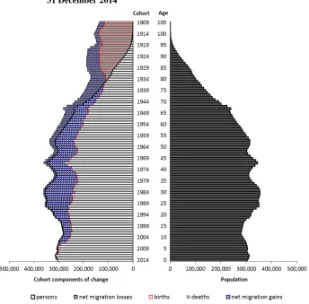
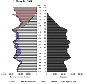
The population pyramid is one of the most popular visual representations of data in demography. In its standard form it comprises two histograms rolled on their sides and placed back-to-back, with the youngest ages at the bottom of the diagram and the oldest at the top. Generally, the male population is placed on the left and the female population on the right. The populations of each age-sex group are shown either as absolute numbers or as a percentage of the whole population. As an example, Figure 1 presents a population pyramid for Australia at 31 December 2014.
Figure 1: The age-sex structure of Australia’s population at 31 December 2014
A population pyramid can be created in common spreadsheet or statistical software without much difficulty, and is easy to understand. It presents immediately digestible information on the age-sex structure of a population that would be less obvious in tabular form. This distribution is important for understanding the demand for the wide range of goods and services which vary by age and sex, such as baby products, childcare, education, housing for first home buyers, household appliances, recreational activities, aged care, and funeral services (Siegel 2002). Population age structure also affects government spending and taxation receipts (Australian Government 2015). A population pyramid additionally offers clues about a population’s fertility history, mortality and migration, position in the demographic transition, and the likely influence of its age-sex structure on future demographic change. The shape of a population pyramid can hint at the economic or demographic role of the population in question, as might be apparent for a university town, a popular seaside retirement region, or an area with a communal establishment like a boarding school or prison. It can also be used to check for potential data problems, such as age heaping. Finally, population pyramids can also be quite entertaining, especially in dynamic form, as presented on some national statistical offices’ and researchers’ websites. Examples can be found
• for Germany,
• for Australia, and
• for Moldova.
is this more the result of a fertility decline two to three decades earlier or recent net out-migration? If age-specific populations at the upper end of the pyramid decline very rapidly with increasing age, is this just the result of mortality, or have past trends in births and migration also contributed?
This paper presents a type of population pyramid that illustrates how births, deaths, and net migration have shaped a population’s age structure. Termed the components-of-change pyramid, it is described and illustrated in section 2 following this introduction. Section 3 then presents a number of examples from different countries and regions, and demonstrates how the components-of-change pyramid helps with understanding a population’s demographic history and why its age structure takes the shape that it does. Section 4 consists of a discussion and conclusions, and includes a consideration of the strengths and weaknesses of the components-of-change pyramid and potential further developments. An Excel workbook containing the example components-of-change pyramids accompanies this paper.
2. The components-of-change population pyramid
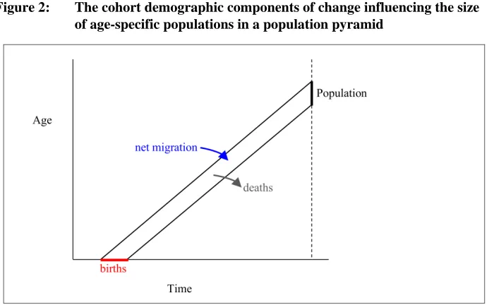
The size of any age group shown in a standard population pyramid equals the original number of births of the cohort, minus the number of deaths which have occurred between birth and the reference date of the pyramid, plus the net balance of inward and outward migration experienced over the same age-time space. This is a simple lifetime cohort accounting (or balancing) equation. Figure 2 illustrates these demographic components in a Lexis diagram.
Figure 2: The cohort demographic components of change influencing the size of age-specific populations in a population pyramid
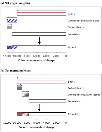
Figure 3: Representation of demographic components in the components-of-change population pyramid
(a) Net migration gains
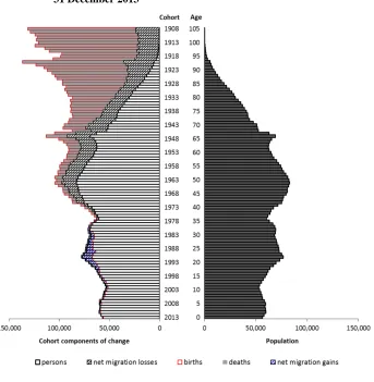
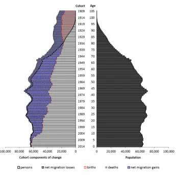
Figure 4 shows a components-of-change population pyramid for Australia at 31 December 2014. The red bars on the left illustrate the annual number of births, starting with the cohort born in 1909 at the top and extending down to the cohort of 2014. Although Total Fertility Rates are now lower than they were during the baby boom between the late 1940s and the early 1970s, the high and sustained growth of Australia’s population and slightly higher fertility rates over the last decade (ABS 2015) means that recent birth cohorts have been the largest ever recorded. As the pyramid shows, nearly all cohorts have been substantially augmented by net migration gains. The exceptions are the youngest childhood cohorts, because these cohorts have only accumulated a few years’ worth of net migration gains, and in Australia net migration gains are relatively small at the youngest ages (ABS 2016a). Not surprisingly, deaths become increasingly important in shaping age structure towards the top of the pyramid where mortality rates are high.
Note that the final age group is age 105, not 105+. If an open-ended age group were used it would refer to an open-ended set of cohorts whose cohort demographic components would be hard to display in the graph. It does mean, however, that a few very high age groups are omitted from the pyramid, but the populations at these ages are so small they would be invisible anyway.
Figure 4: The components-of-change population pyramid for Australia, 31 December 2014
Source: Calculated from ABS data and data in Wilson and Terblanche (forthcoming)
3. More examples
calculated as residuals. The final two examples are for subnational areas of Australia: the state of Queensland and the Northern Territory. Their pyramids incorporate deaths data obtained from the Australian Bureau of Statistics (ABS) and the Australian Demographic Databank (Smith 2007), population estimates from the ABS up to age 85 and alternative estimates based on survivor ratio and extinct cohort methods at higher ages (Terblanche and Wilson 2015), and net migration calculated as residuals. All example pyramids show populations at 31 December for the latest year available (at the time of writing) in each of the data sources.
3.1 England and Wales
The population age structure of England and Wales is shaped by the patterns of births and deaths over many age ranges, but not between the teenage years and the mid-30s (Figure 5). At these ages, substantial net migration gains have augmented the size of cohorts such that the pattern of births during the 1980s and 1990s is largely obscured. Across other ages in the lower half of the pyramid, however, net migration makes only a modest contribution, and it is largely the increases and decreases of births from year to year that shape the population age profile. A dip in births around the turn of the century, and also to a lesser extent in the mid-1970s, reveal themselves as indentations in the age profile centred around ages 12 and 36. Similarly, the small protrusion around age 66 is due to the spike in births immediately following the end of World War II. The subsequent fall in birth numbers and then the baby boom of the 1950s and 1960 also shape the population profile over ages 45 to 65. Not surprisingly, mortality is the dominant force affecting the population age structure at the oldest ages.
3.2 Scotland
were declines in birth numbers around the turn of the century and in the mid-1970s and increases in the late 1940s and during the baby boom period, which show up in the age structure.
3.3 Finland
In contrast to the previous two examples, Finland’s population age structure shows relatively modest net migration effects, with small net migration gains evident in the younger adult ages and relatively minor net migration losses at older ages as well (Figure 7). Given the concentration of migrants at the young adult ages, this is consistent with annual migration statistics that record more emigration than immigration until the early 1980s and then the reverse situation in more recent decades (Statistics Finland 2007). But mostly the age structure is created by fertility and mortality. In the bottom half of the pyramid the population age structure closely matches the trend in annual numbers of births. In the top half of the pyramid, births still influence the changes in population size from one age group to another, though mortality of course becomes increasingly important in depleting populations as they reach the highest ages.
3.4 Sweden
3.5 Switzerland
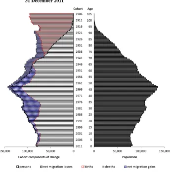
Switzerland’s ‘peaked’ population age profile (Figure 9) provides an interesting contrast with the others shown in this paper. The country has clearly experienced considerable net migration gains which have substantially augmented all cohorts in the main working ages. The large protrusion in the age structure centred around age 47 is due partly to the rise in birth numbers in the 1960s, but is also partly the result of larger net migration gains than in the youngest and oldest cohorts. The cohorts aged between their early 20s and late 30s have been increased to the greatest extent by net migration, and obscure the lower number of births in the 1970s and 1980s. Only in the childhood ages does the age structure closely mirror the trend in births.
3.6 Queensland
The population of Queensland has clearly been augmented by net migration gains (net internal and net international migration combined in this case) to a very large extent (Figure 10). The bulge in age structure between ages 20 and 35 is due to large net migration gains rather than large numbers of births in the 1980s and 1990s. At higher ages, however, similar amounts of net migration gains across cohorts allow the annual pattern of births to be revealed in the age structure, with the peak of births in the early 1970s and early 1960s clearly evident. Across the childhood ages the similarity in age group sizes is not due to a flat trend in births, but to a mixture of births and net migration gains which varies across cohorts. At the youngest childhood ages, cohort sizes are mostly the result of births, while at older childhood ages the cohorts started out much smaller but have accumulated significant net migration gains. The recent increase in the number of births in Queensland is the result of both a rise in the fertility rate and larger populations in the childbearing age groups. At the same time, Queensland’s net migration gains have been smaller in the last few years (ABS 2016b).
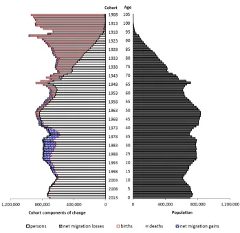
structure has been increased dramatically by net (internal plus international) migration gains, almost completely obscuring the trend in births. It can be seen that the protrusion in the young adult ages is entirely a creation of migration, and not of a past baby boom. Cohorts born prior to the late 1960s were increased substantially by net migration gains, hinting at large net migration gains for the Northern Territory for many decades up to about the late 1980s (given that peak migration is generally in the young adult ages). Migration data indicates this to be mostly correct, with large net migration gains recorded from the mid-1960s to mid-1980s (ABS 2014), with the exception of 1974 when a cyclone destroyed much of the Northern Territory’s capital, Darwin. Since the mid-1980s the Northern Territory’s net migration has fluctuated between net gains and net losses, and this is reflected in relatively smaller (but still quite large) net migration additions to cohorts born from the late 1960s onwards.
3.8 Quantifying the effect of net migration on age structure
The example population pyramids displayed in this section present a visual representation of the role of births, deaths, and net migration in shaping population age structure. Given the large variations in the amounts and cohort patterns of net migration, it is useful to quantify the influence of this demographic component in a simple summary statistic. One approach is to define an index which describes the extent to which cohort net migration has altered the age structure from the original numbers of births. A Net Migration Ratio (NMR) is defined here as the absolute amount of net migration experienced by all cohorts up to the date of the population pyramid divided by the total original number of births, i.e.,
𝑁𝑀𝑅 = ∑ |𝑁∑ 𝐵𝑐 𝑐|
𝑐 𝑐
where 𝑁 refers to net migration, 𝑐 to cohort, and 𝐵 to births. Graphically, it is the area on the population pyramid shaded as net migration divided by the area covered by the red bars representing births. Figure 12 presents Net Migration Ratios for the example populations featured in this paper.
because the net migration covers a triangular Lexis space. The time labels shown in Figure 12 refer to the year of the population pyramid.
Figure 6: The components-of-change population pyramid for Scotland, 31 December 2013
Figure 7: The components-of-change population pyramid for Finland, 31 December 2012
Figure 8: The components-of-change population pyramid for Sweden, 31 December 2014
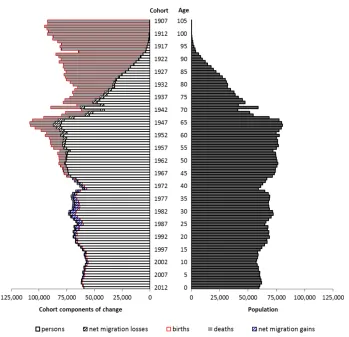
Figure 9: The components-of-change population pyramid for Switzerland, 31 December 2011
Figure 10: The components-of-change population pyramid for Queensland, 31 December 2014
Figure 11: The components-of-change population pyramid for the Northern Territory, 31 December 2014
Figure 12: Net migration ratios for the case study populations in this paper
4. Conclusions
This paper presents a variation on the traditional population pyramid which offers a visual description of the demographic factors which have shaped population age structure. This alternative components-of-change pyramid will hopefully play a useful part in studies seeking to understand the processes which have determined a population’s age structure, as well as being a visualisation tool in its own right. The pyramid is easy to comprehend and, with the Excel template accompanying this paper, is also easy to create. Importantly, it possesses the advantage of depicting the extent to which cohort births, deaths, and net migration are responsible for the size of each age group. The exact contributions of these components to each age group are uncertain in a traditional population pyramid, and ‘reading’ it without additional information can only reveal a limited amount. To aid comparison of age structures over time and between populations, a simple index to quantify the extent to which net migration has influenced age structure, the Net Migration Ratio, is also suggested.
each cohort is also limited. Cohort deaths and net migration in the pyramid are aggregated over the whole lifetime of each cohort up to the reference date of the pyramid, and do not contain information on timing (Figure 2). However, most cohort deaths are generally accumulated in the older ages and net migration in the younger adult ages. In addition, there is no information on whether the presented net migration values are the result of large or small volumes of inward and outward migration. There is also no information by gender in the pyramids shown here.
It may also be useful to point out a potential misconception. The population age structure which would have eventuated in the absence of migration cannot be visualised by just ignoring the striped net migration parts of the pyramid. Migration, of course, affects the numbers of births and deaths in a population. A population which has experienced net migration gains will have more births and deaths because migrants have children and die. Similarly, net migration losses reduce the numbers of births and deaths. The population which would have resulted in the absence of migration from a particular year can be determined by running a cohort-component projection from the year in question that excludes migration.
References
Australian Bureau of Statistics (ABS) (2014). Australian historical population statistics. Catalogue no. 3105.0.65.001. Canberra: ABS.
Australian Bureau of Statistics (ABS) (2015). Births, Australia, 2014. Catalogue no. 3301.0. Canberra: ABS.
Australian Bureau of Statistics (ABS) (2016a). Migration, Australia, 2014‒15. Catalogue no. 3412.0. Canberra: ABS.
Australian Bureau of Statistics (ABS) (2016b). Australian demographic statistics.
September 2015. Catalogue no. 3101.0. Canberra: ABS.
Australian Government (2015). 2015 Intergenerational Report: Australia in 2055. Canberra: Commonwealth Treasury. http://www.treasury.gov.au/
PublicationsAndMedia/Publications/2015/2015-Intergenerational-Report.
Coleman, D. (2010). Projections of the ethnic minority populations of the United Kingdom 2006‒2056. Population and Development Review 36(3): 441‒486.
doi:10.1111/j.1728-4457.2010.00342.x.
The Economist (2011). The world in 2100 [electronic resource]. London: The Economist Newspaper Limited. http://www.economist.com/blogs/dailychart/ 2011/05/world_population.
Haak, L.A. (1942). A new method of analysing the age and sex composition of a population. Proceedings of the Oklahoma Academy of Science 23: 84‒86.
http://digital.library.okstate.edu/OAS/oas_pdf/v23/p84_86.pdf.
Heenan, L.D.B. (1965). The population pyramid: A versatile research technique. The Professional Geographer 17(2): 18‒21. doi:10.1111/j.0033-0124.1965.00018.x. Hoem, J.M. (2005). Why does Sweden have such high fertility? Demographic Research
13(22): 559‒572. doi:10.4054/DemRes.2005.13.22.
Human Mortality Database (HMD) (2016). Deaths, births and population data [electronic resource]. University of California, Berkeley (USA) and Max Planck Institute for Demographic Research (Germany). www.mortality.org.
Lutz, W., Cuaresma, J.C., and Sanderson, W. (2008). The demography of educational attainment and economic growth. Science 319: 1047‒1048.
doi:10.1126/science.1151753.
Price, C.A. (1998). Post-war immigration: 1947‒98. Journal of the Australian Population Association 15(2): 115‒129. doi:10.1007/BF03029395.
Siegel, J.S. (2002). Applied demography. San Diego: Academic Press.
Smith, L. (2007). Australian Demographic Databank, 1901‒2003: Deaths [electronic resource]. Canberra: Australian Data Archive. ADA ID au.edu.anu.ada.ddi. 01118-deaths. https://www.ada.edu.au/social-science/01118-deaths.
Statistics Canada (2013). A new method of analysing the age and sex composition of a population: Marital status: Overview, 2011. Catalogue no. 91-209-X. Ottawa: Statistics Canada.
Statistics Canada (2015). Population projections for Canada (2013 to 2063), provinces and territories (2013 to 2038). Catalogue no. 91-520-X. Ottawa: Statistics Canada.
Statistics Finland (2007). Population development in independent Finland: Greying baby boomers [electronic resource]. Helsinki: Statistics Finland.
http://www.stat.fi/tup/suomi90/joulukuu_en.html.
Statistics New Zealand (2015). National labour force projections: 2015(base)–2068 [electronic resource]. Christchurch: Statistics New Zealand. http://www.stats. govt.nz/browse_for_stats/population/estimates_and_projections/NationalLabour
ForceProjections_HOTP15-68.aspx.
Statistics Sweden (2009). The future population of Sweden 2009‒2060. Stockholm: Statistics Sweden.
Statistics Sweden (2016). Immigration and emigration 1960−2015 and forecast 2016‒ 2060 [electronic resource]. Stockholm: Statistics Sweden. http://www.scb.se/
projectionPopulation-projections/Aktuell-Pong/14505/Current-forecast/The-van Imhoff, E. and Keilman, N. (1991). LIPRO 2.0: An application of a dynamic demographic projection model to household structure in the Netherlands. Amsterdam: Swets & Zeitlinger.