Data Visualization: Tools and Challenges over Big Data
Dr. A SaiHanuman & Dr. B Sankara Babu
Professor in CSE
Gokaraju Rangaraju Institute of Engineering and Technology, Hyderabad, Telangana
Abstract:-Today's enterprises collect and store
vast amounts of data that would take years for a
human to read, let alone understand. We are
producing and treating petabytes of data every
day. Big data will be transformative in every
space of life. But just to process and analyze
those data is not enough, the human brain tends
to find the pattern more efficiently when
information is represented visually. Data
Visualization and Analytics play an essential role
in decision making in various sectors. It also
leads to new opportunities in the visualization
domain representing the innovative ideation for
solving the big-data problem via visual means.
The trick with Big Data visualization is choosing
the most efficient way to visualize the data to
surface any insights it may contain. In some
circumstances, simple business tools such as pie
charts or histograms may reveal the whole story,
but with significant, numerous and diverse data
sets more esoteric visualization techniques may
be more appropriate. In this paper, we discuss
How Data Visualization Works, the importance
of Big Data Visualization, challenges and
comparison of big data visualization tools.
Index Terms:-Big Data; data visualization,
Tableau, and QlikView;
1.
INTRODUCTION
Nowadays Big data analytics makes it feasible for organizations to filter through gathered data with a specific end goal to create suitable, noteworthy organizations conclusions identified with causes, procedures, and
patterns. In any case, for that well-known data to be valuable, it should have the capacity to overcome any issues between data warehouses and supervisors. Even the best analytics programs aren't worth much respect if the human users can't decipher and follow up on the data being displayed. The response to this issue is the big data visualization.
Big data visualization is the procedure by which large amounts of analyzed are transformed into a simple-to-understand visual plan. By introducing complex data as charts, graphs, tables, outlines, or different visuals, users can all the more effectively get a handle on the implications of the data and do as such rapidly. Big data visualization tools are turning into a flat-out need for any business that needs to get the most out of their analytics programs, with 73% of high performers emphatically concurring that such analytics tools are significant in increasing valuable in gaining strategic insights. In that capacity, the visualization showcase is developing at an uncommon rate and is relied upon to reach $6.4 billion preceding the finish of 2019.
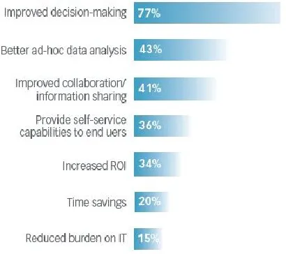
Today businesses struggle to just store the massive amount of data whereas analyzing, interpreting and presenting it in meaningful ways is a thought for later [2]. The primary challenge of Big Data lies in capturing, storing, analyzing, sharing, searching, and visualizing data. One of the major aspects of Big Data analysis is that we can find an unusual pattern in the huge data set, but the result of the investigation is usually raw numbers, and by those numbers, it is challenging to interpret anything. But if those numbers are represented visually then it becomes much easier for our brain to find meaningful patterns and take decision accordingly. Fig. 1, shows the advantages of Big data visualization [3].
1. Quickly process large amounts of data 2. Access important data in real time
3. Understand data better through interactivity 4. See the connections between business processes
and performance
Figure 1. Top benefits of big data visualization
2.
HOW
DATA
VISUALIZATION
WORKS
The human brain has evolved to take in and understand visual information, and it excels at visual pattern recognition. It is this ability that enables humans to spot signs of danger, as well as to recognize human faces and specific human faces such as family members. Big data visualization techniques exploit this by presenting data in the visual form so it can be processed by this
hard-wired human ability almost instantly – rather than, for example, by mathematical analysis that has to be learned and laboriously applied.
The trick with Big Data visualization is choosing the most efficient way to visualize the data to surface any insights it may contain. In some circumstances, simple business tools such as pie charts or histograms may reveal the whole story, but with significant, numerous and diverse data sets more esoteric visualization techniques may be more appropriate. Various Big Data visualization examples include:
Linear: Lists of items, items sorted by a single feature. 2D/Planar/geospatial: Cartograms, dot distribution maps, proportional symbol maps, contour maps.
3D/Volumetric: 3D computer models, computer
simulations
Temporal: Timelines, time series charts, connected scatter plots, arc diagrams, circumflex charts.
Multidimensional: Pie charts, histograms, tag clouds, bar charts, tree maps, heat maps, spider charts.
Tree/hierarchical: Dendrograms, radial tree charts,
hyperbolic tree charts.
Figure 2. The Life cycle of Data Visualization
3. THE IMPORTANCE OF BIG DATA
VISUALIZATION
Powerful data visualization has to be informative, efficient, appealing, and now and again interactive and predictive.
Informative: An essential function of a report is to advise the consumer of something, and a picture can do this. Think about a map, maybe the most hardened type of data visualization, or a pie chart, or a bar graph. Everybody knows about these visuals and can rapidly gather the expected point they speak to. Since we are aggregating data and showing it pictorially, it ought to convey the message that the aggregated data is letting us know and not further intensify the issue that large amounts can display.
Efficient: Maybe the main advantage of using data
visualizations is the proficiency increased through legitimate execution. An all-around planned visual will spare the data investigator valuable time as it can convey the message of the data briefly and without ambiguity. It ought to communicate the customer to a reasonable conclusion rapidly without analyzing the pages of data. This is the reason data visualization dashboards are so key for busy administrators, huge numbers of which settle on choices every day on the best way to maintain their business given data contained in a couple of outstanding planned, brief, dashboards.
Appealing: Much like a perfect work of art attracts the viewer and fascinates their considerations as they look at the picture, appropriately composed data visualizations will attract you and lead you to the proposed decision in an externally satisfying manner. The best promising imagery and covering palette can bring into an exhausting spreadsheet. I've seen firsthand companions' eyes stare off into the great unknown as a spreadsheet is introduced to the gathering. Then again, you introduce similar data to a similar gathering with a convincing visualization, and they lean forward and wind up plainly occupied with the examination of the information presented.
Interactive and Predictive: Some dashboard
visualizations are made to be analytical tools. They contain factors and filters that can be balanced given conceivable outcomes to infer what could be normal if certain criteria are met. The intellect in these activities happens in the outline and setup that takes into consideration for quick analysis of data by the business user.
3.
SIGNIFICANCE
OF
DATA
VISUALIZATION IN ANALYTICS
Data Visualization is the exhibition of data in the graphical layout. It enables individuals to understand the importance of data by abbreviating and displaying the massive amount of data in a primary and straightforward configuration and conveys data plainly and adequately. Humans understand data preferred through graphical format somewhat by merely examining numbers in rows and columns.
Data visualization enables the business to accomplish their objectives in the accompanying ways–
The BI tool connects smoothly to almost any data sources, be it a corporate Data Distribution center or Microsoft Excel or web-based data and comforts the business with the understandings by converting data into visually appealing, interactive dashboards on the go. The data visualization tool sustains a wide assortment of tables, diagrams, and charts and gives the client the capacity to envision a similar arrangement of data in various ways along these lines endeavour to make more alluring and informative dashboard unfailingly.
1. There are many approaches to introduce a straightforward Deals data – from a crosstab answer to a Day by day Deals Outline to Deals by Class by month. Distinctive perspectives answer diverse inquiries.
2. The device likewise gives you the ability to take a gander at data with a geographic component on a guide and gets a new measurement in the examination.
3. It enables the businesses to settle on suitable choices by drilling into the data and finding the insights. I.e., Business can see the examples, patterns, and associates in the data being examined that will reveal to them where they can cut cost, enhance operational procedures and in this way develop their business.
5. The tool enables the client to arrange and show massive data certainly. This is particularly vigorous as something else; the data is insignificant without an approach to sort out and exhibit essential discoveries from the data. 6. In this time of Globalization, associations are endeavouring to expand their span past topographical limits, and there are required to settle on snappy and educated choices, this is best legitimized with data visualization tools.
4.
CHALLENGES:
Big data visualization research will be carried out in the entire big data framework, and presents three main trends:
1. The object is expanding from a traditional single data source to a wide range of sources, such as multi-scale, multidimensional data.
Big data faces four challenges: large data size, fast data change, multiple data types and low-value density [4]. Industry and related research fields have started to use technologies such as mass data storage and data parallel computing to solve the technical problems of large data size and high dimension [5], which has promoted the application of big data visualization in more fields of research.
2) Users are expanding from a small number of expert users to a wide range of non-specific groups.
In the era of big data and new media, the need to analyze and understand data extends from traditional researchers and business users to social media and every information consumer. The broad spectrum and ease of use of visualization make it possible to develop visualization systems that are easy to use by ordinary users in new environments such as the Web, mobile terminals, the Internet and the Internet of Things. One of the trends in the development of big data visualization is the scalable visualization system.
3) Visualization and visual analysis in the framework of big data and data science.
Visualization includes data transformation, data rendering and data interaction [6] three important parts. From the data processing flow point of view, to visualize the data exposed to the user and to deal with the data interface, the use of data integration, data mining [7], data relevant to multi-user collaboration [8], knowledge management, network transport, Web-based, mobile, etc. Big data-oriented visualization enables visual and visual analysis of big data features throughout the lifecycle of data processing.
The theoretical research results are also insufficient, and they face the following challenges:
1) The data scale is large, which has surpassed the limits of the processing power of stand-alone and external memory models and even small computing clusters. However, current software and tools are not efficient to run, and new ideas need to be explored to solve the problem.
2) In the process of data acquisition and analysis, it is easy to produce data quality problems, with special attention to the uncertainty of the data;
3) Rapid dynamic data changes, often in the form of streaming data, need to find real-time streaming data analysis and visualization methods;
4) Faced with complex high-dimensional data, the current software system is mainly based on statistics and basic analysis, and its analytical capabilities are inadequate. 5) The types and structures of multi-source data are different, the existing methods are not enough to support unstructured and heterogeneous data, and the visualization of network data is the most important method to deduce the inherent relationship of heterogeneous data.
The above five aspects are the challenges facing big data visualization, but also gradually become the focus and direction of big data visualization research in the future.
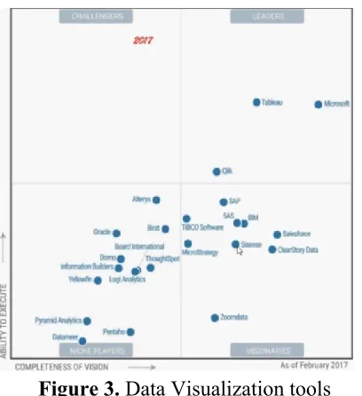
Figure 3.
Data Visualization tools
Two of the most prominent data visualization tools, Tableau, and QlikView are effortlessly the most broadly utilized tools with regards to translating convoluted data sets. An outstanding blend of vivified charts, graphics control tools, and BI abilities for interactive analytics, content and interactive dashboard, the two present exceptional highlights, influencing them to stand out from others. Tableau and Qlik have dependably gotten the desired spot at the Gartner's Enchantment Quadrant. We should endeavor to understand how these two tools are not quite the same as each other.
QlikView:
This visualization device conveyed to you by Qlik is a straightforward and simple device that gives the client a chance to put the business in all-out control. It empowers you to combine, look, picture and break down every one of the data hotspots for getting valuable business bits of knowledge. QlikView is a simple method to find solutions to the most basic business inquiries in snappy time.
One of the most noteworthy utilized tools; it likewise positions high concerning client devotion, execution, highlights, and quality. It offers incorporated BI stage alongside very savvy demos, instructional brochures, and instructional exercises, helping the users to get immediately familiar with the device in a matter of
seconds. It accompanies a few segments, for example, QlikView SERVER (QVS), QlikView Publisher (QVP).
Advantages
1. Deployment and Configuration- This effortlessly
deployable and configurable tool begins delivering unacceptable reports close to the establishment.
2. Ease of use and
functionality- It is anything but difficult to learn and does not require coding for making basic consoles.
It is client driven as it comes arranged with a substantial measure of visualization includes that gives forceful, meaningful insights to the users. 3. Accessibility- QlikView isn't subject to the device and can be effectively gotten to from anyplace.
4. Connectivity with other tools-
It incorporates with an exceptionally wide scope of data sources like Amazon Vectorwise, EC2, and Redshift, Cloudera Hadoop and Impala, Hortonworks Hadoop, HP Vertica, IBM Netezza, MicroStrategy, MS SQL Server, My SQL, ODBC, Standard Accel, Salesforce, SAP, SAP Hana, Teradata, and some more. It can likewise associate with R utilizing Programming interface coordination and with Big Data.
5. Community engagement- It has effectively connected with group and assets that can to help in finding out about this product in an ideal way.
6. Speed- Its quick investigation conveys the outcome rapidly, and it empowers basic leadership that is significantly quicker contrasted with customary strategies. 7. Search options- Its cooperative innovation makes data displaying simpler. Simply type any word in any request into the hunt box, and it will indicate associations and connections over the data.
8.
• It additionally accompanies a free individual version, giving the client a chance to get to the instrument without getting it, for example, if there should arise an occurrence of slight associations.
9. Data storage- It accompanies efficient data storage (QVD arranges) and can perform data warehousing. Disadvantages
Free individual version accompanies the restriction of report sharing.
Its structure can be overpowering with bunches of tabs making it hard to oversee and understand the tools in first go.
It has some additional highlights that are not used to its full affinity.
It has a period demanding setup, not at all like tableau
Tableau:
This fast to dissect and envision device has been a market pioneer for a significantly long time. The visualization abilities of Tableau are very various and profoundly smart, giving it an edge over others. Highlights, for example, word mists, bubble maps; tree maps improve understanding and give different alternatives to show data. The organization expresses that more than 54,000 client accounts have been getting fast outcomes with Tableau in the workplace and hurry. It has few parts, for example, Door/stack balancer, application server, store, VISQL server, the data motor, backgrounder, the data server.
Advantages
1. Deployment- It is easier to deploy as it necessitates more structured data.
2. Usability and functionality
It does not require coding by any stretch of the imagination, and the whole interface depends on simplified making the apparatus simple to utilize and might be successfully utilized by those with minimal specialized aptitude.
Its interface is basic, not loaded with an excessive number of highlights on one page.
It accompanies a capacity to mix data sets and work together progressively making it an exceedingly alluring business knowledge innovation.
Tableau is rich in data visualization capacities and shows profoundly interactive reports and proposals.
3. Connectivity with other tools
Using tableau one can easily connect to the database, reducing time and effort of the user.
It can incorporate with spreadsheets, CSV, SQL databases, Cloudera Hadoop, Firebird, Google Analytics, Google BigQuery, Hortonworks Hadoop, HP Vertica, MS SQL Server, MySQL, Salesforce, Teradata, and so on. It can associate with R that powers the explanatory abilities of the device.
4. Accessibility- It is accessible on all devices and can be gotten to over the web.
5. Group engagement- It has efficiently drawn in group and assets to enable you to take in this product in an ideal way.
6.
Speed- Tableau can make interactive visualizations and reports in a matter of minutes, making it a rapid instrument.
It likewise makes the whole procedure speedier as it permits sharing of reports both on the web and disconnected.
7. Costing- Private versions come with the price range of $999 to $1,999 depending on data access.
9. Security- Tableau practice control over the entrance of data with the assistance of different safety efforts.
Disadvantages
1. Though it can incorporate with numerous data sources, the list is shorter than that of QlikView. 2. The procedure of moving out data is very long. 3. It can be slower than QlikView in discovering its
memory insights.
4. It does not give the feature to search content over every one of your data.
6.
CONCLUSION:
In the domain of big data where every data is vital in one way or the other to be contingent on the visual information to find appropriate patterns. But traditional approaches of visualization do not keep up with the pace and volume of data; we need such tools which deal with all the individualities of big data and gives us result without giving up performance and response time. In this paper, we presented the importance of big data visualization and How Data Visualization Works and what are the challenges. We also distinguished that interactivity of visualization is of extreme significance and good visualization tools should produce an interactive visualization.
REFERENCE:
[1] Jin X, Wah BW, Cheng X, and Wang Y, “Significance and challenges of big data research,” Big Data Research, 2015 Jun 30;2(2):59-64.
[2] Intel IT Center, “Big Data Visualization: Turning Big Data Into Big Insights,” White Paper, March 2013, pp.1-14 [3] SAS, “Data Visualization: Making Big Data Approachable and Valuable, White Paper,” January 2013, pp.1-4
[4]MANYIKA J, CHUI M. Big Data: The Next Frontier for Innovation, Competition, and Productivity [M]. San Francisco: McKinsey Global Institute, 2011: 92-95.
[5] IBM. What is big data? -Bringing big data to the enterprise [EB / OL]. [2016-12-10]. Http://www-1.ibm.com/software/data/bigdata
[6]. FENG M, DENG C, PECK EM, et al. HindSight: encouraging exploration through direct encoding of personal interaction history [J]. IEEE Transactions on Visualization and Computer Graphics, 2017, 23 (1): 351-360. DOI: 10.1109 / TVCG.2016.2599058