S O F T W A R E A R T I C L E
Open Access
Visualizing genomic information across
chromosomes with PhenoGram
Daniel Wolfe, Scott Dudek, Marylyn D Ritchie
*and Sarah A Pendergrass
* Correspondence: [email protected] Center for Systems Genomics, Department of Biochemistry and Molecular Biology, Eberly College of Science, The Huck Institutes of the Life Sciences, The Pennsylvania State University, 512 Wartik Laboratory, University Park, PA 16802, USA
Abstract
Background:With the abundance of information and analysis results being
collected for genetic loci, user-friendly and flexible data visualization approaches can inform and improve the analysis and dissemination of these data. A chromosomal ideogram is an idealized graphic representation of chromosomes. Ideograms can be combined with overlaid points, lines, and/or shapes, to provide summary information from studies of various kinds, such as genome-wide association studies or phenome-wide association studies, coupled with genomic location information. To facilitate visualizing varied data in multiple ways using ideograms, we have developed a flexible software tool called PhenoGram which exists as a web-based tool and also a command-line program.
Results:With PhenoGram researchers can create chomosomal ideograms annotated with lines in color at specific base-pair locations, or colored base-pair to base-pair regions, with or without other annotation. PhenoGram allows for annotation of chromosomal locations and/or regions with shapes in different colors, gene identifiers, or other text. PhenoGram also allows for creation of plots showing expanded chromosomal locations, providing a way to show results for specific chromosomal regions in greater detail. We have now used PhenoGram to produce a variety of different plots, and provide these as examples herein. These plots include visualization of the genomic coverage of SNPs from a genotyping array, highlighting the chromosomal coverage of imputed SNPs, copy-number variation region
coverage, as well as plots similar to the NHGRI GWA Catalog of genome-wide association results.
Conclusions:PhenoGram is a versatile, user-friendly software tool fostering the exploration and sharing of genomic information. Through visualization of data, researchers can both explore and share complex results, facilitating a greater understanding of these data.
Keywords:Data visualization, Bioinformatics, Genome-wide association study, GWAS, Copy-number variants, CNV, SNP, Ideogram
Background
As the types and amount of genomic data being collected continue to increase, so does the need for tools to visualize, analyze, and share these data. One useful data visualization approach for genomic results is the use of chromosomal ideograms. An ideogram is a graphical representation of chromosomes, and these plots have been used with the addition of overlaid points, lines, and shapes to provide summary
information of various kinds coupled with genomic location information [1,2]. For example, the National Human Genome Research Institute (NHGRI) Genome-Wide Association Study (GWAS) Catalog has plotted the results of multiple genome-wide association studies using ideograms, highlighting genomic regions and a range of associ-ated phenotypes for current published GWAS (http://www.genome.gov/gwastudies/) [3].
Any –omic data that can be represented by chromosomal base pair locations or regions can also be plotted with ideograms. Genotyping array coverage information, single nucleotide polymorphism (SNP) imputation results, and the results of association studies with multiple phenotypes such as phenome-wide associations studies (PheWAS) [4,5], are examples of other types of data that can benefit from the broad perspective offered by visualizing data with a chromosomal ideogram. The software PhenoGram has been developed to meet the need for an accessible tool that can allow researchers to both better understand complex data and easily disseminate the results.
PhenoGram was initially conceived as a method to highlight SNP-phenotype associ-ation results across the genome through the use of color-coded circles corresponding to various phenotypes, linked by lines to genomic locations, similar to the aforemen-tioned NHGRI GWAS Catalog plots. We subsequently expanded the PhenoGram
feature set, providing more options for other types of plots. Via the command line or on the web using a graphical interface, researchers can supply different types of infor-mation along with base-pair or region data that plotted onto an ideogram according to the researcher’s preferences. Resulting PhenoGram plots can be downloaded as 1200 dots per inch (DPI) lossless PNG images that are publication ready.
For example, researchers can annotate chromosomal locations or biologically relevant regions to indicate traits associated with specific positions, and can choose different shapes to highlight ancestry or another study attribute related to specific data points. The use of PhenoGram is not limited to association results, as it can be used to plot and annotate chromosome regions across an ideogram without phenotype information. PhenoGram offers a complete genomic picture. Data that relates gene loci, phenotypes, or other attributes to genome location can be complex, and summarizing such data with visualization methods can be important for better understanding results.
Implementation
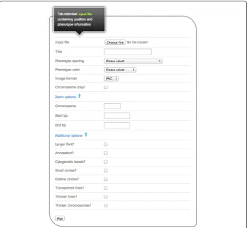
PhenoGram was developed in Ruby, using the RMagick graphics library. The software can be downloaded for use at the command line. The software can also be used via a web-based graphical user interface without a need for downloading the software, and a screen capture of the web interface is shown in Figure 1. Both the web-based graphical user interface as well as the stand-alone software are available at: http://visualization. ritchielab.psu.edu. An example file is available at that site for trying out PhenoGram with the web-based graphical user interface.
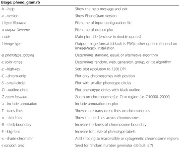
Table 1 PhenoGram plotting options and arguments (−arg name)for creating PhenoGram plots using pheno_gram.rb
Usage: pheno_gram.rb
-h --help Show the help message and exit
-v --version Show PhenoGram version
-iinput filename Filename of input configuration file
-ooutput filename Filename of output plot
-ttitle Main plot title (enclose in double quotes)
-fimage type Output image format (default is PNG); other options depend on ImageMagick installation
-pphenotype spacing Determines standard, equal, or alternative algorithm
-ccolor range Determines random, web, generator, group, or list algorithm
-z --high-res Sets plot resolution to 1200 DPI
-C --chrom-only Plot only chromosomes with position
-S --small-circle Plot with smaller phenotype circles
-O --outline-circle Plot phenotype circles with black outline
-Zzoom location Zoom on chromosome (i.e. 7) or region (i.e. 7:10000–20000)
-a --include-annotation Include annotation on plot
-T --trans-lines Show more transparent lines on chromosomes
-n --thin-lines Show thinner lines across chromosomes
-B --thick-boundary Increase thickness of chromosome boundary
-F --big-font Increase font size of phenotype labels
-x–shade-chromatin Add shading to inaccessible or cytogenetic chromosome regions
There are multiple options that can be used to create various plots, and Table 1 shows the complete list of command line arguments, which are also available on the web interface. A single, tab-delimited input file is required to produce a PhenoGram plot. At a minimum, the input file must contain columns to identify the chromosome, and the base-pair position or base-base-pair to base-base-pair region to be plotted. Other columns such pheno-type, annotation, ancestry or group, and position-color provide additional PhenoGram visualization options. Table 2 summarizes the formatting parameters of the input file.
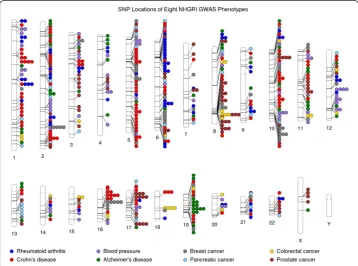
Figure 2Using PhenoGram to plot the NHGRI GWA catalog association results for eight
phenotypes.An Ideogram of all 22 chromosomes is plotted, along with the X and Y chromosomes. Lines are plotted on the chromosomes corresponding to the base-pair location of each SNP, and the line connects to colored circles representing the phenotype(s) associated with that SNP.
Table 2 PhenoGram input file formatting parameters
Recognized column header Required Description
CHR Yes Chromosome number
POS Yes Base-pair location of the SNP or starting location
of a base-pair to base-pair region
PHENOTYPE No Name of the phenotype; required only when
plotting phenotypes as colored shapes
END No Ending location of a base-pair to base-pair region
NOTE (or ANNOTATION) No Values in this column are shown on the plot position to the right of the chromosome; limited to 10 characters
ETHNICITY (or ANCESTRY) No Specifies ethnicity or ancestry for the associated position; accepts up to three unique values in this column
GROUP No Specifies a group identifier such that all phenotypes of
the same identifier share a common color
POSCOLOR No Shades transverse lines on the line plot with a color;
specified by an integer 0-7
Results and discussion
To show the utility of PhenoGram, and the ways that multiple options can be combined for different types of plots, we describe here several example uses of this software. For the first set of examples, we have used a subset of data from the NHGRI GWAS Catalog to demonstrate some features of PhenoGram, highlighting some of the similarities and differences in our plots compared to the NHGRI GWAS Catalog plots. We chose this data because allowed us to represent multiple phenotypes across the genome and highlight other relationships in the data such as pleiotropy or ancestry. In addition, the GWAS Catalog data could be prepared as input to PhenoGram with a single database query and minimal data.
Here, we chose a subset of NHGRI GWAS catalog results with a diverse range of eight selected phenotypes as an example: rheumatoid arthritis, Crohn’s disease, blood pressure, Alzheimer’s disease, breast cancer, pancreatic cancer, colorectal cancer, and prostate cancer. Figure 2 shows a basic PhenoGram plot summarizing the SNP locations for
GWA-significant associations with these eight phenotypes. Like the NHGRI GWAS catalog plots, each line connects a chromosomal location to a colored circle depicting the associated phenotype. A key of phenotypes and corresponding circle colors are displayed across the bottom of the image. PhenoGram has multiple options for altering the graph-ical style of the colored circles. For Figure 2, the options to outline the circles (−O) and increase the phenotype font size (−F) were used.
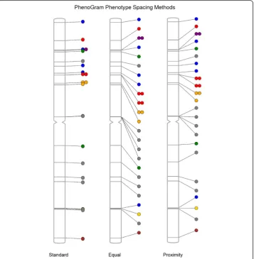
Depending on the amount of data to be plotted, as well as the proximity of genomic regions, different spacing may need to be used to optimally plot multiple data points. For example, an input file with a great number of phenotypes may produce a plot with circles that are too closely juxtaposed. Thus, PhenoGram has several options for modi-fying the spatial presentation of the circles or other annotation on PhenoGram plots.
Figure 3 shows the results of using different PhenoGram spacing algorithms that can
mitigate the issue of overlapping plotted data. The first spacing method is standard spacing and is the default spacing method used by PhenoGram. The equal spacing
method (−pequal) allows the researchers to space the circles at equal intervals along the chromosome. A third spacing method is proximity spacing (−p proximity) which minimizes circle overlap while still attempting to place circles or other annotation near respective chromosomal locations.
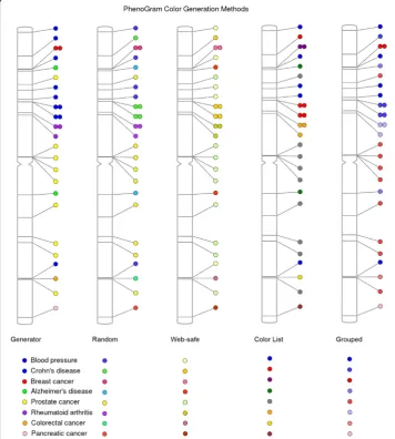
The colors of the plotted circles can be alternately generated based on five different algorithms, shown in Figure 4. For ten or fewer phenotypes, the color list method (−clist) restricts the possible colors to those that are easily differentiated. In plots with a greater number of phenotypes, the standard color generator (−c generator) creates colors with maximum separation between all possibilities. The web-safe color option (−cweb) restricts all possibilities to 216 web-safe, randomly selected possibilities. The least restrictive method is the random generator (−c random) that assigns colors without regard for color proximity. Finally, it is possible to provide in the input file a column that designates a group identifier for a subset of phenotypes such that all those of a similar identifier are plotted in a gradient of one color. Figure 4 shows the grouping method (−cgroup) in a plot to differentiate NHGRI GWAS catalog cancer phenotypes from non-cancer phenotypes.
Similar to grouping data by phenotype, it is possible to overlay a second grouping by ancestry. Shown in Figure 5, the plot resulting from the incorporation of this data into the input file depicts each ancestry group as a unique shape while still differentiating
phenotypes with a color generation method. Here, the phenotype shapes are displayed without a black outline. GWAS catalog data was also used in this plot in order to show the combination of the diverse phenotype colors and distinct shapes by ancestry across the genome. PhenoGram currently accepts up to three different ancestry groups, with each subsequent group beyond three appearing as a circle. Figure 5 displays how PhenoGram can help visualize the relationships between genome location, phenotypes, and ancestry.
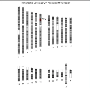
PhenoGram can also create plots that contain, rather than colored shapes, only colored lines that transverse the chromosomes. In this way, the software is also useful for visualizing genome or single-chromosome SNP coverage from a genotyping array as well as to show locations of sequenced loci or other regions of interest. Figure 6 incor-porates the line plotting option (−C) with base-pair position information to display the coverage of genotyping for the custom Immunochip genotyping array, an array focused on autoimmune and immune system related genetic variants [6]. Further, it is possible in the PhenoGram input file to highlight base-pair regions via the use of integer-coded
color options and to annotate positions. In Figure 6, a dense region of genotyping of the array on chromosome six is annotated; this region is the major histocompatibility complex (MHC) region. In line plots, it may be useful to apply the transparent (−T) or thin (−n) line options to improve visualization in densely plotted genome regions.
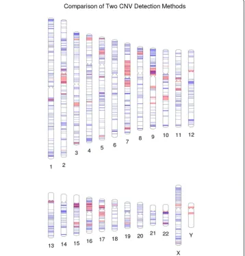
Copy-number variants (CNVs) are a growing area of genetic variant exploration for neurodevelopmental disorders. Recently, a comparison was made of two microarray tech-nologies used in the detection of CNVs. Figure 7 shows the CNV region overlap between results of an Illumina microarray and a custom microarray that was targeted for genomic hotspots of deletions and duplications [7,8]. Another example, using this approach for single SNPs instead of CNVs (not shown here), would be to use PhenoGram with two different colors highlighting the density and location of a series of low frequency variants vs. the density and location of a series of more common variants.
Another option with PhenoGram is to show part of a region in more detail. Depend-ing on the amount of data to be plotted and/or the region of interest, plottDepend-ing only one chromosome can be useful, and this feature was used to plot individual chromosomes for Figures 3 and 4. Although our annotation spacing algorithms attempt to optimize
the presentation of various shapes such as circles representing phenotypes, it can be necessary to visually expand densely annotated chromosomal regions. Figure 8 uses the NHGRI GWAS Catalog data from the eight aforementioned phenotypes to expand on a cluster of closely positioned phenotypes.
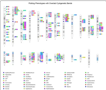
We have added an option in PhenoGram to show the location of cytogenetic bands across the ideogram, and we show an example in Figure 9. Genes are not uniformly distributed along the length of chromosomes. Cytogenetic bands identify biologically relevant chromosomal structure, highlighting regions that are more or less likely to be gene-rich and/or genotyped, and standard regions have been identified that can be visualized on an ideogram documented through the UCSC browser [9] that we downloaded from http://hgdownload.soe.ucsc.edu/goldenPath/hg19/database/. For ex-ample, “G-bands” are less gene-rich than “R-bands” [10], and we identify G-bands in PhenoGram using variations of grey and represent R-bands in white on the ideogram. There are also regions of the genome containing highly condensed heterochromatin that are largely transcriptionally silent, we have identified those in dark blue colors. The biggest regions of heterochromatin are in the long arm of the Y-chromosomes and close to the centromeres of chromosomes 1, 9, and 16. Smaller heterochromatin regions are found at the centromere of each chromosome, and the p-arms of chromosomes 13, 14, 15, 21, and 22. We have also marked the “stalks” in light blue, these are five regions on the acrocentric chromosomes and contain genes that code for ribosomal RNA.
Conclusions
With the ever increasing amounts of data being collected, visually summarizing data can be important for providing insight into complex results. Multiple data results can be plotted across chromosomes, providing useful summary information, and aiding in data analyses as well as sharing results. PhenoGram offers a robust feature set, allowing researchers to plot data of many kinds across a chromosomal ideogram according to preference. In the future we will be adding in additional color option choices for plots, as well as additional software features, to expand plotting options with PhenoGram. The features of PhenoGram can further facilitate the exploration and sharing of gen-omic information.
Availability and requirements
Project name: PhenoGram
Project home page: http://visualization.ritchielab.psu.edu Operating systems(s): Linux, Mac OS X, Windows Programming language: Ruby
Other requirements: RMagick License: GNU General Public License
Any restrictions to use by non-academics: PhenoGram use is restricted to academic and non-profit users
Competing interests
The authors declare they have no competing interests.
Authors’contributions
DW, SD, MDR, SAP have made substantial contributions to conception and design of this software, as well as the drafting of the manuscript or revising it critically for important intellectual content, and have given final approval of the version to be published. The writing of the code for PhenoGram was performed by SD. All authors read and approved the final manuscript.
Acknowledgements
We would like to thank everyone who has had suggestions for improvements and additions to this software. This work was supported by the following funding agencies and grants: 5U01 HG004798-03, 5R01 LM010040-02, and U19 HL065962-10.
Received: 8 August 2013 Accepted: 2 October 2013 Published: 16 October 2013
References
1. Ramos PS, Criswell LA, Moser KL, Comeau ME, Williams AH, Pajewski NM, Chung SA, Graham RR, Zidovetzki R, Kelly JA, Kaufman KM, Jacob CO, Vyse TJ, Tsao BP, Kimberly RP, Gaffney PM, Alarcón-Riquelme ME, Harley JB, Langefeld CD, International Consortium on the Genetics of Systemic Erythematosus:A comprehensive analysis of shared loci between systemic lupus erythematosus (SLE) and sixteen autoimmune diseases reveals limited genetic overlap.Plos Genet2011,7:e1002406.
2. Grossman SR, Andersen KG, Shlyakhter I, Tabrizi S, Winnicki S, Yen A, Park DJ, Griesemer D, Karlsson EK, Wong SH, Cabili M, Adegbola RA, Bamezai RNK, Hill AVS, Vannberg FO, Rinn JL, 1000 Genomes Project, Lander ES, Schaffner SF, Sabeti PC:Identifying recent adaptations in large-scale genomic data.Cell2013,152:703–713.
3. Hindorff LA, Sethupathy P, Junkins HA, Ramos EM, Mehta JP, Collins FS, Manolio TA:Potential etiologic and functional implications of genome-wide association loci for human diseases and traits.Proc Natl Acad Sci 2009,106:9362–9367.
4. Pendergrass SA, Brown-Gentry K, Dudek SM, Torstenson ES, Ambite JL, Avery CL, Buyske S, Cai C, Fesinmeyer MD, Haiman C, Heiss G, Hindorff LA, Hsu C-N, Jackson RD, Kooperberg C, Le Marchand L, Lin Y, Matise TC, Moreland L, Monroe K, Reiner AP, Wallace R, Wilkens LR, Crawford DC, Ritchie MD:The use of phenome-wide association studies (PheWAS) for exploration of novel genotype-phenotype relationships and pleiotropy discovery. Genet Epidemiol2011,35:410–422.
5. Pendergrass SA, Brown-Gentry K, Dudek S, Frase A, Torstenson ES, Goodloe R, Ambite JL, Avery CL, Buyske S, Bůžková P, Deelman E, Fesinmeyer MD, Haiman CA, Heiss G, Hindorff LA, Hsu C-N, Jackson RD, Kooperberg C, Le Marchand L, Lin Y, Matise TC, Monroe KR, Moreland L, Park SL, Reiner A, Wallace R, Wilkens LR, Crawford DC, Ritchie MD:Phenome-Wide Association Study (PheWAS) for Detection of Pleiotropy within the Population Architecture using Genomics and Epidemiology (PAGE) Network.Plos Genet2013,9:e1003087.
6. Cortes A, Brown MA:Promise and pitfalls of the Immunochip.Arthritis Res Ther2011,13:101.
7. Pinto D, Pagnamenta AT, Klei L, Anney R, Merico D, Regan R, Conroy J, Magalhaes TR, Correia C, Abrahams BS, Almeida J, Bacchelli E, Bader GD, Bailey AJ, Baird G, Battaglia A, Berney T, Bolshakova N, Bölte S, Bolton PF, Bourgeron T, Brennan S, Brian J, Bryson SE, Carson AR, Casallo G, Casey J, Chung BHY, Cochrane L, Corsello C,et al: Functional impact of global rare copy number variation in autism spectrum disorders.Nature2010, 466:368–372.
8. Girirajan S, Johnson RL, Tassone F, Balciuniene J, Katiyar N, Fox K, Baker C, Srikanth A, Yeoh KH, Khoo SJ, Nauth TB, Hansen R, Ritchie M, Hertz-Picciotto I, Eichler EE, Pessah IN, Selleck SB:Global increases in both common and rare copy number load associated with autism.Hum Mol Genet2013,22:2870–2880.
9. Furey TS, Haussler D:Integration of the cytogenetic map with the draft human genome sequence.Hum Mol Genet2003,12:1037–1044.
10. Bickmore WA:Karyotype Analysis and Chromosome Banding.John Wiley & Sons, Ltd: In eLS; 2001.
doi:10.1186/1756-0381-6-18
Cite this article as:Wolfeet al.:Visualizing genomic information across chromosomes with PhenoGram.BioData Mining20136:18.
Submit your next manuscript to BioMed Central and take full advantage of:
• Convenient online submission
• Thorough peer review
• No space constraints or color figure charges
• Immediate publication on acceptance
• Inclusion in PubMed, CAS, Scopus and Google Scholar
• Research which is freely available for redistribution