AN APPLICATION
by
Victoria L. Edrington
A Master’s paper submitted to the faculty of the School of Information and Library Science of the University of North Carolina at Chapel Hill
in partial fulfillment of the requirements for the degree of Master of Science in
Information Science
Chapel Hill, North Carolina April, 1999
Approved by:
Sonnenwald
A user interface is a means of communicating a computer program’s type, purpose, and function. If that communication is unclear, the software cannot be used properly. Usability testing is a way in which software engineers can ensure that these user interfaces are providing clear and useful communication.
The goal of this project is to develop a usability test to determine how well a specific interface communicates the necessary information to its user and facilitates task completion. A list of recommended changes to the interface was produced from the results of the study.
Headings:
USER INTERFACE DESIGN AND USABILITY TESTING:
AN APPLICATION
Introduction
Software engineers are fabled for their lack of communication skills and yet many of these engineers communicate with us everyday. Every time we use a piece of software, we rely on the interface to communicate the type and purpose of that program, as well as how to use it. If that information is not communicated effectively, the result may be lost sales, overburdened help desks, and frustrated users. The need for clear and easy to understand interfaces is evident. Through advances in fields like communication, information science, cognitive psychology, and human-computer interaction, we now know more about the way in which humans process information than ever. A brief survey of interface design and usability literature yields a number of design principles and practices that have been shown to improve the final software product. Why then are many interfaces so difficult to use? The answer is simply that software producers are not
putting these principles and practices to use. The reasons vary from increased development costs to an unwillingness of software project managers to change their current design processes.
completion. A list of recommended changes to the interface was produced from the results of the study.
Literature Review
Usability is frequently defined as “the capability in human functional terms to be used easily and effectively by the specified range of users, given specified training and user support, to fulfill the specified range of tasks, within the specified environmental scenarios” (Shackel, 1991, p.21). It is important to note the emphasis given to the
environment or context in which a piece of software will be used in the above definition. This aspect of usability is often overlooked in some approaches to usability testing. Usability cannot be assessed in a vacuum without due consideration to the users and their tasks.
Design Principles
In designing software user interfaces or any device to be used by a human being there are a number of factors that must be considered. Donald A. Norman (1988) lists six such factors in his seminal work The Psychology of Everyday Things:
1) Conceptual Model
An interface must effectively communicate what it is the program is doing. A user must be able to clearly understand the logical model of a system, what it does and how it is supposed to work.
2) Visibility
3) Mapping
Each control must map logically to its function. Users will not easily remember a control that has little or nothing to do with the action it is supposed to activate. Ctrl+Alt+Delete is an arbitrary command to reboot a system and often difficult for novice users to remember. However, most will remember that Ctrl+U will activate the underline feature in a word processing program because this control more naturally maps to its function (Ctrl to activate a control and U for
underline).
4) Affordances and Constraints
For every item on an interface screen there are only a certain number of actions that may be performed with them. Buttons are for clicking on, text boxes are for text input, etc. A user must have a clear idea of how to use a control and, where possible, be constrained to its proper use.
5) Feedback
Humans are very dependent on feedback; they expect a reaction for each action. If we are not given some sort of indication that we have correctly activated some function we remain unsure as to whether or not such a function took place. 6) Error Recovery
Designers must assume that at one time or another a user will activate a function or trigger an action that was not intended. Users must not only be able to
These are a set of general design principles that can be applied to a number of devices, but are easily adaptable to user interfaces. Unfortunately, following all of the above principles will not necessarily lead to a usable design. What is a perfectly obvious and natural control for an engineer may not always be for the general public. This realization led to the development of the User-Centered Design Approach. This process has been best distilled into 4 standards by Gould, et al. (1991) in their article “Making Usable, Useful, Productivity-Enhancing Computer-Applications”:
1) Focus on the Users
There must be direct contact between the end users and the designers. It should be noted that end users are those people who will actually be using the system not just those who are purchasing it. Too often, software designers rely on the specifications and feedback of the managers who are contracting for the system with tragic results. 2) Integrated Design
The user interface, help system, training plan and documentation should be developed in parallel with one another. These four aspects of the system directly affect one another and cannot be effectively developed alone. Changes in the interface will affect the documentation and trouble spots identified in user testing should be reflected in available help and training.
3) Early and Continual User Testing
One of the best ways to glean feedback from users concerning a system is to allow users to interact with it and record their reactions.
4) Iterative Design
design. A prototype is developed, subjected to user testing and the results of that testing reflected in the next prototype.
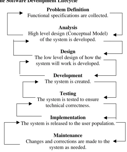
Usability Testing
Usability testing is an integral part of the User-Centered Design model. To be fully effective, testing should be performed throughout the design and implementation process. The software design process can be broken up into six parts. At any point in the process, designers may need to cycle back to any previous step to make corrections and adjustments in an iterative process. Figure 1 is an adaptation of the software development life cycle as presented by William S. Davis (1994).
Figure 1: The Software Development Lifecycle
Problem Definition
Functional specifications are collected.
Analysis
High level design (Conceptual Model) of the system is developed.
Design
The low level design of how the system will work is developed.
Development
The system is created.
Testing
The system is tested to ensure technical correctness.
Implementation
The system is released to the user population.
Maintenance
At each stage of the development process, usability testing can be used to improve the design and implementation of a software system. There are currently two chief
methods of usability testing used: heuristic and experimental/empirical.
Heuristic Approach
The heuristic approach involves asking a group of evaluators, preferably with a wide range of experience in designing or using software applications, to evaluate an interface design against a set of desirable attributes. They may use a prototype of the system interface or, more frequently, a paper mock-up of the interface. Nielsen and Molich (1990) proposed a set of 10 criteria or attributes that a successful interface design should have:
1) Uses a simple and natural dialog. 2) Speaks the user’s language.
3) Minimizes memory load on the user. 4) Is consistent.
5) Provides feedback. 6) Has clearly marked exits.
7) Employs understandable and useful error messages. 8) Prevents user errors.
9) Provides shortcuts for frequent/experienced users. 10)Has useful help and documentation.
detailed user and task profiles. For each segment of the user population, designer’s should account for: the level of computer expertise, past experience with software, how frequently each segment will use the system, and how frequently each segment will perform each of the tasks that can be carried out using the system. Other heuristic
evaluations may be made using an expanded set of attributes that account for diversity in the user population and the tasks to be performed, more in line with the User-Centered Design approach. Deborah Mayhew (1992) suggest using the following 15 attributes when evaluating a system:
1) User Compatibility – take the user profiles into account.
2) Product Compatibility – build on what the users are already comfortable using. 3) Task Compatibility – the interface should be structured to support the user tasks. 4) Work-Flow Compatibility – the user should be able to flow naturally from task to
task.
5) Familiarity – borrow concepts from the users’ experience, like the filing cabinets and trash cans seen in today’s graphical user interfaces.
6) Simplicity – make the interface as simple as possible.
7) Direct Manipulations – allow the user to directly “handle” the objects on the screen, using devices like the mouse.
8) Control Language – use language that emphasizes user control of the system rather than system control of the user. For example, use “Ready for Command” rather than “Enter Command” as a prompt.
9) WYSIWYG – “What You See Is What You Get”.
11)Responsiveness – let the user know what is going on, provide feedback. 12)Invisible Technology – provide a layer of abstraction that hides the underlying
technology.
13)Robustness – don’t let the system crash, provide users with a graceful way to recover from errors.
14)Protection – allow the users to recover from human error.
15)Ease of Learning & Ease of Use – the system should be both easy to use and easy to learn. Of course as Nielsen and Phillips (1993) noted, the relative importance of the two will change according to the nature of the system, will it be used frequently by expert users or only a few times/infrequently.
Experimental Approach
Jeffrey Rubin (1994) further breaks the experimental method down into 4 types of testing, appropriate at various stages of the development cycle.
1) Exploratory
Exploratory testing is done early in the cycle while the functional specifications or high level designs are being developed. The goal is to evaluate how well the
conceptual model of the system is represented. Test participants, usually only a few, use mockups of the user interface and help system as well as the user manual to do so. Designers at this phase will use a qualitative analysis of the data collected to discover errors and omissions in their analysis.
2) Assessment
how well that model has been described. Users are asked to perform various tasks using a more fully fleshed prototype of the system. While some of the analysis remains qualitative, more quantitative measures are possible now (time to complete task, error rates, etc.).
3) Validation
Validation testing occurs quite late in the process, during the development phase and often just prior to release. Test users are now presented with a fully functional prototype. Prior to testing, designers must develop a set of standards or benchmarks the product must attain before release. The system is evaluated using realistic working scenarios to determine whether those standards are met or if any changes will be required.
4) Comparison
Comparison tests are appropriate at any point in the development life cycle. There are often a number of choices that designers must make along the way and they can use comparison tests to aid in making those decisions. The methodology will vary according to the problem faced. The test may be an informal session in which users are asked to compare and evaluate the various designs or it may be more formal and scientifically rigorous, with different user groups evaluating different designs that vary in a single aspect.
Metrics
of positive vs. negative statements made during the test, frequency and helpfulness of manual use, and the number and duration or response delays (Nielsen, 1993, pp.193-4). In addition, one may use the time it takes typical users to learn how to complete specific tasks and retention of that knowledge over time (Shneiderman, 1987, pp.14-15).
Subjective measures of a system’s usefulness should also be used. The
Technology Acceptance Model predicts that user acceptance of a piece of technology depends upon two things: perceived usefulness and perceived ease of use (Morris, 1997, p.59). If a user does not feel that a system is easy to use or relevant to his/her work, he/she is not likely to use it.
Comparison of Methods
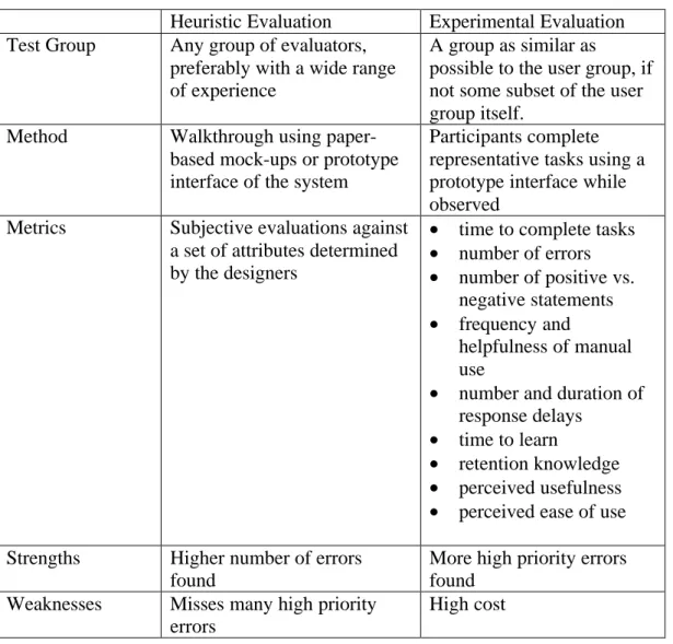
Table 1: A Comparison of Two Usability Evaluation Methods
Heuristic Evaluation Experimental Evaluation Test Group Any group of evaluators,
preferably with a wide range of experience
A group as similar as
possible to the user group, if not some subset of the user group itself.
Method Walkthrough using paper-based mock-ups or prototype interface of the system
Participants complete representative tasks using a prototype interface while observed
Metrics Subjective evaluations against a set of attributes determined by the designers
• time to complete tasks
• number of errors
• number of positive vs. negative statements
• frequency and
helpfulness of manual use
• number and duration of response delays
• time to learn
• retention knowledge
• perceived usefulness
• perceived ease of use
Strengths Higher number of errors found
More high priority errors found
Weaknesses Misses many high priority errors
High cost
Protecting Participant Wellbeing
Like medical testing, social science research can have detrimental effects on its human subjects. These effects and their risks are often difficult to anticipate in the social sciences due to their more intangible, psychological nature. Usability testing comes with its own risks that must be taken into account for the wellbeing of its participants.
design, users will often feel embarrassed or stupid and assume that the fault lies in them, not the system. This is especially acute when tests are conducted in a corporate setting. Participants may fear reprisals from their superiors for poor performance or the ridicule of their coworkers. It is very important to not only preserve a participant’s anonminity where possible, but also provide assurances that any errors made should be viewed as the fault of the system (Nielsen, 1993, pp.181-184). Usability testing participants must realize that it is the system itself being scrutinized and not their performance or skill as users.
The Usability Test
The usability test was conducted using an interface I designed for the Institute of Government Library Catalog. What follows is a description of the study in detail along with the test materials to be used.
Background
The Institute of Government (IOG) Library is part of the Academic Affairs Library system at the University of North Carolina at Chapel Hill. Many of its
publications are cataloged in the university-wide library catalog, however, a number of them are not. The IOG Library must maintain its own catalog for the use of its patrons and staff in order to track all holdings and additional information required by its users. A new library system is currently being developed to satisfy these needs.
Participants
The user group of this particular system is very small; there are only 3 full time staff members at the library. A surrogate user group of 20 participants was culled from students in the School of Information and Library Science at the University of North Carolina at Chapel Hill. To qualify, students were required to either be pursuing a degree in Library Science or have worked in a library in a professional or paraprofessional capacity. Thus, the participants had professional expertise and technical skills similar to the target user group.
Protecting the Participants
A number of efforts were made to ensure the test participants’ wellbeing. First and foremost, all test results remained anonymous. There remains no link between a participant’s real name and the results of their test session. Second, users were asked to read and sign a consent form detailing all aspects of the study prior to their test session (see Appendix I). Third, participants were reminded in both written and verbal
instructions that they could terminate the study at any time and for any reason. Finally, throughout the study, participants were reminded that it was the interface itself that was being tested and any difficulty experienced while using the interface allowed me to glean a valuable piece of information that would be used to improve its design.
Procedure
I. Pre-Study Questionnaire
The goal of the pre-study questionnaire (Appendix II) was to get a sense of each participant’s current level of comfort using personal computers and certain software packages. I expected that users who were more familiar with computers and specifically with the software package used to develop the interface (Microsoft Access) would
commit significantly fewer errors and be able to learn the system more quickly than those who were not. These subjective measures of user comfort were used in analysis of the data collected from the testing itself.
II. The Study
glean even some of the internal thought processes of the participants. I also believe that it made them much more comfortable with criticizing the system.
I choose to act as study monitor during the test sessions. The role of the monitor in this case was to orient the participant, collect study data, operate the video camera, troubleshoot any technical problems with the computer or interface during the session and prompt the participant as needed for any further information. This choice was somewhat unusual since most experts recommend the monitor have no involvement in the actual design and development of the system undergoing testing. It is also unusual to have only one monitor for a study, since it is quite difficult for one person to accurately record all relevant information. Due to the small size and scope of this study, using myself as the sole test monitor was the only feasible option; however, I believe I somewhat mitigated this risks by video taping the test sessions and was able to remain relatively unbiased during the sessions.
Participants were asked to complete a set of three tasks: entering a new serial issue, entering a new book title and creating a report listing the serials routed to a particular library patron. These tasks were chosen as they are representative of the tasks that will be completed every day by users of the system. These tasks were broken into a number of subtasks and I recorded the number of errors made while completing each subtask and whether or not the participant completed the subtask correctly. Errors were defined as a user behavior that did not further their accomplishment of the task; e.g., entering incorrect data into a specific data field, leaving a field blank that should have been filled in, or performing some Input/Ouput function that would not accomplish the user’s intended action. A subtask was marked as completed incorrectly if after the completion of the study, a user left incorrect data within any specified data field or failed to perform a necessary action, such as saving. Due to time considerations, participants were allotted 15 minutes to complete each task. This was done not only to provide a total time limit for each session, but to limit user frustration. Only one participant exceeded this limit and after expressing an interest in continuing, completed the task in an additional 5 minutes. During the session, I gave no information to the participants
concerning how to complete any given task. After completing the three tasks, participants were asked to complete the post-study questionnaire.
III. Post-Study Questionnaire
participant answered a question by selecting a value or point between two values, e.g. wrote in 2.5, the lesser of the two values was used in the final data analysis.
Results
The interface was evaluated quantitatively according to the number of errors made and the number of subtasks completed incorrectly. Comments made by participants during the study or provided in the post-study questionnaire were analyzed qualitatively. Both the quantitative and qualitative analysis of the data gathered in the study provided useful information concerning improvements to be made to the interface design.
Analysis
Level of User Expertise
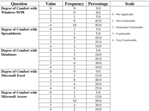
Table 2: Pre-Study Questionnaire Results
Question Value Frequency Percentage Scale
0 0 0.0
1 0 0.0
2 1 5.0
3 9 45.0
Degree of Comfort with Windows 95/98
4 10 50.0
0 1 5.0
1 1 5.0
2 9 45.0
3 7 35.0
Degree of Comfort with Spreadsheets
4 2 10.0
0 1 5.0
1 2 10.0
2 9 45.0
3 6 30.0
Degree of Comfort with Databases
4 2 10.0
0 0 0.0
1 3 15.0
2 8 40.0
3 4 20.0
Degree of Comfort with Microsoft Excel
4 5 25.0
0 1 5.0
1 3 15.0
2 10 50.0
3 4 20.0
Degree of Comfort with Microsoft Access
4 2 10.0
0 – Not Applicable 1 – Not Comfortable 2 – Somewhat Comfortable 3 – Comfortable
The participants culled from the School of Information and Library Science have a wide range of computer experience, although most felt at least comfortable using computers. The results of the pre-study questionnaires are presented in Table 2 above indicate that the participant group was fairly computer savvy.
• 85% felt at least somewhat comfortable using a Database.
• 80% felt at least somewhat comfortable using Microsoft Access.
• 85% felt comfortable or very comfortable using a computer and 95% felt at least
somewhat comfortable using Windows 95/98.
In asking these questions, I was interested in discovering what correlation these results would have on the difficulty a participant experienced using the interface. If, as I suspected, there was a negative correlation between the two, this information could be used to improve user training materials and manuals.
Design Improvements
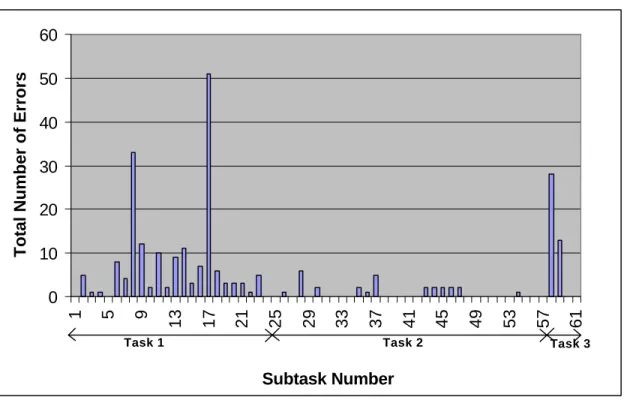
Figure 2: Total Number of Errors for Each Subtask
As can be seen in Figure 2, most of the user errors fell in Task 1, subtasks 1-24. Of particular interest are subtasks 8-9, 17 and 58-59 which account for 55% of the total number of errors committed. The reasons for these errors will be discussed below; however, this does not present a complete picture, as some of the subtasks were skipped.
0 10 20 30 40 50 60
1 5 9
13 17 21 25 29 33 37 41 45 49 53 57 61
Subtask Number
Total Number of Errors
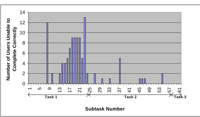
Figure 3: Number of Users Unable to Complete a Subtask Correctly
Once more, a clear pattern emerges from the figure above. Again, the majority of subtasks not completed correctly fall under Task 1. In addition to the subtasks mentioned above, a number of other subtasks become targets for investigation: subtasks 13-15, 16-21, 22, 23 and 37. Any subtask that was completed correctly by at least 18 of the 20 participants was not investigated.
Each of these patterns can be explained by examining at the comments made by the participants while attempting to complete them.
• Subtasks 8-9: Holding and Binding Period
Participants were asked to enter the holding period and binding period for a particular serial title. Values given in the instructions were “2 years” and “6 months”
respectively; however, the data required in these fields were the number of months (integer) in each period and no time measure was displayed next to the text entry
0 2 4 6 8 10 12 14
1 5 9
13 17 21 25 29 33 37 41 45 49 53 57 61
Subtask Number
Number of Users Unable to
Complete Correctly
boxes provided for this information. Participants generally first attempted to enter “2 years” for the Holding Period, but the system refused text entries. Most often, the participants left the Holding Period simply as “2” and attempted to maintain the same time measure in Binding Period by entering “.5”, but decimal entries were refused by the system. Participants found this to be quite frustrating, and the simple addition of the time frame “months” following each text entry box would have cleared up most of the confusion.
• Subtasks 13-15: Subject Headings
Participants were asked to enter 3 subject headings for a particular serial title. Due to the large number of entries to be made for a serial title, screen space was limited. The solution taken in the design phase was to create a sub-form for the entry of the subject headings that allowed users to enter and view only one subject heading at a time. This proved to be troublesome, however, as users frequently could not determine exactly how to move between the individual entries in the sub-form. Even those that were able to move easily between the multiple entries found it annoying and wished to view all three headings at the same time to facilitate entry and checking for data entry errors.
Participants seemed to have no difficulty using these multi-page forms and their use should be expanded throughout the interface.
• Subtasks 16-21: Routing Information
Participants were asked to enter a list of patron names and the order in which this particular serial title would be routed to them. Again, as was done with the Subject Heading Entries, users were provided with a sub-form that displayed only one entry at a time and participants encountered similar difficulties. In addition, the entry for order was confusing to almost all participants. Although this would not present a problem for trained users of the system, the language in the interface is ambiguous and the entry would be better named “Order Received”.
• Subtask 22: Save
Upon completing data entry, participants were required to save the information entered into the form by using either the “Save” or “Close” option buttons to ensure that their entries underwent a data validation process. They were not given any explicit instructions to do so, however. 5 of the participants either minimized the data entry form window or closed it in a manner not expected. Error messages warning users that their data will not be saved properly tied to these events could prevent errors of this type.
• Subtask 23: Holdings
accomplish this task. Again, this would not present a problem for experienced users of the system, but the addition of a menu option on the new serial title entry form to add holding information could be useful.
• Subtask 37: Call/Glidden Number
Participants were required to enter the book’s call number or a glidden number used exclusively by the IOG Library. The number should have been entered with no spaces between the components of that number. The addition of a template displaying an appropriately entered call number could be added to the form to reduce confusion, however, since this system will be used frequently by the same users, a better solution would be to include this format in all training materials and user manuals and add a segment to the data validation code that will check for spaces in the number and return an error message if it finds any.
• Subtasks 58-59: Patron Report
Participants were asked to create a report containing the serials that are routed to a particular patron and the order in which they are received. The major difficulty users had in completing this task was simply determining which menu options to choose to get to the report. Many participants attempted a number of routes before discovering the one that would lead them to the desired report. This should not prove to be a problem for experienced users and, in the event that it does, it would be quite easy to provide another route to the report. Multiple routes may even be included to allow users some flexibility.
There were a number of interface attributes that did not cause any errors and participants were able to navigate successfully, but that were annoying or awkward to use:
• The tab order within the forms was not consistent, sometimes flowing left to right
and others top to bottom as the layout dictated. Participants commented frequently on this and felt that a consist use of left to right tab order was the most familiar and easy to use.
• The help options and error messages were completely useless to the users when
attempting to recover from errors. No attempt was made in the initial design process to provide any additional help or error messages other than what Microsoft Access provided. These help screens and error messages were fairly obscure and rarely provided any assistance to the user. As one user put it, “the HELP screen could actually help.”
• Users frequently spent a long period of time worrying whether or not the data they
had just entered had been saved properly and often expressed as desire for a confirmation of some type.
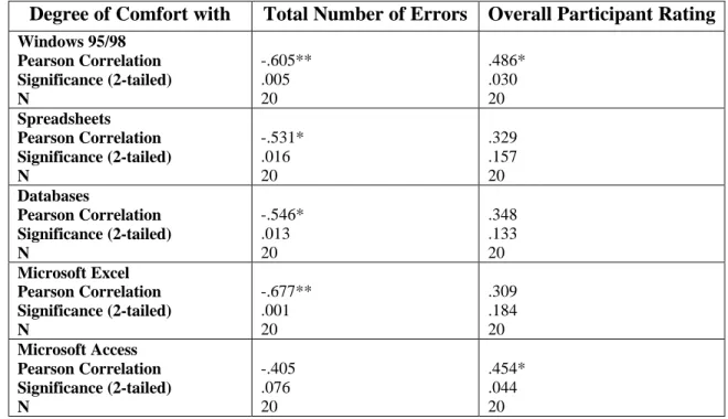
Correlations
The correlations between various data collected in the study did not provide much in the way of new information. Perhaps due to the small sample size, many of the
variables were not significantly related to one another. Selected results of the analysis are presented in Tables 3 and 4.
found between degree of user comfort using Microsoft Access and the Total Number of Errors.
Table 3: Correlation of Pre-Study Questionnaire Results with Total Number of Errors and Overall User Rating
Degree of Comfort with Total Number of Errors Overall Participant Rating
Windows 95/98 Pearson Correlation Significance (2-tailed) N -.605** .005 20 .486* .030 20 Spreadsheets Pearson Correlation Significance (2-tailed) N -.531* .016 20 .329 .157 20 Databases Pearson Correlation Significance (2-tailed) N -.546* .013 20 .348 .133 20 Microsoft Excel Pearson Correlation Significance (2-tailed) N -.677** .001 20 .309 .184 20 Microsoft Access Pearson Correlation Significance (2-tailed) N -.405 .076 20 .454* .044 20 ** Significant at the .01 level
* Significant at the .05 level
The degree to which a user felt comfortable using Windows 95/98 also had a negative correlation to the Total Number of Errors. These correlations imply that users of the operating system have been exposed to a number of design elements available in Microsoft Access, such as multi-page forms, and this would certainly facilitate use of the interface.
The surprising detail that surfaced during analysis was the negative correlation between the degree of comfort using Spreadsheets, and in particular Microsoft Excel, and the Total Number of Errors. Of course, one would expect that familiarity Microsoft products in general should facilitate use of this interface. Familiarity with spreadsheets may also indicate experience with data entry, a major component of two of the study tasks.
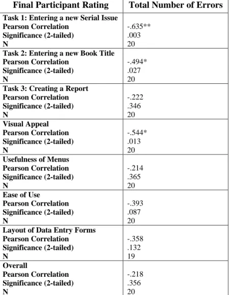
Table 4: Correlation of Final Participant Ratings with Total Number of Errors
Final Participant Rating Total Number of Errors
Task 1: Entering a new Serial Issue Pearson Correlation Significance (2-tailed) N -.635** .003 20
Task 2: Entering a new Book Title Pearson Correlation Significance (2-tailed) N -.494* .027 20
Task 3: Creating a Report Pearson Correlation Significance (2-tailed) N -.222 .346 20 Visual Appeal Pearson Correlation Significance (2-tailed) N -.544* .013 20
Usefulness of Menus Pearson Correlation Significance (2-tailed) N -.214 .365 20
Ease of Use
Pearson Correlation Significance (2-tailed) N -.393 .087 20
Layout of Data Entry Forms Pearson Correlation Significance (2-tailed) N -.358 .132 19 Overall Pearson Correlation Significance (2-tailed) N -.218 .356 20 ** Significant at the .01 level
I was not surprised by the negative correlation between the Total Number of Errors and Participant Ratings for Task 1 and Task 2. One would assume that having experienced more errors, participants would rate the interface lower. I was surprised, however, with the lack of significant correlation between the Total Number of Errors and any other Participant Rating, excluding Visual Appeal. It could be that some of the errors attributed to poor visual cues in the interface could have influenced the significant
correlation between Visual Appeal and Total Number of Errors, but I would have thought that relationship would show itself more clearly in a correlation with Layout of Data Entry Forms. One possible explanation is that in the process of trying to please the monitor, as is often the case in any social science research, participants inflated their ratings of the interface. Following this line of reasoning, Visual Appeal could have been the one ranking participants felt would matter least to the designers of the interface. Alternatively, it could be that even given the errors, participants found it to be a workable interface compared with other systems they had been exposed to.
User Satisfaction
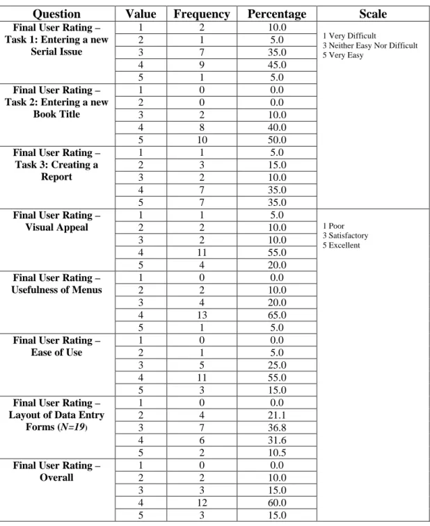
Table 5: Post-Study Questionnaire Results
Question Value Frequency Percentage Scale
1 2 10.0
2 1 5.0
3 7 35.0
4 9 45.0
Final User Rating – Task 1: Entering a new
Serial Issue
5 1 5.0
1 0 0.0
2 0 0.0
3 2 10.0
4 8 40.0
Final User Rating – Task 2: Entering a new
Book Title
5 10 50.0
1 1 5.0
2 3 15.0
3 2 10.0
4 7 35.0
Final User Rating – Task 3: Creating a
Report
5 7 35.0
1 Very Difficult
3 Neither Easy Nor Difficult 5 Very Easy
1 1 5.0
2 2 10.0
3 2 10.0
4 11 55.0
Final User Rating – Visual Appeal
5 4 20.0
1 0 0.0
2 2 10.0
3 4 20.0
4 13 65.0
Final User Rating – Usefulness of Menus
5 1 5.0
1 0 0.0
2 1 5.0
3 5 25.0
4 11 55.0
Final User Rating – Ease of Use
5 3 15.0
1 0 0.0
2 4 21.1
3 7 36.8
4 6 31.6
Final User Rating – Layout of Data Entry
Forms (N=19)
5 2 10.5
1 0 0.0
2 2 10.0
3 3 15.0
4 12 60.0
Final User Rating – Overall
5 3 15.0
1 Poor 3 Satisfactory 5 Excellent
Task 1 where the majority of errors were found. One area of improvement to be gleaned from these results is the Layout of Data Entry Forms, not surprising as a number of interface errors stem from problems with this area.
Recommendations
Based upon my findings in the usability study, I pinpointed eight proposed changes to the interface design to enhance usability.
1) Use a consistent tab order, left to right, rather than top to bottom. 2) Provide format examples for dates and time periods.
3) Add a menu option to add the holding information for a new serial directly to the new serial entry form.
4) Participants with a higher degree of comfort with Windows 95/98 and Databases generally found the interface easier to understand. User training materials should include some basic database principles and an overview of Windows 95/98 specific interface elements, like multi-page forms and window resizing controls.
5) The use of multipage forms with navigation tabs in places in which the data entry screens are cramped for space would allow designers to display a reasonable number of entries where multiples are required.
6) The use of an order field to provide the order in which a serial is routed to a user proved to be unclear. Changing its placement to precede the staff member’s name and/or changing the attribute name to “Order to Be Received In” could alleviate some of the confusion.
8) The interface should provide the user with feedback messages indicating whether or not records are being saved properly.
Conclusions
I found completing this study to be a very useful exercise and would highly recommend it to anyone interested in software design as a career. Although I noticed a few flaws in the study I developed, I believe it was not only a useful learning experience but vastly improved the interface for an information system that will go into production. Having now completed one study, there are a number of things I would take into account in designing another.
Few errors I found in the interface related directly back to the heuristic evaluation criteria or design principles previously. I had expected that many, if not all, would be caused by improper adherence to the heuristic rules. The relationship between
Responsiveness/Feedback, Protection/Error Prevention and Useful Error Messages and the errors I found is obvious in hindsight. Other errors, such as the lack of format examples for time periods and other data, were less directly related to these concepts. I think it would be quite difficult to catch the vast majority of these errors with a simple heuristic evaluation.
The number of participants I used at this stage of testing seemed a bit excessive. Ten participants would have allowed me to catch the errors I found with less time and effort expended.
do think that designers should view the test sessions however, I believe they would accept the design corrections that come out of the process more readily if they were able to see the problems design flaws cause for users. An error is very hard to ignore after watching the 15th person come up against the same difficulties.
When designing a usability test, one must account for the psychological impact it may have on its participants. Even though this study was conducted under relatively relaxed conditions, I did note that a number of the participants were quite nervous and a few frequently apologized for while completing the study tasks. It really is vital for the study monitor to ensure that participants feel comfortable and warn them of the dangers of blaming themselves when the interface is at fault.
Although I did not have the time or resources to do a complete cycle of user testing on this interface, I found the feedback I received from the participants in this study of great help in its improvement. Participants found errors in the interface that I had simply overlooked or did not see being so close to the design. I would recommend that anyone designing a piece of software to put that system thorough as rigorous user testing as time and money will allow. The benefit to the users is great and the system design is improved.
Acknowledgement
s
References
Davis, William S. (1994). Business systems analysis and design. Belmont, CA: Wadsworth.
Gould, John D., Boies, Stephen J., & Lewis, Clayton. (1991). Making usable, useful, productivity-enhancing computer-applications. Communications of the ACM, 34(1), 74 – 85.
Kelly, T., & Allender, L. (1995). Why choose? A process approach to usability testing. In Yuichiro Anzai, Katsuhiko Ogawa, & Hirohiko Mori (Eds.), Symbiosis of human and artifact: Human and social aspects of human-computer interaction:
proceedings of the sixth international conference on human computer interaction,
Tokyo, Japan, 9-14 July 1995, Volume 2 (pp.393-398). Amsterdam: Elsevier. Lin, Han X., Choong, Yee-Yin, & Salvendy, Gavriel. (1997). A proposed index of
usability: a method for comparing the relative usability of different software systems. Behaviour & information technology, 16(4/5), 267-278.
Mayhew, Deborah J. (1992). Principles and guidelines in software user interface design. Englewood Cliffs, NJ: Prentice Hall.
Morris, Michael G., & Dillon, Andrew. (1997). How user perceptions influence software use. IEEE software 14(4), 58 – 65.
Nielsen, Jakob. (1993). Usability Engineering. Boston: Academic Press.
Carrasco Chew & John Whiteside (Eds.), Empowering people: CHI ’90
conference proceedings, April 1-5, 1990, Seattle, WA. (pp.249-256). New York, NY: Association for Computing Machinery.
Nielsen, Jakob, & Phillips, Victoria L. (1993). Estimating the relative usability of two interfaces: Heuritic, formal, and empirical methods compared. In Stacy Ashlund, Kevin Mullet, Austin Henderson, Erik Hollnagel, & Ted White (Eds.), INTERCHI ’93 conference proceedings, April 24-29, 1993, Amsterdam, The Netherlands
(pp.214-221). New York: Association for Computing Machinery.
Norman, Donald A. (1988). The psychology of everyday things. New York, NY: Basic Books.
Rubin, Jeffrey. (1994). Handbook of usability testing: How to plan, design, and conduct effective tests. New York: John Wiley.
Shackel, B. (1991). Usability – context, framework, definition, design and evaluation. In B. Shackel and S. Richardson (Eds.), Human factors for informatics usability
(pp.21-37). New York, NY: Cambridge University Press.
Shneiderman, Ben. (1987). Designing the user interface: Strategies for effective human-computer interaction. Reading, MA: Addison Wesley.
Vora, P. R., & Helander, M. G. (1995). A teaching method as an alternative to the
concurrent think-aloud method for usability testing. In Yuichiro Anzai, Katsuhiko Ogawa, and Hirohiko Mori (Eds.), Symbiosis of human and artifact: Human and social aspects of human-computer interaction: proceedings of the sixth
international conference on human computer interaction, Tokyo, Japan, 9-14 July
Appendix I
Participant Consent Form
Library Database Usability Study
Consent Form
Study Monitor: Victoria Edrington
Study Faculty Advisor: Dr. Diane Sonnenwald
School of Information and Library Science
Introduction to the Study
The Institute of Government Library is part of the Academic Affairs Library system at the University of North Carolina at Chapel Hill. Many of its publications are cataloged in the university-wide library catalog, however, a number of them are not. The IOG Library must maintain its own catalog for the use of its patrons and staff in order to track all holdings and additional information required by its users. A new library system is currently being developed to satisfy these needs. As part of the development process, usability testing is currently being conducted on the interface that will allow library staff to enter new data into the system and create reports.
Purpose
The purpose of this study is to identify weaknesses in the interface before the new system is put into use. The development team will use what is learned from this study to improve the program and make it more user-friendly.
What Will Happen During the Study:
1. You will be asked to complete a pre-study questionnaire to get an idea of how comfortable you currently are using a personal computer and certain software packages.
2. You will be asked to complete 3 tasks that we anticipate will be commonly performed by library staff using the new system. The study monitor will remain in the test room with you to record the results of the study and make sure that there are no technical problems with the new database or the computer you will be using. You will have access to the user manual for the new database to provide any assistance needed. The study session will be videotaped to make sure that no important information is
you should say what you are thinking. The more that is known about how a user is thinking about the program, the better the improvements made to it will be.
3. You will be asked to complete a brief post-study questionnaire so that you can voice any of your final thoughts on the new interface.
Your Rights and Privacy
• Every effort will be made to protect your privacy.
• You will not be identified by name on any of the written materials or in any discussion or publications involving this study.
• The videotape of your study session will be used only to provide any information missed by the study monitor. No one other than the study monitor and the project’s faculty advisor will view the tape. All tapes will be destroyed after the study’s completion on December 15, 1998.
• You may stop the session at any time and without giving any reason. You may also stop work on any part of the study at any time and without giving any reason. Please remember that the interface is still under development and you may find some tasks difficult to complete. The longer you continue to attempt the task, the more
information can be collected about its weaknesses and the more improvements can be made before it is put into official use.
• At the end of the study session, you will receive $10 compensation regardless of any outcomes or whether you complete the study session.
Institutional Review Board Approval:
The Academic Affairs Institutional Review Board (AA-IRB) of the University of North Carolina at Chapel Hill has approved this study.
If you have any concerns about your rights in this study, you may contact the chair of the AA-IRB, David A. Eckerman, at CB#4100, 300 Bynum Hall, UNC-CH, Chapel Hill, NC 27599-4100, by phone at (919) 962-7761, or by email at [email protected].
Summary:
• I understand that this is a usability study to find weaknesses in and help improve the new library database for the Institute of Government at the University of North Carolina at Chapel Hill.
• I understand that I can stop the study session at any time and without giving any reason. I may also stop work on any task in the study session at any time and without giving any reason.
• I have been given a copy of this consent form prior to my study session.
• I have had the chance to ask any questions about this study and they have been answered for me.
• I have read the information in this consent form and I agree to take part in the study.
____________________________________ Participant Signature
Appendix II
Pre-Study Questionnaire
Many people experience different levels of comfort while using personal computers and various software programs. This questionnaire will provide information about how comfortable you currently are using a personal computer and certain software
applications. Please complete it at your convenience and bring it with you to your study session.
Most of the questions will ask you to rate your degree of comfort using various operating systems and software packages, please circle the number that best represents this. If you have not used a particular operating system or software package, circle 0 for Not
Applicable.
1. Please rate your degree of comfort using the following operating systems:
Not Applicable Not Comfortable Somewhat Comfortable Comfortable Very Comfortable
Windows 95/98 0 1 2 3 4
Macintosh OS 0 1 2 3 4
Windows 3.x 0 1 2 3 4
DOS 0 1 2 3 4
UNIX 0 1 2 3 4
Other
Please Specify: _____________
0 1 2 3 4
2. Please rate your degree of comfort using the following software:
Not Applicable Not Comfortable Somewhat Comfortable Comfortable Very Comfortable
Word Processor 0 1 2 3 4
Spreadsheet 0 1 2 3 4
Database
3. Please rate your degree of comfort using the following specific programs:
Not Applicable
Not Comfortable
Somewhat
Comfortable Comfortable
Very Comfortable
Microsoft
Word 0 1 2 3 4
Microsoft
Excel 0 1 2 3 4
Microsoft
Access 0 1 2 3 4
Microsoft
PowerPoint 0 1 2 3 4
4. Overall, how comfortable would you say you are using a personal computer?
Not Comfortable
Somewhat
Comfortable Comfortable
Very Comfortable
Appendix III
Participant Instructions
Below are three tasks we believe are commonly performed by library staff. Please try to complete each task using the prototype library system. You may refer to the user manual at any time you need assistance, but please first try the task without referring to the manual. The study monitor will be available if there is a technical problem with the program or the computer you are using.
In the interest of time, please spend no more than 15 minutes working on each task. The study monitor will let you know when time is up. If you have not completed the task in 15 minutes, don’t worry and simply move on to the next task. Remember, the goal here is to collect information about how usable the program is. Also note that some of the
functions offered on the menus have not been implemented yet. There may be multiple ways to complete each task and your first choice may not be available. Please do not be frustrated, try to complete the task in a different way. Your initial choices will help the developers create new ways to complete these functions.
While completing the tasks, you are encouraged to “think aloud”. Please say aloud what it is you are thinking as you work on the tasks. For example:
“Starting Task #2”
“Looking for the menu to enter data, it’s probably under edit”
“Looking for the enter button, can’t find it. This is really frustrating.”
“It would be really useful if I could enter the data another way, like select from a list of
The study monitor may prompt you every now and then to remind you to think aloud or to ask you to provide more information.
Remember, you may stop work on any task at any time and without giving any reason.
Task 1
Scenario:
The library has received the first issue of a new serial that has not yet been entered into the system. Please enter the new serial and the issue into the system. All relevant information is listed below:
Title: Popular Government
All issues should be included in the recent acquisitions list. Issues will be held for 2 years.
Issues will be sent to the bindary after 6 months.
The fact that this is a new serial and the acquisition date would be useful for patrons to know.
Source: gift-Gilbert Guy
This serial does not continue another title. Type: Periodical
Subject Headings: Elections, Economics, Mass Media Routes to:
1. Victoria Edrington 2. Susan Dunn 3. Jack Johnson
Issue/Volume: Volume 12 Issue 8 August 1998 Location: staff route
Date Entered: today
Received On: October 15, 1998
Task 2
Scenario:
A new book has been received by the library. The relevant information is listed below and a copy of the book has been provided. Please enter the new title into the system. Title: The Bretheren: Inside the Supreme Court
ISBN: 0380521830 Date Entered: today Not part of a series
Book will not be included on recent acquisitions list. 558 pages
Published by: Avon Books Location: New York, NY Year: 1981
Call Number: KF4787 .W66 Copy: 3
Book is not an IOG publication and has no IOG number Current Holding Location is IOG
Ordered from Yankee at the request of John Gullo Price: $10.00
Authors: Bob Woodward and Scott Armstrong No Editors
Task 3
Scenario:
Jack Johnson, one of the faculty at the Institute, has asked to see what serials are
Appendix IV
Prototype User Interface
Main Menu
New Serial Entry Form
New Book Entry Form
Appendix V
Post-Study Questionnaire
The following questionnaire provides you with the opportunity to share any of your final thoughts on the prototype system’s interface, the part of the program you used to perform the study tasks.
1. For each of the three tasks, indicate how easy it was to do the task using the prototype interface:
Very Difficult Neither Easy
Nor Difficult
Very Easy
Entering a new Serial Issue
1 2 3 4 5
Entering a new Book Title
1 2 3 4 5
Creating a Report
1 2 3 4 5
2. Please rate the following aspects of the prototype interface:
Poor Satisfactory Excellent
Visual Appeal 1 2 3 4 5
Usefulness of Menus
1 2 3 4 5
Ease of Use 1 2 3 4 5
Layout of Data Entry Forms
1 2 3 4 5
3. Overall, how would you rate prototype interface:
Poor Satisfactory Excellent