A Geometric Approach to Visualization of
Variability in Functional Data
Weiyi Xie
1, Sebastian Kurtek
1, Karthik Bharath
2and Ying Sun
31
Department of Statistics, The Ohio State University
2School of Mathematical Sciences, University of Nottingham
3Division of Computer, Electrical and Mathematical Sciences
and Engineering, King Abdullah University of Science and Technology
February 7, 2017
Abstract
We propose a new method for the construction and visualization of boxplot-type displays for functional data. We use a recent functional data analysis framework, based on a representation of functions called square-root slope functions, to decom-pose observed variation in functional data into three main components: amplitude, phase, and vertical translation. We then construct separate displays for each compo-nent, using the geometry and metric of each representation space, based on a novel definition of the median, the two quartiles, and extreme observations. The outly-ingness of functional data is a very complex concept. Thus, we propose to identify outliers based on any of the three main components after decomposition. We provide a variety of visualization tools for the proposed boxplot-type displays including sur-face plots. We evaluate the proposed method using extensive simulations and then focus our attention on three real data applications including exploratory data analysis of sea surface temperature functions, electrocardiogram functions and growth curves.
Keywords: amplitude and phase variabilities; Fisher–Rao metric; functional outlier detec-tion; square-root slope function
1
Introduction
Functional data analysis refers to a set of tools, including alignment, comparison, and
statistical modeling, developed to study complex, modern data objects that are represented
as 1D functions, shapes of curves and surfaces, and images. Thus, analysis of functional
data has potential for application to a number of fields including medical imaging, biology,
computer vision, environmetrics, biometrics, and bioinformatics. Thanks to recent progress
in the functional data and shape analysis communities (Kneip and Ramsay (2008); Tang
and M¨uller (2008); Srivastava, Wu, Kurtek, Klassen, and Marron (2011); Marron et al.
(2015); Cheng et al. (2016); Younes (1998); Beg et al. (2005); Srivastava, Klassen, Joshi, and
Jermyn (2011); Kurtek et al. (2011); Jermyn et al. (2012)), statistical methods for analyzing
such datasets are now fairly well established. However, not enough consideration has been
given to visualization of functional data, which is an important part of data exploration.
Effective visualization techniques for such challenging datasets are also indispensable for
communicating results of analysis to experts across a variety of fields. Here, our focus
is to add to the limited selection of literature on functional data graphics by developing
boxplot-type displays for one-dimensional functional data. The key premise of the proposed
method is that the ‘boxplot’ is constructed on the infinite-dimensional function space, thus
truly capturing the full structure of the given data.
Boxplot displays for univariate Euclidean data were pioneered by Tukey (1977), and
have proved to be very effective for exploratory data analysis. In recent years, there have
been some efforts to extend these methods to functional datasets, a direction which is
gain-ing interest. The method of Hyndman and Shang (2010) focused on generatgain-ing functional
bagplots and functional highest-density-region boxplots using only the first two functional
principal component (PC) scores. The approach of Fraiman and Pateiro-L´opez (2012) is
also projection-based, where principal quantile directions are defined (similar in nature to
principal directions of variability in PC analysis). Although useful in some settings, these
methods are not truly functional because the resulting data for which the displays are
generated is lower dimensional (bivariate or multivariate). In fact, this drawback applies
to any method that first uses a basis expansion to represent the functional data and
by the few chosen basis elements is lost from the display.
There has been some success in extending the concept of data depth (Mahalanobis
(1936); Tukey (1974); Oja (1983); Liu (1990); Fraiman and Meloche (1999); Vardi and
Zhang (2000)) from the multivariate setting to the function setting (Fraiman and Muniz
(2001); Febrero et al. (2007, 2008)). Sun and Genton (2011) were the first to generate
boxplot displays for given functions rather than for their multivariate summaries. In their
work, they defined ordering of functions using the notion of a functional data depth
mea-sure called band depth (L´opez-Pintado and Romo (2009)). However, their method has
some shortcomings. First, because some aspects of the boxplot are constructed in a
point-wise manner (i.e., the 50% central region and the minimum/maximum envelopes), the full
functional interpretation of the display is lost and the structure of the underlying function
space is ignored. Second, boxplots generated using band depth as a measure are not
di-rectly applicable to functional data observed under hidden temporal warping variability, as
they are not effective at capturing such variability of the sample functions in the display.
An extension of the original functional boxplots to more general functional data including
shapes and images was presented in Hong et al. (2014).
Another set of approaches relied on multivariate functional depth measures to construct
displays and for outlier detection (Ieva and Paganoni (2013); Claeskens et al. (2014); L´
opez-Pintado et al. (2014); Hubert et al. (2015)). However, these methods inherit some of
the previously mentioned drawbacks. Claeskens et al. (2014) noted the importance of
accounting for temporal variability in functional data when generating displays and in
outlier detection. Their solution was to form bivariate functions using the amplitude and
phase components and perform subsequent analysis based on this representation. The
main issue in this approach is that the amplitude and phase variabilities are estimated
using a completely unrelated procedure to that used for boxplot construction. It seems
more appropriate to use the same framework (functional representation spaces, metrics,
etc.) for both tasks. Additionally, at the initial exploratory stage, it may be beneficial
to consider the two sources of variability separately in the construction of visualization
techniques.
been sparse. The problem of extracting the underlying warping variability from a given set
of functions has been referred to by many names in the literature including registration,
alignment, and separation of amplitude and phase. The focus of the current paper is not
on the problem of amplitude and phase separation in functional data. Instead, we propose
a functional boxplot-type display that can accommodate these two types of variability.
In particular, we argue that most functional datasets contain a minimum of three main
components: translation, amplitude, and phase. The translation component refers to the
action of a translation group on some function space, where the same constant is added to
all values of the function. The amplitude and phase components are much more difficult
to formally define. The definitions used in this work are those by Srivastava, Wu, Kurtek,
Klassen, and Marron (2011), who define the phase component of a function as its warping
under the group of diffeomorphisms and the amplitude component as the values of the
function after the warping has been accounted for. The complexity of many functional
datasets demands that translation, amplitude, and phase components be separated prior
to further statistical analysis; this can also be very helpful for visualization, where a different
display can be generated for each source of variability. In some settings, the translation
component of functional data is dominant compared to the other two, and can thus be
effectively extracted and visualized through principal component analysis (PCA). In this
paper, we focus on a more general case where this may not be true.
The definition and characterization of functional outliers is a complicated process. Our
proposal to first separate the functions into more fundamental components and then detect
outliers based on these components provides a convenient simplification. Furthermore, it
allows us to view function outlyingness with respect to each individual component as well as
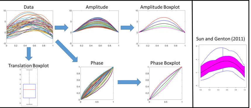
jointly using multiple components. We provide a motivating toy example for the proposed
method in Figure 1. The data here was generated as follows. First, we generated multiple
amplitude components by rescaling a template function (the start and end points of the
template were both zero). The phase variation was applied next using a one-parameter
family of warping functions (similar to those in Section 3.1). Finally, we randomly
trans-lated the functions. Next, we visualize the functions using the proposed approach. The
Figure 1: Visualization of functional data in the presence of temporal variability. The
pro-posed method (left) first decomposes the data into the translation, amplitude and phase
compo-nents, and then generates a boxplot-type display for each one separately (black=median, blue and
green=quartiles, red and magenta=extremes). This allows for effective visualization of variability
in each component. In comparison, the method of Sun and Genton (2011) (right) generates a
single boxplot display where the three sources of variability are difficult to distinguish.
original simulated components. Furthermore, the amplitude and phase boxplots reflect the
natural variation in the simulated data, i.e., the amplitude boxplot shows scale changes
of the template while the phase boxplot reflects variability in warping functions similar to
those observed in the simulated one-parameter family. We contrast these results with those
generated by the popular method of Sun and Genton (2011) where the varaibilities are all
displayed in one boxplot, making interpretation much more difficult in this context.
This work defines a principled method for the construction of boxplot-type displays for
functions in the presence of phase or warping variability. In fact, the construction holds
for any functional data on an ordered domain. First, the given functional data is
decom-posed into translation, amplitude, and phase components using the methods described in
Srivastava, Wu, Kurtek, Klassen, and Marron (2011). Then, the proposed approach relies
on the Riemannian geometry and metrics of the three respective representation spaces for
ordering, and subsequent visualization. The geometric tools are important for constructing
reliable visualization tools as they provide a principled background for summarization of the
distance, which allows one to naturally extract the temporal variability from functional
data. Note that our approach is fully functional and respects the geometry of the
underly-ing function space (i.e., the displays are intrinsic data summaries). This is in contrast to
standard methods that perform analysis using cross-sectional (pointwise) summaries, which
are known to be deficient when functional data contains temporal variability (Srivastava,
Wu, Kurtek, Klassen, and Marron (2011); Tucker et al. (2013)).
We study the ability of the proposed method to detect outliers in several simulated
datasets, and we compare our method to the state-of-the-art functional boxplots by Sun
and Genton (2011). Before proceeding, we would like to clarify our terminology of
boxplot-type displays. As will be clear in later sections, the display generated via the proposed
method is a boxplot on the infinite-dimensional function space of amplitude or phase. The
two-dimensional displays of these boxplots do not necessarily resemble a box, which follows
intuition as it is generally difficult to display infinite-dimensional objects in 2D. Thus,
we additionally provide a 3D surface plot that can be better at displaying the functional
boxplot. To summarize, the main contributions of this paper are the following:
• We separate variability of functional data into the translation, amplitude and phase
components using methods of Srivastava, Wu, Kurtek, Klassen, and Marron (2011)
for individual visualization of functions in the presence of temporal variability.
• We use the Riemannian geometry of the amplitude and phase representation spaces
to define boxplot-type displays for these components. In particular, we use
warping-invariant Riemannian metrics for function ordering and the computation of the five
number summary. This is the first work in literature that provides tools for computing
the amplitude and phase medians, which are more robust to outliers than their mean
counterparts.
• We provide an approach for outlier detection based on the three components.
1.1
Motivating Applications
We provide visualizations and the results of outlier detection on three real, functional
temperature, Berkeley growth data, and electrocardiogram signals. In particular, we study
sea surface temperature in relation to El Ni˜no and La Ni˜na events, which have a strong
impact on weather patterns. Given that many global economies are very sensitive to
climate fluctuations, especially those heavily dependent on agriculture, the study of such
environmental signals in relation to climate changes is pertinent. It is also valuable to note
that, at the time of this writing, we are experiencing one of the strongest El Ni˜no events
since the beginning of record collection. The phase variability in this data comes from
interannual temperature variation (e.g., some years experience longer winters than others).
Both the amplitude (temperature) and phase (timing of seasonal patterns) components are
important features of sea surface temperature functions (see Figure 6).
Growth curves are of great importance in many applications including plant science and
biometrics. Here, we study development patterns of boys and girls through the Berkeley
growth data (Tuddenham and Snyder (1954)), which can reveal important characteristics
of complex growth processes including the number and size of growth spurts across gender
or other important covariates such as socioeconomic status. Phase variability again plays
an important role in this data (Cheng et al. (2016)); it tells us about the time at which
various interesting traits occur (see Figure 9).
Finally, we showcase the proposed visualization techniques on PQRST complexes
ex-tracted from electrocardiogram signals. PQRST refers to the five waves in each complex:
the first positive peak is the P wave, the first negative peak is the Q wave, the second
positive peak is the R wave, the second negative peak is the S wave, and the third positive
peak is the T wave (see Figure 12 for an example). Cardiologists routinely use such data to
diagnose various heart disorders including congenital heart disease and myocardial
infarc-tion. In this application, phase variability directly corresponds to the length of a person’s
heartbeat, and the occurrence and duration of the P, Q, R, S and T waves.
All of these datasets share a common feature: they are all observed under natural
phase variability. Thus, our goal in this paper is to propose a method, which can be
used to discover new data patterns by separately visualizing the amplitude, phase, and
translation components of the functions.
boxplot construction for the amplitude and phase variabilities in functional data. Section
3 provides multiple simulation studies as well as analysis results for the three real datasets
described above. We close with a summary and some directions for future work in Section 4.
The Supplementary Matrial includes a description of the invariance and equivariance
prop-erties of the proposed boxplot displays, a brief discussion of the connections to univariate
Euclidean boxplots, and additional simulation studies and real data examples.
2
Construction of Functional Boxplot-Type Displays
In this section, we describe the construction of boxplot-type displays for translation,
am-plitude, and phase components of a set of functions. We begin by reviewing relevant topics
from Srivastava, Wu, Kurtek, Klassen, and Marron (2011) including function
represen-tations, metrics, and algorithms for amplitude-phase separation. Given these tools, we
proceed to describe our novel method for visualization of various functional data
compo-nents using a unified geometric approach.
2.1
Elastic Functional Data Analysis
We focus our efforts on the visualization of real-valued functions on the interval [0,1], where
we assume that functions are absolutely continuous. Thus, the original function space can
be defined as F = {f : [0,1] → R|f is absolutely continuous}. All methods described herein are valid for functional data on any closed subinterval of the real line. Because we
are interested in visualization of elastic functions (i.e., functions with warping variability),
we define Γ as the set of all warping functions (orientation-preserving diffeomorphisms) of
the unit interval [0,1]: Γ =
γ : [0,1]→ [0,1]|γ(0) = 0, γ(1) = 1,0 <γ <˙ ∞ , where ˙γ is
the time derivative ofγ. Γ is a Lie group with composition as the natural group action; for
a function f ∈ F and a warping functionγ ∈Γ, their composition f◦γ denotes a warping
of f using γ. Warping of a function constitutes its phase variability and should thus be
visualized and analyzed separately from the function’s amplitude. We use Γ to model the
warping functions nonparametrically. While more complicated than the parametric case,
ones presented in the current paper.
To circumvent some of the theoretical issues related to the warping problem, such as
lack of isometry under the L2 metric (see Srivastava, Wu, Kurtek, Klassen, and Marron (2011)), we define a mapping Q : F → L2([0,1],
R) as (for a function f ∈ F) Q(f) = q = sign( ˙f)
q
|f˙|, where | · | denotes the absolute value and ˙f is the time derivative of f;
henceforth, we simply use L2 to represent
L2([0,1],R). This new representation, q, of a
function f is called it’s square-root slope function (SRSF). The mapping f ↔ (q, f(0)), which maps between F and L2 ×R, is a bijection, which can be obtained precisely as
f(t) = f(0) +R0tq(s)|q(s)|ds. Therefore, for each function f ∈ F, there exists a q ∈ L2,
such that q is the SRSF of f (i.e., if f is absolutely continuous, then its SRSFq is
square-integrable) (Srivastava, Wu, Kurtek, Klassen, and Marron (2011); Lahiri et al. (2015)).
Also, note that the SRSF representation is invariant to function translations.
When a functionfis warped byγ, the SRSF off◦γis given by (q, γ) = (q◦γ)√γ˙. One of
the most important properties of SRSFs, and their usefulness in separation of amplitude and
phase variabilities of elastic functions, is the invariance of the L2 distance under warping. That is, for any two functions f1, f2 ∈ F represented using their SRSFs Q(f1) = q1 and
Q(f2) =q2 and any warping functionγ ∈Γ, we have kq1−q2k=k(q1, γ)−(q2, γ)k; this is
different from standard approaches where theL2 metric is used directly on the function space
F: in that case, kf1−f2k 6=kf1◦γ−f2◦γk. Srivastava, Wu, Kurtek, Klassen, and Marron
(2011) showed that this property is essential for defining a proper framework to separate
amplitude and phase variabilities in functional data. Their methods are attractive for our
study because we aim to provide visualization techniques for each of these components
individually. Furthermore, the L2 distance is a proper metric (i.e., it satisfies symmetry,
positive definiteness, and triangle inequality) on the SRSF amplitude spaceL2/Γ ={[q]|q∈
L2}, where [q] ={(q, γ)|γ ∈ Γ}. Equivalently, the pullback of the L2 metric to F, which
results in the extended Fisher–Rao metric (Srivastava, Wu, Kurtek, Klassen, and Marron
(2011)), is a proper metric on the original function amplitude space F/Γ = {[f]|f ∈ F },
where [f] ={f◦γ|γ ∈Γ}denote equivalence classes under the action of the warping group;
thus, each equivalence class contains all possible warpings of a function f (representation
Source of Variability Translation Amplitude Phase
Space R F/Γ L2/Γ Γ Ψ
[image:10.612.93.516.70.128.2]Metric Euclidean Extended Fisher–Rao L2 Fisher–Rao L2
Table 1: Representation spaces and metrics for different sources of variability in functional data.
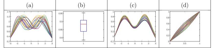
(a) (b) (c) (d)
-3 -2 -1 0 1 2 3 0.2
0.4 0.6 0.8 1 1.2 1.4
1 0.8
0.85 0.9 0.95
-3 -2 -1 0 1 2 3 -0.2
0 0.2 0.4 0.6 0.8 1
0 0.5 1 0
0.2 0.4 0.6 0.8 1
Figure 2: Separation of translation, amplitude, and phase variabilities in elastic functional data.
(a) Original functions. (b) Translation. (c) Amplitude. (d) Phase.
While the above methodological descriptions justify our use of the elastic functional
data analysis framework of Srivastava, Wu, Kurtek, Klassen, and Marron (2011), we omit
their full algorithm for separation of amplitude and phase variabilities for brevity. The tools
provided by this framework allow us to extract different components of given functions and
analyze them separately in their respective representation spaces: (1) amplitude in L2/Γ or F/Γ, (2) warping or phase in Γ, and (3) translation in R. We provide a summary of the relevant representation spaces and corresponding metrics in Table 1. The theoretical
foundations of this framework are studied in detail in Lahiri et al. (2015) and establish
uniqueness of the warping solution in Γ.
In this paper, we approach the problem of functional data visualization by first
extract-ing the translation component. Then, we map all given functions to their correspondextract-ing
SRSFs and use the framework of Srivastava, Wu, Kurtek, Klassen, and Marron (2011) to
extract the amplitude and phase components of the functions. Once each component has
been separated out, we construct individual metric-based, geometric boxplot-type displays
to more accurately visualize various sources of variability in the functional data. As an
ex-ample, consider the simulated functions given in Figure 2(a). These functions clearly differ
in three main aspects: (1) vertical translation (Figure 2(b)), (2) relative heights of peaks
and valleys (Figure 2(c)), and (3) relative positions of peaks and valleys (Figure 2(d)). The
[image:10.612.86.521.156.254.2]construction is trivial for the translation component, which in our framework is defined as
the average height of the function; we use standard boxplots for this case. Instead of using
the average height of the functions one could also use the median or any other measure
of translation. But, the construction of boxplots on the functional spaces of amplitude,
F/Γ, and phase, Γ, is much more challenging and requires geometric tools from those
representation spaces.
2.2
Construction of the Amplitude Boxplot
The construction of a functional boxplot for the amplitude component requires the
compu-tation of the amplitude median, two quartiles, and two extremes. We use the geometry of
the functional representation space to define these boxplot features. Additionally, we
pro-vide a recipe for amplitude outlier identification. Given a set of functions {f1, . . . , fn}, we
begin by finding the amplitude geometric median defined as [ ¯f] = argmin
[f]∈F/Γ
n
X
i=1
Da([fi],[f]),
where Da([f1],[f2]) = inf
γ∈Γkq1 −(q2, γ)k is the amplitude distance (Fletcher et al. (2009)).
The solution to this optimization problem can be found using a standard gradient descent
algorithm. There are three main advantages to using the proposed geometric median over
the previously mentioned band depth methods. First, the definition of the geometric
me-dian in one-dimensional Euclidean space with the absolute value as the metric reduces to
the standard definition of a median on that space (i.e., a point that splits the data into
two equal-sized portions). Second, this definition allows one to automatically separate the
amplitude and phase variabilities under a unified framework, which is not possible under
the band depth setup. Finally, the functional band depth is based on a probability measure
on the function space, which is known to have degeneracy issues (Kuelbs and Zinn (2013);
Chakraborty and Chaudhuri (2014)). In contrast, our notion of a median only requires the
definition of a proper metric on the function space.
The definition of the geometric median is very similar to the definition of the Frechet
or Karcher mean (Dryden and Mardia (1998); Le (2001)); however, it is more robust to
outliers as shown in Fletcher et al. (2009). The amplitude median is actually an entire
equivalence class of functions [ ¯f]; we select one element of this equivalence class as a
and Marron (2011)). Next, we compute ¯q, the SRSF of ¯f, and align all original functions
{f1, f2, . . . , fn} to the amplitude geometric median ¯f using Da. This operation results in
three pieces of information: (1) amplitude distances of all functions from the amplitude
median{D1
a, . . . , Dan}, (2) aligned functions or amplitude components{f˜1, . . . ,f˜n}and their
corresponding SRSFs{q˜1, . . . ,q˜n}, and (3) optimal warping or phase functions{γ1, . . . , γn}.
We use the computed amplitude distances to order the corresponding amplitude
com-ponents {q˜1, . . . ,q˜n} according to their proximity in L2/Γ to the amplitude geometric
me-dian. Then, we extract the 50% of amplitude functions that are closest to ¯q, resulting in
the ordered amplitude functions {q˜(1), . . . ,q˜(bn/2c)}; these functions define the 50% central
amplitude region of L2/Γ. To define the two amplitude quartiles, ˜qQ1 ( ˜fQ1) and ˜qQ3 ( ˜fQ3),
we solve the following optimization problem over the 50% central amplitude region:
(˜qQ1,q˜Q3) = argmax
˜
q1,q˜2∈{˜q(1),...,q˜(bn/2c)}
(1−λ)
kq˜1−q¯k
max
i kq˜(i)−q¯k
+ kq˜2−q¯k max
i kq˜(i)−q¯k
− λ
˜ q1−q¯
kq˜1−q¯k
, q˜2−q¯
kq˜2−q¯k
+ 1
, (1)
where k · k and h·,·i denote the L2 norm and inner product, respectively. The intuition
behind this approach is as follows. The first term in the expression measures the
cumula-tive distance between the two quartiles normalized using the maximum distance from the
amplitude median to any of the amplitude functions within the 50% central region; we
want this quantity to be as large as possible to ensure that the two quartiles are far away
from the geometric median. The maximum value of this first term is 2. The second term
in this expression measures the inner product between the unit vectors pointing from the
amplitude median to each of the amplitude functions in the 50% central region; we want
this term to be as small as possible (i.e.,−1) to maximize the angle between the two chosen
vectors. In this way, we prefer the two vectors which point in opposite directions from the
amplitude median. The inner product between two unit vectors has a minimum value of
−1 and a maximum value of 1, so we add 1 to put the second term on the same scale as
the first term. The tuning parameterλ ∈[0,1] controls the weight of the two terms; we use
λ = 0.5 to achieve a balance between the two terms. Note that the chosen directions for
the first and third quartiles are quite different from the projection-based principal quantile
Given the two quartiles ˜qQ1 and ˜qQ3, we define the amplitude interquartile range (IQR)
as the sum of the amplitude distances from each quartile to the geometric median: IQRa=
kq˜Q1 −qk¯ +kq˜Q3 −qk¯ . Then, the two amplitude outlier cutoffs can be defined as ˜qW1 =
˜
qQ1+ka×IQRa×
˜
qQ1−q¯
kq˜Q1−q¯k and ˜qW3 =qeQ3+ka×IQRa×
˜
qQ3−¯q
kq˜Q3−¯qk. This definition is similar
to the standard boxplot definition where ka = 1.5. In the case of amplitude functions,
the choice of ka is not as obvious and we will study the behavior of outlier detection
with respect to this constant in later sections. An amplitude outlier is then defined as
any amplitude function ˜f whose ˜q is further away from the geometric median ¯q than the
larger of the two amplitude outlier cutoffs; that is, ˜f is identified as an amplitude outlier if
kq˜−qk¯ >max{kq˜W1−qk,¯ kq˜W3−qk}¯ . If one would like to be less conservative, the minimum
can be used instead of the maximum. Thus, the proposed outlier detection procedure
considers an entire region with a specific radius governed by the distance of the amplitude
outlier cutoffs from the amplitude median. This is in stark contrast to projection-based
approaches where one is able to identify outliers in specific directions only. Finally, the two
extreme amplitude functions are defined as those ˜f whose ˜q are closest to each of the two
amplitude outlier cutoffs ˜qW1 and ˜qW3, under the requirement that they lie outside of the
50% central amplitude region and have not been flagged as amplitude outliers.
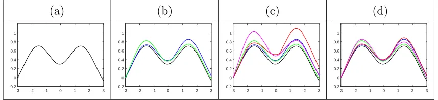
Figure 3 provides an example of constructing an amplitude boxplot for the functional
data shown in Figure 2. In panel (a), we show the amplitude median in black, which is
a nice representative of the original data. Then, we compute the two amplitude quartiles
using Equation 1 displayed in panel (b). The amplitude boxplot shown is invariant to
function translations, and thus, one should only be concerned with ‘shape’ differences of
these summaries. In fact, the two quartiles capture a very intuitive source of variation in
the given data. The median has two peaks of approximately equal size. The first quartile
(blue) has a similarly-sized first peak but a higher second peak, while the third quartile
has a similarly-sized second peak but a higher first peak. The two outlier cutoffs shown in
panel (c) in red and magenta signify amplitudes which are used for outlier detection. As
expected, no amplitude outliers were found in this simulated example. Finally, in panel (d),
(a) (b) (c) (d)
-3 -2 -1 0 1 2 3 -0.2
0 0.2 0.4 0.6 0.8 1
-3 -2 -1 0 1 2 3 -0.2
0 0.2 0.4 0.6 0.8 1
-3 -2 -1 0 1 2 3 -0.2
0 0.2 0.4 0.6 0.8 1
-3 -2 -1 0 1 2 3 -0.2
[image:14.612.91.520.69.167.2]0 0.2 0.4 0.6 0.8 1
Figure 3: Construction of the amplitude boxplot for the data given in Figure 2. (a) Amplitude
median. (b) Amplitude median with quartiles ˜fQ1 (blue) and ˜fQ3 (green). (c) Amplitude median
with quartiles ˜fQ1 and ˜fQ3, and outlier cutoffs ˜fW1 (red) and ˜fW3 (magenta). (d) Full amplitude
boxplot (same as (c) except outlier cutoffs have been replaced by extreme amplitude functions).
2.3
Construction of the Phase Boxplot
The construction of the amplitude boxplot was aided by the linear geometry of the SRSF
functional space. Thus, we were able to add and subtract amplitude functions without
leaving the relevant representation space. But, the representation space of phase
vari-ability is Γ, which is a nonlinear manifold with a nontrivial geometry. Luckily, a simple
transformation of the phase functions, similar to the SRSF, is able to greatly simplify the
Riemannian geometry of Γ.
For a phase function γ ∈ Γ, define its square-root transform (SRT) representation as
ψ =√γ˙, where ˙γ denotes the time derivative of γ. The phase function γ can be recovered
from ψ using γ(t) = R0tψ2(s)ds. This representation of phase variability has two very
important properties. First, notice that ψ(t) > 0, for all t, and kψk = 1. Therefore, all
SRTs lie on the positive orthant of the unit Hilbert sphere denoted by Ψ, which has a well
known geometry. Second, a complicated Fisher–Rao Riemannian metric on Γ simplifies to
the standard L2 metric on Ψ (Srivastava et al. (2007)) (see Table 1). These two results imply that standard tools from Riemannian geometry are available analytically and can
thus be used to construct functional boxplots on Γ. We begin by defining all required tools
and then show how they can be applied to the present problem.
Define the distance between two warping functions,γ1 andγ2, as the arc-length between
their corresponding SRTs, ψ1 and ψ2: Dp(γ1, γ2) = cos−1(hψ1, ψ2i), where h·,·i is the L2
inner product. The tangent space at any point ψ ∈ Ψ is defined as Tψ(Ψ) ={v : [0,1]→
boxplots will be to (1) compute the phase median, (2) map all phase functions to the
tangent space defined at the phase median, (3) construct the phase boxplot in the tangent
space, and (4) map the boxplot to the original representation space Ψ (and Γ). To do this
we need additional geometric tools called the exponential and inverse-exponential maps.
The exponential map at a point ψ1 ∈ Ψ, denoted by expψ1 : Tψ1(Ψ) 7→ Ψ, is defined as
(for v ∈Tψ1(Ψ)) expψ1(v) = cos(kvk)ψ1+ sin(kvk)
v
kvk; expψ1 maps points from the tangent
space at ψ1 to the representation space. For ψ1, ψ2 ∈ Ψ, the inverse-exponential map,
denoted by exp−ψ1
1 : Ψ 7→ Tψ1(Ψ), is given by exp
−1
ψ1(ψ2) =
θ
sin(θ)(ψ2−cos(θ)ψ1) where
θ = cos−1(hψ
1, ψ2i); exp−ψ11 maps points from the representation space to the tangent space
at ψ1.
We begin by finding the geometric phase median in the SRT representation space: ¯ψ =
argmin
ψ∈Ψ
n
X
i=1
Dp(γi, γ) = argmin
ψ∈Ψ
n
X
i=1
cos−1(hψi, ψi). The phase median ¯ψ can be converted
to ¯γ using the inverse mapping defined earlier. To find the two phase quartiles, we map
all ψis to the tangent space at the phase median using the inverse-exponential map: vi =
exp−ψ¯1(ψi). Next, we order the phase functions {ψ1, . . . , ψn} based on the phase distance
Di
p = cos
−1(hψ, ψ¯
ii) ≈ kvik, i= 1, . . . , n. We extract the 50% of phase functions that are
closest to ¯ψ resulting in the ordered phase functions {ψ(1), . . . , ψ(bn/2c)}and corresponding
tangent vectors {v(1), . . . , v(bn/2c)}; these functions define the 50% central phase region of
Ψ. To define the two phase quartiles, ψQ1 (γQ1) and ψQ3 (γQ3), we solve the following
optimization problem over the 50% central phase region:
(ψQ1, ψQ3) = argmax
ψ1,ψ2∈{ψ(1),...,ψbn/2c}
(1−λ)
kv1k
max
i kv(i)k
+ kv2k max
i kv(i)k
− λ
v1
kv1k
, v2
kv2k
+ 1
, (2)
and identify the corresponding warping functions,γQ1 and γQ3, as the two phase quartiles.
The interpretation of this optimization problem is the same as we explained for amplitude.
Given the two quartiles, we compute their respective tangent space representations
(i.e., vQ1 = exp
−1 ¯
ψ (ψQ1) andvQ3 = exp
−1 ¯
ψ (ψQ3)). Then, we define the phase IQR asIQRp =
kvQ1k+kvQ3k, and the two phase outlier cutoffs as ψW1 = expψ¯(vQ1 +kp×IQRp×
vQ1
kvQ1k)
and ψW3 = expψ¯(vQ3 +kp×IQRp ×
vQ3
kvQ3k
). As in the case of the amplitude boxplot, the
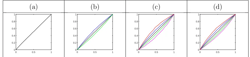
(a) (b) (c) (d)
0 0.5 1 0
0.2 0.4 0.6 0.8 1
0 0.5 1 0
0.2 0.4 0.6 0.8 1
0 0.5 1 0
0.2 0.4 0.6 0.8 1
0 0.5 1 0
[image:16.612.89.519.68.166.2]0.2 0.4 0.6 0.8 1
Figure 4: Construction of the phase boxplot for the data given in Figure 2. (a) Phase median.
(b) Phase median with quartilesγQ1 (blue) andγQ3 (green). (c) Phase median with quartilesγQ1
and γQ3, and outlier cutoffs γW1 (red) and γW3 (magenta). (d) Full phase boxplot (same as (c)
except outlier cutoffs have been replaced by extreme phase functions).
section of the paper. Phase outliers are defined as any phase function γ whose ψ has a
larger phase distance to the geometric median ¯ψ than the larger of the two phase outlier
cutoffs; that is, γ is identified as an outlier if Dp(¯γ, γ) > max{Dp(¯γ, γW1), Dp(¯γ, γW3)}.
Finally, the two extreme phase functions are defined as those whose SRT representations
are closest to each of the two phase outlier cutoffs ψW1 and ψW3, under the requirement
that they lie outside of the 50% central phase region and have not been flagged as phase
outliers.
Figure 4 provides an example of constructing a phase boxplot for the functional data
shown in Figure 2. In panel (a), we show the phase median in black, which is very similar
to the identity element of the warping group (γid(t) =t). This is expected as it is due to the
orbit-centering step during computation of the amplitude median. Then, we compute the
two phase quartiles using Equation 2 displayed in panel (b). The two quartiles capture a
very intuitive source of phase variation in the given data. The median essentially represents
a constant speed traversal of the median amplitude function. The first quartile (blue)
represents a phase function that goes faster over the entire time interval; the third quartile
(green) represents the opposite effect. This type of phase variability corresponds to the
peaks in the original functions occuring either later or earlier than the median time. The two
outlier cutoffs are shown in panel (c) in red and magenta; in panel (d), we display the full
phase boxplot with the two extremes shown in red and magenta. Phase displays throughout
this paper normalize the domain of the warping functions to [0,1] for improved display.
given in the Supplementary Material.
3
Simulations and Applications to Real Data
In this section, we present the results of multiple simulations, where we compare the
pro-posed outlier detection method to the state-of-the-art method by Sun and Genton (2011).
We feel that this is the most closely related approach to our method, and thus, use similar
simulation settings in the current paper. We also study optimal choices of the outlier cutoff
constants ka and kp. As mentioned in Sections 2.2 and 2.3, the choice of these constants
for outlier detection is not trivial. Thus, we have compiled a set of simulation results to
determine approximate scales for ka and kp, which provide a definition of mild, regular,
and severe amplitude and phase outliers. Another approach would be to derive the
em-pirical distributions of ka and kp to match the outlier probabilities in the univariate case,
which can then be used to find appropriate values for various applications. Such a study is
beyond the scope of this paper and we leave it for future work. Finally, we provide
visual-ization and outlier detection results on three real datasets: annual sea surface temperature,
Berkeley growth data, and PQRST complexes extracted from electrocardiogram signals.
In each example, we emphasize the effectiveness of the proposed approach to visualize each
component of variability in the given data: translation, amplitude, and phase.
3.1
Simulations
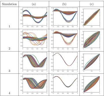
Simulations 1-4 are designed similarly to Model 6 in Sun and Genton (2011). The data is
generated as follows for each of the four simulations:
Simulation 1 Data: We generate 100 functions of the following form:
fi(t) =
a1isin(2πt) +a2icos(2πt) with probability 0.9
b1isin(2πt) +b2icos(2πt) with probability 0.1
, i= 1, . . . ,100,
wheret∈[0,1],a1i anda2i follow a uniform distribution on (0,0.05),U(0,0.05), andb1i and
b2i follow aU(0.1,0.15). We introduce approximately 10% of severe amplitude outliers into
the dataset. This dataset is the same as Model 6 in Sun and Genton (2011); while their
data, the proposed outlier detection approach considers the two components separately.
Simulation 2 Data: Simulation 2 is very similar to Simulation 1, except that we add
additional phase variability to each of the simulated functions. Thus, we first generate 100
functions of the following form:
fi(t) =
a1isin(2πt) +a2icos(2πt) with probability 0.9
b1isin(2πt) +b2icos(2πt) with probability 0.1
, i= 1, . . . ,100,
where t∈[0,1],a1i and a2i follow a U(0,0.05), and b1i and b2i follow a U(0.1,0.15). Thus,
we still introduce 10% of severe amplitude outliers into the dataset. But, in this simulation,
we apply an additional random warping of the formγi(t) = t+αit(t−1), i= 1, . . . ,100, t∈
[0,1], with αi coming from a U(−1,1), to each of the functions fi. This allows us to test
the robustness of the proposed method for detection of amplitude outliers under additional
phase variability.
Simulation 3 Data: Here, we focus our attention on the detection of phase outliers and
the related behavior of kp. To perform our study, we first simulate a random function
f(t) = b1sin(2πt) + b2cos(2πt), where t ∈ [0,1], and b1, b2 are randomly chosen from a
U(0.1,0.15). Then, we simulate 100 random warping functions of the following form:
γi(t) =
t+α1it(t−1), with probability 0.9
t+α2it(t−1), with probability 0.1
, i= 1, . . . ,100,
where t ∈ [0,1], a1i follows a U(−0.6,0.6), and a2i follows a U(0.9,1). We apply these
warping functions to f to result in the simulated dataset: fi(t) =f(γi(t)), i= 1, . . . ,100.
Thus, we have introduced approximately 10% of phase outliers in this data.
Simulation 4 Data: In the final simulation study, we want to emphasize the benefits of
the proposed method for outlier detection. In particular, we show that in the presence of
significant warping variability, the method of Sun and Genton (2011) is prone to detecting
false outliers. Thus, we simulate a dataset that does not contain any amplitude or phase
outliers in the following manner. We simulate 100 functions as ˜fi(t) = b1isin(2πt) +
b2icos(2πt), i= 1, . . . ,100, where t∈[0,1], andb1i and b2i follow a U(0.1,0.11). Then, to
each function ˜fi, we apply a random warping functionγi(t) = t+αit(t−1), i= 1, . . . ,100,
where t∈[0,1] andαi follow aU(−1,1) (i.e., fi(t) = ˜fi(γi(t))).
Simulation (a) (b) (c)
1 0 0.2 0.4 0.6 0.8 1 -0.2
-0.1 0 0.1 0.2
0 0.2 0.4 0.6 0.8 1 -0.4 -0.3 -0.2 -0.1 0 0.1
0 0.5 1 0 0.2 0.4 0.6 0.8 1
2 0 0.2 0.4 0.6 0.8 1 -0.2
-0.1 0 0.1 0.2
0 0.2 0.4 0.6 0.8 1 -0.4 -0.3 -0.2 -0.1 0 0.1
0 0.5 1 0 0.2 0.4 0.6 0.8 1
3 0 0.2 0.4 0.6 0.8 1 -0.2
-0.1 0 0.1 0.2
0 0.2 0.4 0.6 0.8 1 -0.4 -0.3 -0.2 -0.1 0 0.1
0 0.5 1 0 0.2 0.4 0.6 0.8 1
4 0 0.2 0.4 0.6 0.8 1 -0.2
-0.1 0 0.1 0.2
0 0.2 0.4 0.6 0.8 1 -0.4 -0.3 -0.2 -0.1 0 0.1
[image:19.612.125.485.65.395.2]0 0.5 1 0 0.2 0.4 0.6 0.8 1
Figure 5: Datasets for Simulations 1-4. (a) Original functions. (b) Amplitude. (c) Phase.
amplitude in (b), and the phase in (c). As in Sun and Genton (2011), we are interested in
the distribution of two quantities: pc, the percentage of correctly detected outliers (number
of correctly detected outliers divided by the total number of outliers) andpf, the percentage
of falsely detected outliers (number of falsely detected outliers divided by the total number
of non-outliers). Thus, for each simulation, we generate 100 replicates and report the
estimated average values ˆpcand ˆpf and their standard deviations. For additional simulation
studies, designed in a similar manner to Models 1-5 of Sun and Genton (2011), please see
the Supplementary Material.
Simulation 1 Results: Note that there are no phase outliers present in this dataset. Thus,
we focus on amplitude outlier detection. The results in the top portion of Table 2 suggest
choosing ka ≈ 1.3 for detection of severe outliers. This is when the true detection rate is
maximized while the false detection rate is very low. Nonetheless, the proposed method is
ka 0.6 0.8 1.0 1.2 1.3 1.5 1.7
ˆ
pc 100 100 100 100 100 98.95 89.56
(0) (0) (0) (0) (0) (3.75) (13.78)
ˆ
pf 3.69 1.60 0.63 0.15 0.07 0.02 0.01
(1.92) (1.24) (0.77) (0.48) (0.31) (0.15) (0.11)
ka 0.6 0.8 1.0 1.2 1.3 1.5 1.7
ˆ
pc 100 100 100 100 100 98.69 89.79
(0) (0) (0) (0) (0) (4.16) (15.79)
ˆ
pf 3.48 1.59 0.64 0.21 0.11 0.03 0
[image:20.612.147.463.67.274.2](1.87) (1.15) (0.88) (0.52) (0.36) (0.19) (0)
Table 2: Average true positive and false positive outlier detection rates (with standard deviations
in parentheses) for the data in Simulation 1 (top) and Simulation 2 (bottom). Best performance
is highlighted in bold.
very good detection rates. The method of Sun and Genton (2011) performs very well on the
same dataset with an average true detection rate of 100% with standard deviation 0% and
an average false detection rate of 0% with standard deviation 0%. The proposed method
(with ka = 1.3) outperforms the functional bagplot and functional highest-density-region
boxplot methods of Hyndman and Shang (2010) (these results were reported in Sun and
Genton (2011)).
Simulation 2 Results: The bottom portion of Table 2 provides the results of this
sim-ulation. Again, there are no phase outliers present in this dataset, and thus, we focus on
the amplitude component only as in the previous simulation. The true and false detection
rates provide the best tradeoff when the value of ka = 1.3. It is important to note that
despite adding significant phase variability to the simulated functions, the performance of
the proposed amplitude outlier detection method has not deteriorated; in fact, in some
cases it improved slightly. As a comparison, using the method of Sun and Genton (2011)
on the same dataset, the average value of ˆpc was 100% with standard deviation 0% and
the average value of ˆpf was 0 with standard deviation 0. This means that their method
is also fairly robust to the additional phase variability, when the amplitude outliers are
out-kp 0.5 0.6 0.7 0.8 0.9
ˆ
pc 100 (0) 100 (0) 99.83 (1.67) 95.43 (12.00) 78.91 (32.99)
ˆ
pf 2.75 (3.63) 0.71 (1.81) 0.18 (1.09) 0 (0) 0 (0)
ka orkp 0.6 0.7 0.8 0.9 1.0
Amplitude ˆpf 0 (0) 0 (0) 0 (0) 0 (0) 0 (0)
[image:21.612.88.520.69.192.2]Phase ˆpf 4.56 (4.34) 1.79 (2.57) 0.52 (1.32) 0.12 (0.57) 0.01 (0.10)
Table 3: Average true positive and false positive outlier detection rates (with standard deviations
in parentheses) for the data in Simulation 3 (top) and Simulation 4 (bottom). Best performance
is highlighted in bold.
liers, which is not possible with the method of Sun and Genton (2011). Combining our
observations in Simulations 1 and 2, we advise a general setting of the value ofka = 1.3 for
detection of severe amplitude outliers. In the remainder of this paper, we use the following
scale for ka: mild amplitude outliers are detected with ka ∈ [0.6,0.8), regular amplitude
outliers are detected with ka ∈ [0.8,1.3), and severe amplitude outliers are detected with
ka ∈ [1.3,∞). This multiscale approach to outlier detection allows for better exploration
of complex functional datasets.
Simulation 3 Results: As expected, there is essentially no variability present in the
am-plitude component and all variability in the given data is captured in the phase component
(Figure 5). The outlier detection results are presented in the top portion of Table 3. The
phase outlier detection results are best when kp ≈0.7. Therefore, as a guideline, we define
mild phase outliers using kp ∈ [0.5,0.7), regular phase outliers using kp ∈ [0.7,0.9), and
severe phase outliers using kp ∈[0.9,∞). We further emphasize that there are no methods
in the current literature that can detect phase outliers in functional data. We tried to
compare our results to the method of Sun and Genton (2011) on this dataset, but it failed
to produce a credible result, which we suspect is due to the definition of the ranking of the
curves based on band depth.
Simulation 4 Results: In this simulation, we are only interested in the false detection
rates reported in the bottom portion of Table 3. These results confirm that the proposed
method is very effective at separating the amplitude and phase variabilities, and as a
phase variability. In comparison, the method by Sun and Genton (2011) achieved a 6.48%
false detection rate with a standard deviation of 5.99% on the same dataset. Thus, in
the presence of significant phase variability, our method outperforms their state-of-the-art
method.
3.2
Real Data Study 1: Annual Sea Surface Temperature
Approximately 71% of the Earth’s surface is covered by water. The temperature of the sea
surface controls the air-water interaction to/from the atmosphere. In particular, sea surface
temperature coordinates air-sea exchange of CO2, which in turn impacts the sequestration
of CO2 in the ocean. The ocean absorbs most of the heat caused by increasing atmospheric
greenhouse gas levels, which causes ocean temperatures to rise. Therefore, sea surface
temperature reflects the overall trend in the climate system and can be regarded as a
fundamental measure of global climate change. Moreover, the El Ni˜no phenomenon can
also be identified based on sea surface temperature. El Ni˜no is associated with a band of
warm ocean water that develops in the central and east-central equatorial Pacific (between
approximately the International Date Line and 120◦W), including off the Pacific coast of
South America. On the other hand, La Ni˜na events are associated with abnormally cold
ocean water. El Ni˜no Southern Oscillations (ENSO) refer to the cycle of warm and cold
sea surface temperatures of the tropical central and eastern Pacific Ocean.
The sea surface temperature (SST) data for the Ni˜no 1+2 region is provided on the
Climate Prediction Center website1. In our study, we use annual SST data from 1950 to
2014. We interpolate the 12 monthly temperatures using splines to construct a single SST
function for each year (this step is not necessary for our framework). Thus, the dataset
contains a total of 65 annual SST functions. It is important to note that this dataset
contains natural phase variability. That is, hot and cold months do not always occur at
the same time; depending on the year, these events may occur either earlier or later than
the typical (median) time. Thus, it is desirable in this application to separate translation,
amplitude, and phase variabilities and visualize each of them separately.
We begin by displaying the separation of each of the variabilities in Figure 6. First,
(a) (b) (c) (d)
2 4 6 8 10 12 18 20 22 24 26 28 30 1 22 23 24 25 26 1983 1997
2 4 6 8 10 12 -6 -4 -2 0 2 4
[image:23.612.88.520.68.165.2]0 0.5 1 0 0.2 0.4 0.6 0.8 1
Figure 6: Separation of translation, amplitude, and phase variabilities in the sea surface
temper-ature data. (a) Original functions. (b) Translation. (c) Amplitude. (d) Phase.
(a) (b) (c) (d)
2 4 6 8 10 12 -6 -4 -2 0 2 -10 1 -5 15 0 0 10 5 5
[image:23.612.88.531.218.316.2]-1 0 00 0.5 1 0.2 0.4 0.6 0.8 1 -0.1 0.5 0 1 0.1 0 0.2 0.5 -0.5 0
Figure 7: Amplitude and phase boxplot displays for sea surface temperature data. (a)&(b)
Amplitude boxplot and its surface display. (c)&(d) Phase boxplot and its surface display.
note the crisp alignment of functions displayed as the amplitude component. It is clear
from this panel that the only variability contained in this component is due to increasing
or decreasing SST at each time point. Second, as stated earlier, the phase component
is also significant in this dataset. Finally, the translation component displays the overall
annual temperature variability. Figure 7(a)&(c) shows the amplitude and phase boxplots,
respectively, with the two extremes in red and magenta, the two quartiles in blue and
green, and the median in black. Additionally, in Figure 7(b)&(d), we show surface displays
of the amplitude and phase boxplots. The amplitude surface boxplot is constructed by
separating each of the boxplot functions according to the amplitude distances between
them. The phase surface boxplot is constructed by first computing the deviation functions
h=γid−γ for each of the phase boxplot functions and then separating them according to
the phase distances. We found that it is much more effective to display the phase surface
boxplots using the deviation functions because the phase median is always very close to
γid. In this case, a constant deviation function at 0 corresponds to this element of Γ.
Figure 7(a)&(b) illustrates that as we traverse the amplitude boxplot from one extreme
(a) (b) (c) (d)
2 4 6 8 10 12 18 20 22 24 26 28 30
2 4 6 8 10 12 18 20 22 24 26 28 30
2 4 6 8 10 12 -6 -4 -2 0 2 4
2 4 6 8 10 12 -6 -4 -2 0 2 4
(e) (f) (g) (h)
2 4 6 8 10 12 -6 -4 -2 0 2 4
0.050 0.1 0.15 0.2 0.25 0.3 0.2 0.4 0.6 0.8 1 1.2 1997 2007 1957 1960 1969 2000 1982 1968 1950
1950 1960 1970 1980 1990 2000 2010 -2
[image:24.612.85.523.68.261.2]0 2 4
Figure 8: (a) Translation outlier: Year 1983. (b) Translation outlier: Year 1997. (c) Amplitude
outlier: Year 1997. (d) Mild amplitude outlier: Year 2007. (e) Mild amplitude outlier: Year 1957.
(f) Plot of phase (x-axis) vs. amplitude (y-axis) distances of each function in the data from the
median. (g) Plot of annual sea surface temperature anomalies used to identify El Ni˜no and La
Ni˜na. (h) Functional boxplot generated by the method of Sun and Genton (2011).
the beginning of the year becomes steeper and the valley appearing toward the end of the
year becomes deeper. Such amplitude variability is natural in this setting and corresponds
to warmer vs. colder SST across years. The phase boxplot in Figure 7(c)&(d) also shows
natural variability in the given data. The red phase function, representing one of the two
extremes, is above the median phase (black) for the entire period of time; this indicates
that during this year, the SST changes occured later than the median time. The magenta
phase function represents the other extreme; it is below the median phase for the first
half of the time period and above the median phase for the remainder of the time. This
indicates that during that year, the SST changes came earlier than the median time for
the initial half of the year, and later for the latter half.
As a final set of results on this dataset, we study outlying SST years. First, in Figure
8(f), we display a scatterplot of the amplitude (Da,y-axis) and phase (Dp,x-axis) distances
of each annual SST function from the median. Large distances on either the x- or y-axis
may imply the presence of phase or amplitude outliers. We label a few points of interest
We proceed by using the proposed formal outlier detection procedures to examine whether
any amplitude or phase outliers are present in the data. The translation boxplot shows that
the years 1997 and 1983 are detected as translation outliers. Our procedure also flagged
1997 as a regular amplitude outlier, and 2007 and 1957 as mild amplitude outliers. No phase
outliers were detected in this data due to mild interannual variability, which indicates that
across years, no single hot or cold month comes at a very exceptional time compared to
other years. Figure 8(a)&(b) displays the original SST functions for 1983 and 1997 in red
with all other SST functions plotted in green in the background. These translation outliers
had average annual SSTs that were significantly higher than those of other years in this
dataset. Figure 8(c)-(e) displays the amplitude components of all functions in green and
the outliers in red. As amplitude outliers, the SST functions of 1997, 2007 and 1957 had
significantly different ‘shapes’ from the other years. It is important to note that the 1997
amplitude outlier has a very small downward slope during the middle of the year resulting
in abnormally high SST in the winter months, behavior that is typical for El Ni˜no events.
On the other hand, the 2007 mild amplitude outlier has a very steep downward slope during
the middle of the year, resulting in abnormally low SST in the winter months; this behavior
is more consistent with a La Ni˜na event. Figure 8(h) shows the functional boxplot of Sun
and Genton (2011) applied to this dataset.
We can confirm the validity of the reported results based on what is currently known
about strong El Ni˜no and La Ni˜na events. To do this, we use the sea surface temperature
anomaly plot shown in Figure 8(g), where we have highlighted the years identified in
Figure 8(f) in red. Years with abnormally high sea surface temperatures, which correspond
to El Ni˜no events, have high positive peaks in this plot (e.g., 1983 and 1997). Years with
abnormally low sea surface temperatures, which correspond to La Ni˜na events, have low
negative peaks (e.g., 1954, 1964, 1971, 1976, and 2007). According to a National Climatic
Data Center report, the winter of 1997-1998 was the second warmest and seventh wettest
winter since 1895, which also corresponds to a record breaking El Ni˜no event2. Furthermore,
the 1982-1983 El Ni˜no is considered one of the strongest El Ni˜no events since the collection
of records began3. While we are not able to flag all significant El Ni˜no or La Ni˜na years
2http://www1.ncdc.noaa.gov/pub/data/techrpts/tr9802/tr9802.pdf
(a) (b) (c) (d)
5 10 15 0 5 10 15 20 25 1 5.5 6 6.5
5 10 15 -25 -20 -15 -10 -5 0 5
0 0.5 1 0 0.2 0.4 0.6 0.8 1
5 10 15 0 5 10 15 20 25 30 1 5 5.5 6
5 10 15 -30
-20 -10 0 10
[image:26.612.91.519.68.245.2]0 0.5 1 0 0.2 0.4 0.6 0.8 1
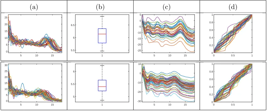
Figure 9: Separation of translation, amplitude, and phase in the Berkeley growth data (top=boys;
bottom=girls). (a) Original functions. (b) Translation. (c) Amplitude. (d) Phase.
as translation or amplitude outliers, we are able to detect some of the strongest events.
We hypothesize that this is due to the events stretching over multiple years, which is not
captured in our annual SST data. In the future, we propose to extend this study using a
multiscale approach, where multiyear SST functions are used for visualization and detection
of amplitude and phase outliers.
3.3
Real Data Study 2: Berkeley Growth Data
The Berkeley growth data is a collection of height growth functions for 39 boys and 54
girls from birth up to 18 years old (Tuddenham and Snyder (1954)). We first transfer
these original growth functions to growth rate functions by taking a derivative. Figure
9(a) shows the original growth velocity functions for boys (top) and girls (bottom). This is
another example where clear warping variability is present in the data; that is, individual
boys and girls have growth spurts (peaks in the velocity functions) at different times. If
this warping variability is not taken into account, the overall structure of the data can be
destroyed when computing summary statistics such as the mean or median. Figure 9 shows
the decomposition of the growth velocity functions into translation, amplitude, and phase
components. We find significant phase variability in both boy and girl groups.
Figure 10 shows the amplitude and phase boxplots for boys and girls. In Figure
(a) (b) (c) (d)
5 10 15 -20 -15 -10 -5 0 -30 -20 0 -10 0 10 5 10 0
20 -5 00 0.5 1 0.2 0.4 0.6 0.8 1 1 0.5 -0.2 1 0 0 0 -1 0.2
5 10 15 -20 -15 -10 -5 0 5 -20 10 0 -10 0 0 10 10 -10
[image:27.612.93.517.68.241.2]20 00 0.5 1 0.2 0.4 0.6 0.8 1 -0.4 -0.2 1 1 0 0.2 0 0.5 -1 0
Figure 10: Amplitude and phase boxplot displays for velocity growth curves in the Berkeley
growth data (top=boys; bottom=girls). (a)&(b) Amplitude boxplot and its surface display.
(c)&(d) Phase boxplot and its surface display.
three being fairly small) and three growth spurts for girls (the first two being fairly small).
The amplitude boxplot for girls (bottom) captures a very interesting source of variability
where growth velocity functions mainly differ in the number and sizes of growth spurts.
For boys (top), the main variability is in the initial growth velocity and the sizes of the
growth spurts. In Figure 10(c)&(d), the phase boxplots show a lot of initial phase
vari-ability in both boys and girls, which stabilizes after approximately nine years of age. This
initial variability shows natural timing variation in growth; for example, the magenta phase
extreme for boys (top) implies that the corresponding boy’s initial growth spurts occurred
earlier than the median, while the last growth spurt occurred at a very similar time to the
median.
We close with a study of amplitude and phase outliers for the boys’ and girls’ growth
velocity functions. Using the proposed framework, boys 11, 22 and 14 were identified as
mild amplitude outliers, and boys 29 and 35 were identified as regular amplitude outliers; no
phase or translation outliers were detected. Figure 11 displays all of the aligned outlying
functions in red with the rest of the data in green. From these plots, we notice that
the outlying observations are significantly different in ‘shape’ from the growth velocity
functions of all other boys. The main difference comes in emphasis and/or deemphasis of
(a) (b)
5 10 15 -25 -20 -15 -10 -5 0 5
5 10 15 -25 -20 -15 -10 -5 0 5
5 10 15 -25 -20 -15 -10 -5 0 5
5 10 15 -25 -20 -15 -10 -5 0 5
5 10 15 -25 -20 -15 -10 -5 0 5 (c) (d)
0.151 0.2 0.25 0.3 0.35 0.4 0.45 2 3 4 5 29 35 11 22 14
[image:28.612.85.525.67.247.2]0.2 0.25 0.3 0.35 0.4 0.45 1 1.5 2 2.5 3 3.5 4
Figure 11: (a) Amplitude outliers: boys 29 and 35. (b) Mild amplitude outliers: boys 11, 22 and
14. (c) Plot of phase (x-axis) vs. amplitude (y-axis) distances of each function in the data from
the median for boys (left) and girls (right). (d) Functional boxplots generated by the method of
Sun and Genton (2011) for boys (left) and girls (right).
curve dataset. In Figure 11(c), we display the phase vs. amplitude distance plots for boys
and girls and highlight the outlying observations. Figure 11(d) gives a comparison to the
functional boxplots of Sun and Genton (2011) on the same dataset. Because of the lack
of separation of amplitude and phase, the given boxplots are harder to interpret than the
proposed method. In particular, it is difficult to separate the variability due to the number
and magnitude of growth spurts (amplitude) and their timing (phase) in the display.
3.4
Real Data Study 3: PQRST Complexes from ECG Signals
The electrocardiogram (ECG) is a diagnostic tool that is routinely used to assess electrical
and muscular functions of the heart and is very popular for diagnosing and monitoring
various heart diseases; thus, studying ECG patterns is integral to cardiac medicine. In
this work, we construct amplitude and phase boxplots for 80 PQRST complexes segmented
from a long ECG signal using the method in Kurtek et al. (2013). The original data came
from the PTB Diagnostic ECG Database (Bousseljot et al. (1995)), which was obtained
from PhysioNet (Goldberger et al. (2000)).
Figure 12 shows the decomposition of the PQRST complexes into the translation,
(a) (b) (c) (d)
0 0.2 0.4 0.6 0.8 1 -1000 -500 0 500 1000 1500 2000 1 0 0.5 1 1.5 2 2.5 3 76 33
0 0.2 0.4 0.6 0.8 1 -500 0 500 1000 1500 2000 2500
[image:29.612.87.518.68.164.2]0 0.5 1 0 0.2 0.4 0.6 0.8 1
Figure 12: Separation of translation, amplitude, and phase in PQRST complexes. (a) Original
complexes. (b) Translation. (c) Amplitude. (d) Phase.
(a) (b) (c) (d)
0 0.2 0.4 0.6 0.8 1 -500 0 500 1000 1500 -1000 0 50 1000 2000 0 1 0.5
-50 0 00 0.5 1 0.2 0.4 0.6 0.8 1 1 -0.2 1 0 0.5 0 0.2 0 -1
Figure 13: Amplitude and phase boxplot displays for ECG data. (a)&(b) Amplitude boxplot
and its surface display. (c)&(d) Phase boxplot and its surface display.
among intervals between the PQRST waves, which corresponds to phase variability of the
PQRST complexes. In addition, the heights of the waves constitute the amplitude
compo-nent. It is clear from Figure 12(c) that the PQRST features are very well aligned in the
amplitude component; this manifests itself in significant phase variability shown in Figure
12(d). Next, in Figure 13, we show the amplitude and phase boxplots. The amplitude
boxplot (panels (a)&(b)) is especially effective at displaying the variability in the heights
of the R and S waves. The phase boxplot (panels (c)&(d)) is harder to interpret in this
case; one of the dominant features is the variability in the initial timing, corresponding to
the P wave of the PQRST complexes.
Finally, we consider outlier detection in this ECG dataset and display the outlying
functions in Figure 14 in red with the original or aligned data in green. We find that
PQRST complexes 3, 76, and 33 are translation outliers, and PQRST complex 33 is a mild
amplitude outlier. This mild amplitude outlier is confirmed by the very high amplitude
distance shown in the phase vs. amplitude distance plot in Figure 14(c). Figure 14(d)
provides a comparison to the functional boxplot of Sun and Genton (2011). Their method
[image:29.612.86.523.217.314.2](a) (b)
0 0.2 0.4 0.6 0.8 1 -1000
-500 0 500 1000 1500 2000
0 0.2 0.4 0.6 0.8 1 -1000
-500 0 500 1000 1500 2000
0 0.2 0.4 0.6 0.8 1 -1000
-500 0 500 1000 1500 2000
0 0.2 0.4 0.6 0.8 1 -500
0 500 1000 1500 2000 2500
(c) (d)
0.2 0.25 0.3 0.35 0.4 0.45 0.5 10
15 20 25 30 35 40
[image:30.612.93.526.66.273.2]33
Figure 14: (a) Translation outliers: complexes 3, 76 and 33. (b) Mild amplitude outlier: complex
33. (c) Plot of phase (x-axis) vs. amplitude (y-axis) distances of each function in the data from
the median. (d) Functional boxplot generated by the method of Sun and Genton (2011).
given functions. For additional real data studies and the computational complexity of the
proposed methods please see the Supplementary Material.
4
Summary and Future Work
In this work, we introduced the concept of boxplot-type visualizations for the translation,
amplitude, and phase components of elastic functional data, allowing for independent
anal-ysis and outlier detection for each component. The proposed method is metric-based and
relies on the geometry of underlying representation spaces. We provided a number of
simu-lation results to compare this method to that of Sun and Genton (2011). Finally, we show
the versatility of the plots in visualizing and detecting outliers in real complex datasets
including annual sea surface temperature, Berkeley growth data, and electrocardiogram
PQRST complexes.
We have identified multiple future directions of research. First, we will formally study
the robustness of the proposed procedure (especially the median amplitude and phase
computation) to various types of outliers. Second, we will theoretically motivate the values
functional boxplots, which are able to display the covariation of amplitude and phase in
functional data. This will require a single ranking procedure for the two components.
Finally, we will focus on defining similar boxplot displays for more complex functional data
including images and shapes of curves and surfaces. In the case of curves, the additional
rotation and scale variabilities in the given data add a layer of difficulty; that is, they also
require a visualization component. In the case of images and surfaces, the Riemannian
geometry of the phase component is much more complicated and requires the development
of novel, computationally efficient tools.
Acknowledgments: We would like to thank the reviewers for their valuable comments,
which greatly improved the quality of this manuscript. This research was partially
sup-ported by NSF DMS 1613054 (to Sebastian Kurtek and Karthik Bharath), and the KAUST
Office of Sponsored Research under award OSR-2015-CRG4-2582 (to Ying Sun).
References
Beg, M. F., M. I. Miller, A. Trouv´e, and L. Younes (2005). Computing large deformation
met-ric mappings via geodesic flows of diffeomorphisms. International Journal of Computer
Vi-sion 61(2), 139–157.
Bousseljot, R., D. Kreiseler, and A. Schnabel (1995). Nutzung der EKG-Signaldatenbank
CAR-DIODAT der PTB uber das Internet. Biomedizinische Technik 40(1), S317–S318.
Chakraborty, A. and P. Chaudhuri (2014). On data depth in infinite dimensional spaces. Annals
of the Institute of Statistical Mathematics 66(2), 303–324.
Cheng, W., I. L. Dryden, and X. Huang (2016). Bayesian registration of functions and curves.
Bayesian Analysis 11(2), 447–475.
Claeskens, G., M. Hubert, L. Slaets, and K. Vakili (2014). Multivariate functional halfspace
depth. Journal of the American Statistical Association 109(505), 411–423.
Dryden, I. L. and K. V. Mardia (1998). Statistical Shape Analysis. John Wiley & Sons.
Febrero, M., P. Galeano, and W. Gonz´alez-Manteiga (2007). A functional analysis of NOx levels: