Improving the product search process through
interface redesign
Christiaan Boersma
[email protected]
Bachelor Thesis
February 2017Creative Technology
University of Twente, Enschede, Netherlands Supervisor: Mariët Theune
Abstract
Contents
1 INTRODUCTION 6
1.1 Overview . . . 6
2 PROBLEM DESCRIPTION 7 2.1 Stakeholders . . . 7
2.2 Scope . . . 7
2.3 Goals . . . 7
2.4 Research Questions . . . 7
2.5 Methods . . . 8
3 ANALYSIS OF THE CURRENT INTERFACE 9 3.1 Interface Description . . . 9
3.2 Evaluation Experiment. . . 10
3.2.1 The Usability test . . . 10
3.2.2 The Questionnaire . . . 11
3.2.3 Interviews . . . 12
3.2.4 Participants . . . 12
3.2.5 Procedure . . . 12
3.3 Results . . . 12
3.3.1 Usability Test . . . 12
3.3.2 Questionnaire . . . 13
3.3.3 Interviews . . . 14
4 LITERATURE 16 4.1 Tables . . . 16
4.2 Text . . . 16
5 REQUIREMENTS 17 6 MOCK-UPS 18 6.1 Mock-up 1: Suggested Functionality . . . 18
6.2 Mock-up 2: Interchanging Columns . . . 18
6.3 Mock-up 3: Interchanging Rows . . . 19
6.4 Mock-up 4: Slow Matching . . . 19
7 Suggested Interface Improvements 21 7.1 Space and Layout Improvements . . . 21
7.2 Workflow Improvements . . . 23
7.3 Consistency Improvements . . . 26
8 The Prototype 28 8.1 Prototype Description . . . 28
8.2 Prototype Analysis . . . 29
8.2.1 Usability test . . . 30
8.2.2 Questionnaire . . . 31
9 Discussion 34 9.1 Planning. . . 34 9.2 Methods . . . 34 9.3 Participants. . . 34
10 Conclusion 36
10.1 Future Work . . . 36
11 Acknowledgements 37
12 APPENDICES 39
Appendix I: Test Data 39
Appendix II: Questionnaire Current interface 42
Appendix III: Questionnaire Prototype interface 47
List of Tables
I Statistics generated from the usability test . . . 13
II SUS score each participant gave the interface . . . 14
III Overview of familiarity with the interface and which participant tested which interface. . . 30
IV Statistics generated from the usability test of the prototype interface . 31 V Comparison of the current interface and the prototype . . . 32
VI SUS score comparison . . . 32
List of Figures 1 The current matching interface used by Mydatafactory. . . 9
2 Partial screenshot of a heatmap generated by GazeRecorder (Deja 2016) during a test. . . 11
3 Picture of the usability test setup when used at Mydatafactory . . . 11
4 Partial screen shot of mock-up 1 Suggested Functionality . . . 18
5 Close-up of mock-up 2 Interchanging Columns . . . 19
6 Close-up of mock-up 3 Interchanging Rows . . . 19
7 Image of mock-up 4 Slow Matching, Alternatives Down . . . 20
8 Image of mock-up 4 slow Match, Alternatives Up . . . 20
9 Illustration of the fast layout design . . . 21
10 Illustration of hiding and showing of the excessive cell content. . . 23
11 Illustration of the pop-up function. . . 23
12 The fast layout of the prototype interface. . . 29
13 The slow layout of the prototype interface. . . 30
1 INTRODUCTION
Mydatafactory is a company that specializes in data matching and data cleansing. Founded in 2009, Mydatafactory operates in the data management domain. My-datafactory provides services that cleanse existing product databases, meaning they remove errors and standardize notation of product data (e.g. “10 mm” or “10.0 mm” becomes “10mm”). Mydatafactory also provides a tool for product matching, meaning that the clients of Mydatafactory can search and match the products they or their clients need against their own or their supplier’s database. This enables clients of Mydatafactory to order supplies more easily, by running an entire list of parts and products through the search engine in one go. Mydatafactory strives for clean, error free product data (e.g. name, size, material, manufacturer, part number, etc. of the products) and fast and easy product matching. Mydatafactory’s clients include Shell (oil company) and ERIKS (supplier of industrial components and products).
Automatically matching these desired products, orlocal articles, to actual products, called master articles, is a difficult process. There are many different brands, having many different products and product types, with many different attributes between products and product types. Not to mention differences between the notations of product attributes and differences in units of measurement, such as foot and meter. Next to these differences there is the possibility of human error made when the master article data was entered into the database or when the local article data was written. Therefore it is necessary to manually check if the search results are indeed the required products. To accomplish this they use a so called matching interface.
Checking all these local articles (±1000 - 10.000 per client list in ERIKS’ case) against matched products is a repetitive and labor intensive job. By redesigning the matching interface, it might be possible to make the matching process easier, faster and less of a burden for the user.
The goal of this research is to improve the design of the product match interface in such a way that it best suits the user. The user should be able to match the local article to the desired result as easy and as fast as possible, without getting tired too soon. At the end of the project there should be a working prototype and a list of recommendations for Mydatafactory.
1.1 Overview
2 PROBLEM DESCRIPTION
Mydatafactory believes that the current matching interface (Figure 1) is not optimal in use and user-friendliness. If the matching-interface is not optimal, then neither is the matching process, meaning it takes more time to complete than it should. The matching-process takes up a lot of valuable time and resources and is therefore rather expensive. Mydatafactory believes that the current matching process could benefit a lot from a redesigned interface when it comes to efficiency, productivity and reduction of cognitive load. A new interface design could help the user to match local articles to master articles faster. The redesign could also reduce the strain on the eyes and mind of the user, making the repetitive process less tiring.
2.1 Stakeholders
This project has multiple stakeholders, namely Mydatafactory and the clients of Mydatafactory. Mydatafactory would benefit from a better interface and faster matching process, since it would increase the attractiveness of their products and services. The clients of Mydatafactory are the companies, especially their employees, who use the system to find and order the parts and products they need. Some employees use the interface every day to do their job. Mydatafactory and its clients want to see an improved and tested user-interface, which reduces the time it takes to match an entire local article list and also reduces the cognitive load on the user.
2.2 Scope
Due to time constraints the scope of this research will be limited to the matching interface and matching process only. The manual search, called manual look-up by Mydatafactory, for the correct product match, when the search engine fails to find the correct master article, will be outside the scope of this project. The matching process starts when the search results of the matching engine are shown to the user and will contain multiple cycles of product matching. Each cycle ends when either the product is matched with one of the results or a manual look-up is initiated. Batch processing, reordering the match results in such a way that the matches which are most likely correct appear on top and other sorting and filtering tactics will also be outside the scope of this project. The scope of this project solely focuses on matching a local article to a master article.
2.3 Goals
The main goal of this project is to improve the current matching interface and deliver a working prototype of the improved interface. Along with this prototype, Mydatafactory will receive this report which explains the issues of the current matching interface and how they could be solved.
2.4 Research Questions
Main Research Question: How can an interface redesign increase efficiency, productivity, attention span and usability of the interface during the matching process?
Sub-Research Question 2: Which interface functions/features could increase efficiency during the matching process? This means functions/features that allow a decrease in time, effort and energy needed to match a product with a local article.
Sub-Research Question 3: How can interface design improve the reading and searching speed of the user? For example, which combination of front and background color, typeface, font size and weight and other factors might increase the users reading speed?
2.5 Methods
Since the interface should help the user to match local articles to master articles faster, the interface will be designed with the user in mind, the so calleduser centered design method. “ ‘User-centered design’ (UCD) is a broad term to describe design processes in which end-users influence how a design takes shape.” (Abras, Maloney-Krichmar, and Preece 2004). This means that the end users are involved in the design process, one way or another. Abras, Maloney-Krichmar, and Preece (2004) suggest seven techniques to involve users in the design process. From these techniques three are used in this study, these are:
• Background Interviews and questionnaires
In order to collect data related to the needs, desires and expectations of the user.
• Usability testing
Generating qualitative and quantitative data about the use of the interface.
• Interviews and questionnaires
Collecting user satisfaction and other qualitative data, especially important after a usability test with a prototype.
3 ANALYSIS OF THE CURRENT INTERFACE
In order to design a new interface, we first need to find out how the current interface is used and which strengths and weaknesses it has. The results of the analysis will then serve as a benchmark against the coming prototype against the current interface. This way we can measure if the prototype is an improvement on the current interface and process. Evaluating the current interface will be done through task driven usability tests, questionnaires and interviews with the users, after which a new interface will be designed based on the evaluation results and literature research. Finally a prototype will be built and bench-marked against the current interface. The prototype will be evaluated using a similar approach to compare its performance to the current interface.
3.1 Interface Description
When starting the program you are asked to select the master article database of the supplier or manufacturer. After the database has been selected, the list of local articles from the client of the supplier or manufacturer can be loaded. You are then able to view this list of local articles and select the local articles and/or attributes you wish to match to the master articles. These master articles contain all the information the supplier or manufacturer needs to deliver the correct products.
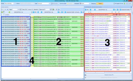
Fig. 1: The current matching interface used by Mydatafactory.
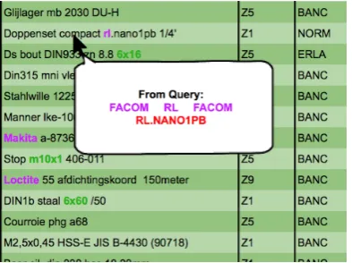
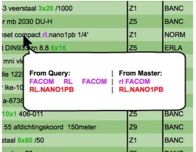
[image:9.595.82.517.379.642.2]the best match and 29 other alternatives to the selected local article (Figure 1 Section 3). These alternatives can be set as best match by double clicking them. After the user has determined that the local article is matched to the correct master article, he or she can check the box of the corresponding row (Figure 1 Section 4) to confirm the match is correct.
The current interface has several features which help the user match products faster and easier. The interface uses bold highlighted text to quickly show the user the criteria on which a product was found. In Figure 1 bold red, purple and green text can be found. These different colors have different meanings within the interface. Red bold text means there is a match on a unique identification number (UID). This can either be a manufacturer part number, barcode, or some other sort of identification number. Purple bold text means the search engine found a manufacturer or brand name within the local article text. Green bold text means the search engine found some sort of measurement or dimension of an article. Section 3 of Figure 1 also contains not bold colored text, which means those articles (either colored blue or green) are preferred articles by the client of Mydatafactory. The highlighting of these products is determined by the client and therefore different for each client of Mydatafactory.
Many rows also have background colors applied to them, the most obvious being the blue background for local articles and green backgrounds for the best matches. In section 3 of Figure 1 however a red background might occur. The default conditions for the appearance of the red background means the product is matched on a UID as well as a manufacturer or brand name. This default setting can be changed by the user to meet other requirements. If a local and master article meet these set requirements, they are also automatically checked as a correct match by the system.
3.2 Evaluation Experiment
Before an improved interface can be designed and built, it is necessary to know how the current users use the interface. Knowing problems, time consuming processes and other constraints users encounter within the interface, is key during the design process. The experiment consisted of three main parts: a questionnaire, a usability test and an interview.
it forward. The process of matching one local article to one master article starts when the screen is loaded and stops when the match is made. The next cycle starts immediately after the match was made. To limit the amount of difference between the usability tests, as many factors as possible were kept the same. During every test, the same hardware setup, the same data source and the same search engine were used.
Fig. 2: Partial screenshot of a heatmap generated by GazeRecorder
(Deja 2016) during a test.
Eye Tracking: To get the most out of the usability tests, eye tracking software was used to capture everything the user looks at. This way it is possible to find view patterns, focus points as well as unconscious glances. From these patterns, focus points and glances, could be determined how the user uses the interface. Eye-tracking soft-ware by Szymon Deja (Deja 2016), called ‘GazeRecorder’, was used to track the eyes of the user during the matching process. GazeRecorder uses a simple webcam to track and record what part of the screen the
user was looking at and then produced a heat map based on this data (Figure 2).
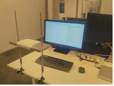
Fig. 3: Picture of the usability test setup when used at Mydatafactory
In order to keep the usability test sessions as constant as possible, every participant used the exact same setup. Since some of the testing took place at Mydatafactory and some at ERIKS, a client of Mydatafactory, at their location in Eindhoven, the entire setup (Figure 3) was brought to Eindhoven to keep most variables constant. The setup consists of a 27 inch monitor connected to a laptop which handled the programs needed to run the matching process and data capturing software and hardware. A web cam placed on top of the monitor recorded the participant’s eyes for the eye tracker software. After the pilot test it became clear that a headrest was needed to keep the participant’s head steady in order to improve eye tracking results.
[image:11.595.322.518.203.297.2] [image:11.595.84.281.400.548.2]3.2.3 Interviews The goal of the interviews was to get feedback directly from the user. The interview enabled the user to elaborate and address parts of the interface that they thought needed improvement or should be left as is. It is possible some of these points might not have been found by the questionnaire or usability test. The interview questions were based on the choices a participant made during the usability test and the questionnaire, therefore there was not a predetermined list of questions.
3.2.4 Participants In total there were six participants, all male, three from Mydatafactory and three from ERIKS. One of the participants from Mydatafactory was a novice user. With this user a pilot test was run. From this pilot it became apparent that a headrest was needed to keep the participant’s head steady during the usability test, in order to produce better eye-tracking results. The pilot test was not included in the results. From the other five participants, three were very familiar with the interface. They had worked a lot with it and knew its functions very well. From these five participants, the participants from ERIKS use the interface almost on a daily basis.
3.2.5 Procedure Every participant did the experiment once and completed it in one go. The experiment started with the first part of the questionnaire, which included the informed consent form and a few experience related questions. When the participant finished the first part, he received information and instructions for the calibration of the eye-tracking setup and the usability test. After this the participant was asked to calibrate the eye-tracker and perform the usability test. When the usability test was completed, the participant was asked to fill out the remainder of the questionnaire, containing the questions specific to the interface design and functioning. During the usability test and the final questionnaire the participant was asked several questions related to choices he made and behavior he showed.
3.3 Results
Analysis of the data should help determining the strengths and weaknesses that the current interface has. When the strengths and weaknesses are known, solutions can be made and the design process can start.
3.3.1 Usability Test In total five usability tests were conducted, with the current interface, including the pilot test. The computed results of the remaining four tests can be found in Table I. As can be seen in Table I it takes 27 seconds on average to match one local article to a master article. Considering the fact that the queries presented to the participants were chosen to contain as many styles and types as possible, meaning the local articles are relatively hard to match, 27 seconds is still a lot of time to match only one product. In those 27 seconds the participants’ eyes went an average of 3 times from left to right and 2.5 times from right to left (Figure 2). This may not seem like much, but it results in a viewing distance of 123.6 cm from left to right and 101.2 cm from right to left per product.
From the table it can also be seen that the participants either use the hotkeys to change the match status or use the mouse (the right click menu).
Observations
Participant 1 2 3 4 Average
Match statistics:
Rows Matched 68% 64% 68% 76% 69%
Rows Left Open 32% 0% 0% 12% 11%
Rows With Other Statuses 0% 36% 32% 2% 22%
Manual look-up used 8% 24% 4% 12% 12%
Time:
Duration Matching 00:05:23 00:13:48 00:11:57 00:14:01 00:11:17 Duration in Manual Look-up 00:01:31 00:03:12 00:00:08 00:03:06 00:01:59 Duration in Matching Interface 00:03:52 00:10:36 00:11:49 00:10:55 00:09:18 Average Duration/Match 00:00:13 00:00:33 00:00:29 00:00:34 00:00:27
Eye-tracking:
Number of Left to Right (L-R) Gazes 38 70 118 83 77,25 Number of Right to Left (R-L) Gazes 28 55 101 69 63,25 Average L-R/Match 1.52 2.8 4.72 3.32 3.09 Average R-L/Match 1.12 2.2 4.04 2.76 2.53 Total Distance 2640cm 5000cm 8760cm 6080cm 5620cm Distance/Match 105.6cm 200cm 350.4cm 243.2cm 224.8cm
Times Horizontally Scrolled 0 14 0 2 4
How status was changed:
Double clicking Alternative Match 52% 24% 68% 36% 45% Manual Look-up Match Result 0% 16% 0% 2% 9%
Pre matched 16% 16% 16% 16% 16%
Checkbox Checked 0% 8% 0% 12% 5%
Right Click Menu Used 0% 36% 0% 8% 11%
F-shortkey Used 0% 0% 28% 12% 1%
Clicked Next Row 44% 16% 4% 12% 19%
TABLE I: Statistics generated from the usability test
use the entire alternative list, when asked they said they did it because it was there already, so they might as well use it. While others simply relied on the search engine to locate the correct one within the first five results, assigning another status such as NIG (Niet In Gamma, not in product range),
There was also a very particular way the participants were looking back and forth between the local articles and the matched master articles. They start with a fixation on the local article, probably trying to remember the name and the numbers listed, then they switch to the matches trying to locate those name and numbers. When the data they are looking for is not highlighted or within the first 3 or 4 alternatives, the ‘ping-ponging’ starts: they focus on the alternatives and quickly go back and forth between the local article and the master articles, re-remembering the initial data. The act of going back and forth and then re-remembering the data, is likely to be a tedious and mentally demanding task.
Further analysis of the questionnaire indicated that for the current interface:
• The use of color for both background and highlighting was preferable and might
even be extended to include more.
• All the participants indicated that sufficient information was present in the
interface, but three participants thought they had to perform too many actions to find the relevant information.
• They had sufficient knowledge and once matches were made, all four participants
were confident about their choices.
• All sections of the interface were easily identified. • Text in all sections was neither easy nor hard to read.
The other questions of the questionnaire were related to possible new functionality. The functionalities that received positive feedback were illustrated in with more detail in the mock-ups (section 6) and some later implemented in the prototype (section 8).
Participant 1 2 3 4 SUS Score 52,5 42,5 62,5 57,5
TABLE II: SUS score each participant gave the interface
3.3.3 Interviews The interviews were the most helpful part of the experiment. They gave the participants the opportunity to give their own suggestions about improvements. From a preliminary talk with two users from ERIKS it became very clear that the
usability problems the current matching interface has, are being worked around or optimized in ways the interface is not intended to be used. At their company they first apply filters to create small batches of queries with similar attributes. These filtered products are then matched, after which they apply different filters to create the next batch of products.
In addition to this short conversation there were individual interviews with the participants and a group session with the participants from ERIKS. Since the points mentioned in both the individual interviews and the group session are overlapping they are combined into one list. Although most of these suggestions are new and might improve the matching process, some of these suggestions could be seen as bug-fixes and consistency issues.
New suggestions
• One single value causes an entire column to be shown. This creates a lot of empty
space, resulting in large view distances.
• Matches made while a filter was in place, might show up later in the matching
process. Hiding these matches is preferable.
• A possibility to select multiple rows in order to change the status of those rows
at the same time, would be useful.
• Unable to copy the data in the table cells.
• The blue text color in the alternatives section has no added value. The amount
of blue makes the black text pop out, also not desired.
• Quick filter at the top of the alternatives list, allowing the user to search through
the 30 alternatives for a specific word or id.
be rerun in order to continue matching. Not saving might result in progress loss as well, when the connection is lost or interrupted.
• The pre-matched results should not be saved in between saves, if they have not
yet appeared to the user
• Rerun the search on a small selection, with adjusted parameters
Bugs
• Emptying a filter after it was used hides all the data and requires a new search
initiation to reappear.
• The interface is lagging when a lot of check boxes are checked in a short time,
probably because the alternatives list is updating.
• Color all instances of the ’matched on’ data.
Consistency Issues
• Automatically going to the next line when the status of a product is changed
to something other than ’Match’, currently only happens when the status is set to ’Match’.
Other comments
These were also found during the conversation and are useful for Mydatafactory, but outside the scope of this project.
• When selecting the source scope, selecting which columns of the local article
data should be used by the search engine, it is unknown how many values a certain column has. It is desired to know these values.
• The persistent search queries in the manual look-up are useful. • Adding a preferred brand to the search parameters.
4 LITERATURE
In order to design the best prototype possible, a literature study was done into several aspects of a search and matching interface, as well as interface design in general and the effects of color and text font when reading text off a screen. This literature study was then used as a guideline during the design of the new interface. When searching for and comparing data in a digital environment, there are certain these guidelines can support the user with his/her task.
4.1 Tables
It is shown that when it comes to tables and table searches, lines separating columns and rows can influence reading and information retrieval speed (Wu and Yuan 2003). It was found that, depending on the search direction, lines can help improving search speed. If the search goes column by column, then there should be lines between the columns, if the search goes row by row, then there should be lines between the rows. When the search can go both ways, there should not be any separating lines.
4.2 Text
Since the matching interface is a text based interface, it is useful to know which typeface, typeface size and color combination is optimal to increase reading speed and comprehension of the data. Garcia and Caldera (1996) investigated the effects of typefaces and typeface sizes on reading speed. They concluded that typeface Arial at 12 characters per inch (cpi) provided the best results, although it was not always the preferred choice.
According to Wu and Yuan (2003) reading speed is higher when foreground luminance is lower than the background luminance (FL < BL), but the visual preferences of the participants was higher for higher foreground luminance with lower background luminance (FL > BL). This means that the lightness of the background color should be lighter than the color of the text for faster reading speed, but the other way around is preferred by the participants of Wu and Yuan’s test.
5 REQUIREMENTS
There are certain requirements that the new interface should fulfill. Mydatafactory would like the new interface to be more efficient and faster in use. The new interface should be easy and intuitive to use, yet still contain all the options and features of the current interface, such as sorting and color highlighting, since different users use different features. Also new features could be implemented, if they speed up the product matching process. The requirements listed here are a combination of requirements from Mydatafactory and requirements found through testing and interviews.
Requirement 1:
The interface should be able to display all relevant attributes in a understandable and clean way.
Requirement 2: The interface should allow the user to quickly see where and on which data(type) a product is matched.
Requirement 3: The interface should bring the number of steps and actions it takes to find and match to the local article with a product down to a minimum.
Requirement 4: The interface should reduce the amount of time the user needs to match a product.
Requirement 5: The interface should reduce the amount of effort needed from the user as much as possible.
Requirement 6: Behavior of the interface should be as expected by the user.
6 MOCK-UPS
Fig. 4: Partial screen shot of mock-up 1 Suggested Functionality This chapter discusses several matching
interface mock-ups. Mock-ups are a visual representation, sometimes with a little functionality, of an idea or design. The mock-ups are meant to give the user a better understanding of certain ideas and functions. The mock-ups discussed in this section are based on the results of the first usability tests conducted at Mydatafactory, recommendations and requirements from Mydatafactory and own ideas. They were later shown to the participants of the last three usability tests right after they completed their tests at ERIKS. Feedback from the participants was gathered by asking them what they thought about the
ideas and functionality proposed in the mock-ups. The feedback received from the three participants is also included in this section. Full images of the mock-ups can be found in appendix IV.
6.1 Mock-up 1: Suggested Functionality
• Description
Mock-up 1 does not feature any layout changes (Figure 4). The functionality consisted of the ’Pop-up Query’, which shows the local article data underneath the mouse when the mouse hovers over the master article data, individual scroll bars for the three sections and an easier way to organize and show or hide columns. What each functionality does exactly is explained in more detail in section 7.
• Feedback From Participants
The proposed functionality was well-received by the participants. They were very excited about the pop-up functionality, since it has the potential to significantly decrease the time and effort needed to match products. The individual scrolling sections was not something they had thought of themselves before, but when explained to them they agreed it would be a welcome improvement. The simplifying of column sort and hiding is very useful according to the participants, but the way proposed in the mock-up, via an additional menu, might not be the way to go, since it uses another menu and there are already enough menus. A better way to achieve this functionality might be a drag and drop method, dragging the column to its preferred location.
6.2 Mock-up 2: Interchanging Columns
• Description
[image:18.595.315.514.135.280.2]‘Description 1 NL’ from the local data, with next to that the ‘Description 1 NL’ from the master data or best match. This continuous until all columns are displayed. See Figure 5 for a partial screen shot of the mock-up.
• Feedback From Participants
The first reaction of the participants showed interest in the concept, but when they started to think about it a little bit more, they all agreed it probably would not work as well as the current layout. They thought it would easily confuse, since the two distinct sections, local articles and master articles, are now mixed.
Fig. 5: Close-up of mock-up 2 Interchanging Columns
Fig. 6: Close-up of mock-up 3 Interchanging Rows
6.3 Mock-up 3: Interchanging Rows
• Description
This mock-up is similar to the interchanging column mock-up, with the minor difference that this mock-up interchanges the rows. Meaning it first shows the entire row of the local article, then the entire row of the best matching master article, after which a new local article row is shown (Figure 6).
• Feedback From Participants
This mock-up was immediately shot down, none of the participants liked it, they all thought the interchanging rows would only lead to confusion and more human error since there is no clear sectioning.
6.4 Mock-up 4: Slow Matching
• Description
[image:19.595.85.282.225.385.2] [image:19.595.317.519.226.377.2]visible. When the status of the local article changes, it should automatically go to the next one, showing only that one at the top.
• Feedback From Participants
The participants liked this idea a lot, especially when during the discussion it came up to make this interchangeable with (a variation on) the current layout, which is more suitable for the fast matches.
Fig. 7: Image of mock-up 4 Slow Matching, Alternatives Down
[image:20.595.314.512.205.388.2] [image:20.595.81.273.207.386.2]7 Suggested Interface Improvements
Fig. 9: Illustration of the fast layout design
From the analysis of usability tests, ques-tionnaires, interviews and conversation with the participants from ERIKS about the mock-ups, several problems with the inter-face could be identified. These problems can be divided into three main categories: ‘space and layout problems’, ‘workflow problems’ and ‘consistency problems’. In order to im-prove the matching interface and process, these problems need to be solved. In this chapter these problems and their suggested solutions will be discussed.
7.1 Space and Layout Improvements
The suggested improvements listed here either change the layout of the interface or optimize the use of screen space within the interface.
Multiple Layouts
• Problem
Based on interviews and conversations with users of the matching interface, it became clear that there are two types of matching modes, fast matching and slow matching. First there are the easy matches. These matches can be checked very fast. Beside these there are the slow matches. These matches are either matched incorrectly by the engine, need more information or cannot be matched because there is no product for them. These matches take more time and effort to go through.
These two matching modes each require a different approach. The fast matching relies heavily on the local article section and the best matched master article section of the screen, while the slower matching relies more on the local article section, the alternative section and the manual look-up. Since the two different modes utilize different parts of the screen, it makes sense to reorganize the screen based on the type of matches being made.
• Fast match layout
The fast match layout is mainly focused on the local article and best match section. It will minimize all the other components on the screen to minimize distractions. To speed up the matching process as much as possible, the order of the local article columns might be reversed. By doing so the distance between the columns containing the most valuable information decreases, such as ’Description 1 NL’ which is the main description of both local and master articles, allowing for less back and forth looking and faster matching (Figure 9).
• Slow match layout
[image:21.595.321.517.132.261.2]stage, it would be useful to hide or minimize it, removing the distraction it might cause. A suggestion might be to move the alternative section under the first line of the local article section (Figure 7 & Figure 8). This reveals the full width of the alternative section and all the information it contains. It also reduces the distance between the description of the local article and the description of the alternatives.
Hide empty columns based on page
• Problem
The current interface hides empty columns, but only across all search results. The downside is that, when there is one value in the entire column, the column is shown on every page, resulting in valuable screen space being lost on almost every page.
• Possible Solution
Checking for and hiding empty columns on a page to page basis reduces the use of space on pages where the column would be empty, while still showing the information when necessary and keeping the structure of the information intact.
Independent scrolling of local article and master article sections
• Problem
With the current interface the local article and the best match section vertically and horizontally scroll as one. Only vertical scroll is desired by the users, since this keeps the rows correctly aligned. Horizontal scroll however is not preferable. When you horizontally scroll the best match section to view additional attributes, the local article section should remain stationary in order to check the values against each other.
• Possible Solution
Make both the local article section and best match section independently scrollable; this way not only the local article section will remain on screen when scrolling, but also allows for better positioning of the best match section.
Hide validated rows
• Problem
The current interface keeps showing validated products in a grayed out state when filters are applied. This also works the other way around: when products are validated with a filter in place, after removal of the filter the validated product remains visible in a grayed out state. These grayed out products use space that could also have been used to display other products. Currently these products can only be hidden by rerunning the matching process, which, depending on the number of queries, could take up a lot of time.
• Possible Solution
Hide excessive cell content and show on mouse over
• Problem
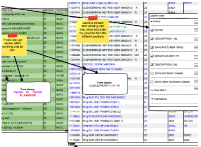
Most of the time the values in the cells are short and concise, however sometimes they are very long and take up a lot of space when the column stretches to fit the text, leaving a lot of unused space above and below that particular cell. It also forces the user to manually shrink the column width because of one cell value, simultaneously hiding its information (Figure 10)
• Possible Solution
Showing the information on mouse over, will minimize the loss of space, remove the time needed to re-size the columns but still have all the data present when needed. This saves space while all information is still easily accessible when needed (Figure 10).
Fig. 10: Illustration of hiding and showing of the excessive cell content.
Fig. 11: Illustration of the pop-up function.
7.2 Workflow Improvements
The suggested improvements in this section are aimed at supporting the user by reducing the number of actions needed to validate a match, automating or simplifying tedious tasks and speeding up the general matching process.
Pop-up Query
• Problem
From the eye-tracking results it was found that the user often goes back and forth between the local article section and the best match section or alternative section. The user is checking and rechecking the local article values against the matches.
• Possible Solution
[image:23.595.85.279.292.449.2] [image:23.595.322.519.298.445.2]Autosave
• Problem
Currently the matches are only saved when the save button is pressed. When the connection to the application is lost or interrupted all matches that have been made are lost. Although internet connections are quite stable at the moment, any interruption could cause this to happen, resulting in loss of data and loss of time.
• Possible Solution
Implementation of autosave function either after every status change, page change or every few minutes, would resolve this issue.
Google/catalog search button
• Problem
Sometimes a user does not know what product or type of product is being matched. During an interview it was suggested a search button might help. This button would open a browser window and search the local article data either on Google, or the company catalog.
• Possible Solution
Incorporate a button which automatically launches a local article related Google or catalog search.
Auto/fast fill manual look-up and filters
• Problem
When users are performing a manual look-up for a local article, they manually type text in the search fields. Most of the time, the text they typed in the search fields is the same as parts of the text in the local articles. This makes the act of filling in the search fields a very tedious and unnecessary job.
• Possible Solution
A auto or fast fill function for the manual look-up fields. If the user is able to select (parts of) the local article and then drag and drop or use a hotkey to fill the search field with those selected parts of the local article, it would speed up this process. This method could also be used to enter values into the filter areas.
Select to filter
• Problem
The same sequence of actions as described above can be used to initiate quick filters. Sometimes the user gets a local article with a very specific attribute. If this attribute is missed by the matching engine, the user can decide to filter the alternatives list first rather than performing a manual look-up.
• Possible Solution
Clear search fields button
• Problem
When asked, the participants from ERIKS stated that it was a good thing that the search fields remained filled; this fits in their work flow of batch processing. Many of the same types of products are matched in sequence, only a detail differs, therefore the manual look-up entries more or less stay the same. However sometimes it is necessary to empty the search fields, and a button would save time in this instance.
• Possible Solution
Add a button or hot key which does this for the user or select the entire contents of the search field when it is activated.
Bulk value change
• Problem
Especially with the fast matches the user can often validate a lot of rows in the same way. From the interview it became apparent that rather than checking and changing the status, the user prefers to check many rows and then change them all. With the current interface this results in a very long response time, since for every status change the interface loads the next alternative list
• Possible Solution
Adding support for row selection and multiple status changes based on that section.
Show number of values on source scope selection
• Problem
The source scope selection determines which columns for the local article data are used when searching for master articles. During the interviews it was mentioned that it was impossible to know how many values a certain column contained before running the matching engine. Knowing these values might help the users when choosing which columns to use for the matching engine.
• Possible Solution
Since the data source is chosen before the matching interface is entered, it should be possible to display the number of values per column when the user is determining the source scope.
Be allowed/able to copy info in the cells
• Problem
Currently it is impossible to select and/or copy data displayed in the matching interface.
• Possible Solution
7.3 Consistency Improvements
Consistency improvements are improvements to already existing functionality or features. The existing functionality or features mentioned here are very useful, but incomplete.
Go to next row on status change
• Problem
This function is already partially implemented. When a match is made, either via the check box, double clicking an alternative match or manual look-up, the interface automatically goes to the next row. From the interviews it became apparent that this behavior is also desirable when the status is set to other values such as: MIN (More Information Needed) or NIS (Niet In SAP, meaning the product should be available, but it is not found). The different statuses can be set by using hotkeys and a right-click menu. In both instances it should jump to the next row
• Possible Solution
Expand this functionality to include status changes via hotkeys or the right click menu.
Report button for bad data
• Problem
This button is specifically aimed at the master data (the data against which the queries are matched). When mistakes in this data are found, they need to be corrected. Mistakes in the master data need to be reported to Mydatafactory. A report button could be used to mark this particular piece of data and allow the user to continue matching. The mistakes can then be sent to Mydatafactory every few days to be corrected
• Possible Solution
A button at the end of every master data row which would add the necessary data to a file or data, which would then be sent to Mydatafactory.
Color all instances of the ’matched on’ string
• Problem
Currently only one instance of a part of text the products are matched on is highlighted through color.
• Possible Solution
Color highlight all instances of the ’matched on’. This will result in faster validation of the match, since currently most of the highlighted instances are at the end of the row, probably due to reverse order highlighting, meaning the highlighting starts at the last column and only highlights one instance.
Empty filter shows all results
• Problem
removing the filter. Only a rerun of the matching engine would make them reappear.
• Possible Solution
Fix this bug by having all the unvalidated local articles reappear.
8 The Prototype
The prototype is meant to test if the findings from the tests, interviews, questionnaire and other sources discussed in chapter 7 actually work and improve the matching process. Since Mydatafactory has ambitions to move to a web application, it was chosen to build a web-based prototype. It also became apparent that Mydatafactory was looking into KnockoutJS as a Javascript framework for the interface. For that reason knockoutJS was used for the implementation.
8.1 Prototype Description
Since not all functionalities mentioned in chapter 7 are relevant or can be tested using the usability tests conducted for this project, not all functions have been implemented into the prototype.
Functionality that has been implemented:
• Multiple Layouts
• Hide empty columns based on page (For the test the empty columns were
removed manually, since it concerns a small dataset)
• Independent scrolling of local article and master article sections • Hide excessive cell content and show on mouse over
• Pop-up Query • Select to filter
• Be allowed/able to copy info in the cells • Go to next row on status change
• Color all instances of the ’matched on’ string • Empty filter shows all results
The following functionalities have not been implemented in the prototype, since they do not directly influence the usability tests or can’t be tested using the current setup:
• Hide validated rows. This functionality is meant to prevent the displaying of
validated rows when filters are in place or removed. However filter functionality does not exist in the prototype. It is useless since there is only one page to match. Since there is no filtering there is also no need to hide validated rows.
• Autosave. This functionality is meant to prevent data loss in case of connection
failure. The prototype is hosted locally, meaning there is no connection to a server. So there is no risk of data loss.
• Google/catalog search button. Searching for products other than the given
options is out of the scope of this project.
• Auto/fast fill manual look-up and filters. Manual look-up is not present in
the prototype.
• Clear search fields button. This is meant for manual look-up search fields,
but manual look-up is outside the scope of this project and therefore not present in the prototype.
• Bulk value change. This is meant for pages where (almost) all rows can be
• Show number of values on source scope selection. No scope can be selected
within the prototype.
• Report button for bad data. Although the test data might have contained
mistakes, it would not have been useful to use this function during such a small usability test
Fig. 12: The fast layout of the prototype interface.
Screen shots of the two different layouts can be found in Figure 12 and Figure 13. In chapter 4 it was discussed which typefaces, color and table designs would increase reading and searching speed. The elements discussed in chapter 4, such as typeface Arial at cpi 12 for optimal reading performance, are also implemented in the prototype. Furthermore it was chosen to keep the colors of the different sections the same as in the current interface, as well as the colors for the highlighting of the important pieces of text. This was chosen because the users were already very familiar with these colors and their meaning, changing the colors would probably only lead to confusion among the participants.
The slow layout of the prototype interface (Figure 13) has changed slightly since the mock-up, the section with alternative matches is permanently overlapping the local article section and best match section, instead of being ‘pulled-up’ when needed by the user. This permanent overlap was introduced to reduce the amount of actions, clicking to pull it up, and reduce the distance between the local articles and the alternative master articles. This did create the need, and extra action, to scroll to the next row every time a match was made or a status is changed. To eliminate this extra action a new auto-scroll functionality was introduced. This auto-scroll functionality centers the active row in the middle of the section, eliminating the need to scroll.
8.2 Prototype Analysis
[image:29.595.85.516.183.358.2]Fig. 13: The slow layout of the prototype interface.
slightly altered to focus more on the prototype and how the changes are perceived by the user, instead of what they want to have changed. The changed questionnaire can be found in section III. Next to these questions, the user will be asked to switch from the ‘fast-layout’ (Figure 12) to the ‘slow-layout’(Figure 13) after row twelve. Not all participants tested both the current and the prototype interface, one participant from ERIKS only tested the current interface, and one participant from Mydatafactory only tested the prototype interface. An overview of familiarity with the interface and which participant tested which interface can be found in Table III.
Participant 0 (pilot) 1 2 3 4 5
Familiarity New Familiar Very Familiar Very Familiar Very Familiar Familiar
Tested Current Interface Yes Yes Yes Yes Yes No
Tested Prototype Interface Yes Yes Yes Yes No Yes
TABLE III: Overview of familiarity with the interface and which participant tested which interface.
8.2.1 Usability test The usability tests were conducted the same way as the usability test of the current interface, with the addition of an explanatory introduction about the functionality of the prototype interface. During this introduction all new functionalities of the interface were shown and explained to the participants, to make sure they know they exist and how they work before they do the usability test. Everything else is still the same as the previous usability tests, the same equipment and product data. Keeping the data the same was not an issue, since there was more than a month between the usability tests done by the user. The results of the usability test are shown in Table IV. With participant 3 there were technical difficulties which prevented the gathering of eye-tracking results.
[image:30.595.79.513.95.284.2]Participant 1 2 3 5 Average
Match statistics:
Rows Matched 52% 56% 80% 56% 61%
Rows Left Open 48% 44% 20% 44% 39%
Time:
Duration in Matching Interface 00:04:46 00:10:40 00:15:40 00:07:58 00:09:41 Average Duration/Match 00:00:12 00:00:26 00:00:38 00:00:19 00:00:24
Eye-tracking:
Number of Left to Right (L-R) Gazes 45 38 - 64 49 Number of Right to Left (R-L) Gazes 13 30 - 63 35.3
Average L-R/Match 1.8 1.52 - 2.56 1.96
Average R-L/Match 0.52 1.2 - 2.52 1.41
Total Distance 2320cm 2720cm - 5080cm 3373cm Distance/Match 92.8cm 108.8cm - 203.2cm 134.9cm
Times Horizontally Scrolled 0 1 0 0 0.3
How status was changed:
Double clicking Alternative Match 25% 36% 56% 4% 30.25% Checkbox Checked 25% 20% 24% 48% 29.25%
Clicked Next Row 42% 40% 20% 48% 37.5%
TABLE IV: Statistics generated from the usability test of the prototype interface
make a match is decreased by 3 seconds. Not only the duration of the matching process is down, but also the looking distance is down by 89.9cm per local article. Considering that the participants are more familiar with the current interface and how that interface is operated, it could improve even more when the users get familiar with the functionality introduced by the prototype and bugs in the prototype are resolved. The only thing that did not improve are the number of matches made. With the prototype interface, fewer local articles were matched with master articles. One reason for this might be the manual look-up. A total of eight products, during the usability test of the current interface, were matched using the manual look-up. Since the manual look-up is missing in the prototype interface, this might have resulted in fewer matches.
8.2.2 Questionnaire The questionnaire given to the participants of the prototype usability test contained many of the same questions as the first questionnaire. The only difference was that the first questionnaire was aiming at finding problems, while this one tried to determine whether or not the proposed solutions were effective. This questionnaire also produced a SUS score (Brooke et al. 1996), this SUS score (Table VI) compared to the SUS score of the current interface. The SUS-score shows that, although not every participant agrees, the prototype is an improvement compared to the current interface. The lower SUS score for participants 1 and 3 could be due to the bugs in the prototype, which lowered their scores because they might have thought it would eventually behave in the same way as the bugs do. Some of these bugs included the automatic scrolling introduced in the ‘slow-layout’. This scroll functionality had the tendency to not scroll far enough and showing only half of the row being matched.
Current interface Prototype interface
Match statistics:
Rows Matched 69% 61%
Rows Left Open or other status 33% 39%
Time:
Duration Matching 00:11:17 09:41 Average Duration/Match 00:00:27 00:00:24
Eye-tracking:
Number of Left to Right (L-R) Gazes 77.25 49 Number of Right to Left (R-L) Gazes 63.25 35.3
Average L-R/Match 3.09 1.96
Average R-L/Match 2.53 1.41
Total Distance 5620cm 3373cm
Distance/Match 224.8cm 134.9cm Times Horizontally Scrolled 4 0.3
How status was changed:
Double clicking Alternative Match 45% 30.25%
Checkbox Checked 5% 29.25%
Clicked Next Row 19% 37.5%
TABLE V: Comparison of the current interface and the prototype
Participant 1 2 3 4 5 average Current interface 52.5 42.5 62.5 57.5 53.75 Prototype interface 45 65 60 67.5 59.75
TABLE VI: SUS score comparison
participant suggested to also include all the master data in the pop-up when hovering over that row, eliminating the need to scroll.
8.2.3 Interviews During the interviews the participants expressed that they liked the new functionality the prototype offers, but that it is not optimal yet. The prototype contained a number of bugs and missed some functionality the old one did have. After it was explained to them that the purpose of the prototype was to test new ideas and most of the old functionality would come back, they understood it better. Next to fixing the bugs and reintroducing old, missing features, the participants suggested some other changes:
Different way of highlighting
The current interface and prototype highlights the parts of the text where the matching engine has matched the local article to a master article. Highlighting of the text essentially has two purposes. The first one is to show important pieces of the local data, the second is to show where that data returns in the master data. It might be useful to change the highlighting to distinguish these two purposes. One way to achieve this might be to underline important pieces of text and highlight when paired to a certain master article.
Thinner top section for ‘slow-layout’
got confused as to which local article they were matching, since multiple were visible.
Ability to add commentary to matches
It was suggested to add the possibility to add commentary or notes to the matches. The reason behind this is that sometimes the local articles are looked up on the internet, because the user does not know what it means. If he finds out what the local article is, it might be useful to add a link or commentary so the next person working with that data does not have to look for it himself.
Text alignment to the right
In the prototype the data of the local articles was aligned to the right in the ’fast’ layout. This was done to bring the data closer to the master articles. Participants indicated that this alignment was making it harder for them to read. Therefore this should be changed back to a left alignment.
Fig. 14: Illustration of a suggested pop-up design
[image:33.595.320.519.324.478.2]9 Discussion
Although the results of this project are very promising somethings did not go as planned or did not deliver the amount or type of results that were expected. With the experienced gained during the course of this project, some things would be done differently if another project came along.
9.1 Planning
The initial planning was to test the current interface and then make several iterative prototypes. Due to delays partially because of the eye-tracking, which will be explained later, this was reduced to one prototype. If the project would be done again The eye-tracking will probably be skipped to be able to run tests earlier in the project. Running the tests earlier in the project might result in better and more iterative prototypes.
9.2 Methods
The methods used did not always provide the amount or type of results that were expected or worth the effort to get them. One of these methods was the use of eye-tracking. The implementation of eye-tracking into the usability test took a lot of effort and getting the right software and hardware also delayed the project a lot. If a screen recording in combination with a web-cam image was used it would have been sufficient in the case of this interface. If the task was more complex than looking form the left to the right and back, eye-tracking would probably have been more valuable. The used to implement eye-tracking might have been useful in the prototyping stage, to create a prototype which would be less buggy and contain more functionality. A better prototype might not only have resulted in better test results, but also more tested functionality.
The most valuable information came from the interviews and group sessions, especially the ones where examples could be given by the participants or when the mock-ups were shown. This allowed the participants to better explain their problems. The group sessions also sparked a sort of brainstorm effect with regard to problem finding. This sort of group session might also have been very insightful after the usability test of the prototype. The interviews provided a large amount of data and could benefit from a little more attention next time.
Although the interviews have proven themselves to be the most valuable, they would have lost a lot of their meaning if there was no interface or prototype to test. During the testing of the prototype it became apparent that bugs and missing or not implemented features weigh heavily on the user experience. Even though this might be expected, it was hard for participants to see through the bugs and quirks of the prototype and focus on the parts that were meant to be tested. For this reason it would benefit the results a lot if more time was spend on the prototype in order to make it function better before being tested.
9.3 Participants
The participants’ social behavior could also have influenced the results by not speaking their minds about certain aspects of the interface, prototype or other things, because they are afraid of being impolite when being honest. Aside from this wrong interpretation of the actions preformed by the participants or answers given to the questions asked could also have influenced the results.
The number of participants could also have been too small and too contained, since there were only six, and all from Mydatafactory or ERIKS, while the interface is used by more clients of Mydatafactory. This could have caused the results to heavily lean towards a certain type of user, while in fact there might be more.
10 Conclusion
The goal of this project was to increase efficiency, productivity and attention span, while decreasing cognitive load on the user during the matching process. This was done by looking at how the current interface looks and is used. Which strengths and weaknesses it has and how do users deal with them. Determining which interface functions and features could increase efficiency during the matching process. Researching how interface design can improve the reading and searching speed of the user. For example, which combination of front and background color, typeface, font size and weight and other factors might increase the users reading speed.
The current interface turned out to be very complex and unfriendly to the user, it does little to support the user in a fast and easily accessible way. That is why new functions and features or new ways to access those functions and features were introduced to support the user and simplify their tasks. These functions and features, mainly the pop-up function, also reduced the back and forth looking habit the users had developed due to the layout of the interface. This habit was especially present when the best match was not correct and the alternative list was used to find the correct match. For this reason a second layout type was introduced, reducing the effort needed to match the more difficult articles. Other functions reduced searching time such as the ‘select to search’ function, allowing the user to locate a certain string in the list of alternatives.
The research into reading and searching from a computer screen determined that the design of the grid, color use, typeface and font size used in the current interface were already pretty good. Only the font size was changed to for optimization.
All these functions, features and redesign choices combined increased efficiency, productivity and usability while decreasing the time and effort needed to match local articles to master articles.
10.1 Future Work
11 Acknowledgements
References
Abras, Chadia, Diane Maloney-Krichmar, and Jenny Preece (2004). “User-centered design”. In: Bainbridge, W. Encyclopedia of Human-Computer Interaction. Thou-sand Oaks: Sage Publications 37.4, pp. 445–456.
Brooke, John et al. (1996). “SUS-A quick and dirty usability scale”. In: Usability evaluation in industry 189.194, pp. 4–7.
Deja, Szymon (2016). GazeRecorder. url: https : / / www . facebook . com / gazerecorder/ (visited on 16/09/2016).
Garcia, Marelys L and Cesar I Caldera (1996). “The effect of color and typeface on the readability of on-line text”. In: Computers & industrial engineering 31.1, pp. 519–524.
12 APPENDICES
Appendix I
Test Data
Test queries used for the usability test (JSON format).
["qid", "Set Id", "Time", "Query - datasource / workpackage", "Query - MDF ID", "Query ARTNR", "Query - DESCRIPTION 1 NL", "Query - DESCRIPTION 2 NL", "Query - MANUFACTURER NAME", "Query - MANUFACTURER PN", "Query - EAN CODE", "Position correct match", "Match - class id", "Match -class name", "Match - MDF ID", "Match - ARTNR", "Match - DESCRIPTION 1 NL", "Match - DESCRIPTION 2 NL", "Match - MANUFACTURER NAME", "Match - MANUFACTURER PN", "Match - EAN CODE", "SELECTIEGROEP", "new position", "new group"]
["100", "1478", "2014-12-03 14:30:49.530", "WP59", "1446459", "2104", "OLIEKEER-RING 40-65-10", "", "", "", "", "7", "1076", "Dynamische dicht./oliekeerringen NBR/OK NBR standaard", "26974", "10009373", "OK NBR E-RST 40x65x10", "", "RX", "", "", "position 6-15", "-1", "not found"]
["101", "1988", "2015-04-01 11:12:09.563", "FC-campina-Aalter-Lagers", "2959060", "09712084", "Nokrol KR52B", "SKF KR 52 B", "SKF", "SKF KR 52 B", "", "1", "1675", "Lagertechniek/Lagertechniek/Nokkenrollen div.", "957195", "23766420", "Kurverol KR 52 B", "open", "SKF", "KR 52 B", "7316571596105", "position 1", "1", "position1"] ["102", "1135", "2014-09-12 15:30:27.547", "WP41", "1432431", "1696", "FACOM SET VOOR BINNEN-BUITENBORGVEREN 470 / / / GAGF004400 / / ", "", "", "", "", "21", "1752", "Gereedschappen/Handgereedschappen/Tangen & Pincetten", "741254", "23446750", "470 2 borgveertangen binnen/buiten", "met bekken cap.max.63mm", "FACOM", "470", "3148515415005", "position 16-30", "4", "position 2-5"]
["103", "1548", "2014-12-16 12:09:36.260", "WP64", "1448505", "22", "Oliekeer-ring DIN3760 A NBR d15xD32xB7", "", "", "", "", "6", "1076", "Dynamische dicht./oliekeerringen NBR/OK NBR standaard", "26484", "10008722", "OK NBR E-RST 15x32x7", "", "RX", "", "", "position 6-15", "24", "position 16-30"]
["104", "10308", "2016-07-28 10:18:48.707", "Knauf", "5456082", "1678", "TRILLINGSDEMPER 30X20 B /55SH M. 8X27", "", "TRELLEBORG INDUSTRIAL AVS", "4669*TDB3020M8X27", "", "8", "1276", "Dynamische dicht./trillingdempers/Tril.d. cilindrisch", "81269", "10041042", "Trillingdemper RX˘00c2˘00ae B 30x20 M8x20", "", "RX", "200050|203020|F1060016092", "", "position 6-15", "9", "position 6-15"]
["105", "10178", "2016-07-12 13:15:16.710", "MDK Cargill", "5451670", "60317935", "VIS A SIX PANS CREUX 8.8 912 - M 12 X 80 - ZN", "", "", "", "", "17", "1826", "Bevestigingen/Mechanische bevestig/Ov. Mech. Bevestig.", "498739", "11768863", "DIN912 8.8 ezn dr tot kop M12x80 /50", "cilinderkopschroef met binnenzeskant", "FAST-X", "11768863", "4043952181089", "position 16-30", "17", "position 16-30"]
["106", "1006", "2014-08-01 11:24:17.110", "WP33-WP36", "1429799", "05010303", "V-RIEM STANDARD ULTRAFLEX SPB 3800 (B=16,3)CONTI", "", "", "", "", "1", "2060", "Mechanische aandrijv/V-riemen/V-riem smalprofiel", "882101", "23617432", "V-riem SPB3800", "", "OPTIBELT", "SPB 38007700", "4014486079012", "position 1", "3", "position 2-5"]