Challenges and tools for identifying malicious user activity
Philip A. Legg
Abstract—One of the greatest challenges for managing organisational cyber security is the threat that comes from those who operate within the organisation. With entitled access and knowledge of organisational processes, insiders who choose to attack have the potential to cause serious impact, such as financial loss, reputational damage, and in severe cases, could even threaten the existence of the organisation. Security analysts therefore require sophisticated tools that allow them to explore and identify user activity that could be indicative of an imminent threat to the organisation. In this work, we discuss the challenges associated with identifying insider threat activity, along with the tools that can help to combat this problem. We present a visual analytics approach that incorporates multiple views, including a user selection tool that indicates anomalous behaviour, an interactive Principal Component Analysis (iPCA) tool that aids the analyst to assess the reasoning behind the anomaly detection results, and an activity plot that visualizes user and role activity over time. We demonstrate our approach using the Carnegie Mellon University CERT Insider Threat Dataset to show how the visual analytics workflow supports the Information-Seeking mantra.
Index Terms—Insider threat, behavioural analysis, model visualization
1 INTRODUCTION
The threat posed by those who operate on the inside is becoming a seri-ous risk for organisational security management. As is often recalled, “employees are an organisation’s greatest asset, and yet also their greatest threat”. Insiders may not just be employees though - they could well be stakeholders, contractors, former employees, or man-agement - anyone who has privileged access to organisational systems and knowledge of the organisational operations could potentially at-tack. This could range from financial or intellectual property losses, reputational damage and negative media attention, through to damag-ing the competitive edge of the organisation and threatendamag-ing its con-tinued existence. According to the 2015 Insider Threat report by Vor-metric [24], 93% of U.S. organisations polled responded as being vul-nerable to insider threats, with 59% of U.S. respondents stating that privileged users pose the biggest threat to their organisation. It is clear then, that the threat posed by insiders is real, and that there is a need for sophisticated measures and tools in order to effectively combat this.
What is it then, that has provoked the threat of insiders to become more prevalent? One answer to this would be the increase in opportu-nity as a result of technology. As technology has advanced, so to have the ways that we are able to conduct our work activities. Remote lo-gins allow us to access work resources from around the globe, such as distributed data repositories, file systems and networked software ap-plications. Likewise, e-mail and web browsing activities allows us to communicate and engage with colleagues and friends from anywhere in the world. Such technologies provide indispensable tools that can enhance business performance and productivity, and can also help to improve the staff morale and satisfaction of employees, to promote a better work-life balance. However, for the insider threat who abuses such resources, these systems combined with their privileged knowl-edge and access allow them to steal from, disrupt, and damage the organisation, without the need for physical presence, and also with the potential of disguising or removing any trace of their actions. In the modern workplace, organisations need to provide such technologies to remain competitive and effective. Therefore, it is clear that security tools are required to flag up such suspicious activity.
One of the key challenges with all automated insider threat detec-tion tools however, is how can the system deem what is malicious activity? Anomaly detection tools are often deployed, as malicious behaviour is typically anomalous to the user’s normal behaviour.
How-• Philip A. Legg is with the Department of Computer Science and Creative Technologies, University of the West of England, Bristol, UK.
E-mail: [email protected]
ever, anomalous behaviour is certainly not always indicative of mali-cious behaviour, which results in many false positives being gener-ated, and many frustrated security analysts who have to examine each of these. There is a need then, for effective integration between auto-mated detection routines that can help to reduce the workload of the human analyst, whilst also having powerful exploratory tools that can support the human analyst for conducting insider threat investigations. In this paper, we propose a visual analytics approach to insider
threat detection. The system incorporates an anomaly detection
tool [15], with a visual analytics dashboard that facilitates an inte-grated exploration of both the detection results and the original activ-ity records. In particular, the system incorporatesmodel visualization to better understand the outcome of the detection routine, allowing the analyst to explore the relationship between the detection results and the original profile features that describe the user’s behaviour. The analyst can explore how different feature combinations impact on the detection results, and can examine which features provoke the system to identify an anomaly. With a detailed activity visualization, the an-alyst can also explore the raw activity data to reason as to whether or not the user poses a threat to the organisation. We also provide a use case of the visual analytics tool, along with a discussion on insider threat research and how this could be extended further in the future.
2 RELATEDWORKS
For our related works, we shall consider the topics of insider threat research, anomaly detection, and security data visualization.
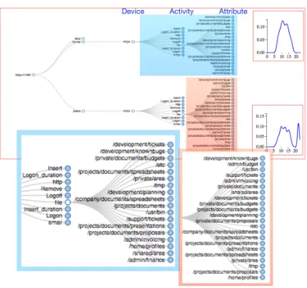
Fig. 1. Tree-structured profiles of user and role behaviours. The profile shows all the devices, activities, and attributes that the user has been observed performing. The probability distribution for normal hourly us-age is given in the top-right, and the distribution for the detected attack is given in the bottom-right. In this example, it can be seen that the user accessed new file resources late at night.
a player will quit their guild. In contrast to real-world insider threat detection, they acknowledge that the game contains obvious malicious behaviours, however they aim to apply these techniques to real-world
enterprises. Eberleet al.[5] consider Graph-Based Anomaly
Detec-tion as a tool for detecting insiders, based on modificaDetec-tions, inserDetec-tions and deletions of activities from the graph. They use the Enron e-mail dataset [12] and cell-phone traffic as two preliminary cases, with the intention of extending to the CMU-CERT insider threat datasets. Sen-atoret al.[22] propose to combine structural and semantic information on user behaviour to develop a real-world detection system. They use a real corporate database, gather as part of the Anomaly Detection at Multiple Scales (ADAMS) program, however due to confidentiality they can not disclose the full details and so it is difficult to compare against the work. Parveen and Thuraisingham [21] propose an incre-mental learning algorithm for insider threat detection that is based on maintaining repetitive sequences of events. They use trace files col-lected from real users of the Unix C shell, however this public dataset is relatively dated now.
With regards to insider threat visualization, the technical report by Harris [9] discusses some of the issues related to visualizing insider threat activity. Nance and Marty [19] propose using bipartite graphs to identify and visualize insider threat activity where the nodes in the graph represent two distinct groups, such as user nodes and activity nodes, and the edges represent that a particular user has performed a particular activity. This approach is best suited for comparative analy-sis once a small group of users and activities have been identified, as scalability issues would soon arise in most real-world analysis tasks. Waltonet al.[25] propose using conditional probability queries with a parallel co-ordinates view to investigate cases of insider threat. Since the analyst can specify queries, this means the problem space is not confined, however it does rely on the creation of well-defined queries by the analyst to identify insider threat behaviour. Stoffelet al.[23] propose a visual analytics application for identifying correlations be-tween different networked devices, based on time-series anomaly de-tection and similarity models. They focus primarily at the network traffic level, and so they do not currently consider other attributes re-lated to insider threat such as file storage systems and USB connected devices. Kintzelet al.[11] use scalable glyph-based visualization us-ing a clock metaphor to present an overview of the activity over time
Group
Ac)vity Type
_hourly_usage_
_new_ac0vity_for_device_
_new_a6ribute_for_device_ _for_role _for_user logon
usb_insert
h6p
file
Fig. 2. Components of derived daily features from user profiles. A single feature consists of one activity (logon, usb, email, file, http), one type (hourly usage, new activity, new attribute), and one group (user/role). All feature combinations are computed from the user profile on a daily basis, resulting in 30 features per user per day.
of thousands of hosts on a network. Zhaoet al.[26] looked at anomaly detection for social media data and presented their visualization tool FluxFlow. Again, they make use of the clock metaphor as part of their visualization, which they combine with scaled circular glyphs to repre-sent anomalous data points. The clock metaphor has been widely used in visualization, and so we also extend this for identifying behavioural patterns as part of our system.
Previous, we have worked on developing techniques for character-ising [20], and detecting [15, 14], insider threats. In this work, we study the workflow of the analyst when adopting such visual analytics tools, in order to support a visual analytics loop for the investigation of insider threat activity.
3 IDENTIFYINGINSIDERTHREATS
From a technical viewpoint, the detection of insider threat relies on the collection of accurate logs that detail what activities have been per-formed, at what time, and by whom. In the work by CMU-CERT [7], and in our synthetic data generation, there are five activities that are logged for all employees: logon, usb, http, file, email. Each activity log records the timestamp, the user ID, the activity performed, the de-vice it was performed on (e.g., PC-123), and any additional attributes (e.g., web address, filename, e-mail recipient). Additional activities such as VPN, printing and physical building access could easily be incorporated into this same data schema, if the activity logs are made available. Detecting the presence of an insider threat can typically be described by three types of anomaly:
• New observations - has the user performed a new activity, or performed an activity with new attributes? (e.g., sending an e-mail to a new recipient). If the activity/attribute is new for this user, is it also new for this role (i.e., has anyone else in the same role performed this same activity before?)
• Time of the observation - has the user performed an activ-ity/attribute at a different time of day compared to their usual behaviour? (e.g., logging on early). Likewise, how does this compare against other users in the same role?
• Frequency of the observation- has the user performed an activ-ity/attribute more frequently compared to their usual behaviour? (e.g., downloading many files from a server). Likewise, how does this compare against other users in the same role?
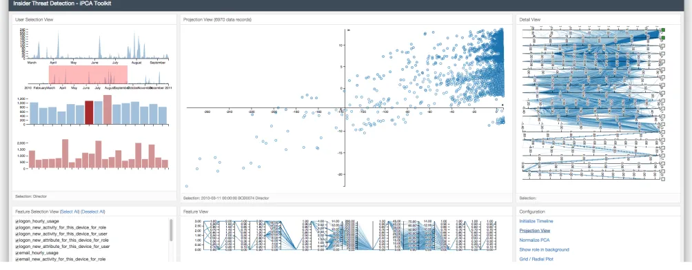
[image:2.612.325.539.60.151.2]Fig. 3. Layout of the visual analytics dashboard. The dashboard consists of six panes (from top-left to bottom-right): User Selection View, Projection View, Detail View, Feature Selection View, Feature View, and Configuration View.
attributes that are performed by each user, and the collection of users within a particular role. Each node within the profile also maintains a histogram that shows the time usage for that particular observation. For each day, we compute observation features based on the user and role profiles (Figure 2), such as‘New device for user’,‘New activity for device for role’,‘New attribute for activity for device for user’, and ‘Hourly usage count for activity’(the complete set of features can be found in [15]). Due to the privacy concerns regarding monitoring of content, the approach has been designed without the need for incor-porating such data. However, should this content be made available, (e.g., e-mail message, file content) then the observation features can be extended to accommodate this based on linguistic deviations and recognised sentiment [13].
For each day within the monitoring period, PCA is performed to identify users that exhibit irregular variances across the set of de-rived features. PCA is a widely used technique for dealing with high-dimensional data that performs high-dimensionality reduction based on the components of data that exhibit the greatest variance, and is an effec-tive tool for identifying outliers. The analyst can configure multiple PCA detectors, based on all features or by selecting a subset of fea-tures. Previously, we have shown how this can be used to perform automated insider threat detection [14, 15].
The biggest drawback to this however, is that PCA is often regarded as a ‘black box’ approach where it is difficult to comprehend the re-lationship between the original feature space and the resulting PCA space. Also, how do we know that we are providing the automated approach with the ‘best’ features for identifying the current threat? There is a need therefore, to incorporate automated assessment tools with visual analytics tools, to facilitate the exploration of the insider threat detection results, and to enhance the reasoning of the analyst to understandwhya particular user is considered a threat, and whether this is a justified result.
4 VISUALANALYTICSSYSTEM
We have developed a visual analytics system that is designed to sup-port the analyst in their reasoning and exploration of insider threat detection (Figure 3). The objective is to be able to analyse the be-haviour of all users within the organisation, to understand their mon-itored activity within the workplace, to identify users who may pose a threat based on the observable features of the user’s profile, and to explore in detail the activities of the selected users to reason whether their actions are deemed as malicious towards the organisation. As described in Section 3, the system serves as a visual analytics tool for
understanding the results generated from an anomaly detection rou-tine. With this, the visual analytics providesmodel visualizationthat enables the analyst to understand how the underlying detection routine is configured, and to assess how effective this configuration may be. Model visualization is becoming an integral part of many visual ana-lytic tools [16, 25], enabling the analyst to better understand the ma-chine learning or data transformation processes that are applied. Here,
we incorporate an interactive PCA approach proposed by Jeong et
al.[10] to highlight the relationship between the PCA space and the original feature space.
To examine the use case of the visual analytics tool, we experiment with the Carnegie Mellon University CERT insider threat datasets. In the dataset tested, there are 1000 users from 15 different job roles, spanning a time period of 17 months (1st January 2010 to 31st May 2011). The activities that are captured in this particular example are lo-gons and logoffs, USB drive insertion and removal, http web logs, and e-mail communications. There is one instance of insider threat present within the dataset. For our implementation, we employ an open-source development stack, that aims to be fast and lightweight, can be easily deployed in any modern web browser, and offers scalability of large data storage and processing. We use MongoDB to store the raw ac-tivity data, and also the aggregated feature data for each user for each day. The back-end server that is responsible for accessing and process-ing the database records is developed usprocess-ing Python, and the Flask web framework. The front-end is developed using HTML and Javascript, using D3.js for the visual components of the dashboard.
The first step is to deploy the profiling tool for the dataset, as de-scribed in Section 3. This constructs user profiles (Figure 1), and then derives a series of daily features (Figure 2) that provide a descriptive account of the user’s behaviour (e.g., number of times they perform particular tasks, number of these activities that are new to this user, number of these activities that are new to any user in this same job role, etc.). Once profiling is complete, the analytical workflow begins, which we detail in the following sections.
4.1 Overview and Filter
re-(a) (b)
[image:4.612.54.289.50.415.2](c) (d)
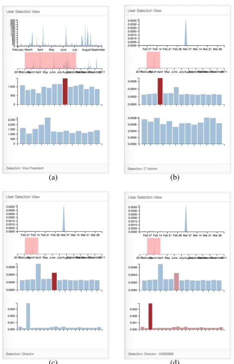
Fig. 4. Step-by-step exploration of detection results using the User Se-lection View. Top-to-bottom: Deviation timeline (focus view), Deviation timeline (contextual view), Role deviation, User deviation. (a) Initial de-tection result with non-normalized features. (b) Dede-tection result with normalized features. (c) Selection of second-most deviating role. (d) Selection of most deviating user compared against peers.
gion, a role bar plot, and a user bar plot. Each plot can be configured to present some summary statistic, such as the amount of activity per-formed each day, or the variance in the activity observed for each role. Here, we use the total anomaly as derived from our detection routine, based on the selected features in the Feature Selection View.
In Figure 4(a), the timeline plot shows the non-normalized devia-tion plot. In Figure 4(b), the timeline plot shows the normalized de-viation plot. Both of these can be beneficial - for example, if we are investigating a user who has downloaded large volumes of data, then a normalized plot may actually disguise the difference between normal and malicious behaviour. In this case, we see that it is the normalized deviation plot that yields a period of significant deviation. By select-ing this time period (Figure 4(b)), we see that the role plot shows ‘IT Admin’ as the most deviating role. However, from the user plot, we see that in actual fact, all ‘IT Admin’ staff show signs of deviation, given the nature of the job role. In Figure 4(c), we select the ‘Direc-tor’ role, which also shows signs of role deviation. Here, we see that one user in particular deviates significantly, compared to their peers. In Figure 4(d), we select all users in the ‘Director’ role, to investigate the reason why user ONS0995 deviates much more than his peers.
The User Selection View provides simple and clear capability to overview and filter the set of possible users. Attempting to
visual-(a)
(b) (c)
[image:4.612.322.550.52.427.2](d)
Fig. 5. Scatter plot and Parallel co-ordinates plot for exploring detection results using iPCA. (a) shows each user for each day, positioned based on the selected eigenspace from the PCA decomposition. (b) and (c) show how the analyst can drag a point to see how position relates to the original feature space by computing an inverse PCA. (d) shows the features for the suspicious insider, where USB insert activity has been newly-observed for both the user and for the role.
ize the full activity of all 1000 users would be impractical and over-whelming. Instead, by allowing the analyst to observe some summary statistic based on the observed user activity, the analyst can quickly drill down to a manageable selection of users for deeper investigation. The dashboard allows the analyst to configure different statistics for display on the plots, including counts and deviations, based on the se-lection of different features.
4.2 Zoom, Filter and Analyse
The next stage of the workflow is to dive deeper into the exploration of the selected users. From the previous stage, the analyst may have selected one, many, or all users to investigate further. Likewise, the analyst may have filtered the investigation to a particular period of time in the activity logs.
(a) (b)
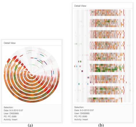
Fig. 6. Two variants of the detail view for exploring user activity, using a circular plot (where time maps to angle and day maps to the radius), or a rectangular grid plot (where time maps to the x-axis and day maps to the y-axis). Colour denotes the observed activity, and the selection pane provides detail of attributes. The role profile can be shown by the translucent coloured segments.
in the Detail View). By selectingGenerate Plot, the server computes a PCA transformation of the selected data space, based on the checked features in the Feature Selection View. Figure 5(a) shows the scatter plot for all users in the role ‘Director’, for the given time period. In total, there are 1197 observations, where each observation point rep-resents a single user for a single day. The position of each point is based on the selected axes from the eigenspace, denoted within the Detail View. Since the top two eigenvalues represent the greatest vari-ance, these are shown by default. The colour of each polyline in the parallel co-ordinates, or point in the scatter plot, denotes the role (in this example, all users are from the same role). The three views are linked so that selection of a point or polyline in one view highlights the corresponding data within the other two views.
In Figure 5(b) and Figure 5(c), we demonstrate how interactive PCA can be incorporated to enhance the analyst’s exploration. The analyst is able to select and drag points within the Projection View. A grey cord is displayed to show the original position of the point, and the point is enlarged to show that it is currently being dragged. As the point is dragged within the PCA space, the serve computes an inverse PCA transformation based on the original model, to map the new po-sition back to the original feature space, which is shown by a black polyline on the feature parallel co-ordinates. This technique, original introduced by Jeonget al.[10] allows the analyst to clearly understand the contribution that each feature has on the output of the PCA met-ric that supports reasoning as to why a user appears as an anomaly. As the point moves between Figure 5(b) and Figure 5(c), the analyst can observe how the black polyline changes to see the impact this po-sitional change has on the feature contributions. For the suspicious user, we can see from Figure 5(d) that they are flagged as an anomaly since new activity has been observed for USB insertions for this user (ONS0995), and for the role (Director) - implying that this role would not typically use a USB device.
4.3 Details-on-Demand
Following investigation of the detection routine, and why a user may be flagged as an anomaly against the selected features, the next stage is to explore the raw activity records for that user. By selecting a user
point in the Projection View, or by double-clicking on a user in the User Selection View, the detailed view can be displayed. We show two variants of the detail view that are supported by the system, using either a radial plot (Figure 6(a)) or a traditional grid plot (Figure 6(b)) . Using the radial plot, we map hourly activity to the angle and days to the radius. Similarly, with the grid plot, the x-axis shows hourly activity and the y-axis shows the days. In both cases, colour is used to denote activity. Transparency is used to represent activity of other users within the same role, to aid comparison between this user and their peers. The analyst can then select segments within the plot to observe details of the activity, such as e-mail recipients, web address, or filename. By selecting multiple users, comparative analysis can also be performed by with different users displayed side-by-side in a grid formation. The radial plot is typically better suited for comparative analysis due to the compact representation.
In Figure 6, it can be seen that the user begins performing activities during the early hours of the morning. In particular, this includes USB insertions, which as found previously, is an activity that no one users in this role would perform. This allows the analyst to reinforce their belief that this user is acting as a threat to the organisation. This stage is critical in the workflow of a security analyst, since a false accusation of a user would be detrimental to the integrity of the organisation, and could provoke further retaliations.
5 DISCUSSION
In the previous section, we have seen how our visual analytics ap-proach can be used for identifying suspicious user activity. For the scenario test cases available from CMU-CERT, we have found that the combination of feature-based profiling and the visual analytics ap-proach proves a powerful tool for identifying which users have been injected as malicious activity. In this section, we discuss some of the challenges that need to be considered for deploying real-world insider threat detection.
The first challenge comes in the form of gathering data. Large or-ganisations may have many offices around the globe, so how can we accurately collect and compile user activity logs? How do we know that the activity logs are accurate and complete? Clearly, if the raw in-put data is incomplete or inaccurate, then the effectiveness of machine learning algorithms and visual analytics tools will be compromised. Likewise, if the malicious insider is capable of concealing their actions by destroying or bypassing activity log records, then all detection tools become ineffective.
Secondly, with employees working around the globe, they may use tools such as VPN to access organisational resources - but what if their travel means that their access times vary? As technology advances, and global travel becomes more vital for conducting business, em-ployees are constantly evolving the way that they choose to work. In such organisations, profiling features such as hourly usage may not be beneficial if most users are seen to access resources around the clock. One alternative is to improve role-based access control across organi-sational servers.
depending on the nature of the business and the way that they oper-ate. It is important when we consider how effective a detection tool is, that we consider how effective it is at establishing what normality may look like for the users who are not under investigation.
Finally, there is the issue of prevention. Many insider threat detec-tion tools are about recognising the attack from a large volume of data, once the attack has taken place. Whilst the organisation can reprimand the employee in question, the data may already be leaked, and so the attack was successful. What many organisations want to do ideally is to prevent the attack from happening in the first place. It is often described as recognising the ‘behavioural pre-cursors’ that lead up to the attack. Studies have taken place to link personality traits with in-sider threat behaviours - for instance, those high in extroversion may be more prone to attack. However, from a technical monitoring stand-point, it is very difficult to infer personality from activity logs. Devi-ations in textual data produced by the employee is perhaps the closest indicator of predicting a threat, such as e-mail [13], instant messages, or social media. Being able to predict the likelihood of a user posing as a threat would clearly be desirable, this is an area of research that requires much attention still.
6 CONCLUSIONS ANDFUTUREWORK
In this paper, we have demonstrated the use of visual analytics to sup-port the identification of insider threat activity, based on user profil-ing and derived features. We present the case of combinprofil-ing anomaly detection techniques with a visual analytics interface that supports ex-ploration of both the detection results and of the corresponding user and role activity. Automated alerting tools based on machine learning alone are known to generate false positives, and perhaps more con-cerning, false negatives. However, by coupling these techniques with a visual analytics tool such as the one presented, their usefulness be-comes significantly improved.
We have also discussed the challenges associated with insider threat detection systems. It is clear that these systems can only go so far to mitigate the threat, however, the coupling of detection and visu-alization can significant reduce the burden on the analyst, meaning that they can focus their time and attention on making better-informed security decisions based on the activity observed via the dashboard, and based on the contextual knowledge of the monitored users (e.g., upcoming deadlines, word-of-mouth). Such proposed solutions may alleviate threats from accidental insiders, or naive insiders, it should also be noted that more sophisticated attackers will try to circumvent systems, and with the right persistence they will most likely succeed. It is therefore systems such as ours which will help identify the users earlier actions of attempting circumvention that will flag them, so that they do not reach the actual goal. Due to the human aspect of the problem, one of the most effective techniques will remain to be hu-man communication, such as body language, tone of voice, and atti-tude towards others. Proposed systems such as ours are designed to compliment other mitigation strategies rather than replace them.
Future work includes the validation of insider threat detection tools with industrial and commercial organisations. As discussed in Sec-tion 5, part of the research challenge is understanding normality within organisations, and how a malicious insider would differ from this. With synthetic datasets, this is a clear limitation for providing tools that can handle real-world variance. The source code of our system, along with test case datasets and a demonstration video, are available
to download from the author’s homepage (http://www.plegg.
me.uk). By making this publicly available, we hope that this can help others to examine and test the system and the underlying detec-tion algorithms against their own datasets to identify where further de-velopment is required and to advance the research on developing more sophisticated insider threat visualization tools. In particular, current efforts are limited by the nature of synthetic datasets, and the under-standing of what real-world normal and malicious behaviour within organisations really looks like. With limited datasets available, de-tection models become confined and may not necessarily fit well for real-world user activity. Future work involves examining what the true scope of normality within a real-world organisation actually is, so as
to understand how detection and visualization can help with the true separation between malicious and non-malicious activity.
REFERENCES
[1] M. Bishop, S. Engle, S. Peisert, S. Whalen, and C. Gates. We have met the enemy and he is us. InProc. of the 2008 workshop on New security paradigms (NSPW’08), Lake Tahoe, California, USA, pages 1–12. ACM, September 2008.
[2] M. Bishop, B. Simidchieva, H. Conboy, H. Phan, L. Osterwell, L. Clarke, G. Avrunin, and S. Peisert. Insider threat detection by process analysis. InIEEE Security and Privacy Workshops (SPW). IEEE, 2014.
[3] O. Brdiczka, J. Liu, B. Price, J. Shen, A. Patil, R. Chow, E. Bart, and N. Ducheneaut. Proactive insider threat detection through graph learning and psychological context. InProc. of the IEEE Symposium on Secu-rity and Privacy Workshops (SPW’12), San Francisco, California, USA, pages 142–149. IEEE, May 2012.
[4] D. M. Cappelli, A. P. Moore, and R. F. Trzeciak. The CERT Guide to Insider Threats: How to Prevent, Detect, and Respond to Information Technology Crimes. Addison-Wesley Professional, 1st edition, 2012. [5] W. Eberle, J. Graves, and L. Holder. Insider threat detection using a
graph-based approach. Journal of Applied Security Research, 6(1):32– 81, 2010.
[6] H. Eldardiry, E. Bart, J. Liu, J. Hanley, B. Price, and O. Brdiczka. Multi-domain information fusion for insider threat detection. InSecurity and Privacy Workshops (SPW), 2013 IEEE, pages 45–51, May 2013. [7] J. Glasser and B. Lindauer. Bridging the gap: A pragmatic approach to
generating insider threat data. 2013 IEEE Security and Privacy Work-shops, 0:98–104, 2013.
[8] F. L. Greitzer and R. E. Hohimer. Modeling human behavior to anticipate insider attacks.Journal of Strategic Security, 4(2):25–48, 2011. [9] M. Harris. Visualizing insider activity and uncovering insider threats.
Technical report, 2015.
[10] D. H. Jeong, C. Ziemkiewicz, B. Fisher, W. Ribarsky, and R. Chang. iPCA: An interactive system for PCA-based visual analytics. In Proceed-ings of the 11th Eurographics / IEEE - VGTC Conference on Visualiza-tion, EuroVis’09, pages 767–774, Chichester, UK, 2009. The Eurographs Association, John Wiley and Sons, Ltd.
[11] C. Kintzel, J. Fuchs, and F. Mansmann. Monitoring large ip spaces with clockview. InProceedings of the 8th International Symposium on Visu-alization for Cyber Security, VizSec ’11, pages 2:1–2:10, New York, NY, USA, 2011. ACM.
[12] B. Klimt and Y. Yang. The enron corpus: A new dataset for email classi-fication research. In J.-F. Boulicaut, F. Esposito, F. Giannotti, and D. Pe-dreschi, editors,Machine Learning: ECML 2004, volume 3201 of Lec-ture Notes in Computer Science, pages 217–226. Springer Berlin Heidel-berg, 2004.
[13] P. A. Legg, O. Buckley, M. Goldsmith, and S. Creese. Visual analytics of e-mail sociolinguistics for user behavioural analysis.Journal of Internet Services and Information Security (JISIS), 4(4):1–13, 2014.
[14] P. A. Legg, O. Buckley, M. Goldsmith, and S. Creese. Automated insider threat detection system using user and role-based profile assessment. Sys-tems Journal, IEEE, PP(99):1–10, 2015.
[15] P. A. Legg, O. Buckley, M. Goldsmith, and S. Creese. Caught in the act of an insider attack: Detection and assessment of insider threat. InIEEE International Symposium on Technologies for Homeland Security (HST 2015), 2015.
[16] P. A. Legg, D. H. S. Chung, M. L. Parry, R. Bown, M. W. Jones, I. W. Griffiths, and M. Chen. Transformation of an uncertain video search pipeline to a sketch-based visual analytics loop.Visualization and Com-puter Graphics, IEEE Transactions on, 19(12):2109–2118, Dec 2013. [17] P. A. Legg, N. Moffat, J. R. C. Nurse, J. Happa, I. Agrafiotis, M.
Gold-smith, and S. Creese. Towards a conceptual model and reasoning struc-ture for insider threat detection. Journal of Wireless Mobile Networks, Ubiquitous Computing and Dependable Applications, 4(4):20–37, 2013. [18] R. Miller and M. Maxim. I have to trust someone... don’t I? Dealing with
insider threats to cyber-security. Technical report.
[19] K. Nance and R. Marty. Identifying and visualizing the malicious insider threat using bipartite graphs. InSystem Sciences (HICSS), 2011 44th Hawaii International Conference on, pages 1–9, Jan 2011.
characterising attacks. InIEEE Symposium on Security and Privacy (SP). IEEE, 2014.
[21] P. Parveen and B. Thuraisingham. Unsupervised incremental sequence learning for insider threat detection. InIntelligence and Security Infor-matics (ISI), 2012 IEEE International Conference on, pages 141–143, June 2012.
[22] T. E. Senator, H. G. Goldberg, A. Memory, W. T. Young, B. Rees, R. Pierce, D. Huang, M. Reardon, D. A. Bader, E. Chow, et al. Detect-ing insider threats in a real corporate database of computer usage activity. InProceedings of the 19th ACM SIGKDD international conference on Knowledge discovery and data mining, pages 1393–1401. ACM, 2013. [23] F. Stoffel, F. Fischer, and D. A. Keim. Finding anomalies in time-series
using visual correlation for interactive root cause analysis. InProceedings of the Tenth Workshop on Visualization for Cyber Security, VizSec ’13, pages 65–72, New York, NY, USA, 2013. ACM.
[24] Vormetric. Insider threat report, 2015.
[25] S. Walton, E. Maguire, and M. Chen. Multiple queries with conditional attributes (QCATs) for anomaly detection and visualization. In Pro-ceedings of the Eleventh Workshop on Visualization for Cyber Security, VizSec ’14, pages 17–24, New York, NY, USA, 2014. ACM.