University of Warwick institutional repository:
http://go.warwick.ac.uk/wrap
A Thesis Submitted for the Degree of PhD at the University of Warwick
http://go.warwick.ac.uk/wrap/70995
This thesis is made available online and is protected by original copyright.
Please scroll down to view the document itself.
Modelling Shape Fluctuations During Cell
Migration
by
Samuel David Russell Jefferyes
Thesis
Submitted to the University of Warwick
for the degree of
Doctor of Philosophy
Systems Biology
Contents
List of Tables iv
List of Figures v
Acknowledgments vii
Declarations viii
Abstract ix
Abbreviations x
Chapter 1 Introduction 1
1.1 Cell Migration . . . 1
1.1.1 Background to Cell Migration . . . 1
1.1.2 Hierarchical Reductionism . . . 2
1.1.3 Using Morphology to Study Migration . . . 3
1.2 Cell Shape Modelling . . . 3
1.2.1 Qualitative Shape Analysis in Literature . . . 3
1.2.2 Quantitative Shape Modelling in Literature . . . 4
1.3 Retinal Pigment Epithelial Cells . . . 6
1.4 Our Approach . . . 7
1.5 Thesis Organisation . . . 10
Chapter 2 Materials and Methods 11 2.1 Cell Culture and Imaging . . . 11
2.1.1 Cell Culture . . . 11
2.1.2 Imaging . . . 11
2.2 Cell Segmentation . . . 12
2.3.1 Laplace-Beltrami Normalisation . . . 13
2.4 Square-Root Elastic (SRE) distance . . . 13
2.5 Affinity Propagation . . . 14
2.6 Seriation Algorithm . . . 15
2.7 Hidden Markov Models . . . 16
2.8 Cell Track Data . . . 17
Chapter 3 The Best Alignment Metric 18 3.1 Introduction . . . 18
3.2 Shape Difference Metric . . . 18
3.2.1 Understanding the data . . . 18
3.2.2 Introducing the Best Alignment Metric . . . 20
3.2.3 Discussion of the Best Alignment Metric . . . 22
3.2.4 BAM comparisons . . . 23
3.3 Kernel Bandwidth . . . 26
3.4 Examining the Performance of the Best Alignment Metric . . . 28
3.4.1 Affinity Propagation for Independent Validation . . . 28
3.4.2 SRE versus BAM . . . 28
3.4.3 Affinity Propagation on a Large Dataset . . . 33
3.4.4 Seriation Extension to Affinity Propagation . . . 33
3.5 Application to Breast Cancer Histology Images . . . 35
3.5.1 Introduction . . . 35
3.5.2 Applying the Extended Affinity Propagation to Histology Data 37 3.6 Discussion . . . 39
Chapter 4 Morphological Phenotyping of Retinal Pigment Epithelial Cells 42 4.1 Visualising Shape Space . . . 42
4.1.1 Shape Averaging . . . 42
4.1.2 Extended Affinity Propagation to Visualise DM Embedding . 43 4.2 Shape Feature Correlation . . . 46
4.2.1 Scalar Shape Features . . . 46
4.2.2 Shape feature correlation . . . 48
4.2.3 Features distributed over the Diffusion Maps embedding . . . 51
Chapter 5 Turn Prediction 69 5.1 Introduction . . . 69
5.2 Development . . . 71
5.2.1 Morphological Analysis . . . 71
5.2.2 Migrational Analysis . . . 75
5.2.3 Turn Prediction Accuracy . . . 76
5.3 Results . . . 77
5.4 Discussion . . . 81
Chapter 6 Discussion and Conclusions 84 6.1 General Discussion . . . 84
6.2 Shape Analysis . . . 85
6.2.1 Shape Space Learning with Diffusion Maps . . . 85
6.2.2 Best Alignment Metric . . . 87
6.3 Mechanisms of migration . . . 88
6.3.1 Turn Prediction . . . 88
6.3.2 Our Migration Analysis in Context . . . 88
6.4 Plan for Publication . . . 90
Appendix A Best Alignment Metric 91 A.1 Best Alignment Metric Formulation . . . 91
A.1.1 Dealing withφ . . . 92
List of Tables
3.1 A table displaying the average time taken to compute SRE and BAM measurements of pairs of shapes, for a range of values for N, which is the number of points sampled from around each curve. Each result is the average measurement computed over 5 distinct pairs of shapes. 30
List of Figures
1.1 Example migrating epithelial cells. . . 7
1.2 Algorithm flow diagram. . . 9
3.1 Cell shape misalignment. . . 19
3.2 Comparative performance of shape distance measures. . . 25
3.3 Absolute relative error from curve sub-sampling. . . 29
3.4 Metric Comparison. . . 32
3.5 Affinity Propagation Exemplars . . . 34
3.6 Seriation Ordered Exemplars . . . 36
3.7 Example Mitotic Cell Candidates. . . 37
3.8 Ordered Exemplars for Mitosis Dataset. . . 38
3.9 Relative Mitotic Count in Ordered Clusters. . . 40
4.1 Axis phenotypes. . . 44
4.2 Affinity Propagation Clusters over DM Embedding. . . 45
4.3 Area distributed over embedding. . . 51
4.4 Major Axis Length distributed over embedding. . . 52
4.5 Minor Axis Length distributed over embedding. . . 53
4.6 Eccentricity distributed over embedding. . . 54
4.7 Orientation distributed over embedding. . . 55
4.8 Convex Area distributed over embedding. . . 56
4.9 Solidity distributed over embedding. . . 57
4.10 Extent distributed over embedding. . . 58
4.11 Perimeter distributed over embedding. . . 59
4.12 Circularity distributed over embedding. . . 60
4.13 Symmetry distributed over embedding. . . 61
4.14 Max distance from centre distributed over embedding. . . 62
4.15 Min distance from centre distributed over embedding. . . 63
4.17 Irregularity distributed over embedding. . . 65
4.18 Irregularity2 distributed over embedding. . . 66
5.1 Track analysis pipeline. . . 71
5.2 Shape representation for Detecting Repolarisation Events. . . 73
5.3 Example cell track labelled for training. . . 74
5.4 Angle check difficulties. . . 76
5.5 Angle distributions. . . 78
5.6 Example repolarising tracks. . . 79
5.7 Example alternative tracks. . . 80
Acknowledgments
I offer my sincere thanks to both of my supervisors; Dr Anne Straube and Dr Nasir
Rajpoot. Both have continuously offered me invaluable guidance, support and
cri-tique. I thank Anne specifically for being ever insightful and enthusiastic in a project
somewhat outside of her usual field, and for being tolerant of my bizarre working
routines. I’d like to thank Nasir, for his continued insightful guidance even from
afar.
I’m very grateful to Prof David Epstein for his considerable input and useful advice
and discussion.
I’d like to thank my advisory committee Prof. Andrew McAinsh, Dr Till
Bretschnei-der and Prof. Matthew Turner, for their time and guidance.
I greatly appreciate the many individuals in the System Biology DTC, BCB and
COMBI groups who sat through my talks, showed interest in my work and offered
valuable input.
Many thanks to the BBSRC for funding this project.
Finally, I thank my family and friends, who have been a constant source of support
Declarations
This thesis is submitted to the University of Warwick in support of my application
for the degree of Doctor of Philosophy. It has been composed by myself and has not
been submitted in any previous application for any degree.
The work presented (including data generated and data analysis) was carried out
by the author.
Parts of this thesis have been published by the author:
Abstract
Cell migration is of crucial importance for many physiological processes, including embryonic development, wound healing and immune response. Defects in cell migra-tion are the cause of chronic inflammatory diseases, mental retardamigra-tion and cancer metastasis. Cell movement is driven by actin-mediated cell protrusion, substrate adhesion and contraction of the cell body.
The emergent behaviour of the intracellular processes described above is a change in the morphology of the cell. This inspires the main hypothesis of this work which is that there is a measurable relationship between cell morphology dynamics and migratory behaviour, and that quantitative models of this relationship can create useful tools for investigating the mechanisms by which a cell regulates its own motil-ity.
Here we analyse cell shapes of migrating human retinal pigment epithelial cells with the aim to map cell shape changes to cellular behaviour. We develop a non-linear model for learning the intrinsic low-dimensional structure of cell shape space and use the resultant shape representation to analyse quantitative relationships between shape and migration behaviour. The biggest algorithmic challenge overcome in this thesis was developing a method for efficiently and appropriately measuring the shape difference between pairs of cells that may have come from independent image scenes. This difference measure must be capable of coping with the widely vary-ing morphologies exhibited by migratvary-ing epithelial cells. We present a new, rapid, landmark-free, shape difference measure called the Best Alignment Metric (BAM). We show that BAM performs highly within our framework, generating a shape space representation of a very large dataset without any prior information on the impor-tance of any given shape feature.
Abbreviations
AP Affinity Propagation
BAM Best Alignment Metric
DM Diffusion Maps
DMEM Dulbecco’s Modified Eagle Medium
GFP Green Fluorescent Protein
GTP Guanine-5’-triphosphate
HMM Hidden Markov Model
hTERT Human telomerase reverse transcriptase
L2-norm Lebesgue 2-norm
NLDR Non-linear Dimensionality Reduction
PCA Principal Component Analysis
R The space of real numbers
RNA Ribonucleic Acid
RPE Retinal Pigment Epithelial
RPE1 GLA6 Retinal Pigment Epithelial cells with mGFP-LifeAct
RSKNNE Reverse Soft K-Nearest Neighbour Density Estimation
SRE Square-Root Elastic (distance)
Chapter 1
Introduction
1.1
Cell Migration
1.1.1 Background to Cell Migration
Cell migration is of fundamental importance for embryonic development, immune response and wound healing [Keller, 2005; Theveneau and Mayor, 2011; Tarbashe-vich and Raz, 2010; Marelli-Berg et al., 2010; Abreu-Blanco et al., 2012]. Equally importantly, defective cell migration is a primary cause of disease: it enables tissue invasion and metastasis by cancer cells, chronic inflammation and mental retarda-tion [Hanahan et al., 2000; Ridley et al., 2003; Roussos et al., 2011]. Cell migraretarda-tion is achieved through dynamic control of the cytoskeleton and regulated through the integration of many complex signalling pathways [Ridley et al., 2003]. The most common mode of cell migration is a crawling process that can be conceptualised as a cyclic process with four steps [Mitchison and Cramer, 1996; Horwitz and Webb, 2003; Lauffenburger and Horwitz, 1996]. Firstly, the front edge of the cell protrudes forward, secondly adhesions are formed that anchor the cell membrane to the sub-strate or neighbouring cells. Thirdly, the adhesions in the rear of the cell disassemble and finally, contraction of the cytoplasm results in the forward translocation of the cell body. The mechanical power for the crawling process comes from a treadmilling process of the actin network [Pollard and Borisy, 2003], where filaments polymerise and branch at the leading edge and depolymerise at the rear of the network and from myosin-mediated actin filament sliding that cause contractions.
actin cortex) can either stabilise or retract the bulbous protrusion [Charras and Paluch, 2008]. Global regulation of these local decisions results in net movement of the cell. The hydrostatic forces are largely generated by myosin-mediated contrac-tility [Charras et al., 2005].
While the underlying motile mechanisms are believed to be well preserved across differing cell types, the outward dynamic behaviour can vary greatly. Dictyostelium discoideum is a species of unicellular organism able to perform both crawling and blebbing and known to adapt its motile behaviour to the environment they find themselves in [Charras and Paluch, 2008]. Fish keratocytes, which have a constant canoe-like shape [Goodrich, 1924], have a large actin network across the leading re-gion (lamellipodium) that barely changes configuration as it migrates [Mogilner and Edelstein-Keshet, 2002]. This constancy means that fish keratocytes are some of the fastest and most directionally persistent moving cells [Keren et al., 2009]. Other cells, such as fibroblasts and neuronal growth cones, more dynamically turn protru-sions on and off in localised regions to allow more adaptive and sensitive motility, but at the cost of speed and persistence. These differences are reflected in the morphol-ogy of the cells, fish keratocytes have one large lamellipodium that changes very little while fibroblasts exhibit highly fluctuating morphologies, stochastically protruding smaller lamellipodia and filopodia in response to their surroundings [Abercrombie et al., 1970].
The ability for a cell to change between different styles of motile behaviour is very important in a number of physiological processes. Transitions between non-motile and motile states such as in Epithelial-Mesenchymal transition [Yang and Weinberg, 2008] have been linked to embryogenesis, wound healing and cancer metastasis. The ability for a cell to transition between mechanisms of migration has been linked to cancer cell metastasis; it is believed that a metastatic cancer cell will need to pass through different environments and may need to use different migratory mechanisms for each [Wang et al., 2005; Friedl and Wolf, 2003].
1.1.2 Hierarchical Reductionism
order to build a full model inductively, while each individual model remains man-ageable. An example of this may be seen from an investigation of cell protrusions in terms of net growth rate of local actin networks. The actin network growth rate is an emergent property of the polymerisation process of individual actin filaments. It would be a much more complex task to model a protrusion in terms of the in-dividual filaments, considering that their orientations and polymerisation rates are not independent. In turn, one can look at the way that cell morphology, a cellu-lar phenomenon, governs its motile behaviour, which is how the cell explores its surroundings. It is this scopic level that we shall be focussing on in this thesis.
1.1.3 Using Morphology to Study Migration
Much work is being carried out to study the dynamics of various cytoskeletal com-ponents at the molecular level. There are indeed mathematical models for each step of cell migration: actin-mediated protrusion, adhesion, contraction. However an integrated model that describes cell migration as a whole requires much more knowledge about how these subprocesses integrate and how this integration is af-fected by environmental cues [Danuser et al., 2013]. We hypothesise that morphology can efficiently represent the emergent behaviour of the intracellular system, in the sense that, in order to induce migration, the intracellular mechanisms must cause a structural change. We explore quantitative models for aspects of morphology and motility, and ultimately the dependence between the two. With knowledge of the common morphological behaviour patterns that accompany any cellular event, we believe it will be possible to infer information about the internal structural dynamics involved with that event.
1.2
Cell Shape Modelling
1.2.1 Qualitative Shape Analysis in Literature
The earliest papers on fish keratocytes [Goodrich, 1924] observed their distinctive shapes and described them qualitatively as canoe-like with a large fan section. The authors even commented on the relation between the geometric orientation of the fan and the direction of motion, although this relationship was not quantitatively modelled until later [Lee et al., 1993; Keren et al., 2008].
claimed that the cells have unchanged morphology in this process, to substantiate this claim the reader is encouraged to assess the figures subjectively. Wang et al. [Wang et al., 2003] claimed that cell shape (as well as polarity), in human embry-onic kidney tumour cells, is regulated by RhoGTPase-dependent regulation of the actin cytoskeleton. This claim was substantiated by the qualitative judgement of the presence or lack of protrusions or lamellipodia-like structures.
1.2.2 Quantitative Shape Modelling in Literature
Here, as with all areas of science, a quantitative understanding has many advan-tages. A quantitative model of shape and shape dynamics allows for objectivity and statistical validation. It also confers the ability to make graded commentary, in other words we become able to quantify a claim such as shape A is more irregular than shape B. One does not naturally think ofshape as a quantitative concept, how-ever there are many ways to create such a representation and the rest of this section will look at different methods that have been used to achieve this in literature.
Shape Features
Simple shape features include basic scalar properties of shape, such as length, area, perimeter, concavity, circularity and symmetry to name just a few1. The simplest way to create a quantitative model for shape analysis of a given biological object is to measure one of these simple shape features. This technique has been applied to many varying biological settings. For example, cell length has been found to be an informative feature in the life and function ofS. pombe [Martin and Berthelot-Grosjean, 2009; Moseley et al., 2009]. Measures of symmetry in breast lesions have shown the ability to distinguish between benign and malignant tumours [Yang et al., 2009; Liney et al., 2006].
Simple features can also be brought into dynamic models. For example, in human epithelial cells, although maximum cell tail length remains unchanged, the lifetime of individual tails decreases dramatically after epigenetic treatment [Theisen et al., 2012].
It is possible to select the examined features to be precisely relevant to the investi-gation. Rangayyan and Nguyen [Rangayyan and Nguyen, 2007] focus on measures of self similarity for categorising contours of breast masses to assist in breast cancer diagnosis; they find that the combination of fractal dimension and fractional con-cavity yields the best results.
1While these features all have some degree of obvious intuitive definition, an explicit formulation
Tweedy et al. examine the Fourier power spectrum of curves, which is a set of fea-tures that look at the various levels of periodicity that exist in each curve, and the authors show successful use of these features to discover the modes of shape variation in chemotaxingD. discoideum [Tweedy et al., 2013]. Note that, although this analysis is based on feature descriptors and not explicit descriptors (explained later), the representation carries a lot of information that is not readily accessible. This is tackled through use of machine learning, which is a common approach for handling high-dimensional and other difficult data, described below.
Machine Learning
The concept ofshape has many different aspects and hence it can be considered as high dimensional. The difficulty is that any quantitative modelling of patterns of shape behaviour will run into difficulty if the shape representation has too many dimensions. This is because of what is known asthe curse of dimensionality, which refers to the fact than many analytical difficulties scale exponentially as the dimen-sionality of the data increases. In this case it is a problem of sampling; a high dimensional space needs a far higher sample size to adequately populate the data space. So it is necessary to perform dimensionality reduction and one field that allows this is Machine Learning.
Machine learning, much like organic learning, involves exposing the ‘learner’ to a large number of examples of the objects of interest, in such a way that the ‘learner’ can develop an ‘understanding’ of the allowed variation within the example set. When used for dimensionality reduction, the algorithm will simplify the input by mapping it into low-dimensional space, attempting to maximise the amount of in-formation preserved in each consecutive new dimension. Often the data is repre-sented to high accuracy with a small number of new dimensions. Tweedy et al. [Tweedy et al., 2013] make use of Principal Component Analysis (PCA) [Pearson, 1901], a well known linear dimensionality reduction technique, to convert their 64-dimensional Fourier descriptors into 3 modes of variation, which account for over 90% of the shape variability.
activate each other and pick up on regular patterns. They use neural networks in a bag of features approach, whereby they measure a large number of features (in many cases with overlapping information) and simply let the machine learning algorithm find the structure therein. They use 145 morphological features and 249 genetic treatment conditions, and then search for joint clusters as a data-mining approach to finding gene networks that control morphological change.
Explicit Shape Descriptors
Measuring a specified feature or property can be very useful in answering specific questions about those features. Given a hypothesis or some a priori information about the involvement of a specific feature within a larger system, then measure-ment of that feature becomes important. However, with a more open-ended enquiry it is possible that leading the analysis with specific feature based analysis may cause one to miss information about the intrinsic underlying mechanisms.
In other imaging tasks, such as image retrieval and object classification, feature-based measurements have other problems relating to the fact that objects can have similar features whilst being visually very different.
This motivates the use of explicit shape descriptors. An explicit shape descriptor is any shape representation that is reversible, i.e. the original shape data is re-coverable. The requirement for a representation to be reversible guarantees that the representation contains all of the information about the object it is trying to represent. For the most part, explicit shape descriptors will be very high dimen-sional, which means dimensionality reduction is necessary. Unless there is empirical evidence or a theoretical justification that the structure of the data space is linear, PCA will not be sufficient to characterise the geometry. Sparks and Madabhusi [Sparks and Madabhushi, 2013] use a non-linear dimensionality reduction (NLDR) technique, called Graph Embedding, to create an explicit shape descriptor to rep-resent prostate gland lumina, whose shape is used by pathologists to grade prostate tumour malignancy. The authors demonstrate that classification in their shape rep-resentation space is effective in this grading task.
1.3
Retinal Pigment Epithelial Cells
Figure 1.1: Example migrating epithelial cells. Representative frames of mi-grating RPE cells expressing mGFP-LifeAct to mark actin. Scale bars are 20µm and relative time is indicated in minutes. Figure reproduced from [Jefferyes et al., 2013].
to genetic modification.
The retinal pigment epithelium is a monolayer that separates the photosensitive retina from the choroid in the eye. These cells perform many functions to maintain the visual performance of the photoreceptors [Strauss, 2005]. Since the epithelium exists as a monolayer in vivo, the cells readily take to a uniform 2D substrate in vitro. Importantly, RPE cells move freely in culture, without requiring stimulus to turn. This internally motivated behaviour is in contrast to the stimulated behaviour seen in chemoattraction experiments.
A high variability in cell shape is commonly found in images of cancer cell migration in vivo[Friedl and Wolf, 2003]. Although we simplify the system by looking at a 2D model, the complexity displayed in our dataset required the development of a novel shape comparison algorithm, tools that will be undoubtedly useful for tackling a three-dimensional model in the future.
1.4
Our Approach
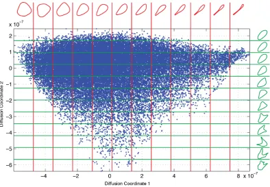
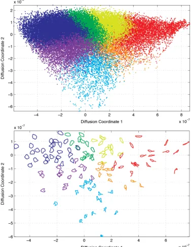
that aim would be to use shape features that are known to be related to cell migra-tion. However, we want to do this in such a way as to assume no prior knowledge of the importance of any individual shape features. This choice has several benefits. Firstly, it is immediately transferrable to other systems, and can provide informa-tion about which are the important features in systems where they are not known. Secondly, we do not limit our analysis to features that are known to be relevant, as it may be that other features are similarly important and their inclusion yields a richer analysis. Instead, we opt for a machine learning approach, which, as discussed earlier, generates a new description of the data that represents the prevalent modes of variation (or degrees of freedom) within the dataset. This approach will feed a descriptive model for the data that will present the shape distribution of our cells in a way that can be explored both subjectively, through visualisation techniques (see Chapter 4), and objectively as a quantitative representation of the cells that can be used to feed further models of dynamic behaviour (see Chapter 5).
Our framework follows on from work done by Rajpoot and Arif [Rajpoot and Arif, 2008], who use unsupervised learning to map the shape space of simple image out-lines and successfully distinguish shapes such as guitars, apples, teddies, cars and carriages. They make use of the Diffusion Maps technique [Coifman and Lafon, 2006a], which seeks to learn the local structure of the data but attempts to ignore larger-scale geometry in the space of the descriptor. A crucial component in their framework is the shape similarity measure, since this measure of similarity is pre-served in the final representation. A major task for this project was developing a similarity measure that appropriately and efficiently captures shape information and ignores extraneous information present in the image. Chapter 3 describes our work for this task, we discuss the requirements we perceived to be in place then show our own developments to solve this problem.
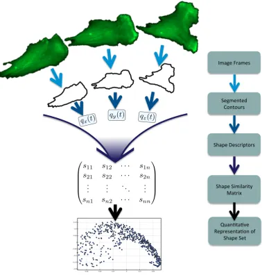
Figure 1.2 gives an overview of the generalised framework that is presented in this thesis. It shows that the cell contours are first segmented from the images, then converted into a descriptor representation. The dataset is then assimilated into a large shape similarity matrix, and from this matrix a low-dimensional, quantitative representation of the dataset is created.
in-ï ï ï ï
ï ï ï
!"#$%&'(#"%)&
*%$"%+,%-& ./+,/0()&
*1#2%&3%)4(52,/()&
*1#2%&*5"56#(5,7& 8#,(59&
qz(t)
qx(t)
qy(t)
s11 s12 · · · s1n
s21 s22 · · · s2n
..
. ... . .. ... sn1 sn2 · · · snn
:0#+;,#;<%& =%2(%)%+,#;/+&/>&
[image:21.595.130.509.183.580.2]*1#2%&*%,&
variance.
1.5
Thesis Organisation
Chapter 2 outlines all experimental techniques used to collect the data for this the-sis. It will also give detail of the analytic techniques available in literature that I employed in various algorithms.
Chapter 3 gives a description of the decisions and development made to create a robust and efficient cell shape representation framework. We also present an alterna-tive framework to independently investigate the performance of the Best Alignment Metric, a novel shape dissimilarity metric.
In chapter 4 we make use of the BAM dissimilarity metric within our cell shape representation framework for the purpose of morphological phenotyping on a large dataset of RPE cells. As shape is a quality commonly assessed subjectively, this chapter contains a number of figures that visualise the output of the shape repre-sentation framework. We also investigate the correlation between the distribution created by our framework and a number of common shape features, many of which are often linked to cell dynamics, in order to determine which of them are best rep-resented by our framework, and therefore which are most dominant in the dynamics of RPE cells.
Chapter 5 presents an investigation into the motile behaviour of RPE cells, making use of our cell shape representation. We demonstrate that it is possible to reason-ably accurately determine the location of a turn in a cell’s path (through one turn mechanism at least) by examining the morphological information of the cell alone. This chapter demonstrates a successful application of the cell shape representation framework and provides evidence for a measurable relationship between cell mor-phology and migratory behaviour.
Chapter 2
Materials and Methods
2.1
Cell Culture and Imaging
2.1.1 Cell Culture
Human retinal pigment epithelial (RPE1) cells immortalised with hTERT (Clon-tech) were grown in RPE medium (DMEM/F-12 medium containing 10% FCS, 2.3
g/l sodium bicarbonate, 2mM L-Glutamine, 100 U/ml penicillin and 100 µg/ml
streptomycin) at 37◦C, 5% CO2 in a humidified incubator. The RPE1 GLA6 cell line was generated by transfecting hTERT RPE1 cells (Clontech) with mGFP-LifeAct [Riedl et al., 2008] followed by selection with 500 µg/ml Geneticin (Invit-rogen). For depletion experiments, small interfering RNA oligonucleotides targeted against Kif1C (5-CCCAUGCCGUCUUUACCAU-[dC]-[dG]-3) or a scrambled con-trol (5-GGACCUGGAGGUCUGCUGU-[dT]-[dT]-3) were transfected using Oligo-fectamine (Invitrogen) following manufacturer’s instructions. Cells were analysed 48 hours after transfection. Depletion efficiency and specificity was validated using immunofluorescence and Western blotting [Theisen et al., 2012].
2.1.2 Imaging
For live cell imaging, 35mm glass-bottom dishes (Fluorodish) or 2-well chambered coverglass chambers were coated with 10µg/mlfibronectin (Sigma). The fibronectin solution was allowed to incubate for 2-12 hours, and was washed twice with ddH2O before equilibrating the chamber with RPE medium. 6000 RPE1 GLA6 cells were seeded into each dish/well and allowed to spread for 4-6 hours. Cell migration experiments were carried out in RPE growth medium in a microscope stage top incubator (Tokai Hit) heated to 37◦C and providing 5%CO
objective on an Olympus personal Deltavision microscope (Applied Precision, LLC) using a GFP filter set (Chroma) and a Coolsnap HQ camera, controlled by Softworx (Applied Precision, LLC). Frame rate was set at imaging every 5 minutes because this was adequate for tracking purposes, since the cells neither moved nor changed shape suddenly over this time period, and with any faster imaging we would begin to see the cells negatively affected due to photodamage. The resulting images acquired at every time point were 1024x1024 pixels with 645nm/pixel resolution.
2.2
Cell Segmentation
To capture cell shape, we extract the outline of cells from image sequences of mGFP-LifeAct-labelled cells. Only those cell outlines were included in the analysis that did not touch the borders or any other cell in the images. The minimal number of consecutive frames needed for inclusion in the dataset was 5 frames. To find the cell boundary, we used a mean shift algorithm embedded into a graphical user interface. We used the Edison Matlab interface for mean shift using the following parameters: SpatialBandWidth = 5, RangeBandWidth = 3, Colour Space = LUV. Segmentation errors that resulted in the fragmentation of long cell extensions were manually fused to prevent bias in the dataset for compact cell shapes that segment more easily.
2.3
Diffusion Maps
The Diffusion Maps (DM) framework is a non-linear dimensionality reduction tech-nique that generates a low-dimensional coordinate representation of data. Similar data points in the high-dimensional space are represented by new low-dimensional points that are close; dissimilar data points are represented by new low-dimensional points that are far apart.
To perform a DM based low-dimensional embedding of n contours, {fi} where
1≤i≤n, one constructs an n×n matrix P with its (j, k)th entry given as fol-lows,
pjk =
w(fj, fk) n
X
i=1
w(fj, fi)
, (2.1)
other eigenvalues have a strictly smaller magnitude. So (by reordering if neces-sary) let 1 = λ0 > |λ1| ≥ |λ2| ≥ . . . ≥ |λn−1| be the set of eigenvalues, and
{ψi|i= 0, . . . , n−1}be the set of corresponding n-dimensional eigenvectors. Then,
ifψ(ij) is thejth component of the eigenvector ψi, we construct a lower dimensional
representation of contourfj as
ϕj = (λt1ψ (j) 1 , λt2ψ
(j)
2 , . . . , λtρψρ(j)), (2.2)
where ρ n is our choice of dimension for the embedding, and t denotes time in the Markovian sense (we chose t = 1 in our analysis, as we are interested in local geometric properties of shape space). Note that ρ is chosen to be much lower than the dimensionality of the original data, and henceϕjis a low dimensional embedding
of the contours. In a similar fashion to other dimensionality reduction techniques,
|λi|reflects the proportion of the overall variance of the dataset that is accounted
for in eigenvectorψi. Hence ρ can be chosen to be large enough to give the desired
accuracy.
2.3.1 Laplace-Beltrami Normalisation
In order to deal with data that is sampled with non-uniform density it is possible to incorporate Laplace-Beltrami Normalisation within the Diffusion Maps framework [Lafon and Lee, 2006]. This is done by replacing both instances of the similarity measurew(., .) of equation 2.1 with the normalised measure ˜w(., .) defined to be
˜
w(fj, fk) =
w(fj, fk) n
X
i=1
w(fj, fi) n
X
i=1
w(fk, fi)
. (2.3)
2.4
Square-Root Elastic (SRE) distance
Joshi et al [Joshi et al., 2007] have presented a framework for consideration of shapes that is suitable for our analysis. While their framework is well defined for all absolutely continuous curves inRn, we will restrict our use to unit path-length
closed curves in the plane. Given a closed curve in the plane,α :S1 →R2 we look
at its Square-Root Velocity representation,q:S1 →R2, defined as
q(t) = pα˙(t)
The space of all such curves is defined as preshape space (C). Hence, the construction ofC is as follows:
C=
q∈L2(S1,Rn)
Z
S1||
q(t)||2dt= 1,
Z
S1
q(t)||q(t)||dt= 0,
, (2.5)
whereRS1||q(t)||2dt= 1 provides the restriction to unit length and
R
S1q(t)||q(t)||dt=
0 provides the restriction that the curves are closed. Then, to tackle the issue of appropriate invariances (see section 3.2.1), the authors introduce shape space (S) as the quotient of preshape space by the groups of reparameterisations (Γ) and ro-tations in the plane (SO(2)) i.e. S =C/(Γ×SO(2)).
They present an algorithm [Srivastava et al., 2011] for determining geodesics in preshape space (C) that minimise path length according to the Elastic metric [Mio et al., 2007]. So the distance between any two curvesq0 and q1 can be defined as
dc(q0, q1) = inf
{κ:[0,1]→C|κ(0)=q0,κ(1)=q1}
L(κ), (2.6)
whereL(κ) = R01phκ˙(t),κ˙(t)idt is the length of κ (a path on C), according to the Elastic metric,h·,·i, as defined in [Mio et al., 2007].
This is used in a second algorithm which finds the geodesic distance in shape space (S). The geodesic distance in shape space between shapes [q0] and [q1] is defined as
dS([q0],[q1]) = inf
{(γ,O)∈Γ×SO(2)}dc q0,O(q1◦γ)
p
˙
γ. (2.7)
This we refer to as the Square-Root Elastic (SRE) distance.
2.5
Affinity Propagation
Affinity Propagation [Frey and Dueck, 2007] is a clustering algorithm that selects a subset of the data to be “exemplars”; all elements are then assigned to exactly one exemplar. Hence, each exemplar forms a cluster with the points that are assigned to it. The algorithm seeks to find the cluster/exemplar configuration that maximises the total sum of exemplar preferences and the similarities between points and their exemplars. This is achieved rapidly by a message passing process that iteratively passes information between nodes and updates the system.
To perform AP clustering on a dataset of sizeK, the algorithm requires a similarity matrix {sij} and a set of preferences ck, for all i, j, k = 1, . . . , K. We set ck to be
is application specific, we discuss our choice for shape clustering in section 3.4.3. The following messages are computed iteratively:
αij =
cj+
X
k6=j
max(0, ρkj) i=j,
min[0, cj+ρjj+
X
k6∈i,j
max(0, ρkj)] i6=j,
(2.8)
ρij =sij−max
k6=j(αik+sik), (2.9)
whereαij = 0 initially. The value of ρij can be thought of as a measure of how well
suitedj is as an exemplar fori, taking into account other potential exemplars fori. The value ofαij can be thought of as a measure of how availablej is to serve as the
exemplar fori, taking into consideration other points for whichj is an exemplar.
2.6
Seriation Algorithm
This is an algorithm designed for a package for cluster analysis [Wishart, 1999], and it deals with the reordering of branches of a dendrogram in order to optimise the rank order of the corresponding similarity matrix. A dendrogram is a way of illustrating the results of hierarchical clustering [Ward, 1963], but the displayed or-der of the branches is not consior-dered. In fact there are 2n−2 ways of rearranging a dendrogram ofn elements.
The seriation algorithm chooses an order that optimises the rank order of the sim-ilarity matrix, which is a matrix with elements sij equal to the similarity between
elements i and j. We construct a matrix A, corresponding to the rank of each el-ement in a row, i.e. in row i let aii = 0 and aik = 1 where k 6= i is the index of
the element most similar to elementi, andaim= 2 wherem6=iis the index of the
element next most similar to i and so on. The goal is then to rearrange the rows and columns (symmetrically) to make this rank matrix as close as possible to the perfect rank matrix:
0 1 2 3 . . .
1 0 1 2 . . .
2 1 0 1 . . .
3 2 1 0 . . .
..
. ... ... ... . ..
Specifically the algorithm tries to minimise the value of
ρ= 1−
P
i
P
j(aij−pij)2
(n3−n) , (2.11)
where aij are the row-wise rank elements as before and pij are the corresponding
perfect rank matrix elements. Full details of the optimisation procedure can be found in [Wishart, 1999].
2.7
Hidden Markov Models
In Chapter 5 we use Hidden Markov Models to predict cell behaviour from cell shape information [Baum and Petrie, 1966]. We considered four hidden states of cell morphology: a depolarised state, a polarised state and the two transition states: depolarising and repolarising.
Hidden Markov Models are used to represent a situation involving hidden states that govern some observable variables. Normally one hidden state will be considered active at a given time. The state will have an emission distribution governing the observables, and transition probabilities that determine the probability that each of the hidden states will be active at the next time step.
If the emission distributions and transition probabilities are known for each state, and we are given a sequence of observed variables, often the challenge is to find the most likely sequence of states to have produced these emissions. To implement the Hidden Markov Model, we used the Probabilistic Modelling Toolkit version 3 [Murphy and Dunham]. This toolbox uses of the Viterbi algorithm [Viterbi, 1967] (summarised below) to find the most likely states for our data sequences.
Assume we have an observed data sequence x1, x2, ..., xT, transition probabilities
τi,j from state ito state j in state spaceS, initial probabilities πi of being in state
iat time 0. Then define the following values:
V1,k=P(x1|k)·πk, (2.12)
Vt,k=P(xt|k)·argmax s∈S
(τs,k·Vt−1,k). (2.13)
Here Vt,k represent the probability of being in state k given the observed variables
order as follows
qT = argmax k∈S
VT,k (2.14)
qt= argmax k∈S
(τk,qt+1·Vt,k),fort= 1, . . . , T −1. (2.15)
We trained the model using 19 manually selected image sequences that were deemed typical examples of a turn through depolarisation/repolarisation. The four states were classified manually and the distribution of the shapes in our shape matrix de-termined.
2.8
Cell Track Data
Chapter 3
The Best Alignment Metric
3.1
Introduction
Our proposed framework for shape analysis makes use of the Diffusion Maps algo-rithm for manifold learning. Applying this algoalgo-rithm to a given dataset requires the selection of a suitable similarity measure. We make use of the simple Gaussian kernel for data pointsx and y,
w(x, y) =exp
−d(x, y)2 2σ2
, (3.1)
whered(x, y) corresponds to a chosen distance metric (for us this will be a difference measure between shapesxand y) andσ corresponds to a chosen kernel bandwidth. The main focus of this chapter is the development of the Best Alignment Metric (BAM), which is our chosen shape distance metric. We will also touch on the choice of kernel bandwidth.
3.2
Shape Difference Metric
3.2.1 Understanding the data
framework. To understand this issue, it is important to note that we are comparing a pair of shapes, and that some information is extraneous to the individual cells, but significant in a relative sense. Specifically, the position and orientation of a cell in a frame does not matter, but to compare two cells we must be careful to control their mutual alignment. One big pitfall here is that many of the common solutions to invariance do not do this. One common style of rotationally invariant shape representation, we call it the standard form, will consistently represent shapes as if they were in a particular orientation, and so will be rotationally invariant but will give no consideration to whether any pair of represented shapes is appropriately mutually aligned. This problem is obvious when presented in figures such as figure 3.1, but the same problem is less clear (but still present) in methods using chain code or Fourier representation, for example.
A
B
C
D
Figure 3.1: Cell shape misalignment. This figure illustrates the difficulties faced when mutually aligning complex shapes along intrinsic axes. The curves labelled A & B show cell contours and their best-fit ellipses with thick major axes. C shows the result of aligning the two major axes (a common approach). D shows a more suitable alignment of the two shapes. Figure reproduced from [Jefferyes et al., 2013].
The simplest solution is to remove this information entirely, for example if we sim-ply compare the length of each cell we would not need to worry about their mutual alignment, however we obviously want to include a lot more information than this. The difficulties in selecting a representation that truly does not carry our identified extraneous information but does, however, carry all other information and addition-ally creating a similarity measure that appropriately reflects shape similarity seemed vast, so we opted for another strategy. The strategy that we decided would be most reliable was to mutually align each pair of shapes.
cri-teria for appropriate handling of the data. We made extensive use of this metric in our preliminary work and employed its use in our publication [Jefferyes et al., 2013]. We found in our early experiments that the datasets were too limited and did not reflect the full dynamic range of cellular behaviour. We needed to increase the size of our dataset and required an algorithm that could handle larger datasets, however the complexity of the SRV algorithm means it was prohibitively slow for these requirements.
This led us to the formulation of the Best Alignment Metric (discussed in section 3.2.2). Beneath this metric is a very simple notion of curve distance. However rather than only considering curves, we consider equivalence classes of curves, i.e. the set of all curves that only vary through operations we would consider irrelevant. We make use of circular convolution in Fourier space to rapidly find the optimum choice amongst all possible pairwise matchings between equivalence classes. We performed some experiments to show that results are comparable to the SRV framework, but computation time is dramatically lower, and so we brought the BAM algorithm for-ward to incorporate into the Diffusion Maps framework for shape representation.
3.2.2 Introducing the Best Alignment Metric
In this section we give an overview of the theory and motivation behind the Best Alignment Metric; for a full brute force proof, see appendix A. At its heart, BAM is based simply on theL2-norm between curves;
||u−v||2
L2 =
Z
||u(s)−v(s)||2ds (3.2)
where u, v ∈ C∞([0,1],
R2) are curves in the plane. In our case these are simple
closed curves (u(0) =u(1), u(a)6=u(b) for a, b∈(0,1),a6=b, equivalently for v). Here, the wordcurve is used in reference to an explicit curve in the plane. It is im-portant to distinguish acurve drawn in the plane from ashape that is independent from a coordinate system. This notion of shape is formally defined as an equiva-lence class of curves over the standard operations of translation, rotation and cyclic reparameterisation.
The BAM distance is defined over these equivalence classes. For a given curve, u, we denote the equivalence class as [u] and define the BAM distance as
dBAM [u],[v]
2
= min (r,θ)
Z
where the argument (s+r) is taken modulo 1, the minimum is taken over [0,1)× [0,2π), rotθ represents a planar rotation of angle θ centred at the origin, and ut
(resp.vt) represents the curveu (resp.v) translated so that the mean of the curve
lies on the origin. In future, we will omit this subscript and all curves can be as-sumed to lie with their mean at the origin. In the appendix A.2, we provide proof that this translation to the origin minimises the L2-norm over all other possible translations.
The above definition is presented for continuous curves. However, in practise of course, the boundaries of cells are observed and represented as discrete approxima-tions. We therefore redefine BAM for discrete curvesu={uj ∈C:j= 0, . . . , N−1}
(note that the number, N, of points used to represent each curve must be fixed across the dataset and points must be evenly spaced around the curve). BAM for discretely represented curves is defined as
dBAM [u],[v]
2 = 1
N min(r,θ)
NX−1
j=0
|vj−eiθ(uj+r)|2. (3.4)
Here (as later) the index (j+r) is taken modulo N, and the minimum is taken over
{0, . . . , N −1} ×[0,2π). As discussed earlier, this is a very simple and intuitive measure of shape difference. Its power comes from its ability to be reformulated to the following expression, which admits a very rapid implementation
N dBAM [u],[v]
2 =
NX−1
j=0
|vj|2+ NX−1
j=0
|uj|2−2 max r
NX−1
j=0
|vjuj+r|. (3.5)
The reasons that this admits a rapid implementation are threefold. Firstly, many of the terms depend only on one curve and so can be computed only once per curve, not per pair of curves. Secondly,θ is removed, as this formulation explicitly computes the appropriate quantity over all rotations. Thirdly, the last term in the expression can be rapidly computed through use of circular convolution. For a brute-force style formulation and proof of BAM and the claims above, see the appendix A.
Algorithm 1Computing the Best Alignment Metric between pairs of curves in a large dataset.
Input: U, a set of M planar curves. Each curve is represented by a cyclic sequence,u= (u0, u2, . . . , uN−1), ofN equally spaced complex numbers with mean equal to zero.
Output: D, an N×N dissimilarity matrix. for-loop overu∈ U
1. Compute s(u) =
NX−1
i=0
|ui|2.
2. Compute (cu,j)Nj=0−1, the fast Fourier transform of (uj)Nj=0−1. 3. Compute (fu,j)Nj=0−1, the fast Fourier transform of (u(N−j−1))Nj=0−1. end
for-loop overu∈ U
for-loop overv∈ U
1. Compute (Xj)Nj=0−1, the inverse fast Fourier transform of (cu,jfv,j)Nj=0−1. 2. Compute A= maxj|Xj|.
3. Compute D(u, v) =ps(u) +s(v)−2A. end
end
3.2.3 Discussion of the Best Alignment Metric
Designing an efficient and effective difference metric is a common challenge in com-puter science. The Best Alignment Metric (BAM) is extremely fast and we believe it will be useful to others working in shape comparison. However BAM has been designed with our application in mind and it may not be suitable for all applica-tions. In this section we discuss certain features of BAM that potential users need to consider.
The first issue to consider is that when comparing two shapes that are the mirror images of each other, BAM will produce a non-zero score (unless obviously, the shapes are identical because they are symmetric). This is suitable for our work because we consider it an interesting difference in cells, for example, it maybe useful in distinguishing a cell turning left from a cell turning right. For this reason, in an application where shape similarity ought to be invariant to reflection, BAM would not be appropriate without alteration.
there is an argument that cells of different sizes may undergo similar morphological changes, e.g. bending or protruding, and so standardising the scale of the shapes allows us to more accurately measure their similarity. Another argument is that in our context, since the microscope is always at a fixed distance from the cells and we standardise the magnification, any difference in the size of the cells is a genuine biological difference between the cells and this may be significant. We opted to make our analysis scale invariant by standardising the perimeter of our shapes. However this turned out to be relatively inconsequential; when we investigated how simple shape features distributed across our low-dimensional representation (as discussed later in section 4.2.3) scale related features such as area and perimeter seemed re-markably ordered in the low-d space as compared to orientation (compare figures 4.3 and 4.11 to figure 4.7). This suggests that size is relatively conserved in our cells and changes in size only occur with other morphological changes.
3.2.4 BAM comparisons
In this section we discuss the performance of BAM, comparing it to other ap-proaches. We measure the speed of some shape distance measures. To do this, we measured the total time taken to compute the distances of 100 pairs, dividing that number by 100 to give a measure of the time to compute the BAM distance once. We ran this process 100 times to create a mean and standard deviation. We calculated that the average time to compute one BAM measurement is 35±1.6µs (microseconds). Below we compare BAM to two other methods (Symmetric Differ-ence and Fourier Descriptors) and discuss the use of Shape Features.
Symmetric Difference
com-putation cost difference is that for a dataset with 10,000 samples computing the pairwise distances with Symmetric Difference would take over a month, whereas with BAM this process would take under an hour. In our analysis of RPE cells we examine a dataset of nearly 38000 cell shapes so this cost is significant.
Comparative performance can be seen in figure 3.2. Subjectively, it seems that there is similar performance between BAM and Symmetric Difference, there is certainly no grounds to justify the extra computation cost.
Fourier Descriptors
A feature set that is commonly used for shape description is Fourier Descriptors. Fourier Descriptors can be generated from the cell outline by performing a Fourier transform, rotation invariance can then be gained by taking the absolute value of the Fourier transform (commonly known as the power spectrum). With the curve represented by a discrete sequence{xn}, we can make use of the fast Fourier
transform
Xk= NX−1
n=0
xne−2πikn/N, (3.6)
from which we can rapidly compute the power spectrum:
Pk =Xk·Xk∗. (3.7)
These features represent the levels of auto-correlation at different frequencies around the cell’s edge. Simply taking the Euclidean distance in this feature space gives us a shape similarity measure. Time experiments reported an average time to compute one FD distance measurement as 7.8±5.4 µs, making it approximately 4.5 times faster than BAM. Figure 3.2 shows the performance of this as a shape similarity measure. For the most part, Fourier Descriptors give perceptually very similar to the performance of BAM. However BAM can be seen (albeit subjectively) to outperform Fourier in rows 5, 8 and 10, at least. This emphasises the fact that aspects of shape information are lost when the phase information is removed, and the power spectrum alone is not enough to faithfully represent shape.
Best Alignment Metric Symmetric Difference Fourier Descriptors
1st 2nd 3rd 4th 5th 1st 2nd 3rd 4th 5th 1st 2nd 3rd 4th
1
2
3
4
5
6
7
8
9
10
[image:37.595.127.515.107.508.2]5th
Figure 3.2: Comparative performance of shape distance measures. Each row above shows a randomly selected target RPE cell outline, followed by 5 outlines identified as closest to the target outline (excluding outlines of the same cell as the target) according to 3 different shape distance measures. The difference metrics are the Best Alignment Metric (as defined in section 3.2.2), the Symmetric Difference and Fourier Descriptors (as described in Section 3.2.4).
Earth Mover’s Distance
The Earth Mover’s Distance [Rubner et al., 1998] is an approach used by many in shape analysis. This distance measure computes the difference between two images by calculating the amount of work required to change one image into the other. The analogy goes that one image can be seen as piles of dirt (where the height of a pile corresponds to the pixel intensity), the other as holes in the ground (depth corresponding to pixel intensity). Then if the dirt were laid on top of the holes and the images were identical the holes would fill up perfectly, otherwise, the work required to move the dirt into the holes measures the difference. This method is seen as intuitive and is popular in shape analysis. However, it is not immediately rotation invariant, this invariance must be introduced.
One method for introducing rotation invariance is to convert the images first into a rotation invariant representation, e.g. Fourier Descriptors or Shape Context [Be-longie et al., 2002; Grauman and Darrell, 2004]. Here we run into the same diffi-culties that we discussed for Fourier Descriptors above, in that to generate these representations we must lose some information.
Another way to introduce invariance would be to pre-align the cell images. We propose that the best method for pre-aligning the images would be to actually use BAM (a discussion of alignment of contours is given in section 3.2.1).
Shape Features
A common approach to biological analysis is to focus investigation on features that are known to be particularly important in a given situation. In shape analysis it is no different and with sufficient knowledge and understanding of the system it would be possible to design an incredibly efficient and effective way of differentiating shapes for any given task. However, as we discussed in section 1.4 we wish to develop a framework that can be applied to a situation without anya priori information.
3.3
Kernel Bandwidth
few, high or low etc. even with a minimal familiarity with the distribution, but in machine vision, becoming context aware takes a lot more effort. Throughout the project we looked at a number of methods for tuning this parameter.
One method we looked at is called Reverse Soft K-Nearest Neighbour Density Esti-mation (RSKNNDE) [Kursun, 2010]. This was designed with spectral clustering in mind, as spectral clustering is sensitive to outliers. The method seeks to mitigate the impact of outliers by weighting each point’s contribution to the kernel estima-tion relative to it’s own density amongst its K-nearest neighbours. The weighted average of the density estimations is then used to create a kernel estimation. Another method we looked at using involved a self-tuning kernel [Zelnik-Manor and Perona, 2005]. This method chooses a unique half-kernel for each datapoint, that is simply its distance from itsKth nearest neighbour, thenσ2 is set to the product of these two. The advantage here is that each distance is considered in the context that it’s in.
The method we eventually chose to use was very simple; just the median of all pairwise distances, as recommended in [Schclar, 2008]. This has been shown to be robust to outliers.
We found that selecting the kernel bandwidth using the median or using the self-tuning kernel method will both produce a point cloud with linear structure in the first two new dimensions. In the third dimension, the point cloud using the me-dian is still linear whereas the point cloud generated using the self-tuning method is curved, so, although we do not make use of the third dimension we decided to move forward using the median method.
Our final distribution proved to be quite robust to the choice of kernel, probably because of the size of the dataset. When analysing smaller datasets we recommend careful consideration of this parameter.
3.4
Examining the Performance of the Best Alignment
Metric
3.4.1 Affinity Propagation for Independent Validation
Our intention for this chapter is to find a shape metric to use within the Diffusion Maps framework as outlined in section 1.4. This framework will create a shape representation that we will later use for exploratory analysis, so it is important at this stage to attempt to validate our shape metric within a more restricted frame-work. To this end, we make use of Affinity Propagation clustering (see section 2.5 or [Frey and Dueck, 2007]). This algorithm is well suited for testing our metric since it’s required inputs are only a similarity matrix and a set of preferences (which we compute from the similarity scores), then we can assess the validity of the cluster assignments.
In section 3.4.2 we look at the comparative performance between the Best Alignment Metric (BAM) and the Square-Root Elastic (SRE) distance (see section 2.4 or [Joshi et al., 2007]). Due to the speed restrictions of the SRE computation, this analysis looks only at relatively small datasets. In section 3.4.3 we apply BAM based AP to a much larger dataset and develop an extension to AP to cope with the difficulties of the larger dataset. We will also discuss how this framework may be used as an alternative framework for shape representation in its own right, and also (as seen in section 4.1) as a useful tool for visualising the structure captured by DM.
3.4.2 SRE versus BAM
0 200 400 600 800 1000 1200 1400 1600 1800 2000
−2 0 2 4 6 8 10 12 14 16 18
Points on the curve (N)
Average absolute relative error (%)
[image:41.595.148.492.107.391.2]SRE BAM
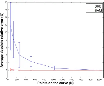
Figure 3.3: Absolute relative error from curve sub-sampling. A plot of the mean absolute relative error (%) of SRE (blue) and BAM (red) as functions ofN, the number of points taken around the curve. Error bars show standard deviation.
the results that are computed using BAM are of high quality. The SRE distance is highly regarded as a sensible measure of shape distance. This section presents results to show that measurements produced by BAM are comparable to measurements produced in the SRE framework.
Number of Points Around the Curve (N)
When computing distances between these shapes, something that affects both ac-curacy and speed is the choice of number of points around the curve (N). An experiment was performed to examine this effect, and inform our sampling choice for later experiments. Five pairs of curves were chosen from our bank of RPE1 cell curves and the BAM and SRE distances were computed between each pair at
N Average BAM time (seconds) Average SRE time (seconds) 64 5.0×10⁻³ 1.2×100
128 8.6×10⁻⁵ 2.9×100 256 9.1×10⁻⁵ 1.7×101 512 1.3×10⁻⁴ 1.2×10² 1024 1.8×10⁻⁴ 9.3×10² 2048 3.0×10⁻⁴ 7.4×10³
Table 3.1: A table displaying the average time taken to compute SRE and BAM measurements of pairs of shapes, for a range of values forN, which is the number of points sampled from around each curve. Each result is the average measurement computed over 5 distinct pairs of shapes.
an absolute relative error was computed. We define absolute relative error as
AREi(N) =
(Di(N)−Di(2048))
Di(2048)
, (3.8)
whereDi(N) is either the BAM or SRE distance measured between shapes fi and
gi at curve sample rateN. The motivation behind equation 3.8 is that accuracy will
increase as N is increased, soDi(2048) is the most accurate of our measurements.
Figure 3.3 shows the mean AREi(N) computed over i at each N, displayed as a
percentage. Here the red line represents the mean absolute relative error of BAM and the blue line represents the mean absolute relative error of SRE measurements. Error bars also show the standard deviation for each N. The error of the SRE measurements are not reliably below 1% until N = 1024, for this reason further analysis was performed on shapes represent with 1024 points.
The time taken to compute each shape distance was recorded. Table (3.1) presents the average time to compute BAM and SRE at each of the values used for N. It can be seen that atN = 128, BAM is 5 orders of magnitude faster than SRE, and atN = 2048, BAM is 7 orders of magnitude faster.
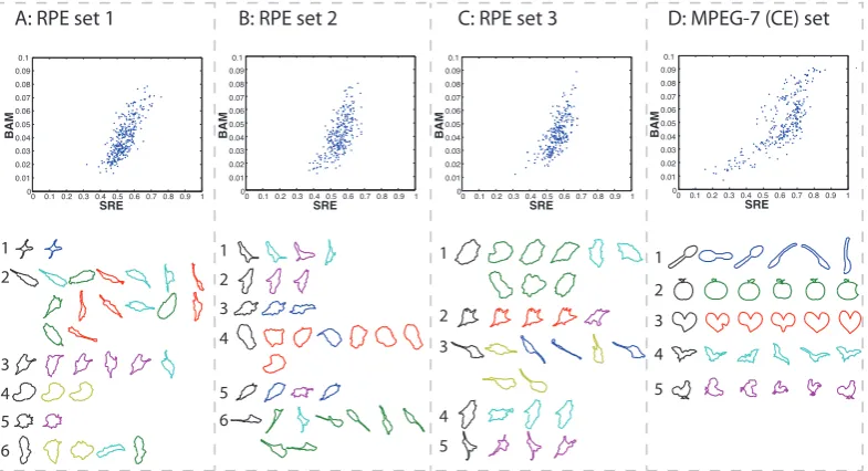
Metric Comparison
stock dataset of boundaries of migrating epithelial cells. The same experiment was then performed on data from a dataset used widely in computer vision literature. The fourth dataset was small subset of the MPEG-7 core experiment (CE) Shape-1 Part-B dataset [Latecki], which comprised of 5 randomly selected members of each of the following classes: spoon,apple,heart,batandchicken.
For each of these datasets the SRE and BAM distance between every distinct pair of shapes was computed. As mentioned above we wished to assess both the quantita-tive and qualitaquantita-tive comparability of the shape distances. The quantitaquantita-tive analysis consisted of examining the correlation statistics between the pairwise distances. For qualitative analysis we felt it was important to assess how similarly the two metrics worked in application. Hence the distances were used to create a similarity matrix (using equation 3.1) for each dataset, which was used to perform Affinity Propaga-tion clustering Frey and Dueck [2007]. Results can be seen in Figure 3.4, and are discussed below. Figure 3.4 contains four scatter plots showing pairwise SRE and BAM measurements for each dataset. All plots seem to indicate a positive correla-tion between the two distance measures.
The Spearman’s rank correlation coefficient between the SRE and BAM measure-ments was computed on each dataset, this had a mean and standard deviation of 0.71±0.85. High values of this correlation coefficient suggest that there that the two distance measurements are likely to be related by a monotonic function. There is clearly a high standard deviation and so we cannot argue that correlation is strong in a numerical sense. But we can still examine performance to see if the output is qualitatively similar.
Figure 3.4 contains an array of shapes for each of the four datasets. These shape arrays present the results of affinity propagation clustering according to both SRE and BAM for each dataset. In each array, shapes are separated vertically by cluster assignment according to SRE. That is to say, there is no row that contains shapes from more than one SRE cluster (although some larger clusters span more than one row). The black shapes in the first column of each array are the exemplary shapes according to SRE, these are aligned with the first row of each cluster. To the right (and sometimes below) each exemplar, the whole cluster (including the exemplar again) is displayed and coloured according to BAM based cluster assignment. If the clustering assignments match perfectly, each row is coloured one unique colour. In discussion, SRE clusters shall be referred to as numbered clusters from top to bottom, BAM clusters shall be referred to by their colours.
0 0.1 0.2 0.3 0.4 0.5 0.6 0.7 0.8 0.9 1 0 0.01 0.02 0.03 0.04 0.05 0.06 0.07 0.08 0.09 0.1 SRE BAM
0 0.1 0.2 0.3 0.4 0.5 0.6 0.7 0.8 0.9 1 0 0.01 0.02 0.03 0.04 0.05 0.06 0.07 0.08 0.09 0.1 SRE BAM
0 0.1 0.2 0.3 0.4 0.5 0.6 0.7 0.8 0.9 1 0 0.01 0.02 0.03 0.04 0.05 0.06 0.07 0.08 0.09 0.1 SRE BAM
0 0.1 0.2 0.3 0.4 0.5 0.6 0.7 0.8 0.9 1 0 0.01 0.02 0.03 0.04 0.05 0.06 0.07 0.08 0.09 0.1 SRE BAM
A: RPE set 1 B: RPE set 2 C: RPE set 3 D: MPEG-7 (CE) set
[image:44.595.125.518.109.322.2]1 2 3 4 5 6 1 2 3 4 5 6 1 2 3 4 5 1 2 3 4 5
Figure 3.4: Metric Comparison. A figure showing quantitative and qualitative comparisons of the measurements of SRE and BAM on four different datasets. Scat-ter plots display the SRE and BAM pairwise distances, demonstrating the extent of the correlation between the distances. The arrays of shapes show the results of affinity propagation, which was separately performed on the SRE and BAM based similarity matrices of each dataset. The shapes are separated vertically by cluster according to SRE. To the left of the first row of each cluster the exemplary shape of that cluster is repeated in black. The (non-black) shapes are coloured according to their cluster assignment by BAM. If the clustering assignments match perfectly, each row is coloured one unique colour. Datasets A, B and C are disjoint sets drawn randomly from a larger dataset of RPE cell outlines. Dataset D is a set of 25 shapes drawn from 5 classes of the MPEG-7 (CE) dataset.
3. Other small discrepancies seem to involve cells that could arguably lie in either of the identified clusters.
Affinity propagation upon the MPEG-7 (CE) set worked equally well with both shape measures, in that both measures resulted in perfect clustering.
3.4.3 Affinity Propagation on a Large Dataset
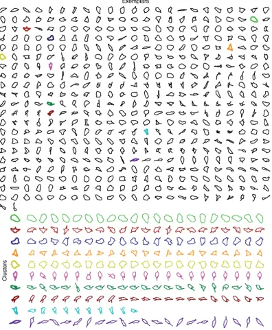
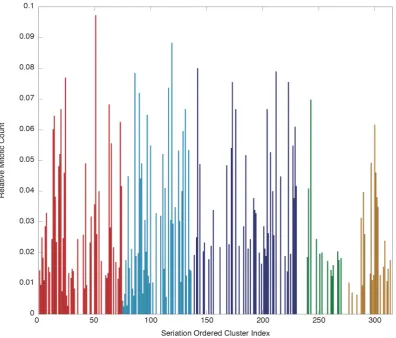
We now examine the performance of BAM alone, on a much larger dataset, and try to simply visually present the clustering assignment. Figure 3.5 displays the 485 exemplars generated from running AP on a dataset of 37818 RPE cell shapes (see section 2.1 for experimental information), as well as some randomly chosen elements from 6 randomly chosen clusters. A perfect clustering algorithm will have low intra-cluster variation and high inter-intra-cluster variation. It is hopefully apparent1 that the clusters have good (low) intra-cluster variation, in that the shapes in each cluster appear to share features. However it is also clear that inter-cluster variation is not consistently high, i.e. some of the exemplars are very similar to each other. This could be seen as redundancy in the model, to be tuned away with more appropriate parameters, however I believe this actually reflects the continuity of the data, i.e. hard clustering is not an accurate representation of the data. The cluster boundaries may therefore be an artifact of the algorithm, at some point the training just fits to the noise because there are no hard boundaries to be found. With that in mind, it must be remembered that the clusters are not independent from their neighbours, so we have developed an extension which attempts to incorporate this structure and gives us options for more quantitative models.
3.4.4 Seriation Extension to Affinity Propagation
In this section we outline an extension to Affinity Propagation that makes use of hierarchical clustering [Ward, 1963] and Wishart seriation (see 2.6 and [Wishart, 1999]). This is to overcome the issue that the hard clustering produced by Affinity Propagation is inappropriate for our continuous shape data. The intention is to measure the inter-cluster similarity and re-order the exemplars to best preserve the continuity in the data.
The result of Affinity Propagation is an assignment of each datapoint to an exemplar point. If we call this exemplar list J, and we recall the shape similarity matrix,
{sij : 1 ≤i, j ≤ K}, we can examine the submatrix constructed by selecting only
1
the columns corresponding to exemplars, i.e {sij : 1 ≤ i ≤ K, j ∈ J }. This
K×|J |submatrix, which we will now call ˆS, can be used to look at the inter-cluster similarity, since any two exemplars that are themselves similar, should produce similar similarity scores with respect to any given third shape. We therefore look at the correlation matrix,C, of ˆS, with the notion that a high correlation score will mean two clusters are similar and a low correlation score will mean they’re different. This correlation matrix can be treated as a similarity matrix for the clusters and we can apply seriation as described in 2.6. This algorithm is used to reorder the rows and columns of the correlation matrix to best reflect row-rank order, we can then put the exemplars into the same order as these rows and columns to create an ordered exemplar list.
Figure 3.6 shows the exemplars again, this time following the ordered exemplar list (presented left to right, line by line). It is clear again that the 485-cluster model has a lot of redundancy, in that many of the exemplars have very similar qualities and should arguably be grouped into the same cluster. In fact it is even clearer here since similar exemplars are placed next to each other. However in this figure it is also possible to see that short sequences of exemplars show gradual progressive changes, highlighting the continuity of the data.
There are noticeable points of discontinuity, simply because the data here is forced into a 1-dimensional format in this list and this is the best solution.
The seriation process is designed to reorder the branches of a dendrogram produced by hierarchical clustering. To produce the new exemplar order, we look at the last layer of the hierarchy where each exemplar occupies its own cluster. However the hierarchical clustering offers the ability for a user to reduce the number of clusters, and therefore limit the redundancy, as may be required. We have coloured the exemplars in figure 3.6 according to clustering into 7 clusters.
3.5
Application to Breast Cancer Histology Images
3.5.1 Introduction