U
SING
M
ACHINE
L
EARNING TO
S
UPPORT
B
ETTER AND
I
NTELLIGENT
V
ISUALISATION FOR
G
ENOMIC
D
ATA
Zhonglin Qu 18885806
Master of Philosophy
Supervisor: Dr Quang Vinh Nguyen
Co-Supervisor: Dr Yi Zhou
Co-Supervisor: Assoc. Professor Daniel R. Catchpoole
Submitted in fulfilment of the requirements for the degree of Master of Philosophy
School of Computing, Engineering and Mathematics Western Sydney University
Using Machine Learning to Support Better and Intelligent Visualisation for Genomic Data i
Keywords
Machine Learning, Visualisation, Artificial Intelligence, Virtual Reality, Genomic Data, Cancer Data, Visualisation Tools, Information Visualisation, Intelligent Visualisation, Visual Analytic.
Using Machine Learning to Support Better and Intelligent Visualisation for Genomic Data ii
Abstract
Massive amounts of genomic data are created for the advent of Next Generation Sequencing technologies. Great technological advances in methods of characterising the human diseases, including genetic and environmental factors, make it a great opportunity to understand the diseases and to find new diagnoses and treatments. Translating medical data becomes more and more rich and challenging. Visualisation can greatly aid the processing and integration of complex data. Genomic data visual analytics is rapidly evolving alongside with advances in high-throughput technologies such as Artificial Intelligence (AI), and Virtual Reality (VR). Personalised medicine requires new genomic visualisation tools, which can efficiently extract knowledge from the genomic data effectively and speed up expert decisions about the best treatment of an individual patient’s needs. However, meaningful visual analysis of such large genomic data remains a serious challenge.
Visualising these complex genomic data requires not only simply plotting of data but should also lead to better decisions. Machine learning has the ability to make prediction and aid in decision-making. Machine learning and visualisation are both effective ways to deal with big data, but they focus on different purposes. Machine learning applies statistical learning techniques to automatically identify patterns in data to make highly accurate prediction, while visualisation can leverage the human perceptual system to interpret and uncover hidden patterns in big data. Clinicians, experts and researchers intend to use both visualisation and machine learning to analyse their complex genomic data, but it is a serious challenge for them to understand and trust machine learning models in the serious medical industry.
The main goal of this thesis is to study the feasibility of intelligent and interactive visualisation which combined with machine learning algorithms for medical data analysis. A prototype has also been developed to illustrate the concept that visualising genomics data from childhood cancers in meaningful and dynamic ways could lead to better decisions. Machine learning algorithms are used and illustrated during visualising the cancer genomic data in order to provide highly accurate predictions. This research could open a new and exciting path to discovery for disease diagnostics and therapies.
Using Machine Learning to Support Better and Intelligent Visualisation for Genomic Data iii
Table of Contents
Keywords ... i
Abstract ... ii
Table of Contents ... iii
List of Figures ... v
List of Tables ... vii
List of Abbreviations ... viii
Statement of Original Authorship ... ix
Acknowledgements ... x
Chapter 1: Introduction ... 1
1.1 Genomic data Background ... 2
1.2 Visualisation ... 4
1.3 Visualisation for Genomic data ... 7
1.4 AI for genomic data visualisation ... 8
1.5 Research Aim and Questions ... 9
1.6 Thesis Outline ... 11
Chapter 2: Literature Review ... 13
2.1 Visualisation ... 13
2.2 Artificial Intelligence ... 18
2.3 Intelligent Visualisation ... 24
2.4 Methods of Genomic Data Analytics and Visualisation ... 29
2.5 Trends of Genomic Data Analytics and Visualisation ... 33
2.6 Summary and Implications ... 37
Chapter 3: Structured Review and Qualitative Review ... 38
3.1 Structured Review ... 38
3.2 Qualitative Review ... 61
3.3 Discussion ... 71
Chapter 4: Research Design ... 73
4.1 Aims and objectives ... 73
4.2 Methodology ... 74
4.3 Development Process ... 79
Chapter 5: Case Studies ... 86
5.1 Case Study 1—RMS dataset ... 86
5.2 Case Study 2—ALL dataset ... 89
Using Machine Learning to Support Better and Intelligent Visualisation for Genomic Data iv 6.1 Discussion ... 93 6.2 Conclusion ... 94 6.3 Future work ... 96 6.4 Publications ... 96 Bibliography ... 97 Appendices ... 107
Using Machine Learning to Support Better and Intelligent Visualisation for Genomic Data v
List of Figures
Figure 1 Worldwide human genome sequencing progress ... 3
Figure 2 Growth of DNA sequencing. ... 4
Figure 3 Different visualisation techniques suit with different size of datasets. ... 5
Figure 4 Treemap view of a social network’s track selections from a streaming media service network. ... 6
Figure 5 Trends of multivariate data analyses. ... 7
Figure 6 A canonical example of a machine learning application with these three stages for DNA sequences. ... 9
Figure 7 the Life Expectancy and Income of 182 nations in the year 2015. ... 14
Figure 8 User-centred design (UCD). ... 15
Figure 9 Zoomable map from crimeSpotting.org. ... 16
Figure 10 Scatterplot. ... 17
Figure 11 3D parallel coordinate... 17
Figure 12 Microsoft’s Holograph, an interactive 3-D platform. ... 18
Figure 13 Hierarchies in AI research. ... 19
Figure 14 Machine Learning potential industries. ... 20
Figure 15 Diagrams of several potential uses for machine learning in traditional analytical process. ... 22
Figure 16 A diagram of a small, stacked ensemble. ... 22
Figure 17 Example of decision tree. ... 23
Figure 18 Traditional spreadsheet and visualisation. ... 25
Figure 19 Behaviour-driven visualisation. ... 27
Figure 20 interplay between machine learning and data visualisation. ... 28
Figure 21 The distribution of genes in eukaryotic genomes. ... 30
Figure 22 Screenshot taken from the Ensembl genome browser. ... 31
Figure 23 Three visualisation methods. ... 32
Figure 24 Skin cancer classification technique. ... 34
Figure 25 Knowledge about associations between genomic factors and disease has rapidly accumulated. ... 36
Figure 26 Genomic Data Visualisation Methods: Scatter plots, Cluster, Heatmap, Network, Genomic Coordinates, AI and VR for visualisation. ... 39
Figure 27 IGV scatter plot displays the relationship ... 42
Using Machine Learning to Support Better and Intelligent Visualisation for Genomic Data vi
Figure 29 A heatmap for comparing genes between different patients. ... 44
Figure 30 IGV genomic coordinates. ... 46
Figure 31 Network visualisation from Cytoscape v3.4.0. ... 47
Figure 32 UCSC shows clustering heatmaps. ... 48
Figure 33 A Visualisation tool for childhood cancer research that runs in Microsoft HoloLens. ... 51
Figure 34 Tools timeline and integration, the blue arrows stand for the timeline and the green arrows stand for integration. ... 52
Figure 35 Genomic Data Visualisation Models. ... 62
Figure 36 The seamless visual analysis. ... 65
Figure 37 Visualisation tool that run on mobile devices. ... 67
Figure 38 A Visualisation on mixed reality Microsoft HoloLens. ... 68
Figure 39 Intelligent visualisation and machine learning framework. ... 75
Figure 40 Machine learning model. ... 77
Figure 41 Scatter Plot with R. ... 80
Figure 42 Decision tree drawn in R ... 81
Figure 43 Decision tree drawn by manual ... 81
Figure 44 Tree used Age as node ... 82
Figure 45 animated 3D scatter plot drawn by R ... 82
Figure 46 3D scatter plot drawn by Unity3D ... 83
Figure 47 An example of manual UI design ... 84
Figure 48 A visualisation process, the final version is shown in Figure 39 ... 84
Figure 49 Visualisation Illustrates the machine learning model, 3D scatter plot, input fields and the real-time prediction result for RMS patient dataset. ... 88
Figure 50 Visualisation Illustrates the machine learning model, 3D scatter plot, input fields and the real-time prediction result for ALL patient dataset. ... 90
Using Machine Learning to Support Better and Intelligent Visualisation for Genomic Data vii
List of Tables
Table 1 The list of visualisation methods, their descriptions and examples ... 41 Table 2 Tools for Visual Analytics of Genomic and Cancer Data ... 61 Table 3 Differences of decision tree model ... 85
Using Machine Learning to Support Better and Intelligent Visualisation for Genomic Data viii
List of Abbreviations
If appropriate, list any abbreviations used in the thesis.
AI: Artificial Intelligence VR: Virtual Reality AR: Augmented Reality
GBM: Glioblastoma Multiforme LGG: Lower Grade Glioma DNA: Deoxyribonucleic Acid RNA: Ribonucleic Acid
TCGA: The Cancer Genome Atlas SNA: Special Nucleic Acids MNV: Murine Norovirus InDels: Insertion and Deletion GO: Gene Ontology
GIAB: Genome in a Bottle
UCSC: University of California Santa Crus AML: Acute Myeloid Leukemia
ALL: Acute Lymphoblastic Leukaemia ARMS: Alveolar Rhabdomyosarcoma ERMS: Embryonal Rhabdomyosarcoma 3D: Three Dimensions
ID3: Iterative Dichotomiser 3
Using Machine Learning to Support Better and Intelligent Visualisation for Genomic Data ix
Statement of Original Authorship
The work contained in this thesis has not been previously submitted to meet requirements for an award at this or any other higher education institution. To the best of my knowledge and belief, the thesis contains no material previously published or written by another person except where due reference is made.
Signature:
Using Machine Learning to Support Better and Intelligent Visualisation for Genomic Data x
Acknowledgements
I cannot believe I am finally here. This thesis would not have been possible without the ongoing support of my supervisors, family, friends, and the academic staff at Western Sydney University.
In particular, I would like to acknowledge the dedication and guidance I received from my supervisors: Dr Quang Vinh Nguyen, Dr Yi Zhou and Assoc. Professor Daniel R. Catchpoole. Thank you all for your support and for sharing your extensive knowledge with me. Vinh, thank you for warmly welcoming me to the world of visual analytics and sharing your knowledge with me. I would not have made it to this point without your patience, persistence and care. Yi, thank you for helping me find and understand all the AI and machine learning knowledge. Dan, thank you for introducing me to the medical industry and arousing my curiosity about genomic data.
To my family: my husband Johnny, my children Zihan and Collins, thank you for your enduring support throughout this process. I would not have made it this far without your love and support.
Finally, to my amazing friends in the HICI group, thank you all for making this academic journal slightly more manageable and enjoyable.
Using Machine Learning to Support Better and Intelligent Visualisation for Genomic Data 1
Chapter 1:
Introduction
In recent years, Artificial Intelligence (AI) has started to be used for big data visualisation including multivariate genomic data for the development of new technologies. Machine learning, as one branch of the AI field, is a way of solving problems without explicitly codifying the solution and a way of building systems that improve themselves over time. AI or machine learning in specific has been applied in genomics for analysing genome sequencing, gene editing, clinical workflow and direct-to-consumer genomics. Future applications of machine learning in the field of genomics are diverse and may potentially contribute to the development of patient or population-specific pharmaceutical drugs. Although machine learning has extraordinary predictive abilities, the machine learning models and the algorithms are hard to understand and maybe even harder to trust, especially in serious industries such as the medical industry. Visualising machine learning models and predictive results in a meaningful way can interpret the complex algorithms and help clinicians, researchers and experts understand and trust the predictive results.
This thesis proposes a novel visualisation prototype that can illustrate the machine learning model and real-time predictive results along with conventional visualisation methods. The visualisation integrates a machine learning model and gives real-time predictions to assist researchers or clinicians’ decisions. The process of machine learning prediction is illustrated in the visualisation as well. The new visualisation tool can interpret the machine learning model for the domain experts who may not be familiar in predictive mathematics algorithms, and it can make the genomic data visualisation and decision-making procedure more reliable for them.
This chapter outlines the genomic data background (Section 1.1), the context of visualisation (Section 1.2), visualisation for genomic data (Section 1.3), Artificial Intelligence (AI) and machine learning for genomic data (Section 1.4). Section 1.5 describes the research aim and research questions. Finally, Section 1.6 includes an outline of the remaining chapters of the thesis.
Using Machine Learning to Support Better and Intelligent Visualisation for Genomic Data 2
1.1 GENOMIC DATA BACKGROUND
After computers and the Internet entered almost every arena of human society, large amounts of digital data are generated and collected in the different format, including medical and genomic data, which is also advancing at a dramatic pace. We are entering an era of big data – datasets that are characterised by high volume, velocity, variety, resolution and indexicality, relationality and flexibility (Khushboo Wadhwani, 2017). Large datasets have become very important sources for discovering insights and ultimately helps to make more precise decisions. However, big data brings in some challenges such as volume, variety, combining multiple data sets, velocity, veracity, data quality, data availability, data discovery, data quality, data extensiveness, personally recognisable information, data assertiveness, quantifiability, data processing, and data management (Khushboo Wadhwani, 2017).
Genomic is a recent convergence of multiple science disciplines including genetics, molecular biology, biochemistry, statistics and computer sciences. Since Gregor Mendel, known as the “father of modern genetics”, discovered the basic principles of heredity which became the foundation of modern genetics and leading to the study of heredity (Biography, 2017), huge amounts of genomic data have been collected around the world by different organisations. For example, one of the world’s largest pharmaceutical companies AstraZeneca has launched a massive effort to compile genome sequences and health records from two million people (Ledford, 2016). The company and its collaborators hoped to unearth rare genetic sequences that are associated with disease and with responses to treatment (Ledford, 2016). Meanwhile, Human Genome Project had successfully completed the ambitious goal of collecting sequence code covering three billion base pairs in the human genome, two years ahead of the previous projects (Francis S. Collins, 2012). From Figure 1, we can see the exponential pace of genomic data growth.
Using Machine Learning to Support Better and Intelligent Visualisation for Genomic Data 3 Figure 1 Worldwide human genome sequencing progress
(measured as base pairs of finished sequence deposited with GenBank) (Francis S. Collins, 2012).
With the development of new technologies, genomic data can be collected and stored in a short period of time and the cost has been dramatically reduced as well. Importantly, the technologies also lead to the age of individual genome sequencing which supports an era of personalised medicine (McClean, 2011). Personalised cancer medicine based on the molecular characteristics of a tumour from an individual patient has great potential in the therapy of many types of cancer (Wistuba, Gelovani, Jacoby, Davis, & Herbst, 2011).
In Figure 2, we can find that DNA sequencing capacities have grown rapidly since 2015 and this trend will likely continue in the future. If the growth continues at the current rate by doubling every seven months, then we should reach more than one Exabytes (1018) of sequence per year in the next five years and the approach one Zettabytes (1021) of sequence per year by 2025 (Stephens et al., 2015). In human health, the major needs driven by the big data are how to interpret genomic sequences and how to find patterns over very large collections in very high dimensions.
Using Machine Learning to Support Better and Intelligent Visualisation for Genomic Data 4 Figure 2 Growth of DNA sequencing.
The plot shows the growth of DNA sequencing both in the total number of human genomes sequenced (left axis) as well as the worldwide annual sequencing capacity (right axis: Tera-basepairs (Tbp), Peta-basepairs (Pbp), Exa-basepa (Stephens et al., 2015).
1.2 VISUALISATION
“A picture is worth a thousand words.” This is an adage especially for life science which is one of the biggest generators of enormous datasets as a result of recent and rapid technological advances. Visualisation is a quick, easy way to convey large amounts of complex data in a universal manner to help humans finding the potential values in their big data. Visualisation is becoming an increasingly important part of cognitive systems which can provide the highest bandwidth channel from the computer to the human. The term visualisation, in the past, meant constructing a visual image in the mind and now comes to mean something more like a graphical representation of data or concepts. The visualising way can be functioned as a cognitive tool which has the following advantages: providing an ability to comprehend huge amounts of data; allowing the perception of emergent properties that were not anticipated; enabling problems with the data to become immediately apparent; facilitating understanding of both large-scale and small-scale features of the data; and facilitating hypothesis formation (Green, Ribarsky, & Fisher, 2008; Keahey, 2013; Ware, 2013). Some intuitive visualisation tools are used to visualise multidimensional cancer genomics
Using Machine Learning to Support Better and Intelligent Visualisation for Genomic Data 5 data which integrate different types of alterations with clinical data for extraction of useful knowledge from the vast amount of data generated by high-throughput technologies (Q. V. Nguyen, Qian, Huang, & Zhang, 2013; Schroeder, Gonzalez-Perez, & Lopez-Bigas, 2013).
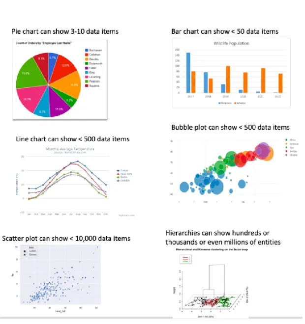
There are hundreds of visualisation methods in the research community. Different visualisation techniques may suit with different applications and datasets with different sizes and properties. As shown in Figure 3, Pie chart, bar chart, line chart, and bubble plot are classic visualisation techniques. Pie charts can show 3-10 data items, bar charts can show fewer than 50 data items, line charts can show fewer than 500 data items, bubble plots can show fewer than 500 data items and scatterplots can show fewer than 10,000 data items.
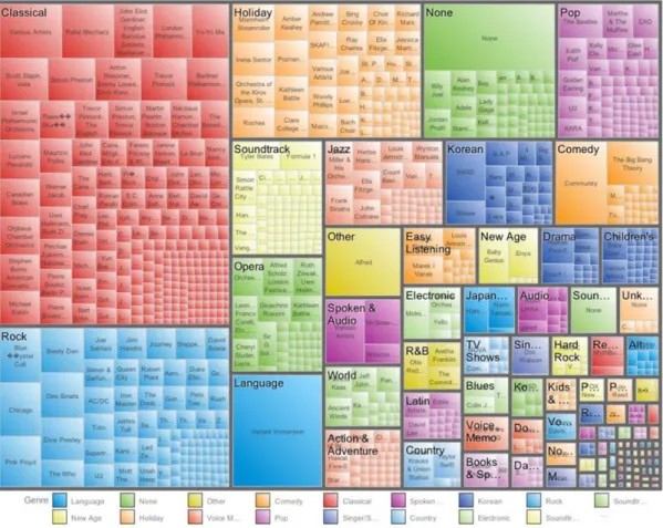
Using Machine Learning to Support Better and Intelligent Visualisation for Genomic Data 6 New visualisation techniques are used for big data such as hierarchies, which are very popular in data analytics and are powerful data abstractions for aggregating information into broader categories. Hierarchies are often referred as “tree” and some of them change to tree map. Many tree visualisation methods finely tuned for specific types of data such as genome sequencing, large social graphs and tournament matches, which can show hundreds or thousands or even millions of entities, are arranged in a hierarchical structure (Keahey, 2013). For example, Figure 4 shows a treemap visualisation of a collection of choices for streaming music and video tracks by a social network community, that a media service could find useful when designing personalised offers of music and videos for download.
Figure 4 Treemap view of a social network’s track selections from a streaming media service network.
Colour represents the genres of the selected tracks, with each genre subdivided into rectangles for each artist. Size of rectangle for both genre and artist represents the number of track plays in that category (Keahey, 2013).
Using Machine Learning to Support Better and Intelligent Visualisation for Genomic Data 7
1.3 VISUALISATION FOR GENOMIC DATA
The complexity of the genomic data makes these datasets incomprehensible without effective visualisation methods. Genomic data visualisation is a rapidly evolving field that has achieved in many areas such as hardware acceleration, standardised exchangeable file formats, dimensionality reduction, visual feature selection, multivariate data analyses, interoperability, 3D rendering and visualisation of complex data at different resolutions, especially in image processing combined with artificial intelligence-based pattern recognition (Pavlopoulos et al., 2015).
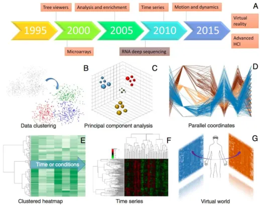
Figure 5 shows the trends of multivariate data analyses and visualisation including A) Timeline of the emergence of relevant technologies and concepts, and B) Visualisation of k-means partitional clustering algorithm, C) 3D visualisation of a principal component analysis, D) Visualisation of gene-expression measures across time using parallel coordinates, E) Visualisation of gene-expression clustering across time, F) 2D hierarchical clustering to visualise gene expressions against several time points or conditions, G) Hypothetical integration of analyses and expression heatmaps and the control of objects by VR devices (Pavlopoulos et al., 2015).
Figure 5 Trends of multivariate data analyses.
Visualisation corresponding to the timeline of relevant technologies and methods (Pavlopoulos et al., 2015).
Using Machine Learning to Support Better and Intelligent Visualisation for Genomic Data 8
1.4 AI FOR GENOMIC DATA VISUALISATION
Artificial Intelligence (AI) is already part of our everyday lives and has been heralded as the key to our civilization’s brightest future (Mills, 2016). Machine learning, as an approach to achieve artificial intelligence, is the practice of using algorithms to parse data, learn from it, and then make a determination or prediction about something in the world (Copeland, 2016). AI and machine learning boost the next generation of visualisation -- intelligent visualisation. Intelligent visualisation could remove the need for a human user to handle tedious or repetitive tasks by learning from previous sessions and input data. Intelligent visualisation combines machine learning algorithms to make high-level, goal-oriented decisions, which makes data visualisation technology directly accessible to a wide range of application scientists (Fuchs, Waser, & Groller, 2009; Ma, 2007).
Some modern data visualisation tools use AI technology, modern 3D plot(s), mobile device(s) and VR technique(s) to tell the full story of genomic data. 3D and VR techniques immerse the user in a digitally created space and simulate movement in three dimensions to greatly increase the bandwidth of data available to our brains (Leung, Delong, Alipanahi, & Frey, 2016; Q. V. Nguyen et al., 2016; Shilling, 2017). Most of the visualisation tools allow users to interact with the data in a way that is far more natural such as reaching out to manipulate objects with our hands, moving around them to view them from a clearer perspective and highlighting objects of interest with a point of the finger.
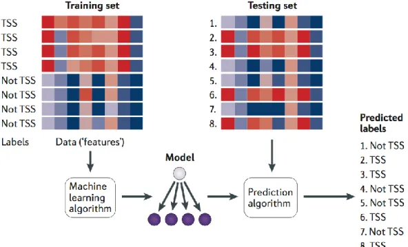
Machine learning combined with data visualisation should have three stages: developing an algorithm, applying genomic data to the algorithm, and predicting new unlabelled data (Libbrecht & Noble, 2015). Figure 6 shows a canonical example of a machine learning application with these three stages. A training set of DNA sequences is provided as input to a learning procedure, along with binary labels indicating whether each sequence is centred on a transcription start site (TSS) or not. The learning algorithm then produces a model that can then be subsequently used, in conjunction with a prediction algorithm, to assign predicted labels (such as ‘TSS’ or ‘not TSS’) to unlabelled test sequences. In the figure, the red-blue gradient might represent, for example, the scores of various motif models (one per column) against the DNA sequence.
Using Machine Learning to Support Better and Intelligent Visualisation for Genomic Data 9 Figure 6 A canonical example of a machine learning application with these three stages for DNA sequences.
(Libbrecht & Noble, 2015).
1.5 RESEARCH AND QUESTIONS AND AIM
Machine learning methods have become more important to genomic data. Gnomic visualisation tools combined with machine learning algorithms would be a new trend in the genomic visualisation evolution in the future. Machine learning is able to address important problems in genomic medicine, for example, creating a predictive model to determine how variations in the DNA of individuals can affect the risk of different disease and to find causal explanations, so that targeted therapies can be designed (Leung et al., 2016). Intelligent data visualisation can provide support to find the relationship between genomic data and diseases and then cure the disease with targeting personalised therapy (Quang Vinh Nguyen et al., 2011). In the analysis of genomic data, the current statistical analysis methods are not enough for achieving data insight, meanwhile, the application of machine learning and data visualisation has become more attractive. Although machine learning has extraordinary predictive abilities, the machine learning models and the algorithms are hard to understand and maybe even harder to trust, especially in serious industries such as the medical industry. Visualising machine learning models and predictive results in a meaningful
Using Machine Learning to Support Better and Intelligent Visualisation for Genomic Data 10 way can help interpret the complex algorithms and help clinicians, researchers and experts understand and trust the predictive results.
The aim of this thesis is to develop a meaningful intelligent visualisation phototype to show large and complex genomic data processed by machine learning models in order to find clues amongst childhood genomic cancer data. Decision tree, which is a machine learning algorithm, will be used in this intelligent visualisation phototype to provide predictive choices for clinicians to assist their decisions. The visualisation prototype not only visualises the patients’ data with the traditional techniques, but also illustrates the machine learning model and prediction process. The success of this research will aid the clinicians to tailor the treatment to the most efficacious for each individual and access to complex genomics data in meaningful and predictive ways.
The following is my research questions:
1. How to use the decision tree model to support effective and intelligent visualisation for genomic data?
The research aims to choose and apply a suitable machine learning algorithm to process genomic data and then visualise intelligently the structured data in the cohort. In this stage, we will use the decision tree model do predictions and help clinicians and medical researchers make better decisions. The model will create effective and intelligent scatterplot visualisations where the axis and attribute mappings and visual properties can be selected intelligently based on the user preference and the nature of the data.
2. How to develop a prototype to illustrate the effectiveness of the model to support better and intelligent visualisations by using scatterplots?
The thesis will develop an application and visualisation methods to present genomic data interactively and intelligently. The visualisation methods should be suitable for visualising big data and suitable for interpreting the machine learning model to the users as well.
Before we developed our prototype, we carried out a usability study to get users’ requirements and includes i) a systematically review about popular genomic data visualisation tools, and ii) a preliminary study for the qualitative review. In the systematically review, we provide a comprehensive comparison of the tools in both
Using Machine Learning to Support Better and Intelligent Visualisation for Genomic Data 11 aspects i) the visualisation methods in genomic and cancer data fields and ii) the trends of visualisation in genomic analytics fields from year 2000s. We reviewed the situation of current genomic and cancer data, the potential application to personalised medicine, and methods for genomic data visualisation. Here we assess the units of traditional approaches such as scatter plots, heatmaps, coordinates, networks and clustering, as well as emerging technologies involving AI and VR. We also review the evolution of genomic data visualisation tools from the speed of technology development, effective interactions, current tool status, tool integrations and new features. In the qualitative review, we interviewed five domain experts to collect feedback of three visualisation tools in order to gain a better understanding of the domain users’ preferences and expectations for the new genomic data visualisation tools.
The research starts with a literature review which presents the related work. Then it follows with three steps as following: i) a usability study to get users’ requirements which are stated in Chapter 3: Structured and Qualitative Studies on Genomic Visual Analytics. ii) a prototype implementation of my research which stated in Chapter 4: Research Design, and iii) case studies on the two datasets which stated in Chapter 5: Case Studies.
1.6 THESIS OUTLINE
The thesis includes Chapter 2: Literature Review; Chapter 3: Structured and Qualitative Studies on Genomic Visual Analytics ; Chapter 4: Research Design; Chapter 5: Case Studies; and Chapter 6: Discussion, Conclusions and Future Work.
Chapter 2: Literature Review describes the related work in the genomic data visualisation field and the existing research that relevant to this thesis. It focuses on the genomic visualisation, intelligent visualisation, artificial intelligence, visualisation methods and trends for genomic data, and the research implications.
Chapter 3: Structured and Qualitative Studies on Genomic Visual Analytics describes a structured review and a preliminary study from the usability study which is designed for the feedback analysis. The purpose of this chapter is to collect the requirements from both the existed tools and the end users who are clinicians or researchers.
Chapter 4: Research Design describes the design process from methodology, how to choose algorithms and selected tools for developing demos and applications.
Using Machine Learning to Support Better and Intelligent Visualisation for Genomic Data 12 The research design process is based on the lessons obtained through the study in Chapter 3.
Chapter 5: Results describes two case studies based on two datasets which are RMS and ALL patients’ genomic data. The two case studies use the prototype system to execute the requirements that are collected in the usability study in Chapter 3. The design methodology and models in Chapter 4 are also applied in the two case studies.
Chapter 6: Discussion, Conclusions and Future Work describes the discussion, research analysis and the future work arising from these studies. It also includes the publication that this thesis contributed.
Using Machine Learning to Support Better and Intelligent Visualisation for Genomic Data 13
Chapter 2:
Literature Review
This chapter begins with the Conception of Visualisation (Section 2.1); The Conception of Machine Learning (Section 2.2) and reviews literature on the following topics: [topic 1] (Section 2.3) [Intelligent Visualisation]; [topic 2] (Section 2.4) [Methods of Genomic Data Analytics and Visualisation]; and [topic 3] (Section 2.5 ) [Trends of Genomic Data Analytics and Visualisation]. Section 2.6 highlights the summary and implications from the literature and develops the conceptual framework for the study.
2.1 VISUALISATION
Visualisation is an essential tool for the human to understand information and uncover insights hidden in their data. The human short-term memory is capable of holding 3 – 7 items in place simultaneously, which means that people can only juggle a few items in their head before they start to lose track of them. Visual process interprets data into visual channels which externalizes the data and enables people to think about and manipulate the data at a higher level. The human visual system is by far the richest, most immediate, highest bandwidth pipeline into the human mind, which is estimated to process about nine megabits of information per second, that corresponds to close to one million letters of text per second (Keahey, 2013). Visualisation is designed to maximise the complementary cognitive strengths of both humans and computers. Humans have perceptual abilities, earliest reasoning skills such as adaptation and accommodation while the computer has superior working memory and can process information without cognitive biases. Human cognition model is used in visual analytics to create and analyse hypotheses which are initiated by the human, but the computer plays a significant role in shortening the process and neutralising biases, as contributing to a more solid conclusion through use of its strengths (Green et al., 2008).
Visual analytics usually use interactive visual interfaces to engage the fast-visual circuitry of the human brain to quickly find relations in complex data, trigger creative thoughts, and use these elements to steer the underlying computational analysis process which can extract new information for further insight (Garg, Nam,
Using Machine Learning to Support Better and Intelligent Visualisation for Genomic Data 14 Ramakrishnan, & Mueller, 2008). For example, the visual representation of quantitative data makes possible to obtain a fast understanding of the displayed reality. It may help to the patterns systematisation of complex relationship among various data types (Ortega & Aguillo, 2013). Figure 7 shows the Life Expectancy and Income of 182 nations in the year 2015 (Gapminder, 2015). Each bubble indicates a country. Size indicates the population. Colour indicates region or continents. It’s clear in this chart that India and China as Asia countries have more population and medium health level, most of the countries in Africa have less population and lower level health, and most countries in Europe and North America have less population but very high health level.
Figure 7 the Life Expectancy and Income of 182 nations in the year 2015. (Gapminder, 2015).
2.1.1 Usability and Interactive Dynamics
Universal usability for visualisation remains a formidable challenge as we need to address the needs of the different user who might have different network speed, different screen size, or different general knowledge. Designers need to choose rapid and high-resolution colour displays to present and manipulate big data in compact and user-controlled ways. Visualisation is used to provide compact graphical presentations and user interfaces for interactively manipulating a large number of data items, which
Using Machine Learning to Support Better and Intelligent Visualisation for Genomic Data 15 usually are extracted from far larger datasets. It also uses the enormous visual bandwidth and the remarkable human visual system to drive users to find potential information, make decisions, or propose explanations for patterns, groups of items, or individual items. Perceptual psychologists, statisticians, and graphic designers provide valuable advice about presenting data information, but user-interface designers still have challenges in processor speed, graphics devices and dynamic displays (Catherine Plaisant, 2005). Usability has three important criticisms: focus on well-defined tasks and goals, emphasis on efficient and effective, and satisfaction. Dimensions of usability in defining the conversation and driving the process are defined include learnability, efficiency, memorability, error tolerant and satisfaction (Quesenbery, 2003). Figure 8 shows a design process with consideration of usability from the very beginning of a project.
Figure 8 User-centred design (UCD).
This process is often called user-centred design (UCD) and comes with its own research tradition and international standards (Larry Goldberg, Trisha O’Connell, & Ben Shneiderman, 2011).
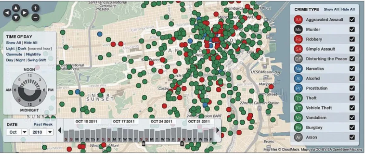
Interactive dynamics is also very important for visual analysis because a single image is not enough to provide a powerful means of making sense of data. Effective visual analytics tools must support the fluent and flexible use of visualisations at rates resonant with the pace of human thought and with basic interactive actions: filter, sort, derive and view manipulation (Jeffrey Heer, 2012). For example, Figure 9 shows a map which can be zoomed, filtered and scrolled. Real-time interactivity is very essential for showing meaningful dataset in a visualisation method.
Using Machine Learning to Support Better and Intelligent Visualisation for Genomic Data 16 Figure 9 Zoomable map from crimeSpotting.org.
(Jeffrey Heer, 2012).
2.1.2 Multidimensional Data Visualisation
High dimensionality is one of the major challenges for data visualisation because parameter optimisation problems require an understanding of the behaviour of the objective function in the n-dimensional space around the optimum and it is not an easy process to convert the high-dimensional data to low-dimensional geometry for display. Understanding the relationship between attributes in the large datasets is essential to extract information subject to constraints on their position or value of dimensional choice for display (Selan dos Santos, 2004).
The challenge of mapping high-dimensional data to lower-dimensional visual representations for large complex information is to find an insightful mapping method. The methods focus on the goals of generating representations that best show phenomena contained in the high-dimensional data like clusters and global or local correlations. Scatterplots and Parallel Coordinates are both commonly used visualisation technique to deal with multivariate datasets (Tatu et al., 2009).
Figure 10 is an example of scatterplots which used to visually inspect the clustering of individuals breeds to their assigned breeds. The first two eigenvectors of the genomic relationship matrix of all individuals in the dataset were used to visually inspect the clustering of individuals according to their assigned breeds. The eigenvector clustering shows significant overlap between breeds (e.g. Hanoverians and Trakehner), while sub-clusters within breeds were apparent (Claas Heuer, 2016).
Using Machine Learning to Support Better and Intelligent Visualisation for Genomic Data 17 Figure 10 Scatterplot.
Scatterplot of the first two eigenvectors of the genomic relationship matrix (a) and cumulative proportion of explained variance by eigenvalues in decreasing order (b) (Claas Heuer, 2016).
Figure 11 is an example of Parallel Coordinates which shows the coordinate view of all cells and nine selected genes. It extrudes the coordinate axes into the third dimension and order the data lines which represents one cell-back-to-front according to their position along the AP- or DV axis of the embryo. Spatial and gene expression information are clearly separated while the basic character of spatial gene expression patterns is preserved in one dimension (Viswebmaster, 2009).
Figure 11 3D parallel coordinate.
Using Machine Learning to Support Better and Intelligent Visualisation for Genomic Data 18 Another method to visualise high dimensional data is to visualise the data in a 3-D space by dividing the high dimension data into several groups of lower dimensional data first. Then using different icons to represent the different sets of data in the form, such as line, point, polygon, etc. (R. Jayabrabu, 2012).
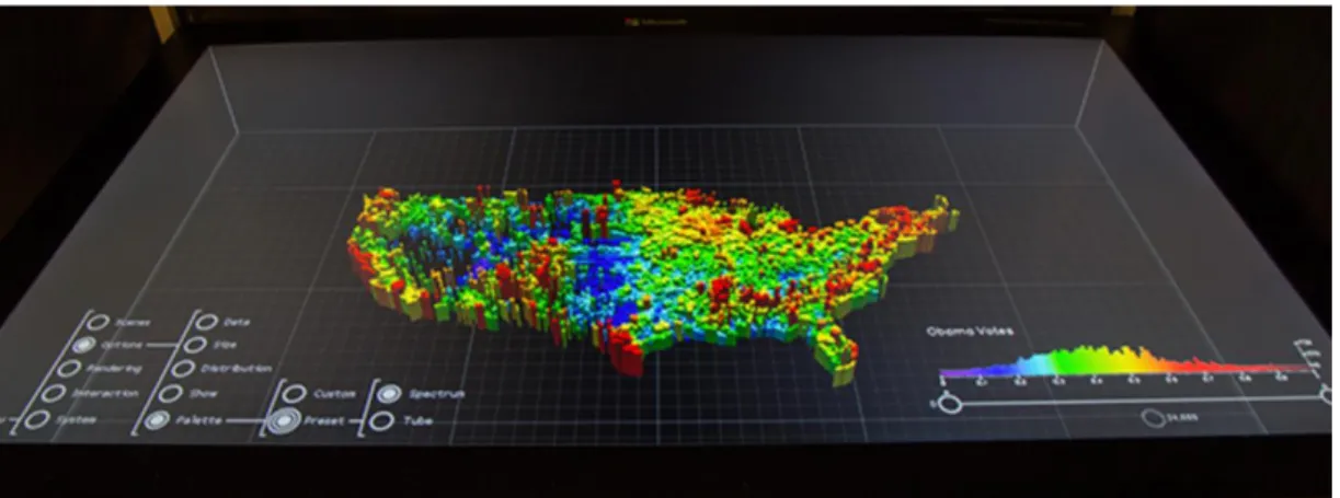
3-D visualisation creatively uses colour, size, the combination of space and time, and advanced computer graphics to show multidimensional data. For instance, neuroscientists Emmanuelle Tognoli and Scott Kelso developed a five-dimensional model known as the 5-D colourimetric technique, that provides a dynamic and comprehensive view of brain activity the through spatiotemporal display and colour coding. Another example is Microsoft’s Holograph, an interactive 3-D platform (Figure 12) that can render static and dynamic images above or below a plane for more natural exploration and manipulation of complex data. And commentary from team members Curtis Wong and David Brown posted on Microsoft News suggests that Holograph may one day allow users to actually reach inside a visual and interact with it (Towler, 2015).
Figure 12 Microsoft’s Holograph, an interactive 3-D platform. (Towler, 2015)
2.2 ARTIFICIAL INTELLIGENCE
2.2.1 AI and Machine Learning
Artificial Intelligence (AI) is a term of cognitive technologies and a big forest of academic and commercial work around the science and engineering intelligent machines. AI has many branches with many significant connections and commonalities among them. Figure 13 shows the most active AI branches (Mills, 2016). AI has been used in many industries and got more and more achievements. The
Using Machine Learning to Support Better and Intelligent Visualisation for Genomic Data 19 most dramatic outcome of Artificial Intelligence research is Google’s AlphaGo program which won the world’s best Go player Ke Jie three-match series (Russel, 2017).
Figure 13 Hierarchies in AI research. (Mills, 2016)
Machine learning has broad potential across industries and uses cases as shown in Figure 14. McKinsey identified 120 potential use cases of machine learning in 12 industries and surveyed more than 600 industry experts on their potential impact. They found an extraordinary breadth of potential applications for machine learning. Each of the use cases was identified as being one of the top three in an industry by at least one expert in that industry. McKinsey plotted the top 120 use cases below, with the y-axis shows the volume of available data (encompassing its breadth and frequency), while the x-axis shows the potential impact, based on surveys of more than 600 industry experts. Size of the bubble indicates the variety of data (number of data types), and the colour of the bubble indicates different industries (Columbus, 2017). For the Healthcare industry, predicting personalised health outcome and diagnosing diseases are both in the higher potential areas.
Using Machine Learning to Support Better and Intelligent Visualisation for Genomic Data 20 Figure 14 Machine Learning potential industries.
The y-axis shows the volume of available data (encompassing its breadth and frequency), while the x-axis shows the potential impact, based on surveys of more than 600 industry experts. Size of the bubble indicates variety of data (number of data types), and the colour of the bubble indicates different industries (James Manyika, 2017).
2.2.2 AI Use in Medical Clinical Practice
AI started to be used in medical clinical practice from the 1980s and in March 2000, a monthly magazine titled Medical Device & Diagnostic Industry published an article claiming that “the medical device industry is seeing an emergence of computer-based intelligent decision support system (DSSs) and expert system, the current system, the current success of which reflects a maturation of artificial intelligence (AI) technology.” Which mentioned several AI-infused devices such as Agilent Acute Cardiac Ischemia Time-Insensitive Predictive Instrument, Intelligent electro-cardiagram (ECG) device that predicts the probability of acute cardiac ischemia (ACI) and General Electric MAC 5000 Resting Test System. Dr. Paul Kligfield, Division of Cardiology at Cornell University stated: “Digital electrocardiographs of all major manufacturers now are capable of providing automated diagnostic statements that can help the physician.” (Nilsson, 2009).
Using Machine Learning to Support Better and Intelligent Visualisation for Genomic Data 21 As shown in Figure 13, machine learning is one branch of the field of artificial intelligence, a way of solving problems without explicitly codifying the solution and a way of building systems that improve themselves over time. The machine learning goal is typically to build predictive or descriptive models from characteristic features of a dataset and then use those features to draw conclusions from other similar datasets. For example, in cancer detection, diagnosis, and management, machine learning helps identify significant factors in high-dimensional datasets of genomic, proteomic, chemical or clinical data that can be used to understand of predicate underlying diseases, in addition to providing possible insights into effective disease management strategies. Machine learning classifiers do best when the number of dimensions is small (less than 100) and the number of data points is larger (greater than 1000). A most significant challenge in the application of machine learning to biological data is the problem of validation, or the task of determining the expected error rate from classifier when applied to a new dataset. 10-folder cross-validation and 10- folder validation idea is used as validation techniques (McCarthy et al., 2004).
Machine learning algorithms tend to create the linear, monotonic, non-polynomial, and even non-continuous functions that approximate the relationship between independent and dependent variables in a dataset. Some industries, such as serious legal mandate in the regulated verticals of banking, insurance, and medicine, need trusting machine learning models. Many organisations and individuals start to embrace machine learning algorithms for predictive modelling task, but it is still a challenge to the widespread practical use of data interpretation. A unique conundrum of banking, insurance, and other similar industries is to find ways to make more and more accurate predictions, but keep their models and modelling process transparent and interpretable (Patrick Hall, 2017).
2.2.3 Traditional Machine Learning and Modern Machine Learning Process
Traditional analytical lifecycle process can be augmented with machine learning techniques leading to potentially more accurate predictions from regulator-approved linear, monotonic models (Patrick Hall, 2017). Figure 15 outlines three possible scenarios in which analytical processes can be augmented with machine learning: introduce complex predictors into traditional, linear models; use multiple gated linear models, and predict linear model degradation.
Using Machine Learning to Support Better and Intelligent Visualisation for Genomic Data 22 Figure 15 Diagrams of several potential uses for machine learning in traditional analytical process.
(Patrick Hall, 2017)
Figure 16 is an illustration of cross-validated predictions from two decision trees and a linear regression being combined by another decision tree in a stacked ensemble. It is a more rigorous way to combine model predictions. This model incorporates machine learning models into traditional analytical processes in order to use linear, understandable models more efficiently and accurately (Patrick Hall, 2017).
Figure 16 A diagram of a small, stacked ensemble. (Patrick Hall, 2017).
Using Machine Learning to Support Better and Intelligent Visualisation for Genomic Data 23
2.2.4 Predicting Genetic Diseases with Decision Tree Model
Decision tree is a predictive model that uses a set of binary rules to calculate a targeted value which can be used for classification, and simple hierarchical structure to identify the class that belong objects from some descriptive traits. Decision tree can be utilised in a wide range of human activities and particularly in automated decision making (Badr Hssina, 2014). In the medical field, there are many applications of decision tree models which can aid in the diagnosis and identification of treatment protocols such as CART, random forest models. In molecular biology, decision trees are used to analyse amino acid sequences in the human genome project because it is simple to understand and interpret, and can help determine worst, best and expected values for different scenarios as well (kane, 2015). Figure 17 is an example of a decision tree model for a map. Training data is used to build the model. The tree generator needs to determine which variable to split at a node and the value of the split, make a terminal note, and assign terminal nodes to a class.
Figure 17 Example of decision tree. (Horning, 2015)
Random forest is one of the decision tree models which uses many decision tree models to classify or regress data. At Mendelics in Brazil, random forests have been used for almost three years in the field of genetics (Mario, 2016). The human genome is over 3 billion nucleotides long and every person has thousands of mutations. Unfortunately, some of these mutations, instead of changing the colour of your eyes, cause diseases. It is not straightforward to determine which mutations cause diseases
Using Machine Learning to Support Better and Intelligent Visualisation for Genomic Data 24 in the middle of this sea of mutations. Researchers in genetics have used machine learning models built with random forests to solve this problem (Mario, 2016).
2.3 INTELLIGENT VISUALISATION
2.3.1 What is Intelligent Visualisation and Why It Matters?
The objective of intelligent visualisation can be explained as “give everybody the right information at the right time and in the right way” which includes two aspects: the first refers to the problem of selecting the relevant information, depending on the situation and the needs, goals, and characteristics of the user; another aspect is that the information should be presented in a way promoting its rapid perception, proper understanding, and effective use which means effective preparation, organisation, and representation of the information (Natalia Andrienko, 2007).
The digital universe is doubling in size every two years (Oracle, 2015), and the amount of data that crosses the Internet every second is greater than all the data stored in the Internet just 20 years ago, which amounts to exabytes of data being created on a daily basis (Polsky, 2017). It is impossible for the human brain to process more than one value at a time let alone hundreds, thousands, millions or billions. Visualisations is the single easiest way for our brains to receive and interpret a large amount of information. Data visualisation represents data in a pictorial or graphical format which can simplify data values, promote the understanding of them, and communicate important concepts and ideas (Polsky, 2017). Advanced data visualisations not only support more in-deep and complex analytics to get insight into what is happened, but also can forecast what might happen with machine learning algorithms.
Figure 18 shows a traditional electronic spreadsheet which limits what you can see, but data visualisation can easily interpret, saving time and energy. As we can see from the left-side image, the spreadsheet cannot display a lot of data in the table and it extremely perceives a large number of numerical numbers. The right image uses charts and heatmaps illustrates the number of units that correspond to each age (represented by the colour gradient) as well as the reliability as the age of a unite increase. In a matter of seconds, we can see the units approaching 20 years of age are approximately 40 percent reliable. This visual simplifies the totality of the data, instantly clarifying what is happening with the reliability of the cell phone motors values, trends and the property of the information in a much better and clear way.
Using Machine Learning to Support Better and Intelligent Visualisation for Genomic Data 25 Figure 18 Traditional spreadsheet and visualisation.
A traditional spreadsheet limits what you can see, meanwhile, the right visualisation simplified the totality of the data and easy to get information instantly (Polsky, 2017)
2.3.2 Background on Intelligent Visualisation
The history of statistical graphics and data visualisation started from the earliest map-making and visual depiction, and then thematic cartography, statistics and statistical graphics, with applications and innovations in many fields of medicine and science that are often intertwined with each other (Friendly, 2006). Using pictures to understand data has been around for centuries. Maps and graphs started in the 17th century, then the pie chart was invented in the early 1800s, and then several decades later, one of the most cited examples of statistical graphics happened when Charles Minard mapped Napoleon’s invasion of Russia. The statistical graphics depicted the size of the army as well as the path of Napoleon’s retreat from Moscow, and tied that information to temperature and timescales for a more in-depth understanding of the event (SAS, 2017).
Using Machine Learning to Support Better and Intelligent Visualisation for Genomic Data 26 Technology speeds up data visualisation and lets it become a rapidly evolving blend of science and art as computers made it possible to process a large amount of data at lightning-fast speeds. There is no “one-size-fits-all” technique to visual data because every task and dataset has its own unique properties. Visualisation systems can integrate a large number of intelligent algorithms to automatically compose or recommend effective visualisation given a user’s task context. There are three categories in existing systems: task-based systems which use formal task descriptions as input to construct appropriate visual presentation; data property-based systems which focus on the dataset being visualised and using features of the data itself as input to the visualisation recommendation or composition algorithm; and hybrid systems which use a combination of both data properties and explicit representation of user intent to determine a proper visualisation. Behaviour-driven visualisation consists of two distinct phases: i) pattern detection which analyses user behaviour dynamically to find semantically meaningful interaction patterns by using a library of pattern definitions developed through observation of real-world visual analytic activity; and ii) visualisation recommendation which uses intelligent algorithms to detected patterns to infer a user’s intended visual task, and then automatically suggests alternative visualisations that support the inferred visual task more directly than the user’s current visualisation (Gotz & Wen, 2009).
Harvest is a behaviour-driven visualisation intelligent visual analytics system which builds a graph-based representation of interconnected trails to represent the user’s visual exploration behaviour. When users save their work via the bookmark, Harvest preserves both the state of the visualisation as well as the automatically recorded analytic trail. When a bookmark is later restored, the trail is restored as well. This allows a user to review the exploration recommendation, and it quickly led users to proper visualisation for their tasks (Gotz et al., 2010). Figure 19 shows key Harvest technologies: smart visual analytic widgets, dynamic visualisation recommendation, and semantics-based capture of insight provenance.
Using Machine Learning to Support Better and Intelligent Visualisation for Genomic Data 27 Figure 19 Behaviour-driven visualisation.
The left shows the history panel displays the unfolding analytics trail; the middle shows users can restore saved trails to re-use past analyses; the right shows mean and 95% confidence interval of task completion time and task error (Gotz et al., 2010)
2.3.3 Machine Learning and Intelligent Visualisation
Machine learning methods use statistical learning and computers to make predictions by finding patterns and unearthing boundaries in data (Stephanie, 2015). Machine learning algorithms have been used to assist in the exploration process in the past and now are used to depict various attributes using multiple views and to allow the engineer to interactively select a subset of the data in these views. The interactive visual analysis combined with machine learning algorithms can find hidden relations between multi attributes in the tedious multidimensional dataset (Fuchs et al., 2009). The future of big data visual exploration will involve the tight integration of visualisation tools with traditional techniques from such disciplines as statistics, machine learning, operations research, and simulation. Visual exploration also needs to combine fast automatic data mining algorithms with the intuitive power of the human mind which can improve the quality and speed of the data exploration process (Keim, 2001).
The fields of visualisation and machine learning have been addressing big data analysis from different perspectives and advances in both communities and need to be leveraged and in order to make progress. Machine learning has proposed algorithms and techniques that can process large volumes of data, enabling visualisation to scale, while information visualisation can leverage the human perceptual system to interpret and uncover hidden patterns in these datasets. Visualisation benefits from machine learning in exploratory procedures such as feature selection, dimensionality reduction and clustering (Daniel A. Keim, 2015).
Figure 20 interplays between machine learning and data visualisation. The core dataset (top) stores the information from the data stream which is pre-processed for
Using Machine Learning to Support Better and Intelligent Visualisation for Genomic Data 28 binary hashing and core sets discovery. Pre-processing enables index-based data retrieval, selection of representative data instances, and fast distance computation. Multi-view visualisation initially displays data. The core set also supports the user in digging deeper and retrieving data from neighbourhood, time, location or concept-specific spaces. Data-related semantic concepts are retrieved from related databases and organized in ontology or network. Visualisations are interlinked: any change in selection in one view updates the information in all other views. Machine learning algorithms for clustering, assessment of concept enrichment, outlier detection and classification of uncharacterised data instances are triggered on the fly. User’s interactions are recorded and modelled and provide means of predicting them and executing the most likely data-intensive operations that the user can trigger in the future before they are actually needed. The user can change the attributes or position of data instances in any visualisation, thus visually changing the objective function that is optimized in the visualisations. Change of objective function is followed by repositioning of data elements in the visualisations.
Figure 20 interplay between machine learning and data visualisation. (Daniel A. Keim, 2015).
Using Machine Learning to Support Better and Intelligent Visualisation for Genomic Data 29 Combining visualisation and machine learning is a challenge for big data analysis. Machine learning should not only be used for mining data but also be used to data visualisation to address the variety and span of data sources to improve human perception.
2.4 METHODS OF GENOMIC DATA ANALYTICS AND
VISUALISATION
2.4.1 Genome Data Collected and Stored
Entire genome sequences are getting completion which drives biology goes to the midst of an intellectual and experimental sea change. Huge data have been collected from the fortuitous confluence of technological advances in protein and DNA analysis as well as imaging advances in cell biology. In the late 1980s, the international Human Genome Project started to collect human genome sequence which stimulated developments both in high-throughput DNA sequencing, which were essential for the success of the project, and in powerful computational tools for sequence analysis. Figure 21 shows the components of studies in Saccharomyces cerevisiae where more and more genes had been studied from 1996 to 2000. In 1996, it was estimated that 30% known genes and 30% were unrecognizable. The situation is even more striking in multicellular organisms. In 1998, it was reported that only 7% had been studied previously, although 42% of the genes had some match to proteins and sequences of random complementary DNAs (expressed sequence tags). These matches can often be clues to the function of previously unstudied genes. By 2000, the number of completely novel genes with no match to anything previously encountered in DNA sequence was reduced to 17% of the 13,600 Drosophila genes in the fly genome (Vukmirovic & Tilghman, 2000).
Using Machine Learning to Support Better and Intelligent Visualisation for Genomic Data 30 Figure 21 The distribution of genes in eukaryotic genomes.
Shown for three organisms are the relative number of genes that were previously identified, to be known, and that had no match in any sequence database at the time of completion of the genome sequence (Vukmirovic & Tilghman, 2000)
Huge genome data has been collected in the past years and started to be shared by different groups such as scientist, bioinformaticians, clinicians and related researchers with various channels, for example, genome browser. Genome browser, which can make data openly accessible to support and progress scientific research across the globe, is an online graphical interface used to display genomic data. The genomic data is from Ensemble based in European, UCSC based at the University of California Santa Crus, and National Centre for Biotechnology Information base in
Using Machine Learning to Support Better and Intelligent Visualisation for Genomic Data 31 Maryland in the USA(Genome, 2016). Figure 22 shows the basic structure of the display on many genome browsers which present the genome sequence horizontally across the screen. Elements in the sequence are presented in specific colours and shapes according to a key.
Figure 22 Screenshot taken from the Ensembl genome browser.
It is showing the visualisation of the genes and other features of interest on human chromosome 16 (Genome, 2016)
2.4.2 Visualisation Tools for Analysing Genomic Data
Massive genomic datasets are generated by different projects which are stored and shared by different groups of professionals. Some basic analysis tools are developed such as Genome Analysis Toolkit and X:Map. Genome Analysis Toolkit (GATK) is a structured programming framework designed to ease the development of efficient and robust analysis tools for next-generation DNA sequencers using the functional programming philosophy of MapReduce (McKenna et al., 2010). X:Map is a tool which designed specifically for high-density microarrays that are required to show for each gene, transcript and exon the probe sets that match it, their specificity and for each probe, their locations of potential hybridization and for each individual exon, its sequence (Yates, Okoniewski, & Miller, 2008). It is essential to use visualisation of multidimensional oncogenomics data to extract useful knowledge from the vast amount of data generated by high-throughput technologies.
By using computational and statistical methodologies, effective visualisation is crucial to successful extraction of knowledge from oncogenomics data for domain experts. High-throughput technologies allow the comparison of the genomic
Using Machine Learning to Support Better and Intelligent Visualisation for Genomic Data 32 sequences, epigenomics profiles, and transcriptomes of tumour cells with those of normal cells. Visualisation techniques and tools can integrate different type of alterations with clinical experience to show the vast amount of multidimensional oncogenomics data in different types of plots such as heatmaps, genomic coordinates, and networks (Bhojwani et al., 2008; Rebeiz & Posakony, 2004; Schroeder et al., 2013). Figure 23 shows examples of three visualisation methods: matrix heatmaps, genomic coordinates and networks that are frequently used in cancer genomics research. Each of the three visualisation methods - matrix heatmaps (from Gitools), genomic coordinates (from UCSC/Cancer Genetics Browser, IGV and Savant) and networks (from CircleMap, Regulome explorer, Caleydo/StratomeX, and Cytoscape) - is associated with a vertex in the triangle. Tools that are placed at a vertex indicate the main visualisation method; those placed in between the vertices use a mixed-model visualisation method (Albuquerque et al., 2017; Schroeder et al., 2013).
Figure 23 Three visualisation methods.
Using Machine Learning to Support Better and Intelligent Visualisation for Genomic Data 33 With such big accumulated genomic data, the current analysis tools may not be sufficient for genomic data generation, distribution, and visualisation. Personalised medicine presents a unique challenge for new tools which can efficiently extract knowledge from the data, explore the multiple relationships between the data, and speed up expert’s decisions. Along with personalised cancer medicine’s development, cancer genomics data visualisation in the clinical setting is likely to become a key topic in the near future. Efficient tools, that support the visual stratification of the tumour genomic profiles and that highlight their relationships to know drugs or treatments, will be more useful than the existing research-oriented tools (Schroeder et al., 2013). In order to help downstream analysts to access and manipulate the massive sequencing datasets in a programmatic way, new feature-rich, efficient, and robust analysis tools are developed to process data and answer specific scientific questions (Chittaro, 2006; McKenna et al., 2010). Further efforts are required to develop new tools to meet the new demands and challenges in the field.
2.5 TRENDS OF GENOMIC DATA ANALYTICS AND VISUALISATION
2.5.1 AI, Machine Learning and Big Data in Healthcare Industry
New technology breaks the barriers such as cost, computing power to implement artificial intelligence and big data to the healthcare industry. Nowadays, sequencing of individual genomes and then comparing them to a vast database allow doctors to predict the probability of a particular disease and choose the best ways to treat those diseases when they appear. Google, Apple, Samsung, and other companies are investing billions in developing new biometric sensors. Combined with big data, the information from these sensors could help to prevent disease and extend lifespans (Marr, 2016a).
Computer scientists at Stanford created an artificial intelligent diagnosis algorithm for skin cancer and it performed with inspiring accuracy (Andre Esteva, 2017). They made a database of 129,450 skin disease images and trained their algorithms to visually diagnose potential cancer. For skin cancer, early detection is critical and mobile devices can potentially extend the reach of dermatologists outside of the clinic. It is projected that 6.3 billion smartphone subscriptions will exist by the year 2021 and can therefore potentially provide low-cost universal access to vital diagnostic care. Neural network, as a deep learning algorithm, allow medical