Institute of Visualization and Interactive Systems University of Stuttgart
Universitätsstraße 38 D–70569 Stuttgart
Bachelor’s Thesis Nr. 49
Visual Analytics of Dynamic
Computer Network Data
Fabian Merkle
Course of Study: Software Engineering
Examiner: Prof. Dr. Ertl
Supervisor: Dipl.Inf. Steffen Koch MSC Harald Bosch
Commenced: April 15, 2013 Completed: October 15, 2013
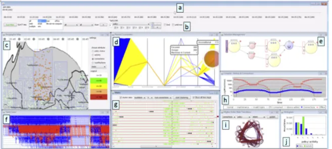
This paper presents how visual analytic techniques can be used for analyzing netflow information and thereby finding network attacks. Network security is a field of increasing importance, but also of increasing complexity. Today networks grow and are common in any larger company. At the same time the attacks increase and sensible data is less secure than before. Systems are built for analyzing network datasets in order to prevent file stealing or other large damages. Those systems try to use as much information as possible, but the large data amounts are difficult to be processed by human insight alone. In such cases automation methods can be of great help in preprocessing the data. On the other hand especially network security datasets with a lot of noise are hard to be solved completely by automation methods. Here human input can help to guide the calculation process. Visual analytics tries to combine both approaches. Most systems, built to solve this dilemma, are a collection of visualizations that show different aspects of a system.
To give the user a simpler approach for analyzing such complex datasets, the presented system, named AnNetTe, was built around one clear three-step interaction pipeline. First the users get an overview of all available data and select a time range. Second they examine the interaction in the network and decide which connections to focus on. Third they explore how the network and the connections they selected interact with each other in detail. Every single step of this pipeline will be presented and by doing so, it will be shown how the best fitting visualization has been found. In the end this system is tested in a small user study and the results of their usability feedback are evaluated.
Contents
1 Introduction 7
2 Related Work 11
3 IEEE VAST 2013 Mini Challege 3 15
4 Goals for the network analysis system 17
4.1 Goals . . . 17 4.2 Interaction Pipeline . . . 18 5 Visualization 21 5.1 Visualization concept . . . 21 5.2 Visualization levels . . . 22 5.2.1 Level 1 - Overview . . . 23 5.2.2 Level 2 - IP ring . . . 26
5.2.3 Level 3 - Connection detail graph . . . 28
6 Interaction 33 6.1 Interaction concept . . . 33
6.2 Interaction levels . . . 34
6.2.1 Level 1 - Overview interaction . . . 34
6.2.2 Level 2 - IP ring interaction . . . 34
6.2.3 Level 3 - Connection detail graph interaction . . . 36
7 Evaluation 37 7.1 First study . . . 37
7.2 Second study . . . 38
7.3 Summary and comparison of results . . . 38
8 Conclusion 41
List of Figures
2.1 HIVEBEAT - interactive visualization environment for security analysis (KBK+12) 11
2.2 FloVis Bundle Diagram for visualizing network connections (TPG+09) . . . 12
2.3 Example of an application using the node link diagram (TPG+09) . . . 12
2.4 ClockView interface using glyphs (KFM11) . . . 13
3.1 Example snipet of the netflow data . . . 15
4.1 Interaction pipeline for using AnNetTe . . . 18
5.1 Overall visualization of AnNetTe - Overview (A), connections (B) and connection details (C) . . . 21
5.2 Overview timelines of AnNetTe . . . 23
5.3 Tree-map showing the number of IP connections (done withTableau software) . 24 5.4 IP and port data analyzed with the entropy method - peaks or change points are marked as possible attacks . . . 25
5.5 IP ring of AnNetTe to visualize connections between IP groups . . . 26
5.6 First concept of how to visualize connections in a node link graph . . . 27
5.7 Connection detail graph of AnNetTe . . . 29
5.8 Parallel coordinates graph used to visualize connection details . . . 29
5.9 Example of the connection detail graph showing a denial of service attack . . . 31
6.1 Example of how to find a network attack with AnNetTe . . . 33
6.2 Details selection in the overview time axis . . . 34
6.3 Highlighting an IP group by mouse over in the IP ring of AnNetTe . . . 35
7.1 User study showing that users’ performance improved in the second study (blue) compared to the first attempt (green) . . . 39
7.2 User study showing that users in network security (blue) find using AnNetTe productive and useful . . . 40
1 Introduction
In today’s information age the transfer of data is of essential importance. Vast amounts of devices connect with each other in intranets and the Internet. These networks are the computational backbone for organizations and governments. The computer systems and networks are vital to these entities, since without them their communication and productivity would be eradicated. Even when intact, a network is useless if its transactions are not secure. This requirement for data protection together with constant growth in the cross linking of the devices are not only expanding in capacity of a network but also in complexity. A shadow economy has risen to steal data and harm networks of organizations, not mentioning cyber warfare. To counter these efforts security software is constantly improved and analysts apply network security analysis to detect malicious activities against their organization.
The network security analysis focuses on finding attacks or suspicious events in a given network dataset. The security analyst uses his experience and domain knowledge to examine the information tracked by the network to find intrusions or attacks. The network data the analysts use is generated in large amounts. The challenge for a network security analysis system is to present the relevant aspects to the analyst and to provide a way of interaction with the data. Two basic approaches can be applied:
• automatic methods • human effort
We will now look at these approaches and discuss their advantages and disadvantages.
Automatic methods are based on computing a result using algorithms. The automation can be used in various ways. Some recognize patterns in existing data. Others find outliers and anomalies. Some use statistics or are based on known attack patterns. In further ways, machine learning can be used to improve the automation methods. The advantages of automatic methods are precision and scalability. First, the automatic methods work exactly according to their algorithm. This gives them the high precision on the tasks they are designed for. The second advantage is that they can run, mostly, on any data size and maybe even on realtime data. The disadvantages of automatic methods are narrow scope and need for adaption. Narrow in scope, because the methods can only be used on exactly the cases they are designed for. Need for adaption, since they need to consistently be changed in order to account for new technologies, structural changes in the data and modification in attack behavior. Since the systems and attack patterns change rapidly one can not rely solely on automatic detection. Attackers try to find new ways to intrude a system, since if one was able to forecast the attack patterns, the attack could be prevented in the first place. This causes new patterns to arise frequently. Even if used extensively in a network security analysis system, the results of the
1 Introduction
automated methods have to be verified by a security analyst. As a result the ever-growing field of network security is too complex and especially too dynamic for automatic methods to work alone.
Human effort relies on security analysts interacting with the data. These domain experts refer to their experience and domain knowledge. They know from their training and from the attacks they uncovered in the past what to look for when analyzing network data. This leads to the advantage of the human effort being widely ranged and flexible. Wide ranged, because the users can rely on the full experience and the knowledge of the current context, which lets them take into account factors an algorithm never could. Flexible, because the human perception can adapt to changing circumstances very quickly without any need for a change in the algorithm. When used without any systems, the analyst would have to interact with the raw data. He would make database enquiries to search for the information he needs. It is the same with automatic methods as a result of the ever-growing field of network security as it is too complex and especially too dynamic for human effort to work alone.
The conclusion is that neither automatic methods nor human effort can work alone and the logical consequence is to combine them. This implies to focus on the strength of both approaches while mitigating their shortcomings. There could be a back and forth between the humans using the system and the internal automatic methods of the system. The automatic methods can efficiently determine standard attacks while the human effort can be used to find overarching patterns and verify edge cases. When using both approaches the users and the system can interact with each other. The system can highlight some patterns which are found by automatic methods. The user then applies these hints in his examination. He dives into the details while giving the system input and thereby directing the focus of the automatic methods.
The need for a combination of automatic methods and human effort raises the question of how the interaction between the humans and the system is done best. Since the human mind can best visually process large amounts of data, it stands to reason to use visual analytic techniques. Visual Analytics aims at including human analysts in interactive feedback loops, enabling them to steer and direct automatic methods based on the visual feedback they receive from previously processed data. Such approaches have been developed for the post analysis of large amounts of data and are currently becoming more common for the analysis and monitoring of dynamic data streams.
This thesis utilizes visual analytics methods to be applied to network security analysis and focuses especially on the netflow analysis. Netflow analysis uses records about the connections between the network devices to identify attacks like network scans or denial of service attacks. Common data examined for the analysis are the IPs and ports connecting with each other as well as the number of bytes and packages. From these logged variables the evaluation of anomalies and peaks lead to the detection of security events, which then can be solved by a network administrator. Combining both fields, this thesis aims at researching visual, interactive means for establishing, controlling and applying methods that support the interaction with the data in order to support the users’ case building in security analysis. In order to demonstrate the appliance of this case building process a system has been built. The system is called
AnNetTe. The name stands for"Analyzing network technology". The system differs from the
other network security solutions by having a clear and simple three-level interaction pipeline. The core part of the thesis is to elaborate the levels of the visualization, the interaction with them and how they are designed.
The structure of this thesis is divided into eight chapters. First the introduction in chapter 1 has given all background knowledge necessary on netflow analysis and visual analytics. Afterwards this knowledge is set into the context of current state of the art applications and concepts in these fields, by presenting the related workin chapter 2. This is followed by a description of theexample data in chapter 3. Then the main part of the thesis begins. Thegoalsare described in chapter 4 where the aspects of solving the netflow challenge are presented. Those goals and the interaction pipeline which has served as a major guideline for getting to the solution give a basic understanding. In chapter 5 this understanding is filled with all details of thevisualizationand all visual aspects of designing the solution. The interaction is then further described in chapter 6 with details on the interaction characteristics of the solution. Concluding the results of a small test group study will be presented in the evaluation in chapter 7. In the end all results are summarized as one conclusion in chapter 8.
2 Related Work
This chapter highlights previous visualization attempts in the field of netflow analysis.
Figure 2.1: HIVEBEAT - interactive visualization environment for security analysis (KBK+12)
HIVEBEAT is an interactive system for security analysis, see (KBK+12). As shown in Figure 2.1,HIVEBEAT combines multiple visualizations like parallel coordinates (d’O85) and matrix view, and additionally helps to visually analyze data sets of status logs. HIVEBEAT
offers a solution for applying an exploratory analysis starting with an overall visualization of the data and examining those further in lower-level views. In the solution presented in this thesis this approach is taken further by offering a unified interaction pipeline of three visualizations. Additionally status log analysis matrix, see Figure 2.1 (component g), serves as an inspiration for the integration of the health information in the third level of our system.
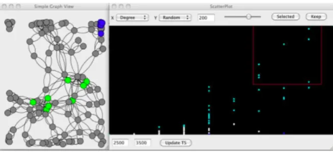
FloVis is a system that uses several views of network data supporting security analysis, see (TPG+09). Additional to role-based information it shows a way of visualizing host to host or network to network connections in a comprehensive way. The presented bundle diagram, Figure 2.2, serves as an inspiration for the visualization of connections between IPs in the second level of our system. This diagram is an alternative to showing networks in a node link diagram which reduces the cluttering of the connections. An example of such a node link diagram is presented in (HHY+10). It shows a visualization consisting of a node-link diagram, scatterplot, and time histogram that allows interactive analysis from different perspectives
2 Related Work
Figure 2.2: FloVis Bundle Diagram for visualizing network connections (TPG+09)
Figure 2.3: Example of an application using the node link diagram (TPG+09)
(see figure 2.3). As described above and in subsection 5.2.2, about the ring graph, we have considered using the node-link diagram and scatterplot, but decided alternative visualizations are more appropriate for large netflow data since the node link has a lot of clutter.
A challenge in the visualization of netflow data is that most data show normal network behavior and the user has to find out where the events of interest are. Therefore a visualization of data with various attributes often serves as a starting point for the analysis. There is also the pixel-matrix visualization technique applied for analyzing multi-attribute data used in Internet network performance analysis, see (HDKS07). The approach differs from the existing techniques by encapsulating regular graphics with color-encoded data values in order to enable users to detect root-causes without clicking through many charts and listings. We have adopted the idea of using color encoding to enable the user to identify different IP groups by color without any click.
ClockView shows the scalable glyph based visualization for the overview analysis, see Figure 2.4 and (KFM11). The approach is to give an overview over the network by showing the details in miniature glyphs in a time series. To use less clutter approach we use entropy data in the
Figure 2.4: ClockView interface using glyphs (KFM11)
overview described in (LCD05). This makes it possible to add other overview variables in a seamless way, see chapter Level 1 - Overview (subsection 5.2.1).
3 IEEE VAST 2013 Mini Challege 3
This chapter describes the network security data offered in the VAST 2013 Mini Challenge 3 which served as the basis for the solution.
IEEE is a professional association dedicated to advancing technological innovation with 425,000 members in 160 countries.1
The VAST Challenge is an annual competition in the field of visual analytics which is open to individuals and organizations. The challenge consists of three separate Mini Challenges. In 2013 the data provided by the Mini Challenge 3 focuses mostly on netflow data of the imaginary company "Big Marketing". Big Marketing has three company parts and around 400 workers as well as their PCs in each part. The IPs indicate in which company part the concerned machine is working and whether it has a special function, for example as an http server. The IPs either start with "10." for external IPs or with"172." for the internal subnet. The given datasets cover two weeks of information about the network of Big Marketing. The data consist of the following parts: netflow data, network health data and IPS log. At the center of the data is the IP address. Each of the different data types available contains the IP as a major reference point. The netflow data show connections between IPs. The network health data show status information about a device which is identified by IP. The IPS log shows warning information on connections which are also connected to IPs. These IP focused data offer the possibility to connect them. On the other hand the concentration offers the challenge to get along with mere IP data to analyze the network and missing additional information. Such information could, for example, be detected viruses or corrupted data. The data parts were given by the VAST committee mostly in coma separated value format, see Figure 3.1.
Figure 3.1: Example snipet of the netflow data
Thenetflow datais 5 GB in size for each week. Overall the csv files cover two weeks in 10 GB. Each row of the datafile represents one connection starting or ending in the companies’ network. For each connection 19 columns give insight into the parameters of this connection. The param-eters for the source and destination IP have a small uncertainty, since the logs might confuse
1
3 IEEE VAST 2013 Mini Challege 3
source and destination of one connection. This will not be considered in the further work. Other than the source and destination IP the information contains parameters of the connection such as whether it is TCP or UDP. A complete row contains the following variables: time, parsed-Date, dateTimeStr, ipLayerProtocol, ipLayerProtocolCode, firstSeenDestIp, firstSeenSrcPort, firstSeenDestPort, moreFragments, contFragments, durationSeconds, firstSeenSrcPayloadBytes, firstSeenDestPayloadBytes, firstSeenSrcTotalBytes, firstSeenDestPacketCount, firstSeenDest-TotalBytes, firstSeenSrcPacketCount andrecordForceOut. A snippet of the data is shown in figure Figure 3.1.
The network health data consists of status information on the workstations and servers. It has an overall size of 4 GB for both weeks. These are status values like CPU, disk and memory usage sent every few minutes to a health monitor. They are important for verifying a network event as an attack, since many attacks lead to unhealthy internal workstations after a short time period. One status message contains one or more of the following 14 columns:
ID, hostname, servicename, currenttime, statusvalue, bbcontent, receivedfrom, diskUsagePer-cent, pageFileUsagePerdiskUsagePer-cent, numProcs, loadAveragePerdiskUsagePer-cent, physicalMemoryUsagePerdiskUsagePer-cent, connMade and parsedDate.
TheIPS loggives hints where the network system detected an attack. An intrusion protection system (IPS) monitors and logs network activities. When it identifies apparently malicious connections, the IPS attempts to block or prevent the activity and creates a record. Such a system was installed into the Big Marketing Company at the beginning of the second week. Its size is only 2 GB for the second week, but its information is a very clear link to possible attacks. One important value in these data is the priority which shows the emergency level. A warning level is a strong indicator for an attack, while normal status message might only indicate some usual pattern. Since the logs are providing the source and destination information of a prevented attack they can be tracked back to the real connection data. Each prevention log consists of the following 13 columns: parsedDate, priority, operation, messageCode, protocol, srcIP, destIP, srcPort, destPort, destService, direction, flags and command.
With this given dataset and the task to analyze it for unusual events the implementation of the system AnNetTe has a clear environment and goal. On the other hand the data are generic enough so that the system works with other data too, as long as they are provided in same format. The resulting goals and visualization are described in the following chapters.
4 Goals for the network analysis system
The visualization solution submitted to the IEEE challenge 3 in 2013 is called AnNetTe. This stands for"analyzing network technology". The system is built in Javascript and uses the D3 (Data-Driven Documents) library, a successor of the Stanford Visualzation Groups’ Protovis. The datasets were preprocessed to decrease loading time in the web application.
The users are specified as experts in the field of network security since they are required to have prior domain knowledge. They should be able to determine whether an event shown in the system classifies as an attack by looking at the data presented. The system allows the users to examine anomalies in the data, see Example data (chapter 3), and verify whether these events are attacks.
This chapter first describes the goal for the visual design. It then extends on the major idea that is used when elaborating the solution: the interaction pipeline.
4.1 Goals
The goal of AnNetTe is to help security analysts to find network attacks. The core idea of the system is that the users can explore the data top-down. They start by selecting some network activities as an entry point in an overview. They then verify if the activities are attacks by drilling down into the information level by level. Each level in the visualization shows the details the level it derives from. This derivation logic leads the users through their analyses. In terms of design goal for AnNetTe we tried to find the right balance between functionality and simplicity. Here the goals in general are described. The later chapters refer to them and show how they are applied.
• Functionality: we define functionality as the quality of being suited to serve a purpose well, namely to find network attacks. We wanted to achieve this to ensure that our system is complete and correct. By complete we mean that the system contains all the relevant information which the user needs to come to a solution and therefore no other systems are needed. By correct we mean that the information represented is true and that the visualization is not misleading.
• Simplicity: we define simplicity as the quality of being easy to understand or to do. We wanted to achieve clear visualizations and make the system easy to use. By clear visualizations we mean focusing on the essential points and summarizing the information to remove unnecessary clutter. This means that every visualization in the system has its specific purpose in the interaction pipeline and concentrates on the information needed
4 Goals for the network analysis system
for that step. Each of those steps is represented in one of the levels described below. By easy to use we mean that the interaction with the system is intuitive and can be learned quickly.
4.2 Interaction Pipeline
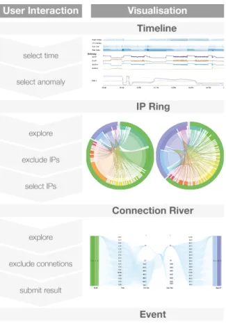
The core idea for the system AnNetTe is to focus on a simple interaction pipeline. Analyzing network to find attacks is a complex matter. Most current approaches give the user a vast variety of visualization and filters to work with the data. Our intention is to build a system consisting of an interaction pipeline concise and meaningful enough to reduce the visualizations and especially filtering done by the user down to a minimum. The contribution therefore is to make the network analysis easy without sacrificing too much depth. The major interaction with the system goes from top to the bottom, from the overview level over the IP ring graph to the connection detail graph. The full interaction thereby works as shown in Figure 4.1.
Figure 4.1: Interaction pipeline for using AnNetTe
The system is used to find network attacks by leading top down through the visualization of each level. The visualizations are linked to their predecessor one level higher. This is especially important since selecting an element will show its details in a visualization one level deeper.
4.2 Interaction Pipeline The system leads the user through the process by offering him an overview of what data are most important. This follows the concept of the sense making process described by Pirolli and Card (PC05). They show how analysts first search for a lot of data and filter them to the more important parts, as provided by our overview, then search for evidence in the ring graph and at last search for schemes in the connection river for their hypothesis building. From the visualization concept the interaction is adapted to the visual information-seeking mantra by Shneidermann (Shn96): Overview first, zoom and filter, then details-on-demand. First the overviewpresents sums of the values like health data over the whole time period. From then on theyzoom to a specific time range. The result is presented in the IP ring, where they explore the connections between the IPs of this period. Once decided for a group of IPs of interest they are represented and filtered in the connection detail graph. The users then exclude unwanted IPs until they are satisfied with the final result. To make playing with the data more convenient we have implementedundo andredo buttons in the connection detail graph and at the ring.
Each of these visualizations is optimized for its usage. For example the lowest level, the connection detail graph, shows the connections between two IP groups from left to right and displays additionally the time, the port and other variables previously hidden.
5 Visualization
This chapter will first describe the visualization concept, meaning the overarching approach for the visualization. This is followed by details about the design of the visualization for each of the three levels.
5.1 Visualization concept
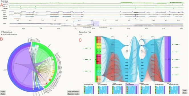
AnNetTe is divided into the following three parts, see Figure 5.1: Overview (A), connections (B) and connection details (C).
Figure 5.1: Overall visualization of AnNetTe - Overview (A), connections (B) and connection details (C)
Each part of AnNetTe represents a different level of detail. They logically follow each other and therefore enable a fluent and easy to grasp interaction with the system. We have come across with those levels by examining how events are found step by step. This emphasizes the difference from other solutions where the interaction process is often not as clear, see Interaction Pipeline (section 4.2). The reasoning behind the levels are referred to in more detail in the next chapters.
5 Visualization
1. Theoverview- see Figure 5.1 part A - is the highest level. This is where the user starts. It shows the most important variables, like bytes, health status or the amount of IPS warnings, as line charts on a timeline. On the x-axis the users select which peak time in the data they want to examine. See Level 1 - Overview (subsection 5.2.1). We have selected these data for the highest level since they serve as good indicators when deciding where to start the analysis. For example unusual peaks in bad health statuses of devices or in number of IPS warnings serve as a good entry point for the analyses.
2. Level 2 is the IP ring graph - see Figure 5.1 part B - showing all the connections between the IP groups of the selected time interval. It enables to quickly recognize which groups contain which IPs. See Level 2 - IP ring (subsection 5.2.2). Since the netflow data are the core information we worked with, we think it is best to visualize it by showing IP groups and the connections between them. To reduce clutter the IPs are consolidated to IP groups on this level.
3. The lowest and third level shows the connection detail graph- see Figure 5.1 part C - and is designed for the verification of the event. The visualisation shows source and destination IPs as blocks. Other information is added using different chart types, in order to have all variables available at the place were the final decision is made. See Level 3 - Connection detail graph (subsection 5.2.3). On this level the user needs all the details about the selected connections between individual IPs.
The approach is to design each level to concentrate on the exact information the users need in the respective stage of their analysis. We use multiple levels, since one visualization would have been too cluttered. An interplay, when jumping back and forth between the visualizations, can be used to put time or IPs in focus, in order to verify or refine an event, see Interaction (chapter 6).
5.2 Visualization levels
The visual structure of the system is the same as the position on the screen and the same as its position in the workflow we determined for these data. Each of the levels is described using the following template: goals, visualization, results.
1. goals: each section starts with a description of the data which the user wants to analyze and infers from it what the visualization should accomplish.
2. visualization: the thinking process is presented to clarify the design decisions which lead to the final visualization.
3. results: a conclusion is given which shows benefits and shortcomings of the selected visualization.
5.2 Visualization levels
5.2.1 Level 1 - Overview
The idea for an overview visualization has arisen while designing the connection graph — see Level 2 - IP ring (subsection 5.2.2). It became apparent that how the data changes over time is of major importance. The goal of this visualization is to give the users the possibility to skim over the dataset and to select the time range which they want to analyze further. As a first step we evaluate which information the user needs to get a clear understanding of the dataset. We take each data field and try if its data plotted on a time axis or on a tree-map graph is a good entry point to find events. The data we select as most important are: number of connections by IP and port, each divided into source and destination, health status, number of IPS denial warnings, CPU load and total bytes. All these data are presented in relation to time.
Two visualizations seem the most appropriate for this task: bar chart or timeline graph. The first alternative is bar charts. This is applicable since the data are aggregated for each minute in time. Therefore the continuous set can be visualized in discrete points. Its disadvantage is that it results in more clutter due to the number of bars and it is not applicable on the detailed axes where the axes would cover each other.
We have instead decided to visualize the overview variables with a traditional function graph, where the x-axis shows the time, see Figure 5.2. Although this method is usually used for continuous data, the fine granularity of the aggregation allows a normal view. We have chosen the timeline since it can be used for the overlapping detail data described below. As an additional advantage the lines show the information without clutter.
Figure 5.2: Overview timelines of AnNetTe
The function graph is used very often and most users know how to read it. When discussing how many axes should be used we decided to give each value its own axis. In order to make these values comparable, despite the separation, we align the timelines vertically below each
5 Visualization
other. The data of health status, number of IPS warnings, CPU load and total bytes is intuitive to use, as the peaks stand out clearly.
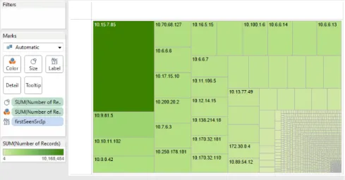
As an additional measure the entropy calculation of connections by IP and port, each divided into source and destination, seems to be useful when we analyze the data. Plotting these data on a simple time axis does not seem appropriate since peaks in number of connection are less imperative an indicator for an attack. In contrast to a simple counting measure the entropy shows the diversity and concentration of each dataset aggregated. This different aspect from the other overview values calls for these data to be represented by another variable. In our search for a useful way to visualize the number of connections we tried different visualizations like tree-maps, as first used by Shneidermann in the 1990s. Figure 5.3 shows how the information has no obvious relation to the overall development. Therefore we find it more useful to see the values in relation to their time. This is where we have come across the work done by Lakhina, Crovella, Diot (LCD05) on how to use traffic feature distribution when mining for anomalies in netflow data. We have decided to use their proposed method of visualizing the entropy for the number of connections for source and destination IP addresses and ports on time axis.
Figure 5.3: Tree-map showing the number of IP connections (done withTableau software) The entropy captures the degree of dispersal or concentration of a distribution of features. This means that it calculates a value showing how many different types of a variable are included in the dataset and how often each of them is used.
For a given histogram withX ={ni, i= 1, ..., N}, the featureioccursni times in the data. To
normalize the calculation the sum of all values ni is integrated as the divisorS . The entropy
H(X) is defined as:
H(X) =−X
i=1
n
(ni/S)log2(ni/S)
Using entropy values for the visualization has the advantage that patterns clearly emerge and the user can see anomalies more easily since major changes in the connections and not only
5.2 Visualization levels
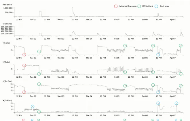
Figure 5.4: IP and port data analyzed with the entropy method - peaks or change points are marked as possible attacks
big increases of numbers are of interest. Figure 5.4 shows that you can identify network events by looking for a peak in the entropy of destination ports while there is a low in the entropy of destination IPs.
In addition to the described value and entropy timeline we have added a detail timeline. It can be seen at the bottom of Level 1 - Overview (subsection 5.2.1). This is appropriate since it is not easy enough to mark the exact period of time the users have in mind from the very small time axes. Another reason is that, even-though using one axis for each of the four entropy datasets are good when searching for points of interest over the whole data set, it appears to be useful to narrow the focus in an additional analysis step. This is achieved by a timeline where the axis shows the selected time range down to the minutes, depending on how much is selected on the time-range. All the entropy data are plotted on this axis. This means that there are four lines for the entropy of the connections: source IP and source port as well as destination IP and destination port . The lines are the same as in the entropy axes over the whole time-range but are bigger in size and have a more granular time axis since a shorter time is displayed on the same vertical space. The comparison between the different entropies is easier since they are in the same timeline. Alternatives to the detailed time axis could by the use of a technique similar to the one used in SmothScroll, see (WE11). We have decided against it since it would have taken too much space and our data do not have enough intermediate steps like years and months to visualize.
5 Visualization
5.2.2 Level 2 - IP ring
The second level visualization enables the analysis of connections in the network in a specified time frame. After the users having selected a time range where they have found suspicious data in the overview, they might want to see which IPs has caused the anomaly.
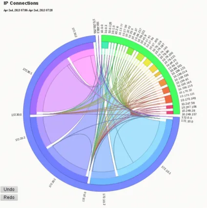
Figure 5.5: IP ring of AnNetTe to visualize connections between IP groups
In order to find those IPs, all the connections of that moment should be displayed. The data that should be focused on for this task is the source and destination IP as well as the number of connections between them.
Two visualizations seemed most appropriate for this task: a ring graph or a node link diagram. Other alternatives would have been a node to node matrix, a ranked listing of the connections or a tree map with linking edges as shown in (MFKN09).
The first alternative is a node link diagram, see Figure 5.6. Nodes would be the IP groups and the links would be the connections between them. It could use the position of nodes as an absolute reference for their identity. This would make it easier for users to recognize the nodes mentally. It would enable them to use the design element of color for an other variable. On the other hand there are two main disadvantages of the node link diagram: Firstly it is much more cluttered especially since there are lots of IP groups. Secondly the size of a node cannot be used. It would destroy the purpose of an absolute position of each node since they would
5.2 Visualization levels
Figure 5.6: First concept of how to visualize connections in a node link graph
move around depending on the size of the neighboring nodes. Additionally the connection itself cannot be varied in size or shape too much since they would clutter.
We have instead decided to visualize the connections in a ring graph, see Figure 5.5. This ring graph, with hierarchical edge bundling, was introduced by Holten (Hol06). The ring shows the sending and receiving IP groups on the circle ring and the connection is visualized by a line which goes through the internal part of ring. We use IP groups instead of single IPs because there was too much clutter in the ring and the loading time is decreased dramatically. We use a changed Holten’s graph in three ways:
1. The connections are not bundled in the centre of the graph, but at the destination point. In that way the width at the source of each connection can indicate the number of connections between this source and the destination of this connection.
2. The address spaces of an IP group are mapped on the layers of the ring edges. This mapping is done the following way: An IP is traditionally partitioned into multiple address spaces separated by a dot. We visualize this address spaces as multiple border layers of the ring. The outermost layer consists of the top domain and represents the highest grouping. This grouping partitions the ring and holds some additional meaning about how the IPs relate to each other. The outer most ring is separated only into a few parts and the user sees at a glance whether an element is external (IPs beginning with
"10.X") or not. Using color this is distinguished further.
3. Color is used to identify the different IP and to indicate the direction of the connections. The colors purple, blue and turquoise stand for the different parts of the company. To differentiate the IP groups of the same domaine the colors of the inner rings vary slightly and increase in brightness. The color scheme is built by using a color schemer1 and
1
the online color schemer used to set the color themehttp://www.workwithcolor.com/hsl-color-schemer-01. htm
5 Visualization
setting a linear lightness distance. Thus the analyst can see that all the purple elements and connections belong to internal IPs. The color also shows the direction of a connection: The source of a connection is the IP which has the same color as the connection itself. For example if a purple edge means that the IP group with a purple color is the one that connects to the IP group on the other end.
Another challenge is to separate the source and destination IPs on the ring and thus giving the connections a direction. Three approaches have been examined:
• Putting the source IPs on the left and the destination IPs on the right of the ring. This increases the elements since some elements appear on both sides of the ring. It also contradicts the semantic of bundling all IPs of one domain under the outermost ring. • Using arrows to indicate the direction of a connection. This results in clutter and the
arrows are unreadable if the amount of elements in the ring is high.
• Using the color of the source IP. This uses the color-scheme described above and adds the information in an elegant way. It is the approach which we have chosen.
The connection ring reveals the connections of specific IP groups by a distinction and unique color. This lets the users see changes over time. The size of the group makes it apparent if it plays an important role in the network in terms of connections for a specified time. In conclusion the unified color enables to recognize patterns over time. The user can animate or change the time selection to compare the situation directly.
5.2.3 Level 3 - Connection detail graph
The detailed visualization shows the most specific information about the connections of a selected IP group. The goal is to enable the detail verification of a network attack.
By the time the user reaches this level he has done a lot of filtering. He now wants to verify whether the selected connections are involved in some attack or not. In order to enable the users to do this evaluation of their case we have decided to provide them with a visualization containing detailed data. These data is each single source and destination IP, source and destination ports and a time dimension for the connections.
Two visualizations seem most appropriate for this task: parallel coordinates or our connection details graph.
The first alternative is parallel coordinates, see Figure 5.8. This graph type has been used in other instances like (KBK+12) and is first mentioned in (d’O85). It is easy to apply it since the program code to visualize it can be taken from a previous project. On the other hand we think parallel coordinates are less ideal for visualizing IP addresses since they are only ordinal scale and we found visualizing the IPs more intuitive similar to the parallel sets, see (KBH06). In our case this is expanded to a metaphorical meaning where a connection is something the user can mentally visualize as a line from a destination to a source instead of simply a dataset with abstract values where parallel coordinates are a better fit.
5.2 Visualization levels
Figure 5.7: Connection detail graph of AnNetTe
5 Visualization
We have decided to visualize the connections between the single IPs in a connection details graph, see Figure 5.7. This graph is a combination of different graph types. The information about the connections is shown like a parallel coordinate graph. The address spaces of the source and destination IPs are shown as differently sized blocks same as the IP groups in the IP ring, see Level 2 - IP ring (subsection 5.2.2). The health values are shown as a matrix with value encoded by color and size. We use the approach to combine all of those different visualizations because it enables search for the best fitting way to show the different data separately. We put them together into one graph because all the data are in one way or the other related to the single IPs.
As a further support we want to integrate the data of each single IP with health information such as CPU and memory usage of the machine. Additionally there is connection specific data like IPS warnings, the connection duration and variables like byte size and payload. The view contains the IP layers from the ring graph and puts the source group the users have selected on the right and the destination group on the left side. In each of the blocks we have added the last address space to the IPs ("255.255.1.X") as an additional layer to show the analysis on individual IPs, not only groups.
Then the source and destination IPs are connected with lines showing the connections. The connections flow through the following axes: time, source port, destination port and time again. The time appears twice since having it in the middle is harder to read for the user. Now users can know the timing of the connection in relation to the IPs not in relation to the ports. After this correction we add a variable axis in the middle which is visualized by the width of each connection. This variable can be the duration of the connection or variables like payload bytes, total source/destination bytes and package count. First the users can switch between those in a drop down. Later we change the selection of the variable representing the connection width to small multiple, meaning small representations of the visualizations. This preview makes the search for anomalies in the data very quick.
To enable the user to further verify an event we add health and IPS information directly into the details visualization. The health information is shown next to each internal IP as little colored squares. They represent values like CPU load, memory usage and the health status value. The squares are dark if its value is high, making outliers easy to spot.
The IPS logs are correlated to connections itself and therefore best plotted in a red color where the connections are shown.
This visualization makes it easy to see the relationship between the different data and use them to determine if they have found a network attack. The major benefit of this connection graph is that connections are shown in a way which the users can relate to. For example a port scan is visualized by one IP having a lot of connections with the ports of one IP. This is shown as a burst of lines, see Figure 5.9. The pattern can be used as a fingerprint for different attack types.
The next chapter describes the interaction concept.
5.2 Visualization levels
6 Interaction
This chapter describes the interaction concept, meaning the over arching approach for the interaction, which is shown in an example scenario. This is followed by details about the design of the interaction for each of the three levels.
6.1 Interaction concept
In order to show how the interaction in AnNetTe is designed, we will now look at an example of how AnNetTe can be used to find network events. Afterwards, the following sections will examine the interaction in each of the visualization levels.
Figure 6.1 shows an example case where users have used AnNetTe to find some network events. The users start by selecting the peak in total bytes in the overview. The river then shows them that there are a lot of connections to the corporate network from a few external IP groups. They then use the connection detail view to search for evidence of an attack. They look at the variables like health status and the domain knowledge to verify their supposition that there has been an attack. Once finished the connection details graph represents a fingerprint like identity of the event. This can be used to quickly identify events of a similar type. In this example the users have even found two events shown on the right side of Figure 6.1: a denial of service attack and a port scan.
2. Entropy outlier
3. Large oustanding connections
1. Total bytes peak
4. Exclude other ips
5. Find IPS
War ning log
3. Large range of ports
(a) (b) (c) (d) (e) (f )
Figure 6.1: Example of how to find a network attack with AnNetTe
As one can see the clear structure of the interaction pipeline makes it easy to work with netflow data by using AnNetTe.
6 Interaction
6.2 Interaction levels
This chapter describes how the interaction with AnNetTe works and the thinking behind these design decisions. We will first explain the basic idea and then illustrate the iteration from each level.
6.2.1 Level 1 - Overview interaction
The overview consists of timelines for which we have implemented a unified interaction. The users should be able to drag from the beginning to the end time on each of the timelines. We have therefore decided to implement how the user can interact with the overview timeline the same way on each of them, see Level 1 - Overview (subsection 5.2.1): main values, entropy data, details’ timeline and even the time lines in the connection detail graph, which will be explained later. Once the users have dragged from a point in the timeline the selection is shown by highlighting the area - see Figure 6.2. Labels at the borders of the selection indicate the absolute beginning and final time, which enable exact adjustments.
Figure 6.2: Details selection in the overview time axis
As the mouse button is released the selection is completed. This triggers the next visualization to load the next level, in this case the details entropy timeline. By such a displaying of details of a selection all the visualizations are linked. The detailed entropy timeline therefore represents the time selected in the level above and the size of the axis steps are calculated to be distributed evenly. This enables the user to change how detailed the timeline should be. The selection in this axis works exactly like on the other axis.
If the users later want to modify the time range the detailed line shows they can either drag the beginning or end line of the selection or the selection as a whole. As in common convention the mouse changes to left, right or multiple arrows to indicate that the users can change their selections. The change would also update the data shown in the lower levels. The linking makes it possible to quickly scan through the data and see the details in the ring immediately. In summary the interaction is the same in all the times lines of AnNetTe.
6.2.2 Level 2 - IP ring interaction
The interaction with the IP ring works in three steps: exploring, excluding and selecting. The first step is exploration. The users examine the connections by looking at IPs which have unusual activity. Since the visualization showing the IP groups is organized as a ring it is easy
6.2 Interaction levels
Figure 6.3: Highlighting an IP group by mouse over in the IP ring of AnNetTe
for the human perception to find the bigger slices on the circle. This could indicate a port scan since an IP tries to access a single IP with a lot of connections. Additional areas of focus could be the connections of an IP group, which the users have already detected as attackers in other events. They can recognize these groups by label or color. The exploration of the data is supported by using mouse over as a highlighting system. By highlighting we mean that if the mouse is moved over a connection in the center of the ring or an IP level on the outside of the ring, every other connection is faded away. The highlighting reduces clutter and helps the user to focus on what is important for him to come to a conclusion, see Figure 6.3. An interesting side effect is that, the user can move alongside the layers of the ring and the related connections because no click is needed for the highlighting. This immediate adaption of the visualization according to the position of the mouse enables the users to skim through the connections.
The second step is exclusion. Once the users have an overview over the connections they can exclude parts of the ring by clicking on connections or border layers in the ring. The element clicked on will disappear, along with its connections and IP source or destination counterpart. The ring will readjust after the exclusion so that the remaining IPs are now filling up the ring. We have introduced the exclusion functionality so that the user can remove the elements in the ring which are not relevant for the visualization of this attack.
6 Interaction
The third step is selection. After arranging the ring to show the connections which are suspicious the users click on theselection modebutton and select an IP group in the ring which they would like to analyze further. The selection will trigger to load the connection detail graph, which shows the activities of the IPs in detail.The highlighting of the selected element, which was described in the exploring paragraph of this chapter, freezes so that the ring shows only the selected connections even if the mouse leaves this area. We have introduced this locking of the highlighted state of the ring, since when using the system it has been hard to remember which part of the ring is shown in the connection detail graph. The highlighting changes if the mouse is used to examine other connections in the ring.
6.2.3 Level 3 - Connection detail graph interaction
The connection detail graph has some similarity with the other visualizations. We use this to keep the interaction consistent. Therefore the user will use the ring by the same three steps as the ring: exploring, exclusion and selection.
The first step is exploration. The analysis of what happened between the destination and source IPs is done with the IP layers and the timeline of the connection detail graph. The exploration is mostly done by moving the mouse over an element to explore. The interactions with the timeline and the IP layer are derived from the other visualizations in the AnNetTe. This way the user already knows how to interact with them. The two vertical time axes in the connection detail graph are selectable the same way as the overview timelines. The selection of any time range will highlight the connections from this time as seen in Figure 6.2. For the IP layers in the connection detail graph the interaction logic is taken from the outside rings in the IP ring. As the mouse is moved over a block of the source or destination layers, the corresponding connections are highlighted and the other connections fade out. To verify an event as an attack the health data is useful. This information is shown in the connection detail graph as colored boxes attached to an internal IP. Mouse over system tips show specific values.
The second step is exclusion. For the connection detail graph to show the IPs and connections involved in the attack the users click on every uninvolved element. It is the same as in the ring where every element which is clicked, disappears and the visualization enlarges the remaining elements.
The third is selection. The selection is used to focus an element and thereby excluding every other element. Just as in the ring the user can use the buttonsselection mode and exclusion mode to switch between selection and exclusion.
After having used exclusion, the connection detail graph visualization now shows a snapshot of the event in which a flow of the connections symbolizes a fingerprint. By fingerprint we mean that the characteristics of the attack type, like port scan or denial of service attack are reflected in the shape of the connections combined. Attacks of the same type would look similar and this would serve as a visual clue to find and evaluate other events of the same type. The next chapter describes the evaluation of AnNetTe.
7 Evaluation
In order to evaluate the interface of AnNetTe we have performed two small user studies. The first study was performed with nine computer scientists who had no previous knowledge of the system or the domain. After this feedback was implemented, a second study with 17 people, including the previous nine was done in order to verify the improvements. This chapter will first describe the studies and then present the results.
7.1 First study
In the first study the participants performed three parts: get an introduction to the system, fulfill tasks with the system and give feedback about the usability.
Firstly, the set up was that we gave the participants a short 15 minute overview of the interface. This explanation consisted of telling the participants the purpose of AnNetTe and walking them through the levels of the visualization. The introduction contained the information shown in Visualization concept (section 5.1)
Second, the participants had to solve four tasks. The task were performed by the participants individually. The whole process was supposed to take about 30 to maximally 45 minutes for each participant. The four task were:
• task 1 - a walkthrough to let the participants see how the system works in action by doing it themselves. The question was"Note down your steps to find the network breakdown in day 14 or 15 and which timeline you used."
• task 2 - The question was"Find a DOS or DDOS attack in day 2 and name the starting time of the attack by using the entropy package."
• task 3 - The question was "Find all events in day 13 by using any timeline you prefer. Please note down which timeline(s) you used to find which event."
• task 4 - The question was"Verify the events you found in Task 4 by using all features of the system. Name as much proof as you can find and tell us how you found it."
The performance of these tasks took more time than we expected. The participants first had to get familiar with the system and data. The study took 90 minutes and only the first three tasks were completed.
7 Evaluation
Thirdly, after having finished their tasks, the participants filled in a questionnaire. In this questionnaire participants could rate different areas on a scale form 1 "absolutely false" to 5
"absolutely true". The questionnaire was part of the CSUS questionnaire for usability rating. This first study was performed by nine computer science students. Their average age was 24. This students were familiar with the usage of visualization tools. Other than basic knowledge, they were unfamiliar with the field of network security.
7.2 Second study
After the first study had been finished and evaluated, the system was adapted to some feedback. When the improvements were complete a second study was done in order to review the results. This time there were 17 participants. They either participated in the first study or had more experience in the network security domain.
The introduction was left out and replaced by an online tutorial screen. The participants of the first study should know the system already. The new participants we expected to adapt faster, since they knew the field.
The tasks of the second study was slightly adapted to the new features. Since the first study was longer than we found necessary, the second study only contained three tasks:
• task 1- walkthrough: "Note down your steps for finding the network breakdown in day 2."
• task 2 - other’s insight: "Select and comment on other submitted events of DoS attack in day 2."
• task 3 - submit new event: "Through others’ finding and your own analysis, please submit at least 1 event and provide the proof and how you found it."
The execution was timed in a better way in this study and all participants finished after a maximum of 40 minutes. When finished with the second study all participants had to fill in the same questionnaire as in the first study.
7.3 Summary and comparison of results
To clarify the changes between the studies we will shortly describe the textual feedback of the first study as well as the changes resulting from that feedback. Then we will compare the results of both studies.
The first textual feedback allowed the users to give feedback on the positive aspects of the system. Five of the participants found the visualizations helpful, while four people liked the look and feel of the system. The points that were described as very useful are the entropy and data overview in different timelines as well as the interaction with the ring graph data.
7.3 Summary and comparison of results In a second question the participants were asked for the most negative aspects as well as for feedback on possible improvements. All participants agreed that the system was too slow for comfortable usage. This problem was later tackled on the backend side. The speed was now more appropriate but still not fast due to the large data size. Another point on which five people commented was that the context of the problem is hard to understand. We afterwards improved the tutorial screen, but think that this general feedback was due to the lack of expertise of participants in network security. None of the later participating network security domain experts had problems understanding the data. Another less prominent feedback considered the color scheme as confusing or the labels to close to each other. These smaller problems were changed for the second study. Now that the feedback and changes are explained the two study results are compared.
For a clear comparison of the efficiency improvement between both studies we look at the correctness of the tasks (Figure 7.1). In both studies we see that the results decrease in correctness according to the increasing difficulty of later tasks. At the same time we see a clear increase of correctness between the two studies. This is the result of better preparation and domain knowledge on the one hand and the improvements and new features resulting of the feedback on the other hand.
88 76 71 94 94 88 Task 1 Task 2 Task 3 Type A Type B
Figure 7.1: User study showing that users’ performance improved in the second study (blue) compared to the first attempt (green)
The values from the questionnaire verify this impression. Here the participants gave a more profound evaluation after the improvements. Figure 7.2 shows the numeric answers the participant of the study gave. It becomes apparent that the participants with prior knowledge about network security, shown in blue here, give a good rating to the system, especially in comparison to the participants of the user group consisting of computer science students. The good ratings, meaning a score of four or higher, on the questions about"quick productivity",
"information easy to find" and"information useful for the task" show that these aspects we aimed for were achieved according to the participants with domain knowledge. The ratings from the other group could be explained by the fact that network security is a field unknown to normal users. This could be avoided by giving the participating computer scientists a deeper introduction to the background of this domain field.
Both comparisons approve of the current version of AnNetTe and show good usability values. Thus the usefulness of these visualizations have not only been achieved theoretically but also shown by the practical experience of the participants.
7 Evaluation
Figure 7.2: User study showing that users in network security (blue) find using AnNetTe productive and useful
8 Conclusion
We have shown how visual analytics can be used to build a streamlined interaction pipeline for analyzing network data. The task has been to use visual analytics for tackling problems where the human interaction with complex data is needed. We have used visual analytics to combine the perception and analytical skill of the users, which is unachieved by machines, with the efficiency and scalability of automatic methods.
AnNetTe demonstrates that it is useful for a complex visualization system to have a clear entry point. The logical starting point for the users is the top level of the interaction pipeline, the overview timelines. These timelines serve as a summery and a point of reference from where to start the analysis. It gives the users a feeling of how much data they have yet to examine and can even motivate them more to complete the analysis. Once the users have selected the time interval to focus on, they will use the second level of the interaction pipeline, the IP ring graph, to determine which IP groups will be included in the further case verification. The structure of the IP ring graph makes it easy to compare the IP groups and their connections in relation with each other. Second offenders become apparent, since the IP groups can be identified by their individual color. Following the selection of IP groups, the third level of the pipeline, the connection details graph finally gives the user all the information needed on a single IP level to verify the network attacks. Even though this level contains a lot of different information, the variables are logically connected to a revealing visualization of the connection details. The interaction pipeline leads the users through the analysis, so that they can focus on the relevant information without distraction. Each level shows the information appropriate for the stage the user is in. This makes it feasible to have an interface without any complex filters. The fact that AnNetTe received an Outstanding Situation Awareness award by the IEEE VAST Challenge 2013 Committee, emphasizes that the techniques are effective. This confirmed AnNetTe’s practical use as a tool for netflow analysis. The user study has proved that by applying this system we have found a solution which has brought about simplicity and functionality, despise dealing with complex data.
The approach of focusing the visualizations on a streamlined interaction pipeline when designing a visual analytics’ system, could in future work be applied to domains other than security analysis.
Bibliography
[d’O85] M. d’Ocagne. CoordonnÈes parallËles et axiales : MÈthode de transformation gÈomÈtrique et procÈdÈ nouveau de calcul graphique dÈduits de la considÈration des coordonnÈes parallËles. Gauthier-Villars, 1885. (Cited on pages 11 and 28) [HDKS07] M. C. Hao, U. Dayal, D. Keim, T. Schreck. A Visual Analysis of Multi-Attribute
Data Using Pixel Matrix Displays. Electronic Imaging 2007, pp. 649505-649505. International Society for Optics and Photonics, 2007. (Cited on page 12)
[HHY+10] L. Harrison, X. Hu, X. Ying, A. Lu, W. Wang, X. Wu. Interactive Detection of
Network Anomalies via Coordinated Multiple Views. Proceedings of the Seventh International Symposium on Visualization for Cyber Security, pp. 91-101, 2010. (Cited on page 11)
[Hol06] D. Holten. Hierarchical Edge Bundles: Visualization of Adjacency Relations in Hierarchical Data. Visualization and Computer Graphics, IEEE Transactions on 12, no. 5 (2006): 741-748, 2006. (Cited on page 27)
[KBH06] R. Kosara, F. Bendix, H. Hauser. Parallel Sets: Interactive Exploration and Visual Analysis of Categorical Data,. Transactions on Visualization and Computer Graphics, 2006. (Cited on page 28)
[KBK+12] R. Krüger, H. Bosch, S. Koch, C. Müller, G. Reina, D. Thom, T. Ertl. HIVEBEAT— A highly interactive visualization environment for broad-scale exploratory analysis and tracing. VAST 2012 Mini Challenge 1 award: Honorable mention for compre-hensive visualization suite." In Visual Analytics Science and Technology (VAST), 2012 IEEE Conference on, pp. 277-278, 2012. (Cited on pages 6, 11 and 28) [KFM11] C. Kintzel, J. Fuchs, F. Mansmann. Monitoring Large IP Spaces with ClockView.
Proceedings of the 8th International Symposium on Visualization for Cyber Security, p. 2, 2011. (Cited on pages 6, 12 and 13)
[LCD05] A. Lakhina, M. Crovella, C. Diot. Mining Anomalies Using Traffic Feature Distributions. ACM SIGCOMM Computer Communication Review, vol. 35, no. 4, pp. 217-228, 2005. (Cited on pages 13 and 24)
[MFKN09] F. Mansmann, F. Fischer, D. Kein, S. North. Visual Support for Analyzing Network Traffic and Intrusion Detection Events using TreeMap and Graph Representations.
ACM Symposium on Computer-Human Interaction For Management of Information Technology, 2009. (Cited on page 26)
Bibliography
[PC05] P. Peter, S. Card. The Sensemaking Process and Leverage Points for Analyst Tech-nology as Identified Through Cognitive Task Analysis. Proceedings of International Conference on Intelligence Analysis, vol. 5, pp. 2-4, 2005. (Cited on page 19) [Shn96] B. Shneiderman. The Eyes Have It: A Task by Data Type Taxonomy for
Informa-tion VisualizaInforma-tions. roceedings of the IEEE Symposium on Visual Languages, 1996. (Cited on page 19)
[TPG+09] T. Taylor, D. Paterson, J. Glanfield, C. Gates, S. Brooks, J. McHugh. FloVis: Flow Visualization System. In Conference For Homeland Security, 2009. CATCH’09. Cybersecurity Applications and Technology, pp. 186-198. IEEE, 2009. (Cited on pages 6, 11 and 12)
[WE11] M. Wörner, T. Ertel. Multi-layer Distorted 1D Navigation. IMAGAPP/IVAPP, 2011. (Cited on page 25)
Declaration
All the work contained within this thesis, except where otherwise acknowledged, was solely the effort of the author. At no stage was any collaboration entered into with any other party.