COPYRIGHT STATEMENT
This copy of the thesis has been supplied on condition that anyone who consults it is understood to recognise that its copyright rests with its author and that no quotation from the thesis and no information derived from it may be published without the author's prior consent.
Election Data Visualisation
By
Elena Long
A thesis submitted to the University of Plymouth in partial fulfilment for the degree of
DOCTOR OF PHILOSOPHY
School of Management Plymouth Business School
iii
Election Data Visualisation
Elena LongABSTRACT
Visualisations of election data produced by the mass media, other organisations and even individuals are becoming increasingly available across a wide variety of platforms and in many different forms. As more data become available digitally and as improvements to computer hardware and software are made, these visualisations have become more ambitious in scope and more user-friendly. Research has shown that visualising data is an extremely powerful method of communicating information to specialists and non-specialists alike. This amounts to a democratisation of access to political and electoral data.
To some extent political science lags behind the progress that has been made in the field of data visualisation. Much of the academic output remains committed to the paper format and much of the data presentation is in the form of simple text and tables. In the digital and information age there is a danger that political science will fall behind.
This thesis reports on a number of case studies where efforts were made to visualise election data in order to clarify its structure and to present its meaning. The first case study demonstrates the value of data visualisation to the research process itself, facilitating the understanding of effects produced by different ways of estimating missing data. A second study sought to use visualisation to explain complex aspects of voting systems to the wider public.
iv
Three further case studies demonstrate the value of collaboration between political scientists and others possessing a range of skills embracing data management, software engineering, broadcasting and graphic design. These studies also demonstrate some of the problems that are encountered when trying to distil complex data into a form that can be easily viewed and interpreted by non-expert users. More importantly, these studies suggest that when the skills balance is correct then visualisation is both viable and necessary for communicating information on elections.
v
List of Contents
Abstract ... iii
Acknowledgements ... xviii
Author’s declaration... xix
1 Introduction ... 1
1.1 Background ... 1
1.2 Dissertation origins ... 3
1.3 Aims and Structure ... 5
2 Visualising data ... 12
2.1 Introduction ... 12
2.2 Perception and Neurocognition ... 13
2.3 The evolution of information visualisation ... 27
2.4 Theories of information visualisation ... 31
2.5 Conclusions ... 41
3 Visualising politics... 43
3.1 Introduction ... 43
3.2 Imaging politics ... 44
3.3 Technological change and political visualisation ... 47
3.4 Democratizing broadcasting ... 52
vi
3.6 Conclusions ... 56
4 Mapping data ... 57
4.1 Introduction ... 57
4.2 Mapping: optimising data visualisation ... 58
4.3 The visualisation of election results ... 61
4.3.1 Interactive maps ... 64
4.3.2 Choropleth Maps ... 66
4.3.3 Proportional or graduated symbols maps ... 68
4.3.4 Election Dashboards ... 70
4.3.5 Cartograms of Election Results ... 74
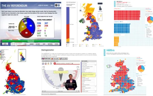
4.4 UK General Election 2010: Different views ... 79
4.4.1 The Guardian ... 79 4.4.2 The Telegraph ... 80 4.4.3 The Times ... 81 4.4.4 Sky News ... 82 4.4.5 Yahoo!... 83 4.4.6 BBC... 83
4.5 Themes within the visualisation of Election Results ... 87
4.6 Conclusions ... 91
5 Data visualisation within the research process ... 93
vii
5.2 Electoral research and mapping ... 95
5.3 Triangles and three-party competition ... 106
5.4 Handling missing data and computing averages ... 112
5.5 Conclusions ... 128
6 Explaining voting systems to the general public ... 130
6.1 Introduction ... 130
6.2 Electoral bias ... 134
6.2.1 Background ... 134
6.2.2 Structuring the presentation ... 135
6.2.3 Electoral Bias and its components ... 137
6.2.4 Examining the survey evidence: electoral bias ... 156
6.3 Supplementary Vote ... 164
6.3.1 Background ... 164
6.3.2 The presentation ... 165
6.4 Examining the survey evidence: supplementary vote ... 173
6.5 Conclusions ... 176
7 Accessing election data by mobile telephone ... 179
7.1 Introduction ... 179
7.2 Growth and development of mobile phone communications ... 181
7.3 Mobile search versus Internet search ... 183
viii
7.5 The problems faced ... 187
7.6 Conclusions ... 191
8 Natural Interface to Election Data ... 193
8.1 Introduction ... 193
8.2 Designing a Web-Based Dialog System ... 195
8.3 Identifying Potential Users ... 197
8.4 Designing for the analysis of Election Data ... 198
8.5 Input and Output Interfaces ... 200
8.5.1 Input interface ... 201
8.5.2 Output Interface ... 203
8.6 Users’ Requests ... 207
8.7 From enquiry to SQL Query translation ... 210
8.8 Help Instructions... 212
8.9 Difficulties with Natural Language Enquiries ... 213
8.10 Interacting with electoral data ... 214
8.11 Drill Down Mapping ... 217
8.12 Conclusions ... 222
9 Political Science meets Broadcasters ... 225
9.1 Introduction ... 225
9.2 Poll tracker ... 227
ix
9.3.1 Historical data ... 232
9.3.2 Historical Cartograms ... 233
9.4 Interpreting general election manifestos at the 2010 general election ... 242
9.5 House of Commons projections ... 246
9.6 The Alternative Vote Referendum ... 251
9.7 Conclusions ... 261 10 Conclusions ... 263 10.1 Overview ... 263 10.2 Chapter summaries ... 264 10.3 Evaluating Outcomes ... 270 10.4 The future ... 275 11 List of References ... 277
12 Bound in Copies of Publications... 297
12.1 Mobile Election ... 297
12.2 Natural Interface to Election Data ... 309
12.3 Election Data Visualization ... 321
x
List of Figures
Figure 2.1 Hierarchical structure of visual system ... 18
Figure 2.2 Two parallel streams of visual information processing ... 19
Figure 2.3 Focus of attention ... 22
Figure 2.4 Eye Movements: Yarbus, 1965 ... 24
Figure 2.5 Eye Movements: 2008 illustration... 24
Figure 2.6 A coxcomb chart ... 29
Figure 2.7 John Snow's Cholera Graphic ... 30
Figure 2.8 Minard's Graphic of Napoleon's Moscow Campaign of 1812 ... 30
Figure 2.9 The visual variables described by Bertin: ... 32
Figure 2.10: Tukey’s boxplot ... 35
Figure 2.11 Confusion between area and position inside a tree map ... 38
Figure 2.12 Voronoi treemap ... 39
Figure 2.13 Cone Tree visualisation ... 39
Figure 2.14 Perspective Wall ... 40
Figure 2.15 Hyperbolic tree ... 40
Figure 2.16 Screenshots from Tableau Software ... 41
Figure 3.1: Triangular graph of party share ... 44
Figure 3.2 Composite screenshot of General Election visualisations ... 47
Figure 3.3 Tweetminster ... 51
Figure 3.4 Facebook polling day ... 52
Figure 3.5 Conservative Party iPhone app ... 54
Figure 3.6 Labour Party iPhone app ... 55
xi
Figure 4.1 USA Today and the 2004 Presidential Election ... 62
Figure 4.2: Mapping electoral data across the United States ... 63
Figure 4.3 The New York Times map ... 64
Figure 4.4 The Sky News US Election map ... 64
Figure 4.5: A choropleth map of United States ... 66
Figure 4.6: USA Today Presidential Election 2008 ... 67
Figure 4.7: New York Times and the Presidential Race ... 68
Figure 4.8: Washington Post and County level data ... 68
Figure 4.9: Heat maps of US elections 2008 ... 69
Figure 4.10: iDashboards of the 2008 US Presidential election ... 72
Figure 4.11: Yahoo US Election 2008 Dashboard ... 73
Figure 4.12: Grundy’s Map of the United States ... 75
Figure 4.13: Dorling’s centroids ... 76
Figure 4.14: Gastner & Newman map of US Presidential Election ... 77
Figure 4.15: Comparison of two images of US presidential election ... 77
Figure 4.16: The Guardian 2010 election map ... 80
Figure 4.17 The Telegraph 2010 election maps... 81
Figure 4.18: The Times 2010 election map ... 82
Figure 4.19: Sky News 2010 constituency battleground ... 82
Figure 4.20:Yahoo 2010 election map and Commons projection ... 83
Figure 4.21: BBC 2010 election visualisation ... 84
Figure 4.22: Comparisons of mapping UK elections... 85
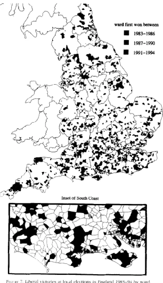
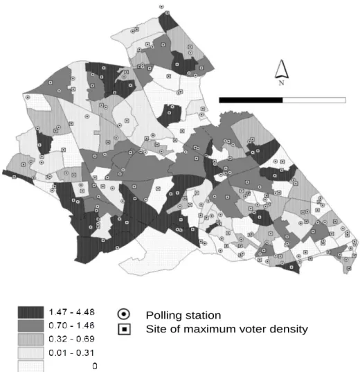
Figure 5.1: Ward boundary maps and seats won by Liberal Democrats 1983-1994 ... 96
xii
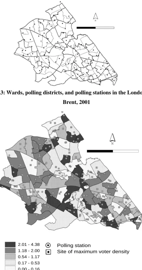
Figure 5.3: Wards, polling districts, and polling stations in the London Borough of Brent,
2001... 99
Figure 5.4: Percentage differences in predicted turnout when re-siting polling stations for European elections ... 99
Figure 5.5: Percentage differences in turnout when re-siting polling stations for local elections ... 100
Figure 5.6: Distribution of percentage vote shares for Respect ... 102
Figure 5.7: Distribution of percentage vote shares for Green ... 102
Figure 5.8: Distribution of percentage vote shares for UKIP ... 103
Figure 5.9: Distribution of percentage vote shares for BNP ... 103
Figure 5.10 Pattern of Green Party competition and 2004 London Assembly list vote ... 105
Figure 5.11 Pattern of Green Party competition and 2008 London Assembly list vote ... 106
Figure 5.12: Distribution of three-party vote shares, 2005 general election ... 108
Figure 5.13: Distribution of three-party vote shares: ... 109
Figure 5.14: The superposition ABC+ACB+BAC+BCA+CAB+CBA ... 110
Figure 5.15: screen grab1 evolution of votes 2005-2010 general election ... 111
Figure 5.16: screen grab2 evolution of votes 2005-2010 general election ... 111
Figure 5.17: Decline in eligible by-elections for forecast model ... 114
Figure 5.18: Declining percentage of by-elections used in forecast model ... 114
Figure 5.19: Old model estimates for Conservative share ... 114
Figure 5.20: Consequence of new data selection criteria ... 119
Figure 5.21: Estimating missing vote shares and model stability ... 119
Figure 5.22: Effect of using one month or three-month averages ... 121
Figure 5.23: Effect of different weighting schemes... 122
xiii
Figure 5.25: Effect of controlling for ward marginality (cut point 20% majority) ... 123
Figure 5.26: Effect of controlling for ward marginality (cut point 15% majority) ... 124
Figure 5.27: Effect of using three cut points... 124
Figure 5.28: Urban vs. Rural by-elections ... 125
Figure 5.29: Comparison of forecasts for Conservative national vote share ... 125
Figure 5.30: Comparing random Sub-samples of data ... 126
Figure 5.31: Revised model and National Equivalent Vote, 1993-2010 ... 127
Figure 6.1: Introducing electoral bias in the UK context... 137
Figure 6.2: Introducing the hypothetical election ... 138
Figure 6.3: The contribution of electoral inequalities to electoral bias ... 139
Figure 6.4: Differences in electorate size and the pattern of party wins ... 140
Figure 6.5: Declaring the national result ... 141
Figure 6.6: A summary of the election outcome ... 141
Figure 6.7: Variations in electoral turnout ... 143
Figure 6.8: Differences in turnout and winning party ... 143
Figure 6.9: Electoral bias produced by differences in turnout ... 144
Figure 6.10: Problems of explaining the impact of vote distribution ... 145
Figure 6.11: Variations in vote shares across constituencies ... 146
Figure 6.12: Different patterns of votes ... 146
Figure 6.13: Frequency of second placed parties at the 2010 general election ... 148
Figure 6.14: Ineffective votes cast for Conservative and Labour at the 2010 general election ... 149
Figure 6.15: Comparing ineffective votes at the 2010 general election ... 149
Figure 6.16: Converting votes into seats: the Conservative party in 2010 ... 150
xiv
Figure 6.18: Comparing conversion of votes into seats, 2010 general election ... 152
Figure 6.19: Summary of bias position after 2010 general election ... 152
Figure 6.20: Boundary Commission impact ... 154
Figure 6.21: The effects of boundary changes on future electoral bias ... 155
Figure 6.22: Summarising the presentation on electoral bias ... 155
Figure 6.23: Age profile of electoral bias survey respondents ... 157
Figure 6.24: Knowledge of electoral bias before and after viewing presentation ... 158
Figure 6.25: Supplementary Vote explained in one minute ... 165
Figure 6.26: Completing a Supplementary Vote ballot paper ... 166
Figure 6.27: First vote counts in a Supplementary Vote election ... 167
Figure 6.28: Process of eliminating all except the top two candidates after first count ... 167
Figure 6.29: Allocating second vote preferences from ballots cast for bottom-placed candidate ... 168
Figure 6.30: Successful and Unsuccessful vote transfers ... 169
Figure 6.31: Recalculation of votes for top two candidates... 169
Figure 6.32: Review of second votes on ballots cast for third-placed candidate ... 170
Figure 6.33: Successful and unsuccessful vote transfers from third-placed candidate... 171
Figure 6.34: Declaring the winner in the Supplementary Vote election ... 172
Figure 6.35: Summarising the second vote strategy ... 172
Figure 6.36: Age profile of respondents to SV survey ... 173
Figure 6.37: Levels of satisfaction with executive summary of SV ... 175
Figure 6.38: Satisfaction with explanations of how SV determines a winner ... 176
Figure 7.1: World Mobile Phone subscriptions per 100 ... 181
Figure 8.1: The Architecture of Web-based Dialogue System ... 196
xv
Figure 8.3: Table Output Interface ... 203
Figure 8.4: Chart Output Interface ... 204
Figure 8.5: Mapping output interface ... 205
Figure 8.6: Input and Output UI Interaction ... 205
Figure 8.7: Example of result of the 2010 general election ... 206
Figure 8.8: Screenshot of the Natural Language Enquiry Template ... 208
Figure 8.9: Screenshot of the Interface for Enquiry Creation ... 209
Figure 8.10: Example of feedback generated for user enquiry ... 209
Figure 8.11: Screenshot of Production Rules creation... 212
Figure 8.12: Help Instructions for NITED ... 213
Figure 8.13: Table Output generated from User enquiry ... 215
Figure 8.14: Histogram and Mapping Output ... 216
Figure 8.15: Two views of UK General Election 2010 results ... 218
Figure 8.16: Step 2 of the DD map algorithm ... 219
Figure 8.17: Step 3 of the DD map algorithm ... 219
Figure 8.18: Merging Steps 2 & 3 ... 220
Figure 8.19: Step 5 of the DD map algorithm ... 220
Figure 8.20: The completed DD map for Harrow East ... 220
Figure 8.21 Examples of DD-Mapping ... 221
Figure 9.1: Poll Tracker for Sky News ... 229
Figure 9.2: Poll Tracker using histograms to show single poll results ... 230
Figure 9.3: Poll Tracker and polls produced by separate polling companies ... 231
Figure 9.4: Raw Data for Historical Cartograms ... 237
Figure 9.5: Cartogram of the 1832 General Election ... 238
xvi
Figure 9.7: Cartogram of the 2005 General Election ... 240
Figure 9.8: Comparing the 1992 and 1997 General Elections ... 241
Figure 9.9: Opening screen of the ‘Who Should I Vote For?’ application ... 243
Figure 9.10: Policy Choices and Level of Importance ... 244
Figure 9.11: Manifesto Options on Tax Policies ... 244
Figure 9.12: Outcome of User choices ... 246
Figure 9.13: State of the Parties showing Labour Majority ... 247
Figure 9.14: State of the Parties showing Hung Parliament ... 249
Figure 9.15: State of the Parties showing Conservative Majority ... 249
Figure 9.16: Comparing winners/non-winners under FPTP and AV ... 252
Figure 9.17: Elimination of Bottom Candidate in AV ... 253
Figure 9.18: Elimination of Other Candidates and Vote Transfers under AV ... 253
Figure 9.19: Example of data for AV application... 256
Figure 9.20: Opening screen of the Alternative Vote Application ... 257
Figure 9.21: Selection of the 1992 General Election to test effects of AV ... 257
Figure 9.22: Allocation of Conservative Voters’ 2nd preference votes ... 258
Figure 9.23: Experiment showing Conservative 2nd votes transferring to Liberal Democrats ... 259
Figure 9.24: Experiment showing Liberal Democrat 2nd votes transferring to Conservatives ... 259
xvii
List of Tables
Table 1: Satisfaction with slides relating to bias caused by electorate size: ... 158
Table 2: Satisfaction with slides relating to bias caused by turnout differences ... 159
Table 3: Satisfaction with slides relating to bias caused by vote distribution ... 159
Table 4: Summarising the bias position after the 2010 general election: ... 160
Table 5: Summarising abstention bias after the 2010 general election ... 161
Table 6: Summarising electorate size bias after the 2010 general election ... 161
Table 7: Summarising vote distribution bias after the 2010 general election ... 162
Table 8: Number of correct responses to quiz ... 162
Table 9: Quiz answers controlling for age and interest in elections ... 163
xviii
ACKNOWLEDGEMENTS
Although I appear as the sole author of this thesis, it is really a collective effort. I am indebted to many great people who have contributed to the work herein and supported me personally throughout my time in graduate school.
I gratefully acknowledge the financial assistance provided by the Economic and Social Research Council.
I would like to thank my supervisors, Professor Michael Thrasher and Dr Galina Borisyuk for giving me trust, ideas, and advice throughout the project and for giving me the opportunity to work and collaborate with many wonderful people at the Elections Centre.
A massive thank you goes to my late father, Vladimir Lovitskii, for his constant encouragement and ongoing support during the long journey.
xix
AUTHOR’S DECLARATION
At no time during the registration for the degree of Doctor of Philosophy has the author been registered for any other University award without the prior agreement of the Graduate Committee.
This study was financed with the aid of a studentship from the Economic and Social research Council.
PUBLICATIONS:
Long, E., V. Lovitskii, M. Thrasher, and D. Traynor. 2009. "Mobile Election." Information Science and Computing, Intelligent Processing 9: 19-28.
Long, E., V. Lovitskii, and M. Thrasher. 2010. "Natural Interface to Election Data." Paper presented at the ITHEA, Sofia, Bulgaria.
Long, E., V. Lovitskii, and M. Thrasher. 2011. "Election Data Visualisation." Paper presented at the ITHEA, Sofia, Bulgaria.
Rallings, Colin, Michael Thrasher, Galina Borisyuk, and Elena Long. 2011. "Forecasting the 2010 General Election Using Aggregate Local Election Data." Electoral Studies 30: 269-77
WORD COUNT of the main body of the thesis: 58,356 (excluding all tables and figures).
Elena Long 19 December 2012
1
1
Introduction
1.1
Background
The advantages of presenting data in graphical rather than tabular form are well known. Human brains find it much easier to absorb information from a graphical representation than either plain text or numbers contained within the rows and columns of a table. There are many explanations for why this is the case (see Chapter 2) but this is only part of the story. There are some ways of displaying data that are better than others but implementing these approaches has proved difficult. While this thesis addresses some of the reasons why some graphical displays work while others do not it is mostly concerned about the practical aspects of implementing methods that deliver information in the desired format. It may be that there is a set of rules (a universal algorithm) that when followed will ensure success but we doubt it. Instead, progress in this field follows from trial and error – some methods work, some do not. Some brilliant innovations capture the imagination which other people then copy and
improve upon. But what works for one era might not be suitable for another; the current generation has grown up with the Internet and prefers information on a screen than on the pages of a book. The type of graphical display of data that works for one type of audience might not work for another audience.
Visualising data involves passing data from a source through a transmitter, a medium, and towards a receiver. The data may be of constant form, for example, population statistics, health records or in our case, voting records. But everything else inside the equation is changing. As data becomes more widely available it is not only government-appointed
2
statisticians that transmit information. Academics, journalists, broadcasters arguably began this process but their numbers are now dwarfed by members of the public that bring new insight and techniques for handling data released into the public domain. Technological changes mean that traditional paper has been joined by telecommunication technologies, touch-screens and most recently interactivity between the user and inter-face. The conversation with data has become much broader. Government statisticians were once compiling data for other government departments, partly to justify expenditure and partly to enable future policy planning. When academics began to use data it was largely to speak to other academics and sometimes their students. The problem was that once the data
conversation spread much further than this then it became too difficult to control. We did not need Darrell Huff (Huff 1954) to tell us that people lie with statistics because Mark Twain (1906) was attributing to Disraeli the phrase “Lies, damned lies and statistics” as one way in which people used numbers to strengthen their argument.
People that are familiar and comfortable with statistics are largely aware of the tricks that are used to present numbers in the way that satisfies the transmitter. But most people do not fall into this category. Alternatively, the person transmitting the information may have good intentions but simply does not understand the information in front of them. The way in which journalists and headline writers report the findings from opinion polls provides a good illustration of that; unfortunately it is not easy to tell whether the misleading headline comes from ignorance or is deliberate. The danger is, of course, that most of their readers do not know also.
3
1.2
Dissertation origins
This thesis began with the idea that there ought to be ways in which complex election data could be transmitted to various audiences in such a way that its content could be easily understood. When I joined what was then called the Local Government Chronicle Elections Centre (now simply The Elections Centre) at Plymouth University in 2008 I became part of a team that had as one of its objectives the desire to develop new methods for conveying electoral information to as many people as possible. This had begun in the 1980s when the Centre’s Directors, Colin Rallings and Michael Thrasher began publication of their Local Elections Handbooks. At that point it was a huge challenge to collect, collate and produce a machine-readable of more than three thousand county council division results and then to publish them in hard copy. Twenty three years later the publishing of results continued but the technological changes in terms of computer hardware and software over that period had been immense. In 1985 the data were stored in a database located on the University main frame computer; there were no desktop computers. By 2008 even the smallest personal computer contained more processing power than the main-frame had. Computer software was also changing. The standard package used by social scientists for quantitative analysis was SPSS – Statistical Package for Social Scientists. Initially, the process of data input and writing instructions was done using punched cards. Later, remote terminals could be used to ‘submit jobs’. Two decades later it is possible to run SPSS on a simple PC. The current version of SPSS will process complex data sets containing hundreds of thousands of cases and provide the skilled user with sophisticated graphical displays.
Yet, it is interesting to read through specialist journals in Political Science and other social sciences and then compare their output with journals in the sciences and engineering. Most social science journals, when they do contain articles that report data, still persist with using
4
tables of some form (Kastellec and Leonin 2007). There are exceptions, notably the American Political Science Review and the American Journal of Political Science but
relatively few UK-based journals use graphics and even fewer use colour (although the main journal, Political Studies, has just started to do this). The gap between what is being
published by scientific and social scientific journals is very large in terms of data visualisation.
The research team at Plymouth was unusual because it contained a variety of mathematicians, statisticians, a computer software specialist, a systems engineer with an expertise in database design and political scientists. It was also unusual in simultaneously talking to different audiences – academic specialists, newspaper and broadcast journalists, broadcast computing and graphic designers, private sector industries, especially in telecommunications,
administrators, politicians and last but not least the general public. My personal role within this team began as a research assistant/data processor but gradually evolved into becoming more of a designer, a communicator between the different specialist activities that were being conducted within and then beyond the Centre. I worked on different projects, collaborating with different people and making a range of contributions within each team.
Within the Centre the aims were to explore the possibilities of data visualisation through different kinds of media and for different audiences. Beyond the Centre there was a larger network of people with a broader range of skills, including mobile phone technology developers, software engineers, website designers and broadcast interactive graphic developers and designers. In later chapters I describe how people brought these skills together to try and facilitate election data visualisation, sometimes succeeding but at other times failing. In fact, for every ‘success’ there were systems that never got developed and
5
even for some that did there was eventual failure. What appeared at first to be a straightforward project proved more difficult than anyone could predict.
I have talked about the way in which the development of different media has expanded the possibilities of presenting data. But in writing this thesis I have struggled with the problems of how to describe on paper the interactivity and dynamics of new methods of data
visualisation. It is far easier, for example, to show someone on a mobile phone or on a computer how a particular software programme works than to describe it using printed text and screen-grabs. In many ways it would have been much easier to film this thesis than to write it! One further problem that arises with this dissertation is that some of the web-based graphics and software programmes described here no longer have ‘live’ links attached to them so that interested readers could make a note of the internet address and try it out for themselves. With hindsight it would have been sensible to record these programmes in action and then to archive these recordings together with the documentation that describes them. Of course, further improvements in computer hardware and more powerful software capabilities would make these programmes appear increasingly ‘clunky’ but for future researchers there is an opportunity missed when we fail to archive our work properly. Throughout the thesis the reader should assume that when no active link is given and when no secondary source citing the information is available then the original data are deemed ‘missing’.
1.3
Aims and Structure
The aim of this thesis is to discover better methods for communicating voting data (mostly but not entirely election results) to a range of different audiences (from expert political scientists to ordinary members of the public) and then to describe those methods so that others might build upon what has been discovered. Better methods mean using more visual
6
displays of data than are currently found in political science journals. It is not just political scientists that are interested in elections, however, and much of the thesis describes ways in which the Elections Centre has become more public-oriented in its data output. Some of these methods are passive; they do not require the user to do anything more than observe. Of course, it matters whether the observer is scanning pages or a computer screen – the medium helps to define the content to a certain extent. When graphics have to be published in black and white, for example, but computers can handle millions of colours that tends to constrain what you can do on the printed page compared with what is possible on a screen. Other methods offer more opportunities to the user and allow them to become engaged in
manipulating the data. This is a challenge – how can we reduce the complexities of data so that non-expert users can interact with the information and take some kind of control over it. In our experience there has been a trade-off. Sometimes, it is necessary to simplify
something so that it might be understood by non-expert users.
The structure of the dissertation is as follows. Chapter 2 describes the evolution of data visualisation methods and shows that human beings have been visualising information for centuries. We are all familiar with the phrase that a picture is worth many words but for many years research into the relationship between cognition and perception has been trying to understand why this might be the case. This has now become big business since data about our eye movements when we view images reveals a great deal about what we are thinking. What is most striking, however, is the rapid acceleration of new methods that are being created by faster computers with bigger storage capacity and faster processing capabilities. There is still a gap, however, between people’s ability to create these graphical displays. Access to high-speed computers is not the problem but writing software that is accessible to a broad audience is a difficulty. It is not only access that is a problem. Even if the software
7
could be written it is still in the user’s control to visualise the data and the selection of methods requires skill and knowledge about the data that is being manipulated. Voting data is a very good example of this; the user needs to know what they have before they can use it intelligently.
Presenting data that relates to the field of politics is the subject of Chapter 3. This begins with recording the criticisms raised by some political scientists about the failure to use a broad range of methods for describing data and insisting instead on using tabular data. The interaction between politics and technological change goes further than just the needs of political scientists. The Arab spring demonstrated how mobile phones and social media have become important to the communication of politics and political events. Media such as twitter, Facebook etc. have allowed the general public to participate in politics in ways that were not imagined twenty years ago (Artusi and Maurizzi 2011). Broadcast media have played a big part in broadening the ways in which information about politics is
communicated to people and they have incorporated a range of social media into their programmes. Aware that more voters are using social media the political parties, not just in the UK, have started to try and talk to people using these means. What is still important, however, is not only the source of information but also its appearance which is determined by such things as word limits on twitter, the costs of downloading large files etc.
Chapter 4 focuses specifically upon the power of maps to convey large amounts of
information in an effective way. It considers how maps have evolved from hand-drawn lines on parchment to computer-generated graphics that can transmit huge amounts of information in the shortest possible time. Cartographers have spent much time considering the best methods for communicating information but once again the advent of computers and computer software known broadly as Geographical Information Systems (GIS) has meant
8
that many more people can create maps and then populate these images with data. There is a large audience that can ‘read’ and understand maps – most people in the UK are familiar with the physical outline of the country and region in which they live and can even relate to views such as western Europe, The United States of America etc. This means that maps can be readily used by political scientists, newspapers and broadcasters to communicate information about election statistics, for example, although it remains the case that using GIS requires some training and experience to work properly. New ways of generating maps that convey political/electoral information are described. Some of these maps are static, presenting details of interest to the observer. More recently, however, interactivity has been introduced with either the on-screen commentator or the web-based application able to zoom in and out of the maps to shrink/enlarge the area of interest. The chapter closes with an examination of how the media used maps to display aspects of the 2010 general election.
Chapter 5 marks the opening chapter in the second part of the thesis that describes a series of research collaborations where data processing and visualisation feature prominently. In this part the focus moves away from observing recent developments achieved by others (Chapters 3 and 4) and instead through a series of case studies reports on work undertaken by the Elections Centre, either independently or in collaboration. The selection of these case studies for inclusion in this thesis was based on a number of criteria. First, we wanted a study that showed how data visualisation has become a very useful means of communicating details and aspect of data relationships within a team of researchers (Chapter 5). Second, we realised that the internet is becoming an increasingly efficient means for communication ideas and information to the general public. Political scientists are suddenly presented with new opportunities to publicise and disseminate their research outside of the specialised channels. In turn, the scope of political scientists can become more public-oriented, fulfilling a
9
perceived need for information amongst the public. In this vein, Chapter 6 presents two case studies that used YouTube to broadcast research. The first of these studies reports on
advanced research undertaken by the Elections Centre on the operation of electoral bias which was then re-drafted for the YouTube medium. The second of these studies begins with a different problem – how can political scientists seek to answer questions that appear to be of concern to the general public. The specific problem was that in the autumn 2012 the electorate were being asked to participate in elections for new Police and Crime
Commissioners using a method of voting known as the Supplementary Vote (SV). It became clear very quickly that most electors were unaware of how SV would work in practice and therefore the challenge became one of devising a video based on Microsoft’s Powerpoint software that could ‘educate’ the public about SV. A third criterion for selecting the case studies was to show that modern techniques in data visualisation are multi-dimensional and require specialist teams to combine and collaborate. Chapters 7-8 report on collaborations with software engineers, while Chapter 9 presents a series of case studies involving
collaboration between the Elections Centre and a national multi-platform media organisation.
Having established the reasons that informed the choice of case studies I now provide a short description of the content of each of these chapters. In Chapter 5, I describe how data
visualisation directly informed the research process by reporting on work that I was involved with to develop a new model for forecasting national vote shares from local election results. This research was eventually published in Electoral Studies (see section on published papers). One of the greatest strengths of data visualisation is that it facilitates understanding of the effects of changing data. This chapter demonstrates how a sequence of graphs (in this case line graphs plotting vote shares over time after controlling in different ways for missing data)
10
is used within a specialist research team to determine which method is the best one to use in forecasting models.
The following four Chapters are linked – how to communicate political data to the wider public. These chapters are also sequential, building from users as passive actors towards users as interactive agents. Chapter 6 shows how a new media, YouTube, can be used as the means for transmitting information about two complex aspects of voting systems. The first is a video that describes the operation of electoral bias in a first past the post voting system while the second is a more recent video that describes the operation of the Supplementary Vote system. In both cases the intended audience is the general public and we report on some feedback that we received on these experiments.
Chapters7 and 8 report on efforts to give mobile telephone and Internet users access to election data that could be user-controlled using natural language interfaces - software that could ‘learn’ from people’s requests. After each user accessed the data the system would remember the syntax used to create a data request and then develop itself so that future requests made in the same way could be satisfied. These experiments demonstrate a sad truth – while political scientists may easily understand concepts like ‘constituency’, ‘vote share’ and ‘percentage change’ that is not the case generally. We conclude from these two experiments that the moment when non-experts can readily access complex-structured databases and use natural language to interrogate those databases is a long way from being realised.
Chapter 9 provides a more optimistic report about advances made when a research centre collaborates with a television broadcaster to create new ways of imagining electoral data and also new methods for user interactivity. The Centre’s directors, Colin Rallings and Michael
11
Thrasher have been involved with election broadcasting for four decades and have been closely involved with how broadcasters manage electoral data and present it to viewers. The development of the Internet opened up new opportunities with television stations become multi-platform, developing their own web-sites as well as broadcasting programmes. Thrasher’s association with BSkyB broadcasting has been especially productive in the
development of interactive web-based applications that have aimed to educate and engage the general public. This type of collaboration between elections database developers and
broadcast/web designers is certainly one possibility for the future direction of data visualisation in the field of politics.
The conclusions are described in Chapter 10. The opening section of that chapter provides a short overview of the general topic before providing short summaries of the previous chapters. Finally, we provide some thoughts about the future of data visualisation and how it should become more embedded in political science and its research literature and, of course, more widely available for the general public.
12
2
Visualising data
2.1
Introduction
This chapter begins by discussing theories of perception and neurocognition in order to try and understand the power of pictorial presentation. Visualisation is a complex process that requires significant effort and thinking to produce efficient and effective outputs. One important advantage of visualisation is its use of a specificity of the human visual system to interpret and understand vast amounts of data in a small amount of time. Interpretation of data does not stop with locating individual values in the data, but also identifying hidden patterns, which would be hidden if not in a visual format. The third section reviews some of the most significant examples of data visualisation that have set the standards for graphic design. Many of those standards are the same today as they were when authors began to summarise data in visual formats. These early pioneers included the 18th century Swiss mathematician Johann Heinrich Lambert who was among the first to use graphs to display data and William Playfair, the Scottish engineer who is regarded as the inventor of statistical graphics at the turn of the 19th century. Many of these early developers worked by instinct and were not concerned with developing theories of information visualisation. In the fourth section, we examine some of the literature that tried to develop a theoretical development of data visualisation, identifying the key elements that should be incorporated within good design. We identify the impact of computerization in the field of data visualisation and
13
examine some important new developments in methods for presenting data. As we stated in Chapter 1, however, data visualisation requires a source, a medium but also a target.
2.2
Perception and Neurocognition
People often say “A picture is worth a thousand words”. Some even cite an old eastern proverb that refers instead to “ten thousand words”. We can also recall the nineteenth century novel, “Fathers and Sons” (1862) written by the great Russian novelist Ivan Turgenev, where the young nihilist Bazarov, who acclaims science to be above anything else, says: “A picture presents to me clearly the same that requires ten pages of written text” (English translation from the original Russian “Рисунок наглядно представит мне то, что в книге изложено на целых десяти страницах”, (Turgenev 2012). But what exactly does science know about the idea that people comprehend information quicker, easier, better if it is presented in graphical form rather than described in words?
Scientists based in the University of Pennsylvania and Princeton University suggest that the human retina would transmit data at roughly the rate of an Ethernet connection, i.e. at the rate of 6–13 Mbit per second (Koch, McLean et al. 2006). Does such incredible speed imply that people absorb visual information more efficiently than information presented through words? Can we say, for example, that people learn and remember visually presented information much better than when this information is only provided to them verbally or that information retention from visual communication is xx times more effective than through words?
There have been a number of experiments that try to demonstrate that visual communication is more powerful than verbal one. Some authors find no significant link between presentation style (verbal vs. multimedia) and recall unless individual preferences are taken into account (Butler and Mautz 1996). However, another source (Lester 2011) reports that according to
14
the psychologist Jerome Bruner people only remember 10% of what they hear and 20% of what they read, but about 80 percent of what they see. Although the multiple intelligence theory (Gardner 2011) states that there are eight different types of intelligence
tactile/kinesthetic, interpersonal, intrapersonal, verbal/linguistic, logical/mathematical, naturalistic, visual/spatial, and musical) and this defines what is the most effective way to learn new information. However, visual/spatial intelligence is the most dominant type of intelligence and many researchers and teachers believe that most of students learn best visually. For example, the Visual Teaching Alliance website
http://www.visualteachingalliance.com/ cites Martin Scorsese: “If one wants to reach
younger people at an earlier age to shape their minds in a critical way, you really need to know how ideas and emotions are expressed visually”, and reports (as well-known facts) that “(1) approximately 65 percent of the population are visual learners; (2) the brain processes visual information 60,000 faster than text; (3) 90 percent of information that comes to the brain is visual”.
Why does it appear that we understand words/numbers and graphs differently? People interpret numbers and graphs differently because they are processed differently in the brain. Numbers and words are generally handled by the verbal linguistic system and graphs are handled by both the non-verbal linguistic system and the limbic system. The bit rate of the visual system is about 10 million bits per second (Koch, McLean et al. 2006) and the rate of reading is approximately 150-400 words per minute. To understand how this works, and provide a foundation for further reading, a very brief review of the relevant neuroscience seems in order.
Below we review some neuroanatomical details of the human brain. However, there are many other important aspects of cognition such as perception, memory, emotional modulation,
15
integration of signals from different sensory modalities etc. These cognitive concepts are essential and there are multiple theories discussing these cognitive primitives. For example, some psychological research on how we perceive verbal and visual information is based on Double-Coding Theory by Paivio (Paivio 1971) who asserted that the human perceptual system consists of two subsystems. There is, however, some disagreement among researchers on the neuroanatomical bases of processing of abstract and concrete verbal information. Followers of Dual-Coding theory support the assumption that processing of abstract words is confined to the left hemisphere, whereas concrete words are processed also by
right-hemispheric brain areas. Theories such as ‘psychophysical complementarity’ (Shepard 1975; Shepard 1981; Shepard 1984) and ‘psychological essentialism’ (Medin and Ortony 1989; Averill 1993) believe that our visual perception is sensitive to the structural organization of human memory and that the accurate visual presentation of a body of information is best achieved by data visualisation techniques. Thus, a focused psychological approach to data visualisation must, first and foremost, concern itself with the cognitive description of information, and later with the result of perceptual processes upon the transference of this information (Lee and Vickers 1998). People have an exceptional recognition memory for pictures, and researchers have long established that pictures are superior to words in
conveying meanings and patterns (Gorman 1961; Shepard 1967). Other psychologists have sought to measure the extent of visual recognition memory (Hartman 1961; Standing, Conezio et al. 1970). Hartman compared the effects of an audio presentation to a pictorial presentation (e.g. spoken words of the objects were compared with their respective pictures) and the pictorial channel was found to have the advantage - see also (Gorman 1961; Jenkins, Neale et al. 1967; Rohwer, Lynch et al. 1967; Shepard 1967).
16
First, we describe the main brain structures relevant to processing of verbal information and explain that the verbal processing is relatively slow process (150-400 words per minute) because it based on a sequential processing and information exchange between brain structures. After that we consider a structure of the visual system in the brain (human or primate) and show that although the anatomical structure is very complex, the processing of visual information is much faster because this happens in a massively parallel manner.
There are two main brain regions dealing with verbal symbolic information (words and numbers) (Bear, Connors et al. 2006). Wernicke’s area provides syntactic processing of symbolic information. Patients with lesions in this area are able to speak words and operate by their vocabulary but they cannot organise their thoughts into syntactically correct
sentences. Broca’s area relates to semantic aspects of information and contains dictionaries. Patients with lesions in Broca’s area have a problem in finding a proper word but they can somehow make a syntactical construction. There is a bundle of axons connecting Wernicke’s area and Broca’s area which provides a communication channel for mutual information exchange between syntactic and semantic centres of information processing. Multiple exchanges between these two centres results in a relatively slow processing of the verbal information.
Now we will describe some anatomical details of the visual system (Tovée 1996) and demonstrate that the organization of the visual system is much more complex than the structure of the verbal system. The visual system is distributed around the brain and is
organised into hierarchical structures of centres for visual information processing on different levels of details. Using an analogy between signal processing in the brain and in artificial computational devices, it seems that the processing of verbal information is a sequential process with multiple exchanges between two main “processors”. Processing of visual
17
information is organised as parallel information processing by many coupled centres (similar to organization of NVIDIA graphical processor) (Lindholm, Nickolls et al. 2008).
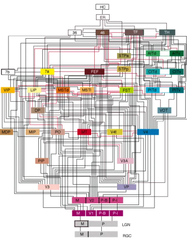
Results of research on the macaque monkey brain shows (Figure 2.1) that its visual system consists of 32 different regions with about 170 reciprocal connections between them (Felleman and Van Essen 1991). First of all, light arrives to the eyeball and reaches the Retinal Ganglion Cells (RGCs) which are located at the back of the ball. RCGs and other neurons of the retina transform the distribution of light on the retina to multiple short
electrical pulses called ‘spikes’ with a duration of about 1 millisecond. The spikes generation by RCG depends on the boundaries between areas with different light intensity. Thus a simple detection of edges is performed by RGCs and coded by spikes. This information is transmitted by the optic nerve to the part of the thalamus called the Lateral Geniculate
Nucleus (LGN) which is the first station of visual processing in the cerebral cortex. The LGN and the primary visual cortex V1 further process the edges of objects in the visual scene and start integration of edges into object representation. On this stage of processing visual objects are represented by orientation of small bars indicating the edges of objects and their parts (Hubel and Wiesel 1965). From V1 the coded visual information is distributed in parallel along multiple ascending pathways. Different areas of the visual system are highly
specialized in particular types of information processing. For example, some higher cortical regions deal with object recognition. They receive highly processed information which is a result of integration of many particular details which have been considered and analyzed at previous stages of processing.
18
19
20
A diagram of hierarchical structures in Figure 2.1 is complex and difficult to understand. A simplification of this diagram is presented in Figure 2.2 (Van Essen and Galant 1994) where two parallel streams of visual information processing are considered. The ventral or ‘WHAT’ stream propagates information on what (i.e. what objects) is presented in the visual scene. The dorsal or ‘WHERE’ stream transmits the information on locations of objects in the visual scene. These two streams run in parallel from RCG, LGN and V1 to higher cortical areas resulting in recognition and eventual understanding of the visual information (Riesenhuber and Poggio 1999; Serre, Oliva et al. 2007).
Ware’s consideration of pre-attentive visual processing concludes that sometimes the time taken to process information from a visual cue is almost instantaneous (Ware 2004). Being very short lived (their lifespan being about 100msec), much of what we ‘see’ of visual representations is generally discarded before it reaches consciousness. Much of this rapid, unconscious processing involves representations in our conceptual short-term memory (Potter 1993) where small bits of information (such as individual words) are merged into more meaningful structures. However, addition processing stages are required before humans become aware of a particular stimulus and it survives in longer-term memory. Repetition blindness and attentional blink (Coltheart 1999) are some of the issues that cause failure in retaining visual information because of higher-level processing of rapidly presented
sequences of visual stimuli, and are thus important to designers of visual analytic systems.
However, it is a challenging question how the brain extracts the visual object from a distributed representation of different features such as local contour details, short bar orientations, shapes, forms, colours, brightness, contrasts, movement direction etc. with a high speed and efficacy. There are several theories how these multiple features distributed between brains regions and locations (Figure 2.2) can be bound together to produce an
21
impression of the whole image which can be recognized and classified. The most prominent is the temporal correlation theory (von der Marlsburg 1981; Gray 1999; von der Marlsburg 1999). According to this theory the neuronal mechanism of feature binding is based on synchronization of neural activity which propagates from along subsequent cortical areas. The same principle of synchronization can be used to model the visual attention which is important part of cognitive processing.
Selective visual attention is a mechanism that allows a living system to select the most important part of the visual input and ignore other components (objects) of incoming visual information. This mechanism is extremely important because the nervous system has a limited processing capacity and it is extremely important to define and select the most important/significant object and process it in a short time. Focusing attention on the
significant part of the visual scene provides a possibility to process the selected object more carefully with taking into account many details of the object (Chik, Borisyuk et al. 2009). An important question of selective attention is how to define the most significant object. There are different possibilities here: to select the brightest object, the most colourful object, the most segregated from the background, etc. Itti and colleagues (Itti, Koch et al. 1998) defined the theoretical bases of an object’s ‘saliency’. The idea of Itti and collaborators is to combine different features of each object and calculate a saliency map of the visual scene which can be used to navigate attention from one object to another. Using this approach they have developed a saliency-based attention system for rapid scene visual attention. This attention system scans the visual scene and finds the most salient object. Thus, attention is focused and the object is selected from a cluttered visual scene. Figure 2.3 demonstrates how the system works. The red can is the most ‘salient’ object in this complex environment and
22
the attention system selects this object (shown by the yellow circle) despite that the can is partially blocked by other objects (Itti and Koch 2001).
Figure 2.3 Focus of attention
As a result of evolution, primate (including human) brains have many highly developed specialised visual cortical areas that perform detailed visual processing. Another important characteristic of a primates’ visual system is its ability to demonstrate advanced oculomotor behaviour – primates can use their eyes to identify/select different objects from complex visual scenes and pursue them in a dynamic environment. In fact, the brain combines a control of eye movement (saccades and gaze direction) with signals from attention system to reach an efficient processing of visual information, object recognition and visual scene understanding.
Many studies use eye movements to investigate cognitive processes such as visual search, scene perception, reading, typing etc. (see for example, (Rayner 1998; Stone, Miles et al.
23
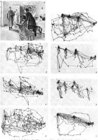
2002; Hayhoe and Ballard 2005; Torralba, Oliva et al. 2006)). Several times per second the eye moves unconsciously in a step-like manner - the gaze ‘jumps’ to some object/particular area of visual scene, ‘freezes’ there for a few moments and jumps again to a new area. These very vast and random-looking eye movements are called saccades. Even when an observer looks calmly at fixed object his/her eyes make small but continuous jumps from side to side. It was shown that the direction of unconscious saccadic eye movements has direct connection to cognitive processes. The classic experiments of Russian psychologist Alfred Lukyanovich Yarbus (1914 -1986) over 50 years ago revealed that saccadic eye movements reflect
cognitive processes (Yarbus 1967). Yarbus found that eye movements during observation of complex natural objects/scenes depend on the task the observer was asked to perform and therefore reflect cognitive processes. In one experiment, he asked several people to look at the same famous painting of Russian Ilya Repin, “The Unexpected”. If the viewer does not receive a particular task, i.e. during a ‘free’ viewing, the gaze tends to jump from face to face (especially concentrated on the eyes and mouth of the characters). However, when asked to evaluate, for example, the family’s financial situation, the trajectories of the gaze reveal that the eyes focus on areas of the image considered relevant to the question. The eye-tracking records clearly show that the subjects visually investigate the picture in a completely different way dependent upon the information they desire. Figure 2.4 shows the original black and white illustration from Yarbus’s book – Repin’s painting and the trajectories of the gaze during different tasks. Later, Archibald re-produced the original image but in colour (Archibald 2008) – Figure 2.5 presents the original image (a), the image plus eye movement trajectories during free examination (b), and finally the image plus trajectories when the observer was asked to estimate the material circumstances of the family (c).
24
Figure 2.4 Eye Movements: Yarbus, 1965
Figure 2.5 Eye Movements: 2008 illustration
Originally, Yarbus made his discovery using a small mirror attached to the eyeball with a rubber disc. The mirror reflects light directed toward the observer permitting a record to be made of tiny eye movements. In recent years, this apparatus was replaced by digital devices.
25
Eye tracking technologies are now used in many subject areas including scientific research (cognitive science, psycholinguistic, human-computer interaction), medicine (diagnostic of balance disorders of central origin) and commercial applications (assessment of web design and website usability, evaluation of advertising campaigns in terms of actual visual
attention). The trajectories of eye movements are recorded and then statistically analysed to provide evidence about which features are the most eye-catching, which features cause confusion and which ones are ignored altogether and ultimately about the effectiveness of a given medium or product.
Results from psychology and neuroscience on perception of visual information reviewed here clearly show that issues of cognition, perception and visual psychology must also be taken into account when deciding how to contextualise, prioritise and present information and support its manipulation. These issues have an impact on the number of dimensions of data that can be usefully presented, spatial positioning and relationships, for example through the use of colour and tone, as well as any dynamic changes in these elements. According to (Ware 2005) the “power of a visualisation comes from the fact that it is possible to have a far more complex concept structure represented externally in a visual display than can be held in visual and verbal working memories" (Ware 2005, p28).
One of the key goals of data visualisation is to communicate information precisely, and to require little effort for the user to understand the data communicated. It is only logical to conclude, therefore, that the human visual system must necessarily be one of the constraints placed on graphics employed in data visualisation. Hence, all information is necessarily compelled by the characteristics of perceptual processing when it is given as a visual display; visualisation techniques that facilitate the flow of information can only be developed when these cognitive processes are fully understood.
26
There remain a variety of academic views about the method whereby humans understand graphics – for example contrast Bertin and Berg’s view (Bertin and Berg 2010) with that of Spence and Lewandowsky (Spence and Lewandowsky 1990). A theory that is notably
relevant to the use and construction of statistical graphs is that of Cleveland (Cleveland 1993). His theory of graphical perception addresses how certain jobs associated with comprehending a graph are performed by the human perceptual system. The perceptual tasks the user can do most easily are those that need to be aligned with the information that is being presented; thus this makes it the goal of any data analysis task. This then provides rules for graph
construction: elementary tasks should be used as high in the order as can be successfully achieved. These guidelines are used in a variety of graphs, such as pie charts, statistical maps with shading, bar charts and divided bar charts. Sometimes, the approach to graphical
display is grounded in perception but in the case of Tufte (Tufte 1990) it was more about the aesthetic.
Regardless of the theoretical approaches essential to the sense-making process is the
perception of patterns in objects. Abstract information, such as political information, could be coded visually and this would in turn create patterns that let the viewer explore and understand the given information; and this in turn can lead to insights that could never occur if the data was studied in any other way.
27
2.3
The evolution of information visualisation
Visualisation has its historical roots as a way to convey data and as an aid for thinking; from the first maps drawn in the 12th century by the Chinese. The invention of Cartesian
coordinates in the 17th century and advances in the fields of mathematics paved the way for data graphics. Since the introduction of data graphics in the late 1700’s (Tufte 1983;
Cleveland 1993) visual representations of abstract information have been used to explore data and reveal patterns. Information visualisation has its origin with Lambert (1728-1777) and Playfair (1759-1823) who were the first to introduce graphics rather than simply presenting data in tabular form and can therefore be regarded as the inventors of modern graphics design (Tufte 1983; Tufte 2001).
Systematic visual representations replaced tables of numbers towards the end of the 18th century, after Playfair wrote the Commercial and Political Atlas in 1786 (Playfair 1786) and the Statistical Breviary, (Playfair 1801) which presented graphs and charts in a form that is easily understood by a modern reader. The statistical line graph, pie chart and bar chart; three of the four basic forms were invented by Playfair. Once Playfair had published these new graphical representations other writers began to contribute their own ideas about pictorial representation.
Joseph Priestly, (1733-1804) influenced by Playfair, was the first to create the concept of representing time geometrically. His revolutionary idea was the use of a grid with time on the horizontal axis; and the reigns of different monarchs represented by different length bars which granted instantaneous visual comparison. Similarly, the French physician Jacques Barbeu-Dubourg (1709–1779) and the Scottish philosopher Adam Ferguson (1723–1816) produced plots that followed a similar principle. In Dubourg’s case it was a scroll produced
28
in 1753 that presented a complex timeline from the time of Creation to the present; Dubourg believed this period spanned 6,480 years. Ferguson published a timeline that begins at the time of the Great Flood (2344 BC—though indicating clearly that this was 1656 years after The Creation), and ranged across the births and deaths of all civilizations until 1780. James Playfair, a Scottish minister although no relation of William Playfair, published A System of Chronology, (Playfair 1784) in the style of Priestly time-bars.
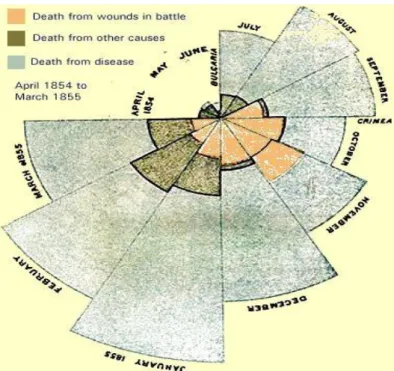
During the 19th century, various forms of graphs, thematic maps and charts were developed. Florence Nightingale, for example, followed Playfair’s examples in order to convey statistical information to a wide audience. Nightingale produced Notes on Matters Affecting the Health, Efficiency and Hospital Administration of the British Army (1859), after witnessing the poor conditions in Crimea for soldiers that were injured (Nightingale 1859). For a variety of reasons this was an important publication but it is interesting from our point of view because it featured several graphs which she described as the “Coxcombs”1 (Figure 2.6) but which are more commonly known as polar area diagrams. The diagram is used to plot cyclical data (here monthly data are being compared) with each month taking 30 degrees of the circle. The size of the radius reports the size of the quantity of interest (In Nightingale’s diagram it is mortality statistics) and the separate shadings represent cause of death (the proportions taking up by the grey shading clearly demonstrate that most soldiers were dying from diseases caught whilst in hospital rather than wounds inflicted on the battlefield).
29
Figure 2.6 A coxcomb chart
The association between mapping information and health statistics was pioneered when Dr. John Snow plotted cholera deaths during an outbreak in central London in 1854 (Figure 2.7). At the time it was widely thought that diseases like cholera were caused by ‘foul air’ but Snow was sceptical of this theory. After talking with Soho residents Snow deduced that the outbreak was centred on a water pump located in Broad Street and the disease declined after the pump was taken out of service. Later, when he was recording the case Snow simply marked the location of water pumps with crosses and deaths with dots on a map of the area.
30
Figure 2.7 John Snow's Cholera Graphic
Shortly after the publication of Snow’s map the French engineer, Charles Joseph Minard produced what is commonly regarded as one of the best statistical graphs ever published (Tufte 1983; Wainer 2000; Friendly 2002). This graphic portrays Napoleon's losses suffered during his invasion of Russia in 1812 (Figure 2.8).
31
The brown and black lines show Napolean’s army on its advance (brown) into Russia and then its later retreat (black). The thickness of the line shows the army’s size where it becomes clear that the army that arrived in Moscow was roughly a fifth the size of the one that began the march. The reader is able to follow the stylized geography because the map shows latitude and longitude and dates are shown at key points of the army’s movements. A temperature chart shows what the army had to endure, particularly during its retreat.
Although it is clear that Minard’s map is brilliant at conveying information about the Russian campaign it is not entirely clear why it achieves what it does achieve. In the following section, therefore, we attempt to discover what lies behind good graphic design.
2.4
Theories of information visualisation
Until recently, the term visualisation meant “formation of mental visual
images“(http://www.merriam-webster.com/). It has now come to mean “something more like a graphical representation of data” (Ware 2004). The concept of information has also
undergone many transformations across time and become more discipline specific (Capurro and Hjorland 2003). The word information became extremely influential in all areas of society and fashionable in English and other languages after publication of Norbert Wiener’s book on Cybernetics (Wiener 1948) and a paper “The Mathematical Theory of
Communication” by Shannon and Weaver (Shannon and Weaver 1949). Although from an information-theoretical point of view information can be precisely defined and measured, psychologists and computer science researchers use the term “information visualisation” just to express a representational mode (instead of using verbal descriptions of subject-matter content) which is then employed to display, for example, objects, procedures, dynamics of systems, processes and events in a visual-spatial manner.