http://researchcommons.waikato.ac.nz/
Research Commons at the University of Waikato
Copyright Statement:
The digital copy of this thesis is protected by the Copyright Act 1994 (New Zealand). The thesis may be consulted by you, provided you comply with the provisions of the Act and the following conditions of use:
Any use you make of these documents or images must be for research or private study purposes only, and you may not make them available to any other person. Authors control the copyright of their thesis. You will recognise the author’s right
to be identified as the author of the thesis, and due acknowledgement will be made to the author where appropriate.
You will obtain the author’s permission before publishing any material from the thesis.
Evaluating Web Mapping Applications
for Visualising Demographic Diversity
A GEOG593 thesis submitted in partial fulfilment of the requirements for the degree
of
Master of Social Sciences
at
The University of Waikato
by
Tristan McHardie
Abstract
The use of maps on the World Wide Web is revolutionising how people access information. These web maps harness text, audio, video, animation, graphics and, most importantly, user interaction to improve the communication and interpretation of geographic phenomena. In this interactive and dynamic environment, web application developers have the opportunity to allow map readers to also be map producers; users can be enabled to query and analyse data and then assemble maps and other visualisations themselves, enhancing their understanding of the data and its geospatial relationships. This thesis focuses on what factors are important for the design of web mapping
applications that provide visualisations of demographic diversity. Demographic information is inherently geospatial, making maps the ideal tool for visualising population statistics and their spatial relationships. An outcome of this research is a set of guidelines for reviewing web mapping applications that portray demographic diversity information. This thesis also provides an insight into the current standard for web mapping of demographic information and identifies the potential for improvement. A review of the literature, as well as a reflexive implementation, are the principal methods used to develop these guidelines. The essential components include the needs of demographers, and principles of cartography and human-computer interaction, as well as a consideration of open source and proprietary software. Five prominent, national demographic web mapping applications (two Australian, and one from New Zealand, the United States of America, and Canada) are used to develop these guidelines, as well as providing an insight into the current standard. The main conclusion of this research is that the guidelines developed provide a worthwhile structure but need to be kept broad. Also, there needs to be more emphasis on user data upload facilities, which is important for demographers, and cartographic communication needs to be given higher priority.
Acknowledgements
First and foremost, I would like to extend my immense thanks to my supervisors, Dr Lars Brabyn and Dr Natalie Jackson, for their enlightenment, expertise,
wisdom, advice and support. While Lars and Natalie actively allowed me to make this thesis my own work, it has benefited enormously from the numerous
conversations we have had.
Secondly, thank you to Capturing the Diversity Dividend of Aotearoa/New Zealand (CaDDANZ) for the generosity that made Masters study a financial possibility for me.
Thirdly, thank you to Mum and Dad for showing their unlimited and
unquestioning confidence in me, and especially Mum for her many hours of proofreading and editing.
Finally, thank you to my dear Emma for her constant love and support, for encouraging me to go back to university, for picking up the pieces when things fell apart, and for keeping me focussed on the end goal.
Table of contents
Abstract ... i
Acknowledgements ... ii
Table of contents ... iii
Table of figures ... vii
Table of tables ... viii
1 Introduction ... 1
1.1 Background and objective ... 1
1.2 Relevance ... 3
1.3 Structure of thesis ... 4
2 Literature review ... 7
2.1 Demography ... 7
2.1.1 Demographers ... 7
2.1.2 Population ageing, migration and diversity ... 8
2.1.3 Typical analysis workflow ... 10
2.1.4 Web application workflow ... 11
2.2 Cartography ... 12
2.2.1 Essential map components ... 14
2.2.1.1 Basemaps... 14
2.2.1.2 Map elements ... 14
2.2.1.3 Scaling and generalisation ... 15
2.2.1.4 Projections ... 16
2.2.1.5 Multiple maps ... 16
2.2.2 Cartographic communication ... 17
2.2.2.1 Map types ... 17
2.2.2.2 Colour and symbology ... 21
2.2.2.3 Spatio-temporal relationships ... 23
2.2.3 Map interactivity ... 24
2.3 Human-computer interaction ... 26
2.3.1 Input and output ... 26
2.3.2 Usability ... 27
2.3.4 Evaluating usability ... 30
2.4 Open source and proprietary software ... 31
2.4.1 Commercialisation ... 33
2.4.2 The pros and cons of open source software ... 34
3 Web mapping of demographic diversity (paper) ... 37
3.1 Abstract ... 37
3.2 Introduction ... 38
3.3 Demography ... 40
3.3.1 Typical analysis workflow ... 41
3.3.2 Web application workflow ... 42
3.3.3 Data procurement ... 42
3.4 Cartography ... 43
3.4.1 Essential map components ... 44
3.4.1.1 Basemaps... 44
3.4.1.2 Map elements ... 44
3.4.1.3 Scaling and generalisation ... 45
3.4.1.4 Projections ... 46
3.4.2 Cartographic communication ... 46
3.4.2.1 Map types ... 46
3.4.2.2 Colour and symbology ... 48
3.4.2.3 Spatio-temporal relationships ... 49 3.4.3 Map interactivity ... 50 3.5 Human-computer interaction ... 50 3.5.1 Design principles ... 51 3.5.2 Evaluating usability ... 53 3.6 Software technology ... 54
3.6.1 The pros and cons of open source software ... 55
3.6.2 Evaluating software technology ... 56
3.7 Method ... 58
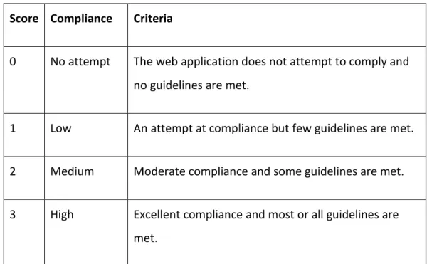
3.7.1 Scoring guidelines ... 60
3.7.2 Chosen web applications ... 64
3.7.2.1 Australian Bureau of Statistics’ “TableBuilder” ... 64
3.7.2.2 Statistics New Zealand’s “StatsMaps” ... 64
3.7.2.3 Statistics Canada’s “GeoSearch” ... 65
3.7.2.5 Australian Government’s “NationalMap” ... 65
3.8 Results ... 67
3.9 Discussion and Conclusion... 68
3.9.1 Demography ... 69 3.9.2 Cartography ... 69 3.9.3 Human-computer interaction ... 70 3.9.4 Software technology ... 71 3.9.5 Limitations ... 72 3.9.6 Future Research ... 72
4 Discussion and Conclusion ... 73
4.1 Demography ... 73 4.2 Cartography ... 74 4.3 Human-computer interaction ... 76 4.4 Software technology ... 77 4.5 Limitations ... 78 4.6 Contribution to knowledge ... 79 4.7 Future Research ... 79
4.7.1 The shape of a potential web application for visualising demographic diversity ... 80
Bibliography ... 83
Appendix: Full results with comments ... 89
Australian Bureau of Statistics’ “TableBuilder” ... 89
Demography ... 89
Cartography ... 90
Human-computer interaction ... 91
Software technology ... 92
Statistics New Zealand’s “StatsMaps” ... 93
Demography ... 93
Cartography ... 94
Human-computer interaction ... 95
Software technology ... 96
Statistics Canada’s “GeoSearch” ... 97
Cartography ... 97
Human-computer interaction ... 97
Software technology ... 97
United States Census Bureau’s “Census Data Mapper” ... 97
Demography ... 97
Cartography ... 97
Human-computer interaction ... 97
Software technology ... 97
Australian Government’s “NationalMap” ... 97
Demography ... 97
Cartography ... 97
Human-computer interaction ... 97
Table of figures
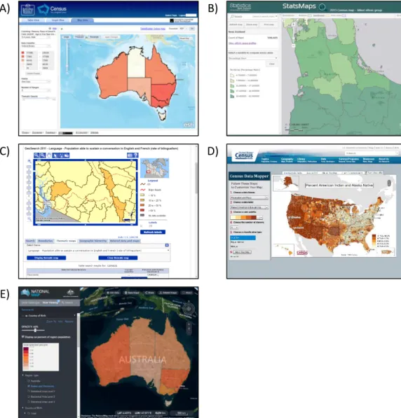
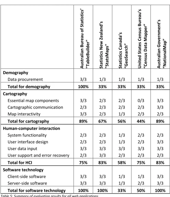
Figure 1: Relationships between disciplines of demography, cartography and human-computer interaction, underpinned by software technology. ... 2 Figure 2: The Demographic Transition (Weinstein & Pillai, 2016, p. 190). ... 9 Figure 3: Examples of representative differences in colour (Kraak & Ormeling, 2011). ... 23 Figure 4: Relationships between disciplines of demography, cartography and human-computer interaction, underpinned by software technology. ... 39 Figure 5: Screenshots of the five evaluated web applications: A) Australian Bureau of Statistics' "TableBuilder" showing a choropleth with options for customising the cartography (Australian Bureau of Statistics, n.d.), B) Statistics New Zealand's "StatsMaps" showing the percentage of Maori population by territorial authority (Australian Bureau of Statistics, n.d.), C) Statistics Canada's "GeoSearch" showing a choropleth of the percentage of the population able to speak both English and French by Census Divisions (Statistics Canada, 2012), D) United States Census Bureau's "Census Data Mapper" showing a choropleth of the percentage of American Indian and Alaska Natives (United States Census Bureau, n.d.), E) the Australian Government's "NationalMap" showing a choropleth, in 3D mode, of the percentage of the population born outside Australia by state (Australian Government, n.d.). ... 66 Figure 6: Bar graph of evaluation results for all web applications. ... 68
Table of tables
Table 1: Cartographic variables for representing qualitative and quantitative differences. ... 21 Table 2: Cartographic variables for representing qualitative and quantitative differences. ... 49 Table 3: Score interpretations for individual evaluation factors. ... 59 Table 4: List of evaluation guidelines. ... 60-63 Table 5: Summary of evaluation results for all web applications... 67
1
Introduction
1.1 Background and objective
The use of maps on the World Wide Web is revolutionising how people access information. These web maps harness text, audio, video, animation, graphics and, most importantly, user interaction to improve the communication and interpretation of geographic phenomena. In this interactive and dynamic environment, web application developers have the opportunity to allow map readers to also be map producers; users can be enabled to query and analyse data and then assemble maps and other visualisations themselves, enhancing their understanding of the data and its geospatial relationships (Buchroithner & Gartner, 2013; Cartwright & Peterson, 2007).
This thesis aims to develop a set of guidelines for evaluating web mapping
applications and to answer the research question: what factors are important for the design of web mapping applications that provide visualisations of
demographic diversity? It approaches this with the end user being a
demographer wishing to perform custom analyses and visualise the results using maps. However, the creation of web maps for population data spans multiple disciplines, and this thesis attempts to answer the research question by reviewing demography, cartography, human-computer interaction and the software technology behind web mapping.
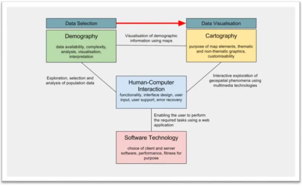
The relationships between demography, cartography, human-computer interaction and software technology are demonstrated in Figure 1.
Demographers are the subject user group, who also provide the information to be mapped and any interpretations of this information. Cartography defines the correct way to produce visualisations of the information using maps. This forms the link between demography and cartography, in the form of a workflow from data selection to data visualisation. Human-computer interaction defines the interface by which computers, in particular, web technology, enable the users to explore, select and analyse demographic data and create dynamic and
sophisticated cartographic visualisations of that data. Human-computer interaction is underpinned by the software technology powering web applications.
Figure 1: Relationships between disciplines of demography, cartography and human-computer interaction, underpinned by software technology.
The approach taken to all four disciplines is from a high-level point of view while acknowledging that there are many nuances and facets that it has not been possible to discuss in detail. The reviews attempt to extract and distill the most fundamental concepts of these separate subjects, which are broad and complex academic disciplines in their own rights.
Investigating demography serves to explain why we would want to look at population diversity in the first place and what we should be looking for. The literature review discusses what is important to demographers, based on research by Van Dalen and Henkens (2012), in particular, population ageing, large-scale migration and urbanisation which contribute to changing diversities in our populations. As demographers are the subject user group, a typical workflow for these users is also discussed, and how this might theoretically translate into a web application.
Cartography covers how maps communicate information and how the traditional principles for static print maps are extended for interactive and dynamic web maps. The implications of user interaction and animation are briefly explored, along with essential components for web maps, the differences between
cartographic convention and cartographic grammar, thematic map types and the use of colour and symbology, with the aim of establishing a critical awareness of how these factors affect the way maps communicate spatial information.
Human-computer interaction is concerned with what makes a web application’s interface usable and useful. Usability studies are already a well-studied topic and, once the foundations have been established, this thesis looks to this
research in order to create a general set of guidelines for evaluating the usability of a web application. Additionally, the human-computer interaction literature highlights methods for the evaluation of software usability, and this is adapted into the method which this thesis later uses for evaluating web mapping applications.
Software technology is discussed in terms of the differences between open source and proprietary software as this is a key issue for organisations wishing to adopt web mapping.
The guidelines developed from the literature are then applied in the evaluation of five publicly accessible web applications which provide data and maps of national statistics. The results of these analyses are used to conclude what issues are currently facing these web applications in terms of communicating the spatial relationships of demographic information, and how these issues might be resolved.
1.2 Relevance
Existing research has focussed more on the usability and functionality of web applications and web maps (see, for example, Komarkova, Jedlicka, & Hub, 2010; Komarkova, Visek, & Novak, 2007) and have developed very specific evaluation criteria which overlook the importance of the map graphics themselves in terms
of cartographic communication. Compared to these other studies, this thesis develops sets of evaluation criteria which take demography and cartography into account in an attempt to highlight a need for a more balanced approach to web map evaluation.
These previous studies also ask very specific questions, often regarding the inclusion or exclusion of specific functionality. However, web applications are hugely variant and there may be perfectly valid reasons why specific items might be limited or missing. Therefore, this thesis develops deliberately broad criteria that are more aptly named guidelines (sometimes called heuristics). These
guidelines allow evaluators more flexibility and subjectivity. More specific criteria are often irrelevant if the web application does not make use of the subject of a particular criterion, and this can unfairly affect the final scores. This thesis will look at what appears to be common amongst web mapping applications, particularly around available map types, and capture these commonalities into the guidelines for evaluation. To achieve this, this thesis takes a fresh look at the fundamentals of the four topics of demography, cartography, human-computer interaction and software technology for web mapping and uses this to make an informed decision on producing its own set of guidelines.
1.3 Structure of thesis
This thesis commences with a literature review chapter containing sections for each of the four subjects of demography, cartography, human-computer interaction and open source and proprietary software. As discussed previously, the literature review takes a high-level look at these subjects and attempts to extract the fundamental principles in order for these to be developed later into evaluation guidelines.
Following the literature review is a chapter that is written as a standalone paper to be submitted for peer review. The paper is the core of the research, taking the fundamental principles established by the literature review and developing them into the evaluation guidelines. It is also here that the method is developed and
the five web applications are evaluated. The paper includes a summary of the evaluation results and concludes with a discussion of these results and how different map types should be used to better communicate geospatial
relationships. It must be noted that the paper contains some duplicated content from the surrounding chapters but in summary form for publication.
After the paper, the thesis itself concludes with a full discussion of the results. Again, these are structured under headings for each of the four subjects and discuss what was discovered during the evaluations. The conclusion chapter also includes a discussion of the limitations of this research and how this research has contributed to filling the knowledge gap, followed by thoughts on future
2
Literature review
2.1 Demography
Demography is a science of populations (Lundquist, Anderton, & Yaukey, 2015; Weinstein & Pillai, 2016) and is explicitly linked to very basic aspects of humanity – when and where we are born, where we are from, where we live, when and where we die. The patterns which emerge when this data is analysed across a whole population provides answers to questions about what has happened, what is happening, and, perhaps most importantly, what might happen to the shape of our groups, communities, regions and nations. Demography is interested in the size and composition of populations, the change in the composition of populations, and the relationships between this change and composition. Demography is a discipline which takes the data and demands to know “so what?” (Lundquist et al., 2015). The answer to this question can inform decisions from government policy through to advertising and marketing.
2.1.1 Demographers
The breadth of application of the discipline is reflected in the disciplines it overlaps, with sociology, economics, anthropology, geography, history and biology (Lundquist et al., 2015) being the subjects with the most commonalities. This variation is reflected within demographers themselves, being “a ‘melting pot’ of different sciences and corresponding approaches” (Van Dalen & Henkens, 2012, p. 365). In a survey done in 2009 across 970 demographers worldwide, this variation within the profession was made apparent. For example, 53 percent of respondents graduated in demography, with others being predominantly from sociology, geography and mathematics and statistics (Van Dalen & Henkens, 2012). Of the respondents, Van Dalen and Henkens found that 46 percent described their practice as applied, 19 percent were fundamental, and 36 percent identified in the middle of the two. This uneven split between academic and applied is important to note. As this research could be used to create a tool for demographers, it is essential to discover what type of practice demographers
engage in, and what the profession considers important. Van Dalen and
Henkens’ survey did show that demographers enjoy analysing data (59 percent) describing it as “highly rewarding”, which indicates there is a market for a tool to aid them in this.
Commonalities in the profession exist at a fundamental level –“it is the norm among demographers is to stay close to the data” (Van Dalen & Henkens, 2012, p. 398). The survey also found that successful demographers must be highly empirical. When asked specific questions relating to their profession, the most important population issue for Asia/Oceania in the next 20 years was identified as population ageing followed by urbanisation and large-scale migration flows.
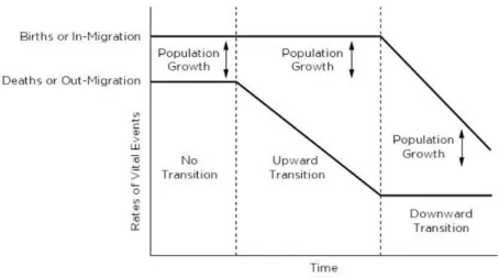
2.1.2 Population ageing, migration and diversity
With population ageing being at the top of the list of what is on a demographer’s mind, it deserves some explanation here. Holdsworth (2013), Jackson (2007), Lundquist et al. (2015) and Weinstein and Pillai (2016) describe population ageing as the phenomenon where a population’s median age increases over time, leading to a point where the population as a whole begins to decline. The process by which this occurs is known as the demographic transition; a four-stage process where the population moves from balance to a decline in mortality (improved life expectancy in infancy, childhood and late adulthood), to a decline in fertility (fewer individuals of child-bearing age), to a state of overall decline. During the shift from the decline in mortality to the decline in fertility, the population grows overall (see Figure 2). Jackson (2007) describes the four “dimensions” of population ageing as:
1. Numerical: absolute increases in the number of elderly 2. Structural: proportional increases in the number of elderly 3. Natural decline: fewer births than deaths
4. Absolute decline: inward migration cannot keep up with natural decline Knowledge of the nature of population ageing and the demographic transition are critical in planning, for example, labour markets.
Figure 2: The Demographic Transition (Weinstein & Pillai, 2016, p. 190).
Once geographically selective, with migrants predominantly moving to colonial settlements such Australia, South Africa, New Zealand, Canada, and the United States of America, migration has now shifted to a worldwide process. The reasons for migration are changing, and the patterns are no longer simply one-way permanent migration, with circular and temporary patterns emerging (Bakens, Nijkamp, & Poot, 2015). The way in which migration occurs impacts both the sending and receiving nations, changing communities, not just culturally, but socio-economically and spatially (Nijkamp & Poot, 2015). For example, migrants seem to settle in urban environments (Bakens et al., 2015), contributing to the phenomenon of urbanisation, one of the priorities identified by Van Dalen and Henkens’ survey. A major outcome of these changes is in the way diversity shifts within a population.
Whilst migration is a major contributing factor to changing the diversity of a population, it is not the only way by which a population’s diversity changes. Population diversity relates to differences occurring between various
characteristics of a population, such as gender, age, ethnicity, culture, religion, language and socio-economics. It also includes how these occur both spatially and temporally, such as the changing structure of a population as it ages or the arrival of different ethnicities due to migration over time. Because of the nature of populations, and especially with increasing urbanisation, population diversity should be considered at multiple scales such as national, regional, local and neighbourhood, to best examine spatio-temporal heterogeneity (Nijkamp &
Poot, 2015). For example, when examining cultural diversity, measurement across multiple scales is important to show where the intermingling of cultures occurs rather than more homogeneous neighbourhoods in an otherwise culturally diverse region. Diversity is usually enumerated as a fractionalisation index; essentially, the probability of an individual from one cohort encountering another individual from a different cohort, and these indices are often
mathematically similar to the indices used by biologists and ecologists (Nijkamp & Poot, 2015). While it is not within the scope of this thesis to discuss the components or mathematics of the many indices available (see, for example, Nijkamp & Poot, 2015), it is sufficient to say that diversity indices are commonly calculated as a value between zero and one, indicating a probability as
mentioned above.
2.1.3 Typical analysis workflow
The typical analysis workflow of a demographer falls into two paths to obtain data for visualisation. This depends largely on the type or depth of analysis they are performing and whether they require the use of raw or pre-processed data. The following sections discuss a typical workflow for both of these paths from a demographer’s point of view and develop this into how a web application might work, based on discussion with N. Jackson (personal communication, June 13, 2016).
For the first path, demographers are often required to answer very specific and unique research questions which require highly bespoke analysis and a
demographer undertaking some deep analysis will require raw data, often from multiple sources and in different formats, and might spend considerable time cleaning, standardising and preparing this data before carrying out any analysis. Typically, such complex numerical analyses would be undertaken using software such as Microsoft Excel. However, in the second path, some demographers may have a use for pre-processed data, such as fractionalisation indices if these are available to them.
Raw population data typically refers to absolute counts for a particular variable, for example, identified ethnicity. This is opposed to pre-processed data, which might include pre-calculated ratios, rates, proportions and indices. Population data is most often aggregated by some areal unit (e.g. census unit, city, region or country) to protect the privacy of individuals within the counting area. Smaller counts might also be rounded or randomised (see, for example, Statistics New Zealand, 2015) to add further privacy protection. In addition, the units of the variable itself may be aggregated; for example, ages grouped in five-year ranges, or broadly categorised ethnicities. While the exact locations of individuals in a dataset naturally provides the best spatial resolution, it has to be accepted that population data, especially from censuses, will be aggregated and analysts must work within this constraint.
2.1.4 Web application workflow
So, what does a demographer need from a web application in order to visualise population diversity using maps? This thesis breaks this question into a workflow of three phases:
Phase 1. Data procurement Phase 2. Data analysis
Phase 3. Visualisation and interpretation
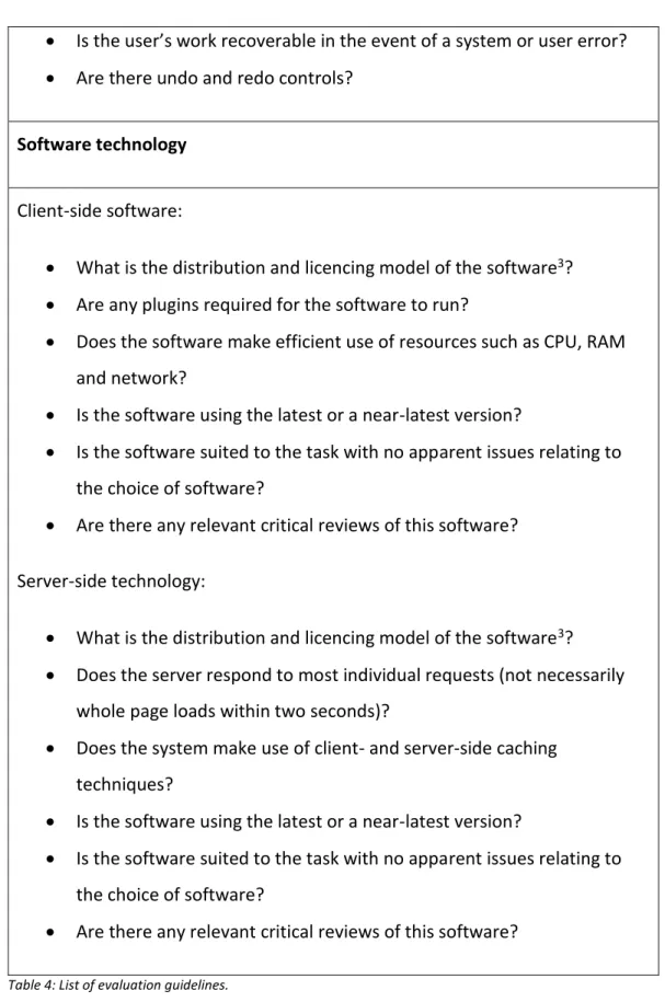
Ideally, a single web application could be used to deliver this entire workflow. However, the data analysis phase would usually be performed using software like Microsoft Excel as clarified by N. Jackson, (personal communication, June 13, 2016). A key issue here is that a web application attempting this phase would need to emulate the complex functionality of this software, and this is by no means a trivial undertaking. Therefore, it is suggested that the notion of
performing the data analysis phase within the web application is abandoned, and left to more appropriate software like Microsoft Excel. The single-application workflow described above now becomes fragmented into three standalone tasks; phase two is outside the scope of the web application, and phases one and
three are standalone functions that can be invoked optionally and
independently. This is especially true when considering that the data may be acquired partly from sources outside of this hypothetical web application. For now, we will consider just the requirements for the data procurement and visualisation and interpretation phases, and treat these as independent of the overall workflow. The paper component of this thesis develops these phases in the context of the hypothetical web application.
2.2 Cartography
Since the Internet became a medium for map distribution in the mid-1990s, the audience for interactive maps has been increasing. In fact, in 2001, the rate at which web map use was increasing was stronger than the growth of the Internet use overall. With continuous improvements in mobile technology, map use is also prospering in this area (M. P. Peterson, 2007b). M. P. Peterson also noted that it is interesting how readily people have adapted to web maps. This new, interactive, multimedia cartography has grown from a user requirement for intuitively presented geographic information by combining extra elements such as text, audio, video and animation to “enhance [the] user experience and make it easier and faster to grasp information” (Cartwright & Peterson, 2007, p. 1). Ormeling (2007) succinctly describes the use of interactive cartography as allowing the user to not just ask ‘what is there’ but also ‘what more is there?’
Geographic information “has become increasingly ‘scientific’ and ‘objective’ in nature” (Taylor & Lauriault, 2007, p. 519) but the focus still needs to remain on qualitative properties such as artistic and emotionalto “more effectively portray and represent a world rich in colours, texture, sounds and smells” (Taylor & Lauriault, 2007, p. 519). Taylor and Lauriault note that the way digital
cartography is currently displayed “is emotionally stark, largely visual and often in black and white.” Whilst information displayed via a computer does not replace the real world, they say that multimedia cartography can attempt to create a more “interesting, engaging and effective” experience.
According to MacEachren, Crawford, Akella, and Lengerich (2008), more emphasis has been placed on developing the tools necessary for web mapping rather than the design principles. Peterson states that “cartography today is as much about [computer programming] as it is about design and data analysis skills” (2015, p. 240). However, Peterson also states that cartographers will still have much to tweak and tune until software improves to the point where most facets will be automatable.
Kraak and Ormeling (2011) note that a geographic information system (GIS) is generally not a drawing tool. Printed maps would normally be created in a GIS and then exported to specialised graphics software for further cartographic refinement. Web maps, on the other hand, are generated directly from GIS software and cannot take advantage of specialised graphics software. This limitation has led to two different paths for the creation of print and web maps.
Cartography aims to reduce reader error and misinterpretation by using suitable graphic presentation. Kraak and Ormeling state that cartographic grammar is well-defined and that the basics do not change for the web, saying “well -designed web maps can be recognised as relatively ‘empty’” (2011, p. 79). Beyond these basics, Peterson asserts that digital map design is still in its youth, and that “common rules or standards for cartographic presentations on screen displays are not defined yet” (2015, p. 55) and there is minimal published
literature on the subject, leaving much to trial and error. M. P. Peterson (as cited in Cartwright & Peterson, 2007) asserts that “paper thinking” still over-influences multimedia cartography.
According to Miller (2007), a web map interface can be broken down into:
Informational objects: the map object itself, direct spatial elements and their symbologies
Functional objects: marginalia such as scale and direction indicators, titles, legends and controls for querying and manipulating the thematic data
Aesthetic objects: for example, borders and logos.
2.2.1 Essential map components
2.2.1.1 Basemaps
Maps can be broadly categorised as either general reference or thematic
(Robinson, 1995). General reference maps describe the location and character of physical objects, and thematic maps describe the distribution of measurable phenomena, such as human populations. Thematic maps still require a degree of general reference detail, in the form of a basemap, so the reader is able to spatially orient and appreciate the location and distribution of the phenomena in relation to the physical world. The level of basemap detail required for a
thematic map might be as minimal as political boundaries but, depending on the needs of the theme and user, it might also include roads, place names, coastlines buildings and bodies of water or other physical objects (Cammack, 2007; Kraak & Ormeling, 2011). An example cited by Kraak and Ormeling (2011) is a map of relative fish catches by country; a landlocked country displayed a relatively high catch when viewed in relation to other landlocked countries. If the topographic detail did not show the presence of a large lake, the reader might interpret the high catch as an anomaly in the data.
2.2.1.2 Map elements
According to cartographic texts such as Kraak and Ormeling (2011), G. N. Peterson (2015) and Robinson (1995), the first essential consideration of map design is that the map must communicate a clear purpose. In the case where mapping, for example, demographic diversity, the demographers are providing meaning to numeric data and this needs to be clearly portrayed by the map’s theme and, in particular, by the map’s title. The map’s title should include the area, the common denominator of the theme and the time. The purpose of the map needs to be clear to the target audience and they must be kept in mind during the design process.
Other cartographic elements which are considered essential to paper maps by Kraak and Ormeling (2011), G. N. Peterson (2015) and Robinson (1995) are north arrows, insets, scale bars, graticules and legends. However, this thesis suggests that, because web maps are a different environment to print maps, the
cartographer should feel free to make a judgement call as to whether these elements are truly required or if they could negatively impact the overarching aim of effective communication. For example, a legend might not be required if the web map uses interactive pop-ups to describe a symbol. Miller (2007) states that a coverage map, or map inset, should be used due to the ability for web maps to be panned and zoomed at the user’s whim. Again, this thesis argues that this is not necessarily true, depending on the context of the map and the
availability of other orienting properties, such as place labels and other
marginalia. Symbols, lines and text should be visually distinct and readable. Good maps will establish a clear visual hierarchy by contrasting the theme from the basemap. The map should only convey one or two phenomena as trying to include too many variables can be detrimental to communication. To overcome the issue of poor quality data, it should be mapped in less detail and at smaller scales to prevent an inaccurate interpretation of quality. Additionally, data sources should be appropriately attributed.
2.2.1.3 Scaling and generalisation
Miller (2007), Kraak and Ormeling (2011), Peterson (2015) and Gaffuri (2011) all discuss a very important and unique factor of web map design: scaling. A user can zoom in and out of a map at will and expect immediate results and this is not a trivial matter like enlarging or reducing a photograph. At smaller scales,
irrelevant objects should be removed, e.g. minor roads. At larger scales, some objects may require more detail, e.g. rivers might need to be represented as polygons rather than simple lines. To achieve this range of requirements, data is commonly served for 20 scale sets (sometimes grouped) where the cartographic features are generalised as the scales get smaller (G. N. Peterson, 2015).
Generalisation is the result of elimination, simplification, displacement and enlargement of cartographic features to improve readability. After
generalisation, the symbols themselves may also be scaled to aid in legibility and prevent overcrowding such as line thickness, font size and point size. The aim is to provide a “consistent look and feel across all zoom levels” (G. N. Peterson, 2015, p. 247).
Research by Cecconi and Galanda (2002), while dated, highlights that
generalisation and scaling are about compromise. When scale sets are generated beforehand, performance is fast and cartographers can easily tune the results, but at the expense of updateability. Conversely, on-the-fly generalisation will seamlessly handle data updates at the expense of speed and intervention from cartographers. This research is backed by Gaffuri (2011) who assert that pre-processed generalisation is not interactive enough. Cecconi and Galanda proposed a combination of on-the-fly adaption and pre-built scale sets.
2.2.1.4 Projections
The standard projection used by web mapping software is Web Mercator and this is often the only option available. While Web Mercator preserves direction and shape, and results in a squareness which is useful for tiling purposes, it can produce noticeable distortion at a continental level and nearer the poles (G. N. Peterson, 2015). This effect may be noticed when comparing the shape of areas on small-scale overviews to the shape of those same areas when viewed at larger scales.
2.2.1.5 Multiple maps
For the purposes of comparison, it can be useful to display two or more maps simultaneously, each map showing a different location or moment in time. MacEachren et al. (2008) created a system for analysing cancer statistics aggregated by area where they used series of multiple linked micromaps. Not only can micromaps such as these show a single phenomenon across different areas or times but they can also be swapped to show a single area with multiple phenomena or times. In cases such as these and, indeed, any situation where two or more maps are being compared, Ormeling (2007) asserts that the theme
or the area (and scale) must remain constant when the opposing element changes.
2.2.2 Cartographic communication
Like print maps, the primary function of (most) web maps will be the
communication of spatially related information. In the case of communicating demographic information – among others – this means using some manner of thematic map to portray the spatial occurrence of a phenomenon.
Maps communicate using the principles of cartographic grammar and cartographic convention. General reference maps, such as basemaps and topographical maps use cartographic convention, for example, the forest is green, the water is blue and north is up. By comparison, when designing
thematic maps cartographers look to the broader rules of cartographic grammar, as convention cannot capture the many different scenarios which thematic maps will potentially encounter (Kraak & Ormeling, 2011). Substantial research on the neurophysiological, psychological and cognitive backgrounds of cartographic grammar underpins cartographic literature and has informed the general
understanding of how humans see and interpret maps. While this thesis will not delve into the specific ways in which human visual hardware turns seeing into perceiving (although human-computer interaction, a related topic, is discussed later in the thesis), it is important to note that this research exists and informs cartography at its most fundamental level. The interested reader should look to works such as MacEachren (1995) for an explanation of this topic, which is multi-disciplined in itself.
2.2.2.1 Map types
Map themes can be qualitative or quantitative. Before choosing a map type, spatial data should be assessed to determine its nature, length and range. Kraak and Ormeling (2011) categorise data into five types:
Nominal: qualitative, e.g. primary spoken language
Ordinal: quantitative, ordered classes, e.g. cold, cool, warm, hot
Interval: absolute quantitative intervals, e.g. the total population of an area
Ratio: relative quantitative intervals, e.g. the proportion of an ethnicity to the total population of an area.
It is also useful to categorise quantitative data as either spatially extensive or intensive. Spatially intensive data is calculated using a spatial variable, for example, population density, where the denominator is the actual area of the aggregation unit. Conversely, spatially extensive data is not derived from a spatial variable and an example of this is absolute population counts (Buckley, 2013; Haining, 2003). The data’s scale, and whether it is spatially intensive or extensive, should inform the choice of map type. Generally, the mapping of population statistics leads to the use of choropleth or proportional symbol maps (Kraak & Ormeling, 2011).
Choropleth maps use discrete, stepped colours to represent quantitative differences between areas. Typically, choropleths are used to visualise statistics that have been aggregated by counting areas, such as census units. This
aggregation yields maps which tend to convey homogeneity in the distribution of the statistic, and it is important that choropleths be used with caution when mapping spatially extensive data. For example, if an area with an absolute population count of 10,000 were divided into two equal parts, it would not necessarily be true to say that both parts contain 5,000 people. Further,
choropleth boundaries may be arbitrary, and may not necessarily represent the distribution of the phenomenon, or may be subject to the modifiable area unit problem1 and ecological fallacies2. Another issue with choropleths is a tendency
for readers to perceive the size of geographic areas as carrying ordinal value,
1 Modifiable area unit problem: summarising data by different areal units produces different results for the same location.
even if this is not relevant. Despite their drawbacks, choropleths are the most commonly used map for visualising socio-economic phenomena due to their ease of construction by computers, and ease of interpretation by readers. A distinction should be made between choropleths and chorochromatic maps; the latter uses colour to represent qualitative, rather than quantitative data. Colour is discussed in more detail below, but choropleths should use differences in lightness or saturation to represent different values, while chorochromatic maps should only use changes in hue (Buckley, 2013; Haining, 2003; Kraak & Ormeling, 2011; Meirelles, 2013).
Cartogram maps are a clever alternative to choropleths where the sizes of areas are changed relative to the occurrence of the phenomenon being mapped, in order to overcome the issue of false ordinal importance mentioned above (Kraak & Ormeling, 2011; Meirelles, 2013). However, this thesis argues that cartograms can distort the size and shape of areas so much that they should be treated more as a supplementary tool.
Another alternative approach to choropleths are dasymetric maps where additional topographic information is used to create areas which better represent the true distribution of the phenomenon being mapped, in order to reduce perceptions of homogeneity. However, because of the limited GIS software options for producing them, dasymetric maps are not likely to be used for dynamic web maps (Kraak & Ormeling, 2011; Meirelles, 2013).
Dot density maps use dots to convey the density of a phenomenon in a particular area. However, the use of dots can lead to a false perception of absolute location when used with aggregated data, and Meirelles claims users have a “tendency to underestimate the number of dots and the differences of densities between areas” (2013, p. 132). When the distribution of values varies too greatly, some areas will appear too dense (overlapping dots) and some too sparse. Dot size and colour can also be used to introduce further dimension and flexibility. Testing is required to determine the best proportion of dots to use, which limits use in automated symbolisation.
Proportional symbol maps use geometric shapes of varying size to convey difference in value. The use of simple geometric shapes as symbols, such as circles, squares and triangles, is important; the more complex the shape, the more difficult it is to perceive a difference in size. The range of values is important and the minimum and maximum values should be shown in the legend. Kraak and Ormeling (2011) warn that three-dimensional symbols can lead to serious misinterpretation because the viewer perceives the area covered by the symbol before the actual size of the symbol (Kraak & Ormeling, 2011; Meirelles, 2013).
Isopleth maps use isolines to partition intervals of a continuous phenomenon where there is a continuous distribution in all directions. While isopleths are not as intuitive as choropleths, they are appropriate for comparing different
phenomena and are therefore more effective than choropleths because they can be used to demonstrate trends and the direction of change. Because of the continuous nature of their surfaces, isopleths can display more than the seven classes recommended for choropleths (see below) (Kraak & Ormeling, 2011; Meirelles, 2013).
Statistical surface maps are useful as dramatic three-dimensional visualisations of the peaks and troughs of a phenomenon. However, the rendered image may become overly complex and background areas can be obliterated by peaks in the foreground (Kraak & Ormeling, 2011). Statistical surfaces are more difficult to construct, especially dynamically, but there may be merit to further research in their use for population mapping, especially in a web mapping environment where the user can pan the three-dimensional model. Colour ramps may help the viewer decipher the complexity more readily, as is the case with other three-dimensional graphs. A downside to statistical surfaces is that it becomes more difficult to include a basemap, thus making it harder for users to spatially orient themselves.
Another option for showing movement of a phenomenon are flow line maps and these are useful for portraying migration trends. Lines of varying thickness
represent value while arrowheads represent direction. The length of the lines can also be used to approximate the distance of movement in the phenomenon. Thick bands may obscure the underlying topography and indeed other bands (Kraak & Ormeling, 2011; Meirelles, 2013).
2.2.2.2 Colour and symbology
Once the correct map type is determined, the way the map is coloured and symbolised needs to be considered. Cartographic convention plays an important role in how maps are interpreted, particularly in topographic maps, as discussed above. However, convention is only part of the story and the “general character of graphics cues used” (Kraak & Ormeling, 2011, p. 62) also help improve
interpretation. For example, points representing businesses use the business’ logos, railways by a dual track with sleepers or hospitals by red crosses. Miller (2007) asserts that these “self-describing symbols” may also negate the need for legends. While conventions are helpful in topographic mapping, Kraak and Ormeling state that thematic maps do not necessarily have conventions, meaning cartographers must look to the broader guidelines of cartographic grammar when choosing map types and symbolisations for these.
In the context of multimedia cartography, Miller (2007) remind us that exact figures can always be made available by interacting with the map, e.g. clicking or hovering over an area or point of interest.
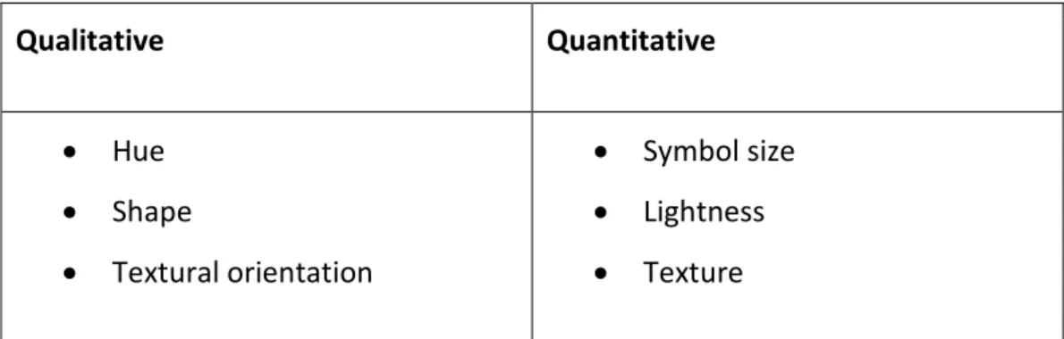
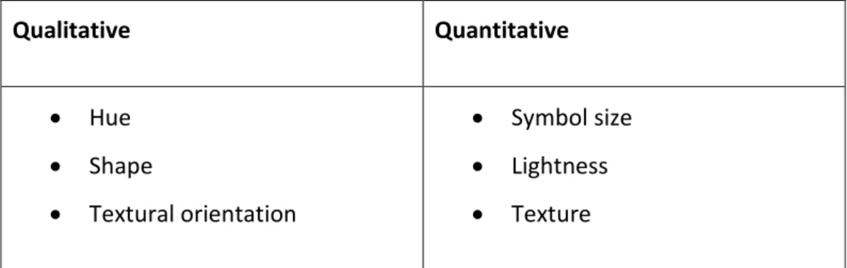
Bertin (as cited in Kraak & Ormeling, 2011; Robinson, 1995) listed six graphic variables which can be exploited by cartographers:
Qualitative Quantitative Hue Shape Textural orientation Symbol size Lightness Texture
Kraak and Ormeling list three other proposed graphic variables in addition to Bertin’s six: saturation, arrangement and focus. In the context of a web browser, Kraak and Ormeling also suggest using opacity, shadow and shading, although these new variables still require more research to determine their cartographic effectiveness. Before choosing which graphic variables to use, the cartographer must determine the hierarchy of information, which will translate into the visual hierarchy. This visual hierarchy will determine the cartographic methods used to demonstrate the importance of each element, e.g. the colour of the sea should not dominate a map explaining strictly land-based phenomena (Kraak &
Ormeling, 2011; Miller, 2007; G. N. Peterson, 2015).
The use of colour has psychological, physiological, cognitive and associative (e.g. convention) issues (Kraak & Ormeling, 2011; Meirelles, 2013). Kraak and
Ormeling state that the colours used to symbolise qualitative and quantitative differences need to be handled differently; normally, changes in lightness are perceived as differences in quantitative value, e.g. pink implies a lower density than red, while changes in hue are perceived as qualitative differences, provided they have a similar lightness. Kraak and Ormeling go on to say that colour is more difficult to perceive in smaller areas and that darker colours tend to dominate an image; therefore, highly saturated colours should be reserved for smaller areas. A system which automates symbolisation would need to take areal size into account so no false ordinal relationship is perceived.
There seems to be no hard-and-fast rule for the maximum number of colours which can be used on a single map. According to Kraak and Ormeling (2011), the maximum number of discernible colours at a glance is eight, although this can be increased using textures. However, G. N. Peterson (2015) claims this number is 10 – 12 before human vision becomes fatigued and that too much colour, including colour in the marginalia, is tiring. G. N. Peterson also suggests the maximum number of discernible shades (lightness) of the same hue is five.
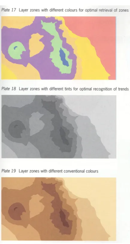
Figure 3: Examples of representative differences in colour (Kraak & Ormeling, 2011).
2.2.2.3 Spatio-temporal relationships
Static maps can only display a single snapshot in time, making it difficult to represent change. Change is more difficult to describe cartographically, for both the cartographer and the user. While change can be represented using a series of static maps, as would be required if the maps were printed, a major benefit of
on-screen cartography is that map themes themselves can be animated. In fact, an animation can be thought of as a series of individual maps displayed frame-by-frame and offers a very expressive way to represent changes in location and value (Kraak, 2007; Kraak & Ormeling, 2011). Interpolation can be used to smooth the transitions between frames (M. P. Peterson, 1995), and, with modern cascading style sheets (CSS) technology, vector data can be animated directly in the browser, allowing the possibility of animating live streaming data. It is also worth noting that the variable of change does not necessarily have to be time; non-temporal variables, such as a change of projection, can also be
animated.
Where animations are provided, the user should be able to control the display with controls for play, pause, fast-forward, rewind and even the possibility of moving through the timeline manually using a slider. In an exploratory environment, the user will likely have queried the data, making them the animator, so care should be taken to ensure there is adequate flexibility in control. (Kraak & Ormeling, 2011; MacEachren et al., 2008).
While the rules for static maps are well defined, animation opens up a new realm of cartographic possibility, the effects of which are not yet fully understood and have been researched (Kraak, 2007; Kraak & Ormeling, 2011). Kraak and
Ormeling note that there are perceptual and cognitive limitations with animations where cognitive overload may mean the user is not able to fully process meaning from the data, due to the sheer number of frames. Kraak and Ormeling also suggest that the symbols used in animations should themselves represent change, e.g. arrows for movement or shapes which change in size.
2.2.3 Map interactivity
In an interactive environment, users become the map producers; they want to assemble the pieces themselves and they may want to spend considerable time customising and exploring (Buchroithner & Gartner, 2013; Cartwright &
and structure knowledge because “interaction is the key to knowledge formation” (2007, p. 2). With an estimate of more than half of the educated population not being competent with maps, interactive multimedia cartography may help improve knowledge acquisition amongst these users (M. P. Peterson, 2007a). Web maps allow the user to query the data and perform analysis, enabling them to explore and understand data, determine geospatial
relationships, synthesise the results of analysis and communicate new geospatial knowledge (Kraak & Ormeling, 2011).
In comparing the difference between static maps and today’s dynamic and interactive web maps, Miller (2007) talks of the “hypermedia paradigm” by which users of such maps are now conditioned to expect extra information to be available by interacting with the map. Interaction with web maps ostensibly falls under human-computer interaction but, as asserted by Cartwright and Peterson (2007), interaction plays a fundamental role in knowledge transfer. To be effective, any interactive map elements must balance their cartographic symbology and iconology with the need to depict that the element is, in fact, interactive; web maps should actively promote interaction by indicating which features are interactive, such as symbols or the cursor changing on hover. The map object should be manually navigable by the user with pan and zoom tools, possibly alongside links that zoom to predefined areas. In fact, Ormeling (2007) asserts that it is “unethical” to only provide fixed frames.
Web map interaction is discussed here under cartography, but it is recognised that this is also rooted in human-computer interaction (Kraak, 2007; Kraak & Ormeling, 2011; MacEachren et al., 2008). In this respect, cartography and human-computer interaction have a lot in common and multimedia cartography has much to learn from human-computer interaction research (Taylor &
2.3 Human-computer interaction
Human-computer interaction (HCI) is a medley of several separate disciplines such as psychology, cognitive science, ergonomics, sociology, computer science, engineering, business and graphic design, to name a few (Dix, Finlay, Abowd, & Beale, 2005). HCI “is both a craft and a science”and does not have a “general and unified theory” (Dix et al., 2005, p. 5). A fundamental principle of HCI is that computers and software should be designed in a user-centric way (Taylor & Lauriault, 2007) and with the understanding that users have specific tasks in mind and want to achieve those tasks in ways which are seamless with respect to their lives outside the computer (Dix et al., 2005). HCI is not just about pretty interfaces; it is integral to the design of systems as a whole and successful products have three use words: useful, usable and used (Dix et al., 2005).
The cartography of web maps and HCI have a lot in common. The crossover is mentioned by Taylor and Lauriault: “Seeing the user as a consumer is important but the future of multimedia cartography also depends on a much deeper understanding of the user in terms of both use and usability issues. Here, multimedia cartography has much to learn from human factors psychology, cognitive science, and from [HCI] research in general” (2007, p. 510).
2.3.1 Input and output
The science of HCI is broken down into input-output channels between humans and computers. A typical consumer computer has a monitor and speakers (output) and a keyboard and mouse (input). Conversely, humans have eyes and ears (input) and limbs (output). Although many other inputs and outputs are possible, this example demonstrates the input-output channels of monitor-to-eyes, speakers-to-ears and limbs-to-keyboard-and-mouse (Dix et al., 2005).
To web map creators, vision is the human input channel of primary importance. Human vision is limited to what can be physically seen but our brains are also very good at interpretation – we can use incomplete information to derive a complete image (Dix et al., 2005). Distance and size are dominating factors in
how humans interpret images; how much of the field of vision an object occupies, along with other cues such as foreground objects overlapping background objects, determines how we perceive (Dix et al., 2005). In reading text, human eyes move in periods of saccades (rapid movements) and fixations. Recognition and interpretation occur during fixations, which occupies 94 percent of viewing time. Common words are recognised by shape, allowing a reader to scan. Deviating from the common shape or nature of words or symbols can affect the speed of interpretation (Dix et al., 2005; MacKenzie, 2013). When searching lists (text or otherwise), there is a linear relationship between the number of items to scan and the time taken to find the item (MacKenzie, 2013). Dix et al. cite how research has proven that backlit screen reading is slower so text interfaces require careful design. A negative contrast (black on white) improves luminance and therefore legibility.
2.3.2 Usability
The usability of a system is governed by how well the user can interact with it. In web mapping, pointing devices (mouses, trackpads, etc.) play the most
important role, allowing the user to move the cursor, operate controls to query the data, pan and zoom map objects and interact with points or areas of interest.
Reaction to a stimulus and the time taken to move in response is largely affected by factors such as age, fitness, fatigue and skill (Dix et al., 2005). MacKenzie (2013) backs this up but adds that interface design is a speed-accuracy tradeoff and that performance improves noticeably with practice. Fitts’ Law (cited in Dix et al., 2005) is a formula derived from an empirical study of human accuracy when moving or reaching for targets at increasing distances, such as moving a mouse. While Fitts’ research was in ergonomics, the formula also holds true in HCI. The formula is:
𝐷 = 𝑎 + 𝑏 ∗ log2(𝐴 𝑊+ 1)
Where D is an index of difficulty (usually time), a and b are constants related to the particular task, A is amplitude (usually the distance to the target) and W is the reachable width of the target. Fitts’ Law is an important concept for analysing user interface design as it shows that relatively smaller targets at relatively larger distances are increasingly difficult to reach, meaning commonly used controls should be grouped near each other or, if they are distant, targets should be of a sufficient size to hit them easily. An example in a web map context might be zoom buttons that are placed in the bottom right corner of the display when most other controls are located near the top left corner. The user will spend the majority of their time near a group of primary controls, so when they do move to the remote zoom buttons, these buttons ought to be large enough so that the index of difficulty in reaching them is appropriate. Alternatively, the zoom buttons can be made smaller but therefore will need to be closer to the primary centre of the user’s attention.
2.3.3 Design principles
Dix et al. (2005) discuss design principles and guidelines for applying HCI in practice without needing to understand the various disciplines which underpin them. The principles often overlap and may enhance or interfere with each other, meaning they need to be applied with careful thought. A distilled list of HCI principles from Dix et al. is below.
Learnability:
Predictability: No surprises. Past interaction guides future interaction as recognition is more powerful than recall. All operations a user can (or cannot) perform should be visible.
Synthesisability: Users should be able to determine that change has occurred as a result of an operation. This helps build a mental model of how the system operates.
Familiarity: The user should be able to apply knowledge of other systems (computer or not) in the operation of the current system.
Consistency: Similar to convention in cartography. Red-coloured feedback means ‘bad’, green-coloured feedback means ‘good’. Arrow keys perform directional operations.
Flexibility:
Dialogue initiative: Interaction can be initiated by the system or by the user. User pre-emptive dialogue, where the user initiates action, is preferred over system pre-emptive, where system initiates action. This gives the user a feeling that they are in control and have the ability to perform actions as they need.
Multi-threading: Allow multiple tasks to occur at the same time. Windowing systems are the most common example of this in practice. Modern web browsers allow this to occur seamlessly in a web context without having to build this into the product.
Task migratability: Task execution can be transferred from the user to the system and vice versa. Mundane actions, like spell checking, can be performed by the system, but it would be unwise to allow the system to always autocorrect.
Substitutivity: Allowing flexibility in the way a user interacts, e.g. when entering values either “2.5cm” or “1 inch” are acceptable.
Customisability: User-initiated customisability is adaptability, and system-initiated customisability is called adaptivity. Users should be able to customise the way they use the system, such as moving toolbars, while the system might automatically adjust itself if it detects an advanced user over a novice. Adaptivity is likely to interfere with predictability if it is not done well.
Robustness:
Observability: The user can determine the internal state of the system by its output.
o Browsability: The state of the system can be explored via the interface.
o Defaults: Suggested input can quickly be perceived as correct or not and reduces physical action. May evolve adaptively.
o Reachability: Ability to navigate through observable states.
Persistence: System outputs should represent system state persistently. For example, a user may hear a ‘beep’ indicating a new email has arrived but will soon forget. A persistent visual notification will serve as an additional reminder.
Recoverability: Humans make mistakes, and a system should allow recovery from these. Undo, redo, back, forward commands are examples of this.
Responsiveness: Users, particularly on the web, are impatient, and the performance of the system is key to usability. Response time should be fast or at least indicate that the system has not stalled.
Task conformance: Does the system perform all the required tasks? Does it fulfil the user’s requirements and expectations based on their
understanding of the tasks?
2.3.4 Evaluating usability
Beyond the HCI fundamentals above, there are already established approaches to how the usability of software is evaluated. The terminology in this area varies, depending on the author and their approach. For example, Komarkova et al. (2007) use the term heuristics for specific criteria which enable unskilled
evaluators to make quick decisions. On the other hand, Nielsen (1995) refers to heuristics as broad rules of thumb which can be used by evaluators who have more background knowledge of the area of evaluation, and this allows more subjectivity in decision making. Travis (2016) uses the term guidelines in the same way Komarkova et al. talk of heuristics. In the interests of consistency and to use a plain English term, this thesis uses the term guideline to refer to the criteria for evaluating usability.
Komarkova et al. (2007) have developed 138 guidelines for evaluating the
usability of web-based GIS. However, this list focusses in detail on the usability of the GIS itself rather than the cartographic communication of the output. Travis (2016) develops a more general approach with a comprehensive 247-point list of guidelines for evaluating usability, task orientation, navigation, data entry, content quality, layout and design, user support and fault tolerance, specifically for web applications. While many of Travis’ guidelines are related to the
marketing aspects of website design, the usability aspects can be adapted for the purposes of performing web application evaluations and these aspects have been included in the HCI factors in Table 4 on page 60 of this thesis.
Also adapted into the HCI factors in Table 4 are the more fundamental and broad usability guidelines from Nielsen and Mack (1994). These guidelines look at the usability of software in very broad terms and reinforce Dix’s et al. (2005) design principles from above. These guidelines are distilled on Nielsen’s (1995) website:
Visibility of system status
Match between system and the real world User control and freedom
Consistency and standards Error prevention
Recognition rather than recall Flexibility and efficiency of use Aesthetic and minimalist design
Help users recognise, diagnose, and recover from errors Help and documentation
2.4 Open source and proprietary software
The free and open source movement has become a cultural revolution, and this is not limited to software; we now have open source cars (‘OSVehicle’, n.d.), electronics (‘Arduino’, n.d.), and even firearms (Defense Distributed, n.d.). The decision between significant capital expenditure in more traditional commercial
software, versus using a competing and ostensibly free alternative is not obvious, and organisations initially approached this choice in a “reluctant and
uncomfortable manner” (Fitzgerald, Kesan, & Russo, 2011, p. vii).
The terminology used to describe software distribution models can be a point of confusion, and definitions vary between sources, which may be a symptom of how rapidly software technology is changing. For example, the opposite of open source is not usually called closed source, and free software might not mean free of charge. This is not an exhaustive list, but it does serve to generalise the most common paradigms of software licencing models.
Open sourcesoftware means the product’s source code has been made publicly available. Open source software is usually non-commercial — although there are exceptions to this — and it is not necessarily free software (see definition below) (Fitzgerald et al., 2011; ‘gnu.org’, n.d.; Open Source Initiative, n.d.).
Proprietary software is the opposite of open source and is sometimes referred to as closed source (not to be confused with commercial software). Proprietary software may be freeware, commercial, or a mix of both (Esri, 2011; Fitzgerald et al., 2011).
Free software does not necessarily mean unpaid or non-commercial but rather free as in liberty. The Free Software Foundation (‘gnu.org’, n.d.) lists the four “essential freedoms” of free software as:
Freedom 0: The freedom to run the program as you wish, for any purpose.
Freedom 1: The freedom to study how the program works, and change it so it does your computing as you wish. Access to the source code is a precondition for this.
Freedom 2: The freedom to redistribute copies so you can help your neighbour.
Freedom 3: The freedom to distribute copies of your modified versions, too. By doing this, the whole community has the opportunity to benefit from your changes. Access to the source code is a precondition for this.
Because being open source is a precondition, free software can be considered a subset of open source software. However, not all open source software is free software but, because most is, the two terms almost describe the same thing and are often used interchangeably (Fitzgerald et al., 2011).
Not to be confused with free software, freeware is proprietary software distributed without direct cost. Although it may still be commercialised
indirectly, freeware cannot be classified as commercial software. Freeware can generally be considered a subset of proprietary software (Esri, 2011; Fitzgerald et al., 2011).
Software is classed as commercial if its purpose is to generate revenue directly and it can be free software (as defined above), open source, proprietary or a mixture (Esri, 2011; Fitzgerald et al., 2011).
2.4.1 Commercialisation
Commercial software, as defined above, is sold directly under some form of licence. Licence terms may include the length of time the software may be used, the maximum number of installations or concurrent users, or may even be pay-per-use (Fitzgerald et al., 2011). Whatever the terms, commercial software incurs direct financial costs. Non-commercial software, such as free and open source and even freeware, may still be commercialised indirectly, even if the software itself is non-commercial. Some examples of indirect revenue streams are:
professional services support