Seminar Paper No. 698
INCOME DISTRIBUTION ACROSS COUNTRIES: HOW IS IT MEASURED AND WHAT DO THE
RESULTS SHOW? by
Peter Svedberg
INSTITUTE FOR INTERNATIONAL ECONOMIC STUDIES Stockholm University
Seminar Paper No. 698
INCOME DISTRIBUTION ACROSS COUNTRIES:
HOW IS IT MEASURED AND WHAT DO THE RESULTS SHOW? by
Peter Svedberg
Papers in the seminar series are also published on internet in Adobe Acrobat (PDF) format.
Download from http://www.iies.su.se/
Seminar Papers are preliminary material circulated to stimulate discussion and critical comment.
September 2001
Institute for International Economic Studies S-106 91 Stockholm
Income distribution across countries:
how is it measured and what do the results show?
Peter Svedberg*
Institute for International Economic Studies
Stockholm University
September 2001
This report was written at the behest of the parliamentary commission on Sweden’s policy for global development ― Globkom
* The author would like to thank Marian Radetzki and Jakob Svensson for their helpful comments on an earlier draft.
1. INTRODUCTION
Income distribution across countries and within countries, the number and proportion of absolute poor, and the absolute income gap between countries, have traditionally been important indicators of the development in the world. This applies both to comparisons between countries and over time. Up to the beginning of the 1990s, however, income data were available for a limited number of countries only and the reliability of these data was not high enough to enable meaningful quantitative studies including the majority of the developing countries. Since that time, the statistical database—despite considerable remaining shortcomings—has improved considerably, and improved estimation techniques have been developed.
A review of how the distribution of incomes has changed within the developing countries and of the proportion of people in the world who find themselves below the World Bank’s poverty line has been presented earlier by Bigsten and Levin (2000). Their review also presents a picture of the past few years’ research into how economic growth affects the distribution of incomes within a country and the proportion of the world population, which lives in absolute poverty. Bigsten and Levin also give a summary of what the causal connection in the opposite direction is supposed to look like theoretically, i.e. how income distribution in a country effects its growth, and what the empirical
research has been able to show (see also IBRD 2000/01, ch. 3).
During the last few years a relatively extensive literature has been dedicated to studying a related, though different, question: how has the distribution of incomes across countries and globally developed over time? This is the question addressed in the present report. I will attempt to explain why different studies have reached completely different results, ranging from a dramatic deterioration in the world income distribution to a rather considerable improvement (section 2). As will be shown subsequently (section 3), the discrepancies largely result from researchers using different measurements for both income and distribution and also because countries and populations are selected and weighted differently. A few additional measurement problems are addressed in section 4. Section 5 discusses how changes in countries’ shares of the world’s population affect income distribution across countries.
The report further attempts to explain why convergence in relative per-capita incomes (ratios) and in growth rates across countries can co-exist with divergence in absolute per capita incomes between countries (section 6). This divergence—increased absolute income gaps—between the poor countries in Africa and South Asia, one the one hand, and the counties in the OECD area, on the other, is inevitable for at least one or two generations to come. A summary and conclusions are presented in section 7 and some reflections concerning the future are offered in section 8.
2. HAVE GLOBAL DISCREPANCIES IN INCOMES INCREASED OR DECREASED?
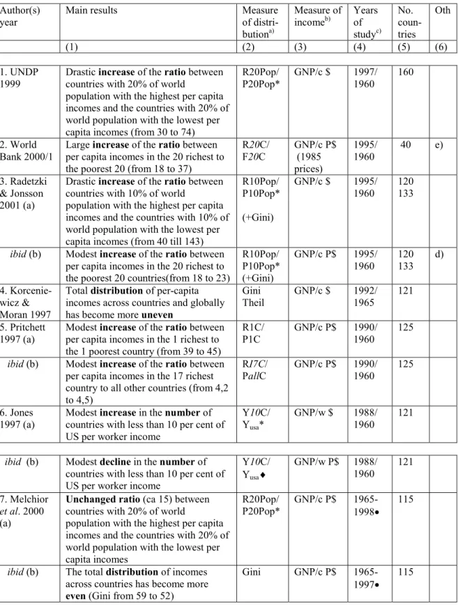
The relative income distribution globally and across countries during the period for which reasonably extensive and dependable data exist (as of 1960) has developed in completely different directions depending on which of the about 10 existing studies one consults. A dramatic deterioration of inter-country income distribution has taken place according to the UNDP and the World Bank. UNDP (1999) has estimated that the ratio of the per-capita income in the countries which collectively have the richest 20% of the world population in relation to the income in the countries with the poorest 20%
(R20Pop/P20Pop), has increased from 30 to 74 between 1960 and 1997. According to the World Bank (IBRD 2000/01), the ratio of the per capita income in the 20 richest
countries and the 20 poorest countries (R20C/P20C)—regardless of population size—has grown from 18 to 37 between approximately the same years (Table 1).
It is not only the international organizations that report sharp increases in inter-country income inequality. Many of the studies summarized in Table 1 find similar, if not always equally drastic, deteriorations (3a, b, 4, 5a, b, 6a, 8a, 9a, and 10a, b). In all of these studies (except study 4), however, the authors have worked with alternative measures for income and distribution, and in some cases found that the distribution of income has then been more or less unchanged or even improved (6, b, 7b, 8b and 9b).
Table 1: Results, methods and measurements in the various studies of changes in the distribution of per capita income across countries and globally
Author(s) year
Main results Measure
of distri-butiona) Measure of incomeb) Yearsof studyc) No. coun-tries Oth (1) (2) (3) (4) (5) (6) 1. UNDP
1999 Drastic countries with 20% of worldincrease of the ratio between population with the highest per capita incomes and the countries with 20% of world population with the lowest per capita incomes (from 30 to 74)
R20Pop/
P20Pop* GNP/c $ 1997/1960 160
2. World Bank 2000/1
Large increase of the ratio between per capita incomes in the 20 richest to the poorest 20 (from 18 to 37)
R20C/ F20C GNP/c P$ (1985 prices) 1995/ 1960 40 e) 3. Radetzki & Jonsson 2001 (a)
Drastic increase of the ratio between countries with 10% of world
population with the highest per capita incomes and the countries with 10% of world population with the lowest per capita incomes (from 40 till 143)
R10Pop/ P10Pop* (+Gini)
GNP/c $ 1995/
1960 120133
ibid (b) Modest increase of the ratio between per capita incomes in the 20 richest to the poorest 20 countries(from 18 to 23)
R10Pop/ P10Pop* (+Gini) GNP/c P$ 1995/ 1960 120133 d) 4. Korcenie-wicz & Moran 1997
Total distribution of per-capita incomes across countries and globally has become more uneven
Gini Theil GNP/c $ 1992/ 1965 121 5. Pritchett
1997 (a) Modest per capita incomes in the 1 richest toincrease of the ratio between the 1 poorest country (from 39 to 45)
R1C/
P1C GNP/c P$ 1990/1960 125 ibid (b) Modest increase of the ratio between
per capita incomes in the 17 richest country to all other countries (from 4,2 to 4,5)
RI7C/
PallC GNP/c P$ 1990/1960 125 6. Jones
1997 (a) Modest countries with less than 10 per cent ofincrease in the number of US per worker income
Y10C/ Yusa*
GNP/w $ 1988/
1960 121
ibid (b) Modest decline in the number of countries with less than 10 per cent of US per worker income
Y10C/ Yusa¨ GNP/w P$ 1988/ 1960 121 7. Melchior et al. 2000 (a)
Unchanged ratio (ca 15) between countries with 20% of world
population with the highest per capita incomes and the countries with 20% of world population with the lowest per capita incomes R20Pop/ P20Pop* GNP/c P$ 1965-1998· 115
ibid (b) The total distribution of incomes across countries has become more even (Gini from 59 to 52)
Gini GNP/c P$
8.Firebaugh
1999 (a) The total across countries has become slightlydistribution of incomes more uneven Gini Theil others GNP/c $ 1965-1989§ 112
ibid (b) The total distribution of incomes across countries has become slightly more even Gini Theil others GNP/c P$ 1960-1989§ 120 9. Schultz
1998 (a) The total across countries has become moredistribution of incomes uneven Gini Theil v-logYª GNP/c $ 1960-1989· 125 ibid (b) The total distribution of incomes
across countries has has remained unchanged over time
Gini Theil v-logYª GNP/c P$ 1960-1989· 125 10. Wade 2001 (a)
The share of the 10 per cent poorest people in the world has declined (from 0,88 to 0,64 per cent) Y10Pop/ YtotPop ª Household surveys 1993/ 1988 ? ibid (b) The total distribution of incomes
across countries has become more uneven (Gini from 63 to 67)
Giniª Household
surveys 1993/1988 ?
a) The * means that the size of the population in the countries has not been considered and ¨ that it has; ª
means that also the income distribution within countries has been considered in at least one alternative estimate.
b) GNP/c $ means Gross Naional Product per capita in constant US dollars without correction for purchasing power parity (PPP); when corrected for purchasing power parity, this is indicated by P$. c) Years expressed as 1995/1960 means that per-capita incomes in these two individual years have been compared. The § means that the estimates have been made for each fifth year within the period; · means that estimations have been made for each year within the period.
d) Most eastern European countries are excluded.
e) Excluding China among the poorest 20 countries in 1960.
The study (7 in Table 1) that gives the most optimistic picture of how income distribution across countries has developed is the one by Melchior and associates (2000). On the basis of two different distribution measurements (explained in more detail in section 3) they conclude that “with a few insignificant exceptions” the international inequality between countries has been reduced between 1960 and 1998. Also Firebaugh (1999) and Schultz (1998) cautiously interpret their results as a modest improvement in the relative distribution of incomes across countries.
3. THE MOST IMPORTANT EXPLANATIONS FOR THE DIFFERING FINDINGS
The large differences which the various studies have found in terms of how income distribution in the world has changed depend primarily on the facts that the studies
employ (1) different measurements of income and (2) different measurements of distribution, and (3) that they weight/select countries and populations differently.
3.1. Alternative measurements for income
Many studies have used national per capita GNP statistics, converted to US dollars ($ hereafter) according to current official exchange rates, as the income measurement (denoted GNP/c $in Table 1). All of these studies have found very large income
discrepancies across countries and also that the differences have increased markedly with time. This result holds true regardless of which measurement is employed for income distribution (cf. below) and also regardless of other methodological differences between the studies. However, none of the studies reporting unchanged or improved income distribution has used exchange-rate-based income measurements.
The most common alternative income measurement used in the studies is also based on national GNP/c, but adjusted for differences in purchasing power across countries. These adjusted income measurements take into consideration that the relative prices for goods and services only sold locally in relation to the prices of goods and services facing international competition is significantly lower in poor countries than in rich ones. Income measurements adjusted for purchasing power parity are arrived at by using the same relative prices for all goods and services in all countries. GNP/c (P$) adjusted for purchasing power parity differs therefore most from non-adjusted GNP/c ($) for the poorest countries, where services and non-traded goods are relatively cheap. For example, in 1999 Ethiopia’s adjusted GNP/c was 600 P$ for 1999 compared to 100$ without adjustment. The adjusted number for the richest countries is often lower than the non-adjusted one (in Sweden, for example, approximately 21,000P$ compared to
25,000$). (Data for over 200 countries are given in IBRD 2000/01, Tables 1 and 1a.) In their respective studies, Radetzki and Jonsson (2001), Firebaugh (1999) and Schultz (1998), have supplied alternative estimates of the changes in per capita income distribution across the richest and poorest countries, employing alternately adjusted and non-adjusted income data—where all other entities in the calculations remain unchanged. The alternative (adjusted) estimates of changes in income distribution produce
modestly from 18 in 1960 to 23 in 1995 (compare 3a and 3b in Table 1). Firebaugh (1999) and Schultz (1998) arrive at even more drastic differences in their studies. When using the adjusted income measurements, they find the changes in distribution to be insignificant, or even improved (see below). The unquestionable conclusion is that the choice of income measurement is the major factor in determining which results are produced.
Can it then be concluded that income measurements adjusted for purchasing power parity are more dependable in international comparisons than non-adjusted measurements? The conclusion of a majority of economists including those at the World Bank and the IMF is in the affirmative. But, as often emphasized, the existing adjusted GNP/c estimates are to a certain degree arbitrary and far from perfectly reliable. They are arbitrary in the sense that the uniform relative prices by which all countries’ production is valued are taken from the USA and hence reflect the production structure there and the preferences of American consumers. It cannot be taken for granted that these preferences (and prices) unambiguously reflect the relative value of goods and services in all other countries. A single alternative uniform relative price structure would produce a partially different ranking of countries in terms of per-capita income.
Another problem is that detailed GNP calculations of adjusted for purchasing power parity have only been undertaken for what is certainly a large (about 120),
although far from complete set of countries, and only for selected years. The estimates for the other countries (and years), which include the many of the poorest countries, are “extrapolations” whose reliability is uncertain. As Radetzki and Jonsson (2001) point out, different adjusted income measurements for one and the same country (and year) vary markedly (see also Dowrick and Quiggin 1997).
Despite the shortcomings, it is difficult to believe that the adjusted GNP numbers should not be more reliable than the non-adjusted ones. One particular problem with the latter is that the official exchange rates in many countries are distorted (often
overvalued). This is particularly true for the many (poor) countries where the currency is not convertible, the trade barriers are high and widespread, the restrictions on capital movement are manifold, and numerous other market “distortions” exist, whose direct and indirect effects on the exchange rates are large. One measurement that gives an indication
of the size of the combined effects of all such distortion on the exchange rate is the exchange rate on the black market, yet even this measurement has limitations.
One related problem is that sudden large changes in the official exchange rate have a proportional effect on the GNP/c. This is perhaps the most important reason why the studies which employ exchange-rate-based income measurements have found drastic deterioration in the distribution of income across countries. The vast majority of the poor countries have devalued their currencies markedly since 1960, which has contributed to declining GNP/c to a corresponding degree when these incomes are valued at the lower exchange rates.1 Take one (of countless) concrete example: Ghana devalued its highly overvalued currency, the cedi, by approximately 90% in 1983. Using a non-adjusted measurement would mean that the GNP/c would fall to 10% of the value of what it was in 1982. Yet it is obviously not the case that the purchasing power (the real income) for the average Ghanaian fell to 10% of what it had been previously—even if it decreased as a result of imported goods being more expensive.2
Another example of the weakness inherent in non-adjusted GNP/c measures is the absurdity of the “consequences” which result from using such measures. Ethiopia, Chad, Somalia, Haiti and other very poor countries in the world have a non-adjusted GNP/c in the range from 100 to 200 $ (IBRD 2000/01). If this GNP/c measurement is related to the corresponding GNP/c in the USA (or Europe) one gets a ratio of about 0.007. It is clearly impossible that the average person in Ethiopia should only consume 0.7% of what the average person in the USA does. If this were to be the case, the mortality rate resulting from undernourishment and sickness in the poorest of countries would be infinitely higher than what is observed (which is bad enough). With such low per capita income (if they are to be compared with income levels in the Western world) as the non-adjusted
1 The setting of exchange rates in the majority of developing countries to market condition to varying degree means that the non-adjusted income figures for these countries and the wealthy countries will become more even over time. Yet the problem with non-adjusted income measurements remains that they do not take into consideration different relative prices between goods and services which occur in trade in relation to those which are only produced and consumed locally.
2 A more closely related case is Sweden. When the Swedish Krona was devalued by 20% in 1992,
Sweden’s GNP/c fell by a corresponding amount in the international organizations’ income tables (which at that time were not adjusted for purchasing power parity). It is difficult to believe that the majority of Swedes considered the devaluation to be a 20% drop in their standard of living in relation to the rest of the world.
GNP/c figures imply (almost regardless of how these incomes are distributed within the country), a population simply cannot survive.
Pritchett (1997) has presented convincing calculations (using three different methods) which suggest that a GNP/c adjusted for purchasing power parity of
approximately 250 P$ is the lowest that is consistent with the current mortality estimates. These calculations are consistent with the fact that the average incomes in the 10 poorest countries are in the 350 - 750 P$ range according to the World Bank. These figures give an indication of just how small the margins of survival are for the poorest in the world.
3.2. Alternative measurements of distribution
The measurements of income distribution used in the existing studies can roughly be divided into two categories. The first category is measured in the form of ratios of the per capita incomes in the “richest” and “poorest” countries at certain times, often called Kuznets ratios (after Kuznets 1956). The other category comprises measures which take the income distribution over the entire range of countries (not just the absolutely richest and poorest) into account; the Gini coefficient is the most commonly employed such measurement. The studies based on different ratio measurements have almost without exception found growing income discrepancies, while those using the Gini or other measurements of the entire distribution—and incomes adjusted for purchasing power parity—suggest that income distribution across countries has remained largely unchanged since the 1960s.
The two sets of measurements of income distribution between countries can be derived from a “Lorentz curve” —the unbroken curve L0 in Figure 1. The curve traces
out the accumulated population’s share of accumulated incomes in the world. The curve shows that the 10% of the population in the world’s poorest countries have about 1% of total incomes; the poorest 20% have 3% of total incomes, etc. The curve also shows that 90% of the population has 48% of total incomes, which means that the 10% of the
world’s population in the wealthiest countries have almost half of the total incomes.3 The
3 These figures are taken from Melchior and associates (2000), yet that these very figures were selected does not means that they are thus the most reliable; they have only been chosen as a concrete example of what a Lorentz curve measures.
ratio of, say, the income ratio of the richest 10% of the population to the 10% poorest hence becomes 48/1 = 48.
Figure 1: Lorentz diagram showing the relative distribution of income across countries
Source: see footnote 3 in text
The Gini coefficient can also be derived from the Lorentz curve (Figure 1). If all countries have had the same per-capita income, the Lorentz curve would coincide with the diagonal, and the Gini coefficient would take the value 0. The more uneven the income distribution, the larger the Gini coefficient in the interval 0 to 100. The Gini coefficient would take the maximum value 100 if all the incomes went to one percent of the world’s population. In geometric terms the Gini coefficient can be calculated as the area (G) between the diagonal and the Lorentz curve (the dotted area) in relation to the area of the triangle ABC in Figure 1. One then sees that the bigger the income
discrepancies are the larger area G0 in relation to ABC will be— and the higher the value
10 30 60 90
Percent of total population
C L0 - 90 - 80 - 70 - 60 - 100 - 50 - 30 - 40 - 10 - 20 0 A 20 40 50 70 80 100 G Percent of total income B
of the Gini coefficient. Gini is consequently a comprehensive measurement of the degree of unequal distribution, i.e., it takes the entire distribution into account (as opposed to the ratio measurements).
3.2.1. Kutznets ratios
The majority of the studies have used Kuznets ratios as the measurements of the distribution, i.e. the ratio of per capita income in the “rich” and “poor” countries. Two main principles have been used to delineate rich and poor countries. The most common method for defining the rich is to single out the countries with the highest per capita incomes and together account for 20% of the world’s population. Likewise, the poor countries are those that have with the lowest per capita income and together account for 20% of the world’s population (R20Pop/P20Pop). UNDP (1999) and some others use this method.
With this definition, the “rich group” consists of about 60 countries (according to the World Bank’s GNP/c P$ measurements). The group includes the entire western OECD block as well as a large number of middle income countries, such as Mexico and Poland. The weighted (by population size) average income in these 60 countries in 1999 was approximately 20,000 P$, ranging from about 7,000 to 38,000 P$. The group of the poorest countries accounting for 20% of the population in the world (i.e. 1.2 billion) includes all of Africa south of the Sahara (excluding the South African Union), Indonesia, Pakistan and (half of) India. The weighted average income in this multitudinous collection of countries was about 1,600 P$, ranging from 350 to approximately 2,000 P$. With this definition of rich and poor countries the per capita income ratio in 1999 becomes 12.5 (20,000/1,600).
The choice of size units for the numerators/denominators in the ratio naturally affects the result when we study inter-country income distribution since the incomes within the respective groups are not evenly distributed. For example, within the group of countries with the 20% richest (or poorest) population, some countries have higher average incomes than others do. The narrower the group for the richest and poorest countries is defined, the higher the resultant ratio (if all other factors in the calculation remain the same). Figure 1 illustrates this, as do the results summarized in Table 1
(although the precondition of everything else remaining the same does not hold). For example, the ratio from Radetzki and Jonsson’s R10Pop/P10Pop measurements for respective years is substantially higher than UNDP’s R20Pop/P20Pop measurements. It is also notable that the ratio for 1990 is 43 with Pritchett’s very narrow definition (the richest country in relation to the poorest) and 4.2 with his much wider groupings (richest 17 countries to the rest).
One alternative method, which the World Bank has recently used, for defining wealthy and poor countries is to set the income in the 20 richest countries in relation to the income in the 20 poorest countries, irrespective of population size (IBRD 2000/01). The difference in calculation methods may seem insignificant at first glance, but it has great quantitative significance for the result. The 20 riches countries have only about 5% of the world’s population and so has the group of the 20 poorest countries. The 20 richest countries make up the upper half in the OECD block as well as a few smaller countries such as Singapore. The weighted average per capita income in these 20 countries is about 28,000 P$. Out of the 20 poorest countries, 16 are African and the others are Bangladesh, Nepal, North Korea and Yemen. The weighted average per capita income in these 20 countries is about 750 P$. The ratio of rich and poor countries in this comparison is 37, i.e. three times as large as in the previous alternative (12.5). The choice of definitions as “rich” and “poor” countries hence plays an essential role for the size of the resultant ratio.
The main advantage of ratio measurements—regardless of whether population size is considered or not¾is that they are simple to calculate and that they show the relative difference between the “extremes” (richest versus poorest). The use of Kuznets ratios for estimating changes over time in the income differences across countries has, however, clear limitations. Firstly, the ratios do not take into account how the distribution is within the groups of the countries with the richest and poorest 20% (or 10%)
populations. Secondly, they overlook the distribution in (the often large) interval between the “richest” and “poorest” countries. Thirdly, these calculations ignore the fact that neither the richest nor the poorest countries are exactly the same at the two points in time (i.e. the “transition problem” which will be discussed in a separate section).
3.2.2. Gini coefficients and similar measurements
Gini coefficients for income distribution across countries have been calculated based on both non-adjusted and, alternately, adjusted GNP/c data in some of the studies, i.e. Radetzki and Jonsson (2001), Melchior et al. (2000), Firebaugh (1999) and Schultz (1998). All these studies found that the Gini coefficient increased markedly over time when the calculations were based on non-adjusted income data. In Radetzki and Jonsson’s study, Gini increased somewhat between the two separate years 1960 and 1995, even when the calculations were performed on adjusted income data. The three other studies, which are all based on annual series of Gini coefficients, found no trend with 1960 as the base year, although they did find a slightly falling trend from the mid 1960’s up to the final year (Table 1). These three studies hence find that employing an income measurement, adjusted for purchasing power parity, decreased somewhat the income discrepancies across the world’s countries over the last third of the 1990s (but even this conclusion needs to be qualified; see below).
The Gini coefficient has the advantage of taking the entire distribution into consideration, yet it suffers from at least four limitations. The first is that different
distributions can produce the exact same coefficient (an example of this is given below).4 The second is that the Gini coefficient is particularly insensitive to changes in the lower half of the distribution, which is often of particular interest. A third limitation with Gini is that it provides no information regarding transition. A Gini coefficient estimated at two different points in time can be exactly the same despite that numerous countries have changing positions in the income ranking. The Gini coefficient is hence of no help in providing a basis upon which to understand why certain countries have moved up in the income rankings, while others have moved down. A fourth limitation is that Gini is affected both by changes in per capita incomes and changes in relative population sizes between countries. The two last problems require a more in-depth analysis, which section 5 will address.
4 Other similarly comprehensive measurements of income which have been used in this field are V”, Var log and Theil. See Firebaugh, pp. 1606-09 for a very elucidating description of how these rather similar measurements can be derived from one and the same general formula for income distribution.
4. ADDITIONAL METHODOLOGICAL ISSUES
As the analysis above makes clear, there are at least three important explanations as to why different studies have reached completely different conclusions regarding the changes in income distribution across countries since 1960. The different investigations are based on different measurements for (1) income and (2) distribution and have also (3) weighted/selected countries differently. The following section will discuss a few other methodological differences between the studies, though these difference are not of the same importance.
4.1 Time aspects
The different reports summarized in Table 1 show results from different years, and use different methods for measuring changes over time. Below we will take a closer look at how these differences influence the results.
4.1.1 Comparisons between separate years versus time-series analysis
Several of the studies have chosen to estimate the distribution as ratios (UNDP and IBRD) or all-encompassing distribution coefficients (Jones 1997; Radetzki and Jonsson 2001) for two different years, which were then compared. These procedures are labor saving but they can skew the results. Firstly, it is not always the case that the initial and terminal years selected are representative. For example, the majority of the studies using such methods have taken 1960 as the initial year. Yet the studies that provide estimates of income distribution based on time series for long periods suggest that the distribution in 1960 was unusually even. Had those studies instead (equally arbitrarily) selected 1965 or 1968 as initial years, they would have arrived at different changes over time. A related problem is that the years compared in some of the investigations are relatively close in time. This is particularly true for Wade’s (2001) study based on household data, where he compares the years 1988 and 1993. This period is far too short to allow any conclusions regarding “trends”.
Some investigations based on time series data have produced graphs, which describe variations in the Gini coefficient over time (Melchior et al. 2000; Schultz 1988). Each of these studies has shown a slightly falling trend since the mid 1960s, yet there
have been relatively marked annual fluctuations, which begs the question of the statistical significance of the trend. This question has not been addressed in the studies, but the authors have however been cautious in interpreting their results. The conclusion is nevertheless that the studies using time series data are essentially more dependable than those that only make comparisons between two arbitrarily selected years.
4.2.2. A longer time perspective
As mentioned, most of the studies take 1960 as their starting point. The primary reason is that 1960 was the first year with somewhat dependable data and, most importantly, sufficiently broadly based statistics (see the next section) for allowing estimates for the larger part of the world’s countries. In some of the studies reviewed, however, the authors have engaged in more or less risky estimates stretching further back in time, 1870 or 1913 (e.g. Pritchett 1997). The income data utilized in these endeavors are mostly taken from Kuznets (1956) and Maddison (1995).
The estimates of the long-term developments in income distribution are primarily based on ratios of per capita incomes for the absolutely richest and poorest countries, or, to put it more precisely, the relatively few poor countries for which any income data whatsoever exist. The conclusion is quite clear that with this measurement, income discrepancies have increased dramatically during the 1900s. This result, “Divergence: Big Time” to use Pritchett’s expression, can hardly be questioned. This simply has to be the outcome since some of the poorest countries (then colonies) at the turn of the
previous century have had very modest growth, or none at all, during the 1900s as a whole. At the same time, the majority of the countries have more than quintupled their incomes and several—the now richest countries—have enjoyed almost a tenfold increase in per-capita income.
It is not only a lack of income data that is the problem when it comes to
estimating income distribution changes over very long periods of time. Another problem is that most of the countries now on the map (about 210) did not exist as nation-states a hundred years ago. Almost all of Africa was colonized and the majority of the countries in the Middle East were provinces of the Ottoman Empire. Prior to 1950, India included what are today Pakistan and Bangladesh (which then separated from Pakistan in 1971). A
later, but similar, measurement problem is that after 1990 the Soviet Union split into 25 countries without individual “statistical histories.” This later circumstance was one of the reasons why Schultz and Firebaugh used 1989 as the terminal year in their studies.
Regardless of the imprecision in the historical data and the roughness of ratio measurements, it is clear that a noticeable deterioration of income distribution across countries in the world took place during the early two-thirds of the 1900s and then leveled off (more or less) during the last third of the century.5
4.3. Income distribution between and within countries
In the investigations that have thus far been reviewed, the issue in question has been how per capita income distribution across countries has changed over time. In a few of the studies the authors have further attempted to estimate the income distribution between households in the world, i.e. both the distribution across and within countries (Schultz 1998; Firebaugh 1999; Wade 2001). After expressing great reservation over the quality of the statistics on the distribution within the majority of the developing countries, Schultz and Firebaugh conclude that: (1) the total distribution is more uneven than the one across countries (an obvious conclusion), (2) that the total distribution has remained unchanged during the periods under investigation (from 1960), and (3) the maldistribution across countries accounts for about ¾ of the total inter-household inequality. In other words, the household income discrepancies within countries are of particularly less importance than those across countries in the world.
The measurement of income that Schultz and Firebaugh use is GNP/c, adjusted for purchasing power parity, and the distribution measure is Gini. Wade’s (2001) study, based on two still unpublished (?) reports from the World Bank, conducted by Milanovic (1999) and Dikhanov and Ward (1999), came to the opposite conclusion, i.e. that the global income distribution deteriorated substantially between 1988 and 1993. The main result in this investigation is that the poorest 10% households in the world (regardless of country) have seen their share of the world’s total income fall from 0.88% to 0.64%
5 Boltho and Toniolo (1999, Table 4) have on the basis of Maddison’s income data calculated Gini coefficients for 49 countries for select years between 1900 and 1998. They found that Gini increased markedly during the first half of the century, was more or less constant form 1959-1980, and then fell somewhat.
(Wade 2001).6 How reliable the results in Wade’s study are yet too early to assess. The study is based on income data from a large number of household surveys, an
“innovation” which is questionable. It is well known is that household surveys suffer from methodological difficulties that are not obviously less serious than those for GNP/c estimates. Moreover, household surveys from different countries (and years) often are not comparable for a variety of reasons.
4.4. Junk in – junk out!
The basic statistics on GNP/c, whether adjusted for purchasing power parity or not, most certainly contain large systematic distortions (biases). According to the current statistics, the per capita income in the absolutely poorest countries exceeds by the smallest of margins that which is possible for survival in a population. This is probably a statistical delusion. Most likely, the incomes, which have been recorded, are incomplete. The main reason for expecting this is that the indirect incomes generated in the agricultural
subsistence sector have been seriously underestimated (Heston 1994). Furthermore, the production and the incomes in other informal sectors have probably also been
underreported, as have the incomes in the “black” and/or illegal sectors. There are investigations (of necessity based on very defective data) which have concluded that in certain (poor) countries up to 80% of the real incomes are not included in GNP/c—as reported in the national accounts.
But it is possible that GNP/c has been underestimated even in the richest countries, which among other reasons results from inflation being overestimated, signifying that the growth of income has been underestimated for a long period of time. This finding is reported in several studies from the USA in particular (Gordon 1990; Moulton and Moses 1997). The net effects on the distribution of incomes globally are thus uncertain, yet the absolute incomes for the countries in the lowest tail in the global income distribution are with great likelihood underestimated.
It is however not only income statistics that suffer from significant margins of error. It also applies to population statistics. Just recently there was a completely
6 All available studies of global income distribution have not been reviewed here (or in Table 1). Additional studies include Bourguignon and Morrisson (1999), Crafts (1999), Boltho and Toniolo (1999).
revolutionizing revision of the UN’s population data, as suggested by the World Bank. A comparison between the two most recent World Development Reports (IBRD 1999/00, 2000/01, table 4) shows that the population growth in the world was revised down by about 40% for the 1980-90 period as well as the 1990-1999 period. Certain
inconsistencies in these numbers suggest printing errors, but the revisions de facto reported must be the most radical statistical revisions ever completed for an indicator as important as population growth. Strangely enough, no comment whatsoever of the underlying reasons is provided by the World Bank (in WDR 2000/01). Nevertheless, all the distribution studies reviewed earlier employed the previous, obviously incorrect population statistics, as their basis. If those statistics are completely misleading, which the World Bank suggests, they must have distorted the estimates of income distribution in the world to a great, although unknown, extent.
4.5. Complementary indicators of differences in living standards
The studies reviewed above have measured differences in living standards exclusively in terms of GNP/c. This measurement is, however, incomplete as an indicator for standards of living. There are other studies aimed at producing international comparisons of how differences in other dimensions have changed over time (e.g. Crafts 1999, Easterly 1999, Easterlin 2000). It is not within the scope of this study to summarize and review this considerable body of literature. It seems, though, that when many alternative indicators, such as average expected life span and literacy, are consulted, a convergence has
occurred over time.
5. WHAT THE TRADITIONAL MEASUREMENTS OF DISTRIBUTION DO
NOT MEASURE
5.1. Transition
Neither ratio measurements of changes in income distribution between countries nor comprehensive measurements of distribution, such as Gini, reveal information about how countries have changed position in the per-capita income ranking over time. In fact, considerable shifts have occurred, particularly in the top income group. Around 1995, for example, the 11 countries with the 10% richest in the world population (when measured
in terms of non-adjusted GNP/c) included only three countries listed in the top income group for 1960, namely USA, France and Switzerland. The countries with the lowest per-capita incomes at the same two points in time show some variations, though not as much as in the top group. In the low income group one finds several African countries on each occasion. Yet the conclusion is nevertheless that it is two somewhat different groups of countries being compared for the respective years. The ratio measurements miss the fact that a significant transition (change in ranking) has taken place between the countries in the two income groups over time. Also comprehensive distribution measurements, such as the Gini coefficient, are silent on transition.
To track and explain transition is essential for understanding why countries have climbed (or fallen) in the ranking. To deepen our insights into what it is that differentiates those countries which have climbed from those which have fallen, the first step is to identify the countries in question.* The question is then whether any measurement exists which reflect the entire distribution between countries while also taking transition into consideration. The answer is “no” in that there are not any measurements which can be rendered as a single figure, but there is a simple way of presenting information on transition (Figure 2).
The horizontal axis charts the income per worker in different countries as a percentage of the corresponding income in the USA for 1960 (from Jones 1997). The vertical axis charts the same ratio for 1988. Each “point” (abbreviation) in the figure corresponds to a country. If, hypothetically, the relative distribution of per-capita incomes across the various countries had remained the same over time, all the observations would lie on the 45o-line. Such has not been the case; the ratio for some countries have
increased, while decreased for others. The countries which have “closed in” on the USA in a relative sense are found above the 45°-line, while those that have fallen back are below the line. It is clear then that a deterioration has occurred at the bottom of the distribution, i.e. among the very poorest of countries, the majority has fallen back even further between 1960 and 1988 (Jones’ result). It is also clear that the top group has enjoyed an improvement in the inter-country distribution, i.e. among the relatively rich countries the majority has closed in on the USA.
It must however be emphasized that Jones way of illustrating transition is based on non-population-weighted observations of countries. A similar means of measuring transition for a small number of “important” countries, with consideration being taken for changes in population size, has been provided by Firebaugh (1999). A simplified version of his analysis will be presented in the next section.
5.2. The effects of changes in population size
One of the earlier conclusions is that if we want to know how the income distribution for the world’s population as a whole has changed over time, then our estimates must take into consideration that population size varies considerably across countries from several hundred thousand to 1.2 billion in China. We also have to take into consideration that the shares of the world’s population represented by various countries have changed over time. The most useful measurements are then comprehensive coefficients such as Gini. A change in this type of measurement reflects changes in per capita incomes across
countries, as well as changes in respective countries’ share of the world’s population. In general, the growth in population has been more rapid in the least developed countries and slowest in the richest countries, although with considerable variation. This has
influenced the distribution as measured by the Gini coefficient. A simple demonstrative example will cast light on this proposition.
Table 2: Total GNP P$ and population in India and the USA, 1960 and 1999
1960c) 1999a) Annual growth 1960-99b) % GNP P$ (billion) Population (million) GNP P$ (billion) Population (million) GNP Popula-tion GNP/c (1) (2) (3) (4) (5) (6) (7) a) absolute numbers India 369 452 2 144 998 4.5 2.0 2.5 USA 2 560 183 8 350 273 3.0 1.0 2.0 Total 2 929 635 10 494 1 271 .. .. .. b) procentage distribution India 13 71 20 78 .. .. .. USA 87 29 80 22 .. .. .. Total 100 100 100 100 .. .. ..
c) GNP/c, income ratio and Gini-coefficient
GNP per capita Gini-coefficient 1960 1999 1960 1999 (1) India 815 2 150 58 58
(2) USA 14 000 30 600
(3) Ratio India/USA (1)/(2) 5.8 7.0 (4) Income gap USA-India (2)-(1) 13 185 28 450
Sources: a) Total GNP P$ and size of population in 1999 are from IBRD 2000/01, tables 1 and 11; b) The rates of growth of GNP and population are derived from various issues of the World Development Report; c) the estimates of total GNP P$ and population in 1960 are derived from these growth rates (columns 5, 6 and 7) and the absolute numbers for 1999 (columns 3 and 4).
The first step is to investigate how the distribution of income between two countries only —the USA and India—has changed over time. Gini will be the
measurement employed. Table 2, panel (a) contains the numbers on the size of total GNP and the population for the two countries in 1960 and 1999. Panel (b) gives the shares of total incomes and population for the respective country. As the numbers show, India has increased its share of both joint income and population relative to the USA (since both growth rates have been higher in India, see columns 5 and 6). These numbers are subsequently used to construct Lorentz curves (Figure 3) and to calculate Gini
coefficients for the distribution of incomes between the two countries for respective years (Table 2, panel c).
Figure 3: Lorenz diagram showing the relative distribution of income between USA and India, 1960 and 1999
Source: The distribution of income and population are from Table 2, panel b.
10 30 60 90
Percent of total population
- 90 - 80 - 70 - 60 - 100 - 50 - 30 - 40 - 10 - 20 0 20 40 50 70 80 100 Percent of total income 1999 1960
Figure 3 shows that the Lorentz curve has shifted position between the two years as a result of the changed shares of total incomes and population. The most interesting part of this example is that the Gini coefficient remains unchanged (at 58), despite the changes in relative income and population. The increased share of the joint incomes for India has contributed to even out the distribution of incomes between the two countries, while its growing share of the population has contributed to shew the distribution; the two effects have neutralized each other (unchanged Gini). The net result, perhaps not
immediately intuitive, is that, despite India having higher growth both in total GNP and in GNP/c than the USA (columns 5 and 7), the distribution of income as measured by Gini has remained unaltered. The general interpretation in the growth literature has been that, since India’s GNP/c has grown faster than the USA’s, India has “caught up” and that “convergence” has taken place. The distribution of income, however, as measured by Gini has remained unchanged.
In perhaps the most important contribution to the empirical research into income distribution in the world, Firebaugh (1999) calculated the relative influence on changes in Gini (and many similar measurements) from changes in per capita incomes relative to changes in population size across countries. He finds, on the basis of estimates for 120 countries, that per capita incomes across countries have diverged, while changes in total population have countered this divergence (the opposite result in comparison with the previous example with only two countries). The net result is a small improvement in the distribution of income as measured with Gini. This improvement comes from a majority of relatively rich countries, including the USA, having grown more slowly than the middle-income countries, while the same rich countries now represent a small share of the world’s population. Another factor is that several of the countries with large populations, though initially economically poor, particularly China, have had above-average increases in per capita income while their portions of the world’s population have remained unchanged for the period (studied) 1960-1989 (Firebaugh 1999).
The conclusion is nevertheless that comprehensive measurements of income distribution such as Gini are incomplete, when the objective is to obtain a detailed picture of how relative income distribution has changed over time. This happens because they
describe the net effect on distribution without differentiating between effects from changes in income and in population shares.
6. RELATIVE VERSUS ABSOLUTE DIFFERENCES IN INCOME
Thus far we have found that the conflicting results in terms of how the distribution of income between countries has developed over time primarily are a result of the choice of income and distribution measurements. Yet before we conclude with a more detailed and nuanced summary of our review of methods and results, a further dimension of the global distribution of income warrant some attention. This is a dimension that most of the growth-cum-distribution literature has ignored; namely how the absolute differences in income between countries have developed over time, i.e. the absolute gap between income as calculated in dollars. All investigations reviewed above have used different measurements of the relative distribution, i.e. the income in a group of countries relative to the income of another group (e.g. a ratio or Gini).
6.1. Relative versus absolute distribution of income: An example
The one-sided focusing on relative distribution obscures important information. To illustrate this, we will return to the earlier example of the distribution of incomes between India and the USA as reported in Table 2. In panel (c), GNP/c has been calculated in the respective countries for the two points in time. As was shown previously, the ratio between the average income in India and the USA increased from 5.8 to 7.0 between 1960 and 1999. The explanation is that India’s GNP/c increased more rapidly during the period (panel a, column 7). Thus, according to this ratio measurement, the relative distribution between the countries has improved over time; India has caught up with the USA, to use the terminology employed in the growth literature. As mentioned earlier, however, when the relative distribution is measured with Gini, the distribution ends up unchanged (Table 2, panel c).
As a third alternative, if the absolute income gap is employed as yet another distribution measurement, the result is a rather considerable deterioration (from about 13,000 to a little over 28,000 P$). It is not possible to say without ado which distribution measurement provides the most relevant information; it all depends on the framing of the
question. It is however misleading to present¾ without reservation¾ a higher per capita income rate of growth for poor countries than for rich ones as a “convergence”. Sure enough, if a very poor country for a very long period of time has higher growth in GNP/c than a very rich county, the per capita incomes will converge at some time in the future. This, however, may take a very long time, several generations with relative growth rates, which seem achievable for the poorest of countries. Over several decades, however, the per-capita income gap between rich and poor countries will inevitably diverge.
6.2. Growing gaps in absolute income
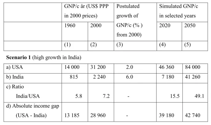
The example with India and the USA can be used for demonstrating the inevitably growing absolute per capita income gaps. The upper two rows in column (2) in Table 3 contain the numbers the World Bank gives for GNP/c adjusted for purchasing power parity in these two countries for the year 2000. As we saw previously (Table 2)—and as everyone knows— that the difference in per capita income is enormous. India’s GNP/c for 2000 was only 7.2 % of the American (row 3) and the absolute difference (gap) was a little over 29,000 P$ (row 4). The question posed is: how long will it take before India’s per capita income starts to “converge” with the American one in absolute terms.
Table 3: Simulated future gap in GNP/c between the USA and India, different scenarios GNP/c år (US$ PPP in 2000 prices) Simulated GNP/c in selected years 1960 2000 Postulated growth of GNP/c (% ) from 2000) 2020 2050 (1) (2) (3) (4) (5)
Scenario 1 (high growth in India)
a) USA 14 000 31 200 2.0 46 360 84 000 b) India 815 2 240 6.0 7 180 41 260 c) Ratio
India/USA 5.8 7.2 - 15.5 49.1 d) Absolute income gap
Scenario 2 (modest growth in India)
a) USA 14 000 31 200 2.0 46 360 84 000 b) India 815 2 240 3.0 4 050 9 820 c) Ratio
India/USA 5.8 7.2 - 8.7 11.7 d) Absolute income gap
(USA - India) 13 185 28 960 - 42 310 74 180
Source: GNP/c for 1960 is from Table 2 above.
Taking first an optimistic scenario (1), we postulate that the future average rate of growth per capita in India will be 6% per year, while the equivalent rate in the USA remains at 2% (the approximate number noted for the 1900s as a whole). In 20 years time, the GNP/c in India will have grown to 7,180 P$, and simultaneously increased in relative terms to 15.5% of GNP/c in the USA. The absolute gap has however increased from 29,000 to over 40,000 P$. The result is a convergence of the relative incomes in the two countries, yet there is a divergence of absolute per capita incomes. In almost all discussion about the extent to which the poor countries have “caught up” with the rich ones, it is an increase in the ratio of per capita incomes that is referred to, not the absolute gap.
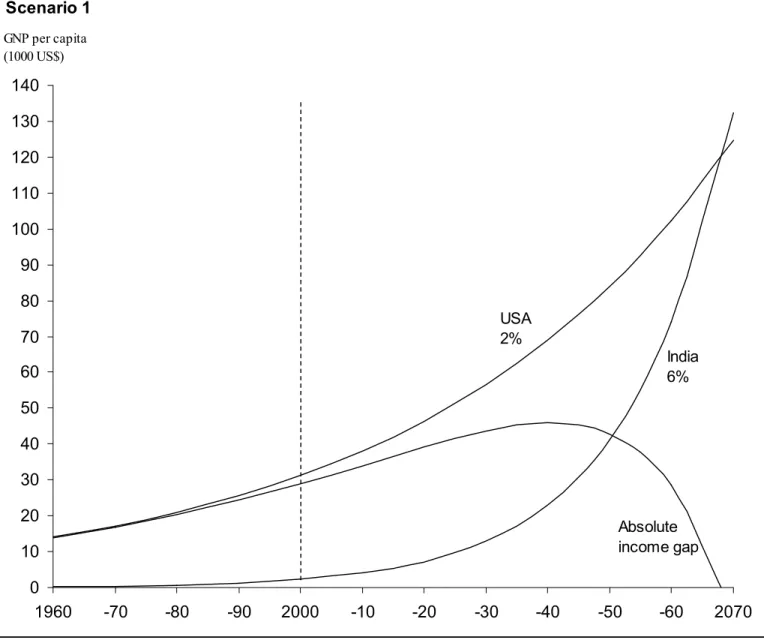
In this hypothetical example, the GNP/c in India at the middle of the current century (at about 40,000 P$) has surpassed by far the current GNP/c in the USA (29,000P$). Furthermore, the ratio of per capita income has improved significantly to 24.3% as of the year 2050. Yet the absolute gap in per capita income has continued to grow (to nearly 43,000 P$). In this scenario, a decrease in the gap would not begin to appear until around the year 2045. Thus it would take almost half a century—or close to two generations—before the absolute differences in per capita income would begin to decrease, even if India’s GNP/c were to grow at three times the rate of the USA’s (Figure 4).
Figure 4: Simulation of future gap in GNP per capita between India and USA
Another, more concrete, illustration is to look back and see that with high growth per capita, about 6% per year, it has de facto been possible for a small number of
countries to go from relative poverty to an income level which measures well up to those in Europe and the USA over a span of 40 years. Around 1960 Korea and Taiwan had GNPs/c (adjusted for purchasing power parity) which were 9% respective 23% of that of the USA. At that time, Korea’s GNP/c was on the same level as that of many African countries. Hardly 40 years later, per capita income in Korea was at parity with that of
0 10 20 30 40 50 60 70 80 90 100 110 120 130 140 1960 -70 -80 -90 2000 -10 -20 -30 -40 -50 -60 2070 Scenario 1 GNP per capita (1000 US$) USA 2% India 6% Absolute income gap
southern Europe (and more than 10 times higher than in a majority of the African countries). In 1997 the per capita income in Singapore, according to the World Bank’s statistics, was at the same level as that of the USA (IBRD 2000/01).
If we return to the previous scenario with India and the USA, we can see that even if India manages to reach an annual growth rate (6%), which is far higher than it has had historically, the absolute gap in per capita incomes will continue to grow for several decades—postulating that growth in the USA and other wealthy countries does not decrease drastically. In a less optimistic scenario, where the future rate of growth in India would be more moderate (3%), yet still higher than that of the USA (2%), the absolute gap in incomes will continue to grow far into the 22nd century (Figure 5).
Figure 5: Simulation of future gap in GNP per capita between India and USA
0 10 20 30 40 50 60 70 80 90 100 110 120 130 140 Scenario 2 GNP per capita (1000 US$) USA 2% India 3% Absolute income gap
What these simple “compounded-interest examples” show is that even if the now poorest countries manage to grow faster than the now rich countries for the coming decades, and the relative distribution of income improves as measured by traditional ratios and Gini coefficients, the absolute gap in per capita incomes will nevertheless continue to grow inexorably for a very long time. In order for the absolute per capita income gap to start to close within the life of the current generation, very high rates of growth will be required in today’s poorest countries—growth rates at a level which extremely few countries (Korea, Singapore and Taiwan) have thus far been able to maintain during long periods.
6.3. What is most important?
One can always discuss whether or not it is the absolute gap between poor and wealthy countries which is most significant, or whether it is the absolute level of per capita income in the now poorest countries, regardless of how the incomes in the now richest countries develop. Many considerations suggest that the absolute level of income in each country be of greater import than is the gap between wealthy and poor countries. If, for example, India can grow at a steady rate of 6% per year, within one generation (30 years) it would reach a GNP/c of about 10,000P$, which is roughly half of the current Swedish GNP/c. It is an income level, which would be sufficient for the elimination of the worst consequences of the current poverty in India: widespread under- and malnutrition, very high levels of infant mortality and illiteracy, which extends over almost half of the population (Fogel 1999; Svedberg 2000). It is also an income that would permit a general level of consumption, which is four times higher than at present. With a rate of growth at 6% India would reach the current average European income level in just over 40 years. With a rate of growth per capita at 2% per year, the average growth which India has had historically (since independence), it will take more than 200 years for India to reach the current per capita income levels of Europe.
6.4. Probable consequences of continued growth in absolute income gaps Before we come to the comprehensive conclusions of this review, we would like to sketch some probable consequences of the large absolute gaps in per capita incomes
which inevitably will expand rapidly in the coming decades. The question is whether there are any special problems with continued growth in the absolute gaps in incomes between countries. One reason to give proper due to absolute differences in incomes between countries is a normative “global perspective of justness” (see, for example, UNDP 1999). But increased absolute income gaps between countries can cause problems other than “injustice.” To be brief, we will limit ourselves to mentioning, just as
examples, three such possible consequences.
Firstly, increased absolute gaps in per capita incomes between countries can lead to the elite in the poorest countries pushing for increasingly unequal economic policies within their countries. In a world where the highly educated in each and every country have access to the same information about the conditions in the rest of the world, there is a risk that the elite in the poor countries will increasingly identify themselves with the populations in the wealthiest countries and “demand” the same standard of living (absolute income). In poor countries, such demands can only be met in the short and middle terms by redistribution from the large majority of poor to the elite itself.
Secondly, growth in absolute rifts in incomes between countries will result in increased incentives for migration of both educated and uneducated workforces from the poor to the rich countries. The migration of educated workforces will lead to a drain on human capital (brain drain) in the poor countries, an already scant capital which is one of the most crucial preconditions for growth. Migration of uneducated workforces from the poor countries is something which the majority of rich countries today obviously want regulated (to relatively low levels), and which de facto is mostly illegal (trafficking) and often connected with other criminal activities.
Thirdly, it is not unthinkable that growth in absolute differences in incomes will lead to increased political tension between countries with a resultant elevated risk of conflicts and wars. Thus far research into these type of problems has assumed in
particular that relative income differences are grounds for conflicts (Collier and Hoeffler 1998, for example), yet it is not inconceivable that growing absolute income gaps can be strong (hidden) driving forces.
7. SUMMARY AND CONCLUSIONS 7.1 Measurements and methods
No single measurement can provide an unambiguous answer to the question of whether the distribution of income across countries has become more or less unequal over time. Both “income” and “distribution” are manifold concepts, which are difficult to measure unambiguously. In terms of income measurements, we have concluded that
measurements not adjusted for purchasing power parity are considerably more unreliable than adjusted measurements. Investigations which are only based on non-adjusted
incomes only (UNDP 1999 and Korceniewicz and Moran 1997) must consequently be interpreted very skeptically. The income measurements that are adjusted for purchasing power parity are not completely dependable, but they are clearly more reliable.
When it comes to distribution measurements, the choice must be based on the question posed. If the question is how the distribution of income between the richest and poorest countries has developed, some ratio measurement will be useful. Such
measurements however have clear limitations. The choice of what country groups that should be included in the ratio will unavoidably be relatively arbitrary. Furthermore, the ratio measurements do not take into consideration the distribution within the group of countries considered, or the distribution across the countries in between the “richest” and the “poorest”, however delineated. This means that they do not convey information about the distribution of income in the world as a whole. When that is the question posed, some type of measurement, which factors in the entire distribution over countries (such as the Gini coefficient), is to be preferred.
But Gini and similar measurements also have obvious limitations. Firstly, such measurements are relatively insensitive to changes in the lowest tail of the distribution (the poorest countries), the part we often are particularly interested in. Secondly, two completely different distributions can produce exactly the same Gini coefficient (which Table 2 and Figure 3 illustrate). Thirdly, changes in Gini provide no information about transition.
Moreover, both types of measurement are sensitive to which years are chosen as the basis for the investigation. The use of time series data for long periods is then preferable to comparisons between individual years chosen arbitrarily. We have
furthermore found it rather dubious to compare the per capita incomes of countries without taking population sizes into consideration. This applies to, for example, the World Bank’s study where an income ratio was calculated for the richest 20 countries and their poorest 20 counterparts, two groups which each make up 5% of the world’s
population only. This measurement is misleading, at least when the intention is to measure “worldwide income inequality” (IBRD 2000/01, box 3.3). When dealing with these types of questions, Gini or similar measurements are more relevant.
7.2. What then are the conclusions about the distribution of income in the world? Despite the agnostic contentions about the ambiguity of the different estimates of income distribution changes, certain conclusions can nevertheless be drawn on the basis of the assembled results in the investigations. The conclusions presented below are primarily based on the studies, which have employed (1) income measurements adjusted for purchasing power parity, (2) countries weighted by population size and (3) time series data.
The first conclusion is that the relative differences in income between the
absolutely poorest countries, which are mainly located in Africa, and the riches countries (primarily within the OECD area) have increased since the 1960s. Both investigations based on different ratios and those using comprehensive distribution measurements (such as Gini) show this.
Another conclusion is that the relative distribution of income across all countries has remained basically unchanged during the last third of the 1900s. The distribution measurement intended for this use is the Gini coefficient in particular, yet other similar measurements have been used and no significant differences have been registered. The relatively unchanged Gini coefficient however obscures the fact that two contradictory forces have neutralized each other. The relative spread in GNP/c adjusted for purchasing power parity has grown, but it has been compensated for by changes in population shares. According to one study, had no changes in populations shares taken place during recent decades, the world Gini coefficient would have increased by 9.5 percentage points since 1960 (Firebaugh 1999, Table B1).
There are also other important transitions lurking behind the largely constant Gini coefficients. Rapidly growing incomes in several middle-income countries (mainly in Southeast Asia) have contributed to a more unequal total distribution.7 On the other hand, the average income levels in China and India, which dominate in terms of population, have increased in relation to middle-income countries in the world. This has had an equalizing effect (cet par).
In short, when changes in population percentages are factored in, a rather significant equalization has thus occurred in relative per capita incomes for a large section of the entire distribution of countries. The income for the “average” inhabitant in the world has thereby increased somewhat relative to the per capita incomes in the richest countries. The deterioration, which occurred, is concentrated in the lowest tail of the distribution, i.e. the initially poorest countries (predominately in Africa) have continued to become more impoverished relative to other countries. This conclusion is valid regardless of whether changes in population shares are considered or not.
8. WHAT DEVELOPMENT IS MOST LIKELY FOR THE FUTURE?
How the future relative distribution of incomes across countries will develop depends partly on the per capita economic growth that respective groups of countries will manage to accomplish, and partly on relative population growth in these groups. If the incomes in the countries, which are now the poorest, grow faster than those of other countries, there will be a consequent improvement in the income distribution (cet par). But if these countries continue to represent an expanding percentage of the world’s population, this will tend to make the distribution more uneven—when distribution is measured by Gini or some similar comprehensive, relative measuring rod. The issue is then what can be said about expected growth rates, both in terms of population and GNP/c, from theoretical perspectives and empirical experiences.
8.1. Population forecasts
As Firebaugh (1999) makes clear, the distribution of income in the world (as measured
7 A further conclusion, which was not discussed in greater detail in this study, is that a significant convergence of incomes has taken place within the OECD block (Gottschalk and Smeeding 1997), which perhaps also has contributed to Gini not have significantly changed for all countries.
by Gini or a similar measurements) has largely remained unchanged for the last third of the 1990’s despite growing differences in per capita income between countries. The reason is that notable changes have occurred in the countries’ shares of the world’s population. On the average, the wealthiest countries have had shrinking shares, while the poorest countries have had increasing shares. However, the trend has been toward
decreasing differences in population growth rates. If the latest statistics from the World Bank are to be believed, the ratio of annual population growth for rich and poor countries has decreased from 2.3/0.6 to 2.0/0.6 between the 1980s and 1990s.
A none too daring prognosis is that the difference in the rate of population
increases in the rich and poor countries will continue to decrease in the future (UN 1998, 2000). Thus there will be a smaller impact of changed population shares on Gini and related measurements of income distribution. Consequently, differences in growth of GNP/c will in all likelihood be of increasing importance for how (the relative) distribution of income across countries will develop in the future.
8.2. Growth in GNP/c
Economic growth theory does not provide us with much guidance, since the innumerable theoretical models developed in recent years predict widely divergent results in terms of growth for countries with different per capita incomes in the initial stage. The neo-classical Solow model, as well as some more recent (endogenous) growth models, predict neutrality or convergence (Solow 1956; Lucas 1988). Other models forecast divergence, i.e. that the already rich countries will grow more quickly than the poor ones (Romer 1990) and that the relative income distribution will thereby become more skewed with time.
Empirical research (see e.g. Temple 1999) reveals a relatively strong connection where countries with low initial income have lower rates of growth. To explain this, some economists have pointed at “inherent” disadvantages for today’s poorest countries. Sachs (1999) and Sachs and Werner (1997) emphasize primarily a tropical climate with
consequent high frequencies of sickness, which reduce peoples’ productivity and shorten their average life spans. They also point out unfavorable factors, such as adverse