Interactive Correction of Mislabeled Training Data
Shouxing Xiang∗, Xi Ye∗, Jiazhi Xia†, Jing Wu‡, Yang Chen∗, Shixia Liu∗ ∗School of Software, TNList Lab, State Key Lab for Intell. Tech. Sys., Tsinghua University†School of Computer Science and Engineering, Central South University ‡School of Computer Science and Informatics, Cardiff University
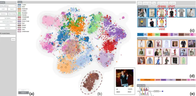
Figure 1: DataDebugger: (a) the navigation stack records the explored hierarchical levels; (b) the tSNE-based visualization shows the item distribution and the confusion between different classes; (c)(d) the selected item view and the trusted item view display the images of selected items and trusted items, respectively; (e) The action trail records the correction history.
ABSTRACT
In this paper, we develop a visual analysis method for interactively improving the quality of labeled data, which is essential to the success of supervised and semi-supervised learning. The quality im-provement is achieved through the use of user-selected trusted items. We employ a bi-level optimization model to accurately match the labels of the trusted items and to minimize the training loss. Based on this model, a scalable data correction algorithm is developed to handle tens of thousands of labeled data efficiently. The selec-tion of the trusted items is facilitated by an incremental tSNE with improved computational efficiency and layout stability to ensure a smooth transition between different levels. To prioritize the display of mislabeled data, we have taken specific consideration of outliers, items whose labels are different from those of its neighboring items, in the sampling process. We evaluated our method on real-world datasets through quantitative evaluation and case studies, and the results were generally favorable.
Keywords: Labeled data debugging, trusted item, tSNE, sampling.
∗e-mail:{{xsx18,yex14 }@mails, shixia@mail}.tsinghua.edu.cn, [email protected]. Shouxing Xiang and Xi Ye are joint first authors. Shixia Liu is the corresponding author.
†e-mail: [email protected] ‡e-mail: [email protected]
1 INTRODUCTION
The quality of training data is crucial to the success of supervised and semi-supervised learning [35, 31, 48, 55]. Errors in data have long been known to limit the performance of machine learning models [14, 33, 38]. More and more experts have realized that high-quality data, rather than more data, leads to better models and performance [56, 57, 59]. However, in the current era of big data, with the rapid growth of data quantity, it is even harder to guarantee data quality. A typical problem is mislabeled data [16], and it is a more prominent issue with the prevalence of data-centric approaches that require a huge amount of annotated/labeled data. Crowdsourcing has been widely adopted to get a dataset labeled in a short amount of time. Although reasonably effective, the reliability of the labels is unavoidably compromised due to the varied subjectivity of multiple annotators and the limited control of their expertise and quality. Web crawling is another quick way to get a large amount of labeled data, where labels are automatically extracted from descriptive keywords. However, this labeling method is error prone as well. An example is the Clothing 1M dataset [53], in which as high as 38.5% of the data was reported to be mislabeled. The large proportion of label errors has adverse effects on training [16].
To deal with noisy labels (i.e., labels with presence of errors) in training, different techniques [16] have been proposed in the ma-chine learning community. Among them, cleansing the training data is an obvious and tempting solution with its general applicability. However, the identification of mislabeled items is nontrivial. Differ-ent heuristics have been used, which makes it important to have prior knowledge of the data and the application. As a result, to include a human in the analysis loop becomes a seemingly effective solution, which will allow users to explore and better understand the data and
make informed corrections. However, for large scale datasets, there are two challenges. One is how to enable effective exploration of large-scale data and quick identification of suspicious regions and items for label errors. The other lies in the efficient correction of label errors when a large number of errors are presented. Case-by-case examination and correction are labor intensive for a human. A more effective and efficient strategy is thus required.
To tackle the challenges, we develop DataDebugger, a visual anal-ysis tool for effective and efficient debugging of label errors. The target users include both machine learning experts who can use the tool for data cleaning before performing learning tasks and data anno-tators who can use the tool to improve their annotation results. Scala-bility to large scale datasets is a particular concern and is achieved in DataDebugger via cooperation between a hierarchical visualization of data and a scalable data correction algorithm. Fig. 1 shows the in-teractive interface of DataDebugger, in which an item view with the hierarchical visualization (Fig. 1 (b)) is at the core. The hierarchical visualization allows users to examine the data and identify problems at different levels. We have developed an incremental t-SNE with improved layout stability to ensure a smooth transition between different levels. We also have taken specific consideration of label errors in the sampling process to prioritize the display of potential errors. A density map is used to reflect suspected error ratios. The selected item view (Fig. 1(c)) and the trusted item view (Fig. 1(d)) al-low users to make corrections and generate a set of trusted items, i.e., items whose labels have been verified by domain experts. To reduce the labor cost in the correction process, we borrow the idea of Data Debugging using Trusted Items (DUTI) [55], which allows propa-gation of label corrections from a small number of trusted items to the whole dataset. We develop a scalable data correction algorithm which is based on [55], but extends its applicability to data of large scales by making use of softmax classification, dimensionality re-duction, and gradient projection for optimization. The interactive visualization facilitates the selection, correction, and verification of trusted items required in the data correction algorithm, while the data correction algorithm speeds up the interactive correction by propaga-tion. The cooperation between the two modules enables an effective exploration of large datasets and efficient correction of label errors. The quantitative experiments and case studies have shown the effectiveness of our method. Using DataDebugger, users can identify label problems, understand possible causes, and make informed corrections. In summary, the main contributions of our work are:
• We developa hierarchical visualization, supported by an in-cremental tSNE and an outlier biased sampling, for exploration of large scale datasets with improved stability and facilitating the identification of label errors.
• We developa scalable data correction algorithmthat is ap-plicable to data of multiple classes and of large scales and provide a visual solution for choosing trusted items.
• We integrate the above techniques into a visual analysis tool that provides experts a practical way to iteratively debug and correct label errors in training data.
2 RELATEDWORK
The presented work relates to machine learning works dealing with label noise and visualization works for data quality management. It also has some similarities to interactive labeling. In this sec-tion, we review the related works and highlight the difference of DataDebugger.
Training Data Debugging.How to deal with label errors in train-ing data has been a popular topic in machine learntrain-ing. Different approaches have been categorized and reviewed in Fr´enay et al.[16]. Pertinent to our work are methods based on correcting label errors either with or without human supervision. Fully supervised verifica-tion of labels is expensive, time-consuming, and unscalable to large datasets. Methods based on unsupervised outlier removal (e.g., [36,
52]) or label correction (e.g., [48]) have the advantage of scalability, but are often less effective. This gap leads to some recent studies that use a small fraction of clean data to semi-supervise the cleaning pro-cess with minimal human supervision. An example is [49], in which a set of clean data is used to supervise the training of a label cleaning network. The network is then integrated with a multitask neural network for jointly classifying images and reducing label errors. An-other example is CleanNet [28] which uses a joint neural embedding network to transfer a small fraction of human-selected representative label seeds to other classes through transfer learning. These meth-ods integrate label cleaning with classification frameworks using deep neural networks (DNNs). More general is the DUTI algorithm proposed in [55], which is independent of learning tasks. DUTI automatically detects and fixes potential label bugs in the training set by propagating the labels from a small set of trusted items. The data correction method in DataDebugger is based on DUTI. But DataDe-bugger addresses the limitations of the original DUTI algorithm as mentioned in [55] by two means. One is the technical improvement of its scalability to large scale datasets. The other is to provide a vi-sual analytics tool to assist the selection of informative trusted items. Visual Data Quality Management.Many visual analysis methods have been developed to assess data quality problems [34]. Some of the methods are concerned with data quality issues on feature entries such as missing values and inconsistencies. Wrangler [25] and its commercial descendant TRIFACTA [60] are typical tools focusing on data transformations, and providing an interactive visual interface to enable various ways to the navigation of the transformation space. Profiler [26] coupled automated anomaly detection with linked sum-mary visualization to help analysts discover and analyze anomalous data. Wilkinson [51] proposed a statistical method for detecting outliers in big data. Predictive Interaction [20] relieves users from specifying data transformation details. It allows users to iteratively highlight features and select the next step from a variety of sugges-tions provided by predictive methods. MetriDoc [8] enables users to customize different automatic quality checks and visually assess the effects of their parameterization. When the additional dimension of time is considered, several tools have also been specifically de-veloped for detecting anomalies in time-series data [19, 23, 17, 18] and reasoning about their causes [2]. In Cao et al.’s work [10], a tensor-based anomaly detection algorithm is integrated with rich-context visualizations to help identify and interpret suspicious patterns in streaming spatiotemporal data. Xie et al. [54] proposed stack trees to represent the temporal and contextual information of anomalous patterns in high-performance computing processes.
Most of the methods mentioned above focus on quality issues on feature entries such as missing values, duplicates, inconsistencies, and input errors, which are important for data warehousing appli-cations. DataDebugger differs from the above tools by focusing on quality issues on labels of training data for supervised learning tasks. Accordingly, a hierarchical visualization and a scalable data correction algorithm are developed to facilitate users in debugging and correcting label errors in training data.
Recently, there are some initial efforts to examine and improve the quality of training data. Alsallakh et al. [1] developed a vi-sual analysis system to analyze hierarchical similarity structures between classes, which was also demonstrated helpful in identify-ing several quality issues in trainidentify-ing data includidentify-ing labelidentify-ing issues. A work that is more specific to detecting label errors in training data is LabelInspect [35], a visual analysis tool to assist experts in verifying uncertain labels and unreliable workers in crowdsourced annotation. It enables an iterative validation procedure by mak-ing use of a learnmak-ing-from-crowds model [30] to recommend the most informative instances and workers for verification. DataDebug-ger follows the same idea of leveraging visualization and a small number of expert labels to facilitate the label verification process. However, as label errors can come from not only crowdsourcing, but
various sources, e.g., web crawling, sensor failures, DataDebugger aims to debug label errors without the restriction of crowdsourced annotations. As a result, information specific to crowdsourcing, e.g., worker behaviours, will be unavailable, making it necessary to develop a more general interactive label debugging solution. Interactive Labeling.An early work was presented by Moehrmann et al. in [37], where a labeling interface based on self-organising maps was developed to allow users interactively selecting and la-beling image data items. It was demonstrated suitable for speeding up the labeling process and simplifying the task for users. In the machine learning field, active learning [9] is another way to include users into the labeling process by providing the labels of items selected by the models. However, users are not involved in the selec-tion of data items. Hoferlin et al. [22] first proposed the concept of ‘inter-active learning’ which extends active learning by integrating users’ knowledge into proposing items for labeling. In recent years, this visual interactive labeling (VIAL) strategy has attracted more interest. In [4], an experimental study was conducted to compare the model-centered labeling via active learning and the user-centered visual-interactive labeling. Quantitative analysis of user strategies in selecting instances in VIAL was reported in [5]. And a unified pro-cess to combine visual analytics and active learning was proposed in [6] for VIAL. These VIAL works provide tools for annotating unlabeled data. DataDebugger, on the other hand, is for debugging mislabeled data from annotated datasets. Thus, our method consid-ers to prioritize the display of mislabeled data at the visualization side and to accurately match the user-selected trusted items at the analysis side.
Summary.Compared with these works, the novelty of DataDebug-ger lies in both the technical improvement of the underlying DUTI algorithm and the hierarchical visualization design that supports debugging label errors from large scale datasets in an informative and efficient way. The correction is independent of the learning tasks and sources of label errors, making it a more general purpose tool that can be used by average data annotators and applicable to datasets with annotations from various sources.
3 DATADEBUGGER
3.1 Requirement Analysis
Our research focus is distilled and driven by our discussions with machine-learning experts and practitioners regarding their needs in addressing label error issues. Specifically, in the past six months, we had biweekly meetings with three experts (E1,E2, andE3) who serve either in academic institutes or in the R&D organization of an industrial company. We began by interviewing the experts about their ongoing machine learning projects in areas such as image clas-sification, segmentation, and object detection, and asked for any major issues that were prevalent in their infrastructures. It turned out that mislabeling was considered the most general and harmful factor in building learning models. Although there is a lack of robust and universal methods for correcting the mislabeled data for diverse situations, attempts have frequently been made to use supervised approaches for cleansing the data. Specifically, the experts con-sidered the exploration of unusual data distribution as the first and the most important step in their data cleaning pipelines since the patterns could significantly affect the choice of appropriate label correction methods or strategies. Unsurprisingly, the experts consid-ered it routine to utilize visualization for obtaining and exploring an overview of data distribution. tSNE was particularly well recognized for its strong non-linear feature, easy accessibility (e.g., through python add-on packages), and optimized visualization. However, when cleaning training data with existing visualization techniques, they still face the following challenges:
R1. Handling large-scale data.The machine learning problems that our experts face typically involve very complex feature space and statistical characteristics, which require a large volume of
train-Training Data Item View Selected Item View Trusted Item View Action Trail Data Correction Corrected data Trusted Items
Selected Items Trusted Items
Corrected data Correction history
Visualization
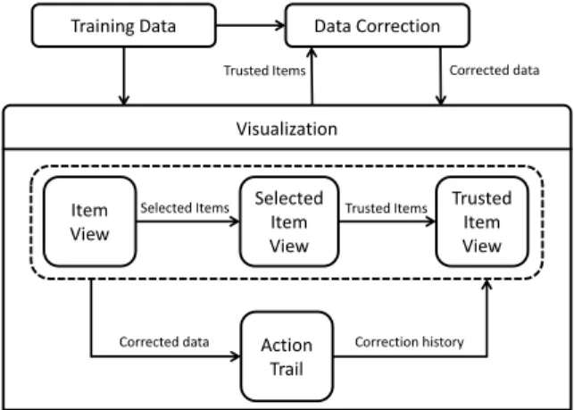
Figure 2: DataDebugger Overview: The visualization module pro-vides trusted items for the data correction module. In return, the data correction module feeds the corrected data to the visualization module for further examination.
ing data for model learning. For example, our collaborators reported two large-scale datasets, a clothing dataset and a motherboard man-ufacturing dataset for classification, both of which involved over 30,000 training items with label error rates of more than 30%. The scale of data poses two significant challenges. First, the algorithms for visualizing high-dimensional space are often computationally expensive and do not scale very well to big datasets. Consequently, they are too slow for interactive interfaces, limiting the efficiency to support the cleaning process. Moreover, displaying cluttered views can hinder users from identifying and exploring the aforemen-tioned suspicious regions from the data distribution. Therefore, the experts demand an efficient visualization that can reduce both the computational and display complexity.
R2. Examining unusual distribution for identifying labeling errors. According to our collaborators, a cleaning pipeline often starts by identifying local regions with unusual patterns of data or la-bel distribution, upon which mislala-beled training items can be largely identified and inspected. Thus, the experts wanted to quickly locate such suspicious regions. Moreover, in each region, the mislabeled training items should always be displayed with priority no matter which data filter or sampling strategy is applied.
R3. Recommending and verifying trusted items. While man-ual inspection and correction is a routine for debugging mislabeled items, the experts need automated approaches to improve efficiency. Methods such as propagation of trusted items [55] are the most discussed and recognized. However, without efficient algorithms and interactive tools, selecting and validating a set of trusted items from the cluttered visualization can still become laborious. Two requirements were identified by our collaborators based on their experience. First, automatic recommendation algorithms are desired to quickly locate trusted items. Second, flexible ways to examine and compare trusted items are required for further verification.
R4. Exploring the details. Exploring the details of training items was considered an essential step to verify the labeling correct-ness. Specifically, the experts would like to be able to explore the details in the context of a distribution visualization so that they can quickly compare groups of items in local regions.
3.2 System Overview
Motivated by the identified requirements, we designed a visual analysis tool, DataDebugger, to help users correct label errors. It contains the following features:
• An item view (Fig. 1(b)) that utilizes a tSNE-based hierarchical visualization to display the distribution of training items, dis-closes patterns of clusters and outliers, and supports interactive
exploration of the details(R1, R2, R4).
• A set of auxiliary views, including a selected item view (Fig. 1(c)), which displays the detailed information of sus-picious items, a trusted item view (Fig. 1(d)), which presents the images and labels of trusted items, and an action trail view (Fig. 1(e)), which provides the correction history(R3).
• A trusted-item-based data correction method to propagate the corrected labels of trusted items to the remaining items(R3). System Pipeline. The system pipeline is shown in Fig. 2. DataDe-bugger takes the training data with noisy labels as input. In the visualization module, the user explores the training data and selects trusted items. The selected trusted items are input into the data correction module, which uses a trusted-item-based method to cor-rect the labels of the training data. After the corcor-rection, the data correction module returns the corrected data into the visualization module for a new iteration.
In the visualization module, the user explores items in the item view, verifies selected items in the selected item view, and edits trusted items in the trusted item view. The action trail records the correction history and allows the user to revisit historical iterations.
4 TRUSTED-ITEM-BASEDDATACORRECTION
In this section, we introduce the developed trusted-item-based data correction method, aiming to identify and correct label errors.
4.1 Method Overview
In DataDebugger, we assume that experts provide a small set of trusted items through interactive visualization. The trusted items are then propagated to the whole data set to identify and correct possible label errors. We formulate the above correction process as a label propagation problem based on trusted items.
Debugging Using Trusted Items (DUTI) [55] is an algorithm that automatically detects and fixes potential label errors in a training set by propagating the labels from a small set of trusted items. It aims to make the smallest changes to the labels of the training set such that the learned classification model correctly predicts the labels of the trusted items and modifies labels of the remaining items. We take a
k-class classification problem as an example to introduce DUTI.
Let(X,Y) = (xi,yi)1:ndenote the training set ofnsamples, where
xiis the feature vector of thei-th sample andyi∈[k]is the class label. Since the data in this set may be mislabeled, we call it a noisy training set. Let(Xe,Ye) = (xei,yei,ci)1:mdenote a small set of trusted items withmn, whereci>0 is the confidence score provided by domain experts about the correctness of the labelyei. Let`(xi,yj,θ) denote the loss of a classification model with parameterθ on the sample with feature vectorxiand labelyj. DUTI is formulated as a bi-level optimization problem:
min δ 1 m m
∑
i=1 ci`(xei,yei,θ) +1 n n∑
i=1 k∑
j=1 δi j`(xi,yj,θ) +γ n n∑
i=1 (1−δi,i) (1) s.t. θ=argmin β 1 n n∑
i=1 k∑
j=1 δi j`(xi,yj,β) +λΩ(β) (2) 0≤δi j≤1,∑
j∈[k] δi j=1, ∀i, (3)whereδiis ak-dimensional vector with its j-th elementδi jdenoting the probability of the samplexibelong to classyj, andΩ(β)is a regulizer to control complexity of the classification modelβ. This formulation tries to correct the labels of noisy data and assigns a smooth label vector to each noisy sample, so that the classification model trained on the noisy data with smooth label (Eq. (2)) can
minimize the prediction loss on the trusted items (the first term in Eq. (1)) and on the noisy items with newly assigned labels (the second term in Eq. (1)). Note that the third term in Eq. (1) ensures that the newly assigned labels are not too much different from the original labels.
The key to solving the bi-level optimization formulated in Eq. (1) is to eliminateβfrom the constraint equation and representθwithδ. With this elimination, only parameterδremains in Eq. (1) and we can use the gradient descent method to minimize the objective func-tion. More specifically, the constraint in Eq. (1) can be functionally equivalent to a Karush-Kuhn-Tucker (KKT) optimality condition when a loss function`()is specified (e.g., the hinge loss in SVM and the exponential loss in Boosting). With this transformation, the gradient process can be seen as a calculation of an inverse Jaco-bian matrix [12] whose size isp×p(p=nk). The computational complexity of this matrix inversion isO((nk)3).
Compared with other outlier detection methods such as proximity-based, density-proximity-based, parametric, and non-parametric [21, 35], DUTI embraces the advantage of being able to deal with not only outliers but also systematic biases. Moreover, it can naturally inte-grate human knowledge into the correction process. These make DUTI a good candidate label correction algorithm for interactive label correction in DataDebugger. However, DUTI suffers the prob-lem of scalability when handling data at large scales. Specifically, it has to 1) calculate the inverse of large dense matrices in ankspace and 2) optimize tens of thousands of constraints and parameters in a
nkspace. We need to address these scalability challenges so as to apply it to our problem for interactive analysis.
4.2 Scalability Improvement
The original DUTI algorithm employs kernel logistic regression for multi-class classification. For ak-class classifiction withnsamples, the dimension ofθisnk, and the inverse matrix calculation has high computational cost. As a result, the method can be computationally prohibitive whennis large (e.g., 10,000). For example, when dealing with the MNIST dataset consisting of 10,000 training samples be-longing to 10 classes, it takes more than 100 hours1to calculate the matrix inversion using MATLAB, which is an efficient mathematical tool in handling matrix operations [27]. To improve the scalability, we employ a linear kernel in logistic regression. Specifically, we define the loss function in Eq.(1) as a cross-entropy based on the softmax function: `(xi,yi,θ) =− c
∑
j=1 1(yi=j)logP(yi=j|xi,θ). (4) The function aims to minimize the difference between the esti-mated label and the true label. Then, the softmax loss of the function can be calculated as:P(yi=j|xi,θ) = exi T θj ∑kj=1exi T θj , (5)
whereθjis ad-dimensional vector anddis the dimension of feature vectorxi. Then the total dimension of the classification modelθis
dk, and the computational complexity of DUTI becomesO((dk)3), which is a great reduction fromO((nk)3)for large datasets (i.e.,
n>>d).
Even we have reduced the computational complexity of DUTI, it is still unaffordable when the dimensiondof feature vectors is large. We adopt two optimization strategies to further speed up the algorithm: 1)dimension reductionto reduce the dimension of the feature vector and 2)greedy gradient projectionto solve the above constrained optimization problem efficiently.
Dimension reduction. In our implementation, we employ the widely used Principal Component Analysis (PCA) [24] to reduce
𝛿"# 𝛿"$ V
𝑑" 𝑔"
Figure 3: Basic idea of gradient projection: compute the gradient direction (gi) by the steepest gradient algorithm first, and then project it to the subspace tangent to the constraints (di).
the feature dimension, in order to save the computational time of the DUTI algorithm. Based on our experiment (Table 1 in Supplemental Materials), the proposed method tolerates the information loss in the dimension reduction process which has little effect on the label correction accuracy.
Greedy gradient projection.In solving the constrained optimiza-tion problem in Eq. (1), the widely used active set method and the sequential quadratic programming method [39] face the problem that the training set changes slowly. In particular, at each iteration, at most one constraint is added to or dropped from the active set, which leads to a slow convergence, especially for a large data set. We tackle this issue based on the gradient projection method [44] which enables bigger changes at each iteration. The basic assump-tion of our method is that the optimalδis in the subspace tangent to the constraints. As shown in Fig. 3, the method first computes the gradient direction (gi) by the steepest gradient algorithm, and then projects the search direction to the subspace tangent to the con-straints. Through such a gradient projection, we obtain a gradient direction that satisfies the constraints.
Although the gradient projection method improves the perfor-mance to some extent, it does not support real-time interactions. Typically, dozens of minutes are needed to run the DUTI algorithm for 10,000 training items. To tackle this issue, we develop a greedy descent projection algorithm. The main assumption is that correct-ing the items with similar noise and distribution will lead to similar gains (−gidi) measured by the loss. Therefore, we group the items intokclusters by a threshold-based clustering algorithm [7], where
kis set by the user. In our experience, we setkas 30. First, we order the items into a sequence according to their gains.Next, we assign two items to the same cluster if the difference between their gains is below a specified threshold. The threshold is determined as thek-th maximum distance between two neighboring items in the sequence. With this clustering algorithm, we segment the training samples intokclusters, the boundary points of which are denoted by ˆB={bˆ1,bˆ2, ...,bˆk}. An exhaustive combinatorial search of all possible clusters is NP-hard. To tackle this issue, we employ a greedy search strategy. In particular, for each ˆbj, the greedy method calculates the total losslibrought by the samples whose gains are greater than ˆbj. Then it selects the samples with the lowest loss.
5 HIERARCHICALVISUALIZATION INDATADEBUGGER
5.1 Hierarchical Representation
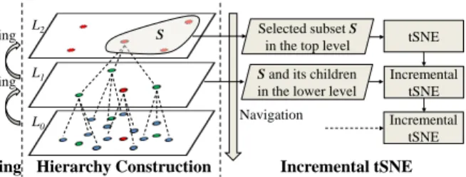
Inspired by existing works on visualizing massive and high-dimensional data [15, 47, 42, 43], we decide to convey the distribu-tion of items using hierarchical projecdistribu-tion. We combine tSNE, which is considered the state-of-the-art dimensionality reduction approach, and hierarchical analysis, which follows the popularOverview-first, Details-on-Demandparadigm [45] to handle large scale data. Fig. 4 shows the construction of our hierarchical representation. We utilize sampling methods to build the levels in a bottom-up manner, starting from the original dataset (Sec. 5.1.1). To avoid distorting the anoma-lous distribution in higher levels, we propose two outlier biased sam-pling methods, which preserve more outliers in the samsam-pling results
Sampling Sampling
L0
L1
L2 Selected subset S
in the top level tSNE Incremental
tSNE
Sampling Hierarchy Construction Incremental tSNE S
Navigation Incremental tSNE
S and its children in the lower level
Figure 4: The proposed hierarchical representation. Left: sampling for building a higher layer; Middle: an item tree with three lev-els. Right: Navigating items through the hierarchical structure and incremental tSNE.
(Sec. 5.1.2). An incremental tSNE (Sec. 5.1.3) is also developed to support top-down navigation through the hierarchical structure.
5.1.1 Hierarchy Construction
As Fig. 4 shows, the hierarchical representation consists of a set of levels that are built in a bottom-up manner.L0indicates the bottom level, which represents the input dataset. LevelLl(l6=0) represents a sampled subset of its previous level,Ll−1. The sampling ratea between two adjacent layers is set asa=25%. When building the levels for a set ofnitems, the user can set the number of items
min the top level, and then the number of levels is automatically calculated aslnn/m
lna .
An item tree to organize the items is generated during the levels building process. Although an item can be included in multiple levels, for clarity, we say an itemiis in levelLlonly whenLlis the highest level that containsi. For each itemiinLl, we assign it as the child of its nearest itemjinLl+1. As a result, each item in the top level is the root of an item tree. Fig. 4(middle) shows an item tree with three levels. When users drill down on a subset of items inLl, we regenerate an embedding containing the selected items and their children.
5.1.2 Sampling methods
Our sampling method aims to preserve labeling outliers as much as possible while maintaining major structures, so that the distribution of labeling outliers can be conveyed in the top level. Theoretically, the outliers to be preserved are defined in the feature space. Prac-tically, we approximate the definition in the projected 2D space as that is where we explore the items. We propose to adapt classic sampling methods, including blue noise sampling and density-based sampling, to emphasize sampling of labeling outliers.
Labeling outliers. For exploring labeling errors, we define la-beling outliers as items that are surrounded by items with different labels. We measure the outlier probabilityπiof an itemiby the percentage of its neighbors with different labels. The neighbors are defined in terms of Euclidean distance in the feature space. Specifically, we haveπi=Di/Ni, whereDidenotes the number of neighbors ofiwith different labels, andNiis the total number of its neighbors. The closerπiis to 1, the more likelyiis a labeling outlier.
Outlier biased blue noise sampling (OBBNS).Blue noise sam-pling (BNS) is designed to generate randomized uniform distribu-tions and is widely used in visualization [11, 32]. Multiple-class blue noise sampling [11] can preserve better blue noise feature in each class and the whole data. However, labeling errors distort the blue noise feature in each class. We thus choose the dart-throwing method [13] for its good performance and simple implementation. The dart-throwing method of original blue noise sampling contains three steps: (1) estimating the sampling radiusr, (2) randomly se-lecting a candidate item, and (3) rejecting the candidate if it is in the 2r-disk of any previous samples, otherwise, accepting it as a
sample. Steps (2) and (3) are iteratively performed until a certain number of items are rejected. We modify this process to emphasize sampling of labeling outliers while keeping the blue noise feature. Specifically, in step (2), we accept a sampleiwith a probability of πiinstead of random sampling. As a result, labeling outliers have a higher possibility of being selected than other items. Therefore, we call our adapted method an outlier biased blue noise sampling.
Outlier biased density-based sampling (OBDBS). Density-based sampling [41] (DBS) preserves small clusters and isolated items by sampling densely in light regions and lightly in dense regions. In a typical density-based sampling method, the sampling probability of item i is defined as 1/ρi, where ρi is the local density of itemi. In our application, we are more interested in labeling outliers than isolated items. Similar to OBBNS, we modify the sampling probability as pi=α/ρi+β×πi. The sampling probabilities are normalized so that their sum equalsm/n, wheren
is the number of all items andmis the number of expected samples. In our case, we set bothαandβ as 1.
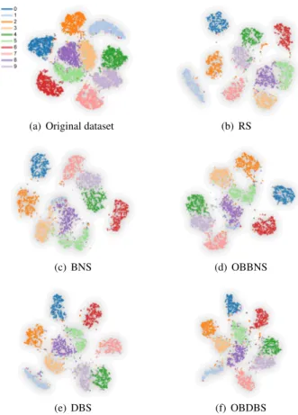
We performed an experiment on the MINST dataset to evaluate the proposed outlier biased sampling methods. The details of the dataset and quantitative results are described in Sec. 6.1.1. Fig. 5 shows the tSNE projections of the dataset and five sampled sub-sets. The projection results demonstrate that the proposed OBDBS achieves a better balance between class consistency and outlier preserving than other four sampling methods. In terms of class consistency, random sampling (RS) (Fig. 5 (b)), DBS (Fig. 5 (e)), and the proposed OBDBS (Fig. 5 (f)) keep the major structures in comparison to the original dataset (Fig. 5 (a)). In BNS (Fig. 5 (c)) and OBBNS (Fig. 5 (d)), the structure of class 1 is obviously distorted. In regard to presenting outliers, OBDBS performs better than random sampling and DBS. For instance, the mixed region among classes 5, 7, and 8, which is presented in the original dataset (Fig. 5 (a)), is better preserved by OBDBS in comparison to random sampling and DBS.
5.1.3 Incremental tSNE
With the constructed hierarchical structure, we develop an incremen-tal tSNE for top-down navigation. When the user selects a set of items in layerLland drills down, the new visualization includes all the selected items and their children in layerLl−1. Because the dis-played items are incrementally changed based on the user selection, we call the projection method as incremental tSNE. In comparison with existing hierarchical tSNE method [42], which supports similar hierarchical navigation, we have a particular focus to keep a stable layout when 1) the user selects a set of items and drills down to display the incremented item set, and 2) labels of items are corrected and the layout needs to be accordingly updated.
In our incremental tSNE, we denote the number of selected items in layerLlasnl, and the number of items to be displayed asnl−1. To generate the new layout, we minimize the following cost function,
fcost=α·KL(PkQ) + (1−α)KL(PckQc), (6)
whereKL(· k ·)is the Kullback-Leibler-divergence between two dis-tributions. The first KL-divergence is the same as the original tSNE. The second KL-divergence is for stability. To maintain stability, we selectncitems from the user selectednlitems using blue noise sampling and add a copy of them as virtual anchor items. In our experiment, we setncas 0.25×nl. The positions of anchor items are stable during the optimization.Pc,Qc∈Rnl×nc are the joint
proba-bility distributions that measures similarities between the items and anchor points in high-dimensional space and 2-dimensional space, respectively. pc i j= exp(−(dh i j)2/2ρi2) i∈Nj 0 otherwise (7) qc i j= (1+ (d p i j)2) −1, (8)
(a) Original dataset (b) RS
(c) BNS (d) OBBNS
(e) DBS (f) OBDBS
Figure 5: The tSNE projections of the MNIST dataset. (a) The origi-nal dataset with 10k items; (b)–(f) the sampled subsets containing 3k items using different sampling methods, respectively.
wheredhi jis the distance between itemiand anchor itemjin the high-dimensional space,di jp denotes the distance in the projected 2-dimensional space, andNjrefers to the nearest neighbors of item
jin the high-dimensional space. To speed up the distribution com-putation, we considerk-nearest-neighbors only when computingpci j. Upon a label correction, the layout should be updated. First, if the corrected items are scattered, their embeddings should be re-positioned closer to items in the same class. This update can guide users to pay more attention to remaining labeling issues in the training data. Second, the updates should be local to keep the overall layout stable. Upon these two requirements, we propose a semi-supervised adaption to support the local update of corrected items. First, we update thek-nearest-neighbors of the corrected items, which describe the local probability distribution. Specifically, given an itemiwith a corrected labelb, we extract itsk -nearest-neighbors with labelb. Then, the joint probability distributionsPc
andQcare updated using Eq. 7 and Eq. 8. Finally, the layout is updated using our incremental tSNE. In each correction, only a small number of items are corrected. Therefore, the layout of most items are stable after the local update. Fig. 6 shows the layouts in four successive correction iterations. While local updates happen, the general layouts keep stable.
5.2 Interactive Exploration and Correction
Exploring distribution at multiple levels (R1, R2, R4). The item view supports a hierarchical exploration of item distribution (R1). Users are first presented with the overview, i.e., the top level of the hierarchical structure. The classes of items are encodes by colors. The selected items are emphasized by thick edges. Ideally, items are visually clustered by labels. However, the labeling noises in
the training data often result in mixed color distribution in some regions. These suspicious regions indicate potential mislabeled items and deserve further examination, e.g., zooming into the regions to explore more items (R2,R4). Navigation steps are recorded in a hierarchy stack (Fig. 1 (a)), from which the user can select any visited views to quickly revisit the navigation. Additionally, a density map is supported in the item view, coupled with the tSNE projection in each level, upon which the users can quickly locate and zoom into regions with dense outliers. They are complementary indicators of mislabeled items. During the exploration, filtering is available in the item view to help the user focus on items of particular classes.
In the item view, there could be overlaps between data items due to the large scale. Our hierarchical visualization is designed to address this issue (R1). During hierarchical navigation, the user can select a small number of items in a drill down operation to reduce overlaps in the new layout. In addition, we provide a density map to display the distribution of items.
Identifying and selecting trusted items (R3). The item view and other three views cooperate to support the identification, selection, and correction of trusted items. During the exploration, the user can select a set of items and add them into the selected item view. If s/he wants to reduce the number of selected items, s/he can use the “Recommend trusted items” operation to select a representative subset. Images of the selected items are shown in the selected items view Fig. 1 (c), where the user can look at the images, relate to the distribution in the item view, refine the selection accordingly, and correct the labels if labeling errors are noticed. After the refinement, the selected items can be added into trusted items. The trusted item view (Fig. 1 (d)) displays the images and labels of all the trusted items. Further editing can be performed in the trusted item view.
Usually, the identification and selection of trusted items in differ-ent regions require differdiffer-ent strategies. In a region without labeling outliers, the user usually selects trusted items using system “recom-mendation”, and verifies the labels by only a glance at the images in the selected item view. In a region with labeling outliers, more careful examinations and operations are required from the user, in-cluding investigating the distribution at different levels, selecting class-balanced trusted items, and correcting the labels step-by-step for each class.
Propagating trusted items to improve the quality of the training set (R3). The propagation of trusted items is performed iteratively. In each iteration, newly selected trusted items are added into the trusted item set of the last iteration. They are fed into the correction module, which propagates the trusted items to the entire dataset. Af-ter the propagation, users can verify the quality improvements from the updated item distribution in the item view and the action trail. The action trail (Fig. 1 (e)) represents the historical record of cor-rection iterations as a tree. Each iteration is represented by a node containing two bar charts: the chart on the top displays the number of newly added trusted items while the other counts the corrected items by the data correction module. In case of undesired correction resulting, rolling back to previous iterations allows the user to re-select trusted items to refine the propagation results. If there is a lack of obvious visible quality improvements in sequences of iterations, the user can stop the iteration to finish the correction process.
6 EVALUATION
In this section, we first conduct quantitative experiments to compare different item sampling in the hierarchical visualization, and to evaluate the effectiveness of the trusted-item-based data correction method. We then demonstrate the effectiveness and usefulness of the developed tool through a representative case study. Two datasets are used for the evaluation.The MNIST dataset[58] contains 10,000 training items with correct labels of the 10 digits (0. . .9). For our experiments, label errors are introduced into the dataset following the contamination mechanism in [55]. The Clothing datasetis
a subset of the Clothing 1M dataset [53] in which images were crawled from several online shopping websites. The images are of 14 classes (T-shirt, Shirt, Knitwear, etc.) with some confusing ones (e.g. Knitwear and Sweater). The class labels are extracted from the description texts provided by sellers, which result in unreliable labels. The subset we use contains 37,497 images with both noisy labels and ground truth. The initial label accuracy is 61.73% for this subset. To optimize feature spaces for more accurate classification, a 4096-dimensional feature vector for each image is extracted from the second last fully connected layer of a well-developed VGG-16 model pre-trained on ImageNet [46].
6.1 Quantitative Experiments
6.1.1 Outlier Biased Sampling
We conduct an experiment to evaluate the performance of two pro-posed sampling methods (OBBNS and OBDBS). They are compared with the original blue noise sampling (BNS), density-based sam-pling (DBS), and random samsam-pling (RS). In our use scenario, we are interested in how outliers and class structures are preserved in the projected 2D space. Therefore, we project the sampling results into 2D space by tSNE and evaluate outlier metrics (true positive ratio) and structure metric (distance consistency difference).
True Positive Ratio (TPR).We are interested in counting the ratio of preserved outliers in the sampled and projected result. If an itemiwithπi>0.5, we call it a positive. If an item is positive in both the original data, in the high-dimensional space, and the sampled data, in the projected space, we call it a true positive. Only true positives can be observed in the projection and provide correct outlier information to users. The TPR is defined asNp/Nh, where
Npis the number of true positives, andNhis the number of positives in the original data, in the high-dimensional space. The higher the TPR is, the better the sampling method performs with respect to outlier preservation.
Distance consistency difference (DSCD)To evaluate the perfor-mance of class structure preservation after sampling and projection, we adopt the density-aware distance consistency (DSC) [50], which measures the position of an item in its class. Given an itemi, when its DSC valueciis close to 1, it is located close to the center of its class; whenciis close to -1,iis likely to located in wrong classes. Given an item setS, we define its DSCDdDSC(S)as the average difference between DSC values in the original space and the sampled and projected space. The smallerdDSC(S)is, the more consistent the cluster distribution is.
Experiments are carried out on the MNIST dataset and a further sampled subset of the Clothing data which contains 10K items. In both datasets, we denote an item as an outlier if its outlier probability is larger than 0.5. With this notion, the MNIST dataset contains 715 outliers and the Clothing dataset contains 1515 outliers. In our test, we sample 3k items from the dataset in the sampling stage and project the sampled data into 2-dimensional space by t-SNE. We test the five sampling methods for ten times and record the average metrics of each method. The results of the two datasets are presented in Table 1 and Table 2. In the two tables, D-SAMP represents the DSCD caused by the sampling stage. D-PROJ measures the class inconsistency caused by the projection stage. D-ALL refers to the overall inconsistency due to sampling and projection.
The results demonstrate that the proposed OBDBS performs bet-ter than other sampling methods in both datasets. In bet-terms of out-lier preserving (TPR), OBDBS preserves outout-liers 1.5–2.0 times of the other methods. Considering class structure preserving metric (DSCD-3), OBDBS performs comparable to, or even slightly bet-ter than the other methods. Specifically, OBDBS is ranked the first on the Clothing dataset and the second on the MNIST dataset. Considering the stages of sampling and projection separately, the results of DSCD-1 and DSCD-2 suggest that major distortion of class consistency is caused by the projection. Since the proposed
Table 1: Numerical experiments of samplings on the MNIST dataset. Four metrics are used to compare the outlier-preserving performance of five sampling methods in different stages.
Metric BNS OBBNS DBS OBDBS RS
TPR 0.2439 0.1969 0.2192 0.3817 0.2468
D-SAMP 0.0269 0.0329 0.0174 0.0138 0.0144
D-PROJ 0.4370 0.3782 0.3739 0.4485 0.5177
D-ALL 0.4424 0.4187 0.3721 0.3803 0.5200
Table 2: Numerical experiments of samplings on the Clothing dataset. Four metrics are used to compare the outlier-preserving performance of five sampling methods in different stages.
Metric BNS OBBNS DBS OBDBS RS
TPR 0.2039 0.2215 0.2129 0.3234 0.2156
D-SAMP 0.0169 0.0163 0.0197 0.0144 0.0184
D-PROJ 0.4378 0.4968 0.4402 0.4825 0.4619
D-ALL 0.4402 0.5008 0.4485 0.4174 0.4643
OBDBS preserves the most outliers while maintaining relative good class structures, we employ OBDBS as the sampling method in our hierarchical representation.
6.1.2 Trusted Item Recommendation
Experiments in this section aim to evaluate the effectiveness of the trusted-item-based data correction method. Trusted items are recommended by density-based selection which tries to select more candidates from sparse regions [41].
Experiments are carried out on both MNIST and Clothing datasets, with different numbers of trusted items recommended, and their ground-truth labels are treated as the expert-verified labels in the experiments. Each set of trusted items are then used as input to the data correction method to propagate their labels to the whole dataset. The label accuracy is calculated by comparing all the labels to the ground-truth, which is used as the evaluation criteria. In this experiment, 20% error rate was introduced into the MNIST dataset. The results are presented in Table 3.
Table 3: Numerical experiments on different no. of trusted items.
0 100 200 300
MNIST 80.00% 88.27% 91.57% 92.27%
0 200 400 600
Clothing 61.73% 70.20% 73.52% 74.61% The results demonstrate that the proposed data correction method can effectively improve the label accuracy of the whole dataset with only a small fraction of data trusted. For example, an around 8% improved accuracy is achieved on both datasets using only 100 (MNIST) and 200 (Clothing) data as trusted items. Increasing the number of trusted items achieves higher accuracy. Comparing the two datasets, to achieve a similar percentage of improvement, double number of trusted items are needed for the Clothing dataset as for the MNIST dataset, showing the former a more challenging case.
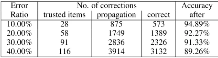
A further experiment was carried out on MNIST dataset with 300 trusted items. The aim is to evaluate the robustness of the data correction method to different error rates. Error rates from 10% to 40% were introduced into the dataset. The results are shown in Table 4. We compared the propagated labels with ground-truth, and noticed that propagation of trusted item labels did make mistakes, as can be seen from columns 3 and 4 in the table. However, despite the mistakes, the label accuracy is consistently improved on presence of different error rates, demonstrating the effectiveness and robustness of the proposed data correction method.
Table 4: Numerical experiments on different error rate in MNIST.
Error No. of corrections Accuracy
Ratio trusted items propagation correct after
10.00% 28 875 573 94.89%
20.00% 58 1749 1389 92.27%
30.00% 91 2836 2326 91.33%
40.00% 116 3914 3132 89.26%
6.2 Case Study
DataDebugger has been implemented as a web-based system with Javascript and Flask. We invited one of our collaborators (E1), a machine learning expert, to use the system on both datasets to eval-uate its usefulness.E1is familiar with both data, and the Clothing 1M data is used in one of his on-going projects. Although the ex-pert has made several prior attempts to clean the data, he wanted to evaluate if DataDebugger could achieve better quality and facilitate the correction process. We set up the data and system, provided a necessary guidance, and recorded the entire correction process for both datasets. Due to the limited space, here we present the case study on the more challenging Clothing data.
Overview of data distribution and initial trusted items. E1 be-gan the correction by observing how the data were distributed with their noisy labels. Immediately at the top level in the item view, he noticed that the distribution was messy, as shown in Fig. 6 (a). He further observed the distribution can be categorized into three types of regions as marked in Fig. 6 (a):
One-class-dominantregions where items of the same class embed-ded in clusters apart from items of other classes (e.g. the brown cluster at the bottom and the light pink cluster at the top left);
Mixed regions where multiple classes are mixed and there is no dominant label (e.g. the green and orange clusters);
Scatteredregions where items of the same class are scattered into more than one disconnected regions (e.g. the pink and the blue clusters).
Hovering over the different regions,E1decided thescatteredand mixedregions are more suspicious of label errors and warrant more attention during the correction process.
To facilitate the correction,E1 let the system recommend 100 trusted items at the top level to get an initial set that coarsely reflects the overall distribution of the training data. These recommended trusted items were highlighted in the item view, and their images with border color indicating the label were displayed in the selected item view (Fig. 1 (c)).
To avoid information overload,E1examined the recommended items class by class in the selected item view. He started with the class “T-shirt” (in blue) which seemed scattered into several regions in the item view. 9 trusted items were recommended for this class, andE1immediately noticed that 3 of them were mislabeled (Fig. 1 (c)). He displayed their thumbnail images, checked the positions of the 3 items in the item view, and corrected their labels. The 9 items with corrected labels were then added into the trusted item set and displayed in the trusted item view (Fig.1 (d)).
For some classes, e.g., the class “Shawl” (in brown), the items gathered in aone-class-dominantregion. When checking the recom-mended items for this class,E1easily determined that these items were all of true labels, only at a glance of their images and distribu-tion (Fig. 1 (d)). He made no correcdistribu-tions and directly added the 10 recommended items into the trusted item set.
A particular item drewE1’s attention when he was checking the item labels for the class “Knitwear” (in orange). From the distribution in the item view, he noticed that this recommended orange item was surrounded by items labeled in blue. Hovering around and checking the items’ pop up infomation, he further found none of these surrounding items have their true labels in orange. At
this point,E1realized that propagating the label of this orange item could be detrimental to the surrounding items, and decided not to add this ‘isolated’ item to the trusted item set.
At the end, among the 100 recommended trusted items,E1flagged 37 label errors. After the propagation, the distribution in the item view is updated, as shown in Fig. 6 (b), and the action trail bar charts indicated the labels of 7961 items had been corrected from the propagation. After the first iteration,E1observed noticeable changes of the distribution in the item view. He hovered over the distribution to examine items and focused on regions with obvious changes. He found several regions had been effectively repaired such as those in Fig. 6 (b) (green circles). But he also noticed further problems in some regions. He decided to refine the trusted items there at detailed levels.
Refining trusted items in local regions. During the examination,
E1immediately noticed region rgn.1, where a cluster of labels were changed wrongly from “Jacket” (in pink) to “Down Coat” (in purple) in the first iteration (Fig. 6(b)). Moreover, the region was mixed by items of several labels.E1decided to zoom into the detailed level for further refinement. As he zoomed in, it became clear that there were no trusted items in the sub-region where labels were wrongly changed. He speculated that the lack of trusted items allowed the invasion of surrounding labels. To fix the problem and reduce the mixed degree,E1first let the system recommend 20 more items in region rgn.1 at the detailed level, and then further selected 5 items manually in the sub-region. Examining images of the recommended and selected items in the selected item view, he verified and corrected their labels, and added them to the set of trusted items.
E1then continued exploring the changes made in the first iteration and noticed the region rgn.2, where the boundary between the two classes shifted substantially (Fig. 6 (a) and (b)). He suspected a high degree of confusion along the boundary and zoomed into the region. Examining the items at the detailed level confirmed his suspicion. He then let the system recommended 25 items at the detailed level and manually selected 5 more along the boundary to enhance the attention there. These recommended and selected items were added to the trusted item set, after their labels being verified and corrected. After refining rgn.1, rgn.2, and a few more regions with similar changes,E1added 89 new trusted items to the initial trusted item set. A second propagation was carried out, and the distribution was up-dated as shown in Fig. 6 (c). The labels of 4372 items were changed during this iteration indicated by the bar charts in the action trail.
The changes from the second iteration were more local and less obvious. E1 turned his attention to thescatteredand themixed regions. The expert first looked at the region rgn.3, which mainly contained items of the class “Vest” (in pink) but was scattered from its main cluster (Fig. 6 (c)). Checking the previous propagation using the action trail (Fig. 6 (a) and (b)), he also noticed its neighboring region which was dominated by the same class had been corrected to the class “Down Coat” (in purple) indicating some bias in the initial labeling process. He suspected biased labeling in rgn.3 as well, and zoomed into this region. At the detailed level, he hovered around checking the pop up information of items, and found all the checked items were actually of the class “Down Coat” but mislabeled “Vest”, which confirmed his suspicion of biased labeling in rgn.3. He thus manually selected 3 items in this region, corrected their labels, and added them into the trusted item set.
E1then moved on to more challenging regions. He selected the lo-cal region rgn.4, where the class “knitwear” (in orange) and the class “sweater” (in green) were heavily mixed. Again, asE1zoomed in, he let the system recommend 25 more trusted items and display their images in the selected item view. From the images, he found the two classes were indeed hard to distinguish due to their similar appear-ance, which was probably the cause of many mislabeled items in this region. In the selected item view,E1verified/corrected the label of each recommended item, and added them to the trusted item set.
A few more scattered and mixed regions were handled. A total of 40 trusted items were added in this iteration. After the propagation, the updated distribution is shown in Fig. 6 (d).E1specifically praised the smooth transition between levels and found the hierarchical visu-alization helpful in switching between global and local exploration. Iterative exploration and correction.After the three iterations as mentioned above,E1noticed no obvious changes in the overall distri-bution. But from the action trail bar charts, the number of corrected items was 2810, still substantial compared to the 40 added trusted items. Given this notice, he carried out one more iteration and fixed a few more scattered and mixed regions with similar operations. As for now,E1was satisfied with the results upon both the distribution and the bar charts, and thus stopped the iteration. He commented that the visual comparison of the distributions and statistics of dif-ferent iterations along the action trail was really useful, especially as a stopping indicator for driving the iterations and justifying the overall propagation contribution.
Table 5 summarizes the post-analysis result based on the system log data, where the last four iterations carried out by the expert were compared to the ground-truth. The results showed continu-ous improvements in label accuracy after each iteration, and the accuracy was increased from 61.73% to 75.02% after the four it-erations. It also showed that the improvements slowed down with more iterations, which is consistent with the expert’s experience from observing the changes in the distribution and in the bar charts. Table 5: Iterative correction. The first row shows the original label accuracy before any correction. The following rows show the number of trusted items added and corrections made at each iteration, and the label accuracy after each iteration.
Iter No. of trusted items No. of corrections Accuracy
added total E1 propagation after
0 0 0 0 0 61.73%
1 100 100 36 7961 69.14%
2 89 189 39 4372 71.28%
3 40 229 11 2810 74.21%
4 77 306 18 1317 75.02%
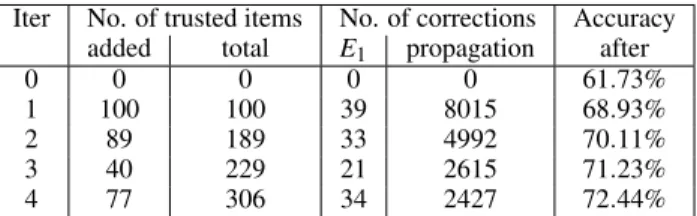
Table 6: Comparative study: iterative correction without interactive selection of trusted items.
Iter No. of trusted items No. of corrections Accuracy
added total E1 propagation after
0 0 0 0 0 61.73%
1 100 100 39 8015 68.93%
2 89 189 33 4992 70.11%
3 40 229 21 2615 71.23%
4 77 306 34 2427 72.44%
Discussion.A comparative study was carried out, in which at each iteration, the same number of trusted items as in Table 5 were au-tomatically recommended by density-based sampling without using DataDebugger for interactive selection. Following the recommenda-tion,E1manually verified the labels of the added trusted items, and propagated the verified labels to the whole dataset. Table 6 shows the results after each iteration. Compared with the case study above, the difference in the label correction process with/without the aid of DataDebugger mainly lies in the step of selecting trusted items. An automatic recommendation is more efficient than interactive se-lection, but loses the benefit of more informative selection from user interaction. As shown in Table 6, with the same number of trusted items added at each iteration, the improvement in labeling accuracy is not as much. Moreover,E1commented that the verification step actually took longer without the spatial visualization and interac-tions provided in DataDebugger.E1considered DataDebugger an
(a) Initial (b) 1st iteration (c) 2nd iteration (d) 3rd iteration Figure 6: Top level item distribution through the iterations.
effective tool to both reduce the labor required from the user and improve the accuracy and efficiency for label correction.
The debugging process also helps his knowledge gain about the data, mentioned byE1as well. The formation of the three types of regions not only indicates where may lie the labeling issues, but also reflects potential causes. Theone-class-dominantregions are as expected and usually do not warrant labeling issues. During the process, the expert observed these regions are of classes that have more distinctive appearance such as “Shawl” and “Underwear”.
Scatteredregions are observed for more general classes such as “T-shirt” and “Vest”. Because of the diverse appearance covered by these classes, biased labeling is more likely and is the main cause of the scattering. An example is the labeling of sleeveless “Down coat” as “Vest”.Mixedregions are usually caused by similar appearance between the two classes. An example is the observed mixture of “Knitwear” and “Sweater” in the debugging process. Forone-class-dominantregions, because of the items distinctive appearance, usually a glance at the recommended items at the top level suffices for verification. But forscatteredandmixedregions, although the causes may be different, they both require more careful examinations at the detailed level and some manual refinement of trusted items. The multiple coordinated views and rich interactions provided in our system support various operations (e.g., selection, verification, correction) on individual data items or groups of them, making our system well adapted to examination of different types of regions, as has been demonstrated in the case study.
7 CONCLUSION, DISCUSSION,ANDFUTUREWORK
In this paper, we presented DataDebugger, a visual analysis tool that combines a hierarchical visualization and a trusted-item-based data correction method to facilitate the correction of label errors in train-ing data. The hierarchical visualization, supported by an incremental t-SNE and an outlier biased sampling, allows interactive exploration of large scale and noisy training items. Accompanied by an info view displaying auxiliary information of selected items, the visualization enables quick localization of label issues and informative selection of trusted items. The scalable trusted-item-based data correction method automatically propagates the labels of trusted items to the whole dataset and significantly reduces the labor required in the data correction process. We conducted both quantitative experiments and a representative case study to demonstrate the effectiveness of our method and the usefulness of visualization to improve the label correction in terms of both accuracy and efficiency.
Nevertheless, our work is a first step and there are a few limita-tions that open avenues for future research.
Generalization. We currently only demonstrated the application of our method to image data. However, the visual analysis pipeline can be easily applied to other types of data such as textual data. The trusted-item-based label correction method can be directly applied to other high-dimensional data. Most high-dimensional data
correc-tion can employ the tSNE-based visualizacorrec-tion. The only changes needed are some customization to visualize the data distribution. For example, to visually illustrate the contents of textual document data, representative keywords can be extracted and displayed around when hovering over the document points.
Algorithm efficiency. The data correction algorithm tends to be rel-atively inefficient when the training data is large. For example, when there are over 10,000 training items, several minutes are needed to propagate the labels of trusted items to other items. As a result, an avenue for future research is to improve the efficiency of the correction algorithm. A potential solution is to parallel the algo-rithm. Another solution is to design a more efficient approximation algorithm with no sacrifice of accuracy.
Distortion caused by projection. In the experiments, we found that most of the distortion between items in the visualization was caused by the tSNE projection (Sec. 6.1.1). This is an inherent limitation of the projection-based method [40]. To alleviate such distortion in terms of class consistency, we updated theknearest neighbors of the items with changed labels. Another potential solution is to use the corrected dataset to fine-tune the deep neural network and extract the fine-tuned new features for each item. However, fine-tuning a neural network is usually very time-consuming, taking from several hours to several days. As a result, it is worthy to study a more efficient and effective way to reduce the distortion effects caused by the tSNE.
Another interesting topic is that the conflicts between the visual perceptual grouping formed by colors and the one formed by the proximities [3] actually indicate possible labeling issues. After a correction, visual conflicts should be eliminated allowing users to focus on other possible issues. Therefore, we proposed a semi-supervised incremental tSNE to group corrected items with the same label together. Other projection methods, such as Lespinats et al. [29], may be considered as well.
Color scalability. The number of colors is an inherent limitation in a multiple-class scenario. When the number of classes exceeds seven, which is considered as the number of distinguishable classes, the visual encoding will be less efficient. A possible solution is to encode only classes of interest. In an extreme case, we can use only two colors to distinguish the class of interest from all other classes. While this degeneration reduces the analysis efficiency, it will be interesting to develop an encoding algorithm to obtain the balance between the efficiency of analysis and visual perception.
ACKNOWLEDGMENTS
We would like to thank Tao Qin for helpful discussions. This re-search was funded by National Key R&D Program of China (No. SQ2018YFB100002), the National Natural Science Foundation of China (No.s 61761136020, 61672308, 61872389), Microsoft Re-search Asia.