Research Article
Towards spatial data quality information analysis tools for experts
assessing the fitness for use of spatial data
R. DEVILLERS*{{, Y. BE´ DARD{, R. JEANSOULIN{§ and B. MOULIN{
{Department of Geography, Memorial University of Newfoundland, St. John’s (NL) A1B 3X9, Canada
{Centre de Recherche en Ge´omatique (CRG), Pavillon Casault, Universite´ Laval, Que´bec (QC), G1K 7P4, Canada
§Laboratoire des Sciences de l’Information et des Syste`mes (LSIS), Centre de Mathe´matiques et d’Informatique (CMI), Universite´ de Provence (Aix-Marseille I),
39 Rue Joliot Curie, 13453 Marseille Cedex 13, France (Received 4 October 2004; in final form 11 November 2005)
Geospatial data users increasingly face the need to assess how datasets fit an intended use. However, information describing data quality is typically difficult to access and understand. Therefore, data quality is often neglected by users, leading to risks of misuse. Understanding data quality is a complex task that may involve thousands of partially related metadata. For complex cases where heterogeneous datasets have to be integrated, there is a need for tools supporting data quality analysis. This paper presents the design of such a tool that can manage heterogeneous data quality information and provide functions to support expert users in the assessment of the fitness for use of a given dataset. Combining concepts from GIS and Business Intelligence, this approach provides interactive, multi-granularity and context-sensitive spatial data quality indicators that help experts to build and justify their opinions. A prototype called the Multidimensional User Manual is presented to illustrate this approach. Keywords: Spatial data quality; Fitness for use; Visualization; Indicators; Spatial OLAP; Dashboard; Metadata
1. Introduction
The last decade has witnessed a major trend towards the democratization of geospatial data. A recent example is Google Earth, which is becoming increasingly popular among the general public as well as being used increasingly by specialists to develop new applications. Geospatial data are now used in various application domains and by a variety of users, from experts using highly sophisticated systems to mass-users using web or mobile mapping technologies. In spite of being a positive evolution, such democratization also facilitates the use of data for non-intended purposes, as well as the overlaying of heterogeneous data collected at different periods, by different organizations, using various acquisition technologies, standards, and specifications. Such a context increases the risks of geospatial data misuse. In this sense, Goodchild (1995) argues that ‘GIS is its own worst enemy: by inviting people to find new uses for data, it also invites them to be irresponsible in
*Corresponding author. Email: [email protected] Vol. 21, No. 3, March 2007, 261–282
International Journal of Geographical Information Science
ISSN 1365-8816 print/ISSN 1362-3087 online#2007 Taylor & Francis http://www.tandf.co.uk/journals
their use’. Such cases of data misuse have already occurred, sometimes leading to significant social, political, or economical impacts (see, for instance, Beard 1989, Monmonier 1994, Agumya and Hunter 1997 and Gervais 2003, for various examples of cases of data misuse).
One solution is to describe more explicitly users’ needs and to better assess the fitness of certain data for a specific use over a given area. This remains, however, a very difficult task, among other reasons, due to the inherent complexity of the problem and to the typically inadequate documentation regarding data specifica-tions (in spite of the development of metadata standards over the past 10 years such as FGDC, ANZLIC, CEN, and, more recently, ISO). Efforts have been deployed to encourage better use of metadata, especially for National Spatial Data Infrastructures (NSDI), while at the same time, an increasing number of papers have been published regarding the evaluation of the ‘fitness for use’ (e.g. Frank 1998, Agumya and Hunter 1999a, b, De Bruinet al.2001, Vasseuret al.2003, Franket al.
2004, Grum and Vasseur 2004). However, assessing the fitness for use remains a task that rapidly becomes very complex, especially when the data for the area of interest come from sources that are heterogeneous spatially, temporally, and, even more problematic, semantically. Consequently, more fundamental research is needed to provide better quality assessment methods, notwithstanding better tools to facilitate this task.
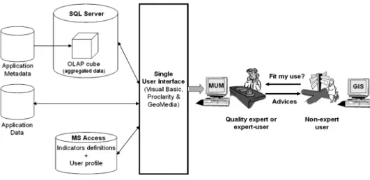
From a legal perspective, as geospatial data become a mass-product, considera-tions about consumer protection, liability, clear instruction manuals with warnings, guarantees and similar issues arise. In this context, meaningful quality information must be available to help users or providers to assess the fitness of the data for a given purpose (Gervais 2003, 2006). So far, this has barely succeeded. Although metadata (i.e. data about data) currently distributed by data producers should help the users in this task, from the end-user standpoint, they are typically expressed in a cryptic language, recorded using a complex structure, lacking explicit links with the data they describe, or simply inexistent in many cases. Hence, data-quality information is not easily accessible, understandable, or adapted to the usage context and users’ need. This could be regarded as a fault from a legal point of view (Gervais 2006). In the context of our research, we consider that experts familiar with spatial data quality issues should get involved in the process (figure 1), either internally within the organization or through mandates with external experts involving their professional liability (Gervais 2003, Be´dard et al. 2004, Devillers 2004). Similar scenarios have already been going for some time (e.g. Gervaiset al.
2006, Marttinen 2006, Smith 2006) and are becoming more frequent within organizations involved in data-warehousing initiatives.
In order to support these ‘quality experts’ in the assessment of the fitness for use, there is a need to provide a more effective approach to express quality information than the simple distribution of metadata. Improved methods and tools would facilitate the integration, management, and communication of information about data quality, allowing experts to increase their knowledge about data quality, and to better assess how data fit an intended use. Several authors have recently mentioned the need for such methods and tools. For instance, Lowell (2004) expresses the need for a ‘computer-based intelligent engine’ that could analyse information about uncertainty. He argues that:
Humans will not be able to absorb and assimilate all of the information presented in an uncertainty-based database, and will not have the capacity to analyse all of it efficiently. This will require the creation of new analytical and visualization tools capable of providing humans with a logical summary of the uncertainty information present in the system.
Due to the complexity of this task, we think that it is currently impossible to design a system providing a clear output regarding the fitness or not of the data for a certain use. We argue that the only possibility available today and in the near future is to provide quality experts with the available information regarding data quality, either at the detailed level of existing metadata or at more general levels resulting from metadata aggregation/generalization (when meaningful) or past quality analysis. It is our belief that no system using fully automatic methods will provide clear answers to such questions, as these are more than technological issues and require in-depth personal understanding of the data that can only be answered by a professional expert. Consequently, the objective of this paper is to present a Spatial data quality Information Analysis tool called the Multidimensional User Manual (MUM) that aims at supporting experts in spatial data quality (rather than supporting the end user of the data) in an innovative manner. This solution makes use of quality indicators organized hierarchically and uses a combination of Spatial On-Line Analytical Processing (SOLAP) and Dashboard tools. The proposed solution is intended to contribute to the professional activity of Quality Reporting and Quality Auditing.
In the present paper, we first discuss the issues of managing and communicat-ing spatial data quality information. Then, we describe our approach that uses quality indicators that are based on quality information stored in a multi-dimensional datacube (in OLAP vocabulary). We name this structure the Quality Information Management Model (QIMM). The advantages of using indicators are explained, as well as their limitations. Top-down and bottom-up approaches, two complementary ways to populate the QIMM, are then discussed. We then present our MUM prototype which supports several techniques to manage, interactively explore, and communicate quality information at different levels of detail to expert users and data quality experts. The use of Spatial On-Line Analytical Processing (SOLAP) functions, as well as the general architecture of the prototype, is described and discussed. This includes the different functions available and how such approaches can facilitate the quality-assessment process (SOLAP fundamentals can be found in Rivestet al.2001, 2005, and Be´dardet al.
2003, in press). Finally, we discuss the integration of MUM into the professional activities of Quality Reporting and Quality Auditing and present future research directions.
2. Geospatial-data-quality management and communication
For about 30 years, two different meanings have been associated with the term ‘data quality’ in the literature, the first restricting quality to the absence of errors in the data (i.e. internal quality) and the second looking at how data fit the user’s needs (i.e. external quality; Juranet al.1974, Morrison 1995, Aalders and Morrison 1998, Aalders 2002, Dassonvilleet al. 2002, Devillers and Jeansoulin 2006). This second definition, usually identified as the concept of ‘fitness for use’ (Juran et al. 1974, Chrisman 1983, Veregin 1999), is the one that reached an official agreement by standardization bodies (e.g. ISO) and international organizations (e.g. IEEE). More accurately, for the latter case, we define quality as the closeness of the agreement between data characteristics and the explicit and/or implicit needs of a user for a given application in a given area.
For more than 20 years, standardization bodies have identified characteristics describing internal quality (e.g. ICA, FGDC, CEN, ISO). Despite some differences between these standards regarding the characteristics identified, there is a general agreement among most of them. The common criteria are often identified as the ‘famous five’: positional accuracy, attribute accuracy, temporal accuracy, logical consistency, and completeness (Guptill and Morrison 1995, ISO/TC 211 2002). From the end-user perspective, knowledge about internal data quality typically comes from the metadata transmitted with datasets by data producers.
One metadata main objective is to allow end users to assess the fitness of a dataset for their use (ISO/TC 211 2003). However, academic studies and practical experience clearly show the limited benefit of metadata in their current form (Timpf
et al.1996, Frank 1998, Fisher 2003, Gervais 2003). End users frequently do not use metadata; indeed, it is not uncommon for users to ask producers not to include the metadata when ordering data. However, this is not an indication that metadata are useless, but an indication that metadata representation does not suit user needs. Our experience is that users rarely utilize metadata beyond those necessary for ordering datasets from digital libraries (e.g. searching datasets based on spatial and temporal extents or keywords).
In addition to the inadequate form of today’s metadata, which is typically too cryptic for most users, metadata are often too general to enable an adequate assessment of quality. This hides most of the information richness which should be communicated. Hunter (2001) clearly illustrates this point by giving several examples of existing metadata such as Positional Accuracy being ‘variable’, ‘100 m to 1000 m’ or ‘¡1.5 m (urban) to¡250 m (rural)’. Such metadata rapidly become
useless when someone wants to know, for instance, the quality of data for a certain region, object class (e.g. buildings) or object instance (e.g. one specific building). Despite higher costs, some data producers already provide certain metadata at the feature instance level (e.g. NTDB product of Geomatics Canada, LCM2000 of the Centre for Ecology and Hydrology, MasterMap of the Ordnance Survey). The recent international standard ISO 19115 (ISO/TC211 2003) also supports metadata encoding down to the feature instance and attribute instance levels, while this was not possible with older metadata standards such as FGDC.
Moreover, today’s metadata are typically provided in a different file than the data, reducing the possibility of easily exploiting quality information directly from certain GIS functions. Consider the simple example of a distance measurement between two objects. Today’s typical GIS provide answers that are related to the encoding of the data (e.g. integer, double) and not the accuracy of the objects that
may be documented in the metadata (e.g. ArcGIS provides distances with six decimals, i.e. a spatial precision of 1mm, corresponding to the average diameter of a bacterium). Given the appropriate metadata, it would be possible to calculate automatically the accuracy of the distance measured and display the result accordingly (e.g. by providing error margins with the distance or just informing the user of the level of uncertainty/reliability related to this measure). Hence, it is possible to benefit from the quality information described in metadata. These benefits would be twofold:
1. A more efficient communication and assessment of quality information (an issue discussed in this paper) would help users to understand the limitations of the data.
2. The management of quality information within a structured database, when associated with a GIS tool, would provide results adapted to the data manipulated for the area of interest (this is a research perspective).
Both points would help to reduce the risk of misuse and then reduce the occurrence of adverse consequences.
Over the last 20 years, several research projects have focused on ways to better describe and communicate quality/uncertainty/error information. Proposed solu-tions were based on either legal and procedural methods (Be´dard 1987, Agumya and Hunter 1999b, Gervais 2003, 2006) or visualization techniques (Buttenfield and Beard 1991, 1994, Beard and Mackaness 1993, Buttenfield 1993, McGranaghan 1993, Fisher 1994, Howard and MacEachren 1996, Beard 1997, Beard and Buttenfield 1999, Leitner and Buttenfield 2000, Drecki 2002, Devillers and Jeansoulin 2006), and on the communication of visual or audio warnings to users (Fisher 1994, Hunter and Reinke 2000, Reinke and Hunter 2002). However, none of these two techniques is yet implemented within commercial GIS software. Furthermore, none of these solutions allows users to navigate easily and rapidly from one quality characteristic to another, from one level of detail to another, from one area to another, from one category of data to another, from one feature to another, and so on, in order to help decide whether or not a dataset would fit the expressed needs for the area and objects of interest. Such functionalities are characteristic of the analytical data structure typical of modern decision-support technologies based on datacubes, such as On-Line Analytical Processing (OLAP), dashboards, datamarts and data mining.
3. Quality indicators and Quality Information Management Model (QIMM) 3.1 Quality indicators
Given that spatial data quality information can be described using many different characteristics (e.g. horizontal and vertical accuracy, omission, commission, topological consistency, up-to-dateness), and given that data producers and standards tend towards a description of ‘feature-level metadata’, the volume of quality information increasingly becomes a problem when trying to convey this information efficiently. In many fields, people have to cope with similar problems of meaningfully communicating large volumes of data to support decision-making processes. They often use ‘indicators’ (also named ‘indices’ or ‘index’ depending on the field) that can be displayed on ‘dashboards’ (also named ‘balanced scorecards’ or ‘executive dashboards’) to communicate relevant information to decision-makers
(Kaplan and Norton 1992, Fernandez 2000, von Schirnding 2000, Goglin 2001). We have adapted this traditional indicator-based approach for spatial data quality communication (Devillerset al.2004) and implemented the resulting approach in a spatial datacube.
Indicators can be defined as ‘a way of seeing the big picture by looking at a small piece of it’ (Plan Canada 1999). Fernandez (2000) defines indicators as ‘information or a group of information helping the decision-maker to appreciate a situation’. Indicators show what is going on globally, allowing or not examination of details. Let us make an analogy to a family doctor who wants to diagnose his patient’s illness. The doctor knows that the human body is a complex system and that he cannot observe and measure all of its characteristics. Hence, he uses certain observations and measures (e.g. body temperature, blood pressure, pulse) to gain a broad view of the patient’s health. If one of these ‘indicators’ shows a problem, the doctor can then use more advanced tests to investigate the potential problem into more details (e.g. blood analysis, X-ray). In similar ways, a number of organizations use indicators to assess larger complex systems (e.g. economic indicators, social indicators, or environmental indicators). Klein (1999) observed different types of decision-makers that have to make rapid and important decisions (e.g. firemen, aircraft pilots, surgeons) and, based on these observations, built the ‘Recognition-Primed Decision model’ that is well known in the decision-making community. Klein argues that decisions of any type are driven by a combination of parameters, including the similarity the situation has with previous situations experienced by the person, the person’s intuition and capacity to imagine potential scenarii, etc. His thesis confirms the importance of experts as a support in complex decision-making processes. He observed that indicators, named ‘cues’ in his model, are key components in decision-making processes and are used to characterize situations and choose which action to perform. Indicators are seen as synthetic key information about complex phenomena providing global pictures and major trends. Several indicators can be aggregated in higher-level indicators, sometimes named ‘aggregate indicators’ (or ‘indices’). Typical strategic decision-making processes use a small number of indicators, or aggregate indicators, as one may see in numerous Business Intelligence (BI) applications and Executive Information Systems (EIS). Typical indicators can be ‘drilled down’ in a small number of layers that are expanded to provide available details when needed. Selecting the most relevant indicators among available ones or collecting new data to build a new indicator represents an interesting challenge when designing decision-support systems.
Using indicators for quality assessment appears not only theoretically interesting, but realistically unavoidable in order to build a usable and credible system. Some could say ‘well … it’s not perfect but that’s the best we can do’, while others could be happier: ‘well … it is sufficient to make my decision’!
However, if indicators and aggregate indicators appear to be unavoidable when one wants to cope with large volumes of information, summarizing different data into a single value is a difficult task that has been discussed and questioned by many authors (e.g. Ott 1978, Meadows 1998, Jollandset al. 2003). Hence, the scientific community is still divided between different types of approaches, such as providing aggregate indicators or indicator ‘profiles’ (matrices). In the first case, the aggrega-tion process is carried out using a mathematical equaaggrega-tion (e.g. aggregaaggrega-tion of indicators using their average value), whereas in the second case, the decision-maker will do this process cognitively. Both approaches have positive and negative aspects,
and there is no perfect solution. The most important problem with aggregate indicators is that it requires many assumptions and decisions about the user needs (e.g. selecting an aggregation method and eventually weights for the indicators). Another important issue is to leave the possibility to the decision-maker to access the original data if needed. For applications requiring too many indicators, as is the case with spatial data quality (see, for instance, the different quality sub-elements suggested by the ISO/TC211 standards), the objective is then to minimize the disadvantages of the aggregate indicator approach.
With this in mind, context-sensitive quality information can be provided to the user at the right level of abstraction in order to help them identify aspects of quality which are relevant for the task at hand. Furthermore, it is not uncommon to see metadata about indicators built into SOLAP applications as well as the access to the finest granularity of data and the possibility of selecting between aggregation methods or adding a new one on the fly.
To analyze the fitness for use of geospatial data for a given area, we designed the MUM analysis tool such that quality indicators would be displayed on a dashboard embedded within a cartographic interface (i.e. SOLAP), acting as a quality information tool that could support quality experts in the assessment of the fitness of datasets of a specific use.
In order to support the quality experts when investigating the robustness of the data obtained (i.e. something every professional must do when building their opinion), the characteristics of our approach include, among others:
N
providing a limited number of indicators and aggregate indicators to the user;N
allowing the user to access the initial detailed data used to calculate theindicators and aggregate indicators;
N
allowing the user to select an aggregation method that best fits his needs, thus not automatically taking this decision for them. The aggregation method will for instance depend on the level of risk the user may accept. For example, a user who does not want to take any risk may use an aggregation technique that will propagate a problem from a detailed level (e.g. poor spatial accuracy of a specific road) to an aggregated indicator (e.g. ‘spatial accuracy’ of the whole dataset). Another user more tolerant to the risk may average indicators values to obtain an aggregated indicator that would not highlight exceptional cases of low or high quality at the detail level. With some OLAP and SOLAP tools, it is even possible to add new indicators and calculate them on the fly for every level of aggregation; some also support operators that go beyond the typical sum, count, min, and max, supporting operators such as log, power, ln, trigono-metric functions, or any other type of aggregation that could be made explicit;N
allowing the user to set their own weights for their indicators, depending ontheir context;
N
providing the possibility to visualize any data quality indicator on a map at the most detailed level (i.e. feature instance), then allowing the possibility of pinpointing potential problems that would not be visible at aggregated levels;N
providing access to the initial metadata used to derive the indicators.This whole approach relies on the assumption that the system should not take the decision for the expert and should not hide variations invisible from indicators. Rather, this approach is context-dependent. It aims at providing the expert with meaningful information about spatial data quality to support the quality analysis
process, whatever the levels of detail and coverages needed in space, time, feature, aggregation method, etc. It is the expert’s responsibility to choose and feed the indicators, and to explore this information to make their opinion. Therefore, the expert can produce a Quality Report or Audit Report with the quantity and level of information required, including a meaningful set of indicators for the task at hand. Each quality indicator can be based on one or several raw metadata. Metadata can be obtained from the traditional metadata provided with the datasets (e.g. metadata describing data quality or other metadata). These typical metadata can follow metadata standards (e.g. ISO/TC 211). But metadata used by MUM are not restricted to these typical metadata and can also come from other sources of information describing data quality, such as an expert opinion, an organization’s internal consensus (e.g. lowest spatial precision for a given area or a lowest degree of completeness for a certain period within a dataset), or information about data quality derived from other calculations relevant to the user. Metadata are then not restricted to those described by the existing metadata standards but more generally refer to any ‘data about data’.
3.2 Quality Information Management Model (QIMM)
A central motivation in this research is to avoid an information overload to users (i.e. the quality experts) when they have to access, compare, and analyse various data quality characteristics at different levels of detail, for different regions, different data sources, etc. According to the well-known psychological research from Miller (1956), human short-term memory (or working memory) can deal with only five to nine chunks of information at once. Hence, it would be of limited use to communicate a larger quantity of information simultaneously to a user. In addition, other psychological studies have shown that the length of time information stays in short-term memory (STM) is very limited (Baddeley 1997). This duration can be quite variable depending on the modality (i.e. acoustic, visual, or semantic), the necessity of performing actions (e.g. selecting an item on the screen of a computer), and other factors (for instance, the level of concentration). Experimental results usually provide durations varying from 2 to 30 s. According to Newell’s (1990) physical and biological tests, among the four computational bands emerging from the natural hierarchy of information processing, response times between 1021
and 101seconds are needed to perform cognitive tasks and maintain a line of thought. Consequently, an efficient method to convey quality information should limit the volume of information to less than nine chunks and provide information to users in less than 10 s in order to avoid interrupting their mind-stream. Another point highlighted by Reinke and Hunter (2002) is the need not only to passively obtain quality information from the system, but also to be able to interact with the system to request additional information (i.e. feedback loop).
To cope with all these constraints, we based our approach on the multi-dimensional database models (datacube) used in the field of Business Intelligence (e.g. data warehousing, OLAP, data mining). In this field, ‘multidimensional’ refers not only to spatial (x,y,z) and temporal (t) dimensions, as in the GIS domain, but also to semantic, temporal, and spatial hierarchies of concepts called dimensions, which are represented by the metaphor of a data hypercube containing data units (facts); each fact contains measures resulting from the intersection of all dimensions at a given level in their respective hierarchies (e.g. Berson and Smith 1997). For instance, a spatial dimension in Spatial OLAP will then not be a spatial axis on
which a measure can be done, as it is in GIS, but a hierarchy of spatial objects representing different levels of granularity (e.g. continentRcountryRregion/state; object classRobject instanceRgeometric primitive). Multidimensional database approaches appeared in the early 1980s (Rafanelli 2003), and numerous books and papers have been published on this vast topic, especially after it became popular in the mid-1990s. Codd (1993) clearly explained their superiority over relational databases when users need to interactively analyse large volumes of data. Datacubes provide an intuitive and very fast data structure supporting interactive analyses at the ‘speed of thought’ when using OLAP tools (Vitt et al. 2002), i.e. within the cognitive band of 10 s defined by Newell (1990), whatever the level of aggregation of data and the number of themes involved. OLAP users can focus on the information they are looking for rather than focusing on the process of getting this information, as it used to be with the SQL queries typical of transactional databases. Multidimensional databases nowadays represent a very important aspect of decision-support systems, and are now penetrating the field of GIS in academia (see, for instance, Miller and Han 2001, Be´dardet al.2003, Be´dard 2005) but also with commercial products (e.g. JMap SOLAP).
Multidimensional databases are very well suited to facilitate data quality analysis in data-rich GIS applications. They are built to specifically query data at the required level of granularity, to provide fast results from complex queries on large volumes of data (not interrupting users’ train-of-thought), and to allow an intuitive navigation into summarized or detailed interrelated information using different operators (providing interaction with the system).
Devillers et al. (2005) presented in detail a model named Quality Information Management Model (QIMM) allowing the management of spatial data quality information within a datacube. Spatial data quality information stored within the QIMM model is afterwards manipulated using Spatial On-Line Analytical Processing (SOLAP; see Rivestet al. 2001, Be´dardet al. 2003) to allow the expert to navigate into quality dimensions and to intersect them for any level of detail. The proposed model is based on two dimensions, namely ‘Quality Indicator’ and ‘Analysed Data’, both designed with four levels of granularity (figure 2). Users can explore quality information by navigating within the system at different levels of detail, going for instance along the ‘Analysed Data’ dimension, from the quality of an entire dataset, down to the quality of a single object instance, and even down to the geometric primitive when available. In each case, the quality may refer to a global
Figure 2. Hierarchical dimensions of the quality information management model (the ‘Analysed Data’ dimension offering alternate paths for detailed analysis).
indicator or, along the ‘Quality Indicator’ dimension, go down to a very specific characteristic of quality. For each intersection between these two dimensions, a map displays the region, layers, occurrences, or primitives being analyzed with corresponding visual variables (colour, pattern, weight, etc.) corresponding to quality values. Panning or zooming on the map could trigger an update of the quality indicators displayed in the dashboard. Examples are presented later in this paper. 3.3 Populating the quality database: Combining bottom-up and top-down approaches Once a multidimensional database structure is designed to manage quality information, the next step is to feed this database with existing or derived quality information. Two approaches can be identified:
N
Bottom-up: This approach is based on existing information describing data quality. It can include metadata distributed by the data producer but can also include any other data quality information that can be assessed. These metadata can be documented at detailed levels (e.g. describing the horizontal spatial accuracy of a specific road segment) and then be aggregated into higher-level information (e.g. average spatial accuracy of the ‘roads’ layer of the selected area, i.e. of all roads of this area). As discussed in section 3.1, our approach does not provide one single way to aggregate quality information. The selection of an appropriate aggregation technique depends on the users and uses. The proposed solution lets the quality expert select the aggregation process that best fits their needs. More than one aggregation process can be used in the same datacube if desired. Examples of aggregation techniques are described in more detail in Devillers et al. (2004, 2005) and in most OLAP reference books (e.g. Berson and Smith 1997).N
Top-down: This approach involves collecting more global quality information that is not explicitly available, such as an expert’s opinion about the average spatial precision of the roads in his region, and in propagating this general level information, when relevant, to detailed levels (e.g. each road of this region could inherit information provided by the experts’ opinion). For instance, it is typical to see land-surveyors having very good knowledge of a territory and of the quality of the different datasets describing it (e.g. cadastral and topographic data). Using their experience is often the most reliable way to discern that a dataset is relevant or not for various applications in this area. They can also provide insights on the spatial heterogeneity of the quality of certain datasets, identifying sub-regions of higher- and lower-quality in the area covered by the data. The experts can also do this with respect to the period of measurements and other informal criteria (e.g. residential developments subdivided before the end of the 1970s were not measured with Electronic Distance Measurement (EDM) equipment and are not as accurate). Information collected through a top-down process can be a good complement to the bottom-up approach, as many dataset have metadata that are incomplete, too general, or just non-existent.While the two approaches are complementary, they both have advantages and drawbacks. In the bottom-up, metadata can be easier to collect, but finding the most efficient methods to aggregate quality information, to analyse and synthesize hundreds of metadata that vary over space, time, and sources can be difficult. As a
single aggregation technique is unlikely to meet every user need, our approach allows the expert to select one or several aggregation techniques that better fit the task at hand. On the other hand, formalizing expert opinions (top-down approach) is not simple either, and the propagation of quality information to lower levels of details has to be done with caution because high-level information can be an implicit aggregation of heterogeneous low-level data. Nevertheless, this remains the most that can be done. With today’s knowledge, it seems reasonable to believe that, although none of these approaches can completely fill the quality database, both could be used in most quality information datacubes. The capacity to acquire relevant data becomes a key element when deciding which approach to choose. In addition, in the context of risk analysis for the use of data, one must keep in mind that ‘no information is information’, and ‘divergent information is also information’. Knowing that no information is available regarding a dataset can lead the user to absorb the remaining uncertainty and proceed to their decision (Be´dard 1987).
4. Applying the concepts: Developing the MUM prototype
Based on the quality-indicator approach and the QIMM data structure, we developed a prototype to support experts in the assessment of the fitness of certain data for an intended use. The prototype implements, as a proof of concept, different operators which have been described in Devillerset al. (2004), such as displaying quality information using indicators, calculating indicators values according to the spatial extent visualized by the user, allowing users to select indicators relevant to their application, and providing indicators at different levels of details. In the next sections, we describe the architecture of this prototype, the quality indicators that make up the multidimensional data structure and how experts can navigate through the quality information.
4.1 Prototype architecture
The prototype was developed using commercial off-the-shelf software driven by a single user interface developed in Visual Basic (fast and easy for prototyping). This user interface adapts and integrates the mapping and database technologies required to suit the needs of the proposed approach (figure 3). The result is a SOLAP application with dashboard capabilities that supports the analysis of spatial data quality. The main technologies include:
N
Microsoft SQL Server/Analysis Services: This is the OLAP server that provides multidimensional database management functionalities in addition to support OLAP queries in the MDX language;N
Microsoft Access: This popular relational database management system is used to store user profiles and multidimensional indicators’ name and characteristics (indicators’ metadata);N
Proclarity: This OLAP client software provides query and navigation functions (e.g. drill-down and roll-up operators) that allow users to explore the quality data stored within SQL Server;N
Intergraph Geomedia Professional: This Geographical Information System (GIS) software provides map-viewing functions such as ‘Zoom In’, ‘Zoom Out’, ‘Pan’, ‘Fit all’ and other tools allowing the creation of maps representing data quality.Data quality information used for the experimentation was based on the ISO 19113 international standard (ISO/TC 211 2002). However, this was only an implementation choice, and the tool presented in this paper can manage and communicate many other types of information about data quality. For increased speed, quality information is stored within the multidimensional database, or datacube, using a full Multidimensional OLAP data structure (MOLAP), in contrast to other possible Relational OLAP structures (ROLAP) mimicking the former (see Berson and Smith 1997, for more details about the different OLAP architectures).
After having completed the design of the complete datacube, we experimented with a subset of the QIMM dimensions to make our proof of concept. Within this prototype, we included the entire ‘Quality Indicator’ dimension and three levels of detail of the ‘Analysed Data’ dimension (i.e. dataset, data layer, and object feature instance).
4.2 Indicator selection, calculation, and representation
The quality indicator approach we adopted is based on three observations: (1) it is impossible in practice to obtain all detailed metadata, and one cannot only provide a unique value for every aspects of the quality; (2) it is too complex to exhaustively consider all factors at once with their detailed spatial and temporal variability; and (3) not all users evaluate quality based on the same criteria. For instance, certain users will be more interested in spatial accuracy, others in completeness, some in temporal data quality, and so on. For this reason, quality indicators can be selected by users according to their needs. Based on the ISO 19113 standard, quality indicators were defined and stored hierarchically within a relational database. The ISO quality elements were used for the prototype, but the approach described in this paper allows users to create their own custom-made indicators, since ISO quality elements may not be sufficient to assess the fitness for use. For instance, if a user is interested in how the dataset ‘ontology’ (i.e. the concepts represented and their definition and characteristics) fits their own ‘user ontology’, they could create one or several indicators that would provide some information on this issue, using certain metrics. For instance, some methods allow the similarity between two ontologies to
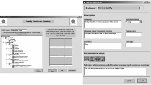
be measured (e.g. see Brodeur et al. 2003, for an example of what ‘geosemantic proximity’ measurements can be). Users can build the indicators they want and display them in their dashboard by simply applying a drag-and-drop operation from the indicator list to the dashboard creation tool (figure 4). Each indicator definition is stored within the database, including a description of what it represents, the way it is calculated, warnings related to its interpretation, and its importance as defined by the user (expressed in terms of weight), etc. The user can eventually adapt some items further or add more metadata about the indicators. One may select among different graphical representations to illustrate each indicator (e.g. traffic light, smiley, speed meter).
Indicator values are based on the spatial extent of the map being displayed to the quality expert. Indeed, if the user zooms in or pans towards a particular region of interest, quality indicators are recalculated for objects located within this area. 4.3 Navigation into spatial data quality information
Using the prototype described in the previous section, geospatial data experts can improve their knowledge of data quality through the use of different navigation tools. As demonstrated in the field of OLAP technology, displaying information at different levels of detail within 10 s allows users to analyze the data without interrupting their train of thought. Figure 5 illustrates the benefits of such a system through different questions a user may have regarding data quality and the different tools offered by the system to help in answering those questions.
4.3.1 Quality indicator representation. Data quality information is communicated through indicators using various representations (e.g. traffic light, smiley, or speed meter). Quality indicator values can be represented using interactive thematic maps displaying quality values on each feature instance or geometric primitive. Using SOLAP operators, it is then possible to drill the data directly on these maps to access another level of detail of the information.
Figure 4. Indicators selection tool (left) with the empty dashboard template and indicators description and graphical representation form (right).
A global indicator represents the aggregation of all indicators for the displayed area. Each indicator is the aggregation of sub-indicators, down to detailed metadata when available. In our prototype, the quality dashboard can include up to nine indicators, which is consistent with Miller’s rule (Miller 1956) that limits human short-term memory to nine chunks of information. The value of each quality indicator varies according to quality. For instance, an indicator using the traffic-light representation can be green, yellow, red, or white, depending on whether the quality exceeds/meets the needs, is close to the needs, does not reach the needs, or is unknown. Several other types of representation are available for each indicator. 4.3.2 SOLAP navigation along the ‘analysed data’ dimension. SOLAP fast drill-down and roll-up capabilities are key elements of the prototype. They allow users to navigate from one level of detail to another along the ‘Analysed Data’ dimension. For instance, this allows users to obtain quality indicator values for the whole dataset, then look at the quality for a certain feature type (e.g. only roads) and move to a more detailed level again to obtain the quality of a single feature instance (e.g. ‘Main Street’). Figure 6 illustrates this example of navigation. The user interface includes cartographic and SOLAP tools in the upper part, the dashboard with its different indicators on the left, and the cartographic interface on the right. These operators fully exploit the advantages of datacubes, allowing the expert to easily take into consideration the spatial variation in data quality, or to discover new trends or patterns into this spatial variability. For instance, modifying min–max values of quality categories on the fly could make it possible to capture new spatial variations not considered in the aggregation algorithms (ex. more imprecision along
a river) or to pinpoint the outliers and specific cases that diverge from the general tendency in their area (e.g. show those lines with positional inaccuracy of¡30 m
among those fitting within the ¡5 m inaccuracy). Thus, the expert can see these
outliers in spite of a positional accuracy indicator that is smiling. Similar solutions can be used to extract information that may be hidden in aggregated indicators. 4.3.3 SOLAP navigation along the ‘quality indicator’ dimension. In addition to the levels of detail within the data, this approach also allows users to explore data quality along a quality indicator hierarchy. The quality indicators in the dashboard can be drilled down and rolled up. Users can then explore quality at aggregated and detailed levels at will, minimizing information overload and offering powerful interaction between the user and the system. For instance, in the example of figure 7, a user looks first at the higher-level indicators. He realizes that ‘General Quality’ is only average (i.e. yellow) because of the lower ‘Internal Quality’. He can then drill-down into the ‘Internal Quality’ to see its sub-indicators At this second level, he can wonder why the ‘Logical Consistency’ indicator is only average, and then drill-down on ‘Logical Consistency’ to obtain more detail. He finally arrives at the last level of detail available in our prototype and sees that the problem comes from the ‘Topological Consistency’. He can then decide if this aspect of data quality is important for his application or not and then decide to either absorb the residual uncertainty or reduce it by, for instance, looking for another dataset (see Be´dard 1987 or Hunter 1999, for details on the concepts of uncertainty absorption and reduction).
Figure 6. Navigation along the ‘Analysed Data’ dimension using two successive drill-down operations.
4.3.4 Indicator mapping. Indicator mapping allows users to obtain an insight into the spatial heterogeneity of a quality indicator. As one limitation of the indicator approach is to aggregate heterogeneous data into a single value, this provides a complementary view on quality information. Metadata often document the average quality (e.g. spatial accuracy) for an entire map sheet, but there can be significant spatial variations in data quality at a more detailed level (e.g. feature instance). Consider a dataset covering a large area (e.g. country) that is the result of the integration of several datasets of various qualities that cover smaller adjacent areas (e.g. states). In such a representation, the user may only get a single value for the quality of the whole dataset and may then underestimate or overestimate quality for specific areas. Using the approach presented in this paper, users can explore quality through the indicators displayed in the dashboard. However, when drilling down on specific quality indicators, a user could lose the global picture. To obtain such information, users would have to obtain quality indicator values successively for each feature instance. Quality indicator mapping aims to address this issue.
Quality maps can also use different types of classification according to the distribution of values. Five different ways to create the qualitative classes were implemented: equal count, equal range, standard deviation, custom equal count, and custom equal range. Changing the way to create classes can be useful, for instance, when all data of a certain dataset have similar quality levels. Instead of obtaining the same value (e.g. green) for all feature instances, it is then possible to Figure 7. Navigation along the ‘Quality Indicator’ dimension using two successive drill-down operations.
highlight features with the lowest and the highest qualities in the distribution (figure 8).
5. Conclusion
This approach is primarily intended to support quality/audit reporting performed as a one-shot contractual professional activity required by a large client. Consequently, it is not a system to be maintained by an organization as GIS applications typically are. Rather, it is a solution requiring a datacube to be fed with quality indicators defined by the quality expert according to the specific needs of their client. It is a powerful means by which the quality expert will become able to build their opinion in the face of a complex situation, to document their report and to justify their recommendations which will include remarks about the variations of quality in space, features, and so on. As such, the quality datacube may become an instrument like the legal registry of a public officer and serve in Court. MUM is not a software solution but an approach integrating methodological and technological solutions to support legal issues related to spatial data quality.
This paper presents a new innovative approach to help data quality experts and expert users of geospatial data to improve their knowledge about spatial data quality in order to better assess the fitness of data for a given use. In addition to being innovative by adapting indicator theory to spatial data quality communica-tion, this approach innovates by its use of both a multidimensional data structure (QIMM) to manage quality information at different levels of detail and a spatial Figure 8. Mapping of a quality indicator highlighting the spatial heterogeneity of quality information.
COLOUR
FIGURE
OLAP solution in order to support for the first time a rapid and easy exploration of quality indicators at different levels of detail. Thus one can easily and immediately obtain the desired information about the analysed data for a given area at a given epoch. Spatial data quality information is explored along an ‘analysed data’ dimension and a ‘quality indicator’ dimension, in addition to being supported by interactive mapping of data quality parameters. Quality information is commu-nicated to users through contextual indicators displayed on a dashboard that is integrated into the mapping interface. The architecture of a prototype was described, as well as its main functionalities that allow users to navigate into diverse quality information at different levels of detail. This prototype was meant as a proof of the applicability of the proposed concepts, the concepts and the general approach being considered as the important results of this research.
A validation of the approach was done through demonstrations of the prototype to different types of users (GIS scientists including specialists in data quality issues, consultants in GIS, data producers, governmental agencies, typical GIS users, etc.). Such presentations were performed through the early stages of the project in order to obtain early feedback from potential users and then adapt the project in consequence. Several of these people also directly tested the prototype in order to provide comments on the concept, design, and how the prototype helped them understand data quality. Users expressed an interest in this approach and found it much more efficient than current metadata to increase users’ knowledge about data quality and help in assessing the fitness of data for certain uses. It was interesting to see that, in addition to the relevance of the prototype for data users, data producers found it very useful to potentially visualize the quality of their data for management purposes. They also realized through this prototype the importance of documenting data quality information in the metadata. A more advanced validation of the approach would help to better quantify the benefit of this approach compared with traditional metadata distribution. It should, however, be done in ‘real-life’ size (i.e. different datasets, different users, different contexts of use). However, such a test would require considerable human and financial resources because of the technical complexity and was not possible within the scope of this research project. This aspect is currently under development in a project involving three major organizations and will allow the automation of many procedures that were done manually for this project.
Different aspects of this research can be expanded to future research, such as improving the model of user needs/profile and formalizing/integrating expert opinions into the QIMM model (i.e. the bottom-up approach). Some studies carried out in the European REVIGIS project for the management of ordinal preferences can also be explored in order to extend MUM numerical indicators (total order) to a partial order that could better express qualitative presentation of data quality. Finally, it is worth mentioning that once quality information is stored in such a structured database with different levels of detail, quality information then becomes easily accessible and can be used to enhance many other aspects of a GIS application. This represents a step towards the creation of ‘quality-aware GIS’, which extends the concept of Unwin’s (1995) ‘error-sensitive GIS’ and of Duckham and McCreadie’s (2002) ‘error-aware GIS’. We refer to a ‘quality-aware GIS’ as a GIS with the added capabilities to manage, update, explore, assess, and communicate quality information, the term ‘quality’ encompassing more than ‘error’ by also addressing issues related to GIS user
contexts and use patterns (e.g. user profile and needs assessment). This is then a further step towards ‘safer’ GIS.
Acknowledgements
This research is part of the MUM project and has benefited from financial support from the Canadian Network of Centres of Excellence GEOIDE, the IST/FET programme of the European Community (through the REV!GIS project), the Ministe`re de la Recherche, de la Science et de la Technologie du Que´bec, the Canada NSERC Industrial Research Chair in Geospatial Databases for Decision-Support, the Centre for Research in Geomatics, and Universite´ Laval. Thanks are due to Mathieu Lachapelle, who contributed to the prototype development, Dr Evan Edinger, for the editing of the manuscript, and to three anonymous reviewers that provided constructive feedback on the paper.
References
AALDERS, H.J.G.L., 2002, The registration of quality in a GIS. InSpatial Data Quality, W. Shi, P. Fisher and M.F. Goodchild (Eds), pp. 186–199 (London: Taylor & Francis). AALDERS, H.J.G.L. and MORRISON, J., 1998, Spatial data quality for GIS. In Geographic Information Research: Trans-Atlantic Perspectives, M. Craglia and H. Onsrud (Eds), pp. 463–475 (London: Taylor & Francis).
AGUMYA, A. and HUNTER, G.J., 1997, Determining fitness for use of geographic information. ITC Journal,2, pp. 109–113.
AGUMYA, A. and HUNTER, G.J., 1999a, Assessing ‘fitness for use’ of geographic information: What risk are we prepared to accept in our decisions? InSpatial Accuracy Assessment, Land Information Uncertainty in Natural Resources, K. Lowell and A. Jaton (Eds), pp. 35–43 (Chelsea, MI: Ann Arbor Press).
AGUMYA, A. and HUNTER, G.J., 1999b, A risk-based approach to assessing the ‘fitness for use’ of spatial data.URISA Journal,11, pp. 33–44.
BADDELEY, A., 1997,Human Memory: Theory and Practice(Hove, UK: Psychology Press). BEARD, K., 1989, Use error: the neglected error component. In Proceedings of
AUTO-CARTO 9, Baltimore, MD, pp. 808–817.
BEARD, K., 1997, Representations of data quality. In Geographic Information Research: Bridging the Atlantic, M. Craglia and H. Couclelis (Eds), pp. 280–294 (London: Taylor & Francis).
BEARD, K. and BUTTENFIELD, B., 1999, Detecting and evaluating errors by graphical methods. InGeographical Information Systems, P.A. Longley, M.F. Goodchild, D.J. Maguire and D.W. Rhind (Eds), pp. 219–233 (Chichester, UK: Wiley).
BEARD, K. and MACKANESSW., 1993, Visual access to data quality in geographic information systems.Cartographica,30, pp. 37–45.
BE´ DARD, Y., 1987, Uncertainties in land information systems databases. InProceedings of Eighth International Symposium on Computer-Assisted Cartography, Baltimore, MD, pp. 175–184.
BE´ DARD, Y., 2005, Integrating GIS and OLAP: A New Way to Unlock Geospatial Data for Decision-making. Directions on Location Technology and Business Intelligence Conference, 2–4 May, Philadelphia, PA.
BE´ DARD, Y., DEVILLERS, R., GERVAIS, M. and JEANSOULIN, R., 2004, Towards multi-dimensional user manuals for geospatial datasets: Legal issues and their considera-tions in the design of a technological solution. In Proceedings of the Third International Symposium of Spatial Data Quality (ISSDQ), Vol. 2, Bruck an der Leitha, Austria, pp. 183–195.
BE´ DARD, Y., GOSSELIN, P., RIVEST, S., PROULX, M.-J., NADEAU, M., LEBEL, G. and GAGNON, M.-F., 2003, Integrating GIS components with knowledge discovery
technology for environmental health decision support. International Journal of Medical Informatics,70, pp. 79–94.
BE´ DARD, Y., RIVEST, S. and PROULX, M.-J., 2006, Spatial on-line analytical processing (SOLAP): Concepts, architectures and solutions from a geomatics engineering perspective. InData Warehouses and OLAP: Concepts, Architectures and Solutions, IDEA Group Publishing, in press. (Hershey: Pennsylvania).
BERSON, A. and SMITH, S.J., 1997, Data Warehousing, Data Mining and OLAP (Data Warehousing/Data Management)(New York: McGraw-Hill).
BRODEUR, J., BE´ DARD, Y., MOULIN, B. and EDWARDS, G., 2003, Revisiting the concept of geospatial data interoperability with the scope of a human communication process. Transactions in GIS,7, pp. 243–265.
BUTTENFIELD, B. and BEARD, K.M., 1994, Graphical and geographical components of data quality. In Visualization in Geographic Information Systems, H.M. Hearnshaw and D.J. Unwin (Eds), pp. 150–157 (Chichester, UK: Wiley).
BUTTENFIELD, B.P., 1993, Representing data quality.Cartographica,30, pp. 1–7.
BUTTENFIELD, B.P. and BEARD, K., 1991, Visualizing the quality of spatial information. In Proceedings of AUTO-CARTO 10, pp. 423–427.
CHRISMAN, N.R., 1983, The role of quality information in the long term functioning of a geographical information system. In Proceedings of International Symposium on Automated Cartography (Auto Carto 6)(Ottawa, Canada), pp. 303–321.
CODD, E.F., 1993,Providing OLAP (On-line Analytical Processing) to User-Analysts: An IT Mandate Report(Sunnyvale, CA: E.F. Codd & Associates).
DASSONVILLE, L., VAUGLIN, F., JAKOBSSON, A. and LUZET, C., 2002, Quality management, data quality and users, metadata for geographical information. In Spatial Data Quality, W. Shi, P.F. Fisher and M.F. Goodchild (Eds), pp. 202–215 (London: Taylor & Francis).
DEBRUIN, S., BREGT, A. and VAN DEVENM., 2001, Assessing fitness for use: the expected value of spatial data sets.International Journal of Geographical Information Science,
15, pp. 457–471.
DEVILLERS, R., 2004, Conception d’un syste`me multidimensionnel d’information sur la qualite´ des donne´es ge´ospatiales. PhD thesis, Sciences Ge´omatiques, Universite´ Laval, Canada.
DEVILLERS, R., BE´ DARD, Y. and GERVAIS, M., 2004, Indicateurs de qualite´ pour re´duire les risques de mauvaise utilisation des donne´es ge´ospatiales. Revue Internationale de Ge´omatique,14, pp. 35–57.
DEVILLERS, R., BE´ DARD, Y. and JEANSOULIN, R., 2005, Multidimensional management of geospatial data quality information for its dynamic use within geographical information systems. Photogrammetric Engineering & Remote Sensing (PE&RS),
71, pp. 205–215.
DEVILLERS, R., and JEANSOULIN, R. (Eds), 2006, Fundamentals of Spatial Data Quality (London: ISTE).
DRECKI, I., 2002, Visualisation of uncertainty in geographic data. In Spatial Data Quality, W. Shi, P.F. Fisher and M.F. Goodchild (Eds), pp. 140–159 (London: Taylor & Francis).
DUCKHAM, M. and MCCREADIE, J.E., 2002, Error-aware GIS development. InSpatial Data Quality, W. Shi, P.F. Fisher and M.F. Goodchild (Eds), pp. 63–75 (London: Taylor & Francis).
FERNANDEZ, A., 2000,Les nouveaux tableaux de bord des de´cideurs(E´ ditions d’organisation). FISHER, P.F., 1994, Animation and sound for the visualization of uncertain spatial information. InVisualization in Geographic Information Systems, H.M. Hearnshaw and D.J. Unwin (Eds), pp. 181–185 (Chichester, UK: Wiley).
FISHER, P.F., 2003, Multimedia reporting of the results of natural resource surveys. Transactions in GIS,7, pp. 309–324.
FRANK, A.U., 1998, Metamodels for data quality description. InData Quality in Geographic Information—From Error to Uncertainty, M.F. Goodchild and R. Jeansoulin (Eds), pp. 15–29 (Editions Hermes).
FRANK, A.U., GRUM, E. and VASSEUR, B., 2004, Procedure to select the best dataset for a task. InProceedings of the Third International Conference on Geographic Information Science (GIScience 2004), Adelphi, USA, pp. 81–93.
GERVAIS, M., 2003, Pertinence d’un manuel d’instructions au sein d’une strate´gie de gestion du risque juridique de´coulant de la fourniture de donne´es ge´ographiques nume´riques. PhD thesis, Sciences Ge´omatiques, Universite´ Laval, Que´bec.
GERVAIS, M., 2006, On the Importance of External Data Quality in Civil Law. In Fundamentals of Spatial Data Quality, R. Devillers and R. Jeansoulin (Eds), pp. 283–300 (London: ISTE).
GERVAIS, M., BE´ DARD, Y., DEVILLERS, R., LARRIVE´ E, S., CHRISMAN, N. and LE´ VESQUE, J., 2006, Auditing spatial data suitability for specific applications: professional and technological issues. Workshop on quality assurance in geographic data production, Marne-la-Valle´e, France, 13–14 February. Available online at: http://www. eurogeographics.org/eng/documents/WSQ_9_Auditing.pdf (accessed 3 September 2006). GOGLIN, J.-F., 2001,Le datawarehouse pivot de la relation client(Paris: Herme`s Sciences). GOODCHILD, M.F., 1995, Sharing Imperfect Data. InSharing Geographic Information, H.J.
Onsrud and G. Rushton (Eds) (New Brunswick, NJ: Rutgers University Press), pp. 413–425.
GRUM, E. and VASSEUR, B., 2004, How to select the best dataset for a task? InProceedings of 3rd International Symposium on Spatial Data Quality (ISSDQ’04), Bruck an der Leitha, Austria, pp. 197–206.
GUPTILL, S.C., and MORRISON, J.L. (Eds), 1995,Elements of Spatial Data Quality(Oxford: Elsevier Science).
HOWARD, D. and MACEACHREN, A.M., 1996, Interface design for geographic visualization: Tools for representing reliability. Cartography and Geographic Information Systems,
23, pp. 59–77.
HUNTER, G.J., 1999, Managing uncertainty in GIS. InGeographical Information Systems, P.A. Longley, M.F. Goodchild, D.J. Maguire and D.W. Rhind (Eds), pp. 633–641 (New York: Wiley).
HUNTER, G.J., 2001, Spatial Data Quality Revisited. InProceedings of GeoInfo 2001, Rio de Janeiro, Brazil, pp. 1–7.
HUNTER, G.J. and REINKE, K.J., 2000, Adapting Spatial Databases to Reduce Information Misuse Through Illogical Operations. InProceedings of 4th International Symposium on Spatial Accuracy Assessment in Natural Resources and Environmental Sciences (Accuracy 2000), Amsterdam, pp. 313–319.
ISO/TC 211, 2002,Geographic Information—Quality Principles, Report, 19113. ISO/TC 211, 2003,Geographic Information—Metadata, Report, 19115.
JOLLANDS, N., LERMIT, J. and PATTERSON, M., 2003, The usefulness of aggregate indicators in policy making and evaluation: a discussion with application to eco-efficiency indicators in New Zealand. Technical Report, International Society for Ecological Economics. JURAN, J.M., GRYNA, F.M.J. and BINGHAM, R.S., 1974, Quality Control Handbook
(New York: McGraw-Hill).
KAPLAN, R. and NORTON, D., 1992, The balanced scorecard: Measures that Drive Performance.Harvard Business Review,70, pp. 71–79.
KLEIN, G., 1999, Sources of Power—How People Make Decisions (Cambridge, MA: MIT Press).
LEITNER, M. and BUTTENFIELD, B.P., 2000, Guidelines for the Display of Attribute Certainty. Cartography and Geographic Information Science,27, pp. 3–14.
LOWELL, K., 2004, Why aren’t we making better use of uncertainty information in decision-making? In Proceedings of 6th International Symposium on Spatial Accuracy Assessment in Natural Resources and Environmental Sciences, Portland, ME.
MARTTINEN, J., 2006, 3rd party quality evaluation—Experience with the Finnish TDB. In Workshop on Quality Assurance in Geographic Data Production, Marne-la-Valle´e, France, 13–14 February.
MCGRANAGHAN, M., 1993, A cartographic view of spatial data quality.Cartographica,30, pp. 8–19.
MEADOWS, D., 1998,Indicators and Information for Sustainable Development: A Report to the Balaton Group(Hartland Four Corners, VT: The Sustainability Institute).
MILLER, G.A., 1956, The Magical Number Seven, plus or minus two: Some limits on our capacity for processing information.The Psychological Review,63, pp. 81–97. MILLER, H.J. and HAN, J., 2001,Geographic Data Mining and Knowledge Discovery(London:
Taylor & Francis).
MONMONIER, M., 1994, A case study in the misuse of GIS: Siting a low-level radioactive waste disposal facility in New York State. In Proceedings of Conference on Law and Information Policy for Spatial Databases, Tempe, AZ, pp. 293–303.
MORRISON, J.L., 1995, Spatial data quality. InElements of Spatial Data Quality, S.C. Guptill and J.L. Morrison (Eds) (New York: Elsevier Science), pp. 1–12.
NEWELL, A., 1990, Unified Theories of Cognition (Cambridge, MA: Harvard University Press).
OTT, W.R., 1978,Environmental Indices: Theory and Practice(Ann Arbor, MI: Ann Arbor Science).
PLANCANADA, 1999,Sustainable Community Indicators Program, Report, Vol. 39(5). RAFANELLI, M., 2003, Multidimensional Databases: Problems and Solutions (Hershey, PA:
Idea Group).
REINKE, K.J. and HUNTER, G.J., 2002, A theory for communicating uncertainty in spatial databases. InSpatial Data Quality, W. Shi, P.F. Fisher and M.F. Goodchild (Eds) (London: Taylor & Francis), pp. 77–101.
RIVEST, S., BE´ DARD, Y. and MARCHAND, P., 2001, Towards better support for spatial decision making: Defining the characteristics of spatial on-line analytical processing (SOLAP).Geomatica,55, pp. 539–555.
RIVEST, S., BE´ DARD, Y., PROULX, M.-J., NADEAU, M., HUBERT, F. and PASTOR, J., 2005, SOLAP: Merging business intelligence with geospatial technology for interactive spatio-temporal exploration and analysis of data.Journal of International Society for Photogrammetry and Remote Sensing (ISPRS)‘Advances in spatio-temporal analysis and representation’,60, pp. 17–33.
SMITH, S., 2006, Quality certification with radius studio. GIS Cafe´ Weekly, February 27–March 3.
TIMPF, S., RAUBAL, M. and KUHN, W., 1996, Experiences with Metadata. InProceedings of Symposium on Spatial Data Handling, SDH’96, Advances in GIS Research II, pp. 12B.31–12B.43 (Delft, The Netherlands).
UNWIN, D., 1995, Geographical information systems and the problem of error and uncertainty.Progress in Human Geography,19, pp. 549–558.
VASSEUR, B., DEVILLERS, R. and JEANSOULIN, R., 2003, Ontological approach of the fitness of geospatial datasets. InProceedings of 6th Agile Conference on Geographic Information Science, Lyon, France, pp. 497–504.
VEREGIN, H., 1999, Data quality parameters. In Geographical Information Systems, P.A. Longley, M.F. Goodchild, D.J. Maguire and D.W. Rhind (Eds), pp. 177–189 (New York: Wiley).
VITT, E., LUCKEVICH, M. and MISNER, S., 2002, Business Intelligence, Making Better Decisions Faster(Seattle, WA: Microsoft Press).
vON SCHIRNDING, Y.E., 2000, Health-and-environment indicators in the context of sustainable development. InProceedings of Consensus Conference on Environmental Health Surveillance: Agreeing on Basic Set of Indicators and Their Future Use, Quebec City, Canada.