NETWORK VISUALIZATION LITERACY: TASK, CONTEXT, AND LAYOUT
Angela Marie Zoss
Submitted to the faculty of the University Graduate School in partial fulfillment of the requirements
for the degree Doctor of Philosophy
in the School of Informatics, Computing, and Engineering, Indiana University
Accepted by the Graduate Faculty, Indiana University, in partial fulfillment of the requirements for the degree of Doctor of Philosophy.
Doctoral Committee ________________________________________ Katy Börner, PhD ________________________________________ Johan Bollen, PhD ________________________________________ Hamid R. Ekbia, PhD ________________________________________ Staša Milojević, PhD March 27, 2018
A
CKNOWLEDGEMENTSThis dissertation would never have been possible without the support and guidance of my own diverse social network, only a few of whom I will be able to thank here.
My utmost gratitude is reserved for my doctoral committee members, Drs. Börner, Ekbia, Milojević, and Bollen. Even though I transitioned to a full-time job after advancing to candidacy, they all graciously accepted the added burden and helped me continue to make steady (if slow) progress. I thank them wholeheartedly for joining me on this adventure and for their advice and wisdom over the years. I am especially grateful for the mentorship of my committee chair, Dr. Katy Börner, who has offered me so many compelling research and professional development opportunities. Thanks so much, Katy.
To my parents, Thomas and Bernadette Zoss, and my sister, Emily Zoss, I give my thanks and love for their help throughout this long process. My parents have dedicated so much time and energy to offering whatever support they could, and their willingness to listen to my ideas about this research and even attend my public defenses has meant the world to me. My sister’s example of life-long curiosity, hard work, and integrity are such an inspiration to me.
Of the many wonderful connections I made as a graduate student at IU, my friendship with Lois Scheidt especially has offered so much comfort during this long process. Finding time for my research was difficult after moving to Duke University, but the Faculty Write Program at the Duke University Thompson Writing Program helped me get back on track.
While countless others have shared this journey with me, I reserve my final thanks for Eric Monson, who has listened, brainstormed, commented, and challenged right alongside me these past few years. You’ve taught me so much. Thanks for daring greatly with me. Blub.
Angela Marie Zoss
NETWORK VISUALIZATION LITERACY: TASK, CONTEXT, AND LAYOUT
Information visualization as a practice is becoming increasingly global, being conducted by and distributed to increasingly diverse stakeholder groups. Visualizations are being viewed in casual contexts and for a variety of purposes. The use of network visualizations has likewise increased in recent years, in part because network visualizations have properties that are applicable to datasets ranging from academic journal and patent citations to molecular interactions to the movement of refugees across national borders.
Unlike charts based on numerical or categorical axes, common network visualizations operate under a set of rules that are largely unexplained to the users of the diagrams. For
example, unlike axis-based charts, there is no stable reference system across node-link diagrams. The same dataset can produce many visualizations that look very different from each other, depending on the choice of layout algorithm, rotation, data thresholding, etc.
Research on the skills required to interpret network visualizations and the prevalence of those skills have typically been small in scale – limited to a small group of users or a limited set of visualization design choices. With the broadening of the audiences for visualizations and the dissemination of more sophisticated visualization types, a detailed examination of the typical skills of a novice viewer of network visualizations is crucial to the development of appropriate and successful visualizations.
This dissertation advances our understanding of network visualization literacy by studying performance of both novices and experts in network science on a variety of network analysis tasks and datasets using a variety of visualization designs. The empirical results will
provide a baseline for understanding network visualization usage and will offer advice to visualization designers on the design features that best support particular tasks.
________________________________________ Katy Börner, PhD ________________________________________ Johan Bollen, PhD ________________________________________ Hamid R. Ekbia, PhD ________________________________________ Staša Milojević, PhD
I.
T
ABLE OFC
ONTENTSI. Table of Contents ... vi
II. Introduction ... 1
III. Literature Review ... 4
A. Visualizing Network Data ... 4
1. Network Data ... 4
2. Network Analysis ... 6
3. Network Visualizations ... 7
4. Node-Link Diagram Properties ... 9
5. Comparisons Between Node-Link and Other Visualizations ... 13
6. Data Concreteness ... 17
B. Visualization Interpretation Tasks ... 20
1. Tasks Taxonomies for Evaluation of Information Visualizations ... 22
2. Tasks for Performance Assessments of Network Diagrams ... 30
C. Differences Between Users ... 40
1. User Skills ... 41
2. Individual Traits ... 55
IV. Research Questions ... 59
V. Opinion Survey of Network Science Researchers ... 62
A. Research Questions ... 62
B. Study Design ... 62
1. Gathering Data on Real-World Tasks ... 62
2. Candidate Task Selection ... 63
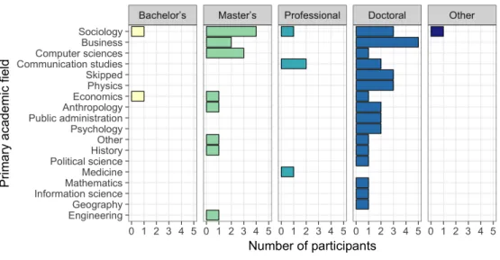
3. Potential Participant Identification ... 64
4. Design of the Questionnaire ... 70
C. Results ... 72
1. Education and Subject Matter Expertise ... 72
2. Evaluation of Network Measures ... 74
3. Testing for Variation in Subgroups... 77
D. Discussion ... 85
E. Conclusion ... 86
VI. Performance Studies ... 88
A. Research Questions ... 88
B. Study Design ... 89
1. Study Manipulations ... 89
2. Study Parameters ... 92
3. Survey Instrument ... 95
VII. Design Conditions: How Context and Design Influence Novice Interpretation ... 105
A. Hypotheses... 105 B. Methods ... 105 1. Participant Recruitment ... 105 2. Pilot Testing ... 106 3. Final Deployment ... 107 4. Data Analysis ... 108 C. Results ... 115
1. Modeling Log Absolute Error ... 115
2. Modeling Node Rank ... 149
VIII. Layout Conditions: How Novice and Expert Performance Varies in Relation to
Different Layout Algorithms ... 178
A. Hypotheses... 178 B. Methods ... 179 1. Participant Recruitment ... 179 2. Pilot Testing ... 184 3. Final Deployment ... 184 C. Results ... 186
1. Modeling Log Absolute Error ... 186
2. Modeling Node Rank ... 211
3. Modeling Percentage ... 218
D. Discussion of Layout Results ... 223
IX. Conclusions ... 228 A. Recommendations ... 228 B. Major Challenges ... 229 C. Future Work ... 232 X. References ... 234 XI. Glossary... 245 XII. Appendices ... 247
A. Instrument for Opinion Survey ... 247
B. Instrument for Performance Studies ... 256
1. Training Block ... 256
2. Experimental Question phrasing... 264
3. All Visualizations ... 265
4. Demographics ... 266
C. Recruitment Text for Performance Studies ... 268
1. Amazon Mechanical Turk Recruitment ... 268
2. Student Recruitment ... 268
3. IUNI Affiliate/CNS PhD Student Recruitment ... 272 XIII. CV
II.
I
NTRODUCTIONInformation visualization as a practice is becoming increasingly global, being conducted by and distributed to increasingly diverse stakeholder groups. Visualizations are being viewed in casual contexts and for a variety of purposes (Harrison, Yang, Franconeri, & Chang, 2014; Sprague & Tory, 2012). The use of network visualizations has likewise increased in recent years, as is suggested by their appearance in everything from general software applications (e.g.,
Google Fusion Tables (Google Help Center, 2015)) to mainstream social media (e.g., Facebook network visualization applications like Friend Wheel (Fletcher, 2007) and Netvizz (Rieder, 2015)). Network visualizations have properties that are applicable to many datasets of interest, ranging from academic journal and patent citations to molecular interactions to the movement of refugees across national borders.
Unlike charts based on numerical or categorical axes, node-link diagrams operate under a set of rules that are largely unexplained to the users of the diagrams. For example, while node-link diagrams do share with other types of charts the ability to encode variables using size, shape, color, texture, etc., there is no stable reference system across node-link diagrams. The layout of the diagram can be rotated without distorting the visualization, though the resulting diagrams may look very different. Furthermore, the absolute positions of the elements are less important than the relative distances between them, which are typically calculated based on link
occurrences and weights – both of which may be removed from the final visualization. Simplification from the multidimensional space of edge weights to a two-dimensional (or perhaps three-dimensional) space can be accomplished using many different techniques and can yield very different visualizations for the same dataset. Moreover, a complete catalog of the
conventions employed by the typical node-link diagram does not exist, and the logic behind the diagram is not included in typical primary or secondary school curricula.
Users of any information visualization form may engage in a variety of tasks, including both low-level tasks like data foraging and high-level tasks like problem solving and composing (Card, Mackinlay, & Shneiderman, 1999), but the success of user interactions with visualizations is dependent on a variety of factors. Research on the skills required to interpret network
visualizations and the prevalence of those skills is still in its early phases. Small-scale studies of these or related visualizations have investigated the specific structural properties of network data (Novick & Hurley, 2001), the graph design aesthetics that are most likely to improve
performance on quantitative interpretation tasks (Bennett, Ryall, Spalteholz, & Gooch, 2007), or metaphoric devices of the diagrams (Fabrikant, Montello, Ruocco, & Middleton, 2004).
Typical evaluations of network visualizations, however, are often designed to evaluate a limited set of visualization properties with a homogeneous user sample. With the broadening of the audiences for visualizations and the dissemination of more sophisticated visualization types, a detailed examination of the typical skills of a novice viewer of network visualizations is crucial to the development of appropriate and successful visualizations.
There is thus a gap in the information visualization literature that complicates our attempts to understand and predict how users from various backgrounds and levels of
visualization expertise will react to network visualizations – in particular, the commonly used node-link diagram that represents networks as nodes and links and determines position based on presence and weight of edges. The proposed study of network visualization interpretation will attempt to fill this gap by studying both novices and experts in network science and by collecting quantitative data about the participants’ interpretations and recognitions of network
visualizations. The empirical results will guide future studies of specific interpretation strategies, design strategies, and instruction strategies by providing designers and visualizers with a better sense of the extent of abilities in potential audience communities and the types of visualization design choices that improve or detract from performance on various interpretation tasks.
III.
L
ITERATURER
EVIEWThis literature review will address the major theoretical and methodological concerns surrounding the interpretation of graphics – specifically network visualizations. Interpretation is being used here as an umbrella term to encompass various strategies and processes employed by the user while interacting with and making sense of visualizations. (See the Glossary section for additional term definitions.) The ability to read and understand different graphical forms is not only an important component of literacy in general but is also of particular interest to the
producers of graphics, including members of the information visualization research community. Social scientists in a variety of fields have addressed aspects of this research
problem. This review will organize and synthesize relevant literature using the following conceptual divisions: literature that focuses on network data and visualizations; literature that focuses on tasks employed in visualization interpretation; and literature that focuses on the visualization user and his/her skills and traits.
A.
Visualizing Network Data
Networks are used in a variety of fields to represent data that are comprised of nodes (entities) and edges (relationships between those entities). Networks can identify both the global structure of interactions between entities and the pathways across which processes can occur. Networks may reveal entities that serve as a “hub” or center of a cluster, as well as entities that serve as a “broker” or gatekeeper, tying two largely unconnected clusters together. Users may employ network visualizations to assess the connectedness of a relational dataset, identify the “backbone” pipelines through a network, or pinpoint the key agents within the structure.
The data sets that comprise networks are, in essence, simple lists of nodes and edges (though each can also have attributes, and the data can also undergo further processing). Edges can have no direction (as when edges represent an associational relationship between nodes), or they can have directionality (where the relationship only exists in one direction – unidirectional – or where there is a reciprocal relationship – bidirectional). Network data in general can be composed of edges or links between any two nodes; that is, in the most general form, there are no constraints placed on the number or types of edges that can be created in a network data set. This can be contrasted with hierarchical (tree) data sets, which are also composed of nodes and edges but which have special data constraints (i.e., edges are directed and acyclic, there is a single root node with no parents, and no node has more than one parent). As another example of constraints placed on the data set itself, a particular data set may be bipartite (having exactly two sets of nodes and allowing only links between those two sets). This is a special case of the general form of networks, however, and the constraints are neither inherent to all networks nor common enough to have been formally encoded into a particular network visualization type.
There are many ways of generating data that can be visualized as a network. In one process, a series of items (e.g., documents) are connected to each other by direct relationship (e.g., one document cites another, one person emails another person); in another, they might be connected to each other by similarity (e.g., two documents use language in a similar way). In the former case, the presence of an edge is an indication that the relationship of interest exists, and an optional edge weight determines the extent or intensity of the relationship. In the latter case, however, the determination of similarity between elements can be a complicated process
For example, if two documents are being evaluated for similarity in terms of the language used in the documents, each document may become a row vector in a document-term matrix. Each term that appears in either document becomes a column in the matrix, and the number of times a document uses the term becomes the value for cell at the intersection of the document and term vectors. To use this type of matrix to generate a network visualization, the many-dimensional vectors must be compared and converted to a single similarity score that will become the weight of an edge between the two documents. Determining the similarity between these two documents then becomes a dimensionality reduction problem – namely, reducing thousands of candidate measures of similarity to a single similarity score. This calculation of edge weights in network datasets is outside the scope of this review.
2. NETWORK ANALYSIS
As with any data structure, many operations can be performed on network data. At the lowest level, there are simple mathematical and statistical operations (e.g., counts, distributions) that can be applied to the nodes, the edges, or the attributes of both; these are the same operations that can be applied to any categorical or numerical data. There are additional operations,
however, that have been developed to analyze the structure of network data, ranging from descriptive statistics that take into account the attachment of edges to nodes (e.g., degree
distributions) to structural or topological analyses that attempt to identify relevant properties of nodes or sets of nodes (e.g., betweenness centralities). Increasingly, clustering algorithms are applied to network data to detect patterns or reduce complexity in the data, and the clustering assignments that are generated by these algorithms can be added as node properties and incorporated into the visualization. Most commonly, network data sets are summarized by the total number of nodes, the total number of edges, the diameter (length of the longest path), the
density (the number of edges over the total number possible), and the global clustering coefficient (Watts & Strogatz, 1998).
3. NETWORK VISUALIZATIONS
Network data can be generated and analyzed without being visualized, but the
visualizations are often compelling and more easily understood than numbers that summarize network properties. The simplest representation is an adjacency list, where each node is itemized and followed by a list of all of the other nodes with which that node shares a link (its neighbors). Large networks are more likely to be visualized as matrices or node-link diagrams and can be displayed using one or more of several organizing principles.
A matrix visualization (Figure 1) is a tabular visualization where a node is represented by either a row or a column (or both) and a link is represented by a numerical value placed in the cell where a node row and a node column intersect. For example, in a matrix visualization of a co-authorship network, a two-dimensional table is created where the same author names appear in the row and column headers. Numerical values representing the co-authorship activity of two authors will appear in the cell where the row of the first author and the column of the second intersect (as well as in the cell where the row of the second author and the column of the first intersect). For a bipartite network data set, the nodes in the rows will be disjoint from the nodes in the columns. Columns and rows can be ordered to group similar authors or to highlight visible patterns in the data values (Eliassi-Rad & Henderson, 2010).
In contrast, node-link diagrams represent each author as a single point (some graphical icon or symbol), and the presence of a link is visualized by the addition of a line or curved edge between the nodes (Figure 2). These components are often laid out such that smaller distances between nodes represent higher similarity (Figure 3), but nodes can also be arranged in a circular layout, perhaps in order of a certain property (e.g., degree), or against a separate reference system like a geospatial map or a science map.
As previously mentioned, a tree or a hierarchy is a special case of a network where certain conditions hold for the nodes and relationships. Trees have several informationally equivalent visualization forms, but they are most commonly visualized either using special types of node-link diagrams (e.g., dendrograms) or using geometric shapes that are contained within each other to indicate the hierarchical relationships (e.g., treemaps).
4. NODE-LINK DIAGRAM1PROPERTIES
Node-link diagrams are constructed by computational algorithms following specific rules for converting complex relational data into a two- (or sometimes three-) dimensional figure. When developing a visualization that represents network data, it is common to desire a layout that place nodes that are highly similar to each other much closer together than nodes that are dissimilar to each other. This activates Gestalt laws of proximity (Healey & Enns, 2012) and has been found to be very powerful in reading and interpreting network visualizations (Fabrikant et al., 2004). Take, for example, three nodes all connected to each other with weighted edges. The placement of those nodes should be governed by an algorithm that finds the weights of the edges that connect those nodes and translates those weights (or some multiple of the inverse of the weights) into the distance between the nodes. That way, the higher the weight is, the closer the nodes get.
The conversion of the weighted edges between the nodes to a two-dimensional
visualization, however, is another dimensionality reduction problem. With three nodes that are all interconnected, it is easy enough for an algorithm to find an appropriate triangle to represent
the relationships between all three of the nodes. But once a fourth node is introduced, the weighted edges between the fourth node and the existing three nodes may conflict with the existing arrangement. For example, two nodes that were very far apart in the original arrangement may both be strongly connected to the new fourth node. Thus, the conflicting weights between the various edges in a network represent a complex mathematical problem that can be addressed either in the data processing phase or in the layout phase of network
visualization development (Börner, Chen, & Boyack, 2003).
a) COMPUTING LAYOUT
Various ways have been devised to compute node positions and edge aesthetics for the visualization of network data as node-link diagrams. Dimensionality reduction techniques – mentioned above as a way to compute similarity between rows in a node attribute matrix – can also be used to reduce the complexity of the multi-dimensional space created by the edge
weights of a network dataset. There are also separate graph-specific layout algorithms that iterate through node locations and try to optimize layouts based on presence and weight of edges or other graph aesthetic principles.
(1) DIMENSIONALITY REDUCTION
Dimensionality reduction can be used to detect important features within a high dimensional space and condense that information either into a single similarity score between every two nodes (producing a new network can then be subjected to other network layout algorithms) or directly into a two-dimensional projection of the high dimensional space. Dimensionality reduction can be applied either to representations of the network that contain only edge information or to matrices that include node attributes, with or without edge
Dimensionality reduction algorithms are often classified as either linear (e.g., Principle Components Analysis, Least Squares Mapping), or nonlinear (e.g., Multidimensional Scaling, Triangulation, K-Nearest Neighbors) (Siedlecki, Siedlecka, & Sklansky, 1988). These may be further distinguished by properties of the algorithm, such as whether the algorithm is
discriminance based or topology preserving (König, 1998). What is common in these techniques is that the focus is on the preservation of as much of the original information as possible, or on the “accuracy” of the layout (though these algorithms can be optimized for certain types of topological information). These techniques in their native forms do not typically take into account whether the resulting layout includes overlapping nodes and edges, uneven node distributions, unequal edge lengths, lack of symmetry, etc. Because these algorithms can be employed on note attribute matrices directly to create a two-dimensional spatialization of node positions, the resulting layouts may forego edge representations entirely, showing just the nodes in a method similar to a scatterplot.
(2) NETWORK-SPECIFIC LAYOUTS
Layouts that have been developed specifically for the layout of network data into node-link diagrams can be deterministic (based on a node or edge attribute, like listing nodes
alphabetically) or non-deterministic (placing nodes according to similarity and aesthetics, attempting to optimize for certain visualization properties). Among non-deterministic layouts, the primary goal is to place nodes with similar connections near each other. This is the
embodiment of the distance-similarity metaphor (Fabrikant et al., 2004). That overarching goal, however, leaves many open questions about what else can promote or inhibit appropriate
visualization interpretation. Layout algorithms have thus been developed to optimize for one or more of a series of graph aesthetic principles (Bennett et al., 2007), including:
• Global and local symmetry
• Non-overlapping nodes
• Minimized edge crossings
• Edges of equal length
• Evenly spaced nodes
• Visual representation or emphasis of clusters (e.g., intra-cluster edges are shortened, inter-cluster edges are lengthened)
• Space-filling algorithms
• Node area awareness
Consideration of task plays a role in the selection of an appropriate layout algorithm. The different graph aesthetic principles vary in terms of the types of tasks they are best suited for. Recent evaluations of graph aesthetics and layout algorithms have been criticized for failing to take into account real-world tasks when conducting the evaluations (Gibson, Faith, & Vickers, 2013).
b) LOGICAL PROPERTIES OF NODE-LINK DIAGRAMS
Typical layout algorithms for node-link diagrams exhibit certain logical2 properties. These are properties of the visualization type that are true regardless of the network dataset being visualized. Because the computation of node and edge positions takes into account only relative information between nodes, the node positions have no natural reference system. Nodes can be rotated or reflected in space without introducing (mathematical) distortion into the visualization.
2 Here, logical properties are defined in contrast to structural or topology-based properties, which include
On the other hand, studies of other visualization types – for example, pie charts (Ziemkiewicz & Kosara, 2010) – has shown that users can attach different meaning to a visualization depending on the location and orientation of certain visualization elements.
Other logical properties of node-link diagrams include the distance-similarity metaphor and the primacy of node position over edge representation (insofar as edges may be selectively removed or bundled to reduce visual complexity).
5. COMPARISONS BETWEEN NODE-LINK AND OTHER VISUALIZATIONS
When a single data set can be represented in multiple ways, those representations are considered informationally equivalent (Larkin & Simon, 1987), though the equivalence of the information content displayed does not preclude different affordances within the representations. Because of these different affordances, informationally equivalent visualizations can still vary in how well suited to a particular data set or visualization task they are.
A series of studies by Novick and colleagues focusing on node-link diagrams, matrices, and hierarchical (tree) visualizations (Novick, 2000, 2006; Novick, Hurley, & Francis, 1999) has identified a series a basic structural properties of these visualization types that may be
differentially useful for various network-based data sets and analysis tasks. The evolved list of structural properties (Novick, 2006) is as follows:
1. Global structure: each visualization type has a global form or structure that distinguishes it from the other visualization types.
2. Building block: the essential component of each visualization type also distinguishes the visualization types from each other.
3. Number of sets: each visualization type is optimally suited for a certain number of sets of data points.
can be created between the items is another distinguishing property of the visualization types. 5. Item distinguishability: each visualization type is differentially suited to distinguishing between
items, particularly by imposing an inherent order on items.
6. Link type: each visualization type is differentially suited for displaying particular link types (associative/undirected, unidirectional, and/or bidirectional).
7. Absence of a relation: each visualization type is differentially suited for displaying the absence of a relation.
8. Linking relations: each visualization type is optimally suited for data sets where there are particular relations between incoming and outgoing links for each node; more specifically, this property distinguishes between diagrams optimized for general network data sets and those optimized for hierarchical data sets with internal constraints about the numbers of parent and child nodes each node can have.
9. Path: each visualization type is differentially suited for display a chain of links, or a path through three or more nodes.
10. Traversal: each visualization type is optimally suited for data sets where there are particular rules about the types of paths that are possible; more specifically, this distinguishes between network data sets, where any path is possible, and hierarchical data sets, where cycles or closed loops are forbidden.
Each structural property can thus be used to match a visualization type with a particular data set or task. This work occasionally conflates the visualization type with the data type, however, and generally fails to distinguish between network data and hierarchical data. That is, hierarchical visualizations are not informationally equivalent to network visualizations because network data cannot be represented by a hierarchical visualization type. The type of data alone may thus be enough to determine the appropriateness of one of these visualization types, rather
than specific properties of a particular data set or the analysis task that needs to be optimized by the visualization type. After removing the properties focused specifically on differentiating network and hierarchical data (5, 8, 10), there remain seven properties that can be used to match a particular network visualization type with a data set and an analysis task.
The Novick et al. studies build on the notion of informational equivalence and test the match between diagram properties and data set/analysis task scenarios. One example of a hypothesized relationship between the structural properties of network visualizations and a particular type of data set is the hypothesis that matrix visualizations are best matched with data that contain associative links, as opposed to directional. For any data set with directional links, it is expected that the use of the matrix visualizations would reduce performance on data analysis tasks. Likewise, if a data set has no inherent constraints on what items can be linked, then a node-link diagram should be a good match. Other properties are more helpful at matching a visualization type to particular analysis tasks, which will be covered in more depth in a later section. Table 1 shows the compiled results of several studies, focusing on the two visualization types and seven properties relevant to general network data.
Table 1. Structural properties of network visualizations, by type and diagnosticity. Bold text indicates high diagnosticity; light text indicates limited diagnosticity. (Novick, 2000, 2006)
Matrix Node-Link
Basic Structure of the Diagram
Global structure Tabular Lack of structure
Building block Cell Two linked nodes
Number of sets Two One
Item/link constraints Between sets (unclear)
No constraints Details about Items and Links in the Diagram
Link type Undirected Any type of
Absence of a relation Best Worst Potential for Movement of Information Through the Diagram
Path Not visible Visible
In the table above, black or dark gray cells indicate a stronger “applicability condition”, or a stronger relationship between the structural property and the diagram type. Light gray cells indicate limited support for applicability of that structural property to that diagram type (i.e., the applicability condition was found to be nondiagnostic of that diagram). The box with italic text had mixed results over the course of multiple studies that were difficult to summarize. The results justify the use of node-link diagrams for data sets with any type of link, where any node can connect to any other node and where the absence of a relation does not need to be
highlighted. The results also emphasize that global data properties like the number of sets are not inherently spatialized by node-link diagrams. An extension of this research may be to the exploration of the ability of users to transfer knowledge of diagrammatic structure from one node-link diagram to another; given the lack of a global structure for node-link diagrams, it is possible that this visualization type is harder to learn as an abstract form.
The Novick et al. studies focus on selecting the general type of visualization, based on certain qualities of the data and tasks. Other attributes of the data set that might constrain the selection of a visualization type are the size, density, clustering coefficient, and node property distributions of the network. Ghoniem, Fekete, and Castagliola (2005) undertook a comparison of matrices and node-link diagrams, varying the size and densities of the sample data sets. They found performance on all experimental tasks deteriorated for node-link diagrams as the size increased from 20 nodes to 50 nodes, and again between 50 nodes and 100 nodes. Increases in density between 0.2 and 0.6 had mixed effects on task performance; some tasks are much harder
with high-density graphs, but others show no significant drop in accuracy as density increases. H. C. Purchase, Cohen, and James (1997) found that an increase in density of node-link diagrams relates to a decrease in accuracy on tasks dealing with the connectivity of a network.
The match between a data set and a visualization type can be further optimized, however, by examining the affordances of different layout algorithms. For example, a data set in which nodes tend to form tight and distinct clusters could be visualized using a matrix that had been sorted to group the clustering nodes together (Fekete, 2009), thereby matching a structural property of the data to a strong visual encoding (proximity).
Node-link diagrams have an especially wide variety of layout algorithms that determine the position of nodes and the appearance or curvature of edges. The most common layout algorithms, especially for small medium-sized networks, are algorithms that draw from physical analogies likes springs and forces, pushing and pulling the nodes into placed based on the presence of edges and further optimizing the layout with other desirable aesthetic properties like symmetry or a minimum of edge crossings (Börner et al., 2003; Brandes, 2001). As with the differences between the broader visualization types, differences between node-link layout algorithms may offer better representations of certain features of different data sets (e.g., large vs. small networks, high density vs. low density networks). For example, Ghoniem et al. (2005) found that matrix representations outperform node-link diagrams over medium-sized networks (50 to 100 nodes) for a variety of network readability tasks, especially as density increased.
6. DATA CONCRETENESS
Beyond the selective use of visualization types and layout algorithms to best present a particular data set, other graphical features of the visualization can improve use of the display. The use of text in conjunction with graphics, for example, is a common practice and is often the
subject of research on cognitive load (see previous section). Consistent with prior research on multimodality and cognitive load, Wiedenbeck (1999) found that a combination of icons and text outperformed both the icon-only and the text-only conditions for novice users of an application interface.
By contrast, however, Koutstaal et al. (2003) found that, as adults age, they become more likely to falsely recognize an abstract graphic when it is labeled than when it is left unlabeled. The theory advanced, called the semantic categorization account, suggests that in these cases “semantic category information truncates, precludes, or preempts further item-specific processing, even though the initial categorization is quite straightforward and effortless”
(Koutstaal et al., 2003, p. 500). In other words, for certain user groups, adding label information to an abstract graphic may complicate visual recognition at a later time because the semantic content presented with the visualization will preempt processing of the visualization’s spatial organization. Put another way, “[t]he graph reader’s situational knowledge may interrupt her work on the cognitive, information-processing tasks performed in interpreting the graph” (Friel, Curcio, & Bright, 2001, p. 140).
The implication of this finding is that cognitive load theory may have a complicated relationship with the concreteness of either the graphic or the accompanying text. Adding concrete graphics or metaphors to an abstract concept is often expected to improve performance because it will activate a mental model and allow for transfer of previously learned interaction techniques. For example, Rieber and Noah (2008) conducted a study to measure learning through use of an interactive tutorial on the relationship between acceleration and velocity. Within the study, the participants saw a simulation of an animated ball whose acceleration needed to be controlled by the participant. Half of the participants received an additional
instruction, however, that directed them to think of the ball as rolling around on a table that could be tilted to control the movement of the ball. The visual metaphor used to frame the data was related to increased success of the participants and “became an important ‘anchor’ when trying to articulate the motion of the ball” (ibid, p. 87).
The presence of concrete stimuli, according to dual coding theory (Kounios & Holcomb, 1994; Paivio, 1971), activates both imaginal and verbal systems, whereas abstract stimuli are processed by a single system. The implication of this is that concrete stimuli are processed more easily, showing improvements in “recall, lexical decision, sentence comprehension, and sentence verification” (Kounios & Holcomb, 1994, p. 804). Clark, AbuSabha, Eye, and Achterberg (1999) developed brochures with increasingly concrete images and text and measured the retention of information by study participants. Participants in the condition with both concrete images and concrete text did show improved recall, but only on the immediate post-test. The effect was not significant after a 30-day delay.
Another series of studies compares concreteness to perceived credibility. Al-Balushi (2011) tested participants’ evaluations of the trustworthiness (or credibility) of various scientific models. The credibility of the model was found to be negatively related to the abstractness; as the models became more abstract, the participants reported lower credibility. Credibility ratings were also negatively related to the age of the participants. In a follow-up study, Al-Balushi (2013) associated these trust ratings to common tests of visual-spatial and visual-object skills. Individuals with high scores on the visual-object test rated scientific models as less credible, and the reverse was true for those with high scores on the visual-spatial test. “Based on the findings, it might be plausible to conclude that as the abstraction level for scientific models increases, such as for theoretical models which lack defined structure and known details, imaginative learners’
difficulty to construct colorful and detailed mental images for natural entities and phenomena increases” (Al-Balushi, 2013, p. 707). It is not yet clear what the relationship between this skepticism and analytic performance might be, but as perceived plausibility or “reasonableness” of the data (Friel et al., 2001, p. 140) is expected to interact with performance for statistical analysis, a lack of trust in the data source is likely to inhibit visualization analysis tasks.
B.
Visualization Interpretation Tasks
Empirical research on the interpretation of visualizations is increasing as the field
matures, though many studies that address interpretation do so under the auspices of evaluation. Visualization evaluation, or the validation of the design of a visualization based on some
empirical or heuristic study, often focuses on changes that could be made to the design of a visualization to improve the performance of the visualization in one or more areas (e.g., system responsiveness, human readability). When evaluation studies seek to validate the readability of a visualization, they attempt measure how well a user can read or interpret the visualization.
How evaluation studies measure user performance is the subject of a workshop entitled “BEyond time and errors: novel evaLuation methods for Information Visualization (BELIV),” which is held every two years at the annual IEEE VIS conference. An early focus on
quantitative measures of visualization interpretation, inspired by psychological aptitude studies and framed as evaluations of visualizations, is beginning to broaden to a more nuanced
understanding of how users interact with static and interactive visualizations. Recent reviews have quantified the nature of visualization evaluation and how commonly different types of evaluation techniques are employed in the field.
used in the field. The review identifies seven “scenarios” of visualization evaluation (Table 2), grouped by those that focus on “understanding data analysis” (typically a focus on the user, goal, or context) and those that focus on “understanding visualizations” (typically a focus on how changes in the design of a visualization influence user performance or experience). The
evaluation approaches uncovered in the information visualization literature are heavily weighted toward those used in work environments or by users whose goals are to conduct a work-related task (data analysis or learning).
Table 2. Seven scenarios of visualization evaluations (Lam et al., 2012). Understanding data analysis:
1. Understanding environments and work practices (UWP)
2. Evaluating visual data analysis and reasoning (VDAR) 3. Evaluating communication through visualization (CTV) 4. Evaluating collaborative data analysis (CDA)
Understanding visualizations:
5. Evaluating user performance (UP) 6. Evaluating user experience (UE)
7. Evaluating visualization algorithms (VA)
The visualization scenarios from Lam et al. (2012) that most closely address research questions about visualization interpretation come from each of the higher-level categories – evaluating users and context and evaluating visualizations. From the former category, scenario number 3 (“evaluating communication through visualization (CTV)”) covers studies that attempt to describe or validate the success of visualizations that are meant to support learning or that operate as casual information displays. This scenario is relevant because its focus is both on visualizations that are not expected to be used for intensive data exploration or analysis and also because it explicitly addresses casual information visualization contexts. The review finds that studies under this scenario often use controlled experiments to test learning outcomes, as well as
The second scenario of interest, from the category of scenarios that focuses on
visualizations themselves, is scenario number 5 (“evaluating user performance (UP)”). In these studies, visualization designs are varied and evaluated using objective user performance metrics to identify the design that yields the highest performance. These studies are largely conducted with controlled experiments, not unlike the previously mentioned studies that use learning outcomes in an experimental setting to evaluate communicative visualizations. Less commonly, these studies can also study logs from interactive visualization systems to identify user
performance metrics in a way that increases ecological validity.
Controlled experiments are commonly used for each of these scenarios. The identification of the performance tasks for such studies, however, is still in flux in the information visualization community; there are pressures to move away from measuring response time and errors (Bertini, Plaisant, & Santucci, 2007). Even identifying tasks that can be completed accurately and that are relevant for the visualization type and users in question is far from trivial.
1. TASKS TAXONOMIES FOR EVALUATION OF INFORMATION VISUALIZATIONS
The selection of tasks for visualization evaluation or interpretation studies can be highly specific to the type of visualization and the data domain or application area. Recent literacy studies (Boy, Rensink, Bertini, & Fekete, 2014) have begun to test user performance on generic chart types, but these studies have confirmed the difficulty of designing generalizable
visualization literacy tasks. This review will explore both broad task taxonomies that summarize common uses of visualizations and specific tasks developed for evaluating network
visualizations.
Task taxonomies are used in visualization evaluation to measure the ability of the visualization to facilitate a user’s (or designer’s) desired tasks. One of the most comprehensive
collections of potential (high-level) interaction tasks comes from Card et al. (1999). The “knowledge crystallization task model” (Table 3) is a model specifically designed to describe information seeking behavior that utilizes a visual interface; the model is thus well suited to organize interactions with graphics. The model highlights the importance of an individual’s goals and task environment when attempting to interpret a visualization. “Knowledge crystallization involves getting insight about data relative to some task” (ibid, p. 11).
Table 3. Knowledge crystallization task model (Card et al., 1999).
Forage for data Search for schema Instantiate schema Problem-solve Author, decide, or act • Overview • Zoom • Filter • Details-on-demand • Browse • Search query • Reorder • Cluster • Average • Promote • Detect pattern • Abstract
• Instantiate • Read fact
• Read comparison • Read pattern • Manipulate • Create • Delete • Extract • Compose
The model is itself spatialized such that the five categories of task are arranged both as a cyclical process and as having linked relations to several of the other tasks. Note that the three reading subtasks under “problem-solve” are derived from Bertin’s (2010) map reading levels, adding specificity to the types of tasks that could be evaluated for a given visualizations. This high level of task analysis includes references to the context to the graphic reading process, such as the possible outcome of decision-making.
The evaluative power of this model, however, lies primarily with the later phases of knowledge crystallization. The Information Visualization design process attempts to incorporate understandings of the early phases of visual search, feature detection, and schema instantiation, but evaluation of visualization systems are seldom able (or motivated) to capture processes at these levels beyond testing the usability of foraging functions. Instead, the success of a
visualization is often measured by the efficiency/accuracy of users undertaking later stages of the knowledge crystallization model. (Note, however, that for users with limited experience with the data being visualized as well as the form of the visualization, even the starting “task” bubble may be a mystery.)
The knowledge crystallization model has considerable overlap with the Börner (2015) model of basic task types: categorize/cluster, order/rank/sort, distributions (also outliers, gaps), comparisons, trends (process and time), geospatial, compositions (also of text),
correlations/relationships. Börner’s tasks (also referred to as “insight needs”) are compiled from many task taxonomies and tools and cover several levels of the knowledge crystallization model. For example, ordering and ranking falls under the “search for schema” level of Table 3, while analyzing trends might extend all the way to the “problem-solve” level. In other ways, Börner’s taxonomy breaks from the knowledge crystallization model, in that Börner’s model is less a model of an information-seeking process than a model of the different charts that might be employed for different general tasks. In the tradition of other “chart chooser” taxonomies, Börner presents these tasks as basic insight needs (or analysis objectives) that can be supported by certain types of visualizations. While also useful as a compilation of high-level analysis tasks, it covers slightly different ground from the knowledge crystallization model, and it is less detailed.
As comprehensive as the knowledge crystallization model is, however, there is room for expansion within some task categories and, even, some subtasks. Hornbæk and Hertzum (2011), for example, conducted a meta-analysis of the use of the term “overview” in information
visualization and identified five major task categories: monitoring, navigating, exploring, understanding, and planning. While “understanding” and “planning” may be broad enough to constitute a different level of analysis from “overview” (or perhaps could be reclassified as
“problem-solving” in this model), distinctions between monitoring, navigating, and exploring may well improve upon the knowledge crystallization task model for the purposes of studying visualization interpretation. Navigating, again, is thought to be a relatively independent visual skill from visual-object and visual-spatial skills like vividness and rotation (Newcombe, Uttal, & Sauter, 2013), and the tacit suggestion that a user navigates to an end goal (as opposed to open-ended “exploring”) suggests that it belongs under “problem-solving” instead of under “foraging.”
The area of search tasks is another where many taxonomies compete. Rasmussen (1995) adapts a library model of information retrieval search tasks to the field of GIS and comes up with five types of search: formal attribute search (for a known item or area), analytical search (a problem-solving strategy), search by analogy (building on prior experience), empirical strategy (expert search using shortcuts), and browsing strategy (to meet an ambiguous information need). The knowledge crystallization model takes account of browsing, formal search, and
schematization, but making the relationship between the various search types more explicit and connecting them to use of shortcuts and other problem-solving strategies could strengthen the model.
A taxonomy of purposes for Geographic Information Systems (GIS) extends the model in another direction. The Geography Education Standards Project (Bednarz et al., 1994) lists three major tasks for GIS: inventory and/or monitoring, spatial analysis, and modeling (p.256). The ability to extend analysis of spatialized data to make predictions is not captured by the
knowledge crystallization model but could easily be added to the final task category. Table 4 below summarizes the extended model.
Table 4. Extended knowledge crystallization task model. Forage for data Search for schema
(search by analogy, empirical strategy)
Instantiate schema Problem-solve Author, decide, or act • Overview • Monitor • Explore • Zoom • Filter • Details-on-demand • Browse (browsing strategy) • Search query (formal attribute search) • Reorder • Cluster • Average • Promote • Detect pattern • Abstract
• Instantiate • Read fact
• Read comparison • Read pattern • Manipulate • Create • Delete • Understand • Plan • Navigate • Analytical search • Extract • Compose • Predict
Each of these high-level task categories are, in fact, the result of combinations of lower level component tasks than can themselves be used as the focus of evaluations. Downs and DeSouza (2006) attempt an exhaustive list of component tasks of spatial thinking, including encoding processes, relational operations, spatial transformations, and functional inferences (Table 5), all of which can be used in the comprehension of the world itself or of spatial representations (diagrammatic or mental). The component tasks are ordered by increasing difficulty. Because Downs and DeSouza (2006) do not differentiate between visual-object and visual-spatial abilities, a proposed association between each item to one (or both) of those categories is also included in Table 5.
This typology includes items (e.g., distinguishing figures from ground, mental rotation) that are so fundamental to visual abilities that they are used to measure either visual-object or visual-spatial abilities and to validate the associated cognitive style dimension. The component tasks and processes listed in Table 5 are easily related to both observable cognitive processes and
Table 5. Component tasks and processes of spatial thinking, coded for relationship to object and spatial abilities.
Component Tasks Processes Object vs. Spatial
encoding processes distinguishing figures from ground object recognizing patterns, both outline shapes and
internal configurations
object, spatial
evaluating size spatial
discerning texture object
recognizing color object
determining other attributes object, spatial
relational operations determining orientation spatial
determining location spatial
assessing distance spatial
comparing size object
comparing color object
comparing shape object
comparing texture object
comparing location spatial
comparing direction spatial
comparing other attributes object, spatial spatial transformations changing perspective (reference frame) spatial
changing orientation (mental rotation) spatial
transforming shapes object
changing size object
moving wholes spatial
reconfiguring parts object, spatial
zooming in or out object
enacting navigating?
panning object
specific graphic forms and problem areas, rendering them a logical bridge between what is known about human capabilities and the larger patterns of behavior connected to graphics. They help to concretize discussions of both cognitive processes and user interactions with spatial representations (diagrammatic or mental).
Important component tasks may be lacking from the above typology, however. Larkin and Simon (1987) claim that individuals and computers alike can run programs over
representations (sentential or diagrammatic) and that these programs utilize search, recognition, and inference operations. The authors’ formulation of “search” for diagrams is a very localized process of selection, testing structures within the diagram for the satisfaction of certain
conditions. “Recognition”, in this context, is less a process of object identification than it is a process of discovery, of finding distinctive properties of the data based on qualities of the representation. An example the authors give is the recognition of local maxima in a data set, which is likely to be greatly facilitated by diagrammatic representation over sentential
representation. “Inference operations” refers to the detection of meaningful visual patterns that can be done by experts; this program type thus connects tasks to the functional knowledge experts are known to have about a domain-specific visualization as discussed in the previous section. Furthermore, functional understanding of diagrams is thought to relate to visual-spatial skills (Blazhenkova & Kozhevnikov, 2009).
Larkin and Simon’s formulation thus includes search (or selecting elements that meet desired conditions) as a fundamental process of interacting with spatialized representations. There is evidence that considerable selection from visual stimuli happens pre-attentively, including types of selection that make use of learned constructs (Arnheim, 1969; Dake, 2007; MacEachren, 2004; Santas & Eaker, 2009). MacEachren’s feature identification model (2004) uses as its foundation the premise that humans make sense of the world by “matching present situations against a collection of patterns (or schemata) representing past experience and ‘knowledge’” (p. 362). Selection can also be active, of course, and it can operate at different levels of task composition, as discussed previously.
While the process typology makes reference to the use of mental representations by outlining the processes that encode phenomena into a representation, other researchers have made more explicit reference to mental representations when discussing visual processing. Mayer and Moreno (2003), for example, note the effects of maintaining or holding mental representations in working memory on cognitive load in multimedia learning environments.
Likewise, Blazhenkova and Kozhevnikov (2010) employ a theory of mental imagery that, while similar to the process typology in the inclusion of generation, inspection, and transformation (of mental imagery) processes, also includes maintenance as a component of visual processing. “Maintenance of a representation” may have been neglected in the typology for reasons similar to those that may have motivation the exclusion of “selection”; both are fundamental to visual processing, but both are also more likely to be seen as automatic and immutable. On the contrary, studies have found that not only do individuals vary in their abilities to perform these processes, but the processes can also be enacted using variable amounts of attention and control (Blazhenkova & Kozhevnikov, 2010; Mayer & Moreno, 2003).
Another potential gap in the spatial thinking typology involves the coverage of object processes. Blazhenkova’s (2010) study of the qualitative differences between visual-object and visual-spatial processing highlights at least one area of sparseness in the process typology: object transformations. In addition to zooming and panning, which were assigned to the visual-object dimension because object visualizers were found to have greater abilities for controlled inspection of their representations, the study ascribed to object visualizers the transformations of pictorial visual properties (e.g., vividness, shape, color).
Sendova and Grkovska (2005) have identified several components of abstract art that are relevant for comprehension, including character and composition of objects (i.e., clustering, overlapping, isolation, balance, relationship between size, shape and color), main categories of objects, hierarchies of visual objects (i.e., using component objects to build compound objects, and so forth up through a hierarchy), and functional associations (e.g., objects occurring in combination). In order to properly include visual-object processes in our process typology, the interpretation of these visual components that is done by visual-object experts needs to be
decomposed into the specific visual processes that are employed. Because the focus of the original process typology was on spatial thinking, the typology is likely to have overlooked several relevant visual-object processes. For now, it is important to note that “functional inference operations” likely has a visual-object corollary that could be called “compositional inference operations.”
As described in the knowledge crystallization model, these component tasks, undertaken at various levels of analysis, can then be combined in relation to a user’s goal to undertake a high-level task. A final, composite taxonomy for both task component processes and goal-oriented tasks (Table 6) covers the broad catalog of possibilities for user interaction with graphics.
For each item in the above typology, the process is described without reference to the subject of the process – the level of analysis, by another light. Bertin’s (2010) map reading levels suggest that operations performed on graphics can have as their subject either individual elements of the graphic, groups of elements, or the graphic as a whole. In terms of network diagrams, this means that various graphic interpretation tasks can be applied to individual nodes and links, small groups of nodes and links, or the full network.
2. TASKS FOR PERFORMANCE ASSESSMENTS OF NETWORK DIAGRAMS
The previous section summarized the use of task taxonomies to describe human behavior when using and interpreting visualizations. Recent abstract task taxonomies have undertaken the difficult work of condensing user-visualization interactions into generic models of visualization use (Brehmer & Munzner, 2013; Lee, Plaisant, Parr, Fekete, & Henry, 2006; Pretorius, Purchase, & Stasko, 2014). Brehmer and Munzner (2013) create a comprehensive generic typology that encompasses the “why”, “how”, and “what” of visualization interaction. Other taxonomies
Table 6. Extended component tasks and processes of spatial thinking, coded for relationship to object and spatial abilities.
Component Tasks Processes Object vs. Spatial
encoding processes distinguishing figures from ground object recognizing patterns, both outline shapes
and internal configurations
object, spatial
evaluating size spatial
discerning texture object
recognizing color object
determining other attributes object, spatial maintaining mental representations in
working memory
object relational operations determining orientation spatial
determining location spatial
assessing distance spatial
comparing size object
comparing color object
comparing shape object
comparing texture object
comparing location, composition object, spatial
comparing direction spatial
comparing other attributes object, spatial recognizing distinctive properties object, spatial making expert inferences object, spatial spatial transformations changing perspective (reference frame) spatial
changing orientation (mental rotation) spatial transforming shapes, sizes, colors, etc. object
moving wholes spatial
reconfiguring parts object, spatial
zooming in or out object
enacting navigating?
panning object
complement this work by offering insight into the unique features of network visualizations. Lee et al. (2006) contribute categories of tasks distinctive to networks (e.g., topology-based tasks) as well as clarifications of generic task categories for networks (e.g., path-specific tasks).
Pretorius, Purchase, and Stasko (2014) conceive of a network analysis task as a process that moves from selecting an entity to selecting a property and finally to performing an analytical activity. This process model includes network-specific definitions of entities, properties, and analytic activities. Their final proposed set of analytical activities include operational tasks
compare), and cognitive tasks (high-level, uncertain, “insight generation” tasks, i.e., “judgment calls”). They further propose that certain combinations of entities, properties, and tasks generate meaningful groups of tasks: topology- or structure-based tasks, attribute-based tasks, browsing tasks, and overview or estimation tasks.
These visualization task taxonomies have been developed and used by visualization system designers to anticipate the general needs of their users and to help evaluators categorize types of observed user behavior. Generally, these taxonomies are used in qualitative studies to analyze and interpret user behavior with a new system. Abstract task taxonomies that have been designed to be general enough to code a wide range of behaviors, however, are not prescriptive; they are not specific enough to guide the development of tasks for quantitative evaluations.
Rather than theorizing about the full range of possible tasks that can be undertaken when using a visualization, evaluating visualization literacy requires the selection of a set of tasks that are based on real-world visualization usage. The gold standard for developing tasks for
quantitative evaluations of visualizations is thus to work with a specific user population in great depth and to compile typical tasks performed over the course of the users’ analysis work. Again, however, these studies are costly, require the experts’ willingness to participate in a lengthy study, and are only appropriate if the tool is being designed for a fairly well-defined user community.
One area of visualization research that is in great need of more standardized quantitative performance tasks is network visualization. Network visualizations have been made more accessible to a more diverse community by the development of easier-to-use tools like Gephi, Cytoscape, and Palladio. Network visualizations also appeal to individuals from a wide number of academic disciplines (and industry segments), making it difficult to identify a group of
individuals to study for candidate network visualization tasks. Efforts to evaluate either specific network visualization systems or network visualization literacy in general may require a list of quantitative tasks that is general enough to account for use across disciplines and tools.
Despite the growing popularity of network visualizations both within and outside of academia, there are still large gaps in our understanding of the use of these visualizations. While there are many studies evaluating specific network visualization tools and layout algorithms, no widespread study of network visualization users has been conducted to collect empirical data on common analysis tasks that can be supported by network visualizations.
Another approach to developing tasks for network visualization literacy studies is to gather tasks used in previous network visualization evaluations. Several performance
assessments3 have been conducted on network visualizations, testing a variety of tasks at each
possible level of analysis. In contrast to attempts by task taxonomies to survey the full range of user interaction, many user studies of network visualizations or layout algorithms employ a very small number of specific tasks. Furthermore, while these studies often explain their choice of network data – typically, they limit the number of nodes and density of the graphs to avoid the dreaded “hairball” visualization – there is typically little to no explanation of their choice of specific tasks. It is unclear if these tasks have been selected because they are important to a
3 We focus here on performance assessments designed to detect individual differences or to compare
different affordances of larger visualization categories. Studies to evaluate specific layout algorithms – e.g., those testing the importance of edge-crossing and symmetry (H. C. Purchase et al., 1997) – or to evaluate the similarity-distance metaphor used by most node-link diagrams (e.g., Fabrikant et al., 2004) are excluded when the tasks
specified group of users, but there has been some criticism (Gibson et al., 2013) that network visualization evaluation tasks often do not take into account real-world analysis settings.
Table 7 summarizes six studies that include network interpretation tasks that can be applied to the exploration of individual differences in network interpretation. The studies have been described by the participants recruited and the materials used to create the visualizations: size and density of networks, real-world versus generated. Three of the papers include tasks focused on individual elements, whereas tasks related to groups of elements appear in almost all of the papers reviewed. One study, describing the development of a tool for browsing the properties of many networks at once (Freire, Plaisant, Shneiderman, & Golbeck, 2010), provides a range of global properties that can also be converted into detection tasks.
The six individual element tasks are proposed by three papers. The approach taken by Ghoniem et al. (2005) actually organizes tasks into three categories: basic characteristics of vertices, basic characteristics of paths, and basic characteristics of subgraphs. (As a “path” in this instance is a combination of links and nodes, those tasks appear with the subgraph tasks in the second level of analysis.) The tasks developed to focus on individual elements were: find the most connected node, find a node given its label, and find a link between two specified nodes. R. e. Keller, C. M. Eckert, and P. J. Clarkson (2006) asked users to: select a node, select a link, count the number of incoming links to one node, and count the number of outgoing links from one node. Finally, Henry and Fekete (2007b) focus on the following tasks in their evaluation: find the actors with the highest number of relations and find a cut point (i.e. an actor linking two sub-graphs). There is agreement on the importance of being able to identify individual nodes, either by name or by an important property like high degree or betweenness centrality.