Learning Analytics in the Flipped Classroom – Learning Dashboards from
the Students' Perspective
Alena Droit Osnabrück University [email protected] Bodo Rieger Osnabrück University [email protected]
Abstract
Blended learning courses offer the opportunity to collect large amounts of learning data that can help students to improve their performance. The presentation of learning data often takes place in the form of Learning Analytics dashboards, which are already in use at some universities. Students, who are the primary data providers and at the same time the main users, should be involved in the process of developing Learning Analytics dashboards from the beginning. Since there are only a few guidelines for designing these dashboards in literature, we conducted a study with 139 business and information systems students who, in addition to answering a questionnaire, also designed their dashboards with the help of a case study. The dashboard analysis provides detailed insights into the design of the functional and information scope, as well as the presentation of the data for Learning Analytics dashboards.
1. Motivation
The digital transformation is not only changing the world of business; it is also transforming teaching and learning at higher education institutions. Blended learning concepts are by now well established in different areas of applications. Through the use of blended learning concepts like the Flipped Classroom (FC), universities react to changed demands of students and new technical developments. In an FC, the traditional activities of the attendance time (e.g., knowledge transfer in lectures) and the application and deepening of knowledge outside the classroom (e.g., with exercises) are switched [1]. An important feature of the FC is the high autonomy of the learners [2]. However, this requires students to have independent working and self-administration skills, which are not always sufficiently available in practice [3, 4]. Access to one's learning data, which becomes available through
the digitization of courses, can help students to analyze, monitor, and improve their learning behavior [5]. Such learning data, which is collected, processed, and evaluated within the framework of Learning Analytics (LA) [6], is most commonly made available to students in the form of LA dashboards. Students are the primary data providers and at the same time, the main users of these dashboards. To ensure a successful implementation of LA dashboards, students' demands and wishes must be taken into account. So far only a few studies focus on the students' perspectives and their expectations [7]. Therefore, we conducted an explorative study with 139 business administration and information systems students at a German university. Our study consists of two parts: An online questionnaire and a case study with an LA data set used by participants to develop their learning dashboards with the software Tableau. The study aims to examine the scope of functions, information, and the presentation of information from the students' point of view. The findings can help academic staff, IT staff, and the administration to design dashboards according to students' needs. Also, the results of the study provide a starting point for further research. For example, prototypical dashboards can be examined and tested, the impact of dashboards on performance and satisfaction in blended learning courses can be examined, and the transferability of the study to other target groups, e.g., to develop dashboards for teachers or administration, can be analyzed.
2. Literature Review
In this section, we provide an overview of topics Flipped Classroom, Learning Analytics, and dashboard design.
2.1. Flipped Classroom and Learning Analytics
The Flipped Classroom (FC) is described by Bishop and Verleger as "an educational technique that consistsof two parts: interactive group learning activities inside the classroom, and direct computer-based individual instruction outside the classroom." [8]. FC can be used in schools, universities, companies or for professional training. Our work focuses on the usage of higher education institutions. Students learn the basics using online material at home, while attendance times are used to develop a deeper understanding of the content and practice its application [9]. The online knowledge transfer can be designed differently, mostly videos, podcasts, or reading assignments are used [10] and made available in learning management systems (LMS) or on platforms such as YouTube [11]. Discussion forums and regular online self-assessments can further complement the FC. Within the attendance periods, the focus lays on problem-oriented and collaborative learning, e.g., with the help of group work and peer-learning [10].
Few studies conclude that FC does not improve student performance compared to traditional teaching concepts [12, 13] while the majority of studies describe positive effects of the FC on student motivation, satisfaction, and performance [8, 14, 15]. Also, commitment, problem-solving skills, and conceptual understanding can be increased [8]. Online materials allow students to progress according to their own learning pace [10]. However, on average, students need more time to work through the online content by themselves, and some students lack the time or motivation to thoroughly and continuously prepare themselves for the attendance times [3]. This can reduce the overall effectiveness of in-class activities [3, 4]. Another problem of online knowledge transfer is the reduction of direct contact between teachers and students. Teachers lack visual signals from traditional lectures and in-class times that enable them to see, for example, whether students are overwhelmed, confused, or bored [16]. Both the insufficient commitment of students and the loss of visual signals for the teachers can endanger a successful FC implementation. To reduce this risk, targeted LA can support the process for students and teaching staff from the beginning [5].
Learning Analytics were defined at the first Learning Analytics and Knowledge Conference as "the measurement, collection, analysis, and reporting of data about learners and their contexts, for purposes of understanding and optimizing learning and the environments in which it occurs." [6]. There is no uniform categorization of LA data, but often a distinction is made between socio-demographic data
(e.g., age, gender, place of residence), previous academic data (e.g., grade average, number of credit points) and learning activity data [7]. Learning activity data includes all data generated by the user of the learning management systems, such as login data, processing time, downloads of learning materials, or
online interactions with other students [7]. The data can also be enhanced with data from external sources like social media platforms. Teachers can observe the online learning behavior of individual students in order to respond to individual learning strategies, provide targeted materials, and identify problems at an early stage [5]. Learning data can also be used at the end of the semester to supplement traditional forms of summative and formative evaluations [17]. Students can use LA to continuously monitor their effort and success in learning throughout the semester [7]. It enables them to understand and, when necessary, to adapt their learning behavior and habits. Since the consideration of the students' perspective is crucial for the development and use of LA [16], it is important to include students from the beginning. This does not only improve the usage of LA, but also satisfaction, motivation, and commitment [16]. In order for students to benefit from the LA data, it should be made easily available in the form of interactive visualizations (dashboards) [7, 18].
2.2. Dashboard Design
Dashboards provide visual representations of relevant information that is made available to users in order to help them make informed decisions [19]. They are among the most useful and frequently used analysis tools in Business Intelligence (BI) [20]. A distinction can be made between two design elements of dashboards; the functional elements, which form the functional scope of the dashboard, and the visual elements, which represent the data as efficiently as possible using different visualizations [21]. There are several studies about the selection [22] and the presentation of information [23, 24]. However, no uniform design guidelines exist, since these depend strongly on the area of application as well as the preferences and expertise of the users [21].
The authors O'Donnell and Davis published a study that examines the significance of functional and visual elements in information systems for user decision making [25]. Based on this study, Yigitbasioglu and Velcu summarized the findings of particular relevance to the development of dashboards [19]:
Functionality: The functionality of a dashboard depends on its purpose. Dashboards should be interactive and can include user alerts or feedback features. It is essential that the functional elements support the overall purpose of the dashboard [21]. There is a trade-off between the complexity and usability of dashboards; too many features can overburden the user and can have a negative impact on work ethic and decision making [19].
Scope of information: Furthermore, the number of the information displayed is relevant. The information base must be large enough to assist the user in deciding without overburdening him with superfluous information [19, 22].
Presentation of information: Dashboard developers face the challenge of having many options for visualizing data. There is no standard visualization, which is transferable to all data; rather, the visualization depends on available data and purpose of the analysis [23]. Tables are often better suited for presenting complex situations [23, 24], while line charts are better suited for illustrating correlations and trends [26]. The use of colors additionally supports the perception of the user [27]. In the following chapters, we examine how the functionality, scope of information, and presentation of information of learning dashboards should be designed from the students' point of view.
3. Research Design
Our approach is an explorative mixed-methods approach. The goal of our study is to evaluate the results of an online questionnaire and analyze dashboards that were designed by the participants to derive general insights into the development of learning dashboards in higher education organizations.
3.1. Study Setting
Participants of the study are business and information systems students enrolled in the bachelor’s and master’s program at the University of Osnabrück. The participants have taken part in a Business Intelligence (BI) course, and therefore have a fundamental knowledge of data modeling, applied analytics, and information design. Participants are also familiar with the FC concept since the BI course was redesigned according to the FC methodology. Learning materials such as videos and texts are made available one week before the classroom sessions in Courseware (CW), an e-learning add-on from the LMS StudIP. Weekly self-assessment tests and exercises supplement the online content. By completing homework exercises, students collect bonus points (BP) for their final grade. The in-class activities take place in small groups in computer labs, where the basic knowledge from lectures is applied in group work with the help of case studies in current software. There are also electronic midterm and final examinations. All participants were familiar with the use of the software Tableau, which we chose for the
dashboard visualization. Most participants had also taken part in other FC courses at university. However, Learning Analytics is not used at the University of Osnabrück, yet.
3.2. Study Design
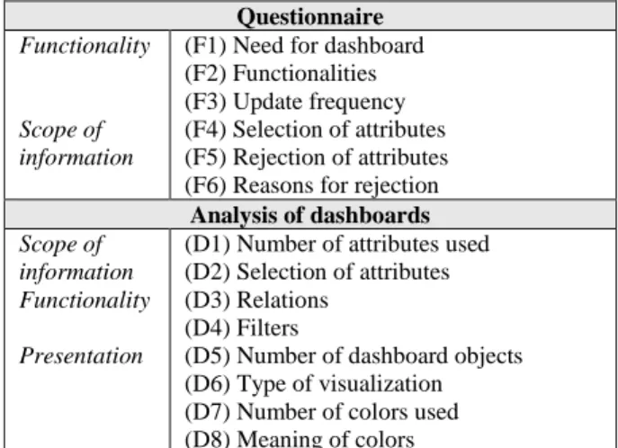
The study includes an online questionnaire and an application part in which participants are asked to create their learning dashboard using an LA dataset. After a twenty-minute introduction on the university campus, the participants can take part in the study from home and have one week to complete both parts. The online-questionnaire contains seven questions, following the first question of whether the participant wants a learning dashboard (F1) and is then divided into two topics (Table 1):
Functionality: The participants are presented with various functions of learning dashboards, such as the comparison of their performance with other students or the prediction of the final grade. Participants can choose whether they favor the functionality, reject it, or are indifferent to it (F2). In an open question, they can also suggest alternative functions. The update frequency (timeliness) of the data is also asked (F3).
Scope of information: To examine which metric and non-metric attributes participants wish to include in their learning dashboards, participants can select them from a list of 33 attributes (F4). The list contains socio-demographic characteristics (e.g., gender, age, nationality), characteristics of previous academic data (e.g., grade average, prior education, and training) and learning activity data (e.g., number of CW logins, downloads of learning material and examination results). Participants could also specify which of these characteristics they explicitly reject (F5). The reason for the rejection can be specified in an open question (F6).
Table 1. Design of the Study
Questionnaire
Functionality
Scope of information
(F1) Need for dashboard (F2) Functionalities (F3) Update frequency (F4) Selection of attributes (F5) Rejection of attributes (F6) Reasons for rejection
Analysis of dashboards
Scope of information Functionality Presentation
(D1) Number of attributes used (D2) Selection of attributes (D3) Relations
(D4) Filters
(D5) Number of dashboard objects (D6) Type of visualization (D7) Number of colors used (D8) Meaning of colors
After processing the questionnaire, the second part of the study follows: A case study with a data set containing the fictitious LA-data of 60 students is made available to the participants. The case study data is similar to the actual data that could be collected from the BI course and includes 49 attributes. The learning activity data of the case study includes a period of six weeks, with online lectures, in-class activities, and exercises each week, as well as midterm and final exam scores. Participants can also obtain data from previous academic and learning activity data from 60 fictional students. To reduce complexity, not all attributes of the online questionnaire were included in the case study; for example, there are no social media activities. The dashboards are examined with regard to the number (D1) and selection (D2) of attributes, relations used (D3), filters used (D4), number of objects (D5), type of visualizations (D6), selection of colors (D7) and the meaning of colors (D8).
4. Results
A total of 139 participants took part in the study, of whom 64% were male and 36% female. All participants have completed the online questionnaire, and 132 participants have submitted their developed learning dashboard. The study was conducted in German, and all results and visualizations were translated into English afterward. The results of the questionnaire were evaluated both empirically and qualitatively by the authors. The answers to the open questions were first coded and then grouped. For the analysis of the dashboards, the dashboards were examined according to the presented criteria by multiple researchers.
4.1. Results of the Questionnaire
Before the participants could specify the desired features of their dashboard, they were asked if they wanted a dashboard for an FC-course (F1). With a clear majority of 84%, the participants affirmed this question, 10% were undecided, and 6% rejected the use of an LA dashboard. From the students' point of view, the dashboard should contain the following functions in addition to the pure presentation of their attributes (F2): (1) Comparison of attributes with other students, e.g. comparison of grades or time spent in the LMS (76% agreement, 14% rejection, 10% undecided). (2) Prediction of the expected final grade, which can be calculated, for example, from grades of similar subjects, the time spent studying online content, the results of self-learning tests and midterm exams (70% agreement, 14% rejection, 16% undecided). (3) Alerts to warn students at an early stage if the passing of the course or
the achievement of their own goals are at risk (66% agreement, 14% rejection, 20% undecided). (4) Recommendations for the selection of elective subjects or additional modules (68% approval, 16% rejection, 16% undecided).
120 participants also proposed other functions in an open field question. Remarkably, 62% of students mentioned that their own assessment of their learning progress should be presented in the dashboard. The dashboard should, therefore, not be exclusively based on automatically collectable data but should allow students to make their entries. Other requested features include a summary of common errors from exercises (17 participants), a countdown for submission deadlines (10 participants), an overview of the required credit points for the current semester (10 participants) and recommendations for the study time of the individual lectures (10 participants). Regarding the timeliness of the LA data (F3), the majority of participants indicated that the data should be updated daily (44%). 29% would like a real-time reporting, 21% hourly reporting, and 6% prefer weekly or monthly updates.
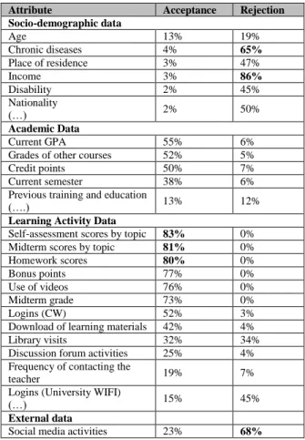
Table 2. Acceptance and rejection rates of selected attributes
Attribute Acceptance Rejection
Socio-demographic data Age 13% 19% Chronic diseases 4% 65% Place of residence 3% 47% Income 3% 86% Disability 2% 45% Nationality (…) 2% 50% Academic Data Current GPA 55% 6%
Grades of other courses 52% 5%
Credit points 50% 7%
Current semester 38% 6% Previous training and education
(….) 13% 12%
Learning Activity Data
Self-assessment scores by topic 83% 0% Midterm scores by topic 81% 0% Homework scores 80% 0%
Bonus points 77% 0%
Use of videos 76% 0%
Midterm grade 73% 0%
Logins (CW) 52% 3%
Download of learning materials 42% 4% Library visits 32% 34% Discussion forum activities 25% 4% Frequency of contacting the
teacher 19% 7%
Logins (University WIFI)
(…) 15% 45%
External data
Furthermore, the results of the scope of information are presented. Table 2 presents a selection of the results of questions F4 and F5, showing which attributes participants would select for their dashboards and which are explicitly rejected. When evaluating the attributes, it is noticeable that students consider the results of their self-assessment tests, midterm exams, and scores of homework exercises to be particularly important. The thematic evaluation is of high relevance here. Through a thematic analysis of their previous course performance, students gain an overview of their strengths and weaknesses and can prepare themselves accurately for the final exam. Only a few students would like to include socio-demographic data; the attributes for a learning dashboard are mainly derived from learning activity data and previous academic achievements.
Explicitly rejected are above all the attributes income (86%), activities on social media platforms (68%), data on illnesses (65%) and nationality (50%). Whether students would also reject overarching evaluations by the administration in which, for example, the influence of income or nationality on academic performance is measured, remains to be investigated. 138 out of 139 participants have given at least one reason for the rejection of characteristics in question F6. The results can be categorized into six groups: 101 students (73%) stated that the rejected characteristics were not relevant to their academic performance or learning outcomes. The dashboard should only provide an overview of relevant indicators and not to distract students with other attributes. 52% said that the denied attributes belong to the category of sensitive data, and they wish to protect their privacy by not analyzing those. A further 47% of participants had concerns about the university's compliance with data protection, for example, that the data could be misused or be made available to third parties without their consent. Potential discrimination was cited by 9% of students as a reason for the rejection. The feeling of constant monitoring or fear of a being a "transparent student" and the increase of pressure during learning was named by 6% as a reason for rejection.
Additionally, participants were able to list additional attributes for their learning dashboards. 133 students provided information that could be summarized into 22 categories. However, most attributes were only mentioned by fewer than 10 participants (e.g., information on learning groups, time spent in part-time jobs, and marital status).
4.2. Results of Dashboard Analysis
Figure 1 shows an example of a student dashboard, which includes 14 attributes like the name, degree, number of logins, and rate of attendance. There are no
relations used, which means that the attributes of the one student are not compared to other students or put in context with other attributes like age and gender. There are also no filters used. The type of visualization includes a bar chart (vertical) and tables. Six colors were used to differentiate the grades of previous courses.
Figure 1. Example of a Student Dashboard As part of the analysis of the scopeof information, we first examined all dashboards developed by the participants in terms of the number of attributes (D1): a total of 1.085 attributes were used in 132 dashboards. On average, 8.22 attributes were used per dashboard (median: 7). At least two and a maximum of 18 attributes were selected. The standard deviation is 3.94 (variance: 15.5). Concerning the selection of attributes (D2), the following can be noted: The most frequently used attributes were the midterm exam grade (number: 78), the results of the homework exercises (47) and the grade of the final exam (61). They all belong to the group of learning activity data. Figure 2 provides an overview of the most frequently used groups of characteristics of learning activity data.
Figure 2. Use of Attributes
26 69 77 24 138 156 144 63 0 50 100 150 200
Socio-demographic data were used less frequently, for example, name (33), gender (6), and age (5). Characteristics such as income and nationality were not used by any participant. The number of academic data used varies greatly: grade average (60), credit points (50), grades from other courses (39), number of semesters (32), education (16), high school GPA (5), previous degree (2). In addition to the case study data, some participants have added the university logo (8), a login link to the LMS (10), the cafeteria menu (1) or a link to an internship exchange (1).
We examined the functional scope of the dashboards by systematically evaluating the relations (D3), and filters (D4) used. In 50 dashboards, attributes did not only present the student’s individual performance but were put in context to fellow students. The following characteristics were most frequently compared with the average of the other course participants: Grade of midterm exam (number: 22), grade of final exam (15), number of bonus points (14), attendance (12), average grade (8), use of video (6) and session time (duration) (5).
Also, 27 participants set attributes, such as examination performance and attendance, in relation to the enrolled degree program (17), gender (6), number of credit points (4) and session time (2). A learning dashboard should, therefore, contain functions for comparing individual performance with the course average and the possibility of aggregating attributes using various characteristics. Filters were rarely used by the study participants, for example, filters for age (2), previous education (2) or gender (2). This is due to the data from the case study, which only contains data from one course in one semester.
Figure 3. Use of Visualizations
The dashboards were also examined with regard to the presentation of the information (D5-D8). Participants used an average of 4.95 objects per dashboard (median 4) for the visualizations. The
standard deviation is 1.84 (variance 3.4), whereby at least one object and a maximum of ten objects were used. Ideally, four to five objects should be displayed on learning dashboards (D5). The visualization forms (D6) used by the participants can be assigned to seven visualization types (see figure 3). Traditional visualization types such as bar charts and tables are most commonly used.
Figure 4. Use of Colors
For the visualization of the LA data, the participants used an average of 2.67 colors per dashboard (median 2). The standard deviation is 2.45 (variance 5.98), with a minimum of zero colors (tables only), and a maximum of ten colors. Figure 4 shows the colors used (D7), but note that blue is the default color of the Tableau software. Different shades, such as light grey and dark grey, were combined in the evaluation. In addition to shades of blue, the colors red, green, and yellow dominate.
In 66 of the dashboards, the meaning of the colors was clearly visible (D8). Colors were used in 19 dashboards to provide an overview of passed (mostly green or blue) and failed (mostly red) performances. Colors were also used in 19 dashboards to separate individual objects from each other. In 15 dashboards, such a delimitation took place within the visualization, e.g., by using one color for each exercise sheet. In nine cases, the colors of a traffic light were used to indicate whether the student's performance was good (green), average (orange) or weak (red) compared to other students. Also, color gradients were used in 5 dashboards within visualizations, e.g., light gray for excellent performance and dark blue for poor performance.
5. Conclusion
We would like to conclude with a summary of the results of our study and highlight the contribution of this paper. We will then discuss the limitations of the study and give an outlook on further possible research.
96 76 43 14 15 7 4 0 20 40 60 80 100 120 122 51 48 34 22 21 15 14 8 17 0 50 100 150
5.1. Results and Contribution
On the one hand, blended learning concepts such as the FC enable detailed learning analyses; on the other hand, these analyses can be used to improve satisfaction and performance in blended learning courses. The use of learning dashboards can help FC students to work continuously and independently and allows them to track their performance and goals. However, there is only few research on the challenges of designing learning dashboards. Students’ requirements and perspective are crucial to developing successful dashboards, as they are the primary data suppliers and users at the same time. For this reason, we conducted a study to analyze the functionalities, scope of information, and presentation of information for a learning dashboard from the students’ point of view.
Learning dashboards should include features to compare individual performance with other students, to calculate the expected grade, alerts, and be able to give recommendations for the course selection. It is also essential that there is a way for students to enter their own data into the dashboards because automatically collected data cannot show students’ offline learning behavior. Ideally, the LA data is updated daily. Concerning the scope of information, students mainly suggest the use of learning activity data of individual courses. Attributes about previous academic performance can also be included in the dashboard. Only few students support the evaluation of socio-demographic data, especially attributes such as income and nationality, are explicitly rejected, as is activity on social media channels. Reasons for the rejection are manifold but mostly refer to the irrelevance of the data for learning success, the protection of privacy or fear of abuse. Bar charts and tables are most suitable for the visualization of the data, whereby no more than four to five different objects should be used. It can be recommended to use two to three colors per dashboards, which can be utilized to differentiate the visualizations or indicate how good or bad the current performance is. The dashboards can further be enhanced with additional interactive features and can be personalized for the individual user [7].
5.2. Limitations and Future Research
The results of this work are not free of limitations. Our participants are enrolled in either the business or information systems program at a German university, and all of them have basic BI knowledge. This was necessary to let them develop their own dashboards from scratch. However, students from disciplines like art or medicine might have very different requirements. Also, there might be cultural bias, since the perception
of topics like data protection in Germany and Europe, especially after the introduction of the GDPR, can be very different from those of other countries. Furthermore, the case study data for the dashboard design only contains data from one course in one semester, time sequences and further comparisons could, therefore, not be displayed by participants. This was necessary in order not to overwhelm the participants. For the creation of the dashboard, users were asked to use Tableau, which the participants had already worked with over the course of at least one semester. Nevertheless, it cannot be ruled out that some participants could not implement all their design wishes due to limited knowledge.
This work provides a fundamental basis for further research. Few studies on students' requirements and experiences with LA dashboards already exist, such as Kitto et al. [28] and Tan et al. [29], but they used a different approach, first designing the dashboards and then involving the students to test and then adapt them, rather than letting the students develop their own ideas. We plan to compare and link the outcomes of our study with their results and the results of other researchers. With the help of the findings, we will design prototypical dashboards and evaluate them with students from different areas of study and age. For the evaluation, it will be helpful to also consider other criteria, like the ease of use, usefulness and helpfulness [29]. The possible benefits of learning dashboards can be evaluated using a control group in FC courses. It should be examined whether learning dashboards actually have positive effects on FC students, as suggested by the literature, and what these effects are. Since dashboards are not only suitable for students but are also important for other target groups, such as teachers and instructional designers at universities [7, 18], similar studies could be carried out on the design of dashboards for these groups.
6. References
[1] Lage, M.J., G.J. Platt, and M. Treglia, "Inverting the classroom: A gateway to creating an inclusive learning environment", The Journal of Economic Education, 31(1), 2000, pp. 30–43.
[2] Kim, M.K., S.M. Kim, O. Khera, and J. Getman, "The experience of three flipped classrooms in an urban university: an exploration of design principles", The Internet and Higher Education, 22, 2014, pp. 37–50.
[3] Lai, C.-L. and G.-J. Hwang, "A self-regulated flipped classroom approach to improving students’ learning performance in a mathematics course", Computers & Education, 100, 2016, pp. 126–140.
[4] Mason, G.S., T.R. Shuman, and K.E. Cook, "Comparing the effectiveness of an inverted classroom to a traditional classroom in an upper-division engineering course", IEEE Transactions on Education, 56(4), 2013, pp. 430–435. [5] Jovanović, J., D. Gašević, S. Dawson, A. Pardo, and N. Mirriahi, "Learning analytics to unveil learning strategies in a flipped classroom", The Internet and Higher Education, 33, 2017, pp. 74–85.
[6] Conole, G., D. Gašević, P. Long, and G. Siemens, "Message from the LAK 2011 General & Program Chairs", Proceedings of the 1st International Conference on Learning Analytics & Knowledge Conference, 2011.
[7] Ifenthaler, D., "Are Higher Education Institutions Prepared for Learning Analytics?", TechTrends, 61(4), 2017, pp. 366– 371.
[8] Bishop, J.L. and M.A. Verleger, The Flipped Classroom: A Survey of the Research, ASEE Annual Conference & Exposition, 2013.
[9] Bergmann, J. and A. Sams, Flip your classroom: Reach every student in every class every day, International Society for technology in Education, Alexandria, 2012.
[10] Said, M.N.H.M. and R. Zainal, "A Review of Impacts and Challenges of Flipped-Mastery Classroom", Advanced Science Letters, 23(8), 2017, pp. 7763–7766.
[11] Herreid, C.F. and N.A. Schiller, "Case Studies and the Flipped Classroom", Journal of College Science Teaching, 42(5), 2013, pp. 62–66.
[12] Gillette, C., M. Rudolph, C. Kimble, N. Rockich-Winston, L. Smith, and K. Broedel-Zaugg, "A Systematic Review and Meta Analysis of Student Pharmacist Outcomes Comparing Flipped Classroom and Lecture", America Journal of Pharmaceutical Education, 2018, pp. 433–440.
[13] Zuber, W.J., "The flipped classroom, a review of the literature", Industrial and Commercial Training, 48(2), 2016, pp. 97–103.
[14] Giannakos, M.N., J. Krogstie, and N. Chrisochoides, "Reviewing the Flipped Classroom Research: Reflections for Computer Science Education", Proceedings of the Computer Science Education Research Conference, 2014, pp. 23–29. [15] Rahman, A.A., B. Aris, H. Mohamed, and N.M. Zaid, "The influences of Flipped Classroom: A Meta Analysis", 6th Conference on Engineering Education (ICEED), 2014, pp. 24– 28.
[16] Ferguson, R., "Learning analytics: drivers, developments and challenges", International Journal of Technology Enhanced Learning, 4(5/6), 2012, pp. 304–317.
[17] Lucke, T., "Using learning analytics to evaluate the effectiveness of the flipped classroom approach", Proceedings of the 25th Annual Conference of the Australasian Association for Engineering Education: Engineering the Knowledge Economy: Collaboration, Engagement & Employability, 2014, pp. 1156–1164.
[18] Greller, W. and H. Drachsler, "Translating Learning into Numbers: A Generic Framework for Learning Analytics", Educational Technology & Society, (15), 2012, pp. 42–57. [19] Yigitbasioglu, O.M. and O. Velcu, "A review of dashboards in performance management: Implications for design and research", International Journal of Accounting Information Systems, 13(1), 2012, pp. 41–59.
[20] Negash, S. and P. Gray, "Business Intelligence", in Handbook on Decision Support Systems 2: International Handbooks Information Systems, 2008.
[21] Few, S., Information Dashboard Design: The Effective Visual Communication of Data, O'Reilly Media, Inc., 2006. [22] Chewning, E.G. and A.M. Harrell, "The effect of information load on decision makers' cue utilization levels and decision quality in a financial distress decision task", Accounting, Organizations and Society, 15(6), 1990, pp. 527– 542.
[23] Davis, F., "Perceived Usefulness, Perceived Ease of Use, and User Acceptance of Information Technology", MIS quarterly, 13(3), 1989, pp. 319–340.
[24] Dilla, W.N. and P.J. Steinbart, "The effects of alternative supplementary display formats on balanced scorecard judgments", International Journal of Accounting Information Systems, 6(3), 2005, pp. 159–176.
[25] O'Donnell, E. and J.S. David, "How information systems influence user decisions: a research framework and literature review", International Journal of Accounting Information Systems, 1(3), 2000, pp. 178–203.
[26] Anderson, J.C. and J.M. Mueller, "The Effects Of Experience And Data Presentation Format On An Auditing Judgment", Journal of Applied Business Research, 21(1), 2011, pp. 53–63.
[27] Goldstein, E.B., Sensation and perception, 8th edn., Wadsworth Cengage Learning, Belmont, 2010.
[28] Kitto, K., Lupton, M., Davis, K., Waters, Z., “Designing for student-facing learning analytics”, Australasian Journal of Educational Technology, 33(5), 2017, pp. 152–168.
[29] Tan, J.P.-L., Koh, E., Jonathan, C., Yang, S., “Learner dashboards a double-edged sword? Students’ sense-making of a collaborative critical reading and learning analytics environment for fostering 21st century literacies”, Journal of Learning Analytics, 4(1), 2017, pp. 117–140.