Tag Clouds in Software Visualisation
Chris Deaker, Neville Churcher, Warwick Irwin Department of Computer Science and Software Engineering
University of Canterbury Christchurch, New Zealand Email: [email protected]
Abstract—Software visualisation employs techniques from the more general information visualisation field to help soft-ware engineers comprehend and manage the size and complex-ity of software systems. In this paper, we explore the use of tag clouds for software visualisation. We describe a tool which implements our approach and illustrate its operation with examples from our software engineering research programme. Keywords-software visualisation; information visualisation; tag clouds; software metrics; software engineering;
I. INTRODUCTION
The term software engineering, coined half a century ago, has long been associated with the challenges arising from the software crisis [1]. Despite many advances in theory, tools and practices scaling software development to cope with systems of ever-increasing current sizes and complexities has continued to be very demanding. This is reflected in the poor success rate for IT projects: while current, universally-applicable data is difficult to obtain, the consensus (see e.g. http://www.it-cortex.com/Stat Failure Rate.htm) indi-cates that a third to a half of all IT projects can be regarded as having failed.
The problem is multi-faceted: more than just technical aspects are involved. A typical project will involve more than one person, making clear, concise, error-free communication between team members a key factor for success. Since the advent of the venerable flow chart, various forms of diagram [2] have been employed to assist with the comprehension and communication of information between software engi-neers. The Unified Modelling Language (UML) has become thelingua franca for this purpose (http://www.uml.org).
A typical project will evolve as successive versions are developed. The widespread adoption of agile processes, such as eXtreme Programming or Scrum, means that a developer team may be sharing a code repository that is being updated on a daily basis. Developers now need to communicate with their future and former selves: diagrams and visualisations provide convenient time capsulesfor this purpose.
Visualisation techniques provide one important means of improving the levels of communication and understanding in order to support overall improvements in the development process.
Tag clouds are a relatively recent addition to the in-formation visualisation toolkit. While they are appealing
and appear to have potential applications in information visualisation and software visualisation, these have not been explored fully.
In this paper, we extend the tag cloud concept in order to accommodate information visualisation features. We con-sider some of the issues which characterise software visuali-sation as well as more general information visualivisuali-sation con-texts. We describe TAGGLE, our prototype implementation, and present examples drawn from our software engineering research.
The remainder of the paper is structured as follows. In the next Section, we give a brief overview of tag clouds and in Section III we discuss visualisation and its rˆole in supporting software engineering activities. In Section IV we provide an overview of TAGGLEand discuss software visu-alisation aspects in Section V. Some implementation issues are discussed in Section VI followed by our conclusions and discussion of ongoing work.
II. TAG CLOUDS
Tag clouds have become commonplace in the last few years. They are often used to indicate the content of blogs (e.g. http://icanhascheezburger.com) and have become popu-lar in other information retrieval contexts where the content of a document or document collection is of interest. Recent examples include analyses of Barack Obama’s election and inauguration speeches1.
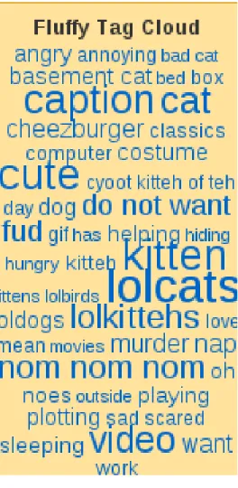
Figure 1 shows a typical example. Many more are avail-able at the Wordle site (http://www.wordle.net, which has contributed significantly to the popularisation of tag clouds. Tags (text labels for data points) are arranged according to some layout strategy. The font sizes used generally correspond to the frequency with which the tags appear in the document under consideration.
In previous work we have begun to explore the potential to extend the tag cloud metaphor to enable clouds to be used as an effective visualisation tool [3]. The key idea involves mapping variables in the data set to visual attributes of the tag cloud. In this way, attributes such as colour may be used to convey additional information rather than just function as “decoration.”
1e.g. http://www.readwriteweb.com/archives/tag clouds of obamas inaugural speech compared to bushs.php
Figure 1. Tag cloud summarising blog content
Others are beginning to use basic tag clouds for software engineering data [4, e.g.] but we are not aware of extensions such as we advocate here.
III. VISUALISATIONISSUES
Scientific visualisation deals with data representing quan-tities which are “really there” — such as magnetic field strength. Information visualisation differs significantly in that it deals with quantities—such as economic data—which have no natural shape. Computed geometry is the basis of these visualisations: choosing an effective metaphor is a key challenge. Software visualisation is a sub-field of information visualisation, dealing with quantities such as software complexity.
Despite this key difference, many of the techniques and challenges are common to both scientific and information visualisation, allowing us to draw on them in our software visualisation activities.
The number of relevant variables may be high and the sizes of data sets is often extremely high. This leads to issues such as information overload. The distribution of values for
a single variable may be skewed and the range of data points may be large. This is typical of software metrics such as cyclomatic complexity, NPATH or LOC. Since outliers are often of particular interest in software visualisation, truncation or scaling approaches are problematic.
The models which are the subjects of visualisations es-sentially consist of elements, properties of elements and relationships between elements.
Users of the visualisations perform a range of navigation, comprehension and exploration tasks involving:
• Determining the presence/absence of an element, prop-erty or relationship
• Studying the distributions of quantities
• Examining the correlations and relationships between quantities
• Discovering new knowledge from the data
In the software visualisation domain, data distributions (such as a histogram of LOC) are heavily skewed, may contain large numbers of data points, may cover large value ranges and may include outliers [5]). No single technique is universally ideal: the challenge is to find “horses for courses” using individual techniques in contexts where they are most effective.
We see tag clouds fitting alongside multivariate data alternatives such as kiviat charts, treemaps and parallel coordinates [6], [7].
Another key challenge is the focus+context problem, where drilling in to explore detailed properties of specific components leads to the user losing awareness of the rela-tionships with the remainder of the system.
Whatever technique is used, we need to be able to map sufficient variables to be useful in software engineering contexts and to support users in the information analysis tasks they perform.
We have previously considered the design of software visualisations [8] and make use of that approach in this work.
IV. TAG CLOUDS WITHTAGGLE
We have implemented an application, TAGGLE, both as a prototype for users and as a platform for ongoing research into layout algorithms and other areas. TAGGLE is written in Java and makes particular use of the Java 2D API for advanced graphics and imaging.
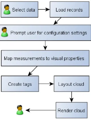
The typical workflow involved in generating a tag cloud is shown in Figure 2.
Data is typically maintained in XML files conforming to a DTD appropriate for input to TAGGLE. This approach allows transformation, using XSLT or other technologies, from other common formats—such as that used by ggobi (http://www.ggobi.org). Similarly, data in TAGGLE’s format can be transformed readily into the formats expected by other tools.
TAGGLE’s internal data structures provide an API allow-ing direct connection to application data sources. This is
Figure 2. Workflow
particularly useful where the data set is evolving during a TAGGLE session.
Figure 3 indicates the data set structure: records contain-ing fields of various types.
The user “designs” a cloud by selecting values for the parameters which determine layout, mappings and other properties. The settings can be saved (again in XML) and loaded to allow re-use of particular combinations with different data sets.
Figure 4(a) shows the visual properties settings tab, which contains individual tabs for setting font colour and other properties. The layout settings tab is shown in Figure 4(b). TAGGLEthen takes care of the extraction of the required data, application of mappings and rendering of the cloud. Our current application uses a Java component for this but the application design allows for other forms. However, we have found it sufficient to save cloud layouts in XML and then use XSLT to translate them to other formats, such as SVG, as required.
Users can interact with the rendered cloud in a several ways. Figure 5 provides an overview. Users may select tags as targets for subsequent actions (e.g. removal, new cloud creation, . . . ), obtain more detail about individual tags, observe areas at higher magnification and so on. Depending on the nature of the operation, the cloud may need to be
Figure 3. Data structures (simplified)
re-computed and re-rendered.
In our work to date, most of our data sets have been taken form our software metrics projects. For example, we might generate a cloud whose labels are class names, font sizes indicate WMC, font colours indicate CBO, font transparency indicates proportion of public elements and font style indicates whether the class is abstract or concrete.
V. TAGCLOUDVISUALISATIONISSUES
Like all information visualisation techniques, tag clouds have their strengths and weaknesses. Understanding these help us determine the best contexts in which to use them.
If only a few tags are present then a cloud adds little value. If the number of tags is very large then navigation and comprehension tasks become difficult. Similar issues arise with alternative techniques. The challenge is to find the “sweet spot” where the number of tags is manageable and the advantages of the tag cloud are not outweighed by other effects.
(a)
(b)
(c) Figure 4. Settings
Figure 5. interactions
There is no “right” mapping from data variables to tag cloud properties. Different mappings may be appropriate as users perform different tasks. Similarly, the user may wish to change mappings during a task. It is important that this process be well-supported and as unobtrusive as possible in order to support tasks.
Tasks performed by users vary considerably but include elements such as the following:
Search: Is particular tag value present or absent? Ordering (lexical, numeric, colour, . . . ) makes searching easier.
Filter: Include/exclude tags whose values are specified in terms of criteria (see Figure 4(c).
Browse: Examining a data set to confirm expected pat-terns and note outliers or deviations from typical distributions.
Explore: Looking for patterns, such as correlations be-tween variables, which may then be studied further with other techniques.
In order to comprehend a tag cloud, we also need to consider what should happen as the containing window or region is re-sized or re-shaped. Ideally, changes in aspect ratio or overall dimension should lead to smooth changes in the tag cloud layout.
If the tag cloud region shrinks then one option is simply to reduce the font size of each tag. However, this approach eventually leads to problems as people’s ability to perceive differences in tag properties such as size, colour, font family and transparency diminishes as the tag size becomes small. These issues also become more apparent as the number of tags increases, whether this is because of the intrinsic
size of the data set or because new tags are being added dynamically.
Conventional responses to such problems in other con-texts include scrollbars or distortion-oriented techniques [9]. However, these are less desirable in the case of tag clouds since they either prevent the cloud from being viewed in its entirety or alter the relative sizes and locations of tags.
We address this problem in a number of ways: • truncation
• filtering
• selection and new cloud creation • linking
Truncation addresses a potentially problematic aspect of tag clouds. A tag with a very long text label will appear to be more prominent than it should even at very small font sizes. We have explored and implemented mechanisms which constrain the aspect ratio of a tag’s bounding rectangle. However, we are not convinced that this is a good solution in general. Another option would be to display only a fixed width ‘window’ showing a sub-string of the tag text, with support for horizontal scrolling.
However, we have had good experience with our implementation of a partial truncation scheme— suggested by our software engineering application domain. Many of the data sets we have used consist of tags representing file/path names, such as
/home/cosc/staff/nic11/research/tag_ cloud/papers/apsec, qualified expressions, such as java.util.Observable.clearChanged() or mangled identifiers, such as TYP_angle_layout_ reporters_SimpleReporter, where a ‘natural’ delimiter could be used to truncate the tag labels. When required, further detail can be obtained by drilling in again. TAGGLE binds the truncation/expansion operation to the mouse wheel.
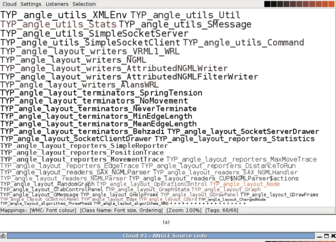
Figure 6(a) shows a tag cloud corresponding to classes in the Angle graph layout tool [10]; the labels are mangled identifiers from the corresponding JST semantic model [11], [12]. Successive truncations each remove a layer (e.g.TYP_
in the first truncation) and the fully-truncated version is shown in Figure 6(b).
Filtering allows tags not directly relevant to the ex-ploration in hand to be suppressed. Only simple filtering expressions (see Figure 4(c)) are currently implemented and we expect this to be a fruitful aspect to explore further in our future work.
More detail about individual tags is available. Hovering over a tag (Figure 7(a)) reveals details of the corresponding data record.
While regular zooming and scrolling is not practicable for tag clouds, we have implemented a feature based on the bifocal display [13]. Figure 7(b) illustrates how this can be used to explore regions of a cloud where the font size
is small, in order to select subsequent operations such as selecting tags or changing the mappings.
Individual tags, or rectangular regions, may be selected. The user can then
• create a new cloud containing only the selected tags, • remove the selected tags form the current cloud • remove all un-selected tags from the current cloud. Clouds can be linked so that selections on one cloud automatically highlight corresponding elements in another cloud. This is a particularly effective way to explore more than one relationship concurrently.
VI. IMPLEMENTATIONISSUES A. Data
A DataSet contains Records—the internal data repre-sentation of what is eventually displayed as a rendered tag. Each Record contains a number of Measurements for different Variable types. The legal value set for each Variable is determined by its Domain, which can be either Nominal, Ordinal, or Ratio. Relationships can be used to bind two Records together, as well as defining a weighting for relationship strength. This area is also responsible for providing a number of record iterators, allowing records to be quickly ordered according to particular measurement values. Figure 3 indicates the basic structure.
B. Mapping
There are three implemented visual properties for each tag: font size, colour, and transparency, with possibilities for a number of additional properties to be added. During configuration, users may select which variable is to be mapped on to which property, as well as specify the lower and upper bounds for each property (for example, minimum and maximum font size). Default values are available for tag colour (black), and transparency (fully opaque) if no mapping is selected.
Once the constraints of the visual property are set, a relative weighting for each record is calculated, according to the record’s rank when all records are ordered by the selected variable. The method of calculation is dependent upon variable type. As ordinal domains have no intrinsic concept of “distance” between values, a “bucket ranking” value is calculated as follows:
ω=ρ/η
Whereρis the records rank in the ordered record set, η is the total number of records, andωis the resulting weighting, such that0 ≤ω ≤1. In ratio domains we can calculate a value which takes into account distance between values on a scale, using the following formula:
ω= (α−min(ξ)) (max(ξ)−min(ξ))
(a)
(b)
(c)
(a)
(b)
Figure 7. Obtaining detail
Whereαis the actual value of the records measurement for the specified variable,min(ξ)andmax(ξ)are the lowest and highest values for all record measurements for the specified variable, and ω is the resulting weighting, such that 0≤ω≤1.
At this point, if specified by the user,ωis converted to its hyperbolic tangent. Discussion of the effect of the different mapping scaling options available can be found in Section 4.2. Using this ω, we can calculate the actual value of the visual property. An example using font size is shown:
β = (int)(((max(θ)−min(θ)×ω) + min(θ) + 0.5) Where ω is the previously calculated record weighting, min(θ) and max(θ)are the specified minimum and maxi-mum font sizes, andβis the tag s final font size. As shown, values are cast and rounded to the nearest integer value. In the case of font colour, values are calculated according to the above algorithm for each of the hue, saturation, and brightness values.
C. Layout
Once a cloud has been created, its words are positioned according to the selected algorithm. Layout is an abstract class which provides utility methods for algorithms, such as for intersection and boundary testing, and defines the abstract method placeWords, which takes a list of non-positioned Words, ordered according to user configuration, and returns a list containing the same words, but with specified positions. All layout algorithms must subclass Layout. This is the extension point for any future alternate layout methods.
Several algorithms have been implemented. Each layout describes a tags position as an x, y co-ordinate on a 2-dimensional canvas, wherexdetermines horizontal position, ydetermines vertical position, and anx, yco-ordinate of0,0 describes the upper-left-most corner of the canvas.
Figure 8 shows some of the sequence of steps in a spiral layout. The tag Decl cannot be placed in the first (highest priority) position and is eventually placed at the lower right of the aggregating cloud. The next tag to be placed,DeclVisitor, does fit in that location.
A 1-D “Typewriter” algorithm is shown in Figure 6. The mappings for Figure 6(c) order the tags alphabetically, making search tasks easier.
VII. CONCLUSION& FUTUREWORK
In this paper we have demonstrated that tag clouds can be extended to include additional information visualisation functionality. This enables tag clouds to be used effectively in software visualisation.
We have described a tool, TAGGLE, which implements our extended tag cloud models. We are encouraged by our experiences thus far, and are continuing to develop our techniques further. One current idea is to include tag clouds in standard javadoc HTML pages.
We have used TAGGLEon data from software engineering projects; typical variables are class names, method names, access modes, and software metrics such as lines of code, cyclomatic complexity and the Chidamber & Kemerer suite. Using the mapping mechanism, with its linear and non-linear (tanh) transformations has allowed us to gain insight into our data sets as effectively as other techniques we have used.
Evaluation is a vital, but challenging, part of visualisation. Our department has recently obtained a Tobii eye tracker
(a)
(b)
(c)
(d)
Figure 8. Spiral layout
(www.tobii.com) and we are currently planning empirical studies to help us both quantify the effectiveness of the current implementation but also to help us determine the most appropriate software visualisation tasks to deploy tag clouds on.
REFERENCES
[1] P. Naur and B. Randell, Eds.,Software Engineering: Report of a conference sponsored by the NATO Science Committee, Garmisch, Germany, 7–11 Oct 1968.
[2] J. Martin and C. McClure, Diagramming Techniques for Analysts and Programmers. Prentice Hall, 1985.
[3] C. Deaker, L. Pettigrew, N. Churcher, and W. Irwin, “Software visualisation with tag clouds,” inASWEC 2010 Industry Track Proceedings, J. Hosking and B. Long, Eds., Auckland, New Zealand, Apr. 2010, pp. 129–133.
[4] C. Anslow, J. Noble, S. Marshall, and E. Tempero, “Visu-alizing the word structure of java class names,” inOOPSLA Companion ’08: Companion to the 23rd ACM SIGPLAN con-ference on Object-oriented programming systems languages
and applications. New York, NY, USA: ACM, 2008, pp.
777–778.
[5] K. Fujimura, S. Fujimura, T. Matsubayashi, T. Yamada, and H. Okuda, “Topigraphy: visualization for large-scale tag clouds,” in Proceeding of the 17th international conference
on World Wide Web, ser. WWW ’08. New York, NY,
USA: ACM, 2008, pp. 1087–1088. [Online]. Available: http://doi.acm.org/10.1145/1367497.1367669
[6] R. Spence,Information Visualisation. Addison-Wesley, 2001. [7] C. Ware, Information Visualization: Perception for Design,
2nd ed. Morgan Kaufman, 2004.
[8] N. Churcher and W. Irwin, “Informing the design of pipeline-based software visualisations,” Department of Computer Sci-ence & Software Engineering, University of Canterbury, Pri-vate Bag 4800, Christchurch, New Zealand, Technical Report TR-COSC 06/04, Sep. 2004.
[9] G. Furnas, “Generalised fisheye views,” inProc ACM SIGCHI ’86 Conference on Human Factors in Computing Systems, 1986, pp. 16–23.
[10] N. Churcher and A. Creek, “Building virtual worlds with the big-bang model,” inInformation Visualisation 2001, ser. Con-ferences in Research and Practice in Information Technology, P. Eades and T. Pattison, Eds., vol. 9. Sydney, Australia: ACS, Dec. 2001, pp. 87–94.
[11] W. Irwin and N. Churcher, “Object oriented metrics: Precision tools and configurable visualisations,” inMETRICS2003: 9th IEEE Symposium on Software Metrics. Sydney, Australia: IEEE Press, Sep. 2003, pp. 112–123.
[12] W. Irwin, “Understanding and improving object-oriented soft-ware through static softsoft-ware analysis,” PhD Thesis, University of Canterbury, Christchurch, New Zealand, 2007.
[13] Y. K. Leung and M. D. Apperley, “A review and taxonomy of distortion-oriented presentation techniques,” ACM Trans-actions on Computer-Human Interaction, vol. 1, no. 2, pp. 126–160, 1994.