City, University of London Institutional Repository
Citation
:
Beecham, R., Dykes, J. ORCID: 0000-0002-8096-5763, Rooney, C. and Wong,
W. (2020). Design Exposition Discussion Documents for Rich Design Discourse in Applied
Visualization. IEEE Transactions on Visualization and Computer Graphics, doi:
10.1109/tvcg.2020.2979433
This is the accepted version of the paper.
This version of the publication may differ from the final published
version.
Permanent repository link:
https://openaccess.city.ac.uk/id/eprint/23913/
Link to published version
:
http://dx.doi.org/10.1109/tvcg.2020.2979433
Copyright and reuse:
City Research Online aims to make research
outputs of City, University of London available to a wider audience.
Copyright and Moral Rights remain with the author(s) and/or copyright
holders. URLs from City Research Online may be freely distributed and
linked to.
City Research Online:
http://openaccess.city.ac.uk/
[email protected]
1
Design Exposition Discussion Documents for
Rich Design Discourse in Applied Visualization
Roger Beecham, Jason Dykes, Chris Rooney and William Wong
Abstract—We present and report on Design Exposition Discussion Documents (DExDs), a new means of fostering collaboration
between visualization designers and domain experts in applied visualization research.DExDsare a collection of semi-interactive
web-based documents used to promote design discourse: to communicate new visualization designs, and their underlying rationale, and to elicit feedback and new design ideas. Developed and applied during a four-year visual data analysis project in criminal intelligence, these documents enabled a series of visualization re-designs to be explored by crime analysts remotely – in a flexible and
authentic way. TheDExDswere found to engender a level of engagement that is qualitatively distinct from more traditional methods of
feedback elicitation, supporting the kind of informed, iterative and design-led feedback that is core to applied visualization research. They also offered a solution to limited and intermittent contact between analyst and visualization researcher and began to address
more intractable deficiencies, such as social desirability-bias, common to applied visualization projects. Crucially,DExDsconferred to
domain experts greater agency over the design process – collaborators proposed design suggestions, justified with design knowledge, that directly influenced the re-redesigns. We provide context that allows the contributions to be transferred to a range of settings.
Index Terms—Design methodology, design study, concurrent evaluation, design exposition, design discourse, remote collaboration, crime analysis, statistical process control, visual representation design, geospatial data, temporal data
F
1
I
NTRODUCTIONA key characteristic of applied visualization research is close connection between front-line analysts, or domain experts, working in the problem domain and visualization specialists developing visualization tools [1], [2], [3], [4]. During the early stages of a project, this typically involves a process of problem characterization whereby visualization researchers must learn important detail about previously unfamiliar datasets and analysis routines [3]. As an applied visualization study progresses, domain experts are called upon to perform analysis, test techniques and evaluate proposed visual analysis tools [3]. More recent examples of applied visualization research have demonstrated that the distinction between visualization researcher contributing new designs and domain expert contributing subject-matter expertise can even be dissolved [5]. Here, through continual discussion and evaluation of designs, domain experts play an active and ongoing role in the design process and visual-ization researchers gain domain-relevant expertise, enabling visualization research that is truly substantive [4].
Effecting such a close collaboration, whereby designs are continually proposed and evaluated by all participants, is a non-trivial task. Resource constraints often mean that contact between analysts and researchers is limited and intermittent. As problems are established and designs de-velop, learning is often required. Analysts might need sev-eral days to explore new designs and encodings and to develop a sensitivity to the trade-offs required when, for example, adjusting to complex re-designs that increase data density. This is particularly problematic when re-designs
• Roger Beecham is at University of Leeds: [email protected]. Jason Dykes is at the giCentre, City, University of London: [email protected]. Chris Rooney is at Genetec: [email protected] and William Wong is at the IDC, Middlesex University: [email protected].
override existing conventions in the application domain. A more intractable challenge is that of social-desirability bias [6]. Collaborators with whom visualization researchers have usefully [1] developed amiable working relationships may unwittingly provide responses that they believe those researchers want to hear. The upshot is that rather than rich and substantive critique informing designs, feedback elici-tation strategies can result in more superficial commentary on initial impressions and usability concerns.
It is for these reasons that we developeddesign exposition
discussion documents(DExDs).DExDsare a structured
collec-tion of interactive web-based documents that use real data to present and explain design candidates and fosterdesign
discourse. The documents were developed and evaluated
during a long-term collaboration with front-line crime an-alysts at West Midlands Police (WMP) whereby a family of re-designs was created for crime monitoring using Statistical Process Control (SPC) charts. They enumerate data analysis problems in the application domain; and then present a collection of proposed re-designs with detailed explanations as to how each addresses the identified domain problems.
The primary contribution of this research is:
• Design Exposition Discussion Documents(DExDs)
– anapproachfor fostering rich and informed design
discourse that enables visualization designers to en-gage with and elicit feedback from front-line analysts in ways that address deficiencies in existing methods. Two more specific secondary contributions are estab-lished through the application domain in which ourDExDs
were developed:
• a characterizationof the data and tasks associated with crime monitoring and analysis through SPC;
2
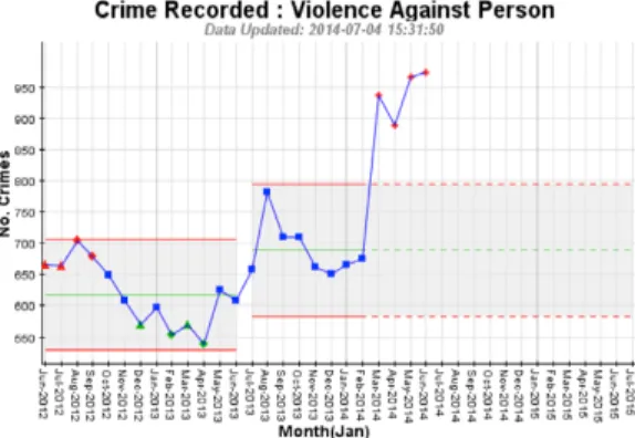
Fig. 1: Example SPC chart used by West Midlands Police. • a family of re-designs for crime monitoring and
analysis, informed, justified and evaluated through deep design discourse with analysts.
We present our work by first describing SPC charts and their role in supporting decision-making at WMP – the background context that underpins our DExDs. We then introduce the DExDs generated through this application domain, identifying key strategies used in their implemen-tation. Some space is then devoted to describing thefamilyof re-designs that were critiqued and developed through these documents – that we generate a set of re-designs that relate to complex and specific tasks, rather than a single solution, is indicative of the rich engagement effected thoughDExDs, and thus evidence of their success. The paper concludes by reflecting on this – evaluating DExDs and the nature of engagement that they enabled as well as speculating on howDExDsmight be extended more widely to applied visualization design research.
2
B
ACKGROUNDThe work presented in this paper forms part of a wide-ranging multi-partner project developing a data analysis system to support crime analysis: VALCRI. Through the project, we had previously engaged front-line analysts at WMP in designing new visualization techniques for sup-porting crime pattern analysis, the visualization outcome of which is documented in Beecham et al. [7]. The subject of SPC charts and the requirement for a visualization re-design was raised during discussions with crime analysts during this initial work and the notion ofDExDsemerged as a candidate design solution in itself during our re-design activity. We devote some space in this section to describing SPC charts and their use by front-line analysts at WMP. This context is necessary for justifying the re-designs presented in Section 4, but also for characterising the sort of applied visualization contexts to whichDExDsmight be targeted.
2.1 SPC charts for defining and studying exceptional crime activity
Originating in engineering and manufacturing but now used in a variety of domains [8], [9], [10], [11], SPC or Shewhart charts [12], combine statistical theory and visual methods to distinguish natural variation from that which is more systematic. An example SPC chart appears in Figure 1. The chart takes the form of a time-series marked with
a mean value of a process (a sequenced set of observa-tions), with control limits marked at roughly three standard-deviations from the mean. Observations that deviate from the process mean but within the control limits represent chance variation; observations outside the control limits rep-resentsignalsthat may warrant further exploration. Where a run of signals occurs in a common direction, suggesting some systematic change, a newprocessis defined.
SPC charts are used extensively by analysts at WMP to make judgements about changes in local crime rates. In this case the process is an expected range of recorded crimes of some type in some area of interest and signals are an observed crime rate or set of rates deemed exceptional to this expected range. The distinctions that WMP make for identifying breaches from expectation (signalsandprocesses) are presented in Table 1. These exceptions can to an ex-tent be ordered, but they can also be categorically distinct. Two successive observations>2 standard deviations (SD) from the process mean might represent an extreme event explained by some temporary set of circumstances; whereas a sequence of three/four observations with an effect size
> 1.5 SD may represent a more persistent challenge. In either case, these definitions are intended to provide alerts for analysts to explore further. Note that when eight or more points exceed the current mean in a single direction, the chart is deemed out-of-process and a new range is defined.
That SPC charts implicitly support statistical judgements makes the technique persuasive. It is worth emphasising, however, that SPC charts are essentially graphical represen-tations of multiple statistical tests. It is typical at WMP for a large number of charts to be viewed for different crime types and reporting areas, but analysed simultaneously.
Thesignalsdisplayed in SPC charts are agnostic to this fact:
no adjustment is made in their visual design for multiple testing, although adopting standard corrections such as
Bon-ferroni may be problematic (too conservative) for this use
case in which a very large number of charts are scanned for comparison simultaneously (c.f. [13]).
2.2 Use of SPC charts at West Midlands Police
Through a series of data analysis workshops (see Section 2.3), we identified three high-level task categories funda-mental to WMP’s use of SPC charts:
T1 Speculative exploration– a data-driven task where analysts openly search for patterns with no pre-specified strategy and time to go into detail;
T2 Morning scanning – a time-critical scan task in which analysts search for current issues and changes in the priority areas to which they are assigned and seek explanations prior to a morning briefing; T3 Presentation to management – high-level
conclu-sions and analysis headlines, with evidence pre-sented in a manner familiar to senior managers Existing practice at WMP involves analysts generating SPC charts by crime type for the WMP Force area as a whole, split by 174 Reporting Areas (RA – the highest resolution area for which crime data are released) and by eight Neighbourhood Policing Units (NPUs) into which RAs are aggregated. After eyeballing the resulting graphical out-put, analysts internally organise charts according to signal
3 severity and patterns of signal and process history. The aim
is to build an area-level picture of current crime activity (T1, T3), identify priorities for follow-up analysis (T2) and to make informed estimates as to the (immediate) future (T3). Crucially here, SPC charts are not solely used to observe relative differences in volume of crimes, but in evaluating numerous Key Performance Indicators within the Force. For example, an increasingly important measure evaluated through SPC methods is police response times – the time that elapsed between an incident being reported and police officers arriving at the scene. Reports and briefing notes used in justifying the deployment of resources are based on signals derived from SPC charts. As such, the graphics under consideration, and their interpretation, are used on a daily basis to inform local policing policy.
TABLE 1: Categories of signal that mandate further analysis (WMP guidelines).
duration effect size
from process meanµ
good
+ve effect
bad
-ve effect
1 data point more than 3SD fromµ 5 5
2 data points more than 2SD fromµ
3/4 data points more than 1.5SD fromµ N N
8 data points in one direction ofµ
2.3 Re-design of SPC charts for West Midlands Police
The process of organising hundreds of SPC charts is cogni-tively demanding, especially so as the tool currently used by analysts at WMP provides limited higher-level overviews or user-specified orderings of charts. The identification of spatial patterns in signals is particularly challenging. Pre-sented with an ensemble of SPC charts over 174 areas (RAs), analysts demonstrate considerable skill in reading area names from SPC charts that are alphabetically ordered, recalling the administrative geography of the wider police force area and relating charts exhibiting signals to this imagined geography. Comparison of SPC charts within their spatial setting is, then, a key priority for visualization re-design – according to a Higher Analyst at WMP, the lack of effective spatial comparison is “where the current technology
falls down”.
Given this, the key Analysis Requirement (AR) that our re-design of SPC charts must support, and relevant to all three task categories, is:
AR1 Spatial– allow analysis of thespatialstructure in the signals detected (T1, T2, T3)
Further analysis requirements, established through work-shops and observations with analysts at WMP during site visits (see Section 2.4), relate to the temporal analysis of signals, distinguishing signal effect size and comparison by crime category:
AR2 Temporal– supporting historical analysis of signals and changes in process (T1, T2);
AR3 Multi-perspective– directly encoding the size, his-tory and duration ofsignal effectin their spatial and temporal contexts (T1, T2);
AR4 Thematic – enabling comparison across crime types and other eminent categories of analysis (T1,T2); AR5 Interactive– providing opportunities for interactive
exploration of signal sensitivity (T1);
AR6 Multi-scale – displaying RAs and NPUs concur-rently (T1,T2,T3)
2.4 Collaboration sessions with West Midlands Police
We scheduled workshops with four WMP front-line analysts who work with SPC charts on a regular basis – one ‘Higher Analyst’ (HA) and three ‘Performance Analysts’ (PA). Three face-to-face meetings were held at WMP in Birmingham in September 2016, January 2017 and March 2017 (Table 2) during which the analysts described how they understood the technique, how and when it was used in practice, and the criteria and level of evidence required for decisions to be made. During the first session, analysts demonstrated exist-ing workflows in some detail. This enabled us to establish and refine tasks and gain initial feedback on some design ideas as data sketches [1] developed. The aim here was to present our initial design ideas and ensure we were on track, while giving the analysts agency by encouraging critique and feedback. Meeting four was a teleconference where further feedback was received on re-designs and again new requirements formed.
The Higher Analyst participated in all four meetings, each Performance Analyst participated in or provided feed-back for at least two. Tasks and analysis requirements for SPC charts were developed through the face-to-face sessions and e-mail in light of knowledge acquired through the wider project. Engagement and evaluation through DExDs took place in parallel to this more formal activity.
TABLE 2:Summary of meetings with WMP.
date place persons theme - outcome
15.09.16 WMP HA, PA SPC as used by WMP
-Task definitions and requirements
05.01.17 WMP HA, PA SPC as used by WMP
-Refine requirements
07.03.17 WMP HA, PA, PA Demo redesigns
-New requirements given re-design
28.03.17 Call HA, PA Feedback redesigns
-New requirements given re-design
3
D
ESIGNE
XPOSITIOND
OCUMENTS(DE
XD
S)
Having provided details of the applied visualization project under which ourDExDs were conceived, in this section we detail theDExDs themselves, identifying their key function and the strategies used in their implementation.
3.1 DExDs for facilitating Design Exposition
In their work onliterate visualization, Wood et al. [14] make the case fordesign exposition– the process of communicating the design choices that lead to a design candidate – as a mechanism for improving visualization practice. They cite notebook environments such as JupyterLab [15], R-Markdown [16] and Observable [17] as playing an impor-tant role in fostering such design communication. Since this work, other means of closely linking visualization and analytic or design commentary have emerged (e.g. [18], [19]) and the importance of doing so in large scale visualiza-tion development projects has been established [20].DExDs