Original citation:
Becker, Sascha O., Fetzer, Thiemo and Novy, Dennis. (2017) Who voted for Brexit? A comprehensive district-level analysis. Economic Policy, 32 (92). pp. 601-650.
Permanent WRAP URL:
http://wrap.warwick.ac.uk/93320
Copyright and reuse:
The Warwick Research Archive Portal (WRAP) makes this work by researchers of the University of Warwick available open access under the following conditions. Copyright © and all moral rights to the version of the paper presented here belong to the individual author(s) and/or other copyright owners. To the extent reasonable and practicable the material made available in WRAP has been checked for eligibility before being made available.
Copies of full items can be used for personal research or study, educational, or not-for-profit purposes without prior permission or charge. Provided that the authors, title and full
bibliographic details are credited, a hyperlink and/or URL is given for the original metadata page and the content is not changed in any way.
Publisher’s statement:
This article has been accepted for publication in Economic Policy. Published by Oxford University Press.
A note on versions:
The version presented here may differ from the published version or, version of record, if you wish to cite this item you are advised to consult the publisher’s version. Please see the ‘permanent WRAP URL’ above for details on accessing the published version and note that access may require a subscription.
Who Voted for Brexit?
A Comprehensive District-Level Analysis
Sascha O. Becker Thiemo Fetzer Dennis Novy∗
June 2017
Abstract
On 23 June 2016, the British electorate voted to leave the European Union. We an-alyze vote and turnout shares across 380 local authority areas in the United King-dom. We find that exposure to the EU in terms of immigration and trade provides relatively little explanatory power for the referendum vote. Instead, we find that fundamental characteristics of the voting population were key drivers of the Vote Leave share, in particular their education profiles, their historical dependence on manufacturing employment as well as low income and high unemployment. At the much finer level of wards within cities, we find that areas with deprivation in terms of education, income and employment were more likely to vote Leave. Our results indicate that a higher turnout of younger voters, who were more likely to vote Remain, would not have overturned the referendum result. We also compare our UK results to explain the vote shares of the far-right leader Marine Le Pen in the 2017 French presidential election. We find similar factors driving the French vote. An out-of-sample prediction of the French vote using UK estimates performs reasonably well.
Keywords: Political Economy, Voting, Referendum, Migration, Austerity,
Globalisation, UK, Scotland, EU, France
JEL Classification: D72, N44, R23, Z13
∗Acknowledgements:Paper presented at the 65th Panel Meeting ofEconomic Policyin April 2017. We are
grateful for constructive comments received by the panel, our discussants Vasso Ioannidou and Andrea
Mattozzi, the editor and three referees. We also thank Andrew Oswald, Alan Taylor, seminar participants
at Warwick and HM Treasury as well as numerous commentators on social media. We thank the ESRC
initiative “The UK in a Changing Europe” for financial support. We thank Bart Los for sharing data
with us. Eleonora Alabrese and Ivan Yotzov provided outstanding research assistance. All three authors
are based at the University of Warwick and affiliated with the Centre for Competitive Advantage in the
Global Economy (CAGE). Becker is also affiliated with CEPR, CESifo, ifo, IZA and ROA. Fetzer is also
affiliated with SERC. Novy is also affiliated with CEPR, CESifo and CEP/LSE.Email addresses: Becker:
1
Introduction
The United Kingdom’s relationship with the European Union (EU) has always been a
very special one. Not being a founding member, the UK only joined the European
Eco-nomic Community (EEC), the precursor of the EU, in 1973. Merely two years later, the
UK held its first in-out referendum. It produced a clear two-thirds majority to remain
as a member. The UK has historically been a key supporter of several core features
of today’s EU such as the Single Market and EU Regional Policy. However, the UK
never joined the Euro. It did not follow the route of the six founding members of the
European project (and many other countries) to proceed towards ever closer union (see
Guiso et al., 2016for an analysis of Euro membership in the context of the European
integration project).1 Over the last two decades, the UK seemed to have grown
increas-ingly lukewarm towards the EU. During the 2015 general election campaign, internal
struggles within David Cameron’s Conservative party led him to promise a referendum
on EU membership. This referendum happened on 23 June 2016.
The UK referendum on EU membership is thought to have been a watershed
mo-ment in European integration and globalisation more broadly. Although the outcome
had been expected to be tight, in the days running up to the referendum bookmakers
and pollsters predicted the Remain side to win. Many observers were left puzzled and
keen to understand who voted for Leave. Various newspapers and blogs quickly
pro-duced correlations between selected variables and the referendum result, but no study
has so far taken a comprehensive approach to attempting to understand the Brexit vote.2
Our paper fills this gap by combining a multitude of geographically disaggregated data
sources to carry out a comprehensive descriptive analysis of the socio-economic
char-acteristics that correlate with the outcome of the 2016 referendum.
In particular, we study the EU referendum results in England, Wales and Scotland
disaggregated across ‘local authority areas’ of the referendum (and across 107 wards
within four cities) and relate them to fundamental socio-economic features of these
areas.3 The EU Referendum Act passed by Parliament in 2015 divided the UK into 382
official counting areas (which are the same as local authority areas), 327 of which are in
1See AppendixAfor a more detailed history of Britain’s role in the EU.
2For instance, seeBurn-Murdoch (2016b) in the Financial Times as an example of various correlation
plots.
3An analysis of voting at the local authority area level does not necessarily reflect individual voting
England, 22 in Wales and 32 in Scotland.4 There are on average roughly 122,000 eligible
voters per local authority area. Data is not provided at the level of individual polling
stations.
As covariates, we focus on socio-economic characteristics that can be broadly grouped
into four categories: measures of an area’s exposure to the European Union; measures
capturing (the quality of) public services provision and exposure to fiscal consolidation
(austerity); demographic and human capital characteristics; and measures capturing
the underlying economic structure of an area.
We adopt a simple machine learning method to capture the subsets of variables
from each group that best ‘predict’ the actual referendum result. We cannot possibly
give a causal explanation of the referendum result because the election outcome is
multi-causal and multi-faceted. Nevertheless, a systematic analysis across an exhaustive
range of socio-economic characteristics can be helpful in directing future research efforts
that aim at carefully identifying specific mechanisms. One might be able to single out
an individual predictor such as immigration from Eastern Europe and try to establish
causality from this specific factor for the Vote Leave share. But this would run counter
to the aim of this paper, which is rather to focus on predictive power by pulling together
various dimensions of the vote pattern.
Our results indicate that even very simple empirical models can explain significant
amounts of variation in the Vote Leave share and achieve good predictive performance.
Which characteristics have significant explanatory power for Leave support?
Surpris-ingly and contrary to much of the political debate in the run-up to the election, we
find that relatively little variation in the Vote Leave share is explained by measures
of a local authority area’s exposure to the European Union (e.g., due to immigration
and trade exposure). Neither is much variation explained by measures capturing the
quality of public services and fiscal consolidation. Rather, a significant amount of the
variation can be linked to variables that seem hardly malleable in the short run by
political choices (variables such as educational attainment, demography and industry
structure). We document that similar patterns hold when we explore data on the EU
referendum result across 107 wards in four English cities – which to the best of our
knowledge this paper is the first to exploit.
Our findings thus suggest that there is a disconnect between the key correlates of
4We drop Northern Ireland because election results were only published for Northern Ireland as a
the vote outcome and the topics dominating the political debate in the run-up to the
election. How can we reconcile this disconnect? The political debate centred on two
issues: the fiscal burden of EU membership and the exposure to European
immigra-tion since the enlargement of the European Union in 2004. Perhaps the UK budget
contribution resonated so strongly with the British electorate because public services
and benefits were under severe strain not least due to fiscal cuts. If we think of fiscal
cuts and migration as political choice variables, we can explore the extent to which the
powerful predictors capturing the underlying fundamentals (educational attainment,
demography and industry structure) interact with these variables that saw significant
change over the course of the last decade. Our results highlight that policy choices
related to pressure from fiscal cuts and migration are linked to a higher Vote Leave
share especially when socio-economic fundamentals are ‘weak’ (low incomes, high
un-employment), and when the local population is less able to adapt to adverse shocks
(due to low qualifications).
We stress that whilst our paper focuses on the variation of vote shares across local
authority areas with respect to key variables such as immigration and education, we
have less to say about the overalllevel of support for Vote Leave. Put differently, our
paper focuses on slope coefficients, not intercepts. This is important because in order
to get a sense of the absolute number of people who voted for or against Brexit, one
would need to refer to data on individuals and how they voted. To some extent, such
information is available through polling data, for instance as provided by Ashcroft
(2016). Such polls indicate that the typical Leave voter is white, middle class and lives
in the South of England. The proportion of Leave voters that are in the lowest two social
classes (D and E) is less than one-third (seeDorling,2016).
We also carry out a back-of-the-envelope calculation regarding turnout. Young
peo-ple voted overwhelmingly in favour of Remain but had a lower turnout than older age
groups. We find that a higher turnout of young voters would have been very unlikely
to result in a different referendum outcome, partly because their turnout was already
elevated compared to previous UK-wide elections.
We also explore the role of some short-run factors such as heavy rainfall and
flood-ing on the referendum day as well as train cancellations in the South East of England.
While we document that these did have a reducing effect on turnout, the reduction does
not seem to have affected the overall result: the Remain campaign would have still lost
on a sunny day.
leader Marine Le Pen across d´epartements in the 2017 French presidential election.
Arguably, both the Leave vote and the support for Le Pen can be described as having
a distinct populist flavour. The question is whether both votes are related to similar
underlying socio-economic conditions. We find that the factors driving the French vote
are indeed similar to those in the UK. A corresponding model for France using the
same variables as for the UK has explanatory power not far below that for the Brexit
referendum. Even an out-of-sample prediction of the French vote using UK estimates
performs reasonably well.
This paper and the Brexit vote it studies can be seen not only in an EU context but
also related to ‘populist’ campaigning and voting more broadly. A large literature in
the social sciences looks at voting patterns across the political spectrum as a function of
demographic, economic and political drivers (seeFerree et al., 2014). The UK, with its
first-past-the-post electoral system for the House of Commons, has typically had clear
majorities for either the Conservatives or the Labour Party since the 1920s. This pattern
was broken in 2010 with the first coalition government that saw the Conservatives and
the Liberal Democrats join forces. Since the 1990s two other major developments have
affected the UK party landscape: the rise of the UK Independence Party (UKIP) and
the rise of ‘nationalist’ parties in Scotland, Wales and Northern Ireland. While the
latter can be seen as a domestic move driven by a renewed push for devolution (and
even independence) for the constituting nations of the UK, the rise of UKIP is directly
related to the EU.Whitaker and Lynch(2011) as well asClarke et al.(2016) study voting
patterns for UKIP and document that, not surprisingly, Euroscepticism combined with
anti-immigration sentiment is the main driving force of UKIP success. For Western
Europe more broadly,Arzheimer(2009) analyzes contextual factors explaining far-right
voting over the period from 1980 to 2002.
Backlash against globalisation is said to have been another important factor in the
Leave vote, especially to the extent that it deteriorates economic and social conditions
for a subset of voters (seeLewis-Beck and Stegmaier, 2000andDruckman and Lupia,
2000).5 Colantone and Stanig(2016) provide evidence of import competition from China
being related to support for Vote Leave in an arguably causal manner. Their results are
consistent with ours in two ways. First, we also find a positive relationship between
trade intensity (in our case with other EU countries) and support for Vote Leave.
Sec-ond, we confirm that areas heavily dependent on manufacturing employment were
5Findlay and O’Rourke (2007) argue that globalisation was historically difficult to maintain unless
more likely to vote Leave.
Of course, the UK’s Brexit vote should not be equated with support for UKIP or
far-right voting more generally. Yet, there are probably some parallels with voting patterns
for right-wing parties in other countries and the ‘once-in-a-lifetime’ opportunity to vote
against what many voters see as unaccountable forces ruling them from the outside.
In the UK context, Becker and Fetzer (2016) explore the impact of immigration from
Eastern Europe on the support for UKIP. Dippel et al. (2015) link votes for far-right
parties in Germany to trade integration with China and Eastern Europe. For the U.S.,
Autor et al. (2016) argue that rising trade integration with China contributes to the
polarization of U.S. politics. Burgoon (2012) analyzes party opposition and support
for trade openness across the European Union. Barone et al. (2016) find that in Italy,
immigration generates a sizeable causal increase in votes for the centre-right coalition
that has a political platform less favourable to immigrants.
The UK’s EU referendum is of course also related to research on referenda as a form
of direct voting. While countries such as Switzerland have ample experience in ‘direct
voting’ (see Funk and Gathmann, 2015), referenda in other countries are rather rare.
The UK traditionally respects the primacy of Parliament over any direct voting. But
both the UK’s European Economic Community (EEC) referendum in 1975 and the EU
referendum in 2016 were initiated by the House of Commons. Theoretical research has
come up with suggestions to improve the efficiency of referenda (Casella and Gelman,
2008). On the empirical side, Matsusaka (1992) asks why some issues are resolved
by popular vote and others by elected representatives. Using data on California he
finds that “good government” issues were usually resolved by legislative measures and
distributional issues by initiatives. In light of this finding, it makes sense to view the
Brexit referendum as one that was at least partially related to distributional issues.
Our paper is organised as follows. Section 2 introduces our empirical approach.
Section 3 discusses the underlying data and our main hypotheses. In Section 4 we
present our results. Section 5 provides a summary and policy conclusions.
2
Empirical approach
We take a comprehensive approach to understanding the factors behind the EU
referen-dum result, and we exploit a range of data sources in the empirical analysis. We would
like to stress right away that our analysis cannot possibly establish causality. Instead,
explain a larger share of the variation in the Vote Leave share. This approach is quite
natural in this setting with a once-in-a-lifetime referendum where we are bound to
an-alyze cross-sectional variation only. If we were to anan-alyze general election results, we
could recur to difference-in-difference type estimates in order to control for fixed effects
at the local authority level. In our analysis, we do not necessarily expect coefficient signs
of each and every coefficient to be stable across all specifications. Instead, it is expected
that the signs of some regressors, to the extent that they are highly correlated with each
other, may change when “more fundamental” regressors are added. We will discuss all
these issues in more detail when interpreting our results.
We carry out three main exercises: a full model, a best subset selection procedure,
and a within-city analysis. We describe these here in turn. Readers familiar with model
selection procedures may want to jump to section2.3.
2.1 Full model
The first approach aims at building a ‘full’ empirical model of the correlation structure
betweenk-dimensional cross-sectional covariatesXcat the local authority area level (380
spatial units across England, Scotland and Wales) and a dependent variable yc, which
is either the share of votes to leaveLcor turnoutTc.6
For time-varying observables, the cross-sectional covariates contain their respective
baseline levels (mostly from the 2001 census),xct, as well as their changes, ∆xc, mostly
between 2001 and 2011, the two census years. The empirical specification takes the form
yc=x0cβ+ec, (1)
which we estimate with ordinary least squares (OLS).
2.2 Model selection
In the second approach, we perform a variable selection exercise to identify the most
robust predictors of the Vote Leave result. In order to identify robust predictors of
the Vote Leave result, we perform a best subset selection (BSS) procedure. Best subset
selection is a machine learning method used to perform ‘feature selection’ in settings
where the aim is to reduce dimensionality of a feature space (Guyon and Elisseeff,
6We remind readers that we drop Northern Ireland and Gibraltar. Northern Ireland is dropped because
2003). The idea of best subset selection is to estimate all possible regressions including
all combinations of control variables and return the statistically optimal model, which
minimizes an information criterion.
The fundamental difference between prediction, which generally takes advantage
of machine learning methods, and causal inference is as follows. While causal
infer-ence focuses on the internal validity of causally estimated reduced-form (or structural)
parameters β, prediction and thus machine learning is concerned with the external
validity of the estimated fitted values ˆy. Causal inference seeks to obtain a set of
es-timated parameters ˆβ that are typically studied in isolation. Thus they often do not
render themselves useful for predictive exercises since the out-of-sample model fit is
generally poor. Instead, good model fit typically requires a multitude of regressors,
and machine learning can often substantially improve out-of-sample predictive
perfor-mance (Mullainathan and Spiess, 2017).7 The underlying estimated parameters that
yield good model fit are typically of limited interest per se.8
We note that the variables we consider pass a first plausibility test (as they were
mentioned during the campaign, for example). They cover broad socio-economic
char-acteristics. They are related to the political science literature documenting determinants
behind elections (we refer to that literature in the introduction). They do not contain
‘nonsensical’ variables that could be thought of as generating ‘random’ and thus
mean-ingless correlations.
The best subset selection algorithm we employ finds the solution to the following
non-convex combinatorial optimization problem:
minβ
C
∑
c=1
(yc−β0− p
∑
j=1
xcjβj)2
| {z }
Residual sum of squares
subject to
p
∑
j=1
I(βj 6=0)≤ s, (2)
where p is the set of regressors of which a subset s is chosen to maximize overall
model fit. The result is a sequence of modelsM1, ...,Ms, ..,Mp, where the overall
opti-mal modelMs∗ is chosen by using either cross validation or some
degree-of-freedom-adjusted measure of goodness of fit such as the Akaike information criterion (AIC).
Throughout, we use the AIC to decide upon the overall optimal modelMs∗ robustly
explaining the variation in the dependent variable.
It is easy to see that this statistically optimal procedure can quickly become
infeasi-7See section4.5where we predict out-of-sample the results of the 2017 French presidential election.
8Some machine learning methods are non-parametric to the extent that the methods do not even
ble. Suppose there are ppotential regressors. Best subset selection proceeds as follows:
the first model estimates – using OLS – all(p1) = pdifferent models containing a single
regressor and chooses as optimal the model that results in the largest reduction in the
residual sum of squares. The second model estimates all possible(p2)models containing
exactly two regressors, and so on. In total,∑kp=1(pk) = 2p models are estimated. With
p= 30 this amounts to estimating just over one billion regressions. The non-feasibility
of best subset selection for large pin high dimensional data has led to machine
learn-ing research efforts focuslearn-ing on developlearn-ing algorithms that solve an approximation of
the best subset selection optimization problem such as Lasso, Ridge regression or
For-ward/Backward stepwise selection (seeHastie et al.,2009for an overview).
It is important to highlight that the best subset selection approach may yield models
of different complexity that are non-nested. We present the sequence of “best”
mod-els for each class of modmod-els with p predictors and explore how the inclusion of more
covariates expands the goodness of fit. One caveat with this approach is that certain
variables may be dropped in case they are highly correlated with each other. That is,
even if a predictor xi contains a distinct signal conditional on xj, it may be dropped
from the analysis as the signal contained is not sufficiently strong.
2.3 Within-city analysis
While official results are only published at the level of local authority areas, we also
managed to obtain voting data at the ward level across four UK cities (see sectionC.1
in AppendixCfor a description). This allows us to zoom into city wards. It also allows
us to address potential worries about ecological fallacy. There is ample variation in the
Vote Leave shares within cities. As a matter of fact, the variation within cities is larger
than across local authorities.
2.4 (No) Difference-in-differences
We considered using the 1975 EU referendum in a difference-in-differences framework.
Unfortunately, corresponding data for the 1975 referendum were only published for 68
counting areas across the UK (see FigureA1for a map of the Leave vote in the 1975
ref-erendum). More importantly, the 1975 referendum took place in a completely different
environment. At the time, the Labour party had pledged to hold a referendum.
Mar-garet Thatcher, the newly elected leader of the Conservatives at the time, campaigned
for Remain. Remain won with a smashing 67.2 percent vote share. Against this
the 1975 referendum vote shares as a regressor in our analysis and generally find a
neg-ative correlation between the 1975 Leave share and the 2016 Leave share. This finding
attests to the notion that these referenda took place under very different circumstances
(seeButler and Kitzinger,1976andCrafts,2016for further background).
3
Hypotheses and data
In this section we discuss prominent hypotheses that have been proposed to explain the
EU referendum result and how we try to capture them in our empirical analysis. We
briefly discuss the variables employed in the analysis.
The empirical analysis of UK election data is challenging as the data is provided
only at the relatively coarse geographic resolution of 380 local authority areas.9 We
start out in section3.1by discussing our main outcome variable, the Vote Leave share
in the 2016 referendum, as well as turnout and then turn to the explanatory factors
behind the outcome. For these factors, we will look at four broad groups of variables:
1) EU exposure through immigration, trade and structural funds;
2) local public service provision and fiscal consolidation;
3) demography and education;
4) economic structure, wages and unemployment.
We also look at ‘random events’ on the referendum day such as rainfall and train
cancel-lations. We discuss each group of variables in sections3.2-3.6. TableA1in the appendix
provides summary statistics for our variables (not standardized).
Finally, in sectionC.1we also describe data used for an analysis at the level of wards
within four UK cities. Wards are areas of finer geographical disaggregation, essentially
city quarters, with an average population of about 7,000 (compared to roughly 170,000
residents per local authority area).
Since we are engaged in a prediction exercise and not in a structural estimation of
voting behaviour, we are agnostic about whether voting results are better explained
by levels of predictor variables, or by changes in those variables over a longer period.
Therefore, throughout the analysis whenever available we generally use both levels and
changes.10
9Due to missing covariates, we drop Northern Ireland and Gibraltar from the available maximum of
382 areas. A few covariates are also missing for some additional local authority areas, which is why some specifications in our regression tables contain fewer observations.
3.1 Voting outcomes
We collect data on turnout and vote shares at the local authority level for the 2016 EU
referendum held on 23 June 2016. Vote Leave won 51.9 percent of votes in the EU
referendum, with a standard deviation of 10.4 percent across UK local authority areas.
46.5 million voters were registered in total, and 72.2 percent of these turned out. Thus,
17.4 million voted for Leave and 16.1 million for Remain. These numbers correspond to
37.4 percent and 34.7 percent of eligible voters, respectively.
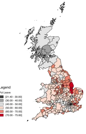
Figure1presents a map of the support for the Leave side across local authority areas,
while Figure2presents the map pertaining to turnout. One striking observation is that
some urban centres seemed to have particularly low turnout. Within London, six local
authority areas (the City of Westminster along with the Boroughs of Newham, Camden,
Lewisham, Tower Hamlets, Barking and Dagenham) had turnout of less than 65 percent
(out of a total of only 22 local authority areas across the whole of the UK). Since support
for Remain in the EU was strongest in London, low turnout could potentially have
affected the overall margin of the result. In section 4.4 we will discuss speculative
scenarios to see how likely differential turnout is in explaining the result.
While our analysis is cross-sectional in nature, it is interesting to note that the 2016
EU referendum result is closely correlated with the UKIP vote share in the 2014
Euro-pean Parliament elections, as illustrated in FigureA2 in the appendix.11 The positive
relationship is striking. A simple regression line has an intercept of around 25
per-cent and a slope close to unity, yielding an R2 of 75 percent.12 While it is beyond the
scope of our correlational analysis to uncover the true causal relationships, the tight
link suggests that the evolution of UKIP support over time may provide a lens for
un-derstanding the causal drivers behind the EU referendum result (seeBecker and Fetzer,
2016for an analysis of UKIP vote shares in EP elections in 1999, 2004, 2009 and 2014).
3.2 EU exposure: immigration, trade and EU transfers
In a referendum on EU membership, the most natural predictors for the decision to
remain in or leave the EU are variables that capture the UK’s exposure to the EU.
Depending on the costs and benefits from EU membership that different parts of the
country perceive, measures of immigration, trade and receipt of EU structural funds is
likely to matter for the Vote Leave share.
11Also seeGoodwin and Heath(2016).
12In the working paper version of this paper,Becker et al.(2016), we also used UKIP vote shares in the
Immigration We first consider immigration, a central topic throughout the Leave
cam-paign. In the wake of the Eastern enlargement of the European Union in 2004, the UK,
Ireland and Sweden were the only countries not to impose transitional controls on
mi-grants from new member states. The UK only put in place immigration controls when
Bulgaria and Romania joined the EU in 2007, but those elapsed by 2014. Given that UK
wages are a multiple of those in accession countries, many Eastern European workers
moved to the UK, and immigration has been at the forefront of the public debate ever
since, especially in the tabloid press. While net immigration from the EU to the UK
was only 15,000 in 2003, in the year before Eastern enlargement, it jumped to 87,000 in
2004. It fell slightly in the aftermath of the global financial crisis when pound sterling
depreciated, only to rise strongly again to an all-time peak of 184,000 in 2015.13
Nev-ertheless, it comes as a surprise to many political observers that thenetmigrant stock
with other EU countries is substantially lower in the UK than in Germany, Spain and
France, not least because the UK has a fairly high emigration rate to the EU compared
to these countries (Vargas-Silva,2012).
In fact, immigration has ranked as a top priority for UK voters over the last decade,
together with the economy and the National Health Service (NHS). A key pillar of the
Leave campaign was to promise control of immigration by restricting the free movement
of labour from other EU countries. However, throughout that period net immigration
from non-EU countries always exceeded EU net immigration typically by a substantial
margin, especially prior to 2013 (seeWadsworth et al.,2016).14
To capture the trends in immigration, we link data from the 2001 and 2011 censuses
on levels as well as growth rates in the local resident shares by three origin groups (EU
15 countries, the 12 EU accession countries that joined the EU in 2004 and 2007, and
non-EU migration).15
Trade The ‘take back control’ theme of the Leave campaign also extended to the free
movement of goods and services. Many voters perceived international trade not as an
opportunity to sell to foreign markets but rather as unwelcome competition
threaten-ing their jobs and livelihoods. To address the role played by ‘globalisation’ and ‘foreign
13Figures are from theOffice for National Statistics.
14In a string of recent immigration-related referenda in Switzerland, the rural regions that had
com-paratively little immigration tended to vote most strongly against it, seehere. Likewise, EU migrants are heavily concentrated in London where the Remain vote share was particularly high.
15The migration growth rate is defined as the change in the number of migrants between 2001 and 2011
competition’ in the context of international trade, we match data on EU trade
integra-tion of individual UK regions to local authority areas. Specifically, we measure trade
integration as the share of value added in a UK region that can be attributed to
con-sumption and investment demand in the rest of the EU. This data is available by 37
NUTS2 regions in the UK for the year 2010. There is considerable variation across UK
regions. The highest degree of trade integration can be found in East Yorkshire and
Northern Lincolnshire, Cumbria, Leicestershire, Rutland and Northamptonshire (over
14 percent), and the lowest in Inner London, North Eastern Scotland, Eastern Scotland
and the Highlands and Islands (around 4 percent).16 We stress that for the purposes of
interpreting our regression results in section4, it is important to keep in mind that due
to the higher aggregation at the NUTS2 level, we have in principle less variation in our
trade integration measure.17
EU transfers Lastly, a further central topic of the referendum campaign was the size
of British EU budgetary contributions. The Leave campaign quoted a figure suggesting
that every week,£350 million were sent to Brussels as the UK’s contribution to the EU
budget. This figure was widely criticized as misleading since a significant share of the
funds were returned to the UK (the net contribution was closer to £120 million per
week).18 While the gross payment towards the EU budget is not attributable to voting
areas, we can track funding received from the EU. Data on EU funding is available by
133 regions in the UK. Those are essentially NUTS3 regions but were aggregated in a
few cases because of past changes to boundaries of NUTS3 regions. We map them onto
the local authority areas. On the one hand, EU funding has been found to be generally
beneficial to regional growth (Becker et al.,2010,2012,2013). But on the other hand, EU
funding may be perceived by voters as a handout and a symbol of foreign dependence
(Davies,2016).
3.3 Public service provision and fiscal consolidation
The referendum also presented an opportunity for those ‘left behind’ to express their
anger, more generally speaking. The Vote Leave promise of ‘taking back control’ lent
itself to an interpretation beyond control of borders and was seen as invitation to take
16We source the data on value added shares fromLos et al.(2017). It combines the contributions of all
major sectors to regional GDP (services, manufacturing, construction and primary industries including agriculture, mining and energy supply). Los et al.(2017) find a positivecorrelation between EU trade integration and the share of voters intending to vote Leave.
17SeeArnorsson and Zoega(2016) for an analysis of the Brexit vote at the level of those NUTS2 regions.
However, these authors do not use any trade-related covariates.
back control of their own lives and express anger over a ruling class that has not
ad-dressed reduction congestion of public services, whether or not related to immigration.
Fiscal cuts In the wake of the global financial crisis, the coalition government brought
in wide-ranging austerity measures to reduce government spending and the fiscal
deficit. At the level of local authorities, spending per person fell by 23.4 percent in real
terms from 2009/10 until 2014/15. But the extent of cuts varied dramatically across
local authorities, ranging from 46.3 percent to 6.2 percent with the sharpest cuts
typ-ically in the poorest areas (Innes and Tetlow, 2015). It is important to note that the
variation of cuts across local authorities is driven by the unequal share of the
popu-lation that receives different kinds of benefits, hence cuts are generally larger in more
deprived areas. Given this, it is not surprising that in regressions where we control for
demographic characteristics that capture ‘need’, the fiscal cuts coefficient changes
sub-stantially, reflecting the more fundamental nature of the underlying demographics that
are themselves predictors of those cuts. While some spending budgets such as the NHS
were ring-fenced and therefore experienced small or no cuts, other areas such as social
services and housing benefits faced drastic spending reductions. At the same time, a
growing population and immigration further increased pressure on public services.
We obtain data compiled by the Financial Times capturing the geographic
hetero-geneity of budget cuts across all UK local authority areas. These variables capture
various spending cuts affecting housing benefits, non-dependant deductions,
disabil-ity living allowance, incapacdisabil-ity benefits, child benefits and tax credits. The measures
are expressed in terms of the financial loss per working adult in pounds sterling per
year over the period from 2010 to 2015. The overall financial loss per working adult
varies between £914 in Blackpool and £177 in the City of London. Most fiscal cuts
were applied across the board affecting individual claimants across the country fairly
homogeneously. This implies that the geographic variation in the size of the fiscal cuts
captures the underlying baseline degree of demand for benefits: the places with highest
demand for benefits were naturally more affected.19 In other words, fiscal cuts largely
reflected (and reinforced) weak fundamentals (see alsoBeatty and Fothergill,2016).
NHS service delivery The Leave campaign made frequent reference to the pressure
on public services in general and the NHS in particular, mainly holding immigration
responsible although in fact, immigrants from the EU were net contributors and thus
subsidized public spending and helped to reduce the fiscal deficit (Wadsworth et al.,
2016).
As a measure of NHS service delivery we capture the fraction of suspected cancer
patients who are being treated within 62 days from being first seen by a doctor. This
is a key NHS health target metric for which we obtained data for the fourth quarter of
2015/16 across England, Scotland and Wales.20 We match the local authority areas to
230 clinical commission groups under the oversight of the NHS Commissioning Board
Authority. The fraction of treated patients varies from around 60 percent to 90 percent.21
Pressure on the housing market Immigration is often made responsible for pressures
on the housing market, which is suffering from a structural deficit of newly built
prop-erties especially across the growing urban centres in the South. We therefore
com-plement the fiscal consolidation and NHS waiting time variables with data from the
2001 and 2011 censuses on the shares of the population owning a house (outright or
mortgaged), or living in council-provided rental housing.
Commuting In addition, we use 2011 census data to control for the share of working
age residents that commute to Inner London for work. Commuting is supposed to
cap-ture two things: first, it can be seen as ‘lack of job opportunities’ at place of residence.
Second, it measure the luxury enjoyed by those with well-paid jobs in London who
reside in posh suburbs. The effect of this variable on the Vote Leave share is ex ante
unclear.
Public sector jobs Furthermore, we consider the public employment share as
mea-sured by the Business Register and Employment Survey. This is another important
measure of local service provision and jobs under threat in the light of austerity
poli-cies.
3.4 Demography, education and life satisfaction
It has been argued that older voters were more prone to Vote Leave, while younger
voters overwhelmingly supported Remain. Also, less educated voters are those who
20The NHS publishes waiting times for a host of potential treatments, but the data for suspected cancer
patients were by far the most complete and constitute a treatment that is of particular urgency where prolonged waiting times can have life-threatening consequences.
21We compute the average within a local authority area. If no clinical commission group sits in a local
might find it harder to grasp the opportunities from globalization in the form of EU
membership and at the same time suffer most from the challenges posed by
global-ization. Voters dissatisfied with their lives and or regions with large disparities in life
satisfaction may have been more prone to Vote Leave. We try to capture those factors
as follows.
Age structure To reflect characteristics of the local population, we rely on data from
the 2001 and 2011 censuses on the share of the local population by age brackets.22
Education We capture the education of the local population by the shares of people
with various qualification levels.23 Figure A3 in the appendix provides a map of the
population shares with no qualifications in the year 2001. We note that, to the extent that
education and the age structure of the population are more fundamental factors, it will
not be surprising to find that they pick up some of the variation in other ‘intermediate’
predictor variables of the Vote Leave share: as argued above, fiscal cuts were largely
fiscal cuts to benefits enjoyed by older and less educated parts of the population. Also,
migration from Eastern Europe was largely into less educated areas (see Becker and
Fetzer, 2016), so again we expect variation in education to affect the coefficients on
migration variables when all of those variables are pooled in the same regression.
Life satisfaction We obtained so-called ‘headline estimates’ of personal well-being
from the Annual Population Survey (APS) provided by the Office of National Statistics,
available at the level of local authorities, for the year stretching from April 2015 to
March 2016. We use both the mean life satisfaction as well as the coefficient of variation
over the four categories Low, Medium, High, and Very High.
3.5 Economic structure, wages and unemployment
A typical narrative is that the Leave campaign resonated particularly well with voters
in areas that had experienced prolonged economic decline, especially in the
manufac-turing sector. Those at the lower end of the wage distribution might have been more
22Those brackets are under the age of 30, between 30 and 44, between 45 and 59, 60 and older. We
ultimately use the share variable for the age group 60 and older as our reference group. As discussed already, best subset selection – while powerful – is also prone to a curse of dimensionality problem so that we cannot use an endless number of covariates.
23There are in principle five brackets: no qualifications, level 1 (up to 4 GCSEs or equivalent), level 2
prone to competition from Eastern European migrants, so wages are also a potentially
important predictor.
Sector structure To capture the economic structure across local authority areas we
col-lect data on the employment shares in retail, manufacturing, construction and finance
in 2001 and 2011. We use both the employment shares across those sectors in 2001 as
well as the changes in those shares between 2001 and 2011 as predictor variables.
Wages We add information on wages and earnings obtained from the Annual Survey
of Hours and Earnings. Specifically, we focus on levels for the year 2005 and changes
in median wages between 2005 and 2015.24 Similarly, we include data from the Annual
Population Survey/Labour Force Survey, in particular the unemployment rate, the
self-employment rate and overall participation rate of the working age population.
3.6 Campaigning and events on the referendum day
Apart from the four broad groups of predictor variables listed so far, events on the day
of the poll may also be important in explaining turnout and voting patterns. Heavy
rain in London and the Southeast of England led to the cancellation of trains during
the evening rush hour, and a number of commuters did not reach the voting booths
in time before their 10pm closure. In line with earlier research (see Madestam et al.,
2013;Meier et al.,2016), this weather pattern may potentially influence turnout and the
voting result in affected areas. We pair daily rainfall measurements from the CHIRPS
precipitation data set, available at a 0.05 degree resolution, with the share of residents
in a local authority area who commute to London. We investigate whether significant
rainfall had an effect on turnout and the Vote Leave result across local authority areas
that host a large share of London commuters.25
In addition, we also study the role of the tabloid press. We construct a measure
covering the extent to which the Daily Mail, the Sun and the Daily Express are read
by residents in these areas. For lack of detailed geographic circulation data, we rely on
the British Election Study (BES) data for 2001, 2005, 2010 and 2015. All these surveys
contain a question whether an individual reads a daily newspaper and if so, which one
it is. We match respondents (who live in wards of sampled constituencies) to the local
authority area and compute an average of the number of respondents over all these BES
24Bell and Machin(2016) report a negative relationship between median wages and the Vote Leave share.
surveys who report reading the Daily Mail, the Sun and the Daily Express.26 These are
naturally noisy proxies and they are only available for around 185 local authority areas,
which is why we treat this analysis as a separate exercise.
4
Results
In section3, we discussed our variables in different groups. To get a first indication of
how these groups are related to the 2016 EU referendum result, in section4.1 we first
regress the vote shares separately on the variables of each group. Our aim is twofold.
First, discussing groups of variables separately allows us to concentrate on the relative
importance of variables within a thematic group as predictors of the Vote Leave result.
In AppendixBwe also perform speculative back-of-the-envelope calculations to see by
how much important predictor variables would have had to be different to overturn the
referendum result. Second, looking at the R2 for groups of variables informs us about
the predictive power of thematic groups relative to each other. After this, in section
4.2 we pool the groups of variables and perform the best subset selection procedure
more generally. Finally, in section4.3we highlight the role played by the interaction of
key predictor variables. This allows us to answer questions such as whether fiscal cuts
affected the referendum result more in regions with weaker fundamentals.
4.1 Predicting the Brexit vote by variable group
All of the four tables pertaining to results for the four groups of predictor variables
(Tables 1-4) follow the same logic: the first column shows the one variable that has
the best predictive power among all variables in the variable group. The subsequent
columns show the different best subsets for regressions with two regressors (column 2),
three regressors (column 3), etc. The last column reports the full set of regressors.
It is important to remember that the best subset ofk−1 predictors is not necessarily
nested in the best subset ofk predictors. Table2 is a case in point where the regressor
in column 1 does not appear in column 2. For this reason, in Tables1 to 4there is no
‘triangular’ structure for the columns displaying the different best subsets. Note that
we standardize all right-hand side variables to mean zero and a standard deviation of
one to ease comparability of coefficient estimates. The left-hand side variable is the
percentage of the Leave vote, i.e., it varies between 0 and 100.
26We only include local authority areas with at least ten respondents across these four surveys.
4.1.1 Group 1: EU exposure (immigration, trade and structural funds)
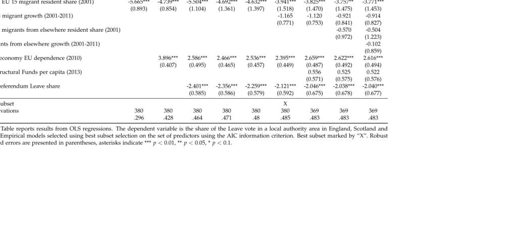
In Table 1 we correlate the Vote Leave share with measures of immigration, EU trade
dependence, EU subsidies (Structural Funds) and the 1975 referendum Leave share. The
variation from the initial EU 15 migrant resident share in column 1 alone generates an
R2 of 29.6 percent. Adding the measure of EU trade dependence in column 2 increases
the R2 further. These two regressors together have the largest explanatory power of
any two variables in this first group of predictors, jointly explaining 42.8 percent of the
variation in the referendum result. The subsequent columns add only marginally to the
R2. Overall, the full set of regressors explains 48.3 percent of the variation in the Vote
Leave share. Using the Akaike information criterion (AIC) as our
degree-of-freedom-adjusted measure of goodness of fit, column 6 turns out to provide the best trade-off
between parsimony and overall explanatory power. This column is marked by an “X”
in the row “Best Subset”. All subsequent tables follow the same logic.
We use migrant resident shares in levels for the year 2001 and their growth between
2001 and 2011 for three subgroups: migrants from the 12 EU accession countries that
joined in 2004 and 2007, from the initial EU 15 countries, and from non-EU countries.
It turns out that migrant shares inlevels are negatively correlated with the Brexit vote
as those immigrants predominantly moved to urban areas that subsequently voted for
Remain in 2016. The striking observation is that in terms of migrant sharegrowth, only
migration from the mainly Eastern European EU accession countries positively
corre-lates with the Vote Leave share. The well-established literature studying the economic
implications of migration on labour market outcomes supports the notion that there
are distributional consequences of low-skilled migration putting pressure on wages for
low-skilled natives (see e.g.,Borjas, 2003;Cortes, 2008; Borjas and Monras, 2016).
Mi-gration from Eastern Europe, predominantly of low-skilled workers, affected areas with
a lower-skilled resident population.27 As we will see below, low skills correlate with a
larger Vote Leave share.
In terms of the point estimates, their interpretation is simplified by the fact that
all regressors are standardized to have mean zero and a standard deviation of one.
For instance, in the best subset specification displayed in column 6, a one-standard
deviation higher initial EU 15 migrant share is associated with a 3.941 percentage-point
lower Vote Leave share.
In Appendix B we explore, in a speculative way, what may have happened to the
27Becker and Fetzer(2016) estimate the causal effect of immigration from Eastern Europe on the UKIP
EU referendum vote under alternative scenarios in which migration to the UK would
have been different. We find that since the vote shares do not appear very sensitive
to migration, only a large reversal of the EU accession immigration experience would
have swayed the vote. We stress, however, that such speculative scenarios must be taken
with a large grain of salt, not least since various regressors on the right-hand side are
correlated and a causal interpretation is generally not possible.
The EU trade dependence of local authority areas is also positively correlated with
the Vote Leave share. The reason is that areas with a heavy concentration of
manufac-turing (such as the North East of England) tend to disproportionately import from and
export to European Union countries, and those areas were likely to vote Leave. This
finding has been highlighted in the public discussion before: those areas most
depen-dent on trade integration with the EU were more likely to vote Leave (see Los et al.,
2017). Interestingly, shortly after the referendum when Nissan threatened to stop
fur-ther investment in Sunderland (one of the areas with a large Vote Leave share), pressure
mounted on Westminster to do “something” to keep Nissan on board.
EU Structural Funds per capita over the EU Programming period 2007-2013 have
no predictive power. Some have argued that EU subsidies in the form of EU Structural
Funds would ‘buy votes.’ Davies (2016) argues that EU funding may be perceived by
voters as a handout and a symbol of foreign dependence. As a consequence, regions
receiving more money may loathe the EU more. Interestingly, Cornwall, the area
receiv-ing the largest amount of EU Structural Funds per capita, voted Leave but immediately
after the referendum (on 24 June 2016) pleaded with the UK government to continue
payments after EU money runs out. Our results indicate that, on balance, EU Structural
Funds do not predict the Vote Leave share.
Finally, we include matched vote shares from the 1975 EU referendum as an
addi-tional regressor. There is a strong negative association between voting Leave in 2016
and 1975, suggesting different underlying attitudes and considerations across voting
areas (see section2.4).
4.1.2 Group 2: Public service provision and fiscal consolidation
In Table2, we observe that the share of residents in a local authority area who commute
to London is a strong predictor for voting Remain.28 This might be explained by the
fact that those commuting into London are relatively high-skilled who have a larger
28Note that people commute to London from as far as Manchester, 200 miles from London and a
tendency to vote Remain. On the other hand, house ownership is strongly correlated
with the Vote Leave share. This correlation may not be surprising as house ownership
is highest amongst the older section of the population. The share of the population in
rented council housing, a measure of those potentially under increased pressure from
migration of largely low-skilled Eastern European migrants, also has a strong positive
correlation with the Vote Leave share.
Another important predictor in this group of variables is the extent of total fiscal
cuts. Local authorities experiencing more fiscal cuts are more likely to vote in favour
of leaving the EU. Importantly, fiscal cuts were implemented as de-facto proportionate
reductions in grants across all local authorities (Innes and Tetlow, 2015). This setup
implies that reliance on central government grants is a proxy variable for deprivation,
with the poorest local authorities being more likely to be hit by the cuts. This makes it
impossible in the cross-section (and challenging in a panel) to distinguish the effects of
poor fundamentals from the effects of fiscal cuts. With this caveat on the interpretation
in mind, our results suggest that local authorities experiencing more fiscal cuts were
more likely to vote in favour of leaving the EU. Given the nexus between fiscal cuts and
local deprivation, we think that this pattern largely reflects pre-existing deprivation. In
AppendixBwe provide speculative scenarios for fiscal cuts.
In a similar manner, pressure on the public health system matters. In regions where
the share of suspected cancer patients waiting for treatment for less than 62 days is
larger, the Vote Leave share is lower. By symmetry, where waiting times are longer, Vote
Leave gains. Finally, areas with a larger share of the workforce in public employment,
a measure of (a) availability of public services and (b) public jobs, the Vote Leave share
is lower. In summary, results indicate that provision of public services and the severity
of fiscal cuts mattered for the referendum result. Overall, variables capturing public
service provision and fiscal consolidation explain slightly more than 50 percent of the
variation in the Vote Leave share.
4.1.3 Group 3: Demography and education
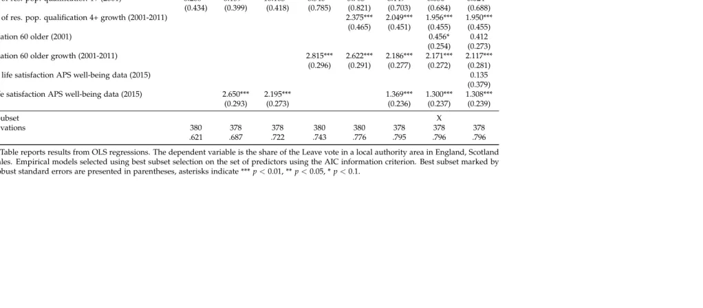
In Table3, we explore whether demography and education variables predict the
refer-endum result. As predictors, we use both the baseline levels in 2001 and the growth
between 2001 and 2011 of the share of the population that has no qualifications or a
high qualification, respectively. The middle qualification range is the reference group.
The results indicate that a larger baseline share of the population with no qualifications
2001 and 2011 is further associated with a higher Vote Leave share. In contrast, the
share of the population that has a high qualification is associated with a lower Vote
Leave share. But somewhat surprisingly, faster growth of the share with a high
qualifi-cation is associated with a larger Vote Leave share. We cannot exclude that this partially
captures a generally faster increase in the population, which in turn might be associated
with pressure on housing and public services.
In terms of age brackets, we use the share of the population aged 60 and older,
which makes those younger than 60 the reference group.29 Both a higher baseline share
of older people as well as a larger increase in their share between 2001 and 2011 predict
a larger Vote Leave share. This is consistent with polls in the run-up to the referendum
indicating a clear age gradient in the Vote Leave share, with younger voters intending
to vote Remain and older voters intending to vote Leave.30
We also add life satisfaction scores from the well-being questions in the Annual
Population Survey. The mean score is insignificant. However, the coefficient of variation
is positively related to the Vote Leave share. This finding suggests that a higher relative
dispersion of well-being across voting areas, which can be interpreted as a measure of
life satisfaction inequality, has positive predictive power for the Vote Leave share.
Overall, it is striking that the demography and education group of variables has
the largest predictive power of any of the groups, with an R2 of close to 80 percent
and strongly significant associations in most cases between our regressors and the Vote
Leave share.
4.1.4 Group 4: Economic structure, wages and unemployment
In Table 4, we concentrate on variables characterizing the sectoral structure of voting
areas, both in terms of levels in the baseline year 2001 and in terms of their changes
from 2001 to 2011. We single out employment in retail, manufacturing, construction and
finance, and subsume all other sectors in the residual reference category. This reference
category is of course quite heterogeneous, containing sectors such as agriculture, the
public sector and various service sectors. This being said, a higher share of employment
in the baseline year in any of the four sectors highlighted in Table4is associated with
a larger Vote Leave share compared to the reference category.
As for the change in employment between 2001 and 2011, a stronger increase in
29Note that in principle, we could use more finely grained age brackets. But in the long specifications
in Section4.2, this would run into dimensionality issues for the machine learning algorithm, as explained above.
manufacturing, construction and finance employment is associated with a higher Vote
Leave share. The growth of retail employment is not significantly associated with the
Vote Leave share.
We also include median hourly pay as well as the interquartile pay range as a
mea-sure of inequality, again both in terms of levels and their changes (with 2005 and 2015
as the relevant years). A higher median hourly pay in the year 2005 is not significantly
related to the vote. However, a stronger increase in that variable is associated with a
lower Vote Leave share, consistent with the narrative that those “left behind” were more
likely to vote Leave. We mostly do not find a significant relationship for the interquartile
pay range, if anything a negative relationship in levels.
Finally, we add the unemployment rate, the self-employment rate and the general
labour participation rate in the year prior to the referendum. A larger unemployment
rate is associated with a larger Vote Leave share, but the self-employment and
partic-ipation rates have no predictive power for the Vote Leave share. Overall, variables in
this group explain around 69 percent of the variation in the Vote Leave share.31
4.1.5 Summary of analysis of four groups of predictor variables
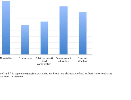
Overall, each of Tables1-4yields an R2 of at least 48 percent with a full set of
regres-sors. The strongest explanatory power lies with demography and education variables
in Table 3. Figure 3 gives a visual overview of the goodness of fit across Tables 1-4,
where as a comparison the first bar represents the explanatory power of the regression
underlying column 2 in Table5(see below).
The analysis of variables by group mainly served the purpose of considering
differ-ent aspects of the referendum result in more detail and to see how well differdiffer-ent groups
of variables perform relative to each other. But of course, it makes sense to allow all
groups of variables to ‘compete’ against each other in a single setup. This is what we
turn to in section4.2.
4.2 Best subset selection results
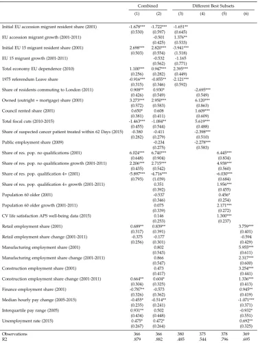
In Table 5 we use the best subset selection procedure for variables across all groups.
Column 1 displays the best subset of variables when all the “best” variables from the
four separate groups of regressors are combined in one joint ‘horse race.’ The regressors
include two migration variables, EU trade dependence, the 1975 referendum vote share,
fiscal cuts, various qualification variables, median pay and the unemployment rate,
amongst others. Overall, we obtain anR2 of almost 88 percent with 19 variables.
Column 2 displays a full specification including all variables without performing
another round of best subset selection that yields essentially the sameR2, despite the
fact that the model of column 1 is a restricted version of the model in column 2. As
a comparison, columns 3 through 6 re-display estimates using only the best subsets
uncovered in each of the four variable groups from the previous tables. We stress
that as in previous tables, Table 5 just reports conditional correlations with no causal
identification.
We need to point out one caveat when it comes to the interpretation of column 2 of
Table5. While the point estimates, coefficient signs and statistical significance of
vari-ableswithin variable groupsare internally consistent when we add successive regressors
(using the same procedure underlying Tables 1-4), some coefficient signs and
statisti-cal significance patterns are different in the combined model of column 2 compared to
columns 3 through 6. This is not surprising per se. The differences are attributable to
the tight correlation between regressorsacross variable groups. For example, in column 2
the coefficient on total fiscal cuts is negative in contrast to the positive coefficient in
column 4.
In particular, the demographic variables are tightly correlated with other key
vari-ables of interest. For example, the correlation between the share of individuals with
no qualifications and the fiscal cuts measure is 65 percent. Similarly, the growth in the
share of individuals with low qualifications may be partly driven by low-skilled
mi-grant growth (its correlation with EU accession mimi-grant growth is 48 percent). Hence, it
is not surprising that when we remove the qualification measures from the analysis, the
coefficient patterns across fiscal cuts and EU accession migration growth remain stable
(see TableA2in the appendix in contrast to Table5).
For completeness and as a robustness check, we also perform a best subset selection
exercise focusing on variables in levels (see TableA3in the appendix) and variables in
changes (see Table A4 in the appendix). In our baseline Table 5 we have two sets of
regressors. First, we have a common core of variables that are in levels only. Second,
we have a set of variables for which both changes as well as baseline levels are available
(mostly qualification variables and employment shares). TableA3performs best subset
selection on the first set and the subset of the second set of variables that are levels only.
TableA4performs best subset selection on the first set and the subset of the second set
in each table, it is not surprising that overall explanatory power in terms ofR2is lower
in principle. But it still turns out roughly the same in the case of Table A3. For the
most part, certainly in TableA3, the variables show similar patterns of magnitude and
significance as in Table5.
To understand not only the predictive but rather the causal drivers of the Brexit
vote, it would seem important to analyze data in panel form. We highlight that
polit-ical support for the UKIP party in previous European Parliament elections, due to its
strong predictive power for the Leave vote in the 2016 referendum, might be the
appro-priate outcome measure to better understand the causal mechanisms by which other
characteristics affect the 2016 referendum result. Becker and Fetzer (2016) provide a
first attempt along those lines, studying the effect of migration from Eastern Europe
on UKIP vote shares over time. It seems an important future research agenda to use
plausible identification strategies and possibly micro-level data on individual voters to
explain voting patterns in response to changes in socio-economic fundamentals.
Finally, we also consider the voting results separately for Scotland only. As there
are only 32 voting areas in Scotland, we face lower statistical power and hence a larger
number of insignificant coefficients. Nevertheless, we find broadly similar regression
results in terms of signs and relative magnitudes compared to those in Tables1-5for the
entire sample. In particular, we find similar roles for higher qualification and median
pay (associated with a lower Vote Leave share) and higher manufacturing employment
(associated with a higher Vote Leave share).32 Therefore, while the intercept of support
for Vote Leave is clearly lower in Scotland, we do not have evidence to suggest that the
coefficient patterns (i.e., slopes) for Scotland behave very differently from those for the
entire sample.
SectionC.2in Appendix Cdocuments that similar socio-economic forces also seem
to be associated with the Vote Leave result when we explore within-city variation. This
suggests that the underlying associations do not just mask a divide between urban and
rural areas.
4.3 Interaction terms
While we have so far concentrated on a comprehensive approach to predicting the Vote
Leave share, we also want to highlight whether salient factors reinforced each other. In
the debate before and after the referendum, increased migration and fiscal cuts were
highlighted as two salient developments over the years preceding the vote. Arguably,