2018
Visualization methods for genealogical and
RNA-sequencing studies: Pertinence, software, and
applications
Lindsay Rutter
Iowa State University
Follow this and additional works at:
https://lib.dr.iastate.edu/etd
Part of the
Bioinformatics Commons
,
Entomology Commons
, and the
Statistics and Probability
Commons
This Dissertation is brought to you for free and open access by the Iowa State University Capstones, Theses and Dissertations at Iowa State University Digital Repository. It has been accepted for inclusion in Graduate Theses and Dissertations by an authorized administrator of Iowa State University Digital Repository. For more information, please [email protected].
Recommended Citation
Rutter, Lindsay, "Visualization methods for genealogical and RNA-sequencing studies: Pertinence, software, and applications" (2018).
Graduate Theses and Dissertations. 17305.
Pertinence, software, and applications
by
Lindsay Rutter
A dissertation submitted to the graduate faculty in partial fulfillment of the requirements for the degree of
DOCTOR OF PHILOSOPHY
Major: Bioinformatics and Computational Biology
Program of Study Committee: Dianne Cook, Co-major Professor Amy L. Toth, Co-major Professor
Heike Hofmann Daniel Nettleton
James Reecy
The student author, whose presentation of the scholarship herein was approved by the program of study committee, is solely responsible for the content of this dissertation. The
Graduate College will ensure this dissertation is globally accessible and will not permit alterations after a degree is conferred.
Iowa State University Ames, Iowa
2018
DEDICATION
TABLE OF CONTENTS
LIST OF TABLES . . . vii
LIST OF FIGURES . . . ix
ACKNOWLEDGEMENTS . . . xvii
ABSTRACT . . . xx
CHAPTER 1. OVERVIEW . . . 1
1.1 Biological data visualization . . . 1
1.2 R statistical software . . . 2
1.3 Dissertation research aims . . . 3
1.4 Visualization of genealogy data . . . 5
1.5 Visualization of RNA-sequencing data . . . 8
1.6 Virus infection and diet effects on gene expression in honey bees . . . 13
1.7 Dissertation organization . . . 14
1.8 References . . . 16
CHAPTER 2. VISUALIZATION METHODS FOR GENEALOGICAL DATA 21 2.1 Introduction . . . 21
2.2 Example datasets . . . 22
2.2.1 Soybean genealogy . . . 22
2.2.2 Academic genealogy of statisticians . . . 23
2.3 Genealogical input format . . . 25
2.4 Generating a graphical object . . . 25
2.5 Plotting a shortest path . . . 27
2.7 Plotting ancestors and descendants by generation . . . 33
2.8 Plotting distance matrix . . . 35
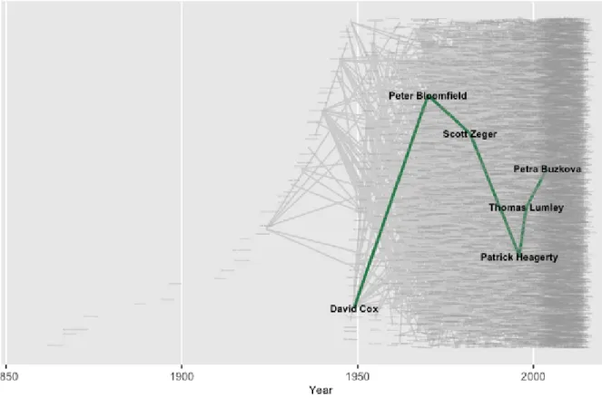
2.9 Academic genealogy of statisticians . . . 36
2.9.1 Interactive visualization of genealogical structure . . . 43
2.10 Conclusions . . . 45
2.11 Acknowledgments . . . 45
2.12 References . . . 45
CHAPTER 3. THE CASE FOR VISUALIZATION METHODS IN RNA-SEQUENCING DATA ANALYSIS . . . 47
3.1 Introduction . . . 47
3.2 Parallel coordinate plots . . . 49
3.3 Scatterplot matrices . . . 51
3.3.1 Overview of scatterplot matrices . . . 51
3.3.2 Assessing normalization with scatterplot matrices . . . 53
3.3.3 Checking for common errors with scatterplot matrices . . . 56
3.3.4 Finding unexpected patterns in scatterplot matrices . . . 58
3.3.5 Assessing differential expression calls in scatterplot matrices . . . 59
3.4 Litre plots . . . 62
3.5 Closing case study . . . 66
3.6 Discussion . . . 94
3.7 Acknowledgments . . . 95
3.8 References . . . 95
CHAPTER 4. SOFTWARE FOR VISUALIZATION METHODS IN RNA-SEQUENCING DATA ANALYSIS . . . 99
4.1 Introduction . . . 99
4.2 Implementation . . . 100
4.3 Supported data types . . . 101
4.5 Discussion . . . 104
4.6 Acknowledgments . . . 104
4.7 References . . . 104
CHAPTER 5. GENE EXPRESSION RESPONSES TO DIET QUALITY AND VIRAL INFECTION IN APIS MELLIFERA . . . 106
5.1 Introduction . . . 106
5.2 Methods . . . 109
5.2.1 Design of two-factor experiment . . . 109
5.2.2 RNA extraction . . . 110
5.2.3 Gene expression . . . 110
5.2.4 Comparison to prior studies on transcriptomic response to viral infection 111 5.2.5 Visualization . . . 112
5.2.6 Gene Ontology . . . 112
5.2.7 Probing tolerance versus resistance . . . 113
5.3 Results . . . 114
5.3.1 Phenotypic results . . . 114
5.3.2 Main effect DEG results . . . 115
5.3.3 Pairwise comparison of DEG results . . . 117
5.3.4 Prior study comparison results . . . 118
5.3.5 Tolerance versus resistance results . . . 121
5.4 Discussion . . . 122
5.5 Acknowledgments . . . 128
5.6 References . . . 128
CHAPTER 6. CONCLUSIONS . . . 136
6.1 Contribution to genealogical data visualization . . . 136
6.2 Contribution to RNA-sequencing data visualization . . . 137
6.3 Contribution to understanding diet quality and viral inoculation effects on gene expression in honey bees . . . 139
6.4 Future work . . . 139
6.5 References . . . 141
APPENDIX A. SUPPLEMENTARY MATERIAL FOR CHAPTER 3 . . . . 142
APPENDIX B. SUPPLEMENTARY MATERIAL FOR CHAPTER 4 . . . . 151
LIST OF TABLES
Table 5.1 Contrasts for assessing gene ontology and pathway analysis. . . 113
Table 5.2 Known functions of the mapped subset of 43 DEGs in the virus main effect. . . 117
Table C.1 Number of DEGs across three analysis pipelines for the diet effect in our study, the virus main effect in our study, and the virus main effect in the study that used single-drone inseminated queen colonies. . . 171
Table C.2 Pathways related to diet main effect Chestnut-upregulated DEGs in our data. . . 172
Table C.3 Pathways related to diet main effect Rockrose-upregulated DEGs in our data. . . 173
Table C.4 Gene ontology results for the 601 DEGs in our data that were upreg-ulated in the NC treatment from the NC versus NR treatment pair analysis. . . 173
Table C.5 Gene ontology analysis results for the 340 DEGs in our data that were upregulated in the NR treatment from the NC versus NR treatment pair analysis. . . 174
Table C.6 Gene ontology analysis results for the 247 DEGs in our data that were upregulated in the VC treatment from the VC versus VR treatment pair analysis. . . 174
Table C.7 Gene ontology analysis results for the 129 DEGs in our data that were upregulated in the VR treatment from the VC versus VR treatment pair analysis. . . 174
Table C.8 Number of DEGs in our data across three analysis pipelines for all six treatment pair combinations between the diet and virus factor. . . 175
LIST OF FIGURES
Figure 1.1 Example pedigree chart from thekinship2package. . . 6
Figure 1.2 Example genealogical display using popular graph software likeGraphViz and Cytoscape. . . 8
Figure 1.3 Original example of replicate line plots fromCook et al.,2007. . . 12
Figure 2.1 Example of unidirectional and directional parent-child relationships. . 28
Figure 2.2 Genealogical path superimposed over data structure with small bin size. 30
Figure 2.3 Genealogical path superimposed over data structure with large bin size. 32
Figure 2.4 Example of the benefits of repeated labeling in genealogical studies. . . 34
Figure 2.5 Example shortest path degree matrix. . . 36
Figure 2.6 Descendant genealogical structure of the academic statistician with the largest number of “descendants” in the Mathematics Genealogy Project. 39
Figure 2.7 Path between the academic statistician with the largest number of “de-scendants” in the Mathematics Genealogy Project and a fifth generation “descendant”. . . 40
Figure 2.8 Path between the academic statistician with the largest number of “de-scendants” in the Mathematics Genealogy Project and a fifth generation “descendant” superimposed on the data structure. . . 42
Figure 2.9 Path between the academic statistician with the largest number of “de-scendants” in the Mathematics Genealogy Project and a fifth generation “descendant” superimposed on the data structure with improved visibility. 43
Figure 3.1 Simulated example of boxplots, multidimensional scaling plots, and par-allel coordinate plots for diagnosing differential expression. . . 50
Figure 3.2 Parallel coordinate plots of significant genes after hierarchical clustering of the data fromLauter and Graham,2016. . . 52
Figure 3.3 Example of the expected structure of an RNA-sequencing dataset, using soybean cotyledon data from Brown and Hudson,2015. . . 54
Figure 3.4 Example of the use of scatterplot matrices to check data normalization with data fromRisso et al.,2011. . . 57
Figure 3.5 Example of the use of scatterplot matrices to check for sample switching using data from Brown and Hudson,2015. . . 60
Figure 3.6 Example of the use of scatterplot matrices to check for geometrical fea-tures using data from Lauter and Graham,2016. . . 61
Figure 3.7 Example of expected structure of DEGs overlaid onto scatterplot matrix using data from Brown and Hudson,2015. . . 64
Figure 3.8 Example litre plots of representative genes from clusters created in Fig-ure3.2using data from Lauter and Graham,2016. . . 65
Figure 3.9 Example of the use of scatterplot matrices to check for lopsided outliers using data from Marioni et al.,2008. . . 67
Figure 3.10 Using parallel coordinate plots to examine DEGs after library lane nor-malization and TMM nornor-malization using data fromMarioni et al.,2008. 68
Figure 3.11 Parallel coordinate plots showing eight hierarchical clusters from the 3,974 genes that remained in the kidney-specific DEGs after TMM nor-malization of data fromRobinson and Oshlack,2010. . . 74
Figure 3.12 Parallel coordinate plots showing eight hierarchical clusters from the 1,968 genes that remained in the liver-specific DEGs after TMM nor-malization of data fromRobinson and Oshlack,2010. . . 75
Figure 3.13 Parallel coordinate plots showing eight hierarchical clusters from the 3,076 genes that were removed from the kidney-specific DEGs after TMM normalization of data fromRobinson and Oshlack,2010. . . 76
Figure 3.14 Parallel coordinate plots showing eight hierarchical clusters from the 1,578 genes that wereadded as liver-specific DEGs after TMM normal-ization of data fromRobinson and Oshlack,2010. . . 77
Figure 3.15 Scatterplot matrix of the 1,136 genes that were in the first cluster of Figure 3.11 from genes that remained as kidney-specific DEGs even after TMM normalization of data fromRobinson and Oshlack,2010. . 78
Figure 3.16 Scatterplot matrix of the 933 genes that were in the first cluster of Figure3.12 from genes that remained as liver-specific DEGs even after TMM normalization of data fromRobinson and Oshlack,2010. . . 79
Figure 3.17 Scatterplot matrix of the 529 genes that were in the first cluster of Figure3.13from genes that no longer remained as kidney-specific DEGs after TMM normalization of data fromRobinson and Oshlack,2010. . 80
Figure 3.18 Scatterplot matrix of the 317 genes that were in the first cluster of Figure 3.14 from genes that were added as liver-specific DEGs after TMM normalization of data fromRobinson and Oshlack,2010. . . 81
Figure 3.19 Example litre plots from the 1,136 genes that were in the first cluster Figure 3.11 of genes that remained as kidney-specific DEGs even after TMM normalization of data fromRobinson and Oshlack,2010. . . 82
Figure 3.20 Example litre plots from the 933 genes that were in the first cluster of Figure3.12 from genes that remained as liver-specific DEGs even after TMM normalization of data fromRobinson and Oshlack,2010. . . 83
Figure 3.21 Example litre plots from the 529 genes that were in the first cluster of Figure 3.13 of genes that no longer remained as kidney-specific DEGs after TMM normalization of data fromRobinson and Oshlack,2010. . 84
Figure 3.22 Example litre plots from the 317 genes that were in the first cluster of Figure 3.14 from genes that were added as liver-specific DEGs after TMM normalization of data fromRobinson and Oshlack,2010. . . 85
Figure 3.23 Scatterplot matrix of thestandardized 1,136 genes that were in the first cluster of Figure3.11from genes that remained as kidney-specific DEGs even after TMM normalization of data fromRobinson and Oshlack,2010. 86
Figure 3.24 Scatterplot matrix of the standardized 933 genes that were in the first cluster of Figure 3.12 from genes that remained as liver-specific DEGs even after TMM normalization of data fromRobinson and Oshlack,2010. 87
Figure 3.25 Scatterplot matrix of the standardized 529 genes that were in the first cluster of Figure 3.13 from genes that no longer remained as kidney-specific DEGs after TMM normalization of data from Robinson and Oshlack,2010. . . 88
Figure 3.26 Scatterplot matrix of the standardized 317 genes that were in the first cluster of Figure3.14from genes that wereadded as liver-specific DEGs after TMM normalization of data fromRobinson and Oshlack,2010. . 89
Figure 3.27 Examplestandardized litre plots from the 1,136 genes that were in the first cluster of Figure 3.11 of genes that remained as kidney-specific DEGs even after TMM normalization of data fromRobinson and Osh-lack,2010. . . 90
Figure 3.28 Example litre plots from the 933 genes that were in the first cluster of Figure3.12 from genes that remained as liver-specific DEGs even after TMM normalization of data fromRobinson and Oshlack,2010. . . 91
Figure 3.29 Standardized litre plots for the nine genes with the lowest FDR val-ues out of the 529 genes that were in the first cluster of Figure 3.13
of genes that no longer remained as kidney-specific DEGs after TMM normalization of data fromRobinson and Oshlack,2010. . . 92
Figure 3.30 Standardized litre plots for the nine genes with the lowest FDR values out of the 317 genes that were in the first cluster of Figure 3.14 from genes that wereadded as liver-specific DEGs after TMM normalization of data fromRobinson and Oshlack,2010. . . 93
Figure 4.1 Video demonstrating an interactive scatterplot matrix thresholded based on prediction interval. . . 102
Figure 4.2 Video demonstrating an interactive volcano plot. . . 103
Figure 5.1 Mortality rates for the four treatment groups, two virus groups, and two diet groups. . . 115
Figure 5.2 IAPV titer volumes for the four treatment groups, two virus groups, and two diet groups. . . 116
Figure 5.3 Parallel coordinate plots of the 1,019 DEGs after hiearchical clustering of size four between the virus-infected and control groups of the study byGalbraith et al.,2015. . . 119
Figure 5.4 Parallel coordinate plots of the 43 DEGs after hiearchical clustering of size four between the virus-infected and control groups of our study. . 120
Figure 5.5 Gene ontology analysis results for the 122 DEGs related to our “tol-erance” hypothesis and for the 125 DEGs related to our “resistance” hypothesis. . . 123
Figure 5.6 Venn diagrams comparing the virus-related DEG overlaps between our dataset and the dataset fromGalbraith et al.,2015. . . 125
Figure A.1 Number of PubMed publications per year for search term “RNA-seq”. 142
Figure A.2 Example application of parallel coordinate plots using the iron-metabolism soybean dataset. . . 143
Figure A.3 Example application of scatterplot matrix to assess the 2,751 significant genes in Cluster 1 from Figure3.2after performing a hierarchical cluster-ing analysis with a cluster size of four on data from the iron-metabolism soybean dataset. . . 144
Figure A.4 Example application of scatterplot matrix to assess the 2,009 significant genes in Cluster 2 from Figure3.2after performing a hierarchical cluster-ing analysis with a cluster size of four on data from the iron-metabolism soybean dataset. . . 145
Figure A.5 Example application of scatterplot matrix to assess the 861 significant genes in Cluster 3 from Figure3.2after performing a hierarchical cluster-ing analysis with a cluster size of four on data from the iron-metabolism soybean dataset. . . 146
Figure A.6 Example application of scatterplot matrix to assess the 17 significant genes in Cluster 4 from Figure3.2after performing a hierarchical cluster-ing analysis with a cluster size of four on data from the iron-metabolism soybean dataset. . . 147
Figure A.7 Demonstration that boxplots and multidimensional plots do not detect sample switching in data from the iron-metabolism soybean dataset. . 148
Figure A.8 The number of DEGs increased vastly over three time points in the soybean iron metabolism study. . . 149
Figure A.9 Litre plots for significant genes inside Cluster 1 from Figure3.2 in data from the iron-metabolism soybean dataset. . . 150
Figure B.1 Video demonstrating an interactive scatterplot matrix from thebigPint package that allows users to threshold based on orthogonal distance from the x=y line. . . 151
Figure B.2 Video demonstrating an interactive scatterplot matrix from thebigPint package that allows users to threshold based on fold change. . . 152
Figure B.3 Video demonstrating an interactive parallel coordinate plot from the plotlypackage. . . 153
Figure B.4 Video demonstrating an improved interactive parallel coordinate plot with thebigPint package. . . 154
Figure C.1 Multidimensional scaling plots constructed from DESeq2 package for the non-infected control and virus treated comparisons for the single-drone dataset and for our dataset. . . 176
Figure C.2 Parallel coordinate plots of the 1,914 DEGs in our data after hiearchical clustering of size six between the Chestnut and Rockrose groups. . . . 177
Figure C.3 Example litre plots of the nine DEGs with the lowest FDR values from the 43 virus-related DEGs of our dataset. . . 178
Figure C.4 Example litre plots of the nine DEGs with the lowest FDR values from the 365 DEGs in Cluster 1 of Figure5.3from the single-drone data. . . 179
Figure C.5 Example litre plots of the nine DEGs with the lowest FDR values from the 327 DEGs in Cluster 2 of Figure5.3from the single-drone data. . . 180
Figure C.6 The 365 DEGs from the first cluster of the single-drone dataset shown in Figure5.3 superimposed onto the form of a scatterplot matrix. . . . 181
Figure C.7 The 327 DEGs from the second cluster of the single-drone dataset shown in Figure5.3 superimposed onto the form of a scatterplot matrix. . . . 182
Figure C.8 The 224 DEGs from the third cluster of the single-drone dataset shown in Figure5.3 superimposed onto the form of a scatterplot matrix. . . . 183
Figure C.9 The 103 DEGs from the fourth cluster of the single-drone dataset shown in Figure5.3 superimposed onto the form of a scatterplot matrix. . . . 184
Figure C.10 The 43 virus-related DEGs from our dataset superimposed onto all genes in the form of a scatterplot matrix, showing only replicates 1, 2, and 3 from both treatment groups. . . 185
Figure C.11 The 43 virus-related DEGs from our dataset superimposed onto all genes in the form of a scatterplot matrix, showing only replicates 4, 5, and 6 from both treatment groups. . . 186
Figure C.12 The 43 virus-related DEGs from our dataset superimposed onto all genes in the form of a scatterplot matrix, showing only replicates 7, 8, and 9 from both treatment groups. . . 187
Figure C.13 The 43 virus-related DEGs from our dataset superimposed onto all genes in the form of a scatterplot matrix, showing only replicates 10, 11, and 12 from both treatment groups. . . 188
Figure C.14 Parallel coordinate plots of the 122 DEGs in our data after hiearchical clustering of size four between the “tolerance” candidate genes. . . 189
Figure C.15 Parallel coordinate plots of the 125 DEGs in our data after hiearchical clustering of size four between the “resistance” candidate genes. . . 190
ACKNOWLEDGEMENTS
I would like to express thanks to my committee members who supported me writing this dissertation. To my co-advisor Dr. Amy Toth, who graciously introduced me to the captivating world of social insects. She leads a large and vibrant laboratory but still provides such undivided attention to individual members. She challenged me to think deeper about both the details and the greater picture of this dissertation, and was there with infectious optimism and gritty encouragement whenever my research reached inevitable slowdowns. To my co-advisor Dr. Dianne Cook and Dr. Heike Hofmann, the dynamic duo behind the statistical graphics group. Both of them encourage students to fully embrace creativity and never fear approaching research questions from unorthodox perspectives. I plan to carry the fulfilling mentality they instilled in me throughout my research career. To my committee members, Dr. Daniel Nettleton and Dr. James Reecy for their thoughtful dedication. I will always remember how focused my five committee members were: After I presented my dissertation, it started noisily hailing against the windows of our meeting room, but this ominous event surrounding us went entirely unnoted for an absurd amount of time because they simply spoke louder. This dissertation incorporates feedback from each of them and I greatly appreciate their assistance and expertise.
I want to express my gratitude for our bioinformatics program coordinator, Trish Stauble. She was often the first person I sought advice from when I faced difficulties and helped me obtain funding on numerous occasions. Trish brings the community together with her open mind and big heart. I enjoyed the dinners she organized for us “children” at her home, where she and her huskies would sing for us. Trish not only generously helped with the logistics of my graduate tenure, but she added splashes of music and color to it along the way.
I have thoroughly enjoyed my time at Iowa State thanks to the fantastic bioinformatics and statistics communities. I would like to thank researchers who were vital to the success of this dissertation. Susan VanderPlas began the work on the genealogy visualization project
and helped me transition to the R programming language. Adam Dolezal began the work on the honey bee RNA-sequencing project and offered much insight into nutrition, viruses, and honey bees. I would also like to recognize Carson Sievert for generous assistance with Plotly technicalities and Dr. Andrew Severin for support with computational resources and general bioinformatics questions. Several researchers advised me in projects during my graduate career that helped me grow as a researcher: Li Xue oriented me to useful bioinformatics techniques in our project on protein interface prediction, Xiaoyue Cheng taught me effective software development techniques in our project on electronic reporting of academic learning, and Roxane Legaie consistently discussed ways to improve my RNA-sequencing visualization tools. I would also like to thank individuals who mentored me during graduate school: Dr. Amy Froelich, Dr. Olga Chyzh, Dr. Holly Bender, and Karen Bovenmyer. Each of these people took time out of their busy schedules to discuss my graduate school progression and career goals and I am forever indebted to their kindness.
I was fortunate to perform research in several labs during my graduate career that helped me broaden and solidify my scientific thinking and would like to thank the advisors who made that possible: Dr. Dennis Lavrov of the Molecular Phylogenetics and Animal Evolution Lab at Iowa State, Dr. Vasant Honavar of the Artificial Intelligence Research Lab at Iowa State, Dr. Nori Satoh of the Marine Genomics Unit at the Okinawa Institute of Science and Technology, and Dr. Jonathan Galazka of the NASA GeneLab at NASA Ames Research Center.
I must thank some of my dearest friends and roommates at Iowa State: Sarah Anderson, Mingze He, Jennifer Chang, Kate Martens, Ana-Marija Nedi´c, Danqing Yu, and Mai Huong. At times, they unwittingly served as backup human alarm clocks, helped me prepare food for my seminars, and joined me in exploring activities outside of research. Together, I hope we all acquired some good old-fashioned, hard-working, and do-it-yourself Iowan spirit.
Last but not least, I would like to thank my family for their unwavering support. My Mom for selflessly backing my dreams even if some have been offbeat; my Dad for fostering my imagination and for sending me articles related to insects, brains, and space science; my brother and sister-in-law for gladly welcoming me to crash their couch so I could participate in hackathons; and my sister for rooting for me since day one as my best friend and for
emboldening me each day as a fellow scientist. My family has gone through great lengths to accommodate my scientific endeavors and I cannot express my gratitude enough for their love. This dissertation would not have been possible if my cat Cletus urinated on it, and so I must sheepishly end by thanking my furry family member for his constructive support as well.
ABSTRACT
As is the case in many fields, biological disciplines are now facing the challenges of increas-ingly large and complex data. Biologists must now process and meaningfully interpret a deluge of data, and one necessary approach toward accomplishing this goal is through the use of vi-sualization. Ultimately, the objective of developing visualization tools for biological data is to provide biologists with enhanced insight into the processes within organelles, cells, organs, and even whole organisms. R is a free interpretive programming language for statistical computing and graphics. It is widely used by statisticians to develop statistical software and data analysis tools, and has become even more popular in recent years for researchers across a wide range of disciplines.
In this dissertation, we focus primarily on developing effective visualization tools for ge-nealogical and RNA-sequencing datasets within the R framework. This work addresses the lack of modern and interactive visualization techniques in the fields of genealogy and RNA-sequencing through the following specific aims: (i) develop improved visualization techniques for genealogical datasets; (ii) generate comprehensive collections of examples underlining the importance of visualizing RNA-sequencing datasets; (iii) develop improved visualization meth-ods for RNA-sequencing datasets; and (iv) perform an RNA-sequencing experiment that ex-amines virus inoculation and nutrition in honey bees while applying the visualization tools we previously validated and developed.
First, we present our software package ggenealogy that includes new visualization tools for genealogical datasets. In particular, we introduce a new method that provides unequivocal information about lineages in situations where intergenerational breeding occurs, as is often the case in agronomic applications. This was not previously possible with standard pedigree charts. Second, we create a compilation of reproducible examples using numerous public RNA-sequencing datasets that demonstrates uncommon visualization techniques detecting
normal-ization issues, differential expression designation problems, and common analysis errors. We also show that these visualization tools can identify genes of interest in ways undetectable with models. Third, we introduce our software package bigPint that comprises visualization tools for RNA-sequencing datasets, many of which we previously showed to be beneficial through exten-sive testing. Fourth, we conduct the first RNA-sequencing study that examines the combined effects of monofloral diets and Israeli Acute Paralysis Virus (IAPV) inoculation on gene ex-pression patterns in honey bees. These factors have been implicated as environmental stressors that pose heightened dangers to honey bee health, the decline of which has major implications for agricultural sustainability. Importantly, we use an extensive data visualization approach in our RNA-sequencing study that incorporates the methods we developed earlier and recommend such an avenue for researchers who have noisy RNA-sequencing data in the future.
CHAPTER 1. OVERVIEW
1.1 Biological data visualization
In recent years, we have experienced a rapid growth in the volume, diversity, and complex-ity of data. Eliciting meaningful information from this overwhelming deluge of data can no longer be accomplished with traditional data processing approaches. Visualization techniques have become an increasingly crucial part of data analysis, as they allow us to examine large quantities of data in easily digestible formats. Fortunately, technological advances are allow-ing for increased accessibility of visualization software in much the same way they allow for the generation of larger datasets in the first place. Indeed, as datasets have increased in size and sophistication, numerous visualization tasks that previously required costly and special-ized hardware can now be comfortably performed with standard personal computers (Inselberg et al. 1985).
In light of this, modern data analysis calls for the effective integration of traditional modeling and visualization approaches. Statistical models are replete with assumptions that must be validated in order to ensure meaningful interpretations. Fortunately, visualization enables analysts to uncover patterns they may not have expected in large datasets with traditional modeling. Analysts can plot aspects of the large datasets to determine whether or not various applied models are sensible. Ideally, they can iterate between visualizations and models, and enhance their models based on feedback from their visuals. In sum, graphics have become even more essential for data scientists to check the quality of large datasets, assess the model diagnostics, and compare results from different methods.
Well-designed data visualization methods are often the simplest but the most powerful. By displaying measured quantities through coordination systems, shapes, lines, and points,
ef-fective statistical graphics allow users to understand abnormalities, correlations, and patterns in their data. They serve as intuitive tools for users from all statistical backgrounds to rea-son about numerical information. Visualization tools can be static, animated, or interactive. However, with progressively large and complex datasets, most modern visualization tools are web-based to allow for animation and interactivity (Inselberg et al. 1985).
As is the case in many fields, biological disciplines are now facing the challenges of big data. Biologists must now process and meaningfully interpret large datasets, and one neces-sary approach toward accomplishing this goal is through the use of visualization. Indeed, a large number of biological data visualization tools have been produced and published in peer-reviewed journals in the past fifteen years (Kerren et al. 2017,Inselberg et al. 1985). Ultimately, the objective of developing visualization tools for biological data is to provide biologists with enhanced insight into the processes within organelles, cells, organs, and even whole organisms (Inselberg et al. 1985). To this end, bioinformaticians have developed biological data visual-ization tools for an array of biological datasets, ranging from phylogenies and alignments to systems biology and macromolecular structures. In this dissertation, we focus primarily on developing effective visualization tools for genealogical and RNA-sequencing datasets.
1.2 R statistical software
R is a high-level interpretive programming language and free software environment for sta-tistical computing and graphics. It is widely used among statisticians for developing stasta-tistical software and data analysis tools, and has become even more popular in recent years for re-searchers across a wide range of disciplines. The reasons for the increasing popularity of R are multifold (Tippmann 2014).
First, R is a flexible because it is not just a statistics package; it is a language. Instead of only allowing users to perform a specific set of tasks with slight customizability through input parameters, it allows users to generate the performance of new tasks. In addition, R is also flexible because it can be integrated with functionality from other powerful languages, such as C and C++. The flexibility of R is also confirmed with its cross-platform capabilities.
Second, R is free to install, use, update, and modify. Even if one group of researchers has the budget to afford proprietary software, they may not be able to distribute their work and collaborate with other groups that may not have the same financial means. The open source nature of R allows for equal access to the software which significantly enhances collaborative work.
Third, R is advantageous in relation to data. It provides efficient systems for creating and accessing data structures. Data can be accessed in its natural form without having to be converted into a particular structure that is esoteric to the language. R can also handle large and complex data: It can be used on high performance computer clusters, it supports multicore task distribution, and it can incorporate parallel statistical computing. Moreover, R contains well developed functions that allow users to access databases and web resources; this is useful for biologists who more than ever require accessing online data sources (Gentleman et al. 2004). Fourth, R is strong in data and model visualization (Gentleman et al. 2004). R supports four different graphics systems, base graphics, grid graphics, lattice graphics, and ggplot2. These systems allow users to efficiently build visualizations, although there is a clear need to render many of these plotting capabilities interactive (Gentleman et al. 2004).
Fifth, the R community is committed to advancing data analysis. It includes well-established mechanisms for creating, testing, and distributing related software components in the form of packages. Users can develop software modules and distribute them with standardized for-mats for version identification, package interdependencies, and test validation. Thousands of packages from around the world providing functions for statistical analysis and visualization have been accepted into the Comprehensive R Archive Network. Along these lines, there are numerous helpful resources for users of all levels from the R community.
In light of these aforementioned benefits, in this dissertation, we primarily develop and share our visualization tools for genealogical and RNA-sequencing datasets in R software.
1.3 Dissertation research aims
The overarching goal of this work is to promote open source data visualization development and usage, especially for large biological datasets. The more focused aim of this research is to
demonstrate the need for data visualization tools for, develop data visualization tools for, and thoroughly test and apply data visualization tools for large genealogical and RNA-sequencing datasets. Currently, there is a need for more modern and interactive visualization tools in the field of genealogy and RNA-sequencing. This work addresses this problem through the following specific aims:
1. Develop and share visualization tools for genealogical datasets. Standard
pedi-gree charts were designed to study human family lines and to select breeding of animals such as show dogs. Even though standard pedigree tools can be applied across many ap-plications, they cannot provide unambiguous displays in situations were intergenerational breeding occurs, as is often the case in agronomic genealogical lineages. We aimed to re-solve this issue by creating alternative pedigree tools that can successfully be applied to such agronomic applications. Moreover, we planned to render various genealogical visual-ization tools interactive to allow for more efficient visual data mining. We also published our genealogical visualization tools in an Rpackage calledggenealogy.
2. Generate a comprehensive collection of examples illustrating the importance
of visualizing RNA-sequencing datasets. RNA-sequencing data is large and biased
multivariate data that often requires sophisticated normalization techniques. The most popular RNA-sequencing data analysis software focuses on linear and negative binomial modeling approaches with numerous normalization approaches, all with little empha-sis on integrating effective visualization tools to assess the appropriateness of applied normalization and modeling techniques. We used several real public RNA-sequencing datasets to create a compilation of reproducible examples that demonstrate why new and effective RNA-sequencing visualization tools are needed to ensure reliable interpretations and conclusions from RNA-sequencing studies. Specifically, we generated case studies that show that visualization techniques can check for normalization problems, common pipeline analysis problems, and differentially expressed genes (DEG) designation prob-lems. We hope this work motivates researchers to slightly alter their RNA-sequencing analysis pipelines to incorporate visualization techniques.
3. Develop and share visualization tools for RNA-sequencing datasets. We aimed to develop and share the visualization techniques that we proved to be effective for RNA-sequencing analysis in Aim 2. We plan to publish our RNA-RNA-sequencing visualization tools in an Rpackage calledbigPint.
4. Perform an RNA-sequencing study that examines virus inoculation and
nu-trition in honey bees while implementing the visualization tools we validated
and developed. We performed a two-factor RNA-sequencing study that investigated
the effects of monofloral diet quality and Israeli Acute Paralysis Virus (IAPV) infection on honey bee gene expression. Diet and viral infection are two of several factors that have been preliminarily implicated in colony collapse disorder. We wished to better understand possible interactive relationships and feedback loops between diet and disease, as well as what mechanisms, if any, diet may use to buffer honey bees against disease. We used a relatively large number of replicates per treatment group (n = 12) in our RNA-sequencing study, and were able to complete an in-depth visualization analysis using the tools we corroborated in Aim 2 and developed in Aim 3 on this larger experimental design.
1.4 Visualization of genealogy data
Genealogical datasets are records or tables of the descent of an organism of interest. These data have practical applications ranging from helping people find distant relatives to cracking forensic cases to tracing disease progression across agronomical lineages. There are several useful Rpackages that offer tools for analyzing and visualizing genealogical datasets. Here, we introduce these packages, and emphasize their shortcomings for which our packageggenealogy addresses through this collection of work.
TheRpackage pedigreeis named after the standardized chart used to study human family lines, and sometimes used to select breeding of animals, such as show dogs (Coster 2013). This package does provide tools that perform methods on parent-child datasets, such as rapidly determining the generation count for each member in the pedigree. However, it does not provide any visualization tools.
Another R package called kinship2 does produce basic pedigree charts (Therneau et al. 2015). In Figure 1.1, we provide an example pedigree chart from the kinship2 package vi-gnette. This pedigree chart adheres to the standard set of symbols used for visualizing ge-nealogical structures: Males are represented with squares and females with circles. Parents are connected to each other by horizontal lines, and to their children by vertical lines. Siblings are connected by horizontal sibship lines. Even though this standard pedigree chart can be ap-plied across many applications, it cannot provide unequivocal information in situations where inter-generational breeding occurs, as is often the case in agronomic genealogical lineages.
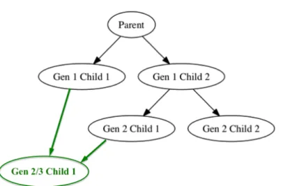
Figure 1.1: Example pedigree chart from the kinship2 package, where the vertical axis de-notes generation count. We superimposed green-highlighted individual 215 for explanatory purposes. As an offspring of a parent-child relationship, individual 215 is both a second and third generation individual. Hence, it should be displayed twice on the vertical axis, once for each of its generation counts. However, standard pedigree tools only allow for an individual to be displayed once, leading to ambiguous portrayal of the genealogical dataset.
We demonstrate how the standardized pedigree charts in the kinship2 package generate ambiguous results in such scenarios by superimposing a hypothetical inter-generational breeding case in Figure 1.1. In that figure, each generation is defined by its position on the vertical axis, with the first generation containing individuals 201 and 202. We superimposed green-highlighted individual 215 onto the pedigree chart for explanatory purposes. Its parents are
individuals 201 and 206, which are from generations one and two, respectively, and have a parent-child relationship between themselves. As an offspring of a parent-child relationship, individual 215 is both a second and third generation individual. Hence, individual 215 should be displayed in both second and third generational positions on the vertical axis. However, standard pedigree tools only allow for an individual to be displayed once. As a result, in special cases where inter-generational breading occurs, such as in agronomic applications, standardized tools for visualizing genealogical information ambiguously portray the genealogical dataset.
In addition, popular graph drawing software such as GraphViz and Cytoscape can be used to visualize genealogical structures (Gansner et al. 2000, Shannon et al. 2003). Graphs are defined as objects with sets of nodes and edges, where sets indicate that their comprised elements cannot be repeated. In other words, graphical structures do not allow for repeated nodes, and hence, as is the case with the aforementioned R packages, these popular graph plotting software cannot precisely portray the genealogical dataset in cases of inter-generational breeding.
We again illustrate this problem in Figure 1.2 with an example genealogy using popular graph drawing software like GraphViz and Cytoscape. Here, generation count is denoted by the vertical axis. As was shown in Figure 1.1, here too we superimpose a green node that has parents from two different generations. This green node is both a second and third generation individual, and should be displayed in both corresponding generation positions on the vertical axis. However, standard graph visualization tools only allow for a given node to be displayed once. As a result, this green node must be ambiguously positioned in either the second or third generation position; in the figure, it is denoted as a third generation individual. In Chapter2, we will demonstrate our new ggenealogyplots that can remedy these problems.
We address these limitations in visualizing genealogical datasets by introducing a new type of plot that displays the paths between the ancestors and descendants constrained by gener-ation for an individual of interest, a technique that cannot otherwise be accomplished with a traditional pedigree chart. This new plot (and other plots) are introduced in Chapter 2.
Figure 1.2: Example genealogical display using popular graph software like GraphViz and Cytoscape, with generation count denoted by the vertical axis. As was shown in Figure 1.1, the green node has parents from two different generations, and hence must be ambiguously positioned as one of two generation counts.
1.5 Visualization of RNA-sequencing data
RNA-sequencing is a popular next-generation sequencing approach that reveals a snapshot of the quantity of RNA in biological samples at a given moment in time. The expression level of RNA can be used to investigate cellular differences between health and diseased states, cellular changes in response to external stimuli, and numerous other research questions. Some of the most popular Rpackages for conducting RNA-sequencing analysis include DESeq2(Love et al. 2014a), edgeR (Robinson et al. 2010a), and LimmaVoom (Ritchie et al. 2015a). While these packages have incredibly benefited the RNA-sequencing community with normalization and modeling techniques, the plotting approaches within them are insufficient.
This is despite the fact that previous studies have provided sound evidence that gene ex-pression data is most effectively explored using graphical and numerical approaches in a com-plementary fashion (Lawrence et al. 2008,Yin et al. 2013,Yin et al. 2012). The authors of one study demonstrated this finding by applying modeling and visualization tools to simulated and real microarray data (Cook et al. 2007). Through the use of plots, they determined that their initial models were inappropriate and needed improvement, and that the data quality was ques-tionable and needed relabeling. Moreover, they demonstrated that some of the most common
plots for gene expression data are rife with problems, while some of the less popular plots are purposeful and powerful. In one example, they showed that heat maps are commonly-used, but they do not allow users to detect outlying genes. In contrast, scatterplots can allow for outlier detection. Furthermore, they introduced a new type of plot called the “replicate line plot”, which can be used to visually mine for genes that show low variability in read counts between replicates but high variability in read counts between treatments. The authors also showed the importance of interactive features on plots for gene expression analysis; they used GGobi (Swayne et al. 2003, Lang et al. 2014, Cook et al. 2014) to generate direct manipulation and linking between various multivariate plots to display the data. Interactive plots for multivariate data could also be accomplished with the use of projections (Wickham et al. 2011).
Despite the availability of many ready-made testing software, reliable detection of differ-entially expressed genes (DEGs) in RNA-sequencing data is not a trivial task. While the data collection might be considered high-throughput, data analysis has intricacies that require careful human attention. In light of this, researchers should use effective and modern data analysis techniques, and verify and strengthen the appropriateness of their models with visual feedback. There is a need to make it easier for researchers to use models and visuals in a com-plimentary fashion during RNA-sequencing data analysis. Fortunately, there are alternative visualization approaches that could benefit the RNA-sequencing community but are currently underestimated and/or relatively unknown. We thoroughly investigate the following three un-common plotting tools that could improve our understanding of and conclusions drawn from RNA-sequencing data, and we show our accomplishments toward thoroughly exploring these tools in Chapters 3,4, and 5:
1. Parallel coordinate plots:
In gene expression data analysis, we are striving to find relative patterns. Side-by-side boxplots are often used for this purpose, but they can hide potential problems that could still be lurking in the data after normalization. This is because most RNA-sequencing nor-malization methods are conducted at the sample-level, and side-by-side boxplots do not show connections between the samples. Consequently, boxplots may deceive researchers
to believe that the normalization succeeded in cases where alternative plots (such as par-allel coordinate plots) would have otherwise indicated that the normalization was in fact unsuccessful due to the presence of inconsistencies (crossings) between replicates. For this reason, parallel coordinate plots (Inselberg et al. 1985,Wegman et al. 1990) are an essen-tial visualization tool when checking the iniessen-tial normalization process of RNA-sequencing analysis. If the normalization is adequate, then the connections between replications should be flat, and we should only see crossings between treatment groups.
The tools currently available for constructing parallel coordinate plots to assess RNA-sequencing data are severely limited: Namely, the large number of genes present can cause constraints in space and time. With one line being drawn for each gene, the resulting plots will have too many lines being drawn to even view patterns of interest in the first place. Moreover, the construction of these plots can be consuming in computation and time, often requiring researchers to wait for minutes before they can view the output. Even though popular tools to visualize parallel coordinate plots (such as theggparcoord function in the GGally package) can be very useful for many datasets, they are not always helpful for RNA-sequencing studies due to the largeness of the data (Schloerke et al. 2016).
As a result, we developed new approaches that both quickly and meaningfully display the key pieces of information from RNA-sequencing data with parallel coordinate plots. First, we used hierarchical clustering analysis to reduce overlapping issues that are inevitable when applying parallel coordinate plots to large datasets: Specifically, this approach allowed us to divide large datasets into clusters of cases that showed similar patterns, which could each then be effectively viewed in a practical fashion using parallel coordinate plots. We introduce the use of these tools in Chapter 3 as a case study applied to real public RNA-sequencing data. We also applied this technique again in Chapter 5 to our own RNA-sequencing study that investigated how virus and diet quality affect honey bee gene expression. Second, we created interactive capabilities for parallel coordinate plots, wherein users can zoom and pan across sections of the plot to decipher specific patterns
more effectively, as well as select specific lines more efficiently and keep, delete, and/or highlight those lines of interest and quickly obtain metadata about them. Examples of this are shown in Chapter 4.
2. Pairwise scatterplots:
Visuals that can effectively plot replicates against each other are useful for RNA-sequencing analysis. We can do this by generating pairwise scatterplots for replicates, using the scatmat() function of theGGallypackage (Schloerke et al. 2016). If the data are clean, then we would expect negligent differences between read counts across replicates. This would result in a scatterplot where the read counts from the two replicates fall along the
x=y relationship. Deviations from this expectation would indicate a quality problem or biological variation between the replicates in the data.
In our attempt to create effective interactive scatterplot matrices, we were met with similar challenges we faced with our first goal: We had a plotting algorithm that was not tailored to deal with vastly sized datasets like RNA-sequencing data. As a result, we again faced space (overplotting) and time (computational speed) constraints, and our goal was to tailor the scatterplot matrix to adapt to large amounts of data. In addition, we recognized that the few data points along the perimeter of thex=y relationship that we can see may be misleading. Hence, we wanted to develop guidelines in terms of what denotes a high-quality dataset where read counts are similar between replicates and different between treatments.
We achieved these goals by rendering the scatterplot matrices interactive. We show examples of our default interactive scatterplot matrix in Chapter 3 using real public RNA-sequencing data. We also show variations of the interactive scatterplot matrix that can be thresholded by prediction interval, orthogonal distance to the x=y line, and fold change in Chapter 4. Moreover, we created versions of the scatterplot matrix wherein genes of interest (usually DEGs) can be superimposed to better understand how their variation compares to the variation in the overall dataset. Examples of this technique are shown with public RNA-sequencing data in Chapter3 and again with our own
RNA-sequencing data in Chapter 5 as part of our study of virus and diet quality effects on honey bee gene expression.
3. Litre plots:
We introduce a new type of plot for gene expression analysis called the litre plot, which is built upon the previously-mentioned “replicate line plot” (Cook et al. 2007). The “replicate line plot” has been shown to be useful for two replicates, and we wished to expand upon this work to render it useful for more than two replicates. We show an example from the original study that introduced “replicate line plots” in Figure1.3(Cook et al. 2007).
Figure 1.3: Original example of three replicate line plots from (Cook et al., 2007). Genes of interest (those that show low variability across replicates but high variability across treatments) are highlighted in orange. For example, in the plot on the left, there are two treatments (MT and M) that each have two replicates. If a gene shows high variability between the two treatments, then it would fall away from the x=y line. If a gene shows low variability between replicates, then the distance between the two replicates will be short. Hence, the genes of interest will be visually represented as the orange ones that are short in length and deviate from thex=y line.
We demonstrate the effectiveness our new interactive litre plots in Chapter 3 using real public RNA-sequencing data. We then use them in an in-depth visualization approach to our own RNA-sequencing dataset in Chapter5as part of our study investigating virus and diet quality effects on honey bee gene expression. This later example demonstrates how we updated and expanded the use of these plots to accommodate a dataset that used as large as 12 replicates per treatment group.
1.6 Virus infection and diet effects on gene expression in honey bees The United States and parts of Europe have witnessed dramatic losses in commercially managed honey bees over the past decade (van Engelsdorp et al. 2009, Kulhanek et al. 2017,
Laurent et al. 2016) to what is considered an unsustainable extent (Caron and Sagili 2011,
Bond et al. 2014). The large-scale loss of honey bees has considerable implications for the agricultural economy because honey bees are one of the leading pollinators of numerous crops (Klein et al. 2007). Honey bee declines have been associated with several factors, which appear to influence the distinct loss of honey bees in interactive fashions as the environment changes (Goulson et al. 2015). Poor nutrition and viral infection are two environmental stressors that pose heightened dangers to honey bee health.
Despite growing interest viruses and diet quality effects on the health and sustainability of honey bees, as well as a recognition that such factors might operate interactively, there are only a small number of experimental studies thus far aimed at elucidating the interactive effects of these two factors in honey bees (DeGrandi-Hoffman and Chen 2015, DeGrandi-Hoffman et al. 2010, Conte et al. 2011). A recent study showed that both diverse pollen diets and high quality monofloral diets are able to reduce virus-induced mortality (Dolezal et al. 2018). Following up on these phenotypic findings, we aim to establish the molecular underpinnings by which high quality monofloral diets protect bees from virus-induced mortality. In particular, it remains unknown whether the protective effect of healthy diet is due to direct effects on immune function (resistance), or if it is due to indirect effects on vigor (tolerance) (Miller and Cotter 2017). Transcriptomics is one means to better understand the molecular mechanisms of dietary and viral effects on honey bee health.
To the best of our knowledge, there are few to no studies specifically inspecting honey bee gene expression patterns related to different monofloral diets, and few to no studies investi-gating honey bee gene expression patterns related to the combined effects of diet and viral inoculation in any broad sense. On account of this, as part of this dissertation, we conduct a two-factor RNA-sequencing study that examines how monofloral diets and Israeli Acute Paraly-sis Virus (IAPV) inoculation influence gene expression patterns in honey bees. We focus on four
treatment groups (low quality diet without IAPV exposure, high quality diet without IAPV exposure, low quality diet with IAPV exposure, and high quality diet with IAPV exposure). We also compare the main effect of IAPV exposure in our dataset to that previously obtained in a study conducted by Galbraith and others in order to better define the repeatability and robustness of our RNA-sequencing results (Galbraith et al. 2015). Importantly, we use an ex-tensive data visualization approach that incorporates the plotting tools we developed earlier, and recommend such an avenue can be beneficial for cross-study comparisons and validation of noisy RNA-sequencing data in the future.
1.7 Dissertation organization
The dissertation research presented here is arranged into the following chapters.
Chapter 1 introduces the concept of biological data visualization inR software, describes the overall objectives and specific aims of this dissertation research, incorporates a concise literature review, and includes an outline of the dissertation organization.
Chapter 2 introduces ggenealogy (Rutter et al. 2015), a published R software package that provides tools for searching through genealogical data, generating basic statistics on their graphical structures using parent and child connections, and displaying the results. The pack-age allows users to draw the genealogy in relation to variables related to the nodes, and to determine and display the shortest path distances between the nodes. Production of pairwise distance matrices and genealogical diagrams constrained on generation are also available in the visualization toolkit. We have tested the tools on a dataset with milestone cultivars of soybean varieties (Hymowitz et al. 1977) as well as on a web-based database of the academic geneal-ogy of mathematicians (North Dakota State University and American Mathematical Society 2010). Susan VanderPlas began the original work for this package and developed features in
theplotAncDes()function. The software package has been available on the Comprehensive R
Archive Network since March 2015 (Rutter et al. 2015). In August 2015, a paper introducing theggenealogysoftware package received a student paper competition award from the Statis-tical Computing and Graphics Section of the American StatisStatis-tical Association. Our manuscript describing the software package has been accepted to theJournal of Statistical Software. In
De-cember 2016, we released a second version of the package as we have added interactive plotting tools that were not available in the first version.
Chapter 3provides an assortment of examples using several public RNA-sequencing data
sets to show that uncommon visualization techniques can detect normalization issues, DEG designation problems, and common analysis errors. We also show that these visualization tools can identify genes of interest in ways undetectable with models. Moreover, the new tools offer an alternative and intuitive approach toward justifiably limiting or expanding DEG sets resulting from model applications. In this chapter, we propose that users slightly modify their approach to RNA-sequencing analysis by incorporating statistical graphics into their usual analysis pipelines. Specifically, we underline the use of parallel coordinate plots, scatterplot matrices, and litre plots. The work in this chapter has been submitted as a manuscript to
Bioinformatics.
Chapter 4 presentsbigPint, a software package we aim to publish on Bioconductor that includes the RNA-sequencing visualization tools we established through extensive case studies in Chapter3. Namely, the package provides users with easy-to-use methods to create parallel coordinate plots, scatterplot matrices, and litre plots, both in static and interactive formats. We explain some of the unique technology behind creating the interactive features of our graphical techniques. We briefly discuss the software reference manual and how our methods can be easily incorporated into popular RNA-sequencing analysis software (Love et al. 2014a,Robinson et al. 2010a,Ritchie et al. 2015a). The work from this chapter will be submitted as a manuscript to a scientific journal such asGenome Biology.
Chapter 5 details an RNA-sequencing study we performed to uncover the effects of viral inoculation and diet quality on honey bee gene expression. Adam Dolezal began the original work and collected the honey bee physical and mortality data. In our study, we found that the diet quality effect had a much larger transcriptomic response than the viral effect in terms of the number of DEGs. We also performed extensive visualization analysis methods using the graphics we developed and introduced in Chapters3and 4. Through this process, we discovered that the data and even the DEGs did not appear clean in terms of replicate consistency and treatment differentiation. As a result, we compared our study to a previous study that also
investigated the honey bee transcriptomic response to viral inoculation only it used honey bees that had 75% genetic similarity as opposed to our honey bees that had 25% genetic similarity (Galbraith et al. 2015). We visually confirmed that the data from the previous study and its resulting DEGs appeared much cleaner, possibly due to the increased genetic similarity in their experimental setup. By verifying the substantial overlap in the DEG lists between our study and the previous study, we were able to carefully place much higher confidence in our DEG results despite the noisy nature of our data as discovered through our visualization tools. We plan to submit the work in this chapter as a manuscript to a scientific journal such as BMC Genomics.
Chapter 6 comprises a summary of the scientific and technical contributions of this dis-sertation research and raises possible future avenues of work.
1.8 References
Bond, J., Plattner, K., and Hunt, K. (2014). Fruit and Tree Nuts Outlook: Economic Insight U.S. Pollination- Services Market. USDA. Economic Research Service Situation and Outlook FTS-357SA.
Brown, A. and Hudson, K. (2015). Developmental profiling of gene expression in soybean trifoliate leaves and cotyledons. BMC Plant Biology, 15:169.
Caron, D. and Sagili, R. (2011). Honey bee colony mortality in the Pacific Northwest: Winter 2009/2010. Am Bee J, 151:73–76.
Conte, Y. L., Brunet, J.-L., McDonnell, C., and Alaux, C. (2011). Interactions between risk factors in honey bees. CRC Press.
Cook D. and Hofmann H. and Lee E. and Yang H. and Nikolau B. and Wurtele E. (2007). Exploring Gene Expression Data, Using Plots. Journal of Data Science, 5:151–182.
Cook, D., Swayne, D.F. (2007).Interactive and Dynamic Graphics for Data Analysis. Springer. Coster, A. (2013). pedigree: Pedigree functions. R package version 0.4.
Coster, A. (2013). pedigree: Pedigree functions. R package version 0.4.
DeGrandi-Hoffman, G. and Chen, Y. (2015). Nutrition, immunity and viral infections in honey bees. Current Opinion in Insect Science, 10:170–176.
DeGrandi-Hoffman, G., Chen, Y., Huang, E., and Huang, M. (2010). The effect of diet on protein concentration, hypopharyngeal gland development and virus load in worker honey bees (Apis mellifera L.). J Insect Physiol, 56:1184–1191.
Dolezal, A., Carrillo-Tripp, J., Judd, T., Miller, A., Bonning, B., and Toth, A. (2018). Inter-acting stressors matter: Diet quality and virus infection in honey bee health. In prep. Galbraith, D., Yang, X., Ni˜no, E., Yi, S., and Grozinger, C. (2015). Parallel epigenomic and
transcriptomic responses to viral infection in honey bees (Apis mellifera). PLoS Pathogens, 11:e1004713.
Gansner, E.R., North, S.C. (2000). Software - Practice and Experience. An open graph visual-ization system and its applications to software engineering, 30:1203–1233.
Gentleman, R., Carey, V., Bates, D., Bolstad, B., Dettling, M., Dudoit, S., Ellis, B., Gautier, L., Ge, Y., Gentry, J., Hornik, K., Hothorn, T., Huber, W., Iacus, S., Irizarry, R., Leisch, F., Li, C., Maechler, M., Rossini, A., Sawitzki, G., Smith, C., Smyth, G., Tierney, L., Yang, J., and Zhang, J. (2004). Bioconductor: open software development for computational biology and bioinformatics. Genome Biology, 5(10):R80.
Goulson, D., Nicholls, E., Bot´ıas, C., and Rotheray, E. (2015). Bee declines driven by combined stress from parasites, pesticides, and lack of flowers. Science, 347:1255957.
Hymowitz, T., Newell, C., and Carmer, S. (1977).Pedigrees of Soybean Cultivars Released in the United States and Canada. International Soybean Series, College of Agriculture, University of Illinois at Urbana-Champaign, Urbana, IL.
Inselberg, A. (1985). The Visual Computer. The Plane with Parallel Coordinates, 1:69–91. Kerren, A., Kucher, K., Li, Y.-F., and Schreiber, F. (2017). BioVis Explorer: A visual guide
Klein, A.-M., Vaissi`ere, B., Cane, J., Steffan-Dewenter, I., Cunningham, S., Kremen, C., and Tscharntke, T. (2007). Importance of pollinators in changing landscapes for world crops.
Proc Biol Sci, 274:303–313.
Kulhanek, K., Steinhauer, N., Rennich, K., Caron, D., Sagili, R., Pettis, J., Ellis, J., Wilson, M., Wilkes, J., Tarpy, D., Rose, R., Lee, K., Rangel, J., and vanEngelsdorp, D. (2017). A national survey of managed honey bee 2014–2015 annual colony losses in the USA. Journal of Apicultural Research, 56:328–340.
Lang, D.T., Swayne, D., Wickham, H., Lawrence, M. (2016). rggobi: Interface between R and GGobi. R package version 2.1.20.
Laurent, M., Hendrikx, P., Ribiere-Chabert, M., and Chauzat, M.-P. (2016). A pan-European epidemiological study on honeybee colony losses 2012–2014. Epilobee, 2013:44.
Lauter, A. M. and Graham, M. (2016). NCBI SRA bioproject accession: PRJNA318409. Lawrence M. and Cook D. and Lee E.K. and Babka H. and Wurtele E. (2008). explorase:
Mul-tivariate Exploratory Analysis and Visualization for Systems Biology. Journal of Statistical Software, 25:1–23.
Love, M., Huber, W., and Anders, S. (2014a). Moderated estimation of fold change and dispersion for RNA-seq data with DESeq2. Genome Biology, 15:550.
Marioni, J., Mason, C., Mane, S., Stephens, M., and Gilad, Y. (2008). RNA-seq: An assessment of technical reproducibility and comparison with gene expression arrays. Genome Research, pages 1509–1517.
Miller, C. and Cotter, S. (2017). Resistance and tolerance: The role of nutrients on pathogen dynamics and infection outcomes in an insect host. Journal of Animal Ecology, 87:500–510. North Dakota State University and American Mathematical Society (2010). The Mathematics Genealogy Project. Archived Web Site. Retrieved from the Library of Congress, Accessed on March 6, 2015.
Ritchie, M., Phipson, B., Wu, D., Hu, Y., Law, C., Shi, W., and Smyth, G. (2015a). limma powers differential expression analyses for rna-sequencing and microarray studies. Nucleic Acids Research, 43(7):e47.
Robinson, M., McCarthy, D., and Smyth, G. (2010a). edger: a bioconductor package for differential expression analysis of digital gene expression data. Bioinformatics, 26:139–140. Rutter, L., Vanderplas, S., and Cook, D. (2015). ggenealogy: Visualization Tools for
Genealog-ical Data. R package version 0.1.0.
Schloerke, B., Crowley, J., Cook, D., Briatte, F., Marbach, M., Thoen, E., Elberg, A. (2016).
GGally: Extension to ggplot2. R package version 1.0.1.
Shannon, P., Markiel, A., Ozier, O., Baliga, N., Wang, J., Ramage, D., Amin, N., Schwikowski, B., and Ideker, T. (2003). Cytoscape: a software environment for integrated models of biomolecular interaction networks. Genome Research, 13(11):2498–2504.
Swayne D.F. and Lang D.T. and Buja A. and Cook D. (2003). Ggobi: Evolving from XGobi into an Extensible Framework for Interactive Data Visualization. Journal of Computational Statistics and Data Analysis, 43:423–444.
Therneau, T., Daniel, S., Sinnwell, J., Atkinson, E. (2015). kinship2: Pedigree Functions. R package version 1.6.4.
Tippmann, S. (2014). Programming tools: Adventures with R. Nature, 517:109–110.
van Engelsdorp, D., Evans, J., Saegerman, C., Mullin, C., Haubruge, E., Nguyen, B., Frazier, M., Frazier, J., Cox-Foster, D., Chen, Y., Underwood, R., Tarpy, D., and Pettis, J. (2009). Colony collapse disorder: A descriptive study. PLoS ONE, 4:e6481.
Wegman, E.J. (1990). Hyperdimensional Data Analysis Using Parallel Coordinates. Journal of American Statistics Association, 85:664–675.
Wickham H. and Cook D. and Hofmann H. and Buja A. (2011). tourr: An R Package for Exploring Multivariate Data with Projections. Journal of Statistical Software, 40:1–18.
Yin T. and Cook D. and Lawrence M. (2012). ggbio: An R package for Extending the Grammar of Graphics for Genomic Data. Genome Biology, 13:R77.
Yin T. and Majumder M. and Chowdhury N.R. and Cook D. and Shoemaker R. and Graham M. (2013). Visual Mining Methods for RNA-Seq Data: Data Structure, Dispersion Estimation and Significance Testing. J Data Mining Genomics Proteomics, 4:1–9.
CHAPTER 2. VISUALIZATION METHODS FOR GENEALOGICAL DATA
2.1 Introduction
Genealogy is the study of parent-child relationships. By tracing through parent-child lin-eages, genealogists can study the histories of features that have been modified over time. Com-parative geneticists, computational biologists, and bioinformaticians commonly use genealogical tools to better understand the histories of novel traits arising across biological lineages. For ex-ample, desirable modifications in crops could include an increase in protein yield or an increase in disease resistance, and genealogical structures could be used to assess how these desirable traits developed. At the same time, genealogical lineages can also be used to assess detrimental features, such as to determine the origin of hazardous traits in rapidly-evolving viruses.
Genealogical structures can also serve as informative tools outside of a strict biological sense. For instance, we can trace mentoring relationships between students and dissertation supervisors with the use of academic genealogies. This can allow us to understand the position of one member in the larger historical picture of academia, and to accurately preserve past relationships for the knowledge of future generations. Similarly, linguistic genealogies can be used to decipher the historical changes of vocabulary and grammatical features across related languages. In short, there is a diverse array of disciplines that can elicit useful information about features of interest by using genealogical data.
In all these examples, the genealogical relationships can be represented visually. Access to various types of plotting tools can allow scientists and others to more efficiently and accurately explore features of interest across the genealogy. We introduce here a developing visualization toolkit that is intended to assist users in their exploration and analysis of genealogical