Jesse D.d.m. Wilbur. The GovStat Glossary Animations: An Evaluation of Control, Learning, Time, and Satisfaction. A Master’s Paper for the M.S. in IS degree. November, 2004. 66 pages. Advisor: Dr. Gary Marchionini
The Glossary Animations are short, instructional multimedia presentations that
explain statistical terms. This paper presents research and best practices that can guide the development of successful multimedia instruction. The Glossary Animations are critiqued, with consideration given to several fields including educational cognitive psychology, instructional design, information science, and graphic design. A study was conducted to examine the use of controls in the GovStat Glossary Animations, and whether different levels of control affect the learning rate, the quality of learning, or user satisfaction. The results of the study are evaluated with the goal of creating a better multimedia instructional interface, and recommendations are provided for future Glossary Animation designs.
Headings:
Web-based multimedia Cognitive load theory Multimedia instruction Learning
THE GOVSTAT GLOSSARY ANIMATIONS:
AN EVALUATION OF CONTROL, LEARNING, TIME, AND SATISFACTION
by
Jesse D.d.m. Wilbur
A Master’s paper submitted to the faculty of the School of Information and Library Science of the University of North Carolina at Chapel Hill
in partial fulfillment of the requirements for the degree of Master of Science in
Information Science.
Chapel Hill, North Carolina November 2004
Approved by
Contents
Acknowledgements 3
Introduction 4
Background 6
Multimedia & Learning
9
Evaluating the SIG Animations
18
Experiment 22
Results 30
Discussion 34
Conclusions 40
Appendices
A: SIG Animation Template Schematic
46
B: Animation Screenshots
47
C: Evolution of the SIG Animations
51
D: Illustrated Levels of Control
54
E: Demographic Questionnaire
58
F: Study Screenshots
61
Acknowledgements
Introduction
The World Wide Web is a major channel of communication for the United States government statistical agencies. Agencies have put their data on the Web in an effort to better serve the public (Marchionini 2003). The percentage of Internet connectivity in the home is rising, and agencies expect that the public consumption of government statistics will increase in tandem. This creates technological as well as usability
challenges for the agencies and the public. The public will face an overwhelming quantity of specialized information, and in turn, the agencies will have to develop or choose new delivery channels and interfaces to help the public manage and
comprehend statistical data. The GovStat Project is part of the initiative to help users “find what they need and understand what they find” (GovStat 2004).
The GovStat Project is a three year effort at the University of North Carolina at Chapel Hill Interaction Design Lab and the University of Maryland Human-Computer Interaction Lab and is funded by NSF grants EIA 0131824 and EIA 0129978. The GovStat Project “seeks to create an integrated model of user access to and use of US government statistical information that is rooted in realistic data models and innovative user interfaces” (GovStat, 2004). The GovStat Statistical Information Glossary (SIG), hereafter referred to as the Glossary, and its component parts, the SIG Ontology, SIG Definitions, and SIG Animations, have emerged from research within the GovStat Project. The Glossary team is a subset of the GovStat Project team and is responsible for developing the SIG Ontology, Definitions, and Animations.
explanations for statistical terms, focusing on terms that are frequently misinterpreted or that define larger concepts (Pattuelli 2003). The goal of the Glossary is not to fully educate users, but to provide the information that they need to complete their task, and to do so in a quick, attractive fashion. The Glossary uses multiple formats to present definitions, which is intended to help users with different visual or learning styles (Brown 2003; Felder 2002; Boulter 1994). Term explanations are available in text-only, text and graphic, and text and animated graphic formats.
Background
Development of the SIG Animations began in January 2003. The SIG Animations were founded on the idea that some statistical terms could best be explained using
animation rather than graphics or text (Tversky 2002; Narayanan 2002). The goal was to illustrate a single statistical concept using moving graphics and text, and to allow users to control the progress of the animation. The SIG Animations were creatively based on pre-existing term explanations. This factor removed the burden of creating a representational concept from scratch and greatly reduced the production time. The development team gave consideration to the placement of text, the addition of sound, and the ability to replay and move back within the animation. However, the
production overhead required to implement sound made that addition impractical. The SIG Animations function primarily as an education tool. They also have a secondary function: the SIG Animations serve as an example of a technology and process to be replicated by government agencies. Initially the Glossary team struggled to find a methodology for creating the SIG Animations that would yield a transferable process. The first attempts resulted in a development method that was unsustainable: all the content was produced in Macromedia Flash, and required specialized training to produce. At the time, each animation was a single, continuous Flash movie. To make the Glossary a viable technological solution for government agencies, the
schedule by multimedia developers. The animation and text were divided into corresponding segments, which also netted two benefits for end users: 1) manageable amounts of text on each screen, 2) the ability to review segments (rather than an entire animation) if the embedded concepts were complex or difficult to understand.
This abstraction allowed the Glossary team to create a presentation template. The template provides a consistent user experience across different presentations. It consists of items that are common to all presentations: navigation, title, animation frame and text area (See Appendix A for a schematic of the template). The template pulls in the appropriate text and animation, and creates a seamless presentation.
The team made additional refinements to the template in September 2004. A progress indicator was added to the template. The progress indicator shows the number of segments in a presentation and the elapsed time in the current segment. The total time in each segment is the estimated number of seconds required for an average reader to read all of the text in a segment. The team also adjusted the method of loading animations and text. These refinements increased the flexibility of the template, and made the SIG Animations easier to develop and maintain.
Multimedia and Learning
The SIG Animations are a multimedia instructional technology. A definition of multimedia is “[t]he combined use of media, such as movies, music, lighting, CD-ROMs, and the Internet, as for education or entertainment” (Dictionary.com). Multimedia, in the context of the SIG Animations, refers to the use of text in
combination with still and moving graphics. Instructional technology has been defined as “applying scientific knowledge about human learning to the practical tasks of teaching and learning” (Heinich 1993, page 6). The use of multimedia for instruction is growing as traditional teaching models are supplanted by newer, learner-centered instruction. (Newby 2000, pp. 7-12)
PROBLEMS WITH MULTIMEDIA
Multimedia is not a perfect solution. Animation specifically has fallen under question and come up lacking in several studies. “Animation per se did not improve
that…. However, it turns out that animations frequently take more time, so they have a cost.” A prior study involving the SIG Animations supports this finding (Haas forthcoming), but the benefits of multimedia overshadow the additional time cost when we consider the quality of learning generated from well-designed multimedia instruction (Mayer 2001). Narayanan (2002), Sweller (1999), Mayer (2001), and Tabbers (2004) have all completed studies which show that properly designed multimedia instruction that accounts for learning styles and cognitive theory can improve the quality of learning.
MULTIMEDIA AND LEARNING STYLES
To justify the use of multimedia, we need to consider studies that show that ifproperly designed, multimedia can enhance learning and allow them to gain a deeper
understanding of the instructional material. Learning styles can strongly affect a person’s ability to draw information from the material (Felder 2002). Therefore, it is imperative to design instruction that takes learning styles into account. Multimedia delivers information in several formats, which accommodates different learning styles. The Felder-Silverman model (Felder 2002) suggests several styles of learning. Two styles are especially pertinent to multimedia instruction: visual/verbal learners, and global/sequential learners.
Studies show that visual learners consider concepts as objects, using objects as reference when solving visual-spatial problems, while verbal learners tend to use words or formulas to work through the same kinds of problems (Boulter 1994). “Visual learners remember best what they see…. Auditory* learners remember much
of what they hear and more of what they hear and then say” (Felder 2002).
Visual/verbal learners benefit from multimedia, which combines delivery methods to effectively reinforce the information, regardless of their learning preference. Felder notes that students remember “50 percent of what they see and hear” (emphasis added). But they remember much less if they only receive the information from one delivery channel. There is evidence, though, that highly visual learners benefit more from multimedia than low visual learners. (Smith 2000; Mayer 2001)
The sequential/global learning styles are also useful for multimedia instructional design. “Sequential learners follow linear reasoning processes when solving problems; global learners make intuitive leaps and may be unable to explain how they came up with solutions.” (Felder 2002). These learner characteristics align well with field dependence/independence characteristics discussed in Chinien (1993). Essentially, field-independent learners tend to have a higher degree of spatial ability and can see the structure in incomplete material — global learners have the same qualities. Field-dependent learners need more structure in their material, and tend to prefer a
sequential approach (Daniels 2000). Multimedia instruction can mitigate the difference between global/sequential learners by presenting an overview of the material, then reinforcing it with segmented presentations that go into more depth (Mayer 2001b).
ROBERT GAGNÉ’S INSTRUCTIONAL DESIGN THEORY
Design (UCD) methods. Systems design is characterized by three features: (Gredler 1997, page 133)
1. Instruction is designed for specific goals
2. Instruction utilizes appropriate technology, given the context and goals 3. Materials undergo repeated cycles of design, testing, and revision
Multimedia designers who are approaching this discipline from a design (rather than instructional) background, will find the systems design model familiar. An
examination of the theoretical background behind the systems design model will expose its implications for multimedia instructional design.
Gagné’s cognitive theory of learning for instructional design is based on an
information-processing theory where learning is the transformation of inputs into outputs that indicate that learning has occurred (Gagné 1975, page 15). The first step of
learning occurs when information is acquired through receptors and subsequently transformed into short-term and long-term memory. Receptors are any of the sensory organs that correspond to the five senses: sight, sound, taste, touch, and smell.
Information enters the receptors, and passes through the sensory register, which transforms the information into “patterns of stimulation” before being placed into short-term memory. The patterns do not include all the information — merely the information deemed important. Gagné calls this selective perception. Encoding occurs when the information goes from short-term to long-term memory. The information is now available as a concept — to use the information it must be cued and retrieved into short-term memory, from which a response (or performance) can be generated. This entire process is known as the Flow of Information (Gagné 1985, pp. 71-76).
“may be conceived as initiating, maintaining, or otherwise supporting several different kinds of ongoing internal processes involved in learning, remembering, and performing” (Gagné 1985, pg. 16) The SIG Animations deal with two learning types that bear further explanation: intellectual skills and information.
Gagne’s Five Types of Learning • intellectual skills
• cognitive strategies • information • motor skills • attitudes
Gagné’s instructional theory encompasses several guidelines for the production of successful multimedia instruction. Interactivity is a crucial requirement for teaching intellectual skills (Gagné 1985, page 290; Cairncross 2001). Intellectual skills range in complexity from the fundamental ability to discriminate between two things to the ability to solve complex problems. This stratification of intellectual ability is a theoretical prerequisite for the construction of learning hierarchies, or a chain of skills required for learning to occur. Two major implications can be derived from the concept of learning hierarchies. “One is that curricula may be designed to reflect ‘process’ as opposed to content….The second implication is that careful attention to prerequisite skills may reduce greatly the need for remedial education.” (Gredler 1997, page 119). Morrison and Tversky’s Conceptual Congruence Hypothesis states that “[t]he greater the congruence between the presentation medium (i.e., a graphic) and the information, the greater the [learning] facilitation” (Morrison 1994). Multimedia animation has the potential to reflect the subtle changes over time in ways that still graphics cannot. Also, Gagné’s theory implies that focusing on one idea at a time and building up complexity in layers will facilitate understanding.
short-term and long-short-term memory (label as image: Paivio 1971, advance organizer: Ausubel 1968, elaboration techniques: Rohwer 1966, cause-effect tree: Gagné 1985). Regardless of the method of encoding, the learner can be assumed to use a set of rules to store information in memory. To support the construction of new knowledge, they have to retrieve their previous knowledge based on cues that were set when they learned the information (Gagne 1985, page 298). Multimedia designers should assist the learner’s retrieval of prior knowledge by using consistent imagery to define a concept, and removing extraneous information so the relationship of image to concept is unfettered by irrelevant material. (Mayer 2001)
DUAL-CODING THEORY
There is new evidence that suggests information processing theory (such as Gagné’s) is incomplete in its depiction of human cognition. Allan Paivio introduces a dual-coding theory, which embodies the notion of two separate cognitive subsystems designed to handle distinct operations: the verbal subsystem which processes information
connections between words and images (Paivio 1986; Mayer 2001). If dual-coding theory is correct, then presenting reinforcing (but not repeated) information in both the verbal and visual channels will result in better learning (Sweller 1999, Mayer 2001).
COGNITIVE LOAD THEORY
Cognitive load theory is “concerned with the consequences of limited working
memory on instructional design” (Sweller 1999, page. 36). We will refer to the concept of a limited working memory as limited capacity. Large amounts of information will likely overwhelm the learner unless: 1) they are familiar with the material and have developed appropriate schemas to help them deal with the amount of information, or 2) the information is crafted in such a way as to mitigate the effect of too much
information (Sweller 1999, pp. 36-37). Sweller (1999) identifies two kinds of cognitive load in instruction: intrinsic and extraneous. Intrinsiccognitive load is defined as “the amount of informational units a learner needs to hold in working memory to
comprehend the information” (Pollock 2002). The intrinsic level of cognitive load cannot be affected by the instructional design or presentation. By contrast, “extraneous cognitive load is generated by the manner in which information is presented to
learners and is under the control of instructional designers” (ibid) [emphasis added]. Germane cognitive load, identified by Brünken (2003), is the load induced by the efforts of the learner to process information. Germane cognitive load is also under the control of the multimedia designer. There are three common methods used to reduce
cognitive load: 1) using both auditory and visual modalities to deliver information, 2) integrating text and graphics to reduce the split-attention effect, 3) removing
redundant information (Sweller 1999; Brünken 2003; Mayer 2001).
“To understand a conventional separate text and diagram format, the learner must hold small segments of text in working memory while searching for the matching diagrammatic entity, with this ongoing process continuing until all the information is rendered intelligible.”
The processing of visually separated information in working memory is extraneous cognitive load because it has nothing to do with actual learning. Instead, it is effort focused on the prerequisite composition of information into a format that the learner can use. If this effect can be mitigated by the integration of text with the associated graphics it will reduce the extraneous cognitive load and increase the cognitive resources available for learning (Kalyuga 1999).
Redundancy occurs when identical information is presented in two different ways. For example, a map that shows street names and highlights the correct route does not also need a full text listing of the streets and turns. This additional text would simply add to the cognitive load, which would reduce the cognitive facilities available (Sweller 1999). This also applies for text that is narrated. If a multimedia presentation has narrated text, the text should not also be displayed on-screen. (Mayer 2001, page 159) While the specifics of execution are under debate (cf. Mayer 2001, Tabbers 2004), the fundamental concept of reducing extraneous information is sound (Sweller 1999, page 53; Mayer 2001).
OTHER COGNITIVE THEORIES OF MULTIMEDIA
Narayanan (2002) promotes a similar processing model. The first step in
Narayanan’s model is information decomposition, where the learner pulls apart the information into recognizable parts. Decomposition is followed by a reconstruction, where the learner combines previous knowledge with new information into a unique model. Narayanan suggests that effective multimedia should progress at a rate that is equal to the learner’s ability to decompose and reconstruct information into
comprehensible models. Narayanan specifically suggests segmenting information into discreet chunks and providing VCR-like controls so that learners can mitigate this burden, and manage the pace of instruction themselves (Narayanan 2002).
Tabbers, Martens, & Merriënboer (2004) contradict Mayer’s assertions regarding the superiority of dual-modality delivery methods. Their study presents an alternative to the dual-channel delivery method promoted by Sweller and Mayer: it tests a model of single-channel delivery, placing a body of instructional text alongside an animated presentation. Sweller and Mayer contend that this increases the cognitive load due to the split-attention effect. Tabbers, et al found that, for longer instructional pieces, listening to narrated text reduces motivation, and results in less focused learning, while letting the learner read at their own pace improved the quality of learning. While the results from Tabbers, et al are interesting (learners presented with text and animations did better on retention and transfer tests than those who received
Evaluating the SIG Animations
Information design, graphic design, and user-centered design provide a principled foundation for developing interfaces for multimedia instruction. Design in multimedia instruction is focused on the delivery of learning concepts via multiple media, but the interface can impede learning (Sutcliffe 1994). The ability to stimulate and orient the learner towards the correct information is an essential factor in designing multimedia for learning. Since selective perception is central to an individual’s ability to learn in both the information processing and cognitive theories of learning, important information must be presented in a way that aids the learner’s recognition and understanding (Gagné 1985; Mayer 2001). It is acknowledged that some learners comprehend visual data better than textual data, but the addition of images is not sufficient to convey important information (Felder 2002; Smith 2000). Graphics, content, and animation should all be focused on imparting the desired information. The following evaluation of the SIG Animations is guided by best practices from the field of design and based on the previously discussed cognitive and instructional design theory.
INFORMATION DESIGN FOR CLARITY
visual displays of data (Tufte 1990). Also, by crafting the content to remove extraneous or irrelevant concepts, multimedia designers can increase the retention of information. (Mayer 2001)
The SIG Animations appear as graphics in a plain field, with explanatory text to the right. The design does not include any unrelated visual or textual material
(Appendix B). In addition, the animations use color and shape to differentiate or relate items, but eschew realism for abstract geometric shapes. Reducing the animations to abstracted geometric shapes and iconic forms, rather than three-dimensional or
realistic figures, focuses the user’s attention on the interaction of the figures and makes the important information more conspicuous (Tufte 1990, page. 83-86; Tversky 2002). Additionally, by using strong color against a light field, we highlight the important data objects and their relationship to one another.
CONTENT DESIGN FOR MULTIMEDIA
Several of the theories previously discussed advocate segmenting content for
instruction (Narayanan 2002, Mayer 2001b, Sweller 1999, Gagné 1992). The Glossary team applied this tactic in the text for each animation, separating the text into chunks that isolate concepts. In addition, the text was adjusted to an eighth reading level, where possible (Haas forthcoming).
The first segment always delivers the answer to the question, “What is [the term]?” For example, if the question is “What is the Consumer Price Index?” the answer is “The Consumer Price Index (CPI) represents changes in prices of all goods and services produced for consumption by urban households.” Each following segment holds
additional information about the term, how it may be calculated, and how it can be used. For example, the text for segments 2-4 of the Consumer Price Index animation reads:
3. Items are mathematically combined to produce a single value, which can only be compared to other CPI values.
4. The Consumer Price Index has increased every year since 1995.
This format is typical of the current SIG Animations. Segmentation decreases the cognitive load on the user by breaking up a difficult concept into smaller, more manageable chunks. The template can accommodate longer, more complex explanations, but short, single-concept segments fit the current SIG Animation framework better.
USER CENTERED DESIGN FOR MULTIMEDIA
Applying User-Centered Design (UCD) methods can improve the interaction and content in multimedia presentations. UCD identifies the human requirements for an interface, specifies the context of use, examines the requirements of use, and
establishes a process to create a design solution. The solution undergoes iterative testing by the target user population; if the desired results are not met, the solution undergoes a revision (Preece 2002). All facets of the SIG Animations have undergone several revisions based on ‘hallway usability tests’ (Spolsky 2000) and GovStat team reviews. The Glossary team adjusted text display, button appearance, layout, and pace. See Appendix C for screenshots of the evolution of the SIG animations.
CRITICISMS OF THE SIG ANIMATIONS
The SIG Animations use graphics and moving images to actively reinforce the concepts presented in the text. The model was built on a common sense instructional approach. We represented abstract concepts with concrete objects to help users follow the process embodied in a term definition. Cognitive load theory and Mayer’s
• Adding narration rather than relying on a single mode for information delivery. While presenting both text and images visually does not contradict the dual-coding model, it does not take full advantage of human dual-channel (multi-modal) processing capability; it also creates extraneous cognitive load by imposing the work on the visual channel only.
• Integrating the on-screen text into the animation, rather than placing it in its own area off to one side. Spatially separating text and associated graphics leads to split attention, and an increased cognitive load.
However, other constraints exist that preclude these enhancements. As discussed previously, the SIG Animations are both a product and a process. They are intended for transfer to government statistical agencies. The Glossary team is working with
government agencies that have small or non-existent budgets for multimedia
development and lack experience with multimedia production. Simpler processes are more likely to be adopted; the additional overhead required for sound production, and the customization required to develop effective integrated presentations put such solutions out of reach for government agencies. Creating a template that can
Experiment
The preceding discussion outlined several cognitive and information design requirements for successful multimedia instruction. We noted that two significant design guidelines were compromised in the design of the SIG Animations. Thus, we can expect that the SIG Animations will tend to overload users’ working memory unless we introduce mitigating factors. We are using the present experiment to test the effect of controls (see sidebar) that allow the user to moderate the pace of the
presentation as per Narayanan (2002) and Mayer (2001b).
SIG Animation Controls
1) Next button 2) Back button 3) Progress indicator 4) Replay option The SIG Animation presentations are divided into
segments. The controls allow a user to advance or review segments, or replay an entire animation. A progress indicator displays the number of animation segments in a presentation. The progress indicator also represents a specified duration: the amount of time calculated for an average reader to read the
explan-atory text for that segment. Appendix D has screenshots showing the various levels of control.
Subjects received six definitions during the study, one each of Index, Consumer Price Index, Anti-knock Index, Adjustment, Age Adjustment, and Seasonal
PREDICTIONS
Level 0
We expect the controls to mitigate the effects of cognitive overload generated by an animation that uses a single channel to deliver both verbal and graphic information. In addition, the current design does not sequence the explanatory text and animation: the animated motion occurs immediately upon entering a segment. While this is of less importance in the other experimental options, Level 0 provides no control over the rate of the presentation, requiring a user to read the text and grasp the animation
simultaneously. The pace of Level 0 is determined by the system (based on the default time for each segment). Thus, we expect the no-controls option (Level 0) to be
associated with the lowest user satisfaction, and the lowest quality of learning
(Narayanan 2002). Viewing time may also turn out to be longer. Longer viewing times reflect presentations that are more difficult to learn, and are thus less desirable
(Sweller 1999). All levels of control have a replay option at the end, which will replay the animation from the beginning.
Level 1
Level 2
Level 2 introduces a Back button as well as a Next button. The Back button allows a user to review a segment or step back through previous segments. The Next button
functions identically to Level 1. We predict that this level of control will have the highest level of user satisfaction, because we believe that people prefer more control to less. (Tabbers 2004; Narayanan 2002) We also predict that it will result in the highest quality of learning because users have the chance to review segments directly if they find that new information has overloaded their memory. The ability to review the information immediately should help them form a better mental model. (Mayer 2001) Again, the time variable is difficult to predict.
VARIABLES
Correct Answers
The subjects’ responses before and after viewing the animation will be evaluated to determine if the animation successfully imparted the required information. We will attempt to relate the number of changed-to-correct answers with the level of control, taking into account the subject’s initial answer. If subjects tend to respond incorrectly the second time, regardless of the level of control, then we may conclude one of two things: 1) that something in the test structure (question was too confusing) contributed to the problem, or 2) the animation did not communicate the necessary information.
Confidence
Subjects mean change in confidence, in conjunction with the number of correct
negative change in confidence across all the subjects, 2) the level of control did not mitigate the cognitive load, in which case we should see Level 0 with the lowest or most significant negative change in confidence, and little or no negative effect from the other two levels.
Time
The time variable is measured in seconds, and begins when the subject clicks on the button labeled “Click to Begin Animation” and ends when they click the “Review Questions” button. Time is calculated on the computer’s internal clock. Each animation consists of several unique segments. The length of each segment is
determined by the amount of time it would take an average reader to read the text in that segment. The default time for the presentation is equal to the sum of the segment times. We will compare the excess time (time beyond the default time) across levels of control, and between animation types. We hope that a calculation of the excess time, rather than total time, will result in a normalized set of data that clearly shows whether animations with one level of control tended to be viewed for more time than another.
User Satisfaction
METHOD
Subjects
Subjects were recruited from the University of North Carolina at Chapel Hill, and may not be representative of the final target population. There were no eligibility
requirements for subjects, except that they be 18 years or older. Subjects were recruited through an email asking for participants for an Animation study (approved by the IRB). We scheduled and administered the test to 24 subjects.
Materials
The materials used were delivered online. They included a questionnaire, a brief introduction to the GovStat Project and the SIG Animations, and instructions concerning the study procedure. The questionnaire asked basic demographic
information that did not include age, but did include educational level, gender, major, and occupation. The remainder of the questions dealt with computer/web experience and statistical familiarity and experience. We asked questions like “What computer applications do you use,” and provided a list of common applications: email, word processing, games, web surfing, etc. We also inquired about previous course work in statistics, familiarity with common statistical programs, and frequency of statistical use. Frequency questions were rated on a nominal five-point scale (see Appendix E for more details about the questionnaire).
seasonal adjustmentterms. Morrison and Tversky (2002) note that multimedia instructional material should be congruent with the presentation. These families of definitions were chosen because the terms include processes and elements that were especially amenable to representation as animation.
Procedure
The study procedure was based on a prior study that focused on the GovStat Glossary definition delivery formats (Haas, forthcoming). The current study took place in the SILS computing lab in Manning Hall. All subjects verified their willingness to participate in the study and were informed of their rights. All subjects consented to participate in the study without reservation.
To begin, subjects were directed to enter an identifying number into the first page of the study (see Appendix F, Fig. 1). Subjects were instructed to read the introduction, then to fill out the questionnaire. They were then presented with instructions that described how the study would progress.
SIG Animation Study: Additional Questions
1) Does this animation make sense to you?
a. Yes b. No
2) Is the pace of the animation too fast/too slow/just right?
a. Too Fast b. Too Slow c. Just Right
3) Do you feel like you have too much/too little/just enough control over the animation?
a. Too much b. Too little c. Just enough
4) Did the controls (next, back, replay) help you as you viewed this animation?
a. Yes b. No
c. Don’t know d. Not available and confidence ratings to reflect any new
information they gathered from the animation. They were also asked to answer four additional questions, which were used along with post-test interviews to determine user satisfaction.
When the subject had completed all of the test questions, we debriefed and interviewed them, asking questions to draw out their reaction to the SIG
Animations and use of the controls in the study. (Appendix G includes typical questions and a collection of responses to the questions). Responses in the interview were recorded on a digital recording device.
Study Design and Analysis
The study design was a 3x6, mixed model, repeated observations design. While we were concerned with variance of data between subjects, we tested data that was collected partially within-subjects. Chi-square tests of significance required additional modeling to compensate for the related, within-subject observations. Descriptive statistics were calculated for correct answer and user satisfaction data (whether an answer was correct, whether the animation was too fast or too slow, etc.). Descriptive means were calculated for time and confidence data.
Additional Questions, above) was frequently misinterpreted. The addition of Replay as a control caused significant confusion. The “Not available” option was listed for use during the occasions when the participant received control Level 0. However, in many of those cases, participants felt that because they had used Replay, they should mark that the controls were useful, despite previous instruction. This inconsistency would not turn out a reliable statistical outcome. Thus the question was discarded. The Additional Question#1 was also discarded, because the overwhelming majority of people answered “yes.” The numbers were so overwhelming that they destroyed the integrity of the statistical tests. It was decided that the statistical incompatibility
outweighed the information value of the question, so statistics for that measure are not reported.
The demographic questionnaire served to categorize the participants into two groups: high statistical knowledge and low statistical knowledge. Due to the dearth of observations, additional demographic information could not be used in any significant way. The animation type was also broken down into two categories: general and specific (see Background section above for further explanation).
Results
The study was conducted to test the effect of three different levels of control on quality of learning, time, and user satisfaction. Twenty-four subjects participated in the test, ranging from university freshman to graduate students, with two participants who had already earned post-baccalaureate degrees.
The analysis found no significant relationships between the control level and the tendency for users to choose the correct answer after viewing the animation, nor did it find a significant relationship between confidence ratings, time values, or prior
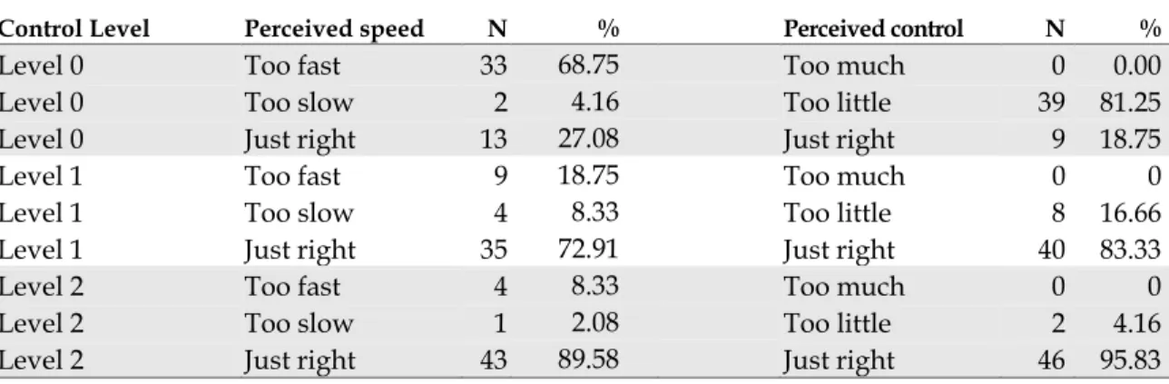
knowledge (high or low statistical experience). However, the relationship between the control level and the level of perceived control was significant, χ2 (2, N = 144) = 19.38,
p < .0001), as was the relationship between the control level and perceived speed of the presentation, χ2 (2, N = 144) = 19.52, p < .0001). The percentages are shown in Table 1.
TABLE 1: Frequencies of Perceived speed & Perceived control vs. Control Level
Control Level Perceived speed N % Perceived control N %
Level 0 Too fast 33 68.75 Too much 0 0.00
Level 0 Too slow 2 4.16 Too little 39 81.25
Level 0 Just right 13 27.08 Just right 9 18.75
Level 1 Too fast 9 18.75 Too much 0 0
Level 1 Too slow 4 8.33 Too little 8 16.66
Level 1 Just right 35 72.91 Just right 40 83.33
Level 2 Too fast 4 8.33 Too much 0 0
Level 2 Too slow 1 2.08 Too little 2 4.16
The analysis uncovered several significant relationships when evaluating animation types. The animation type was significantly related to the tendency to change to the correct answer.
• Change to correct for Question 1, χ2 (5, N = 144) = 21.06, p < .0008
• Change to correct for Question 2, χ2 (5, N = 144) = 14.00, p < .0156
The animation type was also significantly related to the change in confidence. • Change in confidence for Question 1, χ2 (5, N = 144) = 19.87, p < .0013
• Change in confidence for Question 2, χ2 (5, N = 144) = 20.42, p < .0010
Finally, the animation type was significantly related to excess time, χ2 (5, N = 144) =
15.38, p = .0089). Frequencies for the changed to correct values are shown in Table 2. Both the Index and Adjustment animation types had a significant number participants change their response to an incorrect answer. Adjustment also had a significantly lower mean change in confidence rating. Means for change in confidence and excess time are shown in Table 3. The animation type was not significantly related to user satisfaction measures that were tested.
TABLE 2: Frequencies of Changed to correct vs. Animation type
Animation type Changed to correct? Question 1 Question 2
Index No -7 0
Yes 0 9
CPI No 0 0
Yes 17 15
Anti-knock No 0 -1
Yes 20 15
Adjustment No -6 -2
Yes 0 2
Age Adjustment No -1 0
Yes 7 1
Seasonal Adjustment No 0 0
TABLE 3: Mean values of Excess time, and Change in confidence for Questions 1 & 2
Anim.
Type Excess Time Dev. Min Max Std.
Conf. Change
Q1 Dev. Min Max Std.
Conf. Change
Q2 Dev. Min Max Std.
1 15.88 13.25 0 50 1.50 1.22 -1 4 2.67 1.13 0 4
2 27.58 22.32 1 89 2.71 1.12 0 4 1.92 1.28 0 4
3 32.71 20.21 6 95 2.96 1.27 0 4 2.83 1.20 0 4
4 27.88 17.70 9 91 1.04 1.04 0 3 0.67 0.96 -1 3
5 26.25 37.05 -6 160 2.58 1.38 -2 4 2.54 1.28 0 4
6 36.96 23.18 6 90 2.25 1.33 0 0 2 1.29 0 4
Because there appears to be some differences between the general animations (Index and Adjustment) and the agency specific definitions (CPI, Anti-knock Index, etc.), we tested against another condition: general. The testreveals that the relationship between general and changed to correct is significant for both Question 1, χ2 (1, N = 24) =
20.42, p < .0001, and Question 2, χ2 (1, N = 24) = 5.20, p < .0225. Tabulations of the
correct answers from the question review also reflect the differences between the general and specific animation types.
TABLE 4
:
General vs. correct answers from question review (N, percentages)Animation type Q1 correct Q1 incorrect Q2 correct Q2 incorrect
Index 14 10 23 1
CPI 24 0 19 5
Anti-knock 24 0 23 1
Adjustment 12 12 10 14
Age adjustment 23 1 24 0
Seasonal adjustment 24 0 24 0
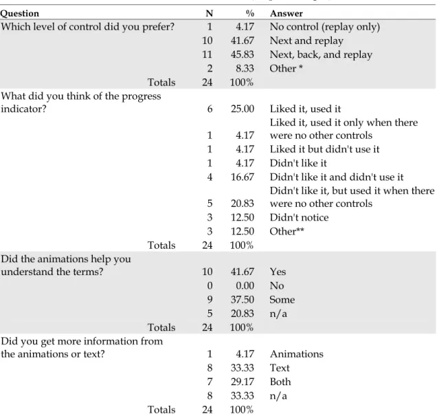
TABLE 5: Post-test interview answer tabulations (N, percentages)
Question N % Answer
Which level of control did you prefer? 1 4.17 No control (replay only) 10 41.67 Next and replay
11 45.83 Next, back, and replay 2 8.33 Other *
Totals 24 100% What did you think of the progress
indicator? 6 25.00 Liked it, used it
1 4.17
Liked it, used it only when there were no other controls
1 4.17 Liked it but didn't use it
1 4.17 Didn't like it
4 16.67 Didn't like it and didn't use it
5 20.83
Didn't like it, but used it when there were no other controls
3 12.50 Didn't notice
3 12.50 Other**
Totals 24 100%
Did the animations help you
understand the terms? 10 41.67 Yes
0 0.00 No 9 37.50 Some 5 20.83 n/a Totals 24 100%
Did you get more information from
the animations or text? 1 4.17 Animations
8 33.33 Text
7 29.17 Both
8 33.33 n/a
Totals 24 100%
* Other indicates additional levels of control in addition to next, or next and replay ** Other indicates mixed responses — i.e., “it was distracting, but I used it all the time”
The results indicate that the control levels had no measurable effect on the quality of learning or time, but significantly impacted user satisfaction measures. The relationship between animations and measured variables is more difficult to isolate — it may either be a factor of the animation type or an artifact of the test design. Because of the
Discussion
The data analysis did not reveal significant differences between the control levels and quality of learning or time spent viewing an animation. However, the control levels were significant when measuring the user satisfaction measures. This conclusion is supported by the post-test interview data: over 95% of the participants favored some form of control. This is not a surprising result; previous research has indicated that user control increases motivation and satisfaction (Mayer 2001; Narayanan 2002; Tabbers 2004). But we did not anticipate the way the participants split on the choice of Level 1 or Level 2. Our assumption was that participants would prefer the most control (Level 2). Instead, the post-test comments suggest that the conditions
supported the use of the Level 1 equally. Informal observation during the test reveal that most participants did not use the Back button when given the opportunity, but stated in the post test-interview that they would like to have it there “just in case.” This result can be explained two ways. The first is that the duration of the SIG Animations was short enough that the ability to immediately review a segment did not hold a competitive advantage compared to restarting the animation. One participant said:
I don’t think I ever used the back button because I knew I could always just use the replay animation button and keep going through [with the next button], and do it all again if I needed to.
The second explanation is that participants found the order of the presentation important. Several responses in the post-test interview suggest that participants
viewed the presentations as a progression; restarting the animation from the beginning gave them the chance to review the construction of the argument, instead of simply reviewing a specific concept within the presentation. One participant stated:
I’m not sure if the back really helps, because I don't know if I would have actually just gone back to the last frame, because they kind of progressed. And then if I wanted to know something I might have wanted to jump to a different frame, but I wouldn't necessarily just go back to the one right before it.
This aligns with Mayer’s (2001b) results, and supports the practice of presenting an overview of the subject before presenting detailed information.
The animation type produced several significant results. The changed to correct, in conjunction with the change in confidence variables can help us determine if the animations helped participants answer the questions and understand the material. Our prediction was that an effect that only appeared with an animation type, but not a control level, would reflect a characteristic of either the animation or test question. The data reveal that Index and Adjustment had at least one particularly low mean
confidence rating and a low incidence of changed to correct answers. In fact, Index and Adjustment had many cases where the participants changed their answers to an incorrect response — the least desirable reaction to viewing the animations. Taken in combination with the related confidence scores, we can conclude that the first question in the Index presentation, and both questions for the Adjustment presentation were confusing or misleading, or that the information in the presentation did not convey the essential information.
Participants were clearly able to identify the definition of an index — the
2) Which of the following comparisons can be done with an index?
A) You can compare the value of an index in one month with its value in the next month to see if it increased or decreased.
B) You can average the monthly values of an index together to get a mean index value for the year.
C) Both 1 and 2. D) None of the above.
The correct answer is “C) Both A and B.” However, of the participants who changed their answer after viewing the animation, 7 out of 8 of them changed their response to answer A. This indicates that the presentation clearly demonstrated answer A, but was unclear on demonstrating answer B.
The Adjustment presentation introduces a different problem. Both Question 1 and 2 had the lowest number of correct answers. Question 1 in particular had a high rate of changed to incorrect. The questions are:
1) Which statement best describes why statisticians adjust some statistics? A) So that real trends stand out from regularly occurring changes. B) So the statistics don’t show big changes between summer and winter. C) So the graphs have smoother lines and are easier to read.
D) To make up for the data they were not able to collect.
2) Which of the following reasons would be a good reason to use an unadjusted rate rather than an adjusted rate?
A) If you wanted to know the actual rate, rather than looking at a trend over time. B) If you wanted to compare rates from different times of year, or from different
parts of the country.
C) If you wanted to know what the raw numbers were. D) If you didn’t want estimated data included in the rate.
For Question 1, all the participants who changed their response (including participants who changed from a previously incorrect answer) chose answer C. The correct
essential information, and influenced them to choose answer 3 as the correct response. This is consistent with Mayer’s Consistency principle (2001). The motion of the graph is too attractive — it overrides the important information in the text, and results in an incorrect response.
The Adjustment animation did not include information that would have helped participants respond to Question 2; all of the relevant material was in the text. The changed to incorrect response was lower with Question 2, but the number of incorrect responses was the highest of all the animation types. This presentation had the
shortest default time, at 13 seconds. It appears that due to the speed of this animation, and despite any mitigation by controls, the animation did not communicate the necessary information to correctly answer Question 2.
The Index presentation had the lowest mean excess time, averaging 10 seconds less than the other presentations (see Table 3). Given the development time spent on this particular presentation (it was the first one created, and has gone through the greatest number of content and animation revisions), we believe that the quality of the
If there was no forward and back they were useful because you knew how much time you had to read. But when you had forward and back button they made me rush when I didn't want to rush. That was annoying. That bothered me.
Some participants suggested that the progress indicator should be tied to the length of the animation, rather than the default time-to-read. They felt that this would help them decide when they could advance, informing them whether or not they could expect further action from the animation. It was also suggested that the progress indicator act as an interactive navigation device that allowed a user to jump from segment to segment, rather than simply displaying the segment and elapsed time.
The responses to “Did the animations help you understand the terms?” and “Did you get more information from the animations, text, or both?” were frequently intermingled. There were several responses that were similar to this one:
The animations solidified what I just read. Maybe I'd have to read it again to be sure, but the animations certainly helped in that they made it clear, absolutely clear what was happening.
The animations, then, had a reinforcing effect, though as we can see from Table 5, participants tended to get their information from the text. Participants also remarked clearly on the simultaneous presentation of text and animation.
Either one or the other, have the animation come first or have the words come first. It's information overload, you don’t know which one to look at.
They clearly would prefer something that allowed for sequential processing of the information, although the dual-channel delivery method would also alleviate this problem. We expected this result, and anticipate designing a solution into the next iteration of the SIG Animations.
Conclusions
This paper has presented considerations from several fields for the development of successful multimedia instruction. The SIG Glossary Animations incorporate design considerations from information science, graphic design, and instructional design, but compromise on some important cognitive learning theory design guidelines. A study was conducted with twenty-four participants to see if the addition of controls would mitigate these compromises, and to see if there were any relationships between the levels of control and the effects on quality of learning, viewing time, or user
satisfaction. The study used six presentations from the SIG Glossary, each with a unique animation type. The control levels measured were: Level 0) no control: only a progress indicator and the ability to replay the entire animation; Level 1) next: pauses the animation at the end of a segment until the user advances; Level 2) next & back: allows the user to review the previous segment. The results show that there are no statistically significant relationships between the level of control and the quality of learning, or the viewing time, but the control levels did relate significantly to user satisfaction measures. Post-test interviews supported the statistical findings and added insight into specific issues that could not be isolated through the quantitative
measures. In addition, several significant relationships were discovered between the animation types and quality of learning measures and time, but not the user
satisfaction measures. We believe these relationships are artifacts of the testing context, but they may provide some clues for future content development of the SIG
Overall, users found the SIG Glossary animations helpful, and overwhelmingly preferred the option to control the pace of the presentation. Users also had several suggestions to improve the progress indicator. We suggest that the best combination of controls is a progress indicator that is tied to the length of the current segment’s animation, a next button, and a replay option. This recommendation relies on the specific context of the SIG Animations, which are extremely short information presentations. This recommendation cannot be generalized to longer presentations.
The research and study results suggest that SIG Animations require additional work. Specifically, the SIG Animations need to accommodate dual-channel delivery of information, or at the least, a sequential presentation of text and animations. Further work is also required to develop a stable process that can generate content at the appropriate level of complexity. Some of the results suggest that the SIG Animations lack the amount or depth of information to allow people to generate other inferences about the term. This is a difficult problem; the potential to overwhelm the user with extraneous information increases as the number of concepts increases. We recommend that the SIG Glossary team design a dual-channel delivery solution with the suggested control configuration, and cultivate a content development process that outputs more complex, in-depth information. These solutions would improve the cognitive
Works Cited
(Ausubel 1968) Ausubel, D. P. (1968). Educational Psychology, A Cognitive View. Holt, Rinehart and Winston: New York, NY.
(Adams 1996) Adams, E. S., Carswell, L. Ainslie, E. Hall, P., Kumar, A., Meyer, J., Motil, J. (1996) Interactive Multimedia Pedagogies: Report of the Working Group on Interactive Multimedia Pedagogy, Proceedings of the SIGCHI Conference on Human factors in computing systems, Vancouver, 182-191.
(Brown 2003) Brown, R.T., Wilbur, J., Haas, S.W., & Pattuelli, M.C. (2003). The GovStat Statistical Interactive Glossary (SIG). Proceedings of the dg.o2003, The National
Conference on Digital Government Research, Boston. Available at:
http://www.diggov.org/dgrc/dgo2003/cdrom/DEMOS/demos2/brown.pdf (November 15, 2004).
(Brünken 2003) Brünken, R., Plass, J. L. & Leutner, D. (2003) Direct Measurement of Cognitive Load in Multimedia Learning. Educational Psychologist, Vol. 38(1), 53-61. (Boulter 1994) Boulter, D. R. (1994) Identification of strategies used in solving
transformational geometry problems. Journal of Educational Research, 1994, vol. 87, issue 5, p 298
(Cairncross 2001) Cairncross, S, & Mannion, M. (2001) Interactive Multimedia and Learning: Realizing the Benefits, Innovations in Education and Teaching International, Vol. 38(2), 156-164.
(Chinien 1993) Chinien, C. A., & Boutin, F. (1993). Cognitive style FD/I: An important learner characteristic for educational technologists. Journal of Educational Technology Systems, Vol. 21(4), 303-311.
(Daniels 2000) Daniels, H.L. & Moore, D. M. (2000) Interaction of Cognitive Style and Learner Control in a Hypermedia Environment, International Journal of Instructional Media, Vol. 27(4), 369-383.
(Dictionary.com) Available at: http://dictionary.reference.com/search?q=multimedia
(Felder 2002) Felder, R.M. (2002) Learning and Teaching Styles in Engineering
Education. Engineering Education, Vol. 78, Issue 7, 674–681. Originally published in 1988. Revised in 2002 with author’s preface available at:
http://www.ncsu.edu/felder-public/Papers/LS-1988.pdf (November 7, 2004).
(Gagné 1975) Gagné, R. (1975) Essentials of Learning for Instruction. Dryden Press: Hinsdale, Illinois.
(Gagné 1985) Gagné, R. (1985) The Conditions of Learning and Theory of Instruction. Holt, Rinehart & Winston: New York, NY.
(Gagné 1992) Gagné, R. (1992) Principles of Instructional Design. Holt, Rinehart & Winston: New York, NY.
(GovStat) GovStat Project website: Available at: http://www.ils.unc.edu/govstat
(November 15, 2004).
(Gredler 1997) Gredler, M. E. (1997) Learning and Instruction: Theory into Practice. Prentice-Hall: Upper Saddle River, NJ.
(Haas 2003) Haas, S. W., Pattuelli, M. C., & Brown, R. T. (2003). Understanding statistical concepts and terms in context: The GovStat Ontology and Statistical Interactive Glossary. Proceedings of the American Society for Information Science and Technology Annual Meeting, Vol. 40, 193-199.
(Harrison 1995) Harrison, S. M. (1995) A comparison of still, animated, or
nonillustrated on-line help with written or spoken instructions in a graphical user interface, Proceedings of the SIGCHI conference on Human factors in computing systems, Denver, 82-89.
(Heinich 1993) Heinich, R., Molenda, M., Russell, J.D., Smaldino, S.E. (1993)
Instructional Media and Technologies for Learning. Upper Saddle River, NJ: Prentice-Hall.
(Kalyuga 1999) Kalyuga, S., Chandler, P. & Sweller, J. Managing Split-attention and Redundancy in Multimedia Instruction. Applied Cognitive Psychology, Vol. 13, 351-371.
(Large 1994) Large, A., Beheshti, J., Breuleux, A. & Renaud, A. (1994). The Influence of Multimedia on Learning: A Cognitive Study. Multimedia 94, 315-319.
(Marchionini 2003) Marchionini, G., Haas, S.W., Plaisant, C., Shneiderman, B., and Hert, C. (2003). Toward a Statistical Knowledge Network. Proceedings of the
http://www.digitalgovernment.org/dgrc/dgo2003/cdrom/PAPERS/datastats/ marchionini.pdf (November 6, 2004).
(Mayer 2001) Mayer, R.E. (2001). Multimedia Learning. Cambridge University Press: New York, NY.
(Mayer 2001b) Meyer, R. E. (2001). When Learning Is Just a Click Away: Does Simple User Interaction Foster Deeper Understanding of Multimedia Messages? Journal of Educational Psychology, Vol. 93(2), 390–397.
(Mayer 2003) Mayer, R.E. & Moreno, R. (2003) Nine Ways to Reduce Cognitive Load in Multimedia Learning. Educational Psychologist, Vol. 38(1), 43-52.
(Morrison 1994) Morrison, J.B. & Tversky, B. (1994) The (in)effectiveness of animation in instruction, CHI '01 extended abstracts on Human factors in computing systems, Seattle, 377-378.
(Narayanan 2002) Narayanan, N. H. & Hegarty, M. (2002). Multimedia design for communication of dynamic information. International Journal of Human-Computer Studies. Vol. 57, 279-315.
(Newby 2000) Newby, T. J., Stepich, D. A., Lehman, J. D., Russell, J. D. (2000).
Instructional Technology for Teaching and Learning: Designing Instruction, Integrating Computers, & Using Media, 2nd ed. Merrill: Upper Saddle River, NJ.
(Pattuelli 2003) Pattuelli, C. (2003). Pattuelli, M.C., Haas, S.W., Brown, R.T., and Wilbur, J. (2003). The GovStat Ontology. Proc. 2003 National Conference on Digital Government Research, Boston. Available at:
http://www.diggov.org/dgrc/dgo2003/cdrom/POSTERS/pattuelli.pdf (November 15, 2004).
(Paivio 1986) Paivio, A. (1986). Mental Representations: A Dual Coding Approach. Oxford University Press: New York, NY.
(Paivio 1971) Paivio, A (1971) Imagery and Verbal Processes. Lawrence Erlbaum: Hillsdale, NJ.
(Pollock 2002) Pollock, E., Chandler, P., & Sweller, J. (2002) Assimilating complex information. Learning and Instruction, Vol. 12(1), 61-86.
(Preece 2002) Preece, J., Rogers, Y. & Sharp, H. (2002). Interaction Design: Beyond Human-Computer Interaction. John Wiley & Sons: New York, NY.
(Smith 2000) Smith, S. M. & Woody, P. C. (2000) Interactive Effect of Multimedia Instruction and Learning Styles. Teaching of Psychology, Vol. 27(3), 220-223. (Spolsky 2000) Spolsky, J. (2000) The Joel Test: 12 Steps to Better Code. Available at
http://www.joelonsoftware.com/articles/fog0000000043.html (November 18,
2004).
(Sweller 1999) Sweller, J. (1999). Instructional Design in Technical Areas. Australian Council for Educational Research: Melbourne.
(Sutcliffe 1994) Sutcliffe, A, Faraday, P. (1994) Designing Presentation in Multimedia Interfaces, Proceedings of the SIGCHI Conference on Human factors in computing systems, Boston, pp. 92-98.
(Tabbers 2004) Tabbers, H.K., Martens, R.L. & van Merriënboer, J.J.G. (2004)
Multimedia instructions and cognitive load theory: Effects of modality and cueing, British Journal of Educational Psychology, Vol. 74, 71–81.
(Tufte 1990) Tufte, E. (1990) The Visual Display of Quantitative Information. Graphics Press: Cheshire, CT.
(Tversky 2002) Tverskey, B., Morrison, J.B. & Betrancourt, M. (2002) Animation: Can it facilitate? International Journal Human Computer Studies, Vol. 57, 247-262.
(Wilbur 2004) Wilbur, J., Haas, S.W. (2004). The GovStat Content Delivery Template (CDT) for Creating Explanatory Animations. Proceedings of the dg.o2004, The National Conference on Digital Government Research, Seattle. Available at:
http://dgrc.org/dgo2004/disc/demos/tuesdemos/wilbur.pdf (November 15,
Appendix A
Template schematic.
Appendix B
An example animation, from beginning to end.
Appendix C
The evolution of the SIG Animations.
ORIGINAL DESIGN
This is the original design of the SIG Animations. The content and explanatory text was integrated, and the button location changed on subsequent screens. Text overlaying the icons was more difficult to read than text on a white background.
SECOND STATE
The first round of revisions led to this design. The title of the animation was set in the upper left corner, and the question was set above the text area. The text area included a scroll bar to accommodate the additive text handling: each text segment was
appended to the previously displayed text. This led to a long text display which users could review.
CURRENT STATE
The final revisions led to the current design. The question was moved under the title, which allows for longer questions (a forward compatibility consideration). The scrollbar was removed from the text area because only the current segment’s text appears in the text area. The controls were moved closer to the middle of the screen, and include a progress indicator (showing the number of segments and the time remaining in the current segment). Also, the color scheme and typography were solidified.
Appendix D
The controls:
PROGRESS INDICATOR
NEXT BUTTON
BACK BUTTON:
REPLAY
Appendix E
Questionnaire
1. Highest level of education completed or pursuing Less than high school diploma
high school diploma 2 year college 4 year college
graduate/professional degree doctoral degree
2. Major(s)?
3. Occupation(s)?
4. Gender: Male Female
5. What computer applications do you use? (Please check all that apply.) email
word processing web surfing games database spreadsheets multimedia programming other
6. How would you describe your skill at searching the web? (Please select the appropriate rating.)
Novice 1 2 3 4 5 Expert
7. Have you ever taken a statistics course or a course in which statistics was an important component?
Yes No
8. If yes, how many courses did you take at each level? high school
college
post-graduate work other
9. Please check the statistical package(s) that you have used. Excel or other spreadsheet
SAS SPSS other none
10. How frequently do you use the following tables? (Include both paper and electronic formats.)
Never Annually Monthly Weekly Daily
Stock market tables/listings Consumer information tables (e.g. price comparison tables) Research results in articles Government statistics on the web (e.g. health, demographic tables)
11. How often have you used data in tables from government websites?
Never Annually Monthly Weekly Daily
12. How often do you use statistical tables on the web?
Never Annually Monthly Weekly Daily
Appendix F
SIG Animations study screenshots
The number entered here determined the order of the presentations, and the mix of control levels.
Appendix G
A selection of responses from the post-test user interview questions. What did you think of the progress indicator?
• “I thought it was a loading indicator, like in flash.” • “It was extra something there, not useful.”
• “I didn't really pay attention to that.”
• “If there was no forward and back they were useful because you knew how much time you had to read. But when you had forward and back button they made me rush when I didn't want to rush. That was annoying. That bothered me.”
• “There were times when the progress bar slowed me down. I had read the text and understood it but I didn't want to hit next because I was curious if
something else would pop up when it was 80% done. SO if you have a next, perhaps you don't want time to read the text built into the progress bar.” • “If I had control over how fast it went, I wouldn’t miss it. “
Did the animations help you understand the terms?
• “Most of the presentations I would have gotten just as much out of it without the animations, but definitely, definitely it helped solidify it.”
• “Either one or the other, have the animation come first or have the words come first. It's information overload. You don’t know which one to look at.”
• “I liked having the animation. They just supported what the written information was and gave me another way to look at it.”
• “If there wasn't enough time to read what they had, the picture got the idea across faster.”
• “The animations solidified what I just read. Maybe I'd have to read it again to be sure, but the animations certainly helped in that they made it clear,
absolutely clear what was happening.”
• “Just putting in a time delay so that you finished reading and then looked at the animation.”