Masterscriptie Studierichting Psychologie
Faculteit Sociale Wetenschappen - Universiteit Leiden Juli 2016
Masterproject: xxxx
Studentnummer: s0924512 Begeleider: Drs. P. Haazebroek Sectie: Cognitieve Psychologie
Is a circle graph more effective
at visualizing uncertainty than a
bar chart with error bars?
Table of Contents
Introduction p 1
Method p 9
Results p 12
Discussion p 19
Conclusion p 27
References p 28
Abstract
This study tried to find an effective way to visualize uncertainty by comparing a bar chart with error bars to a circle graph. Participants were asked to view 48 graphs, make predictions and self-report how confident they were of each prediction. We expected participants in the circle condition to be more cautious when faced with more uncertainty and require less explanation to make statistically informed decisions than for the bar condition. No difference in performance was expected for the nominal or ordinal trials of the circle graph. The results show that the circle graph does not outperform the bar graph. When shown more uncertainty, or given less explanation, participants performed worse for the circle graph than for the bar graph. However, it was found that the circle graph was more intuitive as it did not necessarily require explanation, whereas the bar graph did. Additionally, our explorative look at level of measurement, i.e. nominal or ordinal, points to a gap in the literature. It was found that the nominal trials were more easily understood than the ordinal trials. For both levels of measurement, the circle graph performed worse than the bar graph. Thus, though some support in favour of the
intuitiveness of the circle graph was found, we were unable to prove it was a better alternative to the bar graph. In fact, evidence was found that showed the circle graph to be a worse alternative. Therefore we recommend to keep using the more commonly used bar chart with error bars.
Samenvatting
In dit onderzoek werd er, door middel van een vergelijking tussen een staafdiagram met foutbalken (“bar chart with error bars”) en een cirkeldiagram, gezocht naar een effectieve manier om onzekerheid
te visualiseren. Aan participanten is gevraagd om 48 grafieken te bekijken, daarover voorspellingen te maken en hun vertrouwen daarin vervolgens op een zevenpunts-schaal uit te drukken. Er werd
In this age of information there is increasingly more data available to the general public. All this data is subject to misinterpretation by viewers; with more data available the chances of
misinterpretation increase. This raises the following question: What is the best way to present data? Considering the increased availability of data to the general public, the answer to this question should benefit the understanding of lay people.
Pinker (1990) argues that society currently values presenting data in graphic form. He found literature with experimental evidence that suggests people more easily perceive and comprehend information presented in graphs. More evidence comes from Johnson et al. (2006) and Tversky (2001) who showed graphs were easier to understand than raw numbers or text-based formats. However, there are many different types of graphs ranging from line and bar graphs to flow charts, tree structures and many more (Pinker, 1990). Furthermore, each visualization can have a profound impact on how audiences interpret and comprehend graphs (Ibrekk & Morgan, 1987). Knowing there are so many different graphs and that each can have such a different impact, how does one choose which graph to use? An obvious answer might be to simply use the easiest graph, however Pinker (1990) argues that there is no clear discernible difference in difficulty of graphs, thus there is no such thing as the easiest graph. Rather, finding a good graph to use depends on the type of information that needs to be
communicated.
This is illustrated by the findings of Zacks and Tversky (1999): for categorical (nominal) information, bar graphs are better as they can visualize comparisons more effectively whereas for ordinal or interval information, line graphs are better as they can display trends more effectively (Ali & Peebles, 2013). This effect is so strong that readers that are shown line graphs of heights of male and females will even go as far as making statements such as: ‘’The more male a person is, the taller he/she is’’ (Zacks & Tversky, 1999). Therefore, it should be apparent that the graph type choice
should be made very carefully.
Aside from these two graph types there are of course many other graph types, each better than the other for communicating a specific type of data. However, with data comes uncertainty (Sanyal, Hang, Bhattacasarya, Amburn & Moorhead, 2009) and in 2001, the APA stated that it wants graphs to also show the accompanying uncertainty in the form of confidence intervals (APA 2001; Wilkinson & Task Force on Statistical Inference, 1999). This is easier said than done, as the topic of visualizing uncertainty in graphs, henceforth referred to as uncertainty visualization, has not yet been studied extensively. Indeed, there seems to be no real model or framework that graph designers of uncertainty can follow (Pang, 2001; Thomson, Hetzler, MacEachren, Gahegan & Pavel, 2005). Thus, this study will try to answer the following question: what graph type can be effective for visualizing confidence interval uncertainty? We shall use the previously discussed theories for graph comprehension as the foundation for answering this question.
Introducing Uncertainty
What is uncertainty? Uncertainty comes with all data simply because data from
measurements are not 100% perfect (Griethe & Schumann, 2006). This imperfection is caused by errors, missing values in datasets, deviations etc. These factors can be caused by any number of things, for example inadequate assessing methods or losses from interpolations (Griethe & Schumann, 2006). Uncertainty is a difficult concept to define and there are many different definitions (Griethe &
Schumann, 2006). In general, definitions include elements of how a lack of knowledge about the amount of error should influence how cautious people should be when interpreting the data (Griethe & Schumann, 2006).
In general, uncertainty consists of many different concepts: error, imprecision, accuracy, lineage, subjectivity, non-specificity and noise (for a more detailed explanation of these terms; see Griethe & Schumann, 2005 and 2006). In an ideal world, the chosen uncertainty visualization should be able to distinguish all these different concepts. It should allow the reader to fully comprehend the inherent flaws of the data and correctly interpret the hidden facts (Griethe & Schumann, 2006). However, the goal of graphs is not to communicate everything precisely, as tables already reach this goal, but to make larger amounts of data faster and easier to comprehend (Johnson et al., 2006; Tversky, 2001). Likewise, the goal of adding uncertainty to graphs should not be to communicate all of the uncertainty concepts, but to give readers a clue of just how much they can trust the data by alerting them to not blindly put all of their faith into the data (Edwards & Nelson, 2001). As such, adding uncertainty to a graph can give readers a more complete understanding of the limitations of the data. Therefore, it is believed that to improve graph comprehension, information should be
Techniques to Visualize Uncertainty
Current visualizations of uncertainty. Currently when using graphs to present information,
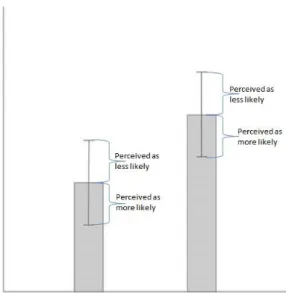
uncertainty is either omitted completely or visualized in one of many ways. There is no universal agreement on how to present uncertainty (Pang, 2001). The most common way is to use bar charts with error bars (Correll & Gleicher, 2013; Sanyal et al., 2009). Despite its ubiquity the bar chart with error bars, is subject to misinterpretation (Correll & Gleicher, 2013). In fact, both the bar itself and the accompanying error bars are likely to be misinterpreted by audiences. In previous research it has been shown that using bars for mean samples can lead to audiences thinking that the values below the bar are more likely to happen than the values above it (see Figure 1). This is called the within-the-bar bias (Newman & Scholl, 2012).
Figure 1. Within-the-bar bias
One example of a shortcoming of the bar chart with error bars. Lay audiences perceive the values below the bar to be more likely than the values above the bar.
utilized here. Uncertainty visualization techniques can be divided into two distinct categories: intrinsic and extrinsic (Gershon, 1998).
Intrinsic techniques. Intrinsic techniques change the appearance of the separate visualizations that make up the graph with the uncertainty. I.e. if data becomes more uncertain, the visualization (such as an error bar) would, for example, become more blurred. In doing so, intrinsic techniques integrate uncertainty into the graph. Such techniques include changing features such as: texture, brightness, hue, size, orientation, position, or shape (Gershon, 1998). Other techniques are: fuzziness, graded point size (MacEachren et al., 2012), Gaussian fade, uniform opacity (McKenzie, Barrett, Hegarty, Thompson & Goodchild, 2013), colour, size, position, angle, focus, clarity, transparency, edge crispness or blurring (Griethe & Schumann, 2006).
Extrinsic techniques. Extrinsic techniques add objects to the graph to convey uncertainty. These include objects such as arrows, bars, circles, violin plots, gradient plots, box plots, rings or other complex objects, e.g. pie charts or indeed error bars (Correll & Gleicher, 2013 and 2014; Andre & Cutler, 1998). These visualization techniques suggest uncertainty is something that comes with the data but is separate from it (Deitrick & Edsall, 2006).
It is suggested that intrinsic techniques may be preferred by lay people over extrinsic techniques. This might be because intrinsic techniques show a more simplified visualization of complex uncertainty data (Cliburn, Feddema, Miller & Slocum, 2002). Moreover, Gershon (1998) advises it is not necessary for a graph to completely show the uncertainty as having a graph filled with extrinsic and intrinsic techniques might cause clutter. As an example he suggests it is only needed to show a few error bars, and not necessarily all of them.
Recent Research on Uncertainty Visualization
Recent research has attempted to identify the best uncertainty visualization by examining the known shortcomings of the most commonly used uncertainty visualization. For example, Correll and Gleicher (2014) investigated alternative visualizations of uncertainty to the bar chart with error bars. Both of their alternatives were expected to at least counter the within-the-bar bias (people think that the values below the bar are likelier to happen than the values above it) seen when using error bars. They argued that their alternatives would accomplish this by having more symmetry around the means. Their results supported their theory; the participants were no longer influenced by the within-the-bar bias. In line with Correll and Gleicher (2014), our study builds on their first steps of making a model or framework which was lacking from all the literature (Thomson et al., 2005).
judgments because these are more intuitive (MacEachren et al., 2012). Our work expands on the proposed study by McKenzie et al (2013), using the circle as a possible alternative to the bar chart with error bars. Inspired by MacEachren et al. (2012), our study also tried to answer which uncertainty visualization is more intuitive and thus leads to better decision making.
Lastly, other research has tried to find out what the next logical step in visualizing uncertainty could be. Skeels, Lee, Smith and Robertson (2010) interviewed people working with uncertainty on a daily basis. In this research, too, participants reported that the most common visualization of
uncertainty was error bars. Some of these participants suggested that an error bar could also be used to show location and described it as a point with a circle around it. Thus, the idea of visualizing
uncertainty with circles seems promising.
The Present Study
Choosing our uncertainty visualization. Our study was carried out in a similar vein to the
study of Correll and Gleicher (2014). We studied if a circle with a mean in the centre could be more effective in visualizing uncertainty as compared to bar chart with error bars. The reason for choosing to compare it to the bar chart with error bars is because this is the most common form of visualizing uncertainty (Corell & Gleicher, 2014; Skeels et al., 2010). If we can find a visualization that is better than the most common one, it could have the largest impact on uncertainty visualization research. In line with Correll and Gleicher (2014) we looked at the likelihood of participants to make a prediction and how confident they were about that prediction.
Based on the Google Maps study by McKenzie et al. (2013) and the study by Skeels et al. (2010), we expected participants to already be relatively familiar with the circle graph. Though readers will be less familiar with the circle graph than with the bar chart with error bars, we expected this difference to be negligible. We expected this to have little effect on their interpretation.
Based on the study by Deitrick and Edsall (2006) it is known that extrinsic techniques imply that the uncertainty is separate from the data. However, based on the study by Sanyal et al. (2009) it is known that uncertainty is inherent to all data and thus cannot be separate from it. More support in favour of using intrinsic techniques comes from Cliburn et al. (2012), who suggested that lay people prefer intrinsic techniques over extrinsic ones; and McKenzie et al. (2013), who also expected intrinsic techniques to outperform extrinsic ones through their intuitiveness. Finally, where the bar chart with error bars consists of two extrinsic techniques; the bar chart and the error bars, the circle graph only consists of one extrinsic technique; the actual circle. Yet, the circle graph can communicate
explanation, and thus be more suitable for lay audiences. Additionally, the circle graph would be less visually cluttering and thus more easily understood.
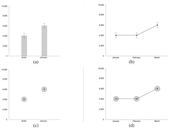
More support for the intuitiveness of the circle graph comes from the Gestalt principles and cognitive naturalness. As mentioned before, for specific types of information, certain graph types are more suitable for visualizing that type of information: it was found that for nominal information, bars were better, as they allowed for easier comparisons. Whilst for interval information, lines were better as they showed trends better (Zacks & Tversky, 1999). However, we do not yet know for which type of information circles are better. Therefore, we took an explorative look to see if, for the circle graph, nominal data visualization elicits different behaviour than ordinal data visualization. Two datasets were designed; a nominal one and an ordinal one. In Figure 2, two data visualizations of the circle graph and of the bar chart with error bars are shown. Furthermore, we believe the circle graph to be cognitively natural as bigger circles in nature mean bigger quantities. Additionally, circles have a very clear centre to them, i.e. they are symmetrical around the mean, thus countering the within-the-bar bias.
(a) (b)
(c) (d)
Figure 2. Nominal and ordinal trials of the bar chart with error bars and the circle graph.
Measuring the Effectiveness of the Circle Graph
To check the effectiveness of the circle graph for visualizing uncertainty, participants were introduced to a fictional election similar to the one used in Correll and Gleicher (2013). The participants were informed that polls had been conducted showing which candidate citizens would most likely vote on. Participants were asked to make predictions on who would most likely win the election. The votes were shown in either a series of circle graphs or bar charts with error bars. Uncertainty comprehension was implicitly tested: for the nominal trials, by seeing how likely a participant was to not make a prediction at all, and for the ordinal trials, by seeing how likely a participant was to choose the option of “stayed the same”. It was expected that when the uncertainty increased, participants would be less likely to make a prediction (or be less likely to choose “stayed the same”), lower likelihood would imply better statistical prediction making.
Aside from implicit testing we also looked at the explicit subjective self-reporting of
participants. Participants had to rate their confidence about their predictions. We expected that when the uncertainty increased, participants in the circle condition were likely to lower their confidence scores more than participants in the bar chart with error bars condition. Thus by lowering their confidence more, the participants in the circle condition would have made slightly better statistically informed decisions. Note that we were only interested in participant confidence when they did make a prediction; not when they refrained. This is because we were unsure if participants correctly
interpreted what we meant by confidence. They could have been very confident of not making a prediction, which would be the opposite of our expectation and thus cloud our data.
To see if the circle graph was more intuitive than the bar chart with error bars, we divided participants into two groups. Participants were given either a short or an extensive explanation on how to interpret the coming graphs. A more intuitive graph would allow participants to make better
decisions without needing more explanation. Therefore, it was expected that participants who saw circle graphs and were given a short explanation would make better statistical decisions (as defined above) than participants who were shown bar charts with error bars and were also given a short explanation.
To explore if the circle graph is better (or worse) for visualizing a specific type of information, we designed two datasets; a nominal one and an ordinal one. If the circle graph had significantly different results for either data visualization then that would imply that the circle graph is better (or worse) for visualizing that type of information. As a control group, we made similar trials for the bar chart with error bars. It was expected that there would be no difference between the nominal or ordinal trials.
Consequently, the following are our hypotheses: 1. Likelihood of Making a Prediction Hypotheses
H2: When presented with higher levels of overlap, participants in the circle condition would be less likely to make a prediction than participants in the bar chart with error bars condition. H3: When presented with higher levels of overlap, and when participants did not receive
explanation, they would be less likely to make a prediction when in the circle condition, than in the bar chart with error bars condition.
H4: Participants would be equally likely to make a prediction for both the nominal and ordinal trials of the circle graph.
2. Confidence Hypotheses
For only those trials where participants did make a prediction:
H5: When presented with higher levels of overlap, participants in both the circle and the bar chart with error bars condition would have lower confidence scores.
H6: When presented with higher levels of overlap, participants in the circle condition would have lower confidence scores than participants in the bar chart with error bars condition.
H7: When presented with higher levels of overlap, and when participants did not receive
explanation, they would have lower confidence scores in the circle condition, than in the bar chart with error bars condition.
Method
Participants
A total of 103 participants were recruited via Amazon Mechanical Turk. This is a website on which people can participate in order to get money. Currently only Americans or people from around the world that signed up in the beta stages can participate. Of the participants, 63 were male and 40 female. The mean age was 34.6 years, with the youngest participant at 19 years old and the oldest participant 67. Of the participants, 41 finished high school, 46 had undergraduate degrees and 15 had graduate degrees. The jobs of the participants varied widely, ranging from accountants, to students, to unemployed, to IT support and so on.
100 participants were from the USA, one participant was from Peru, one from China and one from the Philippines.
Materials
This experiment was conducted on Amazon Mechanical Turk. This website linked to the experiment made in Qualtrics, a common site used for making experiments. In this experiment, participants were shown a series of graphs showing data from a fictional election. Each graph showed a number of data points with means and accompanying margins of error. The uncertainty was
visualized through how much overlap there was between the data points. Participants were shown two blocks, either a nominal block first or an ordinal block first. A different graph was used for each block. For the nominal blocks (see Figure 2a and 2c), participants were shown the expected number of votes for two data points with means: candidates Smith and Johnson. For every trial, they were then asked to make a prediction on who was more likely to win or if the difference between the candidates was too close to call. For the ordinal blocks (see Figure 2b and 2d), participants were shown three data points with means: the months January, February and March. For every trial, they were then asked to make a prediction about whether the expected number of votes in March, increased, decreased or stayed the same, compared to February.
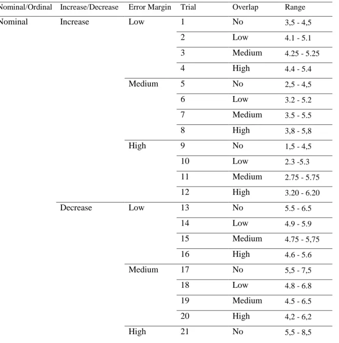
trials of bar chart with error bars or 48 trials of circle graphs. Furthermore, participants saw an additional four practice graphs.Mean averages of the fictional variables on the x-axis varied from 3.5 units to 7.0 units. To see how we designed our graphs in more detail, see Table 3 in the Appendix.
Lastly, the sixth independent variable, Explanation Level, was used as a between-subjects factor. Explanation Level varied on two levels: no explanation or high explanation.
(a) (b)
(c) (d)
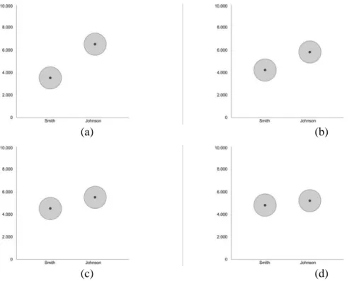
Figure 3. Example trials for the circle graph.
This figure shows four example graphs of increasing levels of overlap. Trial 3a shows no (0%) level of overlap, 3b shows low (20%) levels of overlap, 3c shows medium (50%) levels of overlap and 3d shows high (80%) levels of overlap.
Metrics
Dependent variables and questions. Two dependent variables were used. The first dependent variable, Likelihood of making a prediction, was measured by whether participants made a prediction or if they refrained. For the nominal block, making a prediction was defined by a participant
answering with “Smith” or “Johnson”, refraining was defined by a participant answering with “too close to call”. For the ordinal block, making a prediction was defined by a participant answering with “increased” or “decreased”, refraining was defined by a participant answering with “stayed the same”.
The second dependent variable, confidence, was measured by a 7-point Likert Scale. In both conditions, participants had to state their confidence in their answer for every trial, (for the exact questions, see Appendix).
questionnaires: the General Risk Aversion questionnaire (Mandrik & Bao, 2005) and the Big Five (Gosling, Rentfrow & Swann Jr, 2003). The General Risk Aversion questionnaire consisted of six items (see Appendix for the exact items), and the scores of participants were calculated using the key used by Mandrik and Bao (2005). A shorter version for the Big Five questionnaire was used and consisted of ten items that measured extraversion, agreeableness, conscientiousness, emotional
stability and openness to experience (Gosling, Rentfrow & Swann Jr, 2003). Additionally, a number of general demographic questions were asked; country, age, language etc. For the specific questions see Appendix.
Procedure
After agreeing to join our experiment, participants were transferred to our Qualtrics page. After a short welcome screen, they were randomly assigned their conditions: either no or high explanation (see Appendix), either bar chart with error bars or the circle graph and either a nominal block first or an ordinal block first. Participants were then introduced to the experiment with two practice graphs accompanied by the above mentioned questions.
Each trial consisted of three pages in which a participant could move through in one direction by clicking on the next button. The first page showed the graph with the assigned uncertainty
visualization. The second page showed both the prediction question, which differed depending on the nominal or ordinal block, and the Likert scale. The third page showed the sentence: ‘’When you are ready to continue to the next graph please click on the button.’’ There was no time limit.
After the practice trials, the experimental trials began. Participants were given the first block of 24 trials. After the first block, participants were introduced to the second block of the experiment and were assigned to the remaining nominal or ordinal block. Again, two practice graphs were shown. After having completed the 48 trials, participants were asked to fill in some general background questions and rate their familiarity with the type of graphs shown. At the end of the experiment, participants were debriefed. For a more detailed procedure, see Appendix.
Design
Results
All 103 participants finished the experiment. The average time it took them to finish the experiment was around 16 minutes. The average time participants spent on looking at any trial was 3.16 seconds. The average time spent on answering the corresponding questions was 3.74 seconds. There were some outliers with instances of a participant looking at a graph for 133 seconds, or
answering a question for 269 seconds. Presumably they were distracted at home. All participants were kept in the analyses.
Likelihood of Making a Prediction
A mixed model analysis was used to assess the influence of overlap level, graph type and explanation level on the likelihood of participants to make a prediction. Both graph type and explanation level were between-subjects variables. Overlap was a within-subjects variable. The random factor was the participants. The dependent variable was the likelihood of participants to make a prediction. A significant main effect was found of overlap level on likelihood of making a prediction (F(3, 4829) = 427.38 p < .001). Furthermore, neither graph type, (F(1, 99) < 1, p = .973) nor
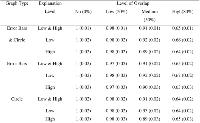
Table 1. Table of estimated marginal means of making a prediction on Overlap for bar chart with error bars and circle.
Graph Type Explanation Level
Level of Overlap
No (0%) Low (20%) Medium
(50%)
High(80%)
Error Bars Low & High 1 (0.01) 0.98 (0.01) 0.91 (0.01) 0.65 (0.01)
& Circle Low 1 (0.02) 0.98 (0.02) 0.92 (0.02) 0.66 (0.02)
High 1 (0.02) 0.98 (0.02) 0.89 (0.02) 0.64 (0.02)
Error Bars Low & High 1 (0.02) 0.97 (0.02) 0.91 (0.02) 0.65 (0.02)
Low 1 (0.02) 0.98 (0.02) 0.92 (0.02) 0.67 (0.02)
High 1 (0.03) 0.97 (0.03) 0.90 (0.03) 0.63 (0.03)
Circle Low & High 1 (0.02) 0.98 (0.02) 0.91 (0.02) 0.64 (0.02)
Low 1 (0.02) 0.98 (0.02) 0.93 (0.02) 0.64 (0.02) High 1 (0.03) 0.98 (0.03) 0.89 (0.03) 0.65 (0.03) “Error Bars” stands for bar chart with error bars. The mean response was whether participants
made a prediction (1), or they refrained from making a prediction (0).
Self-reported confidence
Table 2. Table of estimated marginal means for Confidence scores.
Graph Type Explanation Level
Level of Overlap
No (0%) Low (20%) Medium
(50%)
High(80%)
Error Bars Low & High 6.51 (0.11) 5.79 (0.11) 5.33 (0.11) 4.86 (0.11)
& Circle Low 6.54 (0.15) 5.97 (0.15) 5.53 (0.15) 5.23 (0.15)
High 6.48 (0.14) 5.59 (0.14) 5.13 (0.14) 4.98 (0.14)
Error Bars Low & High 6.54 (0.17) 6.51 (0.17) 5.11 (0.17) 4.62 (0.17)
Low 6.55 (0.24) 5.86 (0.24) 5.50 (0.24) 5.12 (0.24)
High 6.53 (0.24) 5.34 (0.24) 4.73 (0.24) 4.13 (0.24)
Circle Low & High 6.48 (0.13) 5.98 (0.13) 5.56 (0.13) 5.09 (0.13)
Low 6.53 (0.20) 6.11 (0.20) 5.62 (0.20) 5.17 (0.20) High 6.43 (0.16) 5.84 (0.16) 5.49 (0.16) 5.01 (0.17) This table shows the mean confidence scores of participants and the associated standard deviation in brackets. “Error Bars” stands for bar chart with error bars. The mean response was the self-reported confidence scores of participants, from not confident (0) to very confident (7). Note that only the trials for which participants did make a prediction were used.
To assess the three-way interaction effect of overlap, graph type and explanation level, the data was split on graph type. This resulted in two datasets, one for circle and one for bar chart with error bars. For each dataset, a mixed model was used to assess the influence of overlap and
explanation level on the decision confidence of participants. Explanation level was a between-subjects variable. Overlap was a within-subjects variable. The random factor was the participants. The
dependent variable was the self-reported confidence of participants.
For the bar chart with error bars trials a significant main effect of overlap on decision
confidence was found (F(3, 2149) = 275.85, p < .001). There was no main effect of explanation level (F(1, 50) = 2.94, p = .093). For the estimated marginal means of both graph types, see Table 2.
effect of overlap on decision confidence was found (F(3, 1169) = 94.87, p < .001). A contrast test was carried out. All comparisons gave significant results (p < .001). For high explanation level, a
significant main effect of overlap on decision confidence was found (F(3, 980) = 175.20, p < .001). A contrast test was carried out. All comparisons gave significant results (p < .001). For the estimated marginal means of both explanation levels for the bar chart with error bars, see Table 2.
For participants in the circle condition, a significant main effect of overlap on confidence was found (F(3, 2104) = 160.03, p < .001). No significant main effect of explanation level was found (F(1, 49) < 1, p = .497) nor a significant interaction effect of overlap and explanation level (F(3, 2104) < 1,
p = .482). A contrast test was carried out. All comparisons gave significant results (p < .001).
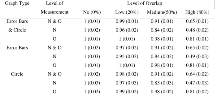
The effect of level of measurement on Likelihood of Making a Prediction
A mixed model analysis was used to assess the influence of overlap, graph type and level of measurement on the likelihood of participants to make a prediction. Graph type was a between-subjects variable. Overlap and level of measurement were within-between-subjects variables. The random factor was the participants. The dependent variable was the likelihood of participants to make a
prediction. Two significant main effects were found: both overlap level (F(3, 4827) = 478.78 p < .001) and level of measurement (F(1, 4827) = 294.21, p < .001) had a significant effect on likelihood of making a prediction. No significant effect was found for graph type (F(1, 101) < 1, p = .939). For the estimated marginal means, see Table 3. Furthermore, a significant two-way interaction effect between overlap and level of measurement was found (F(3, 4827) = 100.54, p < .001). No significant
Table 3. Table of estimated marginal means for Likelihood of Making a Prediction of ordinal/nominal.
Graph Type Level of Measurement
Level of Overlap
No (0%) Low (20%) Medium(50%) High (80%) Error Bars N & O 1 (0.01) 0.99 (0.01) 0.91 (0.01) 0.65 (0.01)
& Circle N 1 (0.02) 0.96 (0.02) 0.84 (0.02) 0.48 (0.02)
O 1 (0.01) 1 (0.01) 0.98 (0.01) 0.81 (0.01)
Error Bars N & O 1 (0.02) 0.97 (0.02) 0.91 (0.02) 0.65 (0.02) N 1 (0.03) 0.95 (0.03) 0.84 (0.03) 0.49 (0.03)
O 1 (0.01) 1 (0.01) 0.98 (0.01) 0.81 (0.01)
Circle N & O 1 (0.02) 0.98 (0.02) 0.91 (0.02) 0.64 (0.02) N 1 (0.03) 0.97 (0.03) 0.83 (0.03) 0.47 (0.03) O 1 (0.02) 0.99 (0.02) 0.98 (0.02) 0.81 (0.02) This table shows the mean responses of participants and the associated standard deviation in brackets. “Error Bars” stands for bar chart with error bars, “N” stands for nominal, “O” stands for ordinal. The mean response was whether or not participants made a prediction (1), or they refrained from making a prediction (0).
To assess the two-way interaction effect of overlap and level of measurement, the data was split on level of measurement. This resulted in two datasets, one for nominal trials and one for ordinal trials. For both datasets, a mixed model analysis was used to assess the influence of overlap on the likelihood of participants to make a prediction. Graph type was a between-subjects variable. Overlap was a within-subjects variable. The random factor was the participants. The dependent variable was the likelihood of participants to make a prediction.
For the nominal trials a significant main effect of overlap on likelihood of participants to make a prediction was found (F(3, 2363) = 394.97, p < .001). No significant main effect was found of graph type (F(1, 101) < 1, p = .951), nor was there a significant interaction effect between overlap and graph type (F(3, 2363) < 1, p = .606). A contrast test was carried out. All comparisons gave significant results (p < .001).
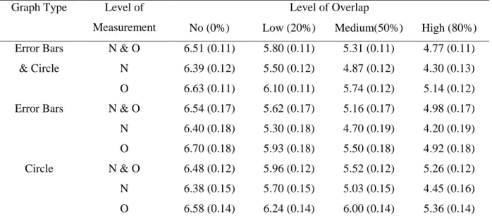
The effect of level of measurement on confidence scores
A mixed model analysis was used to assess the influence of overlap, graph type and level of measurement on the decision confidence of participants for those trials where participants did make a prediction. Graph type was a between-subjects variable. Overlap and level of measurement were within-subjects variables. The random factor was the participants. The dependent variable was the decision confidence of participants. Two significant main effects were found: both overlap level (F(3, 4251.39) = 494.85, p < .001) and level of measurement (F(1, 4252.37) = 364.83, p < .001) had a significant effect on the decision confidence of participants. No significant effect was found for graph type (F(1, 101.36) = 1.70, p = .195). For the estimated marginal means, see Table 4. Furthermore, two significant two-way interaction effects were found: overlap and graph type (F(3, 4251.39) = 12.81, p < .001) and, overlap and level of measurement (F(3, 4250.46) = 21.75, p < .001). No significant two-way interaction effect was found between graph type and level of measurement (F(1, 4252.34) < 1, p = 425) nor was a three-way interaction effect found: F(3, 4250.46) = 1.03, p = .281.
Table 4. Table of estimated marginal means for decision confidence of participants of ordinal/nominal trials.
Graph Type Level of Measurement
Level of Overlap
No (0%) Low (20%) Medium(50%) High (80%) Error Bars N & O 6.51 (0.11) 5.80 (0.11) 5.31 (0.11) 4.77 (0.11)
& Circle N 6.39 (0.12) 5.50 (0.12) 4.87 (0.12) 4.30 (0.13) O 6.63 (0.11) 6.10 (0.11) 5.74 (0.12) 5.14 (0.12) Error Bars N & O 6.54 (0.17) 5.62 (0.17) 5.16 (0.17) 4.98 (0.17) N 6.40 (0.18) 5.30 (0.18) 4.70 (0.19) 4.20 (0.19) O 6.70 (0.18) 5.93 (0.18) 5.50 (0.18) 4.92 (0.18) Circle N & O 6.48 (0.12) 5.96 (0.12) 5.52 (0.12) 5.26 (0.12) N 6.38 (0.15) 5.70 (0.15) 5.03 (0.15) 4.45 (0.16) O 6.58 (0.14) 6.24 (0.14) 6.00 (0.14) 5.36 (0.14) This table shows the mean confidence scores of participants and the associated standard deviation in brackets. “Error Bars” stands for bar chart with error bars, “N” stands for nominal, “O” stands for ordinal. The mean response was the self-reported confidence scores of participants, from not confident (0) to very confident (7). Note that only the trials for which participants did make a
Firstly, to assess the two-way interaction effect of overlap and level of measurement, the data was split on level of measurement. This resulted in two datasets, one for nominal trials and one for ordinal trials. A mixed model analysis was used to assess the influence of overlap on the decision confidence of participants. Graph type was a between-subjects variable. Overlap was a within-subjects variable. The random factor was the participants. The dependent variable was the decision confidence of participants when they did make a prediction.
For the nominal trials, a significant main effect of overlap on the decision confidence of participants was found (F(3, 1922.48) = 343.39, p < .001). No significant main effect was found of graph type (F(1, 102.52) = 1.27, p = .263). A significant interaction effect between overlap and graph type (F(3, 1922.48) = 5.00, p < .005) was found. In order to assess the two-way interaction effect between overlap and graph type, the data was subsequently split on graph type. This resulted in two more datasets, one for bar chart with error bars and one for circle. For both datasets, a mixed model was used to assess the influence of overlap on the decision confidence of participants. There were no between-subjects variables. Overlap was a within-subjects variable. The random factor was the participants. The dependent variable was the decision confidence of participants when they did make a prediction. For bar chart with error bars trials, a significant main effect of overlap (F(3, 971.20) = 188.65, p < .001) was found. A contrast test was carried out. All comparisons gave significant results (p < .001). For circle trials, a significant main effect of overlap (F(3, 951.44) = 157.74, p < .001) was found. A contrast test was carried out. All comparisons gave significant results (p < .001)
For the ordinal trials, a significant main effect of overlap on the decision confidence of participants was found (F(3, 2231.96) = 251.66, p < .001). No significant main effect of graph type (F(1, 100.98) = 1.66, p = .197. A significant interaction effect between overlap and graph type (F(3, 2231.96) = 12.46, p < .001) was found. In order to assess the two-way interaction effect between overlap and graph type, the data was subsequently split on graph type. This resulted in two more datasets, one for bar chart with error bars and one for circle. For both datasets, a mixed model was used to assess the influence of overlap on the decision confidence of participants. There were no between-subjects variables. Overlap was a within-subjects variable. The random factor was the
Discussion
As more and more information is released to the public, it has to be made sure that the information presented to the public cannot lead them to the wrong conclusions. Therefore, the goal of this study was to find an answer to the following question: which graph type, bar chart with error bars or circle, can be more effective for visualizing confidence interval uncertainty? We tried to answer this by comparing a new circle graph to the most used graph type, the bar chart with error bars. In order to answer this question participant behaviour was measured through how likely they were to make a prediction and were asked to self-report their confidence about their prediction. Additional variables were: error margin, the amount of uncertainty as visualized by overlap, the effect of receiving or not receiving an explanation about how to interpret the graphs and the level of measurement used for the graph type (nominal or ordinal).
Discussion H1
We expected participants to be less likely to make a prediction when shown higher levels of overlap regardless of graph type. A significant main effect of overlap level on likelihood of making a prediction was found. Additionally, the pairwise comparisons were significant for all levels of overlap. For higher levels of overlap, participants did score lower on likelihood of prediction (see Table 1). Therefore, the results support H1 and thus participants did become less likely to make a prediction when shown higher levels of overlap. The finding that visualizing more uncertainty (e.g. higher overlap) will make participants less likely to make a prediction is not a new finding in the literature. For instance, Correll and Gleicher (2014) also found this effect; if means were greatly distanced from one another but error was very high, participants were still able to make the correct statistical decision and refrained from making a judgement. Remarkably, in our study, with a score of 0.65, the mean response (see Table 1) of the highest level of overlap (80%) was notably lower than the other
comparisons, whilst the mean response for medium levels of overlap (50%) was almost always above or only one point below 0.90. This means that the majority of participants still made predictions when there was 50% overlap.
The results indicated that there might be an overall threshold at which participants refrain from making predictions. As we can see from the mean response, even at 80% overlap the participants continued to make predictions. One wonders at which level of overlap participants will stop making predictions altogether. Future research could investigate this unwillingness to refrain in more detail.
Discussion H2
Therefore, the results do not support H2. When presented with higher levels of overlap, participants did not significantly differ on likelihood of making a prediction for either graph type. This runs counter to research by Correll and Gleicher (2014) and Sanyal et al., (2009) who expected that the bar chart with error bars would underperform. Future research could focus on comparing the circle graph not only to the bar chart with error bars but also to the alternative visualizations used in other literature such as Correll and Gleicher (2014).
Discussion H3 and H7
Based on research by McKenzie et al. (2013) and research by Cliburn et al. (2012) on intrinsic techniques, we had reason to believe that circles would be more intuitive; as they made better use of intrinsic techniques over extrinsic techniques. Thus, we argue that the circle graph is less complex. Therefore, when participants did not get an explanation, we expected intuition to play a larger role. We expected that the circle graph would enhance the effect of intuition and lead participants to be less likely to make a prediction (or score lower on confidence), thus having made better statistically informed decisions. Analyses showed there was no significant interaction effect between overlap, graph type and explanation level for H3. The results do not support H3. When presented with higher levels of overlap, and when participants did or did not receive an explanation, no significant difference was found in likelihood of making a prediction for either graph type. However, for H7, analyses showed there was a significant interaction effect between overlap, graph type and explanation level. For the circle trials with higher levels of overlap, no significant main effect of explanation level on decision confidence was found. Yet, for the bar chart with error bar trials with higher levels of overlap, two main significant effects for the low explanation and the high explanation were found. Moreover, participants scored lower on confidence in the high explanation condition (see Table 2). Thus, for higher levels of overlap, the bar chart with error bars benefits from explanation whereas the circle does not. It seems the circle is intuitive and does not necessarily require explanation. However, for higher levels of overlap, the circle, no explanation condition still has higher, rather than lower, confidence ratings compared to the bar chart with error bars, no explanation condition. Therefore, the results only partially support H7. Though there is some support for the intuitiveness of the circle graph,
participants did not score lower on confidence than the participants who saw the bar graph (see Table 2).
threshold for the intuitive effect of circles to become noticeable. Moreover, according to other literature, such as Deitrick and Edsall (2006), the circle graph should have been more effective at communicating uncertainty through its intrinsic techniques. Yet, we only found a partial effect. This could be because other literature focuses a lot on spatial uncertainty as their visualization techniques are put on maps. We generalized their reasoning to graphs, but perhaps participants understand graphs differently than maps. Thus, no clear effect is found.
If the intuitive effect of circle does become more noticeable for high levels of overlap, future research should focus on different high levels of overlap. Indeed, for both likelihood of making a prediction (Table 1) and decision confidence (Table 2) a steady decline in scores can be seen as levels of overlap increase. Perhaps levels of 80, 85, 90 and 95% could be used, or at least higher than 50%. This could be linked to the possible explanation mentioned in the discussion of H1, where there seems to be a certain threshold at which people really start to be less likely to make a prediction. If another study is done with only high levels of overlap trials, levels above the certain threshold (50% and above), the intuitiveness effect of the circle should become more apparent.
Noteworthy here, are the mean confidence scores of participants in the bar, high explanation condition which were lower than those in the bar, low explanation condition (see Table 2).
Additionally, the mean confidence scores of the bar, high explanation condition were lower than those in the circle condition as well. It seems that participants in the bar condition scored lower on
confidence when given more explanation. Based on McKenzie et al. (2013) we expected the circle to be intuitive as it was better suited for intrinsic techniques over extrinsic ones. We found a partial effect. In 2015 McKenzie et al. finished their study and found that the least complex visualizations outperformed the more complex ones, even though the more complex ones communicated the uncertainty in a more complete manner. Perhaps this means our circle graph, though seemingly intuitive, was too complex for the participants.
Discussion H4 and H8
We expected participants to be equally likely to make a prediction (or confident) for both the nominal and ordinal trials of the circle graph. Analyses for both hypotheses did not show a significant interaction effect between graph type and level of measurement. However, analyses did show
levels of overlap than the ordinal trials of the circle graph (see Table 4). Thus, the results do not support H8. Participants were not equally likely to make a prediction for both the nominal and ordinal trials of the circle graph.
The confidence scores of participants were lower with the nominal trials of the circle graph than with the ordinal trials. Perhaps the nominal trials of circle graphs elicit lower confidence scores (and lower likelihood of making a prediction) because they do not look similar to the nominal trials of bar graphs which people are more familiar with. The bars of the nominal bar graph touch the x-axis of the graph, whereas the circles of the nominal circle graph float and do not touch the x-axis. This makes the nominal circle graph look like a completely new graph, thus participants become more cautious and less confident. The ordinal trials of the circle graph, however, look a lot more similar to the more commonly used ordinal trials of the bar graph. Both graph types do not have anything touch the x-axis and both have a line going through the means. Future research should perhaps modify the nominal trials of the bar graph to one where the bars do not touch the x-axis. However, the nominal bar trials are also less confident than the ordinal bar trials. So perhaps the effect could be attributed to the difference between nominal and ordinal trials. Perhaps the nominal trials are better suited for communicating uncertainty as comparing two values can be easier than evaluating a trend.
Discussion H5
When presented with higher levels of overlap, we expected the confidence scores of
participants to decrease regardless of graph type. However, a three-way significant interaction effect between overlap, graph type and explanation level was also found. For the circle trials, a significant main effect of overlap on decision confidence was found. For the bar trials, for either level of explanation, a significant main effect of overlap on decision confidence was found. Additionally, the pairwise comparisons were significant for all levels of overlap. And finally, the confidence values did decrease with increasing levels of overlap (see Table 2). The results thus support H5, when presented with higher levels of overlap, the confidence scores of participants decreased. Noteworthy is that every next level of overlap seems to make participants decrease their confidence by about 0.4 to 0.6 points. This happens regardless of the level of overlap. This implies that participants interpret the underlying uncertainty as an interval variable, for each increment of overlap they adjust their confidence linearly; with the same relative amount. It seems the participants interpret going from no (0%) to low (20%) overlap to mean the same as going from medium (50%) to high (80%) overlap. The results indicate that adding uncertainty to graphs is beneficial to the participants understanding, as uncertainty did lower participants their confidence scores, regardless of graph type. However, due to their linear adjustments, we might question how well the participants have understood the implications of the visualized uncertainty. Should the difference between no (0%) and low (20%) overlap have the same effect on participants as the difference between medium (50%) and high (80%) overlap?
The finding that more uncertainty (e.g. higher overlap) will make participants less confident is not a new finding in the literature. This was also found by Correll and Gleicher (2014); larger
uncertainty made participants less confident. However, we do not know by how much confidence should be dropped before they make statistically correct decisions. Future research can focus on finding improved visualizations, as measured by lower confidence, but it should also focus on how well participants understood the uncertainty, as measured by amount of confidence changed per level of uncertainty. A future hypothesis to find out more about participants their interpretation of
uncertainty would be: what is the effect of increasing levels of overlap? The research could go from 0 to 10 to 20 to 30 up until and including 99 or even 100% levels of overlap.
Discussion H6
We expected that, when shown higher levels of overlap, participants in the circle condition would have lower confidence scores than participants in the bar condition. The analyses showed a significant three-way interaction effect between overlap, graph type and explanation level. For the circle graph, the results showed a significant main effect of overlap on decision confidence. For the bar graph, the effect of overlap on decision confidence was dependent on explanation level;
decision confidence. Additionally, the pairwise comparisons were significant for all levels of overlap. For all levels of overlap, except the no level, the significant confidence scores in the circle condition were higher, rather than lower, as compared to either low or high explanation level of the bar condition (see Table 2). Therefore, our results do not support H6. When shown higher levels of overlap,
participants in the circle condition, who were not significantly affected by explanation were not less confident than those in the bar condition, who were significantly affected by both levels of
explanation. In fact, the opposite was found: participants in the circle condition were more confident than those in the bar condition for either level of explanation.
The reason for finding the opposite of what we expected could be explained by the interaction effect of the bar chart with error bars and explanation level. No such interaction was found for the circle graph. For the bar chart with error bars, the effect of overlap on confidence is significantly different for low explanation vs high explanation. I.e. for the bar chart with error bars, low explanation condition the effect of overlap has a smaller (see Table 2) effect on decision confidence than high explanation. Why do higher levels of overlap for circles elicit higher confidence scores than for bar charts with error bars? Perhaps the intuitiveness of circles gives people a false sense of understanding and security. Participants will feel confident of having understood the uncertainty, whilst actually the opposite is true. Thus they lose their cautiousness in interpreting the results and believe the graph shows the true data, rather than the closest estimation of it. Noteworthy here is the difference in confidence scores for medium and high levels of overlap: participants in the circle condition are about 0.5 points more confident than those in the bar condition for either level of explanation (see Table 2). When testing graphs, should we be satisfied with this difference or would we rather see differences in confidence scores of 1 to 2 points?
Our findings are not in line with those of Correll and Gleicher (2014) and Sanyal et al. (2009) who showed the bar chart with error bars to underperform. However, these studies did not specifically look into the effectiveness of the circle graph. Their graphs were slightly different from ours which could be the cause for our opposite finding. Therefore, to better be able to compare the results, future research should look at multiple alternative uncertainty visualizations simultaneously. Furthermore, testing all alternatives at the same time would help find the best alternative, rather than finding one that is more effective than just the bar chart. Indeed, although Correll and Gleicher (2014) did find their alternatives to outperform the bar chart with error bars, they could not say which of their three alternatives was better than the other.
Limitations
was too complex, too unfamiliar or too vague. Indeed, one impractical limitation of the circle graph is that it not only expands vertically, like the bar chart with error bars, but horizontally as well. This means that when the error margin becomes larger, it will be more difficult to fit multiple circles in one graph. A solution might be to use ovals instead of circles. Aside from a practical benefit, ovals might also be better at communicating uncertainty as their extremes are less wide than their centres and thus seem less likely to occur than their means.
Another limitation is that we could only use the confidence scores of participants for those trials when they did make a prediction. We were unable to be sure that when participants chose to not make a prediction that it meant that they understood the uncertainty or that it meant they did not understand the graph. Because of this, some data was not usable. Future research should either, use less ambiguous words and/or phrasing for the no-prediction option or add a fourth option of “I do not know”.
A third limitation, for the hypotheses for which a significant effect was found, is the
possibility that, when presented with higher overlap, “demand characteristics” (Orne, 1962) reduced decision confidence (or likelihood of prediction). Because this study was on the topic of uncertainty, perhaps people figured out to stop making predictions (or became more confident) when they noticed that the variable that changes most in the graphs was the level of overlap. So rather than understand the uncertainty, they instead relied on a heuristic. Participants interpreted what the purpose of the experiment was and subconsciously changed their behaviour in line with that interpretation. Perhaps we can check for this testing effect in future studies by looking at whether participants are more frequently less likely to make a prediction in trials towards the end. This way a change in their behaviour could be observed after they have viewed an x amount of graphs. Thus we could identify when they figured out a heuristic.
A fourth limitation is that our use of the word confidence was ambiguous and could possibly be interpreted in a different way. We wanted confidence to imply how confident participants were in their prediction for that specific trial, however, participants could have interpreted the question to mean how confident they were feeling at that time.
A sixth and final limitation is that of sampling. Anyone 18 or older could participate in our study, thus not every group was represented equally. Furthermore, our sample consisted almost entirely of Americans. Because of the American population, this study had to be done in English, which is not the native language of the researchers. Future research should try to get an even mix of all ages and groups of a population.
Recommendations
The results for hypotheses 1 and 5 suggest that adding uncertainty to graphs does make participants more cautious in their decision making. Therefore, it is recommended to add uncertainty to graphs. The results for hypothesis 2 suggest that the circle is not significantly different than the bar chart with error bars. However, the results for hypothesis 6 suggest that the circle is worse than the bar chart with error bars. Thus we recommend to keep using the bar chart with error bars.
The results for hypotheses 3 and 7 suggest that it cannot be concluded whether a circle or bar chart with error bars is a better choice for conveying uncertainty to an audience. It could be that circle is just as good as bar chart with error bars, in which case, despite its known shortcomings, it is recommended to keep using bar chart with error bars for visualizing uncertainty. This is because people are already familiar with it (Correll & Gleicher, 2014; Sanyal et al., 2009). We suggest that having two different ways to visualize the same thing might cause confusion. Furthermore, the results of hypothesis 7 indicate that the bar chart with error bars benefits from explanation. It could be possible that bar graphs even benefit more from explanation than any other alternative. If we could find an alternative that reaches the same low confidences without explanation, we would have found a better alternative to visualizing uncertainty than bar charts with error bars. We can use the obtained confidence levels in the bar, high explanation condition as a standard that other alternatives should reach, and even surpass. To better understand the standard we can start using, we should also investigate in more detail, how to explain uncertainty verbally, rather than visually, so as to further increase people their understanding of uncertainty. As a bonus, this might also help us find a
significant effect for explanation level in the circle condition allowing us to make better comparisons to the bar condition. The research could vary the length of the explanation and the used terminology, i.e. how difficult the explanation is.
Conclusion
This study looked at the following question: What graph type can be effective for visualizing confidence interval uncertainty? With ever increasing amounts of information becoming available to the public, it is important to show information in as simple a way as possible so that it may be understood by everyone; lay people and experts alike. It was expected that the new circle graph, compared to the more commonly used bar chart with error bars, would be more effective at visualizing uncertainty by making more use of intrinsic techniques which are considered more intuitive. It was found that participants did not necessarily require explanation for the circle graph in order to make statistically correct decisions, thus showing that the circle graph can be intuitive. Thus, there was some support in favour of using the circle graph. However, though the bar chart with error bars did seem to require explanation, it still communicated uncertainty more effectively than the circle graph for either explanation level. An unexpected finding as other studies such as Correll and Gleicher (2014) showed the bar chart with error bars to underperform compared to other alternatives. Additionally, it was found that for higher levels of uncertainty, participants showed worse statistical decision making for the circle graph than for the bar graph. Therefore, despite its known shortcomings, it is recommended to keep using the bar chart with error bars over the circle graph, until a better alternative is found.
Noteworthy though, is the presence of an effect of level of measurement. It was found that the nominal trials of the circle graph and of the bar graph elicited better statistical decision making than the ordinal trials. This would suggest that nominal trials can communicate uncertainty more effectively than ordinal trials. Moreover, for both levels of measurement the circle graph showed worse statistical decision making than the bar graph. The results indicate that when nominal or ordinal uncertainty data needs to be visualized, it is better to choose the bar chart with error bars. However, we do not know the cause for these effects. Considering this was only an exploratory hypothesis, more research is needed into level of measurement and how it affects people their understanding of graphs and
References
American Psychological Association. (2009). Publication manual of the American Psychological Association. Washington, D.C.: American Psychological Association.
Ali, N., & Peebles, D. (2013). The effect of gestalt laws of perceptual organization on the
comprehension of three-variable bar and line graphs. Human factors and Ergonomics Society, 55, 183-203. doi: 10.1177/0018720812452592
Andre, A. D., & Cutler, H. A. (1998, October). Displaying uncertainty in advanced navigation
systems. In Proceedings of the Human Factors and Ergonomics Society Annual Meeting (Vol. 42, No. 1, pp. 31-35). SAGE Publications. doi: 10.1177/154193129804200108
Belia, S., Fidler, F., Williams, J., & Cumming, G. (2005). Researchers misunderstand confidence intervals and standard error bars. Psychological methods, 10(4), 389. doi: 10.1037/1082-989X.10.4.389
Bisantz, A. M., Marsiglio, S. S., & Munch, J. (2005). Displaying uncertainty: Investigating the effects of display format and specificity. Human Factors: The Journal of the Human Factors and Ergonomics Society, 47(4), 777-796. doi: 10.1518/001872005775570916
Cliburn, D. C., Feddema, J. J., Miller, J. R., & Slocum, T. A. (2002). Design and evaluation of a decision support system in a water balance application. Computers & Graphics, 26(6), 931-949. doi:10.1016/S0097-8493(02)00181-4
Correll, M., & Gleicher, M. (2013). Error bars considered harmful. IEEE Visualization Poster Proceedings. IEEE.
Deitrick, S., & Edsall, R. (2006). The influence of uncertainty visualization on decision making: An empirical evaluation. In Progress in spatial data handling (pp. 719-738). Springer Berlin Heidelberg. doi: 10.1007/3-540-35589-8_45
Edwards, L. D., & Nelson, E. S. (2001). Visualizing data certainty: A case study using graduated circle maps. Cartographic Perspectives, (38), 19-36. doi: 10.14714/CP38.793
Gershon, N. (1998). Visualization of an imperfect world. Computer Graphics and Applications, IEEE, 18(4), 43-45. doi: 10.1109/38.689662
Gosling, S. D., Rentfrow, P.J., & Swann Jr, W.B. (2003). A very brief measure of the Big-Five personality domains. Journal of Research in Personality, 37, 504-528. doi:10.1016/S0092-6566(03)00046-1
Griethe, H., & Schumann, H. (2005). Visualizing uncertainty for improved decision making. In Proceedings of the 4th International Conference on Business Informatics Research, 2005.
Griethe, H., & Schumann, H. (2006). The visualization of uncertain data: Methods and problems. In
Proceedings of SimVis '06 (pp. 143-156). SCS Publishing House.
Ibrekk, H., & Morgan, M. G. (1987). Graphical communication of uncertain quantities to nontechnical people. Risk analysis, 7(4), 519-529. doi: 10.1111/j.1539-6924.1987.tb00488.x
Levy, E., Zacks, J., Tversky, B., & Schiano, D. (1996, April). Gratuitous graphics? Putting preferences in perspective. In Proceedings of the SIGCHI conference on human factors in computing systems (pp. 42-49). ACM. doi: 10.1145/238386.238400
Johnson, C., Moorhead, R., Munzner, T., Pfister, H., Rheingans, P., & Yoo, T. S. (2006). NIH/NSF visualization research challenges report. In Los Alamitos, Ca: IEEE Computing Society. MacEachren, Roth, O’Brien, Li, Swingley & Gahegan, 2012. Visual semiotics & uncertainty
visualization: an empirical study. Visualization and Computer Graphics, IEEE Transactions on, 18(12):2496-2505, 2012. doi: 10.1109/TVCG.2012.279
Mandrik, C. A., & Bao, Y. (2005). Exploring the concept and measurement of general risk aversion.
Advances in consumer research, 32, 531-539.
McKenzie, G., Barrett, T., Hegarty, M., Thompson, W., & Goodschild, M. (2013). Assessing the effectiveness of visualizations for accurate judgements of geospatial uncertainty. In Proceedings of Visually-Supported Reasoning with Uncertainty Workshop: Conference on Spatial Information Theory (COSIT '13),Scarborough.
Newman, G. E., & Scholl, B. J. (2012). Bar graphs depicting averages are perceptually misinterpreted: The within-the-bar bias. Psychonomic bulletin & review, 19(4), 601-607. doi:
10.3758/s13423-012-0247-5
Orne, M. T. (1962). On the social psychology of the psychological experiment: With particular reference to demand characteristics and their implications. American psychologist, 17(11), 776. doi: 10.1037/h0043424
Pang, A. (2001, September). Visualizing uncertainty in geo-spatial data. In Proceedings of the Workshop on the Intersections between Geospatial Information and Information Technology
(pp. 1-14).
Pinker, S. (1990). A theory of graph comprehension. In Freedle, R. (ed.), Artificial Intelligence and the Future of Testing, Erlbaum, Hillsdale, NJ, 73–126.
Sanyal, J., Hang, S., Bhattacasarya, G., Amburn, B., & Moorhead, R.J. (2009). A user study to compare four uncertainty visualization methods for 1D and 2D data sets. Transactions on visualization and computer graphics, 15, 1209-1218. doi: 10.1109/TVCG.2009.114 Shah, P., & Freedman, E.G. (2009). Bar and line graph comprehension: An interaction of top-down
and bottom-up processes. Cognitive Science Society, 1-19.doi: 10.1111/j.1756-8765.2009.01066.x
Skeels, M., Lee, B., Smith, G., & Robertson, G. G. (2010). Revealing uncertainty for information visualization. Information Visualization, 9(1), 70-81. doi: 10.1057/ivs.2009.1
Spiegelhalter, D., Pearson, M., & Short, I., (2011). Visualizing uncertainty about the future. Science,
Thomson, J., Hetzler, E., MacEachren, A., Gahegan, M., & Pavel, M. (2005, March). A typology for visualizing uncertainty. In Electronic Imaging 2005 (pp. 146-157). International Society for Optics and Photonics. doi: 10.1117/12.587254
Tversky, B. (2001). Spatial schemas in depictions. In M. Gattis (Ed.), Spatial schemas and abstract thought. 79-111. Cambridge: MIT Press.
Tversky, B., Kugelmass, S., & Winter, A. (1991). Cross-cultural and developmental trends in graphic productions. Cognitive Psychology, 23(4), 515-557. doi: 10.1016/0010-0285(91)90005-9 Wilkinson, L., (1999). Statistical methods in psychology journals: Guidelines and explanations.
American Psychologist, 54(8), 594–604. doi: 10.1037/0003-066X.54.8.594
Appendix:
Procedure
After participants decided to partake in our experiment they were transferred to our Qualtrics page and the experiment could begin:
1. The Welcome Screen
Participants were shown a welcome screen kindly requesting them to remove any distractions so that the data would not be useless.
2. The instruction/explanation screen
Participants were introduced to a fictional election with polling data. Participants were randomly assigned to either the no explanation condition or the high explanation condition. The participants were shown an example question (see Materials section) for the rest of the survey asking them to make a prediction. All participants were introduced to the Likert scale. 3. Practice graphs
Participants were shown 2 practice graphs to make sure they understood what they had to do. They were randomly assigned to either the nominal or ordinal condition.
4. First 24 trials
Each trial consisted of 3 pages in which a participant could move through in one direction by clicking on the next button. The first page showed the graph with the uncertainty visualization. The second page showed the prediction question and the Likert scale. The third page showed the sentence: ‘’When you are ready to continue to the next graph please click on the button.’’ There was no time limit.
5. Second 24 trials
After having seen the first 24 graphs, participants were introduced to the second part of the survey and were assigned to the remaining nominal or ordinal condition. Again, they were shown 2 practice graphs.
6. Final questions
After having completed the 48 trials, participants were asked a number of questions asking them to report their general demographics, as well as fill in a General Risk Aversion questionnaire. Furthermore, participants were asked about how familiar they were with the types of graphs shown.
For personality, familiarity and other background questions see Appendix. 7. Debriefing
Explanation:
Participants in the high explanation conditions were given extra text compared to those were not in the high explanation. The extra explanation differed per graph type and level of measurement.
For the circle, nominal condition, participants were given the following text: Each of the following 24 graphs shows polling data of an upcoming fictional election. Each graph contains dots to depict the polling estimates and surrounding circles that depict the uncertainty of the estimates. The bigger the circle the higher the uncertainty.
For the circle, ordinal condition, participants were given the following text: Each graph contains dots to depict the polling estimates and surrounding circles that depict the uncertainty of the estimates. The bigger the circle the higher the uncertainty.
For the bar chart with error bars, nominal condition, participants were given the following text: Each of the following 24 graphs shows polling data of an upcoming fictional election. Each graph contains bars to depict the polling estimates and so-called whisker lines that depict the uncertainty of the estimates. The longer the whisker lines the higher the uncertainty.
For the bar chart with error bars, ordinal condition, participants were given the following text: Each graph contains bars to depict the polling estimates and so-called whisker lines that depict the uncertainty of the estimates. The longer the whisker lines the higher the uncertainty.
Trial questions:
Per trial, participants had to answer two questions:
For the nominal trials, see figure 2a or 2c:
Who is more likely to win the election? A: Smith
B: Johnson
C: Too close to call
For the ordinal trials, see figure 2b or 2d:
Compared to February, the expected number of voters favouring this party in March: A: Increased
B: Decreased C: Stayed the same
For each graph participants also had to report their confidence by using a Likert scale: