Background: The way we look at data has a great impact on how we can understand it, particularly when the data is related to health and wellness. Due to the increased use of self-tracking devices and the ongoing shift towards preventive medicine, better understanding of our health data is an important part of improving the general welfare of the citizens. Electronic Health Records, self-tracking devices and mobile applications provide a rich variety of data but it often becomes difficult to understand. We implemented the hFigures library inspired on the hGraph visualization with additional improvements. The purpose of the library is to provide a visual representation of the evolution of health measurements in a complete and useful manner.
Results: We researched the usefulness and usability of the library by building an application for health data
visualization in a health coaching program. We performed a user evaluation with Heuristic Evaluation, Controlled User Testing and Usability Questionnaires. In the Heuristics Evaluation the average response was 6.3 out of 7 points and the Cognitive Walkthrough done by usability experts indicated no design or mismatch errors. In the CSUQ usability test the system obtained an average score of 6.13 out of 7, and in the ASQ usability test the overall satisfaction score was 6.64 out of 7.
Conclusions: We developed hFigures, an open source library for visualizing a complete, accurate and normalized graphical representation of health data. The idea is based on the concept of the hGraph but it provides additional key features, including a comparison of multiple health measurements over time. We conducted a usability evaluation of the library as a key component of an application for health and wellness monitoring. The results indicate that the data visualization library was helpful in assisting users in understanding health data and its evolution over time.
Keywords: Data visualization, Health data, Health informatics, Javascript
Introduction
The ongoing shift from reactive to preventive medicine requires that citizens have the skills and means to take an active role in developing and maintaining their wellness. Use of self-tracking devices and personal wellness appli-cations is more and more common, ranging from sports tracking applications to personal genome sequence anal-ysis services. These services and devices produce large amounts of data. In addition, Electronic Health Records are increasingly replacing paper records in hospitals and clinics around the world. The combination of these large and heterogeneous data sources is expected to provide
*Correspondence: [email protected]
Department of Signal Processing, Tampere University of Technology, Korkeakoulunkatu 10, 33720 Tampere, Finland
a “predictive, preventive, personalized and participatory” ecosystem for the benefit of the general welfare [1].
To better understand our health, we need to combine heterogeneous data sources and present the information to the user in a complete and accurate manner. In order to accomplish this, health information technologies and visualization design need to be integrated [2]. The goal is to provide tools for individuals to take better deci-sions regarding their health. Similarly, doctors and other medical experts need tools and solutions for getting a complete and accurate view of the patients health, com-bining together patient’s own measurements and clinical data.
An innovative approach for health data visualization is the Health Graph (hGraph), released publicly by MITRE corporation [3]. In an earlier study [4], it was found that the hGraph-type radial plot can enhance deep
understanding of health data and enable the user to create meaningful health insights based on the interrelationships between the measurements. However, the hGraph shows a static overview of a persons wellness. Disease and wellness are processes that change over time. It is also essentially important to be able to follow up the trajectories in the different parameters, what is the rate of the change and how they respond to events such as medical care actions and interventions. Thus, in addition to a static snapshot such as in hGraph, a temporal way of presenting the data is also needed. While hGraph visualization is useful for the purpose of understanding with a quick glance the over-all situation, it lacks features such as a clear division of measurements according to their category, a distribution of the labels to avoid clutter and the notion of time or evolutionof the data [4].
In this article we present a visualization library based on extending the core ideas of the hGraph. Aim of the library is to provide tools to assist experts and non-experts in the decision making process of assessing the situa-tion of a patient and its evolusitua-tion over time. To test the user satisfaction, ease-of-use and usefulness of the solu-tion, we built an application for health monitoring using the visualization library. The application is a visualization tool that shows a health coaching program and its effects on the evolution of health and wellness of a modeled patient. We evaluated the software solution using usability tests (Heuristic Evaluation, Controlled User Testing and Usability Questionnaires).
First in this article we review the state-of-the-art on health data visualizations and describe the hGraph and results related to its usability and usefulness, which moti-vated us to develop hGraph further. We named the new library built on top of the hGraph core ideas as hFig-ures. The article details the design and implementation of the hFigures library, the features we implemented and how they address the users’ needs. We also describe the usability test process we utilized to assess the library in the context of an application for health monitoring. We present the results and discuss the further improvements of the library and its pitfalls. We also discuss how this library can be used in Personal Health Informatics and in the Health Care processes.
Background
Visualization tools have mostly focused on Healthcare Information Systems and Electronic Health Records (EHR) [2]. For instance, TimeLine is a software devel-oped to retrieve data from several sources and presented in a hierarchical and timeline based structure where clin-icians can browse chronologically through existing EHRs including MRI [5].
Additionally, the growing market for mobile health applications (mHealth) have drawn the attention of
researchers, developers and investors [6]. These applica-tions provide large volumes of personal health data. While the market and demand are expected to grow, the use of the data has the potential to contribute to a better understanding of our health.
Goetze [7] demonstrated the impact of data visualiza-tion as means to represent health data in a complete and accurate manner. He conducted a project that redesigned laboratory test results from numerical tables into colored graphics. He demonstrated that the patients were able to understand better their health situation when presented with the new designs.
Data integration for health monitoring as a Big Data process for personalized medicine has been approached by Idris et al. [8]. The visualization of this information uses traditional bar and pie charts to report to the user a his-torical view of a variety of data including mental, social, physical aspects. The novelty of this work is the integra-tion of heterogeneous data sources while the presentaintegra-tion of the information was done following existing graphical representations.
An extensive choice of graphical representation is listed and explained by S. Few [9]. These techniques have been studied and used widely among researchers and individu-als alike. Examples include: bar, stacked bar, line and bullet graphs. These visualizations can be combined to provide a personalized wellness indicator system, as proposed by Soomlek and Benedicenti [10].
DeRidder et al. developed a combined approach that retrieves data from Personal Health Records (PHRs), and presents them to individual patients using a “3D medical graphical avatar” [11]. The solution is built using HTML5 and WebGL to render 3D graphics using the web browser. Patients can browse “regions of interests” on their avatar and explore further the information contained in EHRs as well as in PHRs.
As stated by Shneiderman et al. [12], new visual rep-resentations are needed for “systematic yet flexible visual analytics processes”. We present an existing tentative solu-tion known as the hGraph, released publicly by MITRE corporation. We describe its main advantages and how they can address these challenges. In a previous study [4] we identified possible improvements and based on our own implementation we addressed these issues and extended the features of the hGraph to better address large data sources.
translates to large datasets. Therefore, health data visual-izations need to scale to accommodate large datasets.
Radar visualization
Radar visualization scales to large amounts of data entries because the points are distributed among the circumfer-ence. Bar charts, lines or scattered plots, pie charts and similar visualizations can quickly grow to a large scale with large datasets. In the case of radar visualizations, the graphical representation scales with the number of points plotted causing the circumference to grow in order to accommodate all the plotted values.
Hoffman et al. seem to have coined the term of “radial visualization” [15, 16]. The term was the foundation of “ pie chart, starplot, and radar plot” which are the basis of “virtually all the radial visualization methods found in the state-of-the-art research” [16].
Draper et al. propose a classification of radial visual-izations into “three main divisions” each comprised of “design patterns” [16].
Polar plots
These are radar visualizations where the center is the starting point from which “line segments” originate [16]. According to this classification, polar plots are divided intoTreeandStarpatterns.
Trees have segments that “branch off ” and are mostly used for visualizing hierarchical data [16]. Examples includeMoiregraph[16, 17] and theHyperbolic Browser [16, 18].
Stars do not have branches but rather straight segments originating from the center, their common uses include “ranking of search results” and “viewing relationships among disparate entities” [16]. Examples of star patterns includeStarstruck [16, 19] andNeighbourhood Explorer [16, 20].
Space filling
Also referred to asRadial Space Filling(RSF) [16, 21], this category comprises the visualizations that fill “most or all of the area of a circle” [16]. The classification identifies three patterns:Concentric,SpiralandEuler. These pat-terns are mostly used for visualizing hierarchical data and
terns can emerge when arranging the data according to its periodicity, as observed by Carlis and Konstan [16, 23]. RankSpiral is an “interface for search engines” developed using Spiral patterns [16, 24].
Euler pattern has “multiple circles placed inside (or adja-cent to) a larger circle” often linked to represent a nested visualization of a hierarchy [16]. An example is Zoomol-ogy, which uses the “outer ring” as the actual root of the hierarchical structure where “each node’s children are rendered as inner circles” [16, 25].
Ring
The Ring visualization distributes the nodes “around the circumference” and its common use is to identify relation-ships between the nodes [16]. The classification divides this group intoConnectedandDisconnectedRings.
Connected Rings have the nodes connected by “line segments” and in some cases “additional nodes” are posi-tioned in the “ring’s interior” [16]. A popular example is the Circos visualization tool for “identification and anal-ysis of similarities and differences arising from compar-isons of genomes” [26].
Disconnected Rings follow the same principle but the nodes have no connections between them, thus repre-senting large datasets without the clutter that Connected Rings have when portraying the relationships between the nodes [16]. SQiRL is an example of this pattern, it is a tool that visualizes the “opinion polls” by breaking down the “respondent’s answers to selected questions” placing them “around the circumference” [16, 27].
In the context of health data visualization, radar visu-alizations have a potential to visualize large amount of datasets due to their clarity in the data representation. However, the potential use of interactivity needs to be addressed by these visualization tools. The ability to rep-resent relevant information should be embedded in the visualization tool leveraging from modern technologies such as Web browsers and Web services as well as with current interfaces such as touchscreens.
The health graph
Apache v2.0 license. The design intention of the hGraph is to facilitate the graphical representation and understand-ing of health data. The data can come from a wide-range of sources such as laboratory tests, physical activity, nutri-tion, sleep monitors and other sources. The domain of this visualization technique includes Personal Health Infor-matics, EHR and Personal Health Record (PHR) visualiza-tion [3].
Following the classification from Draper et al., the hGraph could be classified as a Polar Plot and Ring, fol-lowing the design patterns of a Star and a Connected Ring.
The hGraph design consists of a circular space with an area defined by to circumferences. The area represents the minimum and maximum recommended values for a given measurement. For instance, the minimum and maximum recommended fat percentage of a person in a given age. The measurements are represented as circles and their position in the circular space represents how far or close they are from the recommended values. The position is normalized according to the recommended values.
The values are distributed in a circular space. A graph is formed by joining the data points around the circular area. This polygon or graph reveals a pattern and its shape provides a quick overview of the general situation of all the values and how they deviate from the recommenda-tions. The hGraph design highlights values outside of the recommendation by using the red color on the data points and by modifying the shape of the graph. The rationale of the hGraph is that if the same measurements are plotted in the same order for various cases, then the graph patterns can reveal similar shapes associated with certain health conditions.
Web-based solution
Web-based solutions for data visualization provide flexi-bility, as they can be accessed by any web browser, either from mobile devices or personal computers. The hGraph uses a web approach via HyperText Markup Language (HTML) and Scalable Vector Graphics (SVG). The pro-gramming language of the library is JavaScript and is built using the Data-Driven Documents library. Data-Driven Documents (D3.js) library provides free access to the Doc-ument Object Model (DOM), which is the substrate that enables the programmer to interface with the graphical representations in a web browser [28].
hGraph as an insightful visualization
Based on the approach proposed by C. North [29], a pre-vious study [4] compared visualizations based on how well users derived meaningful insights. The study compared the hGraph visualization along with four alternatives based on the Graphical Perception Framework proposed by Cleveland McGill [14]. The study compared the same
data plotted with these five alternatives plus a control group which had the numerical data with no visualization. The data was comprised by a set of measurements of two modelled patients. The first patient had an elevated at risk of developing Type II Diabetes and the second one had a low risk due to a healthy lifestyle (regular exercise and a balanced diet). The evaluation followed the insight-based methodology similar to other experiments for visualizing genetic expressions [30]. The experiment determined how these visualizations can enable users to understand the overall health situation of the modelled patient with poor health, as well as the possible causes behind that patient’s situation. The hGraph was found to be the most effec-tive solutions for creating meaningful insights and to help users to better understand the data.
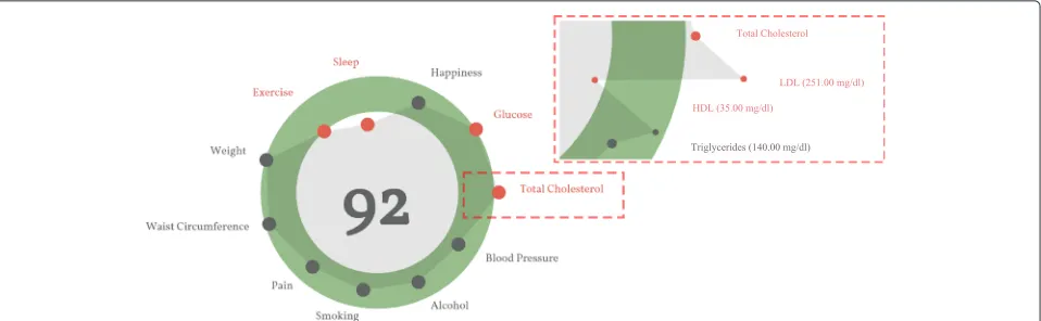
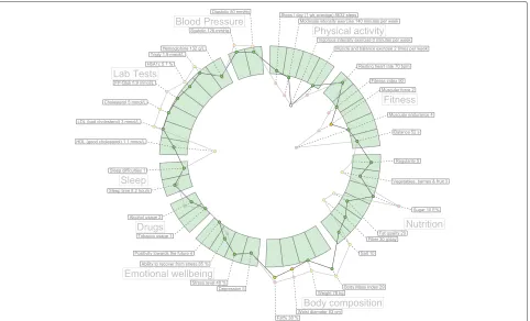
Figure 1 is an example of the hGraph visualization. The figure was extracted as a snapshot as the library gener-ates an SVG document structure that cannot be exported outside the browser. We address this issue in the next section of the article. The hGraph hides the measurements when the zoom level is low, meaning that the user has zoomed out. The shape is an average of the deviation of each measurement under the same category. When the user zooms in, the details are revealed and the rest of the information becomes visible, that is the numerical values and positions (with respect to the recommendation) of the measurements.
Implementation
In this chapter we detail the implementation methodol-ogy and the key features implemented in the library. We named the library Health Figures (hFigures) because it is based on the design principles of the hGraph. hFigures makes an emphasis on multiple graphs, or figures, in order to provide a graphical representation of evolution of the data over time (multiple snapshots of the data at certain points in time).
Methodology
The implementation of the hFigures followed the Extreme Programming methodology [31, 32]. The main key requirement was to provide a visualization which rep-resents the changes in the overall health situation. In addition, the implementation addressed the features that the users requested in a previous study [4].
Extreme Programming focuses on releasing and review-ing functional software continuously [32]. Often these requirements change and the programming practice is to address this changes by prioritizing them at the top of the change list.
Fig. 1An example of the hGraph. The hGraph shows an overview at a low zoom level. When the zoom increases, the details of each measurement are revealed
Machine Learning. Requirements often changed and new releases were assessed by the group. The development of the health monitoring application followed the practice of pair programming, as it is often the case in Extreme Programming [31].
Data source
We use a JSON (JavaScript Object Notation) format to read the data, in which the measurements are grouped according to their categories. The groups contain an array of samples, which represent the values obtained from a measurement (steps per day, cholesterol, triglycerides, blood sugar or depression level using [33]). The samples contain a timestamp in Unix Epoch format and the value of the measurement. The Unix Epoch format is the num-ber of seconds since the first of January 1970, Greenwich Meridian Time (GMT). An example of the data source is in Fig. 2, it shows the first measurement of the group “Blood Pressure” which in this case is comprised by Sys-tolic and DiasSys-tolic measurements and each of them have two samples taken at two particular times, Friday 9th of January 2015 at 10:10:24 GMT (1420798224 — seconds) and Thursday 12th of February 2015 at 12:05:20 GMT (1423742720 — seconds).
SVG document export
The SVG document structure we designed in our imple-mentation can be exported to a separate file outside the web browser. The short-term objective is to build a tool-kit that enables researchers to visualize their data with our implementation so they can use the generated SVG file in articles, posters, presentations or other applica-tions. For instance, Fig. 3 has been exported as an SVG document from the browser into this article. SVG export is possible due to the rendering of our algorithm which does not depend on JavaScript or Cascade Style Sheet (CSS) styling properties to produce a finalized document. The library build the entire image as a stand-alone docu-ment. The hGraph library unfortunately does not produce a complete document but instead depends on CSS and JavaScript code to make the image visible.
Constant graph shape
Figure 1 shows an hGraph example and Fig. 3 shows an hFigures example. The hGraph computes the average of the deviation of the measurements in order to show the polygon or graph, as a representation of the overall health assessment. However, some measurement might deviate towards a lower value and while others towards a higher
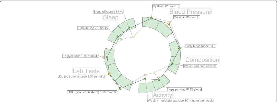
Fig. 3A simple example of hFigures. The measurements are separated by groups in sectors
one, thus the average position would be roughly the mid-dle recommended area. For this reason, hFigures does not change the shape of the graph if the user zooms in or out. Showing and hiding the measurement labels is the only reaction to the zooming events from the user at the moment. This avoids clutter when the user wished to have a quick glance at the picture but keeps the graph with the same shape.
Layout construction
The measurement groups are represented using a circular layout divided in sectors. The goal is to have a clear divi-sion between the groups as they represent the different aspects of the overall health. hFigures uses the d3 pie chart layout and modifies the data source provided to the lay-out. All the measurements have the same numerical value and at the end of the group, we insert an extra value in order to leave a blank space between the circular area sec-tors. The result is visible in the hFigures example shown in Fig. 3 and the code that produced this visualization is in Fig. 4. The pie layout constructs the sectors of the circular area based on a data source. When we provide an array of numbers, the layout uses the numbers to calcu-late the proportions of the area. In order to achieve the layout construction that we have designed, the array has the same constant number multiple times, the number of measurements plus an additional number for each group.
Color-coded entries
The data source can contain additional sets of value ranges. For instance a warning range of values can let the users know when a value has reached a level that requires attention but has not yet reached a critical point. We fol-lowed the users’ feedback that recommends a traffic light-based approach. The green color means that the values
are within the recommended, yellow suggest a warning or follow-up action needed and the red indicated a critical threshold has been passed.
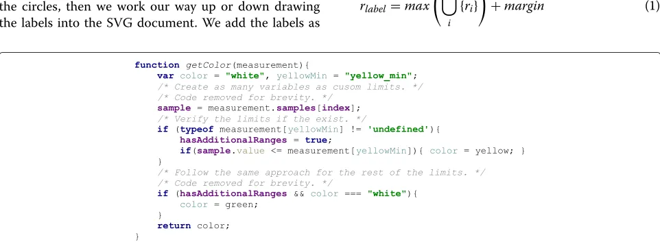
In the implementation, the library verifies if these addi-tional ranges are present in the measurement definition. In order to verify if the property of the object exists, JavaScript provides a qualifier method, typeof. The returned value must be compared with the keyword def-inition for properties that are not present in an object, the keywordundefinedhas been suggested by Mozilla Developer Network [34], a highly reputable source for Web development. The code is shown in Fig. 5.
Multiple graph
The dataset is structured as a set of measurements where each has its own collection of samples. In order to com-pare the evolution of these measurements, the hFigures library allows the graphical representation of any num-ber of samples. The result is a set of graphs or polygons overlapping or stacking with each other. In order to dif-ferentiate them, we use a lighter set of colors so that the users can see the difference between two points in time. As an example, Fig. 3 shows two different samples for each measurement. This example portrays a modeled per-son that has been active in a health coach program. Some measurements have improved and are closer to the rec-ommendation. Users repeatedly expressed that it would be very helpful to visualize two or more different points in time so as to compare how the person has evolved.
Fig. 4Layout construction code. The layout for distributing the measurements is build using d3 pie layout leaving spaced between the measurement groups
probably will) overlap. This is challenge that we address in the next section by finding an optimal label space distri-bution to avoid labels from overlapping and also to reduce the clutter in the visualization space.
Label space distribution
After the measurements are plotted, the labels are added to increase readability. The position of the label needs to be defined within a given range to avoid overlaps and clutter.
Labels need to avoid overlapping with each other and with their measurements. To solve the label overlapping problem we implemented an algorithm that starts by ordering the labels by their angular position, that is the angle at which the measurement is positioned. The next step is to calculate the height of the label and position it over the previous one in the direction that goes from the center of the visualization area upwards or downwards (depending on the angle). The idea is to begin with the center of the area, either to the left or to the right of the circles, then we work our way up or down drawing the labels into the SVG document. We add the labels as
SVG elements and the use thetransformproperty to position them in the corresponding place. Figure 6 shows the spacing between the labels using the algorithm when drawing the labels from the center to the upper right cor-ner. For each of the four quadrants, the library calls the method shown in Fig. 7 which computed the position of the label as we described.
As mentioned before, labels can also overlap with mea-surement circles. To avoid this problem we calculate the maximum radius from the center of the visualization area to the highest value of a measurement sample. From that starting point, we place the label in that position. In other words, for each measurement, we find the largest value of the samples. Figure 8 shows a sector of the hFigures where the sugar measurement label has been pushed out for a few pixels in order to avoid overlapping it with the red cir-cle. The rest of the labels adjust to that position by leaving a user-defined margin.
rlabel=max n
i
{ri}
+margin (1)
Fig. 6Label positioning distribution. The labels are positioned according the their height and margin, as a result the labels do not overlap and clutter is avoided
The radius for the label is the maximum value of the samples translated as graphical coordinates plus a margin. Equation 1 obtains the label radiusrlabelgiven the radii of
the samples of a measurement plus the default marginm.
Feature implementation summary
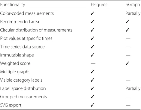
The key improvement of hFigures is the addition of mul-tiple graphs as a mechanism to compare the values of the health measurements over time (Table 1).
The immutable shape of the graph presents the same information (values of the measurements in respect to the recommended target) regardless of zooming. This feature shows the data “as is” without calculating aver-age, mean or deviation. Users stressed the importance of graphically representing the information without any calculations such as mean or accumulated values. The users expressed that showing the measurement values in hFigures helped them to derive valuable insights with just a quick glance at the data, for instance they identi-fied measurement that fall outside of the recommended range easier and without requiring them to zoom in or out.
The hFigures library does not calculate an overall score since the users considered that this task should be the sole responsibility of a health care professional. An over-all score also depends on each person under a case by
case basis. For instance, the hGraph allows the user to assign weights to each measurements’ value, the score is then calculated summing the value of the weights times the measurement’s deviation from the recommendation. The users participating in the design process of our library expressed that an overall score would complicate the inte-gration of the library into daily health care processes as specialists would need to review case by case to find the adequate score formula, which means specifying the weights (importance) of each measurement for a given person.
Measurements in the hFigures library are grouped in sectors which represent the category they belong to. Grouped measurements allow a clear division of cate-gories resulting in enhanced understanding on how cer-tain areas of wellness have changed and how, if any, they affect each other. The sectors remain visible regardless of the zoom level, users expressed that this feature pro-vides an informative approach as the categories are always showing to which category the measurements belong to. Hiding the category labels and displaying the measure-ments without divisions would complicate understanding the status of health categories, such as sleep, nutrition, physical activity and others. Users expressed their confu-sion when they were unable to determine when a category starts or ends after zooming in and out of the hGraph.
Fig. 8Label positioning avoiding overlapping with measurements. Some measurements can be positioned outside of the recommended range, the labels are adjusted to avoid overlapping
The possibility to export the generated figure as an SVG file, allows the integration into research articles, presenta-tions, websites, posters and other Software applications to further enhance the utility of the hFigures.
Evaluation
The health data visualization library was placed in the context of a full application. We tested the library in a contextualized scenario where the users conducted a series of tasks and answered usability questionnaires. In this section we present the methods we used for recruiting the participants and for the usability testing of the library. We also explain the metrics measured and the rationale behind the selection of the usability testing methods.
Nielsen suggests that “usability has multiple compo-nents and is traditionally associated with the five usability
Table 1Comparative functionality table. The table lists the features supported by hFigures and hGraph
Functionality hFigures hGraph
Color-coded measurements ✓ Partially
Recommended area ✓ ✓
Circular distribution of measurements ✓ ✓
Plot values at specific times ✓ —
Time series data source ✓ —
Immutable shape ✓ —
Weighted score — ✓
Multiple graphs ✓ —
Visible category labels ✓ —
Label space distribution ✓ Partially
Grouped measurements ✓ —
SVG export ✓ —
attributes, which are learnability, efficiency, memorability, errors, and satisfaction” [35]. In order to assess the usabil-ity of the software solution, multiple alternatives exist in industry and research. Johnson et al. developed a toolkit for usability testing of Electronic Health Records com-missioned by the Agency for Healthcare Research and Quality of the U.S. Department of Health and Human Services [36]. The toolkit is built on the basis of the assess-ment of existing usability methods in the context of Elec-tronic Health Records and Health Information systems. The toolkit is a detailed analysis of the usability meth-ods, their advantages, disadvantages and appropriateness ranking.
We selected the Usability Questionnaires since it has a high appropriateness ranking [36]. We were able to recruit three usability experts to conduct the Heuristic Evaluation and the Cognitive Walkthrough, both are recommended techniques to complement the evaluation. We concluded the evaluation using the principles of Controlled User Testing.
Continuous health monitoring application
In order to test the hFigures library, we designed an appli-cation for visualizing the health situation of a modeled patient and how this has changed over time within a health coaching program. The objective is to help the users in the decision making process of assessing the over-all health situation and whether or not the health program has provided benefits.
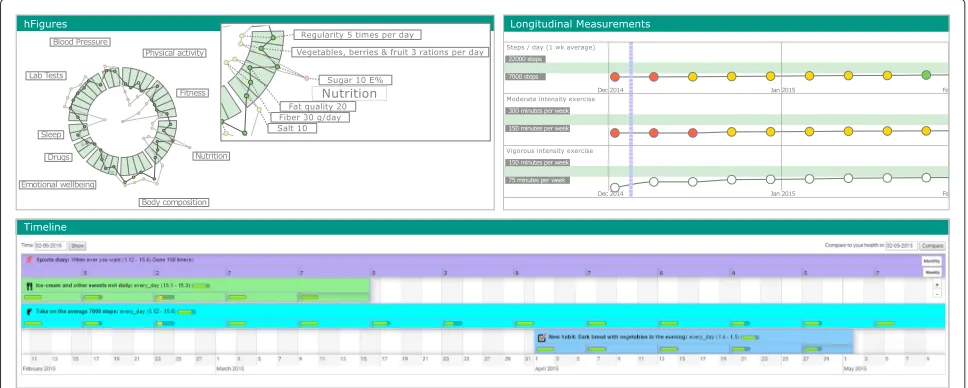
Fig. 9Health Monitoring Application. The health monitoring application with the three components: hFigures, Activity Timeline and Longitudinal Measurements
Activity timeline
This component represents the health interventions (par-ticular actions) that the modeled patient has done during the health coaching program. During the program, sev-eral snapshots of the patient’s ovsev-erall health are taken and visualized using the hFigures library.
hFigures
The developed hFigures library is utilized to display the set of measurements taken during the health coaching program. These measurements describe an overview of the health situation of the modeled patient. Users can change the time at which the snapshot was taken to compare changes over time as a result of the health inter-ventions.
Longitudinal measurements
The application also displays the same set of measure-ments using longitudinal temporal representation. We included this component to provide additional details and trends on how the measurements have changed over the coaching program.
Heuristic evaluation
Heuristic Evaluation requires at least one expert in the area of human-computer interaction [35, 36]. For our eval-uation we recruited three experts, and they assessed the application using Nielsen’s heuristics [35]. The evalua-tion has 11 metrics evaluated using a seven point Likert scale, where the value 1 indicates “strongly disagree” and 7 “strongly agree”
Heuristics are “rules of thumb” comprised of 10 prin-ciples meant to assist the Human-Computer Interac-tion specialist in the usability assessment [36, 37]. We
explain the principles of the Heuristic Evaluation accord-ing Nielsen [37].
1. Visibility of the System Status: Refers to continuous feedback on the status of the system “within reasonable time” (Feedback).
2. Match between system and the real world : The use of the language should be familiar to the user so that conversations follow a “natural and logical order” avoiding technical terminology unfamiliar to the intended user audience (Speak the User’s Language). 3. User control and freedom: Allow the user to recover
from erroneous navigational options with “clearly marked” access options (Clearly Marked Exits). 4. Consistency and standards: Follow the same
language and terminology to avoid the user from guessing the meaning of “words, situations, or actions”(Consistency).
5. Error prevention: Avoid “error-prone” options in the system whenever possible and for those cases when the problematic options cannot be avoided, then present the user confirmation dialogues (Prevent Errors).
6. Recognition rather than recall : Present visible options to the user at all times so as to avoid the effort of remembering previously stated instructions. Whenever options cannot be visible, make them “easily retrievable whenever appropriate” (Minimize User Memory Load).
7. Flexibility and efficiency of use: The interface should accommodate the novice and advance user by providing “tailored frequent actions” (Shortcuts). 8. Aesthetic and minimalist design: The dialogues
Cognitive walkthrough
Wharton et al. developed the Cognitive Walkthrough for usability testing [38]. Johnson et al. summarize this method as a “usability inspection method that com-pares the users’ and designers’ conceptual model and can identify numerous problems within an interface” [36, 38].
Cognitive Walkthrough has successfully been used to evaluate usability of Healthcare Information Systems [36, 39–42] and Web Information Systems [43].
Since Cognitive Walkthroughs “tend to find more severe problems” [36, 44] but “fewer problems than a Heuris-tic Evaluation” [36, 45] we included both methods in our evaluation.
Laboratory testing
Regarded as the “golden standard” for usability testing [46], Laboratory Testing collects “qualitative and quanti-tative” data “since it collects both objective data such as performance metrics (e.g., time to accomplish the task, number of key strokes, errors, and severity of errors) and subjective data such as the vocalizations of users think-ing aloud as they work through representative tasks or scenarios” [36].
Controlled user testing is comprised of “a series of commonly used task scenarios” where users are asked to conduct these tasks using a “thinking aloud” [35, 36, 47]. This process requires “users to talk aloud about what they are doing and thinking” while they complete the tasks using the system [35, 36, 47].
As the “golden standard” in usability testing, this method has been widely used in evaluating Health Infor-mation Systems [36, 48–51]
The data exploration tasks are designed to assist the decision making process on the health situation of the modeled patient. The usability scenario was the main goal of the intended use of the application. We explain the par-ticipants the purpose of the application, which is to facili-tate the decision making process weather or not the over-all health situation of the modeled patient is favourable and weather or not the health coaching program was ben-eficial for the patient. The tasks are designed to represent the common usage of the application, namely to find the
the recommended values.
5. What does the green, yellow and red circles mean? 6. Has the overall health improved after coaching? 7. Which area of health has improved the most after
health coaching?
8. Which measurements show the biggest improvement?
9. Understand the difference between the points inside and outside the recommended area.
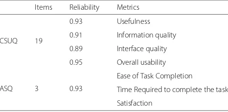
Usability questionnaires
We followed the recommendations from Johnson et al. and used this method in our evaluation. Usability Ques-tionnaires are “the most common” method to “collect self-reported data” from the “users’ experience and per-ceptions after using the system in question” [36]. Although the data collected is self-reported, some questionnaires have reliability in measuring several usability metrics such as “satisfaction, efficiency, effectiveness, learnability, per-ceived usefulness, ease of use, information quality, and interface quality” [36].
We used two Usability Questionnaires to evaluate the usability of our application, Computer System Usability Questionnaire (CSUQ) and After Scenario Questionnaire (ASQ) [52]. Table 2 shows the length, reliability and the metrics of the questionnaires. These questionnaires use a seven-point Likert scale from “strongly disagree” up to “strongly agree”.
Table 2Standard questionnaires table. The table lists the standard questionnaires we used for the user evaluation of the system with their length, reliability and metrics
Items Reliability Metrics
CSUQ 19
0.93 Usefulness
0.91 Information quality
0.89 Interface quality
0.95 Overall usability
ASQ 3 0.93
Ease of Task Completion
Time Required to complete the task
Computer system usability questionnaire (CSUQ)
The questionnaire was developed by IBM and it is a “slight” modification of the Post-Study System Usability Questionnaire (PSSUQ) [53]. Table 2 shows the relia-bility of this questionnaire. The questionnaire has high “coefficient alpha” with a reliability 0.95 in total and “0.93 for system usefulness, 0.91 for informational quality, and 0.89 for interface quality” [36, 52, 53]. We selected this questionnaire since it has been successfully used in the Healthcare domain [36, 54] and in the evaluation of “of a guideline-based decision support system” [36, 55].
After scenario questionnaire (ASQ)
An additional questionnaire developed by IBM [36, 52, 56] and designed to measure the user satisfaction after sce-nario usability studies have been completed [36, 53, 57]. This questionnaire measures the “ease of task completion, time required to complete the tasks, and satisfaction with support information” [36]. Since we already designed the scenario for the evaluation of the system, we included this questionnaire in our study.
Data model
Similar to the study we conducted in the insight-based methodology [4], we modeled a patient using clinical expertise of a physician along with the most common symptoms for developing Type II Diabetes. The mod-eled patient consisted of a set of measurements over time comprised of the following parameters:
• Blood pressure: systolic and diastolic blood pressure • Physical activity: weekly active days [58, 59], steps per
day [60]
• Body composition: Body Mass Index (BMI), waist diameter and fat percentage
• Sleep: time in bed, time asleep
• Fitness: resting heart rate, fitness index [61, 62], muscular force, muscular endurance and balance [63] • Lab Tests: hemoglobin, fB-Gluc, cholesterol, HDL,
LDL, triglycerides
• Nutrition: meal regularity, type of meals (vegetables and fruits), sugar intake, fat quality, fiber and salt intake.
• Drugs: tobacco (cigarettes per day), alcohol abuse, drug abuse (narcotics), medication abuse
• Emotional wellbeing: depression level [33], stress level and stress recovery [64, 65] and optimism [66].
Recruitment
We recruited a total of 14 participants following similar usability studies and Faulkner’s [67] recommendation of conducting usability tests with 10 to 20 users “in order to find 90 to 95 % of usability problems” [68]. Among the 14
participants we were able to recruit 3 usability experts, fol-lowing the recommendations from Nielsen and a number of previous studies stating that 3 to 5 experts are needed to conduct the Heuristics Evaluation [35, 36, 69–72].
Participants were recruited through the university’s stu-dent email lists, self-study groups, lectures and work-shops. After completing the usability tests, the partici-pants received a movie ticket.
Ethics
The study we conducted was a usability evaluation using simulated data not belonging to a real person. The results of the usability tests were kept anonymous and the collected data does not include sensitive information from the participants. According to the ethical princi-ples applied by the Finnish Advisory Board on Research Integrity, our study did not need ethics approval [73].
The experimental procedures described in this paper complied with the principles of Helsinki Declaration of 1975, as revised in 2000. All subjects gave informed con-sent to participate and they had a right to withdraw from the study at any time. The informed consent also explained that their names and identities will be kept confidential, that the results will not be linked to their identities, the sessions will be recorded using a Web cam-era and microphone for further study and that the clinical data visualized did not belong to a real person.
Experiment protocol
The testing process started with the signature of an informed consent where we explained the participants the purpose of the test. Afterwards we proceed to explain a usability scenario and the tasks that the participants were asked to complete. The participants were allowed to ask questions at any time. After performing the tasks we asked the participants to fill in the Usability Questionnaires. We close the session with a briefing interview where we asked the users what they liked and disliked about the application as well as what were their recommendations for further improvements. The sessions were recorded for further study and to find the correct timing of the task completion.
Materials and tools
representation of the data using hFigures. The results of the evaluation are summarized in Table 3. The average response was 6.3 out of 7 points (Additional file 1).
Cognitive walkthrough
During the Cognitive Walkthrough, the concept of the health monitoring application was explained to the usabil-ity experts. The purpose of the application was explained in the context of the health situation of the modeled patient and how the application visualizes the changes in the health situation over time. We used the usability scenario and tasks to confirm that the interface supports the intended use of the application. The questions com-prising the walkthrough, as described by Wharton et al. [38]., were correctly answered by the expert users thus no design or mismatch errors were found.
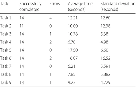
Controlled user testing
Table 4 summarizes the results of the completed, num-ber of errors, average time to complete the task and the standard deviation. All participants completed 7 of the 9
Table 3Heuristic evaluation results. The table summarizes the results of the Heuristic evaluation conducted by three usability experts
Heuristic Average Standard
response deviation
Visibility of system status 6.00 1.00
Match between system and the 6.33 0.57
real world
User control and freedom 6.33 0.57
Consistency and standards 6.67 0.57
Error prevention 6.33 0.57
Recognition rather than recall 4.67 0.57
Flexibility and efficiency of use 6.67 0.57
Aesthetic and minimalist design 7.00 0.00
Help users recognize, diagnose, 6.33 0.57
and recover from errors
Help and documentation 6.67 0.57
Nielsen heuristic evaluation 6.30 0.56
Task 7 14 0 6.21 5.591
Task 8 14 1 7.85 5.882
Task 9 13 1 9.23 4.729
tasks. Task 2 was the most problematic, we asked users to “choose one of these areas and point to its measure-ments”, we found that 3 participants were not able to understand the task thus unable to complete it. The sec-ond most problematic task was number 9, “understand the difference between the points inside and outside the recommended area”, where one participant was unable to complete it successfully incurring in one non-crucial mistake (an error that prevent the task to be completed).
Additional non-crucial errors occurred in tasks 1, 3, 4, 6 and 8. The large number occurred in the first task due to the initial values set in the default zoom level of the hFig-ures component. After the usability testing, we corrected this problem by adjusting the initial zoom level to include the whole figures inside the container (Additional files 2 and 3).
Usability questionnaires
Computer system usability questionnaire (CSUQ)
We computed the results according to Lewis, obtaining the average of “items 1 through 19” to determine the over-all usability rating of the system. System usefulness is the average of items 1 to 8, information quality 9 through 15 and interface quality 16 through 18 [74].
Table 5Computer system usability questionnaire results for the system usefulness assessment. The table shows the results of the questions corresponding to the system usefulness with its average and standard deviation
Question Average Standard
response deviation
Overall, I am satisfied with how 6.29 0.99
easy it is to use this system
It was simple to use this system 6.07 1.20
I can effectively complete my 6.07 1.07
work using this system
I am able to complete my work 5.86 1.40
quickly using this system
I am able to efficiently complete 6.21 0.89 my work using this system
I feel comfortable using this system 6.21 0.97
It was easy to learn to use this system 6.43 0.85
I believe I became productive 5.93 1.26
quickly using this system
System Usefulness 6.13 0.93
application obtained an average of 6.24 out of 7. The com-bined results are shown in Table 8. The score of the overall usability is 6.02 with a standard deviation of 1.04. We can determine that all the participants at least “agreed” in the Likert scale that the application was useful for the deci-sion making process of assessing the health situation and evolution of the modeled patient (Additional file 4).
Table 6Computer system usability questionnaire results for information quality
Question Average Standard
response deviation
The system gives error messages 4.50 2.44
that clearly tell me how to fix problems
Whenever I make a mistake using the 5.43 1.95 system, I recover easily and quickly
The information (such as online 5.29 1.90
help, on-screen mes-sages, and other documentation) provided with this system is clear
It is easy to find the information I needed 6.07 1.27
The information provided for the 5.93 1.39
system is easy to un-derstand
The information is effective in helping 6.14 1.17 me complete the tasks and scenarios
The organization of information on the 6.29 1.14 system screens is clear
Information Quality 5.66 1.20
Table 7Computer system usability questionnaire results for interface quality
Question Average response Standard
deviation
The interface of this system is pleasant 6.36 1.00
I like using the interface of this system 6.36 0.92
This system has all the functions 6.00 1.18 and capabilities I expect it to have
Interface Quality 6.24 0.99
After scenario questionnaire (ASQ)
Table 9 the average response for the ease of task comple-tion was 6.64 with a standard deviacomple-tion of 0.842 and for the time required to complete the task 6.64 and a standard deviation of 0.497. The overall satisfaction was 6.46 and a standard deviation of 0.53. The usability of the system had a high score in the ASQ results meaning that the system was suitable for the scenario in the context of the health data visualization of the modeled patient and its evolution over time (Additional file 5).
Identified issues and suggested improvements
The feedback shows that the main problem was the incomplete visibility of the hFigures in the application component window. Users also requested to show the detailed information as a hovering pop up window in the second figure (measurements before the coaching pro-gram). Currently only the latest measurements have the hovering window however users requested that both mea-surements (the before and after) should contain the same functionality. Additional information was needed in the measurements that contained numerical scales, such as the depression index. A more contextualized approach explaining the meaning of the values can help the user understand the measurements and thus the overall health situation of the patient better.
Discussion
The value of a data visualization depends on the knowl-edge that it can convey to the public. In this section, we claim that hFigures has the potential to be used both in the
Table 8Computer system usability questionnaire results for overall usability, system usefulness, information and interface quality
Metric Questions Average Standard
response deviation
Overall usability 1–19 6.02 1.04
System usefulness 1–8 6.13 0.93
Information quality 9–15 5.66 1.20
clinical and personal wellness applications. Large amounts of measurements do not clutter the visualization area as a result of our implementation, Fig. 10 shows an example of a large visualization of a modeled patient. The comparison of multiple graphs can provide a meaningful visualization to individuals and clinicians alike. The implementation of hFigures follows an extensible approach and even though it was designed to be used for health data visualization, any dataset that has a target range of values as a reference can be visualized.
Translation to health care
The wide variety of EHR formats and data sources from self monitoring applications comprise a challenge in
uni-hFigures is a visualization library based on Web tech-nologies, it uses a Web browser and the rendering of the SVG is compatible with current HTML standards. Thus providing interoperability across multiple devices including tablets, smartphones, workstations or laptops is indeed feasible. The D3.js library that hFigures is built on, enables compatibility with Internet Explorer versions 8 and higher using a component namedAight[75]. Inter-net Explorer 8 is prevalent in hospitals and clinics due to the restrictions in installing custom software.
Patient evolution
Multiple graphs plotted on the layout of recommended values shows the change in the data over time. This could allow clinicians to understand the evolution of certain
aspects in the health of the patient. For instance, health professionals would be able to look at the effect of a trail drug treatment over time. Possibly, the collected sam-ples of a patient before and after starting the trial would be plotted as the multiple graphs portraying the evolu-tion of the patient. Figure 10 shows an example of a more heterogeneous dataset. The labels for each individ-ual measurement are usindivid-ually hidden when a full zoom out is performed by the user. For the purpose of demonstrat-ing the visualization library we have made all the labels visible.
Personal health monitoring
As an example, Fitbit provides activity trackers and a wide-range of devices. The data collected can be obtained through their API. In most cases, providers such as Fit-bit follow an HTTP REST interface. Figure 11 shows an example of the data Fitbit provides through its inter-face. The data has “activities” as properties of a JavaScript object. These entries have in turn a property “startTime”which provides the timestamp required for the hFigures data source file.
In this case, a step counter contains the prop-erty “steps” with the number of steps registered by the device. This and other measurement can be plotted in the hFigures following the data source file structure.
We can also use multiple graphs to show the user-defined goals as a reference in addition to the actual values of the measurement (steps per day). Figure 11 only show steps per day, however the documentation of the API specifies that additional data is available. This data includes distance travelled, sedentary activity, floors climbed, calories burnt and more.
Other device manufacturers such as Withings or Jaw-bone provide their users the possibility to use their APIs to extract collected data in a similar way. As in the case of Fitbit, all data has at least a timestamp (date, time or both) and a set of values. Recommended val-ues for the health measurements can be obtained from healthcare professionals and public health information sources.
Limitations
The library reads the data in JSON format and does not support XML, which is still used by some Health Informa-tion Systems. Data files need to be included in the same HTML file and used to create an instance of the hFig-ures class. The library does not retrieve the data remotely by itself so the data provision is the responsibility of the developer. Other libraries provide an AJAX interface through HTTP(S) communication to an endpoint in order to retrieve the data. The information in the nodes comes entirely from data source file, which means that additional information about the measurements cannot be supplied
otherwise. The extraction of the SVG file requires to export the code embedded in the HTML file. Currently no automatic export functionality is implemented.
Further development
We plan to develop the library further to address the sug-gestions obtained from the participants of the usability testing. The next release of the library already included the fixes for the automatic adjustment of the initial zoom level to show the complete figures within the given con-tainer, usually a <div> element in the HTML docu-ment. The next item to address is the inclusion of addi-tional information explaining the measurements in the hover pop up window. Additionally we need to develop an algorithm to display the values when hovering on the two figures so that the pop up windows do not overlap.
Further development contemplates a Web Service which consumes a JSON data source file and produces an SVG or a HTML document with the interaction features as a JavaScript file attached. Such service has been already requested in other projects for research purposes in order to provide a better software tool for medical decision making processes.
Conclusion
Complete and accurate visualizations of health data have been thought to empower individuals, citizens and health professionals alike, to better understand situations and take better informed decisions [2, 12, 76]. These deci-sions can be medical treatment, behaviour change prac-tices, wellness development, health coaching program and more. In this article we detailed the underlying moti-vation to develop a visualization library inspired by the hGraph.
We tested the visualization library in the context of an application by conducting usability tests comprised of Heuristics Evaluation, Cognitive Walkthrough and Usabil-ity Questionnaires. In the Heuristics Evaluation the aver-age response was 6.3 out of 7 points and the Cogni-tive Walkthrough done by usability experts indicated no design or mismatch errors. In the CSUQ usability test the system obtained an average score of 6.13 out of 7, and in the ASQ test the overall satisfaction score was 6.64 out of 7. The results indicate that the library was helpful in assist-ing users in understandassist-ing health data and its evolution over time.
Fig. 11Fitbit API example response. An example JSON response from a Fitbit activity sensor that can be transformed to a data source to be visualized by hFigures
Open challenges remain in studying alternative features that can help users identify relationships between mea-surements, visualize patterns and enable deeper explo-ration of the data with a higher degree of interactivity.
Availability and requirements • Project name:hFigures
• Project home page and source code repository: https://github.com/ledancs/hFigures
• SciCrunch Resource IDSCR_014201 • Operating System:Platform independent. • Programming language:JavaScript.
• Other requirements:Developers willing to deploy the application need to serve the files via a Web server. Users require a Web browser to visualize the application.
• License:MIT License.
• Any restrictions to use by non-academics:No.
Availability of data
The dataset supporting the conclusions of this article is available in the BioSharing repository with the identifier
biodbcore-000734 at the following url: https://biosharing. org/biodbcore-000734.
The dataset is also available at Tampere University of Technology Personal Health Informatics website in the following url: http://www.tut.fi/phi/?p=319.
Additional files
Additional file 1:Nielsen’s Heuristic evaluation. The data contains the results form Nielsen’s Heuristic Evaluation conducted by three usability experts. (CSV 116 kb)
Additional file 2:Results from laboratory testing. The data contains the task identifier, the average time to completion, number of times the task was successfully completed and the total number of errors. (CSV 209 kb) Additional file 3:Laboratory testing tasks. The data contains the task identifier and the instructions given to the participants to complete the task. (CSV 618 kb)
Additional file 4:Computer system usability questionnaire results. The data contains the results of the Computer System Usability Questionnaire answered by 14 participants. (CSV 639 kb)
Additional file 5:After scenario questionnaire results. The data contains the results of the After Scenario Questionnaire answered by 14 participants. (CSV 149 kb)
Abbreviations
hypertext markup language; JSON: JavaScript object notation; PHR: personal health record; SVG: scalable vector graphics.
Competing interests
The authors declare that they have no competing interests.
Authors’ contributions
AL developed the hFigures library. AL and HN wrote jointly this article. HN suggested several use cases that helped shaped the design process. HN contributed in the design and conception of the library. AL, HN and MAM designed the application for health coaching. AL and MAM implemented the application. AL and MAM integrated the application into a Web service. MAM conducted the user testing and analysed the results. HN and AL wrote jointly the introduction and background. AL wrote the implementation and discussion. MAM and AL wrote jointly the evaluation and results section. HN and AL wrote jointly the conclusion. All authors read and approved the final manuscript.
Authors’ information
AL and HN are part of the Personal Health Informatics research group from the Department of Signal Processing of Tampere University of Technology. AL is a Software Engineer pursuing PhD studies in Health Data Visualization with a strong background in Web Engineering and Health Information Systems. HN is a PhD senior researcher with background in biomedical engineering, signal processing, electrical engineering, user interface design and service design.
Acknowledgements
This research was supported jointly by TEKES (the Finnish Funding Agency for Technology and Innovation) as part of the Digital Health Revolution project, as well as the European Commission and TEKES under the ARTEMIS-JU WithMe project.
Received: 20 July 2015 Accepted: 10 March 2016
References
1. Hood L, Flores M. A personal view on systems medicine and the emergence of proactive {P4} medicine: predictive, preventive, personalized and participatory. New Biotechnol. 2012;29(6):613–624. doi:10.1016/j.nbt.2012.03.004. Molecular Diagnostics and Personalised Medicine.
2. Lesselroth BJ, Pieczkiewicz DS. Data visualization strategies for the electronic health record In: Berhardt LV, editor. Advances in Medicine and Biology, vol. 16. New York: Nova Science Publishers, Inc; 2012. p. 107–40. 3. Follett J, Sonin J. hGraph: An Open System for Visualizing Personal Health
Metrics. Technical report, Involution Studios, Arlington, Massachusetts (April 2012). Accessed 25 Mar 2015. http://www.hgraph.org/docs/ hGraph_Whitepaper.pdf.
4. Ledesma A, Nieminen H, Valve P, Ermes M, Jimison H, Pavel M. The shape of health: A comparison of five alternative ways of visualizing personal health and wellbeing. In: Engineering in Medicine and Biology Society (EMBC), 2015 37th Annual International Conference of the IEEE; 2015. doi:10.13140/RG.2.1.1321.6725.
5. Bui AAT, Aberle DR, Kangarloo H. Timeline: visualizing integrated patient records. IEEE Trans Inf Technol Biomed. 2007;11(4):462–473.
doi:10.1109/TITB.2006.884365.
6. mHealth App Developer Economics 2014: The State of the Art of mHealth App Publishing. Berlin, Germany: research2guidance; 2014. http:// mhealtheconomics.com/mhealth-developer-economics-report/. 7. Goetz T. It’s Time to Redesign Medical Data. Accessed 25 Mar 2015.
http://www.ted.com/talks/thomas_goetz_it_s_time_to_redesign_ medical_data?language=en.
8. Idris M, Hussain S, Ahmad M, Lee S. Big data service engine (bise): Integration of big data technologies for human centric wellness data. In: Big Data and Smart Computing (BigComp), 2015 International Conference On; 2015. p. 244–248. doi:10.1109/35021BIGCOMP.2015.7072838. 9. Few S. Information Dashboard Design. North Sebastopol: O’Reilly; 2006. 10. Soomlek C, Benedicenti L. An agent-based wellness indicator:
experimental results and future directions. J Inf Technol Res. 2013;6(2): 1–23. doi:10.4018/jitr.2013040101.
11. de Ridder M, Constantinescu L, Bi L, Jung YH, Kumar A, Kim J, Feng DD, Fulham M. A web-based medical multimedia visualisation interface for personal health records. In: Computer-Based Medical Systems (CBMS), 2013 IEEE 26th International Symposium On. Porto, Portugal: IEEE; 2013. p. 191–196.
12. Shneiderman B, Plaisant C, Hesse BW. Improving health and healthcare with interactive visualization methods. Technical report, Citeseer. 2013. 13. Baird JC, Noma EJ. Fundamentals of Scaling and Psychophysics. New
Jersey: John Wiley & Sons Canada, Limited; 1978.
14. Cleveland W, McGill R. Graphical perception: Theory, experimentation, and application to the development of graphical methods. J Am Stat Assoc. 1984;79(387):531–554.
15. Hoffman P, Grinstein G, Marx K, Grosse I, Stanley E. Dna visual and analytic data mining. In: Visualization’97., Proceedings. Phoenix, Arizona (AZ), USA: IEEE; 1997. p. 437–441.
16. Draper GM, Livnat Y, Riesenfeld RF. A survey of radial methods for information visualization. IEEE Trans Vis Comput Graph. 2009;15(5):759–76. 17. Jankun-Kelly T, Ma KL. Moiregraphs: Radial focus+ context visualization
and interaction for graphs with visual nodes. In: Information Visualization, 2003. INFOVIS 2003. IEEE Symposium On. Seattle, Washington (WA), USA: IEEE; 2003. p. 59–66.
18. Lamping J, Rao R. The hyperbolic browser: A focus+ context technique for visualizing large hierarchies. J Vis Lang Comput. 1996;7(1):33–55. 19. Hetzler B, Whitney P, Martucci L, Thomas J. Multi-faceted insight
through interoperable visual information analysis paradigms. In: Information Visualization, 1998. Proceedings. IEEE Symposium On. Research Triangle, California (CA), USA: IEEE; 1998. p. 137–44.
20. Spence R. Information visualization. New York: ACM Press; 2001, pp. 85–88. 21. Yang J, Ward MO, Rundensteiner E, et al. Interring: An interactive tool for
visually navigating and manipulating hierarchical structures. In: Information Visualization, 2002. INFOVIS 2002. IEEE Symposium On. Boston Massachusetts (MA), USA: IEEE; 2002. p. 77–84.
22. Howell M. Filelight. Accessed 26 Nov 2015. http://methylblue.com/ filelight/.
23. Carlis JV, Konstan JA. Interactive visualization of serial periodic data. In: Proceedings of the 11th Annual ACM Symposium on User Interface Software and Technology. San Francisco, California (CA), USA: ACM; 1998. p. 29–38.
24. Spoerri A. Rankspiral: Toward enhancing search results visualizations. In: Information Visualization, 2004. INFOVIS 2004. IEEE Symposium On. Austin, Texas (TX), USA: IEEE; 2004. p. 18–18.
25. Hong JY, D’Andries J, Richman M, Westfall M. Zoomology: comparing two large hierarchical trees. In: Poster Compendium of the IEEE Symposium of Information Visualization (InfoVis). Seattle, Washington (WA), USA: IEEE; 2003. p. 120–121.
26. Krzywinski M, Schein J, Birol I, Connors J, Gascoyne R, Horsman D, Jones SJ, Marra MA. Circos: an information aesthetic for comparative genomics. Genome Res. 2009;19(9):1639–1645.
27. Draper GM, Riesenfeld RF. Who votes for what? a visual query language for opinion data. IEEE Trans Vis Comput Graph. 2008;14(6):1197–1204. 28. Bostock M, Ogievetsky V, Heer J. D3data-driven documents. IEEE Trans
Vis Comput Graph. 2011;17(12):2301–2309.
29. Chris N. Toward measuring visualization insight. IEEE Comput Graph Appl. 2006;26(3):6–9.
30. Saraiya P, North C, Duca K. An evaluation of microarray visualization tools for biological insight. In: Information Visualization, 2004. INFOVIS 2004. IEEE Symposium On. Austin, Texas (TX), USA: IEEE; 2004. p. 1–8. 31. Roebuck K. Agile Software Development: High-impact Strategies-What
You Need to Know: Definitions, Adoptions, Impact, Benefits, Maturity, Vendors. Brisbane: Emereo Publishing; 2012.
32. Beck K. Extreme Programming Explained: Embrace Change. Boston: Addison-Wesley Professional; 2000.
33. Poutanen O, Koivisto AM, Kääriä S, Salokangas RK. The validity of the depression scale (deps) to assess the severity of depression in primary care patients. Fam Pract. 2010;27(5):527–534.
34. The Mozilla Developer Network (MDN). The Typeof Operator - JavaScript Reference. Accessed 25 Mar 2015. https://developer.mozilla.org/en-US/ docs/Web/JavaScript/Reference/Operators/typeof.
35. Nielsen J. Usability Engineering. Amsterdam: Elsevier; 1994. 36. Johnson C, Johnston D, Crowle P, et al. EHR usability toolkit: A
Cognitive evaluation of an innovative psychiatric clinical knowledge enhancement system. Medinfo. 2004;11(Pt 2):1295–9.
42. Khajouei R, de Jongh D, Jaspers MW. Usability evaluation of a computerized physician order entry for medication ordering. In: Medical Informatics Europe (MIE). Sarajevo, Bosnia-Herzegovina; 2009. p. 532–536. 43. Blackmon MH, Polson PG, Kitajima M, Lewis C. Cognitive walkthrough
for the web. In: Proceedings of the SIGCHI Conference on Human Factors in Computing Systems. ACM; 2002. p. 463–470.
44. Sears A. Heuristic walkthroughs: Finding the problems without the noise. Int J Hum Comput Interact. 1997;9(3):213–234.
45. Beuscart-Zéphir MC, Elkin P, Pelayo S, Beuscart R, et al. The human factors engineering approach to biomedical informatics projects: state of the art, results, benefits and challenges. IMIA Yearb. 2007;2:109–127. 46. Newman WM. 10. on simulation, measurement, and pfeeewiaie usability
evaluation. Comment Damaged Merch. 1998;13:316.
47. Ericsson KA, Simon HA. Verbal reports as data. Psychol Rev. 1980;87(3):215. 48. Borycki EM, Lemieux-Charles L, Nagle L, Eysenbach G. Novice nurse
information needs in paper and hybrid electronic-paper environments: a qualitative analysis. In: Medical Informatics Europe (MIE). Sarajevo, Bosnia-Herzegovina; 2009. p. 913–917.
49. Currie LM, Graham M, Allen M, Bakken S, Patel V, Cimino JJ. Clinical information needs in context: an observational study of clinicians while using a clinical information system. In: AMIA Annual Symposium Proceedings, vol. 2003. Washington DC, USA: American Medical Informatics Association; 2003. p. 190.
50. Hasman A, et al. Development of methods for usability evaluations of ehr systems. In: Ubiquity: Technologies for Better Health in Aging Societies: Proceedings of MIE2006, vol. 124 IOS Press. Maastricht, The Netherlands: Medical Informatics Europe; 2006. p. 341.
51. Wu RC, Orr MS, Chignell M, Straus SE. Usability of a mobile electronic medical record prototype: a verbal protocol analysis. Inform Health Soc Care. 2008;33(2):139–49.
52. Lewis JR. Ibm computer usability satisfaction questionnaires: psychometric evaluation and instructions for use. Int J Hum Comput Interact. 1995;7(1):57–78.
53. Lewis JR. Psychometric evaluation of the post-study system usability questionnaire: The pssuq. In: Proceedings of the Human Factors and Ergonomics Society Annual Meeting, vol. 36. Thousand Oaks, California (CA), USA: SAGE Publications; 1992. p. 1259–1260.
54. Jaspers MW, Peute LW, Lauteslager A, Bakker PJ. Pre-post evaluation of physicians’ satisfaction with a redesigned electronic medical record system. Stud Health Technol Inform. 2008;136:303.
55. Goud R, Jaspers MW, Hasman A, Peek N. Subjective usability of the cardss guideline-based decision support system. Stud Health Technol Inform. 2008;136:193.
56. Lewis JR. Psychometric evaluation of an after-scenario questionnaire for computer usability studies: the asq. ACM SIGCHI Bull. 1991;23(1):78–81. 57. Bangor A, Kortum PT, Miller JT. An empirical evaluation of the system
usability scale. Int J Hum Comput Interact. 2008;24(6):574–594. 58. United States Department of Health and Human Services. Physical
Activity Guidelines for Americans: Be Active, Healthy, and Happy! ODPHP publication No. U0036. Washington D. C. October 2008. 2008. http:// health.gov/paguidelines/pdf/paguide.pdf.
59. Physical Activity Guidelines Advisory Committee. Physical activity guidelines advisory committee report, 2008. Washington, DC: US Department of Health and Human Services. 2008;2008:5.
65. Teisala T, Mutikainen S, Tolvanen A, Rottensteiner M, Leskinen T, Kaprio J, Kolehmainen M, Rusko H, Kujala UM. Associations of physical activity, fitness, and body composition with heart rate variability-based indicators of stress and recovery on workdays: a cross-sectional study. J Occup Med Toxicol. 2014;34:26–40.
66. Scheier MF, Carver CS, Bridges MW. Distinguishing optimism from neuroticism (and trait anxiety, self-mastery, and self-esteem): a
reevaluation of the life orientation test. J Pers Soc Psychol. 1994;67(6):1063. 67. Faulkner L. Beyond the five-user assumption: Benefits of increased sample sizes in usability testing. Behav Res Methods Instrum Comput. 2003;35(3): 379–383.
68. Berry DL, Halpenny B, Bosco JL, Bruyere J, Sanda MG. Usability evaluation and adaptation of the e-health personal patient
profile-prostate decision aid for spanish-speaking latino men. BMC Med Inform Decis Mak. 2015;15(1):56.
69. Zhang J, Johnson TR, Patel VL, Paige DL, Kubose T. Using usability heuristics to evaluate patient safety of medical devices. J Biomed Inform. 2003;36(1):23–30.
70. Shneiderman B. Designing the User Interface: Strategies for Effective Human-computer Interaction, vol. 3. Boston: Addison-Wesley Reading, MA; 1992.
71. Molich R, Nielsen J. Improving a human-computer dialogue. Commun ACM. 1990;33(3):338–348.
72. Tognazzini B. First Principles of Information Design. Accessed 25 Mar 2015. http://www.asktog.com/basics/firstPrinciples.html.
73. Finnish Advisory Board on Research Integrity: Ethical Principles of Research in the Humanities and Social and Behavioural Sciences and Proposals for Ethical Review. Helsinki. 2009. Finnish Advisory Board on Research Integrity. Accessed 8 Mar 2016. http://www.tenk.fi/en/ethical-review-human-sciences.
74. Lewis JR. Psychometric evaluation of the pssuq using data from five years of usability studies. Int J Hum Comput Interact. 2002;14(3-4):463–488. 75. Allen S. Aight – JavaScript Shims and Shams for Making IE8-9 Behave
Reasonably.