______________________________________________________________________________
DO TODs MAKE A DIFFERENCE? 1 of 38
RailRunner Commuter Rail
New Mexico
Matt Miller, Arthur C. Nelson, Allison Spain, Joanna Ganning, Reid Ewing, & Jenny Liu University of Utah
6/15/2014
Do TOD’s Make a Difference?
Section 1-INTRODUCTION 2 of 38
______________________________________________________________________________
______________________________________________________________________________
DO TODs MAKE A DIFFERENCE? RailRunner Commuter Rail
Table of Contents
1-INTRODUCTION ... 6
Report Structure ... 6
2-DATA AND METHODS ... 7
Selection of Treatment corridor ... 7
Data Source and Extent ... 7
Data Processing ... 8
Study Area ... 8
3-EMPLOYMENT CONCENTRATION ... 10
Introduction ... 10
Data & Methods ... 10
Results ... 10
Discussion & Implications ... 11
4-EMPLOYMENT GROWTH BY SECTOR ... 13
Introduction ... 13
Data and Methods ... 13
Results ... 14
Discussion & Implications ... 15
5-EMPLOYMENT RESILIENCE ... 17
Introduction ... 17
Data and Methods ... 17
Results ... 18
Discussion & Implications ... 20
6-HOUSING AFFORDABILITY ... 22
Introduction ... 22
Data and Methods ... 22
Data Source and Geography ... 23
Data Processing ... 23
Results ... 24
Section 1-INTRODUCTION 3 of 38
______________________________________________________________________________
______________________________________________________________________________
DO TODs MAKE A DIFFERENCE? RailRunner Commuter Rail
7-JOB ACCESSIBILITY ... 26
Introduction ... 26
Data & Methods ... 26
Results ... 27
Overall Balance ... 27
Income Balance ... 28
Industry Balance... 30
Discussion & Implications ... 32
8-SUMMARY OF FINDINGS... 33
9-REFERENCES ... 35
10-APPENDIX A ... 37
LEHD ... 37
Section 1-INTRODUCTION 4 of 38
______________________________________________________________________________
______________________________________________________________________________
DO TODs MAKE A DIFFERENCE? RailRunner Commuter Rail
Table of Figures
FIGURE 1:EXAMPLE CORRIDOR, BUFFERS, AND LED CENSUS BLOCK POINTS ... 8
FIGURE 2:TRANSIT CORRIDOR LOCATION ... 9
FIGURE 4:REGRESSION TREND LINES AND R-SQUARED VALUES FOR DIFFERENT INDUSTRIES ... 18
FIGURE 5:HOUSING, TRANSPORTATION, AND H+T COSTS FOR THE TRANSIT CORRIDOR,2009, BY BUFFER DISTANCE ... 24
FIGURE 6:TRANSPORTATION COSTS &HOUSING COSTS BY TENURE, BY BUFFER DISTANCE. ... 25
Table of Tables
TABLE 1:LOCATION QUOTIENTS COMPARISON FOR TRANSIT CORRIDOR ... 11TABLE 2:SHIFT-SHARE ANALYSIS FOR 0.5 MILE BUFFER OF TRANSIT CORRIDOR ... 14
TABLE 3:SHIFTS BY CORRIDOR ... 15
TABLE 4:CHANGES IN EMPLOYMENT TRENDS FOR 0.5 MILE BUFFER OF THE TRANSIT CORRIDOR ... 19
TABLE 6:JOBS-HOUSING BALANCE FOR ALL INCOME CATEGORIES ... 27
TABLE 7:JOBS-HOUSING BALANCE BY INCOME CATEGORY ... 29
TABLE 8:JOB ACCESSIBILITY TRENDS OVER TIME BY INDUSTRY SECTOR AND CORRIDOR ... 31
Acknowledgements
This project was funded by the Oregon Transportation Research and Education Consortium (OTREC) through a grant provided by the National Institute of Transportation and Communities (NITC). Cash match funding was provided by the Utah Transit Authority (UTA), Salt Lake County (SLCo), the Wasatch Front Regional Council (WFRC), and the Mountainlands Association of Governments (MAG). In-kind match was provided by the Department of City & Metropolitan Planning at the University of Utah, and by the Nohan A. Toulon School of Urban Affairs and Planning at Portland State University.
Disclaimer
The contents of this report reflect the views of the authors, who are solely responsible for the facts and the accuracy of the material and information presented herein. This document is disseminated under the sponsorship of the U.S. Department of Transportation University Transportation Centers Program in the interest of information exchange. The U.S. Government assumes no liability for the contents or use thereof. The contents do not necessarily reflect the official views of the U.S. Government. This report does not constitute a standard, specification, or regulation.
Section 1-INTRODUCTION 5 of 38
______________________________________________________________________________
______________________________________________________________________________
DO TODs MAKE A DIFFERENCE? RailRunner Commuter Rail
PROJECT TITLE
Project Title:
DO TODs MAKE A DIFFERENCE?
PRINCIPAL INVESTIGATOR
Name:
Arthur C. Nelson Title: Presidential Professor Address:
Metropolitan Research Center 375 S. 1530 E. Room 235AAC Salt Lake City, Utah 84112
University: University of Utah
Phone:
801.581.8253 Email: [email protected]
CO-INVESTIGATORS (Add more rows for each additional co-investigator)
Name:
Reid Ewing Name: Jenny Liu
University:
University of Utah University: Portland State University Address:
Metropolitan Research Center 375 S. 1530 E. Room 235AAC Salt Lake City, Utah 84112
Address:
School of Urban Studies & Planning P.O. Box 751
Portland, Oregon 97207 Phone:
801.581.8255 Email: [email protected] Phone: 503.725.5934 Email: [email protected]
CO-INVESTIGATORS (Add more rows for each additional co-investigator)
Name:
Joanna Paulson Ganning Name:
University:
University of Utah University:
Address:
Metropolitan Research Center 375 S. 1530 E. Room 235AAC Salt Lake City, Utah 84112
Address:
Phone:
Section 1-INTRODUCTION 6 of 38
______________________________________________________________________________
______________________________________________________________________________
DO TODs MAKE A DIFFERENCE? RailRunner Commuter Rail
1-INTRODUCTION
This analysis was intended to help answer the following policy questions: Q1: Are TODs attractive to certain NAICS sectors?
Q2: Do TODs generate more jobs in certain NAICS sectors? Q3: Are firms in TODs more resilient to economic downturns? Q4: Do TODs create more affordable housing measured as H+T? Q5: Do TODs improve job accessibility for those living in or near them?
The first question investigates which types of industries are actually transit oriented. Best planning practices call for a mix of uses focused around housing and retail, but analysis provides some surprises. The second question tests the economic development effects of transit—do locations provided with transit actually experience employment growth? The third question is intended to determine the ability of employers near transit to resist losing jobs; or having lost jobs, to rapidly regain them.
The fourth research question confronts the issue of affordable housing and transit. Transit is often billed as a way to provide affordable housing by matching low-cost housing with employment. Yet proximity to transit stations is also expected to raise land values. Proximity to transit, however, may increase actual affordability, regardless of increases in housing costs, because of the reduction in transportation costs. The final research question considers the relationship between workplace and residential locations. To be able to commute by transit, both the workplace and home must be near transit. Effective transit should increase both the number and share of workers who work and live along the transit corridor.
Report Structure
The rest of the report is structured as follows. The following section details the study area and corridors used for analysis in all of the research questions with each research question given its own section. Each section contains a short review of relevant research as well as a description of additional data sources and analytical techniques. Each section then provides relevant analysis, discussion of the analysis, and relevant conclusions. The report concludes with a summary of outcomes from each.
______________________________________________________________________________
DO TODs MAKE A DIFFERENCE? 7 of 38
2-DATA AND METHODS
Data from before and after the opening of a transit line were analyzed to determine if the advent of transit causes a significant change in area conditions. The remainder of this section describes the selection of existing transit (treatment) corridors and the data used for analysis. It also provides an overview of the transit corridor being analyzed.
Selection of Treatment corridor
The process began with Center for Transit Oriented Development (CTOD)’s Transit Oriented
Development (TOD) Database (July 2012 vintage). The database’s unit of analysis is the station. For each station there is information about the station’s location, providing both address and lat-long points. Station attributes include the transit agency for that station as well as the names of routes using that station. The database was enriched with the addition of transit modes for all stations since many transit stations serve more than one mode.
While the database contained routes, it did not identify the corridor for each station. Most transit routes make use of multiple corridors. While routes change in response to operational needs, a corridor consists of a common length of right-of-way that is shared by a series of stations on the corridor. Typically, all stations along a corridor begin active service at the same time. Transit systems grow by adding corridors to build a network. Initial systems may consist of only a single corridor. Distinct corridors for each system were identified on the basis of prior transportation reports (Alternative Analysis, Environmental Assessments, Environmental Impact Statements, Full Funding Grant Agreements) as well as reports in the popular media. Whenever possible, a corridor that started operation after 2002 but before 2007 was preferred. All stations for that corridor were then imported into a geodatabase in ArcGIS. The analysis was carried out using the stations locations as points.
Data Source and Extent
The data used originated from the Census Local Employment-Housing Dynamics (LEHD) datasets. Both the Local Employment Dynamics (LED) and LEHD Origin-Destination Employment Statistics (LODES) were used. Employment data are classified using the North American Industrial Classification System (NAICS), and data are available for each Census Block at the two-digit summary level. Data were downloaded for all years available (2002-2011). The geographic units of analysis are 2010 Census Blocks Points. The database contains information on employment within each block. The data were downloaded from
http://onthemap.ces.census.gov/ for each metro area, using the CBSA (Core Based Statistical Area) definitions of Metropolitan/Micropolitan. In cases where either the transit corridor extended beyond a CBSA metro area, adjacent counties were included to create an expanded metropolitan area.
Section 2-DATA AND METHODS 8 of 38
______________________________________________________________________________
______________________________________________________________________________
DO TODs MAKE A DIFFERENCE? RailRunner Commuter Rail
There is a vast difference between TOD, and Transit Adjacent Development (TAD). The latter refers to any development that happens to occur within the Transit Station Area (TSA), or 0.5-mile buffer around a fixed guide-way transit station, while the former refers to land uses and built environment
characteristics hospitable to transit. This analysis assumes that while the existing development during the year of initial operations (YOIO) may not be TOD, land uses respond to changes in transportation conditions over time, phasing out TAD
and replacing it with TOD. On this basis, the TOD is conflated with TSA for the purpose of this analysis.
Data Processing
ArcGIS was used to create a series of buffers around each corridor in 0.25-mile increments. Those buffers were then used to select the centroid point of the LED block groups within those buffers, and summarize the totals. Because the location of census block points varies from year to year (for reasons of non-disclosure), it was necessary to make a spatial selection of points within the buffer for each year rather than using the same points each year. Figure 1shows an example corridor, the buffers around the corridor, and the location of LED points in reference to both.
Study Area
This study examines Albuquerque’s commuter rail, the RailRunner. It runs along a 97-mile corridor from Santa Fe
to Albuquerque and south to Belen. It began with three stations in 2006, and expanded to 13 stations by 2013. It was developed as part of an ongoing project to connect Albuquerque with Santa Fe and relieve congestion along I-25, and it is almost more of a regional rail system than a commuter rail, requiring over two hours to travel from one end to the other. It makes use of existing freight rail right of way, and consists largely of single track with passing sidings. Because of the corridor’s unique location connecting the majority of population in New Mexico resulted in a very large scale of analysis, existing metropolitan geographies failed to match the extent of the corridor. As an ad-hoc measure, the combined bounds of the Santa Fe, Sandoval, Beranillo, and Valencia Counties were used. Throughout this report, they are referred to as a metropolitan area, despite not formally being a Census Designated MSA or CBSA. Figure 2shows the transit corridor stations as well as the location of LED points.
Section 2-DATA AND METHODS 9 of 38
______________________________________________________________________________
______________________________________________________________________________
DO TODs MAKE A DIFFERENCE? RailRunner Commuter Rail
______________________________________________________________________________
DO TODs MAKE A DIFFERENCE? 10 of 38
3-EMPLOYMENT CONCENTRATION
Introduction
This section is intended to determine if TODs are more attractive to certain NACICS industry sectors. Case studies indicate that economic development and land use intensification are associated with heavy rail transit (HRT) development (Cervero et al. 2004; Arrington & Cervero 2008). Case studies associated with light rail transit (LRT) have inconsistent results, suggesting that much of the employment growth associated with transit stations tends to occur before a transit station opens (Kolko 2011). A study by CTOD (2011) examined employment in areas served by fixed guide-way transit systems, and explored how major economic sectors vary in their propensity to locate near stations, finding high capture rates in the Utilities, Information, and Art/Entertainment/Recreation industry sectors.
Data & Methods
To analyze the difference in the attractiveness of TODs, location quotient was used to analyze the concentration of different industries over time. Location quotient is a calculation that compares the number of jobs in each industry in the area of interest to a larger reference economy for each corridor. The analysis then compares the location quotients of each industry between each corridor. A 0.5-mile buffer around each corridor was used as the unit of analysis.
Results
The location quotients within a 0.5-mile buffer for the transit corridor is shown inTable 1. Location quotients are shown for the first and final years, with a sparkline to show trends between the years. Changes in location quotient between the 2002 and the advent of transit are calculated, as well as the advent of transit and 2011. The final column is the difference between the changes in the two periods. Both corridors are located in a pre-existing, built-up urban area, so additional growth must occur through redevelopment of existing urban land, while the urban area that forms the denominator of the location quotient continues to grow through both development and redevelopment. With an expanding urban area, the location quotient for a fixed area would be expected to fall over time. Any increase in location quotient for a corridor should indicate locational advantage.
Section 3-EMPLOYMENT CONCENTRATION 11 of 38
______________________________________________________________________________
______________________________________________________________________________
DO TODs MAKE A DIFFERENCE? RailRunner Commuter Rail
Table 1: Location quotients comparison for transit corridor
Decreases in the location quotient may indicate that either the amount of employment within the corridor shrunk, or that employment in that industry has grown outside the transit corridor. Prior to the advent of transit, a small number of industries were experiencing significant increases in location quotient. The Management industry is most notable, but the Finance, Administrative and Education industry were all experiencing increases. In 2011, the industries with the highest location quotients in the transit corridor were the Public Administration and Management industries. Between 2006 and 2011, the biggest changes in location quotients were significant increases for the Management and Health Care industries, and significant declines for the Finance, Education, and Arts/Entertainment/Recreation industries.
The difference in changes shows differences in trends between the two time periods (2002-2006 and 2006-2011). Ignoring the Information industry (which declined both before and after the advent of transit), the most substantial difference in changes is for the Management industry, followed by the Health Care industry. Sparklines shows that Management, Health Care and
Arts/Entertainment/Recreation all experience major shifts about the time that RailRunner began operations.
Discussion & Implications
Attributing causal effect to transit lines is always problematic, and more so for Commuter Rail systems. More than light rail systems, they are typically built along existing freight rail corridors. As they
Differences in Changes 2002 2002-2011 2011 Δ 2002-2006 Δ 2006-2011 Δ 2002-2006 & Δ 2006-2011 Utilities 0.11 0.17 0.00 0.06 0.06 Construction 0.40 0.39 -0.03 0.03 0.06 Manufacturing 0.22 0.23 -0.03 0.04 0.07 Wholesale 0.49 0.59 0.02 0.08 0.06 Retail 0.56 0.52 0.02 -0.06 -0.08 Transportation 0.96 1.09 0.03 0.10 0.07 Information 2.31 1.07 -1.15 -0.09 1.06 Finance 0.69 0.67 0.35 -0.37 -0.72 Real Estate 0.94 0.81 -0.24 0.11 0.35 Professional 0.96 1.27 0.18 0.13 -0.05 Management 0.18 2.99 1.16 1.65 0.49 Administrative 0.49 0.58 0.23 -0.14 -0.38 Education 0.85 0.30 0.35 -0.90 -1.25 Health Care 0.48 0.65 -0.08 0.24 0.32
Arts, Ent. Rec. 2.12 1.29 -0.03 -0.81 -0.78
Lodging & Food 1.11 0.98 -0.07 -0.05 0.02
Other Services 0.82 0.85 -0.05 0.08 0.13
Public Admin 5.22 4.96 0.06 -0.32 -0.38
Section 3-EMPLOYMENT CONCENTRATION 12 of 38
______________________________________________________________________________
______________________________________________________________________________
DO TODs MAKE A DIFFERENCE? RailRunner Commuter Rail
represent the re-establishment of regional passenger rail in places that have lacked it for decades, the land uses associated with proximity to commuter rail are those indifferent to the noise and vibration of freight rail. For RailRunner, only a limited number of stations, notably the ones around Ogden Union Station and the Salt Lake Intermodal center, have any kind of transit oriented development associated with them. For most other stations, the only development associated with the RailRunner are park and ride lots.
But which industry sectors do well near transit corridors is not simply a function of proximity to a transit corridor. Increases in location quotients near transit may be confounded by the effect of freeway proximity, which is far more important to most industries than transit access. While transit may be an amenity which offers competitive advantage to some industries, that does not mean that that transit is the only necessary requisite. Transit may enhance a good location, but may not be able to change a bad location into an acceptable one.
A 0.5-mile buffer around a corridor is an inappropriate analytical geography for transit analysis. The buffer distance has been established less by empirical evidence than by custom and by data limitations. That some people walk distances greater than 0.5 miles to transit has been rigorously established, so any buffer distance is somewhat arbitrary. The 0.5-mile buffer is expected to capture the majority of transit effect. Yet there is a negative binomial relationship between distance and number of walkers, so that the number of people willing to take a walk of a given distance falls off exponentially. This also suggests that the strongest effect will be found nearest to transit, and should be most observable there. Using a smaller buffer would reduce the number of confounders.
Comment [a1]: Update – these seem to be copied from the SLC report
______________________________________________________________________________
DO TODs MAKE A DIFFERENCE? 13 of 38
4-EMPLOYMENT GROWTH BY SECTOR
Introduction
This section is intended to determine if TODs generate more jobs in certain NAICS sectors. To determine if the new jobs are actually created as a result of proximity to transit, it is necessary to determine what portion of changes in employment can be attributed to transit and what portion of changes is determined by other factors.
In theory, employment in different NAICS sectors should be variable depending on the NAICS code, as some industry sectors are better able to take advantage of the improved accessibility offered by transit. For example, industries in which employment is characterized by low-income workers in need of affordable transportation or salaried office workers with long distance commutes are more likely to make use of transit. Likewise, arts and entertainment venues prone to serious congestion (due to their high peaks of visitors) would also benefit. Finally, institutions with large parking demands (universities, colleges, hospitals, and some government offices) could be expected to find proximity to transit valuable.
It is difficult to determine to what degree employment growth is caused by location near transit, and what is a product of self-selection, as rapidly growing industry sectors locate next to transit. Shift-Share analysis helps answer this question.
Data and Methods
A shift-share analysis attempts to identify the sources of regional economic changes to determine industries where a local economy has a competitive advantage over its regional context. Shift-share separates the regional economic changes within each industry into different categories and assigns a portion of that the change to each category. For the purpose of this analysis, these categories are Metropolitan Growth Effect, Industry Mix, and the Corridor Share Effect.
1. Metropolitan Growth Effect is the portion of the change attributed to the total growth of the metropolitan economy. It is equal to the percent change in employment within the area of analysis that would have occurred if the local area had changed by the same amount as the metropolitan economy.
2. Industry Mix Effect is the portion of the change attributed to the performance of each industrial sector. It is equal to the expected change in industry sector employment if employment within the area of analysis had grown at the same rate as the industry sector at the metropolitan scale (less the Metropolitan Growth Effect).
3. Corridor Share Effect is the portion of the change attributed to location in the corridor. The remainder of change in employment (after controlling for metropolitan growth and shifts in the industry mix) is apportioned to this variable. Within regions, some areas grow faster than others, typically as a result of local competitive advantage. While the source of competitive advantage cannot be exactly identified, the methods of analysis used suggest that the cause of
Section 4-EMPLOYMENT GROWTH BY SECTOR 14 of 38
______________________________________________________________________________
______________________________________________________________________________
DO TODs MAKE A DIFFERENCE? RailRunner Commuter Rail
competitive advantage can be directly attributed to the presence of transit, or factors leveraged by the presence of transit.
Results
A shift-share analysis of changes in employment within a 0.5-mile buffer of the transit corridor is presented in Table 2. The first batch of columns shows numeric and percentage changes in the metropolitan area, and the second batch of columns shows the numeric and percentage changes in the buffer around the transit corridor. The third batch of columns is the actual shift-share analysis, and apportions the numeric change in the buffer around the corridor.
Table 2: Shift-share analysis for 0.5 mile buffer of transit corridor
For the time period after the advent of transit in 2006, the metropolitan area suffers a minor increase in employment of about 2 percent. In sharp contrast, the employment around RailRunner stations shrinks, with a hefty 6 percent reduction, representing a loss of about 2,500 jobs. In numeric terms, the industry to enjoy the most significant numeric increases is Public Administration, followed by Health Care. The largest numeric increases are in Health Care and Management. Serious declines occur in the Education and Arts/Entertainment/Recreation industries.
After using Shift-Share analysis to disaggregate the cause of change in employment, different patterns emerge. Shift-share indicates that the effect of metropolitan growth was positive, and that the industry mix contributed to growth only in the Public Administration, Health Care, and Educational industries. In total, the corridor effect is strongly negative, with only the Health Care and Management industries benefitting from a location within the corridor. Both Education and Public Administration have large negative corridor effects.
Information about the corridor effect is presented for both the transit corridor in Table 3. Differences between the corridors are also presented. It is intended to confirm that the corridor effects attributed to
2006 2011 # Change % Change 2006 2011 # Change % Change Metro Share Mix ShareIndustry Corridor Effect
Utilities 1,478 1,602 124 8% 16 24 8 0% 0 1 6 Construction 38,323 25,212 (13,111) -34% 1,333 864 (469) -35% 24 (456) (37) Manufacturing 27,524 20,189 (7,335) -27% 505 407 (98) -19% 9 (135) 27 Wholesale 15,965 14,052 (1,913) -12% 767 717 (50) -7% 14 (92) 28 Retail 51,928 53,817 1,889 4% 2,843 2,427 (416) -15% 51 103 (571) Transportation 11,588 10,316 (1,272) -11% 1,088 977 (111) -10% 20 (119) (11) Information 11,314 11,554 240 2% 1,238 1,069 (169) -14% 22 26 (218) Finance 14,752 13,291 (1,461) -10% 1,448 772 (676) -47% 26 (143) (559) Real Estate 6,787 6,107 (680) -10% 450 429 (21) -5% 8 (45) 16 Professional 26,845 25,863 (982) -4% 2,894 2,847 (47) -2% 52 (106) 7 Management 4,601 4,049 (552) -12% 583 1,052 469 80% 11 (70) 528 Administrative 31,674 29,957 (1,717) -5% 2,169 1,510 (659) -30% 39 (118) (581) Education 35,279 42,897 7,618 22% 4,012 1,131 (2,881) -72% 72 866 (3,820) Health Care 52,538 71,501 18,963 36% 2,024 4,020 1,996 99% 37 731 1,229 Arts, Ent. Rec. 10,596 9,700 (896) -8% 2,097 1,084 (1,013) -48% 38 (177) (874)
Lodging & Food 44,273 45,084 811 2% 4,344 3,854 (490) -11% 78 80 (648)
Other Services 13,354 13,277 (77) -1% 965 975 10 1% 17 (6) (2) Public Admin 22,264 30,530 8,266 37% 11,101 13,143 2,042 18% 200 4,121 (2,280) Total 421,083 428,998 7,915 2% 39,877 37,302 (2,575) -6% 720 4,462 (7,757)
NAICS Sector
Section 4-EMPLOYMENT GROWTH BY SECTOR 15 of 38
______________________________________________________________________________
______________________________________________________________________________
DO TODs MAKE A DIFFERENCE? RailRunner Commuter Rail
transit are specific to the transit corridor, and not the result of another effect. The ‘Corridor Benefit’ relates the change in employment totals to the change due to the Corridor Effect. It is calculated as the corridor effect divided by the absolute value of employment change. A value of 1 indicates that almost all the change can be attributed to the corridor effect, while a value of 0 means that the corridor has almost no effect.
Table 3: Shifts by corridor
This graph serves to provide information about the relative Corridor Benefit different industries derive from proximity to RailRunner stations. The Corridor Benefit aids in comparison by providing a metric that is independent of the magnitude of employment. The Corridor Effect from the prior table is provided as a point of reference. The Management industry has the largest Corridor Benefit, followed by Health Care. The Corridor Benefit for other industries is irrelevant, given the magnitude of their Corridor Effect.
Discussion & Implications
New Mexico has many miles of railroad, highway and Interstate for its population. The way between California and the rest of the United States has consistently been through New Mexico, as has the route between Mexico and Canada. Consequently, New Mexico is somewhat unique in its highly linear development pattern. While all Sunbelt cities have paths of growth following limited access highways,
Industry Numeric Change Corridor Effect Corridor Benefit
Utilities 8 6 0.8 Construction -469 -37 -0.1 Manufacturing -98 27 0.3 Wholesale -50 28 0.6 Retail -416 -571 -1.4 Transportation -111 -11 -0.1 Information -169 -218 -1.3 Finance -676 -559 -0.8 Real Estate -21 16 0.8 Professional -47 7 0.1 Management 469 528 1.1 Administrative -659 -581 -0.9 Education -2881 -3820 -1.3 Health Care 1996 1229 0.6
Arts, Ent. Rec. -1013 -874 -0.9
Lodging & Food -490 -648 -1.3
Other Services 10 -2 -0.2
Public Admin 2042 -2280 -1.1
Section 4-EMPLOYMENT GROWTH BY SECTOR 16 of 38
______________________________________________________________________________
______________________________________________________________________________
DO TODs MAKE A DIFFERENCE? RailRunner Commuter Rail
New Mexico is somewhat unique in having almost an excess. While not necessarily compact, urban development in New Mexico tends to take place along linear corridors. This made it uniquely suitable to match rail transit to the urban environment. While formally a commuter rail using DMU (Diesel Multiple Unit) trains, RailRunner is much more a regional rail system, tying together disparate urban areas. Given its scale and frequency RailRunner is more analogous to a network of Amtrak or Greyhound stations than to a Commuter Railway. But DMU trains do offer amenities not available on typical light rail or metro trains, such as larger seats and outlets. Consequently, such vehicles become places where it is possible to get work done, while traveling to work. It is this latter function which may explain the strong growth in Management along RailRunner.
______________________________________________________________________________
DO TODs MAKE A DIFFERENCE? 17 of 38
5-EMPLOYMENT RESILIENCE
Introduction
Resilience is defined as the ability to absorb and recover from shocks or disruptions. Resilient systems are characterized by diversity and redundancy. The resilience of employment is a critical factor in community economic health. For many communities, the loss of a single primary employer can be catastrophic, resulting in a state of sustained collapse. Employment resilience is the capacity to recover from such disruptions, due to locational characteristics.
Access to transit can help improve employment resilience because proximity to transit is a source of competitive advantage for some industries. Firms located near transit also benefit from reduced employee and visitor parking needs. This translates into an ability to economize on the size of parcels required, both reducing costs and increasing the number of viable sites for business locations.
Transit provides a mechanism to meet transportation needs and unusual or unexpected conditions, such as an automobile breakdown or lower income, and it provides alternate transportation options during conditions that impair other modes, such as weather, construction projects, or accident-induced delay. It also provides accessibility to a population unable to drive such as the young, the elderly, and the poor (VPTI 2014). These factors act to reduce tardiness and absenteeism, thus reducing employment turnover.
Transit also helps create ‘thick’ markets for employment, whereby employees can match themselves to numerous different employment opportunities. This reduces the time necessary to find matches, unemployment duration, and the unemployment rate.
Data and Methods
An interrupted time series was used to compare the resilience of employment in both areas to determine if proximity to transit represents a locational advantage. An interrupted time series divides a time series dataset into two time series with the datasets separated by an ‘interruption’ and compares the differences. For the purpose of this analysis, the interruption is the Great Recession, considered to have begun in 2007.
If an interruption has a causal impact, the second half of the time series will display a significantly different regression coefficient than the first half. Failure to be adversely affected by a severe economic shock indicates employment resilience. A low R-squared (R2) represents larger variability in total employment. Industry sectors with a high R2 demonstrate robust trends, indicating that employment failed to change regardless of the effects on the larger economy. The regression coefficient represents the relationships between the change in variables, and the R2 explains how much of the variance in the data is explained by the regression equation—a measure of the ‘goodness’ of the regression.
Section 5-EMPLOYMENT RESILIENCE 18 of 38
______________________________________________________________________________
______________________________________________________________________________
DO TODs MAKE A DIFFERENCE? RailRunner Commuter Rail
Results
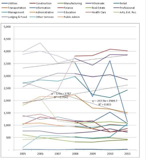
A line graph of the employment by industry time series is presented in Figure 4. The time series (2002-2011) for each is interrupted in 2008. The vertical axis shows total employment in each industry sector along the corridor. Illustrative regression lines with R2 values have been added for some of the industries. The trend lines and associated R2 values for all industry sectors can be found in Table 4.
Section 5-EMPLOYMENT RESILIENCE 19 of 38
______________________________________________________________________________
______________________________________________________________________________
DO TODs MAKE A DIFFERENCE? RailRunner Commuter Rail
As the graph shows, industry employment varies by year, with many industries affected by substantial fluctuations in employment, both before and after the recession. While visual inspection is valuable, more rigorous interpretation is necessary.
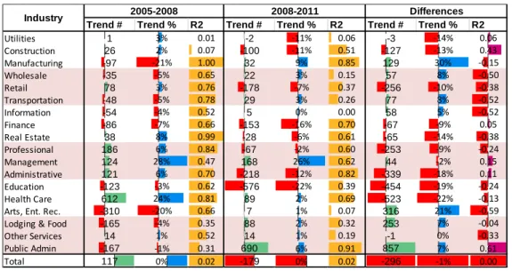
Resilience by industry is presented in Table 4. It highlights the resilience of different industries between 2002-2008 and 2008-2011. The trend number is the linear regression line on industry employment over time. Trend indicates whether total employment increases or decreases during each time period. A negative trend indicates sustained loss of employment while a positive trend indicates a sustained gain. The trend number is the slope of the regression line. However, industries with larger total employment will have larger slopes. To normalize trend numbers for comparison between industries, the trend percent is presented. It is calculated by dividing the trend number for a time period by the average employment for that period. Finally, the R2 column indicates how strong a trend is. Industry sectors with a high R2 demonstrate robust trends—trends in employment change that are consistent over time with less tendency to fluctuate.
The change in the trend between the two time periods is given in the differences column. A positive value for the trend number represents a change from employment loss to employment gain, or a reduction in the rate of decline in employment for that industry. The change in strength of trend is given by the R2 column. A positive value indicates that a previously erratic trend has become more consistent. A negative value means a previously consistent trend has become more erratic.
Table 4: Changes in employment trends for 0.5 mile buffer of the transit corridor
Prior to the Great Recession, about half the industries had positive employment trends. Notably, large positive outliers included Health Care and Management, and negative outliers were
Arts/Entertainment/Recreation and Manufacturing. The overall trend for employment was positive. During the 2008 to 2011 period in the transit corridor, the overall employment trend was slightly
Trend # Trend % R2 Trend # Trend % R2 Trend # Trend % R2
Utilities 1 3% 0.01 -2 -11% 0.06 -3 -14% 0.06 Construction 26 2% 0.07 -100 -11% 0.51 -127 -13% 0.43 Manufacturing -97 -21% 1.00 32 9% 0.85 129 30% -0.15 Wholesale -35 -5% 0.65 22 3% 0.15 57 8% -0.50 Retail 78 3% 0.76 -178 -7% 0.37 -256 -10% -0.38 Transportation -48 -5% 0.78 29 3% 0.26 77 8% -0.52 Information -54 -4% 0.52 5 0% 0.00 58 5% -0.52 Finance -86 -7% 0.66 -153 -16% 0.70 -67 -9% 0.05 Real Estate 38 8% 0.99 -28 -6% 0.61 -65 -14% -0.38 Professional 186 6% 0.84 -67 -2% 0.60 -253 -9% -0.24 Management 124 28% 0.47 168 26% 0.62 44 -2% 0.15 Administrative 121 6% 0.70 -218 -12% 0.82 -339 -18% 0.11 Education -123 -3% 0.62 -576 -22% 0.39 -454 -19% -0.24 Health Care 612 24% 0.81 89 2% 0.69 -523 -22% -0.13
Arts, Ent. Rec. -310 -20% 0.66 7 1% 0.07 316 21% -0.59
Lodging & Food -165 -4% 0.35 88 2% 0.32 253 7% -0.04
Other Services 14 1% 0.52 14 1% 0.19 -1 0% -0.33
Public Admin -167 -1% 0.31 690 6% 0.91 857 7% 0.61
Total 117 0% 0.02 -179 0% 0.02 -296 -1% 0.00
Section 5-EMPLOYMENT RESILIENCE 20 of 38
______________________________________________________________________________
______________________________________________________________________________
DO TODs MAKE A DIFFERENCE? RailRunner Commuter Rail
negative, and about half the industries had declining employment trends. The industries with the largest numeric trends were Public Administration, followed by Management, followed by Lodging/Food. The Trend % calls attention to the magnitude of large magnitude of increases in the Management and Manufacturing industries.
Differences in trends (number and percent) and the strength of trends (R2) indicate which industries in the corridor did better after 2008, as the recession reached its trough and the recovery began. For the industries with positive trends, the most substantial difference in trends is for the Public Administration industry. Few other industries see the increasing R2 that indicates a more consistent trend after the Great Recession.
In terms of trend consistency, as measured by the R2 value, the Health Care industry proved the most resilient. In addition to an improved R2 value, indicating greater consistency in trends, it had positive trends before and after the Great Recession. Only the Other Services industry comes near to meeting this criterion.
In addition to resilient industries, there are industries that are emergent. They represent a phase shift or transition away from pre-recession industrial ecology and toward a new and different one. Emergent industries are characterized by flat or falling trends prior to the recession, but large positive trends following the recession. Industries that characterize this pattern are the Manufacturing and Arts/Entertainment/Recreation sectors.
Discussion & Implications
Some caveats are necessary. Employment in any industry sector is variable over time, and the amount of variability increases with smaller geographic units of analysis. Because the geographic unit of analysis is small, the amount of fluctuation is larger. Changes might ‘average out’ over a larger unit of geographic aggregation and may have significant effects. In a given year, the relocation of a single firm, or the addition of a new building, would be sufficient to dramatically change employment trends in any industry. Finally, the area within a 0.5-mile buffer is fixed, so new development requires the displacement of existing development. The new development may employ workers in different industries, or new residential development may replace existing employment.
Even with the caveats in mind, the employment patterns around the RailRunner show little sign of reacting to the transit access. Partially, it is because there is little within a 0.5-mile radius of RailRunner to react. Apart from the stations in Albuquerque and Santa Fe, all the TOD around RailRunner stations consists of a Park and Ride lot.
Statewide employment totals about 800,000, about 430,000 of which is in the four counties that RailRunner traverses. The employment within two miles of a RailRunner station (not line—station) is about 154,000. In contrast, just over 37,000 is within 0.5 miles, and just over 7500 within 0.25 miles. Employment density near RailRunner is lower within 0.25 miles than for the band between 0.25 and 0.5 miles. The surge in Manufacturing can be attributed to Transit Adjacent Development—industrial parks
Section 5-EMPLOYMENT RESILIENCE 21 of 38
______________________________________________________________________________
______________________________________________________________________________
DO TODs MAKE A DIFFERENCE? RailRunner Commuter Rail
near RailRunner stations. The increase in Public Administration can likely be attributed to growth in State Government near the Santa Fe RailRunner station. While RailRunner is doubtless providing enormous transportation benefits to residents and visitors of New Mexico, the development effect appears to be negligible.
______________________________________________________________________________
DO TODs MAKE A DIFFERENCE? 22 of 38
6-HOUSING AFFORDABILITY
Introduction
It is not always possible to maintain a supply of affordable housing for a growing population by adding housing at the urban periphery. Such locations are the furthest from employment and services, requiring long distance travel to meet basic needs. Total cost of automobile ownership is considerable, given not only the cost of the automobile itself, but also the operations and maintenance costs
associated with fuel, insurance, and repairs. Housing in exurban locations may be cheap without actually being affordable.
It is necessary for housing affordability to include both housing and transportation costs (H + T). Housing costs do not exist in isolation but within the context of transportation costs. While housing in an urban location with transit access may cost more than suburban housing, it may still be more affordable once the effect of associated transportation costs has been taken into account. Low-income households tend to spend a high proportion of their income on basic transportation (VPTI 2012). Faced with high transportation costs, close proximity to public transit networks is an effective solution. Populations in poverty remain concentrated in central cities partially because such locations enjoy high quality public transit (Glaeser et al 2008).
While the effects of heavy rail transit on housing affordability have been extensively researched, the effects of non-heavy rail TOD on housing affordability are mixed. Matching low-income employment to high-income housing fails to improve housing affordability, and matching high-income employment to low-income housing may actually decrease affordability through gentrification-induced displacement. Maintaining affordable housing through TODs may require the allocation of affordable housing resources (NAHB 2010). A review of the hedonic literature reporting the price effects of transit stations on housing suggests that TODs may be an anathema to the provision of affordable housing, given their propensity to increase housing values (Bartholomew and Ewing 2011).
Calthorpe (1993) initially proposed a ten-minute walk, or about a 0.5-mile radius, as the ideal size for a TOD. Empirical studies confirm that while the majority of walk trips occur for distances of or equal to 0.5 miles, the effects of proximity to transit can be detected out to 1.5 miles away (Nelson 2011). Access to fixed guide-way transit systems is frequently by non-walk modes such as bicycle, bus, and automobile. The characteristics of the built environment within a mile buffer of a station can still affect transit ridership (Guerra, Cervero, & Tischler 2011).
Data and Methods
This section describes the data used for analysis, and the techniques used to process and analyze the data. Unlike all other analysis contained in this report, the housing affordability analysis included data from multiple 0.25-mile buffers, not just a single 0.5-mile buffer. Doing so makes it possible to relate the magnitude of the effect of proximity to transit. Near things are more related than distant things (Tobler 1970). This makes it possible to track the relationship between magnitude of effect and proximity to transit. The area within the smallest buffers should show the strongest effect from transit.
Section 6-HOUSING AFFORDABILITY 23 of 38
______________________________________________________________________________
______________________________________________________________________________
DO TODs MAKE A DIFFERENCE? RailRunner Commuter Rail
Data Source and Geography
This study uses the Location Affordability Index (LAI). The Location Affordability Index was developed under the aegis of the Sustainable Communities, an inter-agency partnership between the Housing and Urban Development, US Department of Transportation, and the Environmental Protection Agency. The LAI is an effort to use statistical modeling to determine the factors which underlie the causes of housing and transportation costs. It controls for a number of factors known to influence transportation and housing costs, such as income and number of workers. The full methodology for the LAI can be found at: http://lai.locationaffordability.info/methodology.pdf.
The LAI provides an estimate of the total cost of housing plus transportation for different locations. The LAI offers eight different household profiles of different family types. For this analysis, type 1 household (hh_type1) was used. It represents the Regional Typical household, with average household size, median income, and an average number of commuters per household for the region. A full data dictionary can be found at: http://lai.locationaffordability.info/lai_data_dictionary.pdf
The unit of analysis for the dataset is the 2010 Decennial Census Block Group. The data extent is the Census 2010 Core-Based Statistical Area (CBSA). When transit lines crossed the boundary into adjacent statistical areas, both statistical areas were included.
Data Processing
The data were downloaded from http://www.locationaffordability.info/lai.aspx?url=download.php as CSV (Comma Separated Values) files. It was then joined to a shapefile of the 2010 Decennial Census Block Groups from https://www.census.gov/geo/maps-data/data/tiger.html
Census block groups represent an unacceptably large geography for transit relevant analysis. It was necessary to devise an alternative to determining buffer membership by selecting a centroid. Instead, ArcGIS was used to create a series of buffers around each corridor, in 0.25-mile increments, out to 2 miles. Those buffers were then used to clip the block groups. The characteristics of each block were then weighted by geographic ratio, which is the ratio between the area of the block group, and the area of the portion of the block group that was within a buffer. For instance, if a block group represented 3 percent of the area in the buffer, H+T characteristics for that block group received a weight of 3 percent. The weighted variables were then summed to obtain a geographically weighted value for the buffer. For the purpose of comparison, a metro index was devised. Because the metropolitan area contains all census blocks, not just urban blocks, weighting the blocks by area was deemed inappropriate. Census block groups are intended to contain similar amounts of population, rather than volumes of area, so the size of Census block groups varies by orders of magnitude. Consequently, the comparison value for the metro area was calculated by weighting the block group characteristics by Census 2012 block group population. This weighted average is intended to provide a referent for what normal values are for the metropolitan area.
This analysis makes use of seven characteristics from the location affordability index: Housing Costs as a Percent of Income and Transportation Costs as a Percent of Income, for owners, renters, and all
Section 6-HOUSING AFFORDABILITY 24 of 38
______________________________________________________________________________
______________________________________________________________________________
DO TODs MAKE A DIFFERENCE? RailRunner Commuter Rail
households in the region. Additionally, it makes use of the median income to translate percentages into dollar amounts.
Results
The change in housing and transportation (H+T) costs are presented below with three results presented: 1. Housing, Transportation, and H+T dollar costs for the transit corridor
2. Housing costs by tenure, by percent of income 3. Change in H+T costs for transit corridor
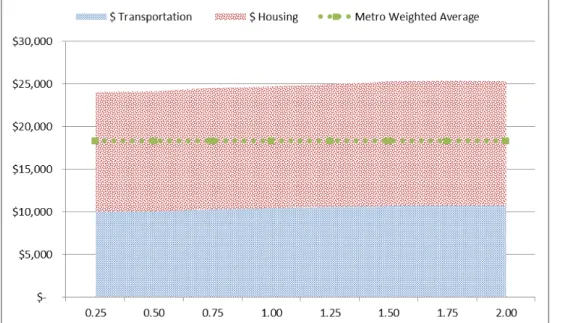
For interpreting the Location Affordability Index, housing is considered affordable if total housing and transportation costs do not exceed 46 percent of income.
The 2009 combined housing, transportation, and H+T dollar costs for the transit corridor are shown in
Figure 5. The vertical axis shows the dollar cost of housing and transportation. The horizontal axis shows how the total varies by buffer distance from the transit corridor. A stacked graph has been used to display the disaggregated effects of housing and transportation on H+T affordability.
Figure 4: Housing, transportation, and H+T costs for the transit corridor, 2009, by buffer distance
As the above graph shows, H+T costs near the transit line are significantly higher than the metropolitan average. Housing costs vary with distance to the RailRunner, but not to any dramatic extent, indicating that the cause is likely a metropolitan scale effect rather than one of proximity to RailRunner. Transit costs are likely slightly higher further away for the same reason.
Section 6-HOUSING AFFORDABILITY 25 of 38
______________________________________________________________________________
______________________________________________________________________________
DO TODs MAKE A DIFFERENCE? RailRunner Commuter Rail
Transportation costs, and housing costs by tenure are shown in Figure 6. The vertical axis shows the percent of income needed to meet housing costs. The horizontal axis shows how the total varies by buffer distance from the transit corridor. The response to transit should be more significant nearer to the transit line.
Figure 5: Transportation costs & Housing costs by tenure, by buffer distance.
Transportation costs are perceptible lower near to RailRunner stations, with most of the change occurring within the 0.75 miles of the corridor. Housing costs for owners shows a ‘rent ridge’ where the rents are highest about 0.75 miles away from the corridor. Housing costs for renters shows a very different pattern, with a nadir at about the same distance, but the same costs within the 0.25 mile buffer and the 1.5 mile buffer.
Discussion & Implications
The strongest response to transit should be in the areas closest to the transit station, and the housing and rental costs near the station should strongly reflect this. The value of the additional accessibility generated by proximity to transit should be capitalized into property value, resulting in rising housing costs. Neither pattern can be observed with relation to proximity to RailRunner. Instead, there is a pattern where the highest housing costs and lowest rental costs occur 0.75 miles from RailRunner. This strongly suggests a confounding factor. I-25 parallels RailRunner for much of the route, and proximity to limited access highways has a much strong effect on home values (and thus housing cost) then proximity to commuter rail.
______________________________________________________________________________
DO TODs MAKE A DIFFERENCE? 26 of 38
7-JOB ACCESSIBILITY
Introduction
Commuters have the ability to travel long distances more rapidly by fixed guide-way transit, making it possible to connect to destinations that are otherwise too distant. TOD is based on the premise that locating housing and employment in close proximity to transit stations will significantly enhance the accessibility of those locations. Because each transit line connects multiple stations, it creates a Transit Oriented Corridor (TOC) where people can live or work near any station and use the rapid transit system to access destinations at any other station along the corridor. Therefore, transit oriented development should significantly enhance employment accessibility along the corridor.
To achieve jobs-housing balance, there should be a rough proportionality between the amount of employment and the amount of housing. However, merely matching the total number of jobs and housing along a corridor is not enough. In recent years, the jobs-housing balance has been refined to include how well jobs (by income) are matched to housing (by income), to ensure that people working in the corridor can afford to live in the corridor. Proximity to light rail stations and bus stops offering rail connections is associated with low-wage job accessibility, but proximity to bus networks alone does not show the same correlation (Fan 2012). To check the degree of match between employment and residence, this analysis controls for both low and high wages. To further check for the degree of match, it compares the occupation balance of how well the number of people employed in the corridor matches the number of people residing in the corridor. If an industry is making heavy use of transit along the corridor, the numbers should be near equivalent.
If transit has a positive effect on jobs-housing balance, there should be a detectable change in the employment resident balance for both wage categories and for all occupation categories.
Data & Methods
The data used comes from the Census Local Employment-Housing Dynamics (LEHD) data source, using the Local Employment Dynamics (LED) datasets. Because the LODES data contains both place of employment and place of residence, it is possible to aggregate data to obtain both workplace area characteristics (WAC) and residential area characteristics (RAC). The ratio between the total workers at these different geographies was used as the jobs-housing balance. Corridors with better jobs-housing balance were presumed to have better job accessibility.
Three analyses were performed to determine job accessibility within the corridors: overall jobs-housing balance, jobs-housing balance by earnings category, and jobs-housing balance by industry. In addition to providing total number of employees per Census Block, the LED employment data are classified by earnings category. The LED classifies income by monthly earnings, into the following categories:
• $1250/month or less
Section 7-JOB ACCESSIBILITY 27 of 38
______________________________________________________________________________
______________________________________________________________________________
DO TODs MAKE A DIFFERENCE? RailRunner Commuter Rail
• Greater than $3333/month
The categories have been treated as low-medium-high income classifications. The actual monthly values are less significant than changes over time in the distribution of each of the categories in proximity to the transit corridor. LED employment data are also classified by industry using NAICS at the two-digit summary level.
ArcGIS was used to create a series of buffers around each corridor in 0.25-mile increments. Those buffers were then used to select the centroid point of the LED block groups and summarize the totals. Because the location of census block points varies from year to year (for reasons of non-disclosure), it was necessary to make a spatial selection of points within the buffer for each year, rather than using the same points each year. For this analysis, the 0.5-mile buffer was used.
Results
Overall jobs-housing balance for the existing transit corridor is presented below in Table 6 for each year. The ratio column indicates the ratio of workers who are employed within the corridor to the number of workers residing in the corridor. The year-on-year change for ratios is also presented. Sparklines at the bottom show the trend for each column. Years for which the transit system is in operation are shaded.
Overall Balance
The jobs-housing ratio at the metropolitan level represents a balanced level of jobs to workers. Comparing that value to the jobs-housing ratio for each corridor demonstrates how far out of balance both corridors are. Ideally, the addition of transit (years of operation highlighted in pink) should make the jobs-housing ratio more similar to the metropolitan level ratio.
Table 5: Jobs-housing balance for all income categories
The overall jobs-housing ratio for the area near RailRunner stations is job-rich, with a jobs-housing ratio about 5 times that for the metropolitan area. With the advent of transit operations, the jobs-housing
Work, 000's Home, 000's Jobs-Housing Ratio Work, 000's Home, 000's Jobs-Housing Ratio Year on Year Change 2002 398 391 1.02 39.3 7.9 5.00 0.00 2002 2003 404 396 1.02 39.2 7.7 5.10 0.10 2003 2004 413 411 1.00 37.0 7.7 4.84 -0.26 2004 2005 421 415 1.01 38.1 7.7 4.98 0.14 2005 2006 423 418 1.01 39.9 7.7 5.20 0.22 2006 2007 443 445 0.99 37.7 8.1 4.68 -0.52 2007 2008 440 445 0.99 39.2 7.8 5.00 0.32 2008 2009 417 404 1.03 35.9 8.2 4.40 -0.59 2009 2010 422 406 1.04 39.7 7.3 5.47 1.07 2010 2011 430 405 1.06 37 7.1 5.29 -0.19 2011 Trend Trend Year Year Metro Transit
Section 7-JOB ACCESSIBILITY 28 of 38
______________________________________________________________________________
______________________________________________________________________________
DO TODs MAKE A DIFFERENCE? RailRunner Commuter Rail
balance generally moves further from parity within the metropolitan area, through a combination of changes in both the number of employees living and residing in the corridor.
Income Balance
Jobs-housing balance by earnings category improves on the overall jobs-housing balance, as the overall jobs-housing ratio provides only a rough metric of the degree to which residents are matched to places of work within a corridor. Matching low-income residents to high-income workplaces will not increase job accessibility. Comparing the jobs-housing ratio by income category makes it possible to gauge not just the overall improvement in jobs-housing balance, but which earnings categories benefit the most from proximity to transit. To determine the degree to which an earnings-specific match is accomplished,
Section 7-JOB ACCESSIBILITY 29 of 38
______________________________________________________________________________
______________________________________________________________________________
DO TODs MAKE A DIFFERENCE? RailRunner Commuter Rail
Table 6: Jobs-housing balance by income category
Work, 000's Home, 000's Jobs-Housing Ratio Work, 000's Home, 000's Jobs-Housing Ratio Year on Year Change 2002 128 125 1.02 9.9 2.7 3.69 0.00 2002 2003 128 124 1.03 10.0 2.6 3.79 0.11 2003 2004 128 126 1.02 8.9 2.6 3.42 -0.37 2004 2005 126 123 1.03 9.1 2.5 3.63 0.21 2005 2006 125 122 1.02 8.6 2.5 3.48 -0.15 2006 2007 125 123 1.02 7.5 2.4 3.14 -0.34 2007 2008 119 118 1.01 8.3 2.2 3.86 0.72 2008 2009 108 102 1.07 7.3 2.2 3.41 -0.44 2009 2010 108 101 1.07 7.8 2.0 3.97 0.55 2010 2011 111 101 1.10 7.3 1.9 3.78 -0.19 2011 Trend Trend Work, 000's Home, 000's Jobs-Housing Ratio Work, 000's Home, 000's Jobs-Housing Ratio Year on Year Change 2002 175 173 1.01 19.0 3.9 4.92 0.00 2002 2003 176 173 1.01 18.6 3.7 5.04 0.12 2003 2004 176 176 1.00 17.6 3.7 4.80 -0.24 2004 2005 179 177 1.01 17.4 3.6 4.84 0.05 2005 2006 185 183 1.01 18.0 3.7 4.92 0.07 2006 2007 185 185 1.00 16.5 3.7 4.43 -0.49 2007 2008 184 184 1.00 16.5 3.7 4.48 0.05 2008 2009 174 166 1.05 14.7 3.8 3.84 -0.64 2009 2010 174 165 1.05 15.2 3.2 4.75 0.91 2010 2011 175 162 1.08 14.1 3.1 4.58 -0.17 2011 Trend Trend Work, 000's Home, 000's Jobs-Housing Ratio Work, 000's Home, 000's Jobs-Housing Ratio Year on Year Change 2002 95 94 1.01 10.3 1.3 7.95 0.00 2002 2003 100 99 1.01 10.5 1.3 7.85 -0.10 2003 2004 108 109 0.99 10.5 1.4 7.65 -0.20 2004 2005 117 116 1.00 11.6 1.6 7.45 -0.20 2005 2006 113 113 1.00 13.4 1.6 8.55 1.10 2006 2007 133 137 0.97 13.7 1.9 7.05 -1.50 2007 2008 137 143 0.96 14.4 2.0 7.16 0.11 2008 2009 135 136 0.99 13.8 2.2 6.38 -0.78 2009 2010 140 140 1.00 16.6 2.1 8.05 1.67 2010 2011 144 142 1.02 15.9 2.1 7.76 -0.29 2011 Trend Trend Year High Income Medium Income Metro Transit Year Low Income Metro Transit Metro Transit Year Year Year Year
Section 7-JOB ACCESSIBILITY 30 of 38
______________________________________________________________________________
______________________________________________________________________________
DO TODs MAKE A DIFFERENCE? RailRunner Commuter Rail
The transit corridor is job-rich for all three income categories, but particularly for high income, where it has 7 to 8 times as many workers as working residents. The jobs-housing ratio is nearest to parity with the metropolitan area for low income workers. Over the study period, the jobs-housing ratio shows no consistent trend toward jobs-housing balance for any income category.
The Sparklines show that low income employment declines steadily throughout the study period. The pattern for low-income workers in the corridor is more erratic. The pattern for medium income workers is fairly flat until 2010, when it falls precipitously. For high-income workers, the number working and residing in the corridor show a consistent pattern of increase.
Industry Balance
Industry balance provides a more refined understanding of the match between place of residence and place of work. Comparing the jobs-housing ratio by industry category makes it possible to determine which industries benefit the most from proximity to transit. The industry balance for the transit corridor is presented in Table 8. The jobs-housing ratio has been broken into two data series by the year of the advent of transit.
If any population is making extensive use of transit, they would be expected to be both working and living in the transit corridor. If so, the number of people in any given industry both working and living in the corridor should increase over time, bringing the jobs-housing ratio for the corridor closer to the ratio for the metropolitan area.
Section 7-JOB ACCESSIBILITY 31 of 38
______________________________________________________________________________
______________________________________________________________________________
DO TODs MAKE A DIFFERENCE? RailRunner Commuter Rail
Table 7: Job accessibility trends over time by industry sector and corridor
In 2006, when transit operations began, the transit corridor was job-rich for all industries, barring Utilities. Following the advent of transit, most industries became more job-poor, moving closer to parity
2002 2002 to 2006 2006 2006 to 2011 2011 Utilities 0.38 0.35 0.73 Construction 1.86 1.73 2.10 Manufacturing 1.41 1.32 1.39 Wholesale 2.78 3.72 3.55 Retail 2.68 2.86 2.55 Transportation 5.11 6.22 5.06 Information 14.63 6.04 5.69 Finance 4.74 6.61 4.00 Real Estate 4.32 3.85 4.66 Professional 7.58 8.99 6.07 Management 1.04 8.33 18.14 Administrative 2.94 4.92 3.51 Education 4.68 6.17 2.08 Health Care 2.39 2.11 3.90
Arts, Ent. Rec. 6.35 7.06 5.04
Lodging & Food 5.02 4.81 4.09
Other Services 3.99 3.55 4.03
Public Admin 15.24 18.50 24.61