Optimizing Scheduling for Outpatient Clinics
A combination of developing a generic tool and immediate application
A.M. Hölscher
Professor R.J. Boucherie
Professor P. Harper
Dr J. Morgan
Preface
Proudly I present my Bachelor Project for Applied Mathematics at the University of Twente. For a period of four months I was given the opportunity to work on a challenging project of Cardiff University. Assisting the project of research associate Jennifer Morgan of Cardiff University, who was working with Cardiff and Vale University Health Board. The project provided the opportunity for me to apply already studied theory to solve a real life problem and to learn about many new parts of theory, while working in a completely new environment. Because of all this, I developed a lot in both a scientific and a personal way.
Working on my Bachelor Project in Cardiff was a great experience and there are a lot of people I want to thank for that. First of all I would like to express many thanks to Professor Richard Boucherie, who made it possible for me to go to Cardiff in the first place. At Cardiff University I was received friendlily by Professor Paul Harper and Doctor Jennifer Morgan. I would like to thank Professor Paul Harper very much for all the guidance, insight and extra materials I was provided with and above all for all the enthusiasm and positive stimulation.
For very similar reasons I would like to express my great appreciation for everything Jennifer Morgan has helped me with. On a day to day basis she was a personal mentor to me. I would like to thank Jennifer Morgan explicitly for always making time to answer my questions whether they were personal or project related, and contributing a huge part to my experience in Cardiff.
To be able to work in close contact with Jennifer Morgan, Andrew Nelson permitted me to work in his department. I am very grateful that I got the opportunity to work at the hospital site this way. I would like to thank the whole department for including me, teaching me some Welsh and making me feel welcome. In particular I would like to thank Rhian Thomas and Helen Bennett for creating the perfect working atmosphere at the office. It really made me enjoy working on my project even more.
In a part of my project I made use of the work of PHD student Geraint Palmer of Cardiff University. I would like to express many thanks to him for making so much time to help me getting familiar with his work and answering all my questions at any time. I also highly valued his patience in discussing his work in the beginning. Later on I appreciated his efforts in discussing the extra features I wanted to add to make it useful for my application. It was a pleasure to work with Geraint.
Last but not least I want to express even more thanks to Professor Richard Boucherie for making time to discuss the progress with me regularly during my time in Cardiff. I realize how much priority for my project this must have meant. On top of that I am very grateful to Professor Richard Boucherie for making sure I got everything I wanted from the project, not just regarding the project but also everything else about the experience. Altogether my project in Cardiff has resulted in a great experience that could not have been better in my opinion.
Management Summary
Outpatient clinics* from many different departments cope with the problem that they have to slot in both new patients and follow up patients. In this project a method was developed to find the strategy that best optimizes the scheduling for these outpatient clinics. The method was applied to a selection of clinics from the Ophthalmology Department of the University Hospital of Wales, but kept as generic as possible.
It needs to be started with determining the demand on the system. If the available historic data provides enough information, forecasting methods can be used. The best forecasting method for the specific time series needs to be determined. For the time series used in this project the best forecasting method turned out to be Holt’s Linear Exponential Smoothing. Unfortunately in our situation there was not enough data available to be sure of previous demand. Because of governmental targets however, new patients have recently been prioritized. Thus the historic appointment data for new patients only could be accurate as historic demand and forecasting could be used on only new patients.
In case historic data does not provide enough information, a simulation, based on follow up structure, can be used to determine demand. This simulation was developed and carried out for our specific situation. An average monthly demand of 213 patients requesting an appointment was found, 45 new patients and 168 follow up patients. If forecasting new patient’s demand was possible, this can be used as a part of the input for this simulation.
To be able to find the best allocation of capacity slots between new patients and follow up patients an optimization, minimizing total waiting time, can be carried out. Applying this optimization method for our situation provided us with an optimal allocation of 44 slots for new patients and 161 slots for follow up patients a month.
Finally, the capacity can be implemented in the earlier mentioned simulation. This way, it can be analysed what happens to waiting times if the capacity is divided between new patients and follow up patients. In our situation it was concluded that the waiting times were distributed very unfairly. To make it fairer the Cardiff and Vale University Health Board can try a couple of solutions. It can be chosen to alter the optimal distribution of slots. This means total waiting time will increase but the waiting times can be distributed in a fairer way. If increasing total waiting time is not a possibility it can be chosen to increase total capacity. A new allocation of capacity can be determined by applying the optimization.
1
Table of Contents
1. Introduction ... 4
1.1 Problem Definition ... 4
1.2 Research Question ... 4
1.3 Research Methodology ... 4
1.4 Data Overview ... 5
1.4.1 Clinics ... 5
1.4.2 Range ... 5
1.4.3 New Arrivals ... 6
1.4.4 Follow Ups ... 6
2. Literature ... 7
2.1 Determining Demand ... 7
2.2 Scheduling Outpatient Systems... 7
2.3 Related Literature ... 8
3. Methods ... 10
3.1 Forecasting Methods ... 10
3.1.1 Moving Average ... 10
3.1.2 Adaptive-Response-Rate Single Exponential Smoothing ... 11
3.1.3 Holt’s Linear Exponential Smoothing ... 12
3.1.4 Comparing Methods ... 12
3.2 Queuing Theory ... 13
3.3 Simulation ... 15
3.3.1 Set up Simulation Code ... 15
3.3.2 Event Structure ... 16
4. Demand Modelling ... 19
4.1 Problem Definition ... 19
4.2 Forecasting Methods ... 19
4.2.1 Trend and Seasonality ... 20
4.2.2 Applying different methods ... 23
4.2.3 Comparing Methods ... 24
4.2.4 Conclusions ... 25
4.3 Simulation ... 26
2
4.3.2 Model ... 27
4.3.3 Goals ... 28
4.3.4 Description of Methodology... 29
4.3.5 Analytical Verification ... 35
4.3.6 Validation... 36
4.3.7 Numerical Results ... 41
4.3.8 Conclusions ... 42
4.4 Summary... 43
5. Capacity Planning ... 44
5.1 Current Situation Capacity ... 44
5.2 Optimization ... 44
5.2.1 Goals ... 44
5.2.2 Xpress MP Optimization ... 44
5.2.3 Excel Solver ... 45
5.2.4 Comparing Methods ... 46
5.2.5 Conclusions ... 47
5.3 Queuing Model ... 47
5.3.1 Model ... 48
5.3.2 Parameters ... 48
5.3.3 Performance Measures ... 49
5.3.4 Conclusion ... 50
5.4 Simulation ... 51
5.4.1 Model ... 51
5.4.2 Goals ... 52
5.4.3 Description of Methodology... 52
5.4.4 Analytical verification ... 56
5.4.5 Validation... 57
5.4.6 Numerical results ... 57
5.4.7 Conclusion ... 59
5.5 Summary... 60
6. Conclusion ... 62
7. Discussion ... 63
8. Recommendations... 64
3
4
1.
Introduction
1.1
Problem Definition
Scheduled care in UK hospitals can broadly be grouped into inpatient and outpatient services. On the one hand there are inpatients, which require to be admitted to the hospital to be closely monitored both during the procedure and afterwards. On the other hand there are outpatients, which do not require any hospital admission. In this project it was focused on only the outpatient services.
Outpatient clinics from many different departments cope with the problem that they have to slot in both new patients and follow up patients. In many of those clinics new patients have to wait a significant amount of time before being seen for an appointment. However, this is subject to the government targets for waiting times for new patients. The appointments of follow up patients need to be fitted around the demand for new patients, which can result in them being delayed.
1.2
Research Question
In this project the main goal is to develop a model for scheduling that minimalizes the waiting times for new patients, while still seeing the follow up patients as timely as possible. This model will give information about for example how best to divide the capacity over new patient and follow up patients. It is intended to make this model as generic as possible so it can easily be extended to a model that can be used for any outpatient clinic in any department as long as there is enough applicable data.
The above can be translated into the following research question:
What strategy best optimizes the scheduling for outpatient clinics?
To help answering this question the following sub questions will be used:
1. What would happen if a fixed number of slots were assigned to new patients and follow up patients?
2. What would happen if the number of capacity slots or the division of capacity over time (master schedule) was changed?
3. What would happen if the number of no-shows could be decreased? 4. What would happen if there would be an unexpected change in demand?
1.3
Research Methodology
To get a grip on the current available data, the project was started with applying forecasting theory. The available time series of registered appointments over time is analysed.
It is intended to use an optimization program to assign (forecasted) demand to the available capacity. The objective function will be to minimize the waiting times for both new and follow up patients. To be able to do a proper optimization it is necessary to create an appropriate picture of demand. This means that first there should be a focus on finding a way to determine demand.
After this the optimization can be carried out to find optimal capacity planning. The results will be tested by means of queuing theory and a simulation. The base scenario will be compared to results after applying minor changes to answer the sub questions.
5
1.4
Data Overview
Because a patient can be seen for different conditions, the follow ups for those different conditions were separated into pathways. The unique combination of patient and pathway was called a PaPa.
1.4.1 Clinics
For our project it was necessary to use a ‘good’ dataset. In this situation ‘good’ means that target dates are available. Target dates contain the information about when a patient should have been seen. Since we are interested in the delay, we need the target date information in addition to the actual appointment date to determine this delay. The Ophthalmology Department of the University Hospital of Wales meets this condition.
This department consists of many different clinics. A clinic means a specific combination of a certain type of clinician and available equipment. For a specific condition, it is possible that there is only a small subset of the clinics that would contain the right combination of clinician and equipment. To be able to use a manageable dataset the project only regards a few clinics of this department. In fact, the project was started with just one clinic, “OPHT103”.
Unfortunately, it was discovered that, in the available dataset, there were a lot of PaPas in this clinic with only one record of an appointment. All PaPas that were recorded in clinic OPHT103 were looked up in the larger dataset with all clinic information of the Ophthalmology Department. It turned out that over 75 percent of all the appointments from those PaPas took place in only three clinics (see Figure 1): OPHT103 itself (22%), OPHT15 (36%) and 987/988 (18%). Apparently, for most conditions that could be treated in OPHT103, 987/988 and OPHT15 contained the right combination of clinician and equipment as well.
Therefore, in this project the data from these three clinics combined was used.
Figure 1.1 Clinic Attendance
1.4.2 Range
The available data start with appointments dates in 2011 and end with appointment dates from the beginning of October 2015. This allows looking for seasonality and trends in the data.
0 100 200 300 400 500 600 700 800 900
987/988 OPTH10
3
OPTH15
A
p
p
o
in
tm
e
n
ts
(#)
6 1.4.3 New Arrivals
When new patients get referred they are placed on a waiting list before getting assigned an appointment. From most patients the available data only contains the date of the first appointment of a patient. So there is no information available about when exactly they were referred. In order to determine waiting times and actual demand for appointments this is of critical importance.
Because of the governmental targets on waiting times of new patients, it can be assumed that the new patients have been prioritized over follow ups. Therefore, it can be assumed that the amount of new patients in a certain period corresponds with the amount of new patients slotted in in that same period. Assuming the data about new arrivals provides good information, the data can be used to forecast future demand. In this project the time series will be analysed and different forecasting methods will be tested.
1.4.4 Follow Ups
A similar problem as for new arrivals arises for follow ups. There is lots of data available about the appointment dates for follow ups, but even with target dates, there is still very little information available about when exactly the appointment should have taken place to be a timely follow up. In other words, there is no way to determine how much a follow up has been delayed or what exactly the demand for follow ups was at a certain point in time.
7
2.
Literature
The very broad topic of this study is outpatient scheduling. A lot of papers could be found on this subject. Therefore, it was started with the focus on Ophthalmology. From there the search was broadened to relevant references. The resulting papers and their relation to this project were discussed, divided into three paragraphs.
In this project it was meant to do two main steps. First the actual demand on the outpatient system needs to be determined. Secondly, the capacity and demand will be compared to obtain as good as possible scheduling. Therefore this chapter was also split into those two paragraphs. Literature about forecasting and/or determining demand will be discussed in the first paragraph. In the second paragraph more general literature about outpatient scheduling will be discussed. In the third paragraph it is explained how this project is a valuable addition to the discussed literature.
2.1
Determining Demand
To be able to do good scheduling it is important to have an idea of future demand. In this project the first aim was to determine actual demand on the clinic. Because there were some data limitations, the exact demand in the current situation was not known. This led to a search for solutions on how to determine this. One of the ideas involved using a ratio of new patients and follow up patients. Such ratios for ophthalmic patients were discussed by Pan et al. (1). Both ratios mentioned, 3:7 and 5:8, were compared to the historic data of this project, but were too far off to use.
Another idea was to forecast by means of regression. This means certain influencing factors could be taken into account. Dechartres et al. (2) found that the level of complexity of consultations is correlated mainly with four factors. The type of referral, the consultation duration, the number of consultations in the previous year and the number of diagnostic tests performed. These factors were determined focusing on doctors’ workload and the length of an actual consultation. This is different from what was focused on in this project. In this project we are only interested in the planning of the consultations, i.e. appointments, assuming each appointment takes exactly one time slot. It might be that the same factors have some influence on the follow up structure however. Therefore these factors were analysed in relation to the follow up structure. The results were not sufficient to use regression. It was decided to use plain forecasting methods on the registered activity.
During the research on literature, nothing was found on trying to determining demand, assuming historic data does not provide an appropriate picture. This part of this project will therefore be a valuable addition to the reviewed literature.
2.2
Scheduling Outpatient Systems
To be able to make a good appointment schedule, one first needs to determine what exactly should be optimized. Most appointment schedules use minimizing waiting times as the objective function. Waiting time is a wide understanding though. It consists of patient waiting time, split in both direct and indirect waiting, and doctor’s idle time. Direct patient waiting time is understood to be the time between the moment the patient arrives and when the patient is served. Indirect patient waiting time is the time between the moment the patient requests an appointment and when the appointment takes place.
8
Tugba and Veral (4) wrote an interesting review of literature about outpatient scheduling in health care. They conclude that you have to deal with the following list of complications:
- Punctuality of the patients - Number of doctors
- Number of appointments per clinic session - No-shows
- Emergency walk-ins
In this project we are not interested in either emergency walk-ins or punctuality of patients. The other aspects can be taken into account. In chapter 5 it will be looked at how best to divide appointment slots over a week with how many clinics working at the same time. This means different numbers of doctors and numbers of appointments per clinic session will be tested. About no-shows Tugba and Veral (4) wrote that it is best handled by shortening appointment intervals. It is especially mentioned that overbooking is not a good method. Since it can be concluded from the data, combining the number of appointments scheduled and the known capacity, overbooking has been used in the past in the clinics that was focused on for this project. By creating a more efficient planning tool it was aimed that this will not be necessary anymore.
By Pan et al. (1) it was investigated how best to improve scheduling. They used a discrete event simulation to compare new results with the old situation. It was concluded that a wider distribution of slots during the week and rearrangement of new patient slots and follow up slots are good ways to do this. In this project a simulation will also be used to test how best to distribute slots weekly. An optimization will be used to look at how slots can best be divided into new patient slots and follow up patient slots.
2.3
Related Literature
De Vuyst et al. (5) used an analytical approach to evaluate appointment schedules in health care. In most reviewed literature a simulation was used however. In this project it was also chosen to use mostly simulation.
It was remarkable that a simulation was used in many of the reviewed literature. For example Harper and Gamlin (6) wrote about reducing outpatient waiting times by means of improving appointment scheduling with a simulation modelling approach. Only this was focusing on direct waiting times, instead of indirect waiting times as we want in this project.
Su and Shih (7) also used simulation to manage an appointment system in outpatient clinics. They were focusing on a mixed registration-type appointment system however. This means they were concerned with both scheduled patients and walk-ins. Similar to what will be done in this project, it also comes down to finding an optimal allocation of slots. In this project all appointments are scheduled however and again we bump into the difference between optimizing direct and indirect waiting times.
The allocation of slots, what was aimed to do for new patients slots and follow up patient slots, was found in a paper by Zonderland et al. (8). They focused on the planning and scheduling semi-urgent surgeries. This means they had to deal with a very unpredictable demand. In this project optimizing allocation of slots was based on a predictable demand.
9
but there was not enough time to analyse what effects reducing them would have. This would be an interesting direction for further extension of the model in this project.
According to Braaksma et al. (10) there is a lot to be gained by using online appointment scheduling in health care. To be able to do this, the study of this project about dividing slots into new patient slots and follow up patient slots in advance might be useful.
10
3.
Methods
3.1
Forecasting Methods
In forecasting there are two types of basic methods to distinguish: averaging methods and exponential smoothing methods. Averaging methods use equal weights for all observations used to forecast, whereas exponential smoothing methods use unequal weights. Unequal weights can give more weight to more recent observations. In this project the averaging methods used is the moving average. The exponential smoothing methods used are adaptive-response-rate single exponential smoothing (ARRSES) and Holt’s Linear Exponential Smoothing.
Another forecasting method is Survival Analysis. In this project there was concluded that it could be a helpful method, but it was not used in the end.
3.1.1 Moving Average
The principal of a moving average is that a new average is calculated every time a new observation becomes available. A fixed number (k) of latest observations is used every time a new forecast is calculated, the newest observation replacing the oldest one. With 𝐹𝑡 and 𝑌𝑡 representing the forecasting value and the observed value at time t respectively, the moving average forecast of order k is given by:
𝐹𝑡+1 =1
𝑘 ∑ 𝑌𝑖
𝑡
𝑖=𝑡−𝑘+1
(1)
This method is not appropriate when the observed data exhibits any trend or seasonality. For example, if a time series contains a linearly increasing trend line, it is not possible to use the above mentioned formula. A value higher than the already observed values is bound to come but it is not possible to forecast this using only the average of previously observed values.
The same holds for seasonality. The more previously observed values are taken into account, the smoother the forecasting graph becomes. This means the peaks or drops in values due to seasonality will not be taken into account.
The formula mentioned earlier represents the simplest way to use a moving average, by using equal methods for a consecutive number of previous observations. There exist however more interesting ways of using moving average. To be able to adapt the method better to our situation, the formula was changed a little.
The observed values used to calculate the forecasting values can instead of consecutive be chosen with gaps. For example the forecasting value can be calculated by means of the last observed value, the 3rd to last observed value and the observed value ten time units previous. Also, the weights can differ for each previously observed value. Now a new formula can be set up:
𝐹𝑡+1 =1
𝑘 ∑ 𝑤𝑖∗ 𝑌𝑖
𝑡
𝑖=𝑡−𝑘+1
(2)
11
In other words, the weights can be adjusted to a specific time series. In fact, the weights can even be optimized for a specific time series. Obviously, the objective here will be to minimize the difference between forecasted values and observed values of the same moment in time. To be able to do this, a sensible number of previous time units that will be taken into account have to be chosen. Then the combination of weights which gives the smallest errors can be found.
An advantage of this method is that it is very adaptable to different time series, since it can be chosen to optimize a lot of weights. The downside of too many weights however is that all that weights will be small and a small change in the data can have large impacts on the forecasting errors. In other words, the method can lack in robustness.
3.1.2 Adaptive-Response-Rate Single Exponential Smoothing
The ARRSES forecasts by adding weighted values of both the last forecasted value and the last observed value. The special aspect of this method is the fact that the weight (α) can be changed when changes in the pattern of data occur. The forecasting equation is given by:
𝐹𝑡+1 = (1 − 𝛼𝑡)𝐹𝑡+ 𝛼𝑡𝑌𝑡 (3) The weight (α) changes by means of changes in the values 𝐴𝑡 and 𝑀𝑡. Those values are determined as follows:
𝐴𝑡 = 𝛽𝐸𝑡+ (1 − 𝛽)𝐴𝑡−1 (4)
𝑀𝑡 = 𝛽|𝐸𝑡| + (1 − 𝛽)𝑀𝑡−1 (5) With:
𝐸𝑡 = 𝑌𝑡− 𝐹𝑡 (6) In these formulas 𝐸𝑡 represents the forecasting error at time t. The value β is, in contrast to α, a fixed parameter between 0 and 1. There can now be derived that 𝐴𝑡 denotes a smoothed estimate of the forecasting error and 𝑀𝑡 a smoothed estimate of the absolute forecasting error. The (adapted) weight α can be calculated as follows:
𝛼𝑡+1= |𝑀𝐴𝑡
𝑡| (7)
This method only uses the last observed value to forecast with and by using the last forecasted value, also the second to last observed value a little. Therefore no trend or seasonality can be taken into account so this method works well when the data is non-seasonal and shows no trend.
Similar to the moving average, the ARRSES method can be adjusted to a specific time series. The parameter α changes by itself, but, as mentioned before, the parameter β is fixed. This last parameter can therefore be optimized according to the time series to which the ARRSES method will be applied. Optimal clearly means the parameter with which forecasting results in forecasting values with the smallest error compared to observed values.
12 3.1.3 Holt’s Linear Exponential Smoothing
In contrast to the other two discussed forecasting methods, Holt’s Linear Exponential Smoothing is able to take a possible trend into account. To achieve this, 𝐿𝑡 and 𝑏𝑡, the level of the series and the estimate of the slope of the series at time t respectively, are introduced:
𝐿𝑡 = 𝛼𝑌𝑡+ (1 − 𝛼)(𝐿𝑡−1+ 𝑏𝑡−1) (8)
𝑏𝑡 = 𝛽(𝐿𝑡− 𝐿𝑡−1) + (1 − 𝛽)𝑏𝑡−1 (9) In these formulas both α and β are fixed smoothing parameters between 0 and 1. The actual forecasting value 𝐹𝑡+𝑚 for time t+m, forecasting m periods ahead is calculated as follows:
𝐹𝑡+𝑚= 𝐿𝑡+ 𝑏𝑡𝑚 (10)
The initial values for 𝐿𝑡 and 𝑏𝑡 have to be estimated. For 𝐿1 the first observed value in the data can be used and for 𝑏1 the difference between the first two values.
This method is applicable when the time series does not contain any seasonality. Because the method only uses the last observed value to calculate the forecasting value it is not possible to take seasonality into account. As mentioned earlier, this method can take trend into account.
Similar to the other methods this method can be adapted to a specific time series. In this case the fixed parameters α and β can be optimized, minimizing the error over a number of forecasts.
The advantage of Holt’s Linear Exponential Smoothing over the other two mentioned methods is the fact that with this method it is possible to forecast more than one time period ahead. Of course it quickly becomes less accurate if the amount of periods to forecast increases. But for forecasting only one time period ahead this method is fairly robust. This means that a small change in the data will not provide large errors in forecasting.
3.1.4 Comparing Methods
There exist a lot of forecasting methods, but which one works best depends on the data series. To be able to compare different methods, they all have to be applied to the same data series. But even then there are different ways to compare. In this project the mean squared error (MSE) and the mean absolute percentage error (MAPE) were used. The MSE can be calculated as follows:
𝑀𝑆𝐸 =∑𝑛𝑡=1(𝐹𝑡− 𝑌𝑡)2
𝑛 (11)
In this formula n represents the number of forecasted values. By squaring the difference between forecasted and observed values, the MSE gives exponentially more weight to large error values. This method is useful if occasional large errors are to be prevented as much as possible.
A disadvantage of the MSE is that it is hard to interpret the obtained value. If you however compare it to other MSE results it can be very useful. This method of error calculation was in this project used for the determination of the error in optimizing the forecasting parameters.
13
𝑀𝐴𝑃𝐸 =
∑ |𝑌𝑡− 𝐹𝑌 𝑡
𝑡 | ∗ 100 𝑛
𝑡=1
𝑛
(12)
Again n represents the number of forecasted values. The MAPE calculates the error subject to the magnitude of the value that was observed. An advantage of this method is that the outcome can easily be interpreted. It provides the average percentage that the forecasting errors are of the observed values.
To compare the different methods, all methods can be optimized to the available time series. The different errors for the same observed values can be calculated (either MSE or MAPE) and the results can be compared. However, the optimized parameters are now suitable for the complete time series. But in reality the parameters will not be optimized every time a new observed value is obtained. Therefore it is also useful to take about three quarters of the time series to optimize the parameters with and then forecast the last quarter. Comparing the errors obtained in this way will give a better impression of which methods work well on the specific time series.
3.2
Queuing Theory
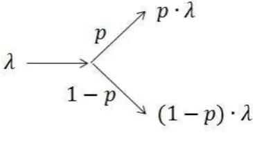
[image:16.595.218.385.386.498.2]To set up the queuing model used in this project, two rules for Poison arrivals were used. The first rule is that two different Poisson arrival processes can be added as follows:
Figure 3.1a: adding arrivals
The second rule states that when splitting a Poisson arrival, the new streams can be treated as new Poisson arrivals with new rates. Visually this comes down to the following:
Figure 3.1b: splitting arrivals
[image:16.595.204.387.579.682.2]14
We will be dealing with an open queuing network. The most important property of this system is quasi-reversibility. The Markov process associated with a queuing system is said to be quasi reversible if the state of the process (for all classes of patients) at time t is independent of the arrival process after time t and independent of the departure process prior to time t. (12) If a quasi-reversible queue has class-dependent Poisson arrival processes, then the departure process of class c customers is also Poison in steady state.
For example, a system like the one shown below consists of quasi-reversible queues. This example was discussed by Bunday (11).
Figure 3.2: Queuing Model
With:
𝜆𝑖 = effective arrival rate at node i
𝛬𝑖 = external arrival rate at node i
𝑟𝑖𝑗 = part of customers moving from node i to node j
For a system as in the example above a product form solution is valid. This means the traffic equations can now be formulated as follows:
𝜆1= Λ1+ 𝜆2 (13)
𝜆2= 𝑟12∙ 𝜆1 (14) Solving the traffic equations yields:
𝜆1 = 1
1 − 𝑟12Λ1 (15) 𝜆2 = 𝑟12
1 − 𝑟12Λ1 (16) According to Jackson’s theorem the two nodes can now be treated separately, with arriving rate 𝜆𝑖 and service rate 𝜇𝑖. In this project node 1 will be an M/M/1 queue and node 2 an M/M/∞ queue. This yields the following performance measures for node 1 and node 2.
Node 1
𝐸[# 𝑖𝑛 𝑠𝑦𝑠𝑡𝑒𝑚] = 𝜆1 𝜇1− 𝜆1
(17)
𝐸[# 𝑖𝑛 𝑞𝑢𝑒𝑢𝑒] = 𝜆1 𝜇1− 𝜆1−
𝜆1 𝜇1
15
𝐸[𝑡𝑖𝑚𝑒 𝑖𝑛 𝑠𝑦𝑠𝑡𝑒𝑚] = 1 𝜇1− 𝜆1
(19)
𝐸[𝑡𝑖𝑚𝑒 𝑖𝑛 𝑞𝑢𝑒𝑢𝑒] = 𝜆1 𝜇1(𝜇1− 𝜆1)
(20)
Node 2
𝐸[# 𝑖𝑛 𝑠𝑦𝑠𝑡𝑒𝑚] =𝜆2
𝜇2 (21)
𝐸[# 𝑖𝑛 𝑞𝑢𝑒𝑢𝑒] = 0 (22)
𝐸[𝑡𝑖𝑚𝑒 𝑖𝑛 𝑠𝑦𝑠𝑡𝑒𝑚] = 1
𝜇2 (23)
𝐸[𝑡𝑖𝑚𝑒 𝑖𝑛 𝑞𝑢𝑒𝑢𝑒] = 0 (24)
3.3
Simulation
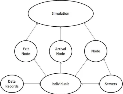
In this project an existing simulation shell, developed by Geraint Palmer with Python, was used. ASQ Simulates Queues is a simulation that can be used to simulate a queuing network of any architecture with multiple classes of customers and a variety of service distributions. To be able to use this simulation shell for this project a list of changes needed to be made. Therefore, it is important to obtain a good understanding of the ASQ Simulates Queues. In this paragraph the setup of the existing simulation code and the event structure will be explained.
3.3.1 Set up Simulation Code
The main object of the framework is called “Simulation”. This contains information about the queuing network itself, global variables, and the methods that run the simulation and write data to a file. Three different pieces of code feed into the “Simulation” code, these three parts are called “Exit Node”, “Arrival Node” and just “Node”. As can be concluded from the names, “Exit Node” deals with the customers that leave the system. This means “Exit Node” functions as a dummy node to send and store information about the individuals that leave the system. “Arrival Node” does the opposite. This creates all newly incoming customers. The individuals never stay here, but are immediately transferred to the relevant node in “Node”. The remaining piece of code “Node” deals with the queue for service, service itself and moving customers amongst nodes. This object also contains methods to give “Individuals” information like arrival date, service start time, service end time and waiting time. It also writes the “Data Records” of “Individuals”. To make the right adjustment to the simulation for this program, “Servers” was added as an object. “Servers” contains methods to change shifts and therefore add and delete servers of relevant nodes.
Every time a customer finishes service a line of the following information is stored:
Table 3.1: Stored Information of a Customer Who Finished Service
Patient
ID Class
Node Number
Arrival Time
Waiting Time
Service Start Time
Service Time
Service End Time
Exit Time
16
Figure 3.3: Overview Different Parts of Code
3.3.2 Event Structure
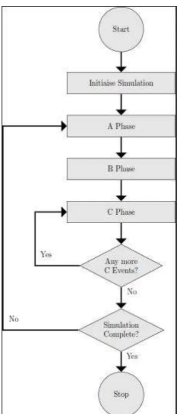
For the simulation a so called three-phase-simulation-approach, described by Stewart Robinson (13), was used. This is shown in figure 3.4.
17
Figure 3.4: Three-phase-simulation-approach
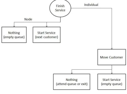
[image:20.595.209.384.65.474.2]In this simulation there were two B events; an external arrival of a customer and a customer ending service. The three B events (given in circles) with their following C events (given in squares) can be viewed in the figures 5 and 6 below.
18
[image:21.595.96.510.147.453.2]After a new customer enters the system at a node, there can either be a queue or not. If there is a queue, the customer just attends the queue and nothing needs to be done. Of course if there is no queue the customer can immediately enter service. This means the C event “Start Service”, which comes down to generating the time this customer’s service will be finished, needs to be carried out.
Figure 3.6: B event 2
After a customer finishes service, there need to be made changes to both the relevant node and the individual. To the node there are again two possibilities of the following situation. The queue for the node can be empty in which case no C event will occur. If the queue is not empty the next customer will start service. In this C event the time for the B event, when this customer finishes service, will be generated.
19
4.
Demand Modelling
To develop an optimal scheduling strategy, the demand for appointments and the available capacity have to be compared. In this section the aim is to determine a stream of demand. The demand was examined in two main steps. Firstly, it was looked at forecasting methods to apply on historic data. Secondly, a simulation was carried out, reproducing the situation, to be able to store the relevant data for this project.
4.1
Problem Definition
To be able to construct a smart scheduling strategy, there are two things that need to be established. Firstly the number of patients requesting an appointment per time unit is needed, in other words; the demand on the system. Secondly the number of available slots, the capacity, is needed. In this section it was focused on the first part, the demand.
In contrast to capacity, the demand is not given for the future. That is why this section is started with looking at different forecasting methods. It was intended to use historic data to get a grip on future demand by means of plain forecasting methods. In doing so a problem was discovered. The available dataset provides information about when appointments are booked in the system. The problem is that the demand is bigger than the current capacity. Therefore the appointment dates do not provide applicable information about the actual demand.
The initial choice for the specific clinic OPHT103 was made because of the relatively good target data. The target data does give an impression about when the follow ups should have taken place, though there is still very little data available compared to the whole set. Using this target data there still can be created a better understanding of historic demand. Unfortunately, it was not sufficient to rely on completely.
For this reason the system was also analysed by means of a Queuing Model, which gives an idea of the busyness of the system. To get a clear picture of the actual demand, by recreating the situation of the system, a Simulation was carried out. As a last part of the problem, input data needs to be gathered for this simulation. In the part of recreating the process of new patients coming in, the forecasting methods come in handy again. As mentioned before, it can be relied upon that recently new arrivals have been prioritized over follow up patients because of the governmental targets. This means forecasting methods applied on the historic data can provide useful information about just the new arrivals.
4.2
Forecasting Methods
To be able to forecast a stream of demand, a historic series of demand is required. As already mentioned in the Problem Definition, determining real demand is hard because the available data about demand is constantly limited by capacity. The question is how to use the historic data that is available. In this project two different methods of using historic data were used.
Firstly, the column appointment dates from the original dataset can be used, completely ignoring whether it is a new patient or a follow up patient. It can be assumed that the real demand was actually higher than the listed demand. After forecasting, the complete forecasted graph can be lifted a little to represent the capacity limitations.
20
Either way, a historic series of data needs to be forecasted. There exist a lot of different forecasting methods, only a few of them were discussed in the section “Methods”. To determine which ones would work best, the historic data needs to be examined.
4.2.1 Trend and Seasonality
[image:23.595.71.526.484.712.2]In order to narrow down the options of forecasting methods, there was searched for trend and seasonality in the data. The monthly total of registered appointments is given in the graph below. The black line represents the linear trend.
Figure 4.1: Trend, monthly total number of registered appointments
From this graph can be concluded that there has been no consistent increase or decrease in the trend over the past 5 years. In the graph below the monthly numbers of new patients and follow ups can be viewed separately. The black lines are linear trend lines.
Figure 4.2: Trend, new patients and follow up patients separately
0 50 100 150 200 250 300
2011 2012 2013 2014 2015
A
p
p
o
in
tm
e
n
ts
(#)
Time (years)
Monthly total number of appointments Linear (Monthly total number of appointments)
0 50 100 150 200 250
2011 2012 2013 2014 2015
A
p
p
ointm
en
ts
(#
)
Time (years)
Monthly number of new patients Monthly number of follow up patients
21
The same conclusion can be drawn as from the first graph. There has been no consistent change in the series over the last 5 years. Therefore, there is no apparent trend in the historic series. Only in the new arrivals there seems to be a slightly increasing trend, but it was suspected that this is a result of the current planning methods. Especially the graph for new patients oscillates a lot near the end. This could be a result of overbooking to shorten the waiting lists for first appointments of new patients.
In this project it can thus be focused on forecasting methods that work well without apparent trends in the data. Still it was considered useful to also test a (few) forecasting method(s) that can take some trend into account.
To search for seasonality the historic data was split into yearly graphs. Below the total registered activity of the last 5 years can be viewed.
Figure 4.3: Yearly total registered activity
In this graph there does not seem to be any particular behaviour depending on the season. To make sure the situation is not different when dividing new patients and follows up patients, the graph below was created as well.
0 50 100 150 200 250 300
jan feb mrt apr mei jun jul aug sep okt nov dec
A
p
p
o
in
tm
e
n
ts
(#)
Time (Months)
22
Figure 4.4: Yearly registered activity for new patients and follow up patients
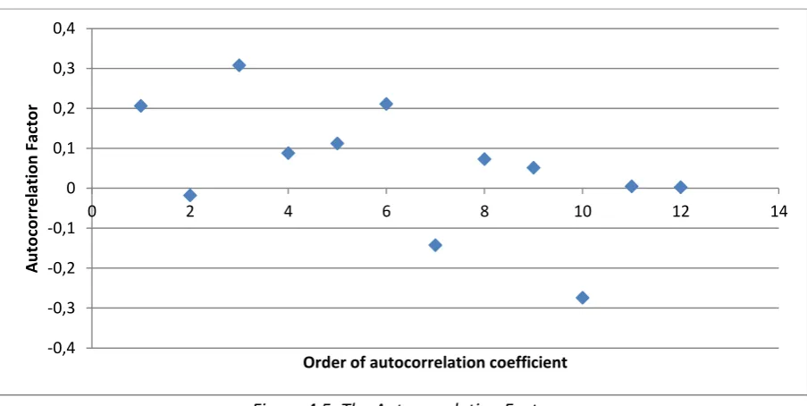
Still there seems no seasonality to be discovered. However, because seasonality is harder to spot than a trend in just a graph, seasonality was also tested by means of the autocorrelation factor. After plotting a time series, this method can help to describe the relationship between various parts of the time series which are a certain time distance apart. The autocorrelation factor consists of autocorrelation coefficients of different order. A coefficient represents the correlation between two moments in time, within the time series, with the number of the order in time units in between. The formula that describes the autocorrelation coefficient with order k is as follows:
𝑟𝑘 =∑ (𝑌𝑡 − 𝑌̅)(𝑌𝑡−𝑘− 𝑌̅)
𝑛 𝑡=𝑘+1
∑𝑛 (𝑌𝑡− 𝑌̅)2 𝑡=1
(25)
With of course 𝑌𝑡 and 𝑌̅ representing the observed value at time t and the mean observed value respectively.
In this project, the autocorrelation coefficients until order 12 of the time series were calculated. The number 12 was chosen to make sure to catch possible yearly seasonality, but to make the number much larger would not make sense because there were only a few years of data available. A plot of all the autocorrelation coefficients together forms the autocorrelation factor:
0 50 100 150 200 250
jan feb mrt apr mei jun jul aug sep okt nov dec
A
p
p
o
in
tm
e
n
ts
(#)
Time (Months)
New '11 FU '11 New '12 FU '12 New '13
23
Figure 4.5: The Autocorrelation Factor
Because all the coefficients, with a very occasional exception, stay near the x-axis, it can be concluded that there was no apparent seasonality. Therefore, in choosing forecasting methods there can be focused on methods that work well without any seasonality in the data series.
4.2.2 Applying different methods
After analysing the available time series, three appropriate forecasting methods were selected. In this paragraph those methods and their results will be discussed. The results were analysed by different error measures and compared.
4.2.2.1 Moving Average
As discussed in the section “Methods”, the particular form of moving average used in this project first needs a maximum number of previously observed values to take into account. To allow for some seasonality to appear it was started with taking the last 12 months into account. Then the weights were optimized. However, for the time periods more than 6 months the weights turned out to be approximately zero. Therefore the number of previously observed values to take into account was narrowed down to only 6 months. Optimized over the complete time series this resulted in the following weights:
Table 4.1: Optimized Weights Moving Average
1 month previous 0.23 2 months previous 0.0 3 months previous 0.43 4 months previous 0.0 5 months previous 0.19 6 months previous 0.15
Though it was concluded that there was no apparent seasonality, this results suggest at least that the demand three months ago has a significant impact on the current demand. This does not have to be seasonality, but it is a definite relationship within the time series which might be used later.
-0,4 -0,3 -0,2 -0,1 0 0,1 0,2 0,3 0,4
0 2 4 6 8 10 12 14
A
u
to
co
rr
e
lation
Fact
o
r
24
The associated MSE (explained in the section “Methods”) in this optimized situation comes down to a value of 1190.
4.2.2.2 ARRSES
For this method only one parameter, β, can be optimized over the complete time series. Also the starting value of the parameter α, which represents the weight of the previous observed value relative to the previous forecasted value, can be optimized. It is part of the forecasting method ARRSES that the parameter α changes over time by itself. The results of the optimized parameters were as follows:
α 0.17809 β 0.185597
This yielded for the complete time series an MSE with a value of 3877.
4.2.2.3 Holt’s Linear Exponential Smoothing
This method has the clear advantage in contrast to the other two methods that it can forecast more than one time period ahead. To be able to compare it to the other method however it was here only used with forecasting one time period ahead. Two parameters can be optimized, both α and β. Optimizing over the complete time series these parameters adopted the following values:
α 0.2134 β 0.0.081959
This yielded an MSE for the complete time series with a value of 1550.
4.2.3 Comparing Methods
In this paragraph the MSE and MAPE values, discussed in the section “Methods”, of all the methods will be compared for optimizing over the complete time series. After this another test will be carried out. This includes optimizing over only a part of the time series and using the obtained parameters to forecast over the part of the time series that was not used to optimize over.
4.2.3.1 MSE and MAPE
In this project the values were optimized with the objective function of minimizing over the MSE error measure, because this is the most common method. The MAPE was however calculated as well. The results were gathered in a table:
Table 4.2: MSE and MAPE Values for All Methods
MSE MAPE
Moving Average 1190 16.35
ARRSES 3877 26.5
25
It can be concluded from both error measures that moving average performs best. However, Holt’s Linear Exponential Smoothing is not far behind. The second method, ARRSES, performs very badly compared to the other two methods, due to the fact that it smooths too much and can very poorly be adapted to a specific time series. In fact ARRSES performs so much worse than the other two methods that it was not considered any further in this project.
4.2.3.2 Forecasting Further
Until now all weights and parameters were optimized over the complete time series, which means all the available data from 2011 until 2015. When a forecasting method is chosen however, the parameters will not be changed for every forecast. This means the parameters will never be optimized for the complete past time series. Therefore the methods Moving Average and Holt’s Linear Exponential Smoothing were also tested differently. For both methods the weights and parameters were again optimized, but now using only the data until the end of 2014.
For Moving average the following weights were adopted:
Table 4.3: Optimized weights Moving Average 2
1 month previous 0.13 2 months previous 0.05 3 months previous 0.46 4 months previous 0.13 5 months previous 0.02 6 months previous 0.02 7 months previous 0.19
The weights have changed considerably compared to the old obtained numbers. Even an extra previous month needs to be taken into account. For Holt’s Linear Exponential Smoothing the newly obtained parameters are as follows:
α 0.235818 β 0.0.061111
It is remarkable that the parameters barely changed for this method. It is clearly much more robust than Moving Average. This also shows in the results in MSE and MAPE calculated over 2015, which will adopt the following values:
Table 4.4: MSE and MAPE Values over 2015
MSE MAPE
Moving Average 3682 37.75
Holt’s Linear Exponential Smoothing 3031 30.93
Clearly, it can now be concluded that Holt’s Linear Exponential Smoothing performs best on the available time series for this project.
4.2.4 Conclusions
26
Along the way another interesting conclusion could be obtained. The activity graph of our three clinics showed a lot of oscillation, especially recently. This suggests that a very irregular planning has been used, probably to decrease waiting lists. This implicates that only forecasting historic activity would not be enough to get a grip on real demand.
4.3
Simulation
In the previous paragraph it was concluded that forecasting with historic activity does not provide all the necessary information to create an impression about real demand. In this section another way of obtaining the right information was carried out. Instead of using historic activity, there will now be more relied upon the follow up structure, of which we know it exists. With the forecasting methods discussed, the follow up structure of the situation can only be taken into account to a limited extend. Therefore, a simulation was also carried out. In this paragraph it is explained how the existing simulation was changed to make it useful for this project and how the necessary parameters to run the simulation were determined. The simulation will be carried out and a possible stream of demand will be produced.
4.3.1 Set up
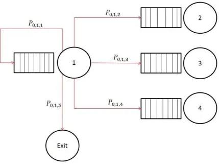
The simulation shell can be used for a queuing system with nodes and different types of customers that are called classes. Every node contains one queue and a chosen number of servers. Incoming customers arrive in the system at a queue from a node with Poisson distributed inter arrival times. The value λ of this distribution can vary per unique node-class combination. In Figure 1 an example with two nodes and three classes can be viewed. Every 𝜆𝑖,𝑗 represents the Poisson distribution parameter at node i for class j.
Figure 4.6: New Arrivals
When customers reach the front of the queue of their node, they will go to the first free server. The service time at a specific node depends on both the node itself and the class of the customer. A distribution can be chosen from a predetermined list of possibilities. In this project, only the exponential and deterministic distributions were used. Every node-class combination contains a unique distribution of service times.
27
Figure 4.7: Node Transition Probabilities
This diagram can be drawn for every different class and every different node. The variable 𝑃𝑘,𝑚,𝑛 represents the probability for a customer from class k to go from node m to the queue of node n. Of course, for every k and m the following constraint should be taken into account:
∑ 𝑃𝑘,𝑚,𝑛
𝑛
= 1 (26)
In summary, the simulation consists of different classes of customers, who each have their own arrival rates per node, service distributions per node and transition probabilities from each node.
4.3.2 Model
28
Figure 4.8: Clinic with Follow Up Structure
This was translated into a simulation point of view (See Figure 4.9). All new patients enter the system at the queue before the clinic node (1). The service represents the given appointment slot. After service a patient can either be discharged or being assigned a follow up. The follow up pause node (2), holds every patient for the time until the new appointment should take place. The service time at node 2 exactly represents the time there should be between appointments. Everybody can enter service at once in this node. To make sure there will never be a queue, this node has an infinite capacity. After service at node 2 all the patients return to the back of the queue for node 1.
Figure 4.9: Simulation Model
For both new patients and follow ups the waiting time in the queue for node 1 corresponds exactly to the waiting time between requesting an appointment and attending an appointment. In this section only the demand, the number of requested appointments at node 1, is of importance. Therefore node 1 contains (for now) infinitely many servers and there will never be a queue.
The relevant information needed for this model can be obtained from the historic data. Firstly the process of newly arriving patients needs to be established. Then the probabilities for patients to be discharged and the average time needed between two appointments are needed.
4.3.3 Goals
29
obtained are the monthly numbers of appointments for both newly arriving patients and follow up patients.
4.3.4 Description of Methodology
Most of the parameters that are needed to carry out the simulation can be gained from historic data. To determine a distribution for the length of the follow up pause the model needs to be refined by analysing the follow up structure. After refining the model there will be looked at the suitability of the existing simulation shell. Necessary changes will be made and explained. Finally the historically based input parameters will be discussed.
4.3.4.1 Follow Up Analysis
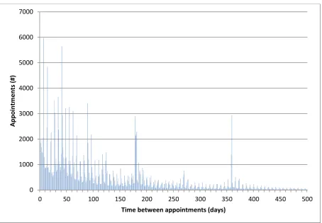
[image:32.595.72.527.331.646.2]From the historic data, the times between appointments when a follow up was assigned have been retrieved. These times were summarized in the bar graph below. The horizontal axis represents the number of days between two appointments and the vertical axis represents the number of appointments that had a follow up after corresponding amount of time.
Figure 4.10: Time between Appointments
It can be concluded from this graph that there are a few clear peaks. Because the first peak can be originated from did not attendees that had to get a rearrangement as soon as possible, this project focused on the other four peaks. The shorter the time between two appointments, the larger the chance of being delayed was according to target dates and estimation. Therefore the first two peaks were adjusted a little and the second two were not. This means the follow up patients can roughly be ordered in the following four categories:
0 1000 2000 3000 4000 5000 6000 7000
0 50 100 150 200 250 300 350 400 450 500
Ap
p
o
in
tm
e
n
ts
(#)
30
Table 4.5: Categories of Follow Up Patients
Category Time between follow ups
1 30 days
2 90 days
3 180 days
4 365 days
This seems appropriate since it corresponds with one month, three months, six months and a year of follow up time. It is also in line with the optimized weight values obtained when using Moving Average to forecast. The strong relationship between two moments in time with three months in between is hereby explained. In the simulation the patients can now be divided in these four categories, in other words: classes.
4.3.4.2 Changes to Existing Simulation Shell
The four different classes of patients can easily be implemented in the existing simulation shell. The only thing that has to be added to Figure 6 is that the black lines (except the one for new patients) now consist of four different classes of patients. These four different classes of patients can now all have their own distribution of pausing time at the Follow Up Pause node and their own chances of being discharged.
The problem that arises is about the changes amongst classes. It was concluded from the historic data that a lot of patients have different lengths of time between follow ups in the same pathway. For example, a patient could be seen every month for a year, but after that the patient could go back to being seen only once every three months. In this case the patient should switch class in the simulation.
31
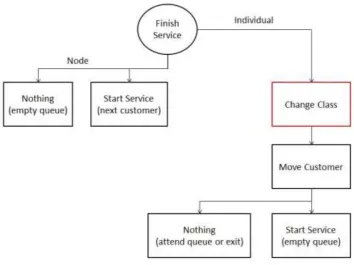
Figure 4.11: B event 2 after Class Change
It is important to conclude that, after a patients has finished service, the class will be changed before it is decided where the patient will go afterwards. Since the transferring probabilities are dependent on the class, the new class influences the following movement of the patient. Because of the complexity of the code, a lot of pieces of the code needed to be changed. Changes were made to “Simulation”, “Individuals”, “Data Records” and “Node”.
4.3.4.3 Input Parameter File
To run the simulation, some parameters have to be determined. As discussed earlier, in this project two nodes and four follow up classes will be used. In addition to those four follow up classes (class 0,1,2 and 3) a class for newly arriving patients (class 4) and a class for exiting patients (class 5) are used. For all combinations, the arrival rates, service times, class changes and node changes need to be determined.
The most logical is to start with the arrivals into the system. The way the simulation is set up the arrivals need to be per class and Poisson distributed.
From the historic data could be retrieved when in the last years the appointments of new arrivals have taken place. This turned out to be on average 1.12 a day. Because of the target dates set by the government, there can be assumed that new patients have been prioritized and that this number is therefore fairly accurate. Since a separate class for all new arrivals was created, it holds that 𝛌𝒊,𝒋 = 0 for both nodes i and for all classes j except for class 4. New patients always arrive at the node that represents the clinic (node 1). After all nobody can start with waiting for a follow up appointment without having been seen for a first appointment. Therefore the parameter 𝛌𝟏,𝟒 = 1.12 at node 1 for class 4 patients.
32
with the time until the next follow up should be. For every patient the pause time until the next appointment starts immediately, consequently node 2 needs infinitely many servers as well. With μ𝑖 representing the service time for class i, the service times at node 2 were set to 𝛍𝟎 = 30 days, 𝛍𝟏 = 90 days, 𝛍𝟐 = 180 days and 𝛍𝟑 = 365 days. Class 4 and 5 patients will never enter node 2 because of the way the simulation is set up. Class 4 patients enter the system at node 1 and will be changed into another class at the end of service at node 1. Class 5 patients leave the system with probability 1 from node 1 and since the class change takes place after service, class 5 patients will never have service at any node.
As mentioned in the previous paragraph, classes of patients can change during one pathway. For the changes amongst classes two matrices are used; one for each node. At the follow up pause node (node 0), no class changes are made. This matrix is an identity matrix. For the class changes at the clinic node (node 1), changes within pathways were analysed in the historical data. The percentages retrieved from the historical data for the 4 follow up classes were as follows:
(
0.59 0.24 0.10 0.07 0.19 0.37 0.29 0.15 0.11 0.20 0.37 0.32 0.12 0.16 0.29 0.43 )
It was expected that most follow up patterns would stay in the same category. Therefore, the numbers on the diagonal were expected to be highest. This is true, though without a large margin. There is a possible explanation for this however.
In which category a follow up was placed, was based on the time until the next appointment was booked. In some cases, this time might be longer than it should have been according to the original target date, causing the follow up to end up in a larger class than it should have been. In this project there was target date information available on a small portion of the original dataset. From this information it could indeed be concluded that a small percentage (about 6%) of the appointments should have ended up in a smaller class. Therefore the numbers were corrected to create a stronger diagonal. The class change matrix was adjusted to the following:
(
0.65 0.21 0.08 0.06 0.19 0.43 0.25 0.13 0.11 0.20 0.43 0.26 0.12 0.16 0.29 0.43 )
Of course it was taken into account that the further a number was from the diagonal, the less it should be changed. After determining this matrix the remaining two classes have to be examined. Of course no patient will ever change to a new arrival class patient. The column which represents changing to class 4 should therefore contain only zeros.
Class 5 represents discharge rates. This means the last column contains the chances of getting discharged per class. The discharge rates were first based on the historical data column “event outcome”, in which a specific code a discharge meant. After analysis however, it was discovered that this information was not accurate enough and yielded too low discharge rates. Revised discharge rates were then based on all the patient-pathways that did not have any appointments after 2013. This means this patients could only still be in the system when they had a 2 year follow up to begin with, which is highly unlikely compared to the concluded follow up structure.
33
( 0.14 0.15 0.19 0.25 0.33
1.0 )
The first number for example can be interpreted as follows: 14% of the patients coming from a follow up pause of type 0 will be discharged after service at the clinic. The fourth row gives a relatively high number, this seems logical because this is the chance of a new arrival immediately being discharged. The last number of the column is irrelevant because, as mentioned before, a class 5 patient will never enter any service and therefore never again change class.
Last, if new patients are not immediately being discharged, they need to be sorted into one of the four follow up classes. To be able to divide the arrivals between the four classes there was looked at the historical data again. Around a quarter of the inter appointment times falls into every category. In other words, they are evenly divided within the system. Therefore the choice was made to divide the arriving patients evenly in those four categories.
Everything discussed about class changes can now be combined in one matrix for node 1. The percentages from the matrix above have to be recalculated, to make sure every row still adds up to 1 combined with discharge rates:
(
𝟎. 𝟓𝟓𝟗 𝟎. 𝟏𝟖𝟎𝟔 𝟎. 𝟎𝟔𝟖𝟖 𝟎. 𝟎𝟓𝟏𝟔 𝟎. 𝟎 𝟎. 𝟏𝟒 𝟎. 𝟏𝟔𝟏𝟓 𝟎. 𝟑𝟔𝟓𝟓 𝟎. 𝟐𝟏𝟐𝟓 𝟎. 𝟏𝟏𝟎𝟓 𝟎. 𝟎 𝟎. 𝟏𝟓 𝟎. 𝟎𝟖𝟗𝟏 𝟎. 𝟏𝟔𝟐 𝟎. 𝟑𝟒𝟖𝟑 𝟎. 𝟐𝟏𝟎𝟔 𝟎. 𝟎 𝟎. 𝟏𝟗 𝟎. 𝟎𝟗 𝟎. 𝟏𝟐 𝟎. 𝟐𝟏𝟕𝟓 𝟎. 𝟑𝟐𝟐𝟓 𝟎. 𝟎 𝟎. 𝟐𝟓 𝟎. 𝟏𝟔𝟕𝟓 𝟎. 𝟏𝟔𝟕𝟓 𝟎. 𝟏𝟔𝟕𝟓 𝟎. 𝟏𝟔𝟕𝟓 𝟎. 𝟎 𝟎. 𝟑𝟑
𝟎. 𝟎 𝟎. 𝟎 𝟎. 𝟎 𝟎. 𝟎 𝟎. 𝟎 𝟏. 𝟎 )
Apart from class changes, transitions among nodes occur after service. Information about this is stored in so called transition matrices. Per class there was a 2x2 transition matrix created. For class 0 until 3 this matrix is the same and looks like the following:
(𝟎. 𝟎 𝟏. 𝟎𝟏. 𝟎 𝟎. 𝟎)
This means every patient is always transferred to the other node than where the patient was coming from. As discussed earlier, nobody can ever change into a patient of class 4, so the transition matrix for class 4 is never used, thus irrelevant. The transition matrix for class 5 is interesting however. All the patients with this class leave the system immediately. This means the transition matrix will only consist of zeros. The simulation will make all remaining patients leave the system, which will be all of them in this case.
Since at both nodes the amount of servers is set to infinity, there will never be any queue. Therefore the queue capacity is irrelevant and can be set to infinity as well.
The simulation time has to be a few years to warm up the system, because of the relatively large amount of follow up time for class 3 patients. Thus, a reasonably high amount of 5000 days was used as simulation time.
4.3.4.4 Warm up time