LOCALIZATION OF DESIGN:
THE EFFECTS OF
COUNTRY SPECIFIC
GRAPHICAL WEB DESIGN
ELEMENTS ON THE
EVALUATION OF
HOMEPAGES
Yassine Mountassir
COMMUNICATION SCIENCE
EXAMINATION COMMITTEE Dr. Thea van der Geest Dr. Somaya Ben Allouch
DOCUMENT NUMBER -
Table of content
Title page ... 1
Table of content ... 2
Summary ... 4
1. Introduction ... 5
2. Theoretical framework ... 8
3. Study overview ... 10
Part I: ... 12
Introduction ... 13
4. Selection of websites ... 15
5. Graphical web design elements in a global setting ... 17
5.1 Spatial organization ... 18
5.1.1 Orientation of the webpage ... 19
5.1.2 Lay-out of the homepage ... 21
5.1.3 Placement of specific content units ... 22
5.2 Text design ... 22
5.2.1 Textual presence ... 24
5.2.2 Typography ... 24
5.3 Color ... 25
5.3.1 Color scheme ... 26
5.3.2 Background. ... 27
5.4 Multimedia ... 28
5.4.1 Images ... 29
5.4.2 Animation ... 29
5.4.3 Video ... 29
5.4.4 Logo ... 30
5.5 Operationalization ... 30
6. Study 1: The comparative content analysis ... 32
6.1 Sample ... 32
6.2 Method and intercoder reliability ... 33
6.3 Results ... 34
6.3.1 Elements that are statistically different merely on the country level ... 36
6.3.2 Elements that are statistically different on both the country and domain level ... 38
Part II ... 43
The user experiment ... 43
Introduction ... 44
7. Selection of evaluation criteria ... 45
7.1 Visual appeal ... 46
7.2 Perceived usability ... 47
7.2 Familiarity ... 48
8. The user experiment ... 49
8.1 Participants ... 49
8.2 Procedure ... 50
8.3 Stimuli ... 51
8.4 Questionnaire ... 54
8.4.1 Instrument ... 54
8.4.2 Pre test ... 55
8.4.3 Pretest outcome questionnaire ... 56
8.5 Plus minus usability study with think aloud protocol ... 57
8.5.1 Instrument ... 57
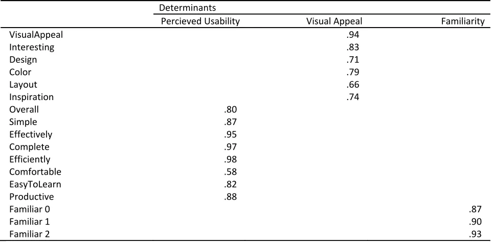
9. Results ... 59
9.1 Questionnaire ... 60
9.1.1 Determining the three determinant scores ... 60
9.1.2 Exploratory analysis of determinants ... 62
9.1.3 Significant differences on country, domain and interaction effect level. ... 62
9.1.4 Exploring the significant differences in the three determinants ... 63
9.1.4.1 Differences on a country level ... 64
9.1.4.2 Differences on a domain level ... 65
9.1.5 Test of homogeneity of the sample ... 67
9.2 Plus minus usability study with a concurrent think aloud protocol ... 68
9.2.1 Methodology ... 68
9.2.2 Comparing determinant scores with number of statements ... 69
9.2.3 Number of comments per category ... 70
9.2.4 Comments per category by country ... 72
9.3 Analysis results of both user experiments ... 81
10. Discussion ... 85
Study I: ... 85
Study II: ... 87
11. Conclusions ... 91
References ... 93
Summary
Purpose:
In today’s ever expanding digital world which knows no regional boundaries or time constraints, web designer have the difficult task to provide us with websites that need to be efficient and effective in this global environment. For web designers, coping with this challenge has put forward the dilemma of either standardizing or localizing web sites. Previous studies have shown that local customs in web design exist. However no systematic study has been done on the effects of these local designs on user preference. This study therefore investigates the effect of country specific graphical web design elements on the user’s evaluation of homepages.Method:
Two studies were conducted to answer whether local design had an influence on the evaluation of homepages. First, a content analysis of in total 90 websites, from three countries (South-Korea, The Netherlands, and The United States) and within three domains (news, education, and government), was conducted to explore differences in the use of graphical web design elements. Second, a user experiment was conducted to explore the effects of the country specific graphical web design elements found in the content analysis. In total 65 Western European participants evaluated ten stimuli of which nine either resembled Korean, Dutch or American design. The evaluation consisted of a questionnaire on the visual appeal, perceived ease of use, and familiarity of the homepages and a plus-minus usability study with concurrent think aloud protocol.Result:
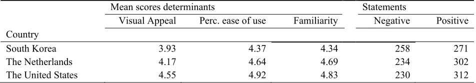
In the comparative content analysis, twelve out of the twenty-two graphical design elements were statistically different. Which indicate there are differences in the design of websites between the three countries used. These differences were incorporated in the stimuli used in the second study. The findings of the second study show that country specific graphical web design elements have an influence on the evaluation of homepages. The Western European participants evaluated the American homepages as statistically more appealing and perceived them as easier to use than both the Dutch and Korean homepages. Furthermore, the Dutch homepages were perceived as statistically easier to use than the Korean homepages. Last, both the Dutch as well as the American homepages were evaluated to be statistically more familiar that the Korean homepages. Additionally, a high correlation was found between all three determinants of the user evaluation. The data of the plus minus usability study showed that less interesting and homepages with fewer images were appreciated less, and also that color vibrancy plays an important role in the appreciation of a website.1.
Introduction
Over the past decades the internet has grown immensely, becoming the most popular medium of
communication around the world (Dong & Lee, 2008). From desktops computers to mobile phones, it has
nested itself in every aspect of our daily lives and due to its omnipresence and the capability to interact in
real time it has changed the way we live and work (Kim & Martinez, 2009). Therefore, geographical considerations and time constraints are no longer a major obstruction in conducting business globally
(Robbins & Stylianou, 2003). For web designers this provides a challenge, as messages need to be
efficient and effective globally within a twenty-four hour economy.
To overcome the challenge of accommodating messages to the international users, an effective
web design needs to address the different preferences that people from different geographical locations
have. Levitt (1983) proposed two options to address this obstacle, either standardize or localize the
system. Others scholars have proposed adaptations on these two solutions, for instance Day (as cited in
Fraterneli & Tisi, 2008) split localization up into two different groups. However, here the dichotomous
scale of localization versus standardization will be the regarded as the preferred scale when studying
messages intended for an international audience.
Even though it is almost thirty years ago that Levitt put forward the dilemma “only recently have
studies included performance criteria and several have demonstrated that an adaptation strategy is more
effective” (De Mooij & Hofstede, 2010, p.85). Unfortunately, no performance criteria have been used in
be of interest to study the effects country specific adaptations have on the evaluation of web pages. Even
more while in many recent studies it has been documented that both the content and the design of
websites are different between countries and/or cultures (Cyr & Trevor-Smith, 2004; H. Kim, Coyle, &
Gould, 2009; Zhao, Massey, Murphy, & Liu, 2003).
This study will address this gap in knowledge and explore the effects of country specific
graphical web design elements on the evaluation of homepages. Therefore, the research question of this
study is:
“What are the effects of country specific graphical web design elements on the evaluation of
homepages?”
Graphical design elements are chosen over content elements as we believe that design can be
assessed without any specific pre-requisites such as for instance language. We believe that the speed of
evaluation of the visual design of a website, as shown in recent publications (Lindgaard, Fernandes,
Dudek, & Browñ, 2006; Tractinsky, Cokhavi, Kirschenbaum, & Sharfi, 2006; Van Der Geest & Van
Dongelen, 2009), further illustrates that design rather than content is a good first contender for an
explorative study of the effects of country specific web design elements.
Here, a two stage model is used to investigate the effects of country-specific design elements.
First, a content analysis of in total ninety homepages from South Korea, The Netherlands, and The United
States will determine which graphical web design elements are country-specific. Thereafter, a user
experiment will determine the effects of these country specific web design elements on the evaluation of participants on visual appeal, perceived ease of use and familiarity.
The contribution of this paper will be in both the insight it provides in the need to localize design
as in the methodology used to determine the effects of country specific web design elements. By studying
the evaluation of localized web design, an empirical argument, either for or against localization, can be
made. Furthermore, this paper contributes to the literature as it provides a methodology to validate
the content analysis, these country-specific elements are studied to analyze their effects on users. The
2.
Theoretical framework
In 1983 Levitt stated that the world was becoming more and more alike due to all the technological
advances, even in spite of our firmly ingrained cultural differences. The author goes on to say that, to
have systems be effective in various cultures, either standardizing or localizing is the option to cope with
these technological changes. Since Levitt’s (1983) publication about the dilemma, the cultural
communication field has also been kept busy studying effective ways to design for cross cultural systems
(Aslam, 2006; Cyr & Trevor-Smith, 2004; De Mooij & Hofstede, 2010; Kondratova & Goldfarb, 2006). Research into cultural differences has ranged from studies on the most effective message in advertising
(Okazaki & Mueller, 2007) to developing a cultural universal color palette for web design (Kondratova &
Goldfarb, 2006, 2009). In the field of Human Computer Interaction (HCI), recent studies have
documented country specific elements within websites. However, little empirical research has been done
on the influence these differences have on the evaluation of these websites.
First, here a broader perspective on the user experience in web design is advocated. User
satisfaction has mainly been considered as stemming from great usability in the field of Human Computer
Interaction (Hassenzahl, Beu, & Burmester, 2001). Therefore, the focus traditionally has been on the
efficiency and effectiveness of applications (Lavie & Tractinsky, 2004; G. Lindgaard & Dudek, 2003). By
doing so it has neglected other relevant aspects of design such as visual appeal (Lavie & Tractinsky,
2004; Lee & Koubek, 2010). Lindgaard & Dudek (2003) propose that user satisfaction is not merely
influenced by usability but is also influenced by emotion, expectation, aesthetics and likeability. Such
with the system. Not just usability but visual appeal, expectation, likeability and emotion are all elements
that have an influence on the user and the user satisfaction.
Today, the increased interest in user satisfaction in web design has heightened the need to study
the influence of localization on user satisfaction. Here the focus will be on the influence the differences in
the use of graphical elements in homepages between countries have on the selected dimensions of user
satisfaction. Graphical design rather than content is chosen even though both are considered to be
important characteristics of websites (Huizingh, 2000; Robbins & Stylianou, 2003). In line with Faiola
and Matei (2005),we believe that, when culturally adapting websites, the less formal dimensions and thus
the design elements are more critical to investigate. For instance, Fogg, Soohoo, and Danielson (2003)
found that nearly half of their respondents assessed credibility of websites on overall visual design. In
similar vein, Lindgaard et al., (2006) show that websites are reliably judged within 50ms. This indicates
the ease of which visual design is assessed and the importance of the overall design of the website, as it is
judged within milliseconds. The influence of this immediate evaluation has not been established, thus
only speculations can be made as to whether users choose to use a website after their immediate
evaluation. However, when this is the case visual appeal should be studied intensively. This in
combination with the heightened interest in localization is the reason the influence of localization of
3.
Study overview
In the field of Human Computer Interaction, the literature on localization of design has mainly
emphasized investigation of cultural markers, a termed coined by Barber and Badre (1998). The authors
state that cultural markers are prevailing interface design elements within a given culture. As mentioned
earlier, several studies have sought and found these cultural markers through content analysis (Callahan,
2005; Cyr & Trevor-Smith, 2004; Kim & Martinez, 2009; I. Kim & Kuljis, 2007). Even though content
analysis is a well-established method in cross cultural research, due to its limitations of merely describing existing phenomena, it does not demonstrate what is effective with users (Baack & Singh, 2007; Taylor,
2005).
In this study a two-staged model is used to determine whether the use of country specific
elements have an effect on homepage evaluation.
First, a comparative content analysis is used to identify country-specific graphical design
elements. Second, an experiment is used to determine the effect country-specific graphical design
elements have on the evaluation of homepages. Several steps need to be taken to both find the country
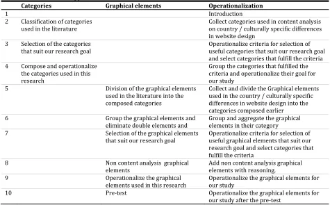
specific markers and also to evaluate if country-specific design elements have an effect on user’s
evaluation. In figure 3-1 we can see an adaptation of the model that was used by Fraterneli and Tisi
(2008) to find culturability guidelines. The model consists of seven steps. The first three steps are
necessary to find country specific design elements, these steps will be discussed in part I. The last four
steps are necessary to determine whether country specific design element have an influence on the user
evaluation, these steps will be discussed in part II.
In part I, the first steps will provide the websites necessary for the content analysis. The second
step will provide the graphical design elements that are analyzed in the content analysis. The third step is
the comparative content analysis, which will demonstrate which graphical design elements are used
significantly more in a specific country.
Part II will start with the fourth step, which is the selection of evaluation criteria to measure
which elements of user experience are used to determine whether country specific elements have an
influence on the user evaluation. The fifth step is to develop stimuli that we can be used to test whether
the differences found in the content analysis have an effect on the user evaluation. The sixth step is to
carry out a user based test to evaluate the influence of country specific design elements on the evaluation
of the user. This will be done through both a 17 item questionnaire and as a plus minus usability study with a concurrent think aloud protocol. The former will give quantitative scores where the latter will be
used to explore the participants’ choices in the questionnaire. The final step is to analyze the result of the
Part I:
Introduction
Part I will provide a detailed description of the steps taken to find country specific design elements. This
is crucial for the second part of this study as this will be the input for the stimuli used in the user
experiment. However, the selection and operationalization of the graphical elements used in the
comparative content analysis itself is also crucial, not doing this properly will not provide the information
necessary to identify country specific design element or will make the content analysis excruciatingly
difficult and/or time consuming. Therefore, the selection of graphical elements is based on related work
on country and cultural differences in web design.
As mentioned earlier, this study will focus on design rather than on content. Even though, web
design deals with creating fully functional websites that are built to deliver information and/or provide
access to tasks that are meaningful and have value to both the user and to the web site owner
(MacDonald, 2003). Consistent with past research here websites are split into content and design as is
done by Robbins and Stylianou (2003) and Huizingh (2000). Here the content of a website is the information presented on the website and the design is the presentation of aforementioned content.
Although, design is not merely concerned with the visual design of a website, it for instance also
encompasses the interaction design or the information architecture of the website, here we are merely
interested in the visual design of websites. Figure I-1 provides a visual representation of how the
Figure I‐1. Schema from web design to graphical elements
To get a grasp of what visual design is and out of which graphical elements it constitutes of, the
following chapters will discuss these questions. However, first the selection of website used in the
comparative content analysis will be discussed. Then the overview of the relevant literature on web design will be provided. This will provide insight into the field of cross cultural and cross country
research on graphical design elements of websites. From these graphical design elements, categories and
graphical elements are selected for use in our comparative content analysis. These graphical elements will
be discussed and an operationalization of both the categories as well as the graphical elements is
provided. Thereafter, the comparative content analysis will be discussed as well as its results. Last this
section will provide an overview of the country specific design elements that will be used in the user
4.
Selection of websites
Our focusing is not predicting preferable use of design elements. Instead, we are merely exploring
differences in the use of graphical elements between countries. By selecting websites for our comparative
content analysis we are framing our research and thereby making it manageable. The obstacle of
determining an appropriate selection of websites for a content analysis has been addressed by several
other studies. This because of the growing interest in cross-cultural design in the field of human computer
interaction (Lindgaard, Litwinska, & Dudek, 2008; Marcus & Gould, 2000). Even though we are not searching for cross-cultural but cross-country differences, here the relevant literature is used to find an
appropriate selection of website. In this study no explanation is sought for these differences within a
cultural framework as for instance is done by Cyr, Head and Larios (2010) in their study on colour appeal
in website design within and across cultures.
Here, a three country comparison is used, while a two country analysis, which seems to be the norm,
greatly decreases the studies generalizability. Furthermore, Steenkamp (2001) suggest that sampling on a
national level, when cultural factors are not part of the theoretical framework, is sufficient to generalize
one’s finding. Content analysis typically show a comparison between Anglo-Saxon and Asian websites,
here we chose to start with a comparison between South Korea and the Netherlands. These countries
represent very distinct cultures as determined by Hofstede (1980). However, both countries have an
extremely high level of broadband internet penetration. The Netherlands is ranked as the number one
country in fixed-broadband subscriptions per 100 inhabitants, with South Korea being fourth, being the
most active mobile internet subscriptions per 100 inhabitants. This paired with high level of economic
development in both countries leads us to believe that websites in these countries are both well developed.
Therefore, a comparison between these countries seems fit to find country-specific design elements.
However, as mentioned earlier, using three countries benefits the generalizability. Consequently, the
United States was added as a benchmark, as this country is often used in cross-cultural research. The
United States also has a high broadband internet penetration and is also economically well developed.
Together with the selection of the countries, three website domains were chosen to compare the
countries homepages. In this study , News & media, Government and Education were chosen from the
eight domains used in Barber and Badre (1998). For a better comparison this has been made more specific
and therefore, newspaper, municipality and university websites were chosen. Three domains were
selected to increase generalizability while comparing websites from too many domains may lead to see
effects that are not country-specific but merely domain-specific. The domains were chosen while we
believe that websites from these domains are well developed, are in the native language and are targeted
towards their own citizens. In case of the university websites, the native versions of the websites were
used instead of the more internationally oriented English versions.
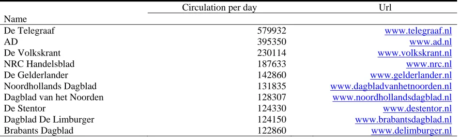
In total 90 websites were selected, respectively 30 from each country. Within these 30 websites,
10 came from each domain. All the websites corresponded to being in the top ten on the following
criteria. The homepages of the newspapers were selected on their papers equivalent circulation figures.
The municipality websites were chosen on their number of inhabitants. The university websites were chosen on their ranking on Top Universities.com. For a more detailed overview of the websites used and
5.
Graphical web design
elements in a global setting
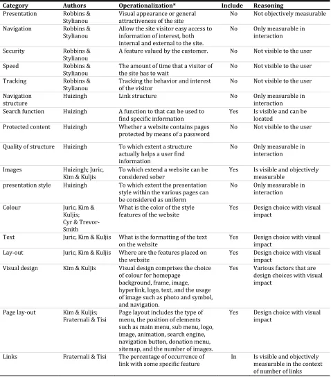
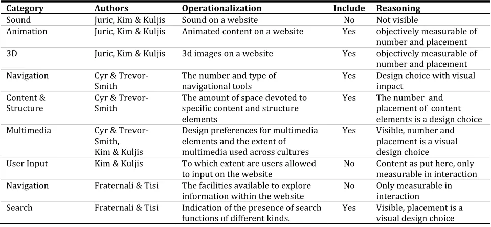
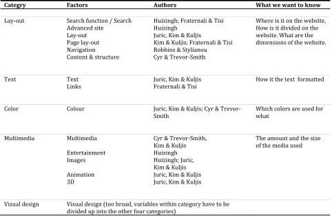
This section will provide insight into the graphical elements used for the comparative content analysis. These graphical elements were divided into several categories to get a better grasp of the graphical
elements as a whole and their relation to the evaluation of the user. The categories were determined after
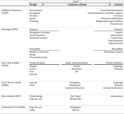
reviewing the literature , which led to an adapted version of the visual attributes classification used in
Juric, Kim and Kuljis (2003).
Due to the diverse interests in past research on country and cultural differences in web design, no
consensus has yet been reached on which categories and what elements should be included in a
comparative content analysis. Therefore, several classifications of web design elements were studied to
review what would suit our research needs. As the primary focus of this study is on visual design, the
categories used in other research were divided over a scale, ranging from design to content. When the
design categories of the various content analyses were aggregated we found that the division of visual
attributes used by Juric, et al., (2003) was almost congruent with the division of visual design we came up
with. Were Juric, et al., (2003) divide web design into three larger categories, visual attributes, audio
visual attributes and language attributes, here visual design of websites is divided into four categories,
spatial organization, text design, color and multimedia. In comparison to the study of juric et al., (2003) it
is advocated that when leaving out sound as an attribute, the two categories visual and audiovisual
as used by Juric, et al., (2003) is called multimedia, while in addition to images, we believe video,
animation are all factors that are part of the visual design of a website and can be seen as one category.
Furthermore, this study uses spatial organization instead of lay-out as we believe that lay-out does
not properly describe the category as it does not encompass all the graphical design elements that are
necessary to arrange the content of a website.
Last, the category of text has been renamed to text design, this merely has been done for
clarification purposes, to point out that solely the design of the text is of interest and not the text itself.
Therefore, thus again the four categories used here are spatial organization, text design, color and
multimedia.
This chapter will provide insight into the categories. First, per category a description of the
category will be provided. This will provide some insight into what the categories encompasses to get a
good grip on what is included in each category. Also the graphical elements that were either deemed as
important by us or were shown to be significantly different in the literature review will be discussed.
Furthermore it will provide insight into the graphical elements used in our comparative content analysis.
For a better more detailed description of which graphical elements were taken up in this study and the
justification of this choice, see appendix B. Last, this section will provide the operationalization of the
graphical elements used in the comparative content analysis.
5.1 Spatial organization
Spatial organization refers to the arrangement of content and design elements. It provides the visitor with
“a contextual and structural model for understanding and accessing information” (Cyr & Trevor-Smith, 2004, p. 1200). Therefore, spatial organization is closely linked to information architecture which
concerns itself with “the structural design of an information space to facilitate task completion and
intuitive access to content” (Rosenfeld & Morville, 2002, p. 4). However, spatial organization is
single page. Spatial organization does however provide structural models to understand and access
information. Spatial organization thus concerns itself with the arrangement of the web site element to suit
the needs of both the visitor as well as the website owner.
Alongside providing these structural models, spatial organization is also connected to the laws of
perceptual organization from the Gestalt psychology. The Gestalt psychology provides insight into the
principles that are utilized to show association between content. By using the Gestalt psychology
designers make apparent that some elements are associated with each other. This makes the searching for
information less strenuous as not everything has to be read thoroughly. Due to this association web
visitors estimate whether the information will be close to their current point of focus and then make a
judgment to search in the vicinity of their focus or scan further.
In this study spatial organization is constitutes out of the following topics:
Orientation of the webpage
Lay-out of the webpage
Placement of specific content units
Here we will provide an overview of the relevant literature on spatial organization in cross country
research.
5.1.1 Orientation of the webpage
The orientation of the webpage concerns itself with the reading direction of the webpage, page alignment,
and the dimensions of the website in general and therefore thus whether the website is horizontally or
vertically orientated.
According to Barbre and Badre (1998), the presentation of information and thus orientation of the
website has immediate implication for the usability of the website. In their study on culturally specific
design elements, they saw that the reading direction of Middle Eastern websites was mostly from right to
left as opposed to the left to right reading direction used in most other geographical locations. Unlike
used in this study the presentation of information is most commonly from left to right. However, we do
believe the reading direction should be considered when localizing a website, still the element is of no
specific use in the comparison of graphical elements within the selected countries.
Nevertheless, page alignment, which is closely related to reading direction, is incorporated in this
study. Page alignment, as used here, is concerned with the placement of the container1 of the website
within the browser. However, instead of the dichotomous scale of left to right or right to left of reading
direction, page alignment has a trichotomous scale. A page can be aligned on the left, in the center, or on
the right within the browser. Although it is hypothesized that there is a link between reading direction and
page alignment, the page alignment will be less obvious than reading direction. Therefore, it is of
interested to see whether there is a difference in the use of this graphical element.
Horizontal versus vertical orientation, another component of orientation, which is concerned with
the height to width ratio of the website, has previously been studied in a cross-cultural setting. In a study
on cultural similarities in the design of university websites containing 160 website divided over 8
countries, Callahan (2005) observed that Japanese websites were predominantly vertically orientated in
contrast to Austrian, Danish and Ecuadorian websites which preferred horizontal page design. A
limitation to the findings of a difference in orientation is that Callahan’s study uses one coder for the
complete number of web pages and an additional coder for merely ten procent of the websites. Even
though overall initial agreement was 85.1% this is something to be cautious of when interpreting the
results provided by the study. Juric et al. (2003) also observed differences in the orientation of websites. In their study to identify cultural markers making use of 40 websites half from Korea and half from the
United Kingdom, they observed that Korean websites were predominantly horizontally orientated and that
UK websites were predominantly vertically orientated. Juric, et al. (2003) did not provide statistically
significant differences but stated that the element is a strong candidates to be a cultural markers and that
their study can serve as a basis for further exploration. Therefore, we incorporate horizontal versus
vertically orientation in our study to explore the implications of orientation as a graphical element.
5.1.2 Lay-out of the homepage
The lay-out of a webpage concerns itself with the grouping and number of content units, for instance,
whether these are symmetrically aligned or the number of columns used to divide the content units. The
lay-out of the homepage is most connected with the grouping principles of the Gestalt psychology.
Proximity, similarity, uniform connectedness, good continuation, common fate, symmetry and closure
(Schiffman, 2000 (source from Hsiao & chou (2006))) are all the grouping principles that help divide the
homepage into comprehensible sections of information.
Symmetry, the Gestalt grouping principles that is easiest to operationalize in context of web design deals with the reflective symmetry of a homepage. Symmetry has been studied by Callahan
(2005), in the author’s study on cultural similarities in the design of university websites, also explored the
use of symmetry. Callahan (2005) observed that symmetry was not a cultural marker, on the contrary,
Danish and Swedish websites even seemed to avoid symmetry, which in turn can perhaps be seen as
“Scandinavian design” and thus a cultural marker. However, the graphical element is taken up in our
study, even though previous studies did not find a significant differences in symmetry.
Content units, which in web design is related to the Gestalt principles of perceptual organization,
with a connection to the grouping principles of proximity and similarity, are units on a website that are
visually grouped together to form an informative block. A news article or commercial areas with several
banners are examples of content units. Because of different viewing patterns found by Dong & Lee
(2008), the number of content units is of interest. The authors found that Korean web users employed a
different viewing pattern when looking at a webpage compared to American users. Specifically, Korean
users scanned the whole web page and showed non-linear scanning patterns in contrast to American users,
who use a sequential reading pattern to read from the center to the periphery of the page. To see whether
this difference in scanning also contributes to differences in the number of content units, we wanted to
incorporate this graphical element in our study. However, due to difficulties in agreeing on the amount of
5.1.3 Placement of specific content units
Other than the placement of these content units, spatial organization also concerns itself with the function
of these content units, where they are situated on the web page and how they are aligned. Menu
placement, and menu orientation are among those content units which are of interest when exploring
cross-country differences. Menu placement for instance seems to be significantly different across cultures
(Cyr & Trevor-Smith, 2004; Juric, et al., 2003; Kim & Martinez, 2009; H. Kim, et al., 2009; I. Kim &
Kuljis, 2007). For instance, in their comparison of German, Japanese, and United States web sites
characteristics of in total 90 websites, Cyr and Trevor-Smith (2004) found that Japanese websites had statistically less menus on the left compared to the other two countries. Kim and Martinez (2009), found
that the website of Ford had more menus on the right on its European websites than it did in the other
country clusters. Furthermore, Asian Pacific sites had more menus on the left for the same Ford website.
Due to these contradicting conclusions drawn by the aforementioned authors, these findings raise an
interest in the placement of the menu on web pages. Also of interest is where the logo and the most
prominent image of the website are positioned as we believe the consensus of where to place these on the
homepage might differ between the countries. Therefore, the placement of the specific content units is
incorporated as graphical element in this study.
5.2 Text design
The category text design deals with the visual design of the text on a website. With the introduction of the
computer, the internet and the rapid dissemination of these vessels of information, the volume of material
that we read from screen has increased (M. C. Dyson, 2004) . Publishing itself has moved from the print
shop to the desktop. The relative ease of manipulating text with desktop publishing software has made
text design independent from the colossal cumbersome mechanical machines used to create documents in
the past (Brumberger, 2003). The ease with which documents can be created has made information on the
to convince readers to start and, maybe even more important, continue to read information. Therefore,
presentation of text on screen has become an integral part of web design as well.
Since its conception, the internet has evolved from the type driven medium it once was. However,
remarkable little research has been done on text design for web pages or the inherent impact of text design
for displays on visual appeal. An explanation for the limited amount of research is the suggestion that the
knowledge of design for print can be translate to screen (M. C. Dyson, 2004). From early on, the
assumption, of translating knowledge of print design to web design, has been questioned by for instance
(Kolers, Duchnicky, & Ferguson, 1981) whom stated that no complete inference can be made from the
old to the new media.
Another problem for text design for screens is the rapid evolvement of screens and their
possibilities (Nebeling, Matulic, & Norrie, 2011) .Whereas it seems, in ancient history, the screens were
primarily black and green, nowadays there are screens that emulate the characteristics of paper, screens
that can be rolled up or screen that are over 30 inches in diameter. The latter displays bring a whole new
set of problems to text design, e.g. non-scalable elements which lead to an increased amount of unused
screen real estate and unnecessary scrolling (Nebeling, et al., 2011). Therefore, research done on reading
from screens may have questionable validity due to the fast changing screen landscape.
Due to the limited amount of research, this paper will use both screen design and paper design
references to determine the graphical elements in this research. We use the term text design to express the
design choices that are concerned with the visual design and presence of text on a website. This ranges from the font of the headline to the amount of text on a website. Text design as used here concerns itself
with the following topics:
Textual presence
Typography
Here we will provide an overview of the relevant literature on spatial organization in cross
5.2.1 Textual presence
Textual presence concerns itself with the amount of text on a web page. Textual presence has not been
studied extensively in an international comparative study. However, we consider textual presence a factor
that might be of essence when localizing a web page. Similar to content areas, textual presence might
correlate with the holistic versus analytical cognition as presented by Nisbett et al. (2001). Here the
holistic minded people used a scanning pattern to explore web page, consequently they had less
difficulties dealing with more information on a web page. Therefore, it is presumed that they are also
capable of dealing with more text on a web page. To see whether difference in web page scanning also
contributes to differences in the text to image ratio, this graphical element is included in our study.
5.2.2 Typography
Typography concerns itself with the selection of typefaces, point size, line length, line spacing, tracking,
kerning, and color of text. Within the localization research, typography has never been a well studied
topic. Even within the entire field of human computer interaction typography has not played an important
role. Dyson (2001) state that “empirical research on reading from screen has spanned more than 20 years,
but progress in developing a sound body of knowledge on the effects of text formats is slow”. Similarly
Nielsen states that extensive research has been done into the effect of various typographical variables on reading of printed material, but that this is not the case with for information presented on screen.
Without being studied extensively typography is an important part of web design, it facilitates
searchability and readability of web pages, it can enhance speed of reading and in line with Dyson (2004)
it can alter visual appeal. To see whether difference in typography also contributes to differences in visual
appeal this graphical element is taken up in our research.
Link typography is the same as typography, however instead of normal text it concerns hyperlinks.
Links are a vital part of websites and the visual design of hyperlinks often uses the colors used in the
information they are looking for and thus are of essence in usability design. Therefore, it is interesting to
see whether there are country specific elements within the link typography.
Hyperlink colors was shown not to differ significantly according to Kim and Kuljis(2007), although
Cyr and Trevor-Smith(2004) found that Japanese sites used the most visual cues when a link has been
visited. However, as we know that we are going to use images in our experiment we will not take in
account visited links while we will be unable to incorporate these in our experiment as merely static
images will be used.
5.3 Color
Color is part of how we perceive the world, it helps us distinguish objects, it alerts us when necessary and
it is another factor that has to be considered when designing a website. Here of interest is to see whether
differences in the use of color can be distinguished within the selected websites. Choices in colors for a
website are usually limited to the corporate color scheme. However, when no such thing exists, color
associations, for instance the association of blue with water, can be used to develop a color congruent
website (Alberts & van der Geest, 2011).
However, different color associations are developed within various contexts, which makes
understanding color responses more complicated (Grossman & Wisenblit, 1999). For instance green
which is associated with the permission to continue in traffic which is good, and within some fruits such
as bananas or tomatoes it’s associated with unripe, which is bad.
Valdez & Mehrabian (1994) have demonstrated that within context, colors influence emotions.
Bottomley and Doyle (2006) showed that the appropriate choice of color can bring inherent and
immediate value to a brand, while the logos used in their study were valued to be more appropriate when the right color was chosen. Alberts & Van der Geest (2011) demonstrate that color has an influence on
trustworthiness. However, the authors note that within some context, the color scheme might be more
Therefore, the conclusion is drawn that color can elicit emotional responses and also influence
perception of websites, but it is dependent of context. Researchers suggest that our emotional reactions to
color have an evolutionary origin, however, context and the association of color within that context are
also believed to be learned as stated by Grossman & Wisenbilt (1999). Culture can therefore play an
important role in how color is perceived and appreciated as is shown in Aslam (2006) in his review of the
psychological and socio-cultural associations and meanings of color in a cross-cultural marketing
perspective. Color can thus be an important factor when designing websites.
The existing literature on website color which takes geographical location / culture in account is
presented here. Here we divide color up into the following two categories:
Color scheme
Background color
5.3.1 Color scheme
The color scheme of a website is used to distinguish the most prominent colors on the website. With color
scheme, we are looking for differences in the use of colors on websites in general. In their study for an
international color palette for cross cultural websites, Kondratova and Goldfarb (2006) suggest the use of
a palette of ten colors to globalize the website. Although Kondratova and Goldfarb (2006) suggest the use
of an international color palette, they also provide some colors that could be used to localize for specific
countries. Thus suggesting that not all colors are appreciated equally in different countries.Specific colors
were also found by Badre and Badre (1998). The authors observed that Israeli and Lebanese websites
made heavy use of the color green. Furthermore, Barber and Badre (1998) observed that governmental
websites mostly used the color of their national flag. The exceptions were Brazilian websites, which used
very bright colors as opposed to the colors of the national flag.
Callahan (2005) observed that Danish websites predominantly used a color scheme which was
dominated by shades of blue. The authors studied cultural differences and similarities in the design of
schemes, various shades of blues, of which some were related to nautical themes, and the other scheme
were various shades of brown. The Greek sites also used toned down colors. Similarly, Japanese sites
used a lot of pastel colors in their websites, where Ecuadorian sites used rather bright colors.
Callahan(2005) also observed that Malaysian websites also used vivid colors and also used a large
number of colors. Kim and Martinez (2009) observed that Yahoo used the smallest number of colors on
their European websites, in their study on differences in visual content of parent and local websites for
U.S. brands. Cyr and Trevor-Smith(2004) also found that German websites used a limited range of colors
such as shades of blue and purple, as well as white.
Even though we assume the color scheme of a website to be very important, due to the small sample
size of 90 website believe that we cannot make an accurate estimate of what the preferred color scheme
within the countries is and therefore it is not incorporated as a graphical element in this study. However,
the main color used on the website is taken in as a graphical element.
5.3.2 Background.
The background of a website might not always be the most prominent visual cue but it’s one of the most
studied visual cues when it comes to color. Several studies showed that white is the most predominant
choice throughout all cultures / countries (Callahan, 2005; Cyr & Trevor-Smith, 2004; I. Kim & Kuljis,
2007). However, Callahan (2005) found that Japanese websites use pastel colors, when white was not
selected as the background color. Juric et al.’s (2003) observed that most of the observed Korean web
sites in their study used a white background, whereas a variety of background colors, including blue, red,
green, orange, and black, was characteristic of British web sites. This shows that several studies have
found that background can be a marker of international differences, and hence we will examine whether
this still holds true and whether the domain has an influence on it, therefore background color is included
as a graphical element in our research. Furthermore, we also include the background of the container of
the web site as this might also be different. Last, we also include whether the background is an image or
5.4 Multimedia
From being a text orientated medium, website have evolved into a mix of print and television. Multimedia
therefore plays an important role in web design. Currently, when looking at websites, one is presented with a surplus of images, videos, graphics, and other multimedia. Today, the choice of content is not
merely what to write, but the selection of pictures, or even videos, that accompany the text has become
essential as well. Content has become much more visual and thereby changing how we design websites.
With the completion of the development of HTML5 in sight, one can see that multimedia is becoming so
crucial to web design that even the mark-up language is changing to facilitate the use of multimedia on
the web.
From a research point of view, multimedia is hard to categorize as either content or visual design.
The distinction can be difficult while some elements are immersed in the design of the website and thus
more static of nature making them more design than content. On the other hand, other elements could be
characterized as content, for instance a news photos, as these are more dynamic of nature while these can
change as the news changes.
However, as with colors, multimedia can elicit an enormous amount of emotions of which appeal
is one as for instance is shown in the study of Cyr, Head, Larios, & Pan (2009) in their study on the
effects of human images in web design. They also show that these human images also lead to different
responses in different countries. Similar to this observation, Riegelsberger & Sasse(2002) claim that the
use of an image and / or other rich media can elicit different affective responses. Therefore, one needs to
be very careful when selecting these. We have tried to avoid getting into the implicit meaning of the
multimedia and merely describing the elements in size, number of use and which medium is used.
We use the following categorization of multimedia
Images
Animation
Video
Logo
5.4.1 Images
Here the text to image ratio is taken into consideration. In their search to find cultural markers, Barber and
Badre(1998) noticed that Lebanese websites were mainly text based. In their search for cultural
manifestations, Kim and Kuljis(2007) found that Korean sites use a lot more images than websites from
the USA. However, this proved to be difficult to assess properly and therefore the text to image ratio was
chosen to measure the presence of images on a homepage.
5.4.2 Animation
In contrast to images here the interest does not lie in the number of images, but of more interest is
whether the homepage uses animation. Cyr and Trevor-Smith (2004), found that US websites used
significantly less animation compared to German and Japanese websites. Although Cyr and Trevor-Smith
(2004) did not find a significant difference in the use of multimedia, streaming video and sound across
cultures, Zhao (2003) found that animated content and floating banners were significantly different for
Chinese and US websites. Furthermore, Callahan (2005) also found that Malaysian and Ecuadorian
websites used a lot of animation compared to other countries. Therefore, animation should be
incorporated as a dichotomous graphical element in this study. However, due to limitations in the
development of the stimuli, as merely images are used to assess homepages, this graphical element will
not be used in the comparative content analysis. However this graphical element should be of interest when developing or studying websites.
5.4.3 Video
As with animation, video should be categorized as a dichotomous variable. The amount and use of
streaming video on websites has been shown to differ culturally. When looking for cultural manifestations
on websites Kim and Kuljis (2007) found that Korean websites had significantly more streaming videos
and animation than UK websites. Nearly the same conclusion was drawn by Kim, Coyle and Gould
that streaming video’s on a website were predictors of Korean group membership. However, as
mentioned earlier, due to the limitation in the development of the stimuli this graphical element will not
be used in our comparative content analysis.
5.4.4 Logo
Use of symbols and logos seemed to differ significantly according to Cyr and Trevor-Smith (2004). The
American websites used, in contrast to other countries, no local or cultural specific symbols. Japanese
sites however where the only sites to use Asian symbols, which is not remarkable while it was the only
Asian country in the three country comparison. What was remarkable was that it was the only country to use symbols for currency and that the symbols were significantly different as they were easy to
understand. However looking at symbols would be searching for differences in content rather than
design, therefore we will not look at this in our comparative content analysis. However, we do look at the
difference in the logo design as this might also symbolize differences in preference of either a visual
preference or a textual preference.
5.5 Operationalization
After the graphical elements were deducted from the literature as, they needed to be operationalized. The
literature and common sense were used to operationalize the graphical elements so there would be no
overlap between the various choices within the graphical elements. The author tested an initial draft of the
coding instrument by coding 90 homepages. Based on this test, coding problems were found and the
instrument was revised. Then a pilot test was held to check the intercoder reliability and after this the
coding workbook was revised again. Hereafter, the coding workbook was finalized, and it was believed
that the coding workbook would permit reliable coding with little training necessary for coders. Tabel
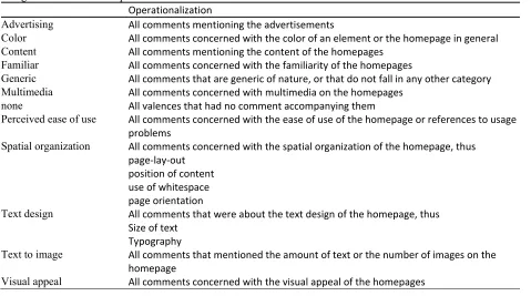
5-1 shows the final operationalization of the graphical elements.
Table 5‐1
The operationalization of the graphical elements
Operationalization
Spatial organization
Symmetry Two thirds of the container of the website is vertically symmetrical. Page alignment The page is aligned on the left, in the center or on the right.
Menu placement The menu is situated within this part of the container of the homepage.
Menu orientation The menu is either horizontally orientated, from left to right or vice versa or the menu is vertically orientated thus from top to bottom or vice versa.
Menu corners Are the corners of the menu angular or rounded or are there no corners
Logo placement In which section of the website is the logo of the city / newspaper / university situated? Thus not the logo of the website but the logo of the city / newspaper / university
Placement of the main image
In which section is the main image situated? E.g. the most prominent image
Orientation Is the website vertically or horizontally orientated (thus is the width < length of the homepage)
Dimensions of the website The dimension of the homepage in pixels in height and width
Text design
Typography The most prominent font of the homepage is in: Sans serif, Serif, Sans serif & serif, Mimicry, or other typography.
Text color title The color of the most prominent title of the homepage Text colors text The color of the most used text (body text) of the homepage
Link typography The most prominent font of the links of the homepage is in: Sans serif, Serif, Mimicry, or other typography.
Link colors Color of the most used link type of the homepage
Color
Main color The color most used on the homepage. customarily, black and white are not colors, unless this really sticks out
Menu color The color of the menu
Menu gradient The menu uses a gradient as part of its background Background color The background color of the entire homepage
Background image The website uses a background image or does it merely use a color Background container
color
The color of the background of the container of the homepage
Multimedia
Text to image ratio The ratio between text and images 10to90, 25to75, 50to50, 75to25, and 90to10 Logo What kind of logo is used, one with only an image, only text, or a combination of
6.
Study 1: The comparative
content analysis
To answer whether the graphical web design elements are used differently between countries, a comparative content analysis was conducted of in total 90 website homepages. The following chapter will
provide insight into this comparative content analysis. First, the collection of the sample of websites will
be described. Then the method and intercoder reliability will be provided. Then the results will be
described. Last, the country specific graphical web design elements will be provided.
6.1 Sample
The homepages of in total 90 websites, 30 from websites from the Netherlands, 30 from South Korea and
30 from the United States, were selected for coding. In the sample three domains of websites were used,
municipality, newspaper, and university websites. Per domain 10 websites were analyzed per country
thus resulting in 10*3*3 equaling in 90 websites. Screenshots of the homepages were taken on the 13th of
august 2011 by using the Screengrab add-on for Firefox 3.6. Furthermore, the websites were also
recorded with Flash and Javascript codes enabled with the Scrapbook add-on also for Firefox 3.6, this was
done for backup purposes as this captured the entire homepage with animation and pop-ups. The latter were not used in this study but could have been, would the choice of the development of the stimuli have
6.2 Method and intercoder reliability
As mentioned before, the author tested an initial draft of the coding instrument by coding 90 homepages.
Based on this test, coding problems were found and the instrument was revised. Thereafter, a pilot test
was held to check the intercoder reliability and after this the coding workbook was revised again. This led
to a finalized version of the coding workbook, and it was believed that the coding workbook would permit
reliable coding with little training necessary for coders. No pilot test was run hereafter and the coding was done by the first author and a second coder. The coding was done separately, the second coder was
handed a coding workbook, the screenshots and got an initial training of approximately an hour. After the
initial content analysis some of the intercoder reliability results were not above the cohen’s kappa mark of
.80 which is commonly used as a benchmark for good intercoder reliability and some revisions were
made to the coding workbook to get the intercoder reliability of all the graphical elements used to a
cohen’s kappa of .800 or above. Another round of coding on the final sample was conducted after an
additional training. The reliability results from the last round of coding are reported in table 6-1.
Table 6‐1.
The results of the reliability analysis performed by two coders
Cohen’s Kappa (n = 90 )
Spatial organization
Symmetry .80
Page Alignment .96
Menu placement .84
Menu orientation .68
Menu corners .97
Logo placement .96
Placement of the main image .84
Orientation .83
Dimension2 ‐
Text design
Typography .82
Link typography 1.00
Text color title .83
Text colors text .96
Link colors .89
Color
Main Color .90
Menu Color .92
Background Color .98
Background Image .95
Background container color .47
Multimedia
Text to Image ratio1 .93
Logo .75
1
Not independently coded, but after discussion this level of agreement was reached.
2 Not coded as is a determined by the dimensions of the screenshot that was acquired with the screenshot
extension for Firefox.
As can be seen from the Cohen’s kappas in table 6-1, we can conclude that merely three variables
are under the .80 mark, which is considered as good intercoder reliability (Ellis, 1994). Therefore, we
conclude that the intercoder reliability is good and thus continue to use the data gathered. For the
comparative content analysis, the coded scores were aggregated. This was done by randomly selecting
one of the two scores of the coders per item, thereby when they coded something equally this would not
make a difference, but when they coded something different it would be randomly selected which
judgment would be used in the rest of this study.
6.3 Results
The results of the comparative content analysis are provided here. Due to the small sample size instead of
loglinear analysis, here chi-square and fisher’s exact test were used. The assumptions of expected
frequencies of five or more could not be reached for the loglinear analysis, this greatly decreases the
power of the test and therefore chi-square tests were used. Due to the nature of this research as being
merely interested in the differences between countries this would suffice here. However, when the
chi-square tests were performed several of the graphical elements also did not meet the assumption of at least
an minimum expected count of five or more in 80% of the cells (Field, 2009). Therefore, when the
minimum expected count was less than five in more than 20% of the cells, the fisher’s exact test was used to spot differences. The data presented in Table 6-2 are the results of the comparative content analysis. If
a p-value of .05 or less is reached, the graphical element is considered to be statistically different and will
Because we are merely interested in the differences on the country level, this section will not
provide the graphical elements that were solely different on a domain level2. This section will first
provide a description of the graphical elements that were solely different between countries, then the
graphical elements that were different between both the country and domain level.
Table 6‐2.
The results of the comparative content analysis
Country Domain
df N χ² p χ² p
Spatial organization
Symmetry 2 90 .82 .75 7.48 .03*
Page alignment 2 90 1.06 .67 9.27 .01*
Menu placement1 ‐ .01* ‐ .05
Menu orientation 2 90 3.36 .29 1.92 .44
Menu corners 2 90 7.92 .03* 12.92 .00*
Logo placement1 ‐ .70 ‐ .21
Placement of the main image1 ‐ .00** ‐ .25
Orientation 2 90 8.09 .02* 24.04 .00**
Dimensions of the website2 (F)5.25 .00 (F)68.04 .00
Type
Typography1 ‐ .22 ‐ .00**
Link typography 3 90 9.73 .007* 15.20 .00**
Text color title1 ‐ .04* ‐ .04*
Text colors text1 ‐ .12 ‐ .00**
Link colors1 ‐ .00** ‐ .00**
Color
Main color 1 ‐ .01* ‐ .10
Menu color 1 .02* ‐ .29
Menu gradient 2 90 4.82 .11 .39 .89
Background color 2 90 9.99 .01** 5.04 .08
Background image 2 90 1.40 .59 7.90 .02*
Background container color1 ‐ .03* ‐ .19
Multimedia
Text to image ratio1 ‐ .03* ‐ .00**
Logo1 ‐ .86 ‐ .00**
*p < .05 **p < 0.01 1 Fisher’s exact test, 2F statistic instead of χ²
Due to an overlap in, the dimension of the website will not be taken into further consideration as
a web design element as the same consequences for the second study are gathered by the orientation
graphical web design element.
6.3.1 Elements that are statistically different merely on the country level
Here the graphical elements are presented that were different on the country level. The different chi
square and fisher’s exact test statistics of differences between countries will be presented. This gives
insight into which country or countries were different from the others.
Table 6-3 provides the elements that are different on the country level. These elements will be
discussed further in the following sections.
Table 6‐3.
The graphical elements that are different on merely the country level
χ² p
Placement of the main image* .01
Background color 9.99 .01
Main color* .01
Background container color 9.71 .05
Menu color 26.86 .02
*Fisher’s exact test was used instead of a chi‐square when the expected frequency was less than five.
To get a better overview of the differences see appendix D. Here a short description will be
provided to indicate the differences within the graphical element.
6.3.1.1 Placement of the main image:
There is a significant association between the
homepage’s country and the placement of the main
image on the website ( p = .01, Fisher’s exact
test).The Korean homepages have no main images
on the right side of the homepages, which is in
Table 6‐4.
Significant test of placement of the main image
χ² p
NLD‐KOR* .39
NLD‐USA** 5.52 .08
KOR‐USA * .00
*Fisher’s exact test **Df = 2 , n = 60
contrast with the US homepages where the main images are equal divided over the website, left, center
6.3.1.2 Background Color
There is a significant association between the
homepage’s country and the background color χ² (2,
N = 90) = 9.99, p = .01. The Korean websites most
often use white as a background color. The Dutch
homepages also use white most often as a
Table 6‐5.
Significant test of the background Color
χ² p
NLD‐KOR* 6.65 .02
NLD‐USA* .27 .80
KOR‐USA* 9.32 .01
*Df= 1 , n = 60
background color but grey is also used a fair amount. The American websites also use white the most, but
blue and grey are also used as background colors.
6.3.1.3 Main Color
There is a significant association between the
homepage’s country and the main color ( p = .011 ,
Fisher’s exact test ). On Korean and US homepages,
blue is most often used as the main color of the
website, where in the Netherlands red, blue and.
Table 6‐6.
Significant test of the main color
χ² p
NLD‐KOR* . 01
NLD‐USA* . 03
KOR‐USA* . 23
*Fisher’s exact test
green are all used and no specific color is used most as the main color of the website
6.3.1.4 Background container color
There is a significant association between the
homepage’s country and the background
container color χ² ( N = 90 ) = 9.71, p = .05. The
consensus of all the countries is that white is
chosen as the container color of the homepage,
Table 6‐7.
Significant test of the background container color
χ² p
NLD‐KOR* 6.07 .05
NLD‐USA* 4.64 .10
KOR‐USA* 6.67 .04
*Df= 2 , n= 60
but in both Korea and the US blue is also used as a viable option. Furthermore, Korean homepages only
use white and blue as background container color, whereas both the Dutch and U.S. homepages also use
6.3.1.5 Menu color
There is a significant association between the
homepage’s country and the background color of the
menu (Fisher’s exact test, p = .02). In Korea the
color most often used as the menu color is blue
whereas white and grey are most often used in
respectively the Dutch and the US websites.
Table 6‐8.
Significant test of the menu color
χ² p
NLD‐KOR* . 01
NLD‐USA* . 03
KOR‐USA* . 22
*Fisher’s exact test
6.3.2 Elements that are statistically different on both the country and domain level
Here the graphical elements are presented that were different on both the country and domain level. The
different chi square statistics of the differences between the countries are presented in table 6-9. This
gives insight into which country was different from the other two. To get a better overview of the
differences see appendix D, were visual aids are used to further explain the difference. Also a short
description will be provided to indicate the difference on the graphical element.
Table 6‐9.
The graphical elements that are different on both the country level and domain level
Country level Domain level
Graphical element χ² p χ² p
Menu Corners 7.92 .03 12.92 .00
Orientation 8.09 .02 24.04 .00
Text color title* .04 .04
Link typography 9.73 .01 15.20 .00
Link colors* .00 .00
Text to image ratio* .03 .00