DOI 10.1007/s10664-016-9437-5
Robust Statistical Methods for Empirical Software
Engineering
Barbara Kitchenham1·Lech Madeyski2·David Budgen3· Jacky Keung4·Pearl Brereton1·Stuart Charters5· Shirley Gibbs5·Amnart Pohthong6
© The Author(s) 2016. This article is published with open access at Springerlink.com
Abstract There have been many changes in statistical theory in the past 30 years, including increased evidence that non-robust methods may fail to detect important results. The sta-tistical advice available to software engineering researchers needs to be updated to address these issues. This paper aims both to explain the new results in the area of robust analysis methods and to provide a large-scale worked example of the new methods. We summarise the results of analyses of the Type 1 error efficiency and power of standard parametric and non-parametric statistical tests when applied to non-normal data sets. We identify paramet-ric and non-parametparamet-ric methods that are robust to non-normality. We present an analysis of a large-scale software engineering experiment to illustrate their use. We illustrate the use of kernel density plots, and parametric and non-parametric methods using four different soft-ware engineering data sets. We explain why the methods are necessary and the rationale for selecting a specific analysis. We suggest using kernel density plots rather than box plots to visualise data distributions. For parametric analysis, we recommend trimmed means, which can support reliable tests of the differences between the central location of two or
Communicated by: Tony Gorschek Lech Madeyski
[email protected] http://madeyski.e-informatyka.pl/
1 School of Computing and Mathematics, Keele University, Keele, Staffordshire ST5 5BG, UK 2 Faculty of Computer Science and Management, Wroclaw University of Science and Technology,
Wroclaw, Poland
more samples. When the distribution of the data differs among groups, or we have ordinal scale data, we recommend non-parametric methods such as Cliff’sδor a robust rank-based ANOVA-like method.
Keywords Empirical software engineering·Statistical methods·Robust methods· Robust statistical methods
1 Introduction
In 1996, the first author of this paper wrote a book on software metrics (Kitchenham1996). In the book chapter addressing statistical methods, her advice was to use box plots to visu-alize data. Box plots are based on the median and fourth statistics (which are similar to quartiles), so are more robust than any graphics based on means. If data were non-normal, she advised the use of non-parametric methods such as Kruskal-Wallis rank tests to compare multiple samples. With more complicated designs she advised using analysis of variance methods (ANOVA) with transformations if necessary.
Other software engineering researchers preferred to avoid the non-parametric tests rely-ing on the Central Limit Theorem, which proves that for any set ofNidentically distributed variables, the mean of the variable values will be approximately normal, with mean,μ, and variance,σ2/N. The Central Limit Theorem provides the justification for use of methods based on the normal distribution to handle small samples, such ast-tests. Their choice was justified by the observation that simulation studies had suggested thet-test and ANOVA were quite robust even if some of the variances within groups differed (Box1954).
In this paper, we discuss more recent studies of thet andF tests that show that if data sets are not normal (that is the data sets do not originate from a Gaussian distribution), the statistical tests may not be trustworthy. Statistical hypothesis testing can make two kinds of error. Type I errors occur when we reject the null hypothesis when it is in fact true, which is also called a false positive. Conventionally statisticians choose a probability level they believe is acceptable for a Type I error, which is referred to as theα-level. It is usually set to values of 0.05 or 0.01. Type II errors occur when we fail to reject the null hypothesis when it is in fact false, which is also called a false negative. Statisticians usually prefer the probability of a Type II, which is referred to as theβ-level to be 0.2 or less. A related concept is statistical power which is the probability of correctly rejecting the null hypothesis, so that power=1−β. Although the probability of either type of error is decreased by using larger sample sizes, aiming for a very lowα-level given a predetermined sample size will increase the achievedβ-level and reduce power. Studies of classical statistical tests under conditions of non-normality have shown that the assumedαlevels of tests are likely to be incorrect, and the power of various tests may be unacceptably low.
In a study of 440 large-sample achievement and psychometric measures data sets, Micceri (1989) found all to be significantly non-normal. He noted that data values were often discrete, while distributions exhibited skewness, multiple modes, long tails, large outlying values and contamination. In our experience, similar issues affect software engi-neering data sets.1The prevalence of non-normal data sets and recent studies showing poor
1There has not been a systematic review of all publicly available software engineering data sets. However,
performance of classical statistical tests on such data sets, suggest that empirical software engineers need a major re-think of the techniques used for statistical analysis. Recent statis-tical studies have not only identified analysis problems, they have also introduced methods of addressing these problems. In this paper we identify a number of robust methods that address the problems associated with non-normal data.2
Interest in robust methods dates back to the early 1960’s, when Tukey and his colleagues introduced the concept of Exploratory Data Analysis (EDA), see for example Mosteller and Tukey (1977) or Hoaglin et al. (1983). Tukey and colleagues pointed out that although classical statistical techniques are designed to be the best possible analysis methods when specific assumptions apply:
“... experience and further research have forced us to recognize that classical tech-niques can behave badly when the practical situation departs from the ideal described by such assumptions.”
Behrens (1997) summarises EDA as involving:
– An emphasis on understanding the data using graphic representations of the data. – A focus on tentative model building and hypothesis generation as opposed to
confirma-tory analysis.
– Use of robust measures.
– Positions of skepticism and flexibility regarding which techniques to apply.
Tukey and his colleagues introduced graphical techniques such as box plots and stem-and-leaf displays and emphasized the importance of residual analysis. All these methods are well known to empirical software engineering researchers. However, they were also concerned with the construction of new types of measures (see Section3.2and AppendixA), which have not been taken up by software engineering researchers.
They emphasized using robust and resistant methods that can be regarded as optimal for a broad range of situations. They proposed the following definitions:
– Resistant measures and methodsare those that provide insensitivity to localized misbe-havior in data. Resistant methods pay attention to the main body of the data and little to outliers.
– Robust methodsare those that are insensitive to departures from assumptions related to a specific underlying model.
In this paper we focus on robust measures and robust methods and regard resistance as being a property of such measures and metrics.
Tukey and his colleagues preferred robust and resistant methods to non-parametric meth-ods. They point out that distribution-free methods treat all distributions equally, but robust and resistant methods discriminate between those that are more plausible and those that are less plausible. To distinguish their approaches from classical methods, they introduced new terms such as batchas an alternative tosampleandfourthsas opposed toquartiles. Currently few of these terms are still in use with the exception of fourths, which are used in the context of box plots. In this paper we will introduce methods that arose from EDA concepts (specifically central location measures related to the median and trimmed means) but will also emphasize the use ofrobustnon-parametric methods as viable alternatives to
parametric analysis. An important issue raised in this paper is that under certain conditions non-parametric rank-based tests can themselves lack robustness.
We illustrate the new methods using software engineering data and analyse the results of a large scale experiment as an example of the use of these techniques. However, before considering the robust analysis methods, we introduce the use of kernel density plots as a means of visualising data. These can provide more information about the distribution of a data set than can be obtained from box plots alone.
Other researchers have started to adopt the robust statistical methods discussed in this paper, e.g., Arcuri and Briand (2011), El-Attar (2014), Madeyski et al. (2014) and Madeyski et al. (2012). In particular, Arcuri and Briand (2014) have undertaken an important survey of statistical tests for use in assessing randomized algorithms in software engineering. We agree with many of their recommendations (particularly their preference for non-parametric methods), but, in this paper, we focus on approaches suitable for relatively small samples such as those obtained from human-based experiments, or algorithms that give rise to rela-tive small data sets (such as project cost estimation models), rather than the large data sets they discuss. The main contribution of this paper is to provide an overview of the techniques with extended examples of their use and an introduction to the underlying theory. In addi-tion, based upon using the open sourceRstatistical programming language (R Core Team 2015), the reproducer Rpackage by Madeyski (2015) complements this paper, as well as the paper by Jureczko and Madeyski (2015), with the aim of making our work repro-ducibleby others (Gandrud2015). All of our data sets are encapsulated in thereproducer Rpackage we have created and made available from CRAN – the official repository ofR
packages. All of the figures in the paper (except the figures in AppendicesAandB, which do not depend on data sets collected by us) are built on the fly from data sets stored in the
reproducerpackage.
2 Problems with conventional statistical tests
In this section we summarise the results of studies that have investigated the performance of parametric and non-parametric statistical tests under conditions of non-normality. These studies identify some of the problems that can occur when using conventional statistical tests on data exhibiting characteristics found in real data sets.
2.1 Parametric tests
Student’st distribution was intended as a small sample correction for normal data, so it is necessary to consider what happens if the population is not normal. We consider first the one-sample case where we want to put confidence limits on the sample mean. With a lognormal distribution (i.e., a skewed distribution with a long tail but relatively few outliers), (Wilcox and Keselman2003) report that with sample sizen =20, the actual distribution varies considerably from thet-distribution. Furthermore, the problem persists even when n=160. In this case, using an alpha value equal to 0.1:
– The lower tail probability of a Type I error is 0.11 rather than 0.05. – The upper tail probability of a Type I error is 0.02 rather than 0.05.
Wilcox and Kesleman also investigated what would happen if the distribution was skewed and had heavy tails (i.e., a relatively large number of outliers). In this case, with n = 20 and a normal distribution, there is a .95 probability that t will be between −2.09 and 2.09 but the actual distribution based on 5000 samples, had 0.025 and 0.975 quantiles of −8.5 and 1.29 respectively. With n = 300, the quantiles were −2.50 and 1.70 compared with theoretical values (under normality) of−1.96 and 1.96 respectively.
There are also problems with “contaminated” normal distributions where the majority of the data comes from one distribution and a small percentage of the data comes from a distribution with a much larger variance. In this case, the variance is larger than the uncon-taminated distribution, which means that the standard deviation is relatively large and the presence of the outliers that cause the variance inflation may be masked. Variance inflation will also increase the likelihood of Type II errors.
In the two-sample case, if, the two groups exhibit the same amount of skewness and sam-ple sizes are equal, thet test should perform correctly because the difference between the mean values should be distributed symmetrically. However, empirical studies summarised by Wilcox (2012) confirm that if distributions vary in shape, Type I errors may be incorrect. If the variance is different in each group (i.e., the data exhibit heteroscedasticity), Ramsey (1980) showed that thettest is robust if:
– Group sizes are equal.
– Data in each group are normally distributed.
– Sample sizes are not small, where small was defined as a sample size ofn <15 in each group.
Box (1954) reported acceptable behaviour of thet test under heteroscedasticity (unequal variances), but his study restricted the extent of the difference between the variances. The maximum heteroscedasticity he studied was one variance being three times larger than the other.
In contrast, Wilcox (1998) found problems with Type I and Type II errors with heteroscedastic data if:
– Data were normal and sample sizes were unequal for two or more groups.
– Data were normal, sample sizes were the same and there were four or more groups. – Data were non-normal when comparing two or more groups even if sample sizes were
equal.
Thus, recent studies imply that:
– We need large sample sizes to avoid problems with non-normal data. – With small samples and non-normal data,ttests might be very problematic.
– Data distributions exhibiting combinations of non-normal properties usually have more severe problems than distributions with only one non-normal property.
– Except under specific conditions, the classical parametrict andF tests are vulnerable to non-normality and heteroscedasticity.
2.2 Non-parametric tests
Given that there might be problems with parametric tests, what about the non-parametric methods? Unfortunately, simulation studies have shown that the large sample approxima-tion for the Mann-Whitney-Wilcoxon (MWW) tests and Kruskal-Wallis test are strongly affected by unequal variances, even if sample sizes are equal. In fact they can be less robust than the standardttest, see Zimmerman and Zumbo (1993) and Zimmerman (2000).
Furthermore, problems with the rank-methods can affect the results of statistical pack-ages and can make the difference between finding a significant result and finding a non-significant result. Bergmann et al. (2000) compared the results of the MWW test for non-normal data provided by 11 different statistical packages. They note that the different packages deliveredpvalues ranging “from significant to non-significant at the 5 % level, depending on whether a large-sample approximation or an exact permutation form of the test was used and, in the former case, whether or not a correction for continuity was used and whether or not a correction for ties was made”. They concluded that “the only accurate form of the Wilcoxon-Mann-Whitney procedure is one in which theexact permutation null distributionis compiled for the actual data”.
The MWW test is based on the U statistic where:
U =n1
i=1
n2
j=1φ
xi, yj
(1)
and
φxi, yj
=
1 ifxi> yj
0 ifxi≤yj. (2)
The Wilcoxon test is based on converting the data from two independent datasets G1 and G2 of sizen1 andn2 respectively into ranks where the ranks are based on all the data (irrespective of which group an observation belongs to). The test statistic (W) is the sum of ranks of observations in G1:
W =U+(n1+1) n1
2 (3)
The statistical tests forWandUare both based on the assumption that there are no duplicate values.
However, ranks have a number of specific properties, that can be seen by considering the formulas for the sum of N integers and the sum of N squared integers:
R=iNi= (N+1) N
2 (4)
This means the average rank is
R= R
N =
N+1
2 (5)
Also
iNi2= (N+1) (2N+1) N
6 (6)
which means that the variance of N ranks is:
sR2 = N (N+1)
6 (7)
if sample sizes are unequal and the null hypothesis is false (i.e., the groups differ), we are almost certain to find large differences in the variances of each group. This variance instability makes applying the large sample tests, which are equivalent to applying the t test (or theFtest for multiple groups) to the ranks, very unreliable. This is the reason why the rank transform process proposed by Conover and Imam (1981) is invalid.3In addition, the values ofU andW depend on the number of observations, so they do not lead to a meaningful effect size.
Looking back to the definition ofU, we can see that it is related to the probability that a random observation from one group is larger than a random observation from another group. Other more reliable non-parametric effect sizes are based on normalisingUwith respect to the sample size and are discussed in Section3.3.
3 Robust statistical methods
Firstly we consider the use of kernel density plots to visualise the distribution of data sets. Then, we present various robust statistical methods described by Wilcox (2012), who also providesRalgorithms implementing them at his website.4
3.1 Kernel density plots
In the past, Kitchenham recommended the use of box plots to give researchers an overview of the distribution of a data set, which could alert them to potential problems of non-normality.5 Now, we believe that advice to be incorrect, and that kernel density plots are often preferable. Kernel density plots are derived from smoothing histograms. Algorithms that construct kernel density plots are available in theRlanguage (R Core Team2015).
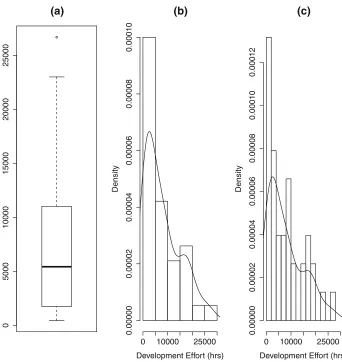
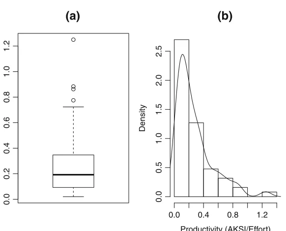
Figure1shows a box plot and two histograms with their kernel density plots superim-posed. The data set in each case is the same. It is a data set of development effort (man hours) from 38 Finnish projects (Kitchenham and K¨ans¨al¨a1983). The box plot and both of the kernel density plots suggest that the data is skewed. The box plot in Fig.1a shows the median slightly off-centred in the box towards the origin, and has a short lower tail and a long upper tail with a single large outlier. However, the kernel density plots in Fig.1b, c pro-vide more detail concerning the distribution, for example indicating the possibility that the distribution is bi-modal and confirming that the majority of the values are relatively close to the origin. The kernel density plots are different because the number of bins used in each density plot is different, however, the general shape of the two functions is very similar. This demonstrates one major advantage of kernel density plots: they are not so dependent on bin size as histograms.
Figure2shows the box plot and kernel density plot of the same 38 projects after trans-forming the data by taking logs. The box plot suggests that the transformation has improved the distribution of the data. However, the kernel density plot suggests that the direction of skewness has been changed and the data is still far from normal.
3Using the rank transform process, data are converted to ranks and a standard parametric analysis is applied
to the ranked data rather than the raw data.
4http://college.usc.edu/labs/rwilcox/home
5There are still many circumstances when a box plot can be extremely useful, for example when comparing
0
5000
10000
15000
20000
25000
(a)
(b)
Development Effort (hrs)
Density
0 10000 25000
0.00000
0.00002
0.00004
0.00006
0.00008
0.00010
(c)
Development Effort (hrs)
Density
0 10000 25000
0.00000
0.00002
0.00004
0.00006
0.00008
0.00010
0.00012
Fig. 1 A boxplot and two kernel density plots of the same finnish data set
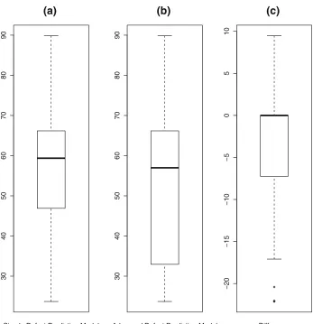
Figure 3 presents results from a study of software defect prediction methods aimed at comparing simple product based models with models including product metrics and a process metric (Madeyski and Jureczko2015).
It shows the box plots of the percentage of classes that need to be tested to find 80 % of the defects using a simple product-based model and an advanced model including a process metric. The data is based on 34 software projects (Madeyski and Jureczko2015; Madeyski 2015). Looking at the box plots of the raw data many of us would believe it was acceptable to use a paired t-test to determine whether the advanced algorithm was better than the simple algorithm (that is, required fewer classes to find 80 % of defects). It is not until we view the box plot of the difference between the raw data values in Fig.3c that we see any indication of the problem with this data set.
6789
1
0
(a)
(b)
Development Effort (ln hrs)
Density
6 7 8 9 10 11
0.0
0.1
0.2
0.3
0.4
Fig. 2 Box plot and kernel density plots of transformed effort data
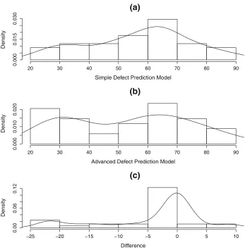
between the paired outcome values in Fig.4c looks even worse. Although the density close to the origin looks fairly normal, it is clear that the data has a very long lower tail with several extreme values. Looking back to Fig.3c, we can see that this is a case where the box plot provides additional useful information. Although the kernel density plot of the difference between the paired observations in Fig.4c seems normal close to the origin, the corresponding box plot indicates that there are many difference observations that share the same zero value, so the distribution is strongly non-normal at the origin.
Overall these examples suggest that the use of kernel density plots and histograms are more likely to alert us to non-normal data than box plots, but box plots can also provide useful additional information.
3.2 Robust parametric methods
30
40
50
60
70
80
90
(a)
Simple Defect Prediction Model
30
40
50
60
70
80
90
(b)
Advanced Defect Prediction Model
−20
−15
−10
−5
05
10
(c)
Difference
Fig. 3 Box plots of software defect prediction data
Another common approach is to remove outliers and then use the standard mean and variance of the remaining data. Wilcox and Keselman (2003) point out that there are two problems with this approach:
1. Outlier detection methods based on means and standard deviations can fail to detect outliers.
2. When extreme values are discarded, the remaining observations are no longer indepen-dent, which invalidates the calculation of the standard error.
However, Wilcox (2012) introduces several robust measures based on removing outliers through the use of a reliable method of detecting outliers. A related approach is called
(a)
Simple Defect Prediction Model
Density
20 30 40 50 60 70 80 90
0.000
0.015
0.030
(b)
Advanced Defect Prediction Model
Density
20 30 40 50 60 70 80 90
0.000
0.010
0.020
(c)
Difference
Density
−25 −20 −15 −10 −5 0 5 10
0.00
0.06
0.12
Fig. 4 Kernel density plots of software defect prediction data
3.2.1 Robust measures based on outlier detection
Robust outlier detection relies on a robust measure of scale such as the median of the absolute deviations from the median (MAD), so ifMis the median of a set ofnobservations:
MAD=median|xi−M|i=1,...,n (8)
In the case of data from a normal distribution, MAD estimates the standard deviation multi-plied byz0.75=0.6745, which is the 0.75 quantile of the standard normal distribution (that is a distribution with meanμ= 0 and varianceσ =1). Any observation from the distri-bution has a 0.5 probability of being within plus or minus 0.6745 of the median. Therefore, instead ofMAD, analysts usually useMADN, where:
MADN = MAD
MADN is preferred because, if the set of observations is normally distributed, it is an unbiased estimate of the standard deviation.MADNcan be therefore be considered a robust measure ofscale.
A valuexiis then assumed to be an outlier if:
|xi−M|
MADN > k (10)
For outlier detection, Wilcox recommends settingkto 2.24. The value 2.24 corresponds to the 0.9875 quantile of the standard normal distribution. This criterion appears less severe than using the theoretical upper and lower tail points of the box plot as a criterion for outlier detection, which corresponds toz0.9965 ≈2.698.6However, in practice, the upper (lower) tail length of a box plot is decreased because the theoretical value of the upper (lower) tail is shrunk to the nearest actual data value.
To construct a robust measure of central locationMest,kis set to 1.28:
Mest =
1.28(MADN ) (i2−i1)+in=−ii1+2 1x(i)
n−i1−i2 (11)
wherex(1), x(2), ..., x(N ) are the observations written in ascending order,i1is the number
of points for which(xi−M)/MADN <−1.28 andi2is the number of points for which (xi −M)/MADN >1.28. The value 1.28 corresponds to the 0.9 quantile of the standard
normal distribution, which means that a randomly sampled observation will have an 80 % chance of being between plus or minus 1.28. Wilcox notes that this value is often used in the construction of robust estimators because it guards against relatively large standard errors but sacrifices very little data when sampling from a normal distribution.
Initially,MADN is constructed using the median of the raw data. If the estimation process is stopped at that pointMest is referred to as theone-stepM−estimator(MOS).
However,Mest can be iteratively refined by substituting the current value ofMest for the
median when calculatingMADN in the next iteration. We explain the theoretical justi-fication forMest in AppendixA. Wilcox provides a bootstrap method for calculating the
standard error ofMest, but this must be treated with caution unless our data set is a random
sample from a defined population.
Omitting the term 1.28(MADN ) (i2−i1)and replacing the criterion for identifying an outlier withk= 2.24, leads to another estimate called the modified one step M-estimator (MOM). Wilcox notes thatMOS is better in terms of the size of the standard error, but MOMhas advantages when using small sample sizes to test hypotheses. Wilcox provides a bootstrap method for calculating the confidence limits ofMOMbut does not provide an estimate of the standard error.
3.2.2 Trimmed and Winsorized means
Trimmed means are based on removing theX% smallest and largest values in a data set. The optimum value ofXis unknown but 20 % is a reasonable default. Wilcox suggests that this provides a reasonable balance between achieving a small standard error and controlling the probability of a Type 1 error. The observations in the data set that specify the values that correspond to the bottom and top X % of observations are calculated as follows. The data
6The theoretical value of the upper (lower) tail of the box plot equivalent is found by multiplying the box
length (which calculated asz0.75−z.25) by 1.5 and adding (subtracting) it to the upper fourth (from the lower
needs to be sorted in ascending and given subscripts from 1 toNidentifying that order. Then the subscript of the observation corresponding toX/100=0.0Xquantile, has the subscript:
ibottom=f loor(0.0X×N )+1 (12)
and the subscript of the observation corresponding to 1−0.0Xquantile is
itop=N−ilowest+1 (13)
where the functionfloortruncates the value of its parameter to the nearest integer. Then, all observations with values lower than the value corresponding toibottomand all observations
with values greater thanitopare excluded from calculation of the trimmed mean.
Winsorized means are derived by replacing theX% lowest observations with the value of the X % quantile andX % largest observations with the value of the(100−X)% quantile. This is referred to asWinsorizingthe data. All observations with subscripts lower
thanibottomare replaced by the value of the observation with subscript equal toibottom. All
observations with subscript greater thanitop are replaced by the value of the observation
with the subscriptitop.
Trimmed means form the basis of alternative approaches totandF. Winsorized means, however, are not usually used as robust central measure in their own right. They are used as a means of obtaining the variance of trimmed means. If a data set of N data points is Winsorized and the estimate of the variance of the Winsorized data set issw2 calculated in the usual way,s2wis another robust measure ofscale. Furthermore, the estimate of the variance of trimmed mean is:
str2 = s 2 w
N (1−X/100) (14)
The square root ofstr2 is the standard error of the trimmed mean.
3.2.3 Examples of robust measures of central location and spread
The goal of robust measures of central location and spread is to be resistant to “misbe-haviour in the data”. We identify the mean as non-robust because one very large abnormal value could make the mean value abnormally large. In contrast, the median is considered robust because one very large abnormal value would not have any effect on the median. This property is shared by all the other robust metrics discussed in Sections3.2.1and3.2.2
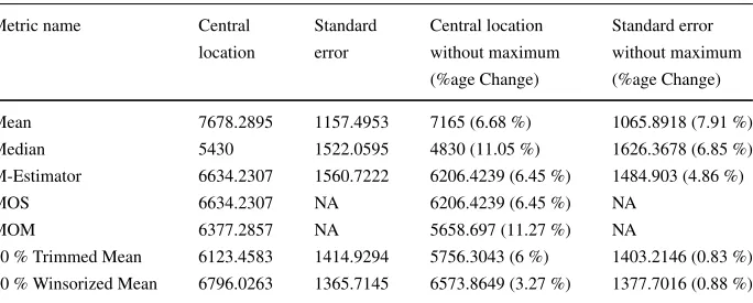
Table 1 Central location and scale measures for the Effort Data with and without maximum value Metric name Central Standard Central location Standard error
location error without maximum without maximum (%age Change) (%age Change)
Mean 7678.2895 1157.4953 7165 (6.68 %) 1065.8918 (7.91 %)
Median 5430 1522.0595 4830 (11.05 %) 1626.3678 (6.85 %)
M-Estimator 6634.2307 1560.7222 6206.4239 (6.45 %) 1484.903 (4.86 %)
MOS 6634.2307 NA 6206.4239 (6.45 %) NA
MOM 6377.2857 NA 5658.697 (11.27 %) NA
which either remove abnormally large and abnormally small values or replace them. How-ever, unlike the data sets used in our examples, in industry data sets are not static. They grow as new projects are completed and existing products are updated. To investigate the impact of data set growth, we look at how the robust metrics behave when the largest value is removed
In Table1we report various measures of central location derived from the data set shown in Fig.1. We report the values from the full data set and from the data set after the maximum effort value was removed.
Considering first the metrics derived from the full data set, we see that, as might be expected in a highly skewed data set, the mean is the largest of the central value metrics and the median is the smallest. TheMest,MOMandMOSare all derived in a similar way
and all have similar values, in factMest andMOS have identical values. The mean has
the smallest standard error while the standard error of the other metrics (for which standard errors can be calculated) are similar.
Looking at the impact on the metrics after removing the maximum value from the data set, we can see that all the values have been reduced. The median has exhibited the largest percentage change (11 %). This might be considered unexpected because the median is supposed to be resistant to changes at the extremes of the data set. It occurs because the values in the data set consist of only 38 data points, which are spread over a very large range of values (from 460 to 26670). The data points in the centre of the data set are not close together, so when a data point is removed, it causes a large fluctuation in the median. Originally, the median was calculated as the average of the two central values ( 5430 = (4830+6030)/2), once the maximum was removed the median became the central value of the remaining 37 values which is 4830.
0.0
0.2
0.4
0.6
0.8
1.0
1.2
(a)
(b)
Productivity (AKSI/Effort)
Density
0.0 0.4 0.8 1.2
0.0
0.5
1.0
1.5
2.0
2.5
Table 2 Central location and spread of productivity data with and without the maximum value Metric name Central Standard Central location Standard error
location error without maximum without maximum (% age Change) (% age Change)
Mean 0.2725 0.0316 0.2568 (5.78 %) 0.0278 (11.96 %)
Median 0.1923 0.0387 0.192 (0.17 %) 0.0283 (26.98 %)
M-Estimator 0.2251 0.0313 0.2206 (2.03 %) 0.0298 (4.83 %)
MOS 0.2256 NA 0.2209 (2.08 %) NA
MOM 0.203 NA 0.203 (0 %) NA
20 % Trimmed Mean 0.2092 0.0291 0.2033 (2.82 %) 0.0256 (11.74 %) 20 % Winsorized Mean 0.2259 0.0284 0.212 (6.17 %) 0.0254 (10.81 %)
Of the other metrics, most exhibited a change of between 6 % and 7 %, including the mean. The mean was not as affected by the removal of the largest value as might be expected because there were a relatively large number of large values in the data set. In this case, the Winsorized mean exhibited the smallest change because with 38, the observation with itop = 31 corresponded to an observation with value 14568. Once the maximum value
was removed, the value ofitop=30 corresponded to an observation with the value 14504,
corresponding to a very small 0.4 % change in the maximum value of the Winsorized data set. In terms of the effect of removing the maximum value on the standard error, as expected, the standard error of the mean exhibited the largest change, and the standard error of the trimmed mean exhibited the smallest change.
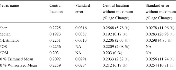
As another example, consider the original COCOMO data set (Boehm1981). This con-tains data on 63 software projects including staff effort measured in person hours and project size measured inK adjusted delivered source instruction (AKDSI),7 from which we can estimate productivity asAKDSI /Eff ort. The box plot and kernel density plot of the pro-ductivity data are shown in Fig.5. Both the box plot Fig.5a and the kernel density plot Fig.5b agree that the data is highly skewed and contains outliers. In contrast to the Effort data set, this data set is concentrated over a small range (0.020465 to 1.25). In addition, the largest value is relatively far from the next smallest value 0.8833), and the central five val-ues are very close together (0.18408,0.1917,0.1923,0.1987,0.2000). The robust measures for the productivity data are shown in Table2.
Given the properties of this data set it is not surprising to find that the mean exhibits a large change when the maximum value is removed and the median exhibits only a small change. In this case, the Winsorized mean exhibits the largest change. This is because with the full data set, N = 63, and the value ofitop was 51 corresponding to an observation
with the value 0.4333. Once the maximum value was removed, the value ofitop was 50
corresponding to an observation with the value 0.3786. This corresponded to a relatively large 12.6 % change in the maximum value of the Winsorized data set. In this case, most of the standard errors exhibited a relatively large change with the change to the median standard error being the largest (27.0 %).
These examples, might suggest that resistance is a somewhat relative concept in the con-text of evolving data sets and depends on the specific nature of a data set. However, they
7The adjustment occurs when projects are updated rather than created as new, and is intended to reflect the
confirm that for skewed data with outliers, the trimmed mean will be closer to the central point of the data set than the mean and will usually be smaller than theM−Estimator, MOS orMOM. It will also usually have a smaller standard error than the mean, even though the divisor (and associated degrees of freedom) will be based onN (1−0.0X)rather thanN.
However, the real importance of using trimmed means and other robust parametric mea-sures is that they allow non-normal data to be analysed fairly on the raw data scale. This is particularly important for ratio-based measures that are known to be strongly skewed, such as productivity (effort/size) or defect rates (faults/size). In spite of the extreme non-normality of such data, practitioners still prefer to use average productivity metrics based on the raw data, for example, to set up baselines and identify good practice, see for example Huijgens et al. (2013).
The problem with using the mean is that with skewed data more than 50 % of projects have productivity values less than the mean. In the COCOMO productivity data, 62 % of the projects had productivity values less than the mean productivity value. Using the mean value gives an inflated value to the central location of the data set, as a result of the large values. The median is much smaller than the mean and 49 % of the projects are less than the median. However, since the median is only based on one or two values (depending on whether the data set has an odd or even number of observations), it is hard to defend the median as a trustworthy measure. In contrast to the mean, 54 % projects had productivity values less than the trimmed mean. Furthermore, since the trimmed mean is based on 60 % of the data set it is a more defensible estimate of the central location than the median.
The practical implication is that benchmarking initiatives that label projects with values less than the mean aspoorly-performingprojects might justifiably be rejected by project managers whose projects performed better than the median. In the case of the COCOMO productivity data, five projects had values greater than the trimmed mean but less than the mean. Furthermore, if the data did not include the largest value, none of the projects would change from being classified as above the trimmed mean to below the trimmed mean.
We would also suggest that projects within plus or minus two standard errors of the trimmed mean should be considered as exhibitingaverageproductivity. Using this criterion, the trimmed mean would classify projects with order statisticsi =28 toi =39 as being average, and there would be no change if the largest value were removed. In contrast, using the mean and its standard error, the nine projects with order statisticsi=35 toi=43 would be classified as average, and if the largest value were removed, the mean would classify the 8 projects with order statisticsi=36 toi=43 as being average. Bearing in mind that the median value corresponds to the project with order statistici =32, it is clear that using the trimmed mean identifies more projects close to the centre of the distribution as average than does the mean.
To identify poorly and exceptionally performing projects, observations with productiv-ity values less than the value of the observation corresponding toibottomcould be described
as poorly performing (in the COCOMO example, the observation withi =13 which had a value 0.07266 correspondedibottom). Equally, projects with productivity values greater
than the value of the observation corresponding toitopcould be described as exceptionally
performing projects (in the COCOMO example the observation withi =51 which had a value 0.4333 corresponded toitop). (Huijgens et al.2013) point out the value of
performing products were classified assemi-detached projects. In the next section, we fol-low up the issue of the impact of project type on productivity in order to demonstrate how trimming can be used to test hypotheses about non-normal data sets on the raw data scale.
Another important issue is that robust measures of spread can be generalised into robust measures of covariance. This leads to the ability to undertake multivariate analysis and robust regression analysis of non-normal data sets without relying on normalising transfor-mations. Although it is beyond the scope of this paper, Wilcox (2012) discusses multivariate methods and robust regression extensively.
3.2.4 Robust alternatives totandF tests
The problem associated with heteroscedasticity among different samples has been known for a long time. Welch (1938) proposed a variant of the t-test that allowed for different variances within each group. This is thedefaultversion of the t–test inR(R Core Team 2015).
The variance of the difference between two means is calculated as:8
var (x1¯ − ¯x2)= (n1−1) s 2
1+(n2−1) s22
(n1+n2−2) (15)
wherex¯1is the mean of then1data points in one of the groups andx¯2is the mean of then1 data points in the other group. This is very similar to the originalt-test except that the two variances are not combined into an overall average. The major difference between a Welch test and at-test is that the degrees of freedom are calculated quite differently as:
df = (q1+q2) 2
q12
(n1−1)+
q22
(n2−1)
(16)
whereqi =si2/ni.
Yuen’s test uses trimmed means instead of the ordinary means together with Welch’s test as a robust test for comparing the central location of two sets of data (Yuen1974). This approach can be extended to cater for repeated measures (paired) designs, multiple groups and factorial designs. It also allows researchers to test linear combinations among mean values. For example in a factorial experiment a researcher might want to know if three levels of a factor are additive. For example, suppose we have a cost estimation factor such as “Required reliability” that has three levels “Low”, “Standard” and “High”, and we believe that this has an additive effect on productivity. If we have productivity values for projects with the different levels of reliability, an additive hypothesis is tested using the following linear combination of mean values:
ˆ
xStandard− ˆxLow= ˆxHigh− ˆxStandard
or equivalently, that
ˆ
xLow+ ˆxHigh−2xˆStandard=0
Yuen’s method is appropriate when testing for differences between central locations, but would not be sensitive to changes in the lower tail of a distribution of the kind that can be seen in Fig.4.
A disadvantage of the use of Yuen’s method is that the use of trimming and Welch’s test means that the number of degrees of freedom are substantially reduced. This will mean we
(a)
Productivity for Organic Projects
Density
0.0 0.2 0.4 0.6 0.8 1.0 1.2 1.4
0.0
1.0
2.0
(b)
Productivity for Semi−Detached Projects
Density
0.0 0.2 0.4 0.6 0.8 1.0 1.2 1.4
0
1
234
(c)
Productivity for Embedded Projects
Density
0.0 0.2 0.4 0.6 0.8 1.0 1.2 1.4
0
246
Fig. 6 Kernel density plots for the COCOMO data set for each project type
need more observations. However, if our data are not normal, we will also need a great many observations before we can be sure that results based on the full data set are reliable.
As an example of this approach, consider the original COCOMO data set (Boehm1981). As discussed in Section3.2.3, the projects were divided into three different types (referred to as the projectmode), labelledorganic,embeddedandsemi-detached. Using this data it is possible to test whether the productivity of projects of each type is the same.
The histograms and kernel density plots for projects of each type are shown in Fig.6. Inspection of the plots confirms long tailed distributions. It also suggests that productivity is generally highest for organic projects and lowest for embedded projects, with semi-detached projects somewhere in between.9
Using trimmed means and the algorithms produced by Wilcox, we can test whether there are significant differences among the trimmed means for the different modes and also
9Comparing Figs.5and6, also confirms that analysing data sets in more homogeneous subsets is likely to
Table 3 COCOMO project productivity summary statistics
Project type # Projects Mean SE Trimmed mean TM SE
Organic 23 0.4368 0.0625 0.3901 0.0718
Semi-detached 12 0.291 0.0482 0.285 0.0375
Embedded 28 0.1296 0.0233 0.1052 0.0133
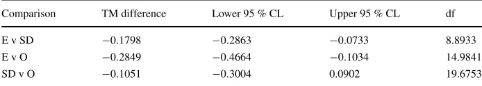
whether there is a linear relationship between trimmed means (Wilcox 2012). Summary statistics of the COCOMO project productivity values are shown in Table3.
Using Yuen’s method, an overall F-test for differences among the three groups of projects was statistically significant(F =18.678, df1=2, df2=14.74, p=9.100371e− 05). Although there are 28 embedded projects, 12 semi-detached projects and 23 organic projects, the degrees of freedom for the denominator of theF-test is 14.74 rather than the 60 that would be found in a standard analysis of variance. This is because 40 % of the data is removed by trimming and the use of Welch’s method for unstable variances further reduces the degrees of freedom and results in non-integer values for degrees of freedom.
Wilcox also provides an algorithm that assesses all pairwise comparisons of the trimmed means that also adjusts the confidence intervals to allow for multiple tests. The results of this analysis are shown in Table4. This suggests that both organic and semi-detached projects are more productive than embedded projects but that there is no significant difference between semi-detached and organic project productivity.
Wilcox’s algorithm will also allow you to test linear combinations of the trimmed means, for example, to test the hypothesis that the difference between the trimmed means is linear, that is:
LinearCombination=T ME+T MO−2T MSD≈0 (17)
The value of the linear combination of trimmed means for the COCOMO data is−0.7706 with 95 % confidence limits (−0.2779, 0.1284). This indicates that we cannot rule out the possibility of a linear effect. However, the degrees of freedom for this test is 18.85, which suggests the test has a low power, which is particularly problematic if we want to be confident that the null hypothesis is likely to be true.
3.3 Non-parametric tests
Looking at Fig. 4rather than considering the difference between means, it might be use-ful to ask the question “What is the probability that a random observation from the set of simple algorithms is greater than an observation from the set of advanced algorithms”. This
Table 4 COCOMO project productivity group comparisons
Comparison TM difference Lower 95 % CL Upper 95 % CL df
E v SD −0.1798 −0.2863 −0.0733 8.8933
E v O −0.2849 −0.4664 −0.1034 14.9841
question is the rationale behind Cliff’sδ. It is also similar to the rationale for the MWW test with theUstatistic, but unlikeU,δcan cope with duplicate values. First of all we need to consider three probabilities:
p1=P (x1i> x2i) p2=P (x1i=x2i) p3=P (x1i< x2i)
Then Cliff’sδis defined as:
δ=p1−p3 (18)
and is therefore the difference between the probability that a random observation from group one is greater than a random observation from group two and the probability that a random observation from group one is less than a random observation from group two (Cliff1993). This is also called the expanded success rate difference (SRD) (Kraemer and Kupfer2006).
p1andp2can be used to calculate the probability of superiority (Grissom1996): ˆ
P =p1+0.5p2 (19)
This metric has also been called the area under the receiver curve (AUC) (Kraemer and Kupfer2006), the measure of stochastic superiority (A12ˆ ) (Vargha and Delaney2000) and the probabilistic index (P (X > Y )) (Acion et al. 2006). Arcuri and Briand (2014) rec-ommend using the metric for software engineering data analysis. Following Vargha and Delaney (2000), they refer to it as theAˆ12metric. Also sincep1+p2+p3=1:
p3=1− ˆP−0.5p2 (20)
which means
δ=2Pˆ−1 (21)
Cliff derived the standard deviation forδ, which can be used to calculate the standard deviation ofPˆ, sincevarδ=4varPˆ.
Looking at the calculation of the MWW U shown in (1), and assuming there are no duplicate values:
p1= U n1n2
(22)
and
p3=1− U
n1n2 (23)
so, that
δ= 2U
n1n2 −1 (24)
Akritas and Arnold (1994) and Brunner et al. (2002) suggested a different but related method, which also allows for duplicate observations by using midranks. Midranks are necessary if there are two (or more) observations with the same value, in that case, the obser-vations are both allocated the average of the two (or more) related ranks. Their method is an ANOVA-like method based on ranks but is robust to heteroscedasticity of group variances. It is important because it can be used to analyse much more complicated statistical designs than simple between-groups designs.
In the two group case, their test metric is simply the probability of superiority,Pˆ. It is calculated by first pooling all observations and calculating allRijwhich are the midranks
associated with the observationsxijwhereijcorresponds to theith observation in groupj.
The average rank for groupjis:
ˆ Rj =
1 nj
Then:
ˆ
P = 1
n1+n2 ¯
R2− ¯R1+0.5 (26)
Wilcox (2012) reports that there is not much to choose between Cliff’s method and Brunner et al.’s method, but that Cliff’s method may have some advantages when there are many tied values and sample sizes are small.
The ANOVA-like method can be generalised to multiple groups, but to perform an overall test of differences amongk > 2 groups usesrelative effects, where the relative effect for groupj is calculated as:
ˆ qj=
ˆ Rj−0.5
N (27)
whereN=nj. The null hypothesis in this case is thatq1=q2=...=qk =0.5.
Both the ANOVA-like method and Cliff’s method can be adapted for repeated mea-sures. This means they could be considered for analysing the software defect prediction data shown in Fig.4. However, since the data includes 17 duplicates, it is likely that Cliff’sδis more appropriate. Wilcox does not provide an implementation of the paired data test, but the details are provided in Cliff (1993). The estimate ofδis:10
dw= dii
n (28)
wheredii =1 if the simple software defect prediction model identified fewer classes than
the advanced model, 0 if the models identified the same number of classes, and−1 if the simple model identified more classes. The variance ofdwis:
s2d
w =
(dii−dw)2
n(n−1) (29)
The estimated value of Cliff’s δ is −0.2647 with 95 % confidence interval (−0.4884,−0.0410) on the assumption that the estimate is approximately normally dis-tributed. The test value is−2.319 which has a probability ofp = 0.0102. This suggests that the predictions made by the advanced defect prediction algorithm have a significant probability of requiring the search of fewer classes than the simple algorithm. This can be compared with the standard Wilcoxon test which reports ap−value of 0.01577 but delivers a warning “cannot compute exact p-values with zeroes”.
For analysing multiple repeated measures (for example, studies where many different cost estimation algorithms are applied to many different data sets), software engineering researchers have often adopted Friedman’s test with corresponding post-hoc tests as recom-mended by Demˇsar (2006) (see, for example, Dejaeger et al.2012). However, in a study of the performance of Friedman’s test, Agresti and Pendergast (1986) found that for an under-lying normal distribution, their rank transformed ANOVA test could be substantially more powerful than the Friedman test. In a more recent paper, Tian and Wilcox (2007) compared the Agresti-Pendergast method with the ANOVA-like method developed by Brunner and colleagues. They found that under most conditions, the ANOVA-like method was preferable to the Agresti-Pendergast method in terms of both Type I errors and power. The exception occurred when there were only two repeated measures for each data set. There has been no direct comparison of the Agresti-Pendergast and Cliff’s method for cases where there are only two repeated measures.
3.4 Guidelines for interpreting effect size magnitude
Effect sizeis a name given to indicators that measure the magnitude of a treatment effect. We agree with Arcuri and Briand (2014) that effect sizes are extremely useful, as they provide an objective measure of the importance of the experimental effect, regardless of the statistical significance of the test statistic. Furthermore, effect sizes are much less affected by sample size than statistical significance and, as a result, are better indicators of practical significance (Madeyski2010; Urdan2005; Stout and Ruble1995).
Cohen (1988,1992) was the first person to propose interpretation guidelines for effect sizes, by suggesting criteria to define a small, a medium or a large effect for use in the behavioural sciences. However, Cohen did not present any systematic calculation of effect sizes from research studies as the basis for his generalizations. That is why Lipsey and Wilson (2001) found these guidelines somewhat arbitrary, and presented different interpre-tations of the magnitude of effect sizes based on the distribution of effect sizes for over 300 meta-analyses of psychological, behavioural, and education studies, suggesting the need for domain specific guidelines.
To allow an interpretation of effect sizes in a software engineering context, Kampenes et al. (2007) therefore proposed magnitude labels based on a systematic review of effect size in 92 software engineering controlled experiments. The sample size is limited but gives a rough estimation of what constitutessmall,mediumandlargeeffect sizes in the software engineering domain.
All these guidelines were presented in Madeyski (2010). In this paper, the guidelines were extended to include the newest effect size indicators (Cliff’s delta and the probability of superiority) and these are all summarised in Table5.
Table 5 Guidelines for effect size magnitude interpretation
Effect small medium large
(Cohen1988)
d 0.20 0.50 0.80
r 0.10 0.243 0.371
r2 0.01 0.059 0.138
(Cohen1992)
d 0.20 0.50 0.80
r 0.10 0.30 0.50
r2 0.01 0.09 0.25
(Lipsey and Wilson2001)
d 0.30 0.50 0.67
(Kampenes et al.2007)
g 0.17 [0.00–0.376] 0.60 [0.378–1.000] 1.40 [1.002–3.40]
r 0.09 [0–0.193] 0.30 [0.193–0.456] 0.60 [0.456–0.868]
r2 0.008 [0–0.0372] 0.09 [0.0372–0.208] 0.36 [0.208–0.753]
Vargha and Delaney (2000) and Kraemer and Kupfer (2006)
Cliffsδ(SRD) 0.112 0.276 0.428
An important issue for the use of effect sizes in meta-analysis is that the variance of the effect size needs to be estimated. Effect size variances are often quite complex to calcu-late, but Wilcox’s software provides standard errors for the Cliff’sdand the probability of superiority (Wilcox2012).
4 Example derived from a multi-site experiment
This section presents a large-scale example of an analysis using robust methods. In this section, we will demonstrate three different options for analysing our data. However, this is for explanatory purposes only, we do not advocate trying many methods until finding one that gives the answer you want. We return to this issue when discussing the results of the experimental analysis.
4.1 Background to the multi-site experiment
The study described here was designed to investigate the use of multi-site studies in order to address the problems of small sample sizes in Software Engineering experiments, see Dyb˚a et al. (2006) and Kampenes et al. (2007). The topic for the multi-site experiment concerned the extent to which structured abstracts were clearer and more complete than conventional abstracts. Specifically, the study investigated the following research question:
Are software engineering researchers likely to produce clearer and more complete abstracts when these are written using a structured form?
A report on our experiences regarding the organisation of the multi-site experiment (referred to using the alternative term distributed experiment) is provided elsewhere (Budgen et al.2013). In this paper we are only concerned with the analysis of the data that was collected from this and used to assess the above research question.
4.2 Experimental design
Formally, our experiment set out to test the following hypotheses:
– Null Hypothesis 1: Structured and conventional abstracts written by software engineer-ing researchers are not significantly different with respect to completeness.
– Alternative Hypothesis 1: Software engineering researchers write structured abstracts that are significantly more complete than conventional abstracts.
– Null Hypothesis 2: Structured and conventional abstracts written by software engineer-ing researchers are not significantly different with regard to clarity.
– Alternative Hypothesis 2: Software engineering researchers write structured abstracts that are significantly clearer than conventional abstracts.
4.2.1 Structure and organisation of the multi-site experiment
The abstracts were obtained from academic papers published in theInformation and Soft-ware Technology journal (IST) and the Journal of Systems and Software (JSS). These software engineering journals are both published by Elsevier, and contain many papers with an empirical content. The important point for our experiment was that IST began mandating the use of structured abstracts in the time period 2009-2011 whereas JSS retained the use of conventional abstracts.
This experiment is aquasi-experimentbecause we selected abstracts from particular vol-umes of the two journals, and could not randomise the source of the structured abstracts. Based on the categories provided by Shadish et al. (2002), the experiment can be clas-sified as “a two-group pretest-posttest design with non-equivalent control groups”. Here the change between pretest and posttest is provided by the transition to the use of struc-tured abstracts over the period 2009–2011 for IST, and the non-equivalent control group is provided by the two blocks of abstracts from JSS.
We conducted the experiment across five sites: Durham and Keele Universities (UK), Lincoln University (New Zealand), the City University (Hong Kong), and the Prince of Songkla University (Thailand). Subsequent to the initial experiment two further sets of data were collected, one from students at City University (Hong Kong) and the other from stu-dents at Wroclaw University of Science and Technology (Poland). The experiment was organized by Budgen who prepared the experiment protocol and the experimental materials, circulated the relevant materials to each site, and co-ordinated the responses.
An Entity-Relationship style diagram illustrating the experiment together with an explanation of the entities and their relationships is presented in AppendixB.
4.2.2 Independent and dependent variables
For this study we can identify three independent variables:
1. Thesourceof the abstracts (JSS; IST)
2. Thetime of publication (Block1; Block2) For both journals, these blocks consist of roughly eighteen months-worth of issues within the period 2009–2011. For JSS, the boundary between blocks was based upon date (mid-2010), whereas for IST, where the transition from conventional to structured abstracts was gradual, with many issues having mixed forms, the boundary is across all issues of 2010, with assignment to block being determined by the form of the abstract.
3. Thelocationof the study/participants (UK-2 sites, NZ, Thailand, HK, Poland)
The dependent variables for the study were measures ofcompleteness (how well an abstract would enable a systematic reviewer to determine the relevance of the associated paper) andclarity(the quality of writing used). These were respectively assessed using a set of 8 questions similar to those employed in previous studies, Budgen et al. (2011,2008), and a 10-point Likert-like scale. The completeness score for a specific abstract for each judge was calculated as:
Completenessi=
i=8
i=1(xi)
QA (30)
wherexiis a numeric value for completeness questioniwhereY es=1, N o=0, P artly=
responses. Thus the completeness score for a specific abstract by a specific judge is a value between 0 and 1. The completeness score for an abstract is:
AbstractCompleteness=medianCompletenessi (31)
wherei=1, ...,4.
4.2.3 Participants and their roles
The participants who acted as “judges” of the abstracts were intended to be undergraduate students studying computing in some form, and who were at approximately the same level of technical educational attainment, approximating to two years of specialist computing study at university, but in practice, some universities also recruited participants who were more experienced, see Budgen et al. (2013). These were students who might be expected to read research papers that have abstracts, but who had not yet had to write dissertations and similar documents containing abstracts. Within the English context (Durham and Keele) this would equate to students who were at the end of their second year of study, or beginning their third year of study. For each site, sixteen participants were recruited locally, using local expertise to match them to the above description. Where necessary, we paid a small honorarium to those taking part. Participants were expected to have a reasonable level of English, since the abstracts were in English, and so we collected data about whether or not this was their first language. Figure16is a flow diagram showing a high-level overview of the experimental process undertaken at each site.
Participants were required to act as judges for four abstracts, one taken from IST and one from JSS in the time period prior to the introduction of structured abstracts and one from IST and one from JSS in the time period following the adoption of structured abstracts by IST. In addition, each abstract was evaluated by four judges. A flow diagram of the experimental process from the viewpoint of the judges is shown in Fig.17.
4.2.4 Experimental materials
Budgen identified all empirical papers in JSS and IST over the two defined time periods. The number of abstracts available from each source and each time period is shown in Table6.
Budgen then created a set of four random number sequences, based on the size of each of the blocks of abstracts. The first four values from each sequence were used to select the abstracts for the first site, the next four for the second site and so on until he had selected 20 abstracts from each journal and each block. In the second data collection activity (from the universities in Hong Kong and Poland), four further abstracts were selected from each journal and block.
All data were collected using paper forms. Budgen prepared a set of data collection forms organized as two A5 sized pages side by side. Each of these had the abstract printed on the
Table 6 Allocation of abstracts to blocks
Id IST organisation No. JSS organisation No.
Block 1 All 2009; conventional (2010) 110 All 2009; Jan–June (2010) 132 Block 2 Structured (2010); all 2011 131 Jul–Dec (2010); all 2011 173
right hand page, and the questions on the left hand page. They were also suitably coded so that they could be tracked by the experimenter. To avoid participants guessing which abstract was supposed to be best, Budgen removed the headings from the structured abstracts and revised any sentences rendered ungrammatical by the removal of the headings. In addition, the title and keywords were removed from each abstract.
The questions were derived from those used in the previous studies (Budgen et al.2011, 2008), with modifications to address the restriction of using only those papers that had an empirical element. For the purpose of data collection, each student judge was required to first complete a consent form, then a short form asking for demographic information, and would then receive the four data collection forms in the defined order,11and one at a time. As they completed a form it was to be returned to the experimenter, who would check that it had been fully completed and then issue the next form. A flow diagram of the process is shown in Fig.15.
The details of the conduct of the experiment, and of the divergences from the plan that occurred, are described in Budgen et al. (2013). The second data collection exercise used the same set of 16 abstracts at two different universities: one in Hong Kong (the City University) the other in Poland (Wroclaw University of Science and Technology).
4.3 Data analysis
The statistical design is a two-by-two factor analysis with journal as one factor and time period as the other factor. What we are interested in is whether the the difference between completeness of IST and JSS abstracts in the second time period is significantly greater than the difference between completeness of IST abstracts and JSS abstracts in the first time period. This is the interaction term in a factorial design and is sometimes referred to as a
differences in differences analysis. That is, if we had normally distributed data, we would test whether:
¯
x22− ¯x12−(x21¯ − ¯x11) >0 (32) wherex22¯ is the mean of IST abstracts in period 2,x12¯ is the mean of JSS abstracts in period 2,x¯21is the mean of IST abstracts in period 1 and ,x¯11 is the mean of JSS abstracts in period 1.
This section examines a number of approaches to analysing the data from the experiment using robust methods.
4.3.1 Preliminary analysis
Data from each site was analysed to assess whether or not there was consensus in the assess-ment of the abstract completeness score. The analysis was based on a oneway analysis of variance of all abstract data collected at a specific site with “abstract” as the factor with 16 levels. We used a standard ANOVA rather than a robust equivalent for this analysis because we wanted deviations from the mean to be emphasized and to calculate theIntra-Class Cor-relation(I CC) (Shrout and Fleiss1979). ICC is assessed on the same subjective scale as the Kappa agreement statistic. The analysis is shown in Table7where
I CC= MSBetween−MSWithin MSBetween
(33)
Table 7 Agreement among Judges for each site
Phase Site MSBA MSW A F p I CC
1 Keele 0.0802 0.019 4.2217 0.0001 0.7631 (Substantial)
1 Durham 0.0673 0.0253 2.6598 0.0052 0.624 (Substantial) 1 Lincoln 0.0858 0.0227 3.7767 0.0002 0.7352 (Substantial) 1 Pr. Songkla 0.0409 0.0205 1.9931 0.0362 0.4983 (Moderate) 1 Hong Kong (CU) 0.0463 0.032 1.4494 0.1636 0.31 (Fair) 2 Hong Kong (CU) 0.0429 0.0579 0.7404 0.7322 −0.3506 (Poor) 2 Wroclaw (POLAND) 0.0424 0.025 1.6955 0.0841 0.4102 (Moderate)
In Table 7, the column labelledP haseidentifies whether the data collection took place in the first phase of the experiment or the second; MSBAis the mean squares between abstracts andMSW Ais the mean squares within abstracts. It is noticeable that all the sites where English is the first language (that is, Keele University (K), Durham University (D) and Lincoln University (L)) achieved substantial agreement, whereas other sites did not achieve such good agreement, although only the Hong Kong City University data in phase 2 achieved no consensus. Given the lack of consensus, we decided to omit the Hong Kong City University phase 2 data from our subsequent analyses but to include the Hong Kong City University phase 1 data.
(a)
JSS Period 1Abstract Completeness score
Density
0.2 0.4 0.6 0.8 1.0
012345
(b)
JSS Period 2Abstract Completeness score
Density
0.2 0.4 0.6 0.8 1.0
0
12345
(c)
IST Period 1Abstract Completeness score
Density
0.2 0.4 0.6 0.8 1.0
0
1
23
4
5
(d)
IST Period 2Abstract Completeness score
Density
0.2 0.4 0.6 0.8 1.0
0
1
23
4
5