A Spatial Explanation for the Balassa–Samuelson Effect
∗
Péter Karádi
†and Miklós Koren
‡October 24, 2008
Abstract
We propose a simple spatial model to explain why the price level is higher in rich countries. There are two sectors: manufacturing, which is freely tradable, and non-tradable services, which have to locate near customers in big cities. As countries de-velop, total factor productivity increases simultaneously in both sectors. However, because services compete with the population for scarce land, labor productivity will grow slower in services than in manufacturing. Services become more expensive, and the aggregate price level becomes higher. The model hence provides a theoretical foun-dation for the Balassa–Samuelson assumption that productivity growth is slower in the non-tradable sector than in the tradable sector. Empirical results confirm two key implications of the theory. First, we compare countries where land is scarce (densely populated, highly urban countries) to rural countries. The Balassa–Samuelson effect is stronger among urban countries. Second, we compare sectors that locate at different distance to consumers. The Balassa–Samuelson effect is stronger within sectors that locate closer to consumers.
1
Introduction
Rich countries are more expensive than poor ones. Balassa (1964) and Samuelson (1964) suggested a simple and powerful explanation of this fact based on the observation that the productivity growth of tradables, such as manufacturing, tends to be faster than the pro-ductivity growth of non-tradables, such as services. Assuming that labor is perfectly mobile across sectors, firms need to pay the same wage in both sectors in equilibrium, and these wages are pinned down by the international price of the tradable good and the productiv-ity in the tradable sector. Relatively lower non-tradable sector productivproductiv-ity, thereby, will imply higher non-tradable prices. Empirical observations support the major propositions of the model about the importance of the non-tradable sector as well as the development of
∗
Preliminary. We thank Gábor Békés, Jonathan Eaton, Nobu Kiyotaki, Esteban Rossi–Hansberg and seminar participants at Princeton, IE–HAS, NYU and the 3rd International Conference in Macroeconomics (Madrid) for useful comments.
†New York University. E-mail: [email protected]
the relative productivities and their effects on the relative prices (see e.g. Obstfeld-Rogoff, 1996)1 Though empirical results are also consistent with the assumption that total factor productivity growth does tend to favor the tradable sector, the theory falls short of providing an explanation for it.
Rich cities are more expensive than poor ones. According tobestplaces.net, the overall cost of living is 54 percent higher in Boston than in Milwaukee. The two cities are of similar size (close to 600,000 people), but the per capita income in Boston ($28,000) is about 56 percent higher than that in Milwaukee ($18,000). Similarly to the price differences across countries, the biggest price differences are in nontradable sectors. Healthcare is 33 percent more expensive in Boston, whereas housing is about 200 percent more expensive.2 While the Balassa–Samuelson explanation has the potential to explain price differences across cities, some simple demand considerations also jump to mind. Demand for services is higher in high-income cities, while supply is limited, which drives up service prices. A scarce factor in cities that may limit the supply of services is land.3
We propose a simple spatial model that reconciles these two facts and connects these two types of explanations. There are two sectors: manufacturing, which is freely tradable, and non-tradable services, which have to locate near customers in big cities. As countries develop, total factor productivity increases simultaneously in both sectors. However, because services compete with the urban population for scarce land, labor productivity will grow slower in services than in manufacturing. Services become more expensive, and the aggregate price level becomes higher with development.
Our model rests on three key observations.
First, land is scarcer than one might first think. The overall population density of the earth is rather low, 43 people per square kilometer. However, population is very clustered, so the average person lives in an area with a population density of 7,300 people per square kilometer.4 A related observation is that in 2005, around 50 percent of the world popu-lation lived in cities.5 This suggests that the scarcity of land, which has the potential to explain price differences across cities, can also be partly responsible for price differences across countries.
Second, whether a good is tradable or not has implications not only for cross-country trade but also for within-country trade, and hence the location of production within the country. Arguably, there are many technological differences between tradable sectors such as manufacturing, and non-tradable sectors such as services. One key difference is, however, that non-tradable goods or services have to be produced at the location of their consumption, 1Hsieh and Klenow (1997) recently argued that low PPP investment rates in poor countries come from
their low relative productivity in producing investment and tradable goods relative to non-tradable con-sumption services.
2All data retrieved from
http://bestplaces.neton January 30, 2008.
3Tang (2007) offers an income-based explanation for the positive correlation between price level and GDP
per capita. He does not focus on cities and the spatial distribution of economic activity, however.
4We used high-resolution population density data from LandScan to calculate, for the average person on
earth, the number of people living within the same 30 arc second by 30 arc second area. (This is basically a population-weighted population density.) By comparison, the population density of New York City is about 10,000 per square kilometer.
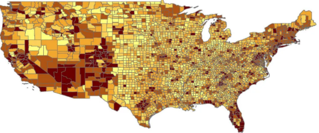
Figure 1: The share of non-traded employment in U.S. counties
Source: 2000 U.S. Census, Summary File 3.
whereas tradable goods and services can be produced far away from consumers, where land prices may be cheaper. Figure 1 shows a map of U.S. counties, displaying the share of employment in non-tradable sectors. Darker colors represent a higher share in non-tradable sectors. We see that non-tradable sectors locate closer to population centers (especially on the East and West Coasts and Florida) than tradable sectors.6 The implication of this observation is that non-tradable prices are more sensitive to the price of land than tradable prices.
Third, productivity growth in the housing sector is limited by the scarcity of land. In-creased productivity in construction can lead to taller and higher-quality buildings, but they cannot substitute for land. Davis and Heathcote (2007) estimate that between 1975 and 2005, the share of land in the value of a home in the U.S. has increased from 35 percent to 45 percent. During the same period, the price of residential land has more than tripled. This suggests that land and structures are complements and that the scarcity of residential land will become more severe with development.7 Together with the previous two observations we have that services, which locate close to their consumers in cities, face higher land rents with development. They become more labor intensive and exhibit lower labor productivity for the same total factor productivity. Our model can hence be thought of as amicrofoundation for the assumption of Balassa and Samuelson that productivity growth is slower in services than in tradable industries.
These empirical observations discipline our modeling choices. We model the spatial dis-tribution of economic activity in a country. Space is represented by a line. As an equilibrium outcome, a section of this line is populated by residents. Services are produced in a section directly adjacent to the residential area, but manufactured products are produced farther away, where rents are lower. Because land complements other consumption goods in final utility, the demand for residential land increases with development. This crowds out other users of land, especially services. That is what leads to an increase in service prices.
An implication of the model is that the relationship between income and the price of non-6This is confirmed more formally in Section 3.
tradables is stronger among highly urbanized countries than among rural countries. This is because land available for non-tradable production is more scarce in urbanized countries and the increased demand for residential land puts more pressure on rents in these countries. Empirically, this relationship is strongly borne out in the data. As we later document in Table 1 for a cross section of 186 countries in 2000, the positive correlation between income and the price level is very strong among urban countries, while there is virtually no such correlation among rural countries. This result is robust to alternative definitions or urbanization (percentage of the population living in cities vs population density).
Note that the above effect is distinct from the direct effect of development on urban-ization. Richer countries tend to be more urban; more urban countries, in turn, tend to have higher prices. Even though this effect is also fully consistent with our model, we would like to test the robustness of the interaction effect of urbanization and development. In future work, we plan to instrument urbanization rates with the geographic features within the country, such as elevation, the slope of the terrain, distance to coastline and rivers, and latitude.
To obtain more direct evidence on the role of sector location in relative prices, we look at detailed product-level price data published for a wide range of countries by the Economist Intelligence Unit. We then measure the location where each product is produced in county-level U.S. data. We classify products that are produced close to consumers (residents) urban products, those that are produced far from consumers are rural products. Our results show that the prices of urban products are more sensitive to income than those of rural products. We emphasize that our results do not overturn previous explanations proposed in in-ternational macroeconomics or the regional economics literature. Instead, we view them as complementing both types of explanations and potentially bridging the gap between the two. The non-reproducible nature of residential land, together with the optimal location of industries, provides a microfoundation for the assumption made by Balassa and Samuelson that non-tradable industries face slower productivity growth. We believe this microfounda-tion is important because models that assume exogenous differences in productivity growth have no predictions about when and why the Balassa–Samuelson effect is stronger in one country than in another. Our model links the strength of the Balassa–Samuelson effect to the regional patterns of countries.
Section 2 describes the model of housing, development, and relative prices. Although the necessary steps are described in some detail, formal proofs are omitted in this draft. Section 3 provides empirical evidence on both the key cross-country implication, as well as some suggestive evidence on the mechanism of the model.
2
A model of housing, development, and relative prices
We wish to study how the relative price of industries is affected by their location and how industry location, in turn, is determined by development. To model the spatial structure of the economy, we use a monocentric city model.
We model each country as an interval on the real line. There is a central business district (CBD), which is a point on the line. Businesses and residences can choose their location
freely within the interval. Locations will be indexed by their distance to the CBD, denoted byz. The CBD serves as a marketplace: all goods and services are exchanged there.8
Households own all the land in the country, and there are perfect rental markets for land. Households also earn income from wages. There is a measure N of workers, each supplying one unit of labor inelastically.
2.1
Technology
There are two produced goods, we call them “manufactured goods” and “services.” Both goods are produced using land and labor and they are costly to transport to the CBD. Manufactured goods are assumed to have lower transport costs than services.
Both sectors use Cobb–Douglas technology with the same land share, β.9
m =Amlβmn 1−β m , s =Aslsβn 1−β s ,
whereli is the amount of land, andni is the number of workers allocated to sector i, andAi is total factor productivity in sector i. Technical progress will be captured as an increase in
Ai.
Housing services are produced using land only,
h =Ahlh,
where lh is land allocated to housing, and Ah is the productivity of residential land (which can be increased, for example, by building taller and better structures).
2.2
Tastes
Consumers consume manufactured goods (m), services (s) and housing (h). They commute to the CBD to work and to buy the two goods.
There is a continuum of identical consumers with mass N. Utility is characterized by a homothetic utility function,
u(m, s, h),
so that indirect utility can be written as
u[I, pm, ps, ph(z)] =
I
P[pm, ps, ph(z)]
.
Herepm is the price of manufacturing,ps is the price of services, andph(z)is the rental price of housing in location z.
8It is straightforward to extend the model to multiple cities in each country as long as these cities do not
overlap.
9We assume identical land shares to highlight that our results do not hinge on factor share differences.
Later, in our empirical application, we allow for different factor shares. The key results would also go through with any twice differentiable constant-returns-to-scale production.
We assume a nested utility structure so that we can think of the bundle of consumption goods as one good,
P[pm, ps, ph(z)] = P[Φ(pm, ps), ph],
where Φis a price aggregator function, and P and Φare both homogeneous of degree one.
2.3
Transport costs
All transport and commuting costs are of the iceberg nature. When a unit of good i is shipped z miles, only D(τiz) fraction of it remains. The function D() is between 0 and 1, continuous and is strictly decreasing in z.
The profit of a firm in industry i, z miles from the center is
πi(z, l, n) =piD(τiz)Aili(z)βni(z)1−β−wni(z)−r(z)li(z),
where w is the wage rate, and r(z) is the land rent in location z.10 Profits are revenues net of transport cost, minus all production costs.
To maintain the convenient iceberg nature of transport costs for residential location, we assume that commuting z miles costs a 1−D(τhz) fraction of the consumption bundle (including manufacturing, services and housing). We can think of this as time lost in com-muting from enjoying the consumption goods. Then the budget constraint of a household at location z is
pmm(z) +pss(z) +ph(z)h(z)≤(w+T)D(τhz).
Expenditure on the manufactured good, on services and housing has to be less than the total income of the household net of commuting costs. Total income is made of wages wand rental income T. Importantly, neither source of income depends on the choice of residential location. Rental income is derived from the plot of land the householdowns, not from where it resides. Perfect rental markets ensure that the ownership of the land is irrelevant for location decisions.
We assume that τh > τs > τm so that commuting is the costliest of all transportation activities. This condition is sufficient to ensure the spatial structure we characterize below: residents live closest to the CBD, followed by service and by manufacturing establishments. We believe this assumption captures key aspects of modern urban structure. Alternatively, we could introduce non-pecuniary externalities that would make residents prefer to live near other residents and services establishments.11 For historical comparisons, we also wish to vary the relative transport costs.
10Note that the wage does not depend on the location. We assume that all employees are hired in the
CBD.
11As a thought experiment, the reader can rank the following three neighborhoods for choice of residence:
(i) a residential area, (ii) a neighborhood with high concentration of restaurants, theaters and other service establishments, (iii) a manufacturing area.
2.4
Equilibrium
Definition 1. An equilibrium in this economy is a collection of land, {li(z)}, and
la-bor allocations, {ni(z)} and goods production, {yi(z)}, in each industry i at each
loca-tion z; a collection of consumptions, (m, s,{h(z)}); and a list of good and factor prices,
(pm, ps,{ph(z)}, w,{r(z)}) such that
1. firms maximize profits (and hence choose their location optimally),
2. households maximize utility (and hence choose their residence optimally),
3. manufacturing and service markets clear at the CBD,
4. the labor market clears at the CBD,
5. land and housing markets clear at each location.
We first characterize the profit maximization problem. The first-order condition for profit maximum is a non-positive profit condition,
piD(τiz)≤
r(z)βw1−β
Aiββ(1−β)1−β
,
with equality whenever there is positive production. The left-hand side is the marginal revenue from selling one more unit of good i in a marketz miles away. The right-hand side is the minimum unit costs of producing good i at location z.
In what follows, we normalize the wage rate to 1 without loss of generality. The zero-profit condition pins down industry i’s bid rent function,
Ri(z, pi) =β(1−β)1/β−1p
1/β i A
1/β
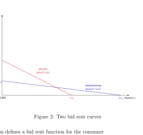
i D(τiz)1/β. (1) This is the maximum rent the industry is willing to pay at location z. It is decreasing in z. Note that, all else equal, the bid rent function is steeper for services becauseτs > τm. Figure 2 plots two bid-rent curves with linear transport costs and β = 1.
Consumers’ choice can be broken down to two steps. The first step is the allocation of consumption expenditure at a given location to manufacturing, services, and housing. Once that decision is made optimally, the resulting utility at location z will be characterized by the indirect utility function of income and prices.
Free mobility ensures that, in optimum, all inhabited locations yield the same utility. Denote this level of utility byu. (This is an endogenous variable that we characterize later.)
Given prices and incomes, the utility achieved at location z is
u= D(τhz)I
P[Φ(pm, ps), r(z)/Ah]
. Here we substituted in the price of housing as ph(z) = r(z)/Ah.
distance z rent manufacturing pmAm(1–τmz) services psAs(1–τsz) 1/τm 1/τs CBD psAs pmAm
Figure 2: Two bid rent curves This equation defines a bid rent function for the consumer
Rh(z, I, u, pm, ps) = AhΦ(pm, ps)P2−1 D(τhz)I/u uΦ(pm, ps) . (2)
This is the rent that yields utility u for a consumer with income I at location z when the two other good prices arepm and ps. Since the price indexP is convex in its arguments, P2 is monotonic. Hence the bid rent function is decreasing in z. Locations closer to the CBD reduce commuting costs and hence command higher rents.
Suppose, for example, that utility is Cobb–Douglas, u(m, s, h) = mαsγhδ. In that case, the bid rent curve simplifies to
Rh(z, I, u, pm, ps) = Ah D(τhz)I upα mp γ s 1/δ .
Proposition 1. An equilibrium exists, is unique, and exhibits the following spatial struc-ture. Residents live closest to the center, followed by service establishments, and then by manufacturing establishment.
This spatial structure permits us to construct the equilibrium as follows. Let z1 denote the boundary between the residential and the services zone, and z2 the boundary between services and manufacturing. The boundary of the city is given byz3 :D(τmz3) = 0.12 These cutoffs pin down the amount of land dedicated to each industry.
Because land rents are a constant fraction of revenue, we can use (1) to express output per given amount of land as
yi(z) = (1−β)1/β−1p1/β
−1 i A
1/β
i D(τiz)1/β. The supplies in the two industries are
s= (1−β)1/β−1p1s/β−1A1s/β Z z2 z1 D(τsz)1/βdz, (3) m= (1−β)1/β−1p1m/β−1A1m/β Z z3 z2 D(τmz)1/βdz. (4)
The next key equation comes from location arbitrage at the manufacturing–service boundary, z2. At this point, Rs(z2) = Rm(z2), which follows from the continuity of D(z). Hence a boundary z2 pins down the relative price of services,
ps
pm
= D(τmz2)
D(τsz2)
. (5)
Note that because τs > τm and D(z) is decreasing in z, the farther out the boundary is, the higher this relative price. Intuitively, it is equally profitable to produce services and the manufactured good at the boundary. The farther out the boundary, the higher the transport cost differential between the two industries. This has to be compensated by higher service prices.
The relative price of services, in turn, determines relative demand. (Because of the nested utility structure, housing does not affect the relative demand of services and manufacturing.)
The supply of housing is simply determined by the land allocated to residential use, h(z) = Ah for all z ≤z1.
The remaining equilibrium condition is labor market clearing. Because both sectors share the same Cobb–Douglas technology, the ratio of the aggregate wagebill to aggregate industrial rents is constant at (1−β)/β. The total wagebill is simply N, because we have normalized the wage rate to one.
N = (1−β)1/βp1s/βA1s/β Z z2 z=z1 D(τsz)1/βdz+ (1−β)1/βp1m/βA 1/β m Z z3 z=z2 D(τmz)1/βdz (6)
2.5
Productivity growth
We conduct the following comparative statics. We increase Am and As proportionally (so that productivity growth is neutral), and ask what happens to industry location (z1, z2) and relative prices.
The following proposition states that without any technological differences across the sectors, their relative price is still affected by the location choice of the sectors.
Proposition 2 (Balassa–Samuelson and the sprawl). Assume that Am/As is constant. The
the relative price of services increases with development if and only if residential land grows with development.
Proof. We can determine the relative price of services from rent arbitrage at boundary z2, equation (5), which is clearly increasing inz2. The relative demand for services is a decreasing function of the relative price,
s m =φ ps pm =φ D(τmz2) D(τsz2) ,
where φ denotes Φ2/Φ1. The relative supply of services is increasing in z2 for any given z1, since as z2 increases, more land gets allocated to services and less to manufacturing. Hence, for a given z1, there is a unique z2 that equates relative demand and supply. This z2 is increasing in z1. Substituting z2 in the relative price equation above, we get the result.
The intuition behind this result is that as residential land grows, both sectors have to locate farther away from the CBD. However, this affects the service sector, which has a higher transport cost, disproportionately more, and it becomes relatively more expensive.
The next question is whether residential land grows with development. The next section shows some empirical evidence that this has indeed been the case in the past decades in the U.S. In the model, we need to impose certain condition to ensure this. The following proposition introduces some necessary conditions.
Proposition 3 (Balanced growth). Productivity growth does not change the relative price of services if either (i) housing productivity grows at the same rate, or (ii) demand for housing is Cobb–Douglas.
If either condition (i) or condition (ii) holds, then the amount of land dedicated to housing is constant with development, which, by Proposition 2, implies that the relative price of services is constant.
2.6
A special case
To explore the properties of the model further, we make the following additional assumptions. Utility is Cobb–Douglas in goods, Leontief in housing,
u(m, s, h) = min{mγs1−γ, h/H}.
Transport costs are exponential,13
D(τ z) = exp(−τ z). These assumptions lead to a closed-form solution.
13This corresponds to a constant hazard rate. If, for example, during each mile transported there is a 1%
First we derive the relative supply of services and manufacturing as a function of z1 and
z2. From equations (3) and (4),
s m = ps pm 1/β−1 As Am 1/β τm τs exp(−τsz1/β)−exp(−τsz2/β) exp(−τmz2/β) (7) Because of the Cobb–Douglas preferences, the ratio of expenditure on the two goods is constant, s m = 1−γ γ pm ps . (8)
We also have the rent arbitrage at the boundaryz2,
ps
pm
= exp(−τmz2) exp(−τsz2)
. (9)
Combining these three equations,
exp [τs(z2−z1)/β] = 1 + 1−γ γ Am As 1/β τs τm (10) As long as Am and As grow in parallel, the amount of land dedicated to services, z2−z1 is independent of the overall level of development. It is increasing in the relative productivity of manufacturing, decreasing in the expenditure share of manufacturing, and decreasing in manufacturing transport costs. We denotez2−z1 by∆z.
∆z = β τs ln " 1 + 1−γ γ Am As 1/β τs τm #
Substituting into the rent arbitrage condition, we find that the relative price of services increases in residential land, just as stated in Proposition 2,
ps
pm
= exp [(τs−τm)(z1+ ∆z)]. (11)
To determine the residential–services boundary z1, we now turn to the relative demand for housing. Because the demand for housing is Leontief, the relative demand for housing does not depend on home rents. Take a household i. For each unit of their composite consumption of manufacturing and services, mγis1i−γ, they will demand H units if housing, irrespective of prices, their income, or where they live.
hi
mγis1i−γ =H.
Because this is true for all households, it is also true for the aggregate, representative house-hold: P ihi P im γ is 1−γ i = h mγs1−γ =H.
The aggregate stock of housing is easily determined as
h =Ahz1.
We need to calculate the total supply of the composite of produced goods, mγs1−γ.
mγs1−γ = (1−β)1/β−1p1m/β−1A1m/βτm−1 1−γ γ 1−γ exp{−[(τs−τm)(1−γ) +τm/β](z1+ ∆z)} = 1−γ γ 1−γ Amτm−βN 1−βexp{−[γτ m+ (1−γ)τs](z1+ ∆z)} (12) =Ahz1/H
The second equation follows from the labor market clearing condition, (6). Taking logs and ignoring constants that depend only on γ,
lnAh+ lnz1−lnH =c+ lnAm−βlnτm+ (1−β) lnN −τ¯(z1+ ∆z), (13) where we introduced the notationτ¯=γτm+ (1−γ)τs for the expenditure-weighted average transport cost.
Totally differentiating (13), we can determine how residential area z1 varies with key variables.
Proposition 4. The demand for residential land increases with (i) the productivity of man-ufacturing relative to housing and (ii) the number of people living in the city.
The first comparative static is crucial because it tells us how residential land varies with development. We will derive its exact form below. Note that the impact of higher population on residential land is not purely demand driven: when there are more people in a city, the city can produce more consumption goods, thereby increasing the demand for housing, which is complement with consumption goods. As a special case, if labor is not used in production, β = 1, then population does not have any impact land demand.14
dz1 dln(Am/Ah) = z1 1 + ¯τ z1 >0 d2z 1 dln(Am/Ah)dlnN = (1−β)z1 (1 + ¯τ z1)3 >0
Because ∆z does not vary with development, we can now characterize the behavior of the service–manufacturing relative price,
dln(ps/pm) dln(Am/Ah) = (τs−τm)z1 1 + ¯τ z1 >0 d2ln(ps/pm) dln(Am/Ah)dlnN = (1−β)z1 (1 + ¯τ z1)3 >0
14This counterintuitive result follows from the homotheticity of the utility function. There is no subsistence
Proposition 5. Suppose that housing productivity Ah is constant and Am and As grow in
parallel. Then the relative price of services increases with Am – the Balassa–Samuelson
effect. The strength of the Balassa–Samuelson effect is
dln(ps/pm)
dlnAm
= (τs−τm)z1 1 + ¯τ z1
>0. (14)
The Balassa–Samuelson effect is stronger if (i) trade cost differential between the two indus-tries is large, (ii) land occupied by residential housing is large, and (iii) the average transport cost is low.
Intuitively, the bigger the tradability difference between the two sectors, the bigger impact an additional mile of transportation has on their relative price. By Proposition 4, we know that residential area increases with development, which also move the service–manufacturing boundary further away from the center.
The model yields the following testable predictions. As productivity increases, 1. residential land grows,
2. home prices increase,
3. the rent gradient becomes steeper,
4. tradable industries move away from center, 5. services become more expensive,
6. labor productivity increases faster in manufacturing.
To see how the strength of the Balassa–Samuelson effect is related to population density, we differentiate (14) with respect to N.15 From Proposition 4, we know thatz1 increases in
N, so we have that
Proposition 6. The Balassa–Samuelson effect is stronger in countries with higher popula-tion per CBD (“urban” countries).
3
Empirical results
The section presents some new international and U.S. facts on the relationship of development and prices that are not well explained by the standard Balassa-Samuelson framework, but are in line with the main predictions of our model formulated above.
15Our concept of population density is the number of people living in a city,N. In the empirical analysis,
2
3
4
5
6 8 10 12 6 8 10 12
Rural country Urban country
Price levels (PPP, logarithm)
GDP (per capita, PPP, logarithm)
Data source: Penn World Table, World Development Indicators
Figure 3: Development, urbanization, and the price level
3.1
Urbanization and prices
It is a well known fact that higher per capita GDP is correlated with higher price levels and the Balassa-Samuelson (BS) hypothesis gives a generally accepted explanation for it. We argue, however, that this relationship is also influenced by the level of urbanization in a country, which is unexplained by the BS framework. Figure 3 shows the cross-country relationships of the (log) price levels and the (log) per capita GDP – both measured in purchasing power parity terms – for more rural and more urban countries.16 The graphs shows, in line with Proposition 6, that the relationship between income and the price level is stronger among more urbanized countries. The comparison is valid as there are reasonable variation in per capita GDP for both groups, even if there are clearly more high-income countries among the more urbanized ones.
To approach the question more formally, we use two measures for of urbanization: the proportion of urban population and the population density, both available for a large number of countries from the World Development Indicators database.17
16We use the 2000 sample of the Penn World Table, and the groupings are according to the proportion of
urban population obtained from the World Bank’s World Development Indicators.
17As our main question is the difference in the ‘closeness of residents,’ both measures are imperfect,
but we consider the proportion of urban population a better measure, as it can be expected to capture the clustering of the population better than just the average population density in a country. As the the definition of urban population is somewhat different in every country, the cross-country results should be treated with some caution.
The cross-country regressions are estimated as
logP =α1+α2logY +α3Z +α4(Z −Z¯)(logY −logY) +ε, (15) where P is the price level, Y is per capita GDP, and Z-s are the different urbanization measures. Our main interest is in the (demeaned) cross-term, as it can be expected to capture how the level of urbanization influences the relationship between the output and the price measures.
Our main price measure is the comparable price level available for over 180 countries from the Penn World Table.18
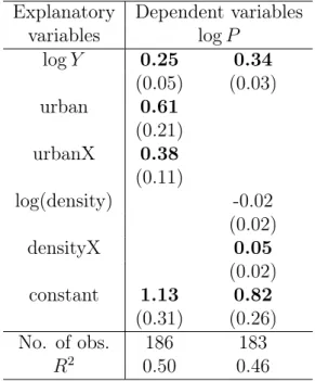
Table 1: Balassa-Samuelson regressions with urbanization (Robust standard errors are in parentheses)
Explanatory Dependent variables
variables logP logY 0.25 0.34 (0.05) (0.03) urban 0.61 (0.21) urbanX 0.38 (0.11) log(density) -0.02 (0.02) densityX 0.05 (0.02) constant 1.13 0.82 (0.31) (0.26) No. of obs. 186 183 R2 0.50 0.46
The regressions reported in Table 1 are consistent with our predictions. We present two regressions with the two urbanization measures. ’Urban’ is the proportion of urban population, and ’density’ is the population density; and ’urbanX’ and ’densityX’ are the demeaned output-urbanization cross terms.
In line with well known previous results, higher per capita output increases the price level across countries, but this relationship is significantly influenced by the level of urban-ization, even after controlling for direct price effects of the urbanization. Looking at the first regression, we have found that 1 percent higher per capita output increases the price level by 0.25 percent for average level of urbanization (54 percent), and 1 percent higher urban-ization has a further 0.61 percent direct effect. The cross effect, however, implies that the 18The sample extends the 115 benchmark countries, that directly participated the 1996 round of the
International Comparison Project(ICP), by using somewhat less reliable price data and other observable variables. Our results are robust to restricting the sample to the benchmark countries.
effect of output on the prices would be close to 0 under the (extreme) case of 0 urbanization (0.25−0.54·0.38 = 0.05) and would be over 0.4 in case of full urbanization.
This effect of urbanization on prices remains unexplained by the standard BS argument, but it is fully in line with our model, where higher population density increases the scarcity of land close to consumers and increases the income sensitivity of service prices.
3.2
Tradability, industry location and prices
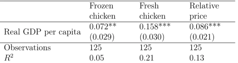
The main assumption of the Balassa-Samuelson framework is the differential productivity growth between the tradable and non-tradable products. This assumes substantially differ-ent production technologies for these product groups, which is not always the case. As a motivational example, we have taken two fairly similar products: ‘frozen’ and ‘fresh chicken’ and run standard Balassa-Samuelson regressions on them.19
Table 2: Balassa-Samuelson regressions, EIU price data, 1997-2006 Frozen chicken Fresh chicken Relative price Real GDP per capita 0.072**
(0.029) 0.158*** (0.030) 0.086*** (0.021) Observations 125 125 125 R2 0.05 0.21 0.13
The main difference between these products is their tradability – it is arguably easier to transport frozen chicken – and clearly not their production technology. The Balassa-Samuelson regressions show that in line with our model, the local per capita GDP has stronger influence on the less-tradable fresh chicken than the more tradable frozen version. Our argument is that because of the tradability differences, fresh chicken needs to be pro-duced closer to the consumer and needs to compete with them for land that is getting scarcer with development.
We now turn to analyze more formally how tradability, or which is equivalent in our model: industry location, influences the effects of development on prices. The international price data we use for this is collected by the Economist Intelligence Unit for cost of living calculations. The data is a panel of more than 150 prices collected in 140 cities of 89 countries all around the world. The products are sampled from all of the main categories of standard consumer price indices and are defined to be relatively comparable internationally.20 For each product-city pair, we take 10 year averages of USD prices between 1997 and 2006.
The analysis also requires a measure for tradability. As we do not have direct data on trade costs, we are constructing an indirect measure that calculates the industries’ proximity to the consumers. This industry location measure is clearly influenced by the transport costs, 19The price data we use here is collected by the Economist Intelligence Unit for over 150 products in 140
cities of 89 countries (see later). The GDP data is from the WDI.
20Controlling for quality differences across countries is extremely difficult, but the quality differences do
as it is the case in our equilibrium, and its advantage is that it more directly tests the spatial argument of our model.
We use good quality US Census data to calculate this measure, and assume that the relative tradability differences across industries are similar across countries. We measure proximity of industry i (ρi) by the population density of an industry i’s average plant:
ρi = P cnicdc P cnic ,
where nic is the number of plants by county c and industry i,21 and dc is the population density of county c provided by the US Decennial Census. Industries with high ρi are ‘closer’ to the residents: their average plant is in a more dense county. For the analysis, we match the products in the EIU survey to 4-digit NAICS sectors in which they are produced. Tables 3 and 4 lists products and the sectors which are the closest and the furthest from the consumers, respectively. The results are in line with the standard intuitions: personal services are the ones located closest to the residents, while manufacturing and utility plants are those located furthest. The only outlier is probably the “Manufacturing Magnetic and Optical Media” industry that, against our priors, seems to be located in high population density areas.
Table 3: Industries close to the residents
Product/Sector Population density
Taxi: initial meter charge
Taxi and Limousine Service 1316
Compact disc album
Manufacturing Magnetic and Optical Media 1268 One good seat at cinema
Motion Picture and Video Industries 1197
Four best seats at theatre
Performing Arts Companies 1127
Babysitter’s rate per hour
Other Personal Services 966
Laundry (one shirt)
Drycleaning and Laundry Services 832
Having measured the tradability of the various industries, we then turn to the question of how the price of these industries vary across cities and countries with different income per capita. More specifically, we hypothesize that the prices of less tradable (“urban”) goods are more sensitive to income per capita than prices of more tradable (“rural”) goods.
21The US Census County Business Patterns database records the number of plants and employment groups
by counties and 6-digit NAICS sectors. We used 4-digit NAICS sectors, which were more in line with the level of detail of our price data. The employment data is reported only in discrete categories, but using center-of-the-bin approximations would result in a very similar ranking of sectors with a regression coefficient of 0.98.
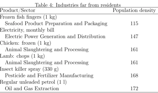
Table 4: Industries far from residents
Product/Sector Population density
Frozen fish fingers (1 kg)
Seafood Product Preparation and Packaging 115 Electricity, monthly bill
Electric Power Generation and Distribution 147 Chicken: frozen (1 kg)
Animal Slaughtering and Processing 161
Lamb: chops (1 kg)
Animal Slaughtering and Processing 161
Insect killer spray (330 g)
Pesticide and Fertilizer Manufacturing 168
Regular unleaded petrol (1 l)
Oil and Gas Extraction 172
Because we measure tradability in the U.S. only, the key assumption is that tradability is a technological trait of the sector that is fairly consistent across countries. Note that we do not need the actual location of industries, which may be very different in a small country that in the large, low-density U.S. We only use the ranking of industries when we compare urban to rural goods.22
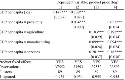
Table 5 presents our main regression results. The basic regression equation is lnpij =αi+β(lnYj −ln¯Yj) +γ(lnYj −ln¯Yj)×(lnρi−ln¯ρi),
where pij denotes prices of product i in city j, Yj is per capita GDP of the country of city
j, and ρi is the proximity measure of the industry product i is produced. Our main inter-est is the coefficient of the (demeaned) cross product measuring how the industry location influences the relationship between the income and prices. The regressions contain product fixed effects (αi), and the standard errors are clustered by countries.23
The first column of table 5 presents a standard Balassa-Samuelson regression and shows that our sample reproduces the standard result that richer countries tend to have higher prices. The significant coefficientγ of the cross-term in the second regression shows not only that more tradable prices increases more with development – as Balassa-Samuelson argument would suggest – but also that this relationship is closely related to the spatial location of these industries, as our model suggests. In particular, the prices of sectors that locate closer to consumers are more sensitive to income.
Given that most urban sectors are service sectors and many of the rural sectors are agricultural, one may wonder whether our results are only driven by this broad difference. In order to test for that, we separate out agricultural, manufacturing and service goods. The 22Even so, some outlier sectors are bound to violate the cross-country homogeneity assumption. For
example, “Manufacturing Magnetic and Optical Media” is a highly urban industry in the U.S., being located almost exclusively in Los Angeles and neighboring countries. We suspect that this reflects more the market structure of the industry than its transportation technology.
Table 5: Industry location and the Balassa–Samuelson effect [1] [2] [3] [4]
GDP per capita (log) 0.148*** 0.139*** [0.027] [0.027]
GDP per capita × proximity 0.034*** 0.051*** [0.009] [0.014] GDP per capita × agriculture 0.183*** 0.192***
[0.029] [0.034] GDP per capita × manufacturing 0.099*** 0.094***
[0.024] [0.024] GDP per capita × services 0.201*** 0.182***
[0.037] [0.038] Product fixed effects YES YES YES YES Observations 37552 33593 37552 33593 Clusters 89 89 89 89 R-squared 0.954 0.954 0.955 0.955 Standard errors (in brackets) are clustered by countries.
*** p<0.01, ** p<0.05, * p<0.1
Dependent variable: product price (log)
third and the fourth regressions introduce sectoral dummies (agriculture, manufacturing and services) interacted with income per capita. They show that while the average price effect of the country’s GDP per capita is different for different sectors – with presumably different production technologies –, controlling for them do not change our main result, namely, the significant effect of the industry location on the price effect of development.24
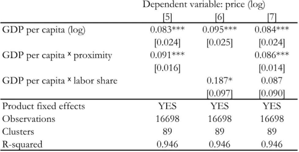
The Bhagwati-Kravis-Lipsey hypothesis argued that differences in labor intensity explains the differential effects of development on tradable and non-tradable prices. To test this hypothesis, we use the NBER Productivity Database (Bartelsman, Becker and Gray, 2000), available for manufacturing sectors, to include a labor share measure in our regressions. Regression [5] in table 6 shows that our results are robust to the subsample of manufacturing sectors, and regression [6] shows that labor share by itself has some marginally significant influence on the price effect of income. In particular, the prices of more labor intensive products are more sensitive to income. Regression [7], however, shows that if proximity is included in the regression, labor share loses its significance, whereas proximity retains its strong positive effect.
4
Conclusion
In this paper we introduced a simple spatial model to explain why the price level is higher in rich countries. Empirical results confirmed two key implications of the theory. First, we compared countries where land is scarce (densely populated, highly urban countries) to 24Note that the prices of agricultural products seem to be as income-sensitive as service prices. This may
Table 6: Industry location and labor intensity Dependent variable: price (log)
[5] [6] [7]
GDP per capita (log) 0.083*** 0.095*** 0.084*** [0.024] [0.025] [0.024] GDP per capita ˣ proximity 0.091*** 0.086***
[0.016] [0.014] GDP per capita ˣ labor share 0.187* 0.087
[0.097] [0.090] Product fixed effects YES YES YES
Observations 16698 16698 16698
Clusters 89 89 89
R-squared 0.946 0.946 0.946
Robust standard errors in brackets are clustered by countries *** p<0.01, ** p<0.05, * p<0.1
rural countries. The Balassa–Samuelson effect is stronger among urban countries. Second, we compared sectors that locate at different distance to consumers. The Balassa–Samuelson effect is stronger within sectors that locate closer to consumers.
References
[1] Alessandria, G., 2007, “Pricing-to-Market and the Failure of Absolute PPP,” Federal Reserve Bank of Philadelphia Working Paper, 07-29.
[2] Balassa, B., 1964, “The Purchasing-Power Parity Doctrine: A Reappraisal,” Journal of Political Economy, 584-596.
[3] Burchfield, M., Overman, H.G., Puga, D. and Turner, M.A., 2006, “Causes of Sprawl: A Portrait from Space," Quarterly Journal of Economics, 587-633.
[4] Canzoneri, M.B., Cumby, R.E., Diba, B., 1999, “Relative Labor Productivity and the Real Exchange Rate in the Long Run: Evidence for a Panel of OECD Countries,” Journal of International Economics, 245-266.
[5] Chatterjee, S. and Carlino, G. A., 2001, “Aggregate Metropolitan Employment Growth and the Deconcentration of Metropolitan Employment," Journal of Monetary Eco-nomics, 549-583.
[6] Chinn, M.D., 2000, “The Usual Suspects? Productivity and Demand Shocks and Asia-Pacific Real Exchange Rates,” Review of International Economics, 20-43.
[7] Davis, M. A. and Heathcote, J., 2007, “The Price and Quantity of Residential Land in the United States,” Journal of Monetary Economics 54:2595-2620.
[8] Davis, M. A. and Palumbo, M. G., 2008, “The Price of Residential Land in Large U.S. Cities,” Journal of Urban Economics, 63:352–384.
[9] Davis, M. A. and Ortalo-Magne, F., 2007, “Household Expenditures, Wages, Rents,” working paper.
[10] Desmet, K. and Fafchamps, M., 2006, “Employment Concentration across U.S. Coun-ties,” Regional Science and Urban Economics, 482-509.
[11] Egert, B., Drine, I., Lommatzsch, K. and Rault, Ch., 2003, “The Balassa-Samuelson Effect in Central and Eastern Europe: Myth or Reality?,” Journal of Comparative Economics, 552-572.
[12] Halpern, L. and Wyplosz, Ch., 2001, “Economic Transformation and Real Exchange Rates in the 2000s: The Balassa-Samuelson Connection,” United Nations Economic Commission for Europe Discussion Paper, 2001.1
[13] Holmes, Th.J. and Stevens, J.J., 2004, “Spatial Distribution of Economic Activities in North America,” in: J. V. Henderson and J. F. Thisse (ed.) Handbook of Regional and Urban Economics, chapter 63, 2797-2843
[14] Hsieh, C.T and Klenow, P.J, “Relative Prices and Relative Prosperity,” The American Economic Review, 562-585.
[15] Obstfeld, M. and Rogoff, K., 1996, Foundations of International Macroeconomics, The MIT Press, Cambridge MA
[16] Overman, H.G., Puga, D., Turner, M.A., 2006, “Decomposing the Growth in Residential Land in the United States,” working paper.
[17] Samuelson, P. A. , 1964, “Theoretical Notes on Trade Problems,” The Review of Eco-nomics and Statistics, 145-154.
[18] Tang, X., 2007, “The Rich Neighborhood Effect versus the Balassa-Samuelson Effect: An Income-Based Explanation of International Price Level Differences,” working paper. [19] Valentinyi, A., Herrendorf, B., 2007, “Measuring Factor Income Shares at the Sector
Level,” working paper.
Data References
1. Bartelsman, E. J., R. A. Becker and W. B. Gray, 2000, NBER-CES Manufacturing Industry Database, NBER.
2. County Business Patterns, 2000, U.S. Bureau of the Census.
4. “EIU City Data,” 2008, Economist Intelligence Unit.
5. Heston, A., R. Summers and B. Aten, 2006, Penn World Table Version 6.2, Center for International Comparisons of Production, Income and Prices at the University of Pennsylvania
6. World Development Indicators, 2007, The World Bank.
A
Appendix
The appendix presents some empirical evidence in the literature supporting essential as-sumptions and mechanisms of our results.
A.1
Land and development
In this section, we first present U.S. time-series evidence showing that over the past decades both residential land area and residental land prices have increased. Because both quantities and prices have gone up, this is consistent with an increase in (per capita) housing demand. Then, using mainly cross-sectional evidence, we show that income is a major factor influ-encing residential demand as implied by our model. The trend increases in housing demand can then be thought of as the by-product of U.S. growth.
Looking at U.S. time-series data, Overman, Puga and Turner, 2006 find that the per capita residential land use between 1976 and 1992 increased by 25.4%, based on the highest available resolution data25 of the US land use based on aerial and satellite photographs. Davis and Heathcote, 2007 find that the implied real price of residential land26has increased substantially during the period (between 1950 and 2000 the residential land prices increased nine-fold) – clearly showing increasing residential demand for land over the period. Figure 4 also shows that the share of land in the value of the aggregate housing stock increased from 10.4% to 36.4%.
Burchfield, Overman, Puga and Turner, 2006 document that US commercial land is, on average, substantially more scattered than residential land, and the probability that a commercial land is surrounded by undeveloped land is much higher in 1992 than it was in 1976.27 It implies that an average commercial land user does not need to compete directly for scarce land close to residents. This hypothesis is further supported by the relative price developments of residential and farm land derived by Davis and Heathcote, 2007 and shown by figure 5. The graph reveals some short term relationship between the two prices, but also shows increasing rent gradient (gap between residential and land prices) in the long term providing saving opportunities for sectors willing to locate further from the consumers.
25The 1992 data is based on 8.7 million 30 x 30 meters cells.
26To get this data, the authors use data on construction costs and decompose the value of an average
home to replacement value and land value.
27A 30 x 30 meter cell is categorized as developed if more than 30% of its area is covered by artificial
.1
.2
.3
.4
Share of land in home values
0 2 4 6 8 10
Real price of residential land (1950=1)
1950 1960 1970 1980 1990 2000
Year
Real price of land Share of land
Figure 4: Land prices and the share of land in home value Source: Davis and Heathcote (2007).
Turning to evidence supporting that income growth is mostly responsible for the increased demand for residential land, Davis and Heathcote, 2007 present some interesting time-series results. They regress implied real land prices (in logs) on per capita real disposable personal income (in logs), nominal interest rate and inflation rate using a quarterly dataset between 1975:4 and 2005:4. They find significant coefficients with an income elasticity of 2.6. 28
Turning to cross-sectional evidence, figure 6 plots the (log) price of land against per capita income for U.S. cities. It strongly supports our conjecture that higher income areas face more appreciated land prices.
More formally, the first three columns of Table 7 show the estimated effects of income on land prices, replacement values (constr) and home values in U.S. metropolitan areas. We also control for the size of the MSA. The regressions show that the regional income influences all the values, but it has the largest effect on the land prices with an amplification factor of 2.8. The last column of table 7 regresses the average per capita number of rooms on income and population using county level data published by the County Business Patterns. It formally supports the prediction that higher income does indeed lead to higher housing and thus land demand as implied by Proposition 4.
28Note, that using the cross-sectional dataset of Davis and Palumbo (2008) with implied residential land
Now focus on rows (1) and (4) of
Table 3
, the house price regressions. Recall that house
prices are a weighted average of land prices and structures costs. In each case, the
coefficients on variables in the house price regressions appear to be a weighted average of
the coefficients from the structures regression and the land regression. For example,
the near-zero coefficient estimate on interest rates in the house price regression is
a mix of the insignificant positive estimate from the structures price regressions (rows 2 and
5) and the significant negative estimate from the land price regressions (rows 3 and 6).
However, since the connection between fundamentals and structures prices is not
grounded in theory, and appears statistically questionable in practice, one should be
cautious in interpreting the near-zero interest rate coefficient in the house price regression
as evidence that nominal interest rates do not impact house prices. Rather we conclude
that it is difficult to properly assess the impact of fundamentals like income, interest rates,
and inflation on the housing market if one fails to disentangle their impact on land and
structures prices separately.
4.5. Farm land versus residential land
Fig. 4
compares our land price series to the price-per-acre of farm land for the aggregate
United States.
30This is the only other published aggregate price series for land in the
United States of which we are aware. First, we note that the market value of residential
land dwarfs the value of farmland. In 2002 there were 938.3 million acres of farmland in
the United States (2002 Census of Agriculture, USDA). The average price per acre was
ARTICLE IN PRESS
1 2 3 4 1975 1980 1985 1990 1995 2000 2005 Index ( 1975:1 = 1.0) Residential Land Farm LandFig. 4. Real residential land and farm land prices (log scale).
30
The annual farm price-per-acre series is available from the United States Department of Agriculture web site, http://www.ers.usda.gov/Briefing/LandUse/aglandvaluechapter.htm. We linearly interpolate the annual data to
M.A. Davis, J. Heathcote / Journal of Monetary Economics 54 (2007) 2595–2620
2612
Figure 5: Real residential and farm land prices (log scale) Source: Davis and Heathcote (2007).
Atlanta Baltimore Birmingham Boston Buffalo Charlotte Chicago Cincinnati Cleveland Columbus Fortworth Dallas Denver Detroit Hartford Houston Indianapolis Kansas Anaheim Los Angeles Memphis Miami Milwaukee Minneapolis New Orleans New York Oklahoma Philadelphia Phoenix Pittsburgh Portland Providence San Bernadino Rochester Sacramento St Louis Salt Lake City
San Antonio San Diego San Francisco Oakland San Jose Seattle Tampa Norfolk Washington D.C. 9 10 11 12 13 L a nd value (logarithm) 10 10.2 10.4 10.6 10.8
Per capita income (logarithm)
Data source: Davis-Palumbo (2007), BEA
Figure 6: Land prices and income across large U.S. cities 24
Table 7: Land prices, demand for housing and income (Robust standard errors are in paren-theses)
Explanatory Dependent variable
variables Land price Constr. price Home price Rooms
(log) (log) (log) per capita
log(income) 2.77 0.38 1.66 0.26 (0.67) (0.11) (0.38) (0.08) log(population) 0.13 0.02 0.05 -0.07 (0.18) (0.03) 0.10 (0.01) R2 0.42 0.25 0.52 0.26 No. of obs. 46 46 46 3219
A.2
Industry location
In this section, we first overview U.S. cross-sectional evidence supporting the spatial equilib-rium predicted by Proposition 1 that non-tradable goods (services) are produced closer to the consumers than tradables (manufacturing).29 30 Second, we present post-war U.S. time-series data showing that this relative spatial position of the two sectors were reinforced by development.
A way to measure the co-location of population and sectors is to calculate the sector’s locational quotient (qi), which is measured as the ratio of an area’s (i) share in the U.S. sec-toral employment (si) and its share in the U.S. overall employment (xi, qi =si/xi). If qi is below 1, the area is underrepresented in that sector, while a locational quotient substantially higher than 1 means the area is specialized in the certain sector. Figure 7 plots the loca-tional quotient in manufacturing for 3219 U.S. counties obtained from the County Business Patters dataset of the Census Bureau31 as a function of the population density of the county. The figure strongly supports our claim that manufacturing is underrepresented in the dense counties, and implies the opposite relationship (not shown) for services.
To examine the effects more formally, we regressed the county level ratio of non-tradable to tradable employment on different measures of urbanization and also included the (log) per capita median income.
The results show that even after controlling for the median income, the level of urbaniza-tion – measured in the proporurbaniza-tion of urban populaurbaniza-tion or populaurbaniza-tion density – significantly 29Our previously used proximity measures support the standard groups: the population density in a county
with an average agricultural plant is 195, with an average manufacturing plant: 474 and with an average service plant: 606.
30Agriculture and mining, as a result of their relatively low trade costs and high land share, are naturally
located in the least densely populated counties (see Holmes and Stevens, 2003, Table 10.)
31The advantage of using counties is that they cover the whole country and capture population clustering
better than state level data. A potential problem arises if a large number of the employees live and work in different counties. Metropolitan statistical areas, that are defined to take commuting habits into considera-tion, are a potential alternative. However, naturally, they do not cover the whole country. Our results are robust to using MSAs.
0 1 2 3 4 -5 0 5 10
Population density (log)
Locational quotient (traded sectors) 95% CI Fitted values
Figure 7: Locational quotient and population densitySource: 2000 U.S. Census
Table 8: Urbanization and relative NT/T employment (Robust standard errors are in paren-theses)
Explanatory Dependent variable variables log(NN T/NT) urban 0.62 (0.02) log(density) 0.07 (0.01) log(income) 0.11 0.18 (0.02) (0.03) constant -0.53 -1.18 (0.28) (0.30) R2 0.20 0.10 No. of obs. 3218 3218
increases the proportion of employees working in non-tradable sectors. This is consistent with the spatial equilibrium in our model, where services are located closer to residents than manufacturing is.
To see how development affects the location of industries, we turn to the time-series evidence. The post-war deconcentration of manufacturing has been widely documented in the literature. Holmes and Stevens, 2004 document that the spatial distribution of
manu-.2 .25 .3 .35 .4 1985 1990 1995 2000 2005 year
in total employment in manufacturing Share of 100 most densely populated counties
Figure 8: Share of 100 most densely populated countiesSource: County Business Patterns
facturing has become much more even between 1947 and 1999, and – in line our previously presented results – became substantially underrepresented in areas with high population density. Desmet and Fafchamps, 2006, similarly, find that manufacturing has become more deconcentrated between 1970 and 2000. Because of the very high spatial correlation of pop-ulation and employment, it is not surprising that the same studies have also found that the spatial distribution of services developed in line with those of the population.
The time series development of the relative manufacturing employment is presented in Figure 8, which plots the share of the 100 most densely populated counties in total employ-ment and in manufacturing between 1986 and 2005. The figure shows gradual deconcentra-tion both in terms of employment and manufacturing, but a faster decrease of the relative share of manufacturing. This implies that relative to services, manufacturing has moved farther away from residents; in line with the predictions of our model.