DataVis Helper:
A Tool for Exploring the Design Space of
Data Visualization
University of Twente
A Creative Technology Graduation Project
Supervised by
Yuri Engelhardt and Barend Köbben
Written by
Roseidys Primera
Abstract
Acknowledgements
Firstly, I would like to thank my advisors; my supervisor, Yuri Engelhardt and my critical observer, Barend Köbben. I thank you, both for asking insightful questions, for all the advice on how to perfect my research project and for always being very enthusiastic and supporting when giving advice.
Secondly, I would like to thank my loving and supporting mother, Marlene Maduro for supporting me through the entire process.
Thirdly, I would like to thank the tool saviour and helper, Sebastiaan den Boer. I thank you for helping me out so much on the development of the tool; your expertise is impeccable.
Table of Contents
Abstract ... 2
Acknowledgements ... 3
Table of Contents ... 4
List of Figures ... 7
List of Tables ... 9
1. Introduction ... 10
1.1 Problem Statement ... 10
1.2 Goal ... 10
1.3 Main Questions ... 11
2. Background ... 12
2.1 The Design Space of Data Visualization ... 12
2.2 The Basic Principles of Visual Encoding ... 13
2.3 State of the Art ... 14
2.3.1 Existing Systems ... 14
1. The Graphic Continuum ... 15
2. A Periodic Table of Visualization Methods ... 17
3. The Data Visualization Catalogue ... 18
4. The TimeViz Browser ... 19
5. A Classification of Chart Types ... 20
6. Qualitative Chart Chooser ... 21
7. Chart Suggestion – A Thought-Starter ... 23
8. Chart Chooser ... 23
9. Chart Chooser Cards ... 24
10. Infographic Taxonomy ... 26
11. Visual Vocabulary ... 27
12. A Tour through the Visualization Zoo ... 28
13. AnyChart- Chartopedia ... 28
14. Tableau ... 29
15. Microsoft Excel ... 31
2.3.2 Problem Analysis ... 32
2.3.4 Improvements ... 33
2.3.5 Focus ... 34
2.4 A Solution ... 34
2.4.1 The Concept ... 34
2.4.2 Application Area and Goal ... 34
3. Methods and Techniques ... 36
3.1 Stakeholders ... 36
3.2 Tool Requirements Analysis ... 37
3.3 Evaluation Procedure ... 37
4. Ideation ... 39
4.1 Application of Principles of Visual Encoding ... 39
4.2 Visualization Analysis ... 40
4.3 The Idea of the Tool vs. Existing Data Visualization Tools ... 40
4.4 Final Idea ... 41
5. Specification ... 43
5.1 Prototyping ... 43
5.1.1 Student Prototyping ... 43
5.1.2 Human- Paper Prototype ... 45
5.2 Expert Requirements ... 48
5.3 Developer Requirements ... 49
5.3.1 Software Requirements ... 49
5.3.2 Structure of the Database ... 50
5.3.3 Structure of the Tool ... 50
5.3.4. Structure of the Interface ... 51
5.4 User Requirements ... 51
6. Realization ... 52
6.1 Tool ... 52
6.1.1 The Database ... 52
6.1.2 The Process ... 54
Home Page ... 54
Step 1: Name your variables ... 57
Step 2: Assigning and Defining Data Types ... 58
6.2.1 Expert Testing ... 62
6.2.2 Universal Testing ... 63
7. Evaluation ... 65
7.1 Results ... 65
7.1.1 Expert Results ... 65
1. The Supervisor ... 65
2. The Data Visualization Designers ... 66
7.1.2 Universal Results ... 67
7.2 Results of SUS ... 68
8. Conclusion ... 73
9. Future Work ... 74
9.2 Major Recommendations ... 74
9.3 Minor Recommendations ... 74
Appendix A – Visualization Analysis A ... 75
Appendix B – Visualization Analysis B ... 87
Appendix C – Visualization Analysis C ... 99
Appendix D – Experts Testing Results ... 109
Appendix E – Universal Testing Results ... 112
Appendix F – Usability Testing Consent Form ... 119
List of Figures
Figure 1: The Graphic Continuum - Flash Cards ... 16
Figure 2: The Graphic Continuum - Poster ... 16
Figure 3: A Periodic Table of Visualization Methods ... 17
Figure 4: The Data Visualization Catalogue – Type View ... 18
Figure 5: The Data Visualization Catalogue – Function View ... 19
Figure 6: The TimeViz Browser ... 20
Figure 7: A Classification of Chart Types ... 21
Figure 8: Qualitative Chart Chooser 1.0 ... 22
Figure 9: Qualitative Chart Chooser 2.0 ... 22
Figure 10: Chart Suggestion – A Thought-Starter ... 23
Figure 11: Chart Chooser ... 24
Figure 12: Chart Chooser Cards ... 25
Figure 13: Chart Chooser Cards – Description ... 25
Figure 14: Chart Chooser Cards – Categories ... 25
Figure 15: Infographic Taxonomy ... 26
Figure 16: Visual Vocabulary ... 27
Figure 17: A Tour through the Visualization Zoo – Sneak Peak ... 28
Figure 18: AnyChart - Chartopedia ... 29
Figure 19: Tableau Interface ... 30
Figure 20: Tableau Visualization Possibilities ... 30
Figure 21: Microsoft Excel Interface ... 31
Figure 22: Example of Visualization Types of Microsoft Excel ... 31
Figure 23: Limitation Matrix ... 33
Figure 24: Human-Prototyping Procedure & Results ... 47
Figure 25: Tool (Back-End) & User (Front-End) Communication ... 50
Figure 26: Version 1.0 Interface Design 'Home Page' ... 55
Figure 27: Version 2.0 Interface Design ‘Home Page’ ... 55
Figure 33: Version 2.0 Interface Design 'Step 2' ... 59
Figure 34: Version 2.0 Interface Design 'Step 3' ... 60
Figure 35: Version 2.0 Interface Design 'Step 4' ... 61
Figure 36: Version 2.0 Interface Design 'Step 5' ... 62
Figure 37: The System Usability Scale Survey ... 64
Figure 38: Question 1 ... 68
Figure 39: Question 2 ... 68
Figure 40: Question 3 ... 69
Figure 41: Question 4 ... 69
Figure 42: Question 5 ... 70
Figure 43: Question 6 ... 70
Figure 44: Question 7 ... 70
Figure 45: Question 8 ... 71
Figure 46: Question 9 ... 71
Figure 47: Question 10 ... 72
Figure 48: A Connected Spatial Bubble Chart ... 110
Figure 49: Animal Allergy Bar Chart and Bubble Chart ... 114
Figure 50: Tree Illustration representing female and male points achieved in a test ... 114
Figure 51: Female and Male Test Percentages Spatial Illustration ... 115
Figure 52: Vitamin Spatial Chart, Scatter Plot and Bar Chart ... 115
Figure 53: Bubble Chart representing time members take over an activity ... 116
Figure 54: Bar Chart representing amount of people in each section of an orchestra ... 116
Figure 55: Scatter Plot representing the number of visitors for an event and the preparation time needed ... 117
Figure 56: Radial Bubble Chart ... 117
Figure 57: Several Sketches of different types of bar chart types ... 118
List of Tables
Table 1: Data Type to Principle ... 40
Table 2: Tableau vs. DataViz Helper Functionalities ... 41
Table 3: Flowchart of the Process of the DataViz Helper ... 42
Table 4: Data Type-Question-Principle Process ... 44
Table 5: Data Type - Question Answered ... 48
Table 6: Data Type to Encoding ... 52
Table 7: Principles ... 53
1. Introduction
The use of technology is rising day by day. We are now able to collect a lot of more data than we were used to years ago. ‘Visualization is also one of the most important components of research presentation and communication due to its ability to synthesize large amounts of data into effective graphics’. [1] The possibility to learn from the data that is being gathered is even bigger due to the collection of data that is available. The act of knowing how to visualise data is becoming more important day by day, hence the relevance of this research project. Furthermore, there are plenty of tools such as catalogues consisting of many types of visualisations that can be used to represent data, but the downfall of most of these catalogues is that they are rarely data centred. The focus is on the functionality of the visualisation, for example; to show comparisons, relationships or hierarchy. Unfortunately, the focus is not on firstly analysing the data and then finding out what this data can visualise. Moreover, most ‘data visualizers’ such as experts, students, journalists in the field of data visualisation and everyday people who would like to visualise data tend to use the most convenient types of graphics, which introduces the goal of the research paper. The goal is to make these ‘data visualizers’ aware that there are many more options in the design space to how they can visualise and represent their data.
1.1 Problem Statement
The first problem as briefly mentioned previously, is that some catalogues and tools used for visualising data are limited when it comes to understanding which visualisation is used for which combination of data types. A possible solution is to analyse the design space of data visualisation by finding out which data types are suitable for which visualisations based on the fundamental principles of visual encoding. For that matter, the design space of data visualisation must be analysed and defined. This design space of data visualisation will be explored in this research project.
1.2 Goal
1.3 Main Questions
2. Background
In this chapter, the background research is discussed. This chapter focusses on finding answers to the first two sub-questions, (1) ‘what has been written and developed regarding the design space of possible types of data visualisations?’ and (2) ‘what has been written and developed regarding making choices in the design process from data to the visualisation?’. Firstly, this chapter will clarify what is meant by ‘The Design Space of Data Visualization.’ Secondly, the relevance and the application of ‘The Basic Principles of Visual Encoding’ are explained. Thirdly, a summary of the state of the art research concerning existing systems which help users explore the design space is discussed. Lastly, a possible solution to the problem is proposed.
2.1 The Design Space of Data Visualization
The central research question of this research paper revolves around ‘The Design Space of Data Visualization.’ However, what is this design space? In this section, the design space of data visualisation is defined.
The design space of data visualisation is defined differently by every data visualisation expert or any data visualisation user, novice or expert. Looking at the bigger picture, data visualisation experts agree that the design space is vast and undefined. ‘The design space of possible vis idioms1 is huge and includes the
considerations of both how to create and how to interact with visual representation’s as defined by Munzner. The design space of data visualisation is the space where design choices are made. What data the user sees, why the user intends to use a vis tool, and how the visual encoding and interaction idioms are constructed in terms of design choices as defined by Munzner.’ [2] For this research, this same definition of the design space of data visualisation will be used. The design space of data visualisation is the process of finding out how to turn the data into a visualisation.
This definition is broad and can be broken down in three sections. Firstly, users can find out how to turn the data into a visualization by using data visualization helpers, such as catalogues that consist of a variety of visualization types. Secondly, users can sketch, to find out how they want to visually represent their data. Lastly, users can directly use data visualization tools, such as Tableau and Excel to visualise their data.
2.2 The Basic Principles of Visual Encoding
As mentioned in the introduction this research project will be applying the basic principles of visual encoding a forthcoming book by Clive Richards and Yuri Engelhardt. The basic principles of visual encoding are used to help users visualise their data. In this section, the basic principles of visual encoding will be explained.
The basic principles of visual encoding are principles which users can use to represent their data visually. These principles are grouped into five types, depicting, linking, grouping, ordering and scaling. There are 13 principles in total; picturing, mapping, connecting, nesting, grouping by enclosure (enclosing), grouping by proximity or alignment (spatial grouping), grouping by colour or shape, ordering by intensity, ranking based spatial ordering (attribute based spatial sequence), chronological spatial ordering (time-based spatial sequence), positioning on a time axis, positioning on an attribute axis and scaling by size.
‘Depicting encompasses both ‘Picturing’ and ‘Mapping.' Depicting is used to represent the visual appearance and/or spatial location of entities in the physical world (existing or imagined). These principles answer questions such as “What?” and “Where?”. Picturing is used to represent the visual appearance of objects or scenes. Picturing can be done by utilising representational methods such as perspective projection. Picturing is the key visual encoding principle used in technical illustrations and other pictorial representations. Mapping is used to represent the two-dimensional layout of physical configurations. Mapping can be done by utilising representational methods such as cartographic projection. Mapping is the key visual encoding principle in world maps, street maps and floor plans.’ [3]
‘Linking encompasses both ‘Connecting’ and ‘Nesting.' Linking is used to represent relationships between entities, such as connections, pathways, chronological order or hierarchies. These principles answers questions such as "Does a given relationship hold (between two entities)?". Connecting can be done by utilising lines, arrows, other joining devices between visual components, or by spatial alignment of visual components. Connecting is the key visual encoding principle in flow charts, family trees and network graphs. Nesting can be done by placing one visual component within another visual element. Nesting is the key visual encoding principle in 'tree map' and 'circle packing' visualisations.’ [3]
encoding principle in tabular representations and in all diagrams that use spatial clustering. Grouping by colour or shape is a visual encoding principle in all diagrams that use colour coding or symbol coding.’ [3]
‘Ordering encompasses 'Ordering by intensity,' 'Ranking-based spatial ordering' and 'Chronological spatial ordering.' Ordering is used to represent ordinal attributes of entities, such as level, rank or chronological order. These principles answers questions such as "Which level?", "Which ranking?", "Which chronological order?". Ordering by intensity can be done by utilising a grey scale or brightness scale. Ordering by intensity is the key visual encoding principle in grey scale maps and maps with brightness gradients. Ranking-based spatial ordering is the key visual encoding principle in ordered lists and 'bump charts.' Chronological spatial ordering is a key visual encoding principle in comic strips and pictorial (graphic) instructions (in addition to 'Picturing’).’ [3]
‘Scaling encompasses 'Positioning on a time axis,' 'Positioning on an attribute axis' and 'Scaling by size.' Scaling is used to represent quantitative attributes of entities, such as amounts/numerical values or points in time. These principles answers questions such as "How many?", "How much?", "When?". Positioning on a time axis is the key visual encoding principle in timelines and clock faces. Positioning on an attribute axis is the key visual encoding principle in line charts and scatter plots. Scaling by size is the key visual encoding principle in bar charts and pie charts.’ [3]
The above-defined principles are applied in the project of this research paper. In chapter 5 the explanation will be elaborated on how these principles are implemented in the project.
2.3 State of the Art
In this chapter, the focus is on three main components. Firstly, on exploring existing systems such as, online tools, articles, blogs and research papers which help users in exploring the design space of data visualisation. Secondly, on describing the problem analysis by determining the limitations, disadvantages and improvements of the existing systems. Lastly, the focus of this research paper is elaborated.
2.3.1 Existing Systems
Chart Chooser Cards, Infographic Taxonomy, The Visual Vocabulary, A Tour through the Visualization Zoo, Anychart-Chartopedia, Tableau and Microsoft Excel.
These 15 existing systems were chosen, because some were recommended by the supervisor of this research project, some were recommended during ‘Data Visualization’ courses given to University of Twente students studying Creative Technology and others were simply found by searching for ‘how to choose the right type of chart’ and ‘data visualization catalogues’.
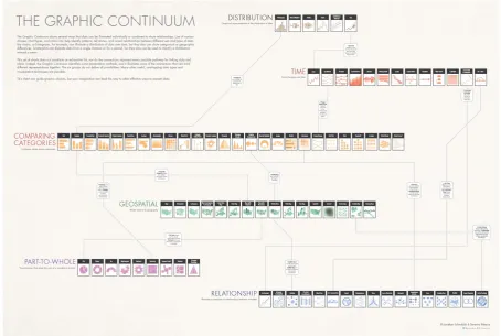
1. The Graphic Continuum
‘The Graphic Continuum’ is a platform which provides users multiple ways to help them in exploring the design space of visualisation, such as via the use of flash cards and posters which is based on the visualizations of the Data Visualization Catalogue. ‘The Graphic Continuum’ consist of a more comprehensive view of graphic types and how they are classified into different categories. The purpose of these tools is to help people decide how to choose the best graph for their data or to expose people to less common graphic types. The flashcards can be seen in figure 1. In figure 2 the poster version can be seen.
The Graphic Continuum flashcards are based on ‘The Graphic Continuum’ poster. The cards are categorised into six categories, namely (1) distribution, (2) time, (3) comparing categories, (4) geospatial, (5) part-to-whole and (6) relationships. At one side of the card a visualisation type is shown, and on the other hand, the category which the visualisation type belongs to is displayed.
Figure 1: The Graphic Continuum - Flash Cards2
Figure 2: The Graphic Continuum - Poster3
2 https://visual.ly/blog/graphic-continuum/
[image:16.595.70.525.364.669.2]2. A Periodic Table of Visualization Methods
The periodic table of visualisation methods is an interactive overview of many visualisation types. The visualisations are categorised by different types of visualisation, such as (1) data visualisation, (2) information visualisation, (3) concept visualisation, (4) strategy visualisation, (5) metaphor visualisation and (6) compound visualisation which can be seen in figure 3. By hovering the mouse over ‘an element’ an example of the visualisation type will be shown. The purpose of this tool is to give a clear overview of many existing visualisation types. This tool does consist of many flaws. Firstly, the different forms of visualisation are not universal and do not give a proper description to when to use the visualisation types. Secondly, an image example of the visualisation type is provided, but the functionality of the visualisation types is not given. Thirdly, there is no useful organisation as mentioned by Few. ‘What is the point of doing an entire research project to force a list of visualization methods into a paradigm that does not fit it? Apart from breaking the visualization methods into general categories (information visualization, concept visualization, etc.), this table exhibits no useful organization.’ [4] The structure of the periodic table does not have an added value.
3. The Data Visualization Catalogue
The Data Visualization Catalogue’ is used for exploring the design space of possible data visualisation types. ‘The Data Visualization Catalogue’ is one of the most descriptive tools; It can be viewed in two ways, firstly by viewing all the types which can be seen in figure 4 and secondly by considering them by what the user wants to show which can be seen in figure 5. The first way lets the user click on one of the visualisation types, once clicked, a short description of the type is given, the anatomy of the visualisation, the functions, variations, examples and possible tools which can generate the visualisation. The second viewing way shows a list of functions, consisting of the functions; comparisons, proportions, relationships, hierarchy, concepts, location, part-to-a-whole, distribution, how things work, processes & methods, movement or flow, patterns, range, data over time, analysing text and reference tool.
Figure 4: The Data Visualization Catalogue – Type View5
Figure 5: The Data Visualization Catalogue – Function View6
4. The TimeViz Browser
Figure 6: The TimeViz Browser7
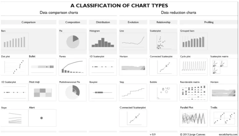
5. A Classification of Chart Types
‘A Classification of Chart Types’ classifies the charts in two sections, (1) data comparison charts and (2) data reduction charts which can be seen in figure 7. The first section is then divided into three subsections, namely (1) comparison, (2) composition and (3) distribution. The second section is also divided into three subsections, specifically (1) evolution, (2) relationship and (3) profiling. This tool divides visualisation types once again into categories, which is only helpful to a certain extent.
Figure 7: A Classification of Chart Types8
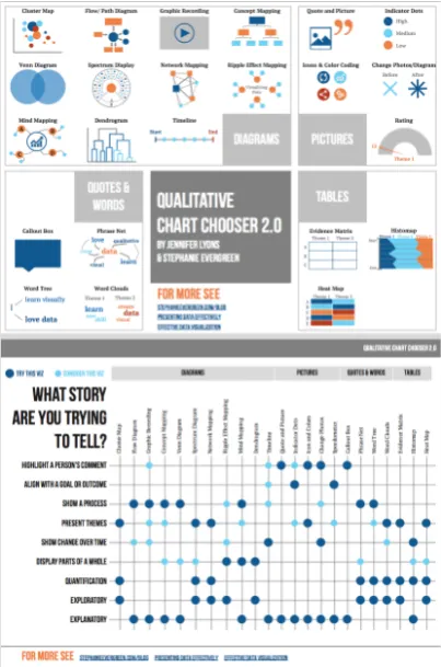
6. Qualitative Chart Chooser
Figure 8: Qualitative Chart Chooser 1.09
Figure 9: Qualitative Chart Chooser 2.010
7. Chart Suggestion – A Thought-Starter
In comparison with other chart choosers, the ‘Chart Suggestion’ which is shown in figure 10 gives more detailed guidance for the user. It starts with the question ‘What would you like to show?’, the answer is then divided into four categories; (1) comparison, (2) distributions, (3) composition and (4) relationship. Both the category distribution and relationship are then divided into subsections depending on the number of variables the user wants to showcase. The category comparison is divided into two subsections; over time and among items. Lastly, the category composition is split into two subsections; changing over time and static. This chart chooser is a more detailed approach of knowing how to show data and is very descriptive and breaks down to the data, but its disadvantage is that it only gives the user the possibility to explore 20 visualisation types.
Figure 10: Chart Suggestion – A Thought-Starter11
8. Chart Chooser
comparison and distribution which results that the tool gives visualisation types which can show both categories. This tool provides, therefore, the relationship between categories.
Figure 11: Chart Chooser12
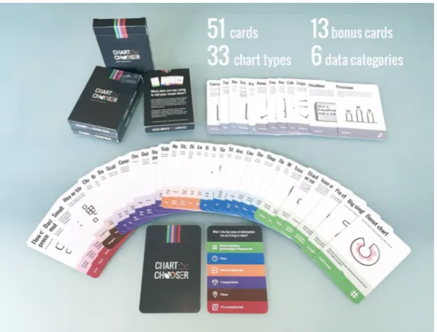
9. Chart Chooser Cards
‘Chart Chooser Cards’ which can be seen in figure 12, are meant to be simple. They help the user choose the best type of chart. The aim of ‘Chart Chooser Cards’ is to cut through the data noise to help users decide which graph type is best and which chart sells their story or message. As shown in figure 13, on each card the common name of the chart type is shown, along with a description, a visual example, when it is used and what type of data set it is best for. As can be seen in Figure 14, the chart types are organised into six categories; (1) small numbers, percentages, frequencies, (2) time, (3) survey responses, (4) comparisons, (5) place and (6) it is complicated. This tool is very descriptive and falls parallel in the same category as ‘The Data Visualization Catalogue.’ There are both descriptive when it comes to the visualisation types. The disadvantage here again is that the combinations of categories are not given.
Figure 12: Chart Chooser Cards13
Figure 13: Chart Chooser Cards – Description14
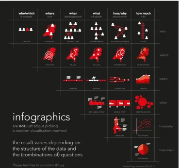
[image:25.595.218.379.357.497.2]10. Infographic Taxonomy
[image:26.595.114.486.319.665.2]‘Infographic Taxonomy’ which can be seen in figure 15, focuses on the importance of the function of infographics. Stating that infographics are not just about picking a random visualisation; the result varies depending on the structure of the data and the (combinations of) questions. ‘Infographic Taxonomy’ consist of 6 main questions which are also paired with each other. The questions are, (1) who/which is involved, (2) where is it, (3) when did it happen, (4) what is it about, (5) how/why does it work and (6) how much is it. The focus is primarily on the interrogative words such as, who/which, where, when, what, how/why, how much. This ‘Infographic Taxonomy’ focuses therefore on the relationship and combination between the questions, which in this case are the categories. Similarly, to the ‘Chart Suggestions - A Thought-Starter,' the Infographic Taxonomy is very data focused, but its disadvantage is that only 20 visualisations are represented.
Figure 15: Infographic Taxonomy16
11. Visual Vocabulary
The ‘Visual Vocabulary’ which is shown in figure 16, aims at users making an informative and meaningful data visualisation by deciding which data relationship is most important in the user’s story, then look at the different types of the chart within the category to form some initial ideas about what might work best. The ‘Visual Vocabulary’ has an interactive online version and a static offline version in the shape of a poster which can be seen in figure 16. It consists of nine categories, namely (1) deviation, (2) correlation, (3) ranking, (4) distribution, (5) change over time, (6) magnitude, (7) part-to-whole, (8) spatial and (9) flow. The ‘Visual Vocabulary’ also gives a short description of each category and examples of when the category is used. Users get a broad overview of all the visualisation types available to use, but the combinations of the categories and relationships between the visualisations are not given.
12. A Tour through the Visualization Zoo
‘A Tour through the Visualization Zoo’ is an extensive article that provides a brief tour through the “visualisation zoo,” showcasing techniques for visualising and interacting with diverse data sets. Here the focus is on a few of the more sophisticated and unusual techniques that deal with complex data sets. Analogously, some of the more exotic forms of visual data representations are covered, starting with one of the most common, (1) time-series data; continuing to (2) statistical data and (3) maps, and then completing the tour with (4) hierarchies and (5) networks. Most of the visualisations are also accompanied by interactive examples. ‘The article concludes that the DNA underlying all visualisations remains the same: the principled mapping of data variables to visual features such as position, size, shape, and colour.’ [5] In figure 17, a sneak peek of ‘A Tour through the Visualization Zoo’ is shown, each section is structured in the same way. First, the visualisation is described, and then an interactive example is provided, where the reader can experience the description in a ‘live’ environment within a context.
The article is focused on very unusual visualisation types, and it does an excellent job at describing each type and its functionalities, but as a disadvantage only describes a small scope of the entire zoo of visualisations.
Figure 17: A Tour through the Visualization Zoo – Sneak Peak
13. AnyChart- Chartopedia
where the chart types are grouped by usage with the categories: (1) comparison, (2) data over time, (3) range, (4) distribution, (5) proportion, (6) location, (7) part of the whole and (8) finance. All types mentioned in the catalogue are supported by JavaScript charting libraries which means all these types can be made using JavaScript. Chartopedia focuses on grouping the types into different types of categories of usage. This catalogue also does not focus on the data, but on how you will want to use the chart type.
Figure 18: AnyChart - Chartopedia18
14. Tableau
Figure 19: Tableau Interface19
Figure 20: Tableau Visualization Possibilities20
15. Microsoft Excel
Microsoft has very similar features as Tableau. The data can be directly visualised by choosing one of the options provided by Excel. The Microsoft Excel interface and visualisation examples can be seen in figure 21 and 22. Microsoft Excel is not as intuitive as Tableau. Tableau uses the 'drag and drop' functionality, by using excel the user must select the data he would like to visualise, but this is not informed in advance, the user must either search for it or figure it out by himself. Also, Excel provides the option to represent data in 35 different visualisation types visually.
Figure 21: Microsoft Excel Interface
2.3.2 Problem Analysis
There is now a clear overview of what is available to use when it comes to exploring the design space of data visualisation. In this section, the limitations, disadvantages for the user and improvements of the existing tools will be discussed.
2.3.3 Limitations and Disadvantages
Limitations and disadvantages are considered factors which limit the user from exploring the complete design space of data visualisation and factors which restrict the user to understand how to represent his data visually fully. While going through the functionalities, purpose and description of all the tools mentioned above, some problems and limitations kept emerging. This list was gathered by picking all the functionalities of each existing system and putting them in one list, since some systems offer other functionalities than other, if you both all the functionalities together that would make a tool that will encourage the user to explore the complete design space.
Some limitations of these systems are:
1. The relationship between visualisation types is not always given; this also includes showing different variations of visualisation types with similar functionalities.
2. A clear description of the categories in which the visualisations are categorised is not always present. 3. Description of the visualisation types is not always present.
4. Mentioning in which tool the visualisation can be made is not always present. 5. The relationship between categories is not always given.
6. The definition of categories is not always given.
7. The possibility to combine categories is not always present.
8. Some visualisation support 20 visualisations, other 100 or more visualisations.
9. The focus is mostly on what the user wants to show, instead of what the data can show. Therefore, these tools are not always data-centred, they are visualization-centred.
10. The tool does not guide the user through the process on how to get from data to visualisation. 11. The tool does not encourage creativity or the freedom to explore new types of visualisation types or
least known visualisation types.
Figure 23: Limitation Matrix
2.3.4 Improvements
As can be seen in figure 23, the tools with the least limitations are: 1) The Data Visualization Catalogue, 2)) The Visual Vocabulary, 6) A Tour through The Visualization Zoo and 7) Anychart-Chartopedia.
The main improvements for the above-explored tools are; (1) to show the combinations and relationship between visualization types, (2) to describe the categories, if the visualization types are categorized, (3) defining the visualization type, by explaining its function and also giving a visual example, (4) mentioning in which tool such a visualization can be made, (5) showing variations of the same type of visualization, (6) to focus on what the data consist of and what can be demonstrated which this data, (7) to guide the user through the entire process and (8) to encourage creativity and freedom of exploration, to come up with new visualization types and come across least known types.
2.3.5 Focus
The focus and the main problem which can be observed in all the existing systems is that the focus is not on the data, but on the result, the visualisation. The step to analyse the data to get to a visualisation is missing. Therefore, the focus of this research project is to make an interactive tool for exploring the design space of data visualisation by applying the principles of visual encoding to take that step from data to visualisation. This tool will focus on the data which will be visualised; what are the attributes of the data, that is the focal point and how to visually represent these data attributes.
2.4 A Solution
As mentioned in the previous section the focus of this research project is to make an interactive tool for exploring the design space of data visualisation by applying the principles of visual encoding from data to visualisation. In this section, the concept, application area and goal of this idea will be elaborated.
2.4.1 The Concept
The tool will be a suggestion web tool. It will help the user explore the design space by starting with his data and potentially ending up with ideas on how to visualise his data. In chapter five and six the concept will evolve into a prototype, therefore in those chapters, the tool will be explained more elaborately. Here a brief idea of the tool will be given. The user will be guided throughout the entire process. Therefore, the process will be divided into steps: Step 1) Analyse the dataset, 2) Define the data types, 3) Connecting the data types to the principles of visual encoding, 4) Sketching, here the user will get the freedom to creatively apply the principles in any way he or she wants to and 5) The user will get suggestions on which visualization types to use that fit the data types and visual encodings. The idea is that the tool is clean, straightforward and easy to use.
2.4.2 Application Area and Goal
The developer of the tool which is the author of this research project realised that there could be misunderstandings on what the difference is between the intended tool and existing data visualisation tools. There are a few data visualisation designers, who use data visualisation tools for the exploration of the design space. In chapter 4, the difference between data visualisation tools and this tool will be explored in more detail.
The goal of this tool is to encourage and motivate users to explore the design space by sketching and by finding out about least known visualisation types. Furthermore, to make users aware of the abundance of visualisation types that exist and that can be used.
3. Methods and Techniques
In this chapter, the methods and techniques used to realise this research project are elaborated. The creative technology design process used as the red line throughout this research project. ‘The process of starting with the ideation, then the specification, the realisation and finally the evaluation.’ [6] In this section, the stakeholders, the tool requirement analysis and the evaluation procedure will be discussed.
3.1 Stakeholders
In this section, everyone who is affected by the web tool, who have power over it or who have an interest in its successful or unsuccessful development will be discussed. Thus, the stakeholders will be discussed. The stakeholders will be divided into four groups: (1) Influencers, (2) Advisors, (3) Users and (4) End Users.
The Influencers are the people who have a direct influence or power over the web tool and research project. A direct influence in the sense of that they can potentially change the look, the feel, and functionality of the tool. The developer of the tool and the supervisor of the research project are known to be ‘the main influencers.' These two stakeholders have the power to determine the functionalities of the tool and the look-&-feel of it as well. The developer makes all the necessary and final decisions in collaboration with the supervisor.
The Advisors are people who have an interest in its successful or unsuccessful development, but also might influence the functionality and look-&-feel of the tool. Moreover, they also might be affected by the tool. Advisors are the critical observer of this research project and experts in the field of data visualisation, which can be teachers of data visualisation and data visualisation designers. The Advisors do not have a direct influence on the development of the tool, they are as the name suggests, advisors. They have the freedom and choice to give their opinion on the web tool, and the developer decides whether he takes their advice into account or not. They are data visualisation experts and designers. Therefore they are also affected by the tool, so they will have the freedom to creatively use the tool whenever they need to explore how to visualise their data set.
The End-Users are the people who will see the end visualisation which the Users make. Their impact on the tool itself is not significant. However, it can happen that the Users advice the End-Users to use the tool, and then they also become Users.
Thus, one of the main stakeholders of the research projects is ‘The Users’ that will use the tool. These users can be both novices to the field of data visualisation and data visualisation enthusiasts.
3.2 Tool Requirements Analysis
The tool must fulfil some requirements before development starts. The requirements are divided into three groups: (1) Main Requirements, (2) Desired Requirements and (3) Additional Requirements.
The Main Requirements are that the tool must be available online and easily accessible to anyone with access to the internet. Therefore, the performance of the web tool must be reasonably good. It will be a web tool; therefore, it is expected to work on any mobile or computer device.
The Desired Requirements are based on the software that will be applied to develop the tool. All software used is desired to be free and simple to use, to showcase that students with any background can be able to develop a web tool. Therefore, ‘Visual Studio Code’ is used for the frontend and backend development, due to its working collaboration with ‘Azure,’ a free cloud computing service for students to develop their web applications. ‘Data Grip’ is used for the management of the database and ‘Bootstrap Studio’ to make the interface of the web tool.
The Additional Requirements are needed to make the entire process of the development of the tool smoother and easier. Therefore, ‘GitHub’ is used for the source code management.
A more detailed approach on how to the tool is made will be given in chapter 5, the chapter on the specification of this research project.
3.3 Evaluation Procedure
to the tool, to improve it before the universal testings began. In these cases, the expert was the supervisor of this research project, a data visualisation expert and enthusiast, also the co-author of the forthcoming work ‘The Fundamental Principles of Visual Encoding’, Yuri Engelhardt. The feedback from two known Dutch Data Visualization Designers was also considered during the testing of the prototype, namely Nadieh Bremer and Jan Willem Tulp.
4. Ideation
In this chapter, the analyses for the development of the envisioned product will be discussed. The idea of the envisioned web tool will be elaborated throughout the following chapters. Firstly, the application of the principles of visual encoding will be explained. Secondly, the visualisation analysis by using the principles will be elaborated, which explores the answer to the third sub question ‘How can the different types of data visualisations be analysed regarding the basic principles of visual encoding?’. Thirdly, the idea of the envisioned tool will be compared with existing visualisation tools. Lastly, the final idea for the envisioned tool will be discussed.
4.1 Application of Principles of Visual Encoding
In chapter 2, section 2.2, the principles of visual encoding were explained. In this section, the application of the principles of visual encoding will be explained. In other words, how the principles will be used and applied in the tool will be elaborated.
The principles of visual encoding will be applied twice in the process of the tool. Firstly, they will be applied by providing the user with the principles which are fitting to his data type, an illustration of this process can be seen in Table 1. This will be further explained in detail in section 4.4. Secondly, with the help of the visualisation analysis, the principles of visual encoding will be the connecting piece to the data types and the existing visualisation types. This will be explained in detail in section 4.2.
Data Type Principles
Visual Appearance and/or Spatial Location
Picturing
Mapping
Relationship
Connecting Nesting
Nominal Attribute
Ranking-based spatial ordering Chronological spatial ordering
Quantitative Attribute
Positioning on a time axis Positioning on an attribute axis Scaling by size
Table 1: Data Type to Principle
4.2 Visualization Analysis
The principles of visual encoding play a significant role in this research project. The goal is to advise users on which visualisation types to use that fit their data, to achieve this the basic principles are used. Each data type can be represented by several principles as mentioned in section 2.2. Each visualisation type consists of a combination of the principles of visual encoding. This is considered the visualisation analysis.
The visualisation analysis consists of analysing all the existing visualisation types. In Chapter 2, existing tools and catalogues have been analysed, and the ones who had the least limitations were (1) The Data Visualization Catalogue, (2) The Visual Vocabulary, (3) A Tour through The Visualization Zoo and (4) Anychart–Chartopedia.
The analysis consisted of three steps. First; all the existing visualisations of the catalogues were gathered, which were in total 220 visualisations. Second; all the similar visualisations were grouped, and duplicates were taken out of the analysis. This concluded with the analysis containing a total of 125 unique existing visualisations. Third; a matrix was made to analyse each visualisation with the basic principles of visual encoding. In other words, examining which principles are used in each visualisation. For example, a line chart consists of applying the principles ‘Positioning on an attribute axis’ and ‘Positioning on a time-axis’. In Appendix A and Appendix B, the procedure of this analysis can be seen. This analysis will be used as part of the database of the tool, to retrieve the data that is needed to give the user suggestions on which visualisation types to use.
4.3 The Idea of the Tool vs. Existing Data
Visualization Tools
Tableau is used by some data visualisation designers as an exploration tool; to quickly place the data and get an overview of what can be visualised. Other data visualisation designers also use ‘Tableau’ for visualising their data for clients and making their end visualisations in ‘Tableau’. In Table 2 the functionalities of Tableau and the envisioned tool (DataVis Helper) are compared.
Tableau DataVis Helper
Data set can quickly be imported
Data set cannot be imported, only gives advice on how the data can be visually represented
Does give the possibility to create visualizations with the imported data
Does not give the possibility to create an end visualization with the user’s data set. The user can explore possibilities on which visualizations to use based on the advice given by the DataVis Helper
Exploration of 24 visualization types is available
Exploration of 125 visualization types is available
Does not encourage users to sketch
Encourages users to sketch and use their creativity
Does not give users suggestions on what is most fitting for their data
Will give users suggestions based on what is most fitting for their data
Table 2: Tableau vs. DataViz Helper Functionalities
As summarised in Table 2, ‘Tableau’ and other data visualisation tools have a different goal and functionality as the DataVis Helper. The 'DataVis Helper' will suggest up to 125 different existing visualisation types, and it encourages users to sketch and use their creativity by applying the principles of visual encoding. ‘Tableau’ and other data visualisation tools have the advantage that the user can directly import their dataset and immediately start visualising their imported data and end up with a visualisation.
understandable for the user. After the visualisation analysis has been done, a few new insights were found which will be explained by going through the first idea of the process of the tool.
The first process of the tool consisted of the following steps; (1) analyse the dataset, (2) define the data types, (3) find fitting principles of visual encoding for the data types, (4) sketch with the principles given, here the user will get the freedom to creatively apply the principles in any way he or she wants to and (5) the user will get suggestions on which visualization types to use that fit the data types and visual encodings.
One critical insight that was found is that some variables in the dataset might be more important than others. This depends on the importance of the variable itself, or it depends on the message or story that the user wants to tell. An extra step has been decided to be added where the user must rank his chosen variables, from most important to least important. A second insight gained was that this tool needs to have a maximum number of variables the user can fill in. It has been chosen that the user can pick a maximum of six variables to fill in.
The concluded steps which are illustrated in Table 3 are: (1) fill in the names of the variables, (2) rank the variables, (3) assign data types to the variables, (4) principles will be given based on the data types, (5) the user can now sketch with the given principles and (6) the user will get existing visualization suggestions that he can use.
Table 3: Flowchart of the Process of the DataViz Helper
Step 1 Step 2 Step 3 Step 4 Step 5 Step 6
Name the variables
Rank the variables
Assign the data types
Principles will be given
User must sketch
5. Specification
The final idea has been specified in the previous chapter. In this chapter, the idea will be further specified with the help of performing human prototyping, feedback sessions with the major stakeholders, the making of the user requirements and possible user scenarios.
5.1 Prototyping
In this part of the ideation phase, a human-paper version of the tool has been made and tested. Firstly, by letting students of a Data Visualization course at the University of Twente analyse visualisation types according to the principles of visual encoding, the insights of this occurrence will be further discussed in section 5.2.1. Secondly, a human-paper prototype has been tested to find out whether the process and flow of the tool will work, this will be further discussed in section 5.2.2.
5.1.1 Student Prototyping
A guest lecture on the topic of ‘The Design Space of Data Visualization’ was given by Yuri Engelhardt, Yuhang Yu and Roseidys Primera to a group of University College students of the University of Twente. The students received an explanation of the design space of data visualisation and on the principles of visual encoding. After these explanations, the students received an exercise where they had to find the principles of visual encoding which were present in the visualisation types in the article ‘A Tour through the Visualization Zoo’. Students were asked to form pairs so that they could discuss the answers together.
The exercise which the students had to perform is the similar process that was mentioned in section 4.2, the so-called ‘Visualization Analysis’ where four data visualisation catalogues were analysed, and the principles present in the visualisation types of these catalogues were found.
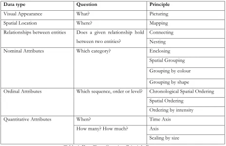
Data type Question Principle
Visual Appearance What? Picturing
Spatial Location Where? Mapping
Relationships between entities Does a given relationship hold between two entities?
Connecting Nesting
Nominal Attributes Which category? Enclosing
Spatial Grouping Grouping by colour Grouping by shape
Ordinal Attributes Which sequence, order or level? Chronological Spatial Ordering Spatial Ordering
Ordering by intensity
Quantitative Attributes When? Time Axis
How many? How much? Axis
[image:44.595.66.531.70.369.2]Scaling by size Table 4: Data Type-Question-Principle Process
The insights gained by testing out the procedure of finding out which principles of visual encoding are present in different types of visualisations were the following: (1) adjusting the terminology of some principles and (2) finding out whether everyday people such as students can grasp the purpose and process of the tool.
The terminology of the following principles was adjusted. Firstly, the difference between ‘nesting’ and ‘enclosing’ was not clear to the students; therefore ‘nesting’ was kept as ‘nesting’, and ‘enclosure’ has been changed to ‘grouping by enclosure’. Secondly, the students did not understand what was meant by ‘spatial grouping’, this term has been changed to ‘grouping by proximity or distance’. Thirdly, the difference between ‘Chronological Spatial Ordering’ and ‘Spatial Ordering’ was not clear, and these principles have been changed into ‘Time-based spatial ordering’ and ‘Attribute-based spatial ordering’. Lastly, the students did not know the difference between the principle ‘time axis’ and ‘axis’. Therefore, the principles consisted of axes has been adjusted into ‘Positioning on a time axis’ and ‘Positioning on an attribute axis’.
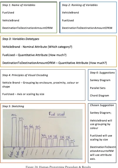
5.1.2 Human- Paper Prototype
A human-paper prototype has been made and tested to gain insights on how the tool will work. The functionality, the flow and the content of the tool were tested. The human part of the prototype is in this case, the developer of the tool. The developer has all the knowledge that the tool will also have. ‘I’ is in this section the developer, also known as the human part of the human-paper prototype.
The procedure of testing the human-paper prototype with a potential user consisted of following the six steps mentioned in section 4.4 as the final idea.
Step 1: The participant was asked to search for a dataset and give the variables he wanted to visualise a name. The names for the variables were the same names stated in his data set as the column names. The insight that was gathered here is that participants might tend to use variables that are known as ‘unique variables’. Unique variables or name tags are variables with consist of a name. For example, the number of each bus line starting from 1 till 30 or the name or number of students, such as Maria and s123456.
Step 2: The participant was then told to analyse the dataset, this consisted of finding out which variables he wanted to visualise based on the analysis he wanted to make or the message he wants to showcase. Based on his analysis on the importance of his variables, he was asked to rank these variables from one being the most significant and three the least important.
Step 3: The participant had to define his variables with the suitable data type. The process of defining the variables into data types was a bit challenging at first since I only gave the names of the data types to the participant such as ‘Visual Appearance or Spatial Location of Entities’ and ‘Relationships between Entities’. These terms are not universally used or known. The participant needed more help figuring out which data types fit with his variables, so I started asking the participant questions, such as, which of these questions does your variable answer. For example, ‘What is x?’ or ‘Where is x?’, ‘x’ represents the variable. The participant got a clearer idea of what kind of data type his variables were by me asking these questions.
Step 5: After some sketching, the suggestions were given. While the participant performed the sketching part, a question or insight arose; that I must make sure that users sketch with the given principles and do not skip this step entirely. The freedom to create your non-existing unique visualisation types is an important part of the goal of the tool. The use of creativity is part of the exploration of the design space and cannot be skipped.
5.2 Expert Requirements
In this section, the expert’s requirements will be elaborated. The main expert of this research project as discussed previously is the supervisor and co-author of the forthcoming book on the basic principles of visual encoding. The expert and the developer had several feedback sessions and brainstorming sessions together to further work out the process of the tool regarding the principles. In this section, the requirements of the expert based on the steps of the tool will be discussed.
Step 1
It must be clear to the user that the use of ‘unique identifiers’ or ‘nametags’ should not be chosen as a variable to visualise. These variables can be added as a label to a value, but cannot be chosen as variables to be visually represented in one way or another. A limit must be set for the user; the user can not fill in endless amounts of visualisations. It has been decided that the user can fill in a maximum of six variables.
Step 2
The user’s ranking of his variables: it has been decided that this step will be optional. Not every user knows what kind of analysis he wants to make and not every user knows the message that they want to showcase. If the user chooses to rank his variables, he must rank them from most important to least important. For the following steps during the process of the tool, his preference will be taken into consideration. The top variables will be assigned to principles of visual encoding first.
Step 3
Users must assign data types to their variables. The users will not have to assign the data type directly, but indirectly by assigning variables to a fitting question that the variables answer. The data types and the suitable questions can be seen in Table 5.
Table 5: Data Type - Question Answered
Data type Question Answered
Visual Appearance What?
Spatial Location Where?
Relationships between entities Does a given relationship hold between two entities?
Nominal Attribute Which category?
Ordinal Attribute Which sequence, order or level? Time Quantitative Attribute When?
Step 4
In the background, the tool will also have a ranking system to determine which principle will be assigned to a variable. The principles of visual encoding that are based on a spatial dimension always will be suggested first.
Nominal Attributes have the principles; enclosing (grouping by enclosure), spatial grouping (grouping by proximity), grouping by colour and grouping by shape. The suggested principle, in this case, is ‘spatial grouping (grouping by proximity). The other principles are on the same level of importance.
Ordinal Attributes have the principles; time-based spatial ordering, attribute-based spatial ordering and ordering by intensity. Firstly, time-based spatial ordering will be suggested, then attribute-based spatial ordering and then ordering by intensity.
Quantitative Attribute has the principles: attribute axis and scaling by size. Attribute axis will be suggested first and then scaling by size.
Step 5
The users get the principles of visual encoding that are fitting to their variables. They will have the opportunity to sketch. At this step examples will be given on when the principles are used, to give the user an idea what is meant by each principle.
Step 6
Suggestions of existing visualisation types consisting of combinations of the principles will be given to the user. First, the visualisation types with the most combinations of principles will be shown and then the visualisation types that combine at least two principles.
5.3 Developer Requirements
In this section, the developer’s requirements will be discussed. The software requirements, the structure of the database, the structure of the tool and the structure of the interface will be discussed.
5.3.1 Software Requirements
The final decision on which software that has been chosen: 1) For the management of the database: Data Grip. 2) For the making of the interface: Bootstrap Studio.
3) For the management of the web development: Visual Studio Code. 4) For the tracking of the documentation: GitHub.
In Chapter 6, the software will be explained in further detailed.
5.3.2 Structure of the Database
The tool consists of two main engines, one being where the tool will be developed, and one is the database of the tool where all the information will be retrieved. For the most efficient information retrieval, the following structure has been chosen for the database. The structure consists of three databases, one for the datatypes, one for the principles and one for the visualisations. This structure and the process of retrieval of the data will be detailed explained in chapter 6.
5.3.3 Structure of the Tool
The structure of the backend and frontend communication of the tool is illustrated in figure 25. In this illustration, the different steps of that tool and the user must perform are illustrated. The main tasks of the tool are to store and retrieve information, and the main tasks of the user are to give and use information. This process will be explained in more detail in chapter 6.
5.3.4. Structure of the Interface
The main requirements for the structure of the user interface have been decided to be as follows; the steps must be easily understandable, and the navigation of the process must run smoothly.
5.4 User Requirements
In this section, the user requirements will be summarised.
The tool will be a universal tool which can be used by anyone. Therefore, it must be easy to understand for all types of users. This suggestion tool, also known as a ‘helper’, is a new concept in the field of data visualisation design space, which means the users do not know what to expect, so the tool must be explained for the user, each step, definitions and examples given must be clear.
6. Realization
In this chapter, the focus is on the making and testing of the tool which has been developed. This chapter focuses on answering the fourth sub question ‘how can all be applied in a tool that can support and encourage users in exploring the design space of data visualisation?’. This chapter starts with explaining all the components of the tool and then ending with explaining the procedure of the usability testings which have been performed.
6.1 Tool
In this section, the development of the tool will be fully explained which consists of explaining the components, process and different versions of the tool.
6.1.1 The Database
The database of the web tool is made of three main tables which manage the information needed to provide the users with the visualisation suggestions. This information consists of the data types, the principles of visual encoding and the visualisation suggestions. The structure of the database can be seen in the following illustrations. The first table connects the data type with an encoding type, which is illustrated in Table 6.
Data Type Encoding
Visual Appearance Depicting Spatial Location Depicting
Relationships Linking
Nominal Attributes Grouping Time Ordinal Attribute Time Ordering Ordinal Attributes Ordering Time Quantitative Attribute Time Scaling Quantitative Attributes Scaling
Table 6: Data Type to Encoding
Encoding Type Principle Example of use
Depicting Picturing Pictorial/Technical Illustration
Depicting Mapping Street map, Floor plan
Linking Connecting Flow chart, family tree, network graph
Linking Nesting Tree map, circle packing
Grouping Grouping by enclosure (Enclosing) Venn diagram
Grouping Grouping by proximity (Spatial grouping) Diagrams that use spatial clustering Grouping Grouping by colour Diagrams that use colour coding Grouping Grouping by shape Diagrams that use shape coding Time Ordering Chronological Spatial Ordering (Time based
spatial sequence)
Comic strip, Pictorial instructions
Ordering Rank-based Spatial Ordering (Attribute based spatial sequence)
Ordered list, bump chart
Ordering Ordering by intensity Greyscale/ Intensity map Time Scaling Positioning on a time axis (Time Axis) Time line, clock face Scaling Positioning on an attribute axis (Attribute
Axis)
Scatter plot
Scaling Scaling by size Bar chart, pie chart
Table 7: Principles
The terms in the brackets are the terms which were used in the final version of the prototype of the tool. The terms which are not in the brackets are the most recent developed terms by the forth coming work ‘The Fundamentals of Visual Encoding’. The purpose of the first and second table is to get from a datatype to a principle. The element ‘Encoding’ in the first table and the element ‘Encoding Type’ in the second table were created to connect one table with the other. This structure was chosen since it gives a clear overview and the information is easily accessible; this makes the workings of the database and the web development software more efficient.
6.1.2 The Process
In this chapter, the process of the web tool is explained. The process consists of the steps and content of the tool when it comes to the front-end development or so called interface of the tool. This section discusses each step one by one with illustration on how the tool developed from start till end with two different versions of the web tool. The latest version of the web tool can be found at www.datavishelper.com
Home Page
This step consists of the home page of the tool. The homepage of the tool is simple and has one goal; for the user to get started with the entire process of finding out more about the design space of data visualisation.
The very first version consisted of a big ‘Let’s Get Started!’ button for you to start the process and a menu with an ‘About’, a ‘FAQ’ and a ‘Contact’ page. The about page explains in short what the tool is, its goal and history, mentioning that this tool is part of a research project. The FAQ (Frequently Asked Questions) page has been added so that users can send their feedback, suggestions, complaints or questions. The feedback received will be evaluated and may be implemented to make the tool better. The ‘Contact’ page focuses on everyone who has contributed to the development of the tool. In figure 26, the first version of the tool is shown. The final version of the pages ‘About’, ‘FAQ’ and ‘Contact’ can be seen in Figures 27, 28 and 29.
Figure 26: Version 1.0 Interface Design 'Home Page'
Figure 28: Version 2.0 Interface Design 'About'
[image:56.595.72.519.376.603.2]Figure 30: Version 2.0 Interface Design 'Contact'
Step 1: Name your variables
Figure 31: Version 1.0 Interface Design ‘Step 1’'
Figure 32: Version 2.0 Interface Design 'Step 1'
Step 2: Assigning and Defining Data Types
[image:58.595.98.499.343.569.2]Figure 33: Version 2.0 Interface Design 'Step 2'
Step 3: Ranking
Figure 34: Version 2.0 Interface Design 'Step 3'
Step 4: Principles of Visual Encoding and Sketching
Step 4 consists of giving the user suggestions on which principles of visual encoding to use to represent their variables visually. This step can be seen in figure 35. The users are encouraged to sketch different types of visualisations with the principles given before moving on to the next step.
The back-end consists of a ranking system when it comes to assigning which principle gets selected by the user. The ranking is based on first assigning the spatial dimensions which are mentioned in section 5.2.
Principle
Picturing Mapping Connecting Nesting
Grouping by enclosure (Enclosing) Grouping by proximity (Spatial grouping) Grouping by colour
Grouping by shape
Chronological Spatial Ordering (Time based spatial sequence)
Rank-based Spatial Ordering (Attribute based spatial sequence)
Ordering by intensity
Positioning on a time axis (Time Axis) Positioning on an attribute axis (Attribute Axis)
[image:61.595.199.397.87.441.2]Scaling by size
[image:61.595.73.524.478.733.2]Step 5
[image:62.595.72.525.226.484.2]The suggestions on which existing visualisation types to use are given to the user. This step can be seen in figure 36. A suggestion will be given if the combination of principles has a suitable visualisation type. The tool gives suggestions of at least a combination of two principles unless the user wants to only visualise one variable then suggestions on how to visualise this one variable will be given. As soon as there are 3 or more variables, the suggestions for the combination of at least two variables will be shown.
Figure 36: Version 2.0 Interface Design 'Step 5'
6.2 Usability Testing
In this section, the procedure of the usability testing will be explained. As discussed in section 3.4, two types of testings will take place (1) Expert Testings and (2) Universal Testings. Here both usability testings will be elaborated. All testings were recorded and documented and the usability testing consent form that each universal participant had to fill in can be seen in Appendix F.
6.2.1 Expert Testing
web tool and (3) they must give critical, constructive and their honest advice on the content and process of the web tool.
The supervisor was tested by a tool walk-through where each step was discussed in detail. The data visualisation designers, on the other hand tested the tool by mail, they were asked to follow the steps of the web tool and provide feedback on their experience with the tool.
6.2.2 Universal Testing
Universal usability tests must be performed to find out if the tool is useful and fulfils the goal and the vision. The technique that is planned to be used is by testing control groups and doing individual sessions. Five types of universal testing groups have been tested: 1) University Students with average experience with data visualization, 2) University Students with little experience with data visualization, 3) University Students with no experience with data visualization, 4) Adults (around the age of 40) with no experience with data visualization and 5) Teenagers (around the age of 15) with no experience with data visualization.
All participants can choose their own data set, and they will be asked to follow the steps of the web tool. At the end the usability test, the users will receive a survey where they will have to describe their experience and improvements for the tool if they have any. The survey used is the ‘The System Usability Scale’ (SUS). ‘The SUS is perhaps the most popular standardised usability questionnaire, accounting for approximately 43% of unpublished usability studies. It is a 10-item questionnaire designed to measure users’ perceived usability of a product or system.’ [7]