Munich Personal RePEc Archive
Communicating quantitative information:
tables vs graphs
Klein, Torsten L.
PAS Research Unit
11 December 2014
Online at
https://mpra.ub.uni-muenchen.de/60514/
C O M M U N I C AT I N G Q UA N T I TAT I V E
I N F O R M AT I O N : TA B L E S V S G R A P H S
klein, torsten l.
*December 11, 2014
In applied statistics and computational econometrics a key task for researchers is to bring the sizable but unstructured body of numeric evidence, for example from Monte Carlo simulation, in a form ready for introducing to scientific dialog. At their disposal they find estab-lished means of arrangement: narrative text, tables, graphs. Employing classical principles of communication to evaluate their suitability graph-ical devices seem optimal. They absorb large quantities of data, and organize content into a productive tool. Graphs confirm the advantage when put to work in a standard simulation exercise. However, theory and application contrast with the norm observed in peer-reviewed jour-nals – by a wide margin and with considerable persistency researchers prefer tables.
jel code:A14, C10, C15, C35, C52, Y10.
key words:econometric and statistical methods, Monte Carlo,
bivariate probit model, exogeneity testing; modes of communication, data visualization; economics of science.
C O N T E N T S
1 Sentence, table, graph: weighing the means of
communi-cation . . . 2
2 A practical assessment from tests of exogeneity in the
bi-variate probit model . . . 6
3 Making a sensible choice in the reality of academic
publish-ing? . . . 8
a Appendix . . . 10
References . . . 12
1 S E N T E N C E , TA B L E , G R A P H : W E I G H I N G T H E M E A N S O F C O M M U N I C AT I O N
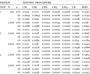
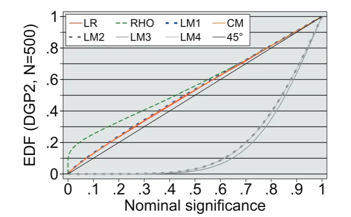
When presenting numeric evidence researchers use, apart from stan-dard word-for-word discourse, tabular or graphical devices. The two examples below come from a Monte Carlo study on statistical procedures and their characteristics. In table1the spreadsheet-style list groups quantities of interest according to simulation parameters in one dimension and the procedures under scrutiny in the other. Here, it assigns rejection frequencies of seven different test statistics to specific values the researchers chose for their degrees of freedom in the exercise: data generating process, number of observations, nominal significance level. A comparison between columns indi-cates, contingent on simulation parameters, the relative performance of the procedures as to empirical size, and so offers a basis to rec-ommend one and dismiss the other. Instead of comparing rejection frequencies the graph in figure1employsPvalues of test statistics and their empirical distribution function (EDF). It is calculated for data generating process 2, samples of 500 observations and then displayed at a number of pre-chosen significance levels.1
Even though for communicating quantities sentence, table and graph are to a certain degree complementary in nature, mutually enhancing their abilities if used in combination, there are advantages to some and shortcomings to others.2 Which one to choose? The classical principles of information exchange – precision and conci-sion – bring the three means into order, with sentence and graphical devices at the poles of the spectrum and tables occupying the middle ground.
The sentence excels when conveying selected quantities from Monte Carlo simulations. A numerical value may not only be penned explicitly, but also commented on without delay for better under-standing by the reader. Yet this runs into difficulty given the need to communicate a lot of data or interrelation among them that is multivariate and hence ill-suited for the linear nature of the sentence. Here resides the graph’s main strength. It absorbs quantitative in-formation in large amounts, consumes space to a minimum still,
1 The main concepts and definitions used are assembled in appendixA.1. The graphical framework is introduced in detail by Davidson and MacKinnon (1998, section 2).
compressing data while making way for appraisal from various direc-tions. Endowed with scales its axes connect data plots to numerical values, a technique more likely than direct statement to trigger inac-curacy, confusion or mistake. Small is its room for commenting, and thus the tolerance for overcharging quantitative displays with textual information. From these extremes the table occupies an intermedi-ate position, combining the ability of the sentence to stintermedi-ate precise quantities as well as supplementary information within a concise and relational format similar to the graph.
So, if presenting simulation data, informing readers of test prop-erties, empirical size or other, which principle should one follow? Precision is irrelevant, concision indispensable.
Of course, any format chosen for display must avoid obscuring numerical results. But numbers given to the fourth decimal, scat-tered between chunks of words perhaps, perhaps shaped into litanies of coded record, offer few benefits for the task at hand: transfer in-formation meaningful to the reader. Quite the opposite, they instill reassurance which may prove deceptive.
For one, each Monte Carlo experiment relies on a data gener-ating process (DGP), a necessary abstraction from economic data encountered in the real world. Although recreating a shortlist of fea-tures deemed important by the researcher, every DGP neglects some characteristics and even rules out others explicitly – one choice only among innumerable possibilities. Hence, there will always remain some arbitrary element, read: imprecision, created by its design. A different kind of arbitrariness stems from the method which is ap-plied to study a procedure’s qualities. The researcher simulates tests of the null hypothesis drawing data samples repeatedly, each time calculating the statistic in question. He then estimates empirical size by taking an average, the rejection frequency, the outcome of a ran-dom variable. Sampling variability will lead to different estimates in different simulations, although conducted on the same DGP, number of observations and number of repetitions; it will make reproducing values identical to those in table1improbable.3 The accuracy
sug-gested by stating point estimates of empirical size cannot solve the randomness inherent to simulation. A third element in the trade off
between precision and concision concerns which numerical values to report. True, focusing on the empirical companions of “conven-tional” suspects as in table 1may first come to mind. Apart from econometric custom however, ten, five, one per cent levels command no special merit over others.4 P value plots also make a choice in
selecting the nodes to be displayed. Yet it is based on a criterion of information processing rather than space restriction: distribute nominal significance covering an interval wide enough for the reader to infer the properties of tests.
Despite their inaccuracy, stemming from the degrees of freedom granted to users and the randomness introduced by method, Monte Carlo experiments are in ample use. They offer a quick escape route from the prison of asymptotic inference, determining test properties in samples of finite length. Insights come from three avenues to discovery that strain all modes of display and their ability to carry the associated information. First, in a given simulation environment the test under scrutiny may be related to a theoretical or asymptotic absolute: is the true null rejected too often or not often enough, is there a high risk of not rejecting a false null? The evidence may then be set against competing procedures. Finally, changing the environment may offer answers on how previous results vary with simulation parameters. Framing test properties from multiple angles induces a challenge to sentence, table and graph alike since each is tied to the medium of communication the researcher employs. In case of the printed page or the inanimate computer screen this leaves two dimensions at their disposal to absorb multivariate data produced by the simulation. For the graph, though, there is a way out. The small multiple loosens the constraint of rectangularity without sacrificing clarity. It also adds to the strength of conveying large amounts of information using minimal space.5
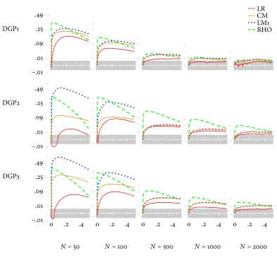
Figure2suggests a small multiple that reports on the same Monte Carlo experiment as table1.6It organizes simulated evidence on
pro-cedures’ empirical size from all parameter pairings: switching DGP for a given sample length while moving down a column, or increasing sample length for a given DGP while moving through a row. Now compare. The table’s spreadsheet anatomy leaves each procedure three slots to state the values of empirical size associated with sim-ulation settings, settings that its stub indicates and orders linearly, one variation after the other. The small-multiple’s matrix concedes 108 slots which correspond to the node count the researcher picks. Instead of citing values it merely labels a necessary few coordinate pairs for orientation; instead of sequencing variation on the line it spans a senior plane of Cartesian tuples – of DGP and sample length. The number of size results stored to the graph is far superior thanks to its aptitude for compressing information, yet in reality this seems only a secondary virtue. For why would providing more evidence imply to facilitate its appraisal? Tipping the balance is not the mere excess amount of data displayed. It is a skill of the nuclearPvalue plot to craft them into one unit thereby revealing information absent from its constituents, and a skill of the small multiple to show this unit evolve through each simulation stage using an arrangement that facilitates inquiry and furthers understanding.
Concision counts. Precision is neither feasible nor necessary nor desired. Therefore, to share quantitative information, to get across the point from a Monte Carlo experiment in economy and clarity, the format is the graph. Nevertheless, closing here would mean closing early. The fit of graphical devices reaches beyond the publication stage: to exploratory data analysis. Patterns and regularities are easily discovered, their dependencies on simulation design made transparent.7This is shown in the next section by employing a small
multiple of P value plots to reassess the simulation that governs table1and setting off discoveries against those from its spreadsheet competitor.
6 With figure1as a starting point the companion paper Klein (2014a) lists the steps taken to arrive at the small multiple.
2 A P R A C T I C A L A S S E S S M E N T F R O M T E S T S O F
EX O G E N E I T Y I N T H E B I VA R I AT E P R O B I T
MODEL
Table1andfigure2display results from the Monte Carlo experiment proposed in Monfardini and Radice (2008). They investigate size characteristics of seven procedures testing exogeneity in a bivariate probit model. Exogeneity requires that across the two relations deter-mining the latent variables stochastic disturbances are uncorrelated. All procedures test the null hypothesis of zero correlation, and differ by the a priori restrictions they impose as well as the quantity of information they require.8
Although Figure2concurs with the evidence in table1multiple
Pvalue plots offer some refinement to analysis.
LR systematically outperforms the other tests for all values ofNand different nominal levels [i.e. at 10%, 5%, 1%].
– Monfardini and Radice (2008, 276)
Indeed, the likelihood ratio test retains the smallest distance between empirical and nominal size at the nodes presented by the small multiple. Sorting through its rows makes the distance as well as the size advantage over other procedures decline at a diminishing rate with sample information available. This monotonicity is stalled in case of DGP2 and DGP3. Here graphical observation detects a marked pattern of under-rejection for small samples in the vicinity of conventional significance levels. If information is sufficient LR is also the only procedure to remain within 0.05 critical values of the Kolmogorov-Smirnov test, delimiting the shaded area: for DGP1 and 1,000 or 2,000 observations the null, differences of thePvalue plot from thePvalues’ theoretical cumulative distribution are due entirely to experimental randomness, can no longer be rejected at the 5 per cent significance level. Furthermore, having to evaluate the bivariate probit model from non-standard samples does not always
entail a clear advantage for LR which considers both specifications, restricted and unrestricted. This becomes obvious from scanning the small multiple column-wise. DGP1 seems easiest to estimate, yet provides LR with a larger edge over others than the more challenging DGP2.
RHO tends to display high over-rejection patterns, especially in DGP2 and DGP3 (the most difficult to estimate), where over-rejection remains serious even whenN= 2,000.
– Monfardini and Radice (2008, 276)
Similar to other tests the size distortion of RHO, a Wald-type statistic, becomes more problematic if the dichotomous variable suspected for endogeneity is observed with outcomes favoring ei-ther 0 or 1, and if the number of observations is small. For these combinations of DGP and sample length figure2plots discrepan-cies between the empirical distribution function and its uniformly distributed theoretical counterpart well above zero. Parting with likelihood ratio, score or conditional moment procedures however, the common hump occurs at low values of nominal significance only. Hence, over-rejection tends to be gravest at conventional levels of ten, five and one per cent. In addition, the small multiple suggests that over-rejection declines with sample size slightly faster under DGP3 than under DGP2.
CM and LM1 [. . .] give highly similar results [and] display empirical sizes quite close to the nominal ones [. . . They constitute] a reliable inference tool for testing exogeneity without simultaneous estimation.
– Monfardini and Radice (2008, 276)
From every combination of DGP and sample length the condi-tional moment test gives a smaller size distortion than the Lagrange multiplier procedure, except for a few singular nodes where perfor-mance is identical. As seen before, results vary systematically with simulation parameters. The advantage of CM is more pronounced for DGP2 and DGP3 as well as in small samples; with evidence ony1t
deviations like shrinking samples a little further may alter results – and verdict – to large extent.
[T]he set of LM tests (LM2, LM3, LM4) originated by the Kiefer formulation of the test statistic variance displays very unsatisfactory size properties in finite samples, with zero rejection frequencies for the sample dimensions analyzed.
– Monfardini and Radice (2008, 276)
P value plots confirm the unsatisfactory performance of the three tests, yet figure 2omits them.9 The little knowledge gained
from inclusion is outweighed by littering space with redundant facts which will inevitably mar comprehension. Table or figure, both methods of display cannot apply their skill to condense information since each datum gives the same. The quoted sentence carries all content.
Even though irrelevant for the communication of size results the graphical tool helps when exploring their link to simulation character-istics, and along the way creates fresh insight. Because the empirical distribution function of LM2, LM3 and LM4 is skewed less compared to other procedures, empirical and nominal size attain their maxi-mum distance at higher nominal significance values; lower skewness means not only equally poor results at conventional levels, but also negligible effects if simulation parameters change, as reported in table1. Taking into account the whole domain of EDF, size distortion tends to be higher for DGP2 than for DGP3, and for DGP3 higher than for DGP1. Similar to other tests rejection frequency decreases with the number of observations, albeit at a diminishing rate. In con-sequence, under-rejection of the three statistics actually deteriorates from an increase in sample length. LM2 and LM4 display similar size properties while LM3 fares somewhat “better” under DGP1 and DGP3, but even worse for DGP2.
3 M A K I N G A S E N S I B L E C H O I C E I N T H E R E A L -I T Y O F A C A D E M -I C P U B L -I S H -I N G ?
The clean split between means of communicating quantitative infor-mation in section1is effective for introducing available possibilities, necessary when discussing their benefit or flaw, and, of course, wrong.
Sentence, table and graph can hardly replace each other: divergent features turn them into complements. How to organize simulation results in prose without tabular or graphical devices converting those of interest in a readily digestible, concise format? How to access a graph’s or table’s contents without textual guidance on the way to read them, without comment on the bottom line of the exercise? Thus, the point in this note is not to advocate one over the other, but to suggest that choosing the means of communicating quantitative information – just like choosing simulation design – belongs to the re-searcher’s degrees of freedom. It deserves conscious effort. Assigning contents to sentence, table or graph he decides on which elements of the Monte Carlo experiment to disclose and which liberties to grant to readers.10 If the researcher aims for providing comprehensive
quantities of data while allowing his audience to explore simulation results for themselves he will supply a graph. If he prefers to regulate the flow of information more tightly and leave readers less room to draw their own conclusions he will offer numeric evidence in a table or resort to textual presentation only.
Researchers choose the second option. This is the upshot from a cursory look at published practice during the past quarter of a cen-tury in table2. When reporting quantitative information tables rule. Graphs do feature in articles on Monte Carlo simulation, although they mostly take a subsidiary role. While exclusive use has somewhat expanded since the late 1990s they fall clearly short of tabular devices accompanying narrative displays consistently in well over half of the published work in the sample. Explaining preference for tables over graphs does not preoccupy this brief note – the economics of academic publishing has already established a collection of factors that will operate on the choice between the two as well.11 To discover
empirically which of these factors in the end account for such distinct yet stable bias sets the task in Klein (2014b).
10 Cf. Tufte (1983, 192).
a A P P E N D IX
a.1 elements of communicating quantitative
infor-mation: rejection frequencies, the p value and
its empirical distribution function
For the purpose of analyzing test statisticτa Monte Carlo simulation is conducted based on a data-generating process (DGP) to obtain
j = 1, . . ., M realizations τj.12 With the aid of these realizations
rejection frequencies like those in table1may be obtained. They are calculated for a chosen significance levelαas the ratio of two figures: the number of times τj exceeds a corresponding critical value cα
from the statistic’s cumulative distribution functionF(τ), and the number of simulations:
1
M
M
∑
j=1
1[τj>cα] (1)
where 1[⋅]is the indicator function.13
ThePvalue, or marginal significance level, of statisticτassigns to each realizationτjthe probability of observing a value of at least
τj:
pj≡p(τj)=1−F(τj).
Its empirical distribution function (EDF) is an estimate of the cumu-lative distribution function of p(τ):
ˆ
F(xi)≡
1
M
M
∑
j=1
1[pj⩽xi], (2)
wherexi ∈(0, 1).
ThePvalue plot displays ˆF, generated from a DGP under the null hypothesis and evaluated at a series of nodes.14 Using the correct
dis-tributionF(τ),pjis the realization of a random variable distributed
12 This appendix merely restates the presentation in Davidson and MacKinnon (1998, 2–3).
13 The distribution under the null hypothesisF(τ)is known and may originate for example from asymptotic theory or bootstrap simulation. A critical valuecαis defined by 1−F(cα) =α. The frequency given assumes a one-sided test, rejecting in the upper tail of the distribution. This is consistent with statistics reported in table1.
uniformly in the interval [0, 1]. This will result in a graph close to the 45° line, and signal thatτmaintains correct size.
a.2 the bivariate probit model – testing exogene
-ity and simulating size
Monfardini and Radice (2008) consider a recursive model for two latent variables, the potentially endogenous variable y∗
1i and the
vari-able of interesty∗ 2i:15
y∗
1i =β′1x1i+u1i (3)
y∗
2i =β′2x2i+u2i=δ1y1i+δ2′z2i+u2i. (4)
Both are tied to observable dichotomous variables y1i andy2iwith
outcome:
yji =
⎧ ⎪ ⎪ ⎨ ⎪ ⎪ ⎩
1, ify∗
ji >0
0, ify∗
ji ⩽0
; j=1, 2. (5)
Exogenous variables of the model include x1i and z2i. They affect
latent variables according to location parametersβ1andδ2. The
rela-tion is disturbed by error termsu1iandu2i which follow a bivariate
normal distribution with unit variance and correlationρ. Across ob-servational unitsithere is no dependence. If errors are uncorrelated the dummy regressor y1iin the equation for y∗2iwill be exogenous.
The model’sKparameters(β′
1β′2 ρ)are estimated from a sample ofN
observations in compliance with the maximum likelihood principle. Testing H0:ρ=0 Monfardini and Radice examine standard mle
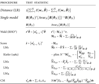
approaches to asymptotic inference: a likelihood ratio test requiring estimation of both the general and the restricted model, a Wald-type test adopting the former only, Lagrange multiplier as well as conditional moment procedures exclusively the latter. Details on each approach and its constituent elements are grouped by table3. The four Lagrange multiplier tests differ in the method they employ to calculate the observed information matrix−HN. While LM1 uses the outer product of gradient, all others rely on the asymptotic block-diagonality of the scaled Hessian under H0.16 Therefore, the(K,K)
element of (−HN)−1 selected by the score vector in the statistics’
quadratic form equals the inverted (K,K) element of −HN. To arrive at this item LM2 computes the outer product of gradient, LM3 its probability limit, and LM4 the corresponding entry in the Hessian. With a single parameter restriction imposed all test statistics have limiting χ2(1)distributions ifρ=0.17
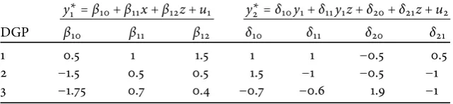
For their Monte Carlo experiment Monfardini and Radice make the bivariate probit model of equations (3) to (5) operational. They formulate three different DGPs, described in table4, and use them to draw samples of N = 500, 1,000, or 2,000 observations. They estimate the model, calculate the seven statistics given by table3, and compare them to critical values associated with nominal significance level α. They repeat each step until M = 5, 000 realizations are obtained for determining the rejection frequencies cited in table 1. Replicated simulation differs from the original in two ways. It combines DGPs with every sample length conceived, and includes two shorter versions ofN= 50, 100. In order to smoothPvalue plots it increases the number of repetitions toM=100, 000.
R E F E R E N C E S
Anscombe, Francis J., 1973, “Graphs in statistical analysis”,The Amer-ican Statistician27(1), 17–21.
Arribas-Bel, Daniel, Julia Koschinsky and Pedro V. Amaral, 2011, “Im-proving the multi-dimensional comparison of simulation results: a spatial visualization approach”,Letters in Spatial and Resource Sciences5(2), 55–63.
Chen, Chun-houh, Wolfgang Härdle und Antony Unwin (eds.), 2008,
Handbook of data visualization, Berlin: Springer.
Davidson, Russell and James G. MacKinnon, 1998, “Graphical meth-ods for investigating the size and power of hypothesis tests”, Manch-ester School66(1), 1–26.
Davidson, Russell and James G. MacKinnon, 1999, “Bootstrap testing in nonlinear models”,International Economic Review40(2), 487– 508.
Fiorio, Carlo V., Vassilis A. Hajivassiliou, Peter C.B. Phillips, 2010, “Bimodalt-ratios: the impact of thick tails on inference”,
Economet-rics Journal13(2), 271–289.
Ioannidis, John and Chris Doucouliagos, 2013, “What’s to know about the credibility of empirical economics?”,Journal of Economic Sur-veys27(5), 997–1004.
Kiefer, Nicholas M., 1982, “Testing for dependence in multivariate probit models”,Biometrika69(1), 161–166.
Klein, Torsten L., 2014a, “The small multiple in econometrics – a redesign”, mimeo, pasResearch Unit.
Klein, Torsten L., 2014b, “Communicating quantitative evi-dence: what determines the preference for tables over graphs?”, mimeo,pasResearch Unit.
Monfardini, Chiara and Rosalba Radice, 2008, “Testing exogeneity in the bivariate probit model: a Monte Carlo study”,Oxford Bulletin of Economics and Statistics70(2), 271–282.
Sargent, Thomas J. and Christopher A. Sims, 1977, “Business cycle modelling without pretending to have too much a priori economic theory”, inNew methods in business cycle research: proceedings from a conference, Federal Reserve Bank of Minneapolis, 45–109.
Sims, Christopher A., 1982,“Policy analysis with econometric models”,
Brookings Papers on Economic Activity, 1982(1), 107–152.
Tufte, Edward R., 1983,The visual display of quantitative information, Cheshirecn: Graphics Press.
Tufte, Edward R., 1990,Envisioning information, Cheshirecn: Graph-ics Press.
Wooldridge, Jeffrey M., 2010,Econometric analysis of cross section and panel data, 2nd edition, Cambridgema:mitPress.
Table 1: Empirical test size – rejection frequencies from an exemplary Monte Carlo simulation.
design testing procedure
DGP N α CM LM1 LM2 LM3 LM4 LR RHO
1 500 10% 0.1154 0.1172 0.0028 0.0038 0.0028 0.1022 0.1240 5% 0.0632 0.0644 0.0004 0.0006 0.0002 0.0536 0.0740 1% 0.0192 0.0192 0.0000 0.0000 0.0000 0.0148 0.0274 1,000 10% 0.1090 0.1100 0.0034 0.0044 0.0036 0.1054 0.1156
5% 0.0586 0.0586 0.0004 0.0008 0.0006 0.0552 0.0654 1% 0.0112 0.0114 0.0000 0.0000 0.0000 0.0102 0.0156 2 1,000 10% 0.1224 0.1228 0.0000 0.0000 0.0000 0.1164 0.1848 5% 0.0720 0.0724 0.0000 0.0000 0.0000 0.0632 0.1356 1% 0.0178 0.0180 0.0000 0.0000 0.0000 0.0132 0.0784 2,000 10% 0.1152 0.1156 0.0000 0.0000 0.0000 0.1084 0.1444 5% 0.0576 0.0576 0.0000 0.0000 0.0000 0.0548 0.0866 1% 0.0132 0.0134 0.0000 0.0000 0.0000 0.0120 0.0340 3 1,000 10% 0.1170 0.1174 0.0000 0.0004 0.0000 0.1038 0.1464 5% 0.0596 0.0600 0.0000 0.0000 0.0000 0.0508 0.0946 1% 0.0148 0.0150 0.0000 0.0000 0.0000 0.0112 0.0414 2,000 10% 0.1076 0.1078 0.0000 0.0000 0.0000 0.1004 0.1192
5% 0.0548 0.0552 0.0000 0.0000 0.0000 0.0480 0.0700 1% 0.0138 0.0138 0.0000 0.0000 0.0000 0.0104 0.0232
Source: Monfardini and Radice (2008, 277: table 1)
Notes: The table gives rejection frequencies of seven procedures assessing in a bivariate probit model the exogeneity of a dichotomous regressor: conditional moment test CM, Lagrange multiplier tests LM1, LM2, LM3 and LM4, likelihood ratio test LR, and Wald-type test RHO. The frequencies are obtained from simu-lating data generating processes DGP1, DGP2 and DGP3 to create samples ofN
observations, evaluating test statistics at asymptotic critical values that correspond to significance levelsα.
Table 2: Methods of display when communicating quantitative in-formation – relative frequencies [%] from a small sample of journal publications.
1989– 1994– 1999– 2004– 2009–
display method 1993 1998 2003 2008 2013
Sentence only 9.52 10.00 3.45 2.70 10.13
Table 68.25 55.00 55.17 56.76 53.16
Graph 7.94 5.00 12.64 16.22 15.19
Graph & table 14.29 30.00 28.74 24.32 21.52
Sum 100.00 100.00 100.00 100.00 100.00
Observations 63 80 87 74 79
Source: various issues ofEconometrica,The Journal of Economic Studies,The Journal of Economics and Statistics; own calculations.
Table 3: Testing exogeneity (H0: ρ =0) – procedures evaluated by
Monte Carlo simulation and their quadratic form statistics.
procedure test statistic
Distance(LR) 2[∑Ni=1ℓ(wi,
ˆ
θ) − ∑Ni=1ℓ(wi,
˜
θ)]
Single model R(θN)′{AvarN[R(θN)]}−1R(θN)
R(θN) AvarN[R(θN)]
Wald (RHO2) r′θˆ=[0′ K−11]′
ˆ
θ r′(−HN)−1r, HN=Ĥ = ∑i ∂2ℓi
∂θ∂θ′∣θ=θˆ
Score ˜s=[0′
K−1s˜ρ]′ −HN
LM1 H̃1= −S˜′S˜= − ∑i ∂ℓi
∂θ
∂ℓi
∂θ′∣θ=θ˜
Kiefer (1982) −plimN−1H∣
H0= −[
Hββ 0K−1 0′
K−1 Hρρ]
LM2 H̃2ρρ= −S˜ρ′S˜ρ= − ∑i ∂ℓ∂ρi
∂ℓi
∂ρ∣θ=θ˜
LM3 H̃3ρρ= − ∑i ϕ
2 1iϕ22i
Φ1iΦ2i(1−Φ1)(1−Φ2i)∣β=β˜
LM4 H̃4ρρ= ∑i ∂
2ℓ i
∂ρ∂ρ∣θ=θ˜
CM 1′
Nm˜ = ∑iu˜1iu˜2i Nm˜′[IK−1−S˜ββ(S˜′ββ
˜
Sββ)−1S˜′ββ]m˜
Source: adapted from information given in Monfardini and Radice (2008).
Notes: All procedures are based on the model in equations (3) to (5) and a sample of observationswi =[y1i y2ix1i′ z2i′ ]′,i=1, 2, . . . ,N. To estimate the(K−1) loca-tion parameters and correlaloca-tion coefficient,θ=[β′
1β′2ρ]′=[β′ρ]′, the method of maximum likelihood is used: maxθ∈Θℓ = ∑Ni=1ℓi = ∑Ni=1ℓ(wi,θ), whereℓ denotes the log likelihood function. Its score is given bys = ∑Ni=1s(wi,θ) =
∑Ni=1∂ℓi/∂θ; scores for individual observations may be stacked in(N×K) ma-trixS = [s(w1,θ) s(w2,θ) . . . s(wN,θ)]′. The Hessian contains the second-order derivatives, H = ∑Ni=1∂2ℓi/∂θ∂θ′. Both score and Hessian are
parti-tioned in similar fashion to the parameter vector, leading to s = [s′β sρ]′,
S =[Sβ Sρ], and sub-matrices of the formHθ1θ2 = ∑iN=1∂2ℓi/∂θ1∂θ2′where
θ1,θ2∈{β,ρ}. Ifρ=0 the model can be separated into two univariate probits, ℓ∣H0= ∑Ni=1ℓ1(y1i∣x1i;β1)+ ∑Ni=1ℓ2(y2i∣y1i,z2i;β2).
Under regularity conditionsθN, the parameter estimator based on sample in-formation, asymptotically follows a normal distribution,θN ∼aN(θo,[I(θo)]−1), with mean equal to the true parameter vectorθo and variance equal to the in-verse of the information matrix I(θo) = −E[∂2ℓ/∂θo∂θ′o], cf. Wooldridge
(2010, 476–479). Parameters and functions thereof obtained from estimating the unrestricted model are marked with a hat (̂), those estimated under H0 with a tilde (̃). Generalized residuals of the restricted model are defined by
˜
Table 4: Data generating process – parameter sets, regressor and error stochastics.
y∗1 =β10+β11x+β12z+u1 y∗2 =δ10y1+δ11y1z+δ20+δ21z+u2
DGP β10 β11 β12 δ10 δ11 δ20 δ21
1 0.5 1 1.5 1 1 −0.5 0.5
2 −1.5 0.5 0.5 1.5 −1 −0.5 −1
3 −1.75 0.7 0.4 −0.7 −0.6 1.9 −1
Source: Monfardini and Radice (2008, 275)
Notes: The two latent variablesy∗1 andy∗2 form a recursive probit model as sug-gested in appendixA.2; observations of the related dichotomous variablesy1and
0
.2
.4
.6
.8
1
EDF (DGP2, N=500)
0
.1 .2 .3 .4 .5 .6 .7 .8 .9
1
Nominal significance
LR RHO LM1 CM
[image:19.595.122.474.302.519.2]LM2 LM3 LM4 45°
Figure 1: Empirical test size –Pvalue plots.
b
C
u
u
o .2 .4
–.01 .01 .09 .25 .49 DGP3
N=50
bC
u
u
o .2 .4
N=100
bC
u
u
o .2 .4
N=500
bC
u
u
o .2 .4
N=1000
bC
u
u
o .2 .4
N=2000
[image:20.595.68.462.95.467.2]b C u u –.01 .01 .09 .25 .49 DGP2 bC u u bC u u bC u u bC u u b C u u –.01 .01 .09 .25 .49 DGP1 bC u u bC u u bC u u bC u u LR CM LM1 RHO
Figure 2: Empirical test size of selected testing procedures –Pvalue discrepancy plots in a small multiple.
Source: Klein (2014a)
Notes: The figure compiles results from replicating the Monte Carlo simulation that feeds table1, and places them within the framework introduced by Davidson and MacKinnon (1998). It displays for each combination of data generating process and sample length, over the interval (0, 0.5] of nominal significance levels,Pvalue discrepancies. They are calculated taking the difference between thePvalues’ empirical distribution function ˆF(xi)and nodesxiinserted for evaluation. Each ordinate is scaled non-linearly according to the power transformation g: y ↦