Kevin Dunn, McMaster University
03 January 2013
1 Visualizing Process Data 1
1.1 Data visualization in context . . . 1
1.2 Usage examples . . . 1
1.3 What we will cover. . . 1
1.4 References and readings . . . 2
1.5 Time-series plots . . . 2
1.6 Bar plots . . . 5
1.7 Box plots. . . 7
1.8 Relational graphs: scatter plots . . . 9
1.9 Tables . . . 11
1.10 Topics of aesthetics and style . . . 13
1.11 Data frames (axes) . . . 13
1.12 Colour . . . 13
1.13 General summary: revealing complex data graphically . . . 14
1.14 Exercises. . . 14
2 Univariate Data Analysis 23 2.1 Univariate data analysis in context . . . 23
2.2 Usage examples . . . 23
2.3 References and readings . . . 23
2.4 What we will cover. . . 24
2.5 Variability . . . 24
2.6 Histograms and probability distributions . . . 27
2.7 Binary (Bernoulli) distribution . . . 32
2.8 Uniform distribution . . . 34
2.9 Normal distribution . . . 34
2.10 t-distribution . . . 46
2.11 Poisson distribution . . . 49
2.12 Confidence intervals . . . 51
2.13 Testing for differences and similarity . . . 53
2.14 Paired tests . . . 62
2.15 Other confidence intervals . . . 63
2.16 Statistical tables for the normal- andt-distribution. . . 66
2.17 Exercises. . . 67
3.2 What is process monitoring about?. . . 92
3.3 What should we monitor? . . . 94
3.4 In-control vs out-of-control . . . 95
3.5 Shewhart chart . . . 95
3.6 CUSUM charts . . . 101
3.7 EWMA charts . . . 102
3.8 Other charts . . . 107
3.9 Process capability . . . 107
3.10 Industrial practice . . . 109
3.11 Industrial case study . . . 112
3.12 Summary . . . 113
3.13 Exercises. . . 113
4 Least Squares Modelling Review 127 4.1 Least squares modelling in context. . . 127
4.2 Covariance . . . 128
4.3 Correlation . . . 130
4.4 Some definitions . . . 131
4.5 Least squares models with a singlex-variable . . . 132
4.6 Least squares model analysis . . . 137
4.7 Investigation of an existing linear model . . . 149
4.8 Summary of steps to build and investigate a linear model . . . 155
4.9 More than one variable: multiple linear regression (MLR) . . . 156
4.10 Outliers: discrepancy, leverage, and influence of the observations . . . 163
4.11 Enrichment topics . . . 166
4.12 Exercises. . . 172
5 Design and Analysis of Experiments 201 5.1 Design and Analysis of Experiments: in context . . . 201
5.2 Usage examples . . . 201
5.3 References and readings . . . 202
5.4 Background . . . 203
5.5 Experiments with a single variable at two levels . . . 204
5.6 Changing one variable at a single time (COST) . . . 207
5.7 Factorial designs: using two levels for two or more factors . . . 209
5.8 Blocking and confounding for disturbances . . . 224
5.9 Fractional factorial designs . . . 226
5.10 Response surface methods . . . 239
5.11 Evolutionary operation . . . 249
5.12 General approach for experimentation in industry. . . 249
5.13 Extended topics related to designed experiments . . . 250
5.14 Exercises. . . 254
6 Latent Variable Modelling 277 6.1 In context . . . 277
6.2 References and readings . . . 277
7.6 More about the direction vectors (loadings). . . 293
7.7 Food texture example . . . 294
7.8 Interpreting score plots . . . 298
7.9 Interpreting loading plots . . . 301
7.10 Interpreting loadings and scores together . . . 303
7.11 Predicted values for each observation . . . 304
7.12 Interpreting the residuals . . . 306
7.13 Example: spectral data. . . 309
7.14 Hotelling’sT2 . . . 311
7.15 Preprocessing the data before building a model . . . 313
7.16 Algorithms to calculate (build) a PCA model . . . 315
7.17 Testing the model. . . 320
7.18 How many components to use in the model using cross-validation . . . 322
7.19 Some properties of PCA models . . . 324
7.20 Contribution plots . . . 325
7.21 Using indicator variables . . . 326
7.22 Visualization topic: linking and brushing . . . 327
7.23 Exercises. . . 328
8 PCR and PLS: Latent Variable Methods for Two Blocks 335 8.1 References and readings . . . 335
8.2 Principal component regression (PCR) . . . 335
8.3 Introduction to Projection to Latent Structures (PLS) . . . 339
8.4 A conceptual explanation of PLS . . . 341
8.5 A mathematical/statistical interpretation of PLS . . . 341
8.6 A geometric interpretation of PLS . . . 342
8.7 Interpreting the scores in PLS . . . 344
8.8 Interpreting the loadings in PLS . . . 345
8.9 How the PLS model is calculated. . . 345
8.10 Variability explained with each component . . . 349
8.11 Coefficient plots in PLS . . . 349
8.12 Analysis of designed experiments using PLS models . . . 350
8.13 Exercises. . . 351
9 Applications of Latent Variable Models 355 9.1 References and readings . . . 355
9.2 Improved process understanding . . . 355
9.3 Troubleshooting process problems . . . 357
9.4 Optimizing: new operating point and/or new product development . . . 359
9.5 Predictive modelling (inferential sensors) . . . 360
9.6 Process monitoring using latent variable methods . . . 361
your data.
This is followed by the section on univariate data analysis, which is a comprehensive treatment of univariate techniques toquantify variabilityand then to compare variability. We look at various univariate distributions, and consider tests of significance from a confidence interval viewpoint. This is arguably a more useful and intuitive way, instead of using hypothesis tests.
The next chapter is onmonitoring charts to track variability: a straightforward application of uni-variate data analysis and data visualization from the previous two chapters.
The next chapter introduces the area of multivariate data. The first natural application there is onleast squares modellingwhere we learn how variation in one variable is related to another vari-able. This chapter briefly covers multiple linear regression and outliers. We don’t cover nonlinear regression models; but hope to add that in future updates to the book.
The next major section coversdesigned experimentswhere we intentionally introduce variation into our system to learn more about it. We learn how to use the models from the experiments to optimize our process (e.g. for improved profitability).
The final major section is on latent variable modellingwhere we learn how to deal with multiple variables and extracting information from them. This section is divided in several chapters (PCA, PLS, and applications), and is definitely the most crude section of this book. This section will be improved in the future.
Being a predominantly electronic book, we resort to many hyperlinks in the text. We recommend a good PDF reader that allows forward and back navigation of links. However, we have ensured that a printed copy can be navigated just as easily, especially if you use the table of contents and index for cross referencing.
Updates: This book is continually updated; there isn’t a fixed edition. You should view it as a wiki. You might currently have an incomplete, or older draft of the document. The latest version of the document is always available athttp://learnche.mcmaster.ca/pid
Acknowledgement: I would like to thank my students and teaching assistants who over the years have made valuable comments, suggestions, corrections, and given permission to use their so-lutions to various questions. Particular thanks to Ian Washington, Ryan McBride, Stuart Young, Mudassir Rashid, Yasser Ghobara, Pedro Castillo, Miles Montgomery, Cameron DiPietro, Andrew Haines, and Krishna Patel. Their contributions are greatly appreciated.
Thanks also to instructors at other universities who have used these notes and slides in their courses.
Thanks everyone!
ically, use it for yourself, or share it with anyone.
The copyright to the book is held by Kevin Dunn, but it is licensed to you under the permissive Creative Commons Attribution-ShareAlike 3.0 Unported (CC BY-SA 3.0)license.
In particular, you are free :
• to share- to copy, distribute and transmit the work
• to adapt- but you must distribute the new result under the same or similar license to this one
• to commercialize- youare allowedto create commercial applications based on this work • attribution- but you must attribute the work as follows:
– Using selected portions: “Portions of this work are the copyright of Kevin Dunn” – or if used in its entirety: “This work is the copyright of Kevin Dunn”
You don’t have to, but it would be nice if you tell us you are using these notes. That way we can let you know of any errors.
• Please tell us if you find errors in these notes, or have suggestions for improvements • Please email to ask permission if you would like changes to the above terms and
condi-tions.
1.1 Data visualization in context
This is the first chapter in the book. Why? Every engineer has heard the phrase“plot your data” but seldom are we shown what appropriate plots look like.
In this section we consider quantitative plots – plots that show numbers. We cover different plots that will help you effectively learn more from your data. We end with a list of tips for effective data visualization.
1.2 Usage examples
The material in this section is used when you must learn more about your system from the data: • Co-worker: Here are the yields from a batch system for the last 3 years (1256 data points), can
you help me:
– understand more about the time-trends in the data? – efficiently summarize the batch yields?
• Manager: how can we effectively summarize the (a) number and (b) types of defects on our 17 aluminium grades for the last 12 months?
• Yourself: we have 24 different measurements against time (5 readings per minute, over 300 minutes) for each batch we produce; how can we visualize these 36,000 data points?
1.3 What we will cover
1.4 References and readings
1. Edward Tufte,Envisioning Information, Graphics Press, 1990. (10th printing in 2005) 2. Edward Tufte,The Visual Display of Quantitative Information, Graphics Press, 2001.
3. Edward Tufte,Visual Explanations: Images and Quantities, Evidence and Narrative, 2nd edition, Graphics Press, 1997.
4. Stephen Few, Show Me the Numbersand Now You See It: Simple Visualization Techniques for Quantitative Analysis; both from Analytics Press.
5. William Cleveland,Visualizing Data, Hobart Press; 1st edition, 1993.
6. William Cleveland,The Elements of Graphing Data, Hobart Press; 2nd edition, 1994.
7. Su, It’s Easy to Produce Chartjunk Using Microsoft Excel 2007 but Hard to Make Good Graphs,Computational Statistics and Data Analysis,52(10), 4594-4601, 2008.
1.5 Time-series plots
We start off considering a plot most often seen in engineering applications: the time-series plot. It is a 2-dimensional plot where one axis, the time-axis, shows graduations at an appropriate scale (seconds, minutes, weeks, quarters, years), while the other axis shows the data. Usually the time-axis is displayed horizontally, but this is not a requirement: some interesting analysis can be done with time running vertically. The time-series plot is a univariate plot (shows only one variable). Many statistical packages will call this a line plot, as it can be used quite generally to display any sort of sequence, whether it is along time, or some other ordering. They are excellent plots for visualizing long sequences of data. They tell a visual story along the sequence axis and the human brain is incredibly adept at absorbing this high density of data, locating patterns in the data such as sinusoids, spikes, outliers, and separating noise from signal.
Here are some tips for effective plots:
1. The software should have horizontal and vertical zooming ability. Once zoomed in, there must be tools to scroll up, down, left and right.
2. Always label the x-axis appropriately with (time) units that make sense.
lationship with other variables. The use of a second x-axis is helpful, on the left hand side is helpful when plotting two trajectories, but when plotting 3 or more trajectories that are in the same numeric range, rather use several parallel axes as shown later.
As shown here, even using differently coloured lines and/or markers may work in selected instances, but this still leads to a clutter of lines and markers. The chart here shows this principle, created with the default settings from Apple iWork’sNumbers(2009).
Using different markers, improving the axis labelling and tightening up the axis ranges, and thinning out the ink improves the chart slightly. This took about 3 minutes extra in the software, because I had not used the software before and had to find the settings.
This final example with parallel axes, is greatly improved, but took about 10 minutes to assemble, and would likely take a similar amount of time to format in MATLAB, Ex-cel, Python or other packages. The results are clearer to interpret: variables “Type A” and “Type B” move up and down together, while variable “Type C” moves in the oppo-site direction. Note how the y-axis for “Type C” is rescaled to start from its minimum value, rather than a value of zero. One should always use “tight” limits on the y-axis
4. Continuing on with the some data, a much improved visualization technique is to use sparklines to represent the sequence of data.
Sparklines are small graphics that carry a high density of information. The human eye is eas-ily capable of absorbing about 250 dots (points) per linear inch and 650 points per square inch. These sparklines convey the same amount of information as the previous plots, and are easy to consume on handheld devices such as iPhones, cellphones, and tablet computing devices which are common in chemical plants and other engineering facilities. Read more about them fromthis hyperlink.
Some further tips:
• When plotting money values over time (e.g. sales of polymer composite over the past 10 years), adjust for inflation effects by dividing through by the consumer price index, or an appropriate factor. Distortions due to the time value of money can be very misleading as thisexample of car sales shows. ACanadian inflation calculatoris available from the Bank of Canada.
1.6 Bar plots
The bar plot is another univariate plot on a two dimensional axis. The axes are not called x- or y-axes with bar plots, instead, one axis is called the category axis, while the other axis shows the value of each bar.
Some advice related to bar plots:
• Use a bar plot when there are many categories, and interpretation of the plot does not differ if the category axis is reshuffled. (It might be easier to interpret the plot with a particular ordering, however the interpretation won’t be different with a different ordering).
• A time-series plot is more appropriate than a bar plot when there is a time based ordering to the categories, because usually you want to imply some sort of trend with time-ordered data.
• Bar plots can be wasteful as each data point is repeated several times: 1. left edge (line) of each bar
2. right edge (line) of each bar 3. the height of the colour in the bar
4. the number’s position (up and down along the y-axis) 5. the top edge of each bar, just below the number 6. the number itself
Note: Maximize data ink ratio within reason.
Maximize data ink ratio= total ink for data total ink for graphics
= 1−proportion of ink that can be erased without loss of data information
• Rather use a table for a handful of data points:
• Use horizontal bars if:
– there is a some ordering to the categories (it is often easier to read these from top-to-bottom), or
– the labels do not fit side-by-side: don’t make the reader have to rotate the page to interpret the plot, rotate the plot for the reader.
• You can place the labels inside the bars.
• You should start the non-category axis at zero: the bar’s area shows the magnitude. Starting bars at a non-zero value distorts the meaning.
1.7 Box plots
Box plots are an efficient summary of one variable (univariate chart), but can also be used effec-tively to compare like variables that are in the same units of measurements.
The box plot shows the so-calledfive-number summaryof a univariate data series: • minimum sample value
• 25thpercentile(1stquartile) • 50th percentile (median) • 75th percentile (3rd quartile) • maximum sample value
The 25th percentile is the value below which 25 percent of the observations in the sample are found. The distance from the 3rd to the 1st quartile is also known as the interquartile range (IQR) and represents the data’s spread, similar to the standard deviation.
The following data are thickness measurements of 2-by-6 boards, taken at 6 locations around the edge. Here is a sample of the measurements, and a summary of the first hundred boards (created inR):
Pos1 Pos2 Pos3 Pos4 Pos5 Pos6 1 1761 1739 1758 1677 1684 1692 2 1801 1688 1753 1741 1692 1675 3 1697 1682 1663 1671 1685 1651 4 1679 1712 1672 1703 1683 1674 5 1699 1688 1699 1678 1688 1705 ....
96 1717 1708 1645 1690 1568 1688 97 1661 1660 1668 1691 1678 1692 98 1706 1665 1696 1671 1631 1640 99 1689 1678 1677 1788 1720 1735 100 1751 1736 1752 1692 1670 1671
> summary(boards[1:100, 2:7])
Pos1 Pos2 Pos3 Pos4 Pos5 Pos6
Min. :1524 Min. :1603 Min. :1594 Min. :1452 Min. :1568 Min. :1503
1st Qu.:1671 1st Qu.:1657 1st Qu.:1654 1st Qu.:1667 1st Qu.:1662 1st Qu.:1652 Median :1680 Median :1674 Median :1672 Median :1678 Median :1673 Median :1671 Mean :1687 Mean :1677 Mean :1677 Mean :1679 Mean :1674 Mean :1672 3rd Qu.:1705 3rd Qu.:1688 3rd Qu.:1696 3rd Qu.:1693 3rd Qu.:1685 3rd Qu.:1695 Max. :1822 Max. :1762 Max. :1763 Max. :1788 Max. :1741 Max. :1765
The following box plot is a graphical summary of these numbers.
Variations for the box plot are possible: • use the mean instead of the median
• outliers shown as dots, where an outlier is most commonly defined as any point 1.5 IQR distance units above and below the median (the upper and lower hinges).
plot is a collection of points shown inside a box formed by 2 axes, at 90 degrees to each other. The marker’s position is located at the intersection of the values shown on the horizontal (x) axis and vertical (y) axis.
The unspoken intention of a scatter plot is usually to ask the reader to draw a causal relationship between the two variables. However, not all scatter plots actually show causal phenomenon.
Strive for graphical excellence by:
• making each axis as tight as possible • avoid heavy grid lines
• use the least amount of ink • do not distort the axes
There is an unfounded fear that others won’t understand your 2D scatter plot. Tufte (Visual Display of Quantitative Information, p 83) shows that there are no scatter plots in a sample (1974 to 1980) of US, German and British dailies, despite studies showing that 12 year olds can interpret such plots. (Japanese newspapers frequently use them).
You will see this in industrial settings as well. Next time you go into the control room, try finding any scatter plots. The audience is not to blame: it is the producers of these charts that assume the audience is incapable of interpreting these plots.
Note: Assume that if you can understand the plot, so will your audience.
Further improvements can be made to your scatter plots: • Extend the frames only as far as your data
• One can add box plots and histograms to the side of the axes to aide interpretation
• Add a third variable to the plot by adjusting the marker size and add a fourth variable with the use of colour:
Gap-1.9 Tables
The data table is an efficient format for comparative data analysis on categorical objects. Usually the items being compared are placed in a column, while the categorical objects are in the rows. The quantitative value is then placed in the intersection of the row and column: called the cell. The following examples demonstrate this.
• Compare monthly payments for buying or leasing various cars (categories). The first two columns are being compared; the other columns contain additional, secondary information.
• Compare defect types (number of defects) for different product grades (categories):
This particular table raises more questions: – Which defects cost us the most money?
– Which defects occur most frequently? The table does not contain any information about production rate. For example, if there are 1850 lots of grade A4636 (first row) produced, then defect A occurs at a rate of 37/1850 = 1/50. And if 250 lots of grade A2610 (last row) were produced, then again, defect A occurs at a rate of 1/50. Redrawing the table on a production rate basis would be useful if we are making changes to the process and want to target the most problematic defect.
– If we are comparing a type of defect over different grades, then we are now comparing down the table, instead of across the table. In this case, the fraction of defects for each grade would be a more useful quantity to display.
– If we are comparing defects within a grade, then we are comparing across the table. Here again, the fraction of each defect type, weighted according to the cost of that defect, would be more appropriate.
Three common pitfalls to avoid:
1. Using pie charts when tables will do
Pie charts are tempting when we want to graphically breakdown a quantity into compo-nents. I have used them erroneously myself (here is an example on a website that I helped with: http://macc.mcmaster.ca/graduate-students/where-do-they-work). We won’t go into details here, but I strongly suggest you read the convincing evidence of Stephen Few in: “Save the pies for dessert”. The key problem is that the human eye cannot adequately decode angles, however we have no problem with linear data.
2. Arbitrary ordering along the first column; usually alphabetically or in time order
Listing the car types alphabetically is trivial: rather list them by some other 3rd criterion of interest: perhaps minimum down payment required, or typical lease duration, or total amount of interest paid on the loan. That way you get some extra context to the table for free.
3. Using excessive grid lines
Tabular data should avoid vertical grid lines, except when the columns are so close that mistakes will be made. The human eye will use the visual white space between the numbers to create its own columns.
To wrap up this section is a demonstration of tabular data in a different format, based on an idea of Tufte inThe Visual Display of Quantitative Information, page 158. Here we compare the corrosion resistance and roughness of a steel surface for two different types of coatings, A and B.
A layout that you expect to see in a standard engineering report:
Product Corrosion resistance Surface roughness Coating A Coating B Coating A Coating B
K135 0.30 0.22 30 42
K136 0.45 0.39 86 31
P271 0.22 0.24 24 73
P275 0.40 0.44 74 52
S561 0.56 0.36 70 75
S567 0.76 0.51 63 70
Note how the slopes carry the information about the effect of changing the coating type. And the rearranged row ordering shows the changes as well. This idea is effective for 2 treatments, but could be extended to 3 or 4 treatments by adding extra “columns”.
1.10 Topics of aesthetics and style
We won’t cover these topics, however Tufte’s books contain remarkable examples that discuss ef-fective use of colour for good contrast, varying line widths, and graph layout (use more horizontal than vertical - an aspect ratio of about 1.4 to 2.0; and flow the graphics into the location in the text where discussed).
1.11 Data frames (axes)
Frames are the basic containers that surround the data and give context to our numbers. Here are some tips:
1. Use round numbers
2. Generally tighten the axes as much as possible, except ...
3. When showing comparison plots: then all axes must have the same minima and maxima (see the exercise regarding theEconomist figure).
1.12 Colour
Colour is very effective in all graphical charts, however you must bear in mind that your readers might be colour-blind, or the document might be read from a grayscale print out.
Note also that a standard colour progression doesnotexist. We often see dark blues and purples representing low numbers and reds the higher numbers, with greens, yellows, and orange in between. Also, there are several such colour schemes - there isn’t a universal standard. The only safest colour progression is the grayscale axis, ranging from blacks to white at each extreme: this satisfies both colour-blind readers and users of your grayscale printed output.
See thesection on scatter plotsfor an example of the effective use of colour.
1.13 General summary: revealing complex data graphically
One cannot provide generic advice that applies in every instance. These tips are useful though in most cases:
• If the question you want answered is to understand causality, then show causality (the most effective way is with bivariate scatter plots). If trying to answer a question with alternatives: show comparisons (with tiles of plots, or a simple table).
• Words and graphics belong together: add labels to plots for outliers and explain interesting points; add equations and even small summary tables on top of your plots. Remember a graph should be like a paragraph of text, not necessarily just a graphical display of numbers which are discussed later on.
• Avoid obscure coding on the graph: don’t label points as “A”, “B”, “C”, .... and then put a legend: “A: grade TK133”, “B: grade RT231”, “C: grade TK134”. Just put the labels directly on the plot.
• Do not assume your audience is ignorant and won’t understand a complex plot. Conversely, don’t try to enliven a plot with decorations and unnecessary graphics (flip through a copy of almost any weekly news magazine to examples of this sort of embellishment). As Tufte mentions more than once in his books: “If the statistics are boring, then you’ve got the wrong numbers.”. The graph should stand on its own.
• When the graphics involve money and time, make sure you adjust the money for inflation. • Maximize the data-ink ratio = (ink for data) / (total ink for graphics). Maximizing this ratio,
within reason, means you should (a) eliminate non-data ink and (b) erase redundant data-ink.
• Maximize data density: humans can interpret data displays of 250 data points per linear inch, and 625 data points per square inch.
1.14 Exercises
Question 1
The data shown here are the number of visits to a university website for a particular statistics course. There are 90 students in the class, however the site is also publicly available.
The following graphics were shown in the print issue ofThe Economistin the 28 November 2009 issue, page 85. The article attempts to argue that there are enough similarities between Japan’s stagnant economic experience in the 1990’s (known as “Japan’s Lost Decade”), and the current experience in the “rich world” western countries to give their policymakers pause for concern. You canread the full article here. What problems do you notice with the graphics?
Question 3
This figure is a screen shot from aToronto Star articleabout mortgage payments as a function of the interest rate. Redraw the same information in a more suitable form.
Question 4
Using theWebsite traffic data set
1. Create a chart that shows thevariabilityin website traffic for each day of the week. 2. Use the same data set to describe any time-based trends that are apparent.
Question 5
1. What type of plot is shown here?
2. Describe the two phenomenon displayed.
3. Which plot type asks you to draw a cause and effect relationship between two variables? 4. Use rough values from the given plot to construct an approximate example of the plot you
proposed in part 3.
may have taken place in 2002 leading to increased phone use.
The rate of kidnappings peaked in 2000, at a rate of 8 per 100,000 residents, and has steadily decreased since that peak.
3. A scatter plot.
4. A scatter plot, from approximate values on the plot, is generated by the following code (you may use any software to construct your plot)
# Data from 1996 to 2007
bitmap(’kidnap-mobile.jpg’, pointsize=14, res=300)
kidnap <- c( 4, 5, 6.5, 7.5, 8.75, 7, 7, 5, 3.25, 2, 1.5, 1.25) mobile <- c(0.3, 0.4, 0.5, 0.6, 0.7, 0.8, 0.9, 2, 3.5, 4.25, 6.5, 7.25) plot(mobile, kidnap, type=’p’, xlab="Mobile phone antennae [thousands]",
ylab="Kidnappings per 100,000 residents") dev.off()
5. The advantage of the time-series plot is that you are able to clearly see any time-based trends - those are lost in the scatter plot (though you can recover some time-based information when you connect the dots in time order).
Comment:
The general negative correlation in the scatter plot, and the trends observed in the time-series plots ask you to infer a relationship between the two trajectories. In this case the plot’s author would like you to infer that increased cellphone penetration in the population has been (partly) responsible for the reduction in kidnappings.
This relationship may, or may not be, causal in nature. The only way to ascertain causality would be to do an experiment: in this case, you would remove cellphone antennae and see if kidnappings increased again. This example outlines the problem with trends and data observed from society -we can never be sure the phenomena are causal:
• firstly we couldn’t possibly perform that experiment of removing cell towers, and
• even if we could, the time scales are too long to control the experimental conditions: some-thing else would change while we were doing the experiment.
To compensate for that, social science studies compare similar countries - for example the original article fromThe Economist’s websiteshows how the same data from Mexico and Venezuela were compared to Columbia’s data. The article also shows how much of the trend was due to political changes in the country that were happening at the same time: in particular a 3rd factor not shown in the plots was largely responsible for the decrease in kidnappings. Kidnappings would probably have remained at the same level if it were not also for the increase in the number of police officers, who are able to respond to citizen’s cellphone calls.
Fortunately in engineering situations we deal with much shorter time scales, and are able to better control our experiments. However the case of an uncertain 3rd factor is prevalent and must be guarded for - we’ll learn about this is the section on design of experiments.
Question 6
Load theroom temperaturedataset from the generalDatasets websiteinto R, Python or MATLAB. 1. Plot the 4 trajectories,FrontLeft,FrontRight,BackLeftandBackRighton the same
plot.
2. Comment on any features you observe in your plot.
3. Be specific and describe how sparklines of these same data would improve the message the data is showing.
Solution
1. You could use the following code to plot the data:
roomtemp <- read.csv(’http://datasets.connectmv.com/file/room-temperature.csv’) summary(roomtemp)
ylim = c(290, 300)
bitmap(’room-temperatures.png’, pointsize=14, res=300, width=10, height=5) par(mar=c(4, 4, 0.2, 0.2)) # (B, L, T, R) par(mar=c(5, 4, 4, 2) + 0.1)
plot(roomtemp$FrontLeft, type=’l’, col="blue",
ylim=ylim, xlab="Sequence order", ylab="Room temperature [K]") lines(roomtemp$FrontRight, type=’b’, pch=’o’, col="blue")
lines(roomtemp$BackLeft, type=’l’, col="black") lines(roomtemp$BackRight, type=’b’, pch=’o’, col="black")
A sequence plot of the data is good enough, though a time-based plot is better.
2. • Oscillations, with a period of roughly 48 to 50 samples (corresponds to 24 hours) shows a daily cycle in the temperature.
• All 4 temperatures are correlated (move together).
• There is a break in the correlation around samples 50 to 60 on the front temperatures (maybe a door or window was left open?). Notice that the oscillatory trend still contin-ues within the offset region - just shifted lower.
• A spike up in the room’s back left temperature, around sample 135.
3. The above plot was requested to be on one axis, which leads to some clutter in the presenta-tion. Sparklines show each trajectory on their own axis, so it is less cluttered, but the same features would still be observed when the 4 tiny plots are stacked one on top of each other.
Another example of effective sparklines are for stock market data. Take a look, for example at Google Finance for ERJ(Embraer SA). Google shows Embraer’s stock price, but scroll down to see the sparklines for other companies that are in the same economic sector (Bombadier, Boeing, Northrop Grumman, etc). This quickly allows you to see whether movements in a stock are due to the overall sector (correlations), or due to a particular company (broken correlations).
If you looked around for how to generate sparklines in R you may have come across this website. Notice in the top left corner that thesparklines function comes from the
YaleToolkit, which is an add-on package to R. We show how toinstall packages in the tutorial. Once installed, you can try out thatsparklinesfunction:
• First load the library:library(YaleToolkit)
• Then see the help for the function: help(sparklines)to see how to generate your sparklines
Question 7
Load thesix point board thicknessdataset, available from datasets website.
1. Plot a boxplot of the first 100 rows of data to match the figurein the course notes
2. Explain why the thick center line in the box plot is not symmetrical with the outer edges of the box.
Solution
1. The following code will load the data, and plot a boxplot on the first 100 rows:
boards <- read.csv(’http://datasets.connectmv.com/file/six-point-board-thickness.csv’) summary(boards)
plot(boards[1:100,5], type=’l’) plot(boards[1:100,5], type=’l’) first100 <- boards[1:100, 2:7]
# Ignore the first date/time column: using only Pos1, Pos2, ... Pos6 columns
bitmap(’boxplot-for-two-by-six-100-boards.png’, pointsize=14, res=300, type="png256", width=6, heigh=5)
par(mar=c(2, 4, 0.2, 0.2)) # (bottom, left, top, right) spacing around plot
boxplot(first100, ylab="Thickness [mils]") dev.off()
dimensions of data. What are the 5 dimensions?
• A condensed version from this,4 minute YouTube videoshows Hans Rosling giving a new perspective on the same data. ThisEconomist article has some interesting background on Dr. Rosling, as does this page,giving a selection of his work.
2.1 Univariate data analysis in context
This section is an introduction to the area of data analysis. We cover concepts from univariate data analysis, specifically the concepts shown in the pictorial outline below. This section is only areview of these concepts; for a more comprehensive treatment, please consult an introductory statistics textbook (see the recommended readings further down).
2.2 Usage examples
The material in this section is used whenever you want to learn more about a single variable in your data set:
• Co-worker: Here are the yields from a batch system for the last 3 years (1256 data points) – what sort of distribution do the data have?
– yesterday our yield was less than 50%, what are the chances of that happening under typical conditions?
• Yourself: We have historical failure rate data of the pumps in a section of the process. What is the probability that 3 pumps will fail this month?
• Manager: does reactor 1 have better final product purity, on average, than reactor 2?
• Colleague: what does the 95% confidence interval for the density of our powder ingredient really mean?
2.3 References and readings
Any standard statistics text book will cover the topics from this part of the book in much greater depth than these notes. Some that you might refer to:
1. Recommended: Box, Hunter and Hunter,Statistics for Experimenters, Chapter 2. 2. Hodges and Lehmann,Basic Concepts of Probability and Statistics
3. Hogg and Ledolter,Engineering Statistics
4. Montgomery and Runger,Applied Statistics and Probability for Engineers
2.4 What we will cover
2.5 Variability
Life is pretty boring without variability, and this book, and almost all the field of statistics would be unnecessary if things did not naturally vary.
Fortunately, we have plenty of variability in the recorded data from our processes and systems: • Raw material properties are not constant
• Production disturbances:
– external conditions change (ambient temperature, humidity) – pieces of plant equipment break down, wear out and are replaced
• Feedback control systems introduce variability in your process, in order to reduce variability in another part of the process (think of what afeedback control systemdoes)
• Operating staff: introduce variability into a process in feedback manner (i.e. they react to process upsets) or in a feedforward manner, for example, to preemptively act on the process to counteract a known disturbance.
All this variability, although a good opportunity to keep us process engineers employed, comes at a price as described next.
2.5.1 The high cost of variability in your final product
Assertion Customers expect both uniformity and low cost when they buy your product. Variabil-ity defeats both objectives.
Three broad outcomes are possible when you sell a highly variable product:
1. The customer may be totally unable to use your product for the intended purpose. Imagine a food ingredient such as fresh milk, or a polymer with viscosity that is too high, or a motor oil with unsuitable properties that causes engine failure.
2. Your product leads to poor performance. The user must compensate for the poor properties through additional cost: more energy will be required to work with a polymer whose melt-ing point is higher than expected, longer reaction times will be required if the catalyst purity is not at specification.
3. Your brand is diminished: your products, even though acceptable will be considered with suspicion in the future.
An extreme example was the food poisoning and deaths that occurred due to the listeriosis outbreak at Maple Leaf Foods, Canada in 2008. The bacterial count in
food products is always non-zero, however the established tolerance limits were exceeded during this outbreak.
Another example was the inadvertent acceleration that occurred in some Toyota car models in 2010. It is still uncertain whether this was manufacturer error or driver error.
In addition to the risk of decreasing your market share (see the above 3 points), variability in your product also has these costs:
1. Inspection costs: to mitigate the above risks you must inspect your product before you ship it to your customers. It is prohibitively expensive and inefficient to test every product (known as “inspecting quality into your product”). A production line with low variability on the other hand, does not require us to inspect every product downstream of production.
The pharmaceutical industry is well known to be inefficient in this respect, with terms such as “100% inspection” and even “200% inspection”.
2. Off-specification products: must be reworked, disposed of, or sold at a loss or much lower profit. These costs are ultimately passed onto your customers, costing you money.
Note: the above discussion assumes that you are able to quantify product quality with one or more univariate quality metrics and that these metrics are independent of each other. Quality is almost always a multivariate attribute of the product. We willdiscuss the use of multivariate methods to judge product quality later.
2.5.2 The high cost of variability in your raw materials
Turning the above discussion around, with you on the receiving end of a highly variable raw material:
• If you do not implement any sort of process control system, then any variability in these raw materials is manifest as variability in your final product. This usually shows up in propor-tion: higher variability in the inputs results in higher variability in the product quality.
2.5.3 Dealing with variability
So, how do we make progress despite this variability? This whole book, and all of statistical data analysis, is about variability:
• in thedata visualization sectionwe gave some hints how to plot graphics thatshow the vari-abilityin our process clearly
• in this section we learn how toquantify variabilityand thencompare variability • later we consider how toconstruct monitoring chartstotrack variability
• in the section onleast squares modellingwe learn howvariation in one variable might affect another variable
• withdesigned experimentswe intentionallyintroduce variationinto our process to learn more about the process (e.g. so that we can optimize our process for improved profitability); and • and in the latent variable modelling section we learn how to deal withmultiple variables,
simultaneously extracting information from the data to understand how variability affects the process.
2.6 Histograms and probability distributions
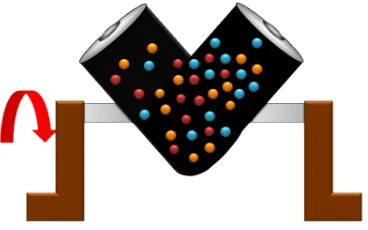
The previous section has hopefully convinced you that variation in a process is inevitable. This section aims to show how we can visualize and quantify variability in a recorded vector of data. A histogram is a summary of the variation in a measured variable. It shows thenumberof samples that occur in acategory: this is called afrequency distribution. For example: number of children born, categorized against their gender: male or female.
The raw data in the above example was a vector of consisted of 2739 text entries, with 1420 of them asMaleand 1319 of them asFemale. In this caseFemaleandMalerepresent the two categories. Histograms make sense for categorical variables, but a histogram can also be derived from a con-tinuous variable. Here is an example showing the mass of cartons of 1 kg of flour. The concon-tinuous variable, mass, is divided into equal-size bins that cover the range of the available data. Notice how the packaging system has to overfill each carton so that the vast majority of packages weigh over 1 kg (what is the average package mass?). If the variability in the packaging system could be reduced, then the histogram can be shifted to the left, thereby reducing overfill.
Plot histograms for the following:
• The grades for a class for a really easy test • The numbers thrown from a 6-sided die • The annual income for people in your country
In preparing the above histograms, what have you implicitly inferred about time-scales? These histograms show the long-term distribution (probabilities) of the system being considered. This is why concepts of chance and random phenomenacan be use to described systems and processes. Probabilities describe our long-term expectations:
• The long-term sex ratio at birth 1.06:1 (boy:girl) is expected in Canada; but a newly pregnant mother would not know the sex.
• The long-term data from a process shows an 85% yield from our batch reactor; but tomorrow it could be 59% and the day after that 86%.
• Canadian life tables from 2002 (Statistics Canada website) show that females have a 98.86% chance of reaching age 30 and a 77.5% chance of reaching age 75; but people die at different ages due to different causes.
• We know that a fair die has a 16.67% chance of showing a 4 when thrown, but we cannot predict the value of the next throw.
(b) number of defects on a metal sheet: none, low, medium, high
(c) yield from the batch reactor: somewhat continuous - quantized due to rounding to the closest integer
(d) daily ambient temperature, in Kelvin: continuous values 2. Decide on a resolution for the measurement axis:
(a) acceptable/unacceptable (1/0) code for the metal’s appearance (b) use a scale from 1 to 4 that grades the metal’s appearance
(c) batch yield is measured in 1% increments, reported either as 78, 79, 80, 81%,etc.
(d) temperature is measured to a 0.05 K precision, but we can report the values in bins of 5K
3. Report the number of observations in the sample or population that fall within each bin (resolution step):
(a) number of metal pieces with appearance level “acceptable” and “unacceptable” (b) number of pieces with defect level 1, 2, 3, 4
(c) number of batches with yield inside each bin level (d) number of temperature values inside each bin level
4. Plot the number of observations in category as a bar plot. If you plot the number of obser-vations divided by the total number of obserobser-vations,N, then you are plotting therelative frequency.
A relative frequency, also called density, is sometimes preferred: • we do not need to report the total number of observations,N
• it can be compared to other distributions
• if N is large enough, then the relative frequency histogram starts to resemble the popula-tion’s distribution
• the area under the histogram is equal to 1, and related to probability
2.6.1 Some nomenclature
We review a couple of concepts that you should have seen in prior statistical work. Population
A large collection of observations that might occur; a set ofpotential measurements. Some texts consider an infinite collection of observations, but a large number of obser-vations is good enough.
Sample
A collection of observations that haveactuallyoccurred; a set ofexistingmeasurements that we have recorded in some way, usually electronically.
In engineering applications where we have plenty of data, we can characterize the pop-ulation from all available data. The figure here shows the viscosity of a motor oil, from all batches produced in the last 5 years (about 1 batch per day). These 1825 data points, though technically asample as excellent surrogate for thepopulationviscosity because they come from such a long duration. Once we have characterized these samples, fu-ture viscosity values will likely follow that same distribution, provided the process continues to operate in a similar manner.
Distribution
Distributions are used to provide a much smaller summary of many data points. His-tograms, discussed above, are one way of visualizing a distribution. We will look at various distributions in the next section.
Probability
The area under a plot of relative frequency distribution is equal to 1. Probability is then the fraction of the area under the frequency distribution curve (also called density curve).
Superimpose on your histograms drawn earlier: • The probability of a test grades less than 80%
• The probability that the number thrown from a 6-sided die is less than or equal to 2
• The probability of someone’s income exceeding $50,000 Parameter
A parameter is a value that describes the population’sdistributionin some way. For example, the population mean.
population mean: E {x}=µ= 1
N
X
x
sample mean: x= 1
n
n
X
i=1
xi
whereN represents the entire population, andnare the number of entries in the sam-ple.
x <- rnorm(50) # a vector of 50 normally distributed random numbers
mean(x)
This is one of several statistics that describes your data: if you told your customer that the average density of your liquid product was 1.421 g/L, and nothing further, the customer might assume that some lots of the same product could have a density of 0.824 g/L, or 2.519 g/L. We need information in addition to the mean to quantify the distribution of values:the spread.
Variance (spread)
A measure of spread, or variance, is useful to quantify your distribution.
Population variance: V {x}=E
(x−µ)2 =σ2 = 1
N
X
(x−µ)2
Sample variance: s2 = 1
n−1 n
X
i=1
(xi−x)2
Dividing byn−1makes the variance statistic,s2, an unbiased estimator of the popu-lation variance,σ2. However, in most engineering data sets our value fornis large, so
using a divisor ofn, which you might come across in computer software or other texts, rather thann−1as shown here, has little difference.
sd(x) # for standard deviation
var(x) # for variance
The square root of variance, called the standard deviation is a more useful measure of spread to engineers: it is easier to visualize on a histogram and has the advantage of being in the same units of the variable.
Degrees of freedom: The denominator in the sample variance calculation, n−1, is called the degrees of freedom. We have one fewer thanndegrees of freedom, because there is a constraint that the sum of the deviations aroundxmust add up to zero. This constraint is from the definition of the mean. However, if we knew what the sample mean was without having to estimate it, then we could subtract each xi from that value, and our degrees of freedom would ben.
Outliers
Outliers are hard to define precisely, but an acceptable definition is that an outlier is a point that is unusual, given the context of the surrounding data. The following 2 sequences of numbers show the number 4024 that appears in the first sequence, has become an outlier in the second sequence. It is an outlier based on the surrounding context.
• 4024, 5152, 2314, 6360, 4915, 9552, 2415, 6402, 6261 • 4, 61, 12, 64, 4024, 52, -8, 67, 104, 24
Median (robust measure of location)
The median is an alternative measure of location. It is a sample statistic, not a popu-lation statistic, and is computed by sorting the data and taking the middle value (or average of the middle 2 values, for evenn). It is also called a robust statistic, because it is insensitive (robust) to outliers in the data.
Note: The median is the most robust estimator of the sample location: it has a break-down of 50%, which means that just under 50% of the data need to be replaced with unusual values before the median breaks down as a suitable estimate. The mean on the other hand has a breakdown value of1/n, as only one of the data points needs to be unusual to cause the mean to be a poor estimate.
median(x)
Governments will report the median income, rather than the mean, to avoid influenc-ing the value with the few very high earners and the many low earners. The median income per person is a more fair measure of location in this case.
Median absolute deviation, MAD (robust measure of spread)
A robust measure of spread is the MAD, the median absolute deviation. The name is descriptive of how the MAD is computed:
mad{xi}=c·median{kxi−median{xi} k} where c= 1.4826 The constantcmakes the MAD consistent with the standard deviation when the obser-vationsxiare normally distributed. The MAD has a breakdown point of 50%, because like the median, we can replace just under half the data with outliers before the esti-mate becomes unbounded.
mad(x)
Enrichment reading: read pages1 to 8of “Tutorial to Robust Statistics”, PJ Rousseeuw, Journal of Chemometrics,5, 1-20, 1991.
2.7 Binary (Bernoulli) distribution
Systems that have binary outcomes (pass/fail; yes/no) must obey the probability principle that:
p(pass) + p(fail) = 1. A Bernoulli distribution only has one parameter, p1, the probability of
If the each observation is independent of the other, then:
• For the above system wherep(pass) = 0.7, what is probability of seeing the following out-come:pass,pass,pass(3 times in a row)?
(0.7)(0.7)(0.7) = 0.343, about one third
• What is the probability of seeing the sequence:pass,fail,pass,fail,pass,fail? (0.7)(0.3)(0.7)(0.3)(0.7)(0.3) = 0.0093, less than 1%
Another example: you work in a company that produces tablets. The machine creates acceptable, unbroken tablets 97% of the time, sopacceptable= 0.97, sopdefective= 0.03.
• In a future batch of 850,000 tablets, how many tablets are expected to be defective? (Most companies will call this quantity “the cost of waste”.)
850000×(1−0.97) = 25,500tablets per batch
• You take a random sample ofn tablets from a large population ofN tablets. What is the chance thatallntablets are acceptable ifpis the Bernoulli population parameter of finding acceptable tablets:
Sample size p= 95% p= 97%
n= 10
n= 50
n= 100
• Are you surprised by the large reduction in the number of defective tablets for only a small increase inp?
2.8 Uniform distribution
A uniform distribution arises when an observation’s value is equally as likely to occur as all the other recorded values. The classic example are dice: each face of a die is equally as likely to show up as any of the others. This forms a discrete, uniform distribution.
The histogram for an event with 4 possible outcomes that are uniformly distributed is shown be-low. Notice that thesamplehistogram will not necessarily have equal bar heights for all categories (bins).
You can simulate uniformly distributed random numbers in most software packages. As an ex-ample, to generate 50 uniformly distributed randomintegersbetween 2 and 10, inclusive:
R:x <- as.integer(runif(50, 2, 11))
MATLAB/Octave:round(rand(50, 1) * (10 - 2) + 2)
Python:
import numpy as np # requires installing the Numpy library
(np.random.rand(50, 1) * (10 - 2) + 2).round()
A continuous, uniform distribution arises when there is equal probability of every measurement occurring within a given lower- and upper-bound. This sort of phenomena is not often found in practice. Usually, continuous measurements follow some other distribution, of which we will discuss the normal andt-distribution next.
2.9 Normal distribution
The average of a sequence of values from any distribution will approach the normal distribution, provided the original distribution has finite variance.
The condition of finite variance is true for almost all systems of practical interest.
The critical requirement for the central limit theorem to be true, is that the samples used to com-pute the average are independent. In particular, wedo notrequire the original data to be normally distributed. The average produced from these samples will be be more nearly normal though. Imagine a case where we are throwing dice. The distributions, shown below, are obtained when we throw a dieM times and we plot the distribution of theaverageof theseMthrows.
As one sees from the above figures, the distribution from these averages quickly takes the shape of the so-callednormal distribution. AsM increases, the y-axis starts to form a peak.
What is the engineering significance of this averaging process (which is really just a weighted sum)? Many of the quantities we measure are bulk properties, such as viscosity, density, or particle size. We can conceptually imagine that the bulk property measured is the combination of the same property, measured on smaller and smaller components. Even if the value measured on the smaller component is not normally distributed, the bulk property will be as if it came from a normal distribution.
2.9.2 Independence
The assumption of independence is widely used in statistical work and is a condition for using the central limit theorem.
Note: The assumption of independence means the the samples we have in front of us arerandomly takenfrom a population. If two samples are independent, there is no possible relationship between them.
We frequently violate this assumption of independence in engineering applications. Think about these examples for a while:
• A questionnaire is given to a group of people. What happens if they discuss the question-naire in sub-groups prior to handing it in?
We are not going to receivenindependent answers, rather we will receive as many independent opinions as there are sub-groups.
• The rainfall amount, recorded every day, over the last 30 days.
These data are not independent: if it rains today, it can likely rain tomorrow as the weather usually stays around for some days. These data are not useful as a representative sample of typical rainfall, however they are useful for complaining about the weather. Think about the case if we had considered rainfall in hourly intervals, rather than daily intervals.
• The snowfall, recorded on 3 January for every year since 1976: independent or not? These sampled data will be independent.
• The impurity values in the last 100 batches of product produced is shown below. Which of the 3 time sequences has independent values?
Sequence 2 (sequence 1 is positively correlated, while sequence 3 is negatively correlated). • We need a highly reliable pressure release system. Manufacturer A sells a system that fails
1 in every 100 occasions, and manufacturer B sells a system that fails 3 times in every 1000 occasions. What is
– p(Afails) = 1/100
– p(Bfails) = 3/1000
– p(both A and B fail) = 1001 · 10003 = 3×10⁻⁵, but only if system A and B are totally independent.
– For the previous question, what does it mean for system A to be totally independent of system B?
It means the 2 systems must be installed in parallel, so that there is no interac-tion between them at all.
– How would the probability of both A and B failing simultaneously change if A and B were not independent?
The probability of both failing simultaneously will increase.
2.9.3 Formal definition for the normal distribution
p(x) = √ 1 2πσ2e
−(x−µ)
2
2σ2
• xis the variable of interest
• p(x)is the probability of obtaining that value ofx
• µis the population average for the distribution (first parameter)
• σis the population standard deviation for the distribution, and is always a positive quantity (second parameter)
Some questions:
1. What is the maximum value ofp(x)and where does it occur, using the formula above? 2. What happens to the shape ofp(x)asσgets larger ?
3. What happens to the shape ofp(x)asσ→0? 4. Fill out this table:
µ σ x p(x)
0 1 0
0 1 1
0 1 -1
Some useful points:
• The total area from x = −∞ to x = +∞ is 1.0; we cannot calculate the integral of p(x) analytically.
• σis the distance from the mean,µ, to the point of inflection
• The normal distribution only requires two parameters to describe it:µandσ
• The area fromx =−σtox=σis about 70% (68.3% exactly) of the distribution. So we have a probability of about 15% of seeing anxvalue greater thanx=σ, and also 15% ofx <−σ
• The tail area outside±2σis about 5% (2.275 outside each tail)
To calculate the point on the curvep(x)we use the dnorm(...) function in R. It requires you specify the two parameters:
> dnorm(-1, mean=0, sd=1) # gives value of p(x = -1) when mu=0, sigma=1
[1] 0.8413447
> pnorm(3, mean=0, sd=3) # spread is wider, but fractional area the same
[1] 0.8413447
You might still find yourself having to refer to tables of cumulative area under the normal distri-bution, instead of using thepnorm()function (for example in a test or exam). If you look at the appendix of most statistical texts you will find these tables, and there is oneat the end of this chap-ter. Since these tables cannot be produced for all combinations of mean and standard deviation parameters, they use what is calledstandard form.
zi =
xi−mean standard deviation
The values of the mean and standard deviation are either the population parameters, if known, or using the best estimate of the mean and standard deviation from the sampled data.
For example, if our values ofxicome from a normal distribution with mean of 34.2 and variance of 55. Then we could writex ∼ N(34.2,55), which is short-hand notation of saying the same thing. The equivalentz-values for thesexivalues would be:zi=
xi√−34.2
55 .
This transformation to standard formdoes not change the distributionof the originalx, it only changes the parameters of the distribution. You can easily prove to yourself that z is normally distributed asz∼ N(0.0,1.0). So statistical tables only report the area under the distribution of a
zvalue with mean of zero, and unit variance.
This is a common statistical technique, to standardize a variable, which we will see several times. Standardization takes our variable from x ∼ N(some mean,some variance) and converts it to
z ∼ N(0.0,1.0). It is just as easy to go backwards, from a givenz-value and return back to our originalx-value.
The units ofzare dimensionless, no matter what the original units ofxwere. Standardization also allows us to straightforwardly compare 2 variables that may have different means and spreads. For example if our company has two reactors at different locations, producing the same product. We can standardize a variable of interest, e.g. viscosity, from both reactors and then proceed to use the standardized variables to compare performance.
Consult a statistical table found in most statistical textbooks for the normal distribution, such as the one found at theend of this chapter. Make sure you can firstly understand how to read the table. Secondly, duplicate a few entries in the table using R. Complete these small exercises by estimating what the rough answer should be. Use the tables first, then use R to get a more accurate estimate. 1. Assume x, the measurement of biological activity for a drug, is normally distributed with mean of 26.2 and standard deviation of 9.2. What is the probability of obtaining an activity reading less than or equal to 30.0?
2. Assumexis the yield for a batch process, with mean of 85 g/L and variance of 16 g/L. What proportion of batch yield values lie between 70 and 95 g/L?
2.9.4 Checking for normality: using a q-q plot
Often we are not sure if a sample of data can be assumed to be normally distributed. This section shows you how to test whether the data are normally distributed, or not.
Before we look at this method, we need to introduce the concept of the inverse cumulative dis-tribution function (inverse CDF). Recall thecumulative distribution is the area underneath the distribution function,p(z), which goes from−∞toz. For example, the area from−∞toz =−1 is about 15%, as we showed earlier, and we can use thepnorm()function in R to verify that. Now theinverse cumulative distributionis used when we know the area, but want to get back to the value along thez-axis. For example, below which value ofzdoes 95% of the area lie for a standardized normal distribution? Answer: z = 1.64. In R we use theqnorm(0.95, mean=0, sd=1) to calculate this value. Theqstands for quantile, because we give it the quantile and it returns thez-value: e.g.qnorm(0.5)gives 0.0.
On to checking for normality. We approach this problem by first constructing some quantities that we would expect for truly normally distributed. Secondly, we construct the same quantities for the actual data. A plot of these 2 quantities against each other will reveal if the data are normal, or not.
1. Imagine we haveNobservations which are normally distributed. Sort the data from smallest to largest. The first data point should be the(1/N ×100)quantile, the next data point is the (2/N ×100)quantile, the middle, sorted data point is the 50th quantile,(1/2×100), and the last, sorted data point is the(N/N ×100)quantile.
The middle, sorted data point from this truly normal distribution must have az-value on the standardized scale of 0.0 (we can verify that by usingqnorm(0.5)). By definition, 50% of the data should lie below this mid point. The first data point will be atqnorm(1/N), the second atqnorm(2/N), the middle data point atqnorm(0.5), and so on. In general, the
theoretical.quantity <- qnorm(P)
[1] -1.64 -1.04 -0.674 -0.385 -0.126 0.125 0.385 0.6744 1.036 1.64
2. We also construct the actual quantiles for the sampled data. First, standardize the sampled data by subtracting off its mean and dividing by its standard deviation. Here is an example of 10 batch yields (see actual values below). The mean yield is 80.0 and the standard devi-ation is 8.35. The standardized yields are found by subtracting off the mean and dividing by the standard deviation. Then the standardized values are sorted. Compare them to the theoretical quantities.
yields <- c(86.2, 85.7, 71.9, 95.3, 77.1, 71.4, 68.9, 78.9, 86.9, 78.4) mean.yield <- mean(yields) # 80.0
sd.yield <- sd(yields) # 8.35
yields.z <- (yields - mean.yield)/sd.yield
[1] 0.734 0.674 -0.978 1.82 -0.35 -1.04 -1.34 -0.140 0.818 -0.200
yields.z.sorted <- sort(yields.z)
[1] -1.34 -1.04 -0.978 -0.355 -0.200 -0.140 0.674 0.734 0.818 1.82
theoretical.quantity # numbers are rounded in the printed output
[1] -1.64 -1.04 -0.674 -0.385 -0.126 0.125 0.385 0.6744 1.036 1.64
3. The final step is to plot this data in a suitable way. If the sampled quantities match the theoretical quantities, then a scatter plot of these numbers should form a 45 degree line. plot(theoretical.quantity, yields.z.sorted, type="p")
A built-in function exists in R that runs the above calculations and shows a scatter plot. The 45 degree line is added using the qqline(...) function. However, a better function that adds a
confidence limit envelope is included in thecar library (see the Package Installermenu in R for adding libraries from the internet).
qqnorm(yields) qqline(yields)
# or, using the ‘‘car‘‘ library
library(car) qqPlot(yields)
The R plot rescales they-axis (sample quantiles) back to the original units to make interpretation easier. We expect some departure from the 45 degree line due to the fact that these are only a sample of data. However, large deviations indicates the data are not normally distributed. An error region, or confidence envelope, may be superimposed around the 45 degree line.
The q-q plot, quantile-quantile plot, shows the quantiles of 2 distributions against each other. In fact, we can use the horizontal axis for any distribution, it need not be the theoretical normal distribution. We might be interested if our data follow anF-distribution then we could use the quantiles for that theoretical distribution on the horizontal axis.
We can use the q-q plot to compare any 2samples of data, even if they have different values ofN, by calculating the quantiles for each sample at different step quantiles (e.g. 1, 2, 3, 4, 5, 10, 15, .... 95, 96, 97, 98, 99), then plot the q-q plot for the two samples. You can calculate quantiles for any sample of data using thequantilefunction in R. The simple example below shows how to compare the q-q plot for 1000 normal distribution samples against 2000F-distribution samples.
rand.norm <- rnorm(1000) # 1000 normal values
rand.f <- rf(2000, df1=200, df=150) # 2000 values from F-distribution
hist(rand.f) # looks sort of normally distributed
quantiles <- c(1, 2, 3, 4, seq(5, 95, 5), 96, 97, 98, 99)/100 norm.quantiles <- quantile(rand.norm, quantiles)
f.quantiles <- quantile(rand.f, quantiles)
plot(f.quantiles, norm.quantiles) # proves it isn’t
library(car)
Even though the histogram of theF-distribution samples looks normal to the eye (left), the q-q plot (right) quickly confirms it is definitely not normal, particularly, that the right-tail is too heavy.
2.9.5 Introduction to confidence intervals from the normal distribution
We introduce the concept of confidence intervals here as a straightforward application of the nor-mal distribution, Central limit theorem, and standardization.
Suppose we have a quantity of interest from a process, such as the daily profit. We have many measurements of this profit, and we can easily calculate theaverageprofit. But we know that if we take a different data set of profit values and calculate the average, we will get a similar, but different average. Since we will never know the true population average, the question we want to answer is:
What is the range within which the true (population) average value lies? E.g. give a range for the true, but unknown, daily profit.
This range is called a confidence interval, and we study themin more depth later on. We will use an example to show how to calculate this range.
Let’s takenvalues of this daily profit value, let’s sayn= 5.
1. An estimate of the population mean is given byx= 1
n
i=n
X
i
xi (wesaw this before)
2. The estimated population variance iss2 = 1
n−1 i=n
X
i
(xi−x)2 (we alsosaw this before) 3. This is new: the estimated mean, x, is a value that is also normally distributed with mean
ofµand variance ofσ2/n, with only one requirement: this result holds only if each of thexi values are independent of each other.
Mathematically we write:x∼ N µ, σ2/n
.
This important results helps answer our question above. It says that repeated estimates of the mean will be an accurate, unbiased estimate of the population mean, and interestingly, the variance of that estimate is decreased by using a greater number of samples, n, to es-timate that mean. This makes intuitive sense: the more independent samples of data we have, thebetterour estimate (“better” in this case implies lower error, i.e. lower variance). We can illustrate this result as shown here:
The true population (but unknown to us) profit value is $700.
• The 5 samples come from the distribution given by the thinner line:x∼ N µ, σ2
• Thexaverage comes from the distribution given by the thicker line:x∼ N µ, σ2/n
. 4. Creatingzvalues for eachxiraw sample point:
zi=
xi−µ
σ
5. Thez-value forxwould be:
z= x−µ
σ/√n
which subtracts off the unknown population mean from our estimate of the mean, and di-vides through by the standard deviation forx.