Oana Stoicescu
ClinFlow: An Interactive Application for
Processing and Exploring Clinical Data
Master’s Thesis
Degree Programme in Biomedical Engineering
April 2020
Programme in Biomedical Engineering, 73 p.
ABSTRACT
Clinical data is the most valuable resource in healthcare development, but it also comes with many challenges. When clinical researchers are required to combine medical expertise with statistical and programming knowledge, the need for data analysis tools arises. The aim of this thesis was to design ClinFlow, an application for clinical data processing and visualization based on user needs. R language and Shiny framework were selected for creating this tool. The goal was to give the means for the clinical researcher to conduct data analysis in an interactive environment, with no need for statistical programming knowledge. A case study using data from The Finnish Type 1 Diabetes Prediction and Prevention (DIPP) study was conducted to demonstrate the feasibility of this application. The initial results achieved in this case study support the previous research of the DIPP study. ClinFlow shows potential for becoming a useful data analysis tool for clinical research.
Keywords: ClinFlow, clinical data, analysis, visualization, preprocessing, type 1 diabetes.
ABSTRACT
TABLE OF CONTENTS FOREWORD
LIST OF ABBREVIATIONS AND SYMBOLS
1. INTRODUCTION 6
1.1. Objectives and scope . . . 7
2. BACKGROUND 8 2.1. Data Visualization Tools . . . 8
3. METHODS 11 3.1. Clinical data preprocessing. . . 11
3.2. Data visualization techniques . . . 12
4. SHINY APP 18 4.1. Requirements. . . 18
4.2. Application Architecture . . . 19
4.3. Application Functionalities. . . 22
4.3.1. Upload and preprocessing . . . 23
4.3.2. Visualizations . . . 29
4.3.3. Panel data. . . 32
5. THE DIPP CASE STUDY 34 5.1. Type 1 Diabetes . . . 34
5.2. Preprocessing of DIPP data. . . 36
5.2.1. The data format . . . 37
5.2.2. Preprocessing pipeline . . . 40
5.3. Analysis of DIPP data with ClinFlow . . . 45
6. DISCUSSION 61
7. CONCLUSIONS 65
The work in this thesis was conducted in the Biomimetics and Intelligent Systems Group (BISG) at the Department of Computer Science and Engineering of the University of Oulu, Finland, as part of the HTx Next Generation Health Technology Assesment project.
First I would like to thank my supervisors Dr. Eija Ferreira and Dr. Satu Tamminen for their endless patience, guidance and valuable advice. Thank you to Prof. Riitta Veijola and Dr. Pekka Siirtola for their valuable contribution, making this work possible. Thank you to all my colleagues at BISG, especially to my friend Gunjan Chandra for her positive and encouraging words. Finally, thank you to my fiancé Niilo for always being there for me.
Oulu, 9th April, 2020
DIPP The Finnish Type 1 Diabetes Prediction and Prevention Study
EHR Electronic Health Records
GADA Autoantibodies to the 65 kDa isoform of GAD
IAA Insulin autoantibodies
IA2A Autoantibodies to islet antigen 2 ICA Islet cell antibodies
LOWESS Locally Weighted Scatterplot Smoothing MCAR Missing Completely at Random
MDS Multidimensional Scaling
PCA Principal Component Analysis
SOM Self-organizing Map
t-SNE t-distributed Stochastic Neighbor Embedding
T1D Type 1 Diabetes
UI User Interface
Medical data is a crucial resource in the process of healthcare progress, fundamental to the development of good care practices for patients and the success of clinical trials [1].Generally, raw medical data provides challenges with the cleanliness, reliability and completeness. Medical data is usually stored in a way that can’t be easily analyzed. Population health data can be large and diverse. The variability in data types can impose a challenge, as well as merging data from different sources or database types, and there is a need for a common terminology consensus across various data sources. There are several sources for uncertainty and errors in the medical data collection phase. From sources such as lab results, medical visits or patient questionnaires, medical records are usually manually introduced in a database which leaves them prone to human errors [2]. Data from these medical records is in a wrong format (free text format), irregular and unstructured [3].
Data mining is the process of discovering patterns and previously unknown relationships within data, and it involves statistical methods and machine learning methods used for extracting novel information from a data set, in a more understandable form for further analysis [4]. For the data mining techniques to be successful in medicine, high quality medical data is needed. However, different data sets have different specific issues that can’t be solved with a general preprocessing algorithm. In order to obtain the data quality necessary for efficiently applying data mining techniques, the data has to go through a preprocessing step. The data preprocessing process includes data cleaning, data integration, data transformation and feature extraction [5]. Data cleaning removes inconsistencies and errors such as extreme outlier removal, deleting duplicate entries, etc. Data integration refers to merging data from multiple sources. Data transformation transforms the variables into appropriate forms and includes scaling, normalization or conversion. Finally, feature extraction refers to creating new, more interpretable and non-redundant features from the existing ones.
A survey [6] conducted in 2018 among clinical trial researchers mainly in North America and Europe found that the biggest challenge with clinical trial data is data quality, followed by inconsistent data, which requires manual effort in aggregating, cleaning and transforming this clinical data. Most of the respondents in this survey experience issues with this manual process, which result in trial delays.
While some preprocessing methods require extensive statistical programming knowledge, others need the expertise of the medical professional, for example, in feature extraction or outlier treatment. The work in this thesis is dedicated to solving clinical data preprocessing and preparation challenges, prior to clinical data analysis and offering a platform for the researcher to easily prepare and analyze clinical data. This is achieved using the R programming language and free software environment for statistical computing and graphics[7].
The main objective is to deliver an interactive application dedicated to analyzing clinical data, that allows for some user-defined data preparation operations like filtering, feature construction and outlier treatment, and a platform for visualizing different analyses. The end goal is to facilitate the researchers to navigate data, collect subsets of data based on their research hypothesis, extract new information and perform analyses where statistical software knowledge is not necessary.
This tool is designed using the Shiny framework [8] - an R package for building interactive applications straight from R. It uses open-source technologies to offer an intuitive user interface that requires no coding or statistical software knowledge. R was chosen due to its built-in statistical analysis capabilities, and the Shiny framework makes it easy to embed R’s capabilities in an interactive user interface.
We will conduct a case study to explore the need, requirements, and feasibility of such a tool, to discuss it’s implementation, and to demonstrate it’s operation and usefulness in processing clinical data. The case study will be conducted using data from the Finnish Type 1 Diabetes Prediction and Prevention (DIPP) study [9], containing globally unique cohort data that has been studied widely by several national and international research groups for the past two decades, with the purpose of developing strategies for prevention of type 1 diabetes. A secondary objective is to design a preprocessing framework for delivering clean and interpretable information, focused on correcting errors found in the DIPP data and extracting useful features that are well hidden in the raw data.
Following is an overview of the thesis. Chapter 2 presents a comprehensive list of data visualization tools and discusses their capabilities. Chapter 3 describes in detail the theoretical background of the statistical methods to be included in the tool. In Chapter 4, the architecture of the tool is presented along with each functionality explained. Chapter 5 contains the methodology of the case study, the preprocessing of the DIPP data and the case study results. Chapter 6 includes the discussion of the case study results and the applicability of the tool, as well as limitations and future work. Finally, the thesis will be concluded in Chapter 7.
2. BACKGROUND
Data collected during clinical trials comes with many challenges such as high volume of data, unclean data, irregularities, as well as other problems related to specific medical domains. Visualization is critical in the analysis of clinical data, not only for discovering patterns in the patient’s medical visits, but also for evaluating the data quality and validity, as well as evaluating whether there is a need for improvement in the data collection practices [10].
Various tools for visualization, management and analysis of clinical trial data have been created throughout all medical specialties. These tools have been proven useful in understanding patients’ medical history and improving clinicians’ recognition of health trends [11].
Statistical techniques for observational analysis can be used for data derived from the routine medical visits of entire populations. However, clinical trial data can be very diverse depending on the medical domain and complex relationships between the variables cannot be easily extracted without personalized tools specific to the studied domain. Specific applications have to be adapted to domain expertise [12].
2.1. Data Visualization Tools
Multiple visualisation tools are currently available for analyzing information in the biological and clinical research. There’s a wide variety of data visualisation tools including clinical, biological and general tools. EventFlow [13], LifeLines [14], LifeLines2 [15] are tools designed for clinical data visualisation and dashboard development for electronic health records (EHR). Deng and Denecke [16] used a tag cloud from radiology reports, pathology reports and surgical reports for summarising unstructured patient records. These tools are very useful for researchers to summarize, aggregate and simplify a large volume of electronic health records, for visually identifying patterns, and they offer also some data wrangling and manipulation functionalities. However, they do not include unsupervised learning methods, such as clustering, that can be useful in clinical trial data analysis. VISualization of Time-Oriented RecordS (VISITORS) [17] is used for visualizing time-oriended health records and Dynamics Icon (DICON) [18] is used for clustering and finding similarities between clusters of patients. These tools don’t offer options for data cleaning or wrangling operations. Data visualisation tools, such as HARVEST [19], offer a web based infrastructure for integrating, discovering and reporting data but are restricted to the data captured in a data warehouse.
EHDviz [20] is a tool for realtime health data in a hospital setting, as well as emulating EHR for population assesment. HTPMod [21] visualizes and models biological data such as genomics and phenomics plant growth data. ExPanD [22] is an R package and tool for generalized panel data which can include visit based medical data. The last three applications include visualizations that can be used for clinical data, but offer little to no preprocessing options. Table 1 summarizes the advantages and limitations of these visualization tools.
Table 1. Advatages and limitations of data visualization tools
Tool Used for Advantages Limitations
EventFlow [13] LifeLines [14] LifeLines2 [15] Visualizing and summarizing patient records
Enables the visual analysis of large scale patient records.
No statistical unsupervised learning methods. VISITORS [17] Exploration of time-series data Enables visualization of similarities between variables and groups of patients.
Uses raw data, no preprocessing.
DICON
[18] Cluster analysis
Highly interactive and suggestive cluster visualizations and similarity detection between different groups.
No preprocessing options other than grouping. HARVEST [19] Data visualizations Supports incremental visualization updates.
Tracks the user’s analysis activities for better recommendations of visualizations.
Dedicated to business data. No preprocessing options. EHDviz [20] Time series visualization of health records
Has options for visualizing individual patients, patients from different hospital locations as well as population and cohort data visualizations.
Only time-series numeric visualizations, no preprocessing or statistical methods. HTPMod [21] Visualization and modelling of large-scale biological data
Has a wide variety of visualization and modelling methods.
Dedicated mostly to plant growth data and gene expression data. Limited preprocessing options and handling of missing values with automated imputation.
ExPanD [22]
Panel data visualization
Options for subsetting data based on categorical variables.
A variety of panel data visualization methods including time trends.
Builds fixed effects regression models.
Not dedicated specifically to clinical data.
Overall, the tools presented above offer a large pool of functionalities for various data types, most of all for EHRs. However, one tool cannot be generalized to all medical data, especially clinical trial data which can be highly diverse depending on the domain. Knowledge about the data collection process and how the clinical trial protocols are designed is also indispensable when processing and analyzing clinical trial data. Most of these tools either do not have preprocessing or they have automated preprocessing that can introduce bias if applied on the whole dataset. The tool we are building integrates open source visualization technologies included in some of the tools listed above, designed for the researcher to be able to verify the availability and correctness of the data and utilize domain knowledge when testing or creating hypotheses, combined with user defined data preparation functionalities for filtering, feature construction and missing data and outlier removal. As a case study, an analysis of the DIPP clinical data was conducted, a preprocessing and feature construction segment customized for the DIPP data was designed and integrated in the application. The application also offers options of exporting the data into formats that are ready to be forwarded into several other visualization tools without further preprocessing.
3. METHODS
Raw medical data is commonly stored in formats that cannot be easily analyzed by computational methods. Medical data may be collected from various images, interviews with the patient, laboratory data, and the physician’s observations and interpretations, and is afterwards stored to a common database [23]. Clinical trial data contains information that require several visits to the clinic, and follows the development of the medical status of each participant. Medical records are usually manually introduced in databases which leaves them prone to human errors. Moreover, data from these medical records is in varying formats (e.g. free text format), irregular and unstructured [2]. As a result, a data preprocessing step is required. For successful preprocessing of the data, knowledge about the dataset itself and the domain studied is crucial. The data visualization process has the role of assisting the researcher to get insight into the data quality and outliers. In clinical data, visualization allows the direct involvement of the medical expert, which is an advantage over the automatic data mining techniques. Moreover, unsupervised learning techniques such as clustering can offer valuable insight into cohorts in clinical studies, and assist the researcher to generate new hypotheses, that can be verified afterwards using machine learning or statistic techniques [24].
3.1. Clinical data preprocessing
Peterkova and Michaľčonok [3] presented some general guidelines for preprocessing steps to follow to deliver clean and interpretable clinical datasets to be used in medical applications. The aim of these guidelines is to reduce the time spent on manual data preprocessing. However, this thesis underlines the importance of customizing the preprocessing methods used for each individual dataset.
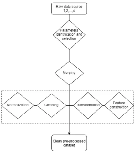
Figure 1 presents a general framework that can be used for data preprocessing. It starts processing from raw-text files and the end result is a structured database. To get a good general idea of the data and the studied problem, as well as to find irregularities from the data, the dataset needs to be visualized. For identifying the parameters, a medical hypothesis is required, defined by relevant literature or a medical expert.
Parameters extraction depends on the data source. Data can come from one or multiple sources like SQL database and/or text tables in different formats. A programming language like R or Python is required for importing and merging data from multiple sources, converting file formats and dropping irrelevant variables.
Data cleaning deals with specific problems in the data and is different from dataset to dataset. This step requires first the identification and definition of errors and error types. For example, clinical data errors could be duplicated entries, unreal entries such as birth date in the wrong century due to human errors, missing values, extreme outliers, etc.
Data normalization in clinical research refers to the process of rationalizing data to a terminology intended for algorithms to understand [25]. For example,
Figure 1. Medical data preprocessing diagram.
the variable formats need to be converted from "character" to "numeric" or "date", converting different measurement units, text parsing, etc.
Finally, data transformation refers to converting the data from one structure to another. This step can be intertwined with the data normalization. For example, this can contain categorisation of continuous variables using a threshold value, categorisation of text variables using certain string patterns. Another important procedure that can be included in this step is feature construction. Feature construction is a process that creates more efficient variables, derived from the existing information through some functional mapping, and adds them to the data in order to improve learning effectiveness [26].
3.2. Data visualization techniques
In order to characterize different visualization techniques, Daniel A. Keim [24] introduced a classification according to three criteria, presented in Table 2: the data type to be visualized (1), the visualization technique (2), and the type of interaction and distortion technique (3).
Clinical data is usually multidimensional data, consisting of a large number of records with multiple variables. It can be visualized using techniques for one-dimensional data by visualizing individual variables, for two-one-dimensional data by
Table 2. Visualization techniques according to three criteria [24].
Criteria Specific techniques
Data type to be visualized
One-dimensional data Two-dimensional data Multidimensional data Text and hypertext Hierarchies and graphs Algorithms and software
Visualization technique
Standard 2D/3D displays
Geometrically transformed displays Icon-based displays
Dense-pixel displays Stacked displays
Interaction and distortion technique
Interactive projection Interactive filtering Interactive zooming Interactive distortion
Interactive linking and brushing
selecting two variables, and for multidimesional data by exploring more complex properties of multiple or all variables.
The visualization techniques in this work are presented and briefly explained below.
1. Charts
Charts are graphical representations of the data. They can be used to explore the frequency of a single variable, such as histograms or bar plots, which can also be colored according to a categorical variable.
Density plots visualize the density distribution of a numeric variable or compare the densities of the variable according to another categorical variable.
The relationship between a categorical and a numeric variable can be explored through Bar plots, box plots, violin plots and stripcharts. They all provide a representation of the numerical distribution for each category. The relationship between two numeric variables can be visualized through scatterplots, to which a third categorical variable can be added and points coloured according to the category. The scatter plot visualization can also be enhanced by fitting a regression line or a LOWESS(Locally Weighted Scatterplot Smoothing) curve, for better understanding of the correlation of two numeric variables.
Finally, all the plots listed above can be visualized into a plot matrix such as a pairwise scatterplot, which allows easy comparison between multiple or all the relationships in the data.
2. Principal Component Analysis
One definition states that Principal Component Analysis (PCA) is a "statistical procedure that uses an orthogonal transformation to convert a set of observations of possibly correlated variables into a set of values of linearly uncorrelated variables called principal components"[27]. The first principal component is the normalized linear combination of the features that has the highest variance in a scalar projection of the data, the second principal component is orthogonal to the first one and accounts for the highest possible variance, and so on, as shown in Figure 2.
Figure 2. PCA of a multivariate distribution [28 p.67].
PCA is used for data reduction, but it can also be applied to cluster a high dimesional dataset [29]. For a dataset of p variables and n entries
x11, x12,..., xnp, centered to have the mean 0 and standard deviation 1, the
first principal component is Z1 = [z11, . . . , zn1] of the form
zi1 =φ11xi1+φ21xi2+. . .+φp1xip, (1)
where z11, z21, . . . , zn1 are called the scores and φ11, φ21, . . . , φp1 are the loadings of the first principal component. The loadings can be interpreted as the correlation of each element with the principal component and are calculated by eigenvector·√eigenvalue. Eigenvalues indicate the amount of variance that can be explained by the component and the eigenvector indicates the direction of the variance. The second principal component is the linear combination with the highest variance out of all possible combinations that are uncorrelated with Z1, and so on. Most of the variance in the data is usually explained by the first two or three principal components, which can be plotted in a 2D or 3D scatterplot. The scatterplot can then be colored according to a categorical variable to highlight the differences between the categories.
3. t-Distributed Stochastic Neighbor Embedding
T-Distributed Stochastic Neighbor Embedding (t-SNE) is a technique for dimensionality reduction, like PCA, well-suited for high-dimensional data [30]. It converts the Euclidean distances between datapoints into conditional probabilities pj|i that represent similarities. For the
low dimesional data representation, similar conditional probabilities are calculated for the correspondent data points in the low-dimensional space,
qi|j. The aim is to minimize the mismatch between pj|i and qi|j by
minimizing the Kullback-Leiber divergence (KL), also called the relative entropy C, using a gradient descent method of the form
δC δyi = 4X j (pij −qij)(yi−yj)(1 +kyi−yjk2)−1, (2) where C = P iKL(Pi||Qi) = Pi P jpj|ilog pj|i
pi|j, Pi is the conditional
probability distribution of data points in the high-dimensional space and
Qi is for the corresponding low-dimensional points in the embedding. This
way, t-SNE maps high-dimensional data to a lower dimensional space of points with multiple features. It can be used for clustering the data based on the similarity of data points, by plotting a 2D or 3D scatterplot.
4. Multi-dimensional Scaling
Multi-dimensional Scaling (MDS), like t-SNE is a technique designed to give a representation of high-dimensional data in a low-dimensional space, by preserving the distances between datapoints [31]. The distance measure can be Euclidean or non-Euclidean. The aim is to find an optimal configuration of points in 2-dimensional or 3-dimensional space. However, this optimal configuration might be a very poor representation of the data. If so, this will be reflected in a high stress value
stress= v u u t P (dij −dˆij)2 P d2 ij , (3)
where dij is the actual distance and ˆdij is the predicted distance on the
lower-dimensional space.
Like t-SNE, the MDS map offers a 2D or 3D scatterplot with a representation of the similarities or dissimilarities between the points in the data, where clusters can be coloured according to categories or groups. MDS is different from PCA in the way that PCA looks for similarities between features by computing the covariance matrix to explain variance in the data, while MDS is looking for similarities between datapoints and plots the similar datapoints closer together on the map.
5. Self-Organizing Map
Self-Organizing Map (SOM) is a dimension reduction and clustering technique, similar to MDS, that maps the high-dimensional data to a
lower-dimension space, usually a 2D map [32 p. 105-176]. But unlike the MDS or t-SNE, SOM is a competitive learning neural network, based on unsupervised learning, meaning that it automatically assigns data points to a class or, in this case, a cluster on the map.
The map is a collection of neurons in a 2D array. Each neuron has an associated weight vectorwij that corresponds to a point in the original
high-dimensional feature space x(t). Each observation in the dataset is assigned to one of the neurons, according to which weight vector the observation is closest to, starting with random weight vectors, and updating them as follows
wij(t+ 1) =wij(t) +αi(t)βij(t)[x(t)−wij(t)], (4)
where t = (1,2,...n) is the current iteration, αi(t) is the learning rate that
decreases monotonically with each iteration, andβij(t) is the neighbourhood
function’s influence calculated by
βij(t) = exp(
−d2
2σ2(t)), (5)
whered is the minimum Euclidean distance out of all the node’s calculated distances, andσ(t) is the neighborhood function’s radius that also decreases over time.
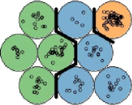
The end result can be interpreted as a combination of dimensionality reduction and clustering, where each cluster corresponds to a neuron in the 2D map. As seen in Figure 3, the SOM allows us to see structure in the clustering, by coloring according to a categorical variable.
Figure 3. SOM with nine neurons. Each color corresponds to a category in the data.
6. k-means Clustering
k-means Clustering is the simplest and most popular clustering method. It works by initially randomly selectingkpoints in the data as the centroids of the clusters, and measuring the Euclidean distance between each data point
and each centroid, assigning that data point to the cluster with the nearest centroid. Then, the centroid is updated as the mean of all the points in the cluster. k-means Clustering is an iterative process and it stops when the centroid’s values don’t change anymore, or when the predefined maximum number of iterations is reached.
The optimal number of k can be decided using plots from various methods such as the Elbow Method [33], The Silhouette Method [34] or the Gap Statistic method [35] shown in Figure 4.
Figure 4. Plots generated by Elbow Method, Silhouette Method and Gap Statistic Method, for choosing the optimal number of clusters in k-means Clustering.
The Elbow Method plots the sum of the squared error (SSE) which is the squared distance between each member of the cluster and the centroid, for
k = 1,...,10. The "elbow", where the line bends clearly to the right in the plot is the optimal k. If the plot line does not bend clearly enough to be able to identify the elbow, it may be better to use another method.
The Silhouette Method plots the coefficient Si = (bi −ai)/max(ai, bi) that
tells how close each point in one cluster is to points in the neighboring clusters, wherebi = minCd(i, C) is the smallest average dissimilarityd(i, C)
of each observation i to the members of the neighboring cluster C.
The Gap Statistic Method compares the total within intra-cluster variation
Wk = Pkr=1 1
2irDr, where Dr is the pairwise distance of all the members
of cluster r to the centroid, for different values of k with a null reference distribution of the data, i.e. a distribution with no obvious clustering. The algorithm works as presented in Algorithm 1.
Algorithm 1 Steps of the Gap Statistic Method.
1: Compute within intra-cluster variation Wk varying the number of clusters k
from 1 to 10.
2: Generate B reference data sets with a random uniform distribution and with the varying number of clusters k compute within cluster variation Wkb. 3: Compute the estimated gap statistic Gap(k) = B1 PB
b=1
log(Wkb∗)−log(Wk). 4: Compute standard deviation sk of Gap(k).
4. SHINY APP
In order for this tool to meet the objective set in this thesis, a set of requirements was defined. This chapter presents the requirements and the general architecture, as well as the functionalities of the tool.
4.1. Requirements
The requirements for the application are divided into two categories: preprocessing and visualization requirements. preprocessing requirements relate to tasks that involve dataset cleaning, transforming, building and subsetting, and visualization requirements relate to data analysis tasks that are available in this tool.
Preprocessing requirements
Assuming that the data uploaded in the application is clinical data, the application should offer two datasets. Patient data, containing constant variables that do not change over time, and visit data, containing variables that change over time for each patient or subject in the dataset.
The application should then provide a user interactive preprocessing interface with options for visualizing and filtering missing data, interactive charts for outlier selection, inspection and removal, a filter for subsetting the data according to user-selected variables, creating new constant variables by aggregating the visit data from a time interval chosen by the user or by categorizing numerical variables by user-defined parameters, and converting the variables, both constant and time-varying, into a panel data structure that can be uploaded directly into other visualization apps for time series data, for example, the R-based Shiny app "ExPanD"[22]. The tool should also offer the option of downloading the preprocessed datasets in the form of ".csv" tables.
For the DIPP data case study, the application should take raw DIPP data as input and deliver a preprocessed clean DIPP dataset, with new variables defined and constructed according to literature review and user needs. This step should offer clean data that can be used for analysis, without further cleaning and preprocessing.
Visualization requirements
The tool should provide an interface containing a comprehensive set of interactive methods for visualizing and analyzing the data. Visual inspection of data is a powerful way to find relationships between different variables or different groups in the data. The application should provide several unsupervised learning methods for clustering, with the purpose of identifying similarities between data points and exploring hidden patterns in the data. The application should also provide the user with a wide range of univariate, bivariate and multivariate charts for visualizing in detail the relationships between user selected variables and groups
in the data. The visualization has a role of assisting the researcher in finding patterns in the data, checking the validity of the findings as well as testing and creating hypotheses.
4.2. Application Architecture
For building this app, we chose the Shiny framework, an R package developed by the RStudio team enabling R programmers to create interactive visualizations for the web [36, 8, 7]. R language is a powerful tool for solving analytical challenges, but it requires programming knowledge. A Shiny app is an interface that allows all of the advanced analytics of R to be made available to the non-R users who will be making the decisions in the data analysis process. A Shiny app contains two parts. A user interface (UI) which dictates the appearance of the user input elements, and a server, which contains the backend processes. These are R scripts developed in parallel, with variable names that match the UI elements with the server calculations. In the server file, the programmer can define reactive expressions, which means that the system responds to user input, such as for example clicking a button to update the elements displayed in the UI. The shiny UI elements can be buttons, sliders, text inputs and drop down menus, which can be combined with other interactive elements from certain R packages, for example, interactive plots built with the "ggplot2" R package [37].
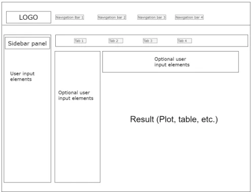
A standard shiny UI page has a sidebar panel, usually for user input elements, and a main panel where results are displayed, and optionally, some more user input elements. It also contains navigation bars, for changing between different Shiny pages, and tabs, to change between different main panels. A simplified scheme of the Shiny UI layout can be seen in Figure 5.
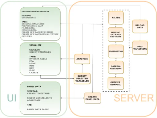
The aim of this work was to build an application that integrates some of the open-source visualization technologies found in other tools with a preprocessing interface that allows the researcher to use the knowledge about the studied domain and the data collection practices when filtering, dealing with missing data and outliers, as well as checking the quality and availability of the data. Clustering visualization methods were implemented in the application for allowing the user to identify important relationships between variables and groups in the data, as well as to discover groups of similar entries and how they are distributed in the clustering space. Various types of exploratory charts were implemented for summarizing the data. Combined with the clustering visualizations, the charts are used to explore the patterns found in the data. The visualizations are intertwined with the preprocessing as well, providing insight into any bias or need for further preprocessing that might be present in the dataset. The tool, named ClinFlow, has a modular architecture, which means that each module is a separate R script. Removing, modifying or replacing a module in the code will not affect the rest of the functionalities. Each functionality of the application has its own server module, matched with the correspondent UI module, as illustrated in Figure 6. The UI contains only three modules for each navigation bar. These are "Upload and preprocess", "Visualizations" and "Panel data".
Figure 5. Basic Shiny UI layout.
The Upload and Preprocess UI module corresponds to the uploading, preprocessing, filter, aggregation, categorization, missing data map and outlier removal server modules, each with its own tab. This module allows the user to upload a dataset and perform actions of their choice to preprocess the data. In this UI module, each UI tab has a server module with the following functionalities:
• The uploading server module inputs a ".csv" table into the app.
• The preprocessing runs the data through a preprocessing pipeline1 and divides it into patient data and visit data.
• The filter subsets the data according to user defined criteria.
• The aggregation module creates a new patient variable from aggregated visit data from a time interval defined by the user from the visit age variable.
• The categorization turns a numeric variable into a categorical variable according to user selected cut-off points.
• The missing data map displays plots of the missing data.
• The outliers server module displays interactive plots, where the user can check and delete outliers.
To match the requirements of this tool an existing Shiny module2by Dijun Chen
et al. [21] was integrated into the app. This open-source application module was
1Depending on the column names in the data, some general preprocessing operations
described in Chapter 5: The DIPP Case Study are applied on the data.
2Code for this module is from the HTPdVis module of the HTPmod app, with the same UI
Figure 6. Architecture of the Shiny app.
distributed under the GNU General Public License. The reasoning for selecting this module is that it contains a wide range of visualization methods included in the requirements for ClinFlow, useful for exploring multivariate diverse datasets, including clinical data. The graphical representations in this module are visually pleasing and intuitive, and the clustering computations are done with built-in R functions. The integrated module required minor changes to better fit the purpose of our tool. More user options were added for choosing the variables to be used in the analysis and missing data treatment. The R package used for 3D plots was changed because the 3D representations in the original application were showing incorrect information when tested with the Iris dataset[38]. The functionalities of the module are presented later in section 4.2. The Visualization UI module has tabs for PCA, t-SNE, MDS, SOM and k-means Clustering methods and a tab for charts. Only one server module is matched with this UI module, containing a reactive function that performs analysis according to the selected tab.
The Panel data UI module is matched with the corresponding server module for turning visit data into panel data. Panel data is a multi-dimensional data that includes multiple subjects measured over a time period. In a long-term clinical study of patients monitored from birth, age can be used as a time vector, but it is impossible to have regular measurements from all the subjects at the exact same age. This server module simulates a regular time period by creating time points using age intervals, with user defined cut-off points, then it aggregates the visit data grouped by patient code for each time point to create a structured panel.
Our tool ClinFlow uses several open source R gadgets and code from other Shiny visualization apps listed in Table 3, along with R common and base packages, to integrate interactive preprocessing and analysis functionalities.
Table 3. Open source gadgets and applications used for developing ClinFlow
Name Type Used for
ggplot2 [37], ggpubr [39], scatterplot3d [40], corrplot [41], naniar [42]
R Packages interactive plots
esquisse [43] R Package and
Shiny module data filter shinyWidgets [44], shinyBS [45], shinyjs [46], htmlwidgets [47], shinydashboard [48] R Packages ui elements
pcaMethods[49] R Package PCA
kohonen [32] R Package SOM
HTPmod(HTPdVis)[21] Shiny app Clustering and visualizations
ClinFlow is designed as a web application to be used in a web browser. The application can be hosted on a cloud hosting service such as shinyapps.io [50], or it can be locally hosted on any server that runs R.
The next section of this chapter is split into three subsections, one for each navigation bar of the app, to demonstrate how it works. The only two conditions that the data need to meet in order to use all the functionalities of the application are:
• The data has a column named "code" that contains a unique identification for each patient or group.
• The data has a column named "Age" that is a numeric vector representing time.
4.3. Application Functionalities
For demonstration purposes, we simulate a clinical dataset using the famous Iris flower dataset introduced by the British statistician and biologist Ronald Fisher in 1936 [38]. The Iris dataset consists of 50 samples from each of three species of Iris (Iris setosa, Iris virginica and Iris versicolor). Four features were measured from each sample: the length and the width of the sepals and petals, in centimeters. The variable "Species" is a factor with three levels. We have added a variable named "code" that has the same information as the "Species", so that each species name represents a unique "patient code", and another variable named "Age" that is a numeric vector, ranging from 1 to 50 for each species. Therefore, our simulated clinical data contains three subjects: "versicolor", "setosa" and "verginica", with four measurements taken regularly from age 1 to age 50. For
a more realistic data, we have also randomly replaced entries in the table with "NA" or missing values.
4.3.1. Upload and preprocessing
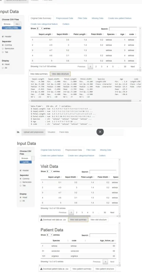
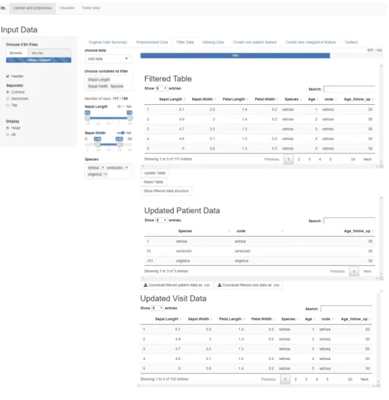
When opening the app, the user is first presented with a prompt in the sidebar for uploading the ."csv" dataset. Then, in the Original Data Summary tab a sample of the first rows of the uploaded raw table is displayed, along with buttons that display a summary and structure of the data. The following tab, Preprocessed Data displays the two tables, Visit and Patient data, along with buttons to download or display the summary and structure of each table. The preprocessing applied on the Iris data has added a new patient variable called "Age_follow_up" for the maximum follow up age of each patient in the data, in our case, for each species of Iris. The visit data still contains the patient variables, but the patient data only contains the constant variables. Figure 7 shows these two tabs, and the original and preprocessed table previews.
Filter Data
The next tab is the Filter Data tab, a functionality that allows the user to choose either visit data or patient data, and to select variables to filter. For the numeric variables, the filtering is done via a slider, and for the categorical ones, a multi-choice selector. If the variables contain missing entries, there is also a switch for filtering out the rows with missing values in the chosen variables. The filter is shown in Figure 8.
The filtered table is updated dynamically as the user filters the data, and the bar above the table shows in percents the amount of data preserved after filtering. The button "Update Table" updates both the visit and patient data displayed below, to include only the filtered information and it also updates the filter options accordingly. There is an option for resetting the table, which brings back the unfiltered preprocessed table from the start, and resets the filter options. This page also contains a button for displaying a summary of the variables and the variable types of the filtered data, and buttons for downloading the updated patient and visit tables.
Missing Data
In this tab, the user can choose to display a missing data map of either the visit or the patient table, and a scatterplot of missing vs. observed values from two chosen variables, in order to study the missing data mechanism. This plot can show whether the data is missing completely at random (MCAR), or not. We have introduced missing values randomly in the data, so the scatterplot displayed in Figure 9 does not show any reason for the missing values. In data analysis, usually, entries that are MCAR can be treated either by deleting them, or by imputation [51]. If the data is not MCAR, this table helps the user to study the missing mechanism and make a decision on how to deal with the missing values without introducing bias in the analysis results.
Figure 8. The Filter Data tab in the Shiny app.
Create new patient feature
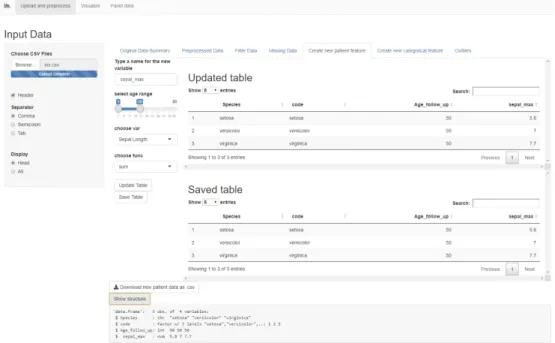
This tab allows the user to add new user-calculated variables to the data. First, it prompts the user to type a new variable name. Then, a slider input lets the user select a range of visit ages from which the data will be aggregated. A drop-down menu allows choosing a visit variable to be aggregated and another drop-down menu allows choosing a function (sum, mean or maximum) for aggregating. For example, in Figure 10, we created a new patient variable called "sepal_max" that marks the maximum value of "Sepal.Length" for each "patient code" from the visits with age between 1 and 15. The page displays an "Updated Table" which is a preview of the patient table containing the new variable. Once the button "Save Table" is pressed, the patient data is saved and the new variable can be used in all the other tabs. This functionality works with categorical variables as well, but instead of a mathematical function, the code looks for a certain factor level. For example, if the variable has the level "TRUE" in one or more visits in the chosen age range, the new patient variable will mark "TRUE", otherwise "FALSE". This is very useful for including a certain period in the life of a patient together with the other non-constant features in the analysis. For example, in a clinical dataset, the user can calculate the maximum weight that a patient reached in the first year of life.
Figure 10. The "Create a new patient feature" tab in the Shiny app.
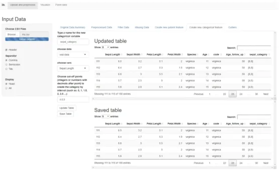
Create new categorical feature
This tab allows the user to create a new feature, either in the patient table or the visit table, based on another numerical feature in that table. The user must choose a numerical variable in the drop down menu, then type the cut-off points, separated by comma, for splitting the variable into intervals closed on the left and open on the right. The last interval is closed on both sides. A new categorical
variable is created with as many levels as there are intervals, labeled as shown in Figure 11. The "Updated Table" displays a preview of the table containing the new categorical variable, and the "Save Table" button adds the new variable to the dataset. The new feature can then be used for conducting group-based analysis. For example, in Figure 11, we have created the variable "sepal_category" that splits the data into two groups based on the sepal length.
Figure 11. The "Create a new categorical feature" tab in the Shiny app.
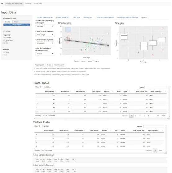
Outliers
This tab allows the user to plot a scatterplot and a boxplot (Figure 12) of two chosen variables, and colour the points by a categorical variable, in order to identify outliers. The scatterplot shows the points in the data and a regression line. The points that are further from the regression line should be investigated as possible outliers. The boxplot shows a representation of the distribution of values on the Y axis, as a box with the edges as the first and third quartile and a median line in between. If the X axis is a categorical variable, the boxplot shows distributions of the data for each category. The values that are far away from the median and the quartiles should be investigated as outliers. The data can be either patient or visit data, and the plots are interactive. Clicking on a point in the scatterplot, or selecting multiple points by dragging and then pressing "Toggle points" will move those entries from the original table into the outlier table, where the user can study them and decide whether they should be removed from the data or not. Once the user presses the "Save new data" button, the new data table without outliers is saved, and the toggled entries are deleted. The "Reset" button, brings the table and the plots back to the original state. This functionality is useful because it allows the user to use the domain knowledge to decide whether an entry is an outlier or not. Sometimes in clinical data, a value can fall far from the mean and still be considered
normal, therefore, a generic outlier detection mechanism is not recommended, without first applying expert knowledge. As stated in the U.S. Food and Drug Administration’s guidelines "Statistical Principles for Clinical Trials" [52], "Clear identification of a particular value as an outlier is most convincing when justified medically as well as statistically, and the medical context will then often define the appropriate action."
Once the table is saved in any of these tabs, the dataset is updated dynamically and all the user input options are updated to the new dataset as well, which means that any new created variables will appear in the drop-down menus and will be available in the filter options. The dataset can be reverted back to the original state in the Filter Data tab, by pressing the button "Reset Table". This will delete any new created variables and will bring back any deleted or filtered out entries.
Figure 12. The "Outliers" tab in the Shiny app.
This dynamic data preparation interface is useful because it allows the researcher to easily create subsets and groups in the data according to the research question, or quickly analyze and compare different groups in order to create a hypothesis.
4.3.2. Visualizations
The second navigation bar includes a tab for viewing the table to be analyzed (Figure 13), tabs for different clustering methods (Figures 14, 15), and a tab for various charts (Figure 16). In the sidebar, the user can select either the patient or the visit table, then choose the variables and missing data treatment to use in the clustering methods. The numeric variables are used for the clustering, and the categorical variables can be used to customize the colours and the shapes of the points in the cluster plots.
The user can choose how to treat missing values in the numeric variables used for clustering, either by deleting the rows containing missing values, estimating the missing values using bayesian PCA [53] or not treating them at all. The clustering methods give an error if missing values are present in the numeric data, so the user must make an informed decision on how to proceed. It is recommended to study the missing mechanisms in the data and make a subset, using the data filter, that doesn’t include missing values that are not MCAR. Imputation or deletion of the missing entries that are not MCAR can introduce bias in the analysis. If the categorical variables contain missing values, the NA entries are automatically assigned the label "Missing" and they appear as a category in the data, in order to preserve as much information as possible. The clustering visualizations allow for user customization of some parameters, rotation of the 3D plot, and saving the plots in various formats.
Clustering is useful in identifying groups of similar entries in the table. Combined with the coloring and categorization options, the user can explore the reasons behind the similarities found in the data points and identify important relationships between variables.
Figure 13. The Visualization Sidebar and tables in the Shiny app.
The Charts tab (Figure 16) includes a drop-down menu for choosing different types of charts for univariate, bivariate or multivariate plotting. According to the chart type to be visualized, more user input fields are activated for selecting which features to plot. The colors for the charts are set using the customization
on the sidebar. This functionality can use the table with missing values, because the plots delete the missing entries from the chosen features automatically.
Figure 14. The clustering visualization methods tabs in the Shiny app for PCA and t-SNE.
Figure 15. The clustering visualization methods tabs in the Shiny app for MDS, SOM, k-Means.
Figure 16. The Charts tab in the Shiny app.
4.3.3. Panel data
The last functionality in this application is a panel data creation tool that turns the visit age into a timestamp and allows the user to choose the variables and the functions to aggregate for each time point of each patient. The time points are introduced manually, separated by comma, and they do not have to be regular. The timestamp created is an ordinal factor. Other fields let the user choose which variables to aggregate by maximum, sum, mean and also add patient variables to the panel data. The constant patient values will repeat for each time point. The result is a structured panel with multiple measurements over time for each patient code (Figure 17). The panel data can be downloaded as a ".csv" table, and it can be uploaded directly into other tools, such as the panel data tool "ExPanD" [22] or used for time trend analysis, without any other preprocessing. Figure 18 shows an example of a time trend plot generated using panel data created with ClinFlow.
Figure 18. A time trend plot example that used the Iris panel data generated with ClinFlow.
5. THE DIPP CASE STUDY
Finland has the highest incidence of type 1 diabetes (T1D) in the world among children, the annual rate is currently 64/100,000 children under the age of 15 years [54]. At the Pediatric Diabetes Clinic, Oulu University Hospital, approximately 60 children with newly onset type 1 diabetes are diagnosed annually.
The Finnish Type 1 Diabetes Prediction and Prevention (DIPP) study [9] was launched in Finland in 1994 as a large scale observational follow-up population study, established in the university hospitals of Tampere, Turku and Oulu. The study was designed for improvement of strategies for T1D prediction and for the development of new techniques to prevent this disease. The data collected for this study consists of an intensive longitudinal follow up of children with genetic risk of T1D and their close relatives. There have been more than 220,000 newborns screened for genetic susceptibility of T1D (data as of June 2017). Children with an increased risk have had follow-up visits every 3 months for one year and then every 6-12 months until approximately 15 years old, or until diagnosed with T1D. The DIPP study is different from the usual clinical trial because it monitors healthy children, and is focused on early prediction and prevention of a disease, rather than treatment outcomes.
In this chapter, we will identify the most prominent topics in T1D prevention research and present the DIPP case study. We will design a preprocessing framework for the DIPP data and we will analyze the DIPP data using the Shiny app, to replicate some of the results found in the reviewed literature.
5.1. Type 1 Diabetes
Type 1 diabetes is a chronic auto-immune disease characterized by the loss of insulin producing beta cells in the pancreatic islets. It has a higher incidence among those that are genetically susceptible. This disease can be held under control only with regular insulin injections. T1D may become symptomatic in the first years of life for some patients, while it might take more than 20 years with no symptoms for others [55].
Although the process of autoimmune destruction takes place in genetically susceptible individuals, the rapidly rising incidence strongly suggests that a combination of genetic [56], environmental and immunologic factors are involved in the pathogenesis of T1D. Some environmental factors included are certain viruses and early life diet and gut microbiota. For example, rubella [57] and enteroviruses [58] have been associated with an increased risk of T1D. Some infections have been shown to cause diabetes in animals [59], however, common vaccinations like MMR (vaccine for measles, mumps and rubella) have not caused a decrease in the T1D incidence. Enterovirus infection has been associated with an increased risk of T1D because in several studies enteroviruses have been found in the pancreatic tissue obtained from organ donors with T1D, and more recently, enteroviral structures have also been found from pancreatic biopsies of newly-diagnosed T1D patients. These viruses are known to damage cell functions through various mechanisms [60].
The diet and gut microbiota also play a role although it is not yet clear. Some studies [61] [62] have found that early introduction of cow’s milk and cereals in the infant’s diet together with a short breastfeeding period may lead to increased risk of T1D. However, prospective cohort studies have not confirmed these findings, and results from Trial to Reduce IDDM in the Genetically at Risk (TRIGR) [63], a large intervention trial, suggested that avoidance of cow’s milk during the first eight months of life does not prevent from islet autoimmunity or development of T1D.
Maternal consumption of sour milk and red meat was related to increased disease risk [61] [64], but maternal consumption of root vegetables, potatoes, berries, fresh milk and cheese have been associated with a decreased risk [65, 66]. Early microbial exposures from pets have also been studied and an association between indoor dogs and a decreased risk of T1D has been found [67]. However, this finding needs to be confirmed in other populations. Some studies found evidence of an association between mother’s age at birth and T1D [68]. According to the studies, a very small percentage of the increase in the incidence of childhood type 1 diabetes in recent years could be explained by increases in maternal age.
However, the onset of T1D is preceded by the appearance of islet autoantibodies detectable in the peripheral circulation. These autoantibodies may appear at birth in the cord blood, if they are transmitted from the mother, but children can start developing their own autoantibodies even as young as six months old [69], while the seroconversion rate in the general population peaks at around two years old [70].
There are five autoantibodies that are currently known to predict T1D. These include islet cell antibodies (ICA), insulin autoantibodies (IAA), autoantibodies to the 65 kDa isoform of GAD (GADA), the insulinoma-associated antigen (IA2A), and zinc transporter 8 (ZnT8A). Individuals who have positivity in at least two of the autoantibodies listed above have a 70% risk of developing T1D in the following few months to fifteen years [71, 72].
Some factors like a young seroconversion age, higher titres of ICA, IAA and IA2A at seroconversion and autoantibody multipositivity (positivity in more than one autoantibody at the same time) have been associated with rapid disease progression (1.5 years between seroconversion and diagnosis) [73]. Also, the season of birth has been found to have an association with disease progression. Slow progressors (>7.25 years between seroconversion and diagnosis) were born more frequently in the fall, whereas other progressors were born more often in the spring [74].
Recently, several large scale randomized controlled trials have been designed to prevent T1D. The European Nicotinamide Diabetes Intervention Trial (ENDIT) [75], The Diabetes Prevention Trial of Type 1 Diabetes (DPT-1) [76] and The Finnish Type 1 Diabetes Prediction and Prevention (DIPP) study [77] have used nicotinamide, parenteral insulin, oral insulin [78] and nasal insulin. Unfortunately, they did not prevent or delay the onset of T1D.
The factors that influence the risk of T1D, especially the mechanism of autoimmune destruction, have been the subject of many DIPP articles. The autoantibodies have an important role in the T1D disease progression, especially the positivity of multiple autoantibodies [72]. The associations between
seroconversion, autoantibody levels and disease progression have been widely explored as well [79, 73, 74].
In this case study, we used the Shiny app to inspect the DIPP data from Oulu University Hospital and the relationships between islet autoantibodies and progression to T1D. We tried to confirm the findings in the study of Knip et al, "Role of humoral beta-cell autoimmunity in type 1 diabetes" [79] that demonstrated which type of autoantibodies, autoantibody combinations and age at seroconversion have the highest risk of disease progression, and the article of Pöllänen et al, "Characterisation of rapid progressors to type 1 diabetes among children with HLA-conferred disease susceptibility", that demonstrated which factors are the most prominent at seroconversion in those children with a rapid disease progression.
5.2. Preprocessing of DIPP data
Since 1994 over 17 000 children with a genetic risk have had regular visits every three months for one year, then every 6-12 months until approximately fifteen years old. At each visit, standard clinical data such as weight and height measurements, questionnaires about diet and breastfeeding, and blood samples for measuring autoantibodies were collected. Before 2003, only ICA was measured, and if the subject became ICA positive, the blood samples from the past were analyzed for the IAA, IA2A, GADA and ZnT8A. After 2003, all samples were analyzed for all the autoantibodies [73].
The DIPP data is stored accross different sources and has several problems that can be present in other long-term clinical studies. These problems can be missing data due to patients dropping out of the study, protocol changes, corrections that need to be added to the original data, human errors, etc. Some of these issues can be detected and solved using the interactive data preparation options in the shiny app, while other more complex issues require the domain knowledge and knowledge about data collection protocols in this study. For the latter part, we created an automated preprocessing algorithm customized for this data only. The preprocessing is integrated into the tool in the way that once the data is uploaded in the app, it performs some general data cleaning operations such as deleting duplicated entries, then it checks for column names of the DIPP parameters and performs operations that are customized for these parameters only. The condition for this preprocessing algorithm to deliver clean DIPP data is that the uploaded raw data has the same column names and variable definitions presented in this chapter. If a column name is missing from the data, all the operations that depend on that variable are skipped. Part of this preprocessing algorithm can also be generalized to other medical data sets, for the variables that are more general such as "birth date" or "visit date", also similar rules and dependencies can be later added to better suit other datasets, which is why we have integrated it in the tool.
We have selected 33 parameters from the DIPP data to be used in our tool.These parameters have been identified from previous articles studying T1D in the DIPP study, for example blood samples with diabetes-related autoantibodies
[79], information about virus infections [57, 58, 59, 60], etc. We collected these parameters from various sources, merged them together in one ".csv" table and added a few corrections manually. These are introduced in the following subsection.
5.2.1. The data format
The patients in the DIPP data are identified by a unique combination of numbers and letters that will be referred throughout this thesis as the "patient code". Each medical visit has a visit date, and the combination of "patient code" and "visit date" is used to identify each hospital visit.
The DIPP data from the Oulu University Hospital was stored in four separate datasets from which we extracted the relevant information, matched by patient code and visit date, and dropped the irrelevant columns. The source datasets and their contents are listed below:
Dataset 1: Autoantibody values from blood samples together with some other variables that we are not using.
Dataset 2: Exported SQL table with background information of the patient (weight and height at birth, and in each visit, information about infections, pregnancy duration, breastfeeding, etc.).
Dataset 3: Table containing all the patient codes from the subjects diagnosed with diabetes, birth date and date of diagnosis.
Dataset 4: A curated table containing patient code, visit date and correct heights and weights from visits.
We took the following actions in order to successfully merge all the information in one table.
• In each dataset, dates have been checked and converted to the format dd/mm/yyyy
• Columns that contain the same information have been renamed with a name consistent accross all tables. For example, Dataset 1 had Finnish column names and Dataset 2 had English names for the birth date and visit date information,so we renamed all the columns in English.
• We replaced the visit height and weight from Dataset 2 with the curated ones from Dataset 4, keeping the correct info that we have and replacing the missing/incorrect values with curated values by matching them with patient code and visit date.
• In Dataset 3, we calculated the patient’s age at diagnosis from date of diagnosis and birth date of the patient.
• We merged Datasets 1, 2 and 3 based on patient code and visit date.
• We created binary factor variable indicating a positive diagnosis of T1D, called "POS_diabetes".
• We dropped the variables irrelevant for our application. For example, date of diagnosis is dropped since we calculated the patient’s age at diagnosis. The final dataset contains the variables listed in Table 4. Each row contains patient code and visit date, patient data, and visit data. In the DIPP case, patient data and visit data are defined as follows:
• Visit data: Each row contains blood sample autoantibody values from one single visit and other measurements from one single visit like weight and height.
• Patient data: Birth information and other info that is not time variant and not connected to one single visit. Diagnosis information and age when diagnosed.
This data has several important characteristics that have influenced the design of the preprocessing framework. For each numeric autoantibody level in relative units (RU), the DIPP study has a off value for positivity [72]. ICA has a cut-off value of 2 RU, GADA has 5.34 RU, IA2A has 0.42 RU. The IAA autoantibody has been measured with two different methods during the years. There are two variables: "mIAA_1.55" and "mIAA_3.47" that have a cut-off positivity value of 1.55 RU, respectively 3.47 RU. The IAA value is usually present in only one of the two columns, while the other has a missing entry.
Some subjects can have positive autoantibodies transferred from the mother, present at birth, in the cord blood or in the early life, that can last up to one year old [69, 81]. These have been proven not to have an influence in the risk of T1D [82], therefore, they need to be excluded from some analyses. It is a difficult task to differentiate between samples containing transferred autoantibodies and samples containing the subject’s own autoantibodies in early life, when the subject might have both.
The patient code is a combination of numbers with a letter, where letter A stands for a child that has been monitored since birth, X stands for their mother, Y stands for their father, and B stands for their sibling. All family members share the same combination of numbers. However, we should note that not all family relationships can be identified in the data, because of the long-term nature of the study. For example, multiple generations from the same families might have been enrolled in the study as children and assigned a patient code with "A", and became parents later, having their own children enrolled as well with a patient code "A". The same person can appear as a child and later as a mother. Also children that are siblings, but each has been enrolled in the study at birth, have different patient codes containing "A" with no way of knowing they are siblings. The same mother might appear multiple times in the dataset under a different code matching each child. We treat each unique patient code as a different person, and only consider family relations between patient codes that match. The mothers and fathers in the dataset do not have follow up visits, they have only one visit with measurements taken at the birth of their child. Not all the children have mothers in the dataset.
The final dataset has 88,939 entries of raw, unclean data, that has several problems:
Table 4. Dataset variables and their explanations Variable name Explanation
birth_date Date of birth.
code Unique patient identification code.
date_of_visit Visit date. GADA_5.34
ICA_2 mIAA_3.47 mIAA_1.55 IA2A_0.42
Autoantibody cut-off values measured from blood samples taken each visit.
height weight
circle_of_head
Patient measurements taken during the visit.
is_pets
A binary indicator variable for pets in the household (0 = no pets in the household, 1 = pets in the household). [67].
type_of_pets Description of the pets – free text field. infections_airway infections_ear infections_fever infections_gastric infections_eye infections_roseola infections_chickenpox infections_hospital_care infections_other infections_entero
A column for each type of infection with a numeric value indicating the number of infections occurred since previous visit.
birth_length birth_weight birth_circle_of_head Dimensions at birth. is_mom_t1d is_dad_t1d
Indicator variables for T1D positivity of the patient’s mother and father(0=negative, 1=positive, 2=unknown). They contain many missing values.
duration
Pregnancy duration for each child – a free text field with inputs of the form “weeks + days”, for example: “37+5”, “38” or “38 + 0” (not structured) [80].
breastfeeding_only breastfeeding_ended
Age when the child stopped exclusive breastfeeding and age when the child stopped any breastfeeding.
POS_diabetes Numeric column: 1 if the child has been diagnosed with T1D and 0 if not (or not yet).
diagnosis_age
Age when the child has been diagnosed with T1D. Contains missing values for the ones who have not been (yet) diagnosed with T1D.
![Table 2. Visualization techniques according to three criteria [24].](https://thumb-us.123doks.com/thumbv2/123dok_us/629829.2575862/13.892.224.777.155.535/table-visualization-techniques-according-to-three-criteria.webp)