Introduction
1.1 Before you start
Statistics starts with a problem, continues with the collection of data, proceeds with the data analysis and finishes with conclusions. It is a common mistake of inexperienced Statisticians to plunge into a complex analysis without paying attention to what the objectives are or even whether the data are appropriate for the proposed analysis. Look before you leap!
1.1.1 Formulation
The formulation of a problem is often more essential than its solution which may be merely a matter of mathematical or experimental skill.Albert Einstein
To formulate the problem correctly, you must
1. Understand the physical background. Statisticians often work in collaboration with others and need to understand something about the subject area. Regard this as an opportunity to learn something new rather than a chore.
2. Understand the objective. Again, often you will be working with a collaborator who may not be clear about what the objectives are. Beware of “fishing expeditions” - if you look hard enough, you’ll almost always find something but that something may just be a coincidence.
3. Make sure you know what the client wants. Sometimes Statisticians perform an analysis far more complicated than the client really needed. You may find that simple descriptive statistics are all that are needed.
4. Put the problem into statistical terms. This is a challenging step and where irreparable errors are sometimes made. Once the problem is translated into the language of Statistics, the solution is often routine. Difficulties with this step explain why Artificial Intelligence techniques have yet to make much impact in application to Statistics. Defining the problem is hard to program.
That a statistical method can read in and process the data is not enough. The results may be totally meaningless.
1.1.2 Data Collection
It’s important to understand how the data was collected.
Are the data observational or experimental? Are the data a sample of convenience or were they obtained via a designed sample survey. How the data were collected has a crucial impact on what conclusions can be made.
Is there non-response? The data you don’t see may be just as important as the data you do see. Are there missing values? This is a common problem that is troublesome and time consuming to deal with.
How are the data coded? In particular, how are the qualitative variables represented.
What are the units of measurement? Sometimes data is collected or represented with far more digits than are necessary. Consider rounding if this will help with the interpretation or storage costs. Beware of data entry errors. This problem is all too common — almost a certainty in any real dataset of at least moderate size. Perform some data sanity checks.
1.1.3 Initial Data Analysis
This is a critical step that should always be performed. It looks simple but it is vital. Numerical summaries - means, sds, five-number summaries, correlations. Graphical summaries
– One variable - Boxplots, histograms etc. – Two variables - scatterplots.
– Many variables - interactive graphics.
Look for outliers, data-entry errors and skewed or unusual distributions. Are the data distributed as you expect?
Getting data into a form suitable for analysis by cleaning out mistakes and aberrations is often time consuming. It often takes more time than the data analysis itself. In this course, all the data will be ready to analyze but you should realize that in practice this is rarely the case.
Let’s look at an example. The National Institute of Diabetes and Digestive and Kidney Diseases conducted a study on 768 adult female Pima Indians living near Phoenix. The following variables were recorded: Number of times pregnant, Plasma glucose concentration a 2 hours in an oral glucose tolerance test, Diastolic blood pressure (mm Hg), Triceps skin fold thickness (mm), 2-Hour serum insulin (mu U/ml), Body mass index (weight in kg/(height inm2)), Diabetes pedigree function, Age (years) and a test whether the patient shows signs of diabetes (coded 0 if negative, 1 if positive). The data may be obtained from UCI
Repository of machine learning databases athttp://www.ics.uci.edu/˜mlearn/MLRepository.html. Of course, before doing anything else, one should find out what the purpose of the study was and more
> library(faraway) > data(pima)
> pima
pregnant glucose diastolic triceps insulin bmi diabetes age test
1 6 148 72 35 0 33.6 0.627 50 1
2 1 85 66 29 0 26.6 0.351 31 0
3 8 183 64 0 0 23.3 0.672 32 1
... much deleted ...
768 1 93 70 31 0 30.4 0.315 23 0
The library(faraway)makes the data used in this book available whiledata(pima)calls up this particular dataset. Simply typing the name of thedata frame,pimaprints out the data. It’s too long to show it all here. For a dataset of this size, one can just about visually skim over the data for anything out of place but it is certainly easier to use more direct methods.
We start with some numerical summaries:
> summary(pima)
pregnant glucose diastolic triceps insulin
Min. : 0.00 Min. : 0 Min. : 0.0 Min. : 0.0 Min. : 0.0 1st Qu.: 1.00 1st Qu.: 99 1st Qu.: 62.0 1st Qu.: 0.0 1st Qu.: 0.0 Median : 3.00 Median :117 Median : 72.0 Median :23.0 Median : 30.5 Mean : 3.85 Mean :121 Mean : 69.1 Mean :20.5 Mean : 79.8 3rd Qu.: 6.00 3rd Qu.:140 3rd Qu.: 80.0 3rd Qu.:32.0 3rd Qu.:127.2 Max. :17.00 Max. :199 Max. :122.0 Max. :99.0 Max. :846.0
bmi diabetes age test
Min. : 0.0 Min. :0.078 Min. :21.0 Min. :0.000 1st Qu.:27.3 1st Qu.:0.244 1st Qu.:24.0 1st Qu.:0.000 Median :32.0 Median :0.372 Median :29.0 Median :0.000 Mean :32.0 Mean :0.472 Mean :33.2 Mean :0.349 3rd Qu.:36.6 3rd Qu.:0.626 3rd Qu.:41.0 3rd Qu.:1.000 Max. :67.1 Max. :2.420 Max. :81.0 Max. :1.000
Thesummary()command is a quick way to get the usual univariate summary information. At this stage, we are looking for anything unusual or unexpected perhaps indicating a data entry error. For this purpose, a close look at the minimum and maximum values of each variable is worthwhile. Starting withpregnant, we see a maximum value of 17. This is large but perhaps not impossible. However, we then see that the next 5 variables have minimum values of zero. No blood pressure is not good for the health — something must be wrong. Let’s look at the sorted values:
> sort(pima$diastolic)
[1] 0 0 0 0 0 0 0 0 0 0 0 0 0 0 0 0 0 0
[19] 0 0 0 0 0 0 0 0 0 0 0 0 0 0 0 0 0 24
[37] 30 30 38 40 44 44 44 44 46 46 48 48 48 48 48 50 50 50 ...etc...
We see that the first 36 values are zero. The description that comes with the data says nothing about it but it seems likely that the zero has been used as a missing value code. For one reason or another, the researchers did not obtain the blood pressures of 36 patients. In a real investigation, one would likely be able to question the researchers about what really happened. Nevertheless, this does illustrate the kind of misunderstanding
that can easily occur. A careless statistician might overlook these presumed missing values and complete an analysis assuming that these were real observed zeroes. If the error was later discovered, they might then blame the researchers for using 0 as a missing value code (not a good choice since it is a valid value for some of the variables) and not mentioning it in their data description. Unfortunately such oversights are not uncommon particularly with datasets of any size or complexity. The statistician bears some share of responsibility for spotting these mistakes.
We set all zero values of the five variables toNAwhich is the missing value code used byR.
> pima$diastolic[pima$diastolic == 0] <- NA > pima$glucose[pima$glucose == 0] <- NA > pima$triceps[pima$triceps == 0] <- NA > pima$insulin[pima$insulin == 0] <- NA > pima$bmi[pima$bmi == 0] <- NA
The variabletestis not quantitative but categorical. Such variables are also calledfactors. However,
because of the numerical coding, this variable has been treated as if it were quantitative. It’s best to designate such variables as factors so that they are treated appropriately. Sometimes people forget this and compute stupid statistics such as “average zip code”.
> pima$test <- factor(pima$test) > summary(pima$test)
0 1
500 268
We now see that 500 cases were negative and 268 positive. Even better is to use descriptive labels: > levels(pima$test) <- c("negative","positive")
> summary(pima)
pregnant glucose diastolic triceps insulin
Min. : 0.00 Min. : 44 Min. : 24.0 Min. : 7.0 Min. : 14.0
1st Qu.: 1.00 1st Qu.: 99 1st Qu.: 64.0 1st Qu.: 22.0 1st Qu.: 76.2 Median : 3.00 Median :117 Median : 72.0 Median : 29.0 Median :125.0
Mean : 3.85 Mean :122 Mean : 72.4 Mean : 29.2 Mean :155.5
3rd Qu.: 6.00 3rd Qu.:141 3rd Qu.: 80.0 3rd Qu.: 36.0 3rd Qu.:190.0
Max. :17.00 Max. :199 Max. :122.0 Max. : 99.0 Max. :846.0
NA’s : 5 NA’s : 35.0 NA’s :227.0 NA’s :374.0
bmi diabetes age test
Min. :18.2 Min. :0.078 Min. :21.0 negative:500
1st Qu.:27.5 1st Qu.:0.244 1st Qu.:24.0 positive:268 Median :32.3 Median :0.372 Median :29.0
Mean :32.5 Mean :0.472 Mean :33.2
3rd Qu.:36.6 3rd Qu.:0.626 3rd Qu.:41.0
Max. :67.1 Max. :2.420 Max. :81.0
NA’s :11.0
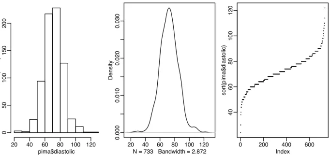
Now that we’ve cleared up the missing values and coded the data appropriately we are ready to do some plots. Perhaps the most well-known univariate plot is the histogram:
pima$diastolic Frequency 20 40 60 80 100 120 0 50 100 150 200 20 40 60 80 100 120 0.000 0.010 0.020 0.030 N = 733 Bandwidth = 2.872 Density 0 200 400 600 40 60 80 100 120 Index sort(pima$diastolic)
Figure 1.1: First panel shows histogram of the diastolic blood pressures, the second shows a kernel density estimate of the same while the the third shows an index plot of the sorted values
as shown in the first panel of Figure 1.1. We see a bell-shaped distribution for the diastolic blood pressures centered around 70. The construction of a histogram requires the specification of the number of bins and their spacing on the horizontal axis. Some choices can lead to histograms that obscure some features of the data. Rattempts to specify the number and spacing of bins given the size and distribution of the data but this choice is not foolproof and misleading histograms are possible. For this reason, I prefer to use Kernel Density Estimates which are essentially a smoothed version of the histogram (see Simonoff (1996) for a discussion of the relative merits of histograms and kernel estimates).
> plot(density(pima$diastolic,na.rm=TRUE))
The kernel estimate may be seen in the second panel of Figure 1.1. We see that it avoids the distracting blockiness of the histogram. An alternative is to simply plot the sorted data against its index:
plot(sort(pima$diastolic),pch=".")
The advantage of this is we can see all the data points themselves. We can see the distribution and possible outliers. We can also see the discreteness in the measurement of blood pressure - values are rounded to the nearest even number and hence we the “steps” in the plot.
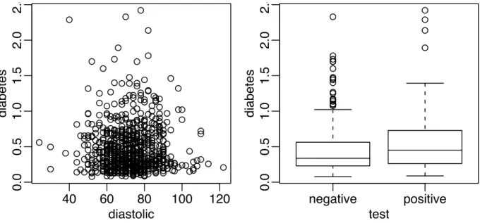
Now a couple of bivariate plots as seen in Figure 1.2:
> plot(diabetes ˜ diastolic,pima) > plot(diabetes ˜ test,pima) hist(pima$diastolic)
First, we see the standard scatterplot showing two quantitative variables. Second, we see a side-by-side boxplot suitable for showing a quantitative and a qualititative variable. Also useful is a scatterplot matrix, not shown here, produced by
40
60
80
100
120
0.0
0.5
1.0
1.5
2.0
2.5
diastolic
diabetes
negative
positive
0.0
0.5
1.0
1.5
2.0
2.5
test
diabetes
Figure 1.2: First panel shows scatterplot of the diastolic blood pressures against diabetes function and the second shows boxplots of diastolic blood pressure broken down by test result
> pairs(pima)
We will be seeing more advanced plots later but the numerical and graphical summaries presented here are sufficient for a first look at the data.
1.2 When to use Regression Analysis
Regression analysis is used for explaining or modeling the relationship between a single variableY, called theresponse, output ordependentvariable, and one or more predictor, input, independent orexplanatory variables, X1 Xp. When p 1, it is called simple regression but when p 1 it is called multiple re-gression or sometimes multivariate rere-gression. When there is more than oneY, then it is called multivariate multiple regression which we won’t be covering here.
The response must be a continuous variable but the explanatory variables can be continuous, discrete or categorical although we leave the handling of categorical explanatory variables to later in the course. Taking the example presented above, a regression of diastolicand bmion diabetes would be a multiple regression involving only quantitative variables which we shall be tackling shortly. A regression of diastolicandbmiontestwould involve one predictor which is quantitative which we will consider in later in the chapter onAnalysis of Covariance. A regression ofdiastolicon justtestwould involve just qualitative predictors, a topic calledAnalysis of VarianceorANOVAalthough this would just be a simple two sample situation. A regression oftest(the response) ondiastolicandbmi(the predictors) would involve a qualitative response. Alogistic regressioncould be used but this will not be covered in this book.
Regression analyses have several possible objectives including 1. Prediction of future observations.
2. Assessment of the effect of, or relationship between, explanatory variables on the response. 3. A general description of data structure.
Extensions exist to handle multivariate responses, binary responses (logistic regression analysis) and count responses (poisson regression).
1.3 History
Regression-type problems were first considered in the 18th century concerning navigation using astronomy. Legendre developed the method of least squares in 1805. Gauss claimed to have developed the method a few years earlier and showed that the least squares was the optimal solution when the errors are normally distributed in 1809. The methodology was used almost exclusively in the physical sciences until later in the 19th century. Francis Galton coined the term regression to mediocrityin 1875 in reference to the simple regression equation in the form
y y
SDy
r x x SDx
Galton used this equation to explain the phenomenon that sons of tall fathers tend to be tall but not as tall as their fathers while sons of short fathers tend to be short but not as short as their fathers. This effect is called theregression effect.
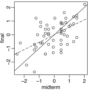
We can illustrate this effect with some data on scores from a course taught using this book. In Figure 1.3, we see a plot of midterm against final scores. We scale each variable to have mean 0 and SD 1 so that we are not distracted by the relative difficulty of each exam and the total number of points possible. Furthermore, this simplifies the regression equation to
y rx > data(stat500) > stat500 <- data.frame(scale(stat500)) > plot(final ˜ midterm,stat500) > abline(0,1)
−2
−1
0
1
2
−
2
−
1
0
1
2
midterm
final
Figure 1.3: Final and midterm scores in standard units. Least squares fit is shown with a dotted line while
We have added the y x (solid) line to the plot. Now a student scoring, say one standard deviation above average on the midterm might reasonably expect to do equally well on the final. We compute the least squares regression fit and plot the regression line (more on the details later). We also compute the correlations.
> g <- lm(final ˜ midterm,stat500) > abline(g$coef,lty=5)
> cor(stat500)
midterm final hw total midterm 1.00000 0.545228 0.272058 0.84446 final 0.54523 1.000000 0.087338 0.77886 hw 0.27206 0.087338 1.000000 0.56443 total 0.84446 0.778863 0.564429 1.00000
We see that the the student scoring 1 SD above average on the midterm is predicted to score somewhat less above average on the final (see the dotted regression line) - 0.54523 SD’s above average to be exact. Correspondingly, a student scoring below average on the midterm might expect to do relatively better in the final although still below average.
If exams managed to measure the ability of students perfectly, then provided that ability remained un-changed from midterm to final, we would expect to see a perfect correlation. Of course, it’s too much to expect such a perfect exam and some variation is inevitably present. Furthermore, individual effort is not constant. Getting a high score on the midterm can partly be attributed to skill but also a certain amount of luck. One cannot rely on this luck to be maintained in the final. Hence we see the “regression to mediocrity”. Of course this applies to any x y situation like this — an example is the so-called sophomore jinx in sports when a rookie star has a so-so second season after a great first year. Although in the father-son example, it does predict that successive descendants will come closer to the mean, it does not imply the same of the population in general since random fluctuations will maintain the variation. In many other applications of regression, the regression effect is not of interest so it is unfortunate that we are now stuck with this rather misleading name.
Regression methodology developed rapidly with the advent of high-speed computing. Just fitting a regression model used to require extensive hand calculation. As computing hardware has improved, then the scope for analysis has widened.