STEVEN KEITH
UNC–Chapel Hill Department of City and Regional Planning Master’s Candidate
Built Environment Surrounding Transit Stations
Abstract
STEVEN KEITH
UNC–Chapel Hill Department of City and Regional Planning Master’s Candidate
Introduction ... 1
Background of Study System... 2
Figure 1: WMATA Metrorail System ... 3
Literature Review... 4
Methods... 9
Table 1: Model Variables ... 10
Figure 2: 2009 Daily Ridership by Station ... 11
Figure 3: Half-Mile Transit Zones ... 12
Table 2: Variable Summary Statistics ... 13
Results ... 14
Table 3: Univariate Associations between Daily Ridership and Independent Variables ... 14
Table 4: Regression Output with Demographic Variables only ... 16
Table 5: Regression Output with all Independent Variables ... 16
Table 6: Regression Output with Full Dataset ... 17
Table 7: Wald Test for Built Environment Variables ... 18
Table 8: Regression Output with DC-only Data ... 19
Table 9: Wald Test for Built Environment Variables (DC Data) ... 19
Table 10: Regression Output with Suburban-only Data ... 20
Table 11: Wald Test for Built Environment Variables (Suburban Data) ... 20
Table 12: Regression Output with Auto-Oriented Variables ... 21
Table 13: Regression Output with Walking-Focused Variables ... 22
Table 14: Regression Output with Auto and Walking Variables ... 23
Table 15: Regression Output for Metro Stations with Parking ... 23
Limitations ... 24
Conclusion ... 24
Bibliography ... 27
Data Sources ... 29
1 Introduction
Public transportation can have a large influence in improving the quality of life for commuters in major cities across the country. Transit also plays an important role in overcoming our nation’s economic, energy, and environmental challenges. Growing ridership numbers show that increasing amounts of people are using transit systems as more and more local communities expand service and build new infrastructure. Transit benefits are all-encompassing, as a variety of types of people benefit from the mobility provided by public transportation service, including families, business, individuals as well as people from various socio-economic backgrounds, different races, and ages (APTA, 2015).
Some of the most important benefits of public transportation stem from the enhancement of personal opportunities. Because public transportation provides opportunities for better personal mobility, access to transit systems delivers a needed way to get to work, go to school, visit the doctor, or run important errands. Public transit has helped save millions of gallons of fuel across the nation and saved millions of hours in travel time not lost to congested roadways. Public transportation has provided economic opportunities, with an average of $4 in economic gains made for every $1 invested in transit infrastructure (APTA, 2015). These networks can also save individuals and families money by providing a more affordable alternative to driving. Lastly, one of the major benefits of public transportation is the fact that it avoids the emission of more than 126 million pounds of hydrocarbons, the primary cause of smog, as well as other emissions that cause respiratory disease (PACommutes, 2015).
Good news then, that the use of public transit (in the United States) has reached its highest levels of ridership since 1956. According to the American Public Transportation Association, more Americans used buses, trains, and subways in 2013 than in any year since 1956. This is due in part to improved service, the recession suffered by the economy, and commuters feeling frustrated with highway and automobile trips. With gas prices lower than in previous years, this rise in ridership undermines conventional wisdom that transit use rises when prices exceed a certain threshold. It shows that other forces are reinforcing enthusiasm for public transportation. This data may be the latest indication of changing consumer preferences, coupled with increased urbanization, rising median ages, and environmental and health concerns1 (Hurdle, 2014).
Though more people use public transportation than ever before, the automobile still reigns supreme as the main mode of mobility. Most commuters who use single-occupancy vehicles are not held responsible for the costs that they impose on society in the form of pollution, congestion, and wear and tear on road infrastructure. By ending underpriced driving (which can be done in a variety of ways, such as higher fuel taxes, dynamic lane pricings, VMT fees) public transportation will become a more attractive option for commuters. Until those changes in policy are made, there are some other opportunities that transit operators and municipalities can implement to influence more public transit ridership (Hurdle, 2014).
Even with the recent increase in transit use popularity, many systems in the country struggle to achieve a level of ridership that can cover operating and maintenance costs. Commonly, transit systems see an influx of riders during peak periods, then minimal ridership at other times during
1 It should be noted that while transit trips did rise in the last few years, so too did the US population, resulting in a
2 the day. Therefore, it is important for regional governments and transit agencies to collaborate together in determining what some of the most influential aspects of getting people to consistently use transit are. There are several techniques transit agencies and municipalities use to increase ridership. Outside of expanding the system or lowering prices, simpler strategies include either providing parking spaces for transit users to park their cars, or building up the density surrounding the transit station to increase the number of potential users that can walk to the station.
Park-and-ride lots are a common land use surrounding transit stations. Whether the provided parking is free or fee-based, surface or structured, having parking around stations enables commuters who live too far away to walk or bike to keep their car parked at the station for several hours or for the day while they use the transit system. Commonly, the further away from the CBD or urban areas of a system, the likelier it is that more parking will be offered. While parking provides neither an attractive nor dynamic area, without it, it can be argued that the transit ridership would suffer, as many first rely on their own vehicles to get to the closest or most convenient transit station (Dickens, 1991).
Proponents of transit-oriented development (TOD) claim that parking should not be provided at such extremes as found in park-and-ride lots. Instead, by creating density surrounding the stations, and improving the walkability of areas within walking distances of transit, a built-in ridership will support the station. Providing a mix of uses around stations also helps to support ridership throughout the day, and not just during peak periods. Not only does an increased residential, employment, and recreational population help to provide riders to the system in a convenient fashion, there are tremendous economic development benefits. The revenues from TOD vastly outweigh those made from parking, which is where the municipal government may be interested in working with transit agencies to capitalize on this opportunity (Duncan, 2010).
The research done for this project aims to use statistical analysis to better understand the relationship between ridership and characteristics of the areas surrounding transit stations. This research attempts to measure the infrastructural features found within a half-mile of transit stations to see if they cater more towards a car-friendly environment or to a walkable and high-density setting, and what effect that has on ridership numbers.
These results should help to aid decision makers and stakeholders in determining the best and highest use of station surroundings. Choices may vary regionally, and at various locations on a transit line. Using the Washington DC Metro system as a base case, this information should be of use to existing transit systems that are weighing the feasibility and tradeoffs of making land use changes, and new systems forming decisions on what land uses to use at their inaugural stations.
Background of Study System
3 riders and the system has averaged over 720,000 daily passenger boarding in the last five years (WMATA, 2015).
The Metro, while utilized by many of the millions of tourists who visit the nation’s capital each year, is primarily used by commuters on their way to and from work. The following six municipalities, spread between two states, Maryland and Virginia, and the District, are served by Metrorail: District of Columbia, City of Alexandria, Arlington County, Fairfax County, Montgomery County, and Prince Georges County. Metro and the federal government are partners in transportation, with thirty-five metro stations serving federal facilities that have been given explicit government policies to locate near transit stations. In fact, 20 percent of Metro’s peak period customers are federal employees (which amounts to more than a third of all federal workers taking Metro to their offices).
The Metro system is 118-miles long and serves 91 stations. Forty-three percent of the track work is underground (although 52 percent of all stations are subterranean), 49 percent is surface level, and the remaining 8 percent is evaluated track. All stations are accessible to people with disabilities via ramps, escalators, and elevators. There are six different lines in the system, organized by color, going either north to south, or east to west, and always having several stations within DC city limits. Service hours begin at 5am on the weekdays (7am on the weekends), and close by midnight Sunday-Thursday (staying open until 3am on Friday and Saturday nights). Figure 1 shows the system layout throughout the region.
Figure 1: WMATA Metrorail System
4 In 2012, Metro began an ambitious decade-long improvement program, designed to enhance the transit experience for passengers. Known as Metro Forward, improvements include new railcars, renovated buildings and infrastructure, and upgraded technologies (WMATA, 2015). Metro officials hope to soon be able to provide a modernized Metro system that is safe, reliable, and comfortable. By using results from this study and other supporting literature, Metro officials can also make informed decisions on the built environment around stations in order to better influence ridership.
As commonly found in transit systems nationwide, fares and advertising revenues do not pay for all operating costs, although Metrorail does have a relatively high farebox recovery rate of 67.5 percent (Johnson, 2014). The District of Columbia, Maryland, Arlington, Alexandria, Fairfax, Fairfax County, and Falls Church (all served by WMATA) must provide monetary contributions to cover the revenue shortfalls. By studying how to increase ridership through the design and land use attribution around stations, WMATA may be able to eventually help ease the current financial burden of the system (WMATA, 2015).
Literature Review
A number of academic reports and scholastic literature were reviewed to assess what research and analysis has already been done on the topic of the effect station surroundings have on transit ridership numbers. It is also important to review studies on the topics of park-and-rides, parking prices, as well as those on transit-oriented development. While many studies have evaluated the effects of the built environment on topics such as walkability and driving, few have directly tried to link the built environment and demographic characteristics from a half-mile radius around transit stations to their ridership numbers.
Park-and-Ride Studies
5 commercial and residential density indicated that retail and residential activity near a transit station slightly decreases the likelihood of provided parking. Duncan was able to conclude that station area characteristics can be significant predictors of park-and-ride provisions, but also that there is some variation among different municipalities and system types (Duncan, 2013).
Caltrans enacted a cost-benefit analysis of park-and-ride facilities due in large part to the fact that they have embraced the reality of not being able to build their way out of congestion. They see park-and-ride programs, along with intermodal facilities, as a vital way to achieve the goal of improving person throughput and reducing reliance on single occupancy vehicles. Park-and-rides have the potential to use existing excess land parcels, partner with transit agencies, and support carpooling and managed lanes operations. For the most part, California has widely accepted and encouraged the value of park-and-ride facilities. Until this study, there were few tools or cases where the benefits and costs of the facilities were quantified. In the past, park-and-ride lots were able to “piggy-back” onto other large capital projects when funds were available. Due to today’s weaker economy, many park-and-ride projects must compete with other initiatives for limited funding. Therefore, a cost-benefit analysis helps in determining the true value of providing parking. This entails obtaining critical components that impact the accuracy of such analysis, such as expected lot utilization, identification of destinations, and mix of users servicing the lots. This type of analysis should be done to determine the financial feasibility and potential returns as compared to some other potential uses of the site. In the end, the project addressed two missing components in the toolbox for assessing park-and-ride projects, cost estimation and cost-benefit analysis. Caltrans created a tool with recent and relevant data on the costs for implementing such a project. Good judgment will be needed when using the cost estimation tool to assess the reasonableness of the results, but the accuracy of the tool should improve in time with additional data. The new cost-benefit tool can help stakeholders estimate the utility of a proposed project, with the key being good assumptions and demand factors used as inputs. This tool aids in providing an improved way of determining the feasibility of a new park-and-ride facility (Caltrans, 2013).
Transit-Oriented Development Analysis
6 increasingly used to help revitalize neighborhoods and has been shown to enhance tax revenues for local jurisdictions, all while contributing to a larger affordable housing stock (DRCCOG, 2014).
Joseph Cutrufo, inspired by a report regarding the prevalence of parking at Metro-North stations in New Jersey and New York, discovered that nearly half of the 43 stations have waitlists for parking permits. This demand still exists despite the fact that commuter parking has increased by over five times the amount since the 1990s. Metro-North claims it has maxed out on the parking it can build after the next several lots and garages currently in construction are completed. Mr. Cutrufo suggests changing the emphasis on maximizing parking spaces, and instead making it easier for commuters to get to and from stations without cars in the first place. He points out several examples in New Jersey and Connecticut, where transit agencies and municipalities have seemingly embraced transit-oriented development. Joseph points out that providing parking around a station only makes sense if there is no desire to live nearby transit, but many different areas in the country have proven that this is not the case. Parking is known to attract riders, but not without substantial opportunity costs, mostly in the form of paving over potential economic development through housing and commercial spaces (Cutrufo, 2013).
Many transit agencies face a tension between providing commuter parking at transit stations and encouraging TOD on land that parking usually occupies. Richard Willson and Val Menotti developed a model, based on data collected through BART, designed to facilitate decision making about TOD and commuter parking. Willson and Menotti have come up with a way to facilitate station planning and development, by examining ridership impacts, fiscal impacts, and qualitative factors of transit station surroundings. Currently, BART has a one-to-one replacement parking policy that requires developers to replace every parking spot they move for TOD. This analysis shows the conditions under which positive ridership and fiscal outcomes occur if BART deviates from the one-to-one replacement requirement. Results focus on the substantial opportunity cost of retaining transit agency land in surface parking as well as the sensitivity of local conditions and policy. Because TOD projects can produce a substantial stream of revenue from increased fares and ground rents, finding creative replacement parking arrangements can make joint development feasible and unlock reliable cash flows. The main conclusion of the model is that leaving transit agencies’ land resources in surface parking involves a substantial opportunity cost in some station contexts. By introducing more aggressive commuter parking pricing and greater development density, the transit system could see an improvement in performance (Willson & Menotti, 2007).
Effects of Free and Priced Parking on Mode Choice
7 opportunities. When parking is removed (or even parking subsidies taken away) there is a noticeable increase in alternative methods of commuting, as can be seen in offices across the country. Overbuilt, or free parking, has all kinds of negative externalities such as more costs to tax payers, higher construction costs for developers, and can even have such far-reaching effects as reducing housing affordability. Having pricing at parking lots, or charging a parking fee can be an effective way of achieving transportation goals. If parking policies align with these goals, progress can be attained at a much easier and faster rate. When parking gets priced rationally, it can discourage driving alone and makes other modes of transportation seem like more viable options (DeWitt & Peterson, 2003).
Khandker Habib, Mohamed Mahmoud, and Jesse Coleman conducted a study investigating the effect of increasing parking charges at park-and-ride stations, to see what impact it had on mode choice for current park-and-ride users. This was done through a stated preference survey designed to study commuters’ willingness to pay for parking. The scenarios presented were combinations of parking charging schemes that asked the respondent to make a mode choice decision in each context. The survey data, collected at 14 of the busiest park-and-ride transit stations in Vancouver, was then used to model mode choice. Currently, the parking lots charge between $3-$6 per day, with some of them still free of charge. The model looked at longer-distance commuting trips and three different transportation options; driving cars the whole way, using transit the entire way, or utilizing the park-and-ride option. The heteroscedastic multinomial logit model used also included several major factors that have been found to influence mode choice at park-and-ride stations. These model parameters were then used to investigate the direct and cross-elasticities of parking charges at park-and-ride stations to mode choices. The results of the model showed that an increase in parking charges at park-and-ride stations were more likely to divert current park-and-riders to use transit all the way for their commute, versus pushing them towards a car-only commute. Further investigation of the data showed that there are two clear segments of travelers currently using the park-and-ride option in Greater Vancouver. One group has perfectly elastic parking costs and its connection to one mode, while the other (smaller group) sees parking cost as inelastic with respect to the park-and-ride mode choice and will pay to park no matter what the cost changes to (Khandker, et.al).
8 long as quality of service does not decline, and other access modes are supported or improved, most riders appear more than willing to pay new fees (Syed et.al, 2009).
Transit Ridership and the Built Environment
Research published for the Regional Science and Urban Economics Journal by David Merriman provides empirical evidence that increases in parking capacity at parking-constrained commuter rail stations in Chicago have increased boardings. Though there is some evidence that increases in parking capacity may slightly reduce boardings at adjacent stations, the net impact of additional parking on system-wide ridership is positive. Merriman conducted this study after noticing that often the supply of parking is inadequate to meet the demand at subsidized prices, resulting in full parking lots that may discourage patronage. His model implies that stations where parking is used to capacity (‘constrained stations’) will experience an increase in boardings when parking is increased, though he also predicts that there is no relationship between changes in parking and boardings at unconstrained stations. Another part of his study was a basic benefit-cost analysis that indicated expansions of parking capacity at constrained rail stations could have positive net social benefits, though the analysis compared expanding parking capacity to doing nothing. It is important to note that other policies, such as expanding bus service may be preferable to the creation of more parking, but these options were not explored (Merriman, 1998).
Gooze, Breiland, and Rowe conducted analysis to explore how the amount of transit ridership would change based on non-motorized access improvements. They were inspired by recent actions taken by transit agencies and local jurisdictions in improving non-motorized connections to transit networks in an effort to increase travel options for residents. Before their research, the potential effect of these improvements on ridership were unknown. In order to quantify these effects, a regression model was developed with factors that influence transit ridership. A variety of variables were evaluated, such as land use mix, land use density, household income, and car ownership. These land use/demographic variables were combined with transit service variables to develop the base transit ridership model. Then non-motorized connectivity variables including route directness, sidewalk density, and bike stress were added to measure their effect on the model. The primary purpose of the model was not to predict ridership, but to see potential changes in ridership based on the improvements in walkable and bikeable connectivity. After final calibration of the model, it was concluded that route directness and sidewalk/walkway density had the largest effect on transit ridership numbers. The outputs of the model could be interpreted as a “one-unit” improvement in connectivity variables resulting in a 25 percent increase in daily boardings. The researchers believe that the tool could be used in market area assessments and project prioritization (Gooze, et. al., 2014).
9 access due to shifts in prevailing conditions. Also, people without vehicles were less likely to switch away from walking to transit. These values are then used to identify the census tracts where little to no barriers exist for walking to transit. It also helped to identify areas which are well served by transit but otherwise have barriers that deter walking. As expected, the results show that suburban environments tend to be problematic for walking access to transit stations (Tilahun & Li, 2014).
Duncan conducted a study in 2010 that looked at whether ridership levels could be maintained without a park-and-ride option, under the assumption that using the land around stations for development would allow more passengers access to the system without driving. Analysis was run for the Bay Area Rapid Transit system using estimated passenger counts based on variables such as parking spaces, housing units, and employment access near stations. The model was then used to estimate the amount of development that would be needed to replace the riders previously generated by station parking. Results found that the characteristics of a station, its surroundings, and its proximity to other stations had an effect on the level of development density needed to effectively replace parking. On average, the model showed that one new housing unit or job was needed to be added adjacent to the station to make up for each lost parking space. This replacement density was found to be much higher than financially or spatially feasible. With the removal of parking spaces, a number of trips from the affected originating stations would be reduced. Interestingly enough, the number of trips terminating at a station increased when parking was removed. Some policy implications of this research are that the geographic scale of station development should be expanded to allow for both development and parking and that parking replacement requirements should not be one for one (Duncan, 2010).
Methods
This research attempts to quantify the change and influence in ridership that can be attributed to the built environment and demographics surrounding transit stations. Therefore, much of the analysis had to be done statistically. As previously mentioned, the DC metro system was chosen for several reasons. First off, familiarity of the network and geographic region made it easier to understand the demographics and land use patterns that existed throughout the system. Secondly, the DC Metro has maintained ridership information well over the years, with demographic and other information readily available as well. Lastly, the system covers a lot of different environments, both urban and suburban, and goes through several different regions and municipalities. For this reason, investigating the differences in stations throughout the system becomes much more interesting.
10 Table 1: Model Variables
For the independent variables, several demographic options were chosen to create a “base” of sorts for modeling transit ridership. Some of the demographic variables could be argued as also auto-oriented or walking-based, depending on how they are framed in the model.
Several ways of obtaining data were attempted, including downloading Census files and inputting into GIS. This proved cumbersome, and an online TOD Database2 contained much of the missing data and was used to help complete the model. All demographic data was obtained through information taken from the American Community Survey (ACS 2005-2009) unless otherwise indicated. Relevant demographic variables such as average number of cars and total population are geographically constrained within a 0.5 Mile Transit Zone radiating out from each Metro station.
Daily ridership numbers were acquired through the database DC Metro keeps on average ridership numbers by year. Due to the demographic data coming from year 2009, the ridership numbers taken for the model were also from that year. This means that the new Silver Line stations in Virginia are ignored for the analysis, which was unavoidable regardless, as they are less than a year old and average ridership numbers have not been released for those stations yet.
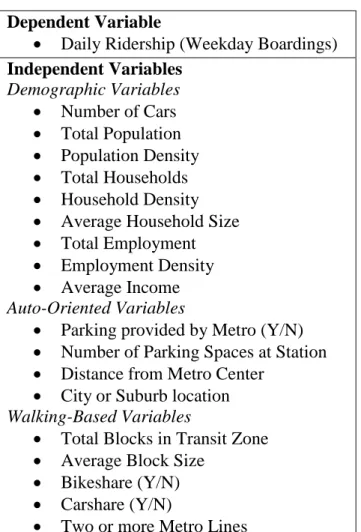
Figure 2 below displays how daily ridership is distributed throughout the Metro system. The three dimensional bars each represent a different Metro station. The darker (and taller) bars indicate greater daily ridership. It is easy to see that a majority of ridership takes place in the center of the study area, which happens to be within the city limits of DC. Another pattern that can be seen in the figure is that the terminal stations on each of the five lines have larger ridership that most of the other suburban stations. This is a logical result as many of the commuters who drive and park cars at Metro stations tend to do so at the first station on the system. These stations usually have the largest catchment areas of the region, because they are pulling riders from all areas beyond the end of the line.
2Center for Transit-Oriented Development: http://toddata.cnt.org Dependent Variable
Daily Ridership (Weekday Boardings) Independent Variables
Demographic Variables Number of Cars Total Population Population Density Total Households Household Density Average Household Size Total Employment Employment Density Average Income Auto-Oriented Variables
Parking provided by Metro (Y/N) Number of Parking Spaces at Station Distance from Metro Center
City or Suburb location Walking-Based Variables
Total Blocks in Transit Zone Average Block Size
Bikeshare (Y/N) Carshare (Y/N)
11 Figure 2: 2009 Daily Ridership by Station
Source: WMATA, U.S. Census, 2015
12
Source: WMATA, US Census, 2015
Auto-oriented variables were obtained from various sources. Parking numbers by station are listed on the Washington Metro Web site and include all metered, covered, reserved, and daily parking spots provided through Metro operations. Private parking spaces were not considered. The Parking (Y/N) variable was a simple function implemented within the database that determined which of the Metro stations provided parking spaces and which did not. The Metro Center station was chosen as a “point of interest” for several reasons, including its geographic location in the center of the city, its high ridership numbers, and its proximity to dense housing and employment. To obtain the Distance to Metro Center variable’s data, I utilized Google Maps and calculated the distance of each station in the database to the point of interest. By choosing the shortest option, I was able to get a reliable measure of how far each Metro station was from this central location. This variable was included in the auto-oriented variables because I was curious whether a station further away from the city center influenced more people to use Metro than stations nearby. Lastly, the variable indicating a City or Suburban location was done by classifying all DC Metro stations as city and all Maryland and Virginia stations as suburban.
For the walking-based variables, the information was taken from either the TOD Database or from the Metro Web site. Total Blocks in Transit Zone was downloaded with the same 0.5 Mile Transit Zone geographic constraint that the other data was held to. So too was the Average Block Size data, and both were taken from 2010 Census files aggregated down to 2009 estimates. These two sets of data were correlated, with the assumption that having a higher number of blocks in the transit zone indicated a smaller average block size. These were walkable characteristics because smaller block size indicates a friendlier walking environment, therefore I wanted to test whether transit zones with high number of blocks (or small average block sizes) saw an increase in transit riders. The Bikeshare and Carshare information was easily obtainable on the Metro Web site, and manually inserted into the database for the stations that had these services. These variables were included in the model because my assumption was that if bikeshare was provided at a station, perhaps commuters used it to get to the station instead of a car, or chose to use transit because they knew they could still be mobile when they arrived at their destination. Same goes for carsharing. I consulted the Metro map to determine which stations had two or more Metro Lines, and inserted the information in the database (remembering not to count the new Silver Line, which did not exist in 2009). The justification for including this as a variable is that most stations that include transfer points are well trafficked, and that commuters may be more willing to use transit when there are
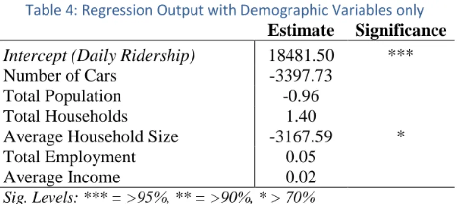
13 more options for routes and destinations at the nearest station. I also wanted to look at which of the stations were connected to Metrobus lines, to see whether having bus access to Metro stations resulted in higher ridership. It turns out that all Metro stations are Metrobus accessible, meaning that the variable became obsolete and unnecessary as part of this analysis. Table 2 shows the summary statistics for all the variables used.
Table 2: Variable Summary Statistics
Variable Name Mean Std. Dev. Minimum Maximum Dependent Variable
Daily Ridership 2009
(Weekday Boardings) 8692.52 6752.54 1540 34465
Independent Variable
Parking provided by Metro (Y/N) 0.48 0.50 0 1
Number of Parking Spaces at
Station 736.24 1328.44 0 5821
Distance from Metro Center
(miles) 6.05 4.52 0 20.9
Average Household Size 2.09 0.47 1.31 3.26
Number of Cars per Household 1.11 0.38 .42 1.91 City or Suburb location
(1=City; 0=Suburb) 0.45 0.50 0 1
Total Blocks in Transit Zone 86.49 35.79 25.91 185
Average Block Size 7.01 3.63 2.71 19.38
Bikeshare (Y/N) 0.41 0.49 0 1
Carsharing (Y/N) 0.80 0.40 0 1
Total Population 6978.72 4761.99 478 29516
Total Households 3313.79 2429.03 70.88 12028
Total Employment 6198.59 8012.08 0.07 36929
Population Density (#/acre) 14.09 9.57 1.17 58.8
Household Density (#/acre) 6.70 4.90 0.17 23.96
Employment Density 12.51 16.21 0 73.52
Average Income 75974.34 24972.64 27801 146335
Two or more Metro lines (Y/N) 0.31 0.47 0 1
14 The first set of regressions that were run were between just the Y-variable (Metro Ridership) and one individual X-variable. I wanted to measure the significance between each independent variable and the dependent variable to gauge their relationship without any other influences. Next, I worked in developing a “base” model with the demographic characteristics. Similarly to finding the individual significance of the variables, this was done to understand the relationships of demographic variables to the ridership numbers, before adding in any of the built environment features. It also ensured that none of the car-based or walkable variables “took credit” for transit ridership from the base cases. After adding the built environment variables to the demographic-only model, it was important to test that the new variables were helpful in making the model more predictive.
From there, many regressions were run with countless combinations of independent variables in relation to the dependent variable. In doing so, several important key points came out, such as the collinearity of a few of the variables like population and housing. By running many models, these potential errors could be identified, addressed, and taken out of the analysis, to create a more reliable output. In the end, I was able to grasp a better understanding of the initial question of the project, whether car-friendly or pedestrian-friendly infrastructure surrounding transit station influences more people to use public transportation.
Results
As mentioned in the methodology section, the first regressions ran were each individual independent variable against the dependent variable of daily Metro riders. Thirteen of the independent variables proved to be more than 95 percent significant, while five of the variables were not significant at the 95 percent confidence level. The results of these outputs can be seen in Table 3. Please note that all official STATA outputs can be found in the Appendix.
Table 3: Univariate Associations between Daily Ridership and Independent Variables
Independent Variable Estimate P-Value*
Parking provided by Metro (Y/N) -5567.60 0.00
Number of Parking Spaces at Station -0.36 0.52
Distance from Metro Center -514.22 0.00 Average Household Size -7320.34 0.00
Number of Cars -7318.93 0.00
City or Suburb location 3676.63 0.01 Total Blocks in Transit Zone 67.24 0.00
Average Block Size -501.04 0.01
Bikeshare (Y/N) 5116.86 0.00
Carsharing (Y/N) 368.92 0.84
Total Population 0.27 0.08
Total Households 0.72 0.02
Population Density 130.93 0.09
15 Table 3: Univariate Associations between Daily Ridership and
Independent Variables
Independent Variable Estimate P-Value*
Total Employment 0.21 0.02
Employment Density 105.70 0.01
Average Income 0.02 0.52
Two or more Metro lines (Y/N) 4825.60 0.00
*Bold p-values indicate significance > 95%
It is interesting to observe the variables that have a negative impact on transit ridership. Most are synonymous with the automobile. For example, if parking is provided by Metro, the model estimates that a reduction of over 5,500 riders will occur at that station. This would seemly indicate that car-friendly stations see less ridership than stations without parking. As distance from the Metro Center Station increases, ridership goes down by over 500 commuters per mile. Some demographic characteristics also have a negative impact on ridership. When average household size increases, ridership falls. Similarly, as the number of cars in a household goes up, ridership on Metro goes down. Another independent variable with a negative correlation with ridership is average block size. This built environment characteristic actually supports the theory that walkable settings influence more ridership, because as block size goes up, ridership goes down. With an increase in block size, there is a decrease in a suitable pedestrian environment, and fewer people will walk.
On the positively correlated side, whether the Metro station was located in the City or Suburbs had a large effect on ridership numbers. Stations designated “City” (all stations within Washington DC boundary) had an average of 3677 more commuters than suburban station locations. Adding bikeshare accessibility adjacent to Metro stations increases ridership by over 5000 people. Total households (and therefore household density) are positively correlated to commuting. As households in a transit zone go up, so too do the ridership numbers. This is understandable, as an increase in households most certainty means increased density, which lends itself to a more walkable environment. This theory is displayed in the Total Blocks in Transit Zone variable, which shows that as the number of blocks increases (and density along with it), so too does ridership. Employment and employment density are similarly correlated to transit ridership. As employment numbers go up within the ½ mile transit zone from a station, so too do commuters that use that particular station. Lastly, having two or more metro lines converging at a single station has a profound effect on ridership. Stations with transfer opportunities (two or more lines meeting) see an increase of riders at just under 5000 people.
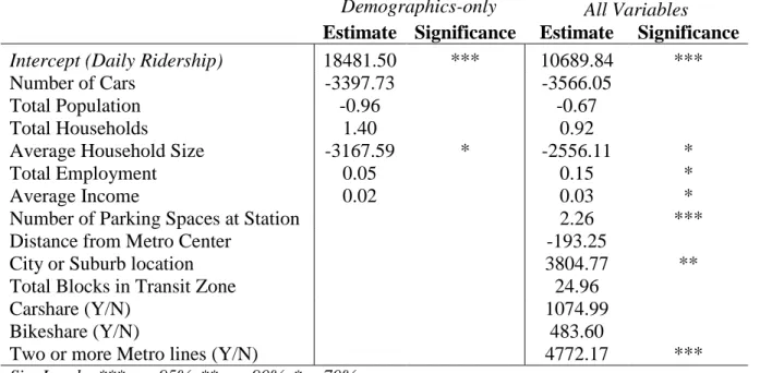
16 Table 4: Regression Output with Demographic Variables only
Estimate Significance Intercept (Daily Ridership) 18481.50 ***
Number of Cars -3397.73
Total Population -0.96
Total Households 1.40
Average Household Size -3167.59 *
Total Employment 0.05
Average Income 0.02
Sig. Levels: *** = >95%, ** = >90%, * > 70%
As the table above indicates, the demographic variables are not significant predictors of transit ridership on their own. It takes some experimentation with different combinations of variables to determine a model with good prognostic standing.
The largest model tested took into account all of the demographic variables as well all of the independent variables we had collected to see what their effect was on daily Metro ridership. Once again, excluded were some of the variables that were related to each other. The model had a large R2 at 0.71, though several of the coefficients ended up being insignificant (at a 95 percent confidence interval), as seen in Table 5.
Table 5: Regression Output with all Independent Variables
Estimate Significance Intercept (Daily Ridership) 10689.84 ***
Number of Cars -3566.05
Total Population -0.67
Total Households 0.92
Average Household Size -2556.11 *
Total Employment 0.15 *
Average Income 0.03 *
Number of Parking Spaces at Station 2.26 *** Distance from Metro Center -193.25
City or Suburb location 3804.77 **
Total Blocks in Transit Zone 24.96
Carshare (Y/N) 1074.99
Bikeshare (Y/N) 483.60
Two or more Metro lines (Y/N) 4772.17 ***
Sig. Levels: *** = >95%, ** = >90%, * > 70%
17 or just more options for travel, increases ridership by 4772. The model also shows that as household size increases, ridership goes down. The total employment found within the transit zone increases ridership by a slight amount, as does increasing incomes. Stations in city locations tend to see more riders than those in suburban locations.
The following table compares the two previous outputs side-to-side to show the impact that adding these built environment characteristics have on the coefficients of the model variables.
Table 6: Regression Output with Full Dataset
Demographics-only All Variables
Estimate Significance Estimate Significance
Intercept (Daily Ridership) 18481.50 *** 10689.84 ***
Number of Cars -3397.73 -3566.05
Total Population -0.96 -0.67
Total Households 1.40 0.92
Average Household Size -3167.59 * -2556.11 *
Total Employment 0.05 0.15 *
Average Income 0.02 0.03 *
Number of Parking Spaces at Station 2.26 ***
Distance from Metro Center -193.25
City or Suburb location 3804.77 **
Total Blocks in Transit Zone 24.96
Carshare (Y/N) 1074.99
Bikeshare (Y/N) 483.60
Two or more Metro lines (Y/N) 4772.17 ***
Sig. Levels: *** = >95%, ** = >90%, * > 70%
It is important to look at whether the model with the additional variables is a better predictor of real life conditions than the demographic base case. There are three common tests that can be used to answer this question. These tests are the likelihood ratio test, the Wald test, and the Lagrange multiplier test. They are usually described as tests for differences among nested models, because the smaller of the two models can be “nested” within the other. For our analysis, the null hypothesis is the demographics-only model (making it the true-to-life model).
All three tests use the likelihood of the models being compared to assess their fit. Determining the likelihood is seeing the probability the data given by the parameter estimates. The ultimate goal of a good model is to find values for the parameters (coefficients) that maximize the value of the likelihood function. In other words, the main goal of a model is to find the right variables and corresponding coefficients that make the data most likely in the real world. Because we are using data that is fixed (given that it comes from real life, and cannot be changed), it is the estimates of the coefficients that need to be changed in ways that maximize likelihood.
18 the fit of the model, because the individual variable is not doing much to help predict the dependent variable in the first place (UCLA, 2015).
In order to perform the test, a full model was run in STATA. Table 7 below shows that results of testing whether the variables of the built environment equaled zero. All of the results see a null hypothesis (equaling zero). This result is negated by the fact that the p-value is significant within the F-statistic value, meaning that we can reject the null hypothesis. This indicates that all the variables create a statistically significant improvement in the fit of the model.
Table 7: Wald Test for Built Environment Variables Number of Parking Spaces at Station = 0 Distance from Metro Center = 0
City or Suburb location = 0 Total Blocks in Transit Zone = 0 Carshare (Y/N) = 0
Bikeshare (Y/N) = 0
Two or more Metro lines (Y/N) = 0 F( 7, 34) = 7.04
Prob > F = 0.00
With this information, we can conclude that all the variables are important for keeping in the model. Based on the p-value of 0, we are able to reject the null hypothesis. The F-statistic itself was determined by taking the Mean Square Model divided by the Mean Square Residual to get 7.04. The numbers in the parentheses are the degrees of freedom from the Wald test and Residual ANOVA output from the regression. The six built environment variables have proven essential to helping estimate the impacts of station environments on ridership for the entire Washington DC Metro system.
With the main model showing significance for all built environment variables, it seemed important to test the variables for significance in two other scenarios, testing for stations that are found completely within DC city limits, and then testing for all the stations outside of the District (classified as the “suburban” locations).
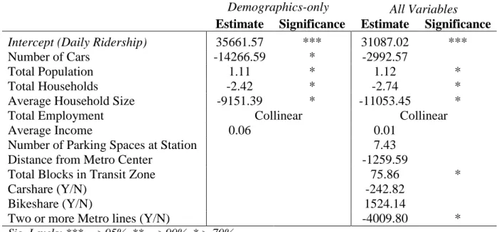
19 Table 8: Regression Output with DC-only Data
Demographics-only All Variables
Estimate Significance Estimate Significance
Intercept (Daily Ridership) 35661.57 *** 31087.02 ***
Number of Cars -14266.59 * -2992.57
Total Population 1.11 * 1.12 *
Total Households -2.42 * -2.74 *
Average Household Size -9151.39 * -11053.45 *
Total Employment Collinear Collinear
Average Income 0.06 0.01
Number of Parking Spaces at Station 7.43
Distance from Metro Center -1259.59
Total Blocks in Transit Zone 75.86 *
Carshare (Y/N) -242.82
Bikeshare (Y/N) 1524.14
Two or more Metro lines (Y/N) -4009.80 *
Sig. Levels: *** = >95%, ** = >90%, * > 70%
Table 9 displays the interesting results of the Wald test for data from the thirty-nine stations located in the borders of Washington DC. Similarly to the previous test for the full model, all the built environment variables equal zero for the null hypothesis. Unlike the full model, the probability of rejecting the null hypothesis is not significant. This means that these built environment variables are not statistically significant in helping estimate system ridership. When using just the data from stations in DC, this test indicates that these six explanatory variables can be omitted from the model. This does make sense when thinking about how the system was built. The DC metro was implemented in the 70s, and by that time the built environment had already been established in many of the areas where stations are located within the district. It seems reasonable to think that demographics such as population and employment have a bigger influence on ridership than total blocks and parking spaces do in an urban environment.
Table 9: Wald Test for Built Environment Variables (DC Data) Number of Parking Spaces at Station = 0
Distance from Metro Center = 0 Total Blocks in Transit Zone = 0 Carshare (Y/N) = 0
Bikeshare (Y/N) = 0
Two or more Metro lines (Y/N) = 0 F( 6, 27) = 0.98
Prob > F = 0.46
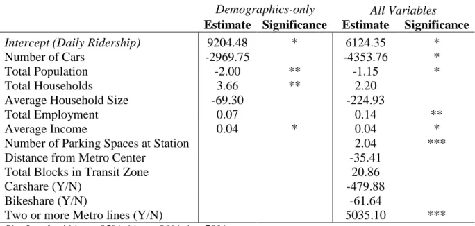
20 station variables are over 95 percent significant. The Wald output in Table 11 helps to identify if these variables should in fact be included in the model.
Table 10: Regression Output with Suburban-only Data
Demographics-only All Variables
Estimate Significance Estimate Significance
Intercept (Daily Ridership) 9204.48 * 6124.35 *
Number of Cars -2969.75 -4353.76 *
Total Population -2.00 ** -1.15 *
Total Households 3.66 ** 2.20
Average Household Size -69.30 -224.93
Total Employment 0.07 0.14 **
Average Income 0.04 * 0.04 *
Number of Parking Spaces at Station 2.04 ***
Distance from Metro Center -35.41
Total Blocks in Transit Zone 20.86
Carshare (Y/N) -479.88
Bikeshare (Y/N) -61.64
Two or more Metro lines (Y/N) 5035.10 ***
Sig. Levels: *** = >95%, ** = >90%, * > 70%
Unlike the Wald test for city-only data, the results for the suburban based data show that the built environment variables are significant and should be included within the model. As the output shows, while the null hypotheses equal zero for the built environment variables, because the probability is significant for the F-statistic, we can reject the hypotheses. Again, this result makes sense in the context of the Metro station locations. With the system being built out from the already dense city into the more sparsely populated suburbs in Maryland and Virginia, every new infrastructural decision made within the transit zone of a station will effect ridership to an extent.
Table 11: Wald Test for Built Environment Variables (Suburban Data) Number of Parking Spaces at Station = 0
Distance from Metro Center = 0 Total Blocks in Transit Zone = 0 Carshare (Y/N) = 0
Bikeshare (Y/N) = 0
Two or more Metro lines (Y/N) = 0 F( 6, 32) = 6.64
Prob > F = 0.00
The following analysis takes a look at several different sub-models, each displaying a variety of combinations of variables that tell a slightly different story. This was done in order to see if specific variables that are associated with different categories (such as driving or walking) have any noticeable effects on system ridership.
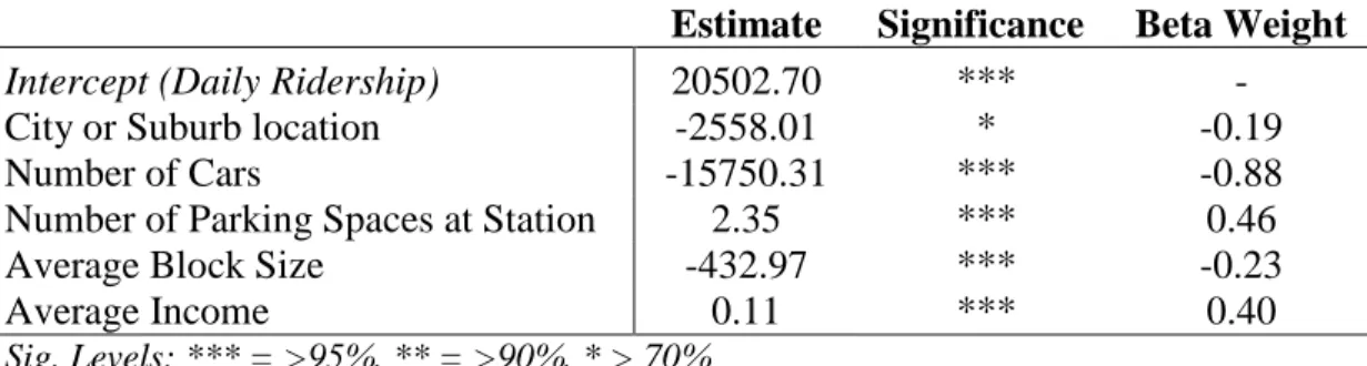
21 demographics associated with the auto such as car ownership and income, as well as the auto related features that surround transit stations, such as parking. This regression had a R2 of 37 percent.
Table 12: Regression Output with Auto-Oriented Variables
Estimate Significance Beta Weight
Intercept (Daily Ridership) 20502.70 *** -
City or Suburb location -2558.01 * -0.19
Number of Cars -15750.31 *** -0.88
Number of Parking Spaces at Station 2.35 *** 0.46
Average Block Size -432.97 *** -0.23
Average Income 0.11 *** 0.40
Sig. Levels: *** = >95%, ** = >90%, * > 70%
The results of Table 12 show that many of the auto-oriented variables are significant when grouped together with daily ridership. The number of cars a household has shown a negative correlation to transit use. As the number of cars goes up in a transit zone, less and less people use the Metro to commute. There is a positive relationship with the number of parking spaces at Metro stations and ridership. With each new parking space provided, slightly more than two new riders are attracted to the system. This seemingly goes against what was found in the regression with this variable and just the dependent variable, where stations that provided parking were seen to have a drop in ridership. The output here must be showing that for the stations providing parking, the more spaces provided, the more attractive the station will be for parking and riding. As expected, there is a negative correlation with average block size and ridership. When blocks get larger, they become less friendly to the pedestrian, and result in lower ridership as the model shows. Interestingly, average income is shown to have a slightly positive relationship with ridership. Normally transit use is associated with lower income populations, but this model shows that an increase in income results in a very slight increase in riders. There are several possible explanations for this. Washington DC is full of affluent residents who predominately use the Metro for mobility. Another reason may be that heavy rail does not have the negative connotation as do other forms of public transportation like buses. As a result, the socio-economic makeup of Metro riders tends to be more representative of all incomes than Metrobus or other similar systems in major cities. The only variable not to be statistically significant was the City or Suburb qualification. Unlike the previous outputs, there is now a negative correlation between City station location and ridership.
For this output, and several of the ones below, I wanted to look at the beta weights of each variable in the model. Beta weights are regression coefficients for standardized data. Beta represents the average amount the dependent variable increases one standard deviation with the other independent variables being held constant. The ratio of beta weights is the ratio of predictive importance of the independent variables (UNESCO, 2014). As seen in Table 12, the Number of Cars variable has the highest beta weight (in absolute value terms). The City or Suburb variable, which is not statistically significant in the first place, has the lowest beta value.
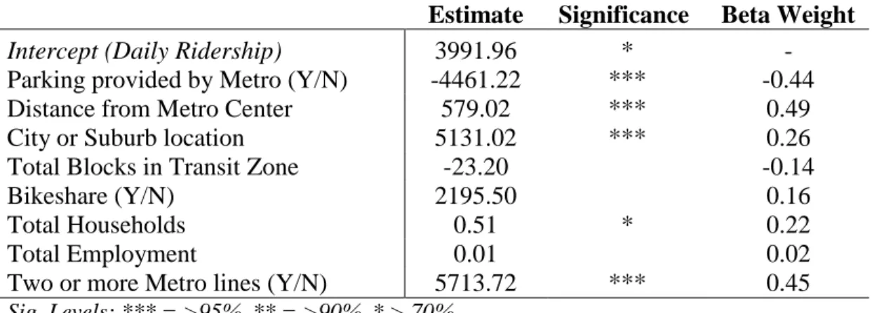
22 environment, in hopes of seeing what types of non-motorized characteristics are most significant in getting commuters to choose Metro. The output produced an R2 of 56 percent.
Table 13: Regression Output with Walking-Focused Variables
Estimate Significance Beta Weight
Intercept (Daily Ridership) 3991.96 * -
Parking provided by Metro (Y/N) -4461.22 *** -0.44
Distance from Metro Center 579.02 *** 0.49
City or Suburb location 5131.02 *** 0.26
Total Blocks in Transit Zone -23.20 -0.14
Bikeshare (Y/N) 2195.50 0.16
Total Households 0.51 * 0.22
Total Employment 0.01 0.02
Two or more Metro lines (Y/N) 5713.72 *** 0.45
Sig. Levels: *** = >95%, ** = >90%, * > 70%
Table 13 indicates that a majority of the walking-focused variables are statistically significant. Including whether parking is provided by Metro may seem counter-initiative to the walking oriented model. It was made to be part of the analysis because the assumption (backed up by real life examples) is that stations that provide parking do not have successful pedestrian environments and infrastructure. The model shows that if parking is provided by Metro, there is a negative impact on ridership. This can be interpreted as the loss of potential riders due to a lack of a walkable and easily accessible (by non-motorized methods) transit zones when parking is offered. The distance from Metro Center results show that the further away from the city the station is, the more riders. This goes against my hypothesis that a more walkable urban environment would create more riders, but it seems that the terminus stations are able attract more riders. This does make logical sense, as the stations further out have the largest catchment areas to pull riders from. Similarly to the analysis just discussed, the variable City or Suburb looks at whether urban stations have a larger influence on transit ridership. In fact, the results show that city Metro stations do have a positive correlation with riders. The beta weights (explained below) will help to determine whether the Distance from Metro Center or City and Suburb variable is a stronger predictor of riders.
As per usual, the non-significant variables (Total Blocks in Transit Zone, Bikeshare, and Total Employment) displayed the lowest beta weights. The variable Distance from Metro Center displays the highest beta weight, and therefore, the highest predictive power. This is closely followed by the Two or More Lines and Parking variables. The City or Suburb variable turns out to have lower predictive abilities than the other significant variables, showing that the Distance from Metro Center (such as terminus stations) impacts ridership more than stations located within the city boundaries.
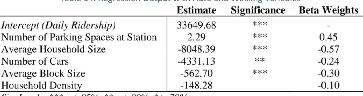
23 Table 14: Regression Output with Auto and Walking Variables
Estimate Significance Beta Weights
Intercept (Daily Ridership) 33649.68 *** - Number of Parking Spaces at Station 2.29 *** 0.45
Average Household Size -8048.39 *** -0.57
Number of Cars -4331.13 ** -0.24
Average Block Size -562.70 *** -0.30
Household Density -148.28 -0.10
Sig. Levels: *** = >95%, ** = >90%, * > 70%
Results of this output show that with the exception of Household Density, the other variables are statistically significant. With the auto and walking variables included, the base daily ridership numbers are 33,650. The number of parking spaces at a station is correlated to ridership in a positive fashion. As parking spaces increase, so too does ridership. According to this model, it seems that every new parking space brings a little more than two riders into the system. As household size increases, there is a significant drop in ridership. This makes sense, as families grow it usually becomes logistically difficult to schedule plans and activities around transit. Similarly, the number of cars found at a household has a negative correlation to Metro riders. As more cars are found in a home, the likelihood of them forgoing private automobile commutes for transit trips decreases. Another negative correlation to ridership is average block size. When blocks become larger in the transit zones surrounding stations, ridership drops. As previously explained, larger blocks create a weaker pedestrian network, so this fall in transit users is not surprising. Unfortunately, Household Density is not significantly significant and inferences on density’s impact on ridership cannot be made.
It seems that the results from this analysis favor auto-oriented characteristics more than walking-based variables. The main auto variable (parking) showed an increase in ridership when more parking spaces were provided, and it also happened to have the highest beta weight. The demographic characteristic of cars per household also showed that as the number of cars increased there would be a decrease in transit use (although this is not a built environment variable). Only one of the walkable characteristics was statistically significant and it showed that block sizes are negatively correlated with ridership numbers. As blocks increase in size, transit commuters go down, and vice versa for when blocks decrease in size and become more walkable. This variable has a lower beta weight than parking does, showing that while influential on transit use, it is not as strong of a predictor of ridership as parking is for Metro stations.
Table 15 is an output that only took into account the stations in the Metro system that offer parking. It includes data from the 41 stations that have parking provided through Metro. The point of this output was to determine whether the transit stations that do have park-and-ride lots have significant impacts on ridership when looking at potentially increasing the number of parking spaces.
Table 15: Regression Output for Metro Stations with Parking Estimate Significance Intercept (Daily Ridership) 3739.11 *** Number of Parking Spaces at Station 1.32 ***
24 With an R2 of 48 percent, the model shows that there is statistical significance for the number of spaces provided at a Metro station (for stations that already provide parking). This output estimates that ridership would increase by 1.3 people for every new space added in an existing park-and-ride transit zone. Results such as this one seem to indicate that expanding parking at the stations that already have spaces would help to influence more transit users, verses allocating available land for mixed-use development.
Limitations
All projects, especially those dealing with statistical analysis, have limitations that keep them from being accurate enough to predict real-life behavior and decision-making. There are several different limitations that have likely had an effect on the overall accuracy of the model outputs above.
To begin, the data used for this analysis is from 2009. This data is now five years old and both the ridership and Metro infrastructure has changed in that time. In 2009, the United States was deep within a recession and transit ridership increased as commuters forwent purchasing cars and spending extra money on gas. The higher ridership from 2009 may skew some of the analysis when thinking for 2015 and the future as ridership on the Metro system has decreased over the past few years. Also, a whole new line has been added to the system that goes through the edge city of Tysons Corner in Virginia. The Silver Line is so new that data on ridership has not been captured at this time, and demographic information would be outdated because of all the new construction that has occurred since the last Census. Hopefully, the information found though this analysis can help shape the built environment that is currently being developed around those new stations to better influence ridership.
Another potential limitation is the fact that the model and variables used for the DC Metro analysis focused on specific details to ensure that the tool worked well for the region. The use of certain variables could make it difficult to transfer this approach to other transit systems directly. It is likely that the model would need to be slightly recalibrated for use in other areas. A data collection effort would be needed to obtain new and relevant demographic and infrastructural variables.
Lastly, this analysis only took into account the Metrorail portion of the public transit system in Washington DC. There is an even larger component that was not analyzed, the Metrobus system. This is due in part to the sheer size of the bus system and the large number of stations that would have to be assessed. Also, bus stations do not tend to warrant new infrastructure within their surroundings and are not as permanent of a decision as rail stations are. An improvement on this report would look into the differences in the influences of ridership for rail verses buses. Bus riders predominantly do not own vehicles so it would seem that walkable environments would be more influential on these transit users than a park-and-ride facility, but that could also vary based on the urban and suburban locations.
Conclusion
25 Both have their individual strengths and limitations and the effect that they have on ridership depends on the system and its setting.
The defense for park-and-ride facilities is that it maximizes the number of people who can easily get to stations, by extending the radius of a station’s catchment area. This seemingly ensures that the maximum number of people have easy access to stations, which then increases ridership. Although commuters who utilize park-and-ride begin and end their trips in personal vehicles, there is a lower social cost then using an automobile for the entire commute. Disadvantages of park-and-ride oriented stations are that they do not improve options for those commuters without access to a personal vehicle, whether that is due to financial, ethical, or physical reasons. Because park-and-ride facilities require cars to be reached, it negates any incentive for households to not own an automobile. Parking lots can also create unpleasant and dangerous environments that are unfriendly for pedestrians (and other non-motorized modes of transportation), deterring them from accessing transit via those modes.
Providing a dense, mixed-use, and walkable environment around transit stations has been said increase the likelihood of transit use for those within immediate surroundings. Because TOD puts more people in close proximity to a transit station this relationship seems justified. The provision of parking near transit stations can compromise the potential for successful development. Therein lies a tough decision, whether to develop the land area around the station to help justify the large investment cost of the transit system, or to create parking that would increase the station catchment area, even if that weakens the economic invectives to focus TOD construction within the transit zones.
The analysis completed for this project focused on how these two different built environment characteristics, auto-oriented and non-motorized-oriented infrastructure, influence ridership on the DC Metro. It is important to keep in mind that the primary goal of the model was not to predict ridership exclusively. I wanted to look at and understand the potential change in ridership that results from changes in transit zone surroundings, whether they focus on cars or pedestrians and bikers. Keeping that in mind, the model should be well suited to estimate the change in transit ridership that could result if various infrastructural changes are implemented. To achieve a conclusion, I first wanted to understand the relationship between the demographic variables and transit use, so that when the built environment variables were added it was clearer as to what constituted the fluctuations in coefficients. It was important to not have parking or walkability “take credit” for the influences of population, income, and other important demographic data.
As the Wald tests showed, the overall system model benefits from including built environment variables. This means that the infrastructure surrounding transit stations along the Metro system influences ridership. Further analysis did show that the built environment variables may not be significant within the District, but are very important for modeling ridership in the stations that are located in both Maryland and Virginia. This means that when it comes to policy decisions regarding the stations in the system, built environment choices will impact changes in ridership at suburban stations to a higher degree than within the city.
26 the region. Therefore when it comes to which of the built environment variables has a greater influence (or deterrence) on ridership, the answer varies throughout the overall system. Increasing parking seems to bring with it new riders. The policy implications of this result means that Metro should look into more parking for stations at the end of the line that are already supporting such a large catchment area. The model results did also show the importance of walkable environments. As block size increased, the amount of riders decreased. This means that walkability is still an important factor to be considered, especially within the ½ mile radius emulating from stations. Policies should be enacted that help to strengthen the pedestrian (and non-motorized) environments in all locations, specifically in suburban areas where the improvements will be most impactful as evidenced during the Wald test.
27 Bibliography
American Public Transportation Association. (2015). Public Transportation Benefits.
http://www.apta.com/mediacenter/ptbenefits/Pages/default.aspx
Caltrans. (2013). Cost-Benefit Analysis of Park & Ride/Intermodal Strategies within the State Highway System in Southern California. Division of Transportation Planning.
http://www.dot.ca.gov/dist12/docs/planning_reasearch_grp/PnR_Final_Report_November_2013.
Center for Transit-Oriented Development. (2014). TOD Database: Washington DC.
http://toddata.cnt.org
Cutrufo, Joseph. (2013). Access to Rail Stations Can’t Just Be About Parking for Cars. Mobilizing the Region.
http://blog.tstc.org/2013/09/24/access-to-rail-stations-cant-just-be-aboutparking-for-cars/
Denver Regional Council of Governments. (2014). What are the benefits of TOD?. Transit Oriented Development. http://tod.drcog.org/what-are-benefits-tod
DeWitt, J. & S. Peterson. (2003). The Myth of Free Parking. Transit for Livable Communities.
http://www.tlcminnesota.org/pdf/mythoffreeparking_PUBLIC.pdf
Dickens. (1991). Park and ride facilities on light rail transit systems. Transportation. Vol. 18, pp. 23–36.
Duncan, M. & Christensen, R. (2013). An analysis of park-and-ride provision at light rail stations across the US. Transport Policy Vol. 25, pp. 148-157.
http://www.sciencedirect.com/science/article/pii/S0967070X12001898
Duncan, Michael. (2010). To Park or to Develop: Tradeoff in Rail Transit Passenger Demand. Journal of Planning Education and Research, Vol. 30, No. 2, pp. 162-181.
http://jpe.sagepub.com/content/30/2/162.abstract
Frost, Jim. (2013). Regression Analysis. The Minitab Blog.
http://blog.minitab.com/blog/adventures-in-statistics/regression-analysis-how-do-i-interpret-r-squared-and-assess-the-goodness-of-fit.
Gooze, Aaron, Breiland, C. & D. Rowe. (2014). Non-Motorized Access Influence on Transit Ridership in the Puget Sound, Washington. Transportation Research Board Annual Meeting Paper.
28 Johnson, Matt. (2014). Comparing Metrobus and Metrorail farebox recovery is apples and
oranges. GreaterGreaterWashington.
http://greatergreaterwashington.org/post/21940/comparing-metrobus-and-metrorail-farebox-recovery-is-apples-and-oranges/
Khandker, N., Mahmoud, M. & Coleman, J. (2014). Effect of Parking Charges at Transit Stations on Park-and-Ride Mode Choice. Journal of the Transportation Research Board. Vol. 2, pp. 163-170. http://trb.metapress.com/content/vnn35x77l0jk8347/
King, D., Manville, M. & M. Smart. (2014). Use of public transit isn’t surging. Washington Post.
http://www.washingtonpost.com/opinions/use-of-public-transit-isnt-surging/2014/03/20/0b44e522-b03b-11e3-95e8-39bef8e9a48b_story.html
Merriman, David. (1998). How many parking spaces does it take to create one additional transit passenger? Regional Science and Urban Economics. Vol. 28, No. 5, pp. 565–584.
http://www.sciencedirect.com/science/article/pii/S0166046298000180
PACommutes. (2015). Benefits. Pennsylvania Department of Transportation.
http://www.pacommutes.com/public-transit/benefits/
Shoup, Donald. (2015). The High Cost Of Minimum Parking Requirements. Transport and Sustainability, Volume 5, 87-113. http://shoup.bol.ucla.edu/HighCost.pdf.
Syed, S., Golub, A. & E. Deakin. (2009). Response of regional rail park-and-ride users to parking price changes. Transportation Research Record. Vol. 2110, pp. 155–162.
http://trb.metapress.com/content/634174162n45nj5w/?genre=article&id=doi%3a10.3141%2f211
0-19
Tilahun, Nebiyou & M. Li. (2014). Walking Access to Transit Stations: Evaluating Barriers using Stated Preference. Transportation Research Board Annual Meeting Paper.
United Nations Educational, Scientific and Cultural Organization. (2014). Key Statistical Concepts and Definitions. http://www.unesco.org/webworld/idams/advguide/Chapt5_1.htm
University of California – Los Angeles. (2015). Likelihood Ratio, Wald, And Lagrange Multiplier (Score) Tests. Institute for Digital Research and Education.
http://www.ats.ucla.edu/stat/mult_pkg/faq/general/nested_tests.htm
Washington Metro Area Transit Authority. (2014). Metro Facts.
http://www.wmata.com/about_metro/docs/Metro%20Facts%202014.pdf
Washington Metro Area Transit Authority. (2014). About Metro.