Fine-Grained Open Learner Models: Complexity Versus Support
Julio Guerra-Hollstein
Instituto de Inform´atica, Universidad Austral de Chile
Jordan Barria-Pineda
School of Information Sciences, University of Pittsburgh
Christian D. Schunn
Learning Research and Development Center, University of Pittsburgh
Susan Bull
Institute of Education, University College London
Peter Brusilovsky
School of Information Sciences, University of Pittsburgh
ABSTRACT
Open Learner Models (OLM) show the learner model to users to assist their self-regulated learning by, for example, helping prompt reflection, facilitating planning and supporting navigation. OLMs can show different levels of detail of the underlying learner model, and can also structure the information differently. As a result, a trade-off may exist between the potential for better support for learning and the complexity of the information shown. This paper investigates students’ perceptions about whether offering more and richer information in an OLM will result in more effective support for their self-regulated learning. In a first study, question-naire responses relating to designs for six visualisations of varying complexity led to the implementation of three variations on one of the designs. A second controlled study involved students in-teracting with these variations. The study revealed that the most useful variation for searching for suitable learning material was a visualisation combining a basic coloured grid, an extended bar chart-like visualisation indicating related concepts, and a learning gauge.
KEYWORDS
Open learner model; navigation support; user study
1
INTRODUCTION
Learner models about student knowledge or skills are typically kept hidden in adaptive educational systems. Opening these models to students could improve transparency and open a channel for stu-dent feedback about the model, as well as to enable the stustu-dent to better understand the state of their knowledge, reason about their knowledge, and use this understanding to better plan his or her learning [6]. A question that has not yet been well-explored is how much information about one’s own knowledge the student should be exposed to, to achieve these benefits. Student knowledge has Permission to make digital or hard copies of all or part of this work for personal or classroom use is granted without fee provided that copies are not made or distributed for profit or commercial advantage and that copies bear this notice and the full citation on the first page. Copyrights for components of this work owned by others than the author(s) must be honored. Abstracting with credit is permitted. To copy otherwise, or republish, to post on servers or to redistribute to lists, requires prior specific permission and/or a fee. Request permissions from [email protected].
UMAP ’17, Bratislava, Slovakia
© 2017 Copyright held by the owner/author(s). Publication rights licensed to ACM. 978-1-4503-4635-1/17/07...$15.00
DOI: http://dx.doi.org/10.1145/3079628.3079682
been modelled using knowledge components of different granular-ity levels from coarse grain course topics to fine-grain skills and concepts (e.g. [1]). Finer-grain models can clearly offer students more information to support their understanding, reasoning, and planning, but finer-grain visualisations might overwhelm students. If information overload is a concern, how might this be usefully addressed? How much information is enough?
This paper presents our exploration of a finer-grain OLM for the domain of learning to program. This area provides natural support for multi-level domain and learner modeling. On the one hand, programming knowledge for a language likeJavacould be considered at the level of broad topics such as variables, conditions, loops, etc. This is the way in which topics are presented in textbooks and courses (with a chapter or a lecture usually devoted to one such topic). On the other hand, knowledge analysis reveals many dozens of small domain concepts such as a specific operators, data types, etc., for which students can have different levels of knowledge. In our past work, we extensively explored personalization and OLM at the larger topic level [31]. We demonstrated that topic-level OLMs could guide students to the most appropriate topics, improve learning outcomes, and increase their engagement. We also demonstrated that open social learner models, an extension of OLM with social comparison on relative performance at the topic-level, further increases the value of OLMs [2, 17]. However, we also observed several limitations of topic-level modeling. For example, averaging knowledge over relatively large topics, topic-level OLMs might hide treacherous knowledge “holes” – missing concepts within otherwise reasonably learned topics. It also offers little support for guiding students to the most appropriate learning content within a topic. Indeed, in a topic-level learner model, all problems associated with a topic may contribute equally to the topic - while finer-level modeling permits the distinction of problems that can help fill the knowledge “holes” from those that push the student to practice already well-learned concepts.
In this work, we augment topic-level OLMs with a more fine-grained concept-level extension and evaluate whether the finer-grained model offers better support for activities that rely on OLM, such as next problem selection. We started with a user study (Study 1) that engaged students in comparing several designs of concept-level OLM in three contexts. The visualisation that was considered most favorably by students was then implemented and evaluated in the second study (Study 2). This study focused on a context for which an OLM could be especially useful: selecting appropri-ate problems to practice. To understand whether our fine-grained
model visualisation offers too much or too little information in this context, we contrasted our basic design with two other exten-sions. One extension offered additional information, while another, instead, offered support for interpreting the information already available. In this paper we present both studies and discuss the results obtained. We believe that these results offer guidance for the future work on fine-grained OLM visualisations.
2
RELATED WORK
Open Learner Models have been implemented in multiple contexts and with different levels of interactivity and complexity [6]. In the context of this paper, the most relevant work is that on the presentation and understandability of OLM visualisations. It has been recognized that, as a representation of a learner model (which is a complex system running in the background), an OLM has to be designed to be understandable and interpretable in order to pro-vide pedagogical support [3, 21]. While some studies have found that simple indicators likeskillometersare preferred by students [11], other studies support more complex representations such as concept maps [25], for example, as tools to represent and refine assessment claims on learners’ knowledge [33]. Moreover, some researcher have proposed offering multiple OLM views, from sim-ple to detailed to structured, giving options that satisfy different students’ preferences [5, 8, 11, 24]. More recent work has taken the issue of complexity and interpretability by extending the OLM with more elaborate features such as indicators of effort, progress, or working style [28]. Our previous work on a questionnaire study of a wide variety of visualisations from different systems found that students expected structured visualisations such as visualizations of Prerequisites and of a Hierarchical Tree (from [24]) to best support the task of identifying what to work on next [4]. However, it was unclear why students might prefer these representations over other structured views such as concept maps. These findings motivate our present work.
3
MASTERY GRIDS FRAMEWORK
The starting point of our exploration of fine-grained OLMs is the Mastery Grids (MG) interface, which is a combination of an OLM visualization with social comparison and a personalized interface for accessing learning content [2, 15, 22]. The original MG inter-face uses a coarse-grained OLM that aggregates and visualizes the learner’s knowledge level of topics (relatively coarse grained units of domain knowledge). Figure 1 shows Mastery Grids with the so-cial comparison feature activated. The first row of cells represents the learner’s knowledge for each course topic using different inten-sities of green (darker green corresponding to more knowledge). The third row represents the average topic-by-topic knowledge of the peer group (i.e., the rest of the class) using different intensities of blue. The second row offers an easy comparison using a differential color: it becomes green when the learner is ahead, or blue if the class is ahead. By clicking in a topic cell, the content activities within the topic are displayed as cells linked to the activities, making the MG an interactive navigational tool. MG is a domain-independent framework and so far, we have developed MG-based courses for Java, Python, and SQL programming. These courses were used as research platforms to evaluate the effects of the MG-based OLM
Figure 1: Mastery Grids interface for Java programming
with and without social comparison on learning and engagement [2, 15].
In the context of this paper, it is important that the MG interface is built on top of a learner modeling and personalization framework that includes a two-level domain model, a learner model, and a content model. Since we use the same framework to implement the finer-grained OLM on top of the MG, we introduce the most essential components of this framework below.
• TheFine-Grained Domain Modelis composed of a set of Knowl-edge Components (KCs) that represent elementary units of knowl-edge such as skills or concepts. For the Java domain, we use 114 KCs from an ontology developed by our group. Examples of KCs areint data type,addition,variable initialization,String concate-nation,for loop,constructor, andinherited method.
• TheCoarse-Grained Domain Modelis composed of a list of topics that represent relatively large fragments of domain knowledge. While the KC-level model is defined by the structure of the do-main, the list of topics reflects a pedagogical approach to teach-ing the domain. Our infrastructure allows different instructors to introduce their preferred sequence of topics for the domain. Structurally, each topic could be mapped into a subset of KCs. Taken together, topic and KCs define a two-level hierarchical domain model.
• Activities-KC mappingis used to connect learning activities (ex-amples, problems, animations) to a set of KCs by allow to be practiced in the activities. This mapping can be established man-ually or automatically. For the Java domain, this mapping is done automatically by the content parser presented in [16], with optional expert refinement (see [19]). In this domain, content activities have between 2 and 70 associated KCs.
• Activity-Topic mappingassociates each course activity with one of the course topics. This mapping, which essentially defines the structure of a course, is usually done manually by course instructors who adopt a specific sequence of topics. In the Java domain, the structure of activities was assembled with the help of instructors of programming courses. The organization of the course influences the decomposition of topics into KCs: an activity only contains KCs of the topic in which it belongs or from topics covered previously.
• TheLearner Modelrepresents an estimation of learner knowl-edge for each component of the domain model. The sources for this knowledge estimation are activity traces produced by the learner’s work with different leaning activities. The Learner Model uses these activity traces and the mapping between activ-ities and domain model components (topics or KCs) to update the learner’s knowledge level for each topic or concept related to
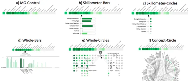
Figure 2: The 6 visualizations prototyped for Study 1.
the activity performed. For example, when the learner solves a problem that contains the KCfor-loop, the LM will consider this as evidence of knowing the KC and will update its estimation. Note that the knowledge level for domain topics visualized by the MG interface can be modelled independently or calculated as an aggregation of knowledge of concepts included into the topic. In past studies of the MG interface, we explored both ap-proaches. Details of the current Learner Model implementation can be found in [18, 19].
4
DEVELOPING THE RICH-OLM
A coarse-grain topic-level OLM provides limited support for some important aspects of Self-Regulated learning (SRL) such as the ability to recognize knowledge gaps and next problem selection. To offer better support for SRL, we designed and implemented a fine-grained OLM visualization that fully reflects the information maintained by the Learner Model in our infrastructure described in the previous section. Our goal was to find a visualization approach that complements the current topic-based MG interface and main-tains a compromise between complexity and the potential support that it offers to learners. In this paper we refer to a combination of the original topic-based OLM (Mastery Grids) and fine-grain OLM as theRich-OLM.
4.1
Study 1: Comparing Design Options for a
Fine-Grained OLM
To understand how to effectively visualize the knowledge-component (KC) space and how much information is needed, we designed a controlled user study that we callStudy 1. We designed five dif-ferent visualizations with difdif-ferent levels of information about the concept space and its relationships. All visualizations include the topic level visualization (Mastery Grids). We excluded the social comparison features in order to focus on the complexity issues of the fine-grained level. These designs, together with a control ver-sion (Mastery Grids alone) are presented in Figure 2. Visualization options varied in terms of the amount of information displayed (show KCs only within the topic, show all KCs at the same time, show connections between KCs), and the visual element used for
representing each KC (bars or circles). Knowledge in each KC is represented with shades of green as in Mastery Grids, and in the case of using bars to represent KCs, we represent such information with both color and size. This decision was motivated to avoid possible biases caused by the use or non-use of color. The designed visualisations were inspired by a wide range of common visual representations previously used in OLM such asskillometers(e.g. [7, 9, 23, 27, 32]),bar chartsorhistograms(e.g.[26, 30]), andconcept maps(e.g.[11, 24, 29]). Although the prototypes were presented as paper mock-ups to subjects, we described them to subjects as functional prototypes with some interactivity features (e.g. how they react when a concept ismouseovered).
• Skillometer-Bars: Shows the list of KC associated to a specific topic as it is pointed to. Each KC is represented with its name and a bar indicating the estimated knowledge.
• Skillometer-Circles: Similar to Skillometer-Bars, but KCs are here represented with colored circles.
• Whole-Bars: Shows all KCs in the course (114) with bar chart parallel to the coarse-grained visualization. The idea is that when topics are pointed to, the related concepts are highlighted. • Whole-Circles: KCs are positioned under the topic to which they
belong and represented with a colored circles. When a concept is pointed to, the name is shown and the connections to other concepts are also shown with the names of the related concepts. These connections are Skill-Combinations [19] and represent pairs of concepts that should be practised together.
• Concept-Circle: Another view of the whole space where names and connections are shown all at the same time. KC are repre-sented with small colored circles. Pointing to a KC will highlight its connected KCs. Pointing to a topic will highlight the group of related concepts in the circle.
Subjects were offered a presentation of the Learner Model, in-cluding all the information described above, and a description of the visualizations shown in Figure 2. We provided several mock-ups for each of them to describe interactivity. Clarifications were given to subjects to ensure that the features of the more complex representations were understood. Subject were selected among
students who had previous experience using Mastery Grids in a course.
Then subjects received a survey with three parts, each setting a different context orscenarioin order to collect a broader subjective evaluation. Part 1 involves a general scenario. Part 2 involves a scenario of preparing for a hypothetical quiz on a specific topic. Part 3 presents the scenario of a midterm exam covering a number of topics. In each part, questions were phrased to match the specific scenario. For example, in the case of part 2, questions explicitly ask the subject to think on the support of the visualization to prepare for the specific topic of the quiz. The questions covered different aspects (the examples in parenthesis are the questions as phrased for Part 1):preparation checking(“The visualization helps me to check whether I am doing well enough in the course”),knowledge reflection(“The visualization makes me think about my knowledge in the course”),strength and weaknesses identification(2 questions: “The visualization helps me to identify the strengths (weaknesses) in my knowledge of the course contents”),motivation to explore(“The visualization motivates me to look for further material to learn more about the course contents”),easy understand(“The visualization is easy to understand”), andtopic awareness(“The visualization helps me to have a better idea of the content involved in each of the topics of the course’). Each part of the survey was presented as a matrix, with the rows containing the questions and the columns containing the 6 visualizations to facilitate comparative answers. In Parts 2 and 3, where the overall stated goal is to prepare for a quiz or midterm exam, we included two additional items:plan next (“The visualization helps me to plan what to do next in order to prepare for the quiz”), andquantify work(“The visualization helps me to quantify how much work I should do to prepare for the quiz”). At the end of the session, subjects were asked to indicate the best and the worst visualization, and provide an explanation of their choices.
Forty two subjects (Information Sciences Master students and Computer Science undergraduate students at the University of Pittsburgh) completed the study. Each received US $20 for partici-pating and signed an informed consent. Multilevel linear regression analysis was performed for each of the aspects measured (depen-dent variables). Random effect of subject in the repeated measures was specified, and models were built using a Maximum Likelihood method. We use the softwareRand the functionlmeto run these analyses (see Chapter 13 of [13] for details of this type of analyses). For space constraints, and since we are not looking for detailed differences but rather are seeking to inform design decisions, we report only general trends observed.
A first run of the analysis contrasted the perception of the visu-alizations, averaging the answers per visualization across different scenarios. The patterns of preferences show a preference for Whole-Barsthat is similar across items of the survey with only slight dif-ferences. Post-hoc comparisons were performed using a Tukey con-trast between the visualization options. Results show a clear advan-tage of all visualizations over both the control version (MG-control) and theSkillometer-Circlesfor all dependent variables, except for easy understand, whereMG-controlis, not surprisingly, generally better evaluated. While generally evaluated higher,Whole-Barsdid not show clear difference compared toSkillometer-Bars. These two
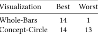
Table 1: Study 1, the visualizations that were most often cho-sen as the best and the worst.
Visualization Best Worst
Whole-Bars 14 1
Concept-Circle 14 13
visualizations using bars were evaluated higher than visualizations that use circles to represent KCs.
A second run of analysis was performed for each survey item separately by scenario. Results showed lower scores in thequiz sce-nario, especially for the aspectsstrengths and weaknesses identifica-tion,knowledge reflexion,motivation to explore, andtopic awareness, which suggest that there is room to improve the system to support more specific tasks.
Interestingly, overall preferences (best and worst) divide opinions between complex representations. Table 1 shows that while the same amount of participants chooseWhole-BarsandConcept-Circle, this last visualization is chosen as the last preferred visualization because of “overwhelming” complexity.
From Study 1, we learned that students prefer bars than circles to represent their knowledge of concepts. They also think that bars are easier to understand. These findings are consistent with preferences for skillometers found in previous research [11], but also suggest that the preference might be due to the visual element used (the bar) and not necessarily the level of complexity offered (no difference betweenWhole-Bars andSkillometer-Bars). Visualizations with connections, which were evaluated as more complex, were not judged as more helpful in any of the aspects. However, preferences forConcept-Circlewere extremely divided (best and worst). Multiple preferences have been recognized in the literature and addressed presenting alternative visualizations [8, 11]. We also learned that visualizations might bring different levels of support depending on the scenario. These scenarios involve different goals students have while using the system. A “take away” is that the current alternatives do not seem to support thequizscenario well, and other features might be needed to improve this. The evidenced differences between scenarios also suggest that it is important for evaluations to specify well defined tasks. Although evaluation for Whole-BarsandSkillometer-Barsare similar in the questionnaire, subjects stated that for tasks like preparing for a midterm, they will prefer to use a visualization that shows the whole concept space. This was a strong reason to select a visualization that includes both global and local context. We conclude that the “sweet spot” is the Whole-Barsvisualization, though there is an interesting research idea in exploringConcept-Circleas an alternative visualization.
4.2
The Rich-OLM
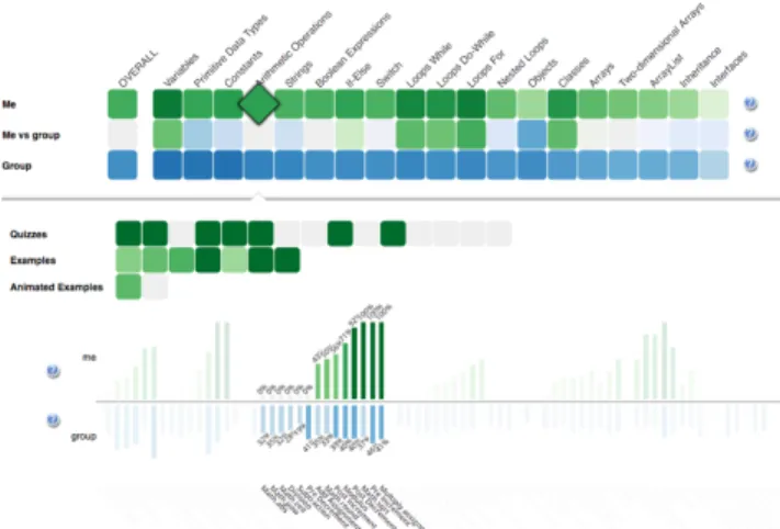
Attending to the results of Study 1, we implemented a Rich-OLM based on theWhole-Barsprototype. It shows the topics with their progress and all the concepts of the course in parallel. When a topic is pointed, related concepts are highlighted (the rest are shaded out). When the learner clicks a topic, the activities contained are shown, and the concepts related to this topic are highlighted, with their names at the bottom of each bar. Figure 3 shows a screenshot when entering the topicArithmetic Operations(Java programming course). The full interface includes social comparison at the levels
Figure 3: Full Rich-OLM interface. The user has entered a topic and the concept bar chart has shaded out and high-lighted only the concepts related.
of topics and concepts, the latter represented as blue bars growing down from the x-axis of the concept bar chart. The visualization was completely built using the javascript libraryd3(www.d3js.org). While evaluating Rich-OLM will require different aspects aligned to different purposes of use and self-regulated learning tasks to be included, we here prioritize the evaluation of the support that the system brings when students are focused in a specific topic and searching for the best activity to engage with. We then designed and performed a second controlled user study to inform this, which is described in the following section.
5
STUDY 2 DESIGN
To evaluate the Rich-OLM, we designed a controlled user experi-ment contrasting three versions of the visualization for a specific task: find the piece of content that best helps the student to increase their level of mastery in a specific topic.
The first version of the visualization is shown in Figure 4 and is simply calledKC. It includes the basic features of the visualization of concepts (or KCs) without social comparison.
The second version (KCG(KC + Gauge)) in Figure 5 adds a vi-sual aid specifically designed to direct the interpretation of the information displayed by the KC visualization towards a sense of the relevance of each of the activities within a topic. Gauges are popular to represent single values and at the same time setting meaningful boundaries, and have also been used in learning analyt-ics visualizations [10, 12, 14, 20]. We then designed theestimated learning gauge, or simply,gauge. TheGaugedoes not add extra information, as the social comparison feature does, but instead presents an interpretative view of the information shown in the concept bar chart: when the learner is inside a topic and points to a content activity, the gauge counts the number of related KCs that are already known, familiar (or partially known) and not known (or new) to the learner based on predefined thresholds. To position the needle, the estimation of learning (which can also be considered as a measure ofdifficulty) is computed using Equation 1.
learninдest imat ed = 0.5∗kcsf amil iar+kcsnew
kcsknown+kcsf amil iar+kcsnew (1)
The third version of the visualization in the study,KCS(KC + So-cial Comparison), is shown in Figure 6. This visualization provides all the information of the full Rich-OLM interface, including the social comparison features, but does not include theGauge.
We use a version of the Java course with 12 topics (Variables and Types, Arithmetic Operations, Strings, Decisions, etc). Each topic has between 13 and 29 content activities of different types (see Section 3). Multiple topics allow us to ask subjects to repeat the task using different visualizations, implementing a within-subject design. To carry out Study 2, we developed a simple interface with which subjects can follow the steps of the study at their own pace. Before starting the tasks, subjects completed apretestconsisting of 24 problems covering the 12 topics (2 problems from each topic). The goals were: (a) to have a measure of the previous knowledge of the subjects, that will be used in the analyses, and (b) to feed the Learner Model to be shown in tasks. Following the pretest, subjects viewed a short video explaining the basic KC visualization and its interactive features.
Tasks were presented in groups of 4 for each visualization. Visu-alizations were introduced to subjects in different orders following a Latin-Square design. Each visualization was first presented with a short tutorial explaining its features, a training step where subjects were free to try the visualization, and an interactive self-assessment test to corroborate that subjects understood the features (if failed, subjects were asked to call the study coordinator for clarifications). Then the tasks for the visualization were introduced one by one, and each task involved one specific topic. The instructions were: “Focus in the topic marked with the orange dot. Select the best activity (to maximize your mastery of the target topic) by right-clicking in its cell. Just pick the activity, avoid solving quizzes or going through examples.” Each topic is inspected only once (12 topics = 1 topic per task, 4 tasks for each visualization, 3 visualizations) and topics were assigned randomly to avoid bias due to the variability of the topics.
After every two tasks, the subjects were asked to fill out atask surveyabout their experience performing the previous two tasks. It covers the usefulness of the visualization, and its influence in mak-ing them reflect on their knowledge. Table 2 shows the items of the survey. Answers options are on a 7-point Likert scale (1:Strongly disagree - 7:Strongly agree). Some items were reversed(R). To facilitate the analyses in the next section, questions were given an identifier, which is shown in the first column of Table 2. Addition-ally, we included four questions from theNASA-TLX1survey (see Table 3). These questions are presented with sliders running from 0 to 1.
Finally, after the series of 12 tasks were completed, subjects were asked to fill out afinal surveyin which were asked to (1) rank the three interfaces according their own preference and explain their ranking, and (2) rate the ease of understanding and ease of use of each visualization using a 7point Likert scale (1:Extremely easy -7: Extremely difficult).
Twenty nine subjects completed Study 2, with all of them com-pleting all steps and surveys. However, some subjects did not explicitly select an activity at the end of the tasks: one subject missed the activity selection in all 12 tasks, two missed this in 10 1NASA Task Load Index: https://humansystems.arc.nasa.gov/groups/tlx/
Figure 4: KC basic visualization. Figure 5: KCG (KCs+Gauge). Figure 6: KCS (KCs+social comparison)
Figure 7: Detail of the Gauge visual aid. Table 2: Usefulness and self-reflectiontask survey.
Item Statement
confidence I am confident that I selected a good activity for the tasks
usefulChoose The visualization was useful to decide which activ-ity to choose
ledUseless (R) The visualization at times led me to less useful activities
findLearn The visualization helped me to find activities where I think I can learn something new
thinkKnowledge The visualization made me think about my own knowledge in programming concepts
notHelpful (R) The visualization did not help me much while searching for a good activity for the target topic avoidEasier The visualization helped me to avoid choosing
ac-tivities which I think are too easy for me avoidHarder The visualization helped me to avoid choosing
ac-tivities which I think are too hard for me criticalEfficacy Without the visualization I will probably fail to
select a good activity for the target topic criticalEfficiency Without the visualization I will probably spend
more time selecting an activity for the target topic tasks, four missed it in two tasks, and one subject missed it in 1 task. Analysis involving selected activities does not include these missing cases. Subjects spent roughly between half an hour and an hour and a half completing theStudy 2(median = 40 minutes, mean = 50 minutes).
6
RESULTS
Table 4 shows the basic statistics for each of the questions in the task survey. Recall that responses were measured on a Likert scale from 1 to 7. NASA TLX survey items 1, 4, 5 and 6 were measured with a continuous scale from 0 to 1. The results of the pretest revealed that subjects had a relative high level of experience (Median=.79).
Table 3: NASA-TLX survey.
Item Statement
TLX1 Mental Demand: How mentally demanding was the task? (0:Very low - 1:Very high)
TLX4 Performance: How successful were you in accomplishing what you were asked to do? (0:Perfect - 1:Failure) TLX5 Effort: How hard did you have to work to accomplish
your level of performance? (0:Very low - 1:Very high) TLX6 Frustration: How insecure, discouraged, irritated,
stressed, and annoyed were you? (0:Very low - 1:Very high)
Table 4: Summary statistics of task surveys.
Question Mean SD Question Mean SD
confidence 5.97 0.98 avoidHarder 4.83 1.83 usefulChoose 5.80 1.05 criticalEfficacy 5.18 1.46 ledUselessR 3.53 1.81 criticalEfficiency 5.7 1.14 findLearn 6.13 0.90 TLX1 0.29 0.27 thinkKnowledge 6.14 0.92 TLX4 0.20 0.22 notHelpfulR 2.92 1.52 TLX5 0.27 0.24 avoidEasier 5.63 1.23 TLX6 0.15 0.18
Only one subject scored less than 50%. We further classified the subjects into apretest group: low or high. We grouped using the median as a compromise to avoid having very small groups in the statistical analyses.
6.1
Survey differences among visualizations
Averages of survey responses show a general tendency to evalu-ate the treatmentKCGas higher, although significant differences were not found. Since correlations were significant and high for many pairs of questions in the survey, and before advancing with more elaborated analyses, we performed a Factor Analysis using Varimax rotation. Three factors were discovered. The first factor groups together the itemsconfidence,usefulChoose,findLearnand avoidEasier. Sinceconfidenceis conceptually a different aspect, we create the scoreUSEFULonly averagingusefulChoose,findLearn andavoidEasier. The second factor discovered contains criticalEf-ficacy,criticalEfficiencyandthinkKnowledge. Again, this last item is conceptually different, so we computed the scoreCRITICALby
Figure 8: Interaction between treatment and pretest group for the measure of Effort (TLX5).
averagingcriticalEfficacyandcriticalEfficiency. The third factor groups the reversed questions,ledUselessandandnotHelpful, which we averaged in the scoreUNHELPFUL.
To uncover differences among treatments (visualizations), we performed repeated-measures ANOVA methods on the scores USE-FUL,CRITICALandUNHELPFULby treatment. Pretest-group (high, low) was added as a between-subjects factor. A significant effect of treatment was found for the scoreUSEFUL,F(1.4,37.7)=3.961,
p =.041, partialη2 =.128. The sphericity assumption was vio-lated in this analysis, so the Greenhouse-Geiser correction was applied. No significant difference was found for the other two variablesCRITICALandUNHELPFUL. Also, no significant effect of pretest group, nor interaction between pretest group and treatment were found. Simple contrast (comparingKCGagainstKCandKCS) showed a marginally significant difference betweenKCGandKCS,
F(1,27) = 4.134,p = .052, partialη2 = .133, indicating higher evaluation ofGauдe. However, more elaborated pairwise compari-son using Bonferroni correction only found a marginal difference between treatmentsKCandKCS(p =.074). Subjects tended to judge theUSEFULof the visualization lower inKCS(Mean=5.604) than inKC(Mean=5.953) for the task defined in the study.
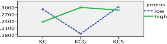
Similar analyses were run for TLX items (mental demand, per-formance,effortandfrustration). No main effect of treatment was found for any of them, nor main effect of pretest groups. Nev-ertheless, a marginally significant interaction of the treatment and pretest groups was found for the perception ofeffort(TLX 5),F(2,54)=2.936,p=.062, partialη2=.098. Figure 8 shows this interaction: lower pretest group (which in fact represents subjects with a medium level of knowledge) expressed lesseffortwhen using the interface containing theGauдe. We note that similar patterns, although not resulting in significant effects or interactions, were observed for the other TLX scores.
6.2
Behavior differences among treatments
Click activity collected while performing a task is summarized in the following variables:
• countSelectActs: number of activities selected in the task (subjects might have thought twice before going to the next task). • lastSelectedActDifficulty: difficulty value of the last activity
se-lected in the task which correspond to the computedestimated learning(see Equation 1 in Section 5) .
• lastSelectedActRelativeRanking: if we rank all the activities that the user has mouseovered by their difficulty score, this is the position of the last selected activity divided by the number of activities mouseovered. The value ranges between 0 and 1, 0 being the higher ranking.
• countMouseoverActivities,timeMouseoverActivities: number and sum of time spent in mouseovering activities. We only counted
Table 5: Log activity summary.
Variable Mean SD countSelectActs 0.98 0.62 lastSelectedActDifficulty 0.75 0.13 lastSelectedActRelativeRanking 0.37 0.30 countMouseoverActivities 3.76 5.33 countMouseoverConcepts 0.67 1.63 timeMouseoverActivities 13.62 24.07 timeMouseoverConcepts 3.49 13.75 countActivityOpened 1.75 2.98
Figure 9: Ranking of difficulty (relative) of the selected ac-tivity. Lower value means higher ranking.
mouseover actions that lasted for 1 second or more to reduce noise of involuntary actions.
• countMouseoverConcepts,timeMouseoverConcepts: number and sum of time spent in mouseovering concepts (KCs). Similar to before, only mouse over actions of more than 1 second are counted.
• countActivityOpened: although we advised subjects not to open activities, in some situations they did so.
Table 5 reports mean and standard deviation (SD) of the variables computed. Note that subjects rarely pointed to concepts. The dif-ficulty of the last activity selected is close to the overall mean of difficulty (Mean =.75,SD = .12). Very high correlations were found betweencountMouseoverActivitiesand timeMouseoverActiv-ities(r =.89) and betweencountMouseoverConceptsand timeMo-useoverConcepts(r=.84), thus we discarded the time variables and keep the counts in the following analyses.
To analyse differences of behavior among treatments, we aggre-gated the log data variables grouping tasks within each treatment (4 tasks in each treatment) and performed repeated-measures ANOVA on log activity variables by treatment. Pretest group was added as a between subject factor. Subjects who did not select activities in tasks were removed from these analyses. The normality (Shapiro-Wilk) as-sumption holds only for the variablelastSelectedActRelativeRanking. Sphericity (Mauchly’s test) holds for variables lastSelectedActRela-tiveRankingandcountMouseoverActivities.
Results of the analysis found a significant effect of treatment only onlastSelectedActRelativeRanking,F(2,46)=4.700,p=.014, partialη2=.170. Pairwise comparisons with a Bonferroni correc-tion showed a marginally significant difference between treatments
KCGandKC (p =.083), and betweenKCGandKCS (p= .053). Subjects selected more difficult activities (relative to the difficulty of the activities inspected) when usingKCG(Mean=.299,SE=.038), compared to when usingKC(Mean=.414,SE =.046) or when using theKCS(Mean=.410,SE=.033). Figure 9 shows the pattern of this effect.
No significant interaction between treatment and pretest group was found for any of the log variables. However, a significant
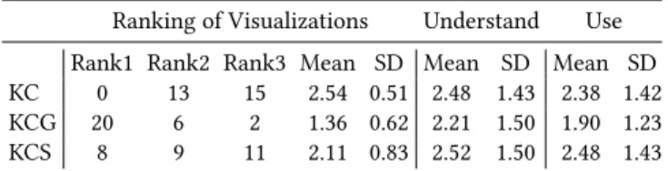
Table 6: Survey 2 summary. Count of rank preferences (rank 1 is top preference), and statistics on the ease of understand-ing and ease of use expressed by subjects.
Ranking of Visualizations Understand Use Rank1 Rank2 Rank3 Mean SD Mean SD Mean SD KC 0 13 15 2.54 0.51 2.48 1.43 2.38 1.42 KCG 20 6 2 1.36 0.62 2.21 1.50 1.90 1.23 KCS 8 9 11 2.11 0.83 2.52 1.50 2.48 1.43 effect of pretest group was found for countMouseoverActivities,
F(1,23) =8.709,p =.007, partialη2 =.275, and countActivity-Opened,F(1,23)=6.477,p=.018, partialη2=.220. High pretest subjects did less mouse-over activities, but they opened activities more, regardless of the visualization.
6.3
Relations between survey and log variables
To better understand the subjective evaluation (survey), we now consider the relations with the log data (objective measures). Since log variables were collected by task and there was one survey for every two tasks, we aggregated log variables across tasks for each survey: Counting variables were added, whereas difficulty of the last activity selected and its ranking were averaged. Correla-tions (using Spearman) between task survey items and log vari-ables revealed some interesting associations. In general, when subjects did more mouse over activities (which we can consider as more work) they lowered their perception of confidence in the task (confidence countMouseoverActivities,rs =−.222,p =.003), they thought the system was less helpful to avoid harder activi-ties (avoidHarder countMouseoverActivities,rs =−.281,p< .001), but also declared lower frustration (TLX6 countMouseoverActivities,
rs =−.210,p=.006). VariablelastSelectedActDifficultywas
nega-tively correlated to both reversed measuresledUseless(rs =−.343,
p< .001) andnotHelpful(rs =−.273,p=.001), which suggests that positive perception of the support given by the system followed the selection of more difficult activities. Similar correlations were found forcountSelectedActs, and this variable also shows a negative correlation tofrustration(rs =−.239,p=.001), which indicated less frustration when subjects did not complete the task in one shot. Finally,countActivityOpenedwas negatively correlated to TLX4(performance), which means that lower levels of failure were perceived after opening more activities.
6.4
Overall perception of the visualizations
At the end of the study session, subjects provided an overall eval-uation of their experience. Table 6 summarizes the ranking that subjects gave to the three visualizations and the mean and standard deviation of the responses to questions about ease of understanding and ease of use. We can see in this table the tendency ofKCGas easier to understand and use, but differences were not significant. With reference to ranking, theKCGwas considered the best by 20 subjects and the worst only for 2 subjects, with a Friedman test shows is a significant difference,χ2(2)=19.929,p < .001. Free text explanation of the rankings were requested. Ten subjects ex-plicitly referred to the advantages of using the gauge. For example, one subject said “the Gauge provides a summary/overview of the knowledge both the student have mastered and haven’t learned, which saves a great bunch of time for comparing between different
concepts and keeping a clear track of all processes”. Five subjects expressed the value of social comparison features, for example “in the social comparison I have a direct and obvious guide as to where others skills are and therefore where my skills should probably be”. Four subjects valued comparison as motivating: “comparison motivates us to perform better and improve our knowledge in the programming concepts”. However, 7 subjects expressed a negative perception of these features: “i am not concerned about the progress of the class and how much I have completed when compared to them”. Three subjects expressed concern about the gauge and how it works: “the gauge is somewhat distracting because some exercise covers concepts under other topics, and the number in the gauge always seduce me choose the one that can cover more new topics”.
7
CONCLUSIONS
In this work we show the design and evaluation process we followed to develop a Rich-OLM, an OLM system combining coarse-grained and fine-grained pieces of the underlying learner model. Since more detailed information adds complexity to the visualisation that makes it harder to understand by learners, our challenge was to balance the amount of information displayed and the potential sup-port offered. To find and assess a design for the fine-grained OLM, we performed two user studies. The first study evaluates different alternative visualizations with different levels of information. We found that learners prefer a bar chart form of knowledge visual-ization: they found these easier to understand, even when they present a detailed complete view of the whole concept space. Based on the results of this study, we developed Rich-OLM, which uses a bar chart to represent a learner’s concept-level knowledge.
In the second study we evaluated the developed Rich-OLM in the context of problem selection. To determine whether our Rich-OLM offers the right amount of information to support this task, we com-pared three versions of the Rich-OLM interface: a basic Rich-OLM, a version with a support tool to help the user in comprehending the OLM data (a gauge summarizing learner information on concepts related to content activities) and a version that offers additional information on the top of the basic version data (social compari-son in both topic and concept level). Evaluation also focused on a clearly defined task: to find activities to increase students’ mastery of specific topics. Results showed the positive effect of the gauge, especially in reducing the effort that less-prepared learners needed to complete the task, along with a very clear preference declared by subjects when comparing to other visualizations. These results sup-port the idea that to allow effective supsup-port while using a learning system, a fine-grained OLM can be enhanced with visual elements helping to interpret the data shown (which could in many cases be of high complexity) [28].
REFERENCES
[1] Peter Brusilovsky and Eva Milln. 2007. User models for adaptive hypermedia and adaptive educational systems. (2007).
[2] Peter Brusilovsky, Sibel Somyurek, Julio Guerra, Roya Hosseini, Vladimir Zadorozhny, and Paula Durlach. 2016. Open Social Student Modeling for Person-alized Learning.IEEE Transactions on Emerging Topics in Computing4, 3 (2016),
450–461. http://doi.ieeecomputersociety.org/10.1109/TETC.2015.2501243 [3] Susan Bull. 2012. Preferred features of open learner models for university
students. InInternational Conference on Intelligent Tutoring Systems. Springer,
411–421.
[4] Susan Bull, Peter Brusilovsky, Rafael Araujo, and Julio Guerra. 2016. Individual and Peer Comparison Open Learner Model Visualisations to Identify What to
Work On Next. In24th Conference on User Modeling, Adaptation and Personaliza-tion. CEUR.
[5] Susan Bull, Inderdip Gakhal, Daniel Grundy, Matthew Johnson, Andrew Mabbott, and Jing Xu. 2010. Preferences in multiple-view open learner models. InEuropean Conference on Technology Enhanced Learning. Springer, 476–481.
[6] Susan Bull and Judy Kay. 2010. Open learner models. InAdvances in intelligent tutoring systems. Springer, 301–322.
[7] Susan Bull and Andrew Mabbott. 2006. 20000 inspections of a domain-independent open learner model with individual and comparison views. In
International Conference on Intelligent Tutoring Systems. Springer, 422–432. [8] Ricardo Conejo, Monica Trella, Ivan Cruces, and Rafael Garcia. 2011. INGRID: A
web service tool for hierarchical open learner model visualization. InInternational Conference on User Modeling, Adaptation, and Personalization. Springer, 406–409. [9] Albert T Corbett and Akshat Bhatnagar. 1997. Student modeling in the ACT
programming tutor: Adjusting a procedural learning model with declarative knowledge. InUser modeling. Springer, 243–254.
[10] Luis de la Fuente Valent´ın and Daniel Burgos Solans. 2014. Am I doing well? A4Learning as a self-awareness tool to integrate in Learning Management Sys-tems.Campus Virtuales3, 1 (2014), 32–40.
[11] Dandi Duan, Antonija Mitrovic, and Neville Churcher. 2010. Evaluating the effectiveness of multiple open student models in EER-Tutor. (2010). [12] Mohammad Hassan Falakmasir, I-Han Hsiao, Luca Mazzola, Nancy Grant, and
Peter Brusilovsky. 2012. The impact of social performance visualization on students. InAdvanced Learning Technologies (ICALT), 2012 IEEE 12th International Conference on. IEEE, 565–569.
[13] Andy Field. 2012.Discovering Statistics Using R. Sage.
[14] Giovanni Fulantelli, Davide Taibi, and Marco Arrigo. 2013. A semantic approach to mobile learning analytics. InProceedings of the First International Conference on Technological Ecosystem for Enhancing Multiculturality. ACM, 287–292. [15] Julio Guerra, Roya Hosseini, Sibel Somy¨urek, and Peter Brusilovsky. 2016. An
Intelligent Interface for Learning Content: Combining an Open Learner Model and Social Comparison to Support Self-Regulated Learning and Engagement. IUI.
[16] Roya Hosseini and Peter Brusilovsky. 2013. Javaparser: A fine-grain concept indexing tool for java problems. InThe First Workshop on AI-supported Education for Computer Science (AIEDCS 2013). University of Pittsburgh, 60–63.
[17] I. Han Hsiao, Fedor Bakalov, Peter Brusilovsky, and Birgitta Knig-Ries. 2013. Progressor: social navigation support through open social student modeling.
New Review of Hypermedia and Multimedia19, 2 (2013), 112–131. DOI:http:
//dx.doi.org/citeulike-article-id:12534194doi:10.1080/13614568.2013.806960 [18] Yun Huang, J Guerra, and Peter Brusilovsky. A data-driven framework of
modeling skill combinations for deeper knowledge tracing. InProc. of the 9th Intl. Conf. on Educational Data Mining.
[19] Yun Huang, J Guerra, and Peter Brusilovsky. 2016. Modeling skill combination patterns for deeper knowledge tracing. InProceedings of the 6th Workshop on
Personalization Approaches in Learning Environments (PALE 2016). 24th
confer-ence on User Modeling, Adaptation, and Personalization (UMAP 2016), CEUR workshop proceedings, this volume.
[20] Imran Khan and Abelardo Pardo. 2016. Data2U: scalable real time student feedback in active learning environments. InProceedings of the Sixth International Conference on Learning Analytics & Knowledge. ACM, 249–253.
[21] Check Yee Law, John Grundy, Andrew Cain, and Rajesh Vasa. 2015. A prelimi-nary study of open learner model representation formats to support formative assessment. InComputer Software and Applications Conference (COMPSAC), 2015 IEEE 39th Annual, Vol. 2. IEEE, 887–892.
[22] Tomasz D Loboda, Julio Guerra, Roya Hosseini, and Peter Brusilovsky. 2014. Mastery Grids: An Open Source Social Educational Progress Visualization. In
Open Learning and Teaching in Educational Communities. Springer, 235–248. [23] Yanjin Long and Vincent Aleven. 2013. Supporting studentsfi self-regulated
learning with an open learner model in a linear equation tutor. InInternational Conference on Artificial Intelligence in Education. Springer, 219–228.
[24] Andrew Mabbott and Susan Bull. 2006. Student preferences for editing, per-suading, and negotiating the open learner model. InInternational Conference on Intelligent Tutoring Systems. Springer, 481–490.
[25] Adrian Maries and Amruth Kumar. 2008. The effect of student model on learning. InAdvanced Learning Technologies, 2008. ICALT’08. Eighth IEEE International Conference on. IEEE, 877–881.
[26] Luca Mazzola and Riccardo Mazza. 2010. GVIS: a facility for adaptively mashing up and representing open learner models. InEuropean Conference on Technology Enhanced Learning. Springer, 554–559.
[27] Antonija Mitrovic and Brent Martin. 2007. Evaluating the effect of open student models on self-assessment. International Journal of Artificial Intelligence in Education17, 2 (2007), 121–144.
[28] Kyparisia A Papanikolaou. 2015. Constructing interpretative views of learnersfi interaction behavior in an open learner model.IEEE Transactions on Learning Technologies8, 2 (2015), 201–214.
[29] Diana P´erez-Mar´ın, Enrique Alfonseca, Pilar Rodr´ıguez, and I Pascual-Neito. 2007. A study on the possibility of automatically estimating the confidence value of studentsfi knowledge in generated conceptual models.Journal of Computers
2, 5 (2007), 17–26.
[30] Lei Shi and Alexandra I Cristea. 2016. Learners Thrive Using Multifaceted Open Social Learner Modeling.IEEE MultiMedia23, 1 (2016), 36–47.
[31] Sergey Sosnovsky and Peter Brusilovsky. 2015. Evaluation of Topic-based Adap-tation and Student Modeling in QuizGuide.User Modeling and User-Adapted In-teraction25, 4 (2015), 371–424.DOI:http://dx.doi.org/10.1007/s11257-015-9164-4
[32] Gerhard Weber and Peter Brusilovsky. 2001. ELM-ART: An adaptive versatile system for Web-based instruction.International Journal of Artificial Intelligence in Education (IJAIED)12 (2001), 351–384.
[33] Diego Zapata-Rivera, Eric Hansen, Valerie J Shute, Jody S Underwood, and Malcolm Bauer. 2007. Evidence-based approach to interacting with open student models.International Journal of Artificial Intelligence in Education17, 3 (2007), 273–303.
![Figure 1: Mastery Grids interface for Java programming with and without social comparison on learning and engagement [2, 15].](https://thumb-us.123doks.com/thumbv2/123dok_us/1993930.2796214/2.918.485.829.125.265/figure-mastery-grids-interface-programming-comparison-learning-engagement.webp)