IOS Press
Linked Open Data Visualization Revisited: A
Survey
Editor(s):Name Surname, University, Country Solicited review(s):Name Surname, University, Country Open review(s):Name Surname, University, Country
Oscar Peña
∗, Unai Aguilera and Diego López-de-Ipiña
Deusto Institute of Technology - DeustoTech, University of Deusto Avda. Universidades 24, 48007, Bilbao, SpainMass adoption of the Semantic Web’s vision will not become a reality unless the benefits provided by data published under the Linked Open Data principles are understood by the majority of users. As technical and implementation details are far from being interesting for lay users, the ability of machines and algorithms to understand what the data is about should provide smarter summarisations of the available data. Visualization of Linked Open Data proposes itself as a perfect strategy to ease the access to information by all users, in order to save time learning what the dataset is about and without requiring knowledge on semantics. This article collects previous studies from the Information Visualization and the Exploratory Data Analysis fields in order to apply the lessons learned to Linked Open Data visualization. Datatype analysis and visualization tasks proposed by Ben Shneiderman are also added in the research to cover different visualization features.
Finally, an evaluation of the current approaches is performed based on the dimensions previously exposed. The article ends with some conclusions extracted from the research.
Keywords: Visualization, Visual Representations, Linked Open Data, Analytics, Semantic Web
1. Introduction
The need to understand and work with new data has accompanied humanity since its origins. The need to store, analyse and spread information can already be observed in the first pictograms drawn by our ancestors in caves, and those techniques have been constantly used and improved through centuries and generations. It is now thanks to the widespread adoption of Internet access, that information technologies come to help to effectively deal with data and avoid overloading.
The amount of data made publicly available by gov-ernments, public entities, companies and even citizens has seen an exponential increase in the latest years, specially due to Open Government and Open Data encouraging policies. The diversity of the published
*Corresponding author. E-mail: [email protected].
datasets holds information about a great variety of top-ics, such as public transport, air and water quality, public funding, cultural agendas and the like. These datasets are traditionally found on the official web-sites of public administrations or on Open Data cat-alogues, normally under standardised document for-mats: plain text, CSV (Comma Separated Values) and spreadsheets are among the most used file formats, but relational database dumps can also be found. Nonethe-less, there are ongoing efforts to make all these data available in machine readable formats, following the Linked Open Data (LOD) principles exposed by Tim Berners-Lee [7], making data publishers to embrace a set of guidelines in order to make data consumable by algorithms through the Internet.
As stated by Tim Berners-Lee, Open Data can fol-low a five-star model1in which each level, from 1 star up to 5, points out an increasingly reusable and pro-cessable dataset. To be fully compliant with LOD’s vi-sion, 5 star data is required, as lower levels do not en-force the linkage of resources over the Internet.
RDF (Resource Description Framework) [10] is an abstract syntax to make statements about resources, and thanks to LOD principles, construct links to avail-able external datasets in a simple manner, making them accessible and queryable through the Internet and pro-moting data reusability. As the amount of information at hand is greater every day, the need to handle it effi-ciently becomes a key requirement for anybody inter-ested in working with it. This situation settles a great scenario for the Information Visualization field (or In-foVis, as it is known by academics and industry), tak-ing advantage of humans capacity to identify patterns and gain insights from visual representations of ab-stract data. InfoVis positions itself in the intersection of other data-related fields: Statistics, Analytics, Dis-semination and so on.
One of the biggest issues concerning mass adoption of LOD outside the Semantic Web (SW) community, is the technical and conceptual knowledge required to take full advantage of the benefits provided by this type of data publishing. Utilizing expressive visual repre-sentations, most users can employ their visual capaci-ties to obtain a clear understanding of the data stored within the dataset. Interactive visualizations also offer the possibility to playand experiment with the data, allowing to perform exploratory knowledge discovery using the “follow your nose” principle [53].
This article is structured as follows: In section 2 background knowledge on information visualization is provided, addressing the best practices to represent ab-stract data in a visual manner to allow a coherent in-terpretation of them. Section 3 describes current ap-proaches that deal with LOD visualization, and are later evaluated in Section 4 according to the previously defined features in order to solve LOD visualization is-sues. Finally, Section 5 discusses the findings of con-ducting this study and the conclusions drawn from it.
1http://5stardata.info/
2. Background
As progress stands on the shoulders of giants, it is important to compile existing research on this field in order to apply it to LOD scenarios.
In accordance with Information Theory, vision is the sense with the largest bandwidth to send information to the brain [52], and humans ability to quickly under-stand complex data through it is reflected on the well known adage “a picture is worth a thousand words”. Promoted by John Tukey, Exploratory Data Analysis (EDA) [49] tries to summarize the main features of a dataset applying visual methods. This makes the EDA approach a perfect candidate to be followed in LOD visualization.
As everyday more and more governments, public entities, organisations, etc. are encouraged (and some-times forced due to transparency policies) to make public data accessible to citizens and interested third parties, automatizing the publication of information is a common approach among practitioners to easily ex-pose huge amounts of files and documents to public consumption. The errors caused by automatic parsing and processing, together with the lack of correctly ap-plying term disambiguation and the selected approach to deal with missing values, gives birth to LOD in need of a lot of pre-processing to be usable for a data analy-sis task.
Likewise, the diversity of topics that those datasets deal with, make the automatic visualization of LOD a great challenge full of research opportunities. Tables have been largely used to display LOD. When con-sulting information about a resource (object), a table is generated with as many rows as attribute instances: a first column with the property name (or IRI), and a sec-ond column with the value. The table layout has been popularised by tools similar to Pubby [24], in charge of the generation of the green-ish HTML pages of DB-pedia articles.
Regarding topic diversity, domain specific tools such as FoaF Explorer [13], map4rdf [34], LinkedGeo-Data browser [48], etc. display a well selected set of visual representations, as result of being tailored for a concrete set of ontologies within a well known envi-ronment.
As diversity increases, more vocabularies are de-signed to reflect the details of a great amount of sub-jects, thus multi-domain or generalist approaches need to be designed in a manner that lets them manage and generate visualizations over different scenarios.
2.1. Datatype analysis
Ben Shneiderman proposed seven basic datatypes [46] a data fragment could be classified into, stating a taxonomy which allows to tag a datum with a certain category, determining how it can be used and which operators are applicable. Following this taxonomy, an extended description of each datatype and their con-nection to LOD principles is detailed.
– 1 dimensional:linear datatypes including textual documents, program source code and alphabeti-cal lists of names which are all organised in a se-quential manner.
Unidimensional data is usually displayed as lists of items organised by a single feature (e.g., alpha-betical order), so it is uncommon to see it visu-alised.
A especial case is when a data dimension has a narrow range of values repeated through the dataset, for example, the names of months or the department titles of an office. These values are known in statistics as categorical data, or factors. A simple aggregation of these values can be used for the creation of distribution analyses in a fur-ther step.
– 2 dimensional (planar):planar or map data in-cluding geographic maps, floorplans or newspa-per layouts.
Geographical features offer an excellent oppor-tunity to help users locate data instances on a map. In combination with map templating en-gines, data instances can be placemarked using different symbols, thus allowing resources to be distinguished attending to their class. The ability to pinpoint elements on a map may help uncov-ering element distribution patterns in the datasets, letting users identify the areas where resources are either tightly gathered or disperse. Advanced projection techniques can also enhance presenta-tion by clustering elements together in associa-tion to the applied zoom level, or even addressing high-interest areas using heatmaps.
Planar data can also be found as an array of bidimensional features, producing geometrical shapes which limit an area within a map. These bounding boxes, when overlayed to a base map, provide great insights of data which affect a greater geographical area, not just a unique, pre-cise point.
Finally, bidimensional data does not only produce visual representations on their own, but in
aggre-gation with other data dimensions can create aug-mented visualizations of greater value. Adding labels, descriptions, images, etc. the map layout is enriched, making geospatial data to be fun to interact with by any user. Furthermore, data in-stances can be collected by geographical areas (such as countries, states, etc.) and normalised, encoding each region within a pre-established colour palette resulting in choropleth maps, or distort established borders to proportionally ex-pose local contrasts over a set of variables using cartograms.
– 3 dimensional (volumetric):real-world objects such as molecules, the human body, and buildings having items with volume and some potentially complex relationship with other items.
Whereas this datatype is one of the pillars of sci-entific visualization, non-trained eyes may find difficult to correctly interpret what 3D graphs and charts are trying to represent. Traditionally re-lated to huge datasets, this datatype adds com-plexity to non-trained users, requiring a devel-oped spatial vision skill in order to understand the underlying data.
Besides, pleasant rendering of both big data sources and 3D images on web browsers still comprises a challenge, but server-side prepro-cessing techniques together with WebGL’s fea-tures [1] should overcome the technical issues in the near-future.
– Multi-dimensional: items from relational and statistical databases with n attributes becoming points in a n-dimensional space.
The easiest manner in whichn dimensional data can be defined is by taking an object, and provid-ing values for each of itsnattributes (withn >1). The descriptions ofmobjects using thosen fea-tures will give birth to an×mmatrix, each row representing an object instance and each column collecting all the measurements for a given di-mension.
Due to its suitability to fit abstract models, map-pings from multi-dimensional data to relational database schemas, spreadsheets or CSV files are quite trivial, and so is expressing these data by means of ontological class resources being the subject of predicate triples with the measured val-ues as the objects.
The number of dimensions can give clues about which visual representations are more appropriate in each case. As an example, a first choice to
ex-hibit a dataset by two of its dimensions would be to draw a scatter plot, each dimension represented over an axis and with the dots placing the union between both for each instance. If a third dimen-sion is added to the analysis, encoding it to each dot’s area will evolve the scatter plot to a bubble chart. More dimensions can be encoded through colours, shapes, etc.
As important as dimensionality, the datatypes of each dimension can filter the universe of visual-izations to the most suitable ones in each case, as expounded in [29].
Advanced visualizations can be developed by bringing the features of other datatypes together in a multi-dimensional space: time-based cyclical data in polar charts, planar combined with times-tamped data in complex timelines, etc.
– Temporal: separated from 1-dimensional data, the distinction in temporal data is that items have a start and finish time, which not only covers timestamped data (i.e., a precise moment in time), but those items spanning through time with a de-fined starting and end date (overlaps are allowed). Time based data is very useful when arranging el-ements through history in chronological order, for example in medical records, project management or historical presentations.
Additionally, temporal data can have a recur-rent regularity (e.g., weekly, monthly, every four years, etc.). All this components make tempo-ral data suitable to be displayed in calendars and timelines (either in combination with geographi-cal features or by its own).
Nevertheless, as with planar data, time-series data makes a perfect candidate to be mixed with new data dimensions, allowing new analyses over data that changes over time. Multiple domains such as finance, science, public policy and management (to name a few), take the advantage of temporal data to detect patterns and trends in their datasets. Time series forecasting can also be used to predict future values based on the recorded measures in our datasets.
Together with multi-dimensional data, temporal information can be represented with the most di-verse variety of visualization techniques, relying on the temporal dimension as a principal compo-nent of the chart.
– Tree (hierarchical): collections of items with each having a link to a parent object (except the root), forming hierarchies or tree-like structures.
Hierarchies or tree structures are formed by items having links to other instances as parents, siblings and children in a resemblance to a family tree. These structures have in common a root node, from which the rest of instances grow in depth, until end nodes are reached (items with no chil-dren), also known as leaves.
Trees provide a great understanding of the over-all structure of the data being studied, where analysts are able to perform the first two tasks of Ben Shneiderman’s visualization mantra [46]: “Overview” and “zoom”, gaining an overview of the whole structure and then zooming in the items of interest.
Common operations performed over trees in-clude count of total items (e.g., total number of classes in the DBpedia ontology [3]), number of children of a selected node (e.g., child classes of dbo:Agent) and number of elements defined within a node (e.g., instances ofdbo:University). The indented tree visual representation has tradi-tionally been used to navigate through file direc-tories in operating systems, or render the struc-ture of software packages in programming suites. The possibility to collapse a subtree made this ap-proach very useful to reach deep nodes within the structure with minimal visual overload and effi-cient interactive exploration.
Adjacency diagrams are a space-filling variant of the previous representations, where the posi-tion of a node relative to adjacent items reveals its place in the hierarchy. IciclePartition layouts are similar to dendrograms, with the advantage of providing an additional dimension (area) to display another variable. Sunbursts are a polar-coordinate variant of icicle layouts.
Substituting adjacency by containment the treemap concept was introduced [30], displaying struc-ture as a set of nested geometries in a tile lay-out. Whilst the most widespread geometry used in treemaps are rectangles, other shapes can also be used generating Voronoi, Jigsaw or Circular treemaps.
– Network:cases emerge where hierarchical struc-tures are not enough to capture the essence of the relationship among items on a dataset, spe-cially within links among LOD sources. Nodes have no linkage constraints, being free to connect to whatever items they want. This freedom allows to combine similar resources within a diverse set of features. Both external and internal links create
a graph of interlinked items, which need a layout algorithm in order to be displayed due to the lack of hierarchical meaning.
The search for an efficient layout that honestly represents the data, depends on the message an-alysts want to highlight. Sometimes anan-alysts will be looking for the shortest paths between two items, or how many cliques [38] the community is divided in. Taking techniques from the Social Network Analysis (SNA) field, who are the key players of the network can also be understood, us-ing a wide set of metrics to determine relevance [37].
The least known network representation is usu-ally the adjacency matrix, a tool often used by mathematicians and computer scientist to relate items in a 2D space. Each cell encodes the value between the column and row data instances (ei-ther showing the number or following a colour palette), and matrix re-arrangement allows to quickly detect clusters and bridges. Besides, no collisions between links can happen, at the ex-pense of requiring a bigger area to display all the information. Filters and selectors can help dimin-ishing the matrix’s width and height.
Easier to interpret are node-link diagrams in a graph layout, where nodes represent each data in-stance, and edges or links between them the at-tribute through which items are connected. De-pending on the algorithm used to display the graph, different attributes will be highlighted in the analysis.
For example, the force-directed layout tries to emulate nodes as being particles or a physical sys-tem, each one repelling the others and only be-ing pulled together those that share links. Edge weight can be used as a gravity indicator, thus the stronger the link, the closer particles will stay together, whereas the weaker the link, the more remote nodes will be placed. Bigger graphs will populate the visualization with nodes and links, creating gianthairballswith multiple line crossings. Although there are researchers trying to minimise the hairball effect [32], usually high density networks are not suitable for graph ren-dering.
The Linked Data Visualization Model (LDVM) [22], mapped these datatypes to visualization tools and RDF vocabularies, creating the mappings summarised in Table 1. The Linked Data Visualization Wizard
(LD-VizWiz) [16] also uses this datatype categorisation in order to deal with the semi-automatic generation of visual representations based on LOD.
Table 1
LDVM’s generic visualization datatypes
RDF Vocabulary Datatype Visualization Tool xsd:int, dc:subject,... (count) 1D Histogram
wgs84:lat, geo:point,... 2D Map
visko:3DPointPlot,... 3D 3D Rendering
qb:Observation, scovo:Item,... Multidim. Chart
xsd:date, ical:dtstart,... Temporal Timeline, Calendar,... rdfs:subClassOf, skos:narrower,... Tree Treemap, SunBurst,...
foaf:knows,... Network Graph,...
2.2. Primitive datatypes
The term “datatype” is misleading for those people with a solid background in Semantics. The usage of this term refers to the abstract structural layout within the data. For example, the1 dimensionaldatatype can be conceptually thought of as aset,listorarrayby a computer scientist, or as avectorby mathematicians.
In computer science and programming, a datatype defines the manner a value should be interpreted, how it is implemented, encoded and stored within a system, what operations can be performed over it, its meaning and the value ranges for the observation [43].
In statistics, the term has a slightly different mean-ing, clustering groups of individual data points into categories with the same semantic context. However, there is a equivalent mapping between both definitions of datatypes, so no deeper understanding is required.
The following primitive datatypes will be consid-ered to take them into account to select the visual rep-resentations that fit best for a particular analysis (note that this classification is conceptual and programming language agnostic):
– Integer:A finite subset of integer values, such as the height of a person in centimetres, or the num-ber of wheels of a vehicle. It may contain negative values.
– Float:The representation of a real number (e.g., the height of a person in meters). It may contain negative values.
– Boolean:A value meaning a logical truth, either
trueorfalse.
– String: Defined as a sequence of characters, it can contain any of the other datatypes in
lit-eral format. This drawback is solved in RDF notations by appending ˆˆdatatype to the object value. Newer approaches such as JSON-LD deal with this situations by using native JavaScript datatypes where possible.
– Date:Usually encoded as a string, a timestamp is defined by either one of the agreed standards such as ISO 8601 [4]. Data correctly formatted as date instances can significantly improve temporal data detection in datasets.
– Geographical coordinates:In a similar fashion, geographical data is usually encoded as strings or floats, making it really difficult to detect these fea-tures by a simple data pre-processing. Actually the best approach is to detect geographical com-ponents by the ontology property used to define them [16], either as isolated latitudeand longi-tudecoordinates, tuples containing both, or lists of geo-points describing a bounding box.
– IRIs:Internationalised Resource Identifiers are a standard defined upon the URI scheme [11]. IRIs can contain any Unicode character, thus allow-ing a true internationalisation of resources over the Internet. Also commonly found as strings, ap-proaches like JSON-LD’s “@id” key allows for a rapid identification of links to other resources, in order to establish relationships among data.
2.3. Analysis message type
On behalf of the type of analysis to perform, there are different visual representations that fit best each of the messages. An analyst may be interested in draw-ing a comparison among funddraw-ings comdraw-ing from differ-ent regional governmdiffer-ents for the last decades, whilst a colleague wants to conduct an experiment about the article publishing patterns of her research institute.
The analysis type usually fits one of the following:
– Comparison:This analysis tries to set one group of variables from another for the selected data. Data comparison may be performed over time, or among items. The former highlights the trends and patterns of data (either periodic or episodic), whereas the latter sets the focus on direct compar-ison among data instances.
– Composition:Its purpose is to render the com-ponents of a whole, based on a singular aspect of the data. Compositions can evolve over time, or be static. The most representative visual repre-sentation for a static composition is the pie chart,
but stacked bars and lines are widely used in both static and over-time visual analyses.
– Distribution:Popular among statisticians during the first analysis stages, provides a layout to dis-play how data items correlate. Distribution analy-ses can be studied over one, two or three variables in an understandable way, making them suitable to quickly get a scent of the information within a dataset.
– Relationship: Tries to expose connections be-tween two or three variables within the dataset. It may become of special interest to the LOD com-munity, merging data from different sources to observe the relations among them.
Based on the works by [14,35,6], and the tour through some of the most typically used charts on [29], it is possible to envisage some common patterns be-tween visual representations and the analysis type to be performed, in order to establish a first recommenda-tion for newcomers to the visualizarecommenda-tion field. A sum-marization of these studies is depicted in Table 2.
2.4. Visual information seeking mantra applied to LOD
Formulated by Ben Shneiderman and popularised as the Information Visualization Mantra:Overview first, zoom and filter, then details on demand, actually its au-thor proposed seven different tasks that can be accom-plished through visualization techniques. Whilst most of the works focus only on the most known version of the mantra, each task forms part of a strategy designed to get the best performances on data analytics:
– Overview: Its focus is set on getting a gen-eral feel of the data analysts are working with. When first approaching an unknown dataset, an overview of the data helps figuring out how the structure looks like. In most works the overview stage is made atontology level, displaying a ta-ble of high-level metadata statistics about the dataset such as number of classes defined, num-ber of triples, out-degree and in-degree proper-ties,owl:sameAslinks, etc. W3C’s VoID vocabu-lary [15] deals with this task by providing means to publish metadata about the dataset in order to be queried by third parties. Hierarchical visual-izations are commonly found in this stage as they supply a visual aid to understand the overall struc-ture in a rapid fashion.
Table 2
Popular charts suitability based on analysis type
Comparison Composition Distribution Relationship
Line chart *
Bar chart * *
Bullet bar chart *
Column chart * * Stacked columns * Area chart * Stacked areas * Pie chart * Scatter plot * * Bubble chart * * * Waterfall chart * Histogram *
– Zoom: When a user is interested in a particu-lar subset of the data, zooming allows to dive deeper in the selection, giving relevance to fea-tures being covered by the lack of detail caused by a high level focus. Interaction through zooming in maps (planar data) or highly-populated graphs (network data) seems natural to lay users, as the navigation patterns of the majority of user inter-faces follow quite similar mechanics.
– Filter:The bigger the dataset, the more impor-tant it becomes to get rid of the features and ele-ments not relevant for the analysis. If the visual-ization is the result of a SPARQL query, FILTER clauses can be included to avoid retrieving non desired data. Facets navigation [42] also lets users select desired features, updating the subset of se-lected data in near real-time. Selecting the best features for filtering purposes is a non-trivial task, and an incorrect strategy may lead towards pre-senting the users a long list of features, thus dam-aging the exploration experience. Projects such as Open Refine2 improve facet filtering by provid-ing sliders and regular expressions where possi-ble. The former filters numerical data above or under a selected threshold to be kept out of the analysis, whilst the latter enables complex filter-ing for power users.
– Details on demand:Once a subset of items are selected, users are usually interested in augment-ing the information about the selection. A detailed view should be able to display further data which could not be accessed at a previous stage. Since
2http://openrefine.org/
showing all data attributes’ values may not be fea-sible, selecting the most appealing ones requires a certain amount of thought: for example, when only a few features can be displayed on a details query, the central geo-point of a city is interesting, whilst for a person instance its birthday should fill the gap.
– Relate:Usually ignored by the LOD visualiza-tion tools following “Shneiderman’s mantra”, the visualization of connections between items is a core task to perform over LOD datasets, in or-der to exhibit the benefits of its principles to peo-ple outside the SW community. When an item is selected, how it interacts with other instances of the dataset or even external resources is vital for the understanding of the Web of Data con-cept [20] envisaged by Tim Berners-Lee. An ini-tial approach consists on presenting a list of re-lated items, or even drawing edges to this exter-nal resources as nodes in a graph [41]. However, more advanced and smart solutions using tech-niques from the EDA field are welcomed.
– History: The interaction between users and the data usually does not follow a pre-established pat-tern, with a clear goal and the precise knowl-edge to directly conduct analyses in order to gain the expected outcome. EDA promotes exploration of uncertain paths, making adventurous guesses about the data and committing mistakes, without the objective of getting conclusive results at the end of the exploration. Therefore, keeping a his-torical record will allow users to undo, replay and progressively refine the performed actions from any given point.
– Extract:Finally, after an effective understanding of the dataset, users (especially technical and ex-pert ones) might be interested in exporting the subset of data eventually obtained, together with the filters, query parameters and tweaks required for its production. The need for interoperable and standardised formats should anybody want their research to be reproducible and repeatable in other environments, either for replicating the analysis in other machines or to have the pro-cess evaluated by colleagues. Whatever the rea-son, the ability to extract data is a must where common standard notations such as RDF/XML [12], RDF/JSON [8] and JSON-LD [5] play a key role.
2.5. Target user categorisation
Finally, a common theme among LOD visualization works is the need for a widespread adoption of the SW, to avoid its practice by community members solely. Vi-sualization tools should set a baseline for LOD explo-ration, thus it must take into account each user’s re-quirements. As addressed in [25], there are three well defined target user groups to be taken into account.
– Lay-users:The vast majority of Internet users are not expected to have knowledge beyond browsing the web, search for relevant content and navigate through links. Their analytical capacities do not need to be developed, neither any domain knowl-edge should be anticipated, but the hunger for in-formation and being the largest group makes them play a key role in the mass adoption of LOD.
– Techies: Those with a computer science back-ground, or in possession of the set of skills to op-erate websites and program algorithms. Knowl-edgeable of conceptual data models, understand-ing of basic SW concepts should not be an is-sue if a solid explanation is provided. Members of this group may need to implement SW services or concepts, or develop an interactive visualization using dynamic data from a SPARQL endpoint
– Domain experts:Even without a technological background (or a different one from computing), experts are perfect candidates to perform complex analyses using a diverse set of data sources. In-depth knowledge usually drives their analyses to a specific goal, with a clear path of the steps to fol-low in order to achieve it. However, dealing with huge amounts of heterogeneous data should ben-efit from a good overview set of visualizations.
3. Actual approaches to visualising LOD
After summarising the elements that shape visual representations, the most relevant current approaches are examined. In 2011, Aba-Sah Dadzie & Matthew Rowe conducted a research on the up-to-date ap-proaches on Visualising Linked Data [25]. They di-vided the analysed browsers between those offering a
a)text-based presentation and thoseb)with visualisa-tion opvisualisa-tions. The Semantic Web and its related tech-nologies have evolved since then, as well as the tools analysed in the survey. Some of them are not longer available as they were an in-lab prototype, whereas others have evolved into new concepts. The tools of this survey exhibit the actual status of the visualization approaches to LOD.
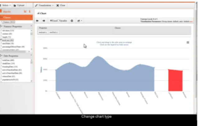
3.1. CODE Visualization Wizard
Within the EU-funded research project CODE3, the
Vis Wizardtool [40,39] envisages a visualization plat-form for all the research publications data extracted due to the project’s efforts.
To publish research data on the LOD cloud, CODE relies on the RDF Data Cube Vocabulary (DCV) [9], a W3C standard developed to represent statistical data as RDF. Document parser’s output is mapped to the DCV as a collection of observations consisting in a set of dimensions and measures.
Figure 1. CODE Linked Data Vis Wizard, with the map selected as the representation to display data, among other options
Once data is loaded in the system,Vis Wizard high-lights the visual representations that can fit the selected
data as shown in Figure 1, depending on its nature. For example, if planar data are found the users will be able to draw a map, disabling the selector otherwise. This recommendations can be improved by implementing newgenerators, well-defined interfaces with the abil-ity to map data to new visualizations when plugged to theVis Wizard.
Lay users can interact with the data by adding and removing dimensions, and changing the visual compo-nents they are referenced to. This opens new opportu-nities to customize the way data is presented.
Finally, using mindmeister’s Mind Mapping soft-ware4, a history of the performed actions, applied fil-ters and generated visualizations can be observed, in order to make data analysis processes reproducible.
3.2. LDVizWiz
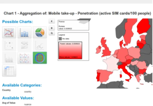
With the goal of providing general purpose visu-alizations of any SPARQL endpoint, LDVizWiz [16] inspects the features of the dataset in order to un-derstand the underlying data and detect categories. Based on the classification provided by Shneiderman, LDVizWiz performs ASK queries to categorise data in one of the following classes: Geography, Tempo-ral, Event, Agent/Person, Organization, Statistics and Knowledge.
Figure 2. LDVizWiz’s display or detected GeoData
Even though some of the categories have a direct mapping to Shneiderman’s taxonomy and certain
vo-4http://mindmeister.com/
cabularies, for example, geography↔planar data as seen in Figure 2, temporal data and knowledge infor-mation↔ hierarchical, others such as Agent/Person or Organization are related to whole ontology class instances. This non-datatype based approach loses some of the advantages provided by best practices and lessons learned from the data visualization field, al-though class-category template filling exhibits a more robust performance if the schema is known before-hand. The biggest drawback is the need to adapt and extend the ASK queries to new vocabularies whenever they are detected.
3.3. LODVizSuite & ResXplorer
Researchers from the iMinds Digital Research Cen-tre5 designed, implemented and evaluated an
interac-tive visual workflow to explore LOD. The workflow uses EDA techniques to guide users through the ex-ploratory stage, and Exex-ploratory Search [36] concepts to ease data querying.
EDA is allowed through narrowing the dataset from high level group overviews towards their details. Pro-viding an overview first, the dataset reveals its underly-ing structure and the internal connections as the users explore deeper in the content. The tool designed for this purpose is named LODVizSuite [26].
Exploratory Search consists on broadening a coor-dinated view (output of the narrowing phase). This set of actions is highly focused on leading to other datasets through relationships, if they are considered relevant enough. Broadening is provided by the ResX-plorer tool [27].
Figure 3. LODVizSuite rendering of a research co-authorship net-work using a force directed layout
For the workflow’s implementation, the Research Information Linked Open Data (RILOD) dataset is used, an integration of heterogeneous sources related with research and investigation within the region of Flanders. Figure 3 shows the connections between re-searchers, with a sidebar displaying the amount of top-ics covered by the selected author in the graph. The data contained within the dataset is enriched with Dig-ital Bibliography and Library Project(DBLP)6 using
ResXplorer.
3.4. LODVisualization
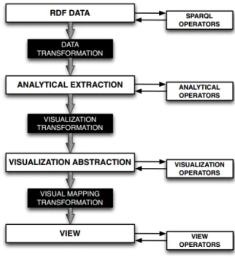
LODVisualization is a tool based on the LDVM (Linked Data Visualization Model) [21] that allows to connect different data sources in a dynamic way us-ing different visual representations. LODVisualization adopts the Data State Reference Model (DRM) [23] as a conceptual framework, implementing it according to the features of LOD as exhibited in Figure 4.
Figure 4. LDVM’s implementation of Ed Chi’s DRM
The tool implements theOverviewtask proposed by Shneiderman, generating visual representations about the hierarchy of classes and properties defined in a SPARQL endpoint graph. Users can also consult the shared properties between two classes, or those in-stances with the highest in/out-degrees, i.e., resources of a given class with the highest number of outgo-ing and incomoutgo-ing links. However, instances referroutgo-ing to the same entity are not disambiguated and are dis-played iteratively.
6http://dblp.uni-trier.de/
LODVisualization can draw treemaps, tables and bar charts with the extracted data from any SPARQL endpoint, without the need of adapting to a certain set of domains. Still, it does not perform the rest of tasks defined by Shneiderman.
3.5. Payola
Payola [31] provides a refined implementation of the LDVM, to generate visualizations for the Czech LOD cloud, a set of public datasets with relevant data for Czechoslovakians, such as public inspections and sanctions depicted in Figure 5. Users are able to con-nect to a SPARQL endpoint or upload a RDF file, per-forming different analysis over the data and visualising them on a web browser, thanks to the implementation of LDVM pipelines. Tech-users can also improve the SPARQL queries and add plugins to Payola in order to get a more refined outcome of the analysis.
Figure 5. Payola visualization of inspection and sanctions data’s structure using the TreeMap representation
Collaboration between users is encouraged, as vi-sualizations and the operators used in their generation can be shared within the platform. This allows not only to re-run experiments, but to connect new analysis op-erators and plugins to existing pipelines in order to pro-duce new visuals with enriched or refined data. This feature allows technical and expert users create visu-alizations which can later be consumed by lay users, taking away the required knowledge to collect and pro-cess data.
3.6. rdf:SynopsViz
The purpose ofref:SynopsViz[19] it to provide hi-erarchical charts and visualizations about LOD. The tool heavily relies on metadata as a means of under-standing a datasets internal structure. Statistics such as total number of triples andowl:sameAslinks are dis-played together with the number of properties, objects,
classes, languages, etc. A faceted navigation bar lets the user filter the data, which will later be visualised using bar, linea or area charts (see Figure 6). If a area of special interest is zoomed, more fine-grained data will fill the available space.
Figure 6. rdf:SynopsViz’s faceted browsing feature over DBpedia
Even though its suitability to perform the “Overview first, zoom and filter” data visualization tasks, more advanced visualizations and interactions are missed in order to get a real feel on the underlying data. A good point though, is the possibility to obtain com-puted statistics about the data being queried, such as: mean, variance, minimum and maximum values, etc.
3.7. Sgvizler
Sgvizler [47] is a JavaScript (JS) wrapper to vi-sualise the result of SPARQL queries within the HTML elements of a website. To accomplish this goal, Sgvizler makes use of HTML5’sdata- prefixed ele-ment attributes, where technical users can specify the SPARQL query to perform together with the endpoint it is addressed to, the type of visualization to generate (e.g., map, treemap, bar chart, etc.), the dimensions of the chart and the format of the data. The tool works excellent with JSON (JavaScript Object Notation) for-mats, as the data sharing with visualization libraries is trivial (web-browser based visualization libraries are developed in JS, whose understanding of JSON is di-rect). Support for Google Charts7and d3js’8force di-rected graphs are built in.
Sgvizler adds Cross-Origin Resource Sharing (CORS) [2] support, in order to query SPARQL endpoints in an external domain. It requires the SPARQL endpoint
7https://developers.google.com/chart/ 8http://d3js.org/
Figure 7. Visualization example using Sgvizler, showing the HTML mark-up with the SPARQL query, the data obtained from the selec-tion in tabular format, and the visual output on a scatter plot
to be CORS-enabled, otherwise they would not return any information to be rendered.
However, Sgvizler requires the user to have a pre-vious SW knowledge, specially about the SPARQL querying language to write down the SELECT state-ments to retrieve data from the endpoint. This makes Sgvizler a good tool for expert users with semantic knowledge and with liberty to modify the HTML of the website to include the special mark-up (Figure 7). Lay users, on the other hands, may not be able to gain any benefit from the use of Sgvizler rather than the vi-sualization of the final output.
3.8. Visualbox
Taking a similar approach to Sgvizler, Visualbox [28] requires users to have a certain technological background, some concepts about RDF and knowledge of the SPARQL language. This tool joins different fea-tures in a single platform: SPARQL syntax highlight-ing to detect common errors, connection to endpoints to perform queries and control of the visualization rep-resentation through templates. Figure 8 shows the vi-sual editor of Vivi-sualbox: the textareas allow to specify the SPARQL query to retrieve data, and how they are going to be rendered using a special templating lan-guage. The options on the sidebar filter elements to generate the final visualization, as depicted on the right side. Visualbox relies on LODSPeaKr9, a framework
to create LOD-based applications, setting the focus on visualizing data.
Figure 8. Visualbox’s graphical editor and final visualization schema
Visualbox uses a templating engine similar to django’s10 where specially marked elements in the template are substituted by the values returned after performing the SPARQL query. This variables are used in the sup-ported web-based visualization engines to create the graphics.
Collaboration between visualizers is encouraged, as all graphs are shareable through a unique URI and the charts can be downloaded as an image to be included in any document.
3.9. VizBoard
VizBoard [51,50] is a SW visualization tool build on top of the CRUISe platform [44], designed as a workbench for information visualization purposes. VizBoard acts as a mash-up tool, where users are able to combine different dimensions of the data to create insightful visualizations that allow any user understand the whole picture of the dataset. Figure 9 displays for data panels with different representations of the under-lying data. Actions performed in each panel update the data on the rest.
Interaction is heavily based on facet navigation, thus letting users select the data components most relevant for their analyses, and keep the non-desired data out of the picture. Through facets understanding the principal components the data is categorised in is quite straight. Finally, VizBoard supports all the information about visualization rendering using The Visualization Ontol-ogy (VISO) [45], a multi-model vocabulary which de-scribes all the concepts and relations on the graphics and visualization fields.
4. Evaluation
In accordance to the features defined in Section 2, the current approaches dealing with LOD
visualiza-10https://djangoproject.com/
Figure 9. Data panels on VizBoard demo
tion described in Section 3 are evaluated to analyse the feature compliance of each tool. The tables sum-marise which tools support the listed features, in order to get on first sight a good perception of their distinc-tivenesses.
4.1. Datatype support
Table 3 portrays which datatypes conceived by Shneiderman are manageable by the current approaches to LOD visualization. OnlySgvizlersupports the visu-alization of 1-dimensional data, but as expressed be-fore, this datatype is not usually visualised, being lists of items it most characteristic representation.
It is noteworthy the lack of support of 3D data by all the analysed tools. 3 dimensional data is fundamental in many scientific fields, and havingdomain expertsas a valuable stakeholder, it does not make much sense to avoid complex structures to being drawn in web browsers. This situation may be due to the big amounts of data scientific areas deal with. The most common approach is to have data dumps to work with loaded in high-capacity computing machines, and launch off-line batch processes to analyse them.
However, the widespread deployment of sensor net-works across cities and real-time data flows (e.g., so-cial networks) will create new challenges to tackle with big datasets over the Internet in the forthcoming years.
4.2. Visualization task support
Regarding visualization tasks support, most of the current approaches are compliant with the shortened version of the visualization mantra: “Overview first, zoom and filter, then details on demand”, and satisfy therelatetask mainly due to the interlinked nature of the resources published as LOD.
Table 3 Tools support of datatypes
1 dimensional 2 dimensional 3 dimensional Multidimensional Temporal Hierarchical Network
CODE * * * LDVizWiz * * * * LOD/VizSuite * * LODVisualization * * Payola * * * * rdf:SynopsViz * * * Sgvizler * * * * * * VisualBox * * * * * VizBoard * * *
As Table 4 shows, bothhistoryandextracttasks are almost ignored, but they are vital when analysts wish to share their experiments, letting others re-run the tri-als, perform further studies on the displayed data or simply reproduce the visualization with a custom set of parameters. Providing a simple mechanism to track the applied algorithms and save the data in standard-ised formats keeps alive the spirit of LOD principles: as data is discoverable through the Internet, consulting the details of the data used in the visualization should be democratised also.
4.3. Other features support
Although all the tools share the goal of visualising LOD, the means and features they provide in order to achieve it significantly differ from one another. Next some common features are detailed, specially those re-quired by certain users groups in order to fed their in-formation analysis hunger. Feature compliance is sum-marised in Table 5.
– Metadata exploration:The structure and inter-esting features about a dataset can be consulted through the VoID description of the dataset (if present) or using custom queries against the data. These high-level properties are usually presented in tabular format during the overview stage of exploratory analyses, and allows to compare the dataset with similar data sources. Some tools up-grade the metadata analyses adding statistical in-formation about the dataset contents [17,33], as well as provenance and data quality metrics.
– Multiple dataset usage:Data discovery and the “follow your nose” principle seem trivial when surfing the Internet or consuming videos from on-line platforms, giving birth to serendipitous be-haviours among users. Within the LOD context,
exploratory data analyses greatly benefit if the used tools support multiple data sources in the same instance, without the need to open new tabs or explore external datasets from scratch.
– SPARQL querying:For those users desiring to have a high level of control about the input data for the analysis, the ability to design and tweak the SPARQL queries is an essential feature. How-ever, in those cases where the exploratory analy-sis begins writing a SPARQL query, lay users will not be able to use the tool.
– Target users:As listed in Section 2.5, three main user groups are envisaged as potential consumers of the tools: lay users [L], techies [T] and domain experts [E].
– Visualization customization: As every visual-ization consumer has its own preferences, the ability to customize the visual components of a representation is appreciated by a subset of power users. The possibility to change the layout, colours and shapes open new ways to improve finding communication. These features are also of high importance for people with visual handi-caps such as Colour Vision Deficiencies (CVD), which affects people’s ability to distinguish cer-tain colours, who would benefit from the avail-ability of correction features within the visualiza-tion.
– Visual ontology support:In order to reuse us-ability patterns and best practices in LOD visual-ization, semantically describing the resulting vi-sual representations is a must to encourage fur-ther improvements. Some ontologies are being designed to describe visualization elements as vi-sual components, purpose and features of the im-ages for the sake of reproducibility, as differ-ent developers can implemdiffer-ent visualization tools
Table 4 Tools support of tasks
Overview Zoom Filter Details on demand Relate History Extract
CODE * * * * * LDVizWiz * * * LOD/VizSuite * * * LODVisualization * Payola * * * rdf:SynopsViz * * * Sgvizler * * * * * VisualBox * * * * * VizBoard * * * * Table 5 Tools support of features Metadata exploration Multiple datasets SPARQL querying Target users Vis. customization Vis. sharing Vis. ontology Vis. recommendation CODE * * L, T, E * * * LDVizWiz L, E LOD/VizSuite L, E LODVisualization * L * Payola * * * L, T, E * rdf:SynopsViz * E * Sgvizler T, E VisualBox * * * T * VizBoard L * * *
which take the visual representation’s character-istics as semantic-annotated inputs.
– Visual recommendations:There are some cases where the output data suits different visual repre-sentations, for example, how a government splits the annual budget between different departments and ministries can be drawn both as a pie chart (circular segments being the portion of the total budget) and as a column chart. The former depicts and image well known for users, whereas the lat-ter gives the opportunity to compare amounts in a clearer manner (humans are not so good in com-paring circular areas).
– Visualization sharing:Sometimes visualizations are the outputs of community efforts to make insights known to a wider audience. Publishing these visualizations on the Internet, allowing con-tributors to collaborate and share improvements built on top of them is a desirable feature among institutions pushing towards Open Data policies.
5. Conclusions
In this paper a background analysis of the Informa-tion VisualizaInforma-tion field is presented together with its adaptability to the Visualization topic within the Se-mantic Web community, specially for the information published under the Linked Open Data principles.
The motivation beneath this study is to exhibit the current approaches to LOD visualization on the Inter-net. As users regularly consume Internet resources by means of a web browser, the survey is conducted over tools which are operable within these environments. Moreover, the number of devices used to access the In-ternet grows in range everyday: smartphones, tablets and laptops are some of the most preferred gadgets, all of them having at least one web browser in com-mon. There are even some Operative Systems such as Chrome OS11, WebOS12 and those running under Smart TVs which are barely more than just a web browser with steroids. Thus betting on for solutions
11http://chromium.org/chromium-os 12http://openwebosproject.org/
compliant with standard web technologies (platform independent) and which do not require any installation in the users’ devices is largely encouraged.
Availability on multiple devices is a fundamental re-quirement for widespread adoption of semantic tech-nologies, but is not enough. The Semantic Web com-munity has worked for the last decade in implement-ing the Internet envisaged by Tim Berners-Lee in 2001 [18], and numerous benefits are developed by its mem-bers. Still, mass adoption of the Semantic Web con-cept is not a reality, and will not be fully achieved unless the vast majority of Internet users enjoy the advantages it brings. Semantics provide descriptions about resources, that is, machines are able to under-standwhat information they are working with, and the possibility to connect to external data sources and en-rich the contents should result in the automatic gen-eration ofsmartvisualizations, meaning visual repre-sentations which are better formed that what could be automatically generated (when possible) if no meta-information about the data was available.
On a similar fashion, application developers need to appreciate the added value of getting knowledge from LOD sources over querying Application Programming Interfaces (APIs), parsing documents, scraping web-sites or retrieving information from local databases. This issue can be further exploited in order to stimu-late LOD principles’ adoption among data publishers, creating LOD-driven markets worth using outside the Semantic Web community practices.
Finally, well established protocols and the know-how provided by the long trajectory of InfoVis re-search must be used and disseminated through LOD visualization practitioners. Backing visualizations with robust vocabularies and procuring a semantic descrip-tion together with the visual representadescrip-tion allow ma-chines not only to understand the data within the graphic, but the procedures and components used for its construction. Nowadays, not many tools meta-information about the visualization using semantic de-scriptions, neither of the processes and applied tech-niques to generate it. In order to foster data discover-ability and reusdiscover-ability, the collaboration and process-description features are welcomed in LOD visual ex-ploration tools.
The authors of this article are expectant to see the evolution of LOD visualization in the near future in its path towards a true acceptance of the Semantic Web in the Internet’s DNA.
References
[1] Chrome experiments - WebGL. http://www. chromeexperiments.com/webgl/.
[2] Cross-origin resource sharing.http://www.w3.org/TR/ cors/.
[3] DBpedia ontology classes. http://mappings. dbpedia.org/server/ontology/classes/. [4] ISO 8601.http://www.iso.org/iso/iso8601. [5] JSON-LD - JSON for linking data. http://json-ld.
org/.
[6] Juice labs - chart chooser. http://labs. juiceanalytics.com/chartchooser/index. html.
[7] Linked data - design issues. http://www.w3.org/ DesignIssues/LinkedData.html.
[8] RDF 1.1 JSON alternate serialization (RDF/JSON). http: //www.w3.org/TR/rdf-json/.
[9] The RDF data cube vocabulary. http://www.w3.org/ TR/vocab-data-cube/.
[10] RDF schema 1.1. http://www.w3.org/TR/2014/ REC-rdf-schema-20140225/.
[11] RFC 3987: Internationalized resource identifiers (IRIs).
http://www.ietf.org/rfc/rfc3987.txt. [12] RDF 1.1 XML syntax, 2001. http://www.w3.org/TR/
rdf-syntax-grammar/.
[13] FoaF explorer, 2002. http://xml.mfd-consult.dk/ foaf/explorer/.
[14] A. Abela. Chart suggestions - a thought starter. http: //www.extremepresentation.com/uploads/ documents/choosing_a_good_chart.pdf. [15] K. Alexander and M. Hausenblas. Describing linked datasets
-on the design and usage of VoID, the vocabulary of interlinked datasets. InIn Linked Data on the Web Workshop (LDOW 09), in conjunction with 18th International World Wide Web Con-ference (WWW 09, 2009.
[16] G. A. Atemezing and R. Troncy. Towards a linked-data based visualization wizard. 2014.
[17] S. Auer, J. Demter, M. Martin, and J. Lehmann. LODStats – an extensible framework for high-performance dataset analyt-ics. In A. t. Teije, J. Völker, S. Handschuh, H. Stuckenschmidt, M. d’Acquin, A. Nikolov, N. Aussenac-Gilles, and N. Her-nandez, editors,Knowledge Engineering and Knowledge Man-agement, number 7603 in Lecture Notes in Computer Science, pages 353–362. Springer Berlin Heidelberg, Jan. 2012. [18] T. Berners-Lee, J. Hendler, and O. Lassila. The semantic web.
Scientific american, 284(5):28–37, 2001.
[19] N. Bikakis, M. Skourla, and G. Papastefanatos. rdf:SynopsViz - a framework for hierarchical linked data visual exploration and analysis. arXiv:1408.3148 [cs], Aug. 2014. arXiv: 1408.3148.
[20] C. Bizer, T. Heath, and T. Berners-Lee. Linked data - the story so far:. International Journal on Semantic Web and Informa-tion Systems, 5(3):1–22, 2009.
[21] J. M. Brunetti, S. Auer, and R. García. The linked data vi-sualization model. InInternational Semantic Web Conference (Posters & Demos), 2012.
[22] J. M. Brunetti, S. Auer, R. García, J. Klímek, and M. Neˇcaský. Formal linked data visualization model. In Proceedings of International Conference on Information Integration and Web-based Applications & Services, IIWAS ’13, pages
309:309–309:318, New York, NY, USA, 2013. ACM. [23] E. H. Chi. A taxonomy of visualization techniques using the
data state reference model. InIEEE Symposium on Information Visualization, 2000. InfoVis 2000, pages 69–75, 2000. [24] R. Cyganiak and C. Bizer. Pubby-a linked data frontend for
sparql endpoints. Retrieved fro m http://www4. wiwiss. fu-berlin. de/pubby/at May, 28:2011, 2008.
[25] A.-S. Dadzie and M. Rowe. Approaches to visualising linked data: A survey.Semantic Web, 2(2):89–124, Jan. 2011. [26] L. De Vocht, A. Dimou, J. Breuer, M. Van Compernolle,
R. Verborgh, E. Mannens, P. Mechant, and R. Van de Walle. A visual exploration workflow as enabler for the exploitation of linked open data. InProceedings of the 3rd Workshop Intelli-gent Exploration of Semantic Data, 2014.
[27] L. De Vocht, S. Softic, E. Mannens, R. Van de Walle, and M. Ebner. ResXplorer: Interactive search for re-lationships in research repositories. In Semantic Web Challenge, part of the 12th International Semantic Web Conference Available at http://challenge. semanticweb. org/2013/submissions/swc2013_submission_14. pdf, 2013. [28] A. Graves. Creation of visualizations based on linked data. In
Proceedings of the 3rd International Conference on Web Intel-ligence, Mining and Semantics, WIMS ’13, pages 41:1–41:12, New York, NY, USA, 2013. ACM.
[29] J. Heer, M. Bostock, and V. Ogievetsky. A tour through the visualization zoo.Communications of the ACM, 53(6):59, June 2010.
[30] B. Johnson and B. Shneiderman. Tree-maps: A space-filling approach to the visualization of hierarchical information struc-tures. InProceedings of the 2Nd Conference on Visualization ’91, VIS ’91, pages 284–291, Los Alamitos, CA, USA, 1991. IEEE Computer Society Press.
[31] J. Klímek, J. Helmich, and M. Neˇcaský. Application of the linked data visualization model on real world data from the czech LOD cloud. 2014.
[32] M. Krzywinski, I. Birol, S. J. Jones, and M. A. Marra. Hive plots—rational approach to visualizing networks.Briefings in Bioinformatics, 13(5):627–644, Sept. 2012.
[33] A. Langegger and W. Woss. Rdfstats-an extensible rdf statis-tics generator and library. InDatabase and Expert Systems Application, 2009. DEXA’09. 20th International Workshop on, pages 79–83. IEEE, 2009.
[34] A. d. Leon, F. Wisniewki, B. Villazón-Terrazas, and O. Corcho. Map4rdf - faceted browser for geospatial datasets. InPMOD workshop. Facultad de Informática (UPM), 2012.
[35] S. Madhu Sudhan and J. Chandra. IBA graph selector algo-rithm for big data visualization using defence dataset. Interna-tional Journal of Scientific & Engineering Research, 4(3), Mar. 2013.
[36] G. Marchionini. Exploratory search: From finding to under-standing.Commun. ACM, 49(4):41–46, Apr. 2006.
[37] A. Mislove, M. Marcon, K. P. Gummadi, P. Druschel, and B. Bhattacharjee. Measurement and analysis of online social networks. InProceedings of the 7th ACM SIGCOMM Con-ference on Internet Measurement, IMC ’07, pages 29–42, New York, NY, USA, 2007. ACM.
[38] J. W. Moon and L. Moser. On cliques in graphs.Israel Journal of Mathematics, 3(1):23–28, Mar. 1965.
[39] B. Mutlu and P. Höfler. Suggesting visualisations for published data. 2014.
[40] B. Mutlu, P. Höfler, V. Sabol, G. Tschinkel, and M. Gran-itzer. Automated visualization support for linked research data. In S. Lohmann, editor,I-SEMANTICS (Posters & De-mos), volume 1026 ofCEUR Workshop Proceedings, pages 40–44. CEUR-WS.org, 2013.
[41] A. G. Nuzzolese, V. Presutti, A. Gangemi, A. Musetti, and P. Ciancarini. Aemoo: Exploring knowledge on the web. In
Proceedings of the 5th Annual ACM Web Science Confer-ence, WebSci ’13, pages 272–275, New York, NY, USA, 2013. ACM.
[42] E. Oren, R. Delbru, and S. Decker. Extending faceted nav-igation for RDF data. In I. Cruz, S. Decker, D. Allemang, C. Preist, D. Schwabe, P. Mika, M. Uschold, and L. M. Aroyo, editors,The Semantic Web - ISWC 2006, number 4273 in Lecture Notes in Computer Science, pages 559–572. Springer Berlin Heidelberg, Jan. 2006.
[43] D. L. Parnas, J. E. Shore, and D. Weiss. Abstract types defined as classes of variables. InProceedings of the 1976 Conference on Data : Abstraction, Definition and Structure, pages 149– 154, New York, NY, USA, 1976. ACM.
[44] S. Pietschmann, M. Voigt, A. Rümpel, and K. Meißner. CRUISe: Composition of rich user interface services. In M. Gaedke, M. Grossniklaus, and O. Díaz, editors,Web Engi-neering, number 5648 in Lecture Notes in Computer Science, pages 473–476. Springer Berlin Heidelberg, Jan. 2009. [45] J. Polowinski and M. Voigt. VISO: A shared, formal
knowl-edge base as a foundation for semi-automatic infovis systems. InCHI ’13 Extended Abstracts on Human Factors in Comput-ing Systems, CHI EA ’13, pages 1791–1796, New York, NY, USA, 2013. ACM.
[46] B. Shneiderman. The eyes have it: a task by data type taxon-omy for information visualizations. In, IEEE Symposium on Visual Languages, 1996. Proceedings, pages 336–343, Sept. 1996.
[47] M. G. Skj\a eveland. Sgvizler: A javascript wrapper for easy visualization of sparql result sets. InExtended Semantic Web Conference, 2012.
[48] C. Stadler, J. Lehmann, K. Höffner, and S. Auer. LinkedGeo-Data: A core for a web of spatial open data. Semantic Web, 3(4):333–354, Jan. 2012.
[49] J. W. Tukey. Exploratory Data Analysis. Pearson, Reading, Mass, 1 edition edition, 1977.
[50] M. Voigt, M. Franke, and K. Mei\s sner. Capturing and reusing empirical visualization knowledge. InUMAP Workshops. Cite-seer, 2013.
[51] M. Voigt, M. Franke, and K. Meißner. Using expert and em-pirical knowledge for context-aware recommendation of visu-alization components. International Journal On Advances in Life Sciences, 5(1 and 2):27–41, June 2013.
[52] C. Ware.Information Visualization, Third Edition: Perception for Design. Morgan Kaufmann, Waltham, MA, 3 edition edi-tion, June 2012.
[53] L. Yu. Follow your nose: A basic semantic web agent. InA De-veloper’s Guide to the Semantic Web, pages 533–557. Springer Berlin Heidelberg, Jan. 2011.