Extending the Glue Visualization Tool with Biological Data-Types
A Thesis
Submitted to the Faculty of
Drexel University by
Alex Koszycki in partial fulfillment of the requirements for the degree
of
Master of Science June 2015
© Copyright 2015
Dedication
I dedicate this paper to my parents Teresa & Dariusz Koszycki for inspiring me to work hard,
never compromise, and dream big.
Acknowledgements
I would like to especially thank my advisor
Dr. William Dampier
for guiding and supporting me throughout the project. I would also like to thank Dr. Chris Beaumont, creator of Glue,
and Dr. Thomas Robitaille, the lead developer to the Glue open-source project, for their guidance and advice on the technical implementation of theses features. Lastly, I would like to thank Dr. Brian Wigdahl and Dr. Michael Nonnemacher
of the Institute for Molecular Medicine & Infectious Disease at the Drexel University College of Medicine.
Table of Contents
Dedication ... iii
Acknowledgements ... iv
List of Tables ... vii
List of Figures... viii
List of Code Snippets... xi
Abstract... xiv
Chapter 1: Exploring and Visualizing Data in the Life Sciences ... 16
The challenge of information in the life sciences ... 17
On exploratory data analysis and letting go of the question ... 20
Visualizations for exploring multidimensional datasets ... 22
Tools of the trade ... 24
Challenges in the future of life sciences data visualization... 26
Chapter 2: Glue Introduction ... 28
The power of linked-view visualizations... 30
Modular architecture and publish-subscribe paradigm... 33
'Hackable' user interface for development of custom pipelines... 40
Chapter 3: Technical Design... 45
Specific Aims ... 46
Specific Aim 1: Date/Time Support Feature... 48
Section 1: Changes to the Scatter Plot Client... 49
Section 2: Changes to the Scatter Plot Widget... 61
Section 3: Implemented Files ... 70
Specific Aim 2: Line Graph Plugin ... 71
Section 1: Create an importable line graph plugin ... 72
Section 3: Identify attributes that can be used for grouping... 85
Section 4: Visualize groups as lines in the viewer window ... 86
Section 5: Implement user-interactive group attribute selection... 91
Section 6: Implemented Files ... 98
Specific Aim 3: Sequence Reader Plugin... 99
Section 1: Implement feature as an importable plugin... 100
Section 2: Introduce attributes for chromosome and sample ... 101
Section 3: Visualize variants as histogram over position... 108
Section 4: Support subset selection using categorical ROI... 110
Section 5: Implement user-interactive widget controls... 111
Section 6: Implemented Files ... 116
Optimization ... 117
Technical Considerations... 118
Chapter 4: Case Studies – Visualizing HIV variants... 121
Background ... 122
Case Study 1: Visualizing SNV 108 in a longitudinal dataset ... 124
Case Study 2: Exploring variants by position ... 134
Chapter 5: Conclusions ... 141
Discussion ... 142
Future Directions... 145
Broader Impact ... 147
List of Tables
List of Figures
Figure 1: Logo of the Glue visualization library. ... 28
Figure 2: Glue was designed with three major goals in mind: (1) Supporting linked-view visualizations, (2) keeping visualization code modular, (3) and allowing users to have programmatic access to customize their use of Glue. ... 29
Figure 3: Data Brushing allows users to interactively visualize subsets within their datasets. In the histogram window, a user selects data with an “isTrue” value of 1. This creates a subset, visible in the "Data Collection" frame. The selection is automatically highlighted in the scatter plot... 31
Figure 4: Data Linking allows users to specify how their datasets relate to each other. Here a user has inputted two files and linked their “x” and “y” fields using the Link Editor dialog... 32
Figure 5: Common workflow of exploring a dataset using Glue. Purple lines indicate user-interaction, green lines indicate the flow of data through the client, and blue lines indicate how the widget initializes the GUI. ... 37
Figure 6: Order in which Glue components initialize and interact to construct a visualization. ... 38
Figure 7: The scatter plot axes formatted in years... 53
Figure 8: The x and y axes limits will display as dates. ... 64
Figure 9: This is the GitHub pull request for scatter plot date/time support. Since the scatter plot is a core viewer in Glue, and date/time support is intended across Glue's functionality, changes were necessary across the core codebase... 70
Figure 10: Plugins appear in the “Data Viewer” selection menu. ... 74
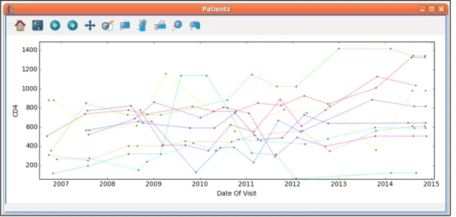
Figure 11: The line graph viewer connects related data-points with lines. ... 87
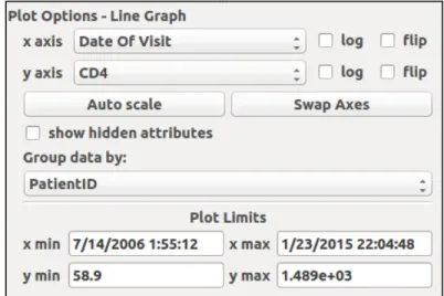
Figure 12: A “Group data by:” combination box is added in the line graph viewer. ... 91
Figure 13: This is the GitHub pull request for the line graph viewer. Since the line graph was implemented as a plugin and based largely on the scatter plot, very few changes were needed in Glue's core codebase. Five files were created to define this plugin. 98 Figure 14: The plugin will load the sequence reader visualization in the "Data Viewer" selection menu. ... 100
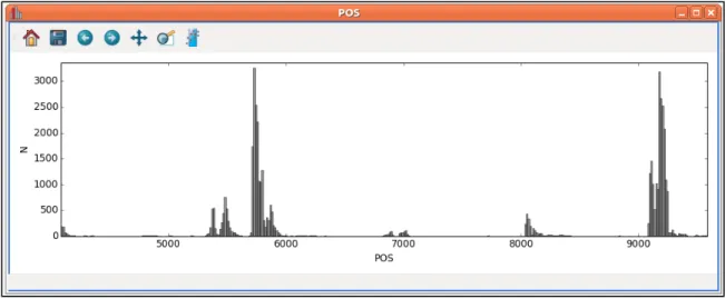
Figure 15: The sequence reader appears as a histogram of variants according to their position on the chromosome or genome. ... 109
Figure 16: The widget control panel for the sequence reader allows users to specify a field for position, the chromosome, and the sample. ... 111
Figure 17: This is the GitHub branch on which the sequence reader feature is being developed. The feature is not yet completed, so it has not been submitted as a pull request. ... 116
Figure 18: The Travis Continuous Integration Server records test coverage. Glue's
coverage may be viewed at any time at https://coveralls.io/r/glue-viz/glue. ... 117
Figure 19: aak65 is my handle on GitHub. ... 118
Figure 20: This graph shows commits to the Glue master branch over time. ... 119
Figure 21: The Fork-Pull-Merge model creates a network of development branches. The “glue-viz” branch is Dr. Beaumont’s master copy, and my various branches are shown in development under “aak65”. The categorical ROI developed by Dr.
Dampier is visible under “JudoWill”... 120
Figure 22: The HIV viral genome is 9,719 nucleotide base pairs long and consists of multiple reading frames. The long terminal region (LTR) is particularly important for the binding of transcription factors and the integration of the provirus into the host cell chromosome [36]... 123
Figure 23: Importing patients.xlsx into Glue. ... 125
Figure 24: (1) Dragging a data or subset object onto the application window will open the "Data Viewer" menu. (2) The "Data Viewer" is used to select a visualization. ... 126
Figure 25: Using plot options to define the scatter plot visualization. ... 127
Figure 26: Drawing a Rectangular ROI: (1) Click the rectangular ROI widget in the visualization's menu bar. (2) Use the cursor to drag a box over the region of interest. (3) The selected data will create a Subset object in the Data Collection window.. 128
Figure 27: Subsets defined on the histogram will appear on the scatter plot. The subsets visible on the plot may be changed by unchecking their associated layers in the plot layers window... 129
Figure 28: Histograms can be used to visualize value distributions in a dataset... 129
Figure 29: The Line Graph viewer is useful for viewing datasets that track parameters over time. ... 130
Figure 30: (1) Subsets may be constructed manually by right-clicking in the
DataCollection window. (2) The user can type in a name for the new subset. (3) The
Selection Mode Toolbar controls the interactive method of defining ROIs. (4) With the “Or Mode”, the user can cherry-pick individual data points. ... 131
Figure 31: Zooming in on a region. (1) The user selects the zooming tool in the viewer toolbar, and (2) drags a rectangle across a region, (3) updating the axes. ... 132
Figure 32: Limits can be typed in as dates when they apply to a date-formatted axis. .. 132
Figure 33: Subsets defined in visualization will propagate to any visualizations that show the feature on which they are based... 133
Figure 34: Multiple datasets can be linked together so that selections made in
visualizations of one propagate to linked fields in another... 135
Figure 35: The linking wizard allows users to connect files by corresponding data fields. ... 136
Figure 36: The Sequence Reader allows users to visualize datasets of variants along position on a chromosome. ... 136
Figure 37: The plot options for the Sequence Reader allow users to select the
chromosome and sample they would like to view. ... 137
Figure 38: A subset created by the categorical ROI propagates across all linked
visualizations, even if they do not explicitly display the categorical data field. All data points associated with the category are highlighted... 138
Figure 39: This histogram shows a subset created by a categorical ROI. ... 139
Figure 40: Histograms can be useful in exploring categorical information, and will initialize with a number of bars corresponding to the number of categories. In a histogram, the y-axis corresponds to the frequency of items in each bin. ... 140
List of Code Snippets
Snippet 1: core/data.py Component: datetime property ... 50
Snippet 2: clients/scatter_client.py ScatterClient: check_if_date method... 51
Snippet 3: clients/scatter_client.py ScatterClient: plottable_attributes method ... 52
Snippet 4: clients/util.py update_ticks function excerpt (matplotlib dates)... 54
Snippet 5: clients/util.py update_ticks function... 55
Snippet 6: clients/util.py visible_limits function ... 56
Snippet 7: clients/scatter_client.py ScatterClient: apply_roi method ... 58
Snippet 8: core/roi.py PolygonalROI: contains method ... 60
Snippet 9: qt/widgets/scatter_widget.py ScatterWidget class ... 62
Snippet 10: qt/widgets/scatter_widget.py ScatterWidget: _connect method... 63
Snippet 11: qt/qtutil.py pretty_date function ... 65
Snippet 12: qt/widgets_properties.py connect_date_edit function excerpt ... 66
Snippet 13: qt/widgets_properties.py DateLineProperty: getter method... 69
Snippet 14: config.py (importing the line graph plugin) ... 74
Snippet 15: plugins/line_graph/client.py LineLayerBase class ... 77
Snippet 16: plugins/line_graph/client.py LineLayerArtist class... 78
Snippet 17: clients/scatter_client.py ScatterClient class... 79
Snippet 18: clients/scatter_client.py ScatterClient: add_layer method... 79
Snippet 19: clients/scatter_client.py ScatterClient: restore_layers method... 79
Snippet 20: plugins/line_graph/client.py LineClient class ... 80
Snippet 21: plugins/line_graph/client.py LineClient: _connect method... 81
Snippet 22: plugins/line_graph/client.py LineClient: _set_xydata method... 82
Snippet 24: plugins/line_graph/client.py LineClient: _on_component_replace method.. 83
Snippet 25: plugins/line_graph/qt_widget.py LineWidget class ... 84
Snippet 26: core/data.py Component: group property... 85
Snippet 27: plugins/line_graph/client.py LineLayerArtist: _recalc method... 88
Snippet 28: plugins/line_graph/util.py get_colors function... 89
Snippet 29: plugins/line_graph/client.py LineLayerArtist: _sync_style method ... 90
Snippet 30: plugins/line_graph/linewidget.ui framework file excerpt ... 92
Snippet 31: qt/widgets/scatter_widget.py ScatterWidget: _load_ui method ... 93
Snippet 32: qt/widgets/scatter_widget.py ScatterWidget: _setup_client method... 93
Snippet 33: plugins/line_graph/qt_widget.py LineWidget: _connect method ... 94
Snippet 34: plugins/line_graph/qt_widget.py LineWidget: restore_layers method ... 94
Snippet 35: plugins/line_graph/qt_widget.py LineWidget: _update_combos method... 96
Snippet 36: plugins/line_graph/client.py LineClient: grouping_attributes method... 97
Snippet 37: config.py (importing the sequence reader plugin)... 100
Snippet 38: plugins/sequence_reader/client.py SeqLayerBase class... 102
Snippet 39: plugins/sequence_reader/client.py SeqLayerArtist class ... 103
Snippet 40: clients/histogram_client.py HistogramClient class ... 103
Snippet 41: clients/histogram_client.py HistogramClient: bins property... 103
Snippet 42: clients/histogram_client.py HistogramClient: add_layer method ... 104
Snippet 43: clients/histogram_client.py HistogramClient: restore_layers method... 104
Snippet 44: plugins/sequence_reader/client.py SeqClient class ... 104
Snippet 45: clients/histogram_client.py HistogramClient: _connect method... 105
Snippet 46: plugins/sequence_reader/client.py SeqClient: _connect method ... 106
Snippet 47: plugins/sequence_reader/client.py SeqClient: set_component method... 106
Snippet 49: plugins/sequence_reader/qt_widget.py SeqWidget: chromosome property 107
Snippet 50: plugins/sequence_reader/qt_widget.py SeqWidget: sample property... 107
Snippet 51: plugins/sequence_reader/client.py SeqLayerArtist: _calculate_histogram method... 108
Snippet 52: plugins/sequence_reader/client.py SeqClient: apply_roi method ... 110
Snippet 53: plugins/sequence_reader/SeqWidget.ui (framework file excerpt) ... 112
Snippet 54: plugins/sequence_reader/qt_widget.py SeqWidget: _load_ui method... 112
Snippet 55: plugins/sequence_reader/qt_widget.py SeqWidget: _setup_client method 112 Snippet 56: plugins/sequence_reader/qt_widget.py SeqWidget: _connect method ... 113
Snippet 57: plugins/sequence_reader/qt_widget.py SeqWidget: _set_attribute_from_combo method ... 113
Abstract
Extending the Glue Visualization Tool with Biological Data-Types Alex Koszycki
Will Dampier, Ph.D.
Glue is a data visualization tool designed for exploratory analysis that allows users to interactively explore relationships and patterns in large multidimensional datasets. Users can construct scatter plots and histograms, select regions of interest, and have their selections propagated across other visualizations and even across multiple files. This powerful functionality, known as data brushing, is immensely useful in teasing out hidden relationships in large complex datasets. Originally developed for astronomical information, we have subsequently extended its use with common biological data-types and visualizations. This project will present and discuss the addition of features designed for visualizing longitudinal time-series datasets and genetic sequences, both of which are common data-types in biological processes. These features will be illustrated in a research case study investigating how sequence variants of the human immunodeficiency virus type 1 (HIV-1) affect clinical outcomes. The implemented features will be discussed in the context of alternative solutions and broad impact.
Chapter 1: Exploring and Visualizing Data in the Life Sciences
The life sciences generate large amounts of complex, diverse, and higher-ordered types of information that often need a less question-driven, more exploratory, mode of analysis and visualization. This chapter will discuss the challenges of life science data-types, the power of exploratory data analysis in visualizing such information, and review tools that currently exist to meet this need in the context of a broader multidimensional data visualization landscape.
The challenge of information in the life sciences
“Data visualization is a process that (a) is based on qualitative or quantitative data and (b) results in an image that is representative of the raw data, which is (c) readable by viewers and supports exploration, examination, and communication of the data.”
– Azzam et al. [1]
Healthcare and medicine has experienced an unprecedented growth in recent decades, as exciting advances, competitive pressures, and more rigorous regulatory elements prompt researchers and industry to incorporate more and more sophisticated technologies to perform investigations, quantify clinically relevant variables, and analyze results. In this rapidly expanding field, the quantity and variety of novel technologies being applied to an ever-growing patient population has resulted in a prodigious capability for accumulating clinically relevant information. The capability for producing data has greatly outpaced our ability to analyze, visualize, and interpret it in an effective, timely, and accessible manner.
As the volume and complexity of data increases, so does the challenge of understanding it. Philosopher George Berkeley, father of the often-repeated thought experiment about a tree falling in a forest with no one to hear, might have pointed out that data is useless if it is not visualized [2]. The purpose of data visualization is twofold: to assist in analysis (both in discovery or decision-making) and to communicate findings. Analysis can be done (and often is) non-graphically just fine, though often this is heavily based on a high level of fluency in the subject matter of investigation. For more casual purposes or large volumes of information, most would choose a graph or chart over a set of numbers in a table. The second goal is just as vital. Data visualization aims to communicate
information clearly, accurately, and effectively – so that if a really important tree falls somewhere in a forest far away; you can be sure to hear about it.
And the life sciences are full of very important trees. Researchers chase cures for diseases, life-extending therapeutics, and the hidden gears that make the human body tick. Laboratory equipment generates enormous datasets that require proper attention and visualization before scientists can even decide what to do with it all. Unfortunately, many life scientists are not explicitly practiced in the data sciences, and this hefty responsibility often rests on the shoulders of investigators poring through an Excel spreadsheet.
The result is an overall increase in the “turnaround time” between identifying and formulating a research question and visualizing its conclusion with relevant clinical data. The progress of research is often slowed by the need to develop novel tools or adapt existing ones to perform the necessary analyses, requiring programming knowledge or resources - both of which may require investment of time and money. The effect is only exacerbated when researchers take on the task of comparing their results across multiple cohorts from other institutions. The breadth of storage systems, coding schemes, analytical methods, and data-types can make comparison difficult or impossible. These factors discourage basic science or clinical researchers from investigating more complex research problems or analyzing their data to its fullest extent.
The difficulty inherent in life science datasets lies in its complexity. Many observe that in science it is often the case that your project makes complete sense to you while an unfamiliar field of research remains shrouded in mystery. The sheer breadth of research areas and the extreme level of background literacy required to understand the work being done directly relate to the generation of data representations that are tailored for very
diverse purposes. These sets of data are often not easy to visualize, consisting of many features or dimensions (the “columns” of a table) – representing everything from laboratory results, genetic sequence information, patient demographics, treatments, behavioral assessment scores, favorite color, ad infitum. Moreover, these data are often longitudinal, consisting of multiple time points, or have accessory information such as statistics, error scores, or term definitions stored separately.
On exploratory data analysis and letting go of the question
"Since the aim of exploratory data analysis is to learn what seems to be, it should be no surprise that pictures play a vital role in doing it well. There is nothing better than a picture for making you think of questions you had forgotten to ask (even mentally)."
– Tukey [3]
Sophisticated visualization techniques are required to tackle these large, multidimensional, often categorical datasets. Researchers need tools to explore and interact with their information dynamically, using visualizations to seek patterns and relationships in their information – even when the question they are chasing is hazy at best or even just a hunch hinting at a hypothesis.
This type of exploration was championed by statistician John Tukey in his seminal book,
Exploratory Data Analysis [4]. At a time when statisticians focused almost exclusively on high-level mathematical models and theory, he advocated for maximizing the simplicity and accessibility of data analysis. He thought that statistics should be paired with visual representations that allow the investigator to tap into the brain’s inherent and powerful ability to recognize patterns. Exploratory data analysis (EDL) intends to go beyond so-called initial data analysis (IDL), which is geared at specific goals like testing a hypothesis or fitting a model. IDL would often be the starting point for the building of a directed visualization to answer a specific question, whereas EDL aims to provide a framework or environment for investigators to be able to meaningfully interact with their data.
This is easier said than done. In a career track rigorously defined by regulatory elements and grant availability, the question is king. Proposals for research projects lay out the
time, resources, and capital needed to test a hypothesis, and obtaining approval is often a balancing act between what could be done and what can be done. There is emphasis on clear-cut answers to distinct questions, on building on the conclusions of others, and on using every dollar carefully – sometimes resulting in laboratories run like small businesses that generate publications like products.
What is needed out of data visualization in the life sciences is not more hassle, nor time-expenditure, nor personal investment, and certainly not more complexity. No what is needed are effective solutions to the “multidimensional challenge” that are quick and painless, and do not require a doctorate in statistics or data science to operate. Some of the solutions devised for this end will be discussed below, as well as the challenges that remain obstacles in this pursuit.
Visualizations for exploring multidimensional datasets
“Much of his work focused on static displays designed to be easily drawn by hand, but he realized that if one wanted to effectively explore multivariate data, computer graphics would be an ideal tool.”
– Friedman on Tukey [5]
In the above quote, Jerome Friedman, a student and contemporary of Tukey, recounts
PRIM-9, the first interactive program developed to explore multivariate data in the EDA school of thought. Since it was developed in 1972, many tools have followed that expand on the principle of “projection pursuit” around which it was built. The idea behind projection pursuit is to represent a high-dimensional set of data with low-dimensional representations. As described by statistician Peter Huber over a decade later, the features to display in the representation should be “interesting” – perhaps machine-picked by considering measures of scale, clumpiness, regression, or sparseness [6]. The goal was to avoid what Huber calls the “curse of dimensionality”, the fact that most relations in a high dimensional dataset are not significant, and only function to detract from interesting interactions or create noise in analyses like spanning trees and clusters.
The projection pursuit incorporated two benchmark visualizations of multidimensional data exploration: the histogram (1-dimensional) and the scatter plot (2-dimensional). These visualizations are aptly suited to display low-dimensional projections. Histograms communicate the distribution of values in a dataset. If the distribution significantly departs from a Gaussian assumption it indicates a potential hidden relationship in the higher dimensional “cloud”. Scatter plotting shows two features in relation to one another, and inherently displays whether visible correlations are present – does a change in one variable coincide with a change in another, are there “clusters” of points, are they
evenly distributed?
A glance at a scatter plot can convince a researcher that two fields are not related rather well, but it is often much more difficult to go in the opposite direction. Correlations on a scatter plot may be loose, and even when they are strong could signify a hidden effecter. Another type of visualization has become popular to extend the ability of viewing higher-dimensional projections when two is not enough to be convincing. The parallel coordinates plot (PCP) is a solution that consists of parallel axes lined up next to one another, and connected by a net of lines [7]. The endpoints of each line are the “row” values of the axes attributes.
The PCP has become quite popular because it can relate any number of features, constrained only by the number that still allows for an intelligible depiction of the relationship of interest. It has spawned a whole family of visualizations in which these axes are arranged in polygons, or cross over each other, or even span the space between scatter plots axes in any number of geometric arrangements [8].
The core visualization types allow researchers to construct projections of high dimensional data that still retain usefulness as vehicles for more significant analyses. Statisticians have developed techniques based on clustering analyses that use both scatter plot matrices and PCPs in informative visualizations [9, 10]. These techniques are effective with all manner of orderings, such as agglomerative clustering, minimal spanning trees, and principal components.
Tools of the trade
“Far better an approximate answer to the right question, which is often vague, than an exact answer to the wrong question, which can always be made precise.”
– Tukey [11]
Tools for visualizing multidimensional datasets in the projection pursuit mode of analysis rely on strong user-interactive components to be effective. Common methods for interacting with data include zooming, filtering, and brushing.
Zooming is essential when working with “big data”. It conserves the ability to view an overview of the data, while allowing the user to drill down into specific regions. Filtering refers to the partitioning of data into segments or subsets. This can be done by directly selecting information on a visualization to define a subset, or by querying the data much like one would query a database. This feature is sometimes difficult to operate intuitively, due to the many ways subsets could logically be defined. Interactive zooming and filtering are a staple of most of these tools, including PAD++ physics exploration tool [12], Spotfire, [13], GGobi [14], and the Glue visualization library discussed in this project [15].
Linked data brushing allows the investigators to select a subregion in a section of a plot, and use that selection as a filter for any linked visualizations showing the data in different ways. A visualization tool known as Tableau is one example of a commercial software that is able to link points shown in multiple displays, and define subsets using colors [16]. This can be done graphically or mathematically, but it is difficult to introduce new boundaries for a subregion within an image. It has a key shortcoming however, in that it doesn’t link image-based information to a tabular representation, preventing the sort of
flexible data brushing Glue offers. This shortcoming is shared by other commercial tools, such as Spotfire.
Exploratory data visualization tools have a considerable presence among statisticians. The GGobi tool is an excellent visualization library (also open-source) that includes all three of the core visualizations along with features including data brushing and linking [14]. It contains many features that allow users a lot of control and transparency in data visualization, but can be intimidating to non-statisticians. Similarly, there are the tools MANET and Mondrian, which are particularly designed to handle data fields that may include missing or incomplete information [17]. This is very useful in the life sciences, where many datasets include categorical information and may not be completely whole. They also have useful mosaic plots, maps, and parallel coordinate plots implemented. GGobi and Mondrian are heavily based in R, the scripting language of choice for statisticians, and prioritize a precise and controlled user interface. Glue, though, is written in Python, and places higher emphasis on hackability and usability. R has a large following as the language of statistical computing, and Python is more focused on general-purpose programming, and is accessible to a wide array of scientific disciplines. This may encourage more biologists to utilize the technique. Many biologists may not feel comfortable with a user-interface that controls high-level statistics, and might appreciate Glue’s simpler interface.
Challenges in the future of life sciences data visualization
“In breaking new ground (new from the point of view of data analysis), then, we must plan to learn to ask first of the data what it suggests, leaving for later consideration the question of what it establishes.”
– Tukey [11]
One of the main challenges with using exploratory data analysis in life science research is a lack of support for biological data-types. Though the tools in this family of data analysis are still actively used, many have remained relatively unchanged over the last two decades, and are unequipped to handle the specific needs of life science information. It will undoubtedly be challenging to implement support for sequencing or longitudinal data without interfering with the mechanism for any visualization tool.
Another challenge is viewing hierarchical information. Many biological datasets are hierarchical in nature, and this complexity is best seen in a clustering heatmap [18, 19]. However, heatmaps do not readily fit into the visualization mode of exploratory analysis in that it would be difficult to maintain information about the cluster profile when a subset is selected.
Time series and longitudinal information is a challenge due to the difficulty to visualize high-dimensional sets of parameters changing over time. However, there are solid efforts to account for this. Tam et al. showed how the scatter plot and parallel coordinate plots can be used to creatively display time series information [20]. Ward and Guo also designed a method for manipulating time series while maintaining data brushing, linking, and exploration functionalities [21]. GGobi and Mondrian include support for time series [14, 17].
the plot area [22]. This can be found in many scripting and directed data visualization libraries, but very few interactive tools are available. The addition of another dimension makes it difficult to smoothly control plot area and impossible to filter out subsets with data brushing. This is a challenge that may become more feasible for exploratory visualization as new tools for interacting spatially with computers are developed.
As always, the volume and size of data affects the way it needs to be handled. The challenge is balancing functionality with efficiency. Having too much redundancy or a codebase with a less than efficient object structure can be an important consideration for moving into the realm of interacting with very large datasets. MANET and Mondrian rely on more of a statistical underbelly than Glue and are reported to have trouble with big data [17]. Python on the other hand is more focused on development and has scientific libraries that are very efficient. Glue takes advantage of these libraries to create a simple interface that can manipulate a lot of information, but does not have as much functionality as the R tools.
As these tools become more suited for research in the life sciences sphere, they will have to tackle these challenges while maintaining the tradition of projection pursuit and dynamic data interaction that makes them so useful for exploration and visualization.
Chapter 2: Glue Introduction
Figure 1: Logo of the Glue visualization library.
When astrophysicist Chris Beaumont was doing his doctoral research on molecular clouds and star formation, he was unsatisfied with the tedium of visualizing the large datasets with which he worked. To address this need he developed Glue, a powerful interactive data visualization environment built around the philosophy of exploratory data analysis.
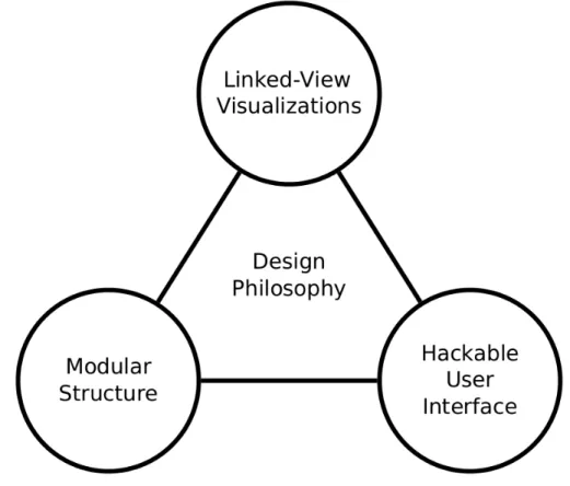
Glue uses linked visualizations to allow a user to easily investigate information across datasets and even separate files. Furthermore, a modular architecture and a publish-subscribe paradigm structures the Glue codebase in a way that supports accessible customization for scientists to implement their own analytical pipelines.
Figure 2: Glue was designed with three major goals in mind: (1) Supporting linked-view visualizations, (2) keeping visualization code modular, (3) and allowing users to have programmatic access to customize their use of Glue.
The power of linked-view visualizations
“The central visualization philosophy behind Glue is the idea of linked views – that is, multiple related representations of a dataset that are dynamically connected, such that interaction with one view affects the appearance of another.”
– Beaumont [15]
The true power of Glue is enabling the user to interactively explore subsets of data across visualizations and datasets. This is supported by two features: brushing and linking.
Brushing
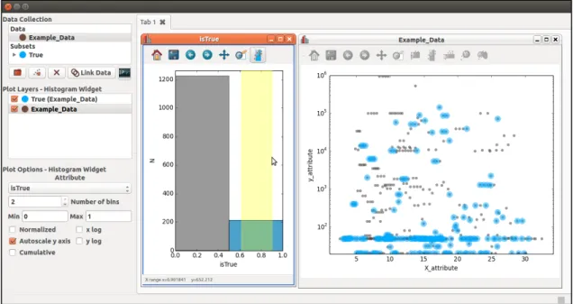
Data brushing is a feature that allows a user to select a subset of information on one visualization, and observe this region in all other open visualizations. The selection is propagated across separate visualizations, giving users a multi-dimensional insight into their dataset. This is done interactively using the mouse to draw a “lasso” or geometric shape around the region of interest. Figure 3shows an example of a subset being selected in a histogram and observed as an overlaid highlight in the scatter plot.
Figure 3: Data Brushing allows users to interactively visualize subsets within their datasets. In the histogram window, a user selects data with an “isTrue” value of 1. This creates a subset, visible in the "Data Collection" frame. The selection is automatically highlighted in the scatter plot.
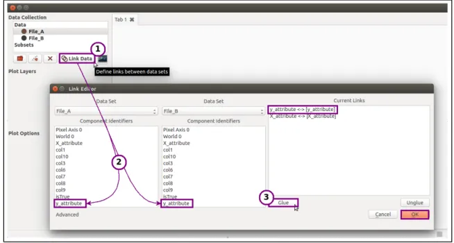
Linking
To extend the brushing capability across datasets, data linking allows the user to define logical relationships between multiple files. For example, suppose File A and File B include different types of information but have an attribute in common – an ID number. If you would like to see your subset overlaid on both datasets, you could link these fields together, essentially telling Glue that they are identical attributes. Now, brushing a set of ID numbers in a visualization of File A's dataset will create a subset that also appears over visualizations associated with File B. Figure 4 shows the dialog box for linking attributes across datasets.
Figure 4: Data Linking allows users to specify how their datasets relate to each other. Here a user has inputted two files and linked their “x” and “y” fields using the Link Editor dialog.
Modular architecture and publish-subscribe paradigm
“One of the design priorities in Glue is to keep visualization code as simple and modular as possible, so that adding new visualizations is straightforward.”
– Beaumont [15]
To meet this priority, Glue's central data objects relate to each other in a
publish/subscribe paradigm, wherein they are able to remain synchronized while not explicitly being aware of each other.
Central Data Objects Data
The data object in the Glue framework stores the actual data that is extracted from an input file. The data object consists of component objects, each of which must have the same shape. The components may be likened to the columns in an Excel spreadsheet, and the header of the column to the ComponentID.
Many objects in Glue will refer back to specific components selected for visualization on a data viewer. These are referred to as attributes. For example, the scatter plot includes the attributes xatt and yatt, which refer to the columns in the dataset that will be plotted against each other on the x and y axes. Attributes are class properties that help Glue's objects pass information among each other.
Subset
A subset defines a set of items in a data object, and is used to store and display a region of interest (ROI). A user-defined region generated by brushing a dataset will result in the creation of a subset. Subclasses generate subsets under different conditions and with different input information, and define state change logic.
DataCollection
A DataCollection is a container of data objects. It is the top-level data container, allowing users to add, retrieve, and display imported data. It creates a hub object, and plays an important role in synchronizing information across Glue.
Hub
The hub receives messages about data and state changes, and broadcasts messages to objects affected by the changes. Objects must subscribe to the hub to receive specific
messages. The hub synchronizes objects in Glue according to the publish/subscribe paradigm, so they do not interact directly with each other. The benefit of this is evident in adding visualizations to Glue: rather than having to consider explicit interactions with all Glue objects, additions need only to interface properly with the hub.
Client
A client defines how data is handled, configured, analyzed, and displayed by a particular data viewer. It is the base class for the actual visualization of information, containing the logic for what will be displayed to the user. It also registers callbacks to the hub, so that the data viewer can react to changes.
Message
A message contains information about a change in the state of an object. It represents an event. Data and subset objects generate messages, as do callbacks for user-interactive features. Messages are sent to the hub, which sends them out to affected objects across Glue's framework.
Syncing objects to the hub
To sync up all these objects, clients attach (or register) callbacks to the hub. These callbacks respond to particular state changes, such as brushing a subset or selecting an
attribute. When the hub receives a message about a state change, it “broadcasts” the
message by calling all of the callbacks associated with that state change. Messages
originate from data and subset objects. Since the message object overrides their
__setattribute__ method, it is not necessary to explicitly define broadcasting behavior – any change to the state of the object will result in an automatic message to the hub.
Flow of data through Glue
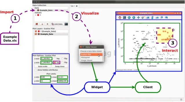
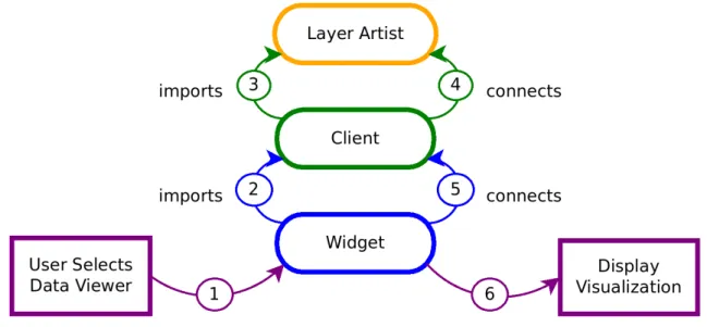
Though the modular design of Glue's internal objects makes it possible to add custom visualizations, the architecture can make it difficult to distinguish how information actually moves through the tool. To visualize this, consider the workflow shown in Figure 5.
Figure 5: Common workflow of exploring a dataset using Glue. Purple lines indicate user-interaction, green lines indicate the flow of data through the client, and blue lines indicate how the widget initializes the GUI.
Glue starts up with an empty DataCollection object, which creates a hub. When we import a file (Step 1 in Figure 5), the information is added to the DataCollection as a data
object. Adding multiple datasets correspond to multiple data objects in the
DataCollection.
Viewer” dialog box prompts the user to select the desired visualization. The entries in its menu correspond to widget files in Glue's qt sub-package. Widgets contain logic for the user-interactive components of Glue. They rely on the Qt framework (available in the PyQt or PySide binding library packages [23, 24]) to build user-interactive components for Glue’s graphical user interface (GUI).
After the user selects a data viewer, an associated widget file is the first to be called. The interactions of the widget, client, and layer artist described below are also shown in Figure 6 to clarify the order in which each is executed.
Figure 6: Order in which Glue components initialize and interact to construct a visualization.
As shown in Figure 6, the widget file immediately imports the associated client. The client decides what to do with the data, but does not actually render anything itself. That is handled by the layer artist, which is loaded in Step 3. This is the class that will go on to actually draw the plot on an axis. Each dataset or subset will have its own layer artist. The client goes through and instantiates the objects that will handle the behavior of data
within the viewer, including how it can be displayed and configured. The client references the layer artist in methods that pass along information about data to visualize (Step 4). It also registers callbacks to the hub, so that the data viewer can react to messages.
Once the client is fully loaded, the widget builds the user-interactive components of the viewer, and connects them to client methods (Step 5). This completes the instantiation of the data viewer, but does not yet display anything. The hub receives messages from these new data objects, and calls the client callbacks registered for appropriate state changes. The client then uses the layer artist to update the axis and display the visualization.
'Hackable' user interface for development of custom pipelines
“When building Glue, we have sought out actions that users most likely want programmatic control over. We then aim to make the interface for performing these actions as simple as possible.”
– Beaumont [25]
Glue was developed with the intention of supporting the ability of users to control the application programmatically to develop their own visualization pipelines. A number of design considerations make Glue particularly hackable: (1) Glue is written in Python, a favorite language for many scientists, (2) Glue can be setup with a Python script to automate a frequently used analysis, (3) Glue gives users access to variables during a live session, and (4) Glue's configuration system supports custom viewers, linking functions, and plugins.
Built on Python
Python is a very scriptable language, preferred by many researchers for developing workflows and pipelines, as well as for off-the-cuff analysis. It is a high-level open-source language supported by a very large community. Consequently many sophisticated scientific libraries exist that make it a favorite for research in a variety of disciplines. Written wholly in Python, Glue makes use of a few of these well-established libraries.
Table 1: Python libraries used in Glue. Library Description
NumPy Supports large multi-dimensional arrays and high-level mathematical functions [26]
pandas Provides efficient and high-performance data structure tools that are geared towards manipulating numerical tables and time series [27]
matplotlib User-friendly plotting and visualizing library that interfaces with NumPy and GUI toolkits such as Qt [28]
Startup Scripting
Using GUIs can sometimes become tedious due to the so-called “cold start problem” – having to perform repetitive tasks to load in data each time they are booted up. If a researcher has many files but would like to visualize each of them in a specific way, it is useful to have a way to automate these tasks. Therefore, Glue can be booted programmatically in a Python script, allowing the user to pre-load datasets and define links or subsets. Furthermore, it is also possible to load in a saved Glue session in its entirety, complete with datasets, links, and subsets.
Interacting with a live session
Many scientists use Python for exploring their data via the command line or an IPython notebook. To support this, Glue includes a programmatic interface control system. The visualization tool may be invoked in a Python session, and interact directly with its variables. The convenience function qglue can be used to translate commonly used objects like NumPy arrays and Pandas DataFrames into Glue objects to give users control of a live visualization session. From the opposite direction, Glue also embeds its own IPython terminal to give users access to Glue variables and the Python command line during a live session.
Configuration
Every time Glue starts, it looks for a configuration file to import – config.py. This file can be placed in the current working directory, the directory in which Glue was installed, or another directory specified by the environmental variable gluerc. Glue looks in this file for any custom viewers, link functions, or plugins to import. There are many registries
located in the config sub-package that allow customization of Glue's functionality, such as data loaders, link functions, colormaps, and viewers.
The goal of this configuration system is to give users control over the visualization of their data as directly as possible, while hiding the abstracted inner workings of Glue objects. Therefore, custom behavior can usually be written in without having to worry about the GUI programming. This is not always true for more advanced configurations, such as plugins that affect the way Glue's central objects interact – though importing an existing plugin can be done using a few simple lines in the config.py file.
Chapter 3: Technical Design
The main goal of this project is to extend Glue’s functionality with data-types that support biological data-types. To achieve these goals, many technical design objectives were developed, and will be discussed in this chapter. These objectives support biological data visualization through importable tools and viewers that will be incorporated in the future as a “Bio-Glue” module. In this manner, the user would be able to incorporate the functionality at his or her discretion.
Specific Aims
Date/Time Support
Glue currently does not include support for viewing date-based data. It can plot only pure numerical information. This reflects the data it had been designed to handle. The time scale of astronomical change is very large, so dates are rarely considered. When they are, a simple system called Modified Julian Date (MJD) is used, representing time as a decimal number of days elapsed from midnight November 17, 1858. Thus, the value is purely numerical. This specific aim will introduce date/time functionality to the Glue scatter plot visualization.
Line Graphing
Often, a dataset will contain multiple patients or samples. This is especially true in longitudinal sets of information, since there is an interest in observing how a feature changes over time. In this case, the ideal solution would be to view data not in a scatter plot, but rather as a line graph – where each line corresponds to an individual member of the dataset. This specific aim will introduce a Line Graph Viewer as an importable plugin.
Sequence Reader
Genomic sequence information is difficult to explore using traditional visualizations. This data is often stored in Variant Call Format (VCF), which keeps track of chromosome (CHROM), position (POS), consensus or reference sequence nucleotide (REF), and any variants present at location (ALT). Additionally, a single VCF file may contain many samples or patients. Consequently, clinical and biological researchers
devote a great deal of time in preparing scripts to analyze this data-type, which is notoriously difficult to work with. This specific aim will introduce a “sequence reader” as an importable plugin.
Section 1: Changes to the Scatter Plot Client
As discussed in the introduction, Glue relies on clients to define the way in which information is treated and displayed. The target of the date-format support added to Glue is the scatter plot client, where this feature would be most useful. However, support will also be integrated into the Data and ROI files, as well as in the client utilities file, all of which extend beyond the scope of the ScatterClient. This allows other visualizations and plugins to integrate the feature as well.
Identify when data is in a date/time format
In order to properly work with longitudinal datasets, Glue must first be able to identify when an attribute is formatted as a date. As mentioned in the introduction, Glue is built around a publish/subscribe paradigm. While this makes Glue a modular tool with the potential for growth in many directions, it does cause some difficulty in communicating the nature of the data that is passed through its clients, layer artists, and widgets. Glue must be able to determine if it is seeing a date/times attribute and pass along information appropriately to the client. This identification can be made upon initialization of a component object, by simply adding a property that describes whether or not data matches known date/time formats.
Conveniently, the NumPy scientific computing package contains support for dates of many formats, including dates in specific time-zones. Each NumPy array has an attribute
dtype (data-type) that describes the format of the object. Glue is able to use NumPy to check the type of data it imports by accessing this dtype attribute. Glue can therefore determine whether any data is formatted as a date by using a simple isinstance call. The property added to Glue's component object is simply:
Snippet 1: core/data.py Component: datetime property
The string compare function was necessary because the dtype attribute often returns class Component(object):
...<code collapsed>... @property
def datetime(self):
return isinstance(self.data.dtype, np.datetime64) or 'datetime64' in str(self.data.dtype) ...
descriptive information about the smallest unit of time it has information for (usually nanoseconds), which causes isinstance to fail.
This property gives Glue the ability to determine whether any component object is a date/time, since it is a part of the core. However, it becomes useful to define a class-level method to call this property once the ScatterClient is considered. This function is given below, and is similar to the check_categorical method used to identify categorical attributes. This method is used later in applying incoming regions of interest (ROIs) to the plot, discussed later in this section.
Snippet 2: clients/scatter_client.py ScatterClient: check_if_date method
def _check_if_date(self, attribute): for data in self._data:
try: if data.get_component(attribute).datetime: return True except IncompatibleAttribute: pass return False
Choose plottable attributes
The client objects in Glue determine how data is treated “behind-the-scenes” so to speak. In this vein, one of the decisions the ScatterClient must make is whether to accept a component in a dataset as "plottable". For example, a dataset may contain a column of data that would be impossible to display on a scatter plot, such as a series of characters. The plottable_attributes class method would determine that this column is not plottable, and Glue would not put it as a selectable attribute in the user-interactive combination box.
Previous to this project, Glue would disregard data formatted in most date/time formats. This reflects the data it had been designed to handle. The time scale of astronomical change is very large, so dates are rarely considered. When they are, a simple system called Modified Julian Date (MJD) is used, representing time as a decimal number of days elapsed from a reference date. Thus, the value was purely numerical.
Implementing an extra check for date/time was quite straightforward, as it was possible to simply check the datetime property added in the first section (Snippet 1).
Snippet 3: clients/scatter_client.py ScatterClient: plottable_attributes method def plottable_attributes(self, layer, show_hidden=False):
data = layer.data
comp = data.components if show_hidden else data.visible_components return [c for c in comp if
Support axis elements
With these additions, Glue is able to use matplotlib’s toolset for plotting date/time attributes; however, instead of a clearly understandable identifier, the axis label displays values in an MJD format. Therefore, the client must also apply the appropriate style of ticks and labels to the axis to display data appropriately (Figure 7). This support is available to all the visualizations, and so it is located in the utilities file (util.py) shared by the clients. The update_ticks function determines how to format the ticks based on the data-types of the components plotted on the associated axis. It also includes support for logarithmic and categorical plotting.
The matplotlib library includes a module ticker that contains classes for locating and formatting ticks for an axis. They support a variety of data formats, and can be set directly to the axis object to change its behavior. The reason the axis showed a number instead of a date is because these two attributes are set to defaults that inadvertently typecast dates to a numerical format.
Fortunately, the matplotlib dates module includes formatters and locators especially suited for dates (Snippet 4). The AutoDateLocator was used to pick the best tick placement based on the range of the data and based on the visible area in the plot. The AutoDateFormatter selects an appropriate string format for the date to be displayed in the label. This is determined by both the date/time data and by the available space on the axis. It selects a format from a dictionary, which may be customized by the user if necessary.
Snippet 4: clients/util.py update_ticks function excerpt (matplotlib dates)
These "auto" functions are ideal for Glue, since they are able to respond to a wide variety of input styles. They also communicate well with the axis, which allows for a seamless behavior with other user-interactive features such as zooming and resizing. Matplotlib also has functions that explicitly inform the axis to treat data as dates, which were also included. These were added to the update_ticks function, which is shown Snippet 5.
locator = AutoDateLocator()
formatter = AutoDateFormatter(locator) axis.set_major_locator(locator)
Snippet 5: clients/util.py update_ticks function def update_ticks(axes, coord, components, is_log): ...<code collapsed>...
is_date = all(comp.datetime for comp in components) if is_log: ...<code collapsed>... elif is_cat: ...<code collapsed>... elif is_date: locator = AutoDateLocator() formatter = AutoDateFormatter(locator) axis.set_major_locator(locator) axis.set_major_formatter(formatter) if coord == 'x': axes.xaxis_date() elif coord == 'y': axes.yaxis_date() else:
axis.set_major_locator(AutoLocator()) axis.set_major_formatter(ScalarFormatter())
Determine visible limits on axis
In the previous sections, Glue was able to recognize, store, and plot date/time formatted data. In this technical objective, the plotted data needs to move in the opposite direction to be used in "snapping" the axes into place. This feature is necessary when plotting new attributes. For example, in the event that data exceeds the visible area of the axis, the plot will rescale to show the entire dataset, snapping the x and y axes.
The function that pulls the required information is visible_limits, and is also located in the client utilities (Snippet 6). It determines the limits of the data in all the visible layer artists on an axis, ignoring hidden layers. This is, if there are multiple subsets or datasets plotted on a scatter plot, the visible limits would be the maximum and minimum for x and y of all the layers. If one of the layers were hidden, visible_limits would ignore it.
This function is called frequently because it is a part of the self-updating behavior of Glue's visualizations. It is called even before any data is actually plotted, and just calculates maximum and minimum values to be zero. However, this becomes problematic with date-formatted information. In the previous section, the axis was altered to expect a date input – and zero is not a viable date.
Snippet 6: clients/util.py visible_limits function def visible_limits(artists, axis):
...<code collapsed>...
if isinstance(data[0], (np.datetime64, datetime.date)) \ or 'datetime64' in str(type(data[0])):
data = pd.to_datetime(data)
lo, hi = date2num(min(data)), date2num(max(data)) else:
...<code collapsed>... return lo, hi
To remedy this, visible_limits checks if the data is date/time in the same way that the component would, and finds the minimum and maximum dates. The min and max
functions do not work with NumPy's datetime64, so the data is first typecast to Pandas'
datetime format [27]. The resulting data are converted to numbers using matplotlib's
date2num function and passed along to downstream functions as usual, to prevent having to implement date-specific changes at each step.
Apply ROIs to artists
The ScatterClient must also update the artists associated with an axis based on a user-specified region-of-interest (ROI). The user is able to select a subset of visualized data, which propagates through all open visualizations. The method apply_roi receives the ROI and identifies the appropriate data from the client's components. It then instantiates a
subset_state from ROI classes in Glue's core and updates the client (Snippet 7). Snippet 7: clients/scatter_client.py ScatterClient: apply_roi method
The check_if_date method defined above is used here to quickly determine whether def apply_roi(self, roi):
if isinstance(roi, RangeROI): lo, hi = roi.range() if roi.ori == 'x': att = self.xatt is_date = self._check_if_date(self.xatt) else: att = self.yatt is_date = self._check_if_date(self.yatt) if is_date: lo = np.datetime64(num2date(lo)) hi = np.datetime64(num2date(hi)) subset_state = RangeSubsetState(lo, hi, att) else: subset_state = RoiSubsetState() subset_state.xatt = self.xatt subset_state.yatt = self.yatt x, y = roi.to_polygon() if self._check_if_date(self.xatt):
x = np.array(list(np.datetime64(num2date(d)) for d in x)) if self._check_if_date(self.yatt):
y = np.array(list(np.datetime64(num2date(d)) for d in y)) subset_state.roi = PolygonalROI(x, y)
mode = EditSubsetMode()
visible = [d for d in self._data if self.is_visible(d)] focus = visible[0] if len(visible) > 0 else None
mode.update(self._data, subset_state, focus_data=focus) self._update_axis_labels()
components have date/time formatted information. If the user has selected a rangeROI, then only the minimum and maximum dates are necessary. Since the ROI in this case is heading out to plots, some of which may have dates, the output format is datetime64. The
num2date function is used to convert the number to a date/time, which is then typecast as a NumPy datetime64 array.
If the ROI was not a range, the PolygonalROI is used instead. The goal is the same, to instantiate a representative subset_state, but the method is a bit more tedious, involving the manual creation of a subset state object. It was also necessary to add support for PolygonalROI to convert dates to numbers using the date2num function. The contains method of the PolygonalROI contains the logic for defining the data within the ROI, and is shown in Snippet 8.
Snippet 8: core/roi.py PolygonalROI: contains method def contains(self, x, y):
if not self.defined(): raise UndefinedROI
if not isinstance(x, np.ndarray): x = np.asarray(x)
if not isinstance(y, np.ndarray): y = np.asarray(y) if isinstance(x[0], np.datetime64)\ or 'datetime64' in str(type(x[0])): x = date2num(to_datetime(x)) vx = date2num(to_datetime(self.vx)) else: vx = self.vx
if isinstance(y[0], np.datetime64)\ or 'datetime64' in str(type(y[0])): y = date2num(to_datetime(y)) vy = date2num(to_datetime(self.vy)) else:
vy = self.vy
xypts = np.column_stack((x.flat, y.flat)) xyvts = np.column_stack((vx, vy)) result = points_inside_poly(xypts, xyvts) good = np.isfinite(xypts).all(axis=1) result[~good] = False
result.shape = x.shape return result
Section 2: Changes to the Scatter Plot Widget
While the client moves information around behind the scenes, the widget support allows the user to interact meaningfully with the data. In supporting date-formatted information, the ScatterWidget governs how dates are presented and inputted in widget controls.
Connect widgets with user-interactive elements
The scatter_widget file links together the user-interactive controls with the appropriate properties and callbacks. This file doesn't do the actual work, but rather connects to objects defined in widget_properties. This is quite useful in that these classes are accessible to other visualizations that would require them, supporting the modular capability of extending Glue.
The only change to the scatter plot widget controls is in how the minimum and maximum edit boxes behave. These boxes allow the user to manually input a range over which to view the plot. By typing in a value into the control and pressing Enter, the widget would activate a callback and update the associated property in the client. This has always been a number, though decimals and scientific notation are also supported.
Snippet 9: qt/widgets/scatter_widget.py ScatterWidget class
This feature adds the capability to display and input a date-formatted entry. There are two class objects from widget_properties that were created to add this functionality: a DateLineProperty and a connect_date_edit callback. These objects replace the
FloatLineProperty and connect_float_edit classes, but encompass their behavior – allowing the user to work with either numerical or date type information without Glue having to switch out the text wrapper property. The DateLineProperty is called in the scatter widget class definition (Snippet 9).
class ScatterWidget(DataViewer): ...<code collapsed>...
xmin = DateLineProperty('ui.xmin', 'Lower x limit of plot') xmax = DateLineProperty('ui.xmax', 'Upper x limit of plot') ymin = DateLineProperty('ui.ymin', 'Lower y limit of plot') ymax= DateLineProperty('ui.ymax', 'Upper y limit of plot') ...
Snippet 10: qt/widgets/scatter_widget.py ScatterWidget: _connect method
The connect_date_editfunction is called in the class method _connect, which sets up the user-edit callbacks for each control (Snippet 10).
def _connect(self): ui = self.ui cl = self.client ...<code collapsed>...
connect_date_edit(cl, 'xmin', ui.xmin) connect_date_edit(cl, 'xmax', ui.xmax) connect_date_edit(cl, 'ymin', ui.ymin) connect_date_edit(cl, 'ymax', ui.ymax)
Displaying dates
Displaying dates in a user-friendly manner is one of the prime objectives of this feature, since having an easy-to-read date facilitates a more fluid exploration of longitudinal clinical or research data. The widget control includes a method setText, which supplies a display string to the widget when called in DateLineProperty or connect_date_edit.
In connect_date_edit the update_widget function chooses how to display a value in the widget control. Once again, the _check_if_date method from the scatter client is use to determine whether an attribute is in a date/time format. If the value is a number, a Qt utility (qtutil.py), pretty_number is called to print out the value to the edit box. If it is a date, update_widget calls the pretty_date function, shown in Snippet 11.
Figure 8: The x and y axes limits will display as dates.
The pretty_datefunction takes a list of numbers, converts it to dates using num2date, and assembles a string for the setText method. The format of the date/time strings generated by this function is month/day/year hour:minute:second:microsecond – though it only displays the precision it is supplied. The resulting string appears in the widget text boxes, as seen in Figure 8.
Snippet 11: qt/qtutil.py pretty_date function def pretty_date(dates):
try:
return [pretty_date(d) for d in dates] except TypeError: