Benjamin David Hennig
Department of Geography University of Sheffield
Rediscovering the World
G r idde d C a r t o g ra m s of Hu m a n a nd P hys i c al Sp a c e
PhD Thesis
Submitted in accordance with the requirements for the degree of Doctor of Philosophy
to my parents
Ingrid and Wolfgang Hennig
in memory of Benedikt Frese
Table of Contents
Abbreviations ... IV
Tables and Figures... V
Abstract ... VII
Chapter 1 Introduction ... 1
1.1 Background ... 2
1.2 Aims and objectives ... 5
1.3 Implications ... 7
Chapter 2 Cartography and globalisation ... 9
2.1 Introduction ... 9
2.2 Changing geographies in a globalising world ... 9
2.2.1 Geography in the anthropocene ... 10
2.2.2 Relevance of space ... 11
2.2.3 Map projections as manifestations of space ... 16
2.2.3.1 From Mercator to Peters ... 17
2.2.3.2 Cartograms ... 22
2.2.3.2.1 Cartogram types ... 22
2.2.3.2.2 A diffusion-based method for density equalising cartograms ... 25
2.2.3.2.3 Cartograms as a map projection ... 27
2.3 A brief history of maps ... 29
2.3.1 Prologue ... 30
2.3.2 Beginnings of modern cartography ... 32
2.3.3 The digital turn ... 36
2.4 Cartography in a digital world... 40
2.4.1 A new golden age of data ... 40
2.4.2 Mapping from the experts ... 41
2.4.3 Mapping from everyone ... 45
2.5 The Worldmapper project ... 48
2.6 Conclusion: Rethinking maps ... 52
Chapter 3 Creating gridded cartograms ... 54
3.1 Introduction ... 54
3.2 Technical notes ... 57
3.2.1 Hardware and software ... 57
3.2.2 Files and file formats ... 59
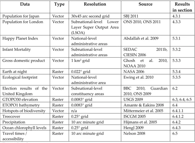
3.3 Data ... 61
3.3.1 Population data ... 61
3.3.1.1 Estimating global population data ... 61
3.3.1.2 The gridded population of the world ... 63
3.3.1.3 Data evaluation ... 65
3.3.2 Socioeconomic and environmental data ... 67
3.4 Methods ... 72
3.4.1 Vectorising a population raster ... 73
3.4.1.2 From raster to vector ... 74
3.4.2 Generating and improving gridded populations ... 76
3.4.2.1 Allocating Palestinians ... 77
3.4.2.2 Gridding Londoners ... 81
3.4.3 Producing gridded cartograms ... 83
3.4.3.1 Basic principles... 83
3.4.3.2 Technique ... 87
3.4.3.3 Implementation ... 89
3.5 Visualisation ... 90
3.6 Conclusion: Equalising population densities ... 95
Chapter 4 The human shape of the planet ... 97
4.1 Introduction ... 97
4.2 A gridded world population cartogram ... 97
4.2.1 A gridded world population cartogram ... 98
4.2.2 A highly detailed gridded world population cartogram ... 104
4.2.3 An experimental gridded global population map ... 106
4.3 Matters of scale ... 107
4.3.1 A world population atlas ... 107
4.3.2 Settlement patterns in the Middle East ... 123
4.3.3 London back in shape ... 125
4.4 Conclusion: Spaces of humanity ... 127
4.4.1 Resolution ... 128
4.4.2 Scale ... 130
Chapter 5 Towards a gridded cartogram projection ... 133
5.1 Introduction ... 133
5.2 What a difference a grid makes ... 133
5.3 Gridded cartograms as a basemap ... 137
5.3.1 National-level: An unhappy humanity ... 137
5.3.2 Subnational data ... 141
5.3.3 A productive humanity ... 145
5.3.4 Light and shadow ... 147
5.3.5 Conclusion ... 151
5.4 Gridded cartogram transformations of quantitative data ... 152
5.4.1 Changing populations ... 152
5.4.2 Human impact ... 156
5.5 Conclusion: The versatility of space ... 159
Chapter 6 Applications for gridded cartograms ... 162
6.1 Introduction ... 162
6.2 Mapping elections: Political views ... 163
6.3 Mapping countries: A new look at the geography of a nation ... 167
6.4 Mapping the world: A multitude of environments ... 171
6.4.1 Biodiversity ... 171
6.4.1.1 Hotspots of biodiversity ... 172
6.4.2 Precipitation patterns ... 174
6.4.3 Oceans ... 178
6.5 Mapping multidimensional data: Remote places ... 179
6.6 Conclusion: An alternative geography of the world ... 185
Chapter 7 Discussion: The map ahead ... 187
7.1 Introduction ... 187
7.2 Revisiting methodologies ... 188
7.3 Theoretical implications ... 194
7.4 Future directions ... 197
Chapter 8 Conclusion and outlook ... 202
8.1 Summary ... 202
8.2 Concluding remarks ... 208
Bibliography ... 214
Acknowledgements ... 232
Appendix ... i
A. Worldmapper basic country data ... ii
B. SEDAC GPWv3 documentation ... vii
Abbreviations
ASCII American Standard Code for Information Interchange BIL Band Interleaved by Line
CPU Central Processing Unit CSS Cascading Style Sheets CSV Comma-Separated Values DBF Database File
DPI dots per inch
ESRI Environmental Systems Research Institute
FAO United Nations Food and Agriculture Organisation
GB Gigabyte
GDP Gross Domestic Product
GIS Geographical Information System GIScience Geographic Information Science GPS Global Positioning System
GPW Gridded Population of the World
(also: GPWv3: Gridded Population of the World, version 3) HDI Human Development Index
HDR Human Development Report HPI Happy Planet Index
IGU International Geographical Union
ISO International Organisation for Standardisation LSOA Lower Super Output Area
MB Megabyte
MDG Millennium Development Goals
NASA National Aeronautics and Space Administration NOAA National Oceanic and Atmospheric Administration ONS Office for National Statistics of the United Kingdom
PC Personal Computer
PDF Portable Document Format
RAM Random Access Memory
Sasi Social and Spatial Inequalities
SEDAC Socio-Economic Data and Applications Center SVG Scalable Vector Graphics
TIF Tagged Image File
UN United Nations
UNDP United Nations Development Programme UNICEF United Nations Children's Fund
Tables and Figures
TablesTable 1.1: Overview of the thesis chapters ... 6
Table 3.1: Technical specifications of the computer systems used in the research ... 57
Table 3.2: Overview of the software used in the research ... 58
Table 3.3: File formats relevant in the research methods ... 60
Table 3.4: Socioeconomic and environmental data used in the thesis ... 68
Table 3.5: Design elements of gridded cartograms and their implementation ... 92
Figures Figure 1.1: Milestones in mapping compared to map results of this PhD research ... 1
Figure 1.2: Worldmapper land area map compared to a land area pie chart ... 2
Figure 1.3: Data visualisation failure ... 3
Figure 2.1: Diagram of the natural- and anthroposphere ... 11
Figure 2.2: North Korea missile threat map ... 17
Figure 2.3: Mercator map on BBC News ... 18
Figure 2.4: Map projections: Mercator, Robinson & Azimuthal Equidistant ... 19
Figure 2.5: Map projections: Cylindric Equal Area & Fuller ... 20
Figure 2.6: Raisz' US population cartogram ... 22
Figure 2.7: Cartogram types ... 23
Figure 2.8: World population cartogram ... 25
Figure 2.9: Basic principles of a diffusion process ... 26
Figure 2.10: National-level world population cartogram with topographic layer ... 28
Figure 2.11: Mercator's map of the world ... 30
Figure 2.12: Humboldt/Berghaus’ global precipitation map ... 32
Figure 2.13: Selection of 19th century maps and visualisations ... 33
Figure 2.14: Mapping population in the 19th and early 20th century ... 35
Figure 2.15: Evolution of maps ... 38
Figure 2.16: Partial map of the internet ... 39
Figure 2.17: Digital cartography in the internet ... 46
Figure 2.18: Worldmapper website ... 49
Figure 2.19: Cartogram of malaria deaths in 2010 ... 50
Figure 2.20: Cartogram of death penalty prosecutions 2007-2010 ... 51
Figure 3.1: Comparison of grid sizes ... 66
Figure 3.2: Comparison of raster and vector data ... 73
Figure 3.3: Scheme of improving the population grid using maps and aerial imagery ... 78
Figure 3.4: Population distribution in the LSOA areas of London ... 82
Figure 3.5: Scheme of making a gridded cartogram ... 85
Figure 3.6: Comparison of the distribution of population values in the global grid ... 86
Figure 3.7: Comparison of the frequency of population values in the grid cells ... 87
Figure 3.8: User interface of the ArcGIS Cartogram Geoprocessing Script ... 88
Figure 4.1: Comparing population cartograms and a conventional map ... 98
Figure 4.2: Gridded world population cartogram ... 100
Figure 4.3: Assessment of lower-quality population data in the gridded cartogram ... 102
Figure 4.4: Gridded world population cartogram based on a high resolution grid ... 104
Figure 4.6: Comparison of gridded population cartograms of Taiwan ... 108
Figure 4.7: Overview of gridded country cartograms ... 110
Figure 4.8: Gridded population cartogram of China ... 111
Figure 4.9: Gridded population cartogram of the Netherlands ... 112
Figure 4.10: Gridded population cartogram of Sri Lanka ... 112
Figure 4.11: Gridded population cartogram of the Bahamas ... 113
Figure 4.12: Gridded population cartogram of the Maldives ... 113
Figure 4.13: Gridded population cartogram of Malaysia, Brunei and Singapore ... 113
Figure 4.14: Gridded population cartogram of Bangladesh ... 114
Figure 4.15: Gridded population cartogram of Cambodia ... 114
Figure 4.16: Population distribution in the most rural countries ... 115
Figure 4.17: Location of the Pearl River Delta in China’s gridded population cartogram ... 116
Figure 4.18: Comparison of gridded population cartograms of Japan ... 119
Figure 4.19: Gridded population cartogram of Japan showing different grid sizes ... 120
Figure 4.20: Gridded population cartogram of Africa ... 121
Figure 4.21: Gridded population cartogram of Europe... 122
Figure 4.22: Map series of Israel and the Occupied Palestinian Territories ... 124
Figure 4.23: Series of population cartograms for London ... 126
Figure 5.1: Global population densities on different map projections ... 134
Figure 5.2: Map projections of the Happy Planet Index ... 138
Figure 5.3: Map projections of infant mortality rates ... 142
Figure 5.4: Map projections of economic activity ... 145
Figure 5.5: Map projections of the world at night ... 149
Figure 5.6: Population changes 1990-2015 ... 153
Figure 5.7: Gridded cartogram of population decline between 1990 and 2015 ... 155
Figure 5.8: Gridded cartogram of population growth between 1990 and 2015 ... 155
Figure 5.9: Ecological footprint map series ... 157
Figure 6.1: Comparison of electoral maps from the 2010 UK general election ... 164
Figure 6.2: British general election results 2005 and 2010 on a cartogram ... 165
Figure 6.3: Cartogram of the 2010 general election displaying changes to 2005 ... 166
Figure 6.4: German population densities drawn on a gridded population cartogram ... 169
Figure 6.5: Topography of Germany shown on a gridded population cartogram ... 170
Figure 6.6: Biodiversity hotspots shown on a gridded world population cartogram ... 172
Figure 6.7: Gridded treecover cartogram ... 173
Figure 6.8: Precipitation patterns on a gridded world population cartogram ... 175
Figure 6.9: Gridded annual precipitation cartogram ... 175
Figure 6.10: Monthly time series of gridded precipitation cartograms ... 176
Figure 6.11: Gridded global annual precipitation cartogram ... 177
Figure 6.12: Gridded ocean cartogram showing the variation in chlorophyll levels ... 179
Figure 6.13: Gridded cartogram of global (in-)accessibility ... 181
Figure 6.14: Gridded cartogram of travel times in Europe ... 182
Figure 6.15: Gridded cartogram of travel times on the British Isles ... 183
Figure 6.16: Gridded cartogram of travel times in Germany ... 184
Figure 8.1: Mapping now and then ... 203
Abstract
‘We need new maps’ is the central claim made in this thesis. In a world increasingly influenced by human action and interaction, we still rely heavily on mapping techniques that were invented to discover unknown places and explore our physical environment. Although the traditional concept of a map is currently being revived in digital environments, the underlying mapping approaches are not capable of making the complexity of human-environment relationships fully comprehensible.
Starting from how people can be put on the map in new ways, this thesis outlines the development of a novel technique that stretches a map according to quantitative data, such as population. The new maps are called gridded cartograms as the method is based on a grid onto which a density-equalising cartogram technique is applied. The underlying grid ensures the preservation of an accurate geographic reference to the real
world. It allows the gridded cartograms to be used as basemaps onto which other information can be mapped. This applies to any geographic information from the human and physical environment. As demonstrated through the examples presented in this thesis, the new maps are not limited to showing population as a defining element for the transformation, but can show any quantitative geospatial data, such as wealth, rainfall, or even the environmental conditions of the oceans. The new maps also work at various scales, from a global perspective down to the scale of urban environments.
The gridded cartogram technique is proposed as a new global and local map projection that is a viable and versatile alternative to other conventional map projections. The maps based on this technique open up a wide range of potential new applications to rediscover the diverse geographies of the world. They have the potential to allow us to gain new perspectives through detailed cartographic depictions.
Chapter 1
Introduction
FIGURE 1.1:MILESTONES IN MAPPING COMPARED TO MAP RESULTS OF THIS PHD RESEARCH Selected examples for important mapping achievements in cartographic history compared to maps created in this PhD research (own depictions, included in this thesis): Mercator’s 1569 map of the world (obtained from WC 2006a), Humboldt/Berghaus’ 1841 global precipitation map (obtained from Ette & Lubrich 2004: 20-21), Raisz’ 1934 US population cartogram (Raisz 1934: 293) and Dorling’s 1991 UK election cartogram (Dorling 1991: Print LXXXIII)
1.1
Background
In a reflection on cartographic practice in British geography published at the time the research presented in this thesis started, Dodge & Perkins (2008: 1272) stated that ‚[t]here are few PhDs that explicitly focus on mapping in the UK‛.
This is a PhD thesis about maps (Figure 1.1).
FIGURE 1.2:WORLDMAPPER LAND AREA MAP COMPARED TO A LAND AREA PIE CHART Reference map of the Worldmapper project depicting the countries in the Worldmapper colour scheme, compared to a pie chart showing the same data of land area distribution split by the main regions used in Worldmapper
(modified from Sasi Research Group & Newman 2006b)
Maps and other forms of geographical data visualisation are not only an enlightening way of making geographical phenomena understandable by stimulating our visual imagination, but also a way to explore the underlying data, to gain new knowledge, and to raise new questions about the emerging pictures (Börner 2010). Visualising geospatial data began to become increasingly important with industrialisation in Europe, which resulted in the collection of a growing amount of data about the people and their living environments.
The development of new statistical methods and ways to visualise them influenced cartographic practice considerably, and coincided with the emergence of thematic maps. Cartographic practice has never been limited only to the mere production of maps, but has always been closely linked to the analysis of data and their visualisation in, around and outside of maps (Figure 1.2). The art and the science of cartography1 in
its deepest origins lends itself to showing the complexity of our world that we
1 As Endey remarks, the art/science dichotomy that started to be made in modern cartography is a false distinction ‚promoted by Modernity’s pervasive scientism‛ (Edney 1999: 165).
FIGURE 1.3:DATA VISUALISATION FAILURE Growing amounts of data require meaningful ways of analysing and visualising them (cartoon reproduced with
permission by Mark Anderson)
otherwise would not fully apprehend, and to using the language of imagery to translate geographical knowledge into understanding.
Digital technology has changed cartography and data visualisation. From a discipline that aims to describe and understand the means of conveying geographic information via traditional mapping methods it has turned into a complex field of analysing and visualising data. The initial limitations of computers that could hardly compete with the hand-drawn display of a statistical graphic or a map are long gone. Computer systems now allow not only complex analysis and calculations, but provide sophisticated means of making the results visible in not only meaningful but sometimes also very beautiful ways (Unwin, Chen & Härdle 2008).
We are now living in a time where we see a new data revolution, with digital technology making yet again unprecedented levels of data available and accessible that needs to be adequately processed and analysed (Figure 1.3). At the same time, what we refer to as globalisation has turned the world into an extremely complex environment that science finds hard to even illustrate in its complexity. The different dimensions of the natural and
the human environment become increasingly interrelated and interdependent, and conventional ways of showing these interrelations and interdependencies fail to explain the processes that determine our everyday life.
In earlier research several years ago, undertaken at the Alfred Wegener Institute for Polar- and Marine Research in Bremerhaven (Germany), I was working with hyperspectral remote sensing data of the coastal areas in the German North Sea (Hennig 2005, Hennig, Cogan & Bartsch 2007). Back then I stated, that ‚the growing amount of remotely sensed data and the ongoing developments in the improvement of spatial and spectral resolution lead to high expectations for current research‛ (Hennig, Cogan & Bartsch 2007: 63). Revisiting these thoughts now, I see a striking parallel in these notions in relation to the broader area of geospatial data in general (which metaphorically can often also be regarded as remotely sensed, although the sensors are not always an airborne or satellite piece of technical equipment). In some areas we believe that we have all the data that could help us explain the processes that shape our
globalised world. The expectations in science are high to make sense of these mountains of data, but these expectations are often not fulfilled because geographical research either fails to understand the complexity of the interrelations and interdependencies, or fails to make sense of its findings and communicate this adequately.
And as I did back in my remote sensing study, I similarly claim now that, although many scientific disciplines benefit from geospatial data, it is still the strength of geographical research to widen and optimise the use of geospatial analysis and their appropriate visualisation. The role of geography is the wider and integrated perspective of the discipline, which can help to understand the wider implications of the complex interrelations between human and natural environments. Cartographic methods (understood in the wider sense of statistical data analysis and visualisation) are an important element in achieving these aims. Cartographic practice integrates the different fields of geography, and communicates geographic work in a visual form. The research follows the thoughts of Crampton (2010) who describes cartography as a critical way of spatial knowledge production. He sees the role of cartography being to understand how geographic science (and other spatial-related fields of science) can be visualised, comprising technical and aesthetic but also ethnical and philosophic issues that need to be addressed and brought together.
Although strongly relying on the use of geographical information systems (GIS) in my work, the mere technical focus of the methods does not express the emphasis that I wish to concentrate on. I position my research in the tradition of cartographic works and thus understand cartography in a very wide sense as the discipline that investigates the methods and understanding of visualising spatial knowledge. My thesis can be seen as an attempt to abandon the barriers between the technical side of cartography (which some see as the science of geographical information and geovisualisation, or GIScience), and the aesthetic as well as more conceptual side that many 'traditional' cartographers defend (Buchroithner & Fernández 2011, Board 2011, Fisher 1998).
Contemporary cartography is both a technical and an aesthetic domain within the field of geographic science. And with 'cartography being dead', as Wood (2003, 2010) put it referring to the end of traditional academic cartography, contemporary cartography needs to be redefined according to today’s challenges. This is a chance to revive cartography. And for geographers who neglected and abandoned the mapping in recent years, it is a chance to ‘reclaim the map’ (Dodge & Perkins 2008) and become again a contributor to a new understanding of our world. As early cartographers
explained the world centuries ago by discovering previously unknown physical spaces, it is now a necessity to tell the stories of the spaces of humanity in a time of globalisation. One new role of cartography is to contribute to an understanding of those spaces that we still do not fully understand, and to analyse how these can be visualised.
1.2
Aims and objectives
The research project links to the work of the Worldmapper project which has made a collection of several hundred cartograms on a broad range of socio-economic conditions of our world available in an online mapping platform. Worldmapper can be seen as a contribution to provide new understanding of the large quantities of information that describe today’s complexity of the world. This connects Worldmapper to the wider background of changing challenges for geography and cartography as outlined above. The scope of Worldmapper2 defined the initial considerations so set the
main aims for the research. The overall aim of this research is
(a) To improve capabilities of the cartogram techniques used in the Worldmapper project. This is complemented by the following specific aims:
(b) To present a method for the creation of cartograms that meets the requirements of an alternative map projection;
(c) To demonstrate the suitability of the new technique at different scales, and using different geospatial data for the transformation;
(d) To show the potential of the new cartograms to serve as an alternative basemaps for additional types of data at changing levels of resolution;
(e) To establish a range of potential applications using the new cartogram approach; (f) To show the implications of the new maps for geographic theory and practice.
Based on these aims, the following objectives were identified:
(1) To investigate how globalisation processes changed the interrelation between the human and physical environment and how this relates to our understanding of space; (2) To illustrate how the changing understanding of the world outlined in objective 1 is
reflected in the theory and practice of modern cartography;
(3) To investigate the special role of digital technology in cartography;
(4) To develop a method for the computer-based creation of density-equalising gridded cartograms;
(5) To provide ways of generating higher-resolution population data that is suitable for a gridded cartogram transformation;
(6) To outline design principles for a suitable presentation of gridded cartograms;
(7) To present a new gridded world population cartogram as an alternative basemap for
human space and investigate its value compared to other map projections;
(8) To assess the effects of different resolutions on gridded cartograms using population data;
(9) To apply different types of data as overlays on gridded population cartograms and investigate their appearance in comparison to other map projections;
(10) To transform other quantitative data using the gridded cartogram approach to review its flexibility beyond a population projection;
(11) To provide examples for further applications of gridded cartograms that demonstrate the potential and limitations;
(12) To discuss the role of new methods such as the gridded cartograms within the debate about the relevance of space in geography;
(13) To review the value of the results for the Worldmapper project;
(14) To identity future directions of research which could facilitate and establish the use of gridded cartograms in a future wider range of cartographic visualisation and geographic practice.
The research will be presented in seven main chapters (Table 1.1) that relate to the objectives outlined above:
Chapter Focus Objectives
1 Introduction (n/a)
2 Literature review and background:
Globalisation and the role of space Cartographic visualisation over time
1 2, 3
3 Methods:
Creating and visualising gridded cartograms Generating gridded population data
4, 5 6 Results:
4 A gridded world population cartogram 7
Gridded population cartograms at changing scales 8
5 Mapping data onto gridded population cartograms
Gridded cartogram transformations of quantitative data
9 10
6 Applications for gridded cartograms 11
7 Discussion:
Gridded cartograms as a map projection for the globalised world 12, 13, 14
8 Conclusion and outlook
Following this introduction, the literature review in chapter 2 outlines the background of a globalised world and the changing meaning of space in geography. This is then put into the context of changing practices in cartographic data visualisation, which is reviewed as part of the development of modern cartography until the most recent changes of digital mapping practices. Map projections and cartograms will be given special consideration, as these do not only reflect the theoretical background of cartography and globalisation, but also relate directly to the Worldmapper project in which this research has been conducted. With the general background outlined, chapter 3 presents the data and methods that are needed to create gridded cartograms as the core methodology developed in the context of this work. This includes the development of techniques to generate gridded population data and considerations of an adequate design of the new map form.
Chapter 4 introduces the first results by evaluating the gridded world population cartogram that has been created with the new technique. Furthermore, the effects of different data resolutions and changing map scales at national-, regional- and urban-level are presented and reviewed. Chapter 5 extends the evaluation of the results towards the versatility of the gridded cartogram technique in comparison to other map projections. The further capabilities are tested for (a) the suitability of gridded population cartograms as a base projection for different types of data, and (b) the use of a gridded cartogram transformation for other quantitative information. Chapter 6 tests the wider applicability of the new technique by presenting a range of case studies that redraw different geographic themes as gridded cartograms. The discussion in chapter 7 critically revisits the broader implications of the research from a methodological and a theoretical perspective and identifies future needs that result from the research. The final synthesis in chapter 8 concludes and reviews the main findings.
1.3
Implications
The implications of this research are to be seen wider than the limited scope of the Worldmapper project. As highlighted above and further outlined in the state of the research in chapter 2, Worldmapper stands for some significant changes in cartographic theory and practice. The demand to find alternative ways of visualising geographic information to explore the complex human-environmental interrelations is high, and should therefore be an essential element of geographic research. There is not only a need to reclaim the map, but also to reclaim geography.
Space is a defining element of geographic research. This applies to empirical, theoretical work as much as to methodological studies as this one. The research presented in this thesis focuses on the human dimension of geographic space by using demographic and socioeconomic data as the main source of data in the development and evaluation of the methodology. However, the domain of human geography is at no point been seen as a restricting boundary to the methodological scope. While most traditional maps have an element of the physical geography in themselves by showing the continent as the basis for human action, the attempt to put the space of humanity in the centre does not reduce the importance of the physical environment. A more universal understanding of the complex interrelations not only of the different spheres of humanity (such as the social, the economic, or the political environments), but also the interdependencies of the natural and the social environments have therefore also been taken into account.
It is essential to focus on particular areas of research. To prevent a distraction from the main review of the technique developed in this research, the presentation of examples from the physical world remains limited to a small number, but is included very consciously and stands for this integrated view of geography. It should always remain a part of geographic practice to consider these links between physical and human geography, and to support the aspiration to preserve the role of geography as an integrated and interdisciplinary subject. If we do not do that, we help to contribute to the abolition of geography as an academic discipline.
I see the technique presented in this thesis as a contribution to redraw the geography of the world by changing our perspectives on the most prevalent features that shape the modern world we are living in. Only by questioning the views that we are used to – be it even the most trivial thing that we take for granted – can enlighten our interpretations of the world and our understanding of issues that we did not understand as much as we thought before. That is why this thesis is neither a piece of research in cartography nor human geography, but a research in geography. I want to contribute a tiny little piece to understanding our planet differently. It is an attempt to rediscover the world of the 21st century by drawing new maps.
Chapter 2
Cartography and globalisation
2.1
Introduction
This chapter introduces the research context of the thesis within the fields of cartography and geography with a special consideration of the role of globalisation and their interrelation. Globalisation has not only changed the way the world works, but also the way we, as those affecting and being affected by globalisation processes, see and perceive the planet. Graphic displays have a long history in translating the complexity of our environment into understandable visual representation, with maps being the most fundamental image that we have in our minds when we reflect on the spaces that we are living in. Maps and visualisations shape our view of the world, and how they do so in the context of a globalised world will be outlined and discussed in this chapter.
Section 2.2 explains the diversification and the changing role of space in geographic practice and theory related to globalisation processes and shows, how this is reflected in the underlying principles of cartographic techniques to construct the base projections of maps. Section 2.3 outlines, how these changes are reflected in the history of modern cartography since the 16th century and presents some key examples. The
shifting concepts and roles of maps caused by the increasing integration of demographic and socioeconomic data mark the beginning of including the human space(s) in maps. These are therefore given special consideration. Section 2.4 builds on these theoretical and conceptual foundations to outline the contemporary state of cartography by assessing the impact of digital technology on geographic data visualisation. The changing nature of cartographic practice will be demonstrated not only by introducing the Worldmapper project, but also by looking at the general identity of the cartographic discipline.
2.2
Changing geographies in a globalising world
‚The role of geography is to analyse and explain the phenomena of the landscapes that surround us, as well as to monitor the nature of human society and the economic, social, political and cultural lives that we live‛ (Dorling & Fairbairn 1997: 1).
Globalisation in a very simplified way describes an increasing economic, social, political and cultural interconnection. It includes the exchange of goods, money, services, of people and ideas. Hence the beginnings of these processes date back much further than the recent 200 years since the industrial revolution started in Europe. The
early roots can be found in the 15th century, in an age of discovery that also established
the first lasting commercial trading links beyond the pure interest of conquering new territories (Tempel 2005). It is also the age of a changed world perception that we now take for granted, which is why it is such a crucial moment in cartographic history. The industrial revolution marks the beginning of the most recent changes in which technological inventions accelerated these global links exponentially, with commercial air traffic and information technology having led to a perception of the world as a
global village (McLuhan & Powers 1992) in which distances count increasingly less (Smith & Timberlake 2001, Zook & Brunn 2006). The technological innovations resulted in a complex web of global links3 that transformed almost every aspect of our existence
regardless of our own degree of integration into these processes (Bekaerta, Harvey & Lumsdainec 2002, Edwards 2000). As a result, globalisation processes affect our social and physical living conditions in multiple ways that can hardly be comprehended in their full extent (Altbach 2004, Chortareas & Pelagidis 2004, Hoekstra & Hung 2005, Lo & Marcotullio 2000, Stulz 2005).
2.2.1
Geography in the anthropocene
The role of geography to analyse and explain the physical and human environments has changed with the increased understanding of the complex correlation between these two environments. While scientists in the 18th century were often regarded as
polymaths who looked at all facets of science, science became increasingly diversified and specialised in the 19th and especially the 20th century (Ross 1962, Thurs 2007). The
image of the geographer as the universal genius is certainly outdated. But interdisciplinary approaches have gained new attention during the past two decades in the light of understanding the human impact to global environmental change. This resulted in a renaissance of a more universal approach to geographic research (Johnston, Taylor & Watts 2002).
The term anthropocene stands exemplarily for a return to traditional virtues of geography as an interdisciplinary discipline. The term is attributed to Paul Crutzen, who used it to describe the human impact on the physics of the atmosphere and on climate change. Crutzen sees the effects of humans on the global environment as being so significant that he claims that with the beginnings of industrialisation they have become a major driving force in environmental change, standing on par with the forces of nature (Crutzen 2002, Crutzen & Stoermer 2000).
3 However, some parts almost disconnected from these links to the globalised world (Chortareas & Pelagidis 2004, Dodge & Kitchin 2004).
FIGURE 2.1:DIAGRAM OF THE NATURAL- AND ANTHROPOSPHERE showing the key components and their interrelations
(translated and modified from Ehlers 2008: 239)
The anthropocene is proclaimed to be a new geologic era, in which the effects of human population and economic development that are also part of the processes of globalisation influence the natural environment as much as the natural environment previously determined the existence of human life across the globe. The anthropocene has become a ‘vivid yet informal metaphor’ of global environmental change (Zalasiewicz, Williams & Ellis 2011, Zalasiewicz et al. 2008). In a broader context, global change research goes further than the focus on climate-related effects and processes, but contains the full range of human-environment relationships (Figure 2.1). This includes the various human and physical dimensions and the processes that also take place within these spheres, as they do not exist as independent entities (Ehlers 2008).
The debate about the complex relations and the diverse natures of the different spheres in which globalisation and global environmental change take place had an impact on how space is perceived in geography. There are theoretical and practical elements to this debate, which become relevant in this research while it addresses the problem of finding new representations for these diverse natures of space in cartographic form.
2.2.2
Relevance of space
For the past decades space has been at the forefront of a discussion not just in geography but in social sciences and beyond. Recent discussions have emphasised the
significance of space and in particular have suggested that space plays an active role in the shape and formation of society. As part of some very basic theory in GIS, Tobler’s so called first law states that ‚everything is related to everything else but nearby things more so‛ (Tobler 1970: 234). Just thinking of the fractal hierarchy of places in which the richest and the poorest people live, and how they are not all geographically adjacent to each other, helps to dispel that theory. But there is little interaction between the schools of thought in geography that the first law perhaps has never even been addressed by those who care more about theory than using GIS and geospatial analysis.
Contemporary discussions on the significance of space began with early spatial battles, and a debate about the relevance of space. The thrust of the argument put forward is that greater social understanding of the complex realities in a globalised world requires us to recognise the dynamic or active character of space. This is in contrast to past thought where social science viewed space, or geography, as a mere reflection or outcome of other underlying factors that were determined through time or history. From this standpoint, time is the dynamic factor which shapes the world, while space is relegated to the receptacle that retains the outcomes of the changes once they have occurred. This passive, or static, view of space is argued to preclude political agency or at least the way in which space can be used politically (Massey 1992, Massey 1995). By the traditional view it is the temporal that is the agent of change and thus contains the seeds of the political.
Through an understanding of the active role of space Massey (2005) and Amin & Thrift (2005) (amongst others), hope to re-kindle political discourse within geographical sciences, giving greater relevance and urgency to geographical matters and broadening its appeal beyond academia. More recent theoretical work in geography often tries to avoid overemphasising either space at the expense of time, or vice-versa. More emphasis is now given to discussing a unity between space and time, with a dialectical understanding of the relationship between the two (see e.g. Jones 2009a). Nevertheless, the outcome of these theoretical developments has been an upgrading of the importance and diversity of space. And space, it is claimed, is no longer the territory of geographers but others such as sociologists, political scientists and economists.
The effort to bring space to the front, to see space as of equal significance to time, reflects the growing emphasis put on multiplicity or difference. The study of space gives a broad scope to consider different experiences according to different areas and cultures. Therefore, there is no single history, say the history of Britain or of the West, but a multitude of different histories and experiences. These experiences differ according to the geographical context: both within and outside Britain and the West.
This includes not just the experience of peoples but of individuals, hence under this view there can be no universal history or grand narrative (Eagleton 2003). Alternatively, it is possible to bring space to the fore and still have some narratives that are quite grand (Taylor 2004b).
Trying to understand the patterns and implications of globalisation processes and their relation to the human being are crucial to human geography. In a remarkably timeless synopsis of the state of human geography in a shrinking world from 1975 (Abler et al. 1975a), Abler and colleagues already noted that ‚instead of viewing our world as shrinking, it is perhaps more accurate to view man as expanding‛(Abler et al. 1975b: 4). In part, these processes have been described as a result of the tyranny of space (Abler et al. 1975b, Warntz 1968), which is a rather negative interpretation of the formation of the global population distribution. These works are an expression of studies about gaining a better understanding of population patterns and the reasons for their emergence. First ideas of a dwindling (‘lifting’) perception of space (Philbrick 1975: 30) begin to enter the theoretical debate about the role of space in a globalised world, although this already indicates that it may not be the loss of the relevance of space but a newly defined space in which a globalised world continues functioning. Some scenarios included a vanishing significance of space as a result of these space-adjusting technologies (transportation and telecommunication), and what continues in contemporary debates is the notion of a growing importance of people’s imagination of space and distance rather than ‚the ”real” nature of space and distance‛ (Abler 1975: 53). Often a greater focus on space is claimed to be one of the elements responsible for the history’s dissolving into the study of multiple histories. Space appears to suggest multiplicity. Space is a place where the experiences of different people or places have been elevated over objective measures or universal narratives. Particular experience now is thus often given preference over supposedly over-generalisation. A multiplicity of experience and values gives space wider relevance. A consequence of the unravelling of universalism has been a tendency to reject science and rationality, and the search for objectivity in general (Eagleton 2003). All these propositions have serious implications for those who want to use empirical evidence to further their arguments. Researchers in social science are often divided between two sides: into those who are said to be quantitative and those who are labelled qualitative. Clearly, the main narrative in this thesis followed the quantitative path and avoided the theoretical implications whenever space came into the main focus. This is a quiet route, where the quantitative researcher makes use of surveys, generating or collecting numbers to measure social (and of course physical) phenomena, numbers that claim to be
representative. In contrast, the qualitative social science researcher typically draws on ‘rich’, in-depth, interviews ‚as an analytical lens through which to examine‛ phenomena (Lewis, Larner & Le Heron 2008: 42). In practice there is, or at least should be, a huge overlap between the two categories. An appreciation that a single method contains both quantitative and qualitative dimensions is inevitable to reconcile these different worlds (Schwanen & Kwan 2009) and to bring the mutual wars of criticism to an end (see Amin & Thrift 2000, Fotheringham 2006, Lawson 2003). A greater integration between qualitative and quantitative approaches should be welcomed.
With a rejection of universalism, emphasis is now often placed on local power relations. From this perspective, observation almost always merely reflects the power relations between different subjectivities (Foucault 1982). Therefore presenting evidence as objective will always be problematic as critics can always argue that this evidence is open to subjective treatment and interpretation. Official information has been particularly criticised for being the product of the subjective will of powerful and oppressive states and other interests. This connects well to Radcliffe’s thoughts that mapping is part of the process whereby states legitimise their power and territory: ‚Maps have retained the power to silence/make visible‛ (Radcliffe 2009: 428).
Running in parallel to these theoretical developments is the rejection of borders and categorisation (Painter 2008). Related to arguments for multiplicity, the drawing of borders and devising of schemes of categorisation has also been criticised. Conventional cartography has been criticised for an inability to show the complexity of connections and interrelations. The legitimacy of the mapping of borders and the categorisation of people e.g. by ethnicity, has been undermined by its association with a western-centric worldview. It is argued that categorisation and border drawing is one way that particular interests have been asserted and how the Other has been defined and excluded. Critics have even named a condition ‘cartographic anxiety’ (discussed in, but not claimed by Painter 2008).
Jones (2009b) challenges these arguments by making a distinction between the instinctive and cognitive need for humans to categorise and a recognition that borders and categories are not fixed but are what he terms inchoate (blurry or fuzzy). Cartographies of complexity do exist, but they rarely become part of a vivid academic debate. Discussing how great it would be if you could visualise the multiplicity of lives lived is far easier to express than actually visualising these great thoughts.
Recent work in geographical theory tends to reject the idea that places should be seen as bounded wholes. Instead it emphasises the connections and flows between places, organisations, people and structures (e.g. Marston, Jones III & Woodward 2005,
Massey 2005), which is known as the relational approach (Ettlinger 2003, Yeung 2005). Space from the perspective of the relational approach tends to be imagined as a product of networks and relations rather than as a defined topology (Amin, Massey & Thrift 2003). It is argued that to visualise the relationships between flows, networks and connections and their relationship to territorial boundedness is what it means to carry out human geography today (see Dicken et al. 2001, Jones & Macleod 2004, Painter 2008, Swyngedouw 2004). However, almost all of this visualisation takes place in the minds of those doing the describing. Cartographers of the unconventional are continuously criticised if they produce images others find hard to understand, what Tobler (2004) addressed in his notion that for example cartograms are simply approached in the wrong way and should simply be accepted as yet another map projection rather than as being unusual.
Jones (2009a: 496) points out a limitation in what he calls the ideal relational approach of the relational approach that is currently so popular in theoretical geography. He points out the lack of a widely applicable and observable material basis. It is mostly through tackling theoretical issues in relation to observable concrete forms that we can increase our understanding of issues he claims. As Amin & Thrift (2005: 223) suggest, ‚theory-making is an assemblage of testable propositions and probable explanations derived
from sensings of the world‛, which means that theory must be put to the test. A solution
might be to look at a few of the problems and phenomena occurring in the world for instance in the form of mapping (Ballas & Dorling 2011).
The methodology presented in this thesis, and its implementation in geographic research, is also a contribution to bridge the described growing divide between recent theoretical developments in human geography and work in human geography with a more empirical focus. By introducing alternative mapping techniques to an audience that has in some ways eschewed visual and especially cartographic imagery (Perkins 2004), a revitalisation of maps as part of the identity of geography may succeed.
A more productive relationship (rather than an unlikely reconciliation, see Turnbull 2000) between some of these disparate schools of thought in contemporary geographical scholarship for a better communication of geographic knowledge is something that lies in the self-interest of geographic practice. By communicating too abstractly, too many members of the potential audience may be left behind. The potential audience in contemporary (not only human) geography is huge. In spite of this potential audience, Johnston (2009) points to a gap and lack of interaction, between what he calls the academic discipline of Geography and geography presented through popular media. The discipline has also been criticised in recent years and decades for a
failure to build an appropriate popular understanding of the subject (Harvey 1984, Johnston 2004). Some of this gap is the result of a set of academic studies which have been too frequently divided between theorists and empiricists.
It lies in the nature of the subject that the academic arguments of geographers relate to issues of great importance to the mainstream news media, from capitalism in crisis to the divisions within a society, there is everyday geography that overlaps considerably with theoretic and empirical academic geography (everything else would be a disgrace and question the relevance of the discipline). However, academic talk in the abstract about systemic failings in spatial systems, about the complexity of processes that shape the globalised world, falls short of the purpose of science to explain its research, and possibly provide solutions to critical questions.
By suggesting new techniques in response to contemporary scholarly debates, empiricists might benefit from insight into new theories in human geography which otherwise they miss, but possibly theorists may benefit from new perspectives on the works of empirists. There is little point in presenting a new method that allows an alternative mapping of the world with gorgeous detail and advanced statistical techniques if one has very little idea what it is that is being mapped, and why and how and for what purpose one might be mapping it.
2.2.3
Map projections as manifestations of space
Maps are the visual manifestation of space. They have become a crucial element in the description of the different spheres of human and physical geography, and helped to illustrate the phenomena that explain the environments we are living in. The physical space has always remained the main centre of the map depiction onto which these phenomena are mapped. But even this physical space adopts very different appearances in map form, as the two-dimensional representation of a three dimensional space requires certain compromises. Depending on the purpose of a cartographic depiction, the question of the appropriate map projection is crucial in the process of map making and has contributed to the changes that cartographic practice underwent in the course of its history.
Map projections did not only solve specific questions of navigation, but also changed people’s perception of the planet. Our idea of a map is not inherent, but are developed by most of us in our childhood, and what we learn then becomes our understanding of space (Bluestein & Acredolo 1979, Presson 1979). Therefore, map projections are of pivotal interest to cartographic research from a conceptual as much as from a methodological perspective. The right map projection can solve a technical problem in
FIGURE 2.2:NORTH KOREA MISSILE THREAT MAP showing the missile range in circles drawn on a Mercator projection (printed in The Economist on May 3, 2003, obtained from ESRI 2009) the same way as it can provide a thought-provoking new perspective on an already known topic – or completely distort the view they give. Maps are never neutral, and ‚there is no innocent way to see them‛ (Wood 2010: 44). Map projections are part of that problem and of the solution at the same time. The field of map projections would be highly undervalued if it were only discussed from a technical-methodological point of view – is connects very immediate to the above outlined changes in geographical thought. Changes in map projections also reflect the diversification of space, and maps always accompanied the globalisation processes (if they not even supported them by providing solutions to discover the planet).
2.2.3.1
From Mercator to Peters
Projections are a key element of mapping techniques. And map projections have some considerable impacts on our understanding of the world, especially (but not only) in a global perspective where different map transformations can result in considerably different appearances of the land areas. Due to the compromises that are necessary to display a three-dimensional space on a flat surface, maps will always remain imperfect cartographic depictions, as stated in a Nature editorial about the virtues of visualisation (Nature 2008). The power of maps also lies in the imperfect nature of a map projection. Maps create images of a space that we cannot oversee with the human eye (not even an astronaut can see all continents at one time in the enviable views from space), and maps shape our imagination of space, our mental maps of the planet. Before a map serving a specific purpose
can be created, the right choice for an appropriate map projection has to be made. The best cartographic visualisation can convey misleading information if an inappropriate map projection is chosen. An infamous example (amongst uncountable others) is a map showing the range of North Korean missiles (Figure 2.2) published in the Economist magazine (ESRI 2009). The map shows the potential missile threat drawn in circles of different ranges on a Mercator projection world
FIGURE 2.3:MERCATOR MAP ON BBCNEWS Clipping from the BBC news website on June 6, 2011 (BBC 2011)
map, which simply is a false depiction as a result of the underlying projection4.
The missile threat map demonstrates not only the importance of map projections and of basic skills that are needed to create a map; it also highlights the lasting legacy that a single map projection can have. Mercator’s map (see section 2.3.2) was a significant contribution to cartography, and particularly useful for navigational purposes which made a new dimension of global links possible in the 16th century. It may not have been
the main cause for the early days of globalisation (and other cartographers had been working on similar approaches before), but his map can be highlighted as one important element in the innovations that were needed to create the globalised world as we know it.
The cylindrical map projection used in the Mercator map is less suitable for showing distances or correct land area sizes, due to the specific mathematic transformation that defines the basic character of the map. Nevertheless, we see Mercator projections in many parts of our everyday life. The screens in airplanes showing the flight route often show a Mercator map (which may please the navigational experts on board, but may sometimes trigger confusion
among the less cartophile passengers who wonder why the plane does not fly in a direct straight line towards the destination), many news media include a Mercator map as a graphical design element (Figure 2.3), to only mention two common uses. These are not particularly false uses, but proofs of the lasting impact of Mercator and of the picture that many people see as the correct depiction of the world.
As the map projection is so central to the cartographic display, the different techniques for mathematical transformations of the Earth’s spherical surface into a plane representation are well investigated. Centuries of cartographic work in this field have led to a wider range of projections, of which Mercator is only a fraction of the different concepts, to create the presumably best map projection. Every map projection follows a certain mathematical procedure that aims to preserve some geometric qualities of the
4 An incorrect use of Mercator’s projection has a long tradition in cartographer’s moaning about improper cartographic practice (see e.g. Miller 1942, Robinson et al. 1995), but the criticism of incorrect uses of map projections shall not be further discussed here.
physical space, or – like the Mercator projection – to reconstruct this space to provide better solutions for a specific purpose.
Four areas are of particular interest in map transformation approaches that have been developed over the centuries: (1) the transformation of angles, (2) the transformation of areas, (3) the transformation of distances, and (4) the transformation of directions. A look at different map projections5 highlights the effects of the different transformations
on the map appearance (Qihe, Snyder & Tobler 1999, Robinson et al. 1995, Snyder 1987, Snyder 1993).
FIGURE 2.4:MAP PROJECTIONS:MERCATOR,ROBINSON &AZIMUTHAL EQUIDISTANT
Included in the maps are key geographic reference lines, i.e. the Equator, the Prime Meridian and the polar circles (own depiction by the author)
There is, of course, no best or optimal map projection that gives the most accurate picture of the world or that is capable of serving all purposes of a map. On larger scales, these issues also become less crucial (although not irrelevant!), as different transformations of a smaller area result in less distortion of area, distance, or direction (Figure 2.4). But different map projections can tell different stories, and, especially on smaller scales, also change our image of the world considerably. Map projections can therefore be used very consciously to convey a specific message. The above-mentioned examples for the use of the Mercator projection may just represent non-reflective uses of a projection that became common, while the same projection in other circumstances
5 The visual style of most world maps and conventional cartograms in this thesis is adapted from the Worldmapper project, which will be introduced in section 2.5. Figure 1.2 serves as a reference map for this colour scheme.
can also make a political statement to create the image of influential power spheres (with e.g. Russia and the USA appearing extensively large on the Mercator map). Apart from the aim to evaluate new mathematical concepts to create better or other map projections, the power of visualisation itself was recognised by many cartographers, and resulted in the creation of specialised projections with different backgrounds and impact. The Dymaxion map by Fuller is eye catching because it does not rely on the basic concept of a coherent reference to the general compass directions. It therefore challenges the map reader with an unusual geometric shape of the surface of the planet. The concept is based on an icosahedron, a regular geometric shape, onto which the land surface is projected and which is then unfolded for the plane display. A projection showing the whole land area in an almost contiguous map can be created by using the North pole as the central unfolding point, which Fuller used as a key depiction in one of his later works on an analysis of the state of humanity (Fuller 1981).
FIGURE 2.5:MAP PROJECTIONS:CYLINDRIC EQUAL AREA &FULLER
The cylindric equal area projection shown here is similar to the map depiction used in Peters’ map of the world. The Fuller projection is based on an icosahedron onto which the world’s surface is unfolded. In this depiction the central unfolding point is the North pole. Included in the maps are key geographic reference lines, i.e. the Equator, the Prime M eridian and the polar circles (own depiction by the author)
The Fuller projection (Figure 2.5, right) is a visually striking representation because of the unusual arrangement of the continents in any of the resulting maps. Compared to his projection, another controversial projection appears rather conventional at first sight. The projection introduced by Arno Peters in 1974 as the Peters projection is based on the concept of a cylindrical equal-area projection (Figure 2.5, left), and as such not a new idea at the time. One of the controversies actually questioned the novelty of Peters’ specific transformation approach. It is originally contributed to James Gall who described the concept already in the 19th century (Gall 1885). Apart from an argument
Peters deliberately linked to his newly published world map6 (Porter & Voxland 1986),
which was later also complemented by a full atlas using this projection (Peters 1989). Generally, the Peters projection is an equal area map, in which every continent and every country is shown in its true physical size, but appears deformed in horizontal dimensions towards the higher latitudes (and in vertical dimensions towards the equator7). The innovative element of the map projection itself therefore is rather little.
Peters also emphasised that his world map is fairer to the world’s population, as is does not overrepresent the political North and suppress the appearance of the developing countries that are largely located closer to the equator. His map was thus acclaimed as a fairer view to tackle the imbalance between the wealthier North and poorer South of the world (Monmonier 1995).
Peters faced criticism for a politicisation of cartography, which certainly neglects the fact that cartography has always been a political instrument, but often in the more subtle form of the topics that were drawn onto the maps, rather than the shape of the map itself. Beyond the controversies around the map, it can perhaps be fairly summarised that the release of the Peters map of the world was a masterpiece of cartographic communication, that did not only contain a slightly provocative and unusual perspective8, but was complemented by some trenchant claims and statements
that questioned the distribution of power and the western-centric views of the world (Crampton & Krygier 2006, Monmonier 1995, Porter & Voxland 1986).
The Gall-Peters projection is an example for how map projections were used to challenge the notion of power and question culturally biased or bigoted world views, which demonstrates how map projections have a tradition in going beyond merely solving mathematical problems of putting the globe on paper, so that not only the topics that are put on the map can constitute an instrumentalisation of maps as political instruments, but also the mistakenly mathematical concept of the specific use of a map projection. As a result, the debate about the power of maps is now complemented by some substantial theoretical accounts related to a critical investigation of maps, map projections and their influences (Harley 1988, Harley 1989, Harley 2001, Wood 1992, Wood 2010, Wood & Fels 2008). This is continued in more recent accounts related to the use of geographical information systems in the creation of maps (Crampton 2010, Schuurman 2000).
6 Peters was not the only one to have presented a new approach to mapping over the years that tries to overcome the Western or Eurocentric view that cartography has been criticised for (see e.g. Mogel & Bhagat 2007).
7 The standard parallel used in the Peters map is the 45th parallel. The distortion is therefore lowest at the 45° latitudes. 8 Peters made further adjustments that added to the unusual appearance. Most remarkable is the relocation of the map centre eastwards, so that he was able to show Russia as a contiguous land area that is not cut at the 180th meridian.
FIGURE 2.6:RAISZ'US POPULATION CARTOGRAM (Raisz 1934: 293)
2.2.3.2
Cartograms
Arno Peters challenged the political imbalance of the world by claiming to have drawn a map that is fairer to people living in the world. Technically, his world map is a fairer view of the continents, rather than the people living on them. A fairer picture of the people living in these countries is given in a rather more unusual cartographic display which is commonly known as a cartogram. There are many different ways to draw a cartogram. Basically a cartogram also applies certain mathematical principles to transform a map or a map-like representation into the cartographic result, just like a conventional map projection.
There is an extensive range of cartogram transformations, such as works related to Lynch’s concept of mental maps as distorted personal representations of space (Gould & White 1974, Lynch 1960), the creation of tube-map style diagrams like Beck’s underground map of London (Garland 1994, Ovenden 2005) and other transport network concepts and map transformations based on (travel and other aspects of) time (Jenny et al. 2006, Street 2006). Although the term was originally very broadly used for maps showing statistical symbols or statistical information9, it now is mainly used in
reference to maps that are transformed on a ‘scale other than a true scale’ (Mayhew 2004, Tikunov 1988).
2.2.3.2.1 Cartogram types
Cartograms themselves were not a completely new development in cartography in the 1970s. Tobler (2004) and Fris (1974) refer to Minard for the first series of published cartograms in the mid-19th century. A first more systematic approach towards the
development of value-area cartograms has been described by Raisz10 who mentions the
idea of a ‘statistical cartogram’ (Raisz 1934). In his paper he outlines a method to create rectangular representations of geographical census divisions resized according to their population size (Figure 2.6). The
rectangular shapes that represent the US states are easy to create and simplify the arithmetic operation (Raisz 1934). Raisz elaborated further examples using other data such as wealth, manufacturing, mining and farming, and suggests a wider application of such depictions for
9 The German word Kartogramm for instance refers to a choropleth map depiction, although it becomes increasingly used in the same way as in the English language (Wilhelmy 1996). See Tobler (2004: 2ff) for historic notions of the term cartogram and its developments.
FIGURE 2.7:CARTOGRAM TYPES
Population cartograms of the US state of California created using different cartogram techniques (image obtained from Demers & Bortins 2002) other topics and other countries. He
also suggests the suitability of such maps as basemaps for certain topics that are difficult to display on a normal map, such as the nationwide depiction of business branch locations in one map.
Raisz’ work is an example for a hand-drawn predecessor of a rectangular population cartogram. Similar depictions are still popular and often used in school books and atlases because of their easy construction (Dent 1999). In rectangular cartograms, the area of interest is displayed as a rectangular shape. In the usual approaches this generalises the physical map considerably and leads to the more diagram-style depiction