Dynamic Visualization and Comparative Analysis of
Multiple Collinear Genomic Data
Jeremy Wang
Dept. of Computer Science University of North Carolina Chapel Hill, NC 27599, USA
Fernando Pardo-Manuel
de Villena
Dept. of Genetics University of North Carolina Chapel Hill, NC 27599, USA
Leonard McMillan
Dept. of Computer Science University of North Carolina Chapel Hill, NC 27599, USA
ABSTRACT
We have developed a novel tool for visualizing and ana-lyzing multiple collinear genomes. Unlike previous genome browsers and viewers, ours allows for simultaneous and com-parative analysis. Our browser is web-based and provides intuitive selection and interactive navigation about features of interest. Dynamic visualizations adjust to scale and data content making analysis at variable resolutions and of multi-ple data sets more informative. Our tool illustrates genome-sequence similarity through a mosaic of intervals represent-ing local phylogeny, subspecific origin, and haplotype iden-tity. Comparative analysis is facilitated through reorder-ing and clusterreorder-ing of tracks, which can vary throughout the genome. In addition, we provide local phylogenetic trees as an alternate visualization to assess local variations. We demonstrate our genome browser for an extensive set of genomic data sets composed of almost 200 distinct mouse strains.
1.
INTRODUCTION
Genome browsers are one of the most common bioinformat-ics tools used by biologists. They allow biologists to visu-alize genomic features such as genes, SNPs, CpG islands, transcription factor binding sites, and many others and to place these features in their genomic context. Generally, genome browsers support analysis of a single genome, but there is often a need to compare features between one or more genomes. Existing tools are not well-suited to do-ing this. Many visualization methods have been developed to support comparative genomics of animals from differ-ent species. These include phylogenetic trees, alignment viewers, Circos diagrams [Krzywinski, 2009], and dot-matrix methods [Brodie et al., 2004]. Tools which perform compar-ative analysis include BLAST (pairwise alignment analysis) [Altschul et al., 1990] and VISTA [Frazer et al., 2004]. Gen-erally these methods support only comparisons between a small number of genomes. There is a need for comparative analysis and visualization tools supporting members of the same species with largely collinear genomes. Our goal was to
develop a system which supports simultaneous and dynamic analysis of many (10s to 100s) collinear genomes.
A web-based resource for investigating genomic data from multiple samples simultaneously would aid many common comparative genome analyses. Comparison between genomes of different samples of the same species, particularly the analysis of local haplotype and phylogeny, can provide in-sight into gene origins and individual variations. They also aid in understanding population structure. Understanding local genomic variations and population structure is the key to studies of genes and their association with disease.
2.
BACKGROUND
There exist many genome browsers and viewers which can integrate multiple data sets pertaining to a particular genome sequence whether it is specific or a species consensus. Many of these are standalone desktop applications. There also exist several web-based genome browsers. These, includ-ing the UCSC genome browser [Kent et al., 2002], GBrowse [Stein et al., 2002], Ensembl [Hubbard et al., 2002], NCBI Map Viewer [Dombrowski and Maglott, 2002], and JBrowse [Skinner et al., 2009], display multiple tracks of data and support many very useful navigation techniques which allow the genome to be traversed and visualized at various resolu-tions. However, existing browsers are limited in their ability to support dynamic and comparative analysis between mul-tiple genomes.
The UCSC Genome Browser [Kent et al., 2002] is the most prevalent web-based genome browser. The UCSC and sim-ilar Ensembl [Hubbard et al., 2002] genome browsers origi-nally targeted human genome data and have since been ex-tended to a large set of vertebrate models. These browsers display the structure and annotations of a particular genome, making the data accessible and navigable. They do not focus on any particular analysis but are comprehensive resources for displaying and navigating genome data. The browsers support standard functions including navigation by panning and zooming. Data sets of interest can be displayed in tracks and reordered manually by the user. The UCSC and En-sembl browsers function as visualization tools for compre-hensive sets of data for many different species, but do not support comparisons between either inter- or intraspecific genomes. They do not support dynamic interactions with the displayed data. Instead, pages must be reloaded in their entirety any time that new data is requested. Due to this limitation, data retrieval is necessarily limited to a small window or few data types to allow quick and easy access. The Generic Genome Browser (GBrowse) [Stein et al., 2002]
is a web-based genome browser available for human, mouse and other model organisms. The main difference between GBrowse and the UCSC browser is extensibility. GBrowse supports user-provided data sets, and as such it provides a flexible framework for displaying and navigating arbitrary genome information. GBrowse’s navigation and display struc-ture is similar to the UCSC browser. Data sets can be in-dividually selected and are displayed as stacked horizontal tracks aligned to a common genomic scale. Unlike the UCSC browser, GBrowse supports asynchronous retrieval and nav-igation of data, meaning the entire page does not need to be reloaded to update the genomic regions displayed. This reduces the computational overhead on both the server and client, refreshing only those parts that change. However, GBrowse is limited in its ability to display small-scale de-tails at high resolutions. JBrowse (Javascript-based genome browser) [Skinner et al., 2009] includes much of the function-ality of GBrowse and, in addition, allows for more interac-tive and dynamic visualizations. JBrowse supports dynamic and fluid transitions between displayed windows, leading to a more intuitive understanding of the relationship between genomic features as a user shifts the frame of reference. JBrowse also supports client-side dynamic rendering rather than the server-side image or block rendering common to other browsers. This reduces the server-side computation and time and cost associated with frequent image transfers. GBrowse and JBrowse are good tools for generic genome annotation analysis, but, as with other existing browsers, do not provide suitable techniques for visualizating multiple genomes concurrently.
The National Center for Bioinformatics Information (NCBI) provides the NCBI Map Viewer [Dombrowski and Maglott, 2002] as an online tool for browsing genomes. Unlike others, the NCBI Map Viewer displays the genome vertically with tracks for only the assembly, contigs, and genes while focus-ing on detailed description and annotation for these features linking to other useful NCBI tools for directly accessing re-lated genes, SNPs, proteins, and more. Map Viewer also does not provide any dynamic navigation, requiring pages to be loaded each time the genome window is adjusted. The browser serves best as a hub through which other resources are accessed by genomic position and is not a standalone analysis tool.
Existing genome browsers are well suited for generic genome annotation and are useful for analysis of the specific data sets they are tailored to, but there are many limitations. Available data is essentially static. In many cases, users have the ability to customize the browser to use different data or display only what they are interested in, but the underlying information remains constant. The visualization is also essentially static, where the current region of inter-est is shipped to the viewer. Data can be viewed at mul-tiple resolutions, but no further attempt is made to adapt the visualization for a particular purpose. These tools are frequently used to provide access to publicly available data sources rather than to support novel visualizations for analy-sis. Our browser addresses the following limitations of exist-ing genome browsers: it supports simultaneous exploration of multiple aligned genomes, it allows for dynamic rearrange-ments of tracks to support comparisons, and it provides al-ternative visualization modes based on the current displayed scale.
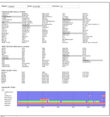
Figure 1: An overview of our web-based genome browser. Shown from top to bottom are the browser’s viewing window editor, strain selection panel, and the subspecific origin data track. The user selects a subset of genomes, which are highlighted and then displayed as tracks. The user can drag tracks within a group to reorder the display of samples. This reordering is reflected in all grouped tracks. Users can navigate the genome by manually entering positions or use the navigation buttons to zoom in and out and pan side to side across the genome. Data tracks can also be collapsed and expanded using the +/- button above each track. In the subspecific origin group the colored tracks indicate the subspecies origin of each strain.
3.
DESIGN
Our genome browser is web-based, allowing users to view and analyze multiple genomic data without a standalone application (http://msub.csbio.unc.edu). Data is stored on a server and the client side consists of only the web browser. It has been tested and works on most modern web browsers and operating systems. Tested browsers include Chromium/ Google Chrome 10.0, Firefox 3.6 and 4.0, Internet Explorer 8, and Safari 5.0. It even loads on iPhones (iOS 4.2.1). Our basic visualization techniques are similar to existing browsers and genome viewers in that separate types of ge-nomic data are represented as vertically stacked horizon-tal bars (tracks) covering a selected region of the genome. We support various navigation techniques including select-ing a region of the genome, pannselect-ing backward and forward through the genome, and zooming in and out. Clicking and dragging over any track highlights the region over which the pointer is dragged on all displayed tracks. This allows users to highlight regions of interest to easily compare between track groups. In addition, once a region is selected, a button appears to allow zooming in to the region. This allows for precise navigation to features of interest. There are also nav-igation buttons to zoom out by fixed small (two) and large (ten) ratios of the displayed window size. Panning side to side is supported by four buttons, two pan in each direction, one a short distance and one a long distance, 10% and 50% of the viewing window size, respectively. Panning small dis-tances allows the user to fine tune the display to focus on a region of interest. Further panning allows users to scan the genome for nearby features while maintaining a local frame of reference. In addition to panning and zooming, when a
point on any track is clicked, a vertical cursor line is high-lighted to allow visual alignment of features at that point. The display window may then be centered at the selected po-sition to best show the chosen feature and surrounding area. Displayed samples can be selected or deselected by clicking the strain name in the selector region. Data sets can also be individually shown or hidden depending on the analysis performed by clicking to toggle the show/hide button next to each track group.
For most data types, the displayed information can be re-trieved as a delimited text file by clicking the output button below each track. This method retrieves the underlying data for the currently selected set of active genomes and within the displayed window so that no further filtering is required. The most common datatype used by our browser is a set of possibly overlapping intervals. Intervals smaller than the viewing resolution of the browser are displayed as a density histogram. Overlapping intervals are displayed on subse-quent stacked tracks. This data representation supports a wide variety of genome annotations and allows the browser to be easily extended to novel data sets.
Our design focuses on the visualization of multiple simulta-neous components from aligned data sets. To this end, we support a multi-row display, where individual data sets are displayed as vertically stacked bars. Given the collinearity of the comparable genomes, features of interest can be visu-alized in multiple genomes simultaneously by navigating to the feature area and comparing data vertically. Intervals for various data types are displayed as horizontal colored bars across the genome, easily highlighting similarities and differ-ences between genomes by their respective color coding at a particular position. To allow users to further customize the visualization to their needs, we support dynamic recoloring of intervals for some data (Fig. 4) as well as automatic sort-ing of samples at a user-selected position (Fig. 3). These dynamic coloring and reordering tools allow comparison of features of interest by visually aligning, spatially and using color, where genomes are similar and different.
Figure 2: Mouse Diversity Array SNPs (above) and subspecific origin (be-low) shown at a fine resolution. A high density of SNPs is represented as a histogram across the genome. As the user zooms in, the histogram’s bar heights dynamically adapt to display the relative SNP densities in each genomic region. Individual SNPs are displayed as vertical ticks along the SNP track as the dis-play resolution approaches an individual base-pair. Alleles are overlayed on the track at low resolutions.
4.
IMPLEMENTATION
In traditional genome browsers, a relatively small amount of data needs to be handled at any one time. Existing browsers need only handle a single sequence. In order to visualize multiple sequences simultaneously (10s to 100s), it is impor-tant to consider methods for efficient data transfer and vi-sualization. In addition to handling multiple sequences, we also support visualization at variable scales which require
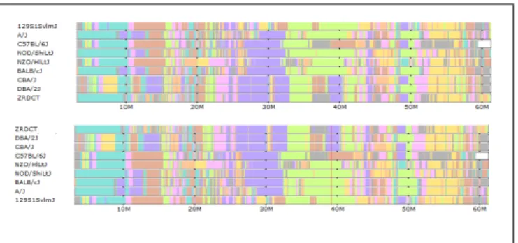
Figure 3: The top track group shows haplotype coloring with strains shown in the default order. The lower track shows this tracks after automatic sorting at the selected cursor position. Strains are sorted by haplotype at the selected position. Strains with the same haplotype are further sorted by adjacent posi-tions until all strains are distinct. All others tracks are automatically ordered to match this sorted order.
dynamic data resolution.
To support faster and more interactive visualization while dealing with remote data, our implementation loads data as needed into the page using asynchronous requests to the server. To reduce data transfer costs in memory and speed, the page is loaded once at the beginning of a session and, subsequently, raw data is loaded. Graphics rendering is han-dled in the browser so that complete images do not have to be transferred from the server. Data rescaling, panning, and drawing visualizations are all handled by the client. Asyn-chronous requests allow the tool to be used while new data are transferred.
We require a set of web-based technologies which support wide platform interoperability and dynamic client-server in-teraction. In addition, to increase ease of development and extensibility, we wanted a framework which was easy to maintain, understand, and use without having to deal with the details of browser compatibility and scripting languages like HTML and Javascript. To these ends, we used the Pyja-mas framework (http://pyjs.org), a Python implementation of the Java-based Google Web Toolkit (GWT). This frame-work allows development using the Python language while outputting browser non-specific HTML and Java- script. We used AJAX to perform asynchronous remote procedure calls to retrieve and reformat data as it is needed.
Figure 4: The default haplotype group coloring, which minimizes color transitions across the entire genome, is shown above. Below is the selected subset of strains recolored according to their displayed order. The topmost strain is assigned a single color and subsequent strains are assigned the same color where their haplotypes match the first strain. A strain is assigned a second color where it does not match the first strain and subsequent strains are assigned the color where they match the new strain but not the first. This process is repeated for all remaining strains in displayed order. This recoloring highlights the haplotype similarities over extended genomic regions (60 Mbases as shown) between the selected strains.
5.
RESULTS
We have deployed an instance of our visualization tool to aid analysis and interpretation of a recently published Na-ture Genetics paper [Yang et al., 2011]. This paper analyzes a set of 100 classical laboratory and 62 wild-derived mouse strains along with 36 wild-caught mice. The study resolves controversies regarding the subspecific origin of the labora-tory mouse and provides the first detailed view of the hap-lotype diversity in most common laboratory mouse strains. We use our tool to visualize eight different data types to aid in comparative analysis of these 198 mouse samples. We include SNPs from the Mouse Diversity Array [Yang et al., 2009] used in genotyping the mouse strains. When viewing small sections of the genome, SNPs are displayed individually as vertical bars along the track. In addition, alleles at each SNP for each strain are displayed at fine-scale resolutions overlaying the subspecific origin and haplo-type coloring tracks to allow for direct comparison (Fig. 2). At coarse-scale resolutions, the SNPs are aggregated into a histogram representing the frequency of SNPs within each small window. Known genes are displayed in a similar man-ner. Where genes overlap, they are displayed on additional stacked horizontal tracks.
Another data track of interest is subspecific origin. The genomes of classical laboratory mouse strains arose through interbreeding of pet mice from different mouse subspecies. In [Yang et al., 2011], the mosaic of each genome was deter-mined (Fig. 1, 2). Subspecies are assigned to each strain as a mosaic of intervals representingMus musculus domesticus, Mus musculus musculus, orMus musculus castaneous sub-species. Subspecies are computed using a Hidden Markov Model based on a set of diagnostic SNPs. Alleles are as-signed diagnostic status for each SNP as either fully infor-mative (common to all members of the subspecies) or par-tially informative (occuring within some members of the sub-species). SNPs for strains with unknown subspecies distri-bution are then assigned a subspecies and confidence based on the diagnostic status of that allele. The HMM is used to assign subspecies to intervals across the genome minimizing subspecies transitions. Subspecific origin is visualized as a mosaic of colored bars representing domesticus (blue), mus-culus (red), or castaneous (green) regions. At fine scales, diagnostic SNPs are shown above the subspecies assignment for each strain, the height and color of the bar representing the relative diagnostic value and implied subspecies, respec-tively.
Regions of heterozygosity are also displayed. Heterozygos-ity is displayed as a mosaic of intervals representing het-erozygous regions in addition to an individual locus-based visualization like the SNP tracks. The heterozygous block visualization is a computed track using a method similar to the subspecific origin HMM to detect contiguous heterozy-gous regions.
Genome mosaic representations, such as subspecific origins and heterozygous regions, are useful for identifying histor-ical recombinations or more recent introgressions between mouse strains. Existing laboratory and wild-derived strains are a mosaic of ancestral genomes which were subsequently inbred. Our genome browser provides the first tool for ex-ploring this genomic diversity at both coarse and fine scales. For classical laboratory strains, several more data sets are
displayed to show local variation and haplotype structure. We include a visualization of intervals which show no evi-dence of historical recombination [Wang et al., 2010] (Fig 5). This visualization is also useful in order to place other data in the context of these breakpoints, which represent possible transitions between ancestral haplotype blocks. Compatible intervals are computed using a maximal-k scan over the 100 classical laboratory strains, that is, a minimal full covering of maximally sized intervals based on the 4-gamete test. Such intervals each define a unique perfect phylogeny tree based on the set of SDPs within the interval. Intervals can overlap at most with one other interval on each side, so intervals are displayed as horizontal bars in alternating stacked horizon-tal tracks. At large scales, the interval density is displayed as a histogram.
Intervals of sequence identity are depicted as uniformly col-ored haplotypes among the subset of selected strains. Strains are divided into haplotype identity groups within each com-patible interval based on sequence similarity (see [Yang et al., 2011]). We compute intervals of identity by descent (IBD) on the fly. As we will see in the following data description, regions of IBD should correspond directly to identical hap-lotype coloring patterns.
We also support a method for exploring the extent of shared haplotypes among the selected strains by assigning unique colors to each haplotype group within each interval (Fig. 4). Initial haplotype colors are assigned to minimize total hori-zontal color transitions. When viewing only a small sample of strains, this coloring can be simplied further by changing colors only when there are haplotype group changes among the selected strains. Colors can be dynamically reassigned according to the order of the selected strains such that col-ors are assigned in descending order. The topmost displayed strains is assigned one solid color across the genome. The second strain is assigned the color of the previous strain where its haplotype is the same as the first and a second color where it is different. This process is repeated for sub-sequent strains. This has the effect of highlighting all regions where the first selected sample shares a haplotype with sub-sequent samples by using the same color. In this way, the haplotype coloring scheme can be substantially simplified for a small sample of strains allowing more intuitive analysis. A generic feature of the browser is that strain tracks can be dragged vertically to reorder their position within a track group, allowing the coloring order to be customized. A final interactive tool facilitates similarity analysis at a particular position by allowing sorting of tracks at a user-selected position. Strains can be sorted vertically according to the haplotype coloring at the selected position such that strains with identical haplotype are grouped together. In addition, strains are further sorted according to their hap-lotypes at increasingly distant positions radiating in both directions from the selected positions until either the edge of the displayed window is reached or all strains are distinct. Lastly, local phylogenetic trees can be displayed by selecting a compatible interval of interest within the genome (Fig. 5). A tree is computed within the interval based on neighbor-joining on haplotype similarity. Selected strains are high-lighted in the haplotype group they fall in, corresponding to a leaf in the tree structure. In contrast to the haplotype identity and IBD tracks, the phylogenetic trees show rela-tive differences and possible ancestral relationships between
similar haplotype groups rather than simply the group mem-bership. Strain names are colored according to their sub-specific origin to show the relationship between subspecies assignment and tree structure.
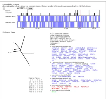
Figure 5: The compatible intervals and haplotype coloring are shown for a small region. Intervals larger than the current pixel resolution are displayed as blue bars while the density of smaller intervals is represented as a histogram. Compatible intervals are computed as maximal overlapping 4-gamete compatible regions across the genome. Such intervals have the property that no more that 2 adjacent intervals can overlap. Overlapping ”even” and ”odd” intervals are dis-played on alternating stacked tracks. A local phylogeny tree is also shown for the highlighted interval (denoted by the vertical red bar along the compatible in-terval track). The local phylogeny tree visualization includes the tree structure, size and location annotation for the interval the tree covers, the leaf descriptions including the strains in each leaf, and the distance matrix used to perform the neighbor-joining between leaves. Letters at the leaves of the phylogeny tree de-note nodes which contain strains. The leaf descriptions show the corresponding node letter, a confidence score, and number of supporting SNPs along with the set of strains in that leaf. Each strain is colored according to its assigned sub-specific origin within the tree’s interval and the strains in the currently selected subset are shown as bold.
6.
CONCLUSION
An instance of our genome browser has been deployed to visualize results of our recent publication [Yang et al., 2011] at http://msub.csbio.unc.edu. It is continually used in com-parative genome analyses of the mouse genomes presented. In the first seven months of our tool’s availability, we have had almost 1000 users make over 15,000 queries. The pri-mary use is subspecific origin analysis and analysis of the relationship between subspecific origin and other genomic features. Another specific analysis for which our tool is par-ticularly well suited is to exploit the predictive power of our local phylogeny and haplotype assignments. Local compar-ative analysis has been shown to be particularly effective in predicting disease and other phenotypic states of the avail-able set of mouse strains given the state of a small sample. There are many technical as well as structural improvements that can be made in the future to make our browser more useful, general, and effective. To allow a larger range of users and wider adoption, we need to improve the ease of extensibility by, for example, adding a simple web-based in-terface for adding and designing visualizations for new data within the existing framework. We present a specific data set here, but our browser is suitable to other organisms and other data to support the same type of multiple genome and sub-population comparative analysis. A more fundamental
improvement we would like to make is to address local in-sertions, deletions, repeats, and other regions where com-parable genomes are not strictly collinear. Even samples of the same and very similar subspecies can have small scale copy-number variations. Assessing these differences is an important part of local haplotype and phylogeny analysis.
7.
ACKNOWLEDGEMENTS
Funding provided by Center for Genome Dynamics (NIH GM 076468 awarded to Jackson Laboratory) and NSF project grant “Visualizing and Exploring High-dimensional Data” (NSF ISS 0534580)
8.
REFERENCES
[Altschul et al., 1990] Altschul, S., Gish, W., Miller, W., Myers, E., and Lipman, D. (1990). Basic local alignment search tool.
Journal of Molecular Biology, 215:403–410.
[Brodie et al., 2004] Brodie, R., Roper, R., and Upton, C. (2004). Jdotter: A java interface to multiple dot plots generated by dotter.Bioinformatics, 20(2):279–281. [Dombrowski and Maglott, 2002] Dombrowski, S. and Maglott,
D. (2002).The NCBI Handbook. Ch 20. Using the Map Viewer to Explore Genomes.National Center for Biotechnology Information.
[Frazer et al., 2004] Frazer, K., Pachter, L., Poliakov, A., Rubin, E., and Dubchak, I. (2004). Vista: computational tools for comparative genomics.Nucleic Acids Research, 32(Web Server issue):W273–9.
[Hubbard et al., 2002] Hubbard, T., Barker, D., Birney, E., Cameron, G., Chen, Y., Clark, L., Cox, T., Cuff, J., Curwen, V., Down, T., Durbin, R., Eyras, E., Gilbert, J., Hammond, M., Huminiecki, L., A., K., Lehvaslaiho, H., Lijnzaad, P., Melsopp, C., Mongin, E., Pettett, R., Pocock, M., Potter, S., Rust, A., Schmidt, E., Searle, S., Slater, G., Smith, J., Spooner, W., Stabenau, A., Stalker, J., Stupka, E., Ureta-Vidal, A., Vastrik, I., and Clamp, M. (2002). The ensembl genome database project.Nucleic Acids Research, 30(1):38–41.
[Kent et al., 2002] Kent, W., Sugnet, C., Furey, T., Roskin, K., Pringle, T., Zahler, A., and Haussler, D. (2002). The human genome browser at ucsc.Genome Research, 12:996–1006. [Krzywinski, 2009] Krzywinski, M. e. a. (2009). Circos: an
information aesthetic for comparative genomics.Genome Research, 19:1639–1645.
[Skinner et al., 2009] Skinner, M., Uzilov, A., Stein, L., Mungall, C., and Holmes, I. (2009). Jbrowse: A next-generation genome browser.Genome Research., 19:1630–1638.
[Stein et al., 2002] Stein, L., Mungall, C., Shu, S., Caudy, M., Mangone, M., Day, A., Nickerson, E., Stajich, J., Harris, T., Arva, A., and Lewis, S. (2002). The generic genome browser: A building block for a model organism system database.
Genome Research, 12:1599–1610.
[Wang et al., 2010] Wang, J., Moore, K., Zhang, Q., Pardo-Manuel de Villena, F., Wang, W., and McMillan, L. (2010). Genome-wide compatible snp intervals and their properties.Proceedings of ACM International Conference on Bioinformatics and Computational Biology.
[Yang et al., 2009] Yang, H., Ding, Y., Hutchins, L.,
Szatkiewicz, J., Bell, T., Paigen, B., Graber, J., de Villena, F., and Churchill, G. (2009). A customized and versatile high-density genotyping array for the mouse.Nature Methods, 6:663 – 666.
[Yang et al., 2011] Yang, H., Wang, J., Didion, J., Buus, R., Bell, T., Welsh, C., Bonhomme, F., Yu, A., Nachman, M., Pialek, J., Tucker, P., Boursot, P., McMillan, L., Churchill, G., and Villena, F. (2011). Subspecific origin and haplotype diversity in the laboratory mouse.Nature Genetics, in press.