Usable Security and E-Banking:
Ease of Use vis-à-vis Security
Data collected in an evaluation of six Danish
web-based electronic banking systems
(DRAFT)
Morten Hertzum, Niels Christian Juul, Niels Jørgensen, Mie Nørgaard.
Roskilde University, Denmark
Table of Contents
Preface...3
Introduction...4
How to read the tables...4
Browser messages...5
Heuristics...6
A taxonomy of ease-of-use problems in e-banking...7
PC and browser configuration...8
Installation...11
Danske Bank...11
Nordea...14
Jyske bank...17
Skandiabanken...20
Sydbank (certificate solution)...23
Sydbank (“key card” solution)...26
Basisbank...31
Summary of tables...34
Every day log on...36
Danske Bank...36
Nordea...38
Jyske bank...40
Skandiabanken...41
Sydbank...44
Basisbank...47
Log off...50
Danske bank...50
Nordea...52
Jyske bank...54
Skandiabanken...56
Sydbank...58
Basisbank...60
Money transfer...61
Danske Bank...61
Nordea...64
Jyske bank...66
Skandiabanken...68
Sydbank...70
Basisbank...72
Weak passwords...74
Danske Bank...74
Nordea...78
Jyske bank...80
Skandiabanken...81
Sydbank...83
Basisbank...85
References...86
Preface
This report contains data collected in an evaluation of six Danish web-based electronic banking
systems.
The report supplements an academic paper in which we interpret and discuss the evaluation results
and motivate the method used to obtain them:
Hertzum et al. Usable Security and E-banking: Ease of Use vis-à-vis Security. Proceedings of
OzCHI 2004, Wollongong, Australia.
The data was collected during June-August, 2003, and the draft version of the present report was
completed November 17, 2004.
Introduction
The evaluation comprised four tasks that a user of an e-banking (web-based electronic banking)
system must or is like to carry out: installation, log on, log off, and money transfer. In addition we
tested the systems' response to weak passwords.
The remainder of this introduction explains how the read the tables in which the evaluation results
are presented, and describes the hardware and software configuration of the PC used for the
evaluation.
How to read the tables
The walk-throughs are documented in tables of four or five columns. The columns are as follows:
1. column shows the number of the current page to reveal if any pages are revisited. For brewity,
we record the display of a window displaying a standard browser message using the
abbreviation "Security alert", "Security warning", or "Security warning". These three types of
messages are described below in the section Browser messages.
2. column holds the information offered by the system. Text shown in italics is the original text in
Danish as offered by the system. If an English term is not followed by an italized (ie. Danish)
term, the system has offered the English term.
3. column describes the correct user-action on the current page.
4. column holds the heuristic evaluation (HE) comments. The comments are based on a set of 12
heuristics presented below in the section Heuristics.
5. column holds the number of the category in which we put the problem. The categories are
defined in the section A taxonomy of ease-of-use problems in e-banking. (Only problems found
during walk-through of the installation task were assigned categories).
After each table we add a few illustrative screen dumps as examples and some additional HE
comments – usually more general ones regarding the system as a whole.
Browser messages
During the walk-throughs some of the system responses come from the browser. Please note that
these messages are not part of the Internet banking system itself, but may be believed so by the
novice user. The messages from the browser are not counted as independent pages in the tables
below. The page number in the table refers to the system page on which the message pops up. The
following three types of messages are generated by the browser:
“Security alert” is used to describe the browser
message: “Security alert: You are about to view
pages over a secure connection. Any information you
exchange with this site cannot be viewed by anyone
else on the Web”. Which includes the check box: “In
the future, do not show this warning” and the
buttons: “OK” and “More info”. When leaving a
secure connection the browser will provide a similar
message.
“Security Warning” describes a browser pop-up
message such as: “Security warning: Do you want to
install and run “
C:\DOCUME~1\INF-M_~1\LOCALS~1\Temp\JVMD0.tmp
” signed on an
unknown date/time and distributed by: Bankernes
EDB Central. Publisher authenticity verified by
VeriSign Class 3 Code Signing 2001-4 CA. Caution:
Bankernes EDB Central asserts that this content is
safe. You should only install/view this content if you
trust Bankernes EDB Central to make that assertion.
SIGNED WITH PERMISSIONS – Full permissions.”.
The message includes the check box such as:
“Always trust content from Bankernes EDB Central”
and the buttons “Yes”, “No” and “More info”.
“Security information” describes the browser
message such as: “Security information. This page
contains both secure and non secure items. Do you
want to display the non secure items?” The message
includes the buttons: “Yes”, “No” and “More info”.
The browser messages inform the user that danger lies ahead, for example, that his actions may
cause him to loose data. Therefore, the system's misuse of a warning sign be regarded as a
usability problem, and will mentioned in the tables below. One browser message may cause
several usability problems. We have, however, chosen to count each browser message as one
whole problem. In the final count (see “Summary of tables” below) one browser message thus
equals one usability problem each time it appears in a sequence.
Illustration 1 Browser pop-up message: Security
Alert.
Illustration 2 Browser pop-up message: Security
warning.
Illustration 3 Browser pop-up message: Security
information.
Heuristics
As mentioned above we estimate breakdowns and problems on the basis of a collection of
heuristics. Heuristics 1, 2, 3, 4, 5, 6, 7, and 8 are sampled from Nielsen and Molich (1990).
Heuristics 3, 4, 5, 8, 9, 10, and 11 are sampled from Shneiderman (1998). Finally we added one
heuristic, Heuristic 12, that we find could be of importance to our main goal. Thus we make our
usability evaluation on the basis of the following heuristics:
No. Heuristic
How we use the heuristic in the investigation
1
Simple and
natural dialogue
Dialogues should not contain irrelevant or rarely needed information.
Every extraneous unit of information in a dialogue competes with the
relevant units of information and diminishes their relative visibility.
All information should appear in a natural and logical order.
2
Speak the user's
language
The dialogue should be expressed clearly in words, phrases and
concepts familiar to the user rather than in system oriented terms or
specific terms used in banking circles
.
3
Minimize user
memory load
The user should not be required to remember information from
previous sites or tasks. Neither should he be obliged to remember
predefined codes.
4
Be consistent
Consistent sequences of actions should be required in similar
situation; identical terminology should be used in prompts, menus etc.
Consistency in colour, fonts layout etc. should also be employed.
5
Provide
informative
feedback
For every action there should be a system feedback. For instance
when logging off the user should receive information that he has
indeed succeeded in doing so.
6
Provide clearly
marked exits
A system should never capture users in situations that have no visible
escape. Users often choose system functions by mistake and will need
a clearly marked “emergency exit” to leave the unwanted state
without having to go through an extended dialogue.
7
Good error
messages
Reading an error message should enable the user to correct the error
rather then just informing him that an error has occurred.
18
Offer error
prevention and
simple error
handling
The system should preferably be designed so that users cannot make
errors. For example by preferring menu selection to form fill in.
9
Permit easy
reversal of
actions
As much as possible actions should be reversible. This feature
relieves anxiety since the user knows that errors can be undone thus
encouraging unfamiliar options.
1The heuristic about error messages is relevant only for the evaluation of the systems' response to
weak passwords (see the chapter Weak Passwords). During the remainder of the evaluation we
behaved “correctly” and did not trigger error messages. Note also that the browser messages
discussed above in section Browser Messages are warnings, not error messages.
10
Design dialogs to
yield closure
Sequences of actions should be organized into groups with a
beginning, middle and end. The informative feedback at the
completion of a group of actions gives users the sense of
accomplishment and satisfaction with the system such as( when
making a money transfer) the system e.g. informs: “Finally you need
to sign the order to transfer the amount”.
11
Support internal
locus of control
Experienced operators strongly desire the sense that they are in charge
of the system and that the system responds to their actions. Make
users initiators of actions rather than responders to actions. With
regard to this heuristic we do accept that a system such as an
e-banking system to some extent demands user response such as signing
in with a password. We do find however that e.g. browser pop-up
messages or pop-up windows that close automatically are in conflict
with this heuristic.
12
Provide
sufficient and
easily accessible
help
The system should provide the user with the possibility to obtain
thorough and sufficient help whenever it is needed. This could be as
e.g. examples of how to fill in dates or how to create a strong
password.
A taxonomy of ease-of-use problems in e-banking
The following table defines four categories of use problems. The categories group
ease-of-use problems according to how they may be fixed eg. easily or only at the cost of weakening
security.
Name
Definition
Fixable but
security-related
An aspect of the user interface that reduces ease of use, but where
modifying this part of the interface would weaken security.
Straightforwardly
fixable
Ease-of-use deficiences that we believe can be fixed without weakening
security or introducing other problems.
Platform-related
Ease-of-use problems that are due to the underlying platform, for
example browser pop-up messages that may confuse the user and which
are outside of the direct control of the bank.
Undue simplification
Ease-of-use problems likely to be experienced by the more informed
user, who may be rightly confused if the user interface describes distinct
features by the same name, for example both password and private key
by the name "code".
Fixable but security-related ease-of-use problems include authentication mechanisms that require
the user to remember a randomly generated eight-character password, where the use of a more
easily remembered password would weaken security.
Straightforwardly fixable ease-of-use problems include confusing terminology such as labelling
the button that a new user must press "Functions" rather than "New user", and where choosing the
more user-friendly label seems seems not to have no undesirable consequences. The category also
includes the use of different phrases such as "code" and "password" to denote the same item,
something that can be fixed simply by using a consistent terminology.
Platform-related deficiencies originate from the underlying software and as such, cannot be fixed
by changing the bank's software. For example, the browser pop-up message "Security alert" is
shown by the browser used on our test machine when a session that uses a secure socket
connection is invoked by some user action. Possible solutions to platform-related deficiencies
include:
•
Eliminate whatever triggers the platform-related deficiency. For example, omit the use of a
secure socket connection to eliminate the "Security alert" message. This solution radically
challenges the whole idea of using the Internet as an infrastructure, and is discussed in more
detail in ..
•
Encourage the user to read a text that explains the relevant browser messages etc. prior to
performing the installation. The benefit of this approach is to provide the user with an
opportunity to obtain some degree of understanding of the security issues related to her use of
the Internet banking system. The difficulty is that many users may simply choose to omit the
reading and studying of such general, explanatory material.
•
Provide on-the-fly explanation of the browser messages, for example "Next a pop-up message
will appear saying that .. This means that .. You may safely ..". This solution may be difficult to
implement, because different platforms (ie. combinations of browsers, versions, etc.) may give
rise to different browser messages. Realistically, only a few, common platforms can be covered.
If implemented, this type of solution should probably include an option for short-cutting the
explanatory messages altogether, since when first read and understood, repeating them at
subsequent sessions is irrelevant and increases the number of steps the user must go through.
Undue simplification is distinct from the other types of deficiencies because it may reduce the
amount of complex terminology presented to the user, and so in some sense facilitates ease of use.
When we label a feature or aspect of the user interface as belonging to this category, it reflects our
point of view that it is desirable that the user is assisted in building some minimal level of
understanding of the relevant, basic security issues, such as the distinction between a private key
stored on hardware and a password remembered by the user. Moreover, the informed user who
already understands eg. the password/key distinction is likely to be confused if the interface
describes them as if they were the same.
PC and browser configuration
The PC used for the evaluation was equipped with a Pentium III 866 MHz processor with
Windows 2000 and the browser Internet Explorer 6.0. The Internet was accessed via a broadband
connection.
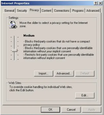
The browser's security settings are set to “Custom” and the privacy to “Medium” (see Illustration
1).
Illustration 4 Browser security settings. The settings concerning
cookies are set to medium.
The Browser is set to prefer English (see Illustration 2).
Illustration 5 Browser language settings. The
browser prefers English to Danish.
Illustration 6 The advanced browser security settings.
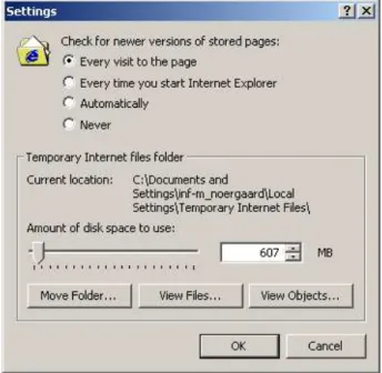
The browser always check for newer versions of pages (see Illustration 4).
Illustration 7 The browser always checks for newer
versions of the page
Finally, the browser's auto complete feature was used for web addresses, forms and user names
and addresses on forms.
Installation
The installation task in each e-bank is described in a separate section. Each section contains the
subsections “Intent”, “Steps and actions”, “Examples”, and “Additional comments”. The
subsection "Steps and actions" contains the core data in the form of a table. These four subsections
will reappear in subsequent chapters as well, to describe the other tasks.
However, since the installation of an Internet bank is for most solutions the largest and most time
consuming task, installation is described also by means of two additional paragraphs: The
paragraph “Preconditions and available Instructions” lists the items and information provided by
the bank in order to make the installation possible. This is information such as pin code and initial
password. The paragraph “Information vs. instruction” comments on the level of information,
whether it be in the form of instructions or thorough information.
The overall structure of the subsections describing the installation sequences is thus: “Intent”,
“Preconditions and available Instructions”, “Steps and actions”, “Examples”, “Information vs.
instruction” and “Additional comments”.
Danske Bank
Intent:
To run Danske Netbank for the first time (24.6.2003).
Preconditions and available Instructions:
Before the installation Danske bank provides the user with:
1. a letter including a 4 digit pin code,
2. a letter including a 6 character agreement number and
3. an instructional pamphlet.
The information enclosed in the pamphlet is however neither sufficient nor correct. The
information is very general, but Danske bank makes a fine attempt to explain basic system features
in a user friendly manner. Since the pamphlet is incorrect we have not used it's instructions in the
following sequence.
Steps and actions:
Pp
System information/actions
User actions
Breakdowns or small
problems
Problem
category
1 www.danskebank.dk
Several menu buttons including “Log on”
Click on button “Log on” Not natural language – the user cannot log on – he is not yet initialized
2 1
Scroll menu unfold several links including
“Danske Netbank”
Click on “Danske Netbank”
1 Browser pop-up message: “Security alert” “OK” is clicked, check box left unchecked
The language is not user friendly and may leave the user worried
3 No sense of internal locus of
control 3
2
Title: “Log on”(“Danske bank log-on”
) Fields: “Agreement number” and “Password” (“Aftalenummer” and “Kodeord”)Buttons: “OK”, “Cancel” and “Functions” (“OK”,
“Annuller” and “Funktioner”)
Click “Functions” The term “Functions” is not
natural dialogue 2 The feedback is not very
2 A scroll menu unfolds:
“New agreement”, “New pin code”, “Change password”,
“Recreate key”, “Delete key”, “Save key”, “Key on floppydisc”(“Ny aftale”, “Ny pinkode”, “Skift
kodeord”, “Gendan nøgle”, “Slet nøgle”, “Gem nøgle”, “Nøgle på diskette”)
Choose “New agreement” The term “New user” should be preferred to “New agreement” according to the request for natural dialogue
2
The term “key” may not be
user language 2
No help is offered 2 3 Pop up message:
Title: “New agreement” (“Ny Aftale”)
Fields: “Agreement number”,“Pin code”,
“New password”, ”Confirm new password”
(“Aftalenummer”, “Pinkode” , “Nyt
kodeord”, “Bekræft nyt kodeord”
) Buttons: “OK”, “Cancel” (“OK”, “Annuller”)Fill in fields and press “OK”
Though the system do hold information about how to create strong passwords this information is not accessible from page 3. This fact may cause the user mental overload
2
The user needs to fill in 2 fields with codes the bank has provided for him. This causes a heavy memory load
2
4
Title: “Information” (“Information”
) Text: “Danske Bank has updated your key. You should save a copy. Do you wish to save a copy now?” (“Danske Bank har opdateret din nøgle. Du bør derfor snarest tage en sikkerhedskopi. Ønsker du at tage en sikkerhedskopi nu?”)Buttons: “Yes” and “No”
Click “Yes” Terminology is inconsistent (mixes Danish and English terms)
3 The text holds difficult
security terms which are not
explained 1
5 Pop up message: “Save as” (“Gem som”) A default path is shown in the field
Accepts default path A path name may not be
user's language 3 6 Pop up message:
Text: (warning sign ) “Information. The task is correctly fulfilled” (“Information. Funktionen er korrekt
gennemført”)
Button: “OK”
Click “OK” The warning sign does not fit
the text 2
Which task (the Danish text uses the word funktion (function)) is the text referring to? Not a simple dialogue
2
7 Title: “View of account” (“Kontooversigt”)
Text: “This is your first log on” (“Det er første gang du
logger på netbanken”)
The welcome text is easily missed which results in a bad
closure 2
Examples:
Information vs. instruction:
The information level is at an instructional level.
Additional usability comments:
1. No examples are available to the user.
2. The system offers no way for the user to exit but to log out of the entire system or use the
backtracking possibilities provided by the browser.
Illustration 8 Screen dump of the message on
page 3. The user has to fill in agreement
number, pin code and new password (x2).
3. Help is very limited. The system does provide some extent of advice regarding the creation of
strong passwords. It may, however, not be sufficient.
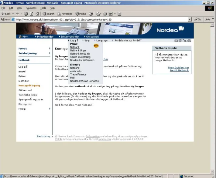
Nordea
Intent:
To run Nordea Netbank for the first time (23.6.2003).
Preconditions and available Instructions:
Nordea provides the user with
1. one letter including a 4 digit pin code,
2. a letter including a 10 digit agreement number (which is not similar to the account number) and
3. a third letter which includes a few instructions about how to get the installation started. These
instructions are however not sufficient nor entirely correct.
Steps and actions:
Pp
System information/actions
User actions
Breakdowns ( ) or small
problems
Problem
category
1
www.nordea.dk
Several menu buttons including “Private customers” (“Privatkunder”)
(A letter from the bank instructs the user
to chose “Internet Bank” (“Netbank”)
followed by “Get started” (“Kom godt
igang”))
Click menu button:
“Private customers”
Neither button “Netbank” nor
“Kom godt igang”exists on
www.nordea.dk
No help is offered
There is no logic in using the label “Private customers”
2 2 2
2 Title: “Private” (“Privat”)
Text: A side menu with 11 buttons including “Self service” (“Selvbetjening”).
Click “Self service” There is no apparent logic in using the label “Self service” - everything the user does on a web page could be labeled “Self service”
2
2 Scroll menu unfolds 10 buttons including “Internet Bank” (“Netbank”).
Click “Internet bank”
(At this point the user
recognizes
the instructions from the letter)2 Scroll menu unfolds 10 buttons including “Get started” (“Kom godt igang”)
Click “Get started” 3 Title: “Get started” (“Kom godt igang”)
Text: (excerpt) “Under “Internet bank” you will choose “log on” followed by “new user”. On the page “new user” you have to fill in agreement number, user name (e.g. your own name) and your five digit pin code. Hereafter you choose your personal password” (“Under punktet Netbank skal
du vælge Log på og derefter Ny Bruger. I det billede, der hedder Ny Bruger, skal du taste dit aftalenummer, brugernavn (fx. Dit navn) og din femcifrede pinkode. Herefter vælger du dit personlige kodeord.”)
Click “Log on” The amount of text is rather large and covers many different types of information.
The explanation of the many following steps may cause an increased memory load.
The term Log on does not cover the action about to take place (installation). It causes confusion that this button does not open the actual log on site.
2 2 2
3 Browser pop-up message: “Security alert” “OK” is clicked, check box left unchecked
The language is not user friendly and may leave the user worried No sense of internal locus of control
3 3 4 Title: “Internet bank” (“Netbank”)
Side menu includes button: “New user” (“Ny
bruger”)
Click “New user” Help offers the opportunity to make a search among issues related to logging
5 Title: “New user” (“Ny bruger”) Fields: “Fill in agreement number”, “Fill in username”, “location of key” (“Indtast
aftalenummer”, “Indtast brugernavn” , “Sikkerhedsnøgle placering”)
Button: “Browse” (“Gennemse”) Fields: “Fill in pin code”, “Fill in personal password”, “Repeat personal password”, (“Indtast
pin kode”, “Indtast personligt kodeord”, “Gentag personligt kodeord”)
Buttons: “Log on”, “Cancel” (“Log på”,
“Annuller”)
Fill in fields Click “Log on ”
The term “key” (which in the Danish text actually says “Security key” is not user friendly language)
Some confusion concerning “user name” - how is it different from a password?
The user have to fill in two codes which are issued by the bank and cause him a heavy memory load.
2 2 1
5 Pop-up message: (warning sign) “Your key will be generated when pressing ok. This may take several minutes.” (“Din sikkerhedsnøgle vil blive genereret
ved trk på ok. Vær opmærksom på at det kan tage flere minutter.”)
Button: “OK” (“OK”)
Click “OK” The warning sign is not appropriate for this kind of message
The term “key” (which in the Danish text actually says “Security key” is not user friendly language)
2 2
6 Title: “Kontooversigt” (“view of account”) Text: “Velkommen NN” (“welcome NN”)
Examples:
Illustration 9 The many scroll menus on page 2. Note that there is a "Log on" buttonin
addition to "Get started" in the last menu.
Information vs. instruction:
Nordea Netbank provides the possibility to obtain general information and ensures understanding
by displaying a variety of links and search fields. The search engine lets the user search between
issues relating to the current task which to the novice user is a great help.
Additional usability comments:
1. The system offers an explanation of various difficult security expressions and provides
examples of strong passwords. However the user is not presented with all of these explanations
and may have to seek out this information by himself by using for instance the help function.
2. The system fails to provide easy reversal of actions as well as presenting obvious exits.
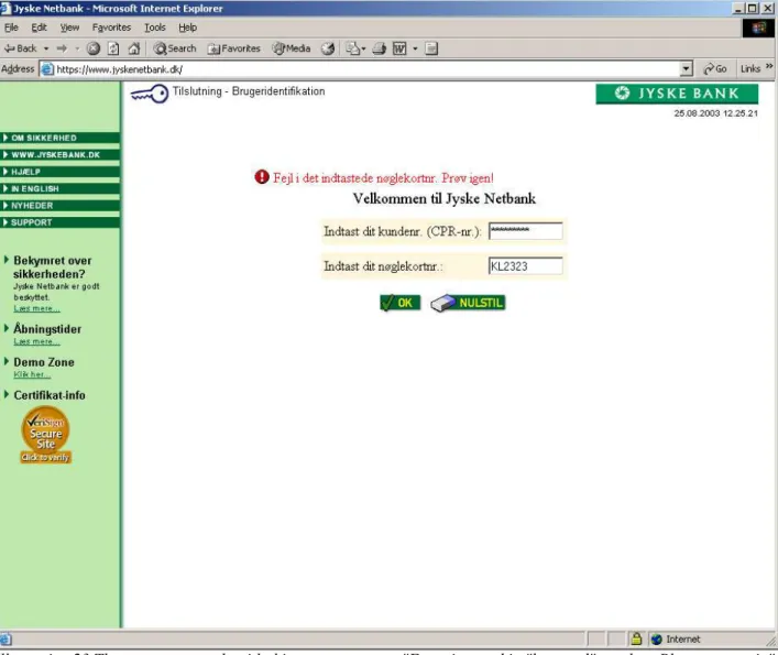
Jyske bank
Intent:
To run Jyske Netbank for the first time (6.6.2003). Jyske Netbank uses a "key card" (see picture
below) and there is not installation procedure. The procedure the user must go through to run Jyske
Netbank for det first time is exactly the same as for every-day log on.
Preconditions and available Instructions:
Initially, Jyske bank has provided the user with:
1. a letter including the “key card” (see picture below) and
2. limited written instruction on how to use it.
Steps and actions:
Pp
System information/actions
User actions
Breakdowns ( ) or small
problems
Problem
category
1 www.jyskebank.dk
Several menu buttons including “Begin Jyske Netbank” (“Start Jyske Netbank”)
Click on menu button “Begin Jyske Netbank”
1 Browser pop-up message: “Security alert” “OK” is clicked, check box left unchecked
The language is not user friendly and may leave the user worried No sense of internal locus of control
3 3 2 Title: “Log on and user identification”, “Welcome to
Internet bank” (“Tilslutning og brugeridentifikation”,
“Velkommen til Netbank”)
Fields: “Fill in customer number (social security number)”, “Fill in key-card number” (“Indtast dit
kundenr. (CPR-nr.)”, “Indtast dt nøglekortnr.”)
Buttons: “OK”, “Reset” (“OK”, “Nulstil”)
Fields are filled in “OK” clicked
For the novice or elderly user the “key card” can be difficult to use. There is a lot of numbers in a rather small font which may
cause problems 1
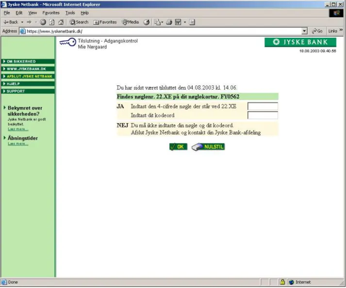
3 Title: “Log in and access control” (“Tilslutning og
adgangskontrol”)
Text: “Does key number 17.ME figure on your key-card number XXXXXX?” (Findes nøglenr. 17.ME på dit
nøglekortnr. XXXXXX?”)
Fields: “Yes. Fill in the 4 characters of the key at 17.ME”, “Fill in password”, “No. Do not fill in your key and password. Log out of Jyske Netbank and contact your branch of Jyske Bank ” (“Ja. Indtast den 4-cifrede nøgle
der står ved 17.ME”, “Indtast dit kodeord”,“Nej. Du må ikke indtaste din nøgle og dit kodeord. Afslut Jyske Netbank og kontakt din Jyske Bank afdeling”)
Buttons: “OK”, “Reset” (“OK”, “Nulstil”)
Key and password are filled in
“OK”, is clicked.
For the novice or elderly user the “key card” can be difficult to use. There is a lot of numbers in a rather small font which may cause problems
The user has to remember a password which causes some memory load
1 1
Illustration 11 This is what the “key card” looks like. It measures the
size of a credit card. Picture from www.jyskebank.dk.
4 Title: “Accounts and payments” (“Konti og betalinger”) Text: “If necessary press authorization to see which accounts you hold authority” ( “Tryk evt. på fuldmagt for
at se hvilke konti du har fuldmagt til”)
Left menu includes the button “Authorization” (“Fuldmagt”)
Menu button “Authorization” is clicked
No accounts are shown at this page even though the title clearly suggests it. The result is confusing and disturbing. This step seems unnecessary and the user may wonder why he has to take additional actions in order to view his accounts.
The menu button “Authorization” is not clearly marked.
2 2 2
5 Title: “View of accounts” (“Oversigt over konti”) The accounts are shown.
Lack of closure.
2
Examples:
Information vs. instruction:
The system offers no other introduction or information but the content of the web page. The
system prefers to provide clear instructions and not understanding or thorough information. The
user can obtain thorough information about specific security issues such as certificates but this
information is however not on a novice level and very poorly marked in the menus.
Additional usability comments:
1. The user can obtain thorough and sufficient help using the “Help” button. Help includes many
illustrative examples but is unfortunately not clearly marked.
2. As for easy reversal of actions the system offers a reset button in an attempt to prevent the user
from using the browser navigation.
3. If using the browser backtracking abilities the user will (rather confusingly) be returned to the
front page.
Skandiabanken
Intent:
To open Skandiabank Netbank for the first time (12.6.2003).
Preconditions and available Instructions:
Before the installation Skandiabanken has provided the user with:
1. one letter including an 8 character pin code and
2. a letter including an 11 digit user number (which is similar to the account number).
The last letter refers to an on line “step-by-step guide” to installation.
Steps and actions:
Pp
System information/actions
User actions
Breakdowns ( ) or
small problems
Problem
category
1 www.skandiabanken.dk
Menu includes button “Internet bank” (“Netbank”)
“Internet bank” is clicked
2 Title: “Welcome to Internet bank” (“Velkommen til
Netbank”)
Menu includes text/button “...is it the first log on click here”, (“...er det første gang, så klik her”)
“...is it the first log on click here” is clicked
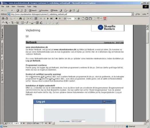
3 Adobe Reader opens “Guide to installation” (“Vejledning”)
Adobe reader is closed “Guide to installation” is difficult to use unless in printed version. The text holds too much information only to be read from the screen, and may cause a heavy mental load It may send the signal, that installation is complicated and difficult
2 2
2 Title: “Welcome to Internet bank” (“Velkommen til
Netbank”)
Menu includes button “Log on Internet bank”,
(“Log på netbank her”)
Click “Log on Internet bank”
The language does not correspond with the attempted
action: installation 2
2 Browser pop-up window: “Security alert” “OK” is clicked and check box left unchecked
The language is not user friendly and may leave the user worried
No sense of internal locus of control
3 3
3 Browser pop-up window: “Security warning” “Yes” is clicked and check box left unchecked
Language is not user friendly Warning sign is in contrast with content.
No sense of internal locus of control
3 3 3
3 Title: “Log on” (“Log on”) Field: “Fill in user number” (“Indtast
brugernummer”)
Check box: “Remember user number” (“Husk
Brugernummer”)
Button: “OK” (“OK”)
User number filled in leaving check box unchecked Click “OK”
The user has to fill in a user number which increases mental memory load
4 Title: “Log on” (“Log on”)
Radio button: “Go on line with the bank” (“Gå
online med banken”)
Fields: “Password”, “Signature file” (a field proposes a default path to the “signature file”. Additionally there is a “view” button) (“Underskriftskode”, “Underskriftsfil”) Radio button: “I have received a pin code from the bank. Create a new signature file” (“Har modtaget
pinkode fra banken. Dan ny underskriftsfil”)
Buttons: “OK”, Return” (“OK”, “Retur”)
Click radio button “I have received a pin code from the bank. Create a new signature file”
Click “OK”
No examples of how to create strong passwords.
Using the expressions
“Uderskriftskode” and “Underskriftsfil” for password
and key may cause problems to the novice user who cannot distinguish between the two. Furthermore the terms -especially signature file - are not “The user's language”
1 1
5 Log on site:
Fields: “Pin code”, “Repeat pin-code”, “New password”, “Repeat new password”, “Path to the signature file” (a default is proposed. Additionally there is a “view” button), “Name of “signature file” (“Pinkode”, “Genindtast pinkode”, “Ny
underskrift”, “Genindtast ny underskrift”, “Sti til underskriftsfil”, “Navn på underskriftsfil”)
Buttons: “OK”, “Return” (“OK”, “Retur”)
The 4 fields are filled in correctly
“OK” is clicked using the default path
The pdf- file “Guidance” offers very limited information about how to create a strong password
The expressions “path” and “signature file” are not necessarily “The user's language”
There is an inconsistent use of “Signature” and “Signature code” (“Underskrift” and
“Underskriftkode”)
The user has to fill in the pin code which increases the mental memory load
2 3 2 1
6 Blank page.
Text: “Generating key” in lower left corner of the browser window
No user action required. Next window pops up automatically
Poor feedback. Lack of internal locus of control
Nor user's language
2 2 2
5 Short re-appearance of page 5 No user action required. Page closes automatically after ½ a sec.
Poor system feedback No internal locus of control
2 2
7 Title: “View of accounts” (“Kontooversigt”) Lack of closure – there is no
“welcome message” 2
Information vs. instruction:
The system provides a printable guide through the entire installation. It generally prefers
instruction as opposed to understanding and thorough information (e.g. “Guidance” and
“Instructions”).
Additional usability comments:
1. Help is accessible from the top of every page, but it may not be sufficient since the user has to
search within various help topics or FAQs.
2. The only options to reverse actions or exit from a task are provided by the browser. However if
using the browser navigation to backtrack the user is returned to the initial page “Welcome to
the Internet bank”. This may be confusing system feedback.
Illustration 14 Screen dump of page 3. The guide to installation is full of useful
examples. Unless it is printed out on paper it is however useless since the user clearly
cannot remember 4 pages of information.
Sydbank (certificate solution)
Intent:
To open Sydbank Netbank (using the certificate solution) for the first time (15.6.2003).
Preconditions and available Instructions:
Before installation Sydbank has provided the user with:
1. a letter including an 8 character user number (which is different from the account number) and a
8 character password.
The user has provided Sydbank with an initial phrase (max. 10 characters) which is to be used
instead of a pin code.
Steps and actions:
Pp
System information/actions
User actions
Breakdowns ( ) or
small problems
Problem
category
1 www.sydbank.dk
Menu buttons include “Start Internet bank” (“Start
Netbank”)
Click “Start Internet bank” Navigation is difficult. One button is called “Gammel
Netbank” (“old Internet
bank”) and another “Start
Netbank” (“Start Internet
bank”). Both are difficult to find.
2
1 Browser pop-up message: “Security alert” Click “OK” The language is not user friendly and may leave the user worried
No sense of internal locus of control
3 3
1 Browser pop-up message: “Security information” Click “Yes” Language is not user friendly No sense of internal locus of control
3 3 2 Title: “Welcome” (“Velkommen”)
Text: “If this is first time you use the new Internet bank it may be to your advantage to view our introduction which can be found under “Get started”” (“Hvis det er første gang, du skal til at bruge den nye
NetBank, kan det være en fordel at gennemgå vores introduktionsforløb, som du kan finde under "Kom godt i gang””)
Menu buttons include “Get started” (“Kom godt
igang”)
Click “Get started”
2 Scroll menu presents a choice between: “Introduction and technical issues”, “Signing up”, “Get started” and “Investment” (“Introduktion og
teknik”,”Tilmelding”, “Kom godt igang” and “Investering”)
Click “Get started” Clicking ”Get started” reveals a new button called “Get started”. In this case there should not be consistency between these two labels
2
3 Title: “Get started” (“Kom godt igang”) Text: (A flash presentation of the Internet bank.) Fields: “User number” and “Password” (“Brugernummer” and “Kodeord”) Buttons: “Log on” and “Help” (“Log på” and
“Hjælp”)
Fill in user number and disposable password Click “Log on”
Initially the two fields are difficult to spot Terminology can be confusing. “Password” (“Kodeord”) may suggest to the user a personal password but in this case it is a disposable password from the bank
User has to fill in two codes provided by the bank – this causes increased memory load
2 1 1
4 Title: “Welcome -> change password -> read certificate .-> accept terms” (“Velkommen-> skift
kodeord -> indlæs certifikat -> accepter vilkår”)
Text: “During this log on you will have your “security solution” to Sydbank opened. Hence the sequence is somewhat different from the ordinary one” (“Ved
denne pålogning skal du have åbnet din sikkerhedsløsning til Sydbank. Forløbet er derfor noget anderledes end det normalt vil være”)
Buttons: “Continue” and “Cancel” “Fortsæt”and
“Afbryd”
Click “Continue” “Security solution” may not be the users language
2
5 Tilte: “Welcome -> change password -> read certificate .-> accept terms” (“Velkommen-> skift
kodeord -> indlæs certifikat -> accepter vilkår”)
Text: “Now you have to fill in your initial phrase. The initial phrase must be typed in precisely as you wrote it on the form to Sydbank” (“Du skal nu indtaste dit
mærke. Mærket skal angives præcist som du angav det på blanketten til Sydbank”)
Field: (to fill in initial phrase)
Text: “Here you need to change your password and you need to pick one which on one hand is easy to remember to you but hard to guess to others. The password should be minimum 8 characters long and preferably contain both ciphers and letters” (“Her
skal du ændre dit kodeord, og du skal vælge et kodeord, der på samme tid er let at huske for dig men svært at gætte for uvedkommende. Kodeordet skal være mindst 8 karakterer langt og helst bestå af både tal og bogstaver.”)
Fields: “Fill in new password” and “Repeat new password” (“Indtast nyt kodeord” and“Gentag nyt
kodeord”)
Buttons: “Continue” and “Cancel” (“Fortsæt”and
“Annuller”)
Fill in initial phrase Fill in password Click “Continue”
The user is required to remember his password and a initial phrase he chose minimum a fourth night ago which increases memory load
The field to fill in the initial phrase holds no way to prevent errors since the user himself chooses the length and content of the initial phrase
Lack of continuity in button terminology. “Afbryd” (previous page) and
“Annuller” are both used to
describe cancellation The system does not provide understanding for strong passwords and delivers no examples to guide the user
1 1 2 1
6 Pop-up message: “You password has been changed. The password you received from (-) cannot be used anymore however you still need to use the user number” (“Dit kodeord er nu ændret. Kodeordet som
du modtog fra (-) kan ikke anvendes mere, men du skal forsat anvende brugernummeret”)
Button: “OK” (“OK”)
Click “OK” A word is missing in the message, which results in a strange unnatural dialogue
The intent of the message is to tell the user not to throw out the paper containing both initial password and user name. However it fails to do so in an awkward dialogue that leaves the user puzzled No help is offered to understand this message
2 2 2
7 Title: “Welcome -> change password -> read certificate .-> accept terms” (“Velkommen-> skift
kodeord -> indlæs certifikat -> accepter vilkår”)
Text: “To use the Internet bank you need to load a certificate onto your PC” (“For at benytte netbanken
skal du have indlæst et certifikat på din PC”)
(Further information about certificates) “The certificate is saved on the following path” (“Certifikatet gemmes i nedenstående stiangivelse”): Field: (containing a default path)
(Additional information about certificates) Buttons: “Continue” and “Cancel” (“Fortsæt” and
“Afbryd”)
Click “Continue” A path may not be user's language
2
7 Browser pop-up message: “Security warning” Click “Yes” Language is not user friendly. Warning sign may be in contrast with content No sense of internal locus of control
3 3
8 Text: “The certificate is being read...” (“Certifikatet
er ved at blive indlæst...”)
No action is required. This window automatically turns into the next after a few seconds
Not a clear response from the system. The page is almost identical to page 6 Lack of locus of control
2 2 9 Title: “Welcome -> change password -> read
certificate -> accept terms” (“Velkommen-> skift
kodeord -> indlæs certifikat -> accepter vilkår”)
Text: “The certificate which you need to log onto the Internet bank has been loaded to your PC. The certificate expires (...) Now you only need to...”(more text) (“Indlæsning af certifikatet på din PC som du
skal bruge ved efterfølgende pålogning til Netbanken er nu fuldendt. Det indlæste certifikat udløber (...) Nu mangler du bare...”)
Buttons: “Continue” and “Cancel” (“Fortsæt” and
“Afbryd”)
Click “Continue” (This is the anticipated response to user actions taken in step 6)
10 Title: “Welcome -> change password -> read certificate .-> accept terms” (“Velkommen-> skift
kodeord -> indlæs certifikat -> accepter vilkår”)
Text: The entire agreement between bank and customer (about 4 printed pages)
Field: “Confirm by filling in your password and clicking OK” (“Bekræft ved at indtaste dit kodeord
og klikke OK”)
Button: “OK” (“OK”)
Fill in password Click “OK”
There is no print version of the agreement. The user must read a long text (which is, by the way, not prepared for the current media) and remember about 4 pages before accepting. This step increases the load on the user's memory dramatically.
2
10 Browser pop-up message: “Security warning” Click “Yes” Language is not user friendly. Warning sign may be in contrast with content. No sense of internal locus of control
3 3
11 Text: “Your password has been changed. In a moment you can get started” (“Dit kodeord er blevet ændret.
Det varer et øjeblik før du kan komme igang”)
No user action required. This page closes automatically in a few seconds.
This is no logic response to the user action of previous steps. Password was changed several steps ago.
Automatic closure results in missing internal locus of control
2 2
12 Title: “View of account” (“Kontooversigt”) Lack of closure. (There is a small welcome notice but it drowns in the additional informations on the page.)
2
Examples:
Unfortunately no examples are available.
Information vs. instruction:
Sydbank succeeds in providing a thorough information about the meaning of various security
concepts and how to use the system. Since this information consists of both a long piece of text as
well as a flash application it is however likely to cause confusion to the user.
Additional usability comments:
1. The user can get help by clicking a “Help” button on top of every page. Help consists of both a
search field and an index which provides a stepwise walk-through the installation.
2. Help provides an explanation of some but not all of the crucial security words.
3. Reversal of actions and exit is provided only by the browser.
4. The system provides the user with a fine sense of progression during the completion of the
installation. Pages 4-10 shows how tasks have been grouped and hence leaves the user with a
fine sense of closure when completing a certain task (see example of page 4 above).
Sydbank (“key card” solution)
Since the installation failed and the task thus unaccomplished we have chosen not to include the 5
throw: “Problem category” in the table below.
Intent:
To run Sydbank Netbank (using the key card solution) for the first time (5.8.2003).
Preconditions and available Instructions:
Before installation Sydbank has provided the user with:
1. a letter including the “key card”,
2. limited instructions about how to activate the card
3. a letter including an 8 character user number (which is different from the account number) and a
8 character password.
The user has provided Sydbank with an initial phrase (max. 10 characters) which is to be used
instead of a pin code.
In order to use Sydbank's “key card solution” the user initially need to have a certificate solution
running.
Steps and actions:
Initially the user has to carry through the installation of the certificate solution according to the
sequence above. The installation of the “key card” solution follows immediately:
Pp
System information/actions
User actions
Breakdowns ( ) or small problems
1 Title: “View of accounts” (“Kontooversigt”) 7 links including “Security” (“Sikkerhed”)
Click “Security”
2 Title: “Security solution” (“Sikkerhedsløsning”) Text: (excerpt): “You have logged on using a certificate” (“Du er logget på med en
certifikatløsning”)
Links: “Change certificate solution”, “Activate key card solution” (“Ændr certifikatløsning”, “Aktiver
nøglerkortløsning”)
Click “Activate key card solution”
3 Title: “Activation of key card solution” (“Aktivering
af nøglekortløsning”)
Text: (excerpt) “When receiving the key card you have to activate the key card. You do this with the function “Change key card solution”” (“Efter
modtagelse af nøglekortet skal du aktivere nøglekortet. Det gør du i funktionen “Ændr nøglekortløsning””)
Buttons: “OK”, “Cancel” (“OK” and “Fortryd”)
Click “OK” No useful help is provided. There is no such function as “Change key card solution” on the page
The feedback is confusing – the user has just clicked “Activate key card solution” and is now asked to click “Change key card solution” . Either there is a problem with consistency or there is a function missing
4 Text: “Your key card solution is now activated” (“Din nøglekortløsning er nu aktiv”)
Button: “OK” (“OK”)
Click “OK” Surprising feedback that does not respond to the conducted action
2 Title: “Security solution” (“Sikkerhedsløsning”) Text: (excerpt) “You have logged on using a certificate” (“Du er logget på med en
certifikatløsning.”)
Links: “Change certificate solution”, “Change key card solution” (“Ændr certifikatløsning”, “Ændr
nøglerkortløsning”)
Menu includes button “Log off” (“Afslut”)
Click (“Log off”) Surprising feedback that does not respond to the action just made
The only sign of change of status is the slight change of words: “Change key card solution” in stead of “Activate key card solution”
5 www.sydbank.dk
The top menu holds the button:“Start Internet bank” (“Start Netbank”)
Click “Start Internet bank”
5 Browser pop-up message: “Security alert” Click “OK” The language is not user friendly and may leave the user worried
No sense of internal locus of control 6 Text: (excerpt) “Welcome to the new Internet bank”
(“Velkommen til den nye netbank”) Fields: “User number” and “Password” (“Brugernummer” and “Kodeord”) Buttons: “Log on” and “Help” (“Log på” and
“Hjælp”)
Fill in user number Fill in password Click “Log on”
The help offered by the search engine is very limited
Help offered by the dialogue is insufficient – how should a user log on using a “key card solution”?
The system does not offer to remember the user number. And since the user number cannot be changed the user may risk mental memory overload
There is no information about using the key card or fields to fill in the numbers
7 Text: “Your password has been accepted. The system is currently getting hold of your certificate. It will only take a moment before you are logged on” (“Dit
kodeord er accepteret. Systemet er i øjeblikket i færd med at hente dit certifikat. Det varer kun et øjeblik, så er du logget på”)
Text: “Note: After an idle period the system will automatically end your log in session and you will be asked to log on once again ” (“Efter nogen tid uden
aktivitet på systemet, vil din login automatisk blive afsluttet og du vil blive bedt om at logge på igen”)
Button: “Cancel” (“Afbryd”)
No user action required. The page closes automatically
The language may not be user friendly No sense of internal locus of control
1 Browser pop-up message: “Security warning” Click “OK” The language is not user friendly and may leave the user worried
No sense of internal locus of control 1 Title: “View of accounts” (“Kontooversigt”)
Top menu: “View”, “Daily finances”, “Investment”, “Housing”, “Contact”, “Guidance & appliance”, “Security” (“Overblik”, “Daglig økonomi”,
“Investering”, “Bolig”, “Kontakt”, “Vejledning & tilmelding”, “Sikkerhed”)
Click “Daily finances”
1 Scroll menu unfolds 4 links including “Payments and transfers” (“Betalinger & overførsler”)
Click “Payments and transfers”
Not user's language: What is the actual difference between the two words? 1 Scroll menu unfolds 4 links including “Transfers”
(“Overførsler”)
Click “Transfers” 8 Title: “Transfers” (“Overførsler”)
Text: “You have no account from which you can withdraw money. Hence you cannot make payments using the Internet bank” (“Du har ingen konto at
hæve på. Du kan derfor ikke foretage betalinger i netbanken”)
Top menu: “View”, “Daily finances”, “Investment”, “Housing”, “Contact”, “Guidance & appliance”, “Security” (“Overblik”, “Daglig økonomi”,
“Investering”, “Bolig”, “Kontakt”, “Vejledning & tilmelding”, “Sikkerhed”)
Click “Security” No way to reverse actions Poor error message
No sense of internal locus of control No help or information
2 Title: “Security solution” (“Sikkerhedsløsning”) Text: (excerpt): “You have logged on using a certificate” (“Du er logget på med en
certifikatløsning.”)
Links: “Change certificate solution”, “Change key card solution” (“Ændr certifikatløsning”, “Ændr
nøglerkortløsning”)
Click “Change key card solution”
9 Title: “Changing key card solution” (“Ændring af
nøglekortløsning”)
Radiobuttons: “Order new key card” and “Activate new key card – please note that your present key card will be erased and hence cannot be used any more” (“Bestil nyt nøglekort” and “Aktiver nyt nøglekort
(vær opmærksom på at dit eksisterende nøglekor slettes og derfor ikke kan benyttes mere” )
Field: “Fill in key card number from the new key card” (“Indtast nøglekortnummer fra det nye
nøglekort”)
Buttons: “OK” and “Cancel” (“OK” and “Fortryd”)
Click “Activate new key card –...”
Fill in correct card number Click “OK”
This is no simple and natural dialogue No help is offered
9 Same text as previous, except from the text above the title:
“You have not filled in the key card number correctly. Please try again. If the number is not accepted please contact the Hotline” (“Du har
indtastet nøglekortnummer forkert. Prøv igen. Hvis nøglekortnummeret stadig ikke accepteres kontakt Hotline”)
(Repeat filling in the correct key card number with the same result)
Eventually the attempts are canceled and the user logs off.
No help offered (e.g. The number of the Hotline) Poor error message since
Examples:
Illustration 15 Screen dumps of page 2. This page offers the possibility to activate the “key
card”.
Illustration 16 Screen dump of page 8. After re-log on the user is met with this
message: “You do not have an account to withdraw from. Thus you cannot
make payments using Netbanken”.
Information vs. instruction:
The key card arrives with a short letter with instructions of how to initialize the solution. The
information offered in this letter (and by the system as a whole) is however rather shallow and
neither informative nor sufficiently instructive.
Additional usability comments:
1. Sydbank Netbank provides absolutely no useful help or information with regard to initializing
the key card.
2. The system feedback and terminology seems sometimes random and the user is left without any
feeling of internal locus of control before simply giving up installation sequence.
Illustration 17 Screen dump of page 4. The “key card” is now active – but what does that
mean. When trying to use the “key card” after a re-log on it is however clear that the
system does not work where as the question as to what is wrong remains unanswered. See
screen dump of page 8.
Illustration 18 Screen dump of page 6. When trying to activate key card again
this page appears. After several attempts it is clear that the number on our “key
card” is not valid, and we are left to contact Hotline.
Basisbank
Intent:
To run Basisbank for the first time (29.7.2003).
Preconditions and available Instructions:
Before the installation Basisbank has provided the user with:
1. a “pin-letter” including a 4 digit access code and a 8 character “key activating code” and
2. an email including a 7 digit user number (which is not identical with the account number). The
email includes a few basic instructions about how to perform the installation.
Steps and actions:
Pp
System information/actions
User actions
Breakdowns ( )
or small
problems
Problem
category
1 www.basisbank.dk
The menu includes the button “Log onto the bank” (“Log på
banken”)
Click “Log onto the bank”
1 Browser pop-up message: “Security alert” Click “OK” The language is not user friendly and may leave the user worried
No sense of internal locus of control
3 3
2 Title “Front page” (“Forside”)
Fields: “Reg. and user no.” and “Access code” (“Reg. og
brugernr.” and “Adgangskode”)
Links: 4 links including “I have received new codes from the bank” (“Jeg har modtaget nye koder fra banken”)
Buttons: “OK” and “Cancel” (“OK” and “Fortryd“)
Click “I have received new codes from the bank”
3 Title: “Activate on line access” (“Aktiver online adgang”) Fields: “Reg.no.”, “User no.”, “Key activating code”, “Email address”, “Signature code”, “Confirm signature code” (“Reg. nr.”,
“Brugernr.”, ”Nøgleaktiveringskode”, “Email adresse”, Underskriftkode”, “Bekræft underskriftkode”)
Buttons: “OK” and “Cancel” (“OK” and “Fortryd”)
Fill in the 6 fields Click “OK”
There is a pause for about 7 seconds with total lack of system response
This page holds many fields to fill in and increases memory load It makes no sense to fill in email address, since the bank has all ready got it
“Nøgleaktiveringsko de” (“key activating
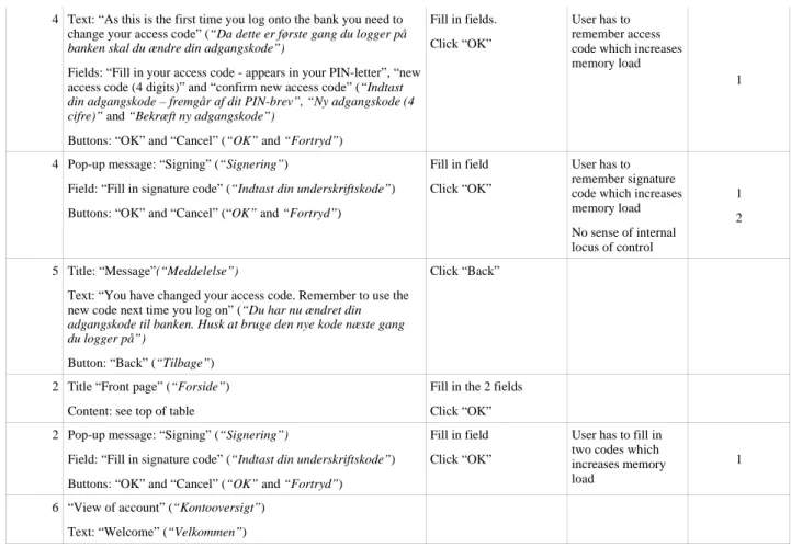
code”) is not user's language Poor help with regard to creating a strong password 2 1 2 2 1
3 Pop-up message: (warning sign) “The key has been generated and saved to disc” (“Nøglen er nu genereret og gemt på disc”) Button: “OK” (“OK”)
Click “OK” The term “key” has never been introduced and the system offers no help to examine it
4 Text: “As this is the first time you log onto the bank you need to change your access code” (“Da dette er første gang du logger på
banken skal du ændre din adgangskode”)
Fields: “Fill in your access code - appears in your PIN-letter”, “new access code (4 digits)” and “confirm new access code” (“Indtast
din adgangskode – fremgår af dit PIN-brev”, “Ny adgangskode (4 cifre)” and “Bekræft ny adgangskode”)
Buttons: “OK” and “Cancel” (“OK” and “Fortryd”)
Fill in fields. Click “OK”
User has to remember access code which increases memory load
1
4 Pop-up message: “Signing” (“Signering”)
Field: “Fill in signature code” (“Indtast din underskriftskode”) Buttons: “OK” and “Cancel” (“OK” and “Fortryd”)
Fill in field Click “OK”
User has to remember signature code which increases memory load No sense of internal locus of control 1 2 5 Title: “Message”(“Meddelelse”)
Text: “You have changed your access code. Remember to use the new code next time you log on” (“Du har nu ændret din
adgangskode til banken. Husk at bruge den nye kode næste gang du logger på”)
Button: “Back” (“Tilbage”)
Click “Back”
2 Title “Front page” (“Forside”) Content: see top of table
Fill in the 2 fields Click “OK” 2 Pop-up message: “Signing” (“Signering”)
Field: “Fill in signature code” (“Indtast din underskriftskode”) Buttons: “OK” and “Cancel” (“OK” and “Fortryd”)
Fill in field Click “OK”
User has to fill in two codes which increases memory load
1
6 “View of account” (“Kontooversigt”) Text: “Welcome” (“Velkommen”)