She Ji: The Journal of Design, Economics, and Innovation Paper Template for Manuscript
Expanding the Design Space of
Data Visualization with Typography
Abstract:
This article is a systematic exploration and expansion of the design space of data of text used in data visualizations. A critical analysis of type in data visualizations reveals gaps in existing frameworks and the actual use of type in practice. A cross-disciplinary review across fields such as typography, cartography and coding interfaces yields various typographic techniques to encode data into text and provides the scope for the expanded design space. Mapping the new attributes back to well understood principles from the domains frames the expanded design space and suggests potential areas of application. We show the designs, implementations and evaluations from six new visualization techniques from ongoing research into new techniques created with our framework. Finally, we do a broad evaluation across a number of visualizations with expert critiques from across disciplines. This revealing opportunities as well as areas of concern pointing towards additional research with our framework.
Keywords: Design space, cross-disciplinary research, font attributes, typographic visualization, text visualization.
Introduction
In data visualization, abstract data elements (such as quantities and categories) are encoded into visual attributes (such as shapes, colors and sizes), which acts as an external memory aid to the human viewer to facilitate perceptual inferences (such as spotting outliers, estimating trends and comparing sizes) and higher level tasks (such as generating hypotheses and disseminating findings)1,2,3. However, typographic attributes, such as bold, italic and font family are rarely used to encode data in visualizations4 suggesting a missed opportunity.
Expanding the design space of data visualization is desirable at it can enable new types of visualizations, enable application to new tasks and domains, and can lead to potential new areas of economic activity.
1 Robert Kosara, What is Visualization? A Definition. EagerEyes. July 24, 2008. URL: https://eagereyes.org/criticism/definition-of-visualization accessed: April 15, 2016.
2 Tamara Munzner, Visualization Analysis and Design, (Boca Raton, FL: CRC Press, 2015), 1-19.
3 Min Chen and Luciano Floridi, “An analysis of information visualization”, Synthese, 190, no. 16 (2013): 3425-3426. 4 Richard Brath and Ebad Banissi, “Font attributes enrich knowledge maps and information retrieval”, International Journal
The contribution of this article is a framework for applying typography and font attributes to data visualizations, along with new visualization techniques created from this framework. The first half of this paper will show a systematic review of data visualization in theory and practice to identify gaps; followed by cross-disciplinary research to define the available typographic parameters; and a characterization of those attributes for use in data visualization to frame the expanded design space. The second half will show a sample of new data visualization techniques created with our framework as well as an evaluation of specific techniques and the broader
framework as part of the ongoing research into this new design space.
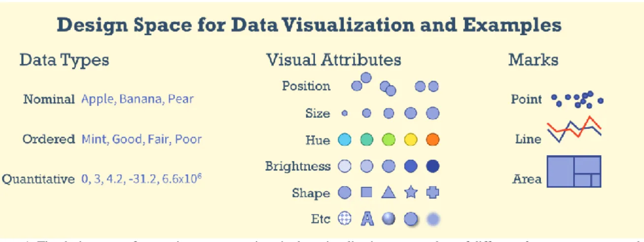
Figure 1. The design space for creating representations in data visualization: source data of different data types are mapped to different visual attributes which are then represented as different types of marks. Copyright © 2016 Author.
Data visualization has become a significant area of research in the last 25 years largely centered on computer science (e.g. conferences such as VisWeek, EuroVis and PacificVis) with focus on different visualization
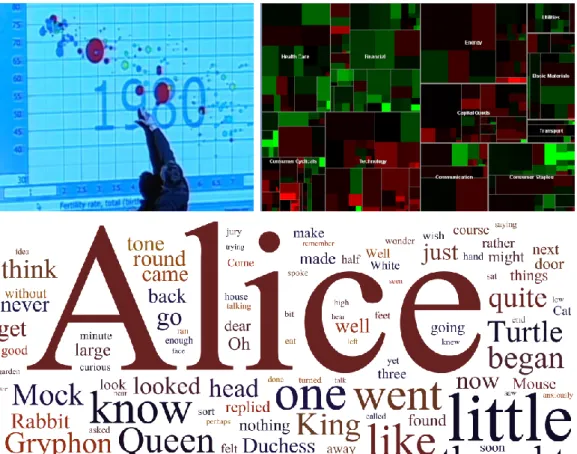
techniques, interactive techniques, related data analysis, evaluation and application. In visualization, a key step is visual encoding: the transformation of data into a visual representation. Early researchers such as Bertin5 and Card6 organized the design space of encoding more or less into a) data types (nominal, ordered and quantitative), b) visual attributes (e.g. location, size, color), and c) marks (i.e. point, line, area) as shown in figure 1. This framework is powerful at explaining the construction of visualizations, such as some well-known visualizations shown in figure 2. For example, the bubble plot (top left) represents quantitative data by x location, y location, size and categoric data as hue and plots the data as point markers. The treemap (top right figure 2) represents quantities by size and hue and plots the data as areas. The tag cloud (bottom figure 2) represents word
frequencies by size and in this particular example applies random hues then plots the words at randomly placed points. The framework continues to aid the education and creation of new visualization techniques, such as introductory textbooks as well as formal declarative grammars (such as Wilkinson’s Grammar of Graphics or Wickham’s ggplot2).
5 Jacques Bertin, Semiology of Graphics, trans. William Berg(Madison, WI: University of Wisconsin Press, 1983), 42–97. 6 Stuart K. Card, and Jock Mackinlay, “The structure of the information visualization design space,” in Proceedings of IEEE
Figure 2. Popular visualizations as framed by visualization design space. Top left: A bubble plot uses x location, y location, size and hue7. Top right: A treemap uses size, hue and areas8. Bottom: A tag cloud uses size and plots words as randomly placed points9. Images copyright © 2006 TED Conferences LLC, copyright © 2016 MarketWatch, Inc, and copyright © 2105
Author (created via http://wordle.net).
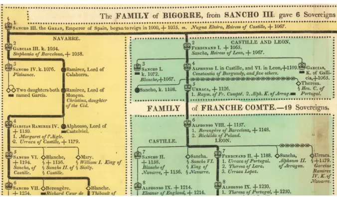
However, if one looks at emerging areas of visualization, such as text visualization, one may notice that innovation is constrained. For example, tag clouds are perhaps the most famous text visualization technique to emerge in the last 20 years. But tag clouds use very traditional visualization attributes of size and color to adjust words based on data properties. Very rarely do text visualizations venture into the un-researched attributes of fonts, such as bold and italic which are not expressed in the traditional visualization design spaces. If one ventures outside of visualization community, however, beautiful historic examples with rich typography can be found in other domains. For example, Carey and Lavoisne’s genealogical tree from 1820 (portion shown in figure 3) uses bold indicates major branches, all caps indicate regions, small caps indicate sovereign rulers, italics represent spouses and additional symbols for added information, e.g. deaths. This suggests a possible gap and opportunity for visualization design.
7 “Hans Rosling: The best stats you’ve ever seen,” TED2006, filmed by TED Conferences LLC, February 2006,
https://www.ted.com/talks/hans_rosling_shows_the_best_stats_you_ve_ever_seen?language=en .
8 Martin Wattenberg, “Map of the Market,” Martin Wattenberg - Data Visualization: Art, Media, Science (personal website), last modified: Sept. 13, 2012, http://www.bewitched.com/marketmap.html
9 Tag cloud created on http://wordle.net on June 6, 2015 using text of Lewis Carroll’s Alice’s Adventures in Wonderland, from http://www.gutenberg.org/files/11/11-h/11-h.htm
Figure 3. Portion from one of many family trees in Carey and Laviosne’s A Complete Genealogical, Historical, Chronological, And Geographical Atlas (1820) using bold, italics, small caps and all caps to encode additional information.
Copyright © 2016 David Rumsey (www.davidrumsey.com) accessed June 6, 2015.
What is a Design Space
Visualization researchers use the term design space without definition. The term is used in many domains including semiconductors, pharmaceuticals and human-computer interaction. Some definitions:
[A design space is] The set of possible designs and design parameters that meet a specific product requirement. Exploring design space means evaluating the various design options possible with a given technology and optimizing with respect to specific constraints like power or cost.10
[A design space is] The multidimensional combination and interaction of input variables (e.g., material attributes) and process parameters that have been demonstrated to provide assurance of quality.11 Design Space Analysis creates an explicit representation of a structured space of design alternatives and
considerations for choosing among them. Different choices in the design space result in different possible artifacts.12
A design space defines a range of possible solutions. It can be a powerful aid as it frames the exploration of many potential design alternatives. However, a design space may also be limiting, as the designer may not search outside the boundaries implied by the design space. Furthermore, designing data visualizations is difficult
10 The National Technology Roadmap for Semiconductors. (SIA Semiconductor Industry Association, 1994), page C-4, last modified Sept. 11, 1998, accessed Jan. 31, 2016.
http://www.rennes.supelec.fr/ren/perso/gtourneu/enseignement/roadmap94.pdf .
11 ICH Harmonised Tripartite Guideline, Pharmaceutical Development Q8(R2), page 7, in association with International
Conference on Harmonisation of Technical Requirements for Registration of Pharmaceuticals for Human Use, published August 2009, accessed Jan 17, 2016,
http://www.ich.org/fileadmin/Public_Web_Site/ICH_Products/Guidelines/Quality/Q8_R1/Step4/Q8_R2_Guideline.pdf 12 Allan MacLean, Richard M. Young, Victoria ME Bellotti, and Thomas P. Moran. “Questions, options, and criteria: Elements of design space analysis,” in Human–computer interaction 6, no. 3-4 (Taylor & Francis: 1991), 201–250.
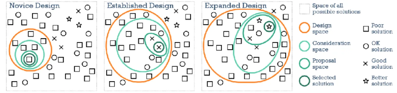
because there are many trade-offs between design alternatives and a small design space will result in a higher probability of missing a good design. Figure 4, adapted from Munzner13, illustrates a design exploration through a design space. First, there are many possible design solutions, some of which are poor and some of which are better: “the vast majority of of the possibilities in the design space will be ineffective for any specific usage context”. The novice visualization designer (left image), unaware of the details of visualization frameworks, will be limited to small portion of possible solutions. In the middle image, the established design space, using the accepted visualization frameworks, is a broader design space than the novice’s and can yield better results. However, the designer that can use an expanded design space (right image) has more potential solutions, including new techniques not feasible under the previous conception of the design space.
Figure 4. Design as a search through a design space. The expanded design space (right) has more alternatives and potentially better solutions than the narrower design spaces. (redrawn and extended based on a drawing by Munzner). Copyright © 2016
Author.
The middle image representing established design approaches and current best practices indicates a potential constraint on design exploration. Communication theorist Marshall McLuhan said: “We shape our tools and then our tools shape us.”14 Therefore, to go beyond the existing framework, it is desirable to explore and characterize a broader design space.
A Method to Expand a Design Space
Many project oriented approaches to design do not focus on the design space. For example, user-centered design techniques are focused on user perceptions, behaviors, needs and experiences. The user-centered approach is focused on the problem space, that is, characterizing the problem to help direct the design approach and find an optimal solution. While user-centered design may result in a single unique solution that goes beyond an established design space, it does not seek to frame the larger design space.
The goal of this article is to outline the steps of a systematic exploration and expansion of a design space and walkthrough that process as applied to the use of text in data visualization. These steps are:
1. Identify gaps in the existing domain’s parameter space, with emphasis on areas with greatest potential.
13 Tamara Munzner, Visualization Analysis and Design, (Boca Raton, FL: CRC Press, 2015), 13. 14 Marshall McLuhan, Heritage Minutes: Marshall McLuhan, last modified Feb. 17, 2016. https://www.historicacanada.ca/content/heritage-minutes/marshall-mcluhan
2. Research background across a wide variety of disciplines to identify the new parameters and characterize those parameters both in terms of their originating disciplines and relating them to well researched parameters in the target domain.
3. Identify new unique considerations for the new parameters that may impact effectiveness and evaluation.
4. Identify new application areas, then design, implement and evaluate new kinds of solutions based on these new parameters.
5. Evaluate the overall results via expert critiques from both target domain and the originating disciplines.
This article will show how a defined design space in data visualization is expanded through a systematic exploration of the parameters of fonts in adjacent spaces such as typography, cartography and notation systems and how those parameters can then be used to create new unique solutions.
Identifying Gaps to Pursue in Data Visualization
In this article, the design space of data visualization is considered. While data visualization as a research field is more than 25 years old (e.g. see early work by Jacques Bertin, Willian Cleveland, Jock MacKinlay), there are many gaps and underexplored areas, such as novel visual attributes, encodings and interactions.
At a high level, interactive data visualization transforms data into a visual representations (such as sizes, shapes and colors) perceived and decoded by a viewer. This sequence can be represented as a pipeline, for example, through steps such as data, enrichment, visual encoding, interaction, rendering, viewing, perceiving and comprehension in figure 5 (simplified from a diagram by Chen and Floridi15).
Figure 5. Visualization pipeline from data to comprehension. Visual encoding is a step unique to data visualization.
Simplified from a diagram by Chen and Floridi. Copyright © 2016 Author.
Each step in the visualization pipeline can enhance the data or introduce unintentional noise and error. As each stage builds on the prior stage, error accumulates. There will be a gap between reality and perception due to incomplete data, design choices, limitations in perception and comprehension, and so on. This gap will always exist and can be identified at different stages as well as in the overall structure. Therefore a reexamination of the overall design and each stage of the interactive visualization pipeline can identify gaps. For example, low-level gaps at individual stages may exist due to assumptions in the original definitions based on technical constraints in those times.
Identify Gaps
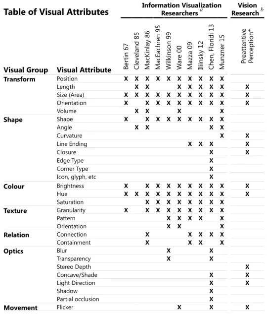
The visual encoding step is unique to data visualization, as opposed to tabular reports, summary statistics or analytics. Most visualizations today primarily rely on encoding data into the visual attributes of position, size and color, and these attributes have been well researched. Beyond these attributes, the list of visual attributes can vary considerably depending on the compilation of research. Table 1 shows a compilation of visual attributes as identified by various researchers over the last few decades. Different researchers may group attributes in various ways - the groupings shown here are the authors. The final column is a list of attributes that have been identified by perceptual psychologists as preattentive that is, attributes that can be automatically perceived regardless of the number of items in a display. Preattentive visual attributes are desirable in data visualization as they can demand attention only when a target is present, can be difficult to ignore, and are virtually unaffected by load.16
Table 1. Table of Visual Attributes. Visual attributes for encoding data as defined by various information visualization researchers and preattentive vision research up to early 2015 (not including authors’ research).
Table of Visual Attributes
Information Visualization Researchers a ResearchVision bVisual Group Visual Attribute Ber
tin 6 7 Cle vel an d 85 M acK in la y 86 M acE ach re n 95 Wil kin so n 99 W ar e 00 M azza 09 Ili in sky 1 2 Ch en , F lori di 1 3 M un zn er 15 Pr eat te nt ive Pe rc ept ion * Transform Position X X X X X X X X X X Length X X X X X X X X Size (Area) X X X X X X X X X X X Orientation X X X X X X X X X X Volume X X X X Shape Shape X X X X X X X X X Angle X X X X Curvature X X Line Ending X X X X Closure X X Edge Type X Corner Type X
Icon, glyph, etc X
Colour Brightness X X X X X X X X X X Hue X X X X X X X X X X X Saturation X X X X X X X X Texture Granularity X X X X X X X X X Pattern X X X X X Orientation X X X Relation Connection X X X X X Containment X X X X Optics Blur X X Transparency X X Stereo Depth X Concave/Shade X X Light Direction X X Shadow X Partial occlusion X Movement Flicker X X X
16 Richard M. Shiffrin and Walter Schneider. ”Controlled and automatic human information processing: II. Perceptual learning, automatic attending and a general theory." Psychological review 84, no. 2 (1977): 127.
Speed X X X
Direction X X
Miscellaneous Text Labels X X X X
Numerosity X Spatial Grouping X Artistic Effects X Arrangement X Resolution X a see references
be.g. see Healey and Enns 2012
Some of these attributes are rarely used in encoding data and have not been thoroughly researched, such as texture, shape and text. There are many possible reasons that some attributes are highly utilized while others less so. Size and hue may be popular because they have strong visceral appeal and they are easy to code (e.g. scale transformations and RGB colors are easily accessible in most programming languages. Some visual attributes are known to be easily perceived, as shown by preattentive research or Gestalt psychology. Computer scientists involved in data visualization may have limited knowledge of visual design vocabularies and grammar.
Technological limitations and change may also be a driver behind the use of these attributes. For example, the resolution of most displays have been limited to 72 pixels per inch until the late 2000’s limiting the use of finely detailed attributes such as texture, shape and text. However, much higher resolutions are now prevalent (e.g. mobile devices and retina displays). With fine detail available, each of these attributes may have additional
parameters and hence capabilities that have not been previously explored, for example serifs, italics and so forth.
Potential Value of Text Visualization
As indicated by the definitions of design space, there is typically an objective to create value in the context of an objective, such as cost, quality or profit. Text is interesting to consider from an economic perspective. There are large amounts of unstructured data (pundits suggest 80% of all data17). However, current visualizations of text rarely use font attributes suggesting an economic opportunity. For example, scimaps.org is a repository of curated exemplars of knowledge maps (data visualization to gain insights into the structure and evolution of large scale information spaces18). While 80% of 144 knowledge visualization examples on scimaps.org use text only a few use font attributes to encode data. Similar results could likely be found in other text visualizations (e.g. processing.org, d3.js, the Guardian, Bloomberg, etc.) The market for structured data is $4.1B (USD) and
growing annually nearly 10% with ten major established companies19. Text visualization is a nascent market with no dominant text visualization companies, although there are dominant providers of texts in specific domains, e.g. Springer (science), Lexis-Nexis (law), Bloomberg (news), Project Gutenberg (open source books), and so on. If one draws parallels to the market for structured data analysis (e.g. relational databases) vs. unstructured data analysis (e.g. search) the unstructured analysis market opportunity emerged many years after the structured market and a similar situation may exist in the opportunity for structured visualization vs. text visualization.
17 Seth Grimes.. “Unstructured Data and the 80 Percent Rule”, Breakthrough Analysis, August 1, 2008. http://breakthroughanalysis.com/2008/08/01/unstructured-data-and-the-80-percent-rule/
18 Knowledge Maps and Information Retrieval (KMIR) Workshopt at Digital Libraries 2014. http://www.gesis.org/en/events/events-archive/conferences/kmir2014 TODO.
19 Data Visualization Applications Market - Forecasts and Trends (2015 - 2020). Mordor Intelligence. 2015. URL: http://bit.ly/1OdIZMj accessed: October 3, 2015.
Potential Objections
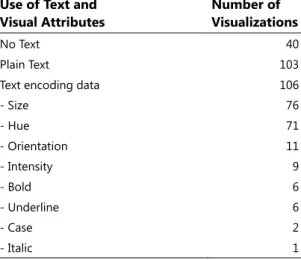
There are already many existing peer-reviewed text visualization techniques. The online Text Visualization Browser (http://textvis.lnu.se/) is a non-exhaustive survey of many peer-reviewed text visualization techniques, with 249 examples logged from 1976-2015, excluding the authors’ contributions (as of Jan 22, 2016). 40 of these have no text and 103 have simple plain text (such as axis labels, node labels, document titles or tweet content). The remaining 106 (only 43%) use some form of visually encoding additional data into text (Table 2) and in many cases may use two or more visual attributes within the visualization (for example using size to convey a magnitude and hue to indicate a measurement such as sentiment). {TODO possible extend table}.
Table 2. Table summarizing use of text in 249 peer-reviewed text visualizations from 1976-2015 on Text Visualization Browser (http://textvis.lnu.se/)
Tag clouds are extremely popular: In the Browser, 39 use tag clouds, that is, 37% of all peer reviewed text visualizations encoding data into text are variants on tag clouds. But tag clouds have many criticisms, such as Jakob Nielsen’s: “A one-paragraph summary [of each report] would probably be more enlightening, be faster to scan, and would take up much less screen space, allowing for more items to be summarized on any given page [than tag clouds].”20
Size may be a poor encoding: Of the 106 text visualizations, 76 use size to adjust word height to encode data (both tag clouds and non-tag clouds). Size is highly preattentive (meaning that it can be perceived almost instantaneously). However, having a few large words reduce the number of words that can be displayed overall thereby reducing data density. Size variation also interrupts readability for longer passages of text.21
Font attributes are rarely used: Only 15 examples in the Browser use any kind of font attribute to encode data. In some cases, the use of these font attributes is fairly simple, for example, to indicate a selection highlight. Interestingly, some of these text visualization systems mix and match software components including list boxes,
20 Jakob Nielsen, “Tag Cloud Examples,” Nielsen Norman Group, last modified March 24, 2009. https://www.nngroup.com/articles/tag-cloud-examples/
21 Thomas Sanocki and Mary C. Dyson. "Letter processing and font information during reading: Beyond distinctiveness, where vision meets design." Attention, Perception, & Psychophysics 74, no. 1 (2012): 132-145.
Use of Text and Visual Attributes
Number of Visualizations
No Text 40
Plain Text 103
Text encoding data 106
- Size 76 - Hue 71 - Orientation 11 - Intensity 9 - Bold 6 - Underline 6 - Case 2 - Italic 1
email lists or search result components and these components do use attributes such as bold or underline for example to differentiate a title or indicate a link. This suggests that visualization developers rarely consider these attributes, even when in plain sight! Perhaps the existing design spaces constrain their abilities to notice the opportunities; or perhaps they do not have the requisite knowledge of typographic design to apply font attributes.
Cross-Disciplinary Research and Relation to Visualization
To address the specific gap, a review of type use across other disciplines can be used to find examples of typographic attributes used to encode data. While there is low exposure to typography in the visualization community, other domains, such as typography, cartography, mathematics, chemistry, programming and so on have a rich history with type and font attributes which informs the scope of the parameter space.
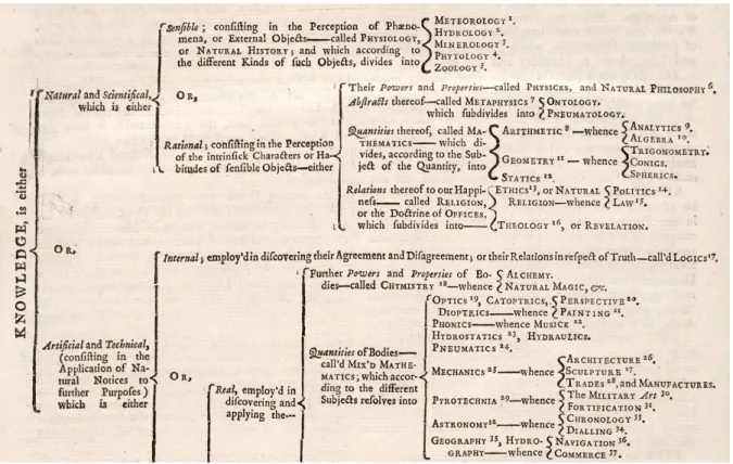
Typographers embed additional data into texts using font attributes in examples from hundreds of years ago. The table of contents for Chambers’ Cyclopaedia22 uniquely creates a readable paragraph split into a hierarchy enhanced with italics, small caps, roman and superscript to differentiate between broad topics, fields,
descriptions and chapters (figure 6). Typographers think about text in different contexts: labels, headlines, paragraphs, captions, tables, books and so forth: type is not homogenous but has many different applications.
Figure 6. Table of contents from Chamber’s Cyclopaedia (1728) using italics, small caps, roman and superscript to differentiate between topics, fields, descriptions and chapters respectively. Copyright ©2016 Board of Regents of the University of Wisconsin System.
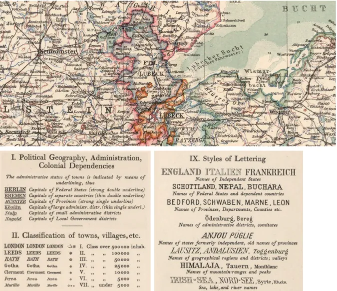
Cartographers have long used variation in typography to indicate data such as type size as well as font-specific
22 Ephraim Chambers, Cyclopaedia, (London, UK: self-published, 1728), page ii. http://digital.library.wisc.edu/1711.dl/HistSciTech.Cyclopaedia
attributes such as font family, font weight, italicization (both forwards and backwards), multiple underline styles (single, double, dashed) and spacing, such as Steiler’s Atlas in figure 7. Cartographers differentiate between attributes used to encode categoric data (e.g. font family), attributes used to encode quantitative data (e.g. size, weight), and attributes (or combinations of attributes) to create an ordering (e.g. case, italics) as seen in a portion of the legend of Steiler’s Atlas in the lower half of figure 7.
Figure 7. Example map using various typographic attributes to encode data including different font families (e.g. high contrast sans serif, low contrast slab serif, and outline font); italics (forward and reverse); case; variable number of underlines; and spacing (to indicate extents).23 Copyright © 2016 Cartography Associates, www.davidrumsey.com.
Other Domains: Notation systems such as chemical formulas (e.g. [As@Ni12As20] 3−), mathematical formulas (e.g. µe(A) = inf{λ∗(O)| O ∈ O,A ⊂ O} ), markup notation (e.g. <div class=“body”>Text</div>) use various typographic features such as superscript/subscript, delimiters and special symbols to add additional information into a line of text. Technical drawings (as used in surveys, engineering and architecture), software code editors and alphanumeric charts (such as financial market profile charts and statistical stem and leaf plots) use different typographic elements to emphasize, delineate or otherwise add information to text. For example, software source
23 Adolf Stieler and H. Haack, Stieler's Atlas of Modern Geography, (Gotha, Germany: Justus Perthes, 1925). http://www.davidrumsey.com/luna/servlet/s/c2dd4y and http://www.davidrumsey.com/luna/servlet/s/791qv7
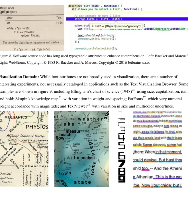
code presentation relies on a variety of visual attributes to enhance code comprehension. Baecker and Marcus characterized a range of visual attributes (including color, size, italics, small caps, bold, font family) for enhancing source code (figure 8 left). These are now commonplace in many modern software code editors. For example, WebStorm (figure 8 right) uses attributes such as background shading, text color, bold, italic, underline (straight and wavy), plus user conventions (e.g. CamelCase) and programming language syntax requirements of scope (e.g. ‘’,[],{},<>) to enhance code readability.
Figure 8. Software source code has long used typographic attributes to enhance comprehension. Left: Baecker and Marcus24. Right: WebStorm. Copyright © 1983 R. Baecker and A. Marcus; Copyright © 2016 Jetbrains s.r.o.
Visualization Domain: While font-attributes are not broadly used in visualization, there are a number of interesting experiments, not necessarily cataloged in applications such as the Text Visualization Browser. Some examples are shown in figure 9, including Ellingham’s chart of science (1948)25 using size, capitalization, italics and bold; Skupin’s knowledge map26 with variation in weight and spacing; FatFonts27 which vary numeral weight accordance with magnitude; and TextViewer28 with variation in size and multicolor underlines.
24 Ron Baecker and Aaron Marcus, Human factors and typography for more readable programs, (ACM, 1989). 25 Harold J. T. Ellingham, “A Chart Illustrating Some of the Relations Between the Branches of Natural Science and Technology,” courtesy of The Royal Society, in 7th Iteration (2011): Science Maps as Visual Interfaces to Digital Libraries, Places & Spaces: Mapping Science, edited by Katy Börner and Michael J. Stamper, accessed Nov. 2, 2013.
http://bit.ly/1hlJ6VK
26 André. Skupin, “In Terms of Geography,” courtesy of André Skupin, San Diego State University, San Diego, CA, in “1st
Iteration (2005): The Power of Maps,” Places & Spaces: Mapping Science, edited by Katy Börner and Deborah MacPherson. http://bit.ly/1R97oms
27 Miguel Nacenta, Uta Hinrichs and Sheelagh Carpendale, “FatFonts: combining the symbolic and visual aspects of numbers.” in Proceedings of the International Working Conference on Advanced Visual Interfaces, (ACM, 2012) 407–414. 28 Michael Correll, Michael Witmore, and Michael Gleicher, “Exploring Collections of Tagged Text for Literary Scholarship,”
Figure 9. Visualizations using font attributes including a chart of science, a knowledge map, FatFonts and TextViewer. Copyrights: © 1948 The Royal Society; © 2004 The National Academy of Sciences; FatFonts are licensed under a Creative Commons Attribution ShareAlike 3.0 Unported License; and © 2011 Michael Correll, Michael Witmore and Michael Gleicher.
Characterization
Based on the cross-disciplinary research, a list of parameters for the design space exploration can be
characterized, based on the guidelines from various fields. Cartographers have differentiated which typographic attributes are relevant to encoding quantitative values (e.g. weight, case) versus categoric values (e.g. font family, spacing).29 Similarly, Baecker and Marcus provided detailed analysis of each typographic attribute relevant to the formatting of software source code. Some font attributes have a range of values, for example, font weight in some typefaces is available in up to 9 weights (e.g. Univers) and can be used to show quantitative data: “Type weight variations imply ordered (quantitative) differences. Bolder implies more, lighter weight implies less.” -
Krygier. Italics are typically forward sloping at 2-20 degrees of inclination30, but historically may have slopes at much steeper angles (e.g. a map from 1881 has an italic slope of 35 degrees31), may range from positive to negative and may include vertical italics. Case is considered more assertive than italics, allows the designer to stay at the same font size rather than change size (e.g. to indicate magnitude)32, can be ordered (e.g. as shown in fig. 3 from ALL CAPS to SMALL CAPS to Proper Nouns for family branch, sovereign ruler, family member). There are more than 100,000 different fonts33, but there are only a few major groupings of font styles into
different categories (e.g. sans serif, serif, script, blackletter) although there are a number of different typographic classification systems34.
Other font-specific attributes include underline, superscript (and subscript), width (spacing, condense/expanded, scaling), paired delimiters (e.g.{}[]--**), and the character glyphs themselves (alphanumerics and symbols). In addition, type designers manipulate other low-level attributes not available to the user of a font. For example, x-height, contrast, stress, and serifs are feasible design parameters, although these attributes are not easily accessible to most applications. All the attributes are shown in Table 3 in the second column. The first column indicates groupings, i.e. the underlying glyphs, the attributes made available as part of a font family applicable to all glyphs, attributes that are only applicable when used across a sequence of letters, and attributes typically only available to the font designer.
Table 3. Table of font-specific visual attributes; related visual channel, preattentive potential, best encoding and example.
29 John Krygier, Making Maps: A Visual Guide to Map Design for GIS. Guildford Press, NY. 2005: 211.
30 Antoinette LaFarge. Typographic Definitions. http://yin.arts.uci.edu/~studio/resources/type03/definitions.html accessed April 16, 2016. TODO.
31 John C. E. Gardiner, A Map of the original warrants of Warren & Forest Counties, Harrisburg, 1881 https://www.loc.gov/item/2012592030 accessed April 16, 2016. TODO.
32 James Craig and Irene Korol Scala, Designing with Type, 5th edition, Watson-Guptill Publications, NY. 2012: 76. 33 Simon Garfield, Just My Type: A Book About Fonts, Gotham Books, NY, 2011: 182.
34 Gavin Ambrose and Paul Harris, The Fundamentals of Typography, 2nd edition, AVA Publishing SA, Lausanne Switzerland, 2011: 87-93.
Relation to Data Visualization
To further characterize font attributes, they can be mapped to related research used by data visualization researchers. Gestalt psychology indicates that similar elements will be perceived as part of a group. Perceptual psychologists and vision research further identify different visual channels, such as position, size, intensity, orientation and shape35. Each font attribute utilizes some combination of these perceptible visual channels as shown in the middle columns of Table 3. For example, font weight, at a macro-level can be understood to primarily alter the intensity of characters, which it achieves at a micro-level by varying the widths of letter strokes.
Some visual channels are stronger cues for guiding attention than others (e.g. Wolfe and Horowitz36), and can visually pop-out (e.g. Healy and Enns37). This is summarized in the column labelled preattentive potential. For example, intensity (luminance) is considered probably preattentive, and line width (size) is considered
undoubtedly preattentive. Font weight, which uses both, is recorded as highly probable in this table.
Some visual attributes have been researched for accuracy in perceiving magnitude (e.g. see Cleveland and McGill38) and the related concept of the number of distinct levels which can be perceived (e.g. see Ware39). For example, some channels are effective for encoding quantitative data (e.g. size), while others can only
differentiate (e.g. shape). Font weight, using size and intensity, can be used for encoding quantitative or ordered data, while font family, using shape, can be used for indicating categories. This is shown in the second last
35 Semir Zeki, A Vision of the Brain, Blackwell Scientific Publications, Boston, 1993.
36 Jeremy M. Wolfe and Todd S. Horowitz. "What attributes guide the deployment of visual attention and how do they do it?." Nature reviews neuroscience 5.6 (2004): 495-501, see Table 1.
37 Chris G. Healey and James T. Enns, "Attention and Visual Memory in Visualization and Computer Graphics," in IEEE
Transactions on Visualization and Computer Graphics 18, 7, (IEEE, 2012), 1170–1188.
38 Cleveland, William S., and Robert McGill. "Graphical perception: Theory, experimentation, and application to the development of graphical methods." Journal Of The American Statistical Association 79, no. 387 (1984): 531-554. 39 Colin Ware Information Visualization: Perception for Design, (Waltham, MA: Morgan Kaufmann, 2013), 130.
column of Table 3. In most cases, font attributes do not have many distinct levels, limiting their use to only a indicating only a few different data levels.
Glyphs (a,b,c,β,δ,ς,ۇ,の,み) can be used to encode literal data. Alphabetic or numeric glyphs can also be used to order data, based on a learned ordering. Both literal encoding and ordered encoding are not constrained to a few values like other attributes, however, these are highly unlikely to be pre-attentive (i.e. unlikely to visually pop-out).
The final column provides an example of the font attribute including variations the attribute across a few levels. For example, variations in underlines can be used to create an ordering as shown in the table (and also fig. 3).
{TODO: Consider paragraph on combinations. Integral vs. separable characteristics and how most attributes utilizes a different visual channel, making them more likely to be somewhat separable, reference Colin Ware, put in a 4 x 4 grid with different attributes.}
Unique Considerations: Legibility and Readability
Given a new palette of tools, there may be new considerations. As revealed in cross-disciplinary research, legibility and readability are of paramount concern to typographers and cartographers. Legibility is concerned with the ability to clearly decipher the individual characters as well as commonalities within a font that increase letter identification.40 Typographers and psychologists discuss factors at the level of characters (e.g. consistent stroke widths, open counters, wider proportions)41, between characters (e.g. risk of error, run-together risk, x-height)42, across a series of letters (e.g. predictability across letters, i.e. font-tuning),43 and environmental factors such as illumination and distance. Readability, is concerned with the ease of reading lines and paragraphs of text, and can also be affected by many factors such as line length, kerning, leading, x-height, font weight.44 Infovis researchers are unfamiliar with these concepts: a recent study on text highlighting did not consider legibility.45
Application Design Space
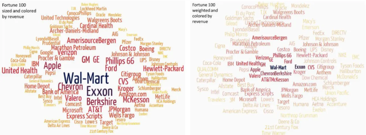
Simply outlining the parameters of a design space does not provide any indication of how these new capabilities might be used. How can they generate new value? Value is unlikely to be uncovered by simply converting an existing successful technique to a new parameter. For example, simply changing a tag cloud to use font weight
40 Thomas Sanocki and Mary C. Dyson. "Letter processing and font information during reading: Beyond distinctiveness, where vision meets design." Attention, Perception, & Psychophysics 74, no. 1 (2012): 132-145.
41 Sophie Beier, Reading Letters, Designing for Legibility, BIS Publishers(2012): 74-75.
42 Victoria Squire, Friedrich Forssman and Hans Peter Willberg, Getting it Right with Type: The Dos and Don'ts of
Typography, Lawrence King Publishing, London, (2006):31-32
43 Isabel Gauthier, Alan CN Wong, William G. Hayward, and Olivia S. Cheung. "Font tuning associated with expertise in letter perception." Perception 35, no. 4 (2006): 541-559.
44 Ching Y. Suen, N. Dumont, M. Dyson, Y-C. Tai, and X. Lu. "Evaluation of fonts for digital publishing and display." In
Document Analysis and Recognition (ICDAR), 2011 International Conference on, IEEE, 2011: 1425. {TODO: ORIG SRC Walter Tracy: Letters of Credit}
45 Hendrik Strobelt et al. "Guidelines for Effective Usage of Text Highlighting Techniques," in IEEE Transactions on
instead of font size is perhaps more space efficient but viscerally less appealing and doesn’t solve any new problems (figure 10).
Figure 10. Tag cloud using size (left) or using font weight (right) to encode the revenues of Fortune 100 companies. Copyright © 2016 Author.
Given the goal of expanding the design space, there should be many demonstrable applications. The cross-disciplinary research again helps frame the space of possible applications. Typographers structure type design ranging from glyph design, to words, to sentence, to paragraphs and documents, to systems applied across many documents (e.g. a type system of a series of books or guidelines for marketing of corporate identity). This is somewhat similar to the visualization differentiation between representations of marks as point, line and area. Also, cartographers differentiate between encoding quantitative data (e.g. font weight) vs. categoric data (e.g. typeface) in addition to the literal encoding of the text itself. Combining these creates a 3 x 6 design space of possible applications shown in table 4. Mark types are listed horizontally, data types are listed vertically, and cell intersections identify applications. For example, cell QW indicates embedding Quantities into Words, which could be achieved with varying font weight or italic slope based on data (similar to the examples shown in table 3), or other novel approaches such as varying the length of a word’s underline to indicate a quantity.
Table 4. Application opportunities for font attributes: data type vs. mark type.
Data Type
P o i n t L i n e A r e a
Glyph Word Sentence Paragraph Document Corpus
Literal Only LG LW LS LP LD LC
Categoric CG CW CS CP CD CC
Quantitative QG QW QS QP QD QC
Table 4 can be combined with 15 font-specific attributes outlined in table 3 as an additional dimension. Combined, this creates a large 3 x 6 x 15 design space which suggests the possibility for at least tens of
techniques, if not 100 or more. Table 3 also hints at other types of data encodings (e.g. grouping) which could be additionally pursued, but outside the current scope of this investigation.
This framework can be used to review the existing text visualization research (i.e. Text Visualization Browser outlined in table 2). 103 of 209 visualizations using text only used a simple literal encoding. 82% of these were
at the level of words (i.e. LW: Literal Words), such as tag clouds, node labels and axis labels, all of which are typically one or two words. Even though the source data may be a document or an entire corpus, analytic techniques reduce the data down to word lists based on frequencies or topics. Nine percent use text
representations focused on lines of text (LS: such as a title or tweet) and eight percent focus on representations that attempt to provide the context of a full paragraph (LP). At the sub-word level, only two text visualizations are listed - for the analysis of suffixes and phonetic units. At the document level, five examples exist (e.g. words or lines in the context of the full document). No examples exist depicting text at the level of a corpus: a corpus is reduced down to marks such as a dot per document in a graph, or lists of words describing a topic. With regards to font specific attributes, these only exist in the Text Visualization Browser at the level of categoric encodings for words and lines.
{TODO - another table from Text Viz Browser?}
The approach, then, is to identify new and potentially valuable applications within these different areas for which new visualizations using font attributes can be constructed and evaluated. The application of text and font attributes to visualizations do not need to be constrained to common typographic nor visualization conventions: font attributes can be applied to subsets of words, sentences can flow along paths, internal properties of glyphs can be modified (e.g. x-height, font width). Given the space limitations of the article, a sampling of six unique problems and designs created under this investigation will be shown, addressing six different areas of the data type/mark type matrix: LS, CD, QW, QP, QS and QG. Two different kinds of evaluation will be discussed: an evaluation of the particular technique within each example, followed by critiques of the larger body of work afterwards. Note that evaluation and critiques are ongoing as this is a work in progress with refinements and additional tests for some techniques as well as new techniques still being generated in relation to the design space (e.g. CW for set visualization).
LS: Literal Sentences - microtext lines
A simple example to start. Line charts are frequently used for timeseries analysis. A simple line chart with one line doesn’t require labeling: the title can unambiguously indicate the line. But when a few lines are added, cross-referencing between a label and a legend requires some cognitive effort. One of the benefits of
diagrammatic representations is reduced cross-referencing: for example, the need to refer back and forth between a line in a chart and a legend with a description46. Furthermore, for some types of data, legends can be quite verbose. Figure 11 plots retweets over time for the most popular Donald Trump tweets beginning in late August 2015. Instead of a separate legend, tweet content replaces the line.
46 Jill H. Larkin and Herbert A. Simon, “Why a diagram is (sometimes) worth ten thousand words,” in Cognitive Science 11, no. 1 (Wiley: 1987): 65–100.
Figure 11. A timeseries chart where a line is replaced by literal text removing the need for a legend. Copyright © 2016 Author.
By replacing the line with the content, the next question of the viewer can be immediately addressed in context (what is that item?). In this example, the very quickly retweeted tweet (orange) was likely due to the huge fan-base of the original author (@Ashton5SOS: Ashton Irwin, drummer for band 5 Seconds of Summer, which has a large number of teenage fans), whereas the slower growth blue line likely grew in popularity due to the comedic content.
The approach can scale to many more lines: figure 12 shows the same approach viewing more than 35 timeseries of country economic data. Each line is labeled with the unique country name in multiple languages as well as redundantly encoded using color.
Figure 12. Timeseries chart with 37 lines, directly identified with text. Copyright © 2016 Author.
A small group of six expert users were provided with variations of the chart in figure 12. The users were from the domain of financial services and use line charts throughout the day during their normal work to analyze timeseries of data. Given a version with only simple, solid lines and end point labels, 4 of 6 experts did NOT visually trace lines to end point labels (e.g. “Which country had the highest unemployment in 2002?”) When provided with lines directly identified with text (as in fig. 12), the experts immediately identified lines made up of micro-labels and would also answer more complex questions requiring assessment of the trend of a line over time in comparison to the other lines (e.g. “How did Switzerland fare through the financial crisis of 2008?”) While 5 of 6 experts were positively inclined, one user could not discern the small (six point) font used in the paper examples provided: interactive control over the font size could have remedied this issue.
CD: Categoric Document - typographic mosaic
Some documents are big tables or lists. Many visualization techniques are used to count things from lists. Distributions, treemaps, mosaic plots and sometimes pie charts and bar charts may represent counts of things by the area that they depict. However, these visualizations depict only the summary and the underlying elements have disappeared. Immediate access to items may be desirable: for example, the viewer’s task may be to locate where a particular item occurs rather than the overall tallies. Or they may be interested in adjacent items to a particular target. And so on. With only sums, getting to the underlying data requires additional interaction, such as a tooltips or clicks. Interactions are quite slow compared to simply shifting attention and thus it is desirable to directly depict the items that make up the sum.
The Titanic dataset is a popular sample dataset in data visualization. There are 1308 passengers, all of which can be categorized by age, gender, class and survivorship. Visualizations typically reduce the data down to a
summaries then plot the sets, for example, as a mosaic plot47, Venn diagram48, Parallel Sets49 and so forth. However, Alsallakh et al’s report of set visualization identifies 26 analytic tasks of which 12 are related to set elements, the elements’ attributes or relations between elements50
: summary techniques do not retain the individual elements which are needed for almost half of the tasks.
With high resolution displays, thousands of individual items can be explicitly labelled and the overall areas depict the counts of the individual items. Figure 13 displays all 1308 passengers on the Titanic, grouped by class vertically (1, 2, 3). Within each horizontal band, both type and color are used to split between:
Gender: men (plain/above) and women & children (italic/below); and Survivorship: died (red serif) and survived (green sans serif)
Macro-patterns are visible - such as the higher proportion of survivors in first class relative to other classes; and the detailed the names of each individual are immediately accessible. Similar to the Vietnam Veterans Memorial, each person is made visible. Macro-questions can be asked of this graphic (e.g. “Were women and children really first across classes?”) and micro-questions (e.g. “Did the Astors’ survive or die?”).
Figure 13. 1308 passengers on the Titanic, organized by class (vertically), survivorship (horizontally, serif/sans serif; red/green) and gender (plain/italic). Copyright © 2016 Author.
47 Pedro M. Valero-Mora, Forrest W. Young, and Michael Friendly. "Visualizing categorical data in ViSta." Computational
Statistics & Data Analysis 43, no. 4 (2003): 495-508.
48 Richard Brath, "Multi-attribute glyphs on Venn and Euler diagrams to represent data and aid visual decoding." In 3 rd
International Workshop on Euler Diagrams, (2012): 122.
49 Kosara, Robert, Fabian Bendix, and Helwig Hauser. "Parallel sets: Interactive exploration and visual analysis of categorical data." Visualization and Computer Graphics, IEEE Transactions on 12, no. 4 (2006): 558-568.
50 Bilal Alsallakh, Luana Micallef, Wolfgang Aigner, Helwig Hauser, Silvia Miksch, and Peter Rodgers. "Visualizing sets and set-typed data: State-of-the-art and future challenges." In Eurographics conference on Visualization (EuroVis)–State of The Art Reports, (2014): 1-21.
Using labels to form areas that can be perceived and compared as quantities assumes labels are of similar length within each area. Unfortunately, surviving first class women & childrens’ names average 36.7 characters in length while deceased third class men average only 22.0 characters. This is remedied in the Titanic dataset by shortening all names to a familiar name and a surname. For example, the passenger recorded as Brown, Mrs. Thomas William Solomon (Elizabeth Catherine Ford) is reduced in the visualization to Elizabeth Brown. With common passenger name lengths, the same two segments average 13.9 and 13.6 characters respectively - a 2% difference, well within the margin of error of area perception.51
QW: Quantitative Words - labelled cartograms
Reviewing cartography yields both typographically rich maps such as the earlier example in figure 7 as well as maps devoid of labels, such as choropleth maps (e.g. figure 14). Choropleth maps fill regions with different colors to indicate data values: they have existed for almost two centuries52 and they are extremely popular (e.g. 300,000 results on Google search). However, choropleth maps have many well-known problems:
Regions with large areas (e.g. Canada, Russia) are much more visually salient than small areas (e.g. Ireland, Iceland).
Some small areas may not be visible at all (e.g. Singapore or Luxembourg on a world map).
Not all viewers are familiar with geographic shapes (e.g. a large percentage of young Americans could not locate Iraq on a map in a National Geographic survey in 200653).
It can be difficult to depict additional data attributes on the map although it can be achieved with techniques such as added glyphs per country, or textures (e.g. stripes).
51 Jeffrey Heer and Michael Bostock. "Crowdsourcing graphical perception: using mechanical turk to assess visualization design." in Proceedings of the SIGCHI Conference on Human Factors in Computing Systems, (ACM, 2010), 203–212. 52 Gilles Palsky, "Connections and exchanges in European thematic cartography. The case of 19th century choropleth maps."
Belgeo. Revue Belge De Géographie 3-4 (2008): 413-426.
53 National Geographic-Roper Public Affairs 2006 Geographic Literacy Study. (GfK, May 2006), accessed Feb. 17, 2016. http://www.nationalgeographic.com/roper2006/pdf/FINALReport2006GeogLitsurvey.pdf
Figure 14. Health care spending as a percentage of GDP depicted on a choropleth map. What is the spending in countries with small area, such as Singapore or Caribbean nations? (image captured from worldbank.org54). Copyright © 2013 World Bank.
A label-based cartogram can be used instead of country shapes. If ISO 3166 codes are used, then labels will be a length (e.g. 3 letter codes). Labels can be located in such that each label is clearly visible and retains local proximity. Furthermore, while a choropleth map typically depicts only one numeric value via color, a label can depict multiple attributes. Typical visual attributes such as size and color can be used to represent data (e.g.
Country Codes of the World55 or UNODC Global Prevalence Estimates of Injecting Drug Users and HIV56).
Alternatively, equal sizes can be used for labels with quantities encoded as font attributes, as shown in figure 15.
Figure 15. Label-based cartogram representing each country via unique three letter mnemonic country code, with additional data indicated via color, font weight, capitalization and italics. Copyright © 2016 Author.
54 World DataBank, Health Nutrition and Population Statistics, “Health Expenditure, total (% of GDP) 2010”, accessed May 15, 2013. http://databank.worldbank.org/data/reports.aspx?source=health-nutrition-and-population-statistics
55 John Yunker, “Country Codes of the World”, Byte Level Research, (2007) http://www.bytelevel.com/map/ccTLD.html accessed April 14, 2016.
56 Harry Pearce and Jason Ching. “UNODC Global Prevalence Estimates of Injecting Drug Users and HIV Among Injecting
Drug Users”, UNOHC, New York (2009). Available in Ellen Lupton, Thinking with Type: A Critical Guide for Designers, Writers, Editors & Students, 2nd ed. Princeton Architectural Press (2010): 44.
A small study was conducted to compare the choropleth map and the labelled cartogram for identification and location tasks with two groups of people (ten undergraduate university students and seven information
visualization professionals). Comparable maps were created with a single variable and consistent color encoding of data. Tasks were similar to the National Geographic survey. The identification task marked a particular country on the map and required the viewer to name the country. The location task required the viewer to find a named country on the map and report the color of that country. Countries used in the tasks were not familiar countries, that is, not highly populated countries (e.g. India, Indonesia), not in the G20 nor Western Europe, nor frequently in the news (e.g. Iran, Iraq). Each viewer had a set of eight questions evenly distributed between the two task types and the two map types.
Table 5. Percent of correct responses on tasks for a choropleth map and an equivalent ISO code map.
Task Choropleth map (%) ISO code map (%)
ISO code performance relative to Choropleth
Identify 15 65 4.4×
Locate 53 85 1.6×
Total 34 75 2.2×
The labelled cartogram outperforms the unlabelled choropleth map in both tasks as shown in Table 5. For the identification task, ISO labels significantly outperform the choropleth with 65% correct answers vs. 15% correct. This may be due to the mnemonic nature of ISO country codes: e.g ona choropleth map, an arrow may be pointing to a shape with few mnemonic affordances, whereas an arrow pointing at a mnemonic code such as SLE, may trigger recognition of Sierra LEone. This small study should be repeated with a larger group of subjects to determine whether these differences work hold in a larger population.
QP: Quantitative Paragraphs - skim formatting
Text skimming is a reading technique of rapid eye movement across a large body to text to get the main ideas and content overview57. At a low level, the strategy requires the reader to dip into the text looking for words such as proper nouns, unusual words, enumerations, etc. To make uncommon words pop-out, first each word in the document can be tagged by its usage frequency in the broad language. Then each word can be assigned a different font weight such that the least frequent words have the heaviest weight down to the most frequent words which have the lightest weight. Figure 16 shows the opening paragraph of A Tale of Two Cities formatted in this way to facilitate skimming. Words such as wisdom, foolishness, belief and incredulity pop out.
57 Anne Arundel College, “Skimming and Scanning,” last modified Oct. 27, 2007. http://www.aacc.edu/tutoring/file/skimming.pdf
Figure 16. First paragraph of Dickens’ A Tale of Two Cities, formatted to facilitate text skimming, by heavily weighting uncommon words so that they visually standout from other words. Copyright © 2016 Author.
Skim Formatting has received feedback from multiple potential user communities with highly positive with responses such as: “I can see using this immediately in my own visualization research,” or “The technique can work well by aiding recognition of keywords instead of relying on searching (recall).” Additional improvements could be made by considering the application of word recognition research58 (e.g. if short words and function words are frequently skipped for fixations, could their emphasis be further reduced?) Another improvement is to reconsider which content is bolded: if the objective is comprehension of main ideas then advanced machine learning algorithms could potentially be used to identify the most salient portions of the text to be most heavily weighted rather than inverse word frequency.
QS: Quantitative Sentences - proportional encoding
There are various applications where short sentences appear in user interfaces such as news, search and social media. These are often used for document titles, news headlines, email subject headings, tweets, search results (keyword in context), pull-quotes and so on. As such, there may be much more associated information, for example, dates, authors, sources, subjects and document properties such as document length and number of readers. Interfaces that list these items often don’t list the other metadata, or use additional columns to list related information in a textual format that does not standout. In some cases, traditional visual attributes such as size and brightness may be used to encode quantities. For example, NewsMap.jp is a treemap of headlines where headline size indicates the number of related articles, and brightness indicates recency.59
Using font-based techniques, quantitative metadata about documents can be depicted in addition to the title. Figure 17 shows a list of Today’s Featured Articles from Wikipedia. Each line shows the title and a portion of the initial sentence of an article. The length of a particular format indicates a quantitative measure. For example, the length of bold is an indicator of the article length - articles regarding Richard Nixon and Barack Obama are particularly long while Drymoreomys is short. Underline indicates readership - the most read article is The Green Children of Woolpit. Note how some formats are easily perceived (e.g. bold) whereas others are require more focused attention (e.g. to detect the shortest upper case requires visually scanning all rows): this was predicted by the preattentive potential previously discussed (central column in Table 3).
58 Larson, Kevin. "The science of word recognition." Advanced Reading Technology, Microsoft Corporation (2004). https://www.microsoft.com/typography/ctfonts/wordrecognition.aspx accessed April 17, 2016.
Figure 17. List of articles from Wikipedia with length of format indicating article length (bold length), page views (underline), newness (case), and number of authors (italic). Copyright © 2016 Author.
The approach can be extended in a few ways. The quantitative data attributes can be used to sort the lines. Also, relative areas of a particular format can be compared. Figure 18 shows two sets of movie reviewers’ comments from the website rottentomatoes.com where the length of bold is used to indicate each reviewer’s score. In this case, the original reviewers commentary was truncated to a set length (and padded if the review was extremely short). Scores were normalized to a common range of 1-10. As the number of reviews vary per movie, the reviews were sorted based on score then sampled at regular intervals across the full range of reviews to extract a common number of reviews (e.g. 16 per movie). Plotting these reviews with the length encoding score reveals patterns. At a macro-level, the movie Toy Story 3, can be seen to have more dark bold, indicating higher review scores than the movie Frozen. The slope is an indication of dispersion: Frozen has a wider range of scores with one reviewer for Frozen providing a particularly poor review (almost no bold). And, at a micro-level, the text is immediately accessible to read.
Figure 18. Movie reviews for Toy Story 3 and Frozen with length of bold indicating score. Toy Story 3 has more bold indicating a higher overall score. Reviews are sorted by score, Frozen has a lower slope indicating higher dispersion. Copyright © 2016 Author
Proportionally encoded headlines are spatially efficient and perceptually efficient. A set of headlines and a single associated quantitative value were compared with three different encodings: 1) size (as in a treemap);, 2) font weight (with 5 different weights applied evenly across the entire sentence to indicate 5 different data values); and 3) proportionally encoded (similar to figure 18). The treemap uses size within a fixed area, making some items large, and thereby decreasing the amount of space available to other items making some headlines too small to read. Both font weight and proportional encoding. By contrast encoding data into font attributes allows a fixed text size to be used making all headlines readable. In terms of perceptual efficiency, comparison of line lengths have the lowest margin of error (+/-2.5%), while comparisons of rectangular areas is higher (+/-5%)60, and font weight only offers a few levels that can be readily perceived. Experimentally, a variety of news headlines were tested and measured with each representation and measured. The proportionally encoded headlines consistently outperformed the other two representations, with more readable headlines and overall lower information lossiness.61
QG: Quantitative Glyphs - prosodic text
Song in prose is often minimally differentiated from other text, for example, by being set in italics. However, this does not convey any of the prosodic song qualities such as the note pitch and note duration. While traditional music notation could be used, this would interrupt the flow of the text and require a lot of space. Instead, each syllable can be encoded independently with low-level typographic attributes. In figure 19, lower-case fonts have been compressed/expanded to indicate note duration; and the lower-case font x-height and baseline have been shifted to indicate note pitch (i.e. tall letters indicate deep pitches, short letters indicate high pitches).
Figure 19. Text encoding per syllable note pitch by character x-height and note duration by character width. Copyright © 2016 Author.
This visualization has not been evaluated. There are many potential issues, for example, x-height cannot represent a wide range of pitches; changes in x-height and font-width can be disruptive to reading; fonts with high aspect ratios are less legible, and so forth.
Evaluation
Evaluation for a design space is an important part of the design process. It is multi-faceted and requires a broader view across the visualization pipeline with a view on the effects of representations, perception and
60 Jeffrey Heer and Michael Bostock. "Crowdsourcing graphical perception: using mechanical turk to assess visualization design." in Proceedings of the SIGCHI Conference on Human Factors in Computing Systems, (ACM, 2010), 203–212. 61 Brath, Richard, and Ebad Banissi. "Evaluating lossiness and fidelity in information visualization." In IS&T/SPIE
comprehension stages. The approach requires multiple perspectives and methods to capture both subjective and objective metrics. Each of the individual visualizations can be evaluated for specific goals as shown in the preceding examples. Techniques included measurement of information density on proportionally encoded lines of text (QS); measured encodingaccuracy on the typographic mosaic(CD);measured task performance on labeled cartograms (QW); user feedback for skim formatting (QP) and task observations for microtext lines (LS).
More important for this article is the evaluation of the broader design space. The design space is multi-dimensional with many different attributes and a wide range of possible applications making it difficult to evaluate the broad space by experimental testing. For example, Lam et al’s Empirical Studies in Information Visualization provides seven different evaluation techniques, however all are constrained to the evaluation of a singular project62.
Expert critique is a different approach to evaluate a large set of related techniques. While computer scientists in general are not familiar with critiques63, the approach is well known among designers, medicine and some engineers (e.g. Brooks64). As this work is influenced by the prior knowledge of experts from across domains, it is ideal to seek out experts across domains for detailed, systematic analysis of these techniques. Critiques to date have been focused on subsets of the larger body of work outlined herein as this is a work in progress and novel techniques are still being generated in relation to the design space. Critiques have been received from
typographers and information visualization practitioners.
Typographic Critiques
A significant portion of the examples have been critiqued by typographers. A subset of examples, similar to those shown above, were presented at a type conference (TypeCon2015)65 followed by reviews with specific attendees afterwards (including at least one online review66.) Reviews have generally been positive along with appropriate skepticism for some techniques. Interestingly, typographers raise different issues than visualization researchers:
Legibility is a key concern to typographers but unexpressed by visualization researchers. Legibility relates to clearly deciphering characters. Legibility wasn’t often an issue, except where too many levels of particular font attribute were not perceivable - for example, the skim formatting of Dickens text in figure 15 utilizes five levels of font weight, but not all levels are uniquely perceivable.
Readability is another important concern for typographers. Readability relates to the ease of reading sequences of text. In particular, a number of typographers expressed concern that changing more than a singular attribute can impact readability: for example, figure 17 simultaneously varies weight, underline, italic and case which reduces readability. This is not a consensus: for example, Kane indicates multiple
62 Heidi Lam et al, “Empirical Studies in Information Visualization: Seven Scenarios,” in IEEE Transactions on
Visualization and Computer Graphics, 18 (9), (IEEE, 2012), 1520–1536.
63 Robert Kosara, “Visualization criticism-the missing link between information visualization and art” In Information
Visualization, 2007. IV'07. 11th International Conference, pp. 631-636. IEEE, 2007.
64 Frederick P. Brooks Jr, The design of design: essays from a computer scientist, (Boston, MA: Pearson Education, 2010), 243–245.
65 Richard Brath and Ebad Banissi, “Using Type to Add Data to Data Visualizations”, TypeCon 2015, Denver (2015). https://richardbrath.files.wordpress.com/2015/08/typecon2015_paper_r2.pdf accessed August 15, 2015.
attributes can be combined to create contrast67 whereas Binghurst indicates that a sudden shift across multiple type attributes does not follow conventional typographic grammar.68 Further typographic examples can be found, for example, dictionary entries use text with many simultaneous variations in font attributes (figure 20). Perhaps this is due to the non-sequential access of dictionaries?
Figure 20. Sample definitions using bold, italics, small caps, upper case, italics, paired delimiters and special characters. From The Concise Oxford Dictionary of Current English (1912), public domain (accessed Feb 12, 2016 via https://archive.org/stream/conciseoxforddic00fowlrich).
If the primary task is reading, then even a singular strong cue, such as font weight, may be disruptive, because it cannot be ignored. Some typographers consider italics as form of quiet emphasis, less disruptive to reading than a strong form of emphasis, such as bold. Interestingly, a typographer showed that skim formatting could allow the viewer to easily toggle back and forth between the non-formatted text and the skim formatted text. In skim formatting some words are lighter (and slightly narrower) while some words are heavier (and slightly wider). On the balance the overall line lengths remain the same, preserving the relative positions of words across both formats. This enables an interactive toggling between both formats and the e