Facultat d’Informàtica de Barcelona
Calibration of Low-cost Air
pollutant sensors using
Machine Learning techniques
Final Master Thesis
Master in Innovation and Research in Informatics Data Science
Pau Ferrer Cid
Supervisor: Dr. Jose Maria Barceló Ordinas
Co-Supervisor: Dr. Jorge García Vidal
Department: AC
Abstract
Nowadays, concern about air pollution has risen due to the effects of the climate change. Citizens and governments are aware of the importance of reducing the air pollution, so that, monitoring pollution levels is a key aspect to introduce new prevention measures. According to recent studies, more than 4 million deaths occur each year due to the presence of air pollution. Internet Of Things (IoT) platforms can provide an efficient way to record pollution data. In this project, data from low-cost air pollutant sensors, from a real IoT platform deployed by the H2020 CAPTOR project, is used to compare several machine learning techniques for sensor calibration. The resulting models are compared taking into account limitations of real calibration campaigns. The algorithms are compared in terms of Quality of Information (QoI) metrics in a short-term and long-term use. Besides, the effect of the training set size is studied, also the training times of the different models, as well as the presence of bias in the long-term predictions. Moreover, taking profit that several collection nodes were placed in the same location, the use of several sensors for sensor fusion using machine learning is seen. Thus, the impact of deploying devices with more than one sensor measuring the same pollutant is studied in terms of prediction accuracy. All results can help to select a calibration model depending on the characteristics of a real deployment, thus improving the accuracy of the data obtained by low-cost sensors.
Acknowledgements
First, thank to the professors Jose Maria Barcelo Ordinas and Jorge Garcia Vidal for their advices and guidance during the whole project and for giving me the chance to work in theStatistical Analysis of Networks and Systems(SANS) research group. Moreover, thank all my family for their support during all my studies and the project. Finally, thank my beloved Miriam, for supporting me at all times, for being my strength and my smile. I have already seen you do years twice and I’m going to keep on giving you smiles and tickles, to keep growing together, to keep sharing moments together.
Contents
List of Tables List of Figures
1 Introduction 2
2 State of the Art 6
2.1 Low-cost sensor calibration . . . 6
2.2 Machine learning applied to sensor calibration . . . 7
2.3 Sensor fusion . . . 8
2.4 Contribution to the state of the art . . . 9
3 Sensor Calibration 10 4 Machine Learning Techniques 13 4.1 Multiple Linear Regression . . . 13
4.2 K-Nearest Neighbours . . . 14
4.3 Random Forest . . . 14
4.4 Support Vector Regression . . . 15
4.5 Principal Components Analysis . . . 16
5 Data, Methodology and Experiments 17 5.1 Data . . . 17
5.2 Machine learning methodology & experiments . . . 21
6 Results 26 6.1 Statistical analysis . . . 26
6.2 Training set size . . . 32
6.3 Training time . . . 33
6.4 Long-term prediction . . . 34
6.5 Calibration using sensor fusion . . . 39
6.5.1 Correlations . . . 39 6.5.2 Calibration experiments . . . 42 7 Conclusions 45 8 Future Work 47 Glossary 48 A Performance metrics 49 B Metadata 51 Bibliography 54
List of Tables
2.1 State of the art . . . 9
5.1 Campaign phases description. . . 19
5.2 Nodes used to perform sensor fusion experiments. . . 20
5.3 Data sets summary. . . 21
5.4 Hyper-parameter selection grid table . . . 23
6.1 Confidence intervals for mean training time of a single MICS sensor. . . 33
6.2 Average validation RMSE for the fusion of 1, 4 and 14 sensors. 44 7.1 Method evaluation summary. . . 46
B.1 Manlleu data set metadata. . . 51
B.2 Tona data set metadata. . . 52
List of Figures
1.1 Tropospheric ozone life cycle. . . 3
1.2 Captor device and reference station . . . 4
3.1 H2020 Captor calibration setting. . . 12
3.2 Sensor calibration settings taxonomy. . . 12
5.1 Captors in Catalonia . . . 19
5.2 CRISP-DM wheel. . . 22
5.3 Model building methodology . . . 23
5.4 Learning curve experiment setting. . . 24
5.5 Long-term experiment setting. . . 25
6.1 Captor 17013 sensor data scatterplot . . . 27
6.2 Boxplots raw sensor values. . . 27
6.3 Ozone densities for Manlleu, Vic and Tona 2017 campaign. . . 27
6.4 Tona, Vic and Manlleu ground-truth ozone concentration values. 28 6.5 Evolution of ozone concentrations and temperature. . . 29
6.6 RMSE boxplots, model comparison . . . 29
1
6.8 C17013 sensor 1 validation data for the different models. . . 31
6.9 Learning curves for sensors C17016 s4 and C17017 s1 . . . 33
6.10 Long-term RMSE for C17017 s4, C17013 s1 and C17017 s1. . . 35
6.11 Long-term target diagrams for node C17017 s4 and all four ma-chine learning methods. . . 36
6.12 Evolution of Mean Bias and CRMSE for sensor 1 of nodes C17013 and C17017 and sensor 4 of node C17106 . . . 37
6.13 Re-calibration C17016 sensor 4 . . . 38
6.14 Sensor correlations for super nodes of Tona, Manlleu and Mon-tecucco . . . 40
6.15 Sensor fusion multicollinearity problem. . . 41
6.16 PCA analysis . . . 42
6.17 RMSE versus number of sensors for Tona and Manlleu . . . 43
1
|
Introduction
Air pollution is one of the major concern nowadays, the effects of the climate change are becoming more and more noticeable. According to theWorld Health Organization (WHO) 1 around four million people die each year due to the
exposure to outdoor air pollution. In addition, all this pollution can cause serious health issues like heart problems, respiratory infections, etc. Among the different air pollutants present, thetropospheric ozone (O3) is a secondary
pollutant, formed due to reactions with other precursor pollutants. It is also a greenhouse gas, so that it contributes to the global warming and it affects more rural villages than urban areas. This pollutant is created as a result of photo-oxidation of some nitrogen oxides (N Ox), carbon oxide (CO) and
volatile organic compounds (V OCs) combined with the presence of sunlight irradiation. These pollutants are produced in big cities and are transported with the wind to areas where they can not be absorbed, because for the removal of ozone a titration withN Oto formN O2is needed. So, with the presence of
sunlight irradiation and the precursors, O3appears, that is why the maximum
levels of tropospheric ozone are observed during the summer. Despite that the N Oxgases are not produced in these rural areas, the combination of pollution
in cities and the wind results in air pollution in rural areas.
Tropospheric ozone can produce a wide range of respiratory problems, from lung problems to eyes irritation. Because of that, governments (e.g. Spanish government) place different reference stations, equipped with measurement in-struments that worth thousands of euros, in order to control air quality levels to give alarms and produce new preventive measures 2. Catalan government leads an alert and warning campaign in which the levels of tropospheric ozone are measured and when these are above some threshold ( information threshold of180µgr/m3and alert threshold of240µgr/m3) the government immediately
communicate it to the citizens via the media and puts in action some mea-sures. The main problem in air pollution monitoring is that the location of the reference stations is sparse over the country, due to their elevated cost, here is where Internet of Things (IoT) and low-cost sensors kick in.
1https://www.who.int/airpollution/data/en/ 2CatalunyaO
3air quality map
CHAPTER 1. INTRODUCTION 3
Figure 1.1: Tropospheric ozone simplified life cycle.
IoT devices - with low-cost air pollutant sensors attached - can provide a cheaper way to locate more measuring devices over areas, in order to obtain measurements at a finer grain scale. The availability of pollution levels at more places can lead to a more efficient data analysis and more spatio-temporal resolution to provide alarms and useful insights about pollution. However, when dealing with low-cost sensors, the measurements obtained may be less accurate than those obtained by reference stations, because of internal error sources (e.g. dynamic range, sensor drift, etc.) and external error sources (e.g. cross-sensitivities, environmental conditions, etc.). The EuropeanH2020 CAPTOR 3project is inspired by this idea, building IoTdo it yourself (DiY)
devices, called Captors, with low-cost tropospheric ozone sensors to form an internet of things platform to combine citizen science with grassroots activism to raise awareness about O3 pollution. The captor project deployed nodes
(Figure 1.2a)) during the summer campaign of 2017 and the summer campaign of 2018. Deploying a total of 35 nodes (with 140 metal-oxide (MOX) ozone sensors, 35 temperature sensors and 35 relative humidity sensors) in Spain, Italy and Austria in each campaign. All these nodes can form what is called a Wireless Sensor Network (WSN), where all nodes have sensors that record data and can communicate between them.
The use of low-cost sensors have a clear limitation, besides they can be in-accurate, they need to be calibrated. Manufacturers usually provide calibrated sensors, but these are calibrated in controlled chambers, so when these sensors are deployed in a real environment the calibration is not accurate. For this purpose, captor nodes are placed besides reference stations during calibration
CHAPTER 1. INTRODUCTION 4
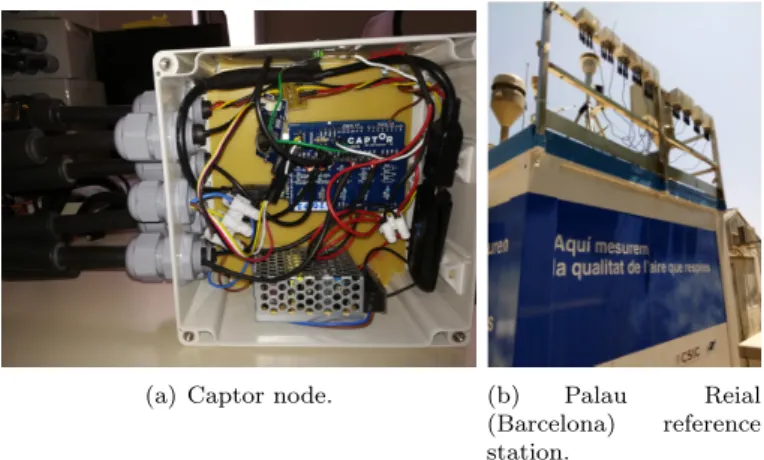
(a) Captor node. (b) Palau Reial
(Barcelona) reference station.
Figure 1.2: Captor Device: 4 ozone MICS sensors, 1 temperature sensor and 1 relative humidity sensor. On the right, Palau Real reference station with some nodes deployed (at the top) for calibration purposes.
periods (what is called a collocated node), so that sensors can be calibrated using the ground-truth values of the reference stations. This calibration is performed by means of machine learning algorithms, from the simpleMultiple Linear Regression(MLR) to Support Vector Regression (SVR). Different ma-chine learning methods are compared in real ozone campaign scenarios to see which algorithm performs the best with these conditions. Other important aspects like the loss in accuracy as the time evolves and the environmental conditions change is studied, what is called the long-term prediction. The comparison of the different models is done by means of comparing Quality of Information (QoI) measures like theRoot Mean Square Error(RMSE) and the R2, training time, training set size and long-term predictions. The long-term
prediction plays a key role in a real deployment as the models can present a loss in accuracy as time evolves, so the models may become biased, this happens because of the seasonality behaviour of the ozone and the limited data used for training. Besides, the fact that a node can have attached more than one sensor measuring the same pollutant can be used to perform sensor fusion us-ing machine learnus-ing, to improve the models or even to provide fault-tolerance properties to the models. Indeed, the evolution of the RMSE depending on the number of ozone sensors used in the calibration is studied. All these aspects, can be useful for future IoT deployments to help decide things like the calibra-tion time length, the algorithm to calibrate the sensors and how many sensor
CHAPTER 1. INTRODUCTION 5
are attached to a node. All these studies are done with the data acquired by theH2020 Captor project data collected during the 2017 campaign.
The different goals of the project can be summarized as follows:
• Acquiring understanding of low-costO3sensors.
• Performing sensor calibration using different machine learning techniques and studying their impact with a real calibration campaign data.
• Studying the calibration period length needed depending on the algo-rithm used for calibration.
• Studying the behaviour of each model in a long-term prediction setting.
• Studying the performance of machine learning models to perform sensor fusion when there exist replicated sensors.
• The production of scientific journal articles in the research area. With one article published [2] showing the results for the whole 2017 family of sensors with MLR and a distributed proposal to overcome the long-term predictions error (not seen in this thesis). One paper submitted, which is based on the results of this master thesis, and one article in edition process, showing sensor fusion results.
It is worth noting that the initial proposal proposed the study of graph signal processing (GSP) applied to the calibration of sensors, but this study was changed by the fusion of sensors study. Since there was not much literature on this type of fusion, and in addition, the available data sets allowed to make the study.
2
|
State of the Art
2.1
Low-cost sensor calibration
Methods for calibrating low-cost air pollutant sensors is an active research field. The common approach used by the different researchers and used in this project consists in placing several devices with sensors in an area where a reference station (the real pollution levels) is present. These devices can form what is called WSN, which can be used for distributed processing and obtaining measures at a finer grain scale. Then, after the devices have collected data for a period, this data is calibrated using a supervised machine learning approach with the ground-truth values (provided by the reference stations) as response variable.
Maag et al. [13] present different techniques used in the calibration of low-cost sensors. In addition, they explain that calibration or adjustment of low-cost sensors must be performed due to the presence of internal and external errors sources in these sensors. In fact, among the internal errors are; drift, dynamic range of response and nonlinearity (sometimes present in metal oxide senors), which can be overcome with a nonlinear method. Among the external errors are the environmental effects and interferences of other pollutants in the readings (cross-sensitivities), which can also be improved with the use of an array of sensors in the calibration.
Some low-cost sensors, like temperature and relative humidity sensors, in general have a linear response with respect to the true phenomena. Moreover, other sensor responses like CO, N O2, O3 and other gas pollutants have been
studied [15], [12]. Indeed, it is shown that an array of sensors is needed in order to calibrate some gas pollutant sensors. For instance, in order to calibrate tropospheric ozone, the ozone, the temperature and relative humidity measures are needed. The most common approach used in the literature is a machine learning approach where the sensors are collocated near a reference station, data is collected and machine learning models are built using a supervised learning algorithm (Spinelle et al. [23]).
CHAPTER 2. STATE OF THE ART 7
The following equation denotes the most widely used model to predict levels of ozone. A multiple linear regression with the ozone sensor measure, the temperature sensor and the relative humidity sensor as independent variables:
ˆ
y=β0+β1∗sO3+β2∗T emp+β3∗RH (2.1)
In the paper presented by Castell et al. [5], low-cost sensors for several air pollutants (e.g. N O, CO, etc.) are studied and some important results obtained. The sensors are studied in terms of different quality of information metrics like the Mean Bias, the RMSE and the coefficient of determination (R2). It is observed that sensors depend on the meteorological conditions and each sensor response is unique, because of that they must be individually cal-ibrated. Besides, they study the expanded uncertainty and conclude that the low-cost sensors are not accurate enough for awareness purposes. However, they state that recent applications of machine learning for calibration can im-prove the accuracy of these sensors.
2.2
Machine learning applied to sensor
calibra-tion
Different techniques have been compared for calibrating N O, N O2
electro-quemical low cost sensors. The simpleMultiple Linear Regression (MLR), the Support Vector Regression (SVR) and the Random Forest (RF) are used by Bigi et al. [4]. The results obtained show that the nonlinear methods (support vector regression and random forest) achieve the best performance compared to the linear method. Another common method tested for sensor calibration are the Artificial Neural Networks (ANN) (Spinelle et al. [23], [24]), some metal-oxide low-cost sensor for measuring O3, N O and N O2 have been
cali-brated with this method. The ANN also shows good results when calibrating low-cost sensors. Zimmerman et al. [25] use the Random Forest technique for calibrating O3 sensors among others, the results obtained also show that this
nonlinear models outperforms the simple multiple linear regression. Barcelo-Ordinas et.al [2] present a deep study of a calibration of a family of metal-oxide low cost sensor using MLR, the short-term is analyzed as well as the long-term predictions, showing the present of bias due to the environmental conditions and a novel distributed solution to reduce this error. Most of these studies are done using a data set obtained after a calibration period, which is then
CHAPTER 2. STATE OF THE ART 8
split into a training set and a test set, then the models are compared using the performance over the test set. However, the models are no tested for long-term predictions, where predictions are done after some time from the calibration. The presence of a drift in low-cost sensors has also been observed and studied. Different solution have been proposed but he most common is a re-calibration approach where the nodes must be placed besides a reference station period-ically to obtain a new model or update the previous one (e.g. Mijling et al. [14]).
Other techniques like including lag variables are tested in a research (see. [6]) using different nonlinear algorithms. The results show that the method that performs the best is the Support Vector Regression with lag variables (like an autoregressive model). Moreover, some geostatistical approaches when deal-ing with WSN of low-costs sensors are also studied in detail in the literature (Schneider et al. [20]), where the Kriging method is used to perform a dis-tributed calibration of the sensors and to predict pollution levels at unobserved places. Kriging performs the prediction as a weighted average of the pollution at observed places. Other different approaches are present in literature (e.g. Kim et al. [11]) where chemistry and location pollution knowledge are used to calibrate a low-cost sensor network. This shows that there are other al-ternatives to machine learning, but these may require deep knowledge about chemistry and environmental models.
2.3
Sensor fusion
The most common type of sensor fusion present in the literature explains how to use sensors measuring different pollutants to improve the accuracy of a model ([7], [23], [24]). This kind of fusion takes benefit of the influence of a pollutant over sensors of different pollutants, the cross-sensitivities present correlates different types of sensors. For instance, including CO and O3 to
improve the model of the CO2. All the sensors are introduced to a machine
learning algorithm as features, models like ANN or MLR. Barcelo-Ordinas et al. [3] already study the use of up to 4 sensors per node to improve calibration models using sensor fusion. Specifically, a fusion of four MOX ozone sensors using a multiple linear regression is done, producing a small improvement over the best sensor of the four available.
Other sensor fusion techniques focus on using statistical methods to sum-marize the data. Khedo et al. [10] use quantiles to fuse measures from different
CHAPTER 2. STATE OF THE ART 9
sensors. Therefore, measures like quantiles, medians or means are a simple way to combine readings from different sensors. The main benefit of using this pro-cedure is the reduction of traffic in the communication and power savings in a WSN. From the machine learning point of view, using the mean of several models or sensors may improve or not the accuracy depending if we use a better or a worse sensor than the baseline one.
Despite the fact that sensor fusion has been studied, using replicated sensors of the same technology has not been studied in great detail (only the use of four sensor with the MLR model). That is one aspect studied in the project, whether if using more than one sensor of the same pollutant can improve the model’s accuracy. Although sensors’ readings of the same pollutant are correlated, they may not be perfect correlated and some improvement can be achieved by using several of them.
2.4
Contribution to the state of the art
Method Short-Term Long-Term Training Set Size Sensor Fusion
MLR X X X X
KNN X
RF X
SVR X
Table 2.1: Studies in the literature regarding the methods used in the project (X denotes studied method).
In previous works, it is shown the use of different machine learning methods with several air pollutant low-cost sensors and also with different type of sensors (electro-chemicals and metal-oxide). It has been seen that each sensor must be calibrated individually (no global model can be used) and that the different technologies obtain different results in terms of accuracy. Table 2.1 shows the studies done in the literature with respect to the studies done in this project. The behaviour of the long-term prediction and the effects of the training set size for the nonlinear methods are studied in this project, as well as, the use of machine learning to fuse sensors’ readings of the same family of sensors.
3
|
Sensor Calibration
There exist several sensor calibration settings depending on different character-istics: whether ground-truth values are used, number of sensors, etc. Here the different possible approaches are listed, the ones in bold are the ones used in the project. Our main goal is to obtain labelled data to perform a supervised learning task. This brief introduction to the sensor calibration taxonomy is based on Barcelo-Ordinas et al. [1] survey. Figure 3.2 summarizes the calibra-tion setting taxonomy. The type of calibracalibra-tion is defined depending on:
• Number of sensors:
– Single senor: Only the sensor of interest is used to estimate the pollution levels.
– Sensor fusion: More than one sensor are used in order to combine the information (sensor fusion experiment done in section 6.5).
• Processing mode:
– Centralized: All data is sent to a central server where the data is processed for calibration purposes and calibration parameters are computed.
– Distributed: Every node in a sensor network sends data and collab-orates in the calibration parameters computations.
• Operation mode:
– Off-line: Sensor calibration is done when the nodes are not oper-ating in the deployment location.
– On-line: Sensor calibration is done on the fly, as the sensor records new data and the node is operating.
• Calibration frequency:
– Pre/Post: The calibration of the sensors is done before and after the deployment of the node in one area. For instance,ozoneoccurs
CHAPTER 3. SENSOR CALIBRATION 11
during the summer, so the sensor needs to be calibrated before and after the summer.
– Periodic calibration: The sensors are re-calibrated after a given pe-riod of time.
– Opportunistic Calibration: The calibration is not guaranteed for a period of time, sensors are calibrated whenever they are close to ground-truth values providers. For instance, when sensors are attached to a bus and this passes by a reference station.
• Position of reference stations:
– Collocated: Nodes are placed besides the reference stations, which provide ground-truth values, to record sensor values with the same conditions as the reference station.
– Multi-hop: Nodes are calibrated using other calibrated nodes that have been calibrated previously.
– Model-based: The nodes are calibrated using references stations that are not near them by using a mathematical model able to infer reference values.
• Ground-truth use:
– Non-blind: The reference values recorded by the reference station are used to calibrate the sensors via a supervised learning approach.
– Semi-blind: Only a partial view of the reference values is available.
– Blind: In this case no ground-truth data is used for sensor calibra-tion. Instead, some phenomena knowledge (e.g. physical models) is used to calibrate them.
• Calibration area:
– Micro: Each sensor is calibrated individually with the goal of ob-taining a good calibration for that certain location.
– Macro: Sensors are calibrated globally in order to obtain the best calibration model for a whole area of deployment.
Figure 3.1 shows the calibration strategy used in the H2020 Captor project. A non-blind pre-post calibration is done with the nodes, these are collocated close to the reference station were they are to be deployed. Then, collected data is processed and the sensors calibrated off-line. Finally, nodes are deployed in the area were they have been calibrated.
CHAPTER 3. SENSOR CALIBRATION 12
Figure 3.1: Calibration type; nodes are collocated besides the reference station; only one sensor is used; calibrated using the ground truth-values; pre-calibration during calibration period; centralized calibration with node not working; nodes deployed in one specific location with the sensor individually calibrated.
Centralized Distributed
On-Line Off-Line
Periodic Opportunistic Pre/Post
Non-Blind Semi-Blind Blind Single Sensor Sensor Fusion Micro Macro (Point) (Area) Model-Based Collocated Multi-hop CALIBRATION Area of Interest Number of Sensors Ground-Truth
use Calibrationtime
Operation mode Processing mode Position from reference
4
|
Machine Learning
Techniques
In this section a brief overview of the different machine learning methods used is provided, as well as a brief introduction to thePrincipal Components Analysis (PCA), used in sensor fusion.
4.1
Multiple Linear Regression
TheMultiple Linear Regression (MLR) method is the extension of the simple linear regression when dealing with several explanatory variables. Given the explanatory variable set X = (x1, ..., xN) (where xi ∈ Rp) and the response
vector y = (y1, ..., yN) (where yi ∈ R), the MLR approximates the response
variabley by a linear combination of the explanatory variables:
yi =β0+
P
X
j=1
βjxi,j+i i= 1, .., N (4.1)
Whereβ∈RP is the vector of coefficients and the error term
i∼N(0, σ2).
The vector of coefficients can be found by minimizing the Residual Sum of Squares (RSS), obtaining what are called theNormal equations:
min β N X i=1 (yi−(β0+ P X j=1 βjxi,p))2 (4.2) ˆ β = (XTX)−1XTy (4.3) In a Linear Regression is interesting to check which coefficients are signifi-cant, it is to say, they do not have a negative impact on predicting the response
CHAPTER 4. MACHINE LEARNING TECHNIQUES 14
variable. The following hypothesis test is performed for each coefficient: H0:βi6= 0 (4.4)
H1:βi= 0 (4.5)
The statistic used for an unknown variance and one coefficient testing is the t, which follows at∼t−studentn−p,α/2.
4.2
K-Nearest Neighbours
TheK-nearest neighbours(KNN), is a nonlinear, non-parametric method where the model itself is the set of training samples, what is called an instance-based method. Given the explanatory variable setX = (x1, ..., xN)(wherexi∈Rp)
and the response vector y = (y1, ..., yN) ( where yi ∈ R), the value of the
response for a new samplexN+1 is the average of the K nearest samples in the
feature space: ˆ yN+1= 1 K X i∈N(xN+1) yi (4.6)
So, the responseyˆN+1will be the response’s average of theKclosest
train-ing samples to the new sample. As it may be noticed, a distance measure is needed to obtain the points that are closer in the feature space. An exam-ple of a distance measure for numeric variables is the Euclidean distance or the Manhattan distance, but more generally, the Minkowski distance is the generalisation: d(x, x0) = P X i=1 (|xi−x 0 i| q)1q (4.7)
4.3
Random Forest
The Random Forest (RF) is an ensemble method. Basically, it builds several uncorrelated decision trees from the data sample, and averages the response of all trees to produce the prediction, so that the variance of the response is
CHAPTER 4. MACHINE LEARNING TECHNIQUES 15
reduced. The algorithm proceeds as follows; given the explanatory variable set X = (x1, ..., xN)(where xi ∈Rp) and the response vectory= (y1, ..., yN)
(whereyi∈R), the algorithm makesT ∈Nbootstrap samples of the data, as
many as trees. Each decision tree is built with a bootstrap sample. Afterwards, another randomisation step is introduced, at each decision node of each tree a random subset of variables to be considered is selected. This way, the decision trees build are uncorrelated as possible. Finally, the prediction for a new observation xN+1 will be:
ˆ yN+1= 1 T X tree∈F ftree(xN+1) (4.8)
As it can be seen above, the response of the different decision trees in the forest for the new data sample is averaged.
4.4
Support Vector Regression
TheSupport Vector Regression (SVR) is a kernel method, the regression vari-ant of the support vector machine. The idea is to map the data to a higher dimensional space where the inner products of the data are done and the re-gression is performed in that space. This may sound extremely time expensive, but it is done via the kernel trick, which consists on using a kernel function k(x, x0)which implicitly maps the data to a higher dimensional space and per-forms the inner products at the cost of working in the input space. The SVR extrapolates the idea of the margin classifier to the regression setting by using the−insensitive loss function:
V(r) =
0 if |r| ≤
|r| − otherwise (4.9)
This method is trained with the Kernel Matrix K ∈Rnxn instead of the
design matrix, so the optimization problem will grow with the number of ob-servations. This can lead to computational problems when dealing with large data sets. It is also worth mentioning that the SVR solves a quadratic opti-mization problem. For further information about support vector regression see [22].
CHAPTER 4. MACHINE LEARNING TECHNIQUES 16
4.5
Principal Components Analysis
The Principal Components Analysis (PCA) is statistical method whose main goal is to find the directions of maximum variation. Thus, the first component will have the largest variance, followed by the second one, third, etc. From the optimization point of view, we want to find the directionuthat maximizes the inertia: MaxuIn =Maxu n X i=1 wiψi2=u 0 X0N Xu (4.10) Where X is the centered data matrix andN the weight matrix. Each one of the components is a linear combination of the original features:
ψi=u1ix1+u2ix2+..+upixp (4.11)
Using this method we can perform dimensionality reduction by keeping the components that explain at least an 80%of the variance or we can use other criteria like the last elbow rule to select the desired number of components to keep. However, this method can also be used for feature extraction by using the resulting components, which have the special property of being orthogonal. A special case of thePCAappears when the data is standardized (as is our case in calibration), then the optimization procedure reduces to the diagonal-ization of the correlation matrix:
Max u0X0N Xu=λ
s.t. u0u= 1 . (4.12)
whereX0N X =Cor(X). For further information about principal compo-nents analysis refer to the book [9].
5
|
Data, Methodology and
Experiments
In this chapter, the data used in the investigation, as well as the devices used, are described. Moreover, the machine learning methodology used for model building and hyper-parameter selection is explained along with the experiments to compare the different methods (experiments’ results explained in chapter 6).
5.1
Data
The project is held within the Statistical Analysis of Networks and Systems (SANS) research group of the computer architecture department of the UPC. Different campaigns forO3sensor calibration have been done in the European
H2020 Captor project1. In order to obtain air pollution measurements for low-cost air pollution sensors, a WSN was deployed. The nodes contained in the WSN were IoT devices with internet connection and some sensors attached to a processing unit. The idea behind using a WSN with IoT devices is that each one of the nodes can collect data and perform operations individually (e.g. record sensors, send data to repository, etc.), but they can also communicate between them to perform operations like a multi-hop calibration, it is to say, data from other nodes is received to improve the calibration models.
The resulting IoT device was calledCAPTOR, the original device followed a do it yourself philosophy. The device used low-cost sensors and anArduino Yun as a computing unit. The idea was to create simple nodes that were likely to be build by any non-expert in electronics, so anyone could put a node in his/her home and collect air pollution data for investigation and awareness purposes. The node has an Arduino yun as computing unit, four SGX Sensortech MICS 1H2020 Captor project: project funded by the European Union for collecting air pollution
data and to raise awareness.
CHAPTER 5. DATA, METHODOLOGY AND EXPERIMENTS 18
2614metal-oxide(MOX)2O
3 sensors, one temperature sensor and one relative
humidity sensor. The node is powered by an external power supply and sends the collected data via 3G or Wifi to a central database. Therefore, the node sends a tuple to the central database containing : timestamp, sensor 1 reading, sensor 2 reading, sensor 3 reading, sensor 4 reading, temperature reading and relative humidity reading. The ozone sensors’ readings consist of resistor values in kiloOhm obtained from measuring the load voltage VL (obtained from the
A/D converter), the input voltage Vin and the load resistorRL:
Sraw=RL(1−
VL
Vin
) (5.1)
The different units of each readings are: kiloohm for ozone sensors, celcius degrees for temperature sensors andpercentage for relative humidity sensors. The device takes samples every minute, then takes intervals of thirty minutes, sorts the samples and removes the largest and smallest samples (5%, as they were outliers), averages the samples and sends the tuple described every half an hour. In Appendix B, the metadata of the three data sets used is provided (feature description and basic descriptive statistics).
For ozone calibration, three different sensors are needed (as seen in the state of the art chapter 2) and therefore present in the node: the ozone sen-sor, the temperature and the relative humidity sensors. Tropospheric ozone is a seasonal pollutant, this means that the highest levels of ozone pollution are usually recorded during the summer. Thus, sensor calibration via ma-chine learning should be as close as possible to the deployment period. Sensor data for calibration has been collected during the 2017 and 2018 summer cam-paigns mainly. Three testbeds have been used to collect data: Spain, Austria and Italy. The campaigns were scheduled in four different phases, these are described in table 5.1:
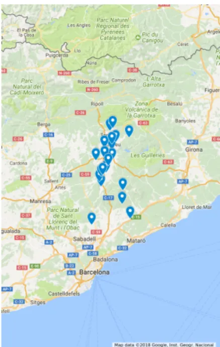
For the 2017 and 2018 a total of 35 captor devices were spread over different places of Catalonia, Austria and Italy. So, a total of 140 sensors where used each year. Figure 5.1 shows the places where 2017 Captors were placed in Catalonia testbeds (areas of Tona, Vic, Manlleu and Montseny). Some of the nodes were placed during the whole campaign near by a reference station, these nodes remained in the same place for phase 1, 2 and 3. Thus, these nodes are the ones used for investigation purposes as the amount of data collected is large enough to perform the experiments of sections 6.1, 6.2, 6.3 and 6.4.
2Two main sensor technologies are used nowadays: metal-oxide sensors and
CHAPTER 5. DATA, METHODOLOGY AND EXPERIMENTS 19
Phase Description
Phase 0
All sensors are placed in the
Palau Reial (Barcelona) reference station to check that all sensors and network connections work properly.
Phase 1
At this stage, also called pre-calibration phase, the nodes are placed at reference stations close by the final
deployment location (phase 2). Phase 2
Few nodes are kept close to the reference stations during the whole measuring stage while some other nodes are placed in volunteers homes. This phase usually comprises July and August months.
Phase 3 Post-calibration phase, all nodes are placed again near the
reference stations were they had been previously placed in phase 1. Table 5.1: Campaign phases description.
Figure 5.1: Deployment places of the different nodes during 2017 campaign. Captors spread over Tona, Vic, Manlleu and Montseny.
The data sets used in experiments (6.1-6.4) developed in this project (ex-plained in the next section) are the data from nodes C17013, C17016, C17017
CHAPTER 5. DATA, METHODOLOGY AND EXPERIMENTS 20
(from Manlleu, Vic and Tona respectively). These nodes remained close to a reference station during the different campaign phases, so data for the entire months of July and August of 2017 is available, and this large amount of data is needed for the experiments. Specifically, node C17013 was deployed from 08/05/2017 to 04/10/2017, node C17016 from 26/05/2017 to05/10/2017 and node C17017 from 08/05/2017 to 05/10/2017. To sum up, data from 12 low-cost metal-oxide sensors is used for calibration and machine learning method comparison.
In section 6.5, a sensors fusion experiment is studied, for this purpose a different data set is used. The two data sets used consist of nodes that coin-cided in the same place during Phase 1, so the amount of data is smaller but have more sensors available to perform sensor fusion. The following Table 5.2 describes the nodes that coincided for a period of time (phase 1) in the same place, so that, used to perform sensor fusion. The two data sets have more than 900 samples (3 weeks approximately), and consist of 24 sensors in the Tona case and 28 in the Manlleu case.
Place Manlleu Tona
Nodes 17017, 17006, 17007, 17012, 17014, 17027
17013, 17001, 17002, 17003, 17005 17010, 17011
Total Samples 918 1395
Table 5.2: Nodes used to perform sensor fusion experiments.
All data is available at zenodo website, doi:10.5281/zenodo.3233516, where the captor data for nodes C17013, C17016 and C17017 is available along with the long-term predictions.
To sum up, the following table 5.3 summarizes the two sets of data used in the different sections. It indicates the number of nodes by which the data sets are formed. The data set one is larger compared to the data set two:
CHAPTER 5. DATA, METHODOLOGY AND EXPERIMENTS 21
Data Set Description Number of sensors Sections Size
Data Set 1 This data set corresponds to nodes that have been placed during the different phases in a reference station. So, more samples with the corresponding refer-ence values are available for research purposes.
12 6.1, 6.2, 6.3,6.4 Large
Data Set 2 This data set corresponds to nodes that have been placed in the same location during the campaign phase 1. So, more sensors with the reference values are available to study a sensor fusion ap-proach to calibration.
24 in Manlleu, 28 in Tona
6.5 Small
Table 5.3: Table summarizing the different data sets using in the project, and their composition.
5.2
Machine learning methodology & experiments
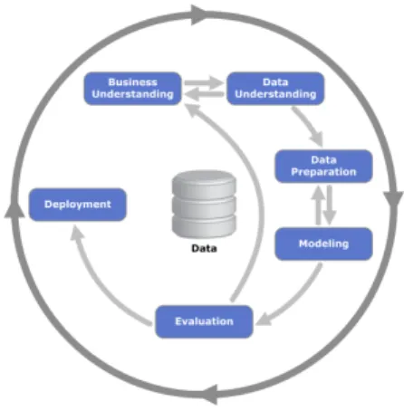
In this project, all steps of the CRISP data mining methodology (Figure 5.2) have been done in order to perform a proper data analysis. Data understand-ing was one of the most important steps, where knowledge about MOX ozone sensors and some knowledge on the pollutant itself were acquired. The nonlin-earities were observed at this step, the effects of the environmental conditions were also noticed, which is an important aspect to take into account. In the data preparation the data was downloaded in a specific file format (.csv) from the central database in order to make easier the data analysis part, while some pre-processing steps like the normalization of the data was also done and the removal of errors in the sensors’ readings. In the modelling stage the different machine learning methods where applied, then in the evaluation the different QoI metrics were compared. Finally, the deployment was not done, as the experiments were done only for research purposes, but the resulting methods can be applied to a real WSN deployment. Several iterations have been done, several models were studied, after the evaluation the data was reviewed to further understand the nature of the underlying structure of the sensor data. For instance, the first approach to sensor fusion did not take into account the presence of multicollinearity, once it had been observed, PCA was used to use orthogonal variables to avoid learning problems, after that models were built and evaluated again.CHAPTER 5. DATA, METHODOLOGY AND EXPERIMENTS 22
Figure 5.2: CRISP-DM wheel. Source: ftp://public.dhe.ibm.com/software/analytics/ spss/documentation/modeler/18.0/en/ModelerCRISPDM.pdf
The data collected by the nodes was used to generate several data sets. The ground-truth values - obtained from the reference station - along with the measurements of the different sensors present in a node lead to a supervised learning problem, where the ground-truth value is to be approximated with the sensors’ readings. It has been seen in previous researches (see chapter 2) that each sensor needs to be calibrated individually and that the metal-oxide sensors need the temperature and relative humidity as independent variables to produce a good ozone approximation. For the experiments of sections 6.1, 6.2, 6.3 and 6.4, twelve ozone sensors are used, a total of three nodes (one per location) with four ozone sensors each.
Given a data set[(x1, y1), ...,(xN, yN)]wherexi∈Rp andyi ∈R, a
cross-validation approach is used to perform hyper-parameter selection for the dif-ferent models 5.3. Before that, a pre-processing step is performed, the difdif-ferent features are normalized by subtracting the mean of the feature in the training set and dividing by the standard deviation of the feature in the training set. Each model needs some hyper-parameters to be provided, these are selected using a10-fold cross-validation procedure. The data set is divided into train-ing set and validation set, 75 percent of the whole data set for traintrain-ing and 25 percent for validation. Then, the training set is used to perform the cross-validation, where the training set is split into 10 bins, a model with a set of hyper-parameters is trained with 9 out of the 10 bins and tested on the tenth. Finally, all cross-validation errors are compared, the best hyper-parameters will be those whose model has the lowest error. Once the hyper-parameters are selected, the model is fitted again with all the training data and tested on
CHAPTER 5. DATA, METHODOLOGY AND EXPERIMENTS 23
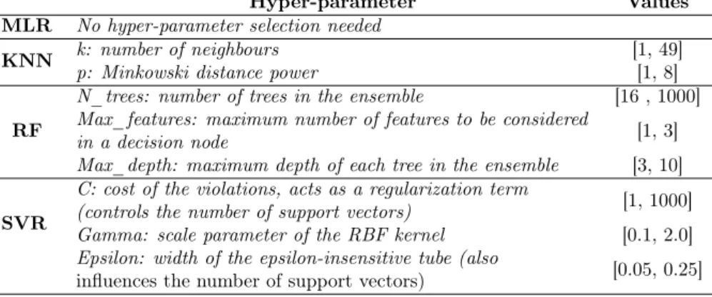
the validation set, so that it can be compared with the other models. Instead of using a test set we decided to use the hold-out partition as a validation set, because we do not want to select a final model among all of them for a deployment, instead, we want to check the performance of the different models (with their best set of hyper-parameters) on a validation set. Table 5.4 shows the different hyper-parameters optimized for the the different models and the range of values tried for each one.
Figure 5.3: Model building methodology.
Hyper-parameter Values
MLR No hyper-parameter selection needed
KNN k: number of neighbours [1, 49]
p: Minkowski distance power [1, 8]
RF
N_trees: number of trees in the ensemble [16 , 1000]
Max_features: maximum number of features to be considered
[1, 3]
in a decision node
Max_depth: maximum depth of each tree in the ensemble [3, 10]
SVR
C: cost of the violations, acts as a regularization term
[1, 1000]
(controls the number of support vectors)
Gamma: scale parameter of the RBF kernel [0.1, 2.0]
Epsilon: width of the epsilon-insensitive tube (also
[0.05, 0.25] influences the number of support vectors)
CHAPTER 5. DATA, METHODOLOGY AND EXPERIMENTS 24
Method comparison in sensor calibration can be challenging, different met-rics can be used to compare different aspects of a method’s performance in a real calibration. Here, the different experiments done along with their goal are explained:
1. Statistical Analysis or Short-term prediction: a basic machine learning approach is used. The whole data set is shuffled, afterwards it is split into training set and validation set. The models are compared using the validation set with some metrics like thecoefficient of determination (R2) and theRoot Mean Squared Error (RMSE). Moreover, the predic-tion of each model (whether overestimates or underestimates) is studied. The goal is to see how the real ozone can be approximated using low-cost metal-oxide sensors. As we are shuffling the data, the change in the environmental condition will not affect model’s performance as temporal order is lost.
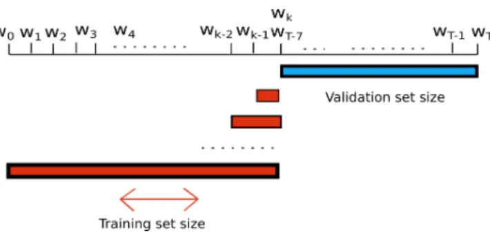
2. Training set size: learning curves are studied, a validation procedure is done while increasing the size of the training set. The goal is to see how many samples each model needs to produce an accurate enough output. In a real campaign it is important to know how many days are needed for calibration before the deployment stage. More precisely, 7 validation weeks are set at the end of the calibration stage, after that, consequent models are build with increasing size, week by week, starting right before the beginning of the validation weeks. The RMSE of the 7 validation weeks is averaged. Figure 5.4 shows the procedure explained:
Figure 5.4: Learning curve experiment setting.
3. Training times: the complexity of each model is studied in terms of training time. The goal is to determine which model takes the largest to
CHAPTER 5. DATA, METHODOLOGY AND EXPERIMENTS 25
be trained. This information is useful to see how many time is needed after the calibration weeks to build the model before the deployment of the IoT nodes.
4. Long-Term prediction: the model is build using a few calibration weeks (4 weeks), then model’s performance is tested with the follow-ing weeks after the trainfollow-ing, day by day. The difference between this approach and the first one is that the data is not shuffled. Thus, en-vironmental conditions can affect the model as we are validating it in different conditions. The goal is to see if the calibration at the beginning of the summer degenerates as summer goes and environmental conditions change (case of a real campaign). Figure 5.5 shows the experiment done with the different sensors, wherewi are the initial weeks anddj are the
days where the models are tested:
Figure 5.5: Long-term experiment, prediction day by day.
5. Sensor Fusion: a similar procedure as in the statistical analysis experi-ment is done. However, in this case the data sets used contain more than four ozone sensors, the data sets contain all the sensor that coincided in Tona and Manlleu in phase 1 of the campaign. Models of increasing number ofO3 sensors are build to see whether if increasing the number
of sensors of the same family can improve the model’s accuracy. At each step, the validation error of ten different models, with randomly selected sensors in each model (the best sensor of all is always present), is aver-aged to give an approximate measure for a model with a certain number of sensors.
6
|
Results
In this chapter, the results of the experiments (explained in chapter 5.2) done are presented and discussed. The different models are compared with five experiments in order to see the performance of each one. Moreover, sensor fusion is studied to observe whether it provides some advantages. Part of the results of this chapter are in the process of being published in research journals. The first part; sensor analysis, training set size and long term prediction , has been submitted to the IEEE Internet Of Things journal. While the fusion of sensors part is in the process of being written to be sent to a journal.
6.1
Statistical analysis
As explained in section 5.2, in this section the different models are compared in terms of several goodness-of-fit measures (e.g. RM SE andR2). The
com-mon machine learning approach is used, data is shuffled and split for hyper-parameter selection and validation. This way we are evaluating a short-term prediction where the training set is large and contains representative data for all environmental conditions (because data is shuffled). The use of nonlinear methods is motivated by the fact that although the metal-oxideO3sensor’s
re-sponse is known to be linear with respect to the ground-truth data sometimes some nonlinearities arise in the sensor’s response ([13]). Figures 6.1 show the nonlinearities present in some sensors’ responses.
Figure 6.2 shows the boxplots for all the data sets. Here you can see the value ranges given by the different sensors, you can see how the response of the sensors is unique and that they follow asymmetric distributions. It is not possible to identify as outliers the values far from the whiskers since the outliers have already been removed by the IoT nodes. In addition, the sensors approximate the levels of ozone (densities in figure 6.3) and these follow a multimodal distribution, for that reason in the boxplots extreme values can be observed. The reference densities are observed to be similar in the Manlleu
CHAPTER 6. RESULTS 27
Figure 6.1a) Normalized sensor vs. normalized ground-truth value (C17013 s4) b) Normalized sensor vs. normalized ground-truth value (C17016 s4)
(a) C17013 (b) C17016 (c) C17017
Figure 6.2Boxplots raw sensor values.
and Vic case where there are two modes and the most frequent values are the low concentrations and the concentrations around 100µgr/m3, while the
concentrations in Tona are higher and the shape of this distribution differs in the mode’s place.
(a) Manlleu ozone den-sity.
(b) Vic ozone density. (c) Tona ozone density.
CHAPTER 6. RESULTS 28
Figure 6.4Tona, Vic and Manlleu ground-truth ozone concentration values during the whole 2017 campaign.
To get an idea of how ozone concentrations are distributed throughout the campaign in different cities, the above Figure 6.4 shows the daily ozone average for the different reference stations, as well as the maximum and minimum average concentrations per month. Basically, it is seen how the ozone values decrease as the summer ends, they decrease with the temperatures, because for the generation of ozone a high solar irradiation is necessary. In addition, it can be observed how the trends for the different reference stations are similar, except for Tona, whose concentrations are higher than those of Manlleu and Vic. For further information about the sensor data, check Appendix B, where some basic descriptive statistics for the different sensors present in the three data sets used in this section are provided.
Nonlinear models are used, because of the presence of nonlinearities, the use of more complex models may result in a better response approximation. Let’s visualize how the ozone concentrations evolve during the summer in Tona and vic (validation set in the long-term prediction), Figure 6.5. It is important to see that the concentrations have large fluctuations and are highly correlated with the temperature, ozone appears with a combination of sunlight and other components, so the temperature is correlated. This large variability does not allow us to perform a classical time series analysis as we get measures every half an hour and the dynamics of the evolution of the ozone may be lost. The black
CHAPTER 6. RESULTS 29
line present in both Figures 6.5a),b) represent the mean ozone concentration in the training set (May and beginning of July). As it is seen the ozone concentrations fluctuate a lot and the environmental conditions during the different months of the summer can be different. For instance, at the end of the summer (September) the ozone concentrations fall below the mean ozone of the training set.
(a) Half day averages of ozone and temperature, C17016 s4
(b) Half day averages of ozone and temperature, C17017 s1
Figure 6.5Evolution of ozone concentrations and temperature.
Figure 6.6: RMSE boxplots for the dif-ferent methods applied to the valida-tion data.
The results obtained for the different models for the short-term prediction are shown in Figure 6.6. As it can be seen, there is a great difference between the MLR and the nonlinear models. The median of the RMSE is reduced more than2µgr/m3 by the nonlinear models.
However, there is not a clear difference in the performance of the SVR, RF and KNN, the three of them seem to pro-duce similar results. All three methods have a similar RMSE median, but the SVR has the lowest 3rd and 1st quan-tile. The 3rd quantile is also improved by more than 2µgr/m3 with respect to
the MLR model. So, there is no big dif-ference between the performance of the nonlinear models. However, the SVR is
CHAPTER 6. RESULTS 30
KNN is the simplest among the nonlinear models. The SVR is able to reduce the RMSE in3.06µgr/m3 in average, the RF in3.11µgr/m3 and the KNN in
2.62µgr/m3. All this also reinforces the fact that even all sensors belong to
the same family of sensors their responses are unique and some sensors’ errors can vary a lot. Indeed, in this case the RMSEs range from 9 to 20µgr/m3,
showing a large variability on the errors. That is why, using an array of sensors of the same family in a device can add some robustness by using always the best sensor.
(a) Validation RMSE & R2. (b) Target diagram Captors.
Figure 6.7: Performance plots captors.
Figure 6.7a) shows the RMSE and theR2for the twelve sensors. It can be seen the reduction in the RMSE by the nonlinear models as well as the fact that the nonlinear models are able to explain much more proportion of the response variability. The coefficient of determination increases as the RMSE decreases, meaning that the models are able to reduce the error and explain more response’s variability. Moreover, the target diagram (see appendix A) for the different sensors is shown, the Mean Bias (Mbias) and the Centered Root Mean Square Error (CRMSE) divided by the deviation of the ground-truth values are observed in the plot. All models share a common property, all sensors have a low bias, indicating that when using a large data set with representative data from all epochs the models have low bias and CRMSE term dominates the error. Indeed, the RMSE can be related to the mean bias and CRMSE:
RM SE2=CRM SE2+M Bias2 (6.1)
CHAPTER 6. RESULTS 31
In air pollution awareness, when some levels of pollution are exceeded an alarm is produced. So, it is important to see whether a model overestimates or underestimates high concentration values. In order to address this problem, Figures 6.8 show the predicted ozone concentration against the reference ozone concentration (for the validation set) for the C17013 node sensor one. As it can be seen, the MLR, which is the simplest model, saturates with high pollution concentrations, it is to say, that the model underestimates the ozone values when the concentrations are large. On the other side, methods like the SVR or the RF have a better accuracy (predictions near to the perfect fit) and in general, the nonlinear models do not underestimate, sometimes they achieve large values while others not.
(a) Validation data C17013 s1, MLR. (b) Validation data C17013 s1, KNN. (c) Validation data C17013 s1, RF. (d) Validation data C17013 s1, SVR.
Figure 6.8: Validation ReferenceO3 against validation predictedO3 (calibration of
CHAPTER 6. RESULTS 32
6.2
Training set size
The goal of this section is to check how the different models behave depending on training set size. The procedure goes as follows; the validation RMSE is obtained for different sizes of the training set, validating the model on the seven last weeks. The experiment starts with a small training set and starts increasing it (moving away form the validation set) in order to see how many observations each model needs to obtain the best accuracy. Related to a real sensor calibration campaign, this would mainly tell how many samples/time each models needs in order to obtain an accurate enough model. For the model building stage, with each training set size across-validation (CV) procedure is done to obtain the best model hyper-parameters using the training set.
For illustration purposes only two learning curves are shown (the most rep-resentatives). Figures 6.9a),b) show the learning curves for two sensors placed in Vic and Tona (C17016 s4 and C17017 s1) . It shows how the validation RMSE evolves as the training set size is increased. Several aspects can be observed:
(i) The MLR method obtains the worst performance but is the model that stabilizes the most quickly. With 1/2 weeks of data it is able to obtain the best model possible with the MLR.
(ii) In general, the nonlinear methods obtain the best performance in terms of validation error but they need more samples in order to obtain the best model possible with each method. Indeed, it is seen that with the non-linear models the larger the training set the better (as seen in subfigures 6.9a) and b))
(iii) The SVR is in general the model that need more samples in order to obtain a better models than the linear one. Between 3/4 weeks are needed to obtain a good enough model. This fact can be seen in subfigure 6.9c).
The models behave different depending on the training set size, this may play a key role when deciding the amount of time that a node is placed besides a reference station in order to collect data for calibration purposes. For instance, if we aim to calibrate the sensors with the support vector regression model we should take into account that the node must remain more time collocated in order to have enough data samples to build the model properly.
CHAPTER 6. RESULTS 33
(a) Learning curve C17016 s4. (b) Learning curve C17017 s1.
Figure 6.9: Learning curves for sensors C17016 s4 and C17017 s1.
6.3
Training time
In this section the training times are presented in order to compare the algo-rithms in terms of complexity. The training time may be important in order to know how many time is needed to build the model before the deployment. This time depends directly on the algorithm complexity of each method, their underlying optimization problems and the number of hyper-parameters to try in the cross-validation procedure. The experiments for obtaining the following times were done in a Dell Optiplex with processor Intel Core i5-6500 3.2Ghz and 8GB RAM.
Table 6.1Confidence intervals for mean training time of a single MICS sensor. Training Time (sec.)
MLR KNN RF SVR
0±0 325.41±10.8 1535.07±32.91 18545.22±1320.24
Model building times clearly show that nonlinear models take much more time than the linear model. The SVR is the model that takes more time, that is because the SVR method uses the kernel matrix, which is anRN xN matrix,
and the number of hyper-parameters tried is large. The models ordered from less complex to most complex are: MLR, KNN, RF and SVR. The multiple linear regression has a training complexityO(p2n+p3), the KNN naïve needs no
training as it is an instance based methods but it requires two hyper-parameters to be optimized, the random forest has complexityO(n2pntrees)and the SVR
CHAPTER 6. RESULTS 34
6.4
Long-term prediction
In this section the models’ long-term prediction is studied. The purpose is to simulate a real deployment where after getting all sensors calibrated they are placed in locations to measure levels of pollution, there, there is no longer a reference station/ground-truth values, so it is not known whether the predic-tions become less accurate as time evolves. In order to simulate this situation, a calibration of (4-5 weeks) is done (without shuffling the data, data from the end of may and beginning of June), then the model is validated day by day in order to see if the accuracy decreases as the environmental conditions (e.g. temperature, humidity and other factors present in summer) change.
First of all, the evolution of the RMSE is inspected. For simplification pur-poses the evolution of sensor 1 from nodes 17013 and 17017 and sensor 4 node 17016 are shown in figure 6.10, as they are representative enough of all sensor family. It can be seen that the error does not remain constant as time and environment conditions evolve, it has a large variability, sometimes the error can be as low as 5µgr/m3 while there are peaks above 40µgr/m3. However,
in subfigure a), the RMSE is seen to increase as the time goes on, indicating that even though a good calibration is done before the deployment period, the models and the metal-oxide sensors can not handle properly the difference in the environmental conditions (regarding the training set/calibration weeks). The other sensors also show an increasing trend in the RMSE, despite of not being as significant as with node 17016, they vary a lot and increase over the days. For instance, the RMSE of sensor s1 C17017 increases during July and decreases during the month of August. Another interesting fact to study is the difference in the long-term performance for the different machine learn-ing techniques. The three subfigures in 6.10 show the nonlinear methods to outperform the linear one in the first days after the calibration period, but as time and conditions change the nonlinear models’ performance crosses with the linear one. Thus, there is no clear advantage in using the nonlinear methods for a long-term prediction as the error also increases like in the linear case. Indeed, in some cases (in subfigures a) and b)) the RMSEs at the month of September for the nonlinear methods are seen to be worse than in the linear method (in subfigure c) not). So, there is no better model when evaluating long-term predictions as all models present some bias.
Now, target diagrams (see Appendix A for further explanation) are used in order to understand better the evolution of the error in the long-term predic-tions. The target diagram decomposes the RMSE in terms of the normalized
CHAPTER 6. RESULTS 35
(a) Long Term RMSE C17016 s4.
(b) Long Term RMSE C17013 s1
(c) Long Term Target RMSE C17017 s1
Figure 6.10: Long term target diagrams for C17016 s4 and the different methods.
mean bias and the normalizedcentred root mean squared error. The centred root mean squared error helps to understand better the variance component of the error (as the means of the reference and prediction are subtracted). This values are plot in a target diagram where the x-axis is the normalized mean bias and the y-axis is the normalized CRMSE, those points that fall outside the unit circle indicate that the null model (mean value of the reference values) is better than the current model. The value of the centred RMSE will always be positive, a convention states that samples will fall on the positive or negative side of the x-axis depending on the ratio of the deviation of reference and the deviation of the predictions. So, this will indicate whether the model has more or less variance than the true phenomena.
All target diagrams show the same pattern on the evolution of the error, in Figure 6.11 the target diagrams for the node 17016 sensor 4 are show for the different methods. The darker points denote days closer to the calibration phase while the lighter ones are the days most far away from the calibration. As mentioned before, the points start to change sides of x-axis, indicating that sometimes the model’s variance is larger than the reference values variance, what is important is that there is a small variation in the x-axis but a large variation in the y-axis. This is stating that the normalized CRMSE has a small increase as time evolves (spread of points along x-axis) while the normalized mean bias is seen to increase as days pass. Thus, the blue points are closer to the y= 0 value while the others sometimes are closer and others are farther. Moreover, for days that are far enough from the calibration or that day had
CHAPTER 6. RESULTS 36
extreme ozone or environmental conditions values, the model becomes worse than the null model. So, the models degrade with environmental condition and consequently with time. As seen in the RMSE evolution 6.10, the dif-ferent methods behave similarly among them and there is no clear advantage of the nonlinear models over the linear ones. The nonlinear methods Figure 6.11b),c),d) show less variation along the x-axis but there is no clear difference.
(a) Long Term Target diagram (b) Long Term Target diagram.
(c) Long Term Target Diagram. (d) Long Term Target Diagram.
Figure 6.11: Long term target diagrams for C17016 s4 and the different methods. Now, let’s take a look at the evolution of the mean bias and the CRMSE to see which one causes the increase in the RMSE metric. In Figure 6.12 the evolution of these metrics is shown, it can clearly be seen that although there is variability in both metrics the mean bias is the one that increases more as days pass. It can be clearly seen in sub-figure a) and b) that the mean bias increases over the months. However, the CRMSE does not show such an increasing trend but it has a large variability over the days depending on the conditions of a certain day.
All this indicates, that all models present a bias as time evolves. This bias could be caused by the metal-oxide sensor’s bias, where the behaviour of the
CHAPTER 6. RESULTS 37
(a) Normalized CRMSE and Mbias for C17016 s4
(b) Normalized CRMSE and Mbias for C17013 s1
(c) Normalized CRMSE and Mbias for C17017 s1
Figure 6.12: Evolution of Mean Bias and CRMSE for sensor 1 of nodes C17013 and C17017 and sensor 4 of node C17106.
sensor depends on the environmental conditions where it has been placed, so that sensor data changes. The use of nonlinear models does not overcome this limitation. As seen in the previous work several approaches can help to overcome this bias problem, the most easy solution but the most expensive one would be a re-calibration procedure (see Mijling et al. [14]).
A virtual re-calibration approach is done with the different methods in order to see if the biases can be improved. The re-calibration is simulated by using the previous four weeks of a period for calibration and validating the model with the consecutive week. These calibration window is slided over the whole data set of the different nodes. Following Figure 6.13, shows the re-calibration results for the different models. It is seen that the re-re-calibration moves all points that are far away from the training period to the y-axis center, this means that in average the predictions have a low bias. Moreover, as the nonlinear models are more complex, they have a lower CRMSE than the MLR bacause of their ability to explain more response’s variability. Moreover, the nonlinear method perform a better job at the re-calibration as they are better at prediction at short-term. Thus, the SVR, RF and KNN care able to group more the data to the point x= 0, y= 0.
This can be done in a real setting at the expensive price of taking the node to the reference station where it needs to be calibrated again, so data from re-calibration periods will be lost and taking the node to a reference station periodically can be costly.
CHAPTER 6. RESULTS 38
(a) MLR Long-term. (b) MLR Long-term re-calibration
(c) KNN Long-term. (d) KNN Long-term re-calibration.
(e) RF Long-term. (f) RF Long-term re-calibration.
(g) SVR Long-term. (h) SVR Long-term re-calibration.
Figure 6.13: Long term target diagrams for C17016 s4 and the corresponding re-calibration results.
CHAPTER 6. RESULTS 39
6.5
Calibration using sensor fusion
The CAPTOR project deployed thirty-five devices with a total of 140 MOX ozone sensors during the 2017 summer campaign. As mentioned in Chapter 5, nodes were spread over the different reference stations during phase 1, for calibration purposes. Therefore, some nodes coincided in the same place during a small period of time (3/4 weeks approximately), allowing us to investigate whether if using more than one metal-oxide sensor in the calibration model would improve the model’s accuracy. Basically, the idea is to introduce each sensor as a feature in the machine learning method and see whether the model improves or not.
An experiment can be done for investigating sensor fusion. Sensor fusion is studied in terms of what a real deployment would look like. Thus, the idea is to test how a node with more than one low-cost ozone sensor would work, studying the improvement of using several sensors in a measuring node. In sub-section 6.5.1, the introduction of the sensor fusion is motivated by studying the different correlations present between the sensors. Finally, in sub-section 6.5.2 the results of the fusion experiments are presented.
6.5.1
Correlations
To understand how the sensor fusion works the correlations between sensors are studied. The idea behind the fusion is to use sensors whose values are not perfectly correlated between them and highly correlated with the response variable. This way, fusing two sensors in a model improves over the best of the two individual ones.
It is true that all sensors measure tropospheric ozone, so that, all sensors will be correlated between each other. However, each sensor presents unique irregularities that could improve the prediction of concentration levels. Figure 6.14 shows the heatmaps with the correlations between sensors and also the reference values (first column) for the two data sets. First, we must observe the first column of the different heatmaps, this corresponds to the correlation between the sensors and the target values. We want these correlations to be as large as possible, it is seen that some of them have a correlation larger than
0.9while a few other a correlation of0.5. Therefore, some sensors will be more accurate as they represent better the true phenomena. Second, the correlation between sensors is important because we want them to be as less correlated

![Figure 3.2: Sensor calibration settings taxonomy. Source: [1]](https://thumb-us.123doks.com/thumbv2/123dok_us/1444163.2693332/20.722.136.594.435.623/figure-sensor-calibration-settings-taxonomy-source.webp)