The key sector identified for the pro-poor growth in most LDCs is the farming sector. Agricultural growth, especially the growth and stabilization of food pro-duction, is likely to benefit poor people. First, many of the rural poor are net food buyers. Smooth and ample local food supplies carry special advantages for them, especially if the international or national food costs of food are high. Second, while poor people’s entitlements to food determine their nutrition levels, their exchange entitlements depend – directly or indirectly – on their earnings from producing food.
Poor performance of food sector is a source of food insecurity only partially compensated by food imports and food aid. Many agriculture-based countries still display an anemic per capita agricultural growth and a little structural transformation (a declining share of agriculture in GDP and a rising share of industry and services as the GDP per capita rises). The same applies to vast areas within countries of all types. The rapid population growth, the declining farm size, the falling soil fertility, and missed opportunities for the income diversification and migration create distress as the powers of agriculture for development remain low.
LEAST DEVELOPED COUNTRIES ECONOMIC SITUATION
For most LDCs, the 1980s saw a macroeconomic instability, with rapidly rising servicing costs on the foreign debt, external terms of trade shocks, and rising fiscal and external imbalances entailing an unsustain-able excess of the aggregate demand over supply1
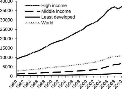
(Behrman and Srinivasan 2006). From a long-term perspective, the LDCs have historically experienced high growth volatility. Although their per capita GDP has increased significantly in the real terms, the gap between them and other developing countries has continued to widen (Figure 1).
Least developed countries – comparison
Vladimír JENÍČEK, Šárka GRÓFOVÁ
Faculty of International Relation, University of Economics, Prague, Czech Republic
Abstract:Th e inter-related causes of food insecurity in these countries are mainly the long lasting civil wars, a limited ac-cess to land, environmental degradation, climatic shocks and the rapid population growth resulting from the high birth rates and the return of refugees.
Key words:economic situation, international trade, foreign direct investments, offi cial development assistance, remit-tances, indicators of health
Supported by the Faculty of International Relations, University of Economics, Prague.
1Many developing countries are heavily dependent on few primary commodities for both foreign exchange and as a
source of the revenue for public spending. The prices of these commodities proved to be highly volatile in the 1970s and 1980s. Increases in their prices often led to public spending sprees, which led to large budget deficits when the primary commodity prices fell.
0 5000 10000 15000 20000 25000 30000 35000 40000
[image:1.595.67.283.462.617.2]High income Middle income Least developed World
Figure 1. GNI per capita, PPP (current international $)
The export-oriented growth model, which implicitly or explicitly underpinned most LDCs’ development strategies during this period, did not result in any high increase in the investment and capital forma-tion in many of them. These countries also became more vulnerable to the global slowdown as their com-modity dependence, export concentration and food imports increased. This model was also associated with growing sectoral imbalances, as the agricultural productivity lagged far behind the expansion of the exports and GDP (UNCTAD 2010).
In this regard, the continuing marginalization of LDCs in the global economy is apparent in a number of dimensions. While the LDCs represent a significant and increasing share of the world population (12% in 2009), their contribution to the global output remains below 0.9%, considerably lower than what it was in the 1980s. In other words, one eighth of the world’s population produces less than one 100th of the world total GDP (UNCTAD 2011).
The GNI per capita (2010, PPP current interna-tional $) for the individual countries is the highest in the Equatorial Guinea, but this is an exception compared to the other highest rates – 23 760 $ per capita. Angola, Bhutan and Samoa have over 4000 $ per capita (5460, 4990, 4250). The lowest rates have been recorded for DRC, Liberia and Burundi (320, 340, resp. 400 $ per capita). For Somalia and Vanuatu, the data are not available (UN 2012).
Structure of economy
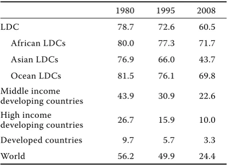
Economic growth in the LDCs has been very fragile; moreover, it has not been inclusive. This is basically because the LDCs have not been able to generate suf-ficient productive jobs and livelihoods for the growing number of people entering the labour market each year. The employment challenge is closely related to the pattern of structural change. The LDCs generally have very high population growth rates, and conse-quently the number of young people entering the labour market is increasing every year. Agriculture typically employs a large proportion of the labour force in Over 4000 $ per capita LDCs (Table 1).
The sector is also less able now to absorb labour owing to the decreasing farm sizes and the lack of investment, including a poor soil management. People are often forced to cultivate the more ecologically sensitive land. As a consequence, more and more people are seeking work outside agriculture, but most LDCs have simply been unable to generate sufficient productive employment opportunities for the young
population in the manufacturing and services sectors. The majority of the non-manufacturing industries, whose contribution to the GDP has grown, tend to be capital-intensive rather than labour-intensive. Thus the majority of young people are finding work in informal activities, most of which are character-ized by a low capital accumulation and a limited productivity, and hence they offer a narrow scope for the economic growth (UNCTAD 2011).
The overall and ongoing pattern of structural change in the LDCs can be described as a “blocked structural transition”. More and more people are seeking work outside agriculture, but the pattern of the structural change in output means that they cannot find any pro-ductive and decent work. In 2008, the self-employed and contributing family workers, mainly engaged in informal economic activities, represented about 80% of the total workforce in the LDCs. Precisely because the boom reinforced the existing specialization in (mostly non-agricultural) primary commodities, instead of spurring the expansion of labour-intensive manufactures and services, the economic growth failed to translate into a broad-based employment creation (UNCTAD 2010).
[image:2.595.305.534.561.727.2]The failure to create a sufficient number of jobs in many LDCs, even when the economic growth was high, is related to another feature of these econo-mies during the 2000s, namely, the lack of structural transformation. However, that was not always the case in the LDCs. Structural transformation was fairly rapid from the beginning of the 1970s to 1980s, when the proportion of agriculture in the GDP for LDCs declined in average from 85% to 37.2%. This
Table 1. Share of agricultural work force in total work force
1980 1995 2008
LDC 78.7 72.6 60.5
African LDCs 80.0 77.3 71.7
Asian LDCs 76.9 66.0 43.7
Ocean LDCs 81.5 76.1 69.8
Middle income
developing countries 43.9 30.9 22.6
High income
developing countries 26.7 15.9 10.0
Developed countries 9.7 5.7 3.3
World 56.2 49.9 24.4
was clearly not a result of an absolute decline of ag-ricultural production, but of its slower rate of growth in comparison with industry and services. In other words, the process of transformation of the produc-tive structure was swift. In contrast, that process has been much slower since the 1980s. The share of agriculture in the GDP decreased from 37.2% in 1980 to 24.6% in 2008 (Table 2).
Inverse tendencies could be seen regarding the share of industry and services in the GDP. Industry accounted for only 5.4% of the GDP in 1970, but recorded a rapid growth in the next decade to reach 19% in 1980. From then on, however, the change has been much slower. The share of industry in 2008 was 28.6% of the GDP. A more detailed analysis, however, shows that the structural transformation in LDCs today is even more elusive than suggested previ-ously. The category of industry includes mining and quarrying, manufacturing, electricity, gas and water supply, and construction. The increase of the share of industry in the 2000s has mainly resulted from the boom of commodity prices and the concomitant rapid expansion of mining and quarrying. The changes in manufacturing, in contrast, have been minimal (UNCTAD 2011).
LDCs in the international trade
In the frame of the individual economies, the foreign trade can have different influences on the diverse population groups. In addition, trade in the inter-national environment has various consequences on various country groupings. (Collier 2007), the pro-ponent of the positive correlation between growth and development, argues that foreign trade and the overall economic globalization have mainly active consequences for the world’s poorest countries – the economic globalization in these countries preserve the trade non-diversification, the international capital avoids LDCs (except mining industry, what acts against diversification) and the international migration leads to the weakening sources of human capital in the LDCs.
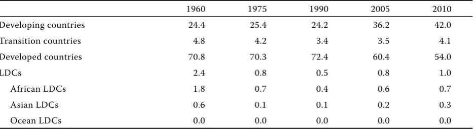
[image:3.595.63.536.101.214.2]The LDCs marginalization in the world economy in the view of international trade is the reality. In 2010, the LDCs, according to (UNCTAD 2010), participated in the commodity exports and imports by approxi-mately 1% (it regards the share in the world population distinctive disproportion). These situations, also as the development of the last 50 years, are described in Tables 3 and 4. It follows that the LDCs relative position in the share of the world commodity exports
Table 2. Share of the sectors in GDP (%)
1980 1995 2008
A I S A I S A I S
LDCs 37.2 19.0 43.8 35.7 21.3 43.0 24.6 28.6 46.8
Lower middle income countries 29.3 38.6 32.1 20.8 38.7 40.5 13.4 40.2 46.4
Upper middle income countries 11.8 38.6 49.6 8.4 31.6 60.0 6.1 33.9 60.0
High income countries 4.0 36.9 59.1 2.3 29.7 68.0 1.5 25.0 73.5
World 6.6 37.0 56.4 4.4 30.5 65.1 2.9 27.0 70.1
A = agriculture, I = industry, S = services
Source: http://data.worldbank.org/indicator/all
Table 3. LDCs share in world exports (in %)
1960 1975 1990 2005 2010
Developing countries 24.4 25.4 24.2 36.2 42.0
Transition countries 4.8 4.2 3.4 3.5 4.1
Developed countries 70.8 70.3 72.4 60.4 54.0
LDCs 2.4 0.8 0.5 0.8 1.0
African LDCs 1.8 0.7 0.4 0.6 0.7
Asian LDCs 0.6 0.1 0.1 0.2 0.3
Ocean LDCs 0.0 0.0 0.0 0.0 0.0
[image:3.595.65.535.613.741.2]and imports has deteriorated, in comparison to the 1960s. The share of LDCs has decreased more than by one half. On the other hand, there can be seen a very slow increase of the LDCs international trade share from the 1990s to present.
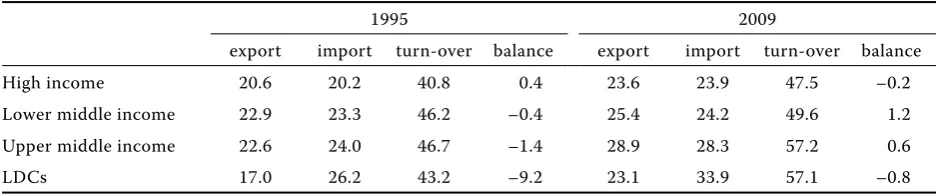
The “internal” importance of foreign trade (e.g. the share of export and import in GDP) is similar in in LDCs as in in LDCs other country groups. As illustrated by Table 5, the export share in the LDCs GDP significantly increased from 1996, and in 2009 it approximated the shares in other country group-ings. The import share in the LDCs GDP is, on the contrary, higher than in other country groupings. The trade balance (goods and services) to GDP is well-balanced for other country groupings, the LDCs have a significant deficit.
Foreign direct investments
The development of the FDI inflow (in absolute terms) to the LDCs in comparison with othergroups of developing countries is mentioned in Figure 2. The global level of foreign direct investments directed at the LDCs reached in 2010 26.4 billion USD. It was the lowest value, but on other hand, it is more than twofold increase compared to 2004. Nevertheless, just about only 2% of the global FDI w to the LDCs
– the highest value to the African countries (88%), followed by the Asian countries (10%) and the Pacific LDCs (2%). The share of LDCs in the global FDI has increased almost 4 times against 1990s. The FDI to LDCs are directed mainly to the mining sector.
[image:4.595.63.531.102.231.2]The FDI importance in economies can be expressed by e.g. calculated per 1 inhabitant or as the FDI/ GDP share. By the comparison of the developing countries groups, the FDI/GDP share is the highest just in the LDCs – it comes to 4.7%. The majority of LDCs has the FDI/GDP share of 5%. However, in the frame of this characterization, the LDCs remain a relatively heterogeneous group. However, there are many considerable exceptions – 9 countries (ap-prox. one fifth of the LDCs) is markedly above the average of the whole group, from these, 2 countries have the FDI/GDP share higher than 30% (Eastern Timor and the Salomon islands), two countries above 20% (Angola and Liberia) and 3 countries above 10% (Nigeria, Chad, DRC). On the contrary, 10 LDCs do not achieve even 1% level of the FDI/GDP share. It is especially the case of the countries, which do nott possess any attractive mineral resources – e.g. Afghanistan, Ethiopia, Rwanda, Nepal or Bhutan. In these cases, the foreign private capital avoids the LDCs and strengthens their marginalization in world’s economy (UNCTAD 2012).
Table 4. LDCs share in world imports (in %)
1960 1975 1990 2005 2010
Developing countries 25.3 22.4 22.2 31.6 38.9
Transition countries 4.7 4.9 3.9 2.5 3.2
Developed countries 70.0 72.7 73.9 65.8 57.9
LDCs 2.5 1.2 0.7 0.8 1.1
African LDCs 1.7 0.9 0.5 0.5 0.7
Asian LDCs 0.8 0.3 0.2 0.3 0.4
Ocean LDCs 0.0 0.0 0.0 0.0 0.0
Source: http://unctadstat.unctad.org/ReportFolders/reportFolders.aspx
Table 5. Trade shares (goods and service) on country groupings GDP (in %)
1995 2009
export import turn-over balance export import turn-over balance
High income 20.6 20.2 40.8 0.4 23.6 23.9 47.5 –0.2
Lower middle income 22.9 23.3 46.2 –0.4 25.4 24.2 49.6 1.2
Upper middle income 22.6 24.0 46.7 –1.4 28.9 28.3 57.2 0.6
LDCs 17.0 26.2 43.2 –9.2 23.1 33.9 57.1 –0.8
[image:4.595.62.534.645.742.2]Official development assistance (ODA)
Th e ODA infl ows are the most signifi cant source of foreign capital for the LDCs. Figure 3 shows the development of the ODA fl ow in the absolute value in comparison with the other groups of developing countries. Th e ODA level directed to the LDCs exceeds the fl ows to higher and middle income developing countries (according to the UNCTAD classifi cation). Only the low middle income developing countries (of which the majority belong to the LDCs) are in aggrega-tion higher recipients of the ODA. We can see, that the ODA volume fl owing to the LDCs has signifi cantly increased – from 0.881 billion USD in the mid-1970s to nearly 42 billion USD in 2009. So the LDCs in 2009 received almost 32% of the global ODA in 2009.
The ODA influence for the LDCs is illustrated also its share in the GDP, which constituted 8.3% in 2009, significantly surpassing other groups of developing countries. (In the low income developing countries, the ODA/GDP share was 2.2%, in the middle income group, it was 0.2%, and in the high income group 0.1% (UNCTAD 2012).
In the frame of the LDCs sub-groupings, this share is the highest in the Pacific countries, followed by the African LDCs and then the Asian LDCs. On the individual countries level, the ODA/GDP share differs between 5–15%, out of this interval there is more than one fifth of the LDCs. In Liberia, it constituted 175.5% in 2010, other countries with high revenues are the Solomon Islands, Burundi, the Democratic Republic of Congo, Mozambique, Sierra Leone, Afghanistan, Samoa, Tuvalu and Haiti (all over 20%). On the opposite, Angola, Equatorial Guinea, Bangladesh and Yemen accepted only below 2% (World Bank 2012).
Remittances
[image:5.595.67.288.82.243.2]Remittances are actually, after the FDI, the second significant source of external financing in develop-ing countries, exceeddevelop-ing the ODA and loan capital. However, remittances are a significant capital source mainly for the middle income developing countries (Figure 4). To the LDCs there were directed in 2010 only 5.9% of the global remittances. In 2010, the LDCs accepted 25.897 milliards USD of official re-mittances, from it, 64% were directed to the Asian countries, 35% to the African and 1% to the Pacific LDCs (World Bank 2012).
0 100 200 300 400
1970 1972 1974 1976 1978 1980 1982 1984 1986 1988 1990 1992 1994 1996 1998 2000 2002 2004 2006 2008 2010
Least developed countries High-income developing countries Middle-income developing countries Low-income developing countries
Figure 4. Remittances inflow for the country groupings (bill. USD)
[image:5.595.67.288.539.698.2]Source: http://unctadstat.unctad.org/ReportFolders/re-portFolders.aspx
Figure 2. FDI inflows to LDCs and other country group-ings (1970–2010, bill. USD)
Source: http://unctadstat.unctad.org/ReportFolders/re-portFolders.aspx
Figure 3. ODA inflows for the country groupings (1970– 2009, bill. USD)
Source: http://unctadstat.unctad.org/ReportFolders/re-portFolders.aspx 0 20 40 60 80 19 70 19 72 19 74 19 76 19 78 19 80 19 82 19 84 19 86 19 88 19 90 19 92 19 94 19 96 19 98 20 00 20 02 20 04 20 06 20 08
Least developed countries High-income developing countries Middle-income developing countries Low-income developing countries
0 50 100 150
1980 1982 1984 1986 1988 1990 1992 1994 1996 1998 2000 2002 2004 2006 2008 2010
Least developed countries High-income developing countries
[image:5.595.307.521.542.697.2]The remittance importance, related to supporting the economic growth, is doubted in the literature, because it concerns a fragmented source of finances, which is, in addition, used in a higher rate by the recipients for consumption. It is estimated that 80% of remittances is consumed and only 20% invested (Carling 2005). On the contrary, the remittances impact on poverty lowering are accented, because it concerns direct transfers, having a direct impact on the increasing recipients income, by which it immediately lower their poverty (expressed by the revenue or consumption).
Although the absolute volume of remittances di-rected to LDCs is low, compared with other groups, the relative value expressed by their share in the GDP is the highest in LDCs – 6.4%. In the lower-middle income countries, it corresponds to 1.1% (World Bank 2012). For most LDCs, where the data are available2, the remittances share in the GDP is
between 1.5–5%. The highest values are recorded in Lesotho, Samoa, Nepal and Haiti (over 20%), but in Angola, Mauritania and Malawi, this value is almost zero (UNCTAD 2012).
INDICATORS OF HEALTH
The population health is one of the basic indicators of the qualitative human capital and the reason (also the consequence) of not only the LDCs economic development. It can be expressed by the infant death rate to the age of five years, the life expectancy at birth, and the undernourishment of the population.
Two from these indicators (infant death rate to the age of five years, share of undernourished population) are use by the DESA in the frame of the classification criteria for the LDCs. These indicators are, mainly in the Sub-Saharan Africa, negatively influenced by the geography and environment, which cause a high affinity to tropical illnesses (HIV/AIDS, malaria, tuberculosis and others).
The share of undernourished population in the LDCs has decreased from 39% to actual 33% from the beginning 1990s to 2006–2008 (although in half-1990s it exceeded 40%, as illustrate by Figure 5). The share of the LDCs undernourished population is also very high in comparison to other developing countries and the world average.
The share of undernourished population in the individual states is very different (mainly 15–30%). In some countries, it even reaches 60% (Eritrea, Burundi), as opposite to the Pacific states Kiribati, St. Tome and Principe, where the share of the undernourished is on the level of the high income countries (around 5%) (FAO 2012).
Important is the knowledge of not only the num-ber of hungry people around the world, but also the depth of their hunger. Figure 6 shows the depth of hunger, or the food deficit of the individual LDCs. It is measured by comparing the average amount of energy that the undernourished people get from the food they eat with the minimum amount of energy they need to maintain the body weight and to undertake a light activity. The intensity of food deprivation is low when the difference is less than 200 kilocalories per person per day, and high when it is higher than
[image:6.595.306.487.525.670.2]2For one quarter (12), the LDCs data were not available.
Figure 6. Average food deficit of undernourished in the LDCs (kcal/person/day)
Source: http://www.fao.org/economic/ess/ess-fs/fs-data/ ess-fadata/en/
Figure 5. Share of undernourished population (in %)
Source: http://www.fao.org/economic/ess/ess-fs/fs-data/ ess-fadata/en/
[image:6.595.64.285.531.681.2]300 kilocalories per person per day. The greater the food deficit, the greater the susceptibility to the health risks related to under-nutrition.
There are many LDCs with the food deficit higher than 300 kilocalories per person per day – Angola, Burundi, Central African Republic, Chad, Comoros, Eritrea, Ethiopia, Liberia, Mosambique, Rwanda, Sierra Leone, Zambia, Zimbabwe and Haiti (the high-est value – 420 kcal/person/day). But only Kiribati, Sao Tome and Principe, Samoa, Solomon Islands and Vanuatu have the low deprivation under 200 kilocalories per person per day (FAO 2012).
Also the infant death rate to the age of five years rapidly decreases. From 1965 to 2009, it can be stated, that in the LDCs the infant mortality decreased from 25.68% to 12.4%. However, Figure 7 also illustrates that the rapid decrease in last years can be seen in all income level countries (with the exception of the high income countries, where it approximates zero). The infant death rate to the age of five years remains very high in the LDCs compared to other country group-ings (in 2009, it was 121 to 1000 live births, just about 2 times more than the world average and 1.7 times more than for the lower-middle income countries). Lowering of the infant mortality rate is essential for the lower birth rates in the LDCs. Researches unambiguously show that if the infant mortality is low, the demand for children is low and it decreases the birth rate. It confirms the theory, that the way to lowering the birth rate and population increments in the LDCs leads through the decrease of the infant mortality rate (Tabutin and Schoumaker 2004).
There are many differences in the LDCs group. The average infant death rate is the highest in the African LDCs, followed by the Asian and Pacific ones. Also on the level of the individual LDCs states, the values can vary. For many LDCs countries, the indicator reaches values, which are typical mainly for the lower or upper-middle income countries (approx. 50 and less – e.g. Vanuatu, Samoa, Solomon Islands). In contrary, a very high infant death rate is typical for the African countries (Chad, Democratic Republic of Congo, Sierra Leone, Somalia, Mali, and Guinea Bissau) or Afghanistan (UN 2012).
The development of the life expectancy at birth from 1960 to 2009 for country groupings, including the LDCs, is illustrated by Figure 8. The life expec-tancy at birth in the LDCs significantly increased in the last 50 years, from 40 years in 1960 to 57 years in 2009. The life expectancy at birth has also grown in other country groupings, so the LDCs continually lag behind (about 7.5 year behind the lower-middle income countries and more than 12 years behind the world average).
[image:7.595.63.280.525.690.2]The differences are also in the frame of the LDCs group. While the average life expectancy at birth of the African LDCs is 53.9 years, in the case of the Asian LDCs, it is 62.1 years, and for the Pacific countries 67.7 years. The range of values is very wide – from the life expectancy below 48 years (Afghanistan, Central African Republic, DRC, Guinea Bissau, Lesotho, and Zambia) to 70 and more years (Samoa and Vanuatu). For Kiribati and Tuvalu, the data were not available (UN 2012).
Figure 7. Infant death rates to the age of five years in the country groupings (per 1000 live births)
[image:7.595.309.521.529.680.2]Source: http://data.un.org/Data.aspx?d=WDI&f=Indicator_ Code%3aSH.DYN.MORT
Figure 8. Life expectancy at birth, total, in country groupings (years)
OTHER INDICATORS
In 2011, the world population reaches 7 billion, of which 855 million are living in the LDCs. Owing to the high fertility, the population of the LDCs is expected to nearly double and increase to 1.67 billion between now and 2050, and this will result in a large and growing youth population. Today, about 60% of the population in the LDCs is under the age of 25, and the number of young people in the LDCs will increase by more than 60% over the next forty years. This high fertility is responsible for the increased rates of the population growth in most of the least developed countries. It also imposes a heavy burden in the health sector, particularly in relation to the need to provide an adequate nutrition, immuniza-tions and other health services to the rising number of children (UNFPA 2011).
According to Figure 9, the population growth rates in the LDCs changed only slightly, from 2.4% in 1970 to 2.2 in 2010. In the upper and lower middle income countries, from the same values in 1970, the popula-tion growth rates decreased much more, to 0.7%, resp. 1.5%. In the high income countries, the population growth is low and also still decreasing; this figure is estimated to be just 0.6% in 2010.
Of course, the global figures conceal great differ-ences in the growth rates between the groupings and countries. The individual LDCs countries with the highest population growth rates (in 2010) above and equal to 3.0 are Liberia (4.0), Niger (3.5), Uganda (3.2), Malawi and Yemen (3.1), Eritrea, Mali, Rwanda and Tanzania (3.0). As opposite, the lowest rates under
the world average (1.1) were recorded by Tuvalu (0.2), Samoa (0.4), and Myanmar (0.8) and Lesotho (only 1.0) (UN 2012).
In 1960, the annual fertility rate in the LDCs reached 6.6 births per 1 woman, at present (in 2009), there is still the annual fertility rate of 4.3 children per 1 woman, which are the highest values compared to other country groupings in all observed time periods. The fertility decline in the LDCs has been markedly slower than in the other developing countries. The most significant decrease in fertility rates were re-corded in the upper middle income countries, as it is stated by Figure 10. The high income and upper middle income countries with the levels around 1.7, resp. 1.8, do not at present as a complex fulfil the criteria’s necessary for the simple reproduction of the population (the theoretical minimum of 2.1 live born children). The LDCs are a very heterogeneous group, as regards this indicator. In 2009, the fertil-ity rates above 6.0 were reached by Afghanistan, Chad, Malawi, Mali, Niger (7.1), Somalia, Uganda and Zambia. Countries with the lowest fertility levels are Bangladesh (2.3) and Myanmar (2.0) (UN 2012).
[image:8.595.77.278.524.706.2]Poverty is a relevant indicator of the social and economic development. In the last years, in the de-velopment studies area and the dede-velopment practice, the effort on its lowering was in fact a synonymous word for development. For the LDCs as a whole or for the individual countries, it is very difficult to analyze this phenomenon exactly enough, because there are not available the complex data. For different coun-tries, there exist data for different years, and so the comparison of data among countries is, even from the
Figure 9. Population growth (annual %)
[image:8.595.319.523.533.708.2]Source: http://data.un.org/Data.aspx?d=WDI&f=Indicator_ Code%3aSP.POP.GROW
Figure 10. Fertility rate, total (births, per woman)
inter-temporal point of view, very difficult, in many cases even impossible. For the following analysis, which is, therefore, of only an illustrative character, there were used the most actual data, available for the individual LDCs – from these data, there were computed weighted averages (population size) for the individual sub-groupings and the whole group of LDCs. The outcomes are the population proportion (not the average values) living in the group of LDCs, the sub-group of the African and Asian countries below the stated poverty levels. The data for the sub-group of the Pacific LDCs were not available. As the LDCs poverty indicators, there were chosen the indicators, for which there were available more actual data. It is the proportion of population living below the poverty level according to the national definition and the international poverty level. The share of population living below the poverty levels in the group of LDCs and its sub-groupings is indicated by Table 6.
It is evident, that poverty is the LDCs substantive socio-economic problem, because nearly half of the
LDCs population lives below the national and inter-national poverty level (the absolute poverty defined by the income resp. consumption below 1.25 USD per capita and day). In the case of the international poverty rate defined by the level of 2 USD, it increased the share of the LDCs poor to more than three quarters. The share of poor in the rural population in the LDCs is significantly higher than in the urban population, the difference is approx. 17%, what corresponds to the theory, saying that in the poorest countries, pov-erty is mainly the rural phenomenon (Moss 2007). The mentioned differences between the urban and rural poverty can be seen also in the observed sub-groupings, the poverty rates (rural, urban, global national) significantly higher are in the African LDCs than in the Asian LDCs. The same is valid in the view of the international poverty rate 1.25 USD, though the poverty rates below 2 USD per capita and day are very similar for both LDCs sub-groupings.
The aspect of the division of poverty rates among the individual LDCs is illustrated by Figure 11, where the stated poverty are the rates on the international level basis 1.00 USD per capita and day (the comparison is only illustrational, because the country data are of different years – based on surveys from 1990 to 2011). In most of the LDCs, the value of this indica-tor is 40–60%. Countries with the highest poverty rates (around 80% of the population) are Burundi, Liberia, Madagascar and DRC, on the contrary, very low poverty rates (around 20% of the population) were observed in Cambodia, Mauritania, Sudan, Djibouti, and Yemen (UN 2013).
From other resources, it is evident, that the poverty rates based on 1.25 USD for the LDCs regions are decreasing. According to (UN 2011), the share of population, living in the Sub-Saharan Africa below 1.25 USD per capita and day, decreased in the period 1900–2005 from 58% to 51%. In South Asia (without India), the share decreases from 45% to 31% in the same time, in the South-east Asia from 39% to 19%.
[image:9.595.64.290.114.214.2]The Human Development Index (HDI) is a com-posite statistical indicator used to rank the coun-tries by the level of “human development”, taken as a synonym of the older terms “standards of living” or “quality of life”, and it distinguishes “very high human development”, “high human development”, “medium human development”, and “low human development” countries. The HDI was devised and launched by the Pakistani economist Mahbub ul Haq and the Indian economist Amartya Sen in 1990 and slightly updated in 2010. The HDI achieves values from 0 to 1, the higher values correspond to the higher level of human
Table 6. Share of population living below poverty level in %
Global
National poverty level
International poverty level
rural urban < 1.25 USD < 2.00 USD
LDCs 46.5 50.2 33.1 49.7 76.8
African LDCs 51.8 55.7 38.0 52.4 77.5
Asian LDCs 37.3 41.0 24.5 44.0 75.4
Source: World Development Indicators Database, African Economic Outlook 2011
Figure 11. Division of the LDCs according to the share of poor population (in %, on the basis 1.00 USD per day)
[image:9.595.68.255.551.706.2]development. The index is now computed for 187 world’s countries, from which 46 are LDCs (Somalia and Tuvalu are not included).
Despite the slightly positive development in the last 30 years, the LDCs occupy the worst world position. According to Figure 12, the HDI for the group of LDCs is lower than for the low human development category of countries, although it has grown most rapidly in comparison with the other country groupings. LDCs with the highest values of HDI, corresponding to the medium human development, are Samoa (0.688, 99th
place of the world chart), Kiribati (0.624), Vanuatu (0.617) and the Lao People’s Democratic Republic (0.524). The absolute lowest value was reached by Burundi (0.316), Niger (0.295) and the Democratic Republic of Congo (0.286, the last world 187th place
in 2011) (UN 2012).
In the LDCs, there is frequently an uncertain access to reliable supplies of drinkable water. The popula-tion lacks the reticulated systems and depends on the access to groundwater. In many localities, par-ticularly in the coastal areas, the unregulated use of groundwater supplies has resulted in a falling water level that becomes progressively more contaminated by the seawater or other pollutants. The water-borne sewage and any disposal of the human waste are often absent or unreliable and the waste disposal may also affect the groundwater on which the people rely.
Although from 1990 to 2010 the share of the popu-lation with the access to the improved water source3
has decreased, there are still only 63.3% of people in the LDCs, which have access to drinkable water (it is 92.9% in the upper middle income countries and 86.8% in the lower middle income countries). In the high income countries, this value approximates 100% in all observed periods (Figure 13). Somalia 29%, Ethiopia 44%, Democratic Republic of Congo 45% and Madagascar 46% are the countries with the lowest values of this indicator in 2010. Data for Equatorial Guinea, Eritrea, Kiribati and Solomon Islands are not included (UN 2012).
CONCLUSION
There has been developed a wide range of the eco-nomic growth theories. Theoretical developments have been accompanied by a growing number of empirical studies. Economic growth means achieving a more massive economy – producing more goods and services on the one side of the national account (gross domestic product), and a larger total income on the other (gross national income). Development does not regard so much the growth of an economy, but rather the conditions under which the production occurs and the results that flow from it. Development
3Access to an improved water source refers to the percentage of the population with a reasonable access to an adequate
[image:10.595.63.284.83.246.2]amount of water from an improved source, such as a household connection, public standpipe, borehole, protected well or spring, and the rainwater collection. Unimproved sources include vendors, tanker trucks, and unprotected wells and springs. A reasonable access is defined as the availability of at least 20 liters per person per day from a source within one kilometer of the dwelling. Source: World Health Organization and United Nations Children‘s Fund, Joint Measurement Programme (JMP) (http://www.wssinfo.org/).
Figure 12. Human Development Index
[image:10.595.307.523.88.250.2]Source: http://data.un.org/DocumentData.aspx?id=269
Figure 13. Access to improved water source (%)
is important because it influences the economy, and more broadly the society and culture, that determines how people live – in the terms of income, services, life chances, education, etc.
The epoch of modern economic growth is still evolving, so all its features are not yet clear, but the key element has been the application of science to the problems of production, which in turn has lead to industrialization, urbanization and the explosive growth in population. Modern economic growth, the term used by Simon Kuznets, refers to the current economic epoch as contrasting with e.g. the epoch of merchant capitalism or the epoch of feudalism. While the economic development and the modern economic growth involve much more than just the rise of the per capita income or product, no sustained development can occur without economic growth.
The LDCs are a category of countries distinguished not only by their widespread poverty, but also by the structural weakness of those countries economic, institutional and human resources, often conditioned by geographical handicaps. This thesis has also con-firmed that the group of LDCs exhibits the lowest values of the socio-economic development, in the comparison with other groups of countries. They constitute a heterogeneous group of countries, in the view of social, health, economic, health, social and foreign trade aspects. Higher levels of development are showed Oceania LDCs – Samoa, Kiribati, Tuvalu and Vanuatu. On the contrary, the least perform-ing in the majority of chosen indicators were the Sub-Saharan Africa states – namely Burundi, the Democratic Republic of Congo, Liberia and Rwanda.
REFERENCES
Behrman J., Srinivasan T.N. (eds.) (2006): Handbook of De-velopment Economics, vol. 3B. Elsevier, North-Holland, Amsterdam.
Carling J. (2005): Migrant Remittances and Development Cooperation. PRIO Report 1/2005. International Peace
Research Institute, Oslo. Available at http://www.prio. no/files/file46220_carling_2005_migrant_remittanc-es_and_development_cooperation.pdf (accessed 2012-05-05).
Collier P. (2007): The Bottom Billion: Why the Poorest Countries Are Failing and What Can Be Done About It.Oxford University Press, New York.
FAO (2012): Food Security Data and Definitions. Available at http://www.fao.org/economic/ess/ess-fs/fs-data/ess-fadata/en/ (accessed 2012-05-05).
Moss T. (2007): African Development. Making Sense of the Issues and Actors. Lynne Rienner Publishers, Boulder, CO.
Tabutin D., Schoumaker B. (2004): The demography of Sub-Saharan Africa from the 1950s to the 2000s. A survey of changes and a statistical assessment. Population E, 59: 457–556.
UN (2011): Millennium Development Goals Report 2011. Available at http://www.un.org/millenniumgoals/11_ MDG%20Report_EN.pdf (accessed 2012-07-05). UN (2012): UN Database. Available at http://data.un.org/
Explorer.aspx (accessed 2012-07-05).
UN (2013): Millennium Development Goals Database. Available at http://mdgs.un.org/unsd/mdg/Data.aspx (accessed 2013-07-05).
UNCTAD (2010): LDC Report 2010. Available at http:// unctad.org/en/Docs/ldc2010_en.pdf (accessed 2012-04-04).
UNCTAD (2011): LDC Report 2011. Available at http:// unctad.org/en/Docs/ldc2011_en.pdf (accessed 2012-04-04).
UNCTAD (2012): Statistics. Available at http://unctadstat. unctad.org/ReportFolders/reportFolders.aspx (accessed 2012-07-05).
UNFPA (2011): Population Dynamics in the LDCs: Chal-lenges and Opportunities for Development andPoverty Reduction. Available at http://unfpa.org/webdav/site/ global/shared/documents/publications/2011/CP51265. pdf (accessed 2012-07-08).
World Bank (2012): World Development Indicators. Avail-able at http://data.worldbank.org/indicator (accessed 2012-07-08).
Received: 18th May 2013
Accepted: 4th June 2013
Contact address: