Three-dimensional visualization of ensemble weather forecasts –
Part 1: The visualization tool Met.3D (version 1.0)
M. Rautenhaus1, M. Kern1, A. Schäfler2, and R. Westermann1
1Computer Graphics & Visualization Group, Technische Universität München, Garching, Germany
2Deutsches Zentrum für Luft- und Raumfahrt, Institut für Physik der Atmosphäre, Oberpfaffenhofen, Germany
Correspondence to: M. Rautenhaus ([email protected])
Received: 4 February 2015 – Published in Geosci. Model Dev. Discuss.: 27 February 2015 Revised: 23 June 2015 – Accepted: 25 June 2015 – Published: 31 July 2015
Abstract. We present “Met.3D”, a new open-source tool for the interactive three-dimensional (3-D) visualization of nu-merical ensemble weather predictions. The tool has been de-veloped to support weather forecasting during aircraft-based atmospheric field campaigns; however, it is applicable to fur-ther forecasting, research and teaching activities. Our work approaches challenging topics related to the visual analysis of numerical atmospheric model output – 3-D visualization, ensemble visualization and how both can be used in a mean-ingful way suited to weather forecasting. Met.3D builds a bridge from proven 2-D visualization methods commonly used in meteorology to 3-D visualization by combining both visualization types in a 3-D context. We address the issue of spatial perception in the 3-D view and present approaches to using the ensemble to allow the user to assess forecast un-certainty. Interactivity is key to our approach. Met.3D uses modern graphics technology to achieve interactive visual-ization on standard consumer hardware. The tool supports forecast data from the European Centre for Medium Range Weather Forecasts (ECMWF) and can operate directly on ECMWF hybrid sigma-pressure level grids. We describe the employed visualization algorithms, and analyse the impact of the ECMWF grid topology on computing 3-D ensemble statistical quantities. Our techniques are demonstrated with examples from the T-NAWDEX-Falcon 2012 (THORPEX – North Atlantic Waveguide and Downstream Impact Experi-ment) campaign.
1 Introduction
Weather forecasting requires meteorologists to explore large amounts of numerical weather prediction (NWP) data, and to assess the uncertainty of the predictions. Visualization meth-ods that facilitate fast and intuitive exploration of the data hence are of particular importance. In practice, the forecast-ing process for the most part relies on two-dimensional (2-D) visualization methods. Meteorologists use weather maps, vertical cross sections and a multitude of meteorological di-agrams to depict the data. From these image sources, they build “mental models” of the three-dimensional (3-D), time-varying forecast atmosphere inside their heads (Hoffman and Coffey, 2004; Trafton and Hoffman, 2007).
Despite the 3-D nature of the atmosphere, 3-D visualiza-tion methods have not found widespread usage, even though there have been promising attempts in the 1990s and early 2000s that suggested added value (Treinish and Rothfusz, 1997; Koppert et al., 1998; McCaslin et al., 2000). Various hindering factors are discussed in the literature, including resistance of forecasters to adapt to new 3-D visualization methods that are decoupled from their “familiar” 2-D prod-ucts (Koppert et al., 1998; Szoke et al., 2003), problems with spatial perception in 3-D renderings (Szoke et al., 2003), as well as issues due to limited performance (Treinish and Roth-fusz, 1997) and the need for dedicated graphics workstation hardware (Koppert et al., 1998).
meth-ods that depict the uncertainty derived from ensemble data is an active topic of research not only for weather forecast ensembles (Obermaier and Joy, 2014). Yet again, ensemble visualization techniques related to weather forecasting pub-lished so far mainly focus on two dimensions as well (e.g. Potter et al., 2009; Sanyal et al., 2010).
In this paper we introduce a new open-source visualiza-tion tool, “Met.3D”, that provides interactive 3-D visual-ization techniques for ensemble prediction data. There has been an immense progress in mainstream graphics hardware capabilities in recent years. Making use of these develop-ments, Met.3D facilitates interactive visualization of present-day NWP data sets on consumer hardware. The tool has been developed as a new effort to demonstrate the feasibility of using 3-D visualization for forecasting, this time also con-sidering uncertainty information from ensemble data sets. It is intended to be used for actual forecasting tasks, as well as a platform to implement and evaluate new 3-D and ensemble visualization techniques.
The work presented in this paper has been inspired by a particular application, forecasting the weather situation to plan research flights during aircraft-based field campaigns. We focus on this application throughout the paper at hand. However, Met.3D is applicable to a broader range of fore-casting and visual data analysis tasks. Both fast exploration and uncertainty assessment play a major role in campaign forecasting:
1. When investigating suitable meteorological conditions to specify the route of a research flight (that is, way-points in 3-D space and time), the forecaster is re-quired to quickly identify atmospheric features relevant to the flight and to communicate findings to colleagues. Upper-level features typically important to flights with high-flying aircraft are of an inherently 3-D nature (for example, clouds, jet streams or the tropopause). From our experience in campaigns with DLR (German Aerospace Centre) involvement, visualization used dur-ing campaigns has been solely based on 2-D methods, typically with limited interactivity. We are hence inter-ested in investigating how 3-D visualization methods and interactivity (to quickly navigate the data space) can be used to aid the exploration.
2. Assessing the forecast’s uncertainty has become indis-pensable as flights frequently have to be planned multi-ple days before take off (typically 3–7 days; the medium forecast range) to obtain the required approval from air traffic authorities. While the use of ensemble pre-dictions has been reported for recent field campaigns (e.g. Wulfmeyer et al., 2008; Elsberry and Harr, 2008; Ducrocq et al., 2014; Vaughan et al., 2015), they have, to the best of our knowledge, not been used to create specific interactive forecast products for flight planning. However, ensembles provide valuable information; for example, 3-D probability fields for the occurrence of
a targeted atmospheric process or feature can be de-rived. Potential flight routes can be planned in regions in which the probability is high. An open question, how-ever, is how can the ensemble data be visualized to im-prove flight planning in the medium forecast range. Our objective is to use interactive 3-D visualization of en-semble predictions from the European Centre for Medium Range Weather Forecasts (ECMWF) to improve the forecast process for field campaigns. The work has been stimulated by the forecast requirements of a specific field campaign, the international T-NAWDEX-Falcon campaign (THORPEX – North Atlantic Waveguide and Downstream Impact Exper-iment – Falcon, hereafter TNF). TNF took place in Octo-ber 2012 with the objective to take in situ measurements in warm conveyor belts (WCBs), airstreams in extratropical cy-clones that lift warm and moist air from near the surface to the upper troposphere (e.g. Browning and Roberts, 1994). Schäfler et al. (2014) provided details on the campaign and its flight planning. The major forecasting challenge was to predict the likelihood of WCB occurrence within aircraft range. This was expressed by a number of forecast questions that guided the development of Met.3D:
A. How will the large-scale weather situation develop over the next week, and will conditions occur that favour WCB formation?
B. How uncertain are the weather predictions?
C. Where and when, in the medium forecast range and within the spatial range of the aircraft, is a WCB most likely to occur?
D. How meaningful is the forecast of WCB occurrence? E. Where will the WCB be located relative to cyclonic and
dynamic features?
In a recent ECMWF newsletter article (Rautenhaus et al., 2014), we provided a brief overview of our work. It is the pur-pose of this publication to describe the techniques we have developed in detail and to present our solutions to particular challenges.
We split our work into two parts, structured as follows. In this paper, we introduce Met.3D. We discuss challenges re-lated to interactive 3-D visualization and present techniques that address questions A and B.
signing interactive methods that provide fast and easy vi-sual access to ensemble information. A supplementary video containing real-time screen recordings of examples shown in Sect. 3 demonstrates the performance of Met.3D on mid-range consumer hardware.
To avoid time-consuming pre-processing of the forecast data prior to visualization, Met.3D operates directly on the ECMWF hybrid sigma-pressure model grid. The characteris-tics of the data and resulting challenges for visualization are discussed along with Met.3D’s visualization algorithms and system architecture in Sect. 4. Section 5 discusses the effi-cient yet accurate computation of statistical quantities from the ensemble predictions. When computing statistical quanti-ties on a per grid-point basis an error is introduced, since the vertical positions of the ECMWF model grid points vary be-tween members. Regridding to a common grid is a solution, albeit time-consuming and hence undesirable for real-time visualization. We analyse the error introduced when ignor-ing such a regriddignor-ing and provide advice on how to handle the issue. Section 6 provides information on code availabil-ity, before the paper is concluded in Sect. 6.
In the second part of this study (Rautenhaus et al., 2015, hereafter “Part 2”), we address forecast questions C to E. A method to compute 3-D WCB probabilities from La-grangian particle trajectories is introduced and evaluated, and Met.3D is extended by a technique to visually analyse the de-rived probabilities. To demonstrate the added value of 3-D vi-sualization for forecasting, we present a comprehensive case study with detailed meteorological interpretations of a fore-cast case of TNF. The case study uses methods from both papers and illustrates how Met.3D can be used in practice. Readers primarily interested in the application of Met.3D should read Sect. 3 in this part, skip the technical sections and proceed to the case study in Part 2.
2 3-D and ensemble visualization in meteorology Our work is related to 3-D visualization in meteorology and to uncertainty and ensemble visualization.
2.1 3-D visualization in meteorology
Visualization tools in meteorology can be distinguished with respect to application in a research setting and application in an operational forecast setting (Papathomas et al., 1988). As Koppert et al. (1998) point out, a tool in an operational setting should offer techniques tailored to the specific fore-casting task and not confuse the forecaster with large sets of parameters that need to be configured. A research setting, on the other hand, demands a tool that is flexible to adapt to
dif-Support System (MSS) is frequently used, a tool that gener-ates horizontal and vertical 2-D sections of the forecast data upon user request (Rautenhaus et al., 2012). This tool mo-tivated the design of our proposed bridge from 2-D to 3-D that we describe in Sect. 3. Further 2-D systems that have been applied include the German Weather Service (DWD) NinJo workstation (Heizenrieder and Haucke, 2009) and the ECMWF Metview software (Russell et al., 2010).
The few reports on the usage of 3-D visualization of atmo-spheric model data in forecasting date to the 1990s and early 2000s. Treinish (1996), Treinish and Rothfusz (1997) and Treinish (1998) reported on experiments with 3-D visualiza-tion for local forecasting during the 1996 Olympic Games in Atlanta. They concluded that an advantage of their 3-D methods was “that they virtually eliminated the need to labo-riously evaluate numerous two-dimensional images”, how-ever, noted a lack of interactivity due to limitations in com-putational performance. Schröder (1997), Lux and Frühauf (1998) and Koppert et al. (1998) presented “RASSIN” and its successor “VISUAL”, a 3-D forecasting system for us-age within the DWD. Discussing their experience with an operational test of the software, Koppert et al. (1998), too, point out the importance of system performance for user ac-ceptance. They furthermore highlight the need for common concepts of operations (user interface and workflow) when forecasters are asked to transition from a 2-D to a 3-D envi-ronment.
dimension as the vertical coordinate in Vis5D and to view a 2-D map of an ensemble product as a 3-D isosurface. Sub-sequently, Nietfeld (2006) reported on the application of 3-D techniques in a WFO to visualize observed radar data in the forecast process, using the “GR2Analyst” software.
With respect to research environments, 3-D visualization is more frequently used. Early approaches in the 1970s and 1980s used mainframe computers to create 3-D views or an-imations of atmospheric observations and numerical model output (e.g. Grotjahn and Chervin, 1984; Hibbard, 1986; Papathomas et al., 1988; Hibbard et al., 1989; Schiavone and Papathomas, 1990, and references therein). For example, Wilhelmson et al. (1990) created an award-winning (cf. Mid-dleton et al., 2005) animation movie of a numerically mod-elled storm, a project that at that time still required multiple months and a large amount of computer time (Wilhelmson et al., 1990). Since around 1990, a number of workstation and desktop visualization tools have appeared. Vis5D, mentioned above, became a major 3-D visualization tool in meteorology and was widely used into the 2000s (Hibbard, 2005; Mid-dleton et al., 2005). However, its development was discon-tinued. A number of other, mostly general-purpose, systems that have been used in the atmospheric sciences are listed by Schröder (1997), Böttinger et al. (1998) and Middleton et al. (2005). They include the commercial systems “Appli-cation Visualization System” (Upson et al., 1989; Favre and Valle, 2005), “Iris Explorer” (Walton, 2005), the “IBM Data Explorer” (Abram and Treinish, 1995; Watson, 1995, later renamed to “OpenDX” and made open source; discontinued in 2007), and “amira” (Stalling et al., 2005; now “Avizo”).
More recently, prominent tools include “Vapor” (Norton and Clyne, 2012; Clyne et al., 2007) and the Unidata “Inte-grated Data Viewer” (IDV) (Murray and McWhirter, 2007; Murray et al., 2009). Vapor is an open-source 3-D visualiza-tion software developed at the United States Navisualiza-tional Cen-tre for Atmospheric Research. It features a number of 3-D visualization techniques to view time-varying gridded data sets; however, it does not provide techniques for ensemble data or forecasting functionality. IDV is a comprehensive Java application for the analysis and visualization of geo-sciences data. It is based on the “Visualization for Algo-rithm Development” (VisAD) library (e.g. Hibbard, 1998, 2005) and supports a variety of visualization methods, in-cluding some 3-D support. For example, Yalda et al. (2012) use IDV’s 3-D capabilities for interactive immersion learn-ing. On a broader scope, “Paraview” (Henderson et al., 2004) is an open-source, general-purpose visualization tool that can also be used with meteorological data. In the context of a graduate university course, Dyer and Amburn (2010) inves-tigated how Paraview can be used in a meteorological setting. Also, commercial general-purpose systems with 3-D capabil-ities that are frequently used in the atmospheric domain in-clude “Interactive Data Language” (IDL) (e.g., cf. Middleton et al., 2005) and “Avizo Green” (e.g. Böttinger et al., 2013).
3-D visualization has also been used for virtual reality appli-cations in teaching (e.g. Gallus et al., 2003, 2005).
A major reason why 2-D methods are often preferred in the atmospheric sciences is that they are well suited to con-vey quantitative information, as Middleton et al. (2005) point out in a survey of visualization in meteorology. 2-D con-tour lines and colour mappings can be used to convey a large range of data values. In a 3-D depiction, only a small num-ber of isosurfaces can be displayed without cluttering and occlusion. However, a 3-D image is able to convey spatial structure in all three dimensions, a distinct advantage com-pared to 2-D methods. On the downside, spatial perception is more challenging in 3-D. Determining the location of a data feature displayed in a 2-D image is usually not an issue. In a 3-D projection, achieving good spatial perception can be difficult. Major influencing factors are, for example, shad-ows (Wanger et al., 1992) and illumination models (e.g. Wei-gle and Banks, 2008; Lindemann and Ropinski, 2011, and references therein). The issue is also noted by Szoke et al. (2003). As an approach, they have implemented a switch to an overhead view and a vertically moveable map in D3D to enable the forecaster to better judge the spatial position of a 3-D feature.
2.2 Ensemble visualization
Ensemble visualization aims at identifying variability, sim-ilarities and differences among ensemble members. It is closely related to uncertainty visualization, of which Pang et al. (1997) and Johnson and Sanderson (2003) provide early overviews. In the atmospheric sciences, 2-D visualizations of statistical quantities that summarize the ensemble distribu-tion or that represent relative frequencies for events are fre-quently used. Wilks (2011, ch. 7.6.6) lists a number of tech-niques. For example, current products provided in ECMWF’s “ecCharts” system (Lamy-Thépaut et al., 2013) include maps of mean and standard deviation (SD), maps of threshold probabilities (for example, the probability of precipitation exceeding a critical threshold) and of derived statistical mea-sures (for example, the extreme forecast index; Lalaurette, 2003).
de-2013). Recently, Whitaker et al. (2013) have generalized box plots to contour box plots to enable an improved quantitative and qualitative analysis of ensembles of 2-D isocontours and level sets. In 3-D, the effect of uncertainty on the position of 3-D isosurfaces has been the topic of a number of studies. It has been approached with, for instance, geometric displace-ments (Grigoryan and Rheingans, 2004) and surface anima-tion (Brown, 2004). In a study concerning the reconstrucanima-tion of the Earth’s subsurface model, Zehner et al. (2010) visu-alize confidence intervals around an isosurface using addi-tional transparent surfaces as well as lines connecting the sur-faces. Recently, techniques have used stochastic modelling of uncertainty in scalar ensembles to quantify and visualize the possible occurrences of isosurfaces (Pöthkow and Hege, 2011; Pöthkow et al., 2011; Pfaffelmoser et al., 2011; Pfaffel-moser and Westermann, 2012). The latter studies all include examples from the atmospheric domain.
A few articles in the visualization literature have presented software tools that put special emphasis on ensembles in earth science applications. Potter et al. (2009) present the “Ensemble-Vis” tool and investigated the usage of multiple linked views to visualize 2-D weather simulation ensembles. They conclude that the combination of standard statistical displays (spaghetti plots, maps of mean and SD) with user interaction facilitates clearer presentation and simpler explo-ration of the data. In their “Noodles” tool, Sanyal et al. (2010) enhanced spaghetti plots by glyphs and confidence ribbons to highlight the Euclidean spread of 2-D contour ensembles. They describe the usage of their methods by atmospheric researchers investigating different parametrizations in the Weather Research and Forecasting (WRF) model. Sanyal et al. (2010) also highlighted the positive effect of interac-tivity and linked views on the user and note the challenge of potential generalization of their work to three dimensions. Recently, Höllt et al. (2014) have presented “Ovis”, a system for the visualization of 2-D ocean height-field ensemble data. They again use linked views of maps, statistical plots and 3-D renderings and demonstrate the use of time-series glyphs for the comparative visualization of the ensembles at two dif-ferent positions over time. Höllt et al. (2014) discussed the application of their tool to off-shore oil operations and the planning of underwater glider paths.
3 The 3-D ensemble visualization tool Met.3D
Met.3D has been developed to support ensemble data explo-ration during forecasting, in particular for field campaigns (at the time of writing this paper). Beside this primary objec-tive, we have designed the software in a way that it can be used as a framework into which new ensemble visualization
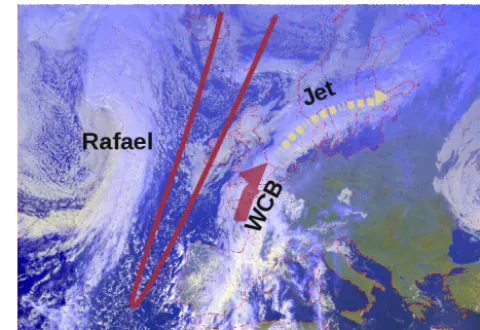
Figure 1. Real-world context for the T-NAWDEX-Falcon case used for the examples: visible Meteosat satellite image of Europe and the North Atlantic of 12:00 UTC, 19 October 2012 (Meteosat op-erated by EUMETSAT, image processing by DLR-IPA). Important features are the narrow trough to the west of the British Isles (dark red line), the former Hurricane Rafael and the WCB manifest in the cloud band east of the trough.
techniques can be implemented and evaluated with respect to their use in forecasting. We note that Met.3D is not intended to be a full-featured meteorological workstation; this would be beyond the scope of our work.
At the time of writing, Met.3D supports forecast data from the ECMWF Ensemble Prediction System (ENS), compris-ing 50 perturbed forecast runs and an unperturbed control run (Buizza et al., 2006; Miller et al., 2010). These 51 fore-cast members approximate the distribution of possible future weather scenarios (Leutbecher and Palmer, 2008).
The visualization examples shown in this paper use data from the TNF forecast case of 19 October 2012. The satellite image in Fig. 1 provides a real-world observation of major features that appear in the visualizations: a distinct narrow trough was located to the west of the British Isles. Upstream of the trough the former Hurricane Rafael transformed into a strong mid-latitude cyclone. East of the trough, ascend-ing WCB air masses formed a cloud band extendascend-ing from Spain to the British Isles. The clouds further stretch along a jet stream over southern Scandinavia and the Baltic Sea.
3.1 User interface
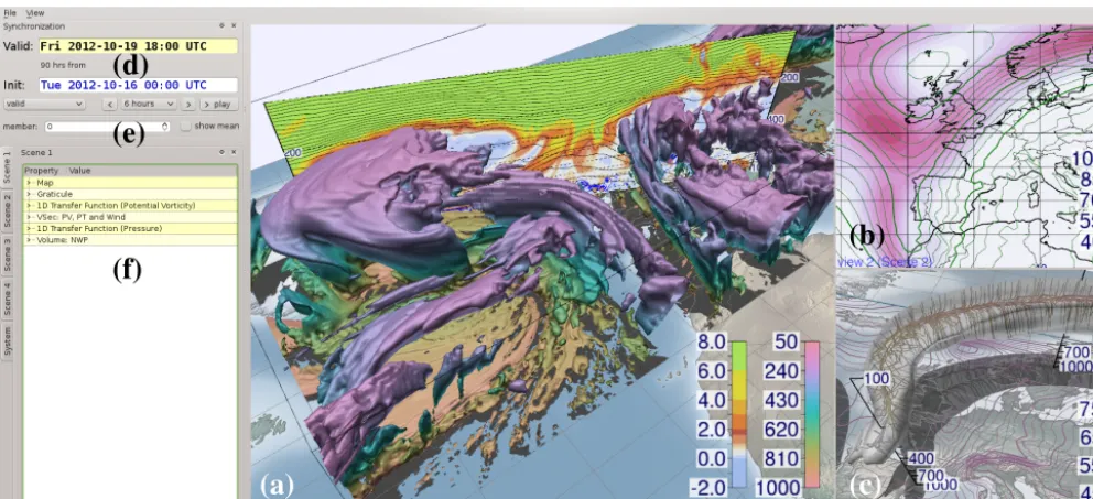
Figure 2 shows the graphical user interface (GUI) of Met.3D. The forecast data fields can be displayed in mul-tiple 3-D views (Fig. 2a, b, c). In the horizontal, a cylin-drical longitude–latitude projection is used. As common in meteorology, the logarithm of pressure serves as the vertical coordinate. Vertical scale, i.e. the proportion of vertical to horizontal units, can be specified for each view individually. Time navigation is provided for the forecast initialization (or base, or run) time and the forecast valid time (Fig. 2d). This way, subsequent forecast runs can be checked for consistency by keeping the valid time fixed and changing the initializa-tion time. A distinct feature is the ensemble navigainitializa-tion. The user can select a specific forecast member for exploration, animate over members and toggle the ensemble mean for all currently displayed data fields (Fig. 2e).
Visual entities such as a horizontal or vertical cross sec-tion, the base map or a 3-D isosurface are represented by “ac-tors” and are assigned to a “scene”. A scene, in other words a collection of actors, can be assigned to one of the views for rendering. An actor can be part of multiple scenes. For ex-ample, a cross section could be viewed as a traditional 2-D image in one view, and be combined with a 3-D isosurface in another. If the section is relocated, its position is updated in both views. To keep the user interface simple, properties that the user can modify for a particular actor (e.g. the isovalue of an isosurface, the forecast variable displayed by an actor, the associated colour palette) are arranged in a tree-like structure on the left of the Met.3D window and are easily accessible (Fig. 2f). If used in a forecast setting, only the uppermost tree nodes are required by the user to, for instance, load pre-defined forecast products.
Trafton and Hoffman (2007) point out the importance of visual comparisons in the forecasting process. Met.3D’s ac-tors can be synchronized in time and ensemble dimension, its views can be synchronized to the same camera viewpoint. Thus, side-by-side comparison of different data sets is facili-tated.
3.2 A bridge from 2-D to 3-D
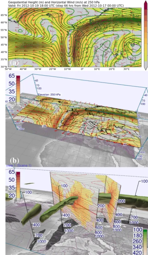
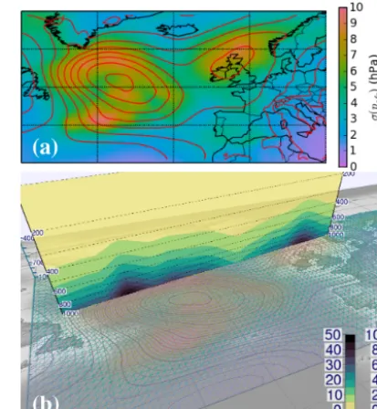
To help forecasters transition to the 3-D visualization envi-ronment, we have implemented horizontal and vertical 2-D sections. The sections reproduce the look of the correspond-ing products in the DLR MSS (Rautenhaus et al., 2012), pro-viding filled and line contours, wind barbs, coast lines and graticule. In Met.3D, the sections are embedded into the 3-D context and can be interactively moved in space by the user in real time. This provides a very fast means to explore the atmosphere’s vertical structure (by sliding a horizontal sec-tion up and down), or the change in forecast variables along a flight track when a waypoint is relocated (by moving a ver-tical section). Also, the camera can be moved interactively to zoom in, pan or tilt the view – for instance, to view
multi-ple sections stacked on each other from an angled viewpoint. Figure 3 illustrates the concept. The forecast wind field is vi-sualized by means of a horizontal and vertical section. The horizontal map – largely resembling the corresponding prod-uct from the MSS – is stacked on top of surface level con-tours displaying the mean sea level pressure (Fig. 3b). The vertical section is augmented by a 3-D isosurface of wind speed (Fig. 3c); the isovalue is chosen such that the strongest winds of the jet stream, an important indicator for the large scale flow of the upper troposphere, are captured. The 3-D display allows us to locate the vertical section in space and additionally provides information on the spatial structure of the jet.
We approach the challenge of spatial perception by draw-ing projections of all rendered structures to the surface to im-itate shadows generated by a light source above the scene. As illustrated in Fig. 3b and c, the shadows help to qualitatively judge the elevation of a feature, and also show its horizontal location. To improve the quantitative judgement of elevation, the user can colour the isosurface according to pressure ele-vation, and place vertical poles in the scene that provide la-belled pressure axes (Fig. 3c). The poles can be interactively moved in the scene (by picking and dragging handles that ap-pear in an “interaction mode”), so that different locations can be probed.
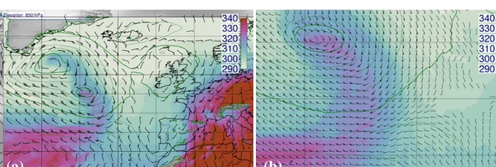
Vertical sections can be drawn along an arbitrary num-ber of waypoints (Fig. 3c). Analogous to vertical poles, each waypoint and section segment displays a handle in interac-tion mode that the user can drag to move the waypoint or segment. They can also be moved synchronously in multi-ple scenes, as illustrated in Fig. 4. Displayed are sections of potential vorticity (Fig. 4a, the red colours around val-ues of 2 PVU (potential vorticity unit) show the dynamic tropopause) and cloud cover fraction (Fig. 4b). Wind barbs overlain on a horizontal section can be configured to auto-matically scale in size and density. In Fig. 5, the horizontal section of equivalent potential temperature shows the differ-ent character of air masses transported by Rafael. When the user zooms into the view, Met.3D increases the density of the wind barbs (Fig. 5b). The frontal zone along which the typical change in wind direction occurs can now be well per-ceived.
(a)
(b)
(c)
(e)
(f)
Figure 2. The main user interface of Met.3D. We apply 2-D and 3-D visualization techniques to explore ensemble weather forecasts. (a) Isosurfaces of cloud cover fraction of 0.5 coloured by elevation (hPa), and a vertical section of potential vorticity (PVU). (b) Horizontal section with contour lines of the mean geopotential height field (m) and filled contours of its SD (m). (c) Normal curves applied to the wind field to visualize the jet core. The white isosurface shows 45 m s−1. Colour coding in m s−1. (d–f) See text for details.
3.3 Ensemble support
Met.3D enables the forecaster to explore variation in the en-semble, to identify regions in which the forecast is uncertain, and to explore possible forecast scenarios. The user can in-teractively navigate through the ensemble members to judge the variability in the forecast. Each member can also be ex-plored individually. Statistical measures including threshold probabilities, mean, minimum, maximum and SD can be de-rived on demand. For threshold probabilities (for example, wind speed exceeding 45 m s−1or cloud cover fraction being below 0.2) the threshold value can be adjusted interactively.
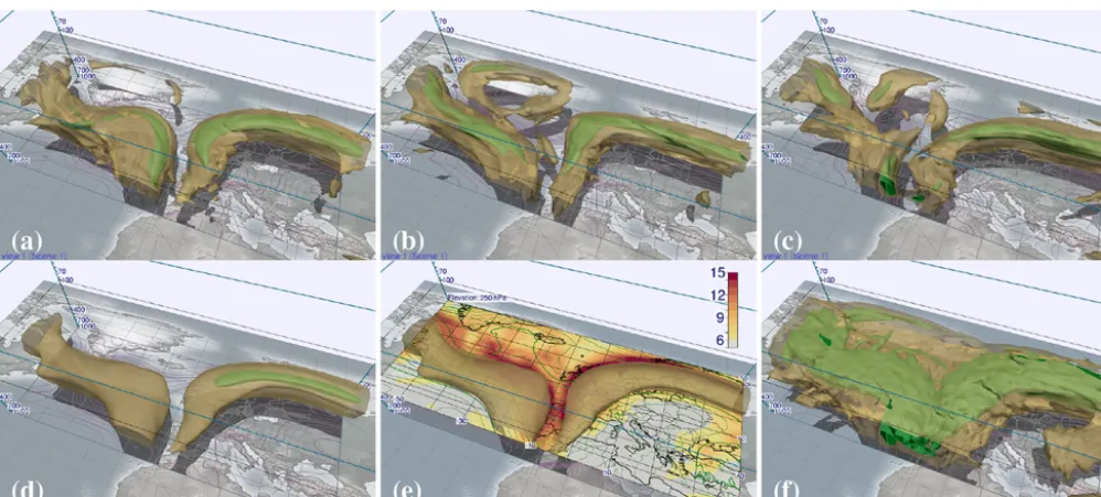
Figure 6 shows an example of exploring the upper-level ensemble wind field of the forecast from Monday, 15 Oc-tober 2012, 00:00 UTC, valid at Friday, 19 OcOc-tober 2012, 18:00 UTC. To visualize the jet stream, two wind speed iso-surfaces are rendered. The large variation of the ensemble re-garding position, structure and strength of the jet stream over the Atlantic highlights high uncertainty in this area. On the other hand, the strong jet extending from Spain to Scandi-navia is predicted with higher certainty; while in the mean wind field the 45 m s−1 signal over the Atlantic is largely smoothed out, it is present over Europe (Fig. 6d). However, adding a horizontal section of wind speed SD (Fig. 6e) to the isosurface of mean wind speed reveals that the position of the jet is uncertain in particular on its northern side.
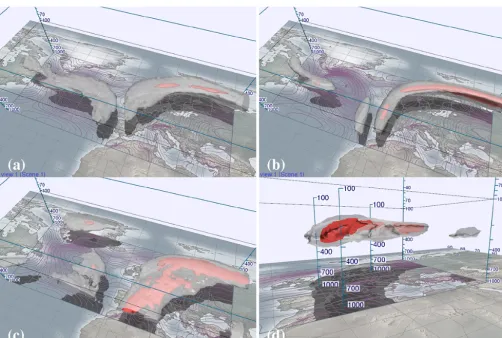
Figure 7 shows the probability of wind speed exceeding 45 m s−1. A high probability of over 70 % can again be found over northern Europe (Fig. 7a). The large horizontal extent of
the area of low (10 %) probability above the Atlantic reflects the uncertainty. The actual jet can occur anywhere in this re-gion. Two days later, with decreasing forecast lead time, the ensemble has significantly converged and the uncertainty has decreased (Fig. 7b).
Figure 7c and d show the probability of the Schmidt– Appleman criterion (Schumann, 1996), an indicator for the occurrence of contrails (aircraft-induced clouds that also have been the target of research flights; Voigt et al., 2010; Kaufmann et al., 2014). Visualization of the probability of the Schmidt–Appleman criterion being fulfilled shows that contrails, in the example, can only occur between about 400 and 200 hPa. In the given case, a high probability can be ob-served on the leading downstream edge of the jet.
3.4 Normal curves
Figure 3. Bridge from 2-D to 3-D visualization. (a) Horizontal section of geopotential height (contour lines) and horizontal wind speed (colour) at 250 hPa, as obtained from the DLR Mission Support System. ECMWF deterministic forecast from 00:00 UTC, 17 October 2012, valid at 18:00 UTC, 19 October 2012. (b) The same data, rendered by Met.3D and mapped into the 3-D context. The section can be interactively moved by the user. (c) Vertical section of horizontal wind speed (colour) and potential tempera-ture (contour lines) in Met.3D, amended by a 50 m s−1isosurface of wind speed, coloured by pressure (hPa). Note how spatial per-ception of the 3-D isosurface is aided by rendering shadows and labelled vertical poles (animated version of this figure in the Sup-plement at 00:05 min).
a 2-D section and a 3-D isosurface to visualize the structure of scalar fields in the interior of an isosurface.
The curves are started on a transparent isosurface and pro-ceed along the field’s gradient direction, i.e. normal to the isosurface. The spacing of the curves can be controlled by
the user (cf. Sect. 4.4). We colour the curves according to the scalar value. This way, we achieve a visual sampling of a subdomain of the volume. In contrast to a 2-D section that samples a planar subdomain, the normal curves sample a 3-D subdomain enclosed by an isosurface via a discrete set of lines. Following the gradient, the curves converge at local extrema of the data field. This way, the user can at a glance identify the locations and strengths of present extrema, and judge the strength and direction of the gradient between an extremum and the outer isosurface.
Figure 8 illustrates the approach. The goal is to identify regions of maximum probability of cloud ice water content exceeding 0.01 g kg−1, and to track the regions’ evolution over time. The normal curves immediately show a maxi-mum in the upper part of the transparent 40 % isosurface (Fig. 8b and c). The corresponding shadows reveal that the maximum is approximately located above the Pyrenees. In-teraction with the vertical axis shows a vertical position be-tween 300 and 200 hPa. Further visual aids can now be added to obtain more quantitative information. In the example, the horizontal section can be immediately placed in the region of interest, without the need to search the entire vertical extent of the model atmosphere (Fig. 8d).
While extrema can also be identified with an inner opaque isosurface (cf. Fig. 7) or by interacting with 2-D sections, the normal curve approach requires less interaction steps. This is advantageous if the absolute values of the extrema are not known beforehand (with isosurfaces the user needs to search over isovalues), and if the extrema shall be visually tracked over ensemble members or time. Concerning time, in partic-ular probability values tend to decrease with increasing fore-cast lead time; hence, a fixed isosurface is not well suited to visualize the temporal evolution of a maximum.
In Fig. 2c (also shown in the video at 05:40 min), the method is applied to the upper-level wind field shown in Fig. 6. Here, the normal curves inside the 45 m s−1 isosur-face converge to the string-like line of local maxima in the wind field – the curves are used to identify the position of the jet core and its strength.
4 Visualization algorithms and system architecture Response time, the time required to display a new image af-ter the user has inaf-teracted with, for example, camera or time step, is crucial to the acceptance of an interactive visualiza-tion tool, as Szoke et al. (2003) and Hibbard (2004) empha-size. To achieve low response times, we make extensive use of modern graphics processing units (GPUs). These highly parallel processors provide high computational throughput and memory bandwidth and are well suited to accelerate vi-sualization algorithms.
GPU acceleration is implemented with OpenGL 4 and the OpenGL Shading Language (GLSL)1, using vertex,
(a)
(b)
Figure 4. Vertical sections can be moved interactively in Met.3D to explore the vertical structure of the atmosphere, for example along potential flight track segments. (a) Potential vorticity (colour coding in PVU), (b) cloud cover fraction. Red colours in (a) mark the 2-PVU surface and thus the dynamic tropopause. Note the low tropopause along the trough. Same forecast as in Fig. 3 (animated version of this figure in the Supplement at 01:24 min).
(a)
(b)
Figure 5. Met.3D automatically scales size and density of wind barbs overlain on horizontal sections. (a and b) Equivalent potential temper-ature (colour coded in K) at 850 hPa, overlain with contour lines of geopotential height. Same forecast as in Fig. 3 (animated version of this figure in the Supplement at 01:54 min).
etry, fragment and compute shaders. These small GPU pro-grams allow the parallel execution of operations on the level of a graphics vertex or of an output fragment (i.e. a single pixel in the generated image), the generation of new geom-etry by the graphics subsystem, or the general parallel ex-ecution of operations. We will not go into detail of graphics technology here, for an introduction to GPU-based visualiza-tion we refer the reader to, for example, Bailey (2009, 2011, 2013) or Engel et al. (2006). On the CPU side, Met.3D is implemented in C++.
A second important factor influencing response time is the way data are read from disk and whether and how it needs to be processed prior to visualization. We have designed an ensemble data pipeline to handle this task efficiently.
In this section, we discuss the methods used to achieve high visualization performance in Met.3D. After describing the data that can be handled by the tool (Sect. 4.1), we discuss the ensemble data pipeline (Sect. 4.2) and the GPU-based visualization algorithms (Sect. 4.3 and 4.4).
4.1 Forecast data
interpo-Figure 6. Navigation through the ensemble. Visualized are the 50 m s−1(green opaque) and 30 m s−1(yellow transparent) isosurfaces of horizontal wind speed (forecast from 00:00 UTC, 15 October valid at 18:00 UTC, 19 October 2012). (a) Control run, members (b) 27 and (c) 33, (d) ensemble mean, (e) ensemble mean augmented by a horizontal section of SD (m s−1), (f) ensemble maximum (animated version of this figure in the Supplement at 02:26 min).
lated in the horizontal to a regular latitude–longitude grid. In the vertical, the data are available on either a set of pre-defined pressure levels (PLs), or, higher resolved and thus better suited for 3-D visualization, on the native model grid levels (MLs). For the latter, the model uses terrain following hybrid sigma-pressure coordinates, as illustrated in Fig. 9. The vertical-pressure coordinate pk of a grid point at level k is defined by a set of fixed coefficientsak andbk and the surface pressurepsfc below the grid point (Untch and Hor-tal, 2004):pk=ak+bk×psfc. With increasing altitude the influence ofpsfcdecreases. During TNF, the operational en-semble forecast was available with 62 levels (91 levels for the deterministic forecast, increased by the time of writing to 137 levels). At this resolution, levels are constant in pres-sure above approximately 64 hPa (70 hPa)2. In the horizon-tal, a spectral truncation of T639 (T1279) is available, cor-responding to a regular latitude–longitude grid of approx. 0.28◦×0.28◦(0.15◦×0.15◦). Forecasts are available twice daily (starting at 00:00 and 12:00 UTC) at a time step of 3 h up to 144 h forecast lead time and 6 h up to 240 h forecast lead time.
For the examples in this paper, we use ENS data interpo-lated horizontally to 1◦×1◦and to 0.25◦×0.25◦; 1◦×1◦is the grid spacing we were able to operationally retrieve during TNF, as permitted by the available internet bandwidth and interpolation time required by MARS. Deterministic data are used at 0.15◦×0.15◦grid spacing. In the vertical, all 62 and 91 levels are used.
2http://old.ecmwf.int/products/data/technical/model_levels/
The forecast domain used in the examples encom-passes 100◦ in longitude by 40◦ in latitude, resulting in 101×41×62 grid points for ENS data fields at 1◦×1◦grid spacing, 401×161×62 points at 0.25◦×0.25◦ grid spac-ing and 669×268×91 points for the deterministic forecast at 0.15◦×0.15◦grid spacing. Using floating point precision (4 bytes per value), the data fields require approximately 1, 16 and 62 MB per member, time step and forecast parameter in graphics memory. For visualizations using multiple fore-cast parameters and the entire ensemble, the required mem-ory quickly adds up.
Forecast data can be read directly from GRIB files output by MARS or from NetCDF-CF3files. Our goal was to mini-mize the time span between data availability at ECMWF and visualization. Hence, no pre-processing of the data prior to usage in Met.3D is required. Forecast parameters not output by the ECMWF model, however, need to be computed first. For this purpose, Met.3D can be connected to the data pro-cessing system of the DLR MSS, which derives additional quantities (for example, relative humidity and potential vor-ticity) from the forecast parameters output by ECMWF.
4.2 Ensemble processing pipeline
To process the ensemble data prior to rendering, we have designed a data processing pipeline composed of modules (“data sources”) that create, read or process data and that can be combined in flexible ways. Figure 10 illustrates the
Figure 7. Probability fields computed from the ensemble, valid at 18:00 UTC, 19 October 2012. (a and b) Probability of horizontal wind speed exceeding 50 m s−1, as computed from the forecast initialized (a) at 00:00 UTC, 15 October 2012 and (b) at 00:00 UTC, 17 October 2012. Shown are the 70 % (red opaque) and 10 % (white transparent) isosurfaces. Note how the ensemble converges. (c and d) Probability of contrail occurrence (Schmidt–Appleman criterion fulfilled and relative humidity greater than 80 %), as viewed from different camera positions (80 % red opaque and 50 % white transparent) (animated version of this figure in the Supplement at 03:23 min).
cept. Algorithms in the data sources (for example, ensem-ble statistics or trajectory filtering; cf. Part 2) can be imple-mented to execute on either CPU or GPU (the latter via com-pute shaders). All data sources are connected to a memory manager that caches intermediate results. The actors that im-plement the visualization methods are placed at the end of a pipeline. They send “requests” into the pipeline to obtain a specific data item. These requests are composed of multiple key/value pairs similar to the Web Map Service requests used in the MSS (see Rautenhaus et al., 2012, for details). A re-quest emitted into a pipeline propagates from data source to data source. Each data source interprets the keys it requires. If the requested operation has been executed before and the result has been cached, no action is taken. Otherwise, the data source defines a processing task to perform the requested op-eration. The task, however, is not executed immediately. If applicable, remaining keys are passed on to the data source’s input(s). If a data source requires additional input, it can also append keys to the request.
All processing tasks defined this way are assembled into a task graph that is passed to a scheduler for execution. Based on the dependencies provided by the graph structure and in-formation carried by the tasks, the scheduler can process the tasks. For example, tasks that have to be performed for all members of the ensemble can be executed in parallel.
Figure 8. Normal curves help to analyse the topology of 3-D scalar fields. They reveal the distribution of data values in a subdomain enclosed by a 3-D isosurface and enable fast identification and tracking of local extrema. (a–c) Probability of cloud ice water content exceeding 0.01 g kg−1. The white transparent isosurface shows 40 % probability. Colour coding in %. (d) Details of the identified maximum are inspected with a horizontal section at 250 hPa. Forecast from 00:00 UTC, 17 October 2012 valid at 12:00 UTC, 20 October 2012 (animated version of this figure in the Supplement at 04:28 min).
to compute the probabilities. The regridding tasks are well suited to be executed in parallel.
To indicate an order of magnitude of the response times that Met.3D achieves on our test hardware when the dis-played data field is changed, Table 1 lists timings for chang-ing the forecast time in the horizontal section in Fig. 3. Tim-ings are provided for displaying a single member of the en-semble and for displaying the enen-semble mean (the latter as an example of a statistic that requires all members of all vari-ables when computed on demand), both when data need to be read from disk and when it is available in cache. If the data to be visualized are available in cache, no task graph needs to be executed and the response time is of the order of a few milliseconds. If data need to be read from disk, the response time is bounded by the disk’s bandwidth. This becomes no-ticeable in particular when ensemble statistical quantities are derived on demand. For the TNF data set at 0.25◦grid spac-ing, all members of the ensemble encompass approximately 3.2 GB that need to be read from disk. Our test hardware
re-quires about 17 s for this task. One possibility to decrease this time is to pre-compute frequently used statistical quantities. In our set-up, this can be done with the MSS data process-ing system. However, the interactivity to change, for exam-ple, the threshold for a probability field is lost with this solu-tion. Alternatively, the system performance can be increased by using pre-loading techniques to hide disk access. Here, the data for an anticipated subsequent time step are read in the background while the user explores the current time step. The current Met.3D architecture is prepared to implement such techniques. However, comprehensive optimizations of the system performance were outside the scope of this project and are left for future work.
4.3 GPU-based visualization algorithms
longitude–latitude-1000 900 800 700 600 500 400
Pr
essu
re
(
hP
a) 14
16
18
20
22
24
(a) (b)
Figure 9. Hybrid sigma-pressure levels used by the ECMWF model. (a) The elevation of the model levels (green lines; the exam-ple shows levels from the 31 level model; level indiceskin green) changes with surface pressure (black curve at the bottom). The data value for a given pressure valuepcan be located at different lev-els in the grid (the red line marks the location ofp=600 hPa). (b) Example of how the surface orography affects the vertical displace-ment of the grid points in a vertical section.
Table 1. Order of magnitude of response times achieved by Met.3D to display a new image after the user has advanced the forecast time for the horizontal section in Fig. 3b, displaying either data of a sin-gle member or of the ensemble mean (the latter an example of a statistic that requires all members of all variables when computed on demand). Timings are measured on the test hardware described in Sect. 3 and given for both forecast data at 1◦grid spacing and at 0.25◦grid spacing; 12 parallel threads are used by the scheduler for task graph execution. Fig. 3b uses four forecast variables, read-ing all ensemble members (for computation of the mean) from the disk hence involves reading 4×51×1 MB at 1◦grid spacing and 4×51×16 MB at 0.25◦grid spacing.
Data Source 1◦ 0.25◦
Single member disk (NetCDF) 50 ms 365 ms
Ensemble mean disk (NetCDF) 0.85 s 17 s
Single member member in cache <10 ms 25 ms
Ensemble mean mean in cache <10 ms 25 ms
pressure space – an operation required by all visualiza-tion algorithms. In the horizontal, data fields on a regular longitude–latitude grid are supported.
To use the data on the GPU, a single forecast variable of a single member is stored in a 3-D texture (i.e. a 3-D data array) in GPU memory. We assume that these data fields fit into GPU memory. Longitude–latitude axes, as well as pres-sure levels for PL grids, are stored in an additional 1-D tex-ture. For ML grids, the corresponding 2-Dpsfcfield and the coefficientsakandbkare stored. This allows for computation of the pressure coordinate of a grid point on the fly, without
tally at the positions of the data grid points and vertically at p(Fig. 11a). Data sampling only needs to be done whenpis changed. Executed in parallel for each vertex, a binary search in the vertex shader yields the model levels (or pressure lev-els)k andk+1 enclosingp in the corresponding grid col-umn. Following the ECMWF FULLPOS interpolation rou-tines (Yessad, 2014), interpolation between these two levels is done linearly in ln(p). The results are cached in a 2-D texture. Filled contours are rendered by assigning colour to each fragment within a triangle in the fragment shader, using the horizontally hardware-interpolated scalar value. To ob-tain a colour, colour palettes (cf. Sect. 3.2) are stored as 1-D transfer functions in 1-D textures. These textures are used as lookup tables (LUTs), mapping a scalar value to a colour. Line contours are generated by a marching squares (e.g. Hansen and Johnson, 2005, ch. 1) implementation in a ge-ometry shader. Each grid cell of the cached 2-D cross section texture is examined in parallel and, if applicable, a line seg-ment is drawn. Graticule, coast and border lines are overlain on each horizontal section to improve spatial perception (cf. Fig. 3b). Wind barbs are also generated in a geometry shader. It takes the horizontal wind field’suandvcomponents as in-put and generates the geometry of the barbs, again exploiting GPU parallelism.
Vertical sections are rendered with a similar grid of trian-gles. A triangle vertex is drawn for each vertical (model or pressure) level and each of a number of intermediate hori-zontal points along a line connecting the waypoints the user has specified (Fig. 9b). The distance between the intermedi-ate points can be specified. A vertex shader computes the ver-tical position of each vertex and places it accordingly. This operation is a simple lookup for PL data and involves interpo-lation ofpsfcand computation of the model level pressure for ML grids. Scalar values are interpolated horizontally, also in the vertex shader, on the level on which the vertex is placed. They are also cached in a 2-D texture that is updated if a way-point is moved. Filled and line contours are generated equiv-alently to those in the horizontal sections.
Figure 10. Pipeline concept of Met.3D: (a) data sources are connected to form a pipeline, into which a visualization “actor” sends data requests; (b) sample pipeline to visualize the probability of horizontal wind speed exceeding 45 m s−1. A request for the probability triggers further requests up the pipeline; (c) Task graph generated by the pipeline in (b).
sampling position to texture coordinates(tlon, tlat, tp)on the unit cube, the GPU interpolates the 3-D texture at an arbitrary position. For regular grids, this mapping is a simple linear scaling. Since, however, PL grids retrieved from MARS are irregularly spaced in the vertical, we need a method to map pressure totp. This is realized by means of an LUT stored in an additional 1-D texture. The level indiceskcan be linearly scaled totp,k∈(0. . .1). Since we know the pressure values pk at the levelsk, we can compute a continuousekfor
inter-mediatepby linearly interpolating in ln(p)(Fig. 11b).ekcan
subsequently be scaled totp. These mappings fromptotp are pre-computed for a number, say 2048, of pressure values and stored in the LUT that can be accessed in the shader.
ML grids are not rectilinear and thus sampling becomes more complicated. As illustrated in Fig. 11b, the continu-ous level indexekin general is not the same for adjacent grid
columns. In the worst case, a givenpis located between dif-ferent model levels in its four surrounding grid columns. Tri-linear hardware interpolation requiresekto be the same in all
surrounding grid columns, it hence cannot be used. Conse-quently, we need to split the interpolation into four vertical interpolations in the grid columns and a subsequent bilin-ear horizontal interpolation. A naïve approach is to use the binary search used for the horizontal sections for the ver-tical interpolations; however, our experiments showed that rendering times can be reduced by a factor of about 2 when again making use of an LUT approach for hardware interpo-lation. However, the horizontal interpolation needs to be im-plemented in software. ML sampling is hence over 4 times more expensive than PL sampling.
(a)
(b)
Figure 11. Sampling data fields in GPU shaders. (a) For each vertex of a horizontal section, model levelskandk+1 are found by binary search. The scalar value is linearly interpolated in ln(p)between these two levels. (b) PL grids are rectilinear (left), allowing for the usage of trilinear hardware interpolation between the grid points surrounding a sample position (red dot). For ML grids (right), the sample position can be located between different model levelskfor two adjacent grid columns, thus prohibiting hardware interpolation.
po-crete values of psfc reflecting the expected range ofpsfc in the data. Using bilinear hardware interpolation, this LUT is used to interpolate in bothpsfc and ln(p)to obtain a map-ping from ln(p)totp. The additional memory requirement is reasonable: for an LUT using 2048 entries in the vertical and 600 entries forpsfcbetween 1050 and 450 hPa, approxi-mately 9 MB of GPU memory are required in float precision (i.e. 4 bytes/value). The table can be shared among variables on the same grid.
The traversal of the data volume is accelerated with an empty-space skipping strategy (Krüger and Westermann, 2003). The longitude–latitude-pressure space covered by a data field is divided uniformly into a regular grid of Ni× Nj×Nk cells. For each cell, minimum and maximum data values are computed. In the shader, the information is used to skip cells in which an isosurface cannot possibly be located. Due to the different horizontal and vertical scales, care has to be taken when choosing the step size for traversing non-empty cells. Depending on the factor that is used to scale ln(p)to azcoordinate in visualization space, the vertical dis-tance between two grid points often is considerably smaller than the horizontal distance. The step size chosen needs to be small enough to ensure that no grid point is skipped during traversal.
Once an isosurface crossing has been identified, the iso-surface normal (equivalent to the gradient of the scalar field at the crossing position) is computed via central differences. The pixel colour is subsequently determined using the com-monly used Blinn–Phong lighting model (e.g Engel et al., 2006). Colour can be pre-defined or obtained from a transfer function. Also, a second scalar field can be mapped to the isosurface to colour, for example, a wind speed isosurface by temperature.
Table 2 lists typical rendering times for images shown in this paper. Note that the performance of the raycaster de-pends on the visualized data as well as on camera viewpoint. In particular the effectiveness of the empty-space skipping strategy for a selected isovalue depends strongly on the spa-tial distribution of the data values. During user interaction, the step size used by the raycaster to sample the data fields can be reduced (cf. Table 2). While this temporarily reduces image quality, rendering time is also reduced.
Two-dimensional sections are rendered at the same per-formance for ML and PL data sets, as the same number of interpolation operations needs to be performed for both grid types. For raycasted images, Table 2 provides timings for ML data sets and PL data sets with the same number of vertical levels. Due to the reduced number of vertical interpolation operations, PL data are typically rendered by a factor of two to three faster than ML data.
brid sigma-pressure model levels (62 levels), PL refers to visualiza-tions from data fields regridded to 62 pressure levels chosen equal to the levels of an ML grid defined by a constant surface pressure of 1000 hPa. Timings are average values of continuous rendering over 30 s. A Met.3D window of 1600 by 900 pixels is used (the size used for the video in the Supplement, corresponding to a viewport of 1192 by 864 pixels). “Animated” for cross sections refers to verti-cally sliding a horizontal section or moving a waypoint of a vertical section.
Figure Setting ML PL
Fig. 3b static 2.3 ms
Fig. 3b animated 2.8 ms
Fig. 4a static 6.2 ms
Fig. 4a animated 6.8 ms
Fig. 6a step size 0.1 417 ms 114 ms Fig. 6a step size 1 107 ms 47 ms
Fig. 7a step size 0.1 222 ms 73 ms
Fig. 7a step size 1 62 ms 39 ms
Fig. 7c step size 0.1 248 ms 76 ms
Fig. 7c step size 1 72 ms 40 ms
Fig. 2c step size 0.1 273 ms 100 ms
Fig. 2c step size 1 83 ms 67 ms
We note that as for the data pipeline, comprehensive op-timizations of the visualization algorithms were outside the scope of our work. In particular with respect to the raycaster, further optimizations are possible, for example, by integrat-ing an adaptive step size strategy.
4.4 Computation of normal curves
Figure 12. Computation of normal curves. Seeding points for the curves (green dots) are placed at the intersections between axis aligned rays (black arrows) and the outer isosurface (only rays from two directions are shown for illustration). Only a single seed is al-lowed in each grid box of the yellow volume.
seed is allowed per grid cell. Hence, if a seed point falls into a cell already occupied, it is discarded (illustrated in the or-ange grid cell). The normal curves are integrated in parallel in the direction of the scalar field’s gradient, using a fourth-order Runge–Kutta scheme. The gradient is computed with the same method used for isosurface shading. If present, the integration can be stopped at an inner opaque isosurface (il-lustrated by the red isosurface in Fig. 12).
5 Impact of (not) regridding on ensemble statistical quantities
A challenge that arises from aiming at interactive ensemble visualization is the efficient yet accurate computation of sta-tistical quantities from the ensemble predictions. We com-pute statistical quantities per grid point. Probabilities, for ex-ample, are computed by evaluating for every member and for each grid point a given probability criterion (for instance, wind speed exceeding a given threshold). The evaluation of the criterion yields for every member a binary volume, with the bits set when the criterion is fulfilled. Probabilities are computed by counting the number of members with a set bit for each grid point. Other statistical measures are computed similarly for each grid point over the ensemble dimension.
For 2-D grids, this is common procedure (Wilks, 2011) and also for 3-D grids not an issue as long as a given grid point is located at the same spatial position in all members. However, due to surface pressure varying between ensemble members, this is not the case for data on ML grids. Hence, depending on the vertical gradient of the forecast variable from which a statistical quantity is computed, an error is in-troduced. One approach to this issue is to vertically regrid all ensemble members to a common grid, for example, the one defined by the mean surface pressure (as done in the example pipeline in Fig. 10). This, however, introduces an additional interpolation step and demands computational resources.
In this section, we investigate the visual and quantitative differences between statistical quantities computed from the
Figure 13. (a) SD of surface pressure, σ (psfc). Forecast from 00:00 UTC, 15 October 2012, valid at 18:00 UTC, 19 October 2012. Red contour lines show mean sea level pressure. (b) Vertical sec-tion of the pressure difference (yellow-blue-black colour bar in hPa) between highest and lowest ensemble member, rendered on top of a wireframe map ofσ (psfc).
original ML grids and those computed from data fields re-gridded to a common grid. The differences are compared to an additional error that is introduced by linearly interpolat-ing the statistical quantities. At ECMWF, maps of statisti-cal quantities on pressure levels are computed from the indi-vidual member’s forecast data on these pressure levels. This implies that a forecast meteorological variable is first inter-polated to the target vertical position for each member (us-ing linear interpolation inpor ln(p); cf. Yessad, 2014), fol-lowed by the computation of the statistical quantity. If, on the contrary, we first compute the statistical quantity on the 3-D model grid and then linearly interpolate to the target vertical position, an error is introduced due to the non-linear nature of most statistical measures. The same problem arises in the horizontal dimensions.
In the following, we analyse regridding and interpolation error for the forecast data we had available from TNF. We present results from the forecast initialized at 00:00 UTC, 15 October 2012 and valid at 114 h lead time at 18:00 UTC, 19 October 2012. This case is representative for the data set, results for other time steps of the TNF data set are similar.
5.1 Variation in grid-point pressure
fore-(a) (d)
(b) (e)
(c) (f)
Figure 14. Visual differences between statistical quantities computed from a vertically regridded ensemble to those computed from the original ensemble. Horizontal section at 950 hPa (approx. model levels 51–55 in Figs. 15 and 16) of (a–c)p(|v|>20 m s−1)(%) and (d– f)σ (RH). Same forecast as in Fig. 13. Shown is (a) the probability and (d) SD computed from the original model grid, (b and e) computed from members regridded to the grid defined by the meanpsfc, and (c and f) the difference between both fields.
cast. This particularly applies to the low-pressure systems over the Atlantic and the northern British Isles. Figure 13b shows a vertical cross section of the maximum pressure dif-ference between any two members per grid point in these two areas. Close to the surface, the difference reaches 40 hPa, corresponding (at low altitudes) to an elevation offset of about 400 m. In most other regions, however, differences are smaller. Also, as expected from the model grid topology, dif-ferences vanish in upper atmospheric levels.
5.2 Difference due to vertical regridding
Vertical regridding is implemented as a data source that can be integrated into the Met.3D ensemble processing pipeline (cf. Fig. 10). The user can toggle between visualizations from original and from regridded data fields, and, if required, per-manently enable regridding. If statistical quantities are com-puted from the original member grids, the resulting field is interpreted on a grid defined by the mean surface pressure.
On our test hardware (cf. Sect. 3), the cost of single-threaded CPU regridding on average is about 60 ms per mem-ber and variable for the TNF ENS forecast at 1◦grid spacing (256 742 grid points per 3-D field) and about 1 s at 0.25◦grid spacing (4 997 262 grid points). Even though multiple en-semble members can be processed in parallel on a multi-core machine and the regridding process could be further sped up using the GPU, there is a delay in particular for high-resolution data sets and visualizations using multiple vari-ables.
Figure 15. Distribution of differences between statistical quantities computed from a vertically regridded ensemble to those computed from the original ensemble. Plots are generated from all 256 742 grid points of the data field. Same forecast as in Fig. 13. Shown are (a and d)
µ(|v|), (b and e)σ (|v|)and (c and f)p(|v|>20 m s−1); (a–c) distribution and vertical occurrence of absolute values of the quantities. (d–f) Distribution and vertical occurrence of differences due to regridding (denoted byregrid1); note the logarithmic scale of the histograms in (d–f). Probability values are discrete due to the size of the ensemble (51 members).
tend to be larger for variables that depend on moisture and variables derived thereof; however, we could not find any ex-amples in which visualized structures were significantly al-tered. For example, while there is some visible difference in σ (RH)along Rafael’s warm front, the structure itself is not significantly altered.
Visual differences strongly depend on the employed colour palette and visualized data range. Depending on the range of values covered by a single colour, small changes might simply not be reflected in the visualization. To ensure that differences in general are small, we have performed a sta-tistical analysis of the entire TNF data set. Figure 15 shows results for three statistical quantities computed from the wind field of the example case: mean µ(|v|), SD σ (|v|), and p(|v|>20 m s−1). The scatter plots show that for all three quantities the largest differences appear at lower altitudes (higher model level indices). Also, differences mostly are small compared to absolute values of the quantities. For
ex-ample, at only a few grid points the difference inσ (|v|)and p(|v|>20 m s−1) exceeds 1 m s−1 and 10 %, respectively. The range of differences observed in Fig. 14 is well reflected in the histogram.
Larger differences appear for statistical quantities com-puted from moist variables (Fig. 16). Again, the histogram forσ (RH)confirms the range of differences shown in Fig. 14 (Fig. 16d). For probabilities of potential vorticity and cloud cover, differences of up to 30 % can occur (Fig. 16e and f). However, for most grid points, differences are smaller.
Figure 16. The same as Fig. 15 but for variables depending on moisture; (a and d) SD of relative humidity; (b and e) probability of potential vorticity exceeding 2 PVU; (c and f) Probability of grid box cloud cover fraction falling below 0.05.
0 2 4 6 8 10
σ(psfc) (hPa) 0
2 46 8 10 12 14 16
nu
mb
er
of
gri
d p
oin
ts
(
×
10
3)
0.00 0.01 0.02 0.03 0.04 0.05 0.06 0.07
bin
av
era
ge
|
re
gr
id∆
σ(
|v
|)
|
Figure 17. Histogram ofσ (psfc), overlain with the bin-averaged difference ofσ (psfc)against the differences betweenσ (|v|) com-puted from a vertically regridded ensemble and comcom-puted from the original member grids. Same forecast as in Fig. 13.
5.3 Error due to vertical interpolation of statistical quantities
The error introduced by vertical linear interpolation of a sta-tistical quantity depends on the quantity. Consider the exam-ple given in Table 3. Due to the linear nature of the ensemble
mean, there is no difference whether we first compute the mean at the grid points and then interpolate to the sample lo-cation or vice versa. For non-linear quantities including SD and probability, the results are different.
Figure 18. Distribution of errors due to vertical linear interpolation (denoted byinterp1) of statistical quantities. (a) Distribution of errors of σ (|v|)(top), and vertical occurrence of the errors (bottom). (b) The same forp(|v|>20 m s−1). (c) Vertical profile of level average differences due to regridding (crosses) and interpolation (dots). Same forecast as in Fig. 13.
Table 3. Example of vertically interpolating statistical quantities. Consider an ensemble of three members and corresponding scalar quantities
s1..s3at the two vertical levelskandk+1. While the mean valueµ(s), interpolated to the mid-level betweenkandk+1, equals the mean of the interpolated scalar values, this is not true for the SDσ (s)and the probability that a scalar value exceeds 1.5,p(s >1.5). The subscript i refers to “interpolated”.
Level s1 s2 s3 µ(si) µi(s) σ (si) σi(s) p(si>1.5) pi(s >1.5)
k 0.8 1.7 1.8 1.433 0.45 0.66
Mid-level 1.4 1.45 1.4 1.4166 1.4166 0.24 0.44 0 0.5
k+1 2.0 1.2 1.0 1.40 0.43 0.33
5.4 Discussion
The examples show that the errors introduced by comput-ing the statistical quantities from the original member grids are of comparable magnitude to the errors introduced by ver-tically interpolating the computed quantities. For most grid points, both are negligible and result in only little difference in the visualization. However, for some variables and cases (in particular moist variables), differences can be of the same order of magnitude as the statistical quantity itself.
We conclude that for general exploration of the forecast data, it is sufficient for the user to use the “fast” option and vi-sualize quantities computed from the original member grids. However, if the result is crucial for an important decision, our advice is to switch to regridded quantities and accept the additional compute time. The “best” results and those most comparable to products obtained from ECMWF can be achieved by first interpolating each member to the desired vertical pressure and then computing the statistical quanti-ties. In this case, neither regridding nor vertical interpolation of the quantity corrupts the result. In Met.3D, this is possible for horizontal sections.
6 Conclusions
We have presented Met.3D, a new open-source tool that provides interactive 3-D visualization techniques for nu-merical ensemble weather prediction data in a way suit-able for weather forecasting. The development of Met.3D has been motivated by the application of forecasting during aircraft-based atmospheric field campaigns, in particular, by the requirements of the T-NAWDEX-Falcon 2012 campaign. However, we see the tool applicable to a wider range of appli-cations, including the analysis of ensemble simulation output in atmospheric research and the usage of Met.3D to support teaching in meteorology classes.
is improved by displaying shadows on the Earth’s surface, enabling the user to judge the horizontal position and rel-ative elevation of an element. Quantitrel-ative height informa-tion can be obtained by means of interactive vertical axes. We have proposed normal curves, a novel visualization tech-nique to reveal the structure inside a transparent 3-D iso-surface of a scalar field. With normal curves, the locations and magnitudes of local extrema in the visualized data can be identified at a glance. To visually provide information on forecast uncertainty, Met.3D implements support for ensem-ble forecasts. The tool is designed to allow for integration of both feature-based and location-based ensemble visualiza-tion techniques. In the presented version, forecast products can be animated over the ensemble dimension, and statistical quantities can be derived and visualized on demand. Con-cerning the computation of statistical quantities from fore-cast data on hybrid sigma-pressure grids, we have shown that ignoring the variation in grid-point pressure between the en-semble members has little impact on the visualization.
The paper at hand is the first of a two-part study. We have focussed on Met.3D’s functionality, system architecture and visualization algorithms. In Part 2, we focus on the spe-cific forecast requirements of T-NAWDEX-Falcon and use Met.3D to predict warm conveyor belt situations. Ensemble particle trajectories are employed to predict a probability of warm conveyor belt occurrence. In particular, a case study, revisiting a forecast case from T-NAWDEX-Falcon, demon-strates the practical application of Met.3D and highlights the potential of the software to improve the weather forecasting process.
Future work needs to include careful evaluation of the pre-sented visualization techniques to study their impact on tasks performed by meteorologists and atmospheric researchers in their daily work. We discuss our point of view on the added value of interactive 3-D ensemble visualization for forecast-ing after the presentation of the case study in the conclusions of Part 2. For example, in our experience, the provided in-teractivity for 2-D sections and the ability to add features as 3-D elements helps to much faster build a mental model of the atmosphere. This, of course, reflects our personal percep-tion. We plan to evaluate the issue with a user study in the near future.
We will actively use Met.3D during upcoming field cam-paigns, including a future NAWDEX campaign scheduled for 2016. We also see much potential for further research in me-teorological visualization. With respect to 3-D visualization, further improvement of spatial perception is very important. In the Met.3D version presented here, shadows are only ren-dered on the Earth’s surface. Global illumination techniques (e.g. Jönsson et al., 2014) that, for example, allow 3-D el-ements to mutually cast shadows on each other, may
fur-challenges include the efficient rendering from further native model grid topologies and real-time placement of text labels to convey quantitative information. The latter applies in par-ticular to 2-D and 3-D contour lines and surfaces. Due to the employed GPU implementation of the 2-D marching squares contouring algorithm, continuous line geometry is not eas-ily available. Hence, it is difficult to compute positions for labels.
With respect to ensemble and uncertainty visualization, open questions are abundant, as reflected by the literature surveyed in Sect. 2. In Part 2, we introduce a feature-based approach for WCBs. Further approaches, both feature based and location based, can be implemented in Met.3D to study their feasibility and applicability in meteorology.
With the development of Met.3D, we have demonstrated how we envision 3-D and ensemble techniques to become a part of standard meteorological visualization. The tool pro-vides a solid software infrastructure that opens the door to in-vestigate the above-listed and other research questions, thus enabling the further advancement of meteorological visual-ization.
Code availability
To facilitate ease of deployment and of future research and developments, we have made the source code of Met.3D available as open-source under the GNU General Public Li-cense, version 3. Please enter the following into your web browser to go to the software repository: https://bitbucket. org/wxmetvis/met.3d; here you can obtain an up-to-date ver-sion of the software. We welcome user feedback as well as contributions that help with the further development of the code. If you are interested, please contact us.
The Supplement related to this article is available online at doi:10.5194/gmd-8-2329-2015-supplement.
Acknowledgements. Access to ECMWF prediction data has been
kindly provided in the context of the ECMWF special project “Support Tool for HALO Missions”. This work was supported by the European Union under the ERC Advanced Grant 291372 – SaferVis – Uncertainty Visualization for Reliable Data Discovery. M. Rautenhaus was supported by a grant from Ev. Studienwerk Villigst e.V. C. M. Grams and A. Schäfler were supported by the German Research Foundation (DFG) as part of the research unit PANDOWAE (FOR896).