Table of Contents
Cascading Style Sheets 2.0 Programmer’s Reference - 1
Introduction - 3 Part I Reference
Chapter 1 - Basic CSS Concepts - 3
Chapter 2 - Values - 18
Chapter 3 - Selectors, Pseudo-Classes, Pseudo-Elements, and At-Rules - 24
Chapter 4 - Visual Media Styles - 35
Chapter 5 - Paged Media Styles - 124
Chapter 6 - Aural Media Styles - 134
Part II Summaries
Chapter 7 - Browser Compatibility - 151
Chapter 8 - CSS2 Quick Reference - 165
Introduction
In the beginning, there was HTML. And it was pretty good, but not great. You couldn’t really create nifty visual designs with it, which gave rise to table-based layout and single-pixel GIF tricks. And that was pretty bad. So CSS was born, and it was very good—in theory, anyway. There was a long struggle to make CSS a viable technology, thanks to imperfect interpretations of the specification, but lo! The day arrived when CSS could be used without fear and dread. And the people rejoiced.
Thanks to CSS, designers can cut back on the FONT and table tricks they’ve been forced to cobble together, and dramatically clean up their markup. With the coming of XHTML and XML, both of which are deeply semantic and must rely on some styling mechanism to become visually appealing, CSS is growing more and more popular. It’s a flexible, easy-to-understand language which offers designers a lot of power. Because it reduces markup clutter, it makes pages easier to maintain. And its centralized styling abilities lets designers adjust page layout with quick, easy edits of the styles, not dramatic changes to the markup. In fact, CSS makes it possible to completely reshape the look of a document without changing a single character inside the BODY element.
This book endeavors to efficiently describe the properties and values of CSS2, which was the latest CSS standard when the book was written, and to provide details on property interactions, common authoring mistakes, and other information which designers should find useful.
The text has been arranged to present basic concepts first, with details on important CSS algorithms and behaviors (Chapter 1). This is followed with “core” information which describes the types of values that can be used in CSS2 (Chapter 2), and the various ways in which elements can be selected for styling (Chapter 3). This first part of the book does its best to describe the foundation of CSS, for the rest of it would not function without the values and concepts presented.
The middle of the book (Chapters 4 through 6) is the largest portion, and is probably the area where readers will spend the most time—all of the properties found in CSS2 are defined, described, and annotated with notes. These properties are broken up into separate chapters, with Chapter 4 devoted to visual-media properties, Chapter 5 to paged-media properties, and Chapter 6 to aural-media properties. Each property is described in terms of its allowed values, its initial (or default) value, and other common aspects. There are also detailed descriptions of the meaning of each allowed value, notes about how the property works, examples of the property in use, and a list of related properties.
The final part of the book (Chapters 7 through 9) contains other useful information about CSS, including a browser support chart, a CSS2 property quick reference, and a list of useful online resources.
Between the contents of this book and the resources provided, it should be possible to decipher any CSS conundrums you may encounter. Although CSS can sometimes seem a bit mystifying, it is more than worth the effort of learning its secrets. Enjoy!
Part I:
Reference
Chapter List
Chapter 1: Basic CSS Concepts Chapter 2: Values
Chapter 3: Selectors, Pseudo-Classes, Pseudo-Elements, and At-Rules Chapter 4: Visual Media Styles
Chapter 5: Paged Media Styles Chapter 6: Aural Media Styles
Chapter 1:
Basic CSS Concepts
Associating Styles with Documents
There are four ways to associate styles with a document. These range from associating a separate stylesheet with your document to embedding style information in the document itself.
LINK Element
The LINK element is found in HTML and XHTML, and is used to associate an external stylesheet with a document.
Generic Syntax
<link rel="..." type="text/css" href="..." media="...">
Attributes
rel=“...”
This attribute describes the relation of the LINKed file to the document itself. For external stylesheets, there are two possible values: stylesheet and alternate stylesheet. Any LINK with a rel of stylesheet will be used in the styling of the document. The value alternate stylesheet is used to refer to stylesheets that are not used in the default rendering of the document, but which can, in theory, be selected by the user and thus change the presentation. The user agent must provide a mechanism to do so in order for this to work, and unfortunately most user agents do not provide such a mechanism. This attribute is required.
href=“...”
The value of this attribute is the URL of the external stylesheet. Either relative or absolute URLs may be used. This attribute is required.
type=“text/css”
This is used to declare the type of data which is being LINKed to the document. When associating a CSS stylesheet, the only allowed value is text/css. Other stylesheet languages will call for different values (e.g., text/xsl). This attribute is required.
media=“...”
Using this attribute, one can declare a stylesheet to apply only to certain media. The default value is all, which means that the styles will be used in all media in which the document is presented.
Recognized values under CSS are all, screen, print, projection, aural, braille, embossed, handheld, tty, and tv. Any number of these values can be used in a media attribute by formatting them as a comma-separated list. This attribute is optional.
Note In this approach, the stylesheet is placed in its own file. Such files are usually given an extension of .css, such as main-styles.css. The LINK element must be placed inside the HEAD element in HTML and XHTML, but XML-based markup languages may have other requirements.
Examples
<link rel="stylesheet" type="text/css"
href="http://www.my.site/styles/basic.css">
<link rel="stylesheet" type="text/css" href="article.css" media="screen,projection">
<link rel="stylesheet" type="text/css" href="printout.css" media="print">
STYLE Element
The STYLE element is found in HTML and XHTML, and is used as a container for an embedded stylesheet.
Generic Syntax
<style type="text/css" media="...">
Attributes
type=“text/css”
media=“...”
This attribute is handled the same as that used on the LINK element. This attribute is optional. Note STYLE must be placed in the HEAD element under HTML and XHTML.
Examples
<style type="text/css">
H1 {color: purple; border-bottom: 1px solid maroon;} H2 {color: blue; background: cyan;}
</style>
<style type="text/css" media="all">
PRE, CODE, TT {font-family: monospace; color: #333;} PRE {margin-left: 3em;}
</style>
STYLE Attribute
Under HTML and XHTML 1.1, any element can take a style attribute.
Generic Syntax
<elem style="...styles...">
Note The value of this attribute is any combination of style declarations. Because this approach binds the style very tightly to the element in question by placing stylistic information within the document itself, use of the style attribute is discouraged in those cases where a more robust solution (e.g., an embedded or external stylesheet) can be used.
Examples
<p style="color: red;">This paragraph’s text will be colored red.</p> <h1 style="font-family: sans-serif; color: magenta; padding: 0.5em; border-bottom: 2px solid green; background: cyan;">This H1 will assault your visual senses</h1>
@import Rule
@import is used to import an external stylesheet in a manner similar to the LINK element. See the entry for @import in Chapter 3 for details.
Rule Structure
The basis of applying styles to documents is the rule. Each rule is composed of a number of components, each of which has a specific name and function. These are summarized in Figure 1-1.
Figure 1-1: CSS rule structure
The selector is the part that determines which portions of the document will be matched by the rule. The rule’s styles will be applied to the selected element(s). For example, a selector of pre means that all pre elements will be selected. Multiple selectors can be grouped in a single rule by separating them with commas. See Chapter 2 for details about the various selectors which may be used.
2. Count the number of other selectors and pseudo-class selectors in the selector (= b) 3. Count the number of element names in the selector (= c)
4. Ignore pseudo-elements
The concatenation of the three values (a-b-c) yields the specificity. Note that these numbers are not represented in base ten; thus 0-0-11 is less than 0-1-0, even though they might be represented as “11” and “10” respectively. It is for this reason that authors are encouraged to think of specificity as a comma- or hyphen-separated list of three numbers. For example:
h1 {color: black} /* spec. = 0-0-1 */ div ul li {color: gray;} /* spec. = 0-0-3 */ pre.example {color: white;} /* spec. = 0-1-1 */ div.help h1 em.term {color: blue;} /* spec. = 0-2-3 */ #title {color: cyan;} /* spec. = 1-0-0 */ body ul#first li ol.steps li {color: silver;} /* spec. = 1-1-5 */
As detailed earlier in the section “Cascade Rules,” specificity is more important than the order in which rules appear. Thus, if the following two selectors match the same element, the declarations from the first will override any conflicting declarations in the second.
div.credits {text-align: center; color; gray;} /* spec. = 0-1-1 */ div {text-align: left; color: black;} /* spec. = 0-0-1 */
Therefore, the element which these two rules match will have gray, centered text.
Important declarations always outweigh non-important declarations, no matter the specificity of their associated selectors (see the next section for more details).
Importance
Declarations may be marked as important using the !important construct. This is applied to the actual declarations which are important, not to the selector nor to the rule as a whole. For example: p {color: red; background: yellow !important; font-family: serif;}
In this example, only the declaration background: yellow is important. The other two declarations are not.
If two or more important declarations involve the same property, then the conflict is resolved using specificity calculations. For example:
h2 {color: red !important; font-style: italic;} h2 {color: green !important;}
Since both color declarations are important, and both associated selectors have the same specificity, the second rule wins because it comes later in the stylesheet. Thus, H2 elements will be green and italicized—the font-style declaration is not affected in this case.
Inheritance
Many styles can be inherited from an element to its descendant elements. Any inherited style will be applied to an element unless the property in question is explicitly set through a rule whose selector matches the element. For example, consider these rules:
body {color: black;} p {color: green;}
Given this, the color of any paragraph will be green, while the color of all other elements will be black. Note that this overriding of inherited styles takes effect no matter what specificity or importance was attached to the original rule. For example:
div#summary {color: black !important;} p {color: green;}
Any paragraphs within a div whose id attribute has a value of summary will still be green, because the explicitly assigned style overrides the inherited style.
This has the advantages of upgrading the inheritance mechanism such that a style can be explicitly assigned to inherit, instead of relying on the normal inheritance mechanism as a "fallback."
Shorthand Properties
There are a few properties in CSS which are considered shorthand properties; that is, they represent a much larger collection of properties. For example, margin is a shorthand for the properties margin-top, margin-right, margin-bottom, and margin-left. The following two rules will have exactly the same effect:
p {margin: 1em;} p {margin-top: 1em; margin-right: 1em; margin-bottom: 1em; margin-left: 1em;}
Because of this, authors must be sure to avoid conflicts between properties and shorthands, or even between two shorthand properties. For example, consider the following two rules as matching the same element:
pre.example {margin: 1em;} pre {margin-left: 3em;}
Due to the operation of the cascade, any pre element with a class of example will have a margin 1em wide, including the left margin. The shorthand’s effects have masked out the value assigned in the pre rule.
Another good example involves text-decoration, which is a shorthand for no properties at all but acts much as a shorthand property does. Consider the following rules:
h2 {text-decoration: overline;} h2, h3 {text-decoration: underline;}
Given these rules, all H2 elements will be underlined but not overlined. The given values of text-decoration do not combine, as each combination of keywords is its own unique value. If it is desirable to decorate H2 elements with both an underline and an overline, then the necessary rule is:
h2 {text-decoration: underline overline;}
Table 1-1 summarizes the shorthand properties in CSS and what properties they represent.
Table 1-1: Shorthand Properties
Shorthand property Represents
background background-attachment, background-color,
background-image, background-position, background-repeat
border border-color, border-style, border-width
border-bottom bottom-color, bottom-style,
border-bottom-width
border-left left-color, left-style,
border-left-width
border-right right-color, right-style,
border-right-width
border-top color, style,
border-top-width
cue cue-before, cue-after
font font-family, font-size, font-style, font-weight,
font-variant, line-height (will also reset font-size-adjust and font-stretch)
list-style style-image, style-position,
list-style-type
margin top, right, bottom,
margin-left
Table 1-1: Shorthand Properties
Shorthand property Represents
padding padding-top, padding-right, padding-bottom,
padding-left
pause pause-after, pause-before
Visual Layout
Although it does contain sections for styling non-visual media, CSS is at its heart a style language for visual presentation. Therefore, since authors will spend so much time worrying about the visual effects of their styles, it is crucial to understand how these effects are constructed and laid out.
There are two basic layout mechanisms in CSS: the box model and the inline layout model. Although they are related, each has its own rules and effects, not all of which are intuitive. In addition, there are special rules to describe how positioned elements are laid out, and how floated elements are placed and sized. These rules are closely modeled on the box model, but there are some important differences.
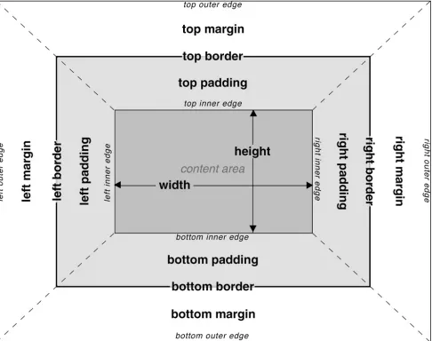
The Box Model
The fundament of visual display under CSS is the box model. Familiarity with the various components of the box model enables the author to understand how a great many properties interact with each other, and to understand why pages appear as they do (or to figure out what’s going wrong in buggy
browsers).
Basic Components
Figure 1-2: The CSS box model
Specific Layout Rules
The background of an element (whether color, image, or some combination) extends to the outer edge of the border, thus filling the content area and the padding. It will also be visible through any “gaps” in the border itself, such as those seen with the border-style values dotted, dashed, and double. The following equation always holds true: margin-left+ border-left-width +padding-left+ width + padding-right + border-right-width + margin-right = the value of width for the parent element (that is, the width of the parent element’s content area). This must sometimes be accomplished by setting the left and right margins to negative values. In such cases, the element will appear to be wider than its parent element, and will "stick out" of the content area of its parent.
Mathematically, however, the negative margins satisfy the above equation, and so the element can be said to be exactly as wide as the content area of its parent. This may seem disingenuous, since the visual effect is precisely the opposite, but this is permitted under CSS.
Only the margins, height and width may be set to auto. The margins may be given negative lengths, but height and width may not. The padding and border widths default to 0 (zero), and may not be set to negative lengths.
Vertically adjacent margins of elements in the normal document flow are collapsed. In other words, if two margins are vertically adjacent to each other, then the actual distance between the two element borders is the maximum of the adjacent margins. In the case of negative margins, the absolute maximum of the negative adjacent margins is subtracted from the maximum of the positive adjacent margins. The vertically adjacent margins of elements which have been floated or positioned do not collapse.
element’s plastic strip touches the edge of the other element’s paper. Thus, the plastic will overlap, but the pieces of paper will never be further apart than the width of the wider plastic strip. This holds true even if multiple elements are adjacent, such as one list ending and another beginning. There are four adjacent margins in this example, the bottom margins of the first list and its last list item, and the top margins of the second list and its first list item. The distance between the content of the two list items will be that of the largest of the four margins.
Recall that horizontally adjacent margins do not collapse. Thus, placing 10-pixel margins on two adjacent inline elements will create a 20-pixel space between the right border of the first element and the left border of the second. Margins on floated and positioned elements are never collapsed, either horizontally or vertically.
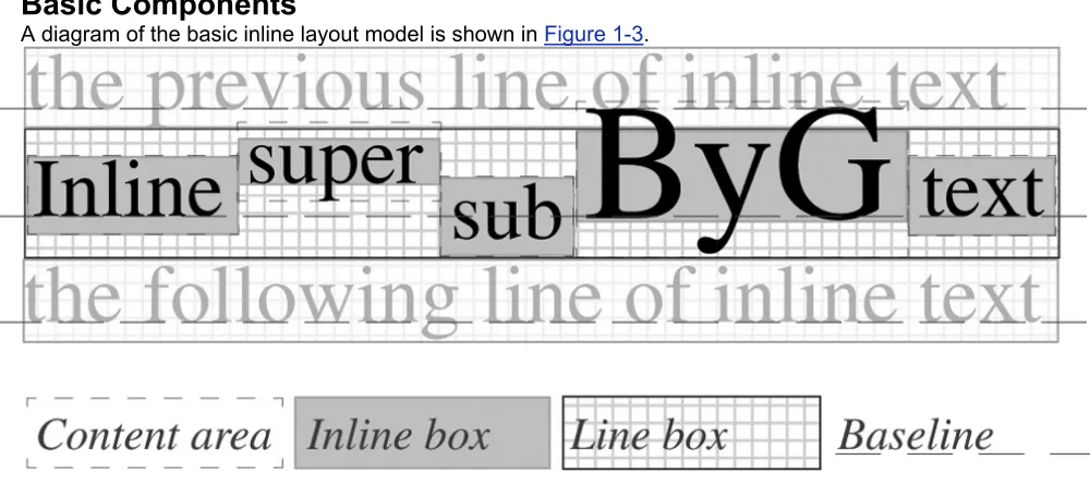
The Inline Layout Model
Almost as fundamental as the box model is the way in which text is arranged within an element. While this may seem simple, it quickly becomes complex once the details are laid bare.
Basic Components
A diagram of the basic inline layout model is shown in Figure 1-3.
Figure 1-3: The CSS Inline layout model
Specific Layout Rules
The height of a line of text is calculated using the following terms:
Content area The box defined by the font-size of each piece of text (whether in an element or not)
Half-leading The distance determined by the value of line-height, where the half-leading equals ((font-size - line-height)/2)
Inline box The box defined by subtracting the half-leading from the top and bottom of the content area; for any given piece of text, the height of the inline box will always be equal to the value of line-height for that same text
Line box The actual box which is stacked below the previous line box; this bounds the top of the highest inline box and the bottom of the lowest inline box in the line How does all this work? For each piece of text, an inline box is generated, using the content area and the half-leading to arrive at its final height. These inline boxes will always be centered vertically within the content area. The inline boxes are then aligned with respect to each other according to the value of vertical-align for each. If the value is baseline, then the text baseline is aligned with the baseline of the line.
not stick out at the right edge, unless it is already as far to the left as possible.) An analogous rule holds for right-floating elements.
8. A floating box must be placed as high as possible.
9. A left-floating box must be put as far to the left as possible, a right-floating box as far to the right as possible. A higher position is preferred over one that is further to the left/right.
10. The top outer edge of the float must be below the bottom outer edge of all earlier left-floating boxes (in the case of clear: left), or all earlier right-left-floating boxes (in the case of clear: right), or both (clear: both).
The margins of floated elements are never collapsed. Thus, even though an element may be floated into the top left corner of its parent element, its margins will push it away from the corner, and will push any content away from the floated element.
Even though floated elements are prohibited from being any higher than the top of the containing block, there is a way around this. By setting a negative top margin, the element can be “pulled up” past the top of its containing block. This is somewhat similar to the ability of elements to be wider than their
containing block through the use of negative left and right margins. As well, floating elements can be pulled out of an element by setting a negative left or right margin. However, the user agent is not required to reflow the document to account for this situation, so a floating element with negative margins may overlap other content within the document. Authors are advised to use this technique very
cautiously.
Although floating elements are removed from the normal flow of the document, they do affect the layout of content within the document. This is effectively done by increasing the padding within any following elements on those lines which are next to a floating element. However, this means that the backgrounds and borders
of any elements will extend “underneath” the floated element, and possibly past the other side of the floated element. This behavior ensures that all element boxes will remain rectangular, but it can lead to unwanted effects.
Positioning Rules
Although CSS started out as a way to style elements in the normal flow of a document, it quickly
became apparent that authors wanted to do more with their layouts. There were requests for a CSS way to replace frames, methods to offset elements from their normal placement, and more. In response, positioning was added to the specification in CSS2. There are really only three kinds of positioning: static, relative, and absolute. Static positioning is the state of normality—in other words, an
“un-positioned” paragraph actually has a static position. Relatively positioned elements are offset from their normal place in the document, while absolutely positioned elements are placed with respect to some point, and they never move from that position.
Every positioned element is placed with respect to its containing block. This block can be thought of as the positioning context for the positioned element. Every positioned element has its own unique containing block. The way to determine such a block is explained in each following section.
Relative Positioning
Relative positioning is fairly simple in its execution. A relatively positioned element is offset from the place it would ordinarily occupy in the normal document flow, and the space it leaves behind is preserved. This makes it fairly likely that the positioned element will overlap other elements and their content, or be overlapped by other elements, depending on the value of the property z-index. It is up to the author to construct styles that avoid such situations, if desired.
Containing Block
The containing block of a relatively positioned element is the box it would have occupied in the normal flow of the document (i.e., had it not been positioned).
Offsets
If any of the values 100, 200, or 300 are unassigned, then they correspond to the next lighter weight available. If no lighter weight is available, then correspond to the next darker weight.
The majority of fonts will have at least two faces: normal and bold, which are mapped to the values 400 and 700. In such a case, the values 100 through 500 will result in a normal face, while 600 through 900 will yield the darker face.
Let’s pick a more complicated example. Assume a font which contains the following four faces: Meyer Regular, Meyer Bold, Meyer Light, and Meyer Dark. This last is even darker than the “bold” face. Given these faces, the weight numbers will be assigned as follows:
Meyer Light: 100, 200, 300 Meyer Regular: 400, 500 Meyer Bold: 600, 700 Meyer Dark: 800, 900
If Meyer Light had not been available as part of the font family, then Meyer Regular would have been the face used for the values 100 through 500. The rest of the assignments would have gone
unchanged.
Chapter 2:
Values
Although authors tend to focus on the properties in CSS, nothing in CSS would work without the values that are assigned to those properties. After all, you can’t describe the left border of an element without being able to say what it looks like, and that’s what values do. In many cases, a property will use its own uniquely defined keywords (e.g., underline or thin). However, there are also many cases where generic types of values can be used. These generic value types are explained in this chapter.
Value Representations
The property reference chapters (4 through 6) use roughly the same value syntax as that described in section 1.3.2 of the CSS2 specification. In particular, the same symbolic conventions are used to indicate alternatives and optional keywords. The grouping symbols are as follows:
A vertical bar (|) is used to separate two or more alternatives when any one, but only one, of them may be used.
A double vertical bar (||) is used to separate two or more alternatives when any of them may be used in any order. This operator is stronger than the single vertical bar.
A sequence of several words means that all of them must occur in the order shown. 2A sequence is stronger than the double vertical bar.
Square brackets ([]) are used to group values together.
Thus, the following two expressions are equivalent: x y || a b | c || m | n
[x y] || [[a b] | c] || [m | n]
In addition to the grouping symbols, there are also modifier symbols. Any keyword, value type, or group can be modified using the following symbols.
An asterisk (*) indicates that the preceding value or group may occur zero or more times, with no defined upper limit.
A plus sign (+) indicates that the preceding value or group must occur one or more times, with no defined upper limit.
A question mark (?) indicates that the preceding value or group is optional.
A pair of two comma-separated numbers in curly braces ({X,Y}) indicates that the preceding value or group occurs a minimum of X times and a maximum of Y times. For example, test{2,5} means that the word test must appear anywhere from two to five times. Any symbols besides the ones defined here must appear literally. Two such examples are the comma (,) and slash (/) symbols.
Basic Rules
It is also the case that values are never quoted (except for string values and some font names). Thus, the keyword value for the color blue should not be written "blue". Instead, it should be blue. This is possibly the second most common mistake committed by CSS authors.
Value Reference
Color Values
Color values are used to specify a color (go figure). Typically, these are used to set a color either for the foreground of an element (i.e., its text) or else for the background of the element. They can also be used to affect the color of borders and other decorative effects. Any color value is referred to in the property reference chapters as <color>.
Value Types
#RRGGBB
#RRGGBB is the familiar color value format used by traditional HTML authors. In this format, the first pair of digits corresponds to the red setting, the second pair to green, and the third pair to blue. Each pair is in hexadecimal notation in the range 00 - FF. Thus, a “pure” green is represented as #00FF00, "pure" red is written #FF0000, medium gray is #808080, and so forth.
#RGB
This is a shorter form of the six-digit notation just described. In this format, each digit is replicated to arrive at an equivalent six-digit value; thus, #6A7 becomes #66AA77, "pure" green is represented as #0F0, and so forth. Medium gray cannot be exactly represented in this format, since it does not use replicated pairs, but it can be approximated as either #777 or #888.
rgb(rrr%,ggg%,bbb%)
This format allows the author to declare RGB values in the range 0% to 100%. Decimal values are permitted (e.g., 57.5%). Any values outside the allowed range are clipped to the closest edge of the range, so that –50% would be clipped to 0%. The value for black is represented as rgb(0%,0%,0%), "pure" green is written rgb(0%,100%,0%), medium gray is rgb(50%,50%,50%), and so forth.
rgb(rrr,ggg,bbb)
The difference between this format and the previous one is that the accepted range of values is 0 - 255. Not coincidentally, this range is the decimal equivalent of 00 - FF in hexadecimal notation. As with the percentage RGB values, any numbers outside the allowed range are clipped to the edges of the range, so 300 would be clipped to 255. In this format, "pure" blue is represented as rgb(0,0,255), white is written rgb(255,255,255), medium gray is rgb(128,128,128), and so forth.
<keyword>
CSS defines 16 keywords, which are based on the original Windows VGA palette. The defined keywords are aqua, black, blue, fuchsia, gray, green, lime, maroon, navy, olive, purple, red, silver, teal, white, and yellow. Some browsers may recognize other keywords, but these are not (as of this writing) found in any specification and are not guaranteed to work consistently between browsers, or indeed from version to version in a single browser.
Note Any color value which goes outside the color range of the display medium will be clipped to the nearest “edge” of the supported colorspace. All RGB colors in CSS are specified in relation to the sRGB specification; see
http://www.w3.org/Graphics/Color/sRGB.html for more details.
Color choices should be made with legibility and visual impairments in mind. For example, various forms of color blindness make it difficult to distinguish between red and green, or red and blue; see the Web Accessibility Initiative (WAI) area of http://www.w3.org/ for more information.
Allowed Properties
The properties which can accept color values are
border-color border-right
border-top-color border-bottom
border-right-color border-left
border-bottom-color color
border-left-color background-color
border text-shadow
Allowed Properties
The properties which can accept length values are
margin right
margin-top top
margin-right width
margin-bottom max-width
margin-left min-width
padding height
padding-bottom max-height
padding-right min-height
padding-left line-height
padding-top vertical-align
border-top-width marker-offset
border-width size
border-right-width background-position
border-bottom-width font-size
border-left-width text-indent
border text-shadow
border-top letter-spacing
border-right word-spacing
border-bottom border-spacing
border-left outline
bottom outline-width
left
Angle Values
Angle values are formatted as an optional sign (plus or minus) followed by a number, followed by an angle unit identifier. Any angle value is referred to in the property reference chapters as <angle>.
Value Types
deg (degrees)
Degrees describe angles using the range 0 – 360, as on compasses; thus a right angle would be 90deg.
grad (gradians)
Gradians describe angles using the range 0–400; thus a right angle would be 100grad.
rad (radians)
Radians describe angles using the range 0–pi (3.14159...); thus a right angle would be 1.57079rad. Note Negative angles are permitted, but will be converted to their positive equivalent.
Thus, a value of –90deg will be converted to 270deg.
Under CSS2, angle values are used only in aural styles. Because no support for aural styles was present at the time of writing, there was no known support for angle values.
Allowed Properties
The properties which can accept angle values are azimuth
elevation
Time Values
Time values are formatted as a number followed by a time unit identifier; thus time values cannot be negative. Any time value is referred to in the property reference chapters as <time>.
Value Types
s (seconds)
ms (milliseconds)
Time measures of one-thousandth of a second; thus 1000ms equals 1s.
Note Under CSS2, time values are used only in aural styles. Because no support for aural styles was present at the time of writing, there was no known support for time values.
Allowed Properties
The properties which can accept time values are pause
pause-after pause-before
Frequency Values
Frequency values are formatted as a number followed by a frequency unit identifier; thus frequency values cannot be negative. Any frequency value is referred to in the property reference chapters as <frequency>.
Value Types
hz (Hertz)
The frequency is defined using the Hertz scale.
khz (kilohertz)
The frequency is defined using the kilohertz scale.
Note Under CSS2, frequency values are used only in aural styles. Because no support for aural styles was present at the time of writing, there was no known support for time values.
Allowed Properties
The properties which can accept frequency values are pitch
Strings
String values are used in very rare circumstances, but can be quite powerful when employed. Any string value is referred to in the property reference chapters as <string>.
Value Types
<string>
Any arbitrary sequence of characters can be codified as a string. The sequence is enclosed in quotation marks, either single or double. If a string is broken across multiple lines for any reason, each newline must be preceded by a backslash. Newline characters cannot directly occur inside a string, but they can be represented using the sequence \A ("A" being the hexadecimal code for a newline in Unicode).
Note If quotation marks need to appear within a string value, then the author should be sure that they are not the same type as those which enclose the value. If they are the same, then the quotation marks inside the string must be escaped using a backslash character (\). For example:
content: "The man said, \"Help me!\" so I did.";
The same would have to be done for single-quote marks inside a string value enclosed by single-quote marks.
Allowed Properties
The properties which can accept string values are content
text-align
Percentages
Percentage values are formatted as an optional sign (plus or minus) followed by a number (either real or integer) followed by a percent sign (%). Any percentage value is referred to in the property reference chapters as <percentage>.
Value Types
<percentage>
Percentage values are always used to express a value in relation to another one, such as setting a font to be half again as big as its parent element’s font with the value 150%. Percentages are calculated in relation to different things for different properties; see the property references for information on each property which accepts percentages.
Note The resulting value for a percentage calculation is inherited to descendant elements; thus, if a font’s size is calculated to be 19 pixels tall, then that size is inherited, not the percentage.
Allowed Properties
The properties which can accept percentage values are
bottom line-height
left vertical-align
right background-position
top font-size
width text-indent
max-width volume
min-width pause
height pause-after
max-height pause-before
min-height
URI Values
URI values are used to point to files or other resources external to the stylesheet. Any URL value is referred to in the property reference chapters as <uri>.
Value Types
url(<uri>)
This construct is used to refer to files external to both the stylesheet and the base document. The only type of file which browsers will generally recognize are graphic files, although in principle any kind of file could be pointed to using this value type.
Note Under CSS, relative URI values are always in relation to the stylesheet itself. If the stylesheet is embedded in the document, then the URI will by coincidence be in relation to the document, but only because the document and the stylesheet are in the same location. Unfortunately, Navigator 4.x interprets URIs in relation to the document itself, not the stylesheet. Therefore, it is sometimes advised that authors only use absolute URIs in their stylesheets.
Allowed Properties
The properties which can accept URI values are
content cue-after
list-style-image cue-before
background-image play-during
cursor
Although the long list of allowed properties and values is very important to CSS, it is even more important to know how and where those properties can be applied to documents. This is accomplished with selectors, pseudo-classes, pseudo-elements, and a collection of what are called at-rules.
Selectors
In order to associate styles with a specific element or set of elements, it is necessary to create a selector. This is the part of a style rule which selects an element or set of elements and therefore causes the styles to be applied to them. There are many kinds of selectors.
Type Selector
A type selector is one which selects elements in the document’s language type. (In CSS1, this was called an element selector.) These are the simplest kinds of selectors.
Generic Syntax
X
Matches any element X.
Note Under HTML and XHTML, these will be the familiar document elements like H2, PRE, TABLE, and so on. In other markup languages, the permitted type selectors will be the range of elements permitted in that particular markup language.
Examples
h3 {color: maroon;}
p {font-family: serif; text-decoration: overline;}
Descendant Selector
A descendant selector is used to select elements which are descendants of another element in the document tree. (In CSS1, this was called a contextual selector.)
Generic Syntax
X Y Z
Matches any element Z which is a descendant of element Y, which is in turn a descendant of element X. Note A descendant selector is composed of a space-separated list of two or more
selectors. Note that the descendant can be of any relation, from a direct child to a great-great-great-great-grandchild, or even further. Thus, the selector div strong will select a STRONG element which is contained within a DIV element, no matter how many "levels deep" the STRONG may be found. To select an element which is the child of another, see the child selector section later in this chapter.
There have been reports of cases where complicated descendant selectors have confused Navigator 4.x. These cases seem to be fairly rare, and are difficult to reproduce when they do occur.
Examples
h1 em {font-style: italic;} div p {background: lime;}
Universal Selector
The universal selector is used to select any element.
Generic Syntax
*
Matches any element.
is a child of the DIV will not be selected.
If no selector is present in a rule, then the universal selector is implied.
Examples
* {color: black;}
div * p {border: 1px solid green;}
Child Selector
A child selector is used to select an element which is a direct child of another element.
Generic Syntax
X > Y
Selects any element Y which is a child of element X. Any deeper relationship (such as a grandchild element) will not be selected.
Note Due to its nature, a child selector must have at least two regular selectors separated by the > symbol. The whitespace around the > symbol is entirely optional.
Internet Explorer 4 has problems handling this selector, and often will match the last type selector in the expression, regardless of its context. In other words, em > strong will incorrectly match all STRONG elements in the document.
Examples
div > p {margin-top: 1.5em;} li>ul {list-style-type: square;}
td > a:link {color: white; background: black;}
Adjacent-Sibling Selector
An adjacent-sibling selector will select an element which immediately follows another element in the document markup.
Generic Syntax
X + Y
Selects any element Y which immediately follows element X.
Note Due to its nature, an adjacent-sibling selector must have at least two regular selectors separated by the + symbol. The whitespace around the + symbol is entirely optional.
Any text which appears between two elements will not affect the operation of this selector, unless that text is contained within an element which is sibling to the other two elements. Thus, if a paragraph is followed by some text which is followed by a DIV, then the text between the two does not affect sibling adjacency. If the intervening text were enclosed in an H3 element, then the H3 would prevent the paragraph and the DIV from being adjacent siblings. Similarly, if two inline elements are separated by text, they are still adjacent siblings.
Internet Explorer 4 and 5 both have problems handling this selector, and often will match the last type selector in the expression, regardless of its context. In other words, em+strong will match all STRONG elements in the document. Opera 3 has much the same problem.
Examples
h1 + p {margin-top: 0;}
p+ul {margin-top: 0.5em; color: gray;} p em + strong {font-style: italic;}
Attribute Selectors
Generic Syntax
X[attr]
Selects any element X with the attribute attr. X[attr="val"]
Selects any element X whose attribute attr has the value val. The match must be exact, so [alt="Figure"] will not match the alt value Figure 1. Spaces are permitted in the value. X[attr~="val"]
Selects any element X whose attribute attr contains a space-separated list of values which includes val. Therefore, [alt="Figure"] will match the alt values Figure 1, Great Figure, Figure this out, and so forth.
X[attr|="val"]
Selects any element X whose attribute attr has a value which is a hyphen-separated list that begins with val. This is primarily intended to allow language matches; for example, the selector
[lang|="en"] will match the values en, en-us, en-uk, and so on. It is possible to construct other matches, such as [alt|="figure"]. This would match the values figure-1, figure-2, and so on.
Note It is possible to combine more than one attribute selector within a single selector. For example, to select any anchor element which has the attributes href and title, the appropriate selector is a[href][title]. If the selector should match only those anchors with an href set to http://www.w3.org/ and any title value, the correct selector is a[title][href="http://www.w3.org/"].
Although they have a great many uses in relation to HTML and XHTML documents, attribute selectors are expected to see very heavy use with pure XML documents.
Opera 4 and 5 both incorrectly handle the |= attribute selector. They will match the specified value if it appears anywhere in the attribute; thus, p[class|="three"] will incorrectly match <p
class="bakers-three">.
Examples
a[link] {color: blue;}
a[link="http://www.w3.org/"] {font-weight: bold;} img[alt~="Figure"] {float: right;}
*[lang|="fr"] {font-style: italic;}
Class Selectors
For any element which has a class attribute, a class selector may be used to select on the value of the class attribute.
Generic Syntax
X.class1
Selects any element X whose class attribute has a value of class1. X.class1.class2...
Selects any element X whose class attribute contains the space-separated values class1 and class2, in any order. Any number of values may be chained together, so long as each is separated from the others by a period. Therefore, a selector such as p.beach.hotel.rooms.rates is a perfectly legitimate construct. There may be other space-separated values in the class attribute, and these will not interfere with the match. For example, p.beach.hotel would match the elements <p class="beach hotel rates"> and <p class="beach hotel pictures">, as well as the element <p class="hotel beach">.
.class1
Selects any element whose class attribute has a value of class1.
Note The class selector is a special HTML- and XHTML-specific notation, and uses a specific syntax which is relevant only to those languages. In those languages, the attribute class may appear on any element. Other markup languages may or may not permit this convention. For most XML-based languages, the attribute
selectors will be more commonly used.
Examples
p.warning .urgent {color; red; font-weight: bold;} div.aside {border: 1px solid blue; background: silver; padding: 1em;}
.help {font-style: italic;}
ID selectors
An ID selector is very similar to the class selector.
Generic Syntax
X#id1
Selects any element X whose ID attribute has a value id1. #id1
Selects any element whose ID attribute has a value id1.
Note Like the class selector, the ID selector is specific to HTML and XHTML. In this case, it is used to select values of the ID attribute, which may appear on any element. Note that HTML and XHTML restrict ID values to be unique within a given document; thus, there can only be one ID attribute with a value of jh8571 for each document. Other markup languages which permit the ID attribute may or may not enforce this uniqueness restriction.
Under CSS1, IDs could not start with a digit, but most browsers ignored this restriction. In CSS2, IDs may begin with digits, so the original problem has in effect corrected itself.
Examples
h1#page-title {border-bottom: 4px double gray; background: gray;}
div#zza77j {color: purple;}
#footer {border-top: 1px solid gray;}
Pseudo-Classes
A pseudo-class is a selector construct which causes a user agent to behave as though it has inserted “phantom classes” into the document markup, and then applied styles based on the modified markup. This is done in order to allow for styling based on things which do not appear in the document itself, such as the state of a hyperlink (e.g., visited or unvisited). Since this phantom markup is represented as a class-attribute structure, these constructs are referred to as pseudo-class selectors.
In CSS1, it was required that a pseudo-class selector be placed at the end of its associated selector. This led to the requirement that with class markup, the pseudo-class selector had to follow the class notation; e.g., a.external:link. This restriction was relaxed in CSS2 to allow the construction a:link.warning. However, this may not be recognized in older CSS-aware browsers, so it should be used with caution.
In CSS2, it is possible to chain multiple pseudo-class selectors together; for example, a:link:hover or input:hover:focus. This was not permitted under CSS1, and older CSS-aware browsers may ignore selectors which use this format, so it should be used with caution as well.
:first-child
The :first-child selector is used to select an element which is not only the child of another element, but is, in fact, the first child.
Generic Syntax
X:first-child
Selects any element X which is the first child of another element.
Note Any text which appears before the first child element will not affect the operation of this selector. For example, the selector p.warning em:first-child will match the first EM element in the following markup.
contains <em>some emphasized text</em> as well as some <strong>strong text</strong>and
<em>more emphasized text</em>.
Again, only the first EM element will be selected, and the text which appears between the opening of the paragraph element and the beginning of the EM element does not prevent the selector from operating.
Examples
p:first-child {font-style: italic;} ol li:first-child {text-indent: -2em;} div:first-child em {font-weight: bold;}
:link
The :link selector is used to apply styles to any hyperlink which points to an unvisited resource.
Generic Syntax
X:link
Selects any element X which is a hyperlink and which points to an unvisited resource.
Note This link state is mutually exclusive with :visited (see the following section). Under HTML and XHTML, the only element which may take a :link pseudo-class is an anchor element (A) which has an href attribute. Other markup languages will almost certainly not have these restrictions, although they are likely to impose others.
Examples
a:link {color: blue; text-decoration: underline;} a.external:link {color: olive;
text-decoration: underline overline;}
:visited
The :visited selector is used to apply styles to any hyperlink which points to a visited resource.
Generic Syntax
X:visited
Selects any element X which is a hyperlink and which points to a resource which has been visited (e.g., one which appears in the browser’s history list).
Note This state is mutually exclusive with :link (see earlier). Under HTML and XHTML, the only element which may take a :visited pseudo-class is an anchor element (a) which has an href attribute. Other markup languages will almost certainly not have these restrictions, although they are likely to impose others.
As the CSS specification says, user agents may choose to return a visited link to an unvisited state. It is up to each user agent to decide how long a link is treated as “visited” before reverting it to “unvisited” status.
Examples
a:visited {color: purple; text-decoration: none;} a.external:visited {color: gray; font-weight: lighter;}
:hover
The :hover selector is used to apply styles to any element which has been designated in some way by the user.
Generic Syntax
Selects any element X which is currently designated.
Note The most common method for “designating” an element without making it active is to move the mouse pointer (cursor) to a point within the element’s box, so that the pointer appears to be “hovering over” the element.
There are no restrictions on the types of elements which can be selected, but most user agents apply :hover styles only to hyperlinks. :hover is not supported at all in Navigator 4.x, Opera 3, and Opera 4, even on hyperlinks.
:hover can be combined with other pseudo-classes to produce state-specific hover effects, but this syntax is not supported by older CSS-aware browsers.
Examples
p.example:hover {color: blue; background: yellow;} a:link:hover {color: blue; background: silver;} input:hover {color: maroon; background: yellow;}
:active
The :active selector is used to apply styles to any element which has been designated by the user and is currently active.
Generic Syntax
X:active
Selects any element X which is currently active.
Note The most common example of the “active” state is when the mouse pointer is positioned within (or “over”) an element during the time in which the user is pressing down the mouse button. Although the most common way of making an element active is to “click on it” with the mouse, it is possible to designate the element via some other means (e.g., tabbing via the keyboard) and then select it through that same means (e.g., hitting the “return” key). Thus, it is possible for an element to be active without also being hovered.
There are no restrictions on the types of elements which can be selected, but most user agents apply :active styles to hyperlinks only. Navigator 4.x and Opera 3 do not support :active at all, even on hyperlinks.
:active can be combined with other pseudo-classes to produce state-specific hover effects, but this syntax is not supported by older CSS-aware browsers.
Examples
a:active {color: yellow; background: blue;} a:link:active {color: white; background: black;} a:visited:active {color: silver; background: gray;}
:focus
The :focus selector is used to apply styles to any element which currently has focus.
Generic Syntax
X:focus
Selects any element X which currently has focus.
Note The most common example of the focus state is a form element which is ready to accept keyboard input. There are no restrictions on the types of elements which can be selected, but many user agents apply :focus styles only to form elements, and sometimes to hyperlinks.
:focus can be combined with other pseudo-classes to produce state-specific hover effects, but this syntax is not supported by older CSS-aware browsers.
Examples
a:focus:hover {font-weight: bold; outline: 1px solid red;} select:focus {width: auto;}
:lang(n)
The :lang selector is used to apply styles to any element which is written in a specified language code, where the code is one specified by RFC 1766.
Generic Syntax
X:lang(n)
Selects any element X which uses the language n.
Note This selector operates in a fashion similar to the |= attribute selector, and is dependent on the document markup to provide the language information. In HTML and XHTML, this can be provided by means of the lang attribute on an element, a meta element within the document, or even in the HTTP headers of the document itself.
:lang can be combined with other pseudo-classes to produce state-specific hover effects, but this syntax is not supported by older CSS-aware browsers.
Examples
*:lang(fr) {font-weight: bold}
HTML:lang(de) {background: cyan;} DIV:lang(en) {font-family: sans-serif;}
:left, :right, and :first
See Chapter 5, “Paged Media Styles.”
Pseudo-Elements
A pseudo-element is a selector construct which causes a user agent to behave as though it has inserted phantom markup into a document, and then applied styles to that phantom element. This is done in order to allow for styling based on things which do not appear in the document itself, such as styling the first line of an element. Since this phantom markup is represented as an element-like structure, the constructs are called pseudo-element selectors.
In CSS, it is required that a pseudo-element selector be placed after the last selector in the overall selector (e.g., div ul ol.step strong:first-letter). Therefore, a pseudo-element selector must come after any pseudo-class selectors.
:first-letter
The :first-letter selector is used to apply styles to the first letter of an element.
Generic Syntax
X:first-letter
Applies styles to the first letter of any element X. X.class1:first-letter
Applies styles to the first letter of any element X that has a CLASS attribute with a value of class1. X#id1:first-letter
Applies styles to the first letter of any element X that has an ID attribute with a value of id1.
Note If the first letter is preceded by a punctuation mark, then the mark is styled along with the first letter. Note that only certain properties may be applied to a first letter.
Allowed Properties
The properties which may be used in a :first-letter rule are
font-variant background margin-top
font-style float margin-right
font-weight clear margin-bottom
font-size vertical-align
(if float is
none)
font-family line-height margin
font text-decoration padding-top
color text-transform padding-right
background-color text-shadow padding-bottom
background-image word-spacing padding-left
background-repeat letter-spacing padding
Examples
body:first-letter {font-style: italic;}
h1 + p:first-letter {font-size: 200%; color: red; float: left;}
*:first-child:first-letter {font-weight: bold;}
:first-line
The :first-line selector is used to apply styles to the first displayed line of an element.
Generic Syntax
X:first-line
Applies styles to the first displayed line of any element X. X.class1:first-line
Applies styles to the first displayed line of any element X that has a class attribute with value class1. X#id1:first-line
Applies styles to the first displayed line of any element X that has an ID attribute with value id1. Note The actual text to which the styles are applied will change depending on the
display environment, the styles used, and so on. Note that only certain properties may be applied to a first line.
Allowed Properties
The properties which may be used in a :first-line rule are
font-variant background-color text-decoration
font-style background-image text-transform
font-weight background-repeat text-shadow
font-size background-attachment word-spacing
font-family background letter-spacing
font vertical-align clear
color line-height
Examples
body:first-line {color: magenta;}
h1 + p:first-line {font-size: 200%; font-style: italic;} *:first-child:first-line {font-weight: bold;}
:before
The :before selector is used to place generated content before the content of an element.
Generic Syntax
X:before
Causes content to be inserted into the displayed document immediately before the content of element X.
X.class1:before
X#id1:before
Causes content to be inserted into the displayed document immediately before the content of element X that has an attribute ID with a value of id1.
Note This pseudo-element selector will insert into the displayed document content which does not appear in the markup. It is used in conjunction with the content property to specify exactly what is generated. Any styles which appear in the same rules will be applied to the generated content; in addition, any styles applied to the affected element which can be inherited will be inherited by the generated content. See the entry for content in Chapter 4, "Visual Media Styles," for more details.
Note that since this generated content does not appear in the document itself, it will not appear at all in older Web browsers, and will not be picked up by indexing programs. Thus, it is not recommended that necessary content be added in this manner.
Examples
h1.title:before {content: "Title: "; color: gray;} blockquote:before {content: open-quote;} p:before {content: url(paramark.gif);}
:after
The :after selector is used to place generated content after the content of an element.
Generic Syntax
X:after
Causes content to be inserted into the displayed document immediately after the content of element X. X.class1:after
Causes content to be inserted into the displayed document immediately after the content of element X that has an attribute class with a value of class1.
X#id1:after
Causes content to be inserted into the displayed document immediately after the content of element X that has an attribute ID with a value of id1.
Note This pseudo-element inserts into the displayed document content which does not appear in the markup. It is used in conjunction with the content property to specify exactly what is generated. Any styles which appear in the same rules will be applied to the generated content; in addition, any styles applied to the affected element which can be inherited will be inherited by the generated content. See the entry for content in Chapter 4, "Visual Media Styles," for more details.
Note that since this generated content does not appear in the document itself, it will not appear at all in older Web browsers, and will not be picked up by indexing programs. Thus, it is not recommended that necessary content be added in this manner.
Examples
h1.title:after {content: "...";}
blockquote:after {content: close-quote;} p:after {content: url(arrow.gif);}
At-Rules
An at-rule is a construct that begins with an “@” symbol immediately followed by an identifier. This identifier is then followed by a block, which is defined as all content contained within a set of curly braces ({}); or else is followed by all content up until the next semicolon (;)—e.g., the syntax of the @import rule. Any unrecognized at-rule must be ignored in its entirety.
@import
Generic Syntax
@import url(...) <media>;
Components
url(...)
The url(...) portion of the rule contains the URL of the external stylesheet, with the actual URL replacing the ... part. Both relative and absolute URLs are allowed, but only one URL may be included in each @import directive. This portion of the rule is required.
<media>
A comma-separated list of target media. This portion of the rule is optional.
Note An @import rule behaves in a fashion similar to the LINK element in HTML and XHTML, except that @import must appear either within a STYLE element or within an external stylesheet. Also, @import is language-independent; so long as CSS is recognized, @import can be used no matter what markup language is used to structure the actual content. Multiple @import rules are permitted within the same stylesheet, but all @import rules must appear before any other rules in the stylesheet, and may not appear inside other at-rule blocks. If an @import rule appears after other style rules in a stylesheet (e.g., h1 {color: gray;}), or is placed within another at-rule block, then CSS2 parsers are required to ignore the incorrectly placed @import rule.
By placing an @import rule inside an external stylesheet, it is possible to use one external stylesheet to bring in another. This sort of recursive importing of styles is not well supported in older browsers. @import is not supported by Navigator 4.x, which is actually somewhat useful since it allows authors to "hide" styles which Navigator 4.x would have trouble interpreting. (For using external stylesheets in Navigator 4.x, see the entry on the LINK element in Chapter 1.)
Examples
<style type="text/css">
@import url(http://www.my.site/styles/autumn.css); </style>
<style type="text/css" media="screen,print"> @import url(print-styles.css) print;
P {margin-left: 1.25em;} </style>
@media
The @media rule is used to specify the target media for a set of style rules. This permits the inclusion of styles for multiple media in a single stylesheet.
Generic Syntax
@media <media> {...styles...}
Components
<media>
The <media> portion is a comma-separated list of target media for the styles which follow. This portion of the rule is optional.
{...styles...}
The collection of rules which are to be applied in the target media. This portion of the rule is required. Note Other rule blocks may not appear inside the @media rule block.
Examples
@media print {
a:link, a:visited {text-decoration: underline;} }
@media screen, projection {
body {color: black; background: #FCD;} a:link, a:visited {text-decoration: none;} }
@media screen,print { * {line-height: 1.25;} }
@charset
The @charset rule is used to specify the character encoding of a document.
Generic Syntax
@charset "<charset>";
Components
<charset>
This must be a character set as described in the IANA registry.
Note Only one @charset rule must appear in an external stylesheet, and it must be the very first thing in the stylesheet, with no content of any kind preceding it.
@charset is not permitted in embedded stylesheets.
Examples
@charset "ISO-8859-1";
@font-face
The @font-face rule is used to exhaustively describe a font face for use in a document.
Generic Syntax
@font-face {<font-description>};
Components
<font-description>
This is formatted as a series of descriptor-value pairs.
Note @font-face may also be used to define the location of a font for download, although this may run into implementation-specific limits.
In general, @font-face is extremely complicated, and its use is not recommended for any except those who are expert in font metrics. A detailed exploration of @font-face could be a chapter (or even a book) in itself, and is not undertaken in this work. See the CSS2 specification, section 15.3, for more details.
Examples
@font-face {
font-family: "Scarborough Light";
src: url("http://www.font.site/s/scarbo-lt"); }
@font-face {
font-family: Santiago; src: local ("Santiago"),
format("truetype");
unicode-range: U+??,U+100-220; font-size: all;
font-family: sans-serif; }
@page
See the entry for @page in Chapter 5, "Paged Media Styles," for details.
Chapter 4:
Visual Media Styles
Overview
At its heart, CSS is a style language for visual presentation. Although it does have sections devoted to aural and paged media, the vast bulk of its properties and abilities lie in the visual realm. It is therefore unsurprising that the bulk of this reference should be devoted to explaining the visual media properties. It is important to note that some of the properties in this section apply not only to visual media. Some of them are also used in the interactive medium, for example. Others, such as display and position, are used in non-visual media, but can have different effects in those media. These differences will be noted, and are also covered in the sections that address non-visual media.
It is important to note that in many circumstances “visual media” is just another term for “continuous media,” which itself is a fancy way of saying “browser display.” This isn’t all the term “visual media” means, but it is what most people care about. Thus, there is a difference between visual and paged media, despite the fact that both are fundamentally dependent on vision to be comprehended. Paged media are covered in Chapter 5. For a review of the fundamentals of visual layout, refer to Chapter 1. Although every property accepts inherit as a value, it is not discussed in detail in the following reference. The operation of inherit is discussed in Chapter 1, as it is the same for every property.
Reference
background
background is a shorthand element used to set background styles for an element.
Summary
Value Syntax
[<background-color> || <background-image> || <background- repeat> || <background-attachment> || <background-position>] | inherit
Initial Value
not defined for shorthand properties
Percentages
allowed on <background-position>
Inherited
no
Applies to
all elements
Media Groups
visual
Values
<background-color>
<background-image>
Defines the location of an image to be placed in the element’s back- ground. See the section on background-image for more details.
<background-repeat>
Sets a repeat direction for an image in the element’s background. See the section on background-repeat for more details.
<background-attachment>
Sets an attachment state for any images in the element’s background. See the section on background-attachment for more details.
<background-position>
Sets a position for the origin image in the element’s background. See the section on background-position for more details.
Note Although all five background aspects can be set via background, only one of them is necessary to constitute a legal value. Thus, it is possible to set just the
background color with background, thus returning the other four aspects to their default values. (See the section on shorthand properties in Chapter 1 for more details.)
In Navigator 4.x, background and its associated properties are not well supported. The most common problem is that a background applied to a block-level element will only set a background for the content of the element, not the entire background of the element. A workaround for this problem is to set an invisibly thin border around the element whose color matches the background of the parent element.
Examples
body {background: white url(/pix/sawtooth.gif) top center repeat-x scroll;}
table {background: silver;}
p.warning {background: yellow url(danger.jpg) repeat-y;}
Related Properties
background-attachment, background-color, background-image, background-position, background-repeat
background-attachment
background-attachment determines the tiling context and scroll state of a background image.
Summary
Value Syntax scroll | fixed | inherit
Initial Value scroll
Percentages
n/a
Inherited
no
Applies to
all elements
Media Groups
visual
Values
scroll
A background image set to scroll will scroll along with the rest of the document.
fixed
Note Although it seems simple in concept, background-attachment is actually quite powerful and in some ways very complicated.
If a background image is set to be fixed, it is locked in place and cannot move while the rest of the document scrolls. One way to take advantage of this effect is to define a tiled pattern which is the same size as a