Data Analysis and Visualization of Sales Data
Using Data Mining Techniques
Kiran N.Singh , Rakhi D.Wajgi
Dept. of Computer science and engineering, YCCE, Nagpur, Maharashtra, India
ABSTRACT: Data is being generated in huge amount from various organizations that is difficult to analyze and exploit. Data created by an expanding number of sensors in the environment such as traffic cameras and satellites, internet activities on social networking sites, healthcare database, government database, sales data etc., are example of huge data. Processing, analyzing and communicating this data are a challenge. Online shopping websites get flooded with voluminous amount of sales data every day. Analyzing and visualizing this data for information retrieval is a difficult task. In this paper, we are presenting a detailed survey of various data visualization techniques, tools and method, for visualizing data and a system which will analyze and visualize sales data. The aim of this paper is to present a comparison of different visualization techniques and help to develop efficient, effective and scalable visualization system which will effectively analyze and visualize data that may help user in applying intelligence in business, revenue generation, decision making, managing business operation and tracking progress of tasks.
KEYWORDS: Sales data, Analysis, Visualization, Report generation
.
I. INTRODUCTION
Data visualization is a process which aims to communicate data effectively and clearly to the user through graphical representation. Visualization is the intermediate between the human intuition and quantitative context of the data, thus an essential component of the scientific path from data into knowledge and understanding. It is a powerful new technology having a great potential to help researchers as well as companies for building revenue decision [1].
Extracting relevant information and useful knowledge from large mixed-mode data spaces is complex by various challenging mark such as the limitations of data storage formats, a deficit of expert prior knowledge for real-world databases, the difficulty of visualizing the data using inefficient data mining tools, etc. Data mining is a series of steps in the knowledge discovery process, consisting of the use of particular algorithms for generating pattern, as required by the real world.
Huge amount of data becomes important not for its quantity but for the quality of information extracted from it. For a relatively complex real problem with a large data space, all knowledge generating and data mining tools would become obviously inefficient, even unassisted sometimes. For a larger complex database with more unanticipated variations than normal ones, even the domain master would find it difficult to reach useful results. In order to express better visualization of results, analysis of data is needed.
One of the key steps in Business Intelligence process where data is extracted and correlated from various data sources. In today’s globalized market most organizations have multiple information repositories. Human Resources, Sales, Customer Management and Marketing all have information systems for their needs. Often each of these departments has multiple databases and applications and with the adoption of SAAS recently, more and more data is kept in different cloud offerings along with some databases in premise.
This paper is organized into different sections as follows:-, section 2 discusses about the related work done by the different authors, section 3 contains the brief description of the proposed methodology, finally we draw some conclusion in section 4.
II. RELATED WORK
elaborates about how the flow of research has been carried out by the authors and researchers from reputed journals and conferences.
In [2] the author has proposed a Sensor: Network based approach for storing, sharing, visualizing and analyzing data from multiple devices and to interact with each other and with the end user through an open REST- based API. The author has visualized the geographical location of the data stream which when clicked pops up a tabbed window containing different associated information.
In [3] the author has proposed a virtual reality platform for scientific data visualization, a tool for multi-dimensional data visualization using which scientist can interact with the data and their colleagues in the same space. The author has mapped data parameters in different data points, shapes, size, colors, XYZ axis and many more. The author has used iViz a visualization tool which can be run as a standalone application or in a web browser.
The author has discussed about a framework of financial time series delivery and visualization which can be used in viewing the historical price movement of a stock [4]. Specialized binary tree (SB- tree) is used for representing the financial time series. Time series data server, SB-tree server and web service contains is the three major components which are distributed on different machines. The system can reduce data volume and can capture the critical points. In [5] the author has proposed a dashboard for displaying data used for communicating and finding trends in laboratory operation. System is based on .NET scripts, SQL repository. The author depicts that data is collected from the multiple sources like admin, internet and user portal and are stored in database using XML layer, Adobe flash, Action Script, etc. Data is being visualized which is used for laboratory and staff management.
In [6] the author has used a concept of visual web mining for analyzing the web data. A tool named WET is been used for visualization which provides a set of visual metaphor that represents the structure of the websites. The websites exploration tool is used for exploring the websites and for giving the feedback to the website owner for the betterment of the website.
In [7] the author has used a concept for analyzing data for examining the trend and evaluating the eco-environment impact of three gorges project. VC.NET and ArcIMs is the development platform for information system. ArcSDE and oracle 10g are used for management and use of spatial data. The author introduces method and processing and storing the data generated from cross-region, cross-department. Visualization helps in enhancing the data analysis and data mining.
In [8] the author has discussed the problem in compliance management which becomes an obstacle for decision making for effective and efficient monitoring. The person should be provided with compliance software which will help in getting high level information about overall compliance status and low level problem regarding possible problems. The author has designed a dashboard for watching the compliance which avoids the obstacle and decision can be made effectively.
In [9] the author has introduced a tool named SECONDA which is used for analyzing both individual and grouped evolution of projects and develops belonging to a software ecosystem, Visualization is implemented in java using JFREECHART libraries. The author has used GNOME ecosystem for studying, under SECONDA. It offers dashboards for extracting provincial and universal matrixes from information stored in the repositories for visual analysis.
In [10] the author has proposed a system for monitoring the user exercising progress and presenting exercise parameters in relation to prescribed targets. This system can be used for monitoring the intensity of the levels recommended by the patients care provider. It uses a miniature wireless 3-axis acceleration tied on the wrist of the patient that transmits acceleration data. The dashboard allows graphical visualization of exercise progress in real time. The author introduces a system where the huge amount of data generated from the collaborative software development tool during the lifecycle of a project can be used to analyze the performance of the individual member, or a team or manager. [11] They can analyze from different perspectives across different dimensions and visualized in different ways.
III.PROPOSED METHODOLOGY
The data visualization mainly focuses on analysing the data and presenting it to the end user. The main goal of visualization is to relate information clearly and effectively through graphical means.
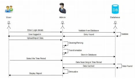
A System is proposed which will analyse and visualize sales data. The data will be graphed on different parameters for different perspectives. Data mining process will be applied to discover patterns for future predictions. Data set of one of the store from USA is taken for analysis and visualization. Data set contains various attributes such as order ID, Order Date, Order priority, Sales, Customer Name, region, Product Name, Product Category and so on. The transition diagram for the system is depicted in the above Figure 1, where the transitions carried among end users, system and database are introduced. The process from the user logged in, visualization till user logged out is briefly depicted.
Figure 1. Transition diagram for the system
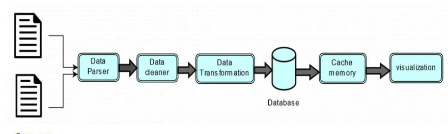
Before importing the data into the database, dataset is being processed through certain parameters by following functions as depicted in Figure 2.
A. Data Parser
Data set has multiple entries which may be relevant to the user or may not be relevant. So, parsing will be done in java using java.util.Iterator class to check the attributes present in the data set.
B. Data Cleaner
Figure 2: Flow diagram for data processing carried out by the system
C. Data Transfer
HSSFWorkbook are used for storing he FileInputStream provided by the user for transforming the attribute name present in the data set. The names of the attributes may not be in proper format. For example, Order Id will be written as OrId which may create confusion.
D. Database
After the above processing, data will be imported in the database. The database will contain appropriate data relevant to the user in the proper format.
E. Cache
Frequent accessed data is extracted from the database and stored in the cache. When the request for accessing the same data is placed then the data is extracted from the cache instead of database which will decrease the time required.
F. Visualization
The data is visualized depending upon the time duration provided by the end user. Top customers, sales per region, top products, no. of customers visited can be visualized. Using this visualization, end user can make decisions such as launching of new products; decisions for revenue generation will be made.
IV.RESULTS
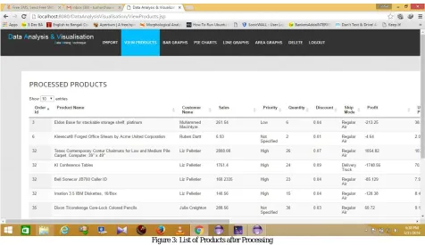
The data set given to the system contains multiple attributes from which few attributes may not be relevant to the end user. Therefore we need to clean the dataset and extract only the relevant attributes from the dataset before storing it in the database. Data is processed under certain functions such as parsing, cleaning and transformation. Figure 3 depicts the data after processing through the functions which is then stored in the database. After data processing, data is to be visualized which may help the end user in making decisions
1. LOGIN MODULE
Graphical user interface is being designed using which authenticated user can login to the system. Username and password is provided to user for accessing the system. Login page is provided so that the reports generated by the system should not be visible to others. Only the authenticated user can check the reports and make decision for the betterment of the organization. The system will maintain a record of the authenticated user such as name, enrollment id, mobile number, address, designation, used id, password, DOB, gender
2. DATA IMPORT MODULE
order. A search option is also provide using which user can search for the entries in the parsed data. Keyword based searching method is used for searching the data. If a letter “A” is typed is search box then it searches for all the letter starting from “A” and makes a group, as the preceding letter is typed then it search in the group, and this continues till the data is retrieved. On using this method user come across many similar words which may be helpful
.
Figure 3: List of Products after Processing
3. VISUALIZATION MODULE
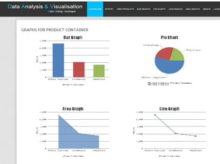
On importing the data into the system, system parses the data through certain phases and generates a dashboard as depicted in Figure 4 which consists of multiple graphs. User can seen the sales of the product in different perspective at the same time of instance. On clicking on to the particular graph user can visualize the data with different attributes.
Figure 4.3.7: Dashboard for Sales depending upon Product Container
V. CONCLUSION AND FUTURE WORK
In this paper we have reviewed different techniques methods and tools which have some shortcomings of their own. We have discussed many paper from which we got a broad idea about a system which is required in today’s world for analysis and visualizing the sales data using which the investors and owners of the organization can make proper decision and generate revenue.
We have proposed a system to perform data analysis and visualization of sales data using different types of techniques. Dashboard is created which consists of multiple graphs which will reduce the effort of the user. User can modify the graphs with respect to different attributes provided by the system. System also gives a facility of sorting and searching the attribute which may help end user in searching an item faster can make decision, predict the future sales, calculate regional sales, increase the production depending on the demand, to take decisions, generate revenue, and plan promotions.
4. Javier. P, Deshayes. R, Goeminne. M and Mens. T, “SECONDA: Software Ecosystem Analysis Dashboard,” in International Conference on Software Maintenance and Reengineering (CSMR), 2010.
5. Jeong. C and Finkelstein. J, “Computer-Assisted Upper Extremity Training Using Interactive Biking Exercise (iBikE) Platform,” in Proceedings of IEEE Conference on Engineering in Medicine and Biological Society (EMBC), 2012.
6. Stroulia. F, Matichuk. I, Rocha. F, Baver. K, “Interactive Exploration of collaboration software development data,” in IEEE International Conference on Software Maintenance (ICSM), 2013.
7. Kumar. P, Ahmad. R, Chaudary. B. D and Sinha. M K, “Enriched dashboard:-An Integration and Visualization Tool for Distributed NLP System on Heterogeneous Platform,” in International Conference on Computer Science and its Applications (ICCSA), 2013.
8. Edsall. R, “The dynamic parallel coordinate plot: visualizing multivariate geographic data,” in Proceedings of the 19th International Cartographic Association Conference, Ottawa, Canada, 1999.
9. Byron. L and Wattenberg. M, “Stacked graphs—geometry & aesthetics,” IEEE Transactions on Visualization and Computer Graphics, vol. 14, no. 6, pp. 1245–1252, 2008.
10. Hoek. P, “Parallel Arc Diagrams: Visualizing Temporal Interactions,” Journal of Social Structure, vol. 12, 2011.
11. Martin. E and Bernardo. V. D, “Enterprise Dashboard Tools for Management of Share-use University Laboratory,” in Proceedings of University Conveinment Industry Micro (UCIM), 2008.
12. Pascual. C. V, “An Information Visualization System for the Understanding of Web Data,” in Proceedings of IEEE Symposium on Information Visualization (INFOVIS), 2008.
BIOGRAPHY
Kiran Singh is a MTECH student in computer Science and Engineering Department, Yeshwantrao Chavan College of
Engineering (Autonomous), Nagpur. She received B.E Degree in 2014 from RTMNU, Nagpur, India. Her Research interests are Data Mining, Language Processing, Computer Network, etc.
Rakhi Wajgi is an Assistant Professor in computer technology Department, Yeshwantrao Chavan College of