Memorial Sloan-Kettering Cancer Center
Memorial Sloan-Kettering Cancer Center, Dept. of Epidemiology
& Biostatistics Working Paper Series
Year Paper
Visualizing Longitudinal Data with Dropouts
Mithat Gonen
∗∗Memorial Sloan-Kettering Cancer Center, [email protected]
This working paper is hosted by The Berkeley Electronic Press (bepress) and may not be commer-cially reproduced without the permission of the copyright holder.
http://biostats.bepress.com/mskccbiostat/paper26
Visualizing Longitudinal Data with Dropouts
Mithat Gonen
Abstract
A triangle plot is proposed to display longitudinal data with dropouts. The tri-angle plot is a tool of data visualization that can also serve as a graphical check for informativeness of the dropout process. There are similarities between the lasagna plot and the triangle plot but the explicit use of dropout time as an axis is an advantage of the triangle plot over the more commonly used graphical strate-gies for longitudinal data. It is possible to interpret the triangle plot as a trellis plot 1 which gives rise to several extensions such as the triangle histogram and the triangle boxplot. R code is available to streamline the use of the triangle plot in practice.
Visualizing Longitudinal Data with Dropouts
Mithat G¨
onen
Memorial Sloan-Kettering Cancer Center
New York, NY
[email protected]
January 27, 2013
Abstract
A triangle plot is proposed to display longitudinal data with dropouts.
The triangle plot is a tool of data visualization that can also serve as
a graphical check for informativeness of the dropout process. There
are similarities between the lasagna plot and the triangle plot but the
explicit use of dropout time as an axis is an advantage of the triangle
plot over the more commonly used graphical strategies for
which gives rise to several extensions such as the triangle histogram
and the triangle boxplot. R code is available to streamline the use of the triangle plot in practice.
Keywords: Triangle plot, data visualization, informative dropout,
1
Introduction
Data visualization is an essential component of data analysis. As stated in Cleveland (1993): “It provides a front line of attack, revealing intricate structure in data that cannot be absorbed in any other way. We discover unimagined effects and we challenge imagined ones.” It is widely argued that graphical displays of information are more efficient in capturing the readers’ attention and result in a higher retention rate of the messages delivered in an article or presentation. In fact the American Statistical Association (ASA) Style Guide (2011) states that “When feasible, put important conclusions into graphical form. Not everyone reads an entire article from beginning to end. When readers skim an article, they are drawn to graphs. Try to make the graphs and their captions tell the story of your article.”
Dropout in longitudinal data is common. It is rare that subjects drop out at random. If the dropout process is informative, data analysis needs to reflect this accordingly. The literature on the various methods proposed to take into account informative dropouts is very rich. Verbeke and Molen-berghs (2000) and Little (2008) are good overviews of this literature.
There are several graphical methods for displaying various features of lon-gitudinally collected data such as plotting the means over time, event charts,
FU-plots, spaghetti plots and lasagna plots. Plotting the means, arguably the most commonly used method in practice, is simple to understand and communicate but can hide the salient features of the dropout process.
Event charts (Goldman, 1992) and extensions (Lee et al., 2000; Atherton et al. 2003) display the timing of multiple events of clinical interest. Related to the event chart is the FU-PLOT of Lesser et al. (1995), which shows the timing of visits or data collection (such as a blood draw). Event charts and the FU-PLOT can be helpful in visualizing the dropout process but they are disconnected from the measured values and hence they cannot guide the analyst as to how informative dropouts are.
The spaghetti plot is simply a longitudinal profile of each patient, usually with a linear interpolation between the time points. It is useful for small data sets where the patients can be categorized in a few groups that can be coded either by color or by a plotting symbol. With large data sets or a large number of groups the plot quickly becomes uninterpretable. The lasagna plot (Swihart et al., 2010), a cousin of the spaghetti plot, displays the longitudinal information in color-coded layers much like a heatmap, with subjects as rows and time as columns. In the last section we will mention a connection between the lasagna plot and the triangle plot.
All of these plots have features that have made them useful in displaying various aspects of longitudinal data but none deals with the issue of informa-tive dropout. The goal of this article is to close this gap using the triangle plot which retains the longitudinal aspect of the data while uncovering the amount of information in the dropout process.
2
Triangle Plot
The observed data will be denoted by Xit where i = 1, . . . , n indexes the
subject and t = 1, . . . , T denotes all the possible timepoints at which mea-surements may be taken. Also let Di = 1, . . . , T be the dropout time for
each patient. To be precise, Di is the last time point when the ith subject is
measured; dropout happens between Di and Di+ 1.
Group the subjects by their dropout time into mutually exclusive and collectively exhaustive subsets Sd such that subject i is in Sd if and only if
Di =d. The triangle plot displays the mean of Xit for each measurement t,
separately for each Sd. Specifically,
Ydt = 1 nd n X i=1 XitI(Di =d)
and t = 1, . . . , T, where nd= n X i=1 I(Di =d)
is the number of subjects in Sd.
Since, by definition,d≤t,{Ydt}is a triangular array of numbers and can
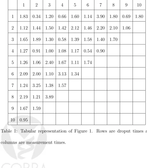
be plotted as a triangle. Here it is assumed that there is no interval missing-ness; that is, dropouts do not return at later time points. This is discussed in more detail in the last section. Figure 1 gives an example using simulated data from a lognormal distribution with median 1 and mean e1/2. This
sim-ulated example contains 10 time points, 100 subjects and an independent uniform dropout process. Each row is a dropout time and each column is
a measurement time. The top row (d = 10) is for subjects with complete
data. The row below the top is for subjects who dropped out after t = 9,
hence they all have d = 9. Each row has only the subjects with dropout
one time point earlier than the subjects in the row above and one time point later than those in the row below. The first column of the plot features the baseline means for each dropout group and there is no discernible difference between them. Hence this example reveals no baseline differences between the dropout groups. There does not seem to be any indication of informa-tive dropout either; mean measurements over time seem to follow a similar
pattern for patients who drop out early (lower rows of the graph) and who drop out later (upper rows). This is consistent with the independent uniform dropout process used in data generation.
The values plotted in Figure 1 are given in Table 1. This table is an alternative way to display the necessary information. It has the advantage of reporting the actual means but lacks the visual appeal and, arguably, the power of Figure 1 in conveying the key features of the dropouot process.
To assess the amount of visual signal one can expect from triangle plots in the presence of varying degrees of informative dropout, a second simulated example is shown in Figure 2. Here data for 100 subjects are generated from a six-dimensional multivariate lognormal distribution representing the six time points at which measurements are made. This is achieved first by generat-ing from a multivariate normal with the followgenerat-ing first-order autoregressive correlation matrix:
1 2 3 4 5 6 7 8 9 10 1 1.83 0.34 1.20 0.66 1.60 1.14 3.90 1.80 0.69 1.80 2 1.12 1.44 1.50 1.42 2.12 1.46 2.20 2.10 1.06 3 1.65 1.89 1.30 0.58 1.39 1.58 1.40 1.70 4 1.27 0.91 1.00 1.08 1.17 0.54 0.90 5 1.26 1.06 2.40 1.67 1.11 1.74 6 2.09 2.00 1.10 3.13 1.34 7 1.24 3.25 1.38 1.57 8 2.19 1.21 3.89 9 1.67 1.59 10 0.95
Table 1: Tabular representation of Figure 1. Rows are droput times and columns are measurement times.
1 0.5 0.25 0.125 0.062 0.031 0.5 1 0.5 0.25 0.125 0.062 0.25 0.5 1 0.5 0.25 0.125 0.125 0.25 0.5 1 0.5 0.25 0.062 0.125 0.25 0.5 1 0.5 0.031 0.062 0.125 0.25 0.5 1
Then subjects are randomly assigned to a dropout timed and the mean
of their profile is chosen as δd. When δ = 0 there is no informative dropout
but as δ increases the mean of those subjects who drop out early (who have
small d) will be less than those who drop out later (who have large d). The generated random variates are then exponentiated to obtain the simulated data.
The triangle plots in Figure 2 are obtained using simulated data generated in this manner for four different values ofδranging from 0 to 0.6. Whenδ = 0 there is no pattern within a given column of the triangle plot. In other words the rows seem exchangeable and there seems to be no information in the dropout process. This is less so for δ = 0.2 although some of the lower rows
a strong conclusion. Hence the amount of information in the dropouts is not sufficient in the case of δ= 0.2 to be judged from the triangle plot. Starting from δ = 0.4, however, there is clear signal in the plots: higher rows have higher means for all time points suggesting that early dropouts have lower means and subjects with lower values tend to drop out early. For δ > 0.6 (not shown) the visual signal for informative dropout was consistently strong. While it is difficult to generalize from one simulated example, it appears that differences between successive means greater than 20% of the standard deviation can be visually detected by the triangle plot.
The presentation so far focused on plotting the means of observed values. In many cases there will be covariatesW that explain some of the variability in the data which will usually lead to the use of a model of the form
Xit=E(Xit|Wit) +it.
The interest, then, will be on whether there is informative dropout after
adjusting for W. This can be addressed by forming a triangle plot based
on the residuals from the fitted model instead of Xit. The key issues in this
approach are the appropriate specifications of E(Xit|Wit) andit, which are
3
A Trellis Interpretation of the Triangle Plot
Trellis plots are tools that allow conditional visualization of data. If condi-tioning variables are all discrete then a trellis plot provides an orderly display of various subsets created by the conditioning variables. Therefore it is possi-ble to view the triangle plot as a trellis plot where the conditioning variapossi-bles are measurement time and dropout time.
This is best explained visually. Figure 3 is a triangle histogram gener-ated from the simulgener-ated data (corresponding to δ = 0.6) using the lattice
library which implements trellis plots inR(Sarkar, 2008). It has the same up-per triangular structure but instead of plotting only the mean (Ydt) via color
coding it actually displays the corresponding histogram ofXitI(Di =d). The
advantages of Figure 3 over the regular triangle plot are the same as the ad-vantages of using a histogram to summarize data instead of the mean: using a single number summary can distort the true patterns whereas a summary of the entire distribution is less likely to fall into that trap. But there are also disadvantages. It takes much more eyework to visually compare the various histograms displayed in Figure 3 and this will quickly be infeasible as the number of measurement times grows. It could also be visually unappealing depending on the individual shape of the histograms. In Figure 3, for
exam-ple, some of the histograms for early dropout times have a single bar. This happens because the bins of the histogram are fixed for the entire plot and informative dropout results in observations that have a different distribution for early dropouts which, in this case, manifests itself as a narrow range of values of the plotting variable.
An obvious alternative to the triangle histogram is the triangle box plot where a box plot is displayed in each panel instead of a histogram.
4
Quality of Life Example
Surgery is the only possible cure for gastric cancer, but it is a morbid proce-dure with possible long-term side effects. As a result, quality of life (QOL) following gastrectomy concerns surgeons and patients alike. Using the FACT-Ga, a specifically designed and validated instrument for patients with gastric cancer, QOL data were collected from 170 patients over six time periods spanning two years. QOL instruments typically have subscales pertaining to various aspects of QOL. Each subscale produces a score between 0 and 100. Figure 4 is a triangle plot of the physical functioning subscale. The top row (d= 6) has high means for each time point. Asddecreases, the mean at each
time point tends to decrease. This is, of course, a general trend and there
are exceptions such as a high mean for d = 3 and t = 3. It is nonetheless
evident that patients who complete all the six assessments have had a much better quality of life at all time points than others. This points to informative dropout, as is common in most QOL studies.
Figure 5 highlights another utility of the triangle plot by plotting mul-tiple subscales and providing a quick visual comparison between them. For physical and emotional subscales earlier dropout groups have low means, again notwithstanding the occasional counter-example such as (d, t) = (3,3) for the physical subscale and (d, t) = (4,3) for the emotional subscale. For social and functional subscales it is harder to discern such a difference. For
the functional subscale the rows with d≥4 have moderate means while the
rows for 2 ≤ d ≤ 3 have high means. For the social subscale high means
seem to appear in middle rows but not in the upper or lower ones. Overall these plots suggest informative dropout for physical and emotional subscales but they are inconclusive at best for social and functional subscales. Inter-preted together, Figures 4 and 5 provide support for a statistical analysis that incorporates informative dropout.
5
Discussion
The triangle plot is a simple data visualization tool for longitudinal data with dropouts and is most useful to assess informative dropout. It is different than event charts and follow-up plots which focus on the timing of dropout but not necessarily how informative it is. It is also different than spaghetti and lasagna plots that focus on individual profiles. The originators of the lasagna plot suggested dynamic grouping and sorting of the layers of the plot (Swihart et al., 2010). It seems possible to recover the triangle plot through a particular selection of the order of grouping and sorting, hence the triangle plot can be considered a special case of the lasagna plot that focuses on the informativeness of the dropout process. As argued in Section 3, however, the triangle plot can also be considered a trellis plot and this interpretation invites several useful extensions such as the triangle histogram and the triangle box plot.
The triangle plot is most useful when missingness is monotone; that is, when patients dropping out do not return. With arbitrary missingness it is not so easy to meaningfully group the patients by their dropout patterns for a triangle plot. A small amount of non-monotone missing data can be handled by either ignorance (group those patients with their last observation time) or
imputation. Imputing non-monotone missing values usuaully requires weaker assumptions than imputing monotone missing values so the latter option can be viable even when there is a moderate amount of non-monotone missing data (Horton and Kleinman, 2007).
Further variations of the triangle plot are possible but not explored here. For example, it is possible to annotate the graph by the sample sizes of each dropout group, using change from baseline as the plotting variable instead of the actual values and plotting actual time points at which the measurements are taken instead of an equally spaced time index.
As with all graphical tools there is be an element of subjectivity in the conlcusions drawn from triangle plots. It is possible, perhaps likely, that one analyst will see informative dropout in a triangle plot whereas another sees nothing but random scatter. Notwithstanding such subjectivity, the trian-gle plot should be a useful addition to the toolkit of statisticians analyzing longitdinal data.
R code for generating triangle plots, histograms and boxplots, with some of this added functionality, is available in the Supplemental Appendix.
References
American Statistical Association Style Guide (2011). Available athttp://pubs. amstat.org/page/styleguide. Retrieved on May 12, 2011.
Atherton, P. J., Jasperson, B., Clement-Brown, K. A., Allmer, C., Novotny P., Erlichman, C. and Sloan, J. A. (2003). “What Happened to All the Pa-tients? Events Charts for Summarizing Individual Patient Data and Display-ing Clinically Significant Changes in Quality of Life Data”Drug Information Journal 37:11–21.
Cleveland, W. S. (1993). Visualizing Data. Summit, NJ: Hobart Press.
Goldman, A. I. (1982). “Event charts: visualizing survival and other
time-events data.” The American Statistician 46: 13–18.
Horton, N. J. and Kleinman, K. P. (2007). “Much ado about nothing: A comparison of missing data methods and software to fit incomplete data
regression models.” The American Statistician 61: 79–90.
Lee, J. J., Hess, K. R. and Dubin J. A. (2000). “Extensions and Applications
Lesser, M. L., Kohn N. E., Napolitano, B. A. and Pahwa, S. (1995). “The FU-PLOT: A Graphical Method for Visualizing the Timing of Follow-up in
Longitudinal Studies.” The American Statistician 49:139–144.
Little, R. J. A. (2008). Selection and pattern-mixture models. In Advances in Longitudinal Data Analysis, G. Fitzmaurice, M. Davidian, G. Verbeke, and G. Molenberghs (eds). London : CRC Press.
Sarkar, D. (2008). Lattice: Multivariate Data Visualization in R. New York: Springer-Verlag.
Swihart, J. S., Caffo, B. James, B. D., Strand, M., Schwartz, B. S. and Punjabi, N. M. (2010). “Lasagna Plots: A Saucy Alternative to Spaghetti
Plots” Epidemiology 21:621–625.
Verbeke, G. and Molenberghs, G. (2000). Linear Mixed Models for Longitu-dinal Data. New York : Springer-Verlag.
Figures
Figure 2: Triangle plot for simulated data with varying levels of informative dropout
Figure 3: Triangle histogram for simulated data with δ = 0.6
Figure 4: Triangle plot for gastric cancer quality of life example: the physical well-being subscale of FACT-Ga
Figure 5: Triangle plots for gastric cancer quality of life example: the four main subscales of FACT-Ga
Dropout Time 4 6 8 10 2 4 6 8 10 0 2 4
Delta=0 Dropout Time 1 2 3 4 5 6 1 2 3 4 5 6 Measurement Time Delta=0.2 Dropout Time 1 2 3 4 5 6 1 2 3 4 5 6 Measurement Time Delta=0.4 4 5 6 1 2 3 4 5 6 Delta=0.6 4 5 6 1 2 3 4 5 6
P ercent of T otal 20 40 60 80 100 0 20 40 60 80 100 0 20 40 60 80 100 0 20 40 60 80 100 0 400 800 0 400 800 0 400 800 0 20 40 60 80 100
Dropout Time 2 3 4 5 6 1 2 3 4 5 6 60 70 80 90 100
Physical Dropout Time 1 2 3 4 5 6 1 2 3 4 5 6 Measurement Time 60 70 80 90 100 Emotional Dropout Time 1 2 3 4 5 6 1 2 3 4 5 6 Measurement Time 60 70 80 90 Social 4 5 6 1 2 3 4 5 6 Functional 4 5 6 1 2 3 4 5 6