Scholarship@Western
Scholarship@Western
Electronic Thesis and Dissertation Repository
11-28-2014 12:00 AM
Multivariate Spatial Visualization using GeoIcons and Image
Multivariate Spatial Visualization using GeoIcons and Image
Charts
Charts
Bo Shan
The University of Western Ontario
Supervisor Micha Pazner
The University of Western Ontario Graduate Program in Geography
A thesis submitted in partial fulfillment of the requirements for the degree in Master of Science © Bo Shan 2014
Follow this and additional works at: https://ir.lib.uwo.ca/etd
Part of the Geographic Information Sciences Commons, and the Remote Sensing Commons
Recommended Citation Recommended Citation
Shan, Bo, "Multivariate Spatial Visualization using GeoIcons and Image Charts" (2014). Electronic Thesis and Dissertation Repository. 2542.
https://ir.lib.uwo.ca/etd/2542
This Dissertation/Thesis is brought to you for free and open access by Scholarship@Western. It has been accepted for inclusion in Electronic Thesis and Dissertation Repository by an authorized administrator of
(Thesis format: Monograph)
by
Bo Shan
Graduate Program
in
Geography
A thesis submitted in partial fulfillment
of the requirements for the degree of
Master of Science
The School of Graduate and Postdoctoral Studies
The University of Western Ontario
London, Ontario, Canada
Spatial databases are growing in size and complexity, yet current visual data
min-ing methods are challenged when it comes to multivariate spatial data. The specific
research question addressed in this thesis is: how can spatial multivariate data be
effectively visualized using an icon based non-fused co-visualization approach? The
thesis presents a Python based design and implementation of a visualization program
termedGeoIcon Viewer. The program incorporates two different visualization
meth-ods: GeoIcon Image Map and Region-of-Interest Image Layers Chart. The GeoIcon
Image Map technique uses an icon to co-visualize up to nine attributes at a single
location. The Region-of-Interest Image Layers Chart method uses a small multiples
approach to support the GeoIcon Image Map technique for data with negligible value
differences. The thesis demonstrates the successful implementation of the GeoIcon
Viewer with a case study involving remote sensing digital image analysis of a copper
deposit. With the two visualization methods and eight input attributes, the GeoIcon
Viewer generated real time interactive visualization outputs that can aid a user in
multivariate spatial data mining.
Keywords: Visualization, Multivariate, Spatial Data, Icons, Geographic Informa-tion Systems, GIS, Remote Sensing, GeoIcon
Certificate of Examination ii
Abstract ii
Table of Contents iii
List of Figures vi
List of Tables ix
1 Introduction 1
1.1 Problem . . . 1
1.2 Objective . . . 3
1.3 Thesis Organization . . . 4
2 Literature and Background 6 2.1 Knowledge Discovery from Databases . . . 6
2.1.1 Input Data: Non-Spatial and Spatial Data . . . 7
2.2 Data Mining Stage of KDD . . . 10
2.2.1 The Computational Approach . . . 10
2.2.2 The Visualization Approach . . . 11
2.2.3 Exploratory Visual Analysis . . . 13
2.3 Multivariate Data Visualization . . . 17
3 System Design 25
3.1 Introduction . . . 25
3.2 Overall System Design . . . 26
3.2.1 Input Data Requirement . . . 27
3.2.2 Visualization Methods . . . 28
3.2.3 Interaction Techniques . . . 28
3.2.4 Resulting GUI Design . . . 30
3.3 Components Design and Specifications . . . 31
3.3.1 Icon Design . . . 35
3.3.2 Region-of-Interest Image Layers Chart . . . 38
3.3.3 Summary and the Next Step . . . 39
4 Software Implementation 41 4.1 Implementation Process . . . 41
4.2 Implementation: Program Paradigm . . . 42
4.3 Data Flow . . . 43
4.4 Component Development and Implementation . . . 46
4.4.1 Python Libraries . . . 46
4.4.2 Overview Window: The Input Data . . . 47
4.4.3 Visualization Processors . . . 54
4.4.4 Display of Visualization Outputs . . . 61
4.5 Components Integration . . . 63
5 Demonstration and Evaluation 65 5.1 Case Study and Data . . . 66
5.1.1 Alunite . . . 77
5.1.2 Calcite . . . 77
5.1.5 Carbonate, Mafic, and Vegetation . . . 78
5.1.6 Input Data for GeoIcon Viewer . . . 79
5.2 Results and Analysis . . . 79
5.2.1 Overview Window . . . 80
5.2.2 Colour Chooser and Control/Legend Window . . . 81
5.2.3 Visualization Window: Icon Design . . . 81
5.2.4 Visualization Outputs: Three Attributes . . . 83
5.2.5 Visualization Outputs: Five Attributes . . . 89
5.2.6 Visualization Outputs: Eight Attributes . . . 94
5.3 Program Evaluation . . . 98
6 Summary and Future Work 100 6.1 Future Improvements . . . 103
Curriculum Vitae 110
1.1 The GeoIcon Viewer program . . . 4
2.1 Statistical profiles of four datasets with different patterns . . . 12
2.2 Dataset plots . . . 12
2.3 Hertzsprung Russell Diagram . . . 13
2.4 Visualization technique classification chart . . . 16
2.5 Bristle map approach for vector data . . . 19
2.6 IconMapper icon design . . . 20
2.7 IconMapper output visual clutter . . . 22
2.8 Pixel bar chart design . . . 23
2.9 Pixel bar chart for consumer spendings . . . 23
3.1 Waterfall development model . . . 25
3.2 Feature requirements translated into program components . . . 26
3.3 Graphic User Interface conceptual design . . . 31
3.4 Grayscale low contrast image . . . 32
3.5 Overview image comparison . . . 33
3.6 GeoIcon Viewer icon design . . . 35
3.7 Icon element colour customization . . . 38
3.8 Region-of-Interest Image Layers Chart method design . . . 39
4.1 Implementation stages of the Waterfall model . . . 42
4.4 Open Image: creating false colour composite . . . 48
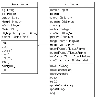
4.5 Overview Window class diagram . . . 51
4.6 Visualization Processors and associated components . . . 54
4.7 Control/Legend Window class diagram . . . 55
4.8 GeoIcon class diagram . . . 56
4.9 Icon element construction algorithm . . . 57
4.10 Region-of-Interest Image Layers Chart class diagram . . . 59
4.11 Visualization Window and associated processes . . . 61
4.12 Visualization Window class diagram . . . 62
5.1 An image map of the case study area . . . 67
5.2 Alunite distribution map . . . 69
5.3 Calcite distribution map . . . 70
5.4 Kaolinite distribution map . . . 71
5.5 Hydroxide distribution map . . . 72
5.6 Quartz distribution map . . . 73
5.7 Carbonate distribution map . . . 74
5.8 Mafic distribution map . . . 75
5.9 Vegetation distribution map . . . 76
5.10 Overview Window component evaluation . . . 80
5.11 Control/Legend Window implementation result . . . 81
5.12 GeoIcon Viewer icon design implementation result . . . 82
5.13 Icon image map for three attributes with input data range of 2 . . . . 84
5.14 Icon image map for three attributes with input data range of 15 . . . 87
5.15 Region-of-Interest Image Layers Chart method with three attributes . 88 5.16 Icon image map for five attributes with input data range of 2 . . . 90
5.18 Region-of-Interest Image Layers Chart with five attributes . . . 93
5.19 Icon image map for eight attributes with a non threshold image . . . 96
5.20 Region-of-Interest Image Layers Chart with eight attributes . . . 97
5.1 Mineral index equations . . . 66
Chapter 1
Introduction
1.1
Problem
Advances in information technology such as data collection, distribution, and
stor-age have brought many improvements to geographic information systems. Modern
satellite sensors with faster revisit time collect vast amount of high resolution data.
Along with advancements in personal mobile sensors, the amount of spatial data is
growing rapidly. Not only are the sizes of databases increasing, but the types of data
measured and collected are more numerous. The result is the emergence of spatial
databases of unprecedented size and complexity.
The field of data mining and Knowledge Discovery from Database (KDD) was
de-veloped to extract patterns and knowledge from vast amounts of data. Spatial data
contain spatial information that correlates to locations on Earth or other physical
spaces, and require special data mining techniques other than that of alpha-numeric
data due to concepts such as spatial autocorrelation, spatial heterogeneity, and
Spatial databases are of little value without proper methods to extract the information
contained in them. A specialized branch of KDD, Geographic Knowledge Discovery
from Database (GKDD) which uses geocomputational and geovisualization methods,
was developed in response to the growing complexity of spatial databases (Miller and
Han, 2009).
While data mining via (geo)computational methods are efficient and comprehensive,
current methods are not flexible enough to handle the wide variety of data and pattern
types found in modern spatial databases because computational methods are designed
for mathematical patterns. In contrast, studies such as Anscombe (1973), Guo et al.
(2005), Gahegan et al. (2001), and Keim et al. (2005) have shown that there are
advantages specific to the visualization approach: uncompressed hypothesis space,
ability to process both qualitative and quantitative data, and the inclusion of the
human cognition system which is less influenced by data noise. However, neither
using a pure computational or visual approach is as effective as the combined use of
both approaches.
Geovisualization attempts to visually stimulate and engage the human cognitive
func-tion to find patterns. However, geovisualizafunc-tion has tradifunc-tionally been developed for
uni- and bivariate spatial data. The most common medium to present spatial data
is a map. Maps allow data to be plotted based on spatial location, which is critical,
since concepts of location and space are vital to understanding geographic patterns.
Colour brightness and saturation are used to represent quantitative differences
be-tween plotted data points. However, colour is only one visual component and thus is
mostly suitable for one attribute.
With the growing complexity of spatial databases, there is a lack of capability to fully
utilize these new complex spatial datasets due to the fact that current visualization
question addressed in this work is: how can spatial multivariate data be visualized
using an icon based non-fused co-visualization approach?
There has been a substantial amount of work on multivariate geovisualization. Two
examples are the bristle map approach for vector data (Kim et al., 2013) and the
IconMapper System for raster data (Pazner and Zhang, 2004). The IconMapper
System replaced each raster cell with an icon to produce an icon map. Icon elements
embedded within each icon represent different attributes using visual primitives such
as colour and size. However, there were several issues with the program that limited
its effectiveness and usability including method design, lack of software features, and
portability.
1.2
Objective
The objective of this research was to design and implement a new visualization
soft-ware system based on the older IconMapper System in order to answer the thesis
research question. The new visualization software, GeoIcon Viewer, aims to improve
the older IconMapper System by:
1. Implementation of a new icon design to improve visual performance.
2. Implementation of new significantly different program features to improve the
icon visualization method and the visual analysis process.
3. The removal of dependence and reliance on third party software and operating
systems.
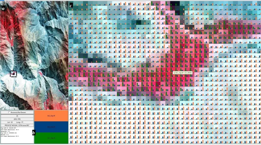
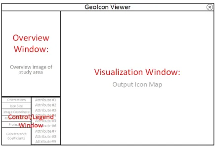
An example of a GeoIon Viewer screen is shown in Figure 1.1. The figure shows the
that display the overview map, legend, and GeoIcon Image Map visualization result.
In this example, three attributes are rendered and displayed at each location in the
icon image map.
Figure 1.1: Icon image map visualization of alunite, kaolinite, and vegetation. The GeoIcon Viewer user interface consists of the following three windows: a) Overview Window, b) Control/Legend Window, and c) Visualization Window.
1.3
Thesis Organization
Following this introduction, Chapter 2 provides background information on data
min-ing and Knowledge Discovery from Database. The chapter addresses how spatial data
require a specialized version of KDD due to inherent data characteristics. The
chap-ter also explores the different stages of (G)KDD and focuses on the visualization
approach including current and new methods in spatial data visualization.
Chapter 3 is about the design process of the GeoIcon Viewer. More specifically, the
software components. The three main feature requirements are the new icon design
(GeoIcon Image Map), data query system, and Region-of-Interest Image Layers Chart
visualization method. The design process is approached from three different aspects:
input data, visualization methods, and interaction techniques. Designs for each
indi-vidual program component and the overall system were created based on these three
aspects and the specified feature requirements.
Chapter 4 provides a detailed description of the implementation of the software
com-ponents, as well as how these components interact with each other. A specific
pro-gramming paradigm known as Object Oriented Propro-gramming was used to implement
the GeoIcon Viewer based on the programming language chosen. The chapter
pro-vides details about the functions and data structures implemented for the major
program component such as the visualization processor.
Chapter 5 demonstrates and evaluates the GeoIcon Viewer using a case study
involv-ing remote sensinvolv-ing digital image analysis of a copper deposit. GeoIcon Image Map
and Region-of-Interest Image Layers Chart outputs are created using ASTER satellite
data acquired over the area of the copper deposit. The program evaluation is divided
into two parts. The first part examines the GeoIcon Viewer with regard to its desired
functions and its actual capabilities. The latter part evaluates the effectiveness of the
GeoIcon Viewer and its two visualization methods.
The final chapter presents a summary of the research project and discusses possible
additions and changes to the GeoIcon Viewer to improve its role in visual spatial data
Chapter 2
Literature and Background
The goal of this project is to create a new visualization program. The research field
of Knowledge Discovery from Databases helped to form the rationale for the GeoIcon
Viewer, and is presented in the following sections.
2.1
Knowledge Discovery from Databases
Knowledge Discovery from Databases (KDD) is developed based on the belief that
very large databases contain information in the form of patterns, and is a process
for extracting potential information from very large datasets (Miller and Han, 2009).
KDD is commonly referred to as data mining. However, data mining is only one
component of the KDD process. KDD is suitable for very large datasets with millions
of data records which are too complex to be analyzed by conventional statistical
data analysis. The purpose of KDD is to uncover hidden patterns, relations, and
trends that are obscured by the complexity of the dataset. KDD follows an inductive
approach where users examine the results to gain understanding without anya priori
and Yeung, 2007) (Miller and Han, 2009). Thus, KDD is considered an exploratory
and probabilistic analysis method since it only seeks to uncover rather than to explain
hidden patterns.
The Knowledge Discovery from Databases process is composed of multiple stages:
data integration/cleaning, data selection/transformation, data mining, knowledge
discovery/construction, and lastly deployment (Fayyad et al., 1996) (Miller and Han,
2009) (Gahegan et al., 2001) (Lo and Yeung, 2007). The data integration/cleaning
stage consists of finding and combining multiple data sources into one, and
prob-lems of missing or erroneous data are rectified. Relevant data are formated for the
next step during the transformation stage. The formatting process includes
reclas-sification, denormalization, and aggregation (Lo and Yeung, 2007). Computational
and visual approaches help to extract hidden patterns from the dataset in the data
mining stage. Users construct hypotheses based on the outputs for further analysis
and decision making in the last two stages. The focus of this project is on
visual-ization methods used in the data mining stage. Thus the following sections focus on
the data mining stage with a particular emphasis on visualization methods and input
data. The focus on input data is due to the fact each computational and visualization
method is designed for a specific type of data, and the GeoIcon Viewer is specifically
designed for spatial data.
2.1.1
Input Data: Non-Spatial and Spatial Data
Knowledge Discovery from Databases is traditionally designed for non-spatial data
for uses in fields such as physics, astronomy, business, and biology (Miller and Han,
2009). However, there has been an explosive growth in digital spatial data within the
last few years. Advancements in information technology (IT) infrastructures lead to
MacEachren and Kraak (2001) 80% of data generated today are spatial in nature. IT
advancements also increase the capabilities of Geographical Information System to
support decision making, and this progress is marked by more powerful computations,
efficient data analysis techniques, and very large and complex spatial databases (Guo
et al., 2005) (Guo, 2003). The magnitude and complexity of these datasets allow for
more detailed analysis, but present an extraordinary challenge for traditional KDD
in terms of analyzing and transforming these data into knowledge, and prompted the
growth of a specialized version of KDD called Geographic Knowledge Discovery from
Databases (GKDD).
Digital spatial data are the numerical representation of real world features, and can
be categorized into objects and phenomena (Lo and Yeung, 2007). Objects are
dis-crete and definite entities with well defined boundaries, and some examples include
roads, buildings, or bodies of water. In contrast, phenomena are features such as
precipitation or temperature that are distributed across space without discrete
bor-ders. Storing and processing these two categories of spatial data require the use of
Conceptual Computational Models (Wise, 2002). There are two commonly used data
models for spatial data: Vector and Raster data model. Within a Vector model,
spatial objects are stored as one of three geometric objects: point, line, or polygon.
Corresponding attribute data for each geometric object are stored within an attribute
table. For the Raster model, data is stored as a layer which is simply a tessellation
filled with numbers. Each raster or vector data element corresponds to a specific
spatial location on Earth.
Spatial Data in Knowledge Discovery from Databases
While spatial databases may be equal in size and complexity with non-spatial
KDD process cannot address. There is a relationship or interrelatedness between up
to four dimensions of geographic data that is not present in non-spatial data: latitude
or northing, longitude or easting, elevation, and time. These four dimensions form the
framework for all other spatial data attributes (Miller and Han, 2009). Data mining,
especially computational, techniques must take into account the inherent geometric
and topological measurement framework that spatial data contains (Miller and Han,
2009).
In addition to dependencies and relationships amongst attributes, spatial data such
as temperature or precipitation often exhibit spatial dependency and heterogeneity.
Spatial dependency is the tendency for attributes in space to be related, and can
be summarized by Tobler’s First Law of Geography which stated that “things closer
together in space are more closely related than distant things” (Tobler, 1970, p. 236).
However, this property is not always true and depends on other spatial attributes
such as direction or land cover. Spatial heterogeneity refers to the non-stationarity
of geographic processes (Miller and Han, 2009) which means geographic processes
vary by location and that the global pattern might be completely different from local
patterns. Traditional computational mining techniques were constructed based on
data independence and stationarity assumptions, and thus are not suited for spatial
data (Miller and Han, 2009).
The complexity of spatial data presents a challenge to the standard KDD process.
Non-spatial data are easily represented and processed as points in the information
space, but many geographic objects contain size, shape, and boundary properties
which also affect the specific geographic process. Furthermore, relationships such as
distance, direction, and connectivity are critical in understanding geographic patterns,
2.2
Data Mining Stage of KDD
2.2.1
The Computational Approach
The data mining stage contains a variety of methods spanning a continuum of
com-putational and visual approaches. Comcom-putational methods are designed to take
ad-vantage of the computational power and the formalism of statistical inferences to
search and uncover patterns in a comprehensive and consistent manner. The main
advantage of computational methods is the speed and efficiency of the algorithms.
However, these algorithms are only applicable to quantitative data and mathematical
patterns. Qualitative data such as opinions are difficult to process without
conver-sion to ordinal, interval, or ratio data by the user. The lack of automated processing
for qualitative data means that computational approaches require human level
in-telligence inputs (Miller and Han, 2009). In addition, the size and dimensionality
of these very large databases still pose difficulties for automatic pattern detection
despite the increasing computing power. A large hypothesis space, which is all the
possible patterns within a dataset, is present due to the size and dimensionality of the
dataset. Computational methods narrow down the hypothesis space because the act
of choosing a specific algorithm is to assume what pattern exists in a dataset. In
do-ing so, there is an imposition of an a priori hypothesis which results in undiscovered
patterns. Lastly, as mentioned in the previous section, the inherent characteristics of
spatial data pose difficulties for computational data mining. To address the
short-comings of the computational approach, human level intelligence and visualization
methods are used in conjunction with computational statistical methods to form an
effective KDD process. The following subsections provide a background on the
visu-alization techniques used in KDD and GKDD with a particular focus on spatial data
2.2.2
The Visualization Approach
Within the KDD process, visual data mining or scientific visualization techniques
involve using information systems to facilitate visualization and interaction with the
data in order to promote visual thinking (Worboys and Duckham, 2004).
Geovi-sualization is the sub-branch of scientific viGeovi-sualization geared for spatial data, and
integrates different methods from scientific visualization, cartography, image analysis,
exploratory data analysis, and geographic information systems to create an
enivron-ment for the visual exploration, analysis, synthesis, and presentation of spatial data
(MacEachren and Kraak, 2001). By transforming the visualization space to an
ex-plorable multi-dimensional space, visualization approaches act as the link between
human intelligence and the rigid computational approaches (Hernandez, 2007). In
the past, the focus of visualization research has been in fields such as engineering or
medical sciences (Hernandez, 2007). However, the amount of spatial data being
col-lected is promoting research in geovisualization. The rapid growth of spatial datasets
presents a major challenge in incorporating geovisualization within the GKDD
pro-cess. The purpose of geovisualization is to exploit human visual cognitive abilities
in pattern recognition, ordering, and interpretation of visual cues (Hernandez, 2007)
(MacEachren and Kraak, 2001) (Keim et al., 2005) (Fairbairn et al., 2001). The
rea-son is that humans learn more effectively and efficiently within a visual environment
rather than a textural or numerical setting (Tufte, 1990) (Tufte, 1997). In a study
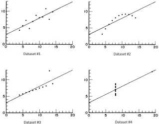
Anscombe (1973), four datasets with the same statistical profile were generated as
shown in Figure 2.1. Although the statistical profile of these four dataset were the
same, their graphs were very different as shown in Figure 2.2. This study highlights
that visualization techniques can provide different additional insights about data that
numerical analysis could not.
Figure 2.1: The statistical profile of four datasets used in Anscombe (1973).
Figure 2.2: Graph of four datasets with the same statistical profile from Anscombe (1973).
data (Fekete et al., 2008). Spence and Garrison (1993) compared the summaries of
computational and visualization approaches. Using the Hertzsprung Russell Diagram
shown in Figure 2.3a as input data, Spence and Garrison (1993) found that the
visual summary in Figure 2.3b was much better than that of any computational
approach given the noise within the dataset. The capability of the human visual
system in filtering and pattern recognition is what visualization techniques aim to
Figure 2.3: a: Hertzsprung Russell Diagram. b: Standard visual summary of the Hertzsprung Russell Diagram. (Spence and Garrison, 1993).
2.2.3
Exploratory Visual Analysis
To incorporate the human cognition system in pattern detection, the KDD process
uses an approach known as the Exploratory Visual Analysis (EVA) or Exploratory
Spatial Data Analysis (ESDA) whose main goal is to facilitate the exploration and
manipulation of data visualizations by users to discover more about the data
(Pur-chase et al., 2008) (Gahegan et al., 2001) (MacEachren and Kraak, 2001). As the
name implies, the aim is not to analyze the data, but to present the data in a way that
visually stimulates human cognition and intelligence via different data representation
styles (Gahegan, 1998).
In a dataset characterized by vast size and high dimensionality, the number of
po-tential patterns is quite high. As stated before, selecting a specific computational
method compresses the potential hypothesis space, and may lead to undiscovered
patterns. For example, a regression analysis assumes either a linear or nonlinear
pat-tern, and configures the coefficients in relation to that pattern type. In doing so,
is to use multiple algorithms for all pattern types. However, this can take a large of
amount of effort for very large datasets, and there is a lack of knowledge as to what
pattern types exist. In addition, computational algorithms are not suited for certain
data types and patterns without preprocessing, and are also sensitive to noise. In
con-trast, exploratory visualization facilitates an interactive and unencumbered search for
patterns by simply presenting the data to users and allowing the human brain to form
insights and conclusions (MacEachren and Kraak, 2001). Visual data exploration can
be used for hypothesis generation as well as for verification. EVA plays an important
role in the process-pattern tracking where the key aspects of a process are displayed
as the process unfolds (Gahegan et al., 2001).
There are several advantages to using a visual exploratory environment in the
knowl-edge construction process. The exploratory environment allows for a more direct
involvement on behalf of users. Within an interactive visualization environment, the
user can ideally manipulate and visualize data in meaningful ways that maximize the
potential of the user’s cognitive functions. Also, by using the human brain and
cogni-tive function to observe and form hypothesis about a data set, there is no imposition
ofa priori hypothesis on the dataset, and hence a less likely chance of hidden patterns
going undetected. In addition, Spence and Garrison (1993) demonstrated visual data
analysis is well suited for non-homogeneous and noisy data. Lastly, using a visual
ex-ploratory method requires relatively less understanding of the complex mathematical
or statistical algorithms in computational approaches (Keim et al., 2005). However,
understanding of different concepts such as data processing, dimension reduction,
and visualization method algorithms may maximize the effectiveness of the visual
approach.
Different visualization approaches employ different graphical representations of the
confirma-tion, synthesis, and presentation (Gahegan et al., 2001). The sub-steps within the
exploration stage are known as the Information Seeking Mantra, and are composed of
overview, zoom and filter, and details on demand (Keim et al., 2005). In the overview
sub-step, users identify interesting potential patterns. Once a possible pattern is
iden-tified, users can visually isolate the data subset and access more details. Users can
confirm, construct, and present potential patterns within the dataset through
ex-ploration and interaction with data visualizations. Visualization approaches have
changed from visualizing the data on a static two dimensional map to within an
interactive and dynamic visualization environment. Data are no longer represented
by unchanging symbolism on paper, but rather by pixels on a screen based on user
specifications. The effectiveness of visualization methods has been growing, and
Ex-ploratory Visual Analysis has been used for data exploration in multiple studies such
as Keim and Hermann (1998), Keim and Kriegel (1996), MacDougall (1992),
Fother-ingham and Charlton (1994), Dykes (1997), Hearnshaw (1994), and many more.
A large number of visualization techniques have been developed, and these techniques
can be classified based on three criteria shown in Figure 2.4. The three criteria or
dimension of the classification system can be assumed to be orthogonal. This means
that any visualization technique may be used in conjunction with any interaction
technique for any data type to form different visualization environments (Keim et al.,
2005).
According to Hinneburg et al. (1999) and Gahegan et al. (2001), common
visualiza-tion techniques can be categorized into chart-based, pixel-based, glyph/iconographic,
and map-based techniques. A chart-based technique plots the data on a graph, and
common examples include scatter plots, parallel coordinate plots, and stacked plots.
Pixel-based methods map data values to pixels which are then arranged in a specific
Figure 2.4: Information Visualization Technique Classification from Keim et al. (2005).
useful overview of the dataset. Glyph and iconographic techniques aim to display
the perception of ‘whole’ while allowing differentiation of the individual attribute
(Gahegan et al., 2001). The best known example is the Chernoff Face method in
Chernoff (1973) where the eyes, ears, mouth, and nose represent different attribute
values through shape, size, placement, and orientation. The map-based method is the
primary approach in cartography and geovisualization, and is a powerful technique
for exploration, extraction, and summary of spatial data (Fairbairn et al., 2001). For
data that can be displayed spatially, a digital map representation allows for data
exploration but also serves as a foundation for incorporating different representation
schemes with varying degrees of abstractions ranging from Chernoff Faces or charts
on one end to the Imhof method (Imhof, 1982).
In a map-based approach, geographic coordinates are used to plot data points on
a two dimensional cartographic X-Y plane. For the raster model, each data point
corresponds to a square within the tessellation. The two dimensional planimetric view
is the conventional display method used in geovisualization. The potential spatial
2007). As computing power increases, the three dimensional perspective view is
becoming more common. Geographic coordinates are plotted on two axes (X and Y),
while another variable such as elevation is plotted on the third (Z) axis. Depending
on the spatial distribution of data points and the map scale, some areas of the display
map may contain a higher amount of visual information than other areas. Information
density becomes an issue when a large amount of data is plotted in one area on a small
scale map. The resulting visualization is a trade off between information density and
portions of data displayed. For three dimensional maps, a significant fraction of the
data may be obscured unless the view point is changed.
The map-based visualization approach described above is commonly used for
uni-variate or biuni-variate data. For uniuni-variate data, colour is used to show and highlight
possible spatial patterns. The purpose of colour is to make information visually
distinguishable. A colour may be described by three dimensions: hue, value, and
saturation. Hue is the dominant wavelength reflected, and is commonly referred to as
the colour. The value or the lightness is how light or dark a colour is with a constant
hue. Lastly, saturation is the purity of a hue where a narrower range of reflected
wavelength equals a purer saturation Lo and Yeung (2007). In cartography, changes
in hue often represent qualitative or nominal changes such as in a thematic map of
land type where each colour corresponds to one land type. In contrast, changes in
colour value and saturation are used to represent quantitative differences such as in
a choropleth map of rainfall amount.
2.3
Multivariate Data Visualization
Past mapping methods have been focused on univariate and bivariate data. The
research topic in geovisualization. The disadvantage of using colour in map-based
techniques is the inability to visualize multiple attributes at a single location. The
three common approaches to visualizing multivariate data are the fused
visualiza-tion, non-fused co-visualizavisualiza-tion, and semi-fused visualization approach. In a fused
visualization approach, map algebra operations produce a composite image, which is
used to represent and visualize a specific subset of data (Pazner and Zhang, 2004).
Attribute data are combined together via mathematical functions such as the Simple
Additive Weighting method (SAW) to produce a composite map (Malczweski, 1999).
In addition, various overlay methods are used, including translucent overlay.
In contrast, a non-fused co-visualization approach (Figure 1.1) aims to visualize
mul-tiple attributes at each location on a single image or map. This type of visualization
depicts each attribute independently through different display properties such as
ge-ometry, colour, texture, or pattern, and then integrates all of the depictions into
one map via methods such as glyphs or icons (Guo et al., 2006). The non-fused
co-visualization approach may also incorporate the fused approach where a composite
image showing global pattern can be displayed and compared with multiple individual
attributes simultaneously.
The constant format or small multiples method can be considered as a combi-nation of fused visualization and non-fused co-visualization (Tufte, 1990). The small
multiples method is where “the same basemap is used in a series but the data
visual-ized change over time” (Kimerling et al., 2012, p. 138). The advantage of this method
is that the location or geographic extent remains constant and this allows users to
focus on the changes in data.
There has been an increased focus on multivariate data visualization, and many
meth-ods have been developed. For non-spatial data, there are techniques such as the
2002). For spatial data, relatively new techniques include the IconMapper System
(Pazner and Zhang, 2004) and bristle map method (Kim et al., 2013). A bristle map
consists of a series of lines extending from linear map elements such as roads, train,
or power lines. These lines encode multiple attributes through variations in length,
density, color, orientation, and transparency of the bristles. A bristle map for day and
night burglary rates is shown in Figure 2.5. The colour of the bristles indicates time of
burglary, and the bristle density and length encode the rate of burglary occurrences.
Figure 2.5: Colour, bristle density, and bristle length are used to encode multivariate data about urban burglary rate (Kim et al., 2013).
Unlike the bristle map, the IconMapper System by Pazner and Zhang (2004) is
de-signed for raster data. Miller (1956) found that providing and organizing visual
stimulants into multiple dimensions increases the amount of information the brain is
able to receive, process, and remember. The IconMapper visualization technique
ren-ders an icon at each cell to form more graphically rich and meaningful visualization
primitives by using colour, length, width, orientation, shape, and texture to encode
multiple attributes. The IconMapper System used a static pictorial and dynamic
Figure 2.6: Icon design template a) Static pictorial, b) Dynamic bar-chart icon. (Pazner and Zhang, 2004)
A static pictorial template design used five static icon elements to encode five spatial
variables as shown in Figure 2.6a. The color of each icon element changed based on
the data value. The collective shape and colour of each static icon element indicated
the traversability at each location (Pazner and Zhang, 2004). The icon design in
Figure 2.6b is a dynamic icon where the size of each bar icon element changes with
the value. The color coding of the bar icon elements allows users to differentiate the
attributes on display (Pazner and Zhang, 2004). There are several issues with the
IconMapper System visualization technique, some of which are listed below.
1. As shown in Figure 2.7, the display of a large number of icons results in high
visual information density and hinders the visual exploratory process. This
hindrance is further exacerbated by the process to interpret icon element colour
and size.
2. The design of the dynamic bar icon leads to misleading visual effects such as
the seemingly continuous vertical line across multiple cells as shown in Figure
2.7.
However, this might not be sufficient for high dimensional databases used in
modern GIS.
4. Users cannot customize the icon element colour which may lead to unintuitive
colour representations.
5. The IconMapper query system returned the date of creation, attribute layer
used, and the style of icon used. However, this information does not contribute
much to exploratory visual analysis.
As a result of these design issues, the IconMapper System did not serve as an
inter-active and effective visual exploratory program. The IconMapper System processed
the input raster to produce an icon map, but did not allow users to select and focus
on a particular region of interest (ROI). An interactive program, ideally, allows users
to select, create, and explore data visualizations in real time rather than waiting for
a static image file to be created and viewed.
A high dimensional database may contain ordinal, interval, and ratio attribute data,
and the range for each attribute may differ significantly. A standardization procedure
is required for the different attributes. Due to the number of display pixels allocated
to each icon, the visualization of data value by each icon element is very coarse as
can be seen in Figure 2.7. Similar data values result in bar icon elements that are
indistinguishable in size, which makes it harder to gain an accurate understanding of
the data. As the number of pixels allocated to each icon element is dependent on the
number of attributes being visualized, more attributes result in icon elements with
negligible size differences. Thus, a visualization method is needed to display a high
number of spatial attributes simultaneously in such a way that relatively small value
differences can be displayed and differentiated. A potential solution is the hierarchical
to represent each data item by a single pixel within the bar chart, and the data value
is encoded by the pixel colour and can be accessed as needed.
Figure 2.8: Pixel bar chart design (Keim et al., 2002).
The data is arranged in a particular order within each bar using the X and Y ordering
attributes as shown in Figure 2.8. The dividing attribute is used to separate the entire
input data into multiple pixel bars. The pixel bar chart shown in Figure 2.9 displays
multiple attributes simultaneously by using the product type as the dividing attribute
while the number of visits and money spent are the X and Y ordering attributes
respectively. The colour of the pixel encodes the amount of money a customer has
spent.
Figure 2.9: Pixel bar chart for consumer information (Keim et al., 2002).
The hierarchical pixel bar chart and the small multiples approach are combined to
differences. The design and implementation of this new visualization method,
Region-of-Interest Image Layers Chart, are presented in the following chapters.
2.4
Summary
Due to the growing complexity of spatial datasets, new techniques are required to
uncover hidden patterns and information from these large and complex datasets.
Vi-sualization methods provide a bridge between computational outputs and the human
cognition system within the (G)KDD process. Visualization methods try to uncover
hidden patterns within large datasets by presenting data in visually stimulating forms
to engage the human cognition system. Visualization methods such as the
IconMap-per System provide an environment for exploratory visual spatial data analysis, but
there are issues. The icon design used in IconMapper System was only capable of
visualizing five attributes simultaneously. Furthermore, the icon design lacked a
dy-namic positioning system for the icon elements which resulted in an inefficient use
of icon pixel space. The design of the icon elements also created unwanted visual
effects such as vertical bar stacking as shown in Figure 2.7. The colour of each icon
element was predefined based on position, and this leads to an unintuitive colour
rep-resentation. In addition to the inefficient icon design, the IconMapper System lacked
an effective data query system. At the beginning of the next chapter, the design for
a new software is provided which addresses all the design issues of the IconMapper
Chapter 3
System Design
3.1
Introduction
The goal of this project was to create new multivariate spatial data visualization
soft-ware based on the IconMapper System by Pazner and Zhang (2004). The GeoIcon
Viewer features a new icon design, data query system, and the Region-of-Interest
Im-age Layers Chart method. The end goal of the new visualization software is to provide
a dynamic and interactive environment for effective visual exploratory analysis. The
entire development process of the GeoIcon Viewer follows a Waterfall development
model shown in Figure 3.1.
Figure 3.1: The GeoIcon Viewer development process follows the traditional Waterfall model approach.
the Waterfall model. The design stage is critical and a prerequisite for later stages
of software development. The design and implementation of the GeoIcon Viewer
follows a reductionist philosophy where the final visualization software is the sum of
its components and processes. However, it is the purpose of the software that dictates
the number and type of components necessary. A clear understanding of the overall
purpose and functionality of the software is necessary to create an effective design. A
more detailed design process is shown in Figure 3.2 where feature requirements are
specified and used to guide the design process.
Figure 3.2: Feature requirements are used to guide the design process and specify required program components.
3.2
Overall System Design
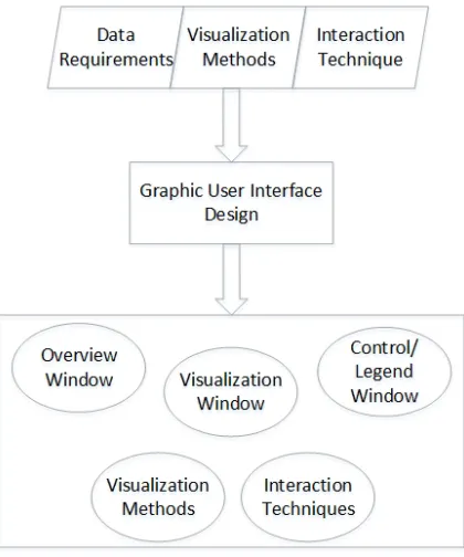
The purpose of system design stage is to examine and specify the purpose and required
functionalities of the GeoIcon Viewer. Certain functionality requirements have to be
shown in Figure 2.4, there are three design criteria for a visualization program that
must be considered: input data, visualization methods, and interaction techniques.
These three criteria help to design a suitable graphic user interface (GUI) as shown
in Figure 3.2. The GUI is broken down further into several subcomponents where
each requires further design and implementation.
3.2.1
Input Data Requirement
The GeoIcon Viewer is most suitable for visualizing raster data due to the inherent
characteristics of the iconic visualization approach which works by replacing each
raster cell with an icon that displays multiple attributes through a combination of
visual primitives. While it is feasible to create an icon object for vector data, there are
better visualization methods such as the bristle map approach by Kim et al. (2013).
The Region-of-Interest Image Layers Chart method shown in Figure 2.8 is also well
suited for the raster data structure, as each raster cell is easily mapped to a set of
pixels within each bar. Thus, the visualization methods dictated that the GeoIcon
Viewer must be able to handle and process data in raster format.
Raster File Formats
Raster data can be stored in several different file formats and each format has
dif-ferent characteristics depending on the data source or the compression method (Lo
and Yeung, 2007). The different formats include generic raster file, raster data
inter-change, and proprietary GIS software format. Generic raster format includes ASCII
and binary raster files, which are simply a list of cell values and are exchangeable
between different platforms. However, the raster data interchange format has largely
For-mat or TIFF is the most common raster data interchange format. TIFF is platform
independent and supported by a wide range of GIS hardware and software. GeoTIFF
is able to store spatial information including map projections and georeference
coef-ficients to support spatial operations. TIFF also supports data compression which
allows efficient storage of large raster datasets. Proprietary formats such as .GRID or
.PIX are created and can only be opened by specialized GIS software such as ESRI
ArcInfo or PCI Geomatica.
TIFF is the logical choice for raster data format because it supports the storage of
spatial information and is platform independent. Having the ability to handle and
process TIFF files fulfills the input data requirement. The ability to retrieve spatial
information stored in a TIFF file is essential since the GeoIcon Viewer is focused on
spatial data visualization.
3.2.2
Visualization Methods
The chosen visualization method is the second criteria to consider. Since the goal is
to use the GeoIcon Image Map and Region-to-Interest Image Layers Chart methods
to visualize multivariate spatial data, the GeoIcon Viewer must be able to create and
display these two objects. The required input data are the raw values from GeoTIFF
images. Thus, the program must be able to retrieve a subset or all of the raster data
values. The program manipulates and processes the raw data to create visualization
outputs, which are then displayed in a separate GUI window.
3.2.3
Interaction Techniques
In addition to the input data and visualization methods, an effective visual
ex-plore, interact, and manipulate visualization outputs as needed. The two interaction
techniques required are View Enhancement and Selection. View Enhancement
meth-ods allow users to adjust the level of detail being visualized. The Selection techniques
provide users with the ability to isolate a subset of the displayed data, and are the
basis for operations such as highlighting, filtering, or additional quantitative analysis
methods.
A well known View Enhancement technique is zooming. Working with large datasets
requires the ability to present the data in a compressed overview format as well as in
a variety of higher resolutions. An icon object becomes larger in size but also presents
more details when zoom is applied. There are two common ways to incorporate the
zoom feature. The first is to apply the zoom to the entire dataset and replace the
original image in the display window with the zoomed image. The second is by having
multiple display windows where each window corresponds to a specific zoom level.
Comparison of the two methods is difficult as there are unique advantages to each
design. A single display window design is space efficient and more appropriate for
mobile displays which have smaller screen resolutions and physical dimensions. In
contrast, a multiple window design is able to display data at different detail levels
simultaneously but is more suited for large monitors, and is the reason why the
GeoIcon Viewer uses a multiple window design.
The Selection technique is critical to the overall function of the program and in
particular the data query feature. The View Enhancement technique influences how
the Selection method is designed. The brushing and linking technique is the required
Selection approach for a multiple window design GUI. The idea of brushing and
linking is to use multiple visualization methods to overcome any disadvantages of
information related to a selected data object. Linking means that changes to selected
data objects in one display window are reflected by changes in the other windows.
The GeoIcon Viewer uses two types of interaction technique: View Enhancement
and Selection. Zoom is implemented via a multiple window GUI design, where each
window displays the data at a specific scale or zoom level. The brushing and linking
technique, which is required due to the multiple window design and the selected
visualization methods, enables user exploration and interaction with visualization
outputs.
3.2.4
Resulting GUI Design
Feature design requirements were drafted based on the three criteria described above.
The GeoIcon Viewer must be able to read, process, and extract pixel data and
spa-tial information from TIFF files. Secondly, the program must be able to generate
GeoIcon Image Map and Region-of-Interest Image Layers Chart outputs, which are
the icon image map and image layers chart respectively. Thirdly, two types of
inter-action methods are required: zoom and selection. The zoom feature design led to the
multiple display windows GUI design, which in turn dictated the use of the brushing
and linking method as the selection technique.
The conceptual GUI based on these design requirements is shown in Figure 3.3.
The GUI is comprised of the Overview, Visualization, and Control/Legend windows.
These windows are linked so that changes in one window are reflected in the other
windows. Once the system design requirements are listed and the GUI is
conceptu-alized, the design process moves onto the second stage of the Waterfall model and
focuses on the design of individual program component including the GUI windows
Figure 3.3: The GUI is made of up three windows, each of which has a specific purpose. The GUI design is influenced by the interaction techniques selected.
3.3
Components Design and Specifications
This section deals with the function and design of each individual program component
shown in the bottom rectangular box of Figure 3.2. Each component was designed
for a specific purpose and combines together to form the GeoIcon Viewer and all its
required functions following a reductionist approach.
Overview Window
The Overview Window provides a basis for interaction techniques and displays the
overview map via mouse click. This bring up more detailed information within the
other two GUI windows. The user selection isolates a specific data subset referenced
by the spatial or image coordinates. The Overview Window also provides a frame of
reference for users during the exploratory analysis. When users select a specific region
on the overview map, it is highlighted to provide a link between the visualization
outputs and the actual spatial location.
When users select a raster image, it is displayed in the Overview Window. For raster
data, each attribute is stored as a grayscale TIFF image where the number within
each cell is the attribute value. When a grayscale image is used as the overview
map, the chosen image might not be suitable for display. For example, if a chosen
image has a histogram similar to the one shown in Figure 3.4a, the displayed image
contains very low contrast and is useless for visual examination. In order for users to
distinguish any details, prior image enhancement has to be performed to produce a
more meaningful overview image.
Figure 3.4: Histogram profile of Band 3 image of Landsat 8, where the majority of values are grouped around 10 to 50 and thus the image contains no contrast.
Using a preprocessed grayscale image provides more information to users. However,
a grayscale image is still lacking compared to a colour image in visual stimulation
and interpretation. As shown in Figure 3.5, the preprocessed grayscale image allows
interpretation and identification of possible land use types. Thus, the GeoIcon Viewer
allows users to display colour images as well as creating false colour composite (FCC)
for the overview image. In some cases, users might not have sufficient remote sensing
data to create a FCC nor a colour image of the study area, and thus the GeoIcon
Viewer also supports the display of grayscale images. The program automatically
performs histogram equalization to provide a more meaningful display image.
Figure 3.5: a: An histogram equalized grayscale image. b: A true color composite of same area.
In summary, the Overview Window is the first component of the graphic user interface
and addresses the input data requirement. In order to handle raster data and provide
an effective visual display, the Overview Window supports grayscale, colour, and user
created false colour composite TIFF images. The Overview Window also provides
the environment or facility for user interaction including selection and zoom.
Visualization Window
The Visualization Window (VW) shown in Figure 3.3 is the second GUI component
and displays the icon image map. The Visualization Window is linked to the other
two GUI windows. User selections in the Overview Window provide the input data for
meta-data information such as the visualization method used or the date of creation.
Selections of icon elements in the Visualization Window via mouse clicks trigger the
new data query process which returns the input data values and attribute name.
The Region-of-Interest Image Layers Chart output or image layers chart is displayed
in a pop-up window rather than in the Visualization Window. The reason for this
design is to allow users to view both visualization outputs concurrently. The main
visualization method in GeoIcon Viewer is the GeoIcon Image Map technique. The
purpose of Region-of-Interest Image Layers Chart is to support the GeoIcon
Im-age Map method when the sizes of the icon elements are hard to distinguish. The
Region-of-Interest Image Layers Chart display window is linked to the three main
GUI windows and also supports data query. The design of the Region-of-Interest
Image Layers Chart method is described later on in this chapter.
Control and Legend Window
The Control and Legend Window (CLW) in Figure 3.3 does not display any
visualiza-tion outputs but rather provides users with addivisualiza-tional informavisualiza-tion about the current
region of interest and visualization output properties, including the current location,
size of the icon, and the spatial coordinate system. The spatial coordinates allow
users to incorporate other data sources such as high resolution satellite images for a
more effective visual exploration. The legend displays and changes with the selected
attributes and their corresponding colours. The legend works in conjunction with the
3.3.1
Icon Design
The IconMapper System used the icon design shown in Figure 3.6a. In that design,
the height of each bar icon element changed with the data value. The color coding
of the bar icon elements allowed users to differentiate the attributes on display, but
these colours were fixed (Pazner and Zhang, 2004). The icon element size changed in
the vertical dimension, but its horizontal dimension was fixed. The position and the
width of each icon element remained constant regardless of the number of attributes
on display. Furthermore, the maximum height of each icon element extended to the
edge of the icon. These design choices together led to the unwanted visual effects
shown in Figure 2.7.
Figure 3.6: a: IconMapper System icon design. b: New three or less attributes icon design used in GeoIcon Viewer. c: New four to six attributes icon design. d: New seven to nine attributes icon design.
Size
The new icon design shown in Figure 3.6b-d aim to address and improve on the design
have selected. The more attributes selected, the bigger the icon size. One reason is to
allow sufficient icon size so that users can distinguish the differences in icon element
size. More importantly, a dynamic or variable icon size enables the visualization
of more attributes within each icon. As stated in Chapter 2, spatial databases are
growing in dimensionality and size. Having the ability to visualize more than five
attributes simultaneously allows for more complex visual pattern detection. The
original program requirement was to visualize up to ten attributes due to the fact
composite index images and models often incorporate a similar number of variables.
However, a square icon was better suited for nine attributes arranged in a three by
three configuration (which ultimately was not implemented).
There are three icon sizes for three ranges of attribute numbers. For three or less
attributes as shown in Figure 3.6b, the icon size is 35 by 35 pixels. For between four
to six attributes in Figure 3.6c, the icon size is 50 by 50 pixels. Lastly, the output
icon size is 70 by 70 pixels for seven to nine attributes as shown in Figure 3.6d. The
change in icon size allows more attributes to be visualized while at the same time
maintaining readability.
Besides the number of attributes selected, the size of an icon is also affected by
the graphic user interface. The number of icons that can be displayed is lower as the
display window (VW) is smaller in a multi-window design compared to that of a single
window design. There is a trade-off between the icon size and the number of icons
displayed. Larger icon allows smaller value differences to be distinguished. However,
a smaller number of icons can be rendered at once. In contrast, the IconMapper
System output shown in Figure 2.7 had too many icons and resulted in non-visually
well resolvable high information density. In particular, icon element sizes were difficult
to visually resolve and compare. Limiting the spatial extent of the output map to
displayed, but increases the resolution of each icon. The decision on the number and
size of icons is subjective, and is made by the developer but ideally should follow user
testing and feedback.
The width and position of the icon elements changes depending on the number of
attributes as shown in Figure 3.6b-d. This change means that the icon pixel space is
more optimally utilized no matter how many attributes are displayed. In addition,
the height of each icon element is limited. There is a predefined border space around
icon elements in order to mitigate the vertical bar effect shown in Figure 2.7.
Colour
Colour is an important visual component that allows users to identify each icon
element. Each icon element is preset to a certain colour during the development
stage of the IconMapper System. In the GeoIcon Viewer, users assign a colour to
each attribute selected as shown in Figure 3.7. The software automatically queries
the directory of the overview image and lists all TIFF image files. Users click on each
attribute image name to bring up the colour picker. Allowing users to assign their own
choice of colour to each atttribute produces a more intuitive colour representation.
However, the trade-off is that multiple colour choices may lead to undesired negative
visual effects. Examples include close colour ambiguities or unanticipated problematic
Figure 3.7: Dialog window for customizing the colour of each icon element.
3.3.2
Region-of-Interest Image Layers Chart
The purpose of Region-of-Interest Image Layers Chart method is to act as a visual
support aid for the GeoIcon Image Map visualization method. The advantage of the
Region-of-Interest Image Layers Chart method is its ability to visualize and highlight
negligible data value differences. Data values within a neighbourhood are often very
similar based on Tobler’s First Law of Geography (Tobler, 1970). The trade-off
be-tween the icon resolution/size and the number of icons displayed is unavoidable due
to the current display technology, and this means that small value differences are
harder to visually distinguish with more icons displayed. For example, a value
differ-ence of 0.01 results in an icon element size differdiffer-ence of only 5 pixels if the allocated
pixel size for an icon element was 500 pixels. The size difference varies depending on
the icon size and the standardized data value. Icon elements may only differ by 1
pixel for value differences in the thousandth place and hence it is very difficult if not
impossible for users to visually detect and compare.
The Region-of-Interest Image Layers Chart is a semi-fused visualization method
cre-ated from a combination of the hierarchical pixel bar chart and the small multiples
technique. Each pixel bar or image layer bar corresponds to an attribute the user has
Figure 3.8: Design for the Region-of-Interest Image Layers Chart method.
allows users to focus on spatial patterns. Pixels are arranged by spatial coordinates
within each image layer bar as shown in Figure 3.8. In doing so, each pixel within
the image layer bar is spatially referenced. The colour of each image layer bar ranges
from the user selected colour to white and represents the maximum and minimum
standardized value respectively. Small differences in data values are more visually
dis-tinguishable when stretched into the three colour channels. The Region-of-Interest
Image Layers Chart, like the GeoIcon Image Map method, is capable of visualizing
up to nine different attributes simultaneously.
3.3.3
Summary and the Next Step
Chapter 3 described the design process of the GeoIcon Viewer following the Waterfall
model shown in Figure 4.1. The first step was to list the design requirements for input
data, visualization methods, and interaction techniques. These requirements in turn
influenced the graphic user interface design. The GUI itself was broken down into
different components, each of which serves a specific purpose in the program. The new
icon design aims to improve the shortcoming of the previous design by incorporating
and lastly an increase in the number of attributes that can be visualized. The
Region-of-Interest Image Layers Chart method is designed to support the GeoIcon Image Map
method for regions with negligible value differences. The next chapter moves on to
the third and fourth stages in the Waterfall model, and focuses on the implementation
Chapter 4
Software Implementation
4.1
Implementation Process
The Software Implementation chapter is about the third and fourth stage of the
Wa-terfall model shown in Figure 4.1. The design stage specified a number of program
components that needed to be implemented, including a TIFF file handler, graphic
user interface, query system, and visualization processors. Each program component
was developed and tested independently and integrated into the program. This
chap-ter is divided into several sub-sections including programming paradigm, data flow,
component implementation, and integration.
Several terminologies are defined below to make the implementation process easier to
follow. GeoIcon Image Map is the name of the visualization method using the new
icon design, and this method produces an icon image map. The Region-of-Interest
Image Layers Chart method generates an image layers chart which is composed of
Figure 4.1: Once design requirements are specified, the next steps are implementation and integration.
4.2
Implementation: Program Paradigm
The program paradigm is the style of programming used during software development
and is dependent on program specifications and the chosen programming language.
A feature requirement of the GeoIcon Viewer is portability and platform
indepen-dence. While programming languages such as C or C++ are platform independent
(Lutz, 2013), Python is the programming language chosen to implement the GeoIcon
Viewer. The standard implementation of Python compiles and runs on nearly all
major platforms in use today including Linux, Unix, Windows, and Mac OS. Python
offers several additional advantages over C or C++ in addition to portability and
platform independence. The development productivity in Python is higher than C,
C++, or Java since Python code is one-third to one-fifth the size of the equivalent
code in other languages. Shorter code requires less maintenance and debugging. The
downside of Python is that its execution speed may be slower than C or C++, and
whether the execution speed is an issue depends on the purpose of the program.
Op-erations such as animation or numeric programming require the execution speed of C
or C++. However, the execution speed is less critical for visualization software such